microsoft excel chapters 7&8 nagendra vemulapalli [email protected]
TRANSCRIPT


Announcements
• Homework Assignment3 is due on 02/22/2013 by 11:59pm
• Exam1 for section#7 (sections meeting at 11:30am MW) is on 02/27/2013
• Exam1 for section#9 (sections meeting at 12:30pm MW) is on 02/25/2013

Pivot Tables and Charts
• Pivot Table– They provide great Flexibility while working with Large
amount of Data– They allow to select portions of the data and View them
in different ways – Can quickly summarize long lists of data by categories.
• Pivot Chart– They give the graphical representation of Pivot Table
DataP.S –They will be used in the Homework later, so learn
them well ..!!

Remember..!!
• When creating a Pivot Chart it automatically creates a Pivot Table to go along with it.
• If you create a Pivot Table first, it won’t create a Pivot Chart, but one can easily be made from the table later on.

Areas in Pivot Table
• Legend Fields – Column Labels, what shows up in the legend on the side
• Axis fields – Row Labels, what shows up at the bottom, How they sort the data
• Values – The data you want to show, (almost always numbers)
• Report Filter –Filters the entire report based on selected items in the report filter.

Pivot table and Pivot Charts Example
• Download Example1 and open• Select A1:D26• Insert ribbon -> click on the tiny triangle below
PivotTable button -> select PivotTable• Create PivotTable window will show up• OK

Example Continued
• Drag fields– Drag “Media” to “Row Labels” box– Drag “Agent” to “Column Labels” box– Drag “Quarter” to “Report Filter” box– Drag “Amount” to “Values” box
• To get the chart, go to Options ribbon -> Tools group -> PivotChart

Pivot Chart Editing
• Almost All the concepts of Chart editing applicable– Example For Inserting labels and Axis Title can be
done Chart Design Tab Layout group or Chart Layout Tab Labels group
– To Move Chart To New Location Click on the Chart Design Tab Move Chart

Grouping and Averaging
• Open Example2• Select A1:C22• Create Pivot Table• Drag– “Employees” to Row Label– “Year” to Column Label– “Salary” to Values
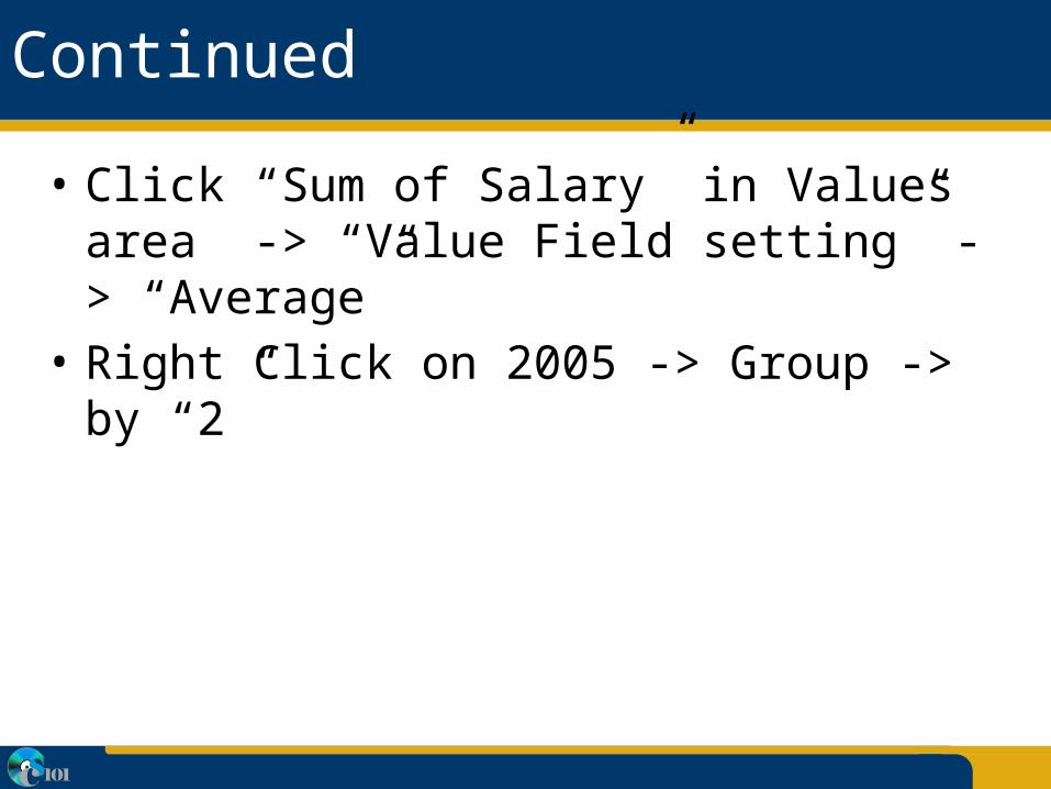
Continued
• Click “Sum of Salary” in Values area -> “Value Field setting” -> “Average”
• Right Click on 2005 -> Group -> by “2”

Payment Function - PMT
• Calculates the payment to be paid per month at fixed amount and fixed constant interest rate.
• Use it to determine if it’s something you can afford (a car, a house, a boat, . . .)
• Syntax=PMT(interest/12, payments, -financed)

Example_4(PMT function)
• Download Example3 from the class website• Enter the following:–B1 (House price) 1,00,000–B2 (down payment) 5,000–B3 (financed amount) =B1-B2–B4 (% interest) 0.06–B5 (years) 30–B6 (number of payments) =B5*12

PMT function
• In B7 (Monthly Bill) type=PMT(B4/12, B6, -B3)
• You should see $569.57 a month for 360 months• Now change period from 30 years to 15 years:– You will see the monthly payment change by 232$

30 years vs. 15 years
• 30-year model569.57*360 = $205,045.2
• 15-year model801.28*180= $144,299.58
• So you’re saving 60,745.68when you go for the 15-year model.

Goal Seek
• Allows for a “what if” analysis scenario• Allows setting a target number and can
manipulate another number to temporarily see what its value should be to reach that specific target
• So now let’s go back to our example and do the following Let’s say that we want to get our monthly payment down to $675 and we need to know how much to put down in order to clear the loan in the same number of years…

Goal Seek
• Make cell B7 the active cell by clicking in it• Select “Data” ribbon Data Tools group What-
If Analysis Goal Seek
• Change the “To Value” 675• “By Changing Cell:” B2 (it will be absolute
reference)• hit OK• Observe the new down payment in B2

Scenario Manager
• Its Part of the “What If” analysis tool of Excel• Enables us to Specify Multiple set of
assumptions and Gives ability to see different sets of “What If” Conditions
• Different scenarios can be stored on work sheet to look at the multiple possibilities

Example
• Download the file Example4
• We will create an “Optimistic” and “Modest” scenario to see what grade you would probably end up with in CS101!

Enter Data
• B2 45• B3 42• C2 =SUM(B2:B13)• D2 =SUM(B15:B17)• E2 =SUM(C2:D2)

Creating “Optimistic” Scenario
• Data ribbon Data Tools group What-If Analysis Scenario Manager
• Click “Add”• Scenario name: Optimistic• Changing cells:– Delete whatever is in the text entry box– Hold down the Ctrl key and select cell ranges: B4:B7 B9 B11:B13 B15:B17
• OK
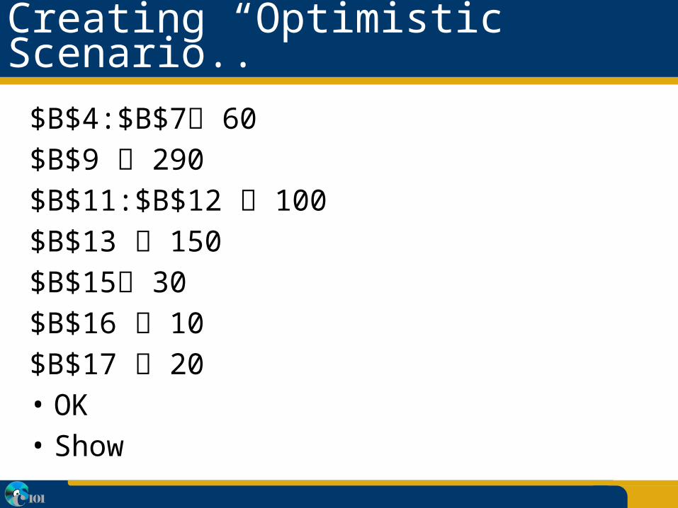
Creating “Optimistic” Scenario..
$B$4:$B$7 60$B$9 290$B$11:$B$12 100$B$13 150$B$15 30$B$16 10$B$17 20• OK• Show

“Modest” Scenario
• Close• Undo• What-If analysis Scenario Manager • Add• Scenario name: Modest• OK

Modest Scenario (Continued)
$B$4 - $B$7 all 40$B$9 240$B$11 - $B$12 80$B$13 120$B$15 25$B$16 5$B$17 15• OK• Show
• Choose “Optimistic” and press “Show”• Go back and forth to see the differences

Scenario Editing
• But what if you have already received your first three homework assignments’ grade? In this case, B3 doesn’t need to be in the scenario anymore. We have to remove it by:
• Data ribbon What-If analysis Scenario Manager • Choose “Optimistic” and press Edit• Replace B4 with B5• Do the same for “Modest”• Show