mix mag double page spread analysis
TRANSCRIPT
Pull Quote
Body text
White space
Main Image
Masthead

Caption
House style- Mix Mag uses bright colours which are associated with electronic music, this has been continued in the use of a two page image which would draw attention to the article which is continued on the next page. The house style continues on the article page due to the use of small text so the article contains a lot of information on one page. The page uses straight lines which would make it appear formal. However the use of bright colours similar to a dance club’s lighting gives an informal appearance and associates it with a younger audience.
The Guttenberg principal- A large drop cap has been placed in a strong fallow area and this may draw the reader to the article due to the size and it being the first place in the double page spread that is first seen. The weaker fallow areas on the first page are filled with the article and are therefore also viewed. On the second page the weak fallow areas are not.
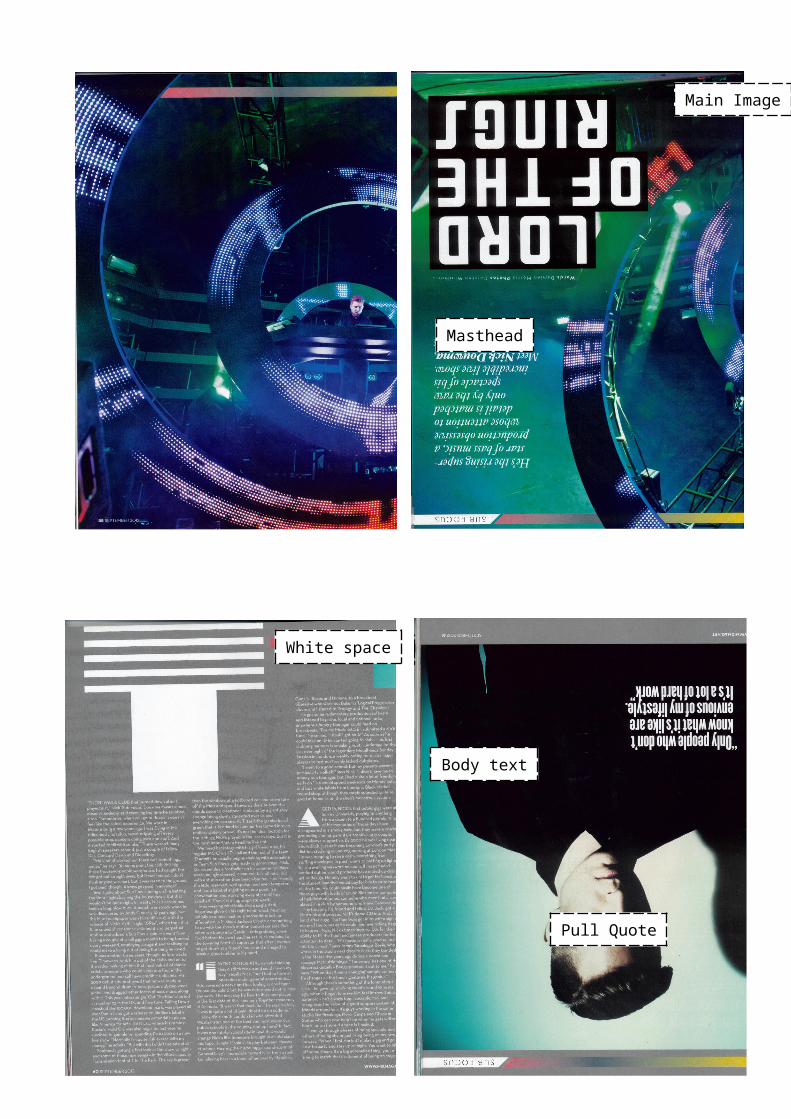
Main Image- The main image on the article page is linked to the page containing the masthead due to the use of the colours blue and black. These contrast each other making the artist more prominent because blue is the colour that is mostly used in the two pages. There is no direct address in the image because the article does not need to involve the reader because they have already taken an interest in the magazine. The lighting hides the subjects face in shadow
Masthead- The article masthead uses black and white. The black is prominent against the images colour therefore it is clearly visible and draws attention. This is also because it takes up a large portion of the page because the article has been placed on the previous page, therefore not detracting from the content. The use of ‘Lord of the Ring’ is likely to interest the reader due to it being unlikely in this magazine.
Text- The text is consistent through the article because it is white on both double page spreads. This links the two pages together. The font varies in the use of drop caps which gives the large space taken up by text more a more interesting appearance. The size of the pull quote also varies to be noticed and to encourage the reader to read the article. The text also stands out because it is prominent against the use of grey making it clear. A lot of text has been used and each column is not broken up into smaller sections to make it easier to read. This means the appearance of the article text does not encourage the reader.
Design Balance- The article page there is no balance between text and images in the layout due to the use of only one main image. The size means the image is more likely to be noticed than other smaller images. It is more likely in a double page spread to use one large image when there is only one artist as apposed to images of a band.
Use of rule of thirds- With a grid each intersecting line would cross through the subject therefore giving it a professional appearance. This fits in the appearance of the magazine which is also at a professional standard. Also with the use of the rule of thirds the subject is recognisable which is important so he is associated with the article.