mogul portfolio · archer medium 200pt archer medium 24pt c74 m52 y20 k2 #52739c c26 m77 y81 k18...
TRANSCRIPT

Mogul PortfolioBrand Design

Glenn Cook Technologies Brand refreshGlenn Cook Technologies, one of Hawke’s Bay’s most
recognised IT specialists, needed a brand refresh that
was more in tune with their reputation as consummate
IT professionals.
When undertaking a brand refresh it’s important to be
mindful and respect the history behind the existing
logo. The current brand had served them well for
more than eight years and Glenn and the team were
keen to evolve the brand identity rather than replace.
After the initial planning session, we explored several
possible design directions but the idea of using the
company initials as the logo was a clear favourite.
The colour scheme used in their existing branding
was given a refresh using more brighter pastel tones.
The icon’s strong and simplistic charm was partnered
with a typeface that was neutral, easy to read and
would bring a warming familiarity to it.
Along with the branding we also developed a new
website to complete the package.
Client
Glenn Cook Technologies
Capabilities
Brand Design, Web Design, Web Development
Website
www.glenncook.co.nz
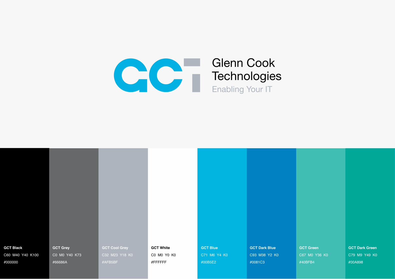
GCT Black
C60 M40 Y40 K100
#000000
GCT Grey
C0 M0 Y40 K73
#66686A
GCT Cool Grey
C32 M23 Y18 K0
#AFB5BF
GCT White
C0 M0 Y0 K0
#FFFFFF
GCT Blue
C71 M6 Y4 K0
#00B5E2
GCT Dark Blue
C93 M38 Y2 K0
#0081C3
GCT Green
C67 M0 Y36 K0
#40BFB4
GCT Dark Green
C79 M9 Y49 K0
#00A898

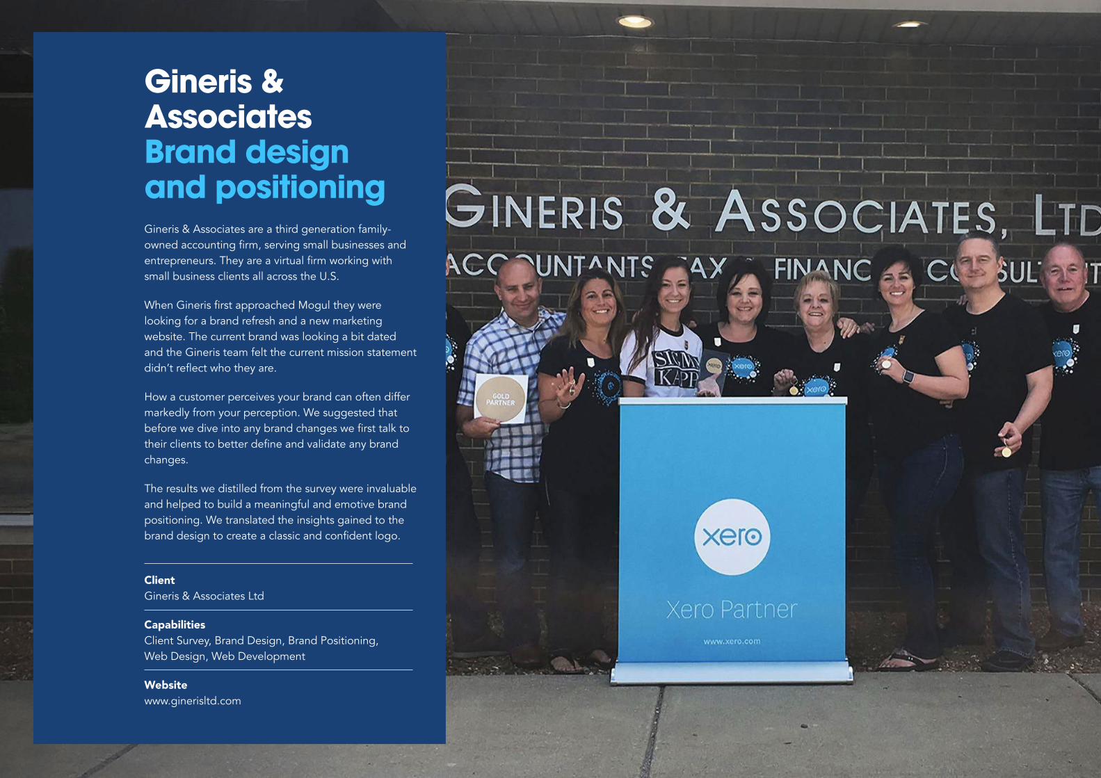
Gineris & Associates Brand design and positioningGineris & Associates are a third generation family-
owned accounting firm, serving small businesses and entrepreneurs. They are a virtual firm working with small business clients all across the U.S.
When Gineris first approached Mogul they were looking for a brand refresh and a new marketing
website. The current brand was looking a bit dated
and the Gineris team felt the current mission statement
didn’t reflect who they are.
How a customer perceives your brand can often differ
markedly from your perception. We suggested that
before we dive into any brand changes we first talk to their clients to better define and validate any brand changes.
The results we distilled from the survey were invaluable
and helped to build a meaningful and emotive brand
positioning. We translated the insights gained to the
brand design to create a classic and confident logo.
Client
Gineris & Associates Ltd
Capabilities
Client Survey, Brand Design, Brand Positioning,
Web Design, Web Development
Website
www.ginerisltd.com


El Gusto Your go-to online recipe bankWhen a group of housewives began sharing recipes
in Argentina, it was the beginning of their next big
adventure - El Gusto. El Gusto is an online recipe
bank, meal planner and inspiration hub for all things
food and entertaining.
When El Gusto approached Mogul, they had the name and the recipes but needed help to bring it
to life. Not only did we develop the brand with the
website but we worked on the go-to-market strategy,
which included a video story and targeted email
newsletter campaign.
We created a simple logo that would be easy to
recognise and read, and aligned with the cooking
industry. Slab typefaces are commonly used in
cookbooks so we first selected a suitable slab typeface that worked well on both print and screens.
We defined a colour palette and produced brand guidelines to provide direction on how to use their
new brand identity.
With the design established, we were then able to
translate the new look and feel across the website.
Client
El Gūsto
Capabilities
Brand Design, E-commerce, Email Newsletter, SLA,
Web Design, Web Development
Website
www.elgustoglobal.com


AaBbAĀBCDEĒFGHIĪJKLMNOŌPQRSTUŪVWXYZaābcdeēfghiījklmnoōpqrstuūvwxyz 1234567890
Archer Medium 200pt
Archer Medium 24pt
C7
4 M
52
Y
20 K
2
#5
27
39
c
C2
6 M
77
Y
81 K
18
#a
24
d3
9
C2
4 M
49
Y
84 K
5
#b
c8
54
4
C2
3 M
29
Y
21 K
0
#b
5b
8b
a
C0
M
0 Y
0 K
0
#ffffff
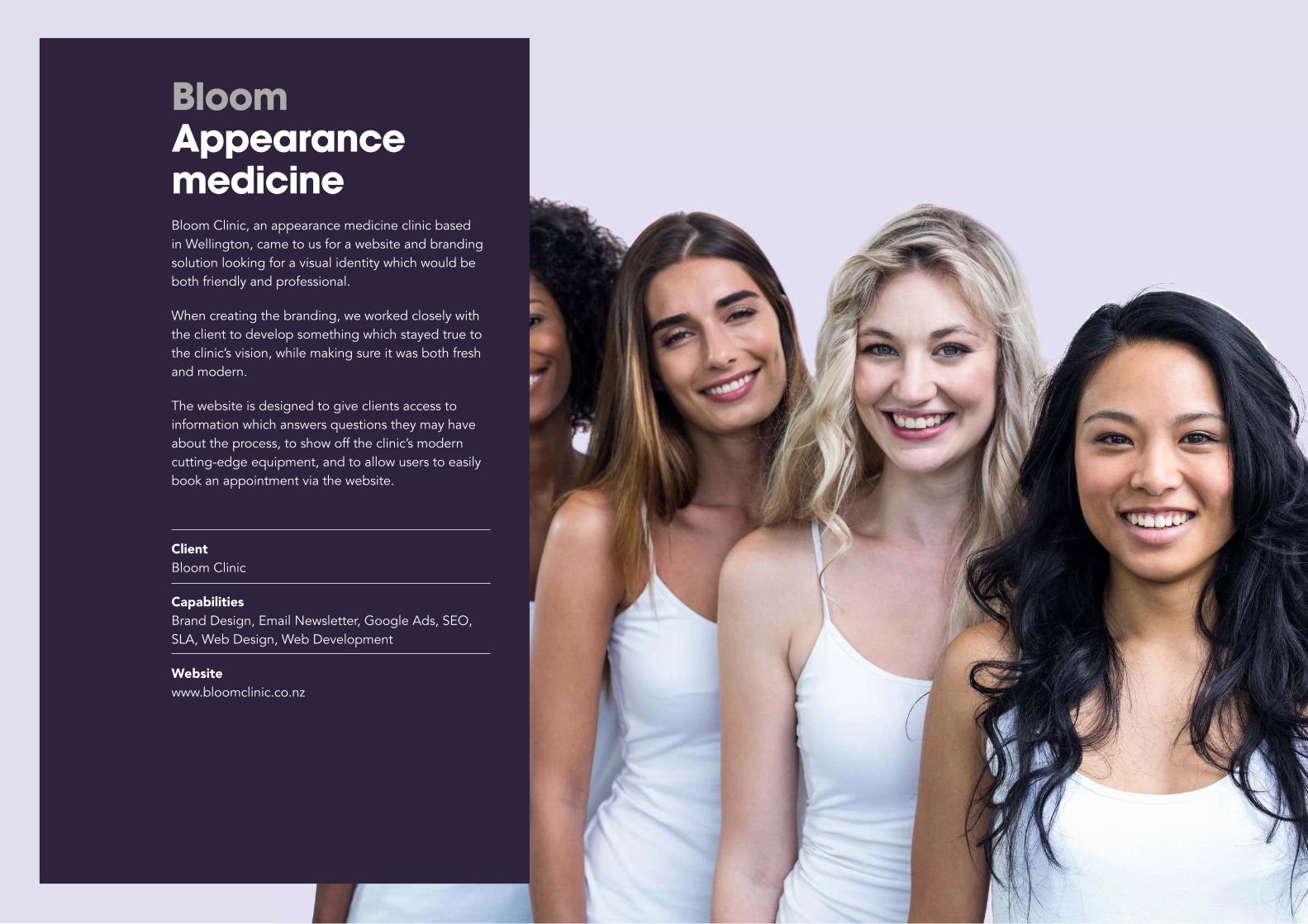
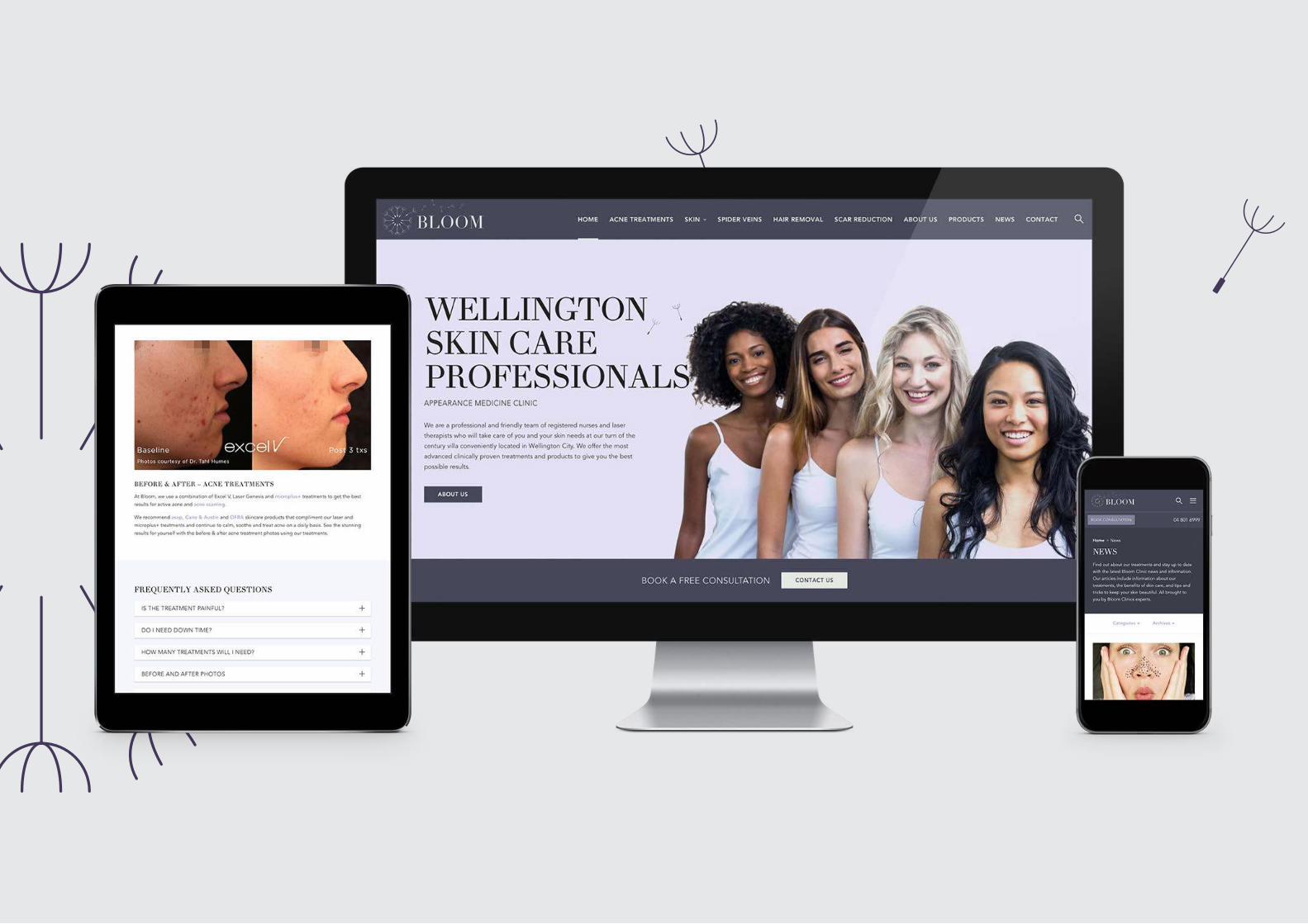
Bloom Appearance medicineBloom Clinic, an appearance medicine clinic based
in Wellington, came to us for a website and branding
solution looking for a visual identity which would be
both friendly and professional.
When creating the branding, we worked closely with
the client to develop something which stayed true to
the clinic’s vision, while making sure it was both fresh
and modern.
The website is designed to give clients access to
information which answers questions they may have
about the process, to show off the clinic’s modern
cutting-edge equipment, and to allow users to easily
book an appointment via the website.
Client
Bloom Clinic
Capabilities
Brand Design, Email Newsletter, Google Ads, SEO,
SLA, Web Design, Web Development
Website
www.bloomclinic.co.nz
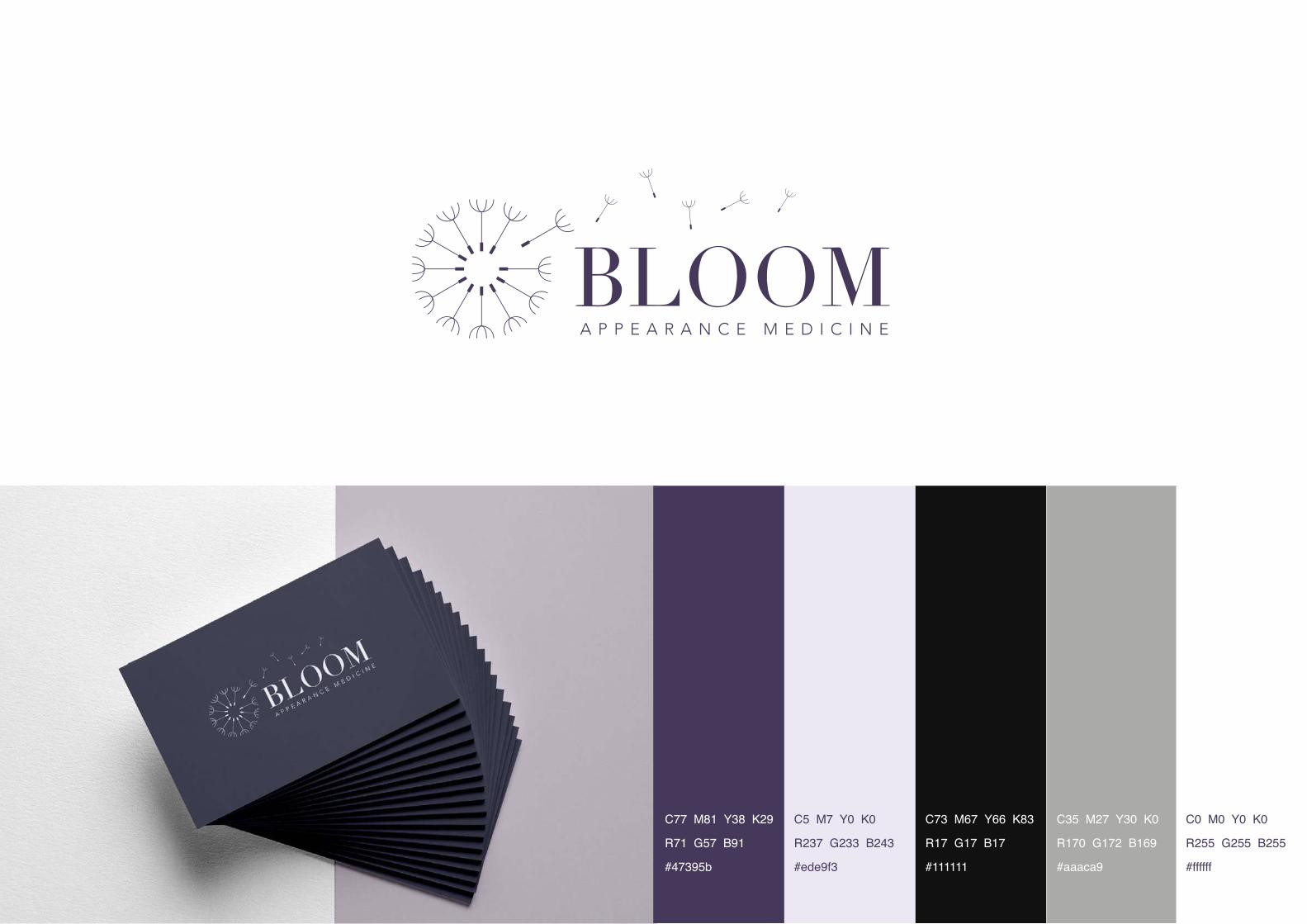
A P P E A R A N C E M E D I C I N E
C77 M81 Y38 K29
R71 G57 B91
#47395b
C5 M7 Y0 K0
R237 G233 B243
#ede9f3
C73 M67 Y66 K83
R17 G17 B17
#111111
C35 M27 Y30 K0
R170 G172 B169
#aaaca9
C0 M0 Y0 K0
R255 G255 B255
#ffffff
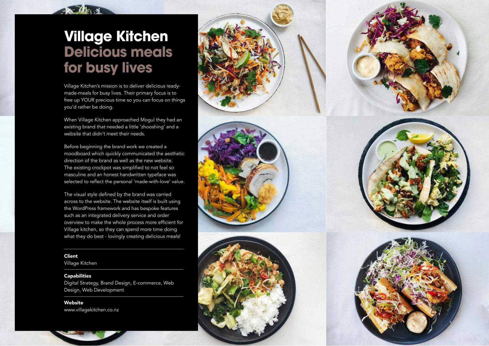
Village Kitchen Delicious meals for busy livesVillage Kitchen’s mission is to deliver delicious ready-
made-meals for busy lives. Their primary focus is to
free up YOUR precious time so you can focus on things
you’d rather be doing.
When Village Kitchen approached Mogul they had an existing brand that needed a little ‘zhooshing’ and a
website that didn’t meet their needs.
Before beginning the brand work we created a
moodboard which quickly communicated the aesthetic
direction of the brand as well as the new website.
The existing crockpot was simplified to not feel so masculine and an honest handwritten typeface was
selected to reflect the personal ‘made-with-love’ value.
The visual style defined by the brand was carried across to the website. The website itself is built using
the WordPress framework and has bespoke features
such as an integrated delivery service and order
overview to make the whole process more efficient for Village kitchen, so they can spend more time doing
what they do best - lovingly creating delicious meals!
Client
Village Kitchen
Capabilities
Digital Strategy, Brand Design, E-commerce, Web
Design, Web Development
Website
www.villagekitchen.co.nz

delicious meals for livesbusy
delicious meals for livesbusy

Typography
hello beautiful MarkerABCDEFG 12345!@#$%bosk hand
ABCDEFG 12345!@#$%
Icon