music magazine layout design
TRANSCRIPT
Layout design-Front cover
Emma CollinsYear 12
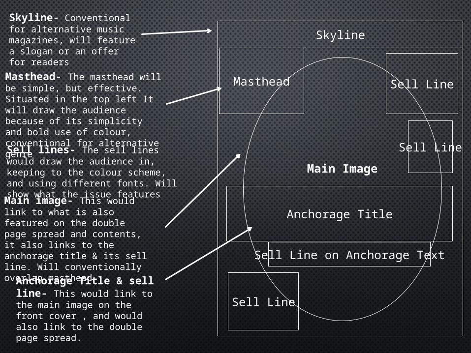
Sell lines- The sell lines would draw the audience in, keeping to the colour scheme, and using different fonts. Will show what the issue features
Masthead- The masthead will be simple, but effective. Situated in the top left It will draw the audience because of its simplicity and bold use of colour, conventional for alternative genre
Anchorage Title & sell line- This would link to the main image on the front cover , and would also link to the double page spread.
Main image- This would link to what is also featured on the double page spread and contents, it also links to the anchorage title & its sell line. Will conventionally overlap masthead
Skyline
Masthead
Anchorage Title
Sell Line on Anchorage Text
Sell Line
Sell Line
Sell Line
Main Image
Skyline- Conventional for alternative music magazines, will feature a slogan or an offer for readers
Masthead
Anchorage Title
Sell Line on Anchorage Text
Sell Line
Sell Line
Sell Line
Main Image
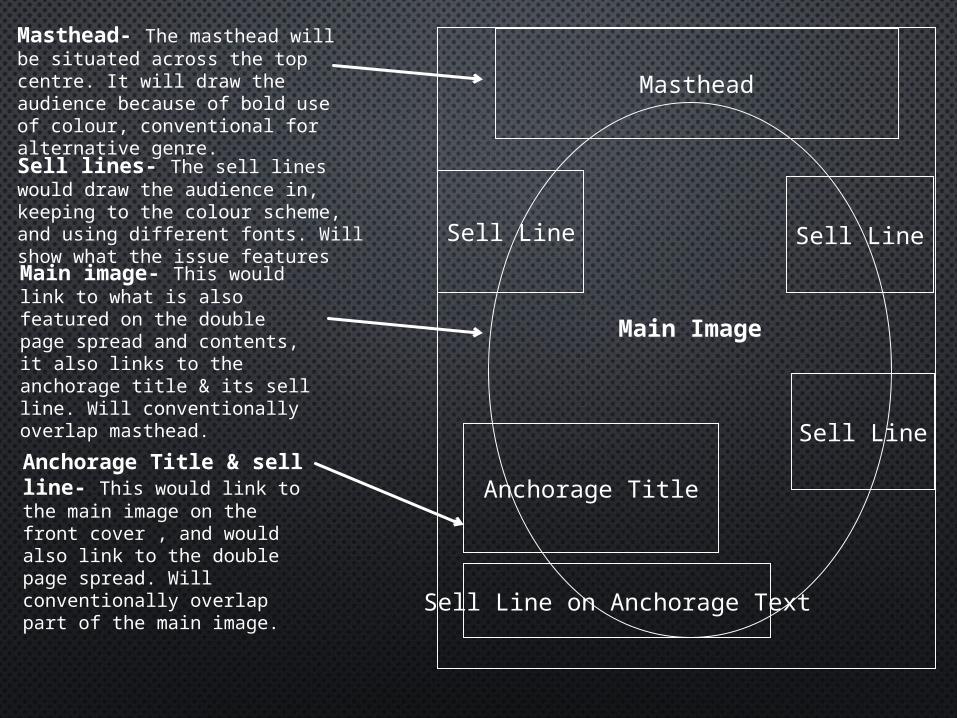
Sell lines- The sell lines would draw the audience in, keeping to the colour scheme, and using different fonts. Will show what the issue features
Masthead- The masthead will be situated across the top centre. It will draw the audience because of bold use of colour, conventional for alternative genre.
Anchorage Title & sell line- This would link to the main image on the front cover , and would also link to the double page spread. Will conventionally overlap part of the main image.
Main image- This would link to what is also featured on the double page spread and contents, it also links to the anchorage title & its sell line. Will conventionally overlap masthead.
Skyline
Masthead
Anchorage Title
Sell Line on Anchorage Text
Sell Line Sell Line
Sell Line
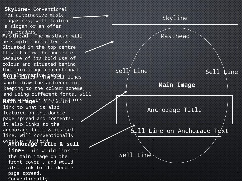
Main ImageSell lines- The sell lines would draw the audience in, keeping to the colour scheme, and using different fonts. Will show what the issue features
Masthead- The masthead will be simple, but effective. Situated in the top centre It will draw the audience because of its bold use of colour and situated behind the main image conventional for alternative genre
Anchorage Title & sell line- This would link to the main image on the front cover , and would also link to the double page spread. Conventionally overlapping the main image
Main image- This would link to what is also featured on the double page spread and contents, it also links to the anchorage title & its sell line. Will conventionally overlap masthead.
Skyline- Conventional for alternative music magazines, will feature a slogan or an offer for readers