my diary cover process and reflection
DESCRIPTION
yaaaaaay finally finished itTRANSCRIPT
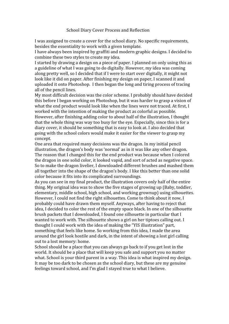
School Diary Cover Process and Reflection I was assigned to create a cover for the school diary. No specific requirements, besides the essentiality to work with a given template. I have always been inspired by graffiti and modern graphic designs. I decided to combine these two styles to create my idea. I started by drawing a design on a piece of paper. I planned on only using this as a guideline of what I was going to do digitally. However, my idea was coming along pretty well, so I decided that if I were to start over digitally, it might not look like it did on paper. After finishing my design on paper, I scanned it and uploaded it onto Photoshop. I then began the long and tiring process of tracing all of the pencil lines. My most difficult decision was the color scheme. I probably should have decided this before I began working on Photoshop, but it was harder to grasp a vision of what the end product would look like when the lines were not traced. At first, I worked with the intention of making the product as colorful as possible. However, after finishing adding color to about half of the illustration, I thought that the whole thing was way too busy for the eye. Especially, since this is for a diary cover, it should be something that is easy to look at. I also decided that going with the school colors would make it easier for the viewer to grasp my concept. One area that required many decisions was the dragon. In my initial pencil illustration, the dragon’s body was ‘normal’ as in it was like any other dragon. The reason that I changed this for the end product was because when I colored the dragon in one solid color, it looked vapid, and sort of acted as negative space. So to make the dragon livelier, I downloaded different brushes and mashed them all together into the shape of the dragon’s body. I like this better than one solid color because it fits into its complicated surroundings. As you can see in my final product, the illustration covers only half of the entire thing. My original idea was to show the five stages of growing up (Baby, toddler, elementary, middle school, high school, and working grownup) using silhouettes. However, I could not find the right silhouettes. Come to think about it now, I probably could have drawn them myself. Anyways, after having to reject that idea, I decided to color the rest of the empty space black. In one of the silhouette brush packets that I downloaded, I found one silhouette in particular that I wanted to work with. The silhouette shows a girl on her tiptoes calling out. I thought I could work with the idea of making the “YIS illustration” part, something that feels like home. So working from this idea, I made the area around the girl look hostile and dark, in the intent of showing a lost girl calling out to a lost memory: home. School should be a place that you can always go back to if you get lost in the world. It should be a place that will keep you safe and support you no matter what. School is your third parent in a way. This idea is what inspired my design. It may be too dark to be chosen as the school diary, but these are my genuine feelings toward school, and I’m glad I stayed true to what I believe.

Final design: