nme analysis
TRANSCRIPT
NME Analysis
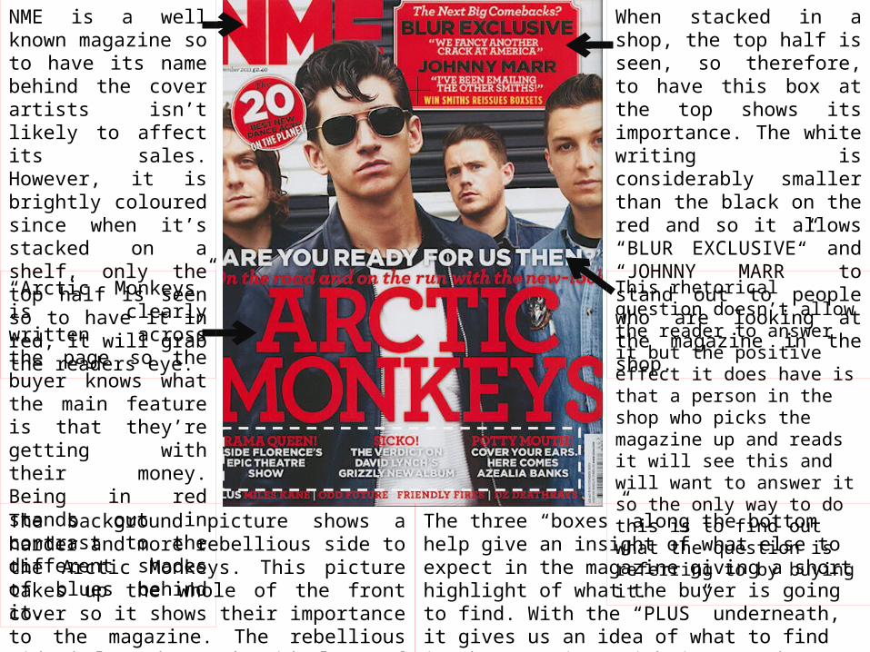
NME is a well known magazine so to have its name behind the cover artists isn’t likely to affect its sales. However, it is brightly coloured since when it’s stacked on a shelf, only the top half is seen so to have it in red, it will grab the readers eye.
“Arctic Monkeys” is clearly written across the page so the buyer knows what the main feature is that they’re getting with their money. Being in red stands out in contrast to the different shades of blues behind it.
When stacked in a shop, the top half is seen, so therefore, to have this box at the top shows its importance. The white writing is considerably smaller than the black on the red and so it allows “BLUR EXCLUSIVE” and “JOHNNY MARR” to stand out to people who are looking at the magazine in the shop.
This rhetorical question doesn’t allow the reader to answer it but the positive effect it does have is that a person in the shop who picks the magazine up and reads it will see this and will want to answer it so the only way to do this is to find out what the question is referring to by buying it.
The background picture shows a harder and more rebellious side to the Arctic Monkeys. This picture takes up the whole of the front cover so it shows their importance to the magazine. The rebellious side helps shows the ideology of the magazine and an idea of its contents.
The three “boxes” along the bottom help give an insight of what else to expect in the magazine giving a short highlight of what the buyer is going to find. With the “PLUS” underneath, it gives us an idea of what to find in the magazine; with just words, we have to buy to find out what.

“INSIDE THIS WEEK” is centric and in capitals, with the date printed below. This is purely to show it’s a contents without writing the word “contents”; it makes it more sophisticated and puts a twist on it.
This page will be page 3 usually so it’s one of the first to be seen. To put an advertisement here, the publisher will know it will be noticed when the reader opens their magazine. This particular advertisement is making the readers aware that they can subscribe to this magazine and it will allow them to save money.
By separating this “Plus” column into twelve different sections, it allows the reader to find exactly what they’re looking for. If they know an artist or band has performed live and want to see the reviews, photos and comments, then this allows them to find it under the “LIVE” header. They know where to find features and where to find reviews, etc. This layout tells them exactly where everything can be found.
The use of having 6 separate photos of artists and bands around the centre picture shows those things which have importance and the publisher thinks the reader will be keen to read. The page numbers are bold on the picture so they are easily accessible and the reader can find them quickly.
As we saw on the front cover, there was a Blur exclusive in this magazine. Not only was it bold but it stuck out and showed that it was an important matter. The centre picture of this contents page is of Damon Albarn with a quote which he said during the interview. The page number is also on this picture, plus being on page 6 is near the front so is going to be found fast if the magazine is being read chronologically. Plus it shows it’s important. “Blur exclusive!” is written again so reinforces that it cannot be found anywhere else.

This double page spread is of the Arctic Monkeys (the band on the cover).
The top two thirds of the left page is of the whole band. Below, we have the article.
The article is written like a story of the interview between NME and the monkeys. The style and language of the writing is very intellectual. The style of writing is as if the interview was fictional and someone has written the events, just like a story.
In the middle of the article, there is a large, bold and striking quote from Alex Turner (lead singer) with eight stars below; this seems to show like NME have rated what he has said. This highlights what the interview consists of.
The red column on the right hand side is rather colloquial and seems relaxed as well as jokey. The title is in a different font so stands out. The answers are in white and names are written in black so it helps break up the speech and who says each bit. This sis separated so that the reader can read this before the whole interview and it allows them to get a taste of what to expect from the rest of the interview.
The rest of the page on the right is of different pictures of the Arctic Monkeys. There are little captions which are red with white writing this is so you get an insight of what was happening if you weren’t to know.