novel visualizations and interactions for social … figure 1. social network representing the...
TRANSCRIPT

TO AUTHORS:
Include only B/W FIGURES (high quality and clear)
FOLLOW THE FORMAT OF THIS SAMPLE
FOLLOW THE FORMAT OF REFERENCES
Chapter X
Novel Visualizations and Interactions for Social Networks Exploration
Nathalie Henry Riche1 and Jean-Daniel Fekete
2
1Microsoft Research, Redmond, USA
2INRIA, France
1. Introduction
In the last decade, the popularity of social networking applications has dramatical-
ly increased. Social networks are collection of persons or organizations connected
by relations. Members of Facebook listed as friends or persons connected by fam-
ily ties in genealogical trees are examples of social networks. Today's web surfers
are often part of many online social networks: they communicate in groups or fo-
rums on topics of interests, exchange emails with their friends and colleagues, ex-
press their ideas on public blogs, share videos on YouTube, exchange and com-
ment photos on Flickr, participate to the edition of the online encyclopedia
Wikipedia or contribute to daily news by collaborating to Wikinews or Agoravox.
Recent online networking systems with a racing popularity such as Friendster,
LinkedIn or Facebook are even exclusively dedicated to manage and extend one's
own social network. Registered users voluntarily enter their contacts (family,
friends or colleagues) and the nature or their relationships. Contacts not already
registered on the website are personally invited to join the community. Thanks to
this snowball effect, these online communities grow almost exponentially each
day. Before this era of online social networking sites, large social networks were
already available such as telephone networks listings, postal communication or
bank transactions. However, the fact that these systems store all their data digital-
ly and make it available online tremendously simplifies their collection and analy-
sis processes. Compared to data collected through polls and interviews, collected
networks are far larger and often contain much richer information. This avalanche
of vast new datasets raises new challenges for their analysis: tools need to support
a very large amount of data often evolving through time.

2
Analyzing how people communicate, collaborate, what information they ex-
change, what role they play in the social group is becoming a point of interest of a
large variety of organizations, out passing the personal use. The stakes of social
networks analysis are becoming very high. Since September 11, research has been
led to help intelligence agencies monitor closely terrorist networks, attempting to
discover when they will act. After epidemic diseases such as SARS or the bird flu,
the need for effective analysis tools to study transmission networks and to seek
and contain new outbreaks is becoming pressing. The needs to perform detailed
social network analysis is also important, for company managers and research in-
stitutes, who aim at studying the flow of communication between employees or
the strength of collaboration between scientific to evaluate them and improve
their productivity. While a large part of research in social network analysis is ded-
icated to develop models of such social networks to predict their evolution or bet-
ter study their structure, there is a clear need for tools supporting the exploratory
analysis of real social networks.
In the last five years, an increasing part of the research in information visualiza-
tion focused on graph exploration, tackling the problem from novel angles using
alternative representations to traditional node-link diagrams, as well as novel in-
teraction techniques, scaling to explore larger graphs. In this article, we review
these novel techniques in the context of social network analysis.
2. Node-Link Diagrams
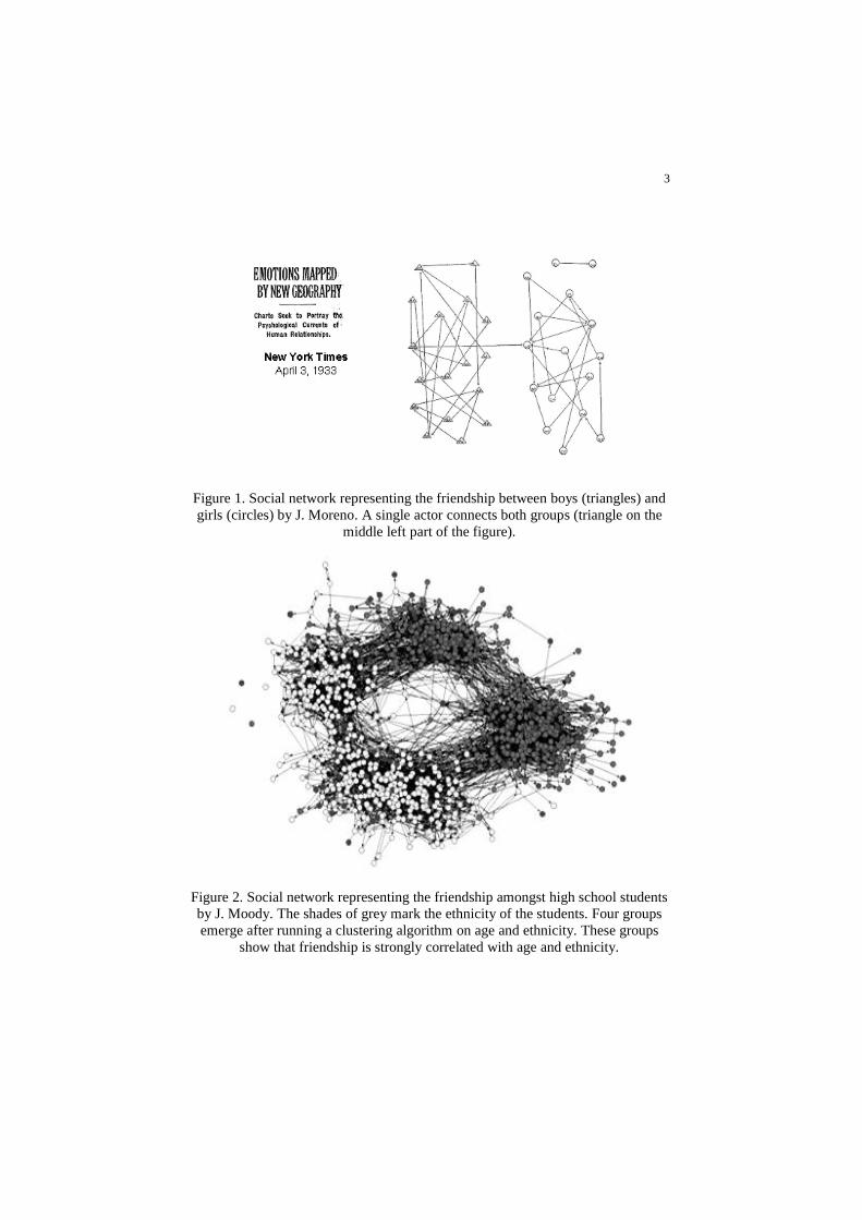
Jacob Moreno was the first pioneer of social network visualization [1]. More than
70 years ago, he published visual depictions of social friendship in schools, using
these visualizations to support his findings. Figure 1 presents an example of node-
link diagram depicting friendship between girls and boys. The principle of node-
link diagrams is to graphically represent actors of the network by nodes and con-
nections by links. In Figure 1, different shapes are used for the nodes, marking
males and females; arrows connect them, indicating the directionality of the
friendship relation.
Node-link diagrams are the most commonly used representation of graphs and
networks. It is well illustrated by Freeman in his survey and history of social net-
work visualization [2]. In this article, Freeman presents a wide variety of social
networks and demonstrates that visual representations are a powerful tool to illus-
trate social network analysis concepts such as central actors or communities. Fig-
ure 1 demonstrates how a visual representation can highlight central actors, repre-
senting communities by two dense groups of nodes and links and placing the actor
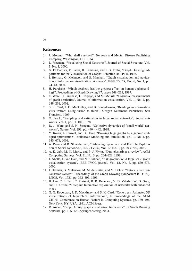
bridging them in the center of the representation. Figure 2 presents an example
from Moody, in which four distinct communities emerge.
3
Figure 1. Social network representing the friendship between boys (triangles) and
girls (circles) by J. Moreno. A single actor connects both groups (triangle on the
middle left part of the figure).
Figure 2. Social network representing the friendship amongst high school students
by J. Moody. The shades of grey mark the ethnicity of the students. Four groups
emerge after running a clustering algorithm on age and ethnicity. These groups
show that friendship is strongly correlated with age and ethnicity.

4
Node-link representations are widely used and familiar to a very large audience,
making them a powerful communication tool. However, their readability and the
message they convey greatly depends on the positions of their nodes. Whether
they are manually drawn as in Figure 1 or automatically generated as in Figure 2,
determining what makes a node-link diagram aesthetically pleasing, easy to read
or conveying given findings is a difficult challenge. Since the 90s, an entire field
of research is devoted to the problem of graph drawing, i.e. generating algorithms
to place nodes in the space according to certain criteria such as minimizing the
number of link crossing each other. A good introduction to graph drawing can be
found in the book of Di Battista et al. [3] including more than 300 algorithms to
layout graphs in 2D space. Additional state-of-the-art techniques to draw and nav-
igate in node-link diagrams can be found in Herman et al. [4]. Researchers per-
formed a number of studies [5,6] to identify which criteria are the most important
to improve human understanding. However, the number of these criteria and their
interaction with each other is so large that it is difficult to identify a core set and
thus create the ideal layout algorithm.
Information visualization has a slightly different perspective on the topic [7]. This
field of research focuses on visual exploration and the discovery or communica-
tion of insights about the data. For example, representations in Figure 1 and Figure
2 do not provide the best possible layout (and certainly do not minimize the num-
ber of link crossings) but they convey important information about the network
highlighting central actors and social groups. Different representations may help
discover different insights in the data. Thus, information visualization does not
aim at the ideal representation but advocates for the use of multiple representa-
tions and multiple perspectives on the data, supported by interactions to quickly
explore them. Following this philosophy, we present in this article a set of tech-
niques to complement the use of traditional node-link diagrams for analyzing so-
cial networks.
3. Scaling to Larger Networks
While many systems exists for analyzing small and medium sized networks, up to
a few hundred nodes, scaling to large networks with several thousand or even mil-
lions of nodes remains a challenge. Node-link diagrams with more than a few
hundred nodes often become an undistinguishable hairball of nodes and links, dif-
ficult to transform either automatically or manually into a readable representation.
In this case, analysts have to resort to one or more of these solutions:
1. Reducing the quantity of information by filtering or aggregating data
2. Representing a subset of the network and exploring it incrementally
3. Providing more visual space to represent the graph
4. Using an alternative representation

5
3.1 Reducing the quantity of information
An obvious technique to reduce the size of a graph is to remove some of its verti-
ces and edges. Two approaches exist to filter networks: 1) filtering out elements
while preserving a representative sample or 2) filtering data that is not of current
interest to the analyst.
1. There are multiple ways to sample a network [8]. However, this approach is
particularly challenging for social networks as they often exhibit small-world
networks properties [9]: globally sparse and locally dense networks. In these
cases, preserving a representative topological structure is difficult as filtering
links can result in disconnecting the network or losing the power-law distribu-
tion of the connections. Recent advances in graph drawing compute a hierar-
chical decomposition of graphs [10], each level being a coarsened version of
the previous one. This decomposition is useful both to speed-up the layout
computation and to visualize a meaningful structure at several zooming level.
However, due to the small-world property, coarsening a locally dense graph
still produces a locally dense graph albeit smaller.
2. The second approach is to filter nodes and edges according to the value of a
given measure. This measure can be computed according to structural proper-
ties of the graph (e.g. filter by connected components), or based on data prop-
erties of the network (e.g. filter data by year). SocialAction [11] is a good ex-
ample of social network analysis system based on filtering (Figure 3). In this
system, nodes and edges are ranked according to specific features or metrics
such as centrality or betweenness selected by the user. This ranking controls
the sections of the network displayed as well as visual encodings such as col-
or and size.
A different approach to reduce the quantity of information displayed without fil-
tering is to aggregate nodes and edges together. Many techniques exist to com-
pute cluster data [12]. Ideally, the output of graph clustering techniques is a set of
clusters regrouping similar vertices (according to some similarity metrics comput-
ed from topology or data attributes). Then, to gain space, vertices appearing in the
same cluster can be aggregated into a single representative super-node (Figure 4).
This aggregation can be done iteratively, aggregating the network at multiple lev-
els of details. Ask-GraphView [13] is a good example of such systems.
Reducing the quantity of information displayed lead to multiple issues. When fil-
tering nodes and links, the topological structure of the network may be damaged
and specific properties lost. When aggregating nodes together, detailed infor-
mation on the connectivity inside the super-node is lost and data attributes of indi-
vidual nodes have to be averaged or summarized in some ways. Other attributes
can be created as well, such as the count of elements in the cluster, averages, min
values, etc.

6
Figure 3. Screenshot of Social Action, the panel on the left show an ordered list of
actors sorted by betweeness centrality. The nodes are colored according to this
measure and users can filter the network to show the top most central actors.
Figure 4. Initial network on the left, resulting aggregated network on the right
3.2 Incremental exploration
When dealing with large networks, the main challenge is to obtain a readable lay-
out in a reasonable time. Algorithms exist to handle special cases of networks such
as large trees, able to draw trees without crossings, in a time linear with the num-
ber of nodes. Thus, researchers explored the possibilities to draw networks as
trees and ―fix‖ them by adding additional links [14] (Figure 5). Unfortunately as
the network gets further away of the tree structure, the visual representations be-
come less readable. In this case, the remaining solution is used to show only a
subset of the network and to provide interaction to explore the remaining parts.
TreePlus [15] is a good example of such system, exploiting the readability of tree
layout algorithms and combining it with fast interaction techniques (Figure 6).
The disadvantage of systems based on incremental exploration is the lack of over-
view provided to the user making it difficult to guide the analysis and therefore
necessary to explore the whole network.

7
Figure 5. A network represented as tree plus additional links on the left. A net-
work represented as a Treemap plus additional links on the right.
Figure 6. A screenshot of TreePlus, representing a small part of a network as a tree
and providing interaction to explore the remaining parts.

8
3.3 Using more visual space
To augment the available visual space, a number of researcher work investigated
the third dimension. One more dimension theoretically offers more display space
and also provides an additional freedom to optimize aesthetic criteria such as min-
imizing the number of link crossings. A number of systems draw graphs in 3D
[16, 17], examples are provided in Figure 7. The main drawback of 3D representa-
tions is the occlusion and the difficulty for users to create a mental map of the
whole network [18]. To solve these issues, some systems attempt to provide mul-
tiple views to users; others offer them navigation and interaction techniques to
visualize the network under multiple angles. However, in most cases, these tech-
niques disorient users, making visual exploration fruitless. Several studies show
that if 3D visualizations may appear attractive, they do not improve performances,
even decreasing them for several tasks [19].
Another approach to increase the visual space is to use alternate geometries such
as hyperbolic geometry instead of Euclidian geometry. In the hyperbolic space,
the parallelism axiom is rejected (i.e., two parallel lines in Euclidian space diverge
from each other in hyperbolic space). Thus, considering a disk in hyperbolic
space, the space increases exponentially as one gets further from its center. A net-
work drawn on such a disk benefits from an infinite space on its borders. The
principle applies to 2D [20] and 3D [21] (see Figure 7). Unfortunately, to be dis-
played, hyperbolic spaces have to be projected in a Euclidian space and, similarly
to 3D representations, navigating in hyperbolic space is disorienting for users, re-
quires extensive navigation and makes it more difficult to build and maintain a
mental map of the whole network.
3.4 Alternative representations
The last solution to visualize large diagrams is to resort to a different representa-
tion than node-link diagrams. An obvious choice is to use the adjacency matrix
representation. We dedicate the remaining of this chapter to its variations. Other
alternative representations are Treemaps, a tree visualization similar to Venn Dia-
grams where sub-trees are depiected with inclusion [22]. Exploiting the earlier ap-
proach of visualizing networks as trees with additional links, researchers have at-
tempted to use Treemaps+links [23] to represent networks (Figure 5). Similarly to
the attempts described earlier, these representations decrease in readability as the
network get denser. Finally, a few systems use simple charts such as bar charts
and scatter plots to analyze networks such as PaperLens [24] and NetLens [25]
(Figure 8). These charts represent different attributes of the actors of the network.
While they do not provide any overview or visual depiction of the actual actors
and connections, they allow users to answer questions by querying the charts back
and forth.

9
Figure 7. Top images show networks drawn in 3D: ConeTrees on the left and vis-
ualization generated with the Tulip toolkit on the right. Bottom images show net-
works represented in hyperbolic space: 2D on the left and 3D on the right.
Figure 8. A screenshot of NetLens, an interactive system to explore networks us-
ing simple bar charts. Users filter different attributes of the network by clicking on
corresponding bars. NetLens provide the textual result on the lower windows.

10
4. Adjacency matrix representations
An adjacency matrix is a table in which vertices of the graph are placed both in
rows and columns. If vertex A is connected to vertex B, the cell at the intersection
of the line of A and the column of B is marked. Since vertices are represented both
in rows and columns, there are two cells corresponding to a pair of vertices, mak-
ing it possible to represent directed edges. In the case of non-directed graphs, the
mark is generally duplicated in both cells. Traditionally, a numerical value marks
the connection (0 if no connection, 1 if there is one, n if the edge is weighted).
Figure 9 shows an example.
Contrary to node-link diagrams, which suffer from link crossings when the net-
work is dense and from the high complexity of the layout algorithm when the
number of nodes of the network is large, adjacency matrices scale very well. In-
deed, the cells representing the links do not cross of overlap each other and the
time to draw the representation is low since the whole list of actors is placed line-
arly. However, two main factors have to be considered when using adjacency ma-
trices to represent large graphs:
1. While always readable, matrices require reordering of their rows and columns
to reveal insights about the data.
2. Matrices use an amount of space quadratic in the number of nodes, requiring
effective navigation techniques to explore them.
Figure 9. Node-link diagram and its corresponding adjacency matrix on the left.
Bertin’s reordorable matrix [26] on the right.

11
4.1 Reordering
In his ―Semiology of graphics‖ [26], Jaques Bertin shows that replacing numerical
values by visual indicators and reordering rows and columns dramatically im-
proves the readability of tables and matrices. Figure 9 shows an example of the
reorderable matrix. This matrix contains only 5 rows and 5 columns, representing
the consumption of 5 types of meat in 5 countries. While the numerical table
makes it possible to read any cell, it remains difficult to grasp higher-level organi-
zation of the data. However, once values are transformed into graphical indicators
and rows and columns are manually reordered, one can discover a number of in-
sights.
First, one can identify at a glance that France is the country producing the most
meat overall, while Belgium is the country producing the least. One can also iden-
tify three profiles of production (marked as A, B and C on the Figure). To go a
step further in interpreting this matrix, imagine that a law must be voted to limit
the production of porcs (first column). According to the production profiles, this
law would upset the two countries in group A. This representation shows that the
country to convince is Belgium, since its profile of production is neutral. This ex-
ample illustrates the importance of reordering the rows and columns of a matrix.
While non-reordered matrices are readable, reordered matrices may help discover
more insights about the data.
A large variety of techniques exists to reorder rows and columns of an adjacency
matrix. Performing a survey of these techniques is a challenge since they come
from a variety of domains and serve a variety of purposes. For example, tech-
niques to linearize a graph (i.e., placing all the vertices linearly and ordering them
to maximize an aesthetic criterion such as minimizing the number of edge cross-
ing) or techniques to minimize the bandwidth of a table to optimize computation
can be used to reorder adjacency matrices. These techniques vary in their com-
plexity and the quality of their results varies according to the context. Mueller et
al. [27] attempted to compare the quality of 8 algorithms. However, evaluating
which order leads to better analysis results is challenging [28] since it depends on
the data and tasks to be completed. A good measure of quality remains to be
found.
Visual patterns can emerge from ―well ordered‖ matrices, compare to ―well
placed‖ node-link diagrams. Figure 10 shows examples of relevant pattern for so-
cial network analysis. In this case, both representations were arranged manually.
Several tools such as PermutMatrix [29] or VisuLab [30] offers visual representa-
tions of matrices and allows to experiment with multiple reordering techniques
and their associated parameters. While we will not detail the categories of reorder-
ing techniques in this chapter, it is important to understand that a given ordering
may have a strong impact on the readability and interpretation of matrices, simi-
larly to the effect of the graph layout on node-link diagrams.

12
Figure 10. Visual patterns in matrices and node-link diagrams:
A - central actor, B - community, C - clique.
4.2 Navigation
Considering a given level of details, matrices require more space than node-link
diagrams. For example, on a 17-inch monitor, matrices are limited to approximate-
ly a hundred of rows and columns if the analyst desires to read each label com-
fortably. Scaling to larger graph therefore requires extensive navigation.
In the field of Human-Computer Interaction, many techniques exist to navigate in
large spaces, possibly at different levels of details. Most common techniques are
Focus+Context [31] such as bird’s eye views and fisheyes. Bird’s eye views con-
sist in miniature overviews of the whole representation in which users may move
the position of their current view. This technique results in faster navigation than
with standard scrollbars. Fisheyes allow visualizing multiple levels of details in a
single view. Fisheyes act as magnifying lenses increasing details on regions of in-
terest. TableLens [32] is a good example of the use of fisheyes in tables and matri-
ces.
When navigating in large matrices it is essential to be able to read labels of rows
and columns. For this reason, splitting the screen is a good solution. More sophis-
ticated techniques exist, folding the space in 1D or 2D such as Melange [33] to
provide both readable labels and context. A few navigation techniques have been
specifically designed for navigating in adjacency matrices: MatrixZoom [34] or
ZAME [35] provide navigation in aggregated matrices.

13
5. Visualizing social networks with matrix-based representations
Matrices or node-link diagrams both have advantages and drawbacks for visualiz-
ing social networks. In this section, we present the pros and cons of each represen-
tation and propose a set of visualizations combining the best of both worlds.
5.1 Matrix or node-link diagram?
Matrix and node-link diagrams have different properties making them suitable
representations for different tasks and datasets. Ghoniem et al. [36] performed a
user study to quantify the performance of both representations for several low-
level readability tasks. To summarize their results, the study showed that node-
link diagrams are more effective for very small (under 20 vertices) and sparse
networks whereas matrices outperform them otherwise except when the task is to
follow paths in the network. Building from these results and our experience, we
attempt to list the main advantages of each representation in the following para-
graph.
The advantages of matrices:
1. Matrices provide powerful overview visualization since the time to create
them is low and since they are always readable. They constitute a good
representation to initiate an exploration.
2. Matrices do not suffer from node overlapping, if the task requires to al-
ways read the actors’ labels, this representation is more appropriate.
3. Matrices do not suffer from link crossing each other; therefore they are a
viable alternative for dense networks.
4. Matrices show all possible pairs of vertices, they can highlight the lack of
connections and also the directedness of the connections. They are par-
ticularly appropriate for directed and dense networks.
The advantages of node-link diagrams:
1. These representations are familiar to a wide audience; they constitute a
powerful communication tool. In contrast, matrices require training and
help decoding their meaning for novice users.
2. For small or sparse networks, Ghoniem et al. [36] proved that node-link
diagrams were more effective than matrices.
3. For a similar level of details, the space used by matrices is larger than the
space to display node-link diagrams. Therefore, for a compact representa-
tion, node-link diagrams are a better choice.
4. When the analysis requires to perform a number of path-related tasks
(e.g., find the shortest path from John to Mary), node-link diagrams are
more appropriate. Ghoniem et al. [36] showed that such tasks were diffi-
cult to perform with matrices.

14
Figure 11. A screenshot of MatrixExplorer. This system combines matrices (left
large window) and node-link diagrams (right large window). The smaller window
on the left shows a treemap view of the macrostructure of the network (connected
components). The windows in the lower right corner show miniature bird’s eye
views of the visualizations. Queries and textual data are shown in top windows.
5.2 Matrix + Node-Link Diagrams
To combine advantages of both representations and to support the visual explora-
tion of social networks, we designed MatrixExplorer [37] (Figure 11). To con-
ceive this system, we observed and discussed with a small group of social scien-
tists. We divided their analysis process in four main stages. For each, we describe
how matrices and node-link diagrams can be combined to achieve the best of both
worlds.
1. Initiate the exploration
2. Explore interactively and iteratively
3. Find a consensus in the data or validate an hypothesis
4. Present the findings
Initiate Exploration
The main advantage of matrices is to always provide a readable representation of a
network even when it is very large. Associated to their low rendering time, these
two properties make them suitable representations to initiate the exploration. To il-
lustrate this idea, we study the following example.
Figure 12 shows a matrix and a node-link representation of a social network con-
taining the email exchange of more than 450 persons during a year. Persons are
nodes or rows/columns, email exchanges between two persons are represented by
a link or a cell filled with black in the matrix. The node-link representation, using
a traditional force-directed layout, makes it difficult to identify specific nodes or
links. After studying this diagram, an analyst may retain that the network is very
dense and form the hypothesis that almost everyone have been exchanging emails
with each other. One may also identify a few nodes on the periphery, indicating
that a few persons did not communicate with the rest.

15
Figure 12. Social network representing the email communication of more than 450
persons in a research institution over a year. The left image is a node-link dia-
gram; the right image is a matrix (black shows connection, grey is no connection).
Studying the matrix representation conveys far more information. Each black dot
represents a connection between a row and a column (i.e. an email exchange be-
tween two persons); the gray background shows the lack of connection. From the
matrix presented in Figure 12, an analyst can quickly assess that the network rep-
resented is, in fact, not very dense. Indeed, there is a majority of gray in the matrix
showing that many actors did not exchange email with each other.
Studying further the representation, the analyst can observe clusters of black dots
in the matrix. These blocks are groups of persons, exchanging a lot of email with
each other. Since this data shows the email communication of a large research or-
ganization, glancing at the names of these actors reveals that these groups are in
fact research teams. In addition to the clusters, the analyst can observe a cross pat-
tern: vertical and horizontal lines constituted of black dots with an approximate
length of half the matrix. Glancing at the names of the actors reveal that this pat-
terns is associated with the administrative service, dealing with travels of the
whole institutions and thus, communicating with many persons in the network.
This simple example shows that matrices have a strong potential to convey the
overview of a network and initiate its exploration. We showed that, when correctly
reordered, matrices highlight salient patterns of a network such as clusters or cen-
tral actors. However, since they are far less familiar than node-link diagrams,
some time is required to learn to decode and interpret these visual patterns.

16
Explore interactively
After interviewing and observing multiple social network analysts, we realized
that the exploration process itself is iterative and requires the creation of multiple
visualizations. Interaction on these representations includes the configuration of
the visualization (adjust its layout and its graphical attributes), the filtering as well
as the grouping and possible aggregation of some of its elements.
Both the matrix and node-link representations support the analysis of the network
at different levels of details. For instance, if an analyst is looking for an overview
of the network to identify its main communities, the matrix is the best option.
Then, when a more detailed analysis is required, to identify actors bridging two
communities for example, node-link diagrams constitute a better alternative. With
MatrixExplorer, we provide multiple views of the network and provide a number
of tools to interactively manipulate matrix and node-link representations (Figure
11).
Initially, the matrix and node-link representations are synchronized to combine
their advantages and ease the identification of visual patterns. Selecting a row or
column in the matrix highlights the corresponding node in the other representa-
tion.
In addition, visual variables such as size or color can be shared by both visualiza-
tions. Thus, it is possible to use matrices for some tasks and node-link diagrams
for other. Selecting a visual pattern in the matrix and visualizing its equivalent in
the node-link diagram also ease the understanding and learning of matrix repre-
sentations, making them accessible to less expert users.
To interactively manipulate matrix and node-link representations, we provide the
following set of tools:
1. Interactive specification of visual attributes. The user controls the mapping
data-visual encoding by entering values in a text field or selecting a value in a
list. Visual attributes of nodes, rows or columns such as label, color, transpar-
ency or size as well as attributes of links or cells such as thickness, color or
texture may be associated to a data attribute.
2. Interactive layout and reordering. Users may directly move a node or a
row/column in both representations to change its position or order.
3. Automatic layout and reordering techniques. Since laying out node-link dia-
grams or reordering large matrices by hand may be extremely tedious, we
provide algorithms to automate layouts and reorderings. These techniques
vary in their computation time and quality. As we mentioned earlier, it is dif-
ficult to identify the appropriate techniques a priori, thus we provide users
with several.
4. Computer-assisted layout and reordering techniques. We developed tools to
support reordering, allowing users to apply layout and reordering algorithms
to specific subsets of the network.

17
5. Interactive filtering. This functionality allows filtering actors or connections
according to a selection or by selecting a specific value of a data attribute
from a list (such as age or sex for example). Using the principle of dynamic
queries [ref], the system provides dynamic feedback when the user modifies
the parameters of the filter.
6. Interactive clustering. Once groups of actors are identified, we provide a sim-
ple mechanism to mark them and associate them to a visual attributed such as
the color or shape of the nodes.
7. Overview+Detail techniques to navigate in both representations. To support
navigation in large visual spaces, we propose two techniques providing fo-
cus+detail. We provide a brid’s eye view to nagivate and a fisheye lens to
magnify regions of interest for details. We also provide a Treemap to repre-
sent the macrostructure of the network (Figure 11) and providing a fast filter-
ing mechanism to isolate each connected component of the network.
By combining both representations of a network and by interacting with them,
MatrixExplorer supports an iterative and interactive exploration process. Users
can create multiple views on a network, compare them and explore them at differ-
ent levels of details.
Find a consensus in the data
Each visualization may lead to the discovery of different insights. While in many
cases, these insights may be confirmed by searching them using different repre-
sentations, layouts or order during the analysis. It is possible that they differ
slightly or even contradict each other when observed under different conditions.
This may happen when attempting to identify clusters for example. In this case,
different techniques to reorder the matrix may lead to different cluster sets. To
help analysts find a consensus and validate hypotheses, some support is needed.
MatrixExplorer allows analysts to find consensus in the data through simple inter-
actions. For example, by associating visual variables such as colors to different
cluster sets and by reordering the matrix several times, analysts can identify clus-
ters appearing clearly in multiple orders as more valid. In addition, to mark the
uncertainty of attribution of an actor to a given cluster, MatrixExplorer also pro-
vides a technique to indicate the degree of membership of the element to a given
cluster. Analysts can mark elements less likely to belong to a cluster with a lighter
color. Finally, we support overlapping clusters and multiple sets of clusters: ele-
ments may belong to multiple clusters at the same time.
Present findings
While matrix representations may prove effective when exploring large networks,
node-link diagrams are essential to communicate findings to a wide audience.
Many node-link diagrams may be created for presenting results with different fil-
ters and possibly different aggregations. To ease this process. MatrixExplorer al-
lows users to generate pictures while performing the exploration.

18
5.3 Hybrid representations
Providing both matrix and node-link diagrams to the user has a number of ad-
vantages but also drawbacks. First, it requires a large amount of display space. At
least 2 display monitors are required to comfortably use MatrixExplorer; a third
one is strongly recommended to display textual and detailed views. Secondly, we
observed that switching from one representation to the other may induce high
cognitive load to the user and split attention is always tiresome. Indeed, a single
node on the node-link diagram becomes both a row and column in the matrix and
a link, visually represented by a line, becomes a cell, i.e. a rectangle, in the matrix.
Switching representations between tasks require a few seconds of adjustment, dis-
orienting momentarily users. To minimize the display space required and limit the
cognitive cost when switching representations, we developed two hybrid represen-
tations: MatLink [38] and NodeTrix [39]. The goal of these hybrids is to augment
one representation to overcome its drawbacks and enrich it with the advantages of
the other one.
Augmenting matrices
As Ghoniem et al. demonstrated in their study, matrices do not support well path-
following tasks. For example, finding the shortest path between two given actors
is far easier in a node-link diagram, in which users can quickly investigate the
multiple paths and assess what the shortest path is. These tasks being very com-
mon in social network analysis, we proposed to create a hybrid representation to
overcome the problem in matrices: MatLink (Figure 13).
The principle of MatLink is to augment a standard matrix representation with links
on its borders. These links provides a dual encoding of the connections between
actors and ease path-following tasks since they use the visual representations of
node-link diagrams. Two types of links are added to the representations: static
links (in white on the figure) and interactive links (in a darker shade). The interac-
tive links appear when the mouse cursor is moving over a specific row or column.
When a row or column is selected, these links show a shortest path to any othe
row or column placed under the cursor.
Figure 13. Matlink support path-following tasks in standard matrices by adding
links of their borders. White links are static and alsways shown. Links with a
darker shades are interactive and follow the mouse pointer or selection.

19
Assessing the readability of MatLink
To assess the performance of MatLink compare to traditional matrices, we per-
formed a user study, borrowing the study design, low-level readability tasks and
procedure from Ghoniem et al.[36]. In addition, we introduced specific tasks of
social network analysis: find a cut point, find a clique and find communities
(strongly connected groups). Our results show that MatLink significantly improve
standard matrix representations. In particular, MatLink ease path-following tasks
and performs even better than node-link diagrams for densely connected networks.
The only task for which node-link diagrams still perform better is the identifica-
tion of cut points. With MatLink, this task requires to identify specific visual pat-
terns of the links. We believe this is possibly with more training, our participants
having had only a few minutes of training with each technique for each task.
Using MatLink for navigating in the matrix
In addition to improving the readability of matrices, MatLink also supports navi-
gation in large ones. Since matrices display actors in rows and columns, they re-
quire far more space than node-link diagrams to represent a network. Thus, it of-
ten happens that the neighbors of a given actor are placed outside of the current
view; the reordering algorithm rarely offering strong guaranties regarding distanc-
es between connected nodes in the matrix. In standard matrices, visiting all neigh-
bors of an actor placed in a row requires to review the whole set of columns, an
extremely tedious task for large networks. In MatLink, all links connected to a
given actor are displayed when this actor is selected. Thus, a direct visual feed-
back is provided on the number of neighbors and the curvature of the links pro-
vides an indication of their distance in the matrix as shown in Figure 14.
In addition, to ease the navigation in very large matrix, we developed techniques
helping users to navigate on these links and reach elements out of the view. The
first technique Mélange [33] folds the space between two far away nodes as if it
was a piece of paper (Figure 15). Thus, users may see side by side parts of the ma-
trix that are far away, the intervening folded space providing context. Mélange al-
so offers the possibility to specify a different zoom factor for each non-folded re-
gion. The two other techniques use links as navigation support [40]. Bring-and-
Go, brings neighbors of an actor closer as if their links were elastic, by moving the
cursor over one of the neighbor and releasing the mouse, the view and the node
travel to its previous location. Link Sliding allows users to locks their cursor to a
given link and travel very fast to its destination. These three techniques provide
users with effective tools to navigate in large matrices with MatLink.

20
Figure 14.Links in MatLink provide a visual cue that an actor on a path is outside
the view. These links also provide a mean to quickly navigate to the neighbors by
using Link Sliding [ref] for example.
Figure 15. Melange is a space folding technique designed to show far away parts
of a matrix side by side while preserving the intermediate context.

21
Merging matrix and node-link diagram
Node-link diagrams or matrices perform differently according to the types of visu-
alized networks. For example, node-link diagrams or hybrids Treemap+links are
well suited to represent tree-like networks. Conversely, for dense networks or bi-
partite networks, matrices are better suited, maximizing the use of space and re-
move any link crossing. For small-world networks, however, the choice of repre-
sentation is not so clear. When visualizing such network with a node-link diagram,
the dense regions (e.g. communities) suffer from link crossing and become diffi-
cult to read. However, when using a matrix representation, the visualization is
very sparse and requires a lot of navigation for exploration.
To solve this problem, we created NodeTrix [39]: a hybrid visualization merging
node-link diagrams and matrices. The principle of NodeTrix is to represent the
global network as a node-link diagram and the locally dense subparts as matrices
(Figure 16).
Interactive exploration
To ease creation, exploration and edition of matrices in NodeTrix, we developed a
number of interactions based on traditional drag-and-drop of objects with the
mouse cursor. The matrices may be generated automatically or created interactive-
ly. Performing a lasso selection on a group of nodes in the node-link diagrams
transforms these nodes into a matrix representation. This representation on dense
subparts of the networks allows identifying information such as the lack of con-
nections between two actors. In the node-link representation, such information is
difficult to read due to the high number of links and their crossings. It may also be
useful to extract a set of communities from a standard matrix and place them in a
NodeTrix view to better understand how they are connected.
Figure 16. NodeTrix representation of the collaboration network of researchers in
information visualization, filtered down to a hundred actors.

22
Matrix representations have the advantage of placing actors of the network linear-
ly (in rows and in columns), thus it becomes easy to identify the community
members connected to external actors. To add or remove actors from the matrix,
users simply select the node or row/column representing an actor and drag it in or
out of the matrix. Other interactions include the possibility to merge two matrices
or split them to get back to the original node-link representation. Finally, to help
users understand the change of representation, we animate the transformation (see
the steps of the animation in Figure 17).
The main drawback of NodeTrix is the concrete representation of communities,
making it impossible to place an actor in two different communities. To solve this
problem, we provide users with the possibility to duplicate an actor and place it in
two or more communities [41]. Preliminary results of a user study suggest that du-
plications improve readability by providing non-biased view of each community.
It becomes easier to identify actors acting as bridge between communities and un-
derstand the inter-community connections. Our results also show that confusion
can be minimized by visually representing links between duplicates.
Presenting findings
Because matrices can be expanded showing detailed information on actors and
connections or compacted (their rows and columns headers retracted and their size
minimized) showing higher-level connection patterns, NodeTrix can be used for
both exploration and communication. Figure 16 shows an example of the compact
representation of a network with more than a hundred actors. Figure 18 shows the
same network with more details.
Figure 17. Animation to transform a node-link diagram (1) into a matrix (5).

23
Figure 18. NodeTrix showing the same collaboration network than Figure 16 at a
more detailed stage: including all labels of researchers and using shades of grey to
indicate the number of publications.
6. Conclusion
Given the vast amount of data available online, the visual analysis of social net-
works has become exciting but also challenging. Tools are required to scale to
handle very large networks whereas traditional node-link representations do not
scale very well. Without such visualization tools, statistical tools remain the most
reliable approach to analyze large social networks. While statistical tools help an-
swering a vast number of questions and validate hypotheses, they do not support
the exploration process very well. Supporting this exploration process and helping
analysts discover insights about the data and answering questions they did not
even know they had is the goal of information visualization [42].

24
In this chapter, we presented a number of recent works to visually explore social
networks. These novel information visualization techniques open a new era for the
exploratory analysis of social networks. They allow scaling to larger networks and
provide powerful communication means.
We initiated this chapter by presenting a number of techniques to help node-link
diagrams scale to larger networks. We highlighted the familiarity of these repre-
sentations and attempted to describe when these representations are more appro-
priate. However, node-link diagrams suffer from important readability problems
[36]. For this reason, we presented a set of novel techniques based on adjacency
matrix representations [43]. We showed that matrix-based representations can
scale to larger networks and provide insightful overviews. Through the chapter,
we stressed the necessity to reorder their rows and columns and learn to decode
their visual patterns.
Information visualization advocates for the use of multiple representations;
providing analysts with multiple perspectives on their datasets and interactive
tools to manipulate them. Following this philosophy, we combined both node-link
diagrams and matrix representations with MatrixExplorer [37] and presented a
number of techniques to interact with these representations. To go a step further,
we presented novel representations merging node-link diagrams and matrices:
MatLink [38], overcoming the problem of paths finding in matrices, and NodeTrix
[39], improving the readability of dense clusters in node-link diagrams. This set
of visualization techniques presented in this chapter aims at helping analysts ex-
plore social networks, raising novel questions about a particular dataset and dis-
covering new insights.
A concrete example of exploratory analysis using matrix-based representations is
presented in [44]. In this case study, we reported insights on the scientific collabo-
ration in the field of HCI. Figure 19 presents a few visualizations extracted from
this case study. Learning to decode specific patterns in matrices can lead to inter-
esting discoveries and quickly attract the attention of an analyst on salient part of a
network.
While we addressed the challenge of visualizing larger and denser social net-
works, other challenges remain. In particular, merging exploratory techniques with
model-based techniques remains to be done to validate hypothesis once they are
found visually or explore discrepancies from an expected model.

25
Figure 19. Matrix-based representations depicting the collaboration network of re-
searchers in information visualization. The matrix shows a central actor (Shnei-
derman) as well as a group of researchers collaborating strongly with each other
(PARC). The NodeTrix view shows different patterns of collaboration. A shows a
clique, B shows two cliques with three actors bridging them. Both A and B tend to
be collaboration patterns of research companies, C shows a standard collaboration
pattern for university professors (they collaborate with many students who rarely
collaborate with each other) and D shows a hybrid version of these two patterns.
The same patterns are visible in Figure 16.
A
C
B
D
26
References
1. J. Moreno, ―Who shall survive?‖, Nervous and Mental Disease Publishing
Company, Washington, DC, 1934.
2. L. Freeman, ―Visualizing Social Networks‖, Journal of Social Structure, Vol.
1, No. 1, 2000.
3. G. Di Battista, P. Eades, R. Tamassia, and I. G. Tollis, ―Graph Drawing: Al-
gorithms for the Visualization of Graphs‖, Prentice Hall PTR, 1998.
4. I. Herman, G. Melancon, and S. Marshall, ―Graph visualization and naviga-
tion in information visualization: A survey‖, IEEE TVCG, Vol. 6, No. 1, pp.
24–43, 2000.
5. H. Purchase, ―Which aesthetic has the greatest effect on human understand-
ing?‖, Proceedings of Graph Drawing’97, pages 248–261, 1997.
6. C. Ware, H. Purchase, L. Colpoys, and M. McGill, ―Cognitive measurements
of graph aesthetics‖, Journal of information visualization, Vol. 1, No. 2, pp.
248–261, 2002.
7. S. K. Card, J. D. Mackinlay, and B. Shneiderman, ―Readings in information
visualization: Using vision to think‖, Morgan Kaufmann Publishers, San
Francisco, 1999.
8. O. Frank, ―Sampling and estimation in large social networks‖, Social net-
works, Vol. 1, pp. 91–101, 1978.
9. D. J. Watts and S. H. Strogatz, ―Collective dynamics of ’small-world’ net-
works‖, Nature, Vol. 393, pp. 440 – 442, 1998.
10. Y. Koren, L. Carmel, and D. Harel, ―Drawing huge graphs by algebraic mul-
tigrid optimization‖, Multiscale Modeling and Simulation, Vol. 1, No. 4, pp.
645–673, 2003.
11. A. Perer and B. Shneiderman, ―Balancing Systematic and Flexible Explora-
tion of Social Networks‖, IEEE TVCG, Vol. 12, No. 5, pp. 693–700, 2006.
12. A. K. Jain, M. N. Murty, and P. J. Flynn, ―Data clustering: a review‖, ACM
Computing Surveys, Vol. 31, No. 3, pp. 264–323, 1999.
13. J. Abello, F. van Ham, and N. Krishnan, ―Ask-graphview: A large scale graph
visualization system‖, IEEE TVCG journal, Vol. 12, No. 5, pp. 669–676,
2006.
14. I. Herman, G. Melancon, M. M. de Ruiter, and M. Delest, ―Latour: a tree vis-
ualisation system‖, Proceedings of the Graph Drawing symposium (GD’ 99),
LNCS, Vol. 1731, pp. 392–399, 1999.
15. B. Lee, C. S. Parr, C. Plaisant, B. B. Bederson, V. D. Veksler, W. D. Gray,
and C. Kotfila, ―Treeplus: Interactive exploration of networks with enhanced
r4edu
16. G. G. Robertson, J. D. Mackinlay, and S. K. Card, ―Cone trees: Animated 3D
visualizations of hierarchical information‖, In Proceedings of the ACM
CHI’91 Conference on Human Factors in Computing Systems, pp. 189–194,
New York, NY, USA, 1991. ACM Press.
17. D. Auber, ―Tulip : A huge graph visualisation framework‖, In Graph Drawing
Software, pp. 105–126. Springer-Verlag, 2003.

27
18. A. G. Sutcliffe and U. Pater, ―3D or not 3D: is it nobler to the mind?‖, In Brit-
ish Human Computer Interaction Conference, pp. 79–94, Cambridge Univer-
sity Press, 1996.
19. A. Cockburn and B. McKenzie, ―An evaluation of cone trees‖, People and
Computers XV (Proceedings of the 2000 British Computer Society Confer-
ence on Human Computer Interaction., 2000.
20. J. Lamping and R. Rao, ―The Hyperbolic Browser: A focus + context tech-
nique for visualizing large hierarchies‖, Journal of Visual Languages and
Computing, Vol. 7, No. 1, pp. 33–35, 1996.
21. T. Munzner, ―H3: Laying out large directed graphs in 3d hyperbolic space‖,
Symposium on Information Visualization (InfoVis’ 97), pp. 2–10, 1997.
22. B. Shneiderman, ―Tree visualization with tree-maps: 2-d space-filling ap-
proach‖, ACM Trans. Graph. Vol. 11 No. 1, pp. 92-99, 1992.
23. J-D. Fekete, D. Wang, N. Dang, and C. Plaisant, ―Overlaying graph links on
treemaps‖, IEEE Symposium on Information Visualization Conference Com-
pendium (demonstration), October 2003.
24. B. Lee, M. Czerwinski, G. Robertson, and B. B. Bederson, ―Understanding
eight years of infovis conferences using paperlens‖, In INFOVIS ’04: Pro-
ceedings of the IEEE Symposium on Information Visualization
(INFOVIS’04), pp. 216, Washington, DC, USA, 2004.
25. H. Kang, C. Plaisant, B. Lee, and B. B. Bederson, ―Netlens: Iterative explora-
tion of content-actor network data‖, Proc. of IEEE VAST, pp. 91–98, 2006.
26. J. Bertin, ―Semiology of graphics‖, University of Wisconsin Press, 1983.
27. C. Mueller, B. Martin, and A. Lumsdaine, ―A comparison of vertex ordering
algorithms for large graph visualization‖, In Asia-Pacific Symposium on Vis-
ualization (APVIS’07), February 2007.
28. N. Henry and J-D. Fekete, ―Evaluating visual table data understanding‖, In
BEyond time and errors: novel evaLuation methods for Information Visuali-
zation (BELIV’06), Venice, Italy, 2006. ACM Press.
29. G. Caraux and S. Pinloche, ―Permutmatrix: A graphical environment to ar-
range gene expression profiles in optimal linear order‖, Bioinformatics, Vol.
21, pp. 1280–1281, 2005.
30. VisuLab, http://www.inf.ethz.ch/personal/hinterbe/Visulab
31. M. S. T. Carpendale, ―Framework for Elastic Presentation Space‖, Ph. D. the-
sis, Simon Fraser Univ., 1999.
32. R. Rao and S. K. Card, ―The table lens: merging graphical and symbolic rep-
resentations in an interactive focus + context visualization for tabular infor-
mation‖, In CHI ’94: Proceedings of the SIGCHI conference on Human fac-
tors in computing systems, pp. 318–322, New York, NY, USA, 1994.
33. N. Elmqvist, N. Henry, Y. Riche, and J-D. Fekete, ―Melange: space-folding
for multi-focus interaction‖, In CHI ’08: Proceedings of the SIGCHI confer-
ence on Human Factors in computing systems, New York, NY, USA, 2008.
34. F. van Ham, ―Using multilevel call matrices in large software projects‖, In
Proceedings of the 2003 IEEE Symposium on Information Visualization, pp.
227–232, Seattle, WA, USA, 2003. IEEE Press.

28
35. N. Elmqvist, T-N. Do, H. Goodell, N. Henry and J-D. Fekete, ―Navigating
wikipedia with the zoomable adjacency matrix explorer‖, Proceedings of Pa-
cific Visualization conference, 2008.
36. M. Ghoniem, J-D. Fekete, and P. Castagliola, ―On the readability of graphs
using node-link and matrix-based representations: a controlled experiment
and statistical analysis‖, Information Visualization, Vol. 4, No. 2, pp. 114–
135, 2005.
37. N. Henry and J-D. Fekete, ―MatrixExplorer: a Dual-Representation System to
Explore Social Networks‖, IEEE TVCG (Infovis’06 proceedings), Vol. 12,
No. 5, pp. 677–684, 2006.
38. N. Henry and J-D. Fekete, ―Matlink: Enhanced matrix visualization for ana-
lyzing social networks‖, In Lecture Notes in Computer Science (Proceedings
of the 13th IFIP TC13 International Conference on Human-Computer Interac-
tion, INTERACT’07), Vol. 4663, pp. 288–302, 2007.
39. N. Henry, J-D. Fekete, and M. McGuffin, ―Nodetrix: Hybrid representation
for analyzing social networks‖, TVCG (Proceedings of IEEE Information
Visualization conference), Vol. 13, No. 6, pp. 1302–1309, 2007.
40. T. Moscovich, F. Chevalier, N. Henry, E. Pietriga, and J-D. Fekete, ―Topolo-
gy-aware navigation in large networks‖, In Proceedings of the 27th interna-
tional Conference on Human Factors in Computing Systems, pp. 2319-2328,
Boston, MA, 2009.
41. N. Henry, A. Bezerianos, and J-D. Fekete, ―Improving the readability of clus-
tered social networks by node duplication‖, IEEE Transactions on Visualiza-
tion and Computer Graphics (Proceedings of Visualization/Information Visu-
alization 2008), Vol. 14, No. 6, 2008.
42. J.-D. Fekete, J.J. van Wijk, J.T. Stasko, C. North, ―The Value of Information
Visualization‖, In: A. Kerren, J.T. Stasko, J.-D. Fekete, C. North (eds.), In-
formation Visualization - Human-Centered Issues and Perspectives, LNCS
Vol. 4950, Springer, pp. 1-18, 2008.
43. N. Henry, ―Exploring Large Social Networks with Matrix-Based Representa-
tions‖, Ph.D. Thesis, Cotutelle Université Paris-Sud (France) and University
of Sydney (Australia), July 2008.
44. N. Henry, H. Goodell, N. Elmqvist and J-D. Fekete, ―20 Years of 4 HCI Con-
ferences: a Visual Exploration‖, In International Journal of Human Computer
Interaction — Reflections on Human-Computer Interaction, A Special Issue
in Honor of Ben Shneiderman's 60th Birthday, Vol. 23, No. 3, pp. 239-285,
December 2007.