parnb etrrand guidelines - · pdf filepartner logos size relationship–primary logotype...
TRANSCRIPT

Partner Brand GuidelinesHow we create music moments with our friends.
Partner Brand GuidelinesHow we create music moments with our friends
Brand role
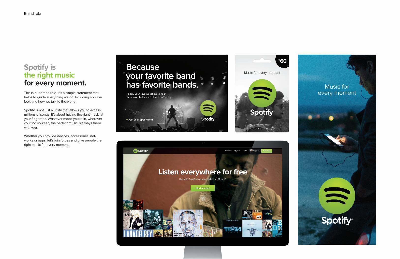
Spotify isthe right musicfor every moment.
This is our brand role. It’s a simple statement that helps to guide everything we do. Including how we look and how we talk to the world.
Spotify is not just a utility that allows you to access millions of songs. It’s about having the right music at your fingertips. Whatever mood you’re in, wherever you find yourself, the perfect music is always there with you.
Whether you provide devices, accessories, net-works or apps, let’s join forces and give people the right music for every moment.
Primary Black Logotype
Minimum size
Primary White Logotype Clearspace
Minimum size
XX/3
Minimum print size 0.4 inch (10 mm) wide.
Minimum digital size 45 pixels wide.
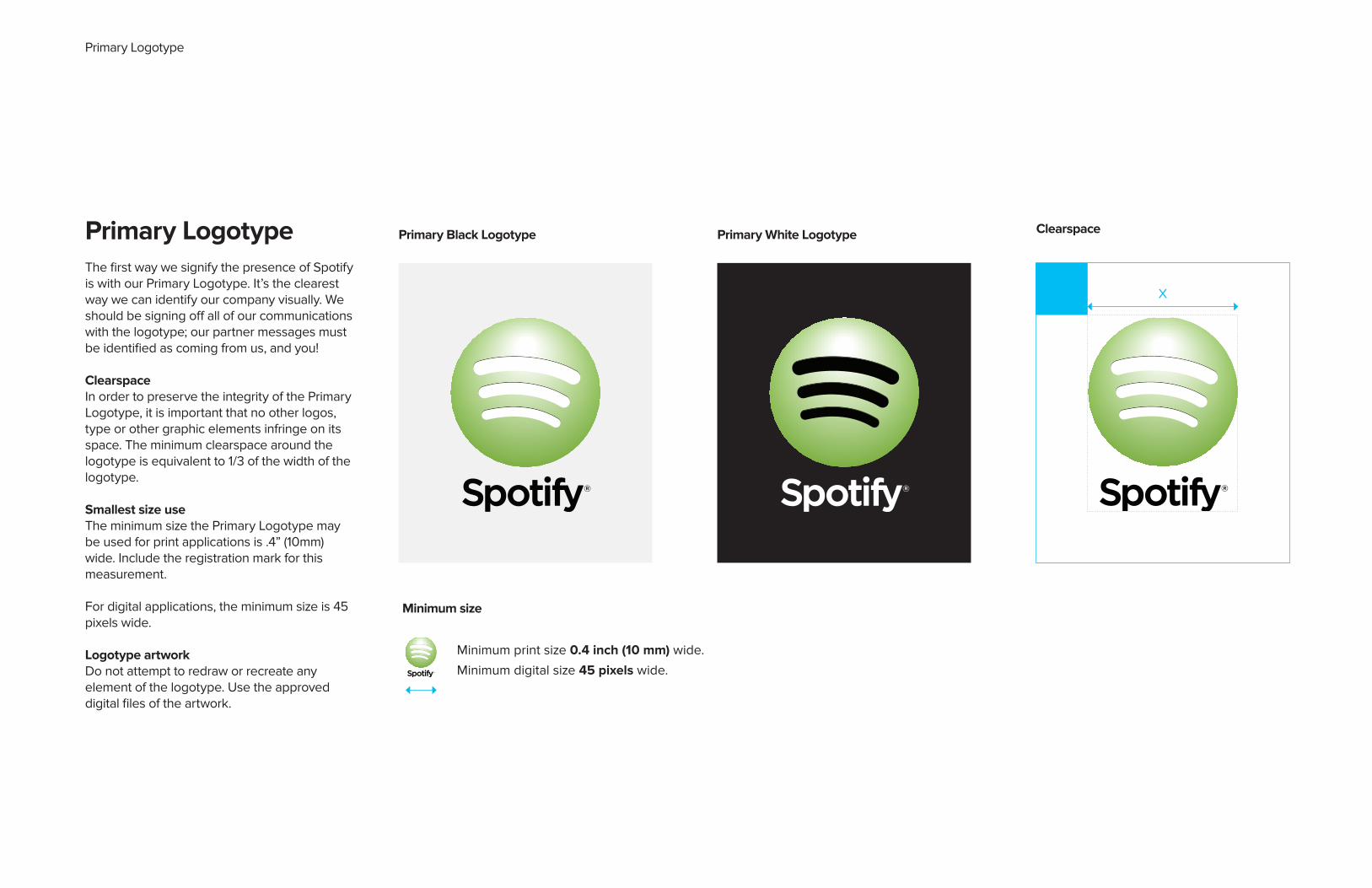
Primary LogotypeThe first way we signify the presence of Spotify is with our Primary Logotype. It’s the clearest way we can identify our company visually. We should be signing off all of our communications with the logotype; our partner messages must be identified as coming from us, and you!
ClearspaceIn order to preserve the integrity of the Primary Logotype, it is important that no other logos, type or other graphic elements infringe on its space. The minimum clearspace around the logotype is equivalent to 1/3 of the width of the logotype.
Smallest size useThe minimum size the Primary Logotype may be used for print applications is .4” (10mm) wide. Include the registration mark for this measurement.
For digital applications, the minimum size is 45 pixels wide.
Logotype artworkDo not attempt to redraw or recreate any element of the logotype. Use the approved digital files of the artwork.
Primary Logotype

Horizontal Logotype
Clearspace
Horizontal Black Logotype Horizontal White Logotype
Minimum size
Minimum print size 0.6 inch (15 mm) wide.
Minimum digital size 80 pixels wide.
Y
Y/2
Horizontal LogotypeIf it’s impossible to use the Primary Logotype for some reason, you have the option of using the Horizontal logotype. It’s still a good way of showing off the Spotify brand, so don’t you worry!
ClearspaceIn order to preserve the integrity of the Primary Logotype, it is important that no other logos, type or other graphic elements infringe on its space. The minimum clearspace to the around the logotype is equivalent to 1/2 of the height of the logotype.
Smallest size useThe minimum size the Primary Logotype may be used for print applications is .6” (15mm) wide. Include the registration mark for this measurement.
For digital applications, the minimum size is 80 pixels wide.
Logotype artworkDo not attempt to redraw or recreate any element of the logotype. Use the approved digital files of the artwork.

Monochromatic Logotype
Monochromatic Black Logotype Monochromatic White Logotype Clearspace
Minimum size
Monochromatic Black Logotype Monochromatic White Logotype Clearspace
XX/3
Y
Y/2
Minimum size Vertical
Minimum print size 0.4 inch (10 mm) wide.
Minimum digital size 45 pixels wide.
Minimum size Horizontal
Minimum print size 0.6 inch (15 mm) wide.
Minimum digital size 80 pixels wide.
Monochromatic LogotypeThe monochromatic logotype should only be used when there are not enough colors to properly reproduce the Primary Logotype.
ClearspaceThe minimum clearspace around the Primary Logotype is equivalent to 1/3 of the width of the logotype.
The minimum clearspace around the Horizontal Logotype is equivalent to 1/2 of the height of the logotype.
Smallest size usePrimary Logotype should never be smaller than .4” (10mm) wide. Include the registration mark for this measurement.
For digital applications, the Primary Logotypes’ minimum size is 45 pixels wide.
Horizontal Logotype should never be smaller than .6” (15mm) wide. Include the registration mark for this measurement.
For digital applications, the Primary Logotypes’ minimum size is 80 pixels wide.
Logotype artworkDo not attempt to redraw or recreate any element of the logotype. Use the approved digital files of the artwork.

Partner logosSize relationship–Primary LogotypeWhen partner logos are longer and more text-based, we prefer them to be at the same height as the logotype.
For symbol-based logos, we prefer them to be 2X the height of the logotype.
Size relationship–Alternate LogotypeWhen partner logos are longer and more text-based, we prefer them to be at between 30 and 50% the height of the stroke.
For symbol-based logos, we prefer them to be the same height as the logotype.
AlignmentWe prefer our partner’s logos to always be center aligned with either the Preferred or Alternate logotype.
Always consult the partner’s companyguidelines for logo usage, minimum size, etc.
Relationship with text-based logotypes
Relationship with symbols
Together with Partner Logos
Y/2
Y
X
X/3

Partner Logotype Don’ts
Logotype Don’tsTo make sure our logotype appearsas consistently as possible throughoutour communications, we’ve identifieda few ways we don’t want our logotype to appear.
Don’t separate the icon from the word mark. They should always be treated as a whole.
Avoid stylizing the logotype with outlines, glows, or any other techniques.
Don’t use our logo against a green background.
Don’t skew, rotate or stretch the logotype.
Respect the distance guidelines so that each logo has enough breathing room.
Only use specified colours to represent the logotype.

How we look Colour
Spotify Green Solid
Pantone 376CC54 M0 Y100 K0R132 G189 B0
Spotify Black Solid
Pantone Process Black CC0 M0 Y0 K100R0 G0 B0
Spotify Grey Solid
Pantone Cool Gray 8CC0 M0 Y0 K60R130 G130 B130
Spotify White Solid
C0 M0 Y0 K0R255 G255 B255
ColourSpotify Green is our hero colour. We use Spotify Green to clearly signify the presence of Spotify in people’s lives, and to help our users immediately identify us. Use this colour generously for our type, charts and as a background.
We have a select set of supporting neutral colours which help Spotify Green to sing.In the majority of uses, we want strong contrast between all of the colours used.
Solid colours work best in printed applications and for text.
The gradients are best applied in digital applications like our website and email.
Spotify Sand Solid
Pantone Cool Gray 1CC6 M5 Y6 K0R236 G235 B232

Partner Messaging
Partner Messaging

Partner Messaging
With Spotify, your music is everywhere. Working out, partyingor relaxing, the right music is always at your fingertips.
There are millions of songs on Spotify – from old favourites tothe latest hits. Just choose the music you love, or let Spotifysurprise you.
This is an alternative paragraph to use if you want to get across catalogue breadth.
There are millions of songs on Spotify – from Beyoncé to Bach,and Metallica to Mumford & Sons. Just choose the music youlove, or let Spotify surprise you.(Feel free to localise these artists.)
Key descriptive messaging

Partner Messaging
FreeInstant music for free on your computer, featuring ads.
UnlimitedUnlimited, ad-free music on your computer.
PremiumYour music is everywhere, on all your devices.
Product messaging
Here are quick descriptors for our product tiers.

Partner Messaging
•Listen on all your devices•Download music & listen offline•Better sound quality•No ads & no commitment*
* Delete ‘no commitment’ if inappropriate.
Premium descriptor
With Spotify Premium, your music is everywhere. Just hit play.Plane, train or living room, the right music is always there for you. Stream anything you like, or go offline and listen to your saved music.
Premium messagingHere’s the list of Premium benefits. You’ll want to stress the benefits that are most relevant for your customers.

Partner Messaging
1. The offer is from SpotifyPlease make it clear that the free trial offer is from us, not your brand.
2. The offer is not exclusivePlease don’t suggest that the offer is exclusive to your customers.
Examples:
Premium free trial messagingSome simple rules to help you message Spotify free trials in a legal and Spotify way.
Right:Try Spotify Premium free for 30 days. Visit theguardian.co.uk
Wrong:The Guardian gives you 30 days free Spotify Premium.

Partner Messaging
General free trial messaging:
Try Spotify Premium for free.Enjoy unlimited music on all your devices for 30 days.
General headline & descriptor:
Try Spotify Premium free on your (device).Enjoy unlimited music for 30 days.<Try it free>
Examples:
Premium free trial messaging – specific messagingSome simple rules to help you message Spotify free trials in a legal and Spotify way.
Try Spotify Premium for free on your Samsung TV.Enjoy unlimited music for 30 days.
<Try it free>
Try Spotify Premium on your Sonos Play 3.Enjoy unlimited music for 30 days.
<Try it free>

Partner Messaging
Premium free trial messaging – bundling
The trial itself cannot be bundled with your services/products
Right:Try Spotify Premium free for 30 days on your Sonos.
Wrong:Get 30 days Spotify Premium free when you buy a Sonos Play 3.

Partner Messaging
General Partnership Messaging:
Listen everywhere with Telefonica & Spotify
Specific bundle examples:
With (bundle), you can enjoy unlimited music from Spotify on all your devices.
With (bundle), you have 150 minutes, 500MB and unlimited music from Spotify for 2 years.
With (bundle), you can enjoy Spotify for only X per month.Listen everywhere with unlimited music on your (device).
Product Bundling

Partner Messaging
Right:
Win Spotify Premium for a year!Get lucky with 12 months of unlimited music on all your devices
Win Spotify Premium for X months!
Wrong:
Win free music for a year!(Spotify is already free).
Competitions

Partner Messaging
Music for every moment.
For music.
Spotify inside.(For pre-loads).
Short copy
For buttons and boxes, or when very short copy is required.
Messaging contacts For copy approval/requestsPlease contact [email protected]
Questions about Spotify copy?Please say hello to Paul Moulton, Head of Copy [email protected]

Checklist
ChecklistTo make sure your communications are as successful as possible, please refer to the following checklist.
For more details, check out our full Brand Identity Guidelines.
Have you used Spotify Green? We hope so. Check that your green is the correct green (it should be PMS 376).
Does our primary or horizontal logotype have enough clearspace? Always make sure our logo has enough room to breathe. Please check the guidelines on previous pages.
Is our logotype placed on aclean background? The White Primary Logotype likes a dark background, and the Black Primary Logotype is very fond of a light background. This is to allow for sufficient contrast.
Is our logotype used more than once in the same space? It shouldn’t be.

Contact For more information about our brand, feel free to contact Christian Wilsson in Stockholm or Sophia Bendz in New York.
Contact
Christian [email protected]
Sophia [email protected]

Thanks!