pcmdi report no. 55 summarizing multiple aspects of …
TRANSCRIPT

UCRL-JC-138644
PCMDI Report No. 55
SUMMARIZING MULTIPLE ASPECTS OF MODEL PERFORMANCE IN A SINGLE DIAGRAM
by
Karl E. Taylor
April 2000
PROGRAM FOR CLIMATE MODEL DIAGNOSIS AND INTERCOMPARISON UNIVERSITY OF CALIFORNIA, LAWRENCE LIVERMORE NATIONAL LABORATORY,
LIVERMORE, CA 94550

DISCLAIMER
This document was prepared as an account of work sponsored by an agency of the United States Government. Neitherthe United States Government nor the University of California nor any of their employees, makes any warranty,express or implied, or assumes any legal liability or responsibility for the accuracy, completeness, or usefulness of anyinformation, apparatus, product, or process disclosed, or represents that its use would not infringe privately ownedrights. Reference herein to any specific commercial product, process, or service by trade name, trademark,manufacturer, or otherwise, does not necessarily constitute or imply its endorsement, recommendation, or favoring bythe United States Government or the University of California. The views and opinions of authors expressed herein donot necessarily state or reflect those of the United States Government or the University of California, and shall not beused for advertising or product endorsement purposes.
This report has been reproduceddirectly from the best available copy.
Available to DOE and DOE contractors from theOffice of Scientific and Technical Information
P.O. Box 62, Oak Ridge, TN 37831Prices available from (615) 576-8401, FTS 626-8401
Available to the public from theNational Technical Information Service
U.S. Department of Commerce5285 Port Royal Rd.,
Springfield, VA 22161

UCRL-JC-138644
PCMDI Report No. 55 (revised)
Summarizing Multiple Aspects of Model Performance in a
Single Diagram
Karl E. Taylor
Program for Climate Model Diagnosis and Intercomparison
Lawrence Livermore National Laboratory
Livermore, CA 94550, USA
Journal of Geophysical Research (in press)
Original PCMDI Report: 14 April 2000
Revised: 25 September 2000

i
ABSTRACT
A diagram has been devised that can provide a concise statistical summary of how well
patterns match each other in terms of their correlation, their root-mean-square difference
and the ratio of their variances. Although the form of this diagram is general, it is
especially useful in evaluating complex models, such as those used to study geophysical
phenomena. Examples are given showing that the diagram can be used to summarize the
relative merits of a collection of different models or to track changes in performance of a
model as it is modified. Methods are suggested for indicating on these diagrams the
statistical significance of apparent differences, and the degree to which observational
uncertainty and unforced internal variability limit the expected agreement between
model-simulated and observed behaviors. The geometric relationship between the
statistics plotted on the diagram also provides some guidance for devising skill scores
that appropriately weight among the various measures of pattern correspondence.

1
1. Introduction.
The usual initial step in validating models of natural phenomena is to determine
whether their behavior resembles the observed. Typically, plots showing that some
pattern of observed variation is reasonably well reproduced by the model are presented as
evidence of its fidelity. For models with a multitude of variables and multiple
dimensions (e.g., coupled atmosphere-ocean climate models), visual comparison of the
simulated and observed fields becomes impractical, even if only a small fraction of the
model output is considered. It is then necessary either to focus on some limited aspect of
the physical system being described (e.g., a single field, such as surface air temperature,
or a reduced domain, such as the zonally averaged annual mean distribution) or to use
statistical summaries to quantify the overall correspondence between the modeled and
observed behavior.
Here a new diagram is described that can concisely summarize the degree of
correspondence between simulated and observed fields. On this diagram the correlation
coefficient and the root-mean-square (RMS) difference between the two fields, along
with the ratio of the standard deviations of the two patterns are all indicated by a single
point on a two-dimensional plot. Together these statistics provide a quick summary of
the degree of pattern correspondence, allowing one to gauge how accurately a model
simulates the natural system. The diagram is particularly useful in assessing the relative
merits of competing models and in monitoring overall performance as a model evolves.
The primary aim of this paper is to describe this new type of diagram (section 2)
and illustrate its use in evaluating and monitoring climate model performance (section 3).
Methods for indicating statistical significance of apparent differences, observational
uncertainty, and fundamental limits to agreement resulting from unforced internal
variability are suggested in section 4. In section 5 the basis for defining appropriate "skill
scores" is discussed. Finally, section 6 provides a summary and brief discussion of other
potential applications of the diagram introduced here.

2
2. Theoretical basis for the diagram.
The statistic most often used to quantify pattern similarity is the correlation
coefficient. The term "pattern" is used here in its generic sense, not restricted to spatial
dimensions. Consider two variables, fn and rn, which are defined at N discrete points (in
time and/or space). The correlation coefficient (R) between f and r is calculated with the
following formula:
( )( )
rf
N
nnn rrff
NR
σσ
∑=
−−= 1
1
, (1)
where f and r are the mean values, and σf and σr are the standard deviations of f and r,
respectively. For grid cells of unequal area, the above formula would normally be
modified in order to weight the summed elements by grid cell area (and the same
weighting factors would be used in calculating σf and σr). Similarly, weighting factors
for pressure thickness and time interval can be applied when appropriate.
The correlation coefficient reaches a maximum value of one when for all n,
( ) ( )rrff nn −=− α , where α is a positive constant. In this case the two fields have the
same centered pattern of variation, but are not identical unless α = 1. Thus, from the
correlation coefficient alone it is not possible to determine whether two patterns have the
same amplitude of variation (as determined, for example, by their variances).
The statistic most often used to quantify differences in two fields is the root-
mean-square (RMS) difference, E, which for fields f and r is defined by the following
formula:
( )2
1
1
21
−= ∑
=
N
nnn rf
NE .
Again, the formula can be generalized for cases when grid cells should be weighted
unequally.

3
In order to isolate the differences in the patterns from differences in the means of
the two fields, E can be resolved into two components. The overall "bias" is defined as
rfE −=
and the centered pattern RMS difference by
( ) ( )[ ] 21
1
21
−−−=′ ∑
=
N
nnn rrff
NE . (2)
The two components add quadratically to yield the full mean-square difference:
.222 EEE ′+= (3)
The pattern RMS difference approaches zero as two patterns become more alike, but for a
given value of ,E′ it is impossible to determine how much of the error is due to a
difference in structure and phase and how much is simply due to a difference in the
amplitude of the variations.
The correlation coefficient and the RMS difference provide complementary
statistical information quantifying the correspondence between two patterns, but for a
more complete characterization of the fields, the variances (or standard deviations) of the
fields must also be given. All four of the above statistics ( fER σ,, ′ and σ r ) are useful in
comparisons of patterns, and it is possible to display all of them on a single, easily
interpreted diagram. The key to constructing such a diagram is to recognize the
relationship between the four statistical quantities of interest here,
RE rfrf σσσσ 2222 −+=′ ,
and the Law of Cosines,
φcos2222 abbac −+= ,
where a, b, and c are the lengths of the sides of a triangle, and φ is the angle opposite side
c. The geometric relationship between fER σ,, ′ and σr is shown figure 1.

4
Figure 1: Geometric relationship between the correlation coefficient, R, the pattern RMSerror, ,E′ and the standard deviations, σf and σr, of the test and reference fields,respectively.
With the above definitions and relationships it is now possible to construct a
diagram that statistically quantifies the degree of similarity between two fields. One field
will be called the "reference" field, usually representing some observed state. The other
field will be referred to as a "test" field (typically a model-simulated field). The aim is to
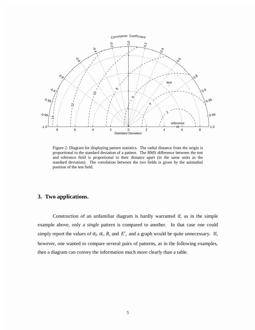
quantify how closely the test field resembles the reference field. In figure 2 two points
are plotted on a polar style graph, the ‘o’ representing the reference field and the ‘x’, the
test field. The radial distances from the origin to the points are proportional to the pattern
standard deviations, and the azimuthal positions give the correlation coefficient between
the two fields. The radial lines are labeled by the cosine of the angle made with the
abscissa, consistent with figure 1. The dashed lines measure the distance from the
reference point and, as a consequence of the relationship shown in figure 1, indicate the
RMS error (once any overall bias has been removed).
The point representing the reference field is plotted along the abscissa. In the
example, the reference field has a standard deviation of 5.5 units. The test field lies
further from the origin in this example and has a standard deviation of about 6.5 units.
The correlation coefficient between the test field and the reference field is 0.7 and the
centered pattern RMS difference between the two fields is a little less than 5 units.
5
8 6 4 2 0 2 4 6 8 Standard Deviation
-1.0
-0.99
-0.95
-0.9
-0.8
-0.6
-0.4
-0.2 0.0
0.2
0.4
0.6
0.8
0.9
0.95
0.99
1.0
Correlat ion Coeff icient
2
4
6
8
10
12
14
reference
reference
test
test
O
3. Two applications.
Construction of an unfamiliar diagram is hardly warranted if, as in the simple
example above, only a single pattern is compared to another. In that case one could
simply report the values of σf, σr, R, and ,E′ and a graph would be quite unnecessary. If,
however, one wanted to compare several pairs of patterns, as in the following examples,
then a diagram can convey the information much more clearly than a table.
Figure 2: Diagram for displaying pattern statistics. The radial distance from the origin isproportional to the standard deviation of a pattern. The RMS difference between the testand reference field is proportional to their distance apart (in the same units as thestandard deviation). The correlation between the two fields is given by the azimuthalposition of the test field.

6
3.1 Model-data comparisons.
Figure 3 shows the annual cycle of rainfall over India as simulated by 28
atmospheric general circulation models (GCM's), along with an observational estimate
(solid, thick black line). The data are plotted after removing the annual mean
precipitation, and both the model and observational values represent climatological
monthly means computed from several years of data. The observational estimate shown
is from Parthasarathy et al. (1994) and the model results are from the Atmospheric Model
Intercomparison Project (AMIP), which is described in Gates et al. (1999). Each model
is assigned a letter which may be referred to in the following discussion.
Figure 3 shows that models generally simulate the stronger precipitation during
the monsoon season, but with a wide range of estimates of the amplitude of the seasonal
cycle. The precise phasing of the maximum precipitation also varies from one model to
the next. It is quite difficult, however, to obtain information about any particular model
from the figure; there are simply too many curves plotted to distinguish one from the
other. It is useful, therefore to summarize statistically how well each simulated "pattern"
Apr May DecNovOctSepAugJulJunMarFebJan
Month
-6
-4
-2
0
2
4
6
8
10
Pre
cipi
tatio
n R
ate
(mm
/day
)
obsABCDEFGHIJKLMN
OPQRSTUVWXYZab
Mon Nov 6 15:44:06 2000
Figure 3: Climatological annual cycle of precipitation over India (with annual meanremoved) as observed (Parthasarathy et al., 1994) and as simulated by 28 models.
Figure 3 shows that models generally simulate the stronger precipitation during
the monsoon season, but with a wide range of estimates of the amplitude of the seasonal
cycle. The precise phasing of the maximum precipitation also varies from one model to
the next. It is quite difficult, however, to obtain information about any particular model
from the figure; there are simply too many curves plotted to distinguish one from the
other. It is useful, therefore to summarize statistically how well each simulated "pattern"

7
(i.e., the annual cycle of rainfall) compares with the observed. This is done in figure 4
where a letter identifies the statistics computed from each model's results. The figure
clearly indicates which models exaggerate the amplitude of the annual cycle (e.g., models
K, Q, and C) and which models grossly underestimate it (e.g., I, V, and P). It also shows
which model-simulated annual cycles are correctly phased (i.e., are well correlated with
the observed), and which are not. In contrast to figure 3, figure 4 makes it is easy to
identify models that perform relatively well (e.g., A, O, Z, and N) because they lie
0 1 2 3 4 5
0
1
2
3
4
5
Sta
ndar
d D
evia
tion
(mm
/day
)
0.0
0.1
0.2
0.3
0.4
0.5
0.6
0.7
0.8
0.9
0.95
0.99
1.0
Correlat ion
Obs.
E
F
D
G
H
J
I
K
M
N CL
O
P
∆
B
Q
Y
RT
S Z
U
V
W
XA
Γ
Figure 4: Pattern statistics describing the climatological annual cycle of precipitationover India simulated by 28 models compared with the observed (Parthasarathy et al.,1994). To simplify the plot, the isolines indicating correlation, standard deviation andRMS error have been omitted.

8
relatively close to the reference point. Among the poorer performers, it is easy to
distinguish between errors due to poor simulation of the amplitude of the annual cycle
and errors due to incorrect phasing, as described next. An assessment of whether the
apparent differences suggested by figures 3 and 4 between the models and observations
and between individual models are in fact statistically significant will be postponed until
section 4.
According to figure 4, the RMS error in the annual cycle of rainfall over India is
smallest for model A. Figure 5 confirms the close correspondence between model A and
the observed field. Other inferences drawn from figure 4 can also be confirmed by figure
5. For example models A, B, and C are similarly well correlated with observations (i.e.,
the phasing of the annual cycle is correct), but the amplitude of the seasonal cycle is
much too small in B and far too large in C. Model D, on the other hand, simulates the
amplitude reasonably well, but the monsoon comes too early in the year, yielding a rather
poor correlation. Thus, figure 4 provides much of the same information as figure 3, but
displays it in a way that allows one to flag problems in individual models.
Apr May DecNovOctSepAugJulJunMarFebJan
Month
-6
-4
-2
0
2
4
6
8
10
Pre
cipi
tatio
n R
ate
(mm
/day
)
obsABCD
Mon Nov 6 15:28:11 2000
Figure 5: Climatological annual cycle of precipitation over India (with annual meanremoved) as observed and as simulated by four models (a subset selected from figure 3).
According to figure 4, the RMS error in the annual cycle of rainfall over India is
smallest for model A. Figure 5 confirms the close correspondence between model A and
the observed field. Other inferences drawn from figure 4 can also be confirmed by figure
5. For example models A, B, and C are similarly well correlated with observations (i.e.,
the phasing of the annual cycle is correct), but the amplitude of the seasonal cycle is
much too small in B and far too large in C. Model D, on the other hand, simulates the
amplitude reasonably well, but the monsoon comes too early in the year, yielding a rather
poor correlation. Thus, figure 4 provides much of the same information as figure 3, but
displays it in a way that allows one to flag problems in individual models.
9
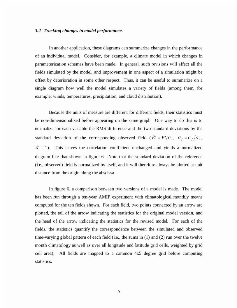
3.2 Tracking changes in model performance.
In another application, these diagrams can summarize changes in the performance
of an individual model. Consider, for example, a climate model in which changes in
parameterization schemes have been made. In general, such revisions will affect all the
fields simulated by the model, and improvement in one aspect of a simulation might be
offset by deterioration in some other respect. Thus, it can be useful to summarize on a
single diagram how well the model simulates a variety of fields (among them, for
example, winds, temperatures, precipitation, and cloud distribution).
Because the units of measure are different for different fields, their statistics must
be non-dimensionalized before appearing on the same graph. One way to do this is to
normalize for each variable the RMS difference and the two standard deviations by the
standard deviation of the corresponding observed field ( ′ = ′�E E rσ , rff σσσ =ˆ ,
�σr = 1). This leaves the correlation coefficient unchanged and yields a normalized
diagram like that shown in figure 6. Note that the standard deviation of the reference
(i.e., observed) field is normalized by itself, and it will therefore always be plotted at unit
distance from the origin along the abscissa.
In figure 6, a comparison between two versions of a model is made. The model
has been run through a ten-year AMIP experiment with climatological monthly means
computed for the ten fields shown. For each field, two points connected by an arrow are
plotted, the tail of the arrow indicating the statistics for the original model version, and
the head of the arrow indicating the statistics for the revised model. For each of the
fields, the statistics quantify the correspondence between the simulated and observed
time-varying global pattern of each field (i.e., the sums in (1) and (2) run over the twelve
month climatology as well as over all longitude and latitude grid cells, weighted by grid
cell area). All fields are mapped to a common 4x5 degree grid before computing
statistics.
10
0.0 0.2 0.4 0.6 0.8 1.0 1.2
0.0
0.2
0.4
0.6
0.8
1.0
1.2
Sta
ndar
d D
evia
tion
(Nor
mal
ized
)
0.0
0.1
0.2
0.3
0.4
0.5
0.6
0.7
0.8
0.9
0.95
0.99
1.0
Correlat ion
Obs.
P
U
VCLT
PSL
OLR
TAS
T
Z
PRW
Many of the arrows in figure 6 point in the general direction of the observed or
"reference" point, indicating that the RMS difference between the simulated and observed
fields has been reduced in the revised model. For sea level pressure (PSL), the arrow is
Figure 6: Changes in normalized pattern statistics between two versions of a model. Thestatistics for the older version of the model are plotted at the tail of the arrows, and thearrows point to the statistics for the revised model. The RMS error and standarddeviations have been normalized by the observed standard deviation of each field beforeplotting. The fields shown are: sea level pressure (PSL), surface air temperature (TAS),total cloud fraction (CLT), precipitable water (PRW), 500 hPa geopotential height (Z),precipitation (P), outgoing longwave radiation (OLR), 200 hPa temperature (T), 200 hPameridional wind (V), and 200 hPa zonal wind (U). The model output and reference(observationally-based) data were mapped to a common 4x5 degree grid beforecomputing the statistics. The following reference data sets were used: for OLR, Harrisonet al. (1990); for P, Xie and Arkin (1997); for TAS, Jones et al. (1999); for CLT, Rossowand Schiffer (1991); and for all other variables, Gibson et al. (1997).

11
oriented such that the simulated and observed variances are more nearly equal in the
revised model, but the correlation between the two is slightly reduced. For this variable,
the RMS error is slightly reduced (the head of the arrow lies closer to the observed point
than the tail) because the amplitude of the simulated variations in sea level pressure is
closer to the observed, even though the correlation is poorer. The impression given by
the figure overall is that the model revisions have led to a general improvement in model
performance. In order to prove that the apparent changes suggested by figure 6 are in
fact statistically significant, further analysis would be required, as discussed in the next
section.
4. Indicating statistical significance, observational uncertainty, and
fundamental limits to expected agreement.
In the examples shown above, all statistics have been plotted as points, as if their
positions were precise indicators of the true climate statistics. In practice, the statistics
are based on finite samples, and therefore they represent only estimates of the true values.
Since the estimates are in fact subject to sampling variability, then the differences in
model performances suggested by a figure might be statistically insignificant. Similarly,
a model that exhibits some apparent improvement in skill may in fact prove to be
statistically indistinguishable from its predecessor. For proper assessment of model
performance, the statistical significance of apparent differences should be evaluated.
Another shortcoming of the diagrams, as presented above, is that neither the
uncertainty in the observations nor internal variability, which limits agreement between
simulated and observed fields, has been indicated. Even if a perfect climate model could
be devised (i.e., a model realistic in all respects), it should not agree exactly with
observations that are to some extent uncertain and inaccurate. Moreover, because a
certain fraction of the year-to-year differences in climate is not deterministically forced,
but arises due to internal instabilities in the system (e.g., weather "noise", the quasi-
biennial oscillation, ENSO, etc.), the climate simulated by a model, no matter how

12
skillful, can never be expected to agree precisely with observations, no matter how
accurate.
In the verification of weather forecasts, this latter constraint on agreement is
associated primarily with theoretically understood limits of predictability. In the
evaluation of coupled atmosphere/ocean climate model simulations started from arbitrary
initial conditions, the internal variability of the model should be expected to be
uncorrelated with the internal component of the observed variations. Similarly, in
atmospheric models forced by observed sea surface temperatures, as in AMIP, an
unforced component of variability (in part due to weather "noise") will limit the expected
agreement between the simulated and observed fields.
4.1 Statistical significance of differences
One way to assess whether or not the apparent differences in model performance
shown in figure 4 are in fact significant is to consider an ensemble of simulations
obtained from one or more of the models. For AMIP-like experiments, such an ensemble
is typically created by starting each simulation from different initial conditions, but
forcing them by the same time-varying sea surface temperatures and sea ice cover. Thus,
the weather (and to a much lesser extent climate statistics) will differ between each pair
of realizations.
In the case of rainfall over India, results were obtained from a six-member
ensemble of simulations by model M. The statistics comparing each independent
ensemble member to the observed are plotted as individual symbols below the "M" in
figure 7. The close grouping of the symbols in the diagram indicates that the uncertainty
in the point-location attributable to sampling variability is not very large. A formal test
for statistical significance could be performed, based on the spread of points in the figure,
but for a qualitative assessment this is not necessary. If model M is typical, then the
relatively large differences between model climate statistics seen in figure 3 are likely to

13
0 1 2 3 4 5
0
1
2
3
4
5 S
tand
ard
Dev
iatio
n (m
m/d
ay)
0.0
0.1
0.2
0.3
0.4
0.5
0.6
0.7
0.8
0.9
0.95
0.99
1.0
Correlat ion
Obs.
M
indicate true differences in most cases. The differences are unlikely to be explained
simply by the different climate "samples" generated by simulations of this kind. A
similar approach for informally assessing statistical significance could be followed to
determine whether the model improvements shown in figure 6 are statistically significant.
Figure 7: Pattern statistics describing the modeled and observed climatological annualcycle of precipitation over India computed from six independent simulations by modelM. The close clustering of points calculated from the model M ensemble indicates thatthe differences between models shown in figure 4 are generally likely to be statisticallysignificant.

14
One limitation of the above approach to assessing statistical significance is that it
accounts only for the sampling variability in the model output, not in the observations.
Although an estimate of the impact of sampling variability in the observations will not be
carried out here, there are several possible ways one might proceed. One could split the
record into two or more time-periods and then analyze each period independently. The
differences in statistics between the sub-samples could then be attributed to both real
differences in correspondence between the simulated and observed fields and differences
due to sampling variability. With this approach an upper limit on the sampling variability
could be established. Another approach would be to use an ensemble of simulations by a
single model as an artificial replacement for the observations. A second ensemble of
simulations by a different model could then be compared to a single member of the first
ensemble, generating a plot similar to figure 7. The effects of sampling variability in the
observations could then be assessed by comparing the second ensemble to the other
members of the first ensemble, and then quantifying by how much the spread of points
increased. If the sampling distribution of the first ensemble were similar to the sampling
distribution of the observed climate system, then the effects of sampling variability could
be accurately appraised. A third option for evaluating the sampling variability, at least in
the comparison of climatological data computed from many time samples, would be to
apply, "bootstrap" techniques to sample both the model output and the observational data.
If such a technique were used, care would be required to account for the temporal and
spatial correlation structure of the data (Wilks, 1997).
4.2 Observational uncertainty.
Because of a host of problems in accurately measuring regional precipitation,
observational estimates are thought to be highly uncertain. When two independent
observational estimates can be obtained, and if they are thought to be of more or less
comparable reliability, then the difference between the two can be used as an indication
of observational uncertainty. As an illustration of this point, an alternative to the India
rainfall estimate is plotted in figure 8 based on data from Xie and Arkin (1997). Also the
other points plotted in figure 8, labeled with letters, indicate model results. The capital

15
0.0 0.4 0.8 1.2 1.6 2.0
0.0
0.4
0.8
1.2
1.6
2.0S
tand
ard
Dev
iatio
n (N
orm
aliz
ed)
0.0
0.1
0.2
0.3
0.4
0.5
0.6
0.7
0.8
0.9
0.95
0.99
1.0
Correlat ion
Ref.Xie-Arkin
E
F
D
G
H
J
I
K
M
N CL
O
P
∆
B
Q
Y
RT
S Z
U
V
W
XA
Γ
e
f
d
g
h
j
i
k
m
n cl
o
p
δ
b
q
y
rt
s z
u
v
w
x aγ
letters reproduce the results of figure 4 in which the models were compared to the
Parthasarathy et al. (1994) observational data. The corresponding lower case letters
indicate the statistics calculated when the same model results are compared with the Xie
and Arkin (1997) observational data. So the reference for the upper case letters (and for
the point labeled "Xie-Arkin") is the Parthasarathy et al. (1994) data, and the reference
for the lower case letters is the Xie and Arkin (1997) data. Note that for all models the
Figure 8: Normalized pattern statistics showing differences between two observationalestimates of rainfall ["reference" data set: Parthasarathy et al., (1994); alternative data set(indicated by the asterisk): Xie and Arkin (1997)]. Also shown are differences between28 models and each of the reference data sets [upper case letters for the Parthasarathy etal., (1994) reference and lower case letters for the Xie and Arkin (1997) reference].

16
normalized standard deviation increases by the ratio of the variances of the two
observational data sets, but for most models the correlation with each of the observational
data sets is similar. In a few cases, however, the correlation can change; compare, for
example, differences between G and g and D and d.
Another way to compare model simulated patterns to two different reference
fields is to extend the diagram to three-dimensions. In this case one of the reference
points (obs1) would be plotted along one axis (say the x-axis), and the other (obs2) would
be plotted in the xy-plane indicating its statistical relationship to the first. One or more
test points could then be plotted in three-dimensional space such that the distance
between each test point and each of the reference points would be equal to their
respective RMS differences. Distances from the origin would again indicate the standard
deviation of each pattern, and the cosines of the three angles defined by the position
vectors of the three points would indicate the correlation between the pattern pairs (i.e.,
model-obs1, model-obs2, and obs1-obs2). In practice, this kind of plot might prove to be
of limited value because visualizing a three dimensional image on a two-dimensional
surface is difficult unless it can be rotated using an animated sequence of images (e.g., on
a video screen).
4.3 Fundamental limits to expected agreement between simulated and observed fields.
Even if all errors could be eliminated from a model and even if observational
uncertainties could be reduced to zero, the simulated and observed climate can not be
expected to be identical because internal (unforced) variations of climate (i.e., "noise" in
this context) will never be exactly the same. Although a good model should be able to
simulate accurately the frequency of various "unforced" weather and climate events, the
exact phasing of those events cannot be expected to coincide with the observational
record (except in cases where a model is initialized from observations and has not yet
reached fundamental predictability limits). The "noise" of these unforced variations
prevents exact agreement between simulated and observed climate. In order to estimate
how well a perfect model should agree with perfectly accurate observations, one can

17
again consider differences in individual members of the ensemble of simulations
generated by a single model, this time comparing the individual members to each other.
Any differences in the individual ensemble members must arise from the unforced
variations that also fundamentally limit potential agreement between model-simulated
and observed climate.
As an illustration of this point, the normalized statistics for rainfall over India
have been computed between pairs of simulations comprising model M's 6-member
ensemble. Each realization of the climatic state is compared to the others yielding 15
unique pairs. The statistics obtained by considering one realization of each pair as the
"reference" field and the other as the "test" field are plotted in figure 9 as small circles.
The high correlation between pairs of realizations indicates that according to this model
(run under AMIP experimental conditions), the monthly mean climatology of rainfall
over India (calculated from 10 simulated years of data) is largely determined by the
imposed boundary conditions (i.e., solar insolation pattern, sea surface temperatures, etc.)
and that "noise" resulting from internal variations is relatively small. If the unforced
variability, which gives rise to the scatter of points in figure 9, is realistically represented
by model M, then even the most skillful of AMIP models can potentially be improved by
a substantial amount before reaching the fundamental limits to agreement imposed by
essentially unpredictable internal variability. A related conclusion is that since the
correlations between modeled and observed patterns shown in figure 4 are larger than any
of the intra-ensemble correlations shown in figure 9, it is likely that the apparent
differences between model results and observations are in fact statistically significant and
could not be accounted for by sampling differences.
Note that in figure 9 the spread of ensemble points in the radial direction indicates
the degree to which unforced variability affects the pattern amplitude, whereas the spread
in azimuthal angle is related to its effect on the phase. Also note that in the case of the
amplitude of annual cycle of India rainfall, observational uncertainty limits the expected
agreement between simulated and observed patterns even more than unforced variability.
Finally, note that in AMIP-like experiments, the differences in climatological statistics

18
0.0 0.2 0.4 0.6 0.8 1.0 1.2
0.0
0.2
0.4
0.6
0.8
1.0
1.2
Sta
ndar
d D
evia
tion
(Nor
mal
ized
)
0.0
0.1
0.2
0.3
0.4
0.5
0.6
0.7
0.8
0.9
0.95
0.99
1.0
Correlat ion
Ref.
ensemble M
computed from different members of an ensemble will decrease as the number of years
simulated increases. Thus, compared to the 10-year AMIP simulation results shown in
figure 9, one should expect that in a similar, 20–year AMIP simulation, the points would
cluster closer together and move toward the abscissa.
Figure 9: Normalized pattern statistics showing differences within a six memberensemble of simulations by model M. Thirty points are plotted, two for each pair ofensemble members, one with the first realization taken as the reference, and the otherwith the second realization taken as the reference. The correlation for each pair does notdepend, of course, on which realization is chosen as the reference, but the ratio of theirstandard deviations does, so the points scatter symmetrically about the arc drawn at unitdistance from the origin. Only 15 points are truly independent.
19
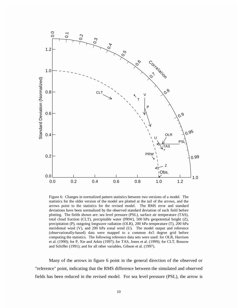
Figure 10 provides another example in which the diagram is used to indicate how
far a model is from potentially realizable statistical agreement with observations. For
each field, the arrows originate at the point comparing an observed field to the
corresponding field simulated by a particular AMIP model. The arrows terminate at
points indicating the maximum agreement attainable, given internal variability in the
0.0 0.2 0.4 0.6 0.8 1.0 1.2
0.0
0.2
0.4
0.6
0.8
1.0
1.2
Sta
ndar
d D
evia
tion
(Nor
mal
ized
)
0.0
0.1
0.2
0.3
0.4
0.5
0.6
0.7
0.8
0.9
0.95
0.99
1.0
Correlat ion
Ref.
PCLT
TAS
U
V
T
PSL
PRW
Z
OLR
Figure 10: Pattern statistics for one of the AMIP models (indicated by the tail of eacharrow) and an estimate of the maximum, potentially attainable agreement withobservations, given unforced internal weather and climate variations, as inferred from anensemble of simulations by model M (indicated by the head of each arrow). The fieldsshown are described in figure 6. In contrast to figure 6 which shows statistics computedfrom the annual cycle climatology (in which twelve climatological monthly-meansamples were used in computing the statistics at each grid cell), here the full space-timestatistics are plotted (i.e., 120 time samples, accounting for year-to-year variability, areused in computing the statistics).

20
system. The model shown in the figure is one of the better AMIP models, and the
estimates of the fundamental limits to agreement are obtained from model M's ensemble
of AMIP simulations, as described above (with the arrow head located at the center of the
cluster of points). The longer the arrow, the greater the potential for model improvement.
For some fields (e.g., cloud fraction and precipitation), the model is far from the
fundamental limits, but for others (e.g., geopotential height), there is very little room for
improvement in the statistics given here.
In contrast to the climatological mean pattern statistics given earlier in figure 6
(computed from the climatological annual cycle data), figure 10 shows statistics
calculated from the 120 individual monthly-mean fields available from the 10-year AMIP
simulations (thereby including interannual variability). The statistical differences among
the individual monthly-mean fields are generally larger than the differences between
climatological fields because a larger fraction of the total variance is ascribable to
unforced, internal variability. Thus, in figure 10 the arrowheads lie further from the
reference point than the corresponding statistics calculated from climatological annual
cycle data. Note also that according to figure 10, there are apparently large differences in
the potential for agreement between simulated and observed data, depending on the field
analyzed. These differences are determined by the relative contributions of forced and
unforced variability to the total pattern of variation of each field.
Boer and Lambert (2000) have suggested an alternative way to factor out the
weather and climate noise which limit agreement between simulated and observed fields.
They estimate the limits to agreement between simulated and observed patterns of
variability that can be expected in face of the unforced natural variability, and then rotate
each point in the diagram clockwise about the origin such that the distance to the
"reference" point (located at unit distance along the abscissa) is now proportional to the
error in the pattern that remains after removing the component that is expected to be
uncorrelated with the observed. This modification has the virtue that for all fields,
independent of the differing influence of internal variability, the "goal" is the same: to
reach the reference point along the x-axis. There are, however, disadvantages in rotating

21
the points. The correlation coefficient between the modeled and observed field no longer
appears on the diagram but instead is replaced by an "effective" correlation coefficient,
which is defined as a weighted difference between two true correlation coefficients.
Because the "effective" correlation coefficient is a derived quantity, interpretation is more
difficult. For example, if the interannual variability (i.e., interannual anomalies)
simulated by an unforced coupled atmosphere/ocean GCM were compared to
observations, the true correlation would be near zero (even for a realistic model), whereas
the "effective" correlation would be near one, even for a poorly performing model. This
difference in true versus "effective" correlation could cause confusion. One could also
argue that explicitly indicating the limits to potential agreement between simulated and
observed fields, as in figure 9, provides useful information that would be hidden by Boer
and Lambert's (2000) diagram.
5. Evaluating model skill.
In the case of mean sea level pressure in figure 6, the correlation decreased
(indicating lower pattern similarity), but the RMS error was reduced (indicating closer
agreement with observations). Should one conclude that the model skill has improved or
not? A relatively skillful model should be able to simulate accurately both the amplitude
and pattern of variability. Which of these factors is more important depends on the
application and to a certain extent must be decided subjectively. Thus, it is not possible
to define a single skill score that would universally be considered most appropriate.
Consequently, several different skill scores have been proposed (e.g., Murphy, 1988;
Murphy and Epstein, 1989; Williamson, 1995; Watterson, 1996; Watterson and Dix,
1999; Potts et al., 1996).
Nevertheless, it is not difficult to define attributes that are desirable in a skill
score. For any given variance, the score should increase monotonically with increasing
correlation, and for any given correlation, the score should increase as the modeled
variance approaches the observed variance. Traditionally, skill scores have been defined
22
to vary from zero (least skillful) to one (most skillful). Note that in the case of relatively
low correlation, the inverse of the RMS error does not satisfy the criteria that skill should
increase as the simulated variance approaches the observed. Thus, a reduction in the
RMS error may not necessarily be judged an improvement in skill.
One of the least complicated scores that fulfills the above requirements is defined
here:
)1()ˆ/1ˆ(
)1(4
02 R
RS
ff +++=
σσ(4)
where R0 is the maximum correlation attainable (according to the fundamental limits
discussed in section 4.3 and as indicated, for example, by the position of the arrowheads
in figure 10). As the model variance approaches the observed variance (i.e., as �σ f →1 )
and as R R→ 0 , the skill approaches unity. Under this definition, skill decreases towards
zero as the correlation becomes more and more negative or as the model variance
approaches either zero or infinity. For fixed variance, the skill increases linearly with
correlation. Note also, that for small model variance, skill is proportional to the variance,
and for large variance, skill is inversely proportional to the variance.
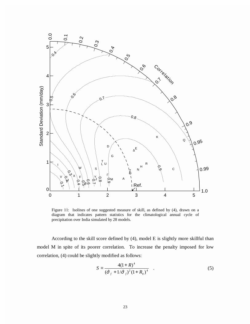
The above skill score can be applied to the India rainfall statistics shown earlier,
which are plotted again in figure 11 along with contours of constant skill. The skill score
was defined with R0 set equal to the mean of the thirty intra-ensemble correlation values
shown in figure 9 (i.e., R0=0.9976). In addition to the properties guaranteed by the
formulation, skill is seen to decrease generally with increasing RMS error, but at low
correlation, models with too little variability are penalized. If in a particular application
such a penalty were considered too stiff, a different skill score could be devised that
would down-weight its importance.
Under the above definition, the skill depends on R0, which is the maximum,
potentially realizable correlation, given the "noise" associated with unforced variability.
Estimates of R0 are undoubtedly model dependent, and for that reason, the value of R0
should always be recorded whenever a skill score is reported.
23
0 1 2 3 4 5
0
1
2
3
4
5 S
tand
ard
Dev
iatio
n (m
m/d
ay)
0.0
0.1
0.2
0.3
0.4
0.5
0.6
0.7
0.8
0.9
0.95
0.99
1.0
Correlat ion
0.10.2
0.3
0.4
0.4
0.5
0.50.6
0.6
0.7
0.7
0.8
0.8
0.9
0.9
Ref.
E
F
D
G
H
J
I
K
M
N C
L
O
P
∆
B
Q
Y
RT
SZ
U
V
W
XA
Γ
According to the skill score defined by (4), model E is slightly more skillful than
model M in spite of its poorer correlation. To increase the penalty imposed for low
correlation, (4) could be slightly modified as follows:
.)1()ˆ/1ˆ(
)1(44
02
4
R
RS
ff +++=
σσ(5)
Figure 11: Isolines of one suggested measure of skill, as defined by (4), drawn on adiagram that indicates pattern statistics for the climatological annual cycle ofprecipitation over India simulated by 28 models.

24
Once again the India rainfall statistics can be plotted, this time drawing the skill
score isolines defined by (5). Figure 12 shows that according to this skill score, model E
would now be judged less skillful than model M. This illustrates that it is not difficult to
define skill scores that preferentially reward model simulated patterns that are highly
correlated with observations or, alternatively, place more emphasis on correct simulation
of the pattern variance.
0 1 2 3 4 5
0
1
2
3
4
5
Sta
ndar
d D
evia
tion
(mm
/day
)
0.0
0.1
0.2
0.3
0.4
0.5
0.6
0.7
0.8
0.9
0.95
0.99
1.0
Correlat ion
0.1
0.1
0.2
0.2
0.3
0.3
0.4
0.4
0.5
0.5
0.6
0.6
0.7
0.7
0.8
0.9
Ref.
E
F
D
G
H
J
I
K
M
N C
L
O
P
∆
B
Q
Y
RT
SZ
U
V
W
XA
Γ
Figure 12: As in figure 11, but for an alternative measure of skill defined by (5).

25
6. Summary and further applications.
The diagram proposed here provides a way of plotting on a two-dimensional
graph three statistics that indicate how closely a pattern matches observations. These
statistics make it easy to determine how much of the overall RMS difference in patterns
is attributable to a difference in variance and how much is due to poor pattern correlation.
As shown in the examples, the diagram can be used in a variety of ways. The first
example involved comparison of the simulated and observed climatological annual cycle
of precipitation over India. The new diagram made it easy to distinguish among 28
models and determine which models were in relatively good agreement with
observations. In other examples, the compared fields were functions of both space and
time, in which case direct visual comparison of the full simulated and observed fields
would be exceedingly difficult. In this case, statistical measures of the correspondence
between modeled and observed fields offered a practical way of assessing and
summarizing model skill.
The diagram described here is beginning to see use in some recent studies (e.g.,
Räisänen, 1997; Gates et al., 1999; Lambert and Boer, 2000), and one can easily think of
a number of other applications where it might be especially helpful in summarizing an
analysis. For example, it is often quite useful to resolve some complex pattern into
components, and then to evaluate how well each component is simulated. Commonly,
fields are resolved into a zonal mean component plus a deviation from the zonal mean.
Similarly, the climatological annual cycle of a pattern is often considered separately from
the annual mean pattern or from "anomaly" fields defined as deviations from the
climatological annual cycle. It can be useful to summarize how accurately each
individual component is simulated by a model, and this can be done on a single plot.
Similarly, different scales of variability can be extracted from a pattern (through filtering
or spectral decomposition), and the diagram can show how model skill depends on scale.
Although the diagram has been designed to convey information about centered
pattern differences, it is also possible to indicate differences in overall means (i.e., the

26
"bias" defined in section 2). This can be done on the diagram by attaching to each plotted
point a flag with length equal to the bias and drawn at a right angle to a line defined by
the point and the reference point. The distance from the reference point to the end of the
flag is then equal to the total (uncentered) RMS error (i.e., bias error plus pattern RMS
error), according to (3).
An ensemble of simulations by a single model can be used both in the assessment
of statistical significance of apparent differences and also to estimate the degree to which
internal weather and climate variations limit potential agreement between model
simulations and observations. In the case of multi-annual climatological fields, these
fundamental limits to agreement generally decrease with the number of years included in
the climatology (under an assumption of stationarity). However, in the case of statistics
computed from data that have not been averaged to suppress the influence of unforced
internal variability (e.g., a monthly mean time-series that includes year to year
variability), the differences between model-simulated and observed fields cannot be
expected to approach zero, even if the model is perfect and the observations are error
free. These fundamental limits to agreement between models and observations are
different for different fields and generally will vary with the time and space-scales
considered. One consequence of this fact is that a field that is rather poorly simulated
may have relatively little potential for improvement compared to another field that is
better simulated.
Two different skill scores have also been proposed here, but these were offered as
illustrative examples and will, it is hoped, spur further work in this area. It is clear that
no single measure is sufficient to quantify what is perceived as model skill, even for a
single variable, but some of the criteria that should be considered have been discussed.
The geometric relationship between the RMS difference, the correlation coefficient and
the ratio of variances between two patterns, which underlies the diagram proposed here,
may provide some guidance in devising skill scores that appropriately penalize for
discrepancies in variance and discrepancies in pattern similarity.

27
Acknowledgments.
I thank Charles Doutriaux for assistance in data processing, Peter Gleckler for
suggestions concerning the display of observational uncertainty, and Jim Boyle and Ben
Santer for helpful discussions concerning statistics and skill scores. This work was
performed under the auspices of the U.S. Department of Energy Environmental Sciences
Division by University of California Lawrence Livermore National Laboratory under
contract No. W-7405-Eng-48.

28
References
Boer, G.J., and S.J. Lambert, Second order space-time climate difference statistics.
Clim. Dyn., submitted, 2000.
Gates et al., An overview of the results of the Atmospheric Model Intercomparison
Project (AMIP). Bull. Amer. Meteor. Soc., 80, 29-55, 1999.
Gibson, J.K., P. Kållberg, S. Uppala, A. Hernandez, A. Nomura, and E. Serrano, ERA
description. ECMWF Re-Anal. Proj. Rep. Ser., vol. 1, 66 pp., Eur. Cent. for
Medium-Range Weather Forecasts, Reading, England, 1997.
Harrison, E.P., P. Minnis, B.R. Barkstrom, V. Ramanathan, R.D. Cess, and G.G. Gibson,
Seasonal variation of cloud radiative forcing derived from the Earth Radiation
Budget Experiment. J. Geophys. Res., 95, 18687-18703, 1990.
Jones, P.D., M. New, D.E. Parker, S. Martin, and I.G. Rigor, Surface air temperature and
its changes over the past 150 years. Rev. Geophys., 37, 173-199, 1999.
Lambert, S.J., and G.J. Boer, CMIP1 evaluation and intercomparison of coupled climate
models. Clim. Dyn., submitted, 2000.
Murphy, A.H., Skill scores based on the mean square error and their relationship to the
correlation coefficient. Mon. Wea. Rev., 116, 2417-2424, 1988.
Murphy, A.H., and E.S. Epstein, Skill scores and correlation coefficients in model
verification. Mon. Wea. Rev., 117, 572-581, 1989.
Parthasarathy, B., A.A. Munot, and D.R. Kothawale, All-India monthly and seasonal
rainfall series: 1871-1993. Theoretical and Applied Climatology, 49, 217-224,
1994.

29
Potts, J.M., C.K. Folland, I.T. Jolliffe, and D. Sexton, Revised "LEPS" scores for
assessing climate model simulations and long-range forecasts. J. Climate, 9, 34-
53, 1996.
Räisänen, J., Objective comparison of patterns of CO2 induced climate change in coupled
GCM experiments. Clim. Dyn., 13, 197-211, 1997.
Rossow, W.B., and A. Schiffer, ISCCP cloud data products. Bull. Am. Meteorol. Soc.,
72, 2-20, 1991.
Watterson, I.G., Non-dimensional measures of climate model performance. Int. J.
Climatol., 16, 379-391, 1996.
Watterson, I.G., and M.R. Dix, A comparison of present and doubled CO2 climates and
feedbacks simulated by three general circulation models. J. Geophys. Res., 104,
1943-1956, 1999.
Wilks, D.S., Resampling hypothesis tests for autocorrelated fields. J. Climate, 10, 65-82,
1997.
Williamson, D.L., Skill scores from the AMIP simulations. Proc. of the First Int. AMIP
Scientific Conference, WCRP-92, WMO TD-732, Monterey, CA, World
Meteorological Organization, 253-258, 1995.
Xie, P., and P. Arkin, Global precipitation: A 17-year monthly analysis based on gauge
observations, satellite estimates, and numerical model outputs. Bull. Amer.
Meteor. Soc., 78, 2539-2558, 1997.