pf case study - innovativegis.com geo-business data ... interval and ratio data, on the other hand,...
TRANSCRIPT

Topic 3 – Grid-Based Mapping ______________________________________________________________________________________
______________________________________________________________________________________
Analyzing Geo-Business Data 21
Topic 3
Grid-Based Mapping
3.1 Raster Data Characteristics
Historically maps involved “precise placement of physical features for navigation” using lines, colors and symbols
to represent the map features. More recently, however, computer-based map analysis has become an important
ingredient in how we perceive spatial relationships and form decisions.
Understanding that a digital map is first and foremost an organized set of numbers is fundamental to analyzing
mapped data. But exactly what are the characteristics defining a digital map? What do the numbers mean? Are
there different types of numbers? Does their organization affect what you can do with them? If you have seen one
digital map have you seen them all?
In an introductory GIS course, concepts of “vector” and “raster” seem to dominate discussion of what a digital map
is, and isn’t. Within this context, the location of map features are translated into computer form as organized sets of
X,Y coordinates (vector) or sets of grid cells (raster). Considerable attention is given data structure considerations
and their relative advantages in storage efficiency and system performance.
However this geo-centric view rarely explains the full nature of digital maps. For example consider the numbers
themselves used to form X,Y coordinates—how does number type and size effect precision? A general feel for the
precision ingrained in a “single precision floating point” representation of Latitude/Longitude in decimal degrees
involves…
1.31477E+08 ft = equatorial circumference of the earth
1.31477E+08 ft / 360 degrees = 365214 ft/degree length of one degree Longitude
Single precision number carries six decimal places, so—
365214 foot/degree * 0.000001= .365214 feet *12 inches/foot = 4.38257 inch precision
Think if “double-precision” numbers (eleven decimal places) were used for storage—you likely could distinguish a
dust particle on the left from one on the right.
In analyzing mapped data, however, the characteristics of the attribute values are even more critical. While textual
descriptions can be stored with map features they can only be used in geo-query. For example if you attempted to
add “Longbrake Lane” to “Shortthrottle Way” all you would get is an error, as text-based descriptors preclude any
of the mathematical/statistical operations.
So what are the numerical characteristics of mapped data? Figure 3-1 lists the data types by two important
categories—numeric and geographic. You should have encountered the basic numeric data types in several classes
since junior high school. Recall that nominal numbers do not imply ordering. A 3 isn’t bigger, tastier or smellier
than a 1, it’s just not a 1. In the figure these data are schematically represented as scattered and independent pieces
of wood.
Ordinal numbers, on the other hand, do imply a definite ordering and can be conceptualized as a ladder, however
with varying spaces between rungs. The numbers form a progression, such as smallest to largest, but there isn’t a
consistent step. For example you might rank five different soil types by their relative crop productivity (1= worst to
5= best) but it doesn’t mean that soil 5 is exactly five times more productive than soil 1.
When a constant step is applied, interval numbers result. For example, a 60o Fahrenheit spring day is
consistently/incrementally warmer than a 30 oF winter day. In this case one “degree” forms a consistent reference
step analogous to typical ladder with uniform spacing between rungs.

Topic 3 – Grid-Based Mapping ______________________________________________________________________________________
______________________________________________________________________________________
Analyzing Geo-Business Data 22
Figure 3-1. Map values are characterized from two broad perspectives—numeric and geographic—then further
refined by specific data types.
A ratio number introduces yet another condition—an absolute reference—that is analogous to a consistent footing or
starting point for the ladder, analogous to zero degrees “Kelvin” defined as when all molecular movement ceases. A
final type of numeric data is termed “binary.” In this instance the value range is constrained to just two states, such
as forested/non-forested or suitable/not-suitable.
So what does all of this have to do with analyzing digital maps? The type of number dictates the variety of
analytical procedures that can be applied. Nominal data, for example, do not support direct mathematical or
statistical analysis. Ordinal data support only a limited set of statistical procedures, such as maximum and
minimum. Interval and ratio data, on the other hand, support a full set mathematics and statistics. Binary maps
support special mathematical operators, such as .AND. and .OR.
Even more interesting (this is interesting, right?) are the geographic characteristics of the numbers. From this
perspective there are two types of numbers. “Choropleth” numbers form sharp and unpredictable boundaries in
space such as the values on a road or cover type map. “Isopleth” numbers, on the other hand, form continuous and
often predictable gradients in geographic space, such as the values on an elevation or temperature surface.
Figure 3-2 puts it all together. Discrete maps identify mapped data with independent numbers (nominal) forming
sharp abrupt boundaries (choropleth), such as a cover-type map. Continuous maps contain a range of values (ratio)
that form spatial gradients (isopleth), such as an elevation surface. This clean dichotomy is muddled by cross-over
data such as speed limits (ratio) assigned to the features on a road map (choropleth).
Discrete maps are best handled in 2D form—the 3D plot in the top-right inset is ridiculous and misleading because it
implies numeric/geographic relationships among the stored values. What isn’t as obvious is that a 2D form of
continuous data (lower-left inset) is equally as absurd.
While a 2D contour map might be as familiar and comfortable as a pair of old blue jeans, the generalized intervals
treat the data as discrete (ordinal, choropleth). The artificially imposed sharp boundaries become the focus for
visual analysis. Map-ematical analysis of the actual data, on the other hand, incorporates all of the detail contained
in the numeric/geographic patterns of the numbers ...where the rubber meets the spatial analysis road.

Topic 3 – Grid-Based Mapping ______________________________________________________________________________________
______________________________________________________________________________________
Analyzing Geo-Business Data 23
Figure 3-2. Discrete and Continuous map types combine the numeric and
geographic characteristics of mapped data.
3.2 Visualizing Grid-Based Data
For thousands of years, points, lines and polygons have been used to depict geographic information. With the stroke
of a pen a cartographer could outline a continent, delineate a highway or identify a specific building’s location.
With the advent of the computer, manual drafting of these data has been replaced by the cold steel of the plotter.
In digital form the spatial data is linked to attribute tables that describe characteristics and conditions of the map
features. Desktop mapping exploits this linkage to provide tremendously useful database management procedures,
such as address matching, geo-query and routing. Vector-based data forms the foundation of these techniques and
directly builds on our historical perspective of maps and map analysis.
Grid-based data, on the other hand, is a relatively new way to describe geographic space and its relationships.
Weather maps, identifying temperature and barometric pressure gradients, were an early application of this new data
form. In the 1950s computers began analyzing weather station data to automatically draft maps of areas of specific
temperature and pressure conditions. At the heart of this procedure is a new map feature that extends traditional
points, lines and polygons (discrete objects) to continuous surfaces.
The rolling hills and valleys in our everyday world is a good example of a geographic surface. The elevation values
constantly change as you move from one place to another forming a continuous spatial gradient. The left-side of
figure 3-3 shows the grid data structure and a sub-set of values used to depict the terrain surface shown on the right-
side.
Grid data are stored as an organized set of values in a matrix that is geo-registered over the terrain. Each grid cell
identifies a specific location and contains a map value representing its average elevation. For example, the grid cell
in the lower-right corner of the map is 1800 feet above sea level. The relative heights of surrounding elevation
values characterize the undulating terrain of the area.

Topic 3 – Grid-Based Mapping ______________________________________________________________________________________
______________________________________________________________________________________
Analyzing Geo-Business Data 24
Figure 3-3. Grid-based data can be displayed in 2D/3D lattice or grid forms.
Two basic approaches can be used to display this information—lattice and grid. The lattice display form uses lines
to convey surface configuration. The contour lines in the 2D version identify the breakpoints for equal intervals of
increasing elevation. In the 3D version the intersections of the lines are “pushed-up” to the relative height of the
elevation value stored for each location. The grid display form uses cells to convey surface configuration. The 2D
version simply fills each cell with the contour interval color, while the 3D version pushes up each cell to its relative
height.
Figure 3-4. Contour lines are delineated by connecting interpolated points
of constant elevation along the lattice frame.
The right-side of figure 3-4 shows a close-up of the data matrix of the project area. The elevation values are tied to
specific X,Y coordinates (shown as yellow dots). Grid display techniques assume the elevation values are centered

Topic 3 – Grid-Based Mapping ______________________________________________________________________________________
______________________________________________________________________________________
Analyzing Geo-Business Data 25
within each grid space defining the data matrix (solid back lines). A 2D grid display checks the elevation at each
cell then assigns the color of the appropriate contour interval.
Lattice display techniques, on the other hand, assume the values are positioned at the intersection of the lines
defining the reference frame (dotted red lines). Note that the “extent” (outside edge of the entire area) of the two
reference frames is off by a half-cell. The alignment difference between grid and lattice reference frames is a
frequent source of registration error when one “blindly” imports a set of grid layers from a variety of sources.
Contour lines are delineated by calculating where each line crosses the reference frame (red X’s) then these points
are connected by straight lines and smoothed. In the left-inset of the figure note that the intersection for the 1900
contour line is about half-way between the 1843 and 1943 values and nearly on top of the 1894 value.
Figure 3-5. Three-dimensional display “pushes-up” the grid or lattice reference frame
to the relative height of the stored map values.
Figure 3-5 shows how 3D plots are generated. Placing the viewpoint at different look-angles and distances creates
different perspectives of the reference frame. For a 3D grid display entire cells are pushed to the relative height of
their map values. The grid cells retain their projected shape forming blocky extruded columns.
3D lattice display pushes up each intersection node to its relative height. In doing so the four lines connected to it
are stretched proportionally. The result is a smooth “wireframe” that expands and contracts with the rolling hills and
valleys. Generally speaking, lattice displays create more pleasing maps and knock-your-socks-off graphics when
you spin and twist the plots. However, grid displays provide a more honest picture of the underlying mapped data—
a chunky matrix of stored values.
3.3 Normalizing and Exchanging Data
The last couple of sections have dealt with the numerical nature of digital maps and their display. Two other
important considerations surrounding grid maps are data normalization and exchange. Normalization involves
standardizing a data set, usually for comparison among different types of data. In a sense, normalization techniques
allow you to “compare apples and oranges” using a standard “mixed fruit scale of numbers.”
Topic 3 – Grid-Based Mapping ______________________________________________________________________________________
______________________________________________________________________________________
Analyzing Geo-Business Data 26
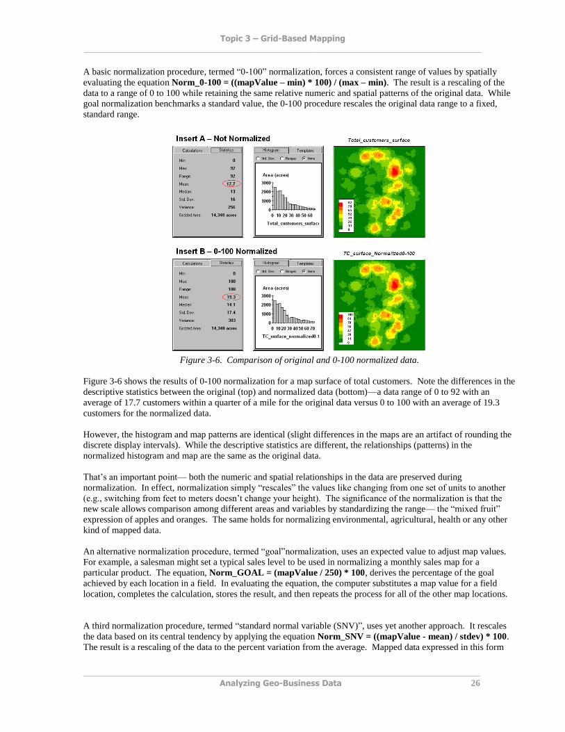
A basic normalization procedure, termed “0-100” normalization, forces a consistent range of values by spatially
evaluating the equation Norm_0-100 = ((mapValue – min) * 100) / (max – min).. The result is a rescaling of the
data to a range of 0 to 100 while retaining the same relative numeric and spatial patterns of the original data. While
goal normalization benchmarks a standard value, the 0-100 procedure rescales the original data range to a fixed,
standard range.
Figure 3-6. Comparison of original and 0-100 normalized data.
Figure 3-6 shows the results of 0-100 normalization for a map surface of total customers. Note the differences in the
descriptive statistics between the original (top) and normalized data (bottom)—a data range of 0 to 92 with an
average of 17.7 customers within a quarter of a mile for the original data versus 0 to 100 with an average of 19.3
customers for the normalized data.
However, the histogram and map patterns are identical (slight differences in the maps are an artifact of rounding the
discrete display intervals). While the descriptive statistics are different, the relationships (patterns) in the
normalized histogram and map are the same as the original data.
That’s an important point— both the numeric and spatial relationships in the data are preserved during
normalization. In effect, normalization simply “rescales” the values like changing from one set of units to another
(e.g., switching from feet to meters doesn’t change your height). The significance of the normalization is that the
new scale allows comparison among different areas and variables by standardizing the range— the “mixed fruit”
expression of apples and oranges. The same holds for normalizing environmental, agricultural, health or any other
kind of mapped data.
An alternative normalization procedure, termed “goal”normalization, uses an expected value to adjust map values.
For example, a salesman might set a typical sales level to be used in normalizing a monthly sales map for a
particular product. The equation, Norm_GOAL = (mapValue / 250) * 100, derives the percentage of the goal
achieved by each location in a field. In evaluating the equation, the computer substitutes a map value for a field
location, completes the calculation, stores the result, and then repeats the process for all of the other map locations.
A third normalization procedure, termed “standard normal variable (SNV)”, uses yet another approach. It rescales
the data based on its central tendency by applying the equation Norm_SNV = ((mapValue - mean) / stdev) * 100..
The result is a rescaling of the data to the percent variation from the average. Mapped data expressed in this form

Topic 3 – Grid-Based Mapping ______________________________________________________________________________________
______________________________________________________________________________________
Analyzing Geo-Business Data 27
enables you to easily identify “statistically unusual” areas— +100% locates areas that are one standard deviation
above the typical value; -100% locates areas that are one standard deviation below.
Map normalization is often a forgotten step in the rush to make a map, but is critical to a host of subsequent analyses
from visual map comparison to advanced data analysis. The ability to easily export the data in a universal format is
just as critical. Instead of a “do-it-all” GIS system, data exchange exports the mapped data in a format that is easily
consumed and utilized by other software packages.
Figure 3-7. The map values at each grid location form a single record in the exported table.
Figure 3-7 shows the process for grid-based data using a map stack of corn yield and nutrient maps. From the
computer’s perspective business and agricultural data are essentially the same—an organized se of numbers ripe for
analysis. Recall that a consistent analysis frame is used to organize the data into map layers. The map values at
each cell location for selected layers are reformatted into a single record and stored in a standard export table that, in
turn, can be imported into other data analysis software.
Figure 3-8. Mapped data can be imported into standard statistical packages for further analysis.
Figure 3-8 shows the agricultural data imported into the JMP statistical package (by SAS). Area (1) shows the
histograms and descriptive statistics for the P, K and N map layers shown in figure 2. Area (2) is a “spinning 3D
plot” of the data that you can rotate to graphically visualize relationships among the map layers. Area (3) shows the

Topic 3 – Grid-Based Mapping ______________________________________________________________________________________
______________________________________________________________________________________
Analyzing Geo-Business Data 28
results of applying a multiple linear regression model to predict crop yield from the soil nutrient maps. These are
but a few of the tools beyond mapping that are available through data exchange between GIS and traditional
spreadsheet, database and statistical packages—a perspective that integrates maps with other technologies.
Modern statistical packages like JMP “aren’t your father’s” stat experience and are fully interactive with point-n-
click graphical interfaces and wizards to guide appropriate analyses. The analytical tools, tables and displays
provide a whole new view of traditional mapped data. While a map picture might be worth a thousand words, a
gigabyte or so of digital map data is a whole revelation and foothold for site-specific decisions.
3.4 Grid Data Organization
From previous discussions on data characteristics (see Topic 2.3), recall that map features in a vector-based mapping
system identify discrete, irregular spatial objects with sharp abrupt boundaries. Other data types—raster images,
pseudo grids and raster grids—treat space in entirely different manner forming a spatially continuous data structure.
Raster images are composed of thousands of “pixels” (picture elements) that are assigned color values from black
(no reflected light) to white (lots of reflected light). The patterns of gray forms the forests, fields, buildings and
roads you see. While raster maps contain tremendous amounts of information that are easily “seen,” the data values
are far too limited for the full suite of map analysis operations.
Pseudo grids are formed by sets of uniform, square polygons covering an analysis area. Each grid element is treated
as a separate “polygonal cell” with spatial and attribute tables defining the set of little polygons. While pseudo grids
store full numeric data in their attribute tables and are subject to the same vector analysis operations, the explicit
organization of the data is both inefficient and too limited for advanced spatial analysis as each polygonal cell is
treated as an independent spatial object.
Raster grids, on the other hand, organize the data as a listing of map values like you read a book—left to right
(columns), top to bottom (rows). This implicit configuration identifies a grid cell’s location by simply referencing
its position in the list of all map values.
In practice, the list of map values is read into a matrix with the appropriate number of columns and rows of an
analysis frame superimposed over an area of interest. Geo-registration of the analysis frame requires an X,Y
coordinate for one of the grid corners and the length of a side of a cell. To establish the geographic extent of the
frame the computer simply starts at the reference location and calculates the total X, Y length by multiplying the
number of columns/rows times the cell size.
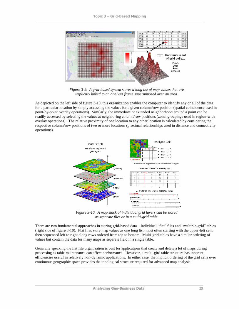
Figure 3-9 shows a 100 column by 100 row analysis frame geo-registered over a subdued vector backdrop. The list
of map values is read into the 100x100 matrix with their column/row positions corresponding to their geographic
locations. For example, the maximum map value of 92 (customers within a quarter of a mile) is positioned at
column 67, row 71 in the matrix. The 3D plot of the surface shows the spatial distribution of the stored values by
“pushing” up each of the 10,000 cells to its relative height.
In a grid-based dataset, the matrices containing the map values automatically align as each value list corresponds to
the same analysis frame (#columns, # rows, cell size and geo-reference point).
Topic 3 – Grid-Based Mapping ______________________________________________________________________________________
______________________________________________________________________________________
Analyzing Geo-Business Data 29
Figure 3-9. A grid-based system stores a long list of map values that are
implicitly linked to an analysis frame superimposed over an area.
As depicted on the left side of figure 3-10, this organization enables the computer to identify any or all of the data
for a particular location by simply accessing the values for a given column/row position (spatial coincidence used in
point-by-point overlay operations). Similarly, the immediate or extended neighborhood around a point can be
readily accessed by selecting the values at neighboring column/row positions (zonal groupings used in region-wide
overlay operations). The relative proximity of one location to any other location is calculated by considering the
respective column/row positions of two or more locations (proximal relationships used in distance and connectivity
operations).
Figure 3-10. A map stack of individual grid layers can be stored
as separate files or in a multi-grid table.
There are two fundamental approaches in storing grid-based data—individual “flat” files and “multiple-grid” tables
(right side of figure 3-10). Flat files store map values as one long list, most often starting with the upper-left cell,
then sequenced left to right along rows ordered from top to bottom. Multi-grid tables have a similar ordering of
values but contain the data for many maps as separate field in a single table.
Generally speaking the flat file organization is best for applications that create and delete a lot of maps during
processing as table maintenance can affect performance. However, a multi-gird table structure has inherent
efficiencies useful in relatively non-dynamic applications. In either case, the implicit ordering of the grid cells over
continuous geographic space provides the topological structure required for advanced map analysis.
_______________________________________________________________
Topic 3 – Grid-Based Mapping ______________________________________________________________________________________
______________________________________________________________________________________
Analyzing Geo-Business Data 30
3.5 Exercises
Access MapCalc using the GB_Smallville.rgs by
selecting Start Programs MapCalc
Learner MapCalc Learner Open existing
map set GB_Smallville.rgs. The following
set of exercises utilizes this database.
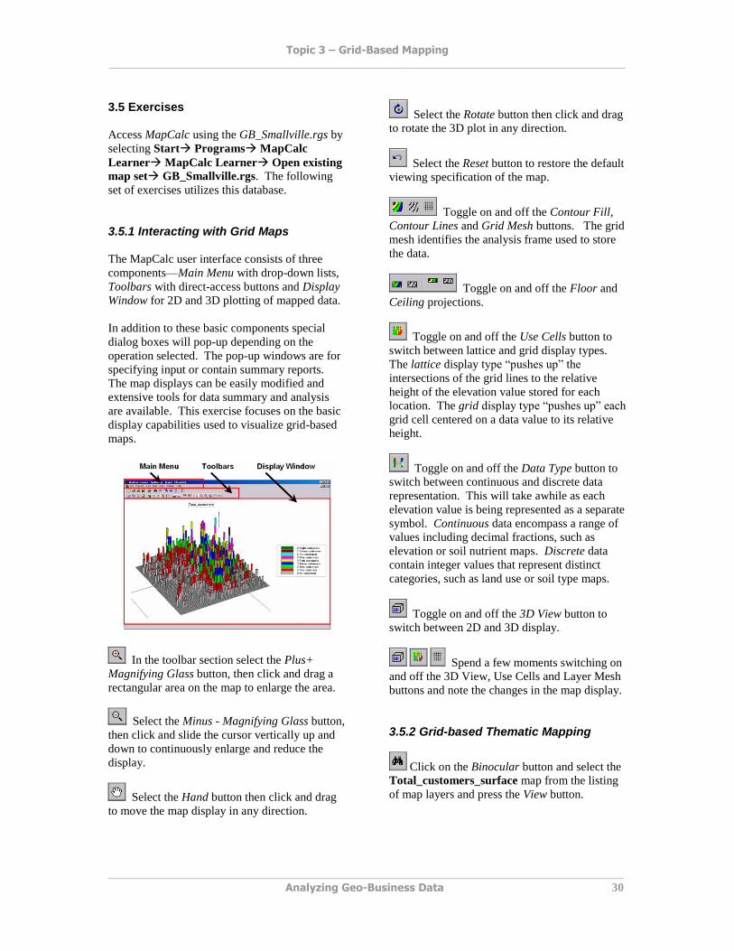
3.5.1 Interacting with Grid Maps
The MapCalc user interface consists of three
components—Main Menu with drop-down lists,
Toolbars with direct-access buttons and Display
Window for 2D and 3D plotting of mapped data.
In addition to these basic components special
dialog boxes will pop-up depending on the
operation selected. The pop-up windows are for
specifying input or contain summary reports.
The map displays can be easily modified and
extensive tools for data summary and analysis
are available. This exercise focuses on the basic
display capabilities used to visualize grid-based
maps.
In the toolbar section select the Plus+
Magnifying Glass button, then click and drag a
rectangular area on the map to enlarge the area.
Select the Minus - Magnifying Glass button,
then click and slide the cursor vertically up and
down to continuously enlarge and reduce the
display.
Select the Hand button then click and drag
to move the map display in any direction.
Select the Rotate button then click and drag
to rotate the 3D plot in any direction.
Select the Reset button to restore the default
viewing specification of the map.
Toggle on and off the Contour Fill,
Contour Lines and Grid Mesh buttons. The grid
mesh identifies the analysis frame used to store
the data.
Toggle on and off the Floor and
Ceiling projections.
Toggle on and off the Use Cells button to
switch between lattice and grid display types.
The lattice display type “pushes up” the
intersections of the grid lines to the relative
height of the elevation value stored for each
location. The grid display type “pushes up” each
grid cell centered on a data value to its relative
height.
Toggle on and off the Data Type button to
switch between continuous and discrete data
representation. This will take awhile as each
elevation value is being represented as a separate
symbol. Continuous data encompass a range of
values including decimal fractions, such as
elevation or soil nutrient maps. Discrete data
contain integer values that represent distinct
categories, such as land use or soil type maps.
Toggle on and off the 3D View button to
switch between 2D and 3D display.
Spend a few moments switching on
and off the 3D View, Use Cells and Layer Mesh
buttons and note the changes in the map display.
3.5.2 Grid-based Thematic Mapping
Click on the Binocular button and select the
Total_customers_surface map from the listing
of map layers and press the View button.
Topic 3 – Grid-Based Mapping ______________________________________________________________________________________
______________________________________________________________________________________
Analyzing Geo-Business Data 31
Confirm that the display is a Continuous 2D
Lattice with Layer Mesh off.
As you Mouse-Over a map display the
map value at each location is reported as the
cursor moves.
Double-click anywhere
in a map display to pop-up the Data Inspection
tool that reports the values for all map layers at
the current cursor position (drill-down).
Click on the Shading Manager button (or
right-click on the display and select Shading
Manager) to pop-up the map legend editing
window.
. Note
that there are 7 contour intervals from 0 to 92
customers and that each interval step is 13. Also
note that the 0 to 13 interval covers most of the
field (4904 cells for 7036 acres or 49%). The
interval is assigned a dark green color.
Click on the Binocular button and select the
Total_customers_surface map from the listing
of map layers and press the Clone View button.
Change the Number of Ranges from 7 to 5 and
note the change in the listing of the contour
intervals. Change the Color Ramp so the yellow
inflection is at the 3rd
interval by 1) clicking Off
the Lock by 4th
interval, 2) clicking On the color
block at the 3rd
interval, 3) selecting Yellow from
the color pallet and pressing OK. Press OK in
the shading manager window to finalize the map
display.
Click on the Tile Vertically button to
display all of the open map displays. Minimize
the Total_customer map so the two displays of
the yield data are side-by-side. Note the
differences between the two maps—spatial
patterns appear to have changed somewhat yet
the data is the identical.
Seven Intervals Five Intervals
Click on the Binocular button and select the
Total_customers_surface map from the listing
of map layers and press the Clone View button to
create another copy of the same data.
Access the
Shading Manager and change the Calculation
Mode from Equal Ranges to Equal Count. Note
the changes in the contour intervals. In this
instance the contour intervals are defined by
equal percentages of the map area
(approximately 2000 acres each) with the
min/max range for each interval varying widely.
Place the Equal Ranges and Equal Count
displays side-by-side—note the differences in the
map appearance, yet the data are the identical.

Topic 3 – Grid-Based Mapping ______________________________________________________________________________________
______________________________________________________________________________________
Analyzing Geo-Business Data 32
Equal Ranges Equal Count
Maximize the Equal Count map by
clicking on the Box button in the upper-right
corner of the display window. Note that each
map display is contained in its own window and
standard Microsoft Windows procedures are
used.
3.5.3 Map Summary Statistics and Charts
Click on the Binocular button and select the
Total_customers_surface map to restore the
original display of the yield data.
Click on the Shading Manager button then
the Statistics tab for a summary of the map data
comprising the yield map. Click on the
Histogram tab and select the Ranges option for a
plot of the data distribution indicating the
contour interval breaks. Click OK to dismiss the
shading manager.
Statistics Tab Data Distribution
Click on the Layer Mesh and the Use
Cells buttons to generate a 2D grid display of the
data. Mouse-over the upper-left grid cell in field
and note the map value stored at this location (0
Customers within .25 mile reach).
Mouse-over pop-up Data table
From the Main Menu, select Map Properties
then click on the Data tab to view the data table.
Note that the top-right entry in the table
(column= 1, row= 1, value= 0) corresponds to
the upper-left cell in the map display.
From the Main menu, select Map Set New
Graph Histogram Total_customers_surface to generate a
histogram plot of the data.
Right-click on
the plot, then select Properties and set the color
to red and the pattern to solid.
From the Main menu, select Map Set New
Graph Scatterplot specifying
Total_customers_surface as the X-axis and
Customers_surface2 as the Y-axis to generate a
scatter plot of the total customer surface versus a
surface of customers purchasing a specific
product.
Note that a
linear regression line is fitted to the data to help
visualize the overall numerical relationship
between the two map variables (see Topic 8 for
more information).
3.5.4 Map Normalization
Generate a statistical summary report of the
Total_customers_surface by right-clicking on
Topic 3 – Grid-Based Mapping ______________________________________________________________________________________
______________________________________________________________________________________
Analyzing Geo-Business Data 33
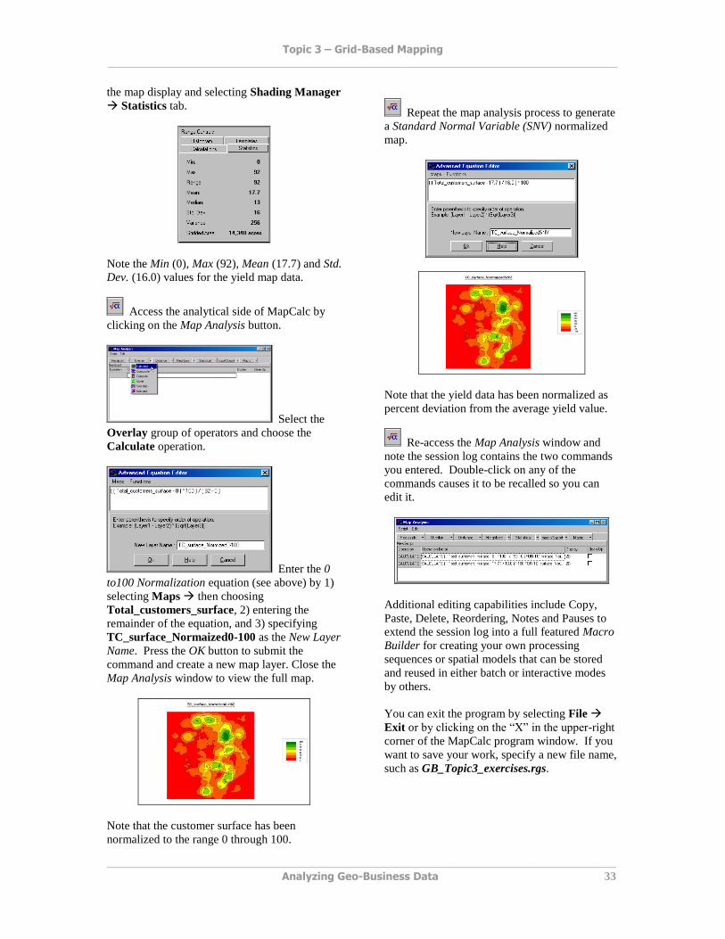
the map display and selecting Shading Manager
Statistics tab.
Note the Min (0), Max (92), Mean (17.7) and Std.
Dev. (16.0) values for the yield map data.
Access the analytical side of MapCalc by
clicking on the Map Analysis button.
Select the
Overlay group of operators and choose the
Calculate operation.
Enter the 0
to100 Normalization equation (see above) by 1)
selecting Maps then choosing
Total_customers_surface, 2) entering the
remainder of the equation, and 3) specifying
TC_surface_Normaized0-100 as the New Layer
Name. Press the OK button to submit the
command and create a new map layer. Close the
Map Analysis window to view the full map.
Note that the customer surface has been
normalized to the range 0 through 100.
Repeat the map analysis process to generate
a Standard Normal Variable (SNV) normalized
map.
Note that the yield data has been normalized as
percent deviation from the average yield value.
Re-access the Map Analysis window and
note the session log contains the two commands
you entered. Double-click on any of the
commands causes it to be recalled so you can
edit it.
Additional editing capabilities include Copy,
Paste, Delete, Reordering, Notes and Pauses to
extend the session log into a full featured Macro
Builder for creating your own processing
sequences or spatial models that can be stored
and reused in either batch or interactive modes
by others.
You can exit the program by selecting File
Exit or by clicking on the “X” in the upper-right
corner of the MapCalc program window. If you
want to save your work, specify a new file name,
such as GB_Topic3_exercises.rgs.

Topic 3 – Grid-Based Mapping ______________________________________________________________________________________
______________________________________________________________________________________
Analyzing Geo-Business Data 34