physics excel laboratory tutorials - winthrop university
TRANSCRIPT
1
Physics Laboratory
Excel Tutorials
Tutorial Menu
Hello, and welcome to my Microsoft Excel tutorials. I've created these pages to supplement your physics laboratory course here at Clemson University. Most of our lab courses require using Excel or some similar spread sheet application to display data, perform calculations and create plots. These tutorials are designed to familiarize our lab students with specific Excel tasks, which are required for successful completion of the course.
There are dozens of ways to perform the same Excel operation. In these tutorials I present various techniques and methods that I have found works well for me. Below is a listing of the 10 tutorials and their subheadings. Even if you are familiar with Excel, you should start at the beginning and work your way to the end.
1. Terminology 2. Arithmetic
i. Addition ii. Other basic operators iii. Exponential operator iv. Referencing cells within formulas v. Three built in functions (SUM, AVERAGE, SQRT)
3. Basic Actions i. Create titles and headings ii. Add units to headings iii. Copy and paste your formula iv. Use correct significant figures v. Emphasize important text vi. Shade important cells vii. More cell manipulations (resize columns, change font styles, add borders) viii. That ###### error message ix. Display sample formulas x. Consult the page setup (print gridlines and row and column headings)
4. Algebra i. Thickness of sheet of paper ii. Distance traveled around a perimeter iii. Conversions iv. Solve a quadratic equation v. Determine the radius of a sphere vi. PI( ), a built-in constant vii. Copy and paste formulas
5. Displaying Symbols i. Display symbols with "Symbol" font ii. Display symbols with <ALT>+code
6. Trigonometry i. Using radians ii. Built-in trig functions (sine, cosine tangent, arcsine, arccosine, arctangent) iii. Finding the height of a tree
2
iv. Finding the launch angle of a ski ramp v. Verifying a trig identity
7. Graphing Data and Curve Fitting i. An experiment to determine π ii. How to plot a data set iii. Displaying units on the axes iv. Displaying symbols v. Add a trendline and equation to the graph vi. Altering the look of the displayed equation vii. Altering the attributes of the trendline viii. Calculating π from the slope (and finding % Error)
8. Advanced Graphing and Curve Fitting i. Creating plots of two data series on one graph ii. Altering the graph's legend iii. Fitting multiple curves on one set of data iv. Using error bars
9. Advanced Topics i. Creating user-defined constants ii. Adjusting the graph's scale
10. Using Excel's Statistics Commands i. Basic built-in functions (AVERAGE, MEAN, MODE, COUNT, MAX, MIN) ii. Linear regression equations (SLOPE, INTERCEPT, CORREL) iii. Error analysis tools (STDEV) iv. Miscellany (ABS)
11. Linear Regression and Excel i. Sample data ii. Linear regression equations iii. Applying regression to the sample data iv. Linear regression with built-in functions
12. Helpful Hints Concerning the Physics Lab Reports i. Work carefully ii. Neatly display your work iii. Display sample formulas iv. Check your work by hand v. Printing tips (making your work easy to read, easy to grade, and adjusting it to fit neatly on
the printed page)
Of course, Microsoft Excel has an extensive built-in help application and you are encouraged to use it to dig deeper into the capabilities of the spread sheet program. These pages are intended to be used by the uninitiated physics laboratory student as a basic tutorial on getting started with Excel.
Copyright © 2000, Clemson University. All Rights Reserved.
3
Terminology Let us begin our Excel tutorial with a discussion of the terminology that we will use throughout the tutorial. It will be helpful if you have your copy of Excel open while reviewing these pages.
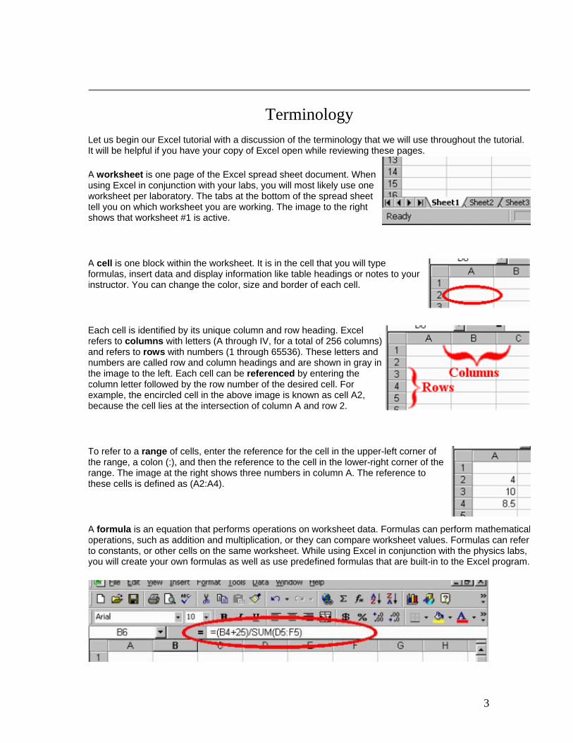
A worksheet is one page of the Excel spread sheet document. When using Excel in conjunction with your labs, you will most likely use one worksheet per laboratory. The tabs at the bottom of the spread sheet tell you on which worksheet you are working. The image to the right shows that worksheet #1 is active.
A cell is one block within the worksheet. It is in the cell that you will type formulas, insert data and display information like table headings or notes to your instructor. You can change the color, size and border of each cell.
Each cell is identified by its unique column and row heading. Excel refers to columns with letters (A through IV, for a total of 256 columns) and refers to rows with numbers (1 through 65536). These letters and numbers are called row and column headings and are shown in gray in the image to the left. Each cell can be referenced by entering the column letter followed by the row number of the desired cell. For example, the encircled cell in the above image is known as cell A2, because the cell lies at the intersection of column A and row 2.
To refer to a range of cells, enter the reference for the cell in the upper-left corner of the range, a colon (:), and then the reference to the cell in the lower-right corner of the range. The image at the right shows three numbers in column A. The reference to these cells is defined as (A2:A4).
A formula is an equation that performs operations on worksheet data. Formulas can perform mathematicaloperations, such as addition and multiplication, or they can compare worksheet values. Formulas can refer to constants, or other cells on the same worksheet. While using Excel in conjunction with the physics labs, you will create your own formulas as well as use predefined formulas that are built-in to the Excel program.
4
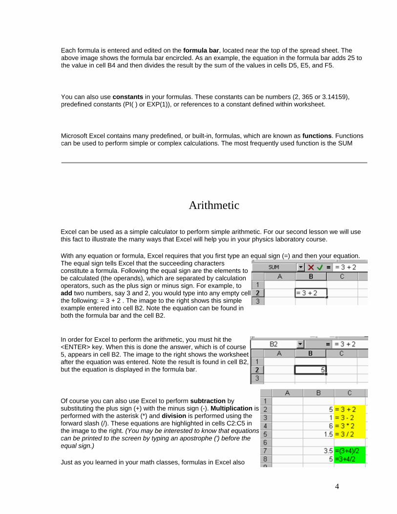
Each formula is entered and edited on the formula bar, located near the top of the spread sheet. The above image shows the formula bar encircled. As an example, the equation in the formula bar adds 25 to the value in cell B4 and then divides the result by the sum of the values in cells D5, E5, and F5.
You can also use constants in your formulas. These constants can be numbers (2, 365 or 3.14159), predefined constants (PI( ) or EXP(1)), or references to a constant defined within worksheet.
Microsoft Excel contains many predefined, or built-in, formulas, which are known as functions. Functions can be used to perform simple or complex calculations. The most frequently used function is the SUM
Arithmetic Excel can be used as a simple calculator to perform simple arithmetic. For our second lesson we will use this fact to illustrate the many ways that Excel will help you in your physics laboratory course.
With any equation or formula, Excel requires that you first type an equal sign (=) and then your equation. The equal sign tells Excel that the succeeding characters constitute a formula. Following the equal sign are the elements to be calculated (the operands), which are separated by calculation operators, such as the plus sign or minus sign. For example, to add two numbers, say 3 and 2, you would type into any empty cell the following: = 3 + 2 . The image to the right shows this simple example entered into cell B2. Note the equation can be found in both the formula bar and the cell B2.
In order for Excel to perform the arithmetic, you must hit the <ENTER> key. When this is done the answer, which is of course 5, appears in cell B2. The image to the right shows the worksheet after the equation was entered. Note the result is found in cell B2, but the equation is displayed in the formula bar.
Of course you can also use Excel to perform subtraction by substituting the plus sign (+) with the minus sign (-). Multiplication is performed with the asterisk (*) and division is performed using the forward slash (/). These equations are highlighted in cells C2:C5 in the image to the right. (You may be interested to know that equations can be printed to the screen by typing an apostrophe (') before the equal sign.)
Just as you learned in your math classes, formulas in Excel also
5
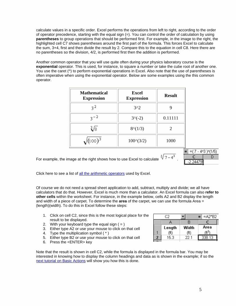
calculate values in a specific order. Excel performs the operations from left to right, according to the order of operator precedence, starting with the equal sign (=). You can control the order of calculation by using parentheses to group operations that should be performed first. For example, in the image to the right, the highlighted cell C7 shows parentheses around the first part of the formula. This forces Excel to calculate the sum, 3+4, first and then divide the result by 2. Compare this to the equation in cell C8. Here there are no parentheses so the division, 4/2, is performed first then the addition is performed.
Another common operator that you will use quite often during your physics laboratory course is the exponential operator. This is used, for instance, to square a number or take the cube root of another one. You use the caret (^) to perform exponential operations in Excel. Also note that the use of parentheses is often imperative when using the exponential operator. Below are some examples using the this common operator.
Mathematical Expression
Excel Expression Result
3^2 9
3^(-2) 0.11111
8^(1/3) 2
100^(3/2) 1000
For example, the image at the right shows how to use Excel to calculate .
Click here to see a list of all the arithmetic operators used by Excel.
Of course we do not need a spread sheet application to add, subtract, multiply and divide; we all have calculators that do that. However, Excel is much more than a calculator. An Excel formula can also refer to other cells within the worksheet. For instance, in the example below, cells A2 and B2 display the length and width of a piece of carpet. To determine the area of the carpet, we can use the formula Area = (length)(width). To do this in Excel follow these steps:
1. Click on cell C2, since this is the most logical place for the result to be displayed.
2. With your keyboard type the equal sign ( = ) 3. Either type A2 or use your mouse to click on that cell 4. Type the multiplication symbol ( * ) 5. Either type B2 or use your mouse to click on that cell 6. Press the <ENTER> key
Note that the result is shown in cell C2, while the formula is displayed in the formula bar. You may be interested in knowing how to display the column headings and data as is shown in the example; if so the next tutorial on Basic Actions will show you how this is done.

6
changes, the dependent cell also changes, by default. For example, if the value of the toy car's mass in the above example changes, the result of the formula =A2*B2 also changes. Try it and prove it to yourself! If you use constant values in the formula instead of references to the cells (for example, =1.53*2.12), the result changes only if you modify the formula yourself.
Microsoft Excel contains many predefined, or built-in, formulas, which are known as functions. Functions can be used to perform simple or complex calculations. The most frequently used functions are the SUM, AVERAGE and SQRT functions.
• The SUM function is used to add numbers in a range of cells. • The AVERAGE function is used to average numbers in a range of cells. • The SQRT function is used to take the square root of a number or an operation.
The table below details how to use these three functions.
The SUM Function
To add a column or a row of numbers follow the steps below:
1. Click on an empty cell. In the above example, we chose cell F1 in which to enter our formula.
2. With your keyboard type the equal sign (=) 3. Begin the function by typing SUM(
* Don't forget to open the parentheses! 4. Either type A1:E1 or use your mouse to
highlight cells A1, B1, C1, D1 and E1 5. Complete the function with a closing
parentheses by typing ) 6. Press the <ENTER> key
Note the sum of the numbers is displayed in cell F1 and the formula can be found in the formula bar.
The AVERAGE Function
To average a column or a row of numbers follow the steps below:
1. Click on an empty cell. In the above example, we chose cell F1 in which to enter our formula.
2. With your keyboard type the equal sign (=) 3. Begin the function by typing AVERAGE(
* Don't forget to open the parentheses! 4. Either type A1:E1 or use your mouse to
highlight cells A1, B1, C1, D1 and E1 5. Complete the function with a closing
parentheses by typing ) 6. Press the <ENTER> key
Note the average of the numbers is displayed in cell F1 and the formula can be found in the formula bar.

7
The SQRT (SQuare RooT) Function
To find the square root of a number located within a worksheet cell follow the steps below:
1. Click on an empty cell. In the above example, we chose cell B2 in which to enter our formula.
2. With your keyboard type the equal sign (=) 3. Begin the function by typing SQRT(
* Don't forget to open the parentheses! 4. Either type B1 or use your mouse to click on cell
B1 5. Complete the function with a closing parentheses
by typing ) 6. Press the <ENTER> key
See the complete list of Excel's built-in mathematical and trigonometric functions and their descriptions.

8
9
Basic Actions There are a few things you can do to your worksheet that makes it more readable. This will greatly help your TA better grade your lab report and ascertain where you are making your mistakes. Here we discuss a few of the things you can do to improve the look of your worksheet.
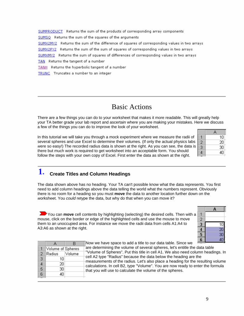
In this tutorial we will take you through a mock experiment where we measure the radii of several spheres and use Excel to determine their volumes. (If only the actual physics labs were so easy!) The recorded radius data is shown at the right. As you can see, the data is there but much work is required to get worksheet into an acceptable form. You should follow the steps with your own copy of Excel. First enter the data as shown at the right.
Create Titles and Column Headings
The data shown above has no heading. Your TA can't possible know what the data represents. You first need to add column headings above the data telling the world what the numbers represent. Obviously there is no room for a heading so you must move the data to another location further down on the worksheet. You could retype the data, but why do that when you can move it?
You can move cell contents by highlighting (selecting) the desired cells. Then with a
mouse, click on the border or edge of the highlighted cells and use the mouse to move them to an unoccupied area. For instance we move the radii data from cells A1:A4 to A3:A6 as shown at the right.
Now we have space to add a title to our data table. Since we are determining the volume of several spheres, let's entitle the data table "Volume of Spheres". Put this title in cell A1. We also need column headings. Incell A2 type "Radius" because the data below the heading are the measurements of the radius. Let's also place a heading for the resulting volume calculations. In cell B2, type "Volume". You are now ready to enter the formula that you will use to calculate the volume of the spheres.

10
Add Units to the Headings
The radius and volume headings are missing the units of the data the columns contain. Is the radius 10 cm, 10 m, 10 in? Of course, units are need. The best way to do this is place the units in parentheses below the heading. To keep the heading and the unit in the same cell, first type the heading and then simultaneously press the <ALT>+<ENTER> keys. This will add a carriage return within the cell, thus allowing you to type the unit below the heading.
Notice the units of volume is cm3 but is written as cm^3 in cell B2. This is a common method that students use to write subscripts. But there is a better way. Instead of typing cm^3, type cm3, then highlight the 3. When the 3 is highlighted, click on the Format >> Cells >> Superscript and the 3 become superscripted as shown to the right.
Copy and Paste Your Formula
You should recall that the volume of a sphere is given
by the formula , where r is the sphere's radius and π = 3.14159. Therefore, the formula that you will use to find the volume of the first sphere is =(4/3)*3.14159*A3^3. Enter this formula in cell B3. Note that the result (4188.787 cm3) is displayed in the cell.
We could repeat this process for each radius in the table and type new formulas for each. However the best (and fastest) way to determine the volume of the remaining spheres is to use the copy and paste functions. It would be useful to copy the formula in cell B3 and paste it to cell B4 through B6.
To copy the contents of a cell, highlight the cell by clicking on the cell. In our example, click on cell B3. Then click on the Copy Button, , on the tool bar. The cell will be marked with a marquee border as shown below.
Double-check your formula to ensure it is correct before copying it!

11
To paste the copied cells to another location, highlight the destination cells with your mouse. In our example, we highlighted cells B4, B5 and B6. Then click on the Paste Button, on the tool bar. The formula is then moved to the destination cells as shown below. Note that the pasted formula automatically changed the cell reference to the appropriate radius.
It is always a good idea to double-check the first and last cells with a calculator after a paste just to make sure the formulas were correct.
Use Correct Significant Figures
Any good physics laboratory student knows that 2.2 times 5.1 is 11, not 11.22 like your calculator says. This is, of course, due to the number of significant figures used. The numbers 2.2 and 5.1 both have two significant figures, therefore, the answer must also have two significant figures. By default Excel displays the maximum number of decimal places. However, the number of decimals displayed can be manually
forced by using the Increase Decimal Button, and Decrease Decimal Button, , depending on the given situation. For example, the image at the right shows the how to use the Decrease Decimal Button to reduce the number of decimals in the answer.
Throughout these tutorials, we will not be concerned with significant figures. I just wanted you to know how to adjust the number of decimals so your lab write-ups will be done correctly.
Emphasize Important Text
It is helpful to emphasize text like titles, column headings, and final results. One way to make text stand out is to make it bold. To make the entire contents of a cell bold, for instance the title found in cell A1, simply highlight (select) the cell (or cells) and click the Bold Button, , on the toolbar.
You need not make the entire cell contents bold as shown above. For instance, you can make the heading bold while the units are displayed as normal text. To do this, from the formula bar, highlight the text you wish to make bold and then click the Bold Button, , on the toolbar.
12
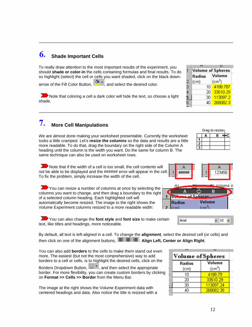
Shade Important Cells
To really draw attention to the most important results of the experiment, you should shade or color-in the cells containing formulas and final results. To do so highlight (select) the cell or cells you want shaded, click on the black down-
arrow of the Fill Color Button, , and select the desired color.
Note that coloring a cell a dark color will hide the text, so choose a light shade.
More Cell Manipulations
We are almost done making your worksheet presentable. Currently the worksheet looks a little cramped. Let's resize the columns so the data and results are a little more readable. To do that, drag the boundary on the right side of the Column A heading until the column is the width you want. Do the same for column B. The same technique can also be used on worksheet rows.
Note that if the width of a cell is too small, the cell contents will not be able to be displayed and the ###### error will appear in the cell. To fix the problem, simply increase the width of the cell.
You can resize a number of columns at once by selecting the columns you want to change, and then drag a boundary to the right of a selected column heading. Each highlighted cell will automatically become resized. The image to the right shows the Volume Experiment columns resized to a more readable width:
You can also change the font style and font size to make certain text, like titles and headings, more noticeable.
By default, all text is left-aligned in a cell. To change the alignment, select the desired cell (or cells) and then click on one of the alignment buttons, : Align Left, Center or Align Right.
You can also add borders to the cells to make them stand out even more. The easiest (but not the most comprehensive) way to add borders to a cell or cells, is to highlight the desired cells, click on the
Borders Dropdown Button, , and then select the appropriate border. For more flexibility, you can create custom borders by clicking on Format >> Cells >> Border from the Menu Bar.
The image at the right shows the Volume Experiment data with centered headings and data. Also notice the title is resized with a
13
different font style, and borders have been added.
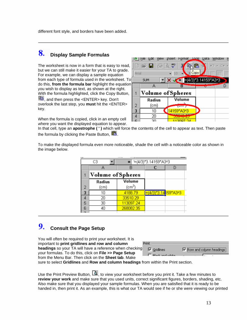
Display Sample Formulas
The worksheet is now in a form that is easy to read, but we can still make it easier for your TA to grade. For example, we can display a sample equation from each type of formula used in the worksheet. To do this, from the formula bar highlight the equation you wish to display as text, as shown at the right. With the formula highlighted, click the Copy Button,
, and then press the <ENTER> key. Don't overlook the last step, you must hit the <ENTER> key.
When the formula is copied, click in an empty cell where you want the displayed equation to appear. In that cell, type an apostrophe ( ' ) which will force the contents of the cell to appear as text. Then paste the formula by clicking the Paste Button, .
To make the displayed formula even more noticeable, shade the cell with a noticeable color as shown in the image below.
Consult the Page Setup
You will often be required to print your worksheet. It is important to print gridlines and row and column headings so your TA will have a reference when checking your formulas. To do this, click on File >> Page Setup from the Menu Bar. Then click on the Sheet tab. Make sure to select Gridlines and Row and column headings from within the Print section.
Use the Print Preview Button, , to view your worksheet before you print it. Take a few minutes to review your work and make sure that you used units, correct significant figures, borders, shading, etc. Also make sure that you displayed your sample formulas. When you are satisfied that it is ready to be handed in, then print it. As an example, this is what our TA would see if he or she were viewing our printed

14
Volume Experiment worksheet (note we did not use a color printer so the shading was converted to gray-scale):
Algebra Excel is very useful when solving algebraic equations. The program, however, will not actually perform any algebraic operations; you must supply the proper formula.
For instance, we can use Excel to determine the thickness of one sheet of paper. Say we know that a ream of paper contains 500 sheets and is 4.895 cm thick. The thickness of a single sheet can be determined by dividing the total thickness by the total number of sheets in the ream. Let's utilize the spread sheet program by first recording our known values, i.e., the total number of sheets and the total thickness. These are entered into columns A and B, respectively, in the example below. The formula (=B2/A2) can then be entered in cell C2. The worksheet example is shown below.
Note that the cell containing the formula is highlighted and the equation is also printed and highlighted. With any worksheet that you turn in to be graded, it is important that you highlight and print your formulas so your TA can follow your steps and correct your mistakes. Also be sure to print the gridlines and the Row and Column headings. For information about these and other basic actions, see the previous tutorial.
Here is another slightly more complicated example where Excel can be a help to us. Let's say that we wish
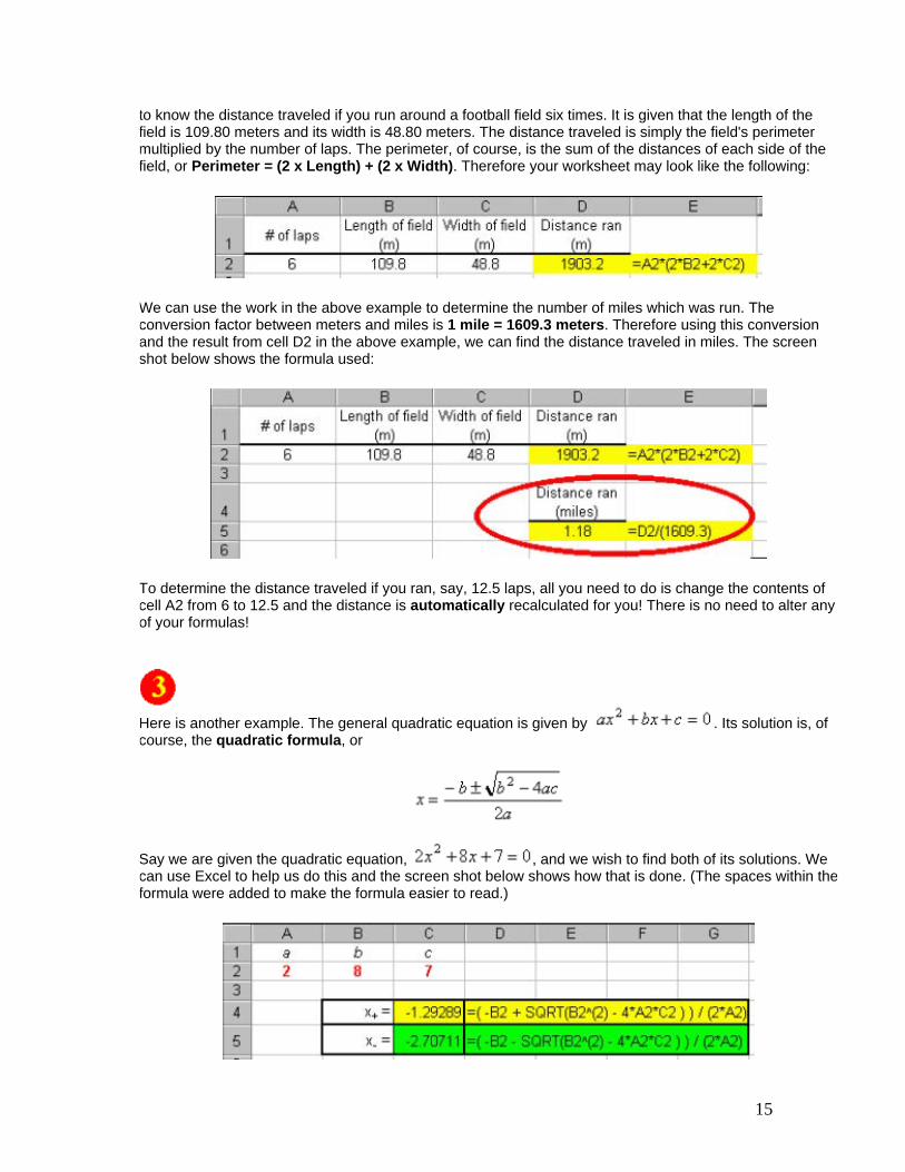
15
to know the distance traveled if you run around a football field six times. It is given that the length of the field is 109.80 meters and its width is 48.80 meters. The distance traveled is simply the field's perimeter multiplied by the number of laps. The perimeter, of course, is the sum of the distances of each side of the field, or Perimeter = (2 x Length) + (2 x Width). Therefore your worksheet may look like the following:
We can use the work in the above example to determine the number of miles which was run. The conversion factor between meters and miles is 1 mile = 1609.3 meters. Therefore using this conversion and the result from cell D2 in the above example, we can find the distance traveled in miles. The screen shot below shows the formula used:
To determine the distance traveled if you ran, say, 12.5 laps, all you need to do is change the contents of cell A2 from 6 to 12.5 and the distance is automatically recalculated for you! There is no need to alter any of your formulas!
Here is another example. The general quadratic equation is given by . Its solution is, of course, the quadratic formula, or
Say we are given the quadratic equation, , and we wish to find both of its solutions. We can use Excel to help us do this and the screen shot below shows how that is done. (The spaces within theformula were added to make the formula easier to read.)
16
Of course, to solve another quadratic equation, all one needs to do is change the values of the constants a, b and c in cells A1, B1 and C1. There is no need to alter the formula and the new result is given immediately after the new values are entered!
Are you beginning to see how Excel can make your physics laboratory experience a more enjoyable one? If not, please tell me ( )why.
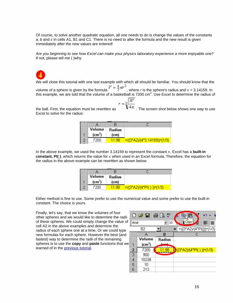
We will close this tutorial with one last example with which all should be familiar. You should know that the
volume of a sphere is given by the formula , where r is the sphere's radius and π = 3.14159. In this example, we are told that the volume of a basketball is 7200 cm3. Use Excel to determine the radius of
the ball. First, the equation must be rewritten as . The screen shot below shows one way to use Excel to solve for the radius:
In the above example, we used the number 3.14159 to represent the constant π. Excel has a built-in constant, PI( ), which returns the value for π when used in an Excel formula. Therefore, the equation for the radius in the above example can be rewritten as shown below:
Either method is fine to use. Some prefer to use the numerical value and some prefer to use the built-in constant. The choice is yours.
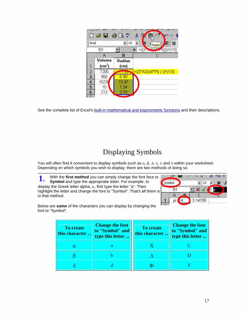
Finally, let's say, that we know the volumes of four other spheres and we would like to determine the radii of these spheres. We could simply change the value of cell A2 in the above examples and determine the radius of each sphere one at a time. Or we could type new formulas for each sphere. However the best (and fastest) way to determine the radii of the remaining spheres is to use the copy and paste functions that we learned of in the previous tutorial.
17
See the complete list of Excel's built-in mathematical and trigonometric functions and their descriptions.
Displaying Symbols You will often find it convenient to display symbols such as α, β, ∆, π, ≅ and ± within your worksheet. Depending on which symbols you wish to display, there are two methods of doing so.
With the first method you can simply change the font face to Symbol and type the appropriate letter. For example, to
display the Greek letter alpha, α, first type the letter "a". Then highlight the letter and change the font to "Symbol". That's all there is to that method.
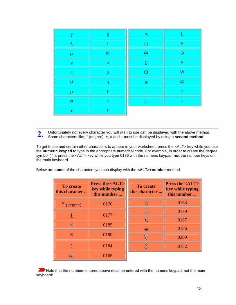
Below are some of the characters you can display by changing the font to "Symbol".
To create this character ...
Change the fontto "Symbol" andtype this letter ...
α a
β b
δ d
To create this character ...
Change the fontto "Symbol" andtype this letter ...
Χ C
∆ D
Φ F
18
γ g
λ l
µ m
ν n
π p
θ q
ρ r
σ s
τ t
Λ L
Π P
Θ Q
Σ S
Ω W
≅ @
⊥ ^
∴ \
Unfortunately not every character you will wish to use can be displayed with the above method. Some characters like, ° (degree), ±, × and ÷ must be displayed by using a second method.
To get these and certain other characters to appear in your worksheet, press the <ALT> key while you use the numeric keypad to type in the appropriate numerical code. For example, in order to create the degree symbol ( ° ), press the <ALT> key while you type 0176 with the numeric keypad, not the number keys on the main keyboard.
Below are some of the characters you can display with the <ALT>+number method.
To create this character ...
Press the <ALT>key while typingthis number ...
° (degree) 0176
± 0177
0185
× 0180
÷ 0184
0165
To create this character ...
Press the <ALT>key while typingthis number ...
0163
0179
0187
0186
0209
0182
Note that the numbers entered above must be entered with the numeric keypad, not the main keyboard!
19
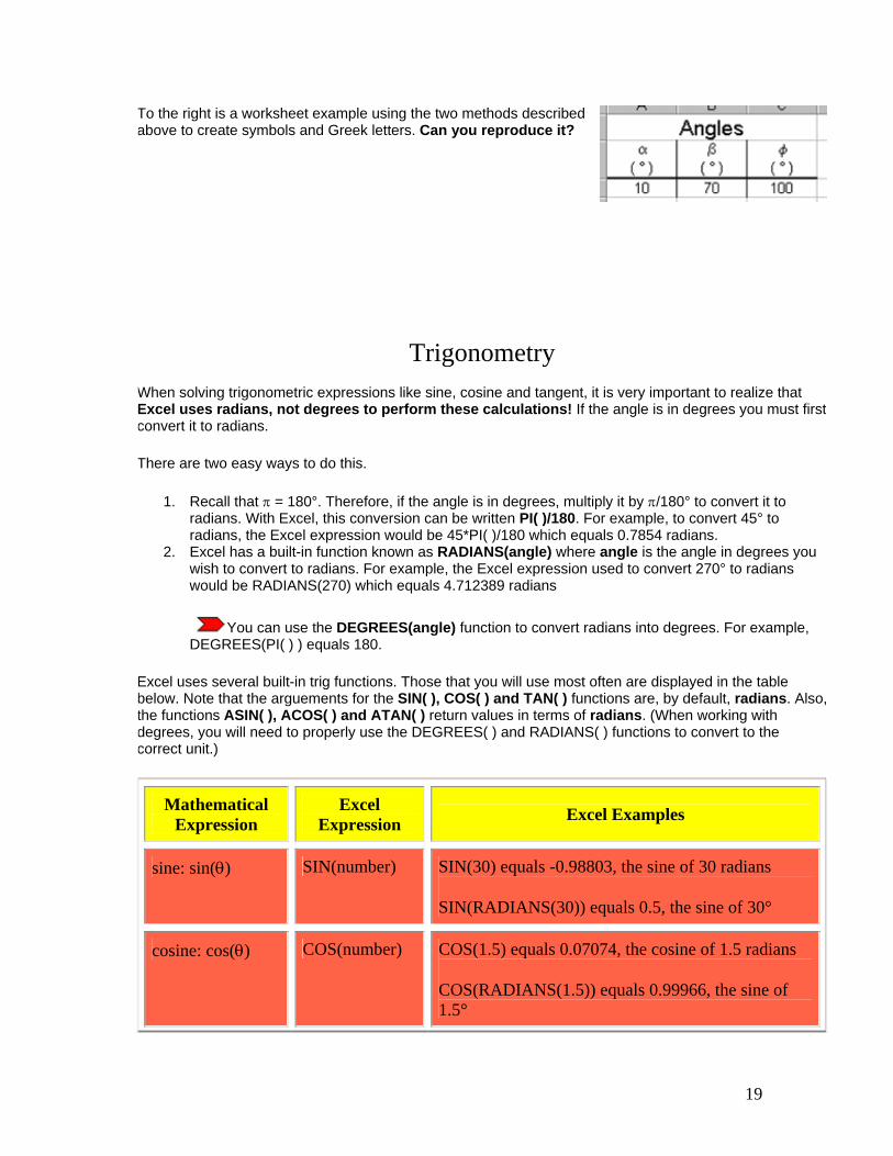
To the right is a worksheet example using the two methods described above to create symbols and Greek letters. Can you reproduce it?
Trigonometry When solving trigonometric expressions like sine, cosine and tangent, it is very important to realize that Excel uses radians, not degrees to perform these calculations! If the angle is in degrees you must first convert it to radians.
There are two easy ways to do this.
1. Recall that π = 180°. Therefore, if the angle is in degrees, multiply it by π/180° to convert it to radians. With Excel, this conversion can be written PI( )/180. For example, to convert 45° to radians, the Excel expression would be 45*PI( )/180 which equals 0.7854 radians.
2. Excel has a built-in function known as RADIANS(angle) where angle is the angle in degrees you wish to convert to radians. For example, the Excel expression used to convert 270° to radians would be RADIANS(270) which equals 4.712389 radians
You can use the DEGREES(angle) function to convert radians into degrees. For example, DEGREES(PI( ) ) equals 180.
Excel uses several built-in trig functions. Those that you will use most often are displayed in the table below. Note that the arguements for the SIN( ), COS( ) and TAN( ) functions are, by default, radians. Also, the functions ASIN( ), ACOS( ) and ATAN( ) return values in terms of radians. (When working with degrees, you will need to properly use the DEGREES( ) and RADIANS( ) functions to convert to the correct unit.)
Mathematical Expression
Excel Expression Excel Examples
sine: sin(θ) SIN(number) SIN(30) equals -0.98803, the sine of 30 radians
SIN(RADIANS(30)) equals 0.5, the sine of 30°
cosine: cos(θ) COS(number) COS(1.5) equals 0.07074, the cosine of 1.5 radians
COS(RADIANS(1.5)) equals 0.99966, the sine of 1.5°
20
tangent: tan(θ) TAN(number) TAN(2) equals -2.18504, the tangent of 2 radians
TAN(RADIANS(2)) equals 0.03492, the tangent of 2°
arcsine: sin-1(x) ASIN(number) ASIN(0.5) equals 0.523599 radians
DEGREES(ASIN(0.5)) equals 30°, the arcsine of 0.5
arccos: cos-1(x) ACOS(number) ACOS(-0.5) equals 2.09440 radians
DEGREES(ACOS(-0.5)) equals 120°, the arccosine of -0.5
arctangent: tan-
1(x) ATAN(number) ATAN(1) equals 0.785398 radians
DEGREES(ATAN(1)) equals 45°, the arctangent of 1
Below are a few examples of problems involving trigonometry and how we used Excel to help solve them.
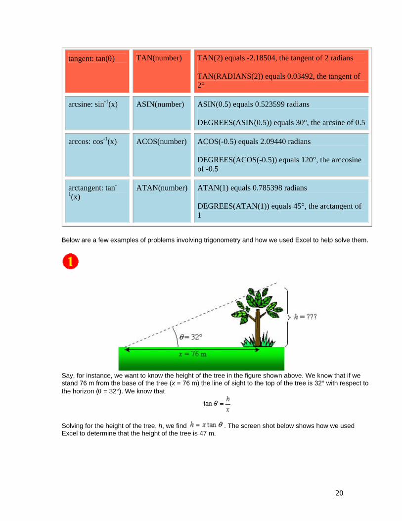
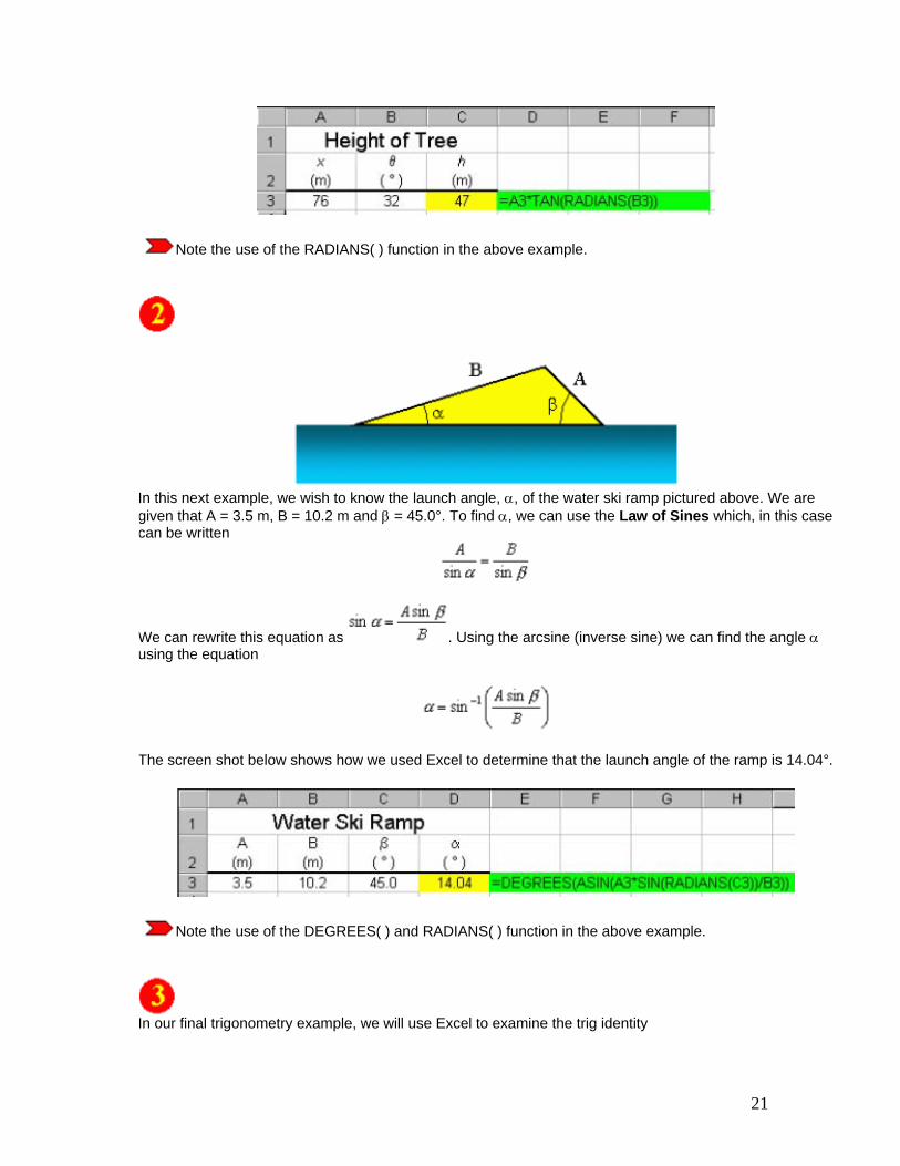
Say, for instance, we want to know the height of the tree in the figure shown above. We know that if we stand 76 m from the base of the tree (x = 76 m) the line of sight to the top of the tree is 32° with respect to the horizon (θ = 32°). We know that
Solving for the height of the tree, h, we find . The screen shot below shows how we used Excel to determine that the height of the tree is 47 m.
21
Note the use of the RADIANS( ) function in the above example.
In this next example, we wish to know the launch angle, α, of the water ski ramp pictured above. We are given that A = 3.5 m, B = 10.2 m and β = 45.0°. To find α, we can use the Law of Sines which, in this case can be written
We can rewrite this equation as . Using the arcsine (inverse sine) we can find the angle α using the equation
The screen shot below shows how we used Excel to determine that the launch angle of the ramp is 14.04°.
Note the use of the DEGREES( ) and RADIANS( ) function in the above example.
In our final trigonometry example, we will use Excel to examine the trig identity

22
Notice in the screen shot below that this identity holds true when θ is given in radians and degrees.
Note the units for the angle θ are placed in different cells than the numbers. If we place the numbers and the units in the same cell, Excel will not be able to decipher the number and therefore we will not be able to reference the cells for use in any equation!
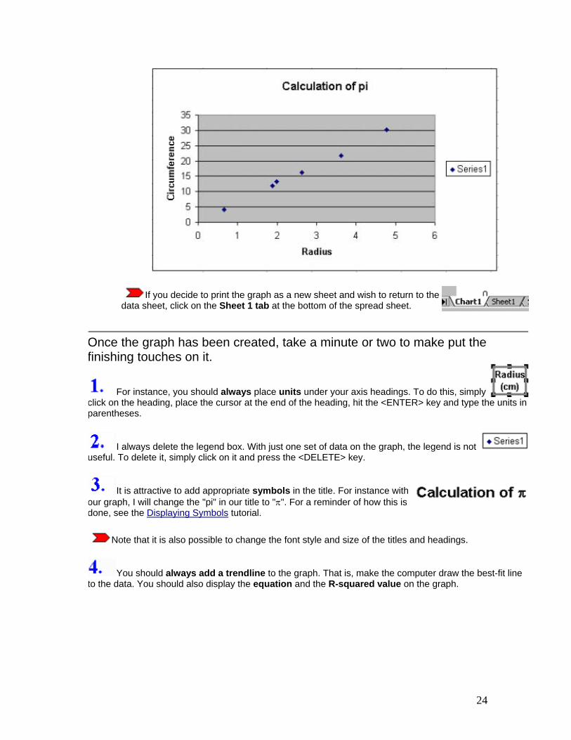
Graphing Data and
Curve Fitting In this tutorial on graphing, we will examine data taken from an experiment in which the circumferences and radii of several circular objects were measured. The data is displayed in the screen shot to the right. For more information on formatting the data and displaying the text see the previous tutorials.
Of course, the equation associated with this data is C = 2πr, or the circumference of a circle is equal to two times pi times the circle's radius. In this experiment, the circumferences and radii are measured. We hope to be able to determine the value for π, which, to six significant figures, is given as 3.14159.
It is my firm belief (although not necessarily the belief of all at this University) that beginning laboratory students should plot their data by hand rather than use a computer application to perform this task. However, at this time, some of our lab courses permit computer graphing. Here we show how to use Excel to plot the data. To do so, follow the steps below. It may appear that this is a difficult process, but it is rather straightforward and simple.
1. Enter the data onto the worksheet as shown in the above screen shot. 2. Click on an empty cell within the worksheet and then click the Chart Wizard button,
, from the toolbar. 3. A Chart Type window (Step 1 of 4) will open. Choose the XY (Scatter) option,
. Do not select a sub-type which connects data points with lines or
smooth curves. Press the Next > button. 4. A Chart Source Data window (Step 2 of 4) will open. Click on the Series tab near
the top of the window.
23
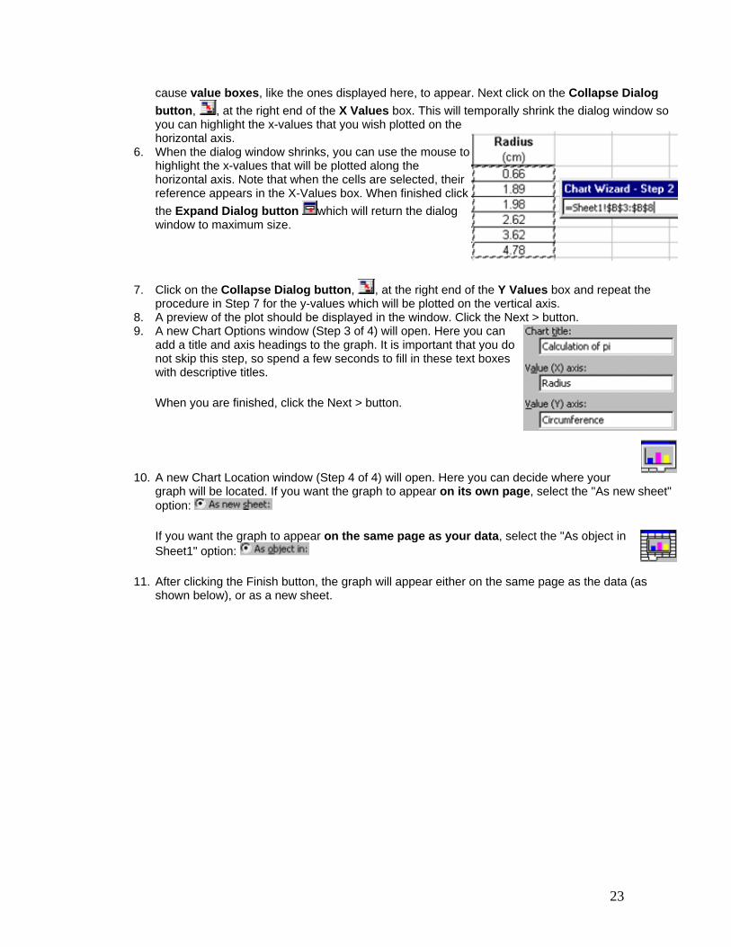
cause value boxes, like the ones displayed here, to appear. Next click on the Collapse Dialog button, , at the right end of the X Values box. This will temporally shrink the dialog window so you can highlight the x-values that you wish plotted on the horizontal axis.
6. When the dialog window shrinks, you can use the mouse to highlight the x-values that will be plotted along the horizontal axis. Note that when the cells are selected, their reference appears in the X-Values box. When finished click the Expand Dialog button which will return the dialog window to maximum size.
7. Click on the Collapse Dialog button, , at the right end of the Y Values box and repeat the procedure in Step 7 for the y-values which will be plotted on the vertical axis.
8. A preview of the plot should be displayed in the window. Click the Next > button. 9. A new Chart Options window (Step 3 of 4) will open. Here you can
add a title and axis headings to the graph. It is important that you do not skip this step, so spend a few seconds to fill in these text boxes with descriptive titles.
When you are finished, click the Next > button.
10. A new Chart Location window (Step 4 of 4) will open. Here you can decide where your graph will be located. If you want the graph to appear on its own page, select the "As new sheet" option:
If you want the graph to appear on the same page as your data, select the "As object in Sheet1" option:
11. After clicking the Finish button, the graph will appear either on the same page as the data (as shown below), or as a new sheet.
24
If you decide to print the graph as a new sheet and wish to return to the data sheet, click on the Sheet 1 tab at the bottom of the spread sheet.
Once the graph has been created, take a minute or two to make put the finishing touches on it.
For instance, you should always place units under your axis headings. To do this, simply click on the heading, place the cursor at the end of the heading, hit the <ENTER> key and type the units in parentheses.
I always delete the legend box. With just one set of data on the graph, the legend is not useful. To delete it, simply click on it and press the <DELETE> key.
It is attractive to add appropriate symbols in the title. For instance with our graph, I will change the "pi" in our title to "π". For a reminder of how this is done, see the Displaying Symbols tutorial.
Note that it is also possible to change the font style and size of the titles and headings.
You should always add a trendline to the graph. That is, make the computer draw the best-fit line to the data. You should also display the equation and the R-squared value on the graph.

25
Since the relationship between the circumference and the radius is linear, we can expect the plotted data to form a straight line in the form of y = mx + b. To add the trend line, click anywhere on the graph and then click on Chart >> Add Trendline from the menu bar. Since we expect the fit to be linear, select linear
fit. <>
It is possible with Excel to add trendlines other than linear ones. For example, you may choose logarithmic, exponential, polynominal, power series, or a moving average, depending on the trend(s) displayed by the data.
It is also possible with Excel to add multiple trendlines to one set of data. For information on that technique see my tutorial on fitting multiple curves on one set of data.
To display the equation and R-squared value on the graph, click on the Options tab. Then place check marks in the appropriate boxes.
When the OK button is pressed the best fit line is drawn and the equation of the line and R-squared value will be displayed on the graph. It will look something like the screen shot to the right. You may move the equation by clicking and dragging it to the desired location.
The R-squared value is actually the square of the correlation coefficient. The correlation coefficient, R, gives us a measure of the reliability of the linear relationship between the x and y values. A value of R = 1 indicates an exact linear relationship between x and y. Values of R close to 1 indicate excellent linear reliability. If the correlation coefficient is relatively far away from 1, the predictions based on the linear relationship, y = mx + b, will be less reliable. For more information about this topic, see the linear regression tutorial.
You should find it odd that the equation displayed on the graph is y = 6.179x + 0.2327. After all, we did not measure y's and x's, but rather we measured circumferences (C's) and radii (r's). You should always change the displayed equation to match your measured variables! To change the equation, simply click on the equation and change the variables. The screen shot to the right shows how we made our equation more representative of the experiment. Recall that the governing equation of this experiment is C = 2πr.
By doing this step, you are in essence telling your TA that you really do understand what was actually measured and how well the experiment matched the theory.
A nice touch to your graph is to decrease the thickness of the best-fit line. The default size is rather thick and often hides the actual data points. To make the line thinner, double-click on the trendline and then change its weight to a thinner line.
The final result of your efforts is a graph that looks something like the following:

26
Simply making the graph is not all that is required of the physics student. The real job of the physics student is to determine what physics principles (if any) were verified by the laboratory experiment. You must constantly ask yourself: "What physics principle was this experiment designed to show?" and "Did the experiment actually verify the theory?"
In this example experiment, we hoped to show that if we plotted the circumferences of several circles versus their radii, the slope of the resulting graph should equal 2π. We have a very nice graph, but we have not determined if the experiment actually verified the formula C = 2πr!
You should expect by now that we can use Excel to compare the experimental slope to the theoretical slope. Another way of stating this is what is our experimental value of π? The screen shot to the right shows how we used Excel to do this. Our slope was determined to be 6.179. (No units, right?!) The theoretical value of the slope is equal to 2π, or π = slope/2.
The formula in cell E3 (=E1/2) gives the experimental value of π to be 3.09. The formula in cell E4 gives the percent error between the actual and experimental values. As you can see, an error of only 1.66% indicates that the student performed this lab very carefully!
Note that in our percent error formula (cell E4 above) we did not explicitly multiply the result by
100%. Instead, we simply calculated the fraction and then clicked on the Percent Style button, .
So here is what the finished worksheet might look like:

27
Once again, ask your TA if your graphs should be on separate pages or included with the data table as shown above.
Once again, make sure that when you print your worksheet you print the gridlines and row and column headings. Review how to do this by visiting the Basic Actions tutorial, section 9.

28
Advanced Graphing
and Curve Fitting
Creating plots of two data series on one graph.
Say you wish to plot two data series on one graph. For instance, you wish to plot two position versus time curves on one graph. To the right are the position and time data for two automobiles.
To plot both of these on the same graph, first follow steps 1-7 from the Graphing Tutorial on the previous page. This will create the first data series to the graph.
While the window below is still open, click again to create the second data series. Then repeat steps 5-7 from the Graphing Tutorial. Continue until all data sets have been added.
29
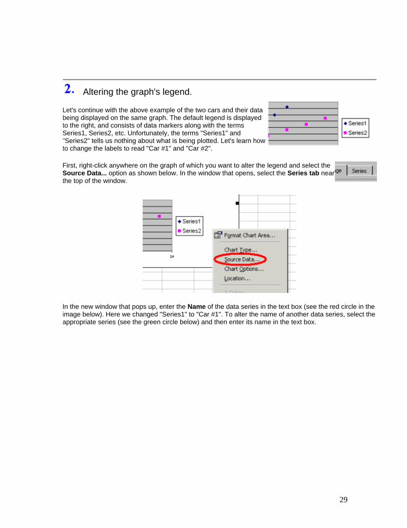
Altering the graph's legend.
Let's continue with the above example of the two cars and their data being displayed on the same graph. The default legend is displayed to the right, and consists of data markers along with the terms Series1, Series2, etc. Unfortunately, the terms "Series1" and "Series2" tells us nothing about what is being plotted. Let's learn how to change the labels to read "Car #1" and "Car #2".
First, right-click anywhere on the graph of which you want to alter the legend and select the Source Data... option as shown below. In the window that opens, select the Series tab near the top of the window.
In the new window that pops up, enter the Name of the data series in the text box (see the red circle in the image below). Here we changed "Series1" to "Car #1". To alter the name of another data series, select the appropriate series (see the green circle below) and then enter its name in the text box.

30
The end result is a more descriptive legend:
Fitting multiple curves on one set of data.
31
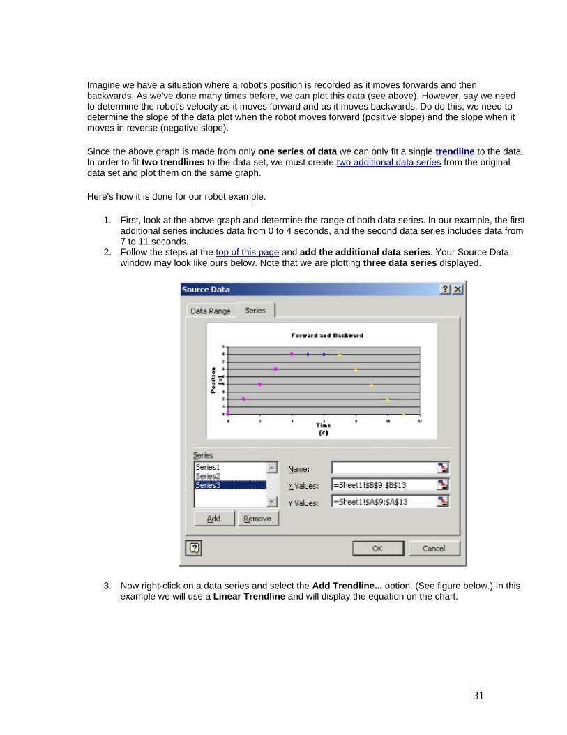
Imagine we have a situation where a robot's position is recorded as it moves forwards and then backwards. As we've done many times before, we can plot this data (see above). However, say we need to determine the robot's velocity as it moves forward and as it moves backwards. Do do this, we need to determine the slope of the data plot when the robot moves forward (positive slope) and the slope when it moves in reverse (negative slope).
Since the above graph is made from only one series of data we can only fit a single trendline to the data. In order to fit two trendlines to the data set, we must create two additional data series from the original data set and plot them on the same graph.
Here's how it is done for our robot example.
1. First, look at the above graph and determine the range of both data series. In our example, the first additional series includes data from 0 to 4 seconds, and the second data series includes data from 7 to 11 seconds.
2. Follow the steps at the top of this page and add the additional data series. Your Source Data window may look like ours below. Note that we are plotting three data series displayed.
3. Now right-click on a data series and select the Add Trendline... option. (See figure below.) In this example we will use a Linear Trendline and will display the equation on the chart.
32
4. Repeat the above step for each data series. The final result is a graph with two trendlines displayed. See our graph below. We now know that the robot moved forward at a velocity of 2m/s and backward at -2m/s. (Note that the y-intercept of the third data series can not be interpreted to have any physical meaning.)
Using error bars.
In this example, we measure the mass and volume of various quantities of water. By plotting mass versus volume, we may determine the density of water from the graph's slope. Recall that M = ρV. The measured data and the resulting plot is shown below.
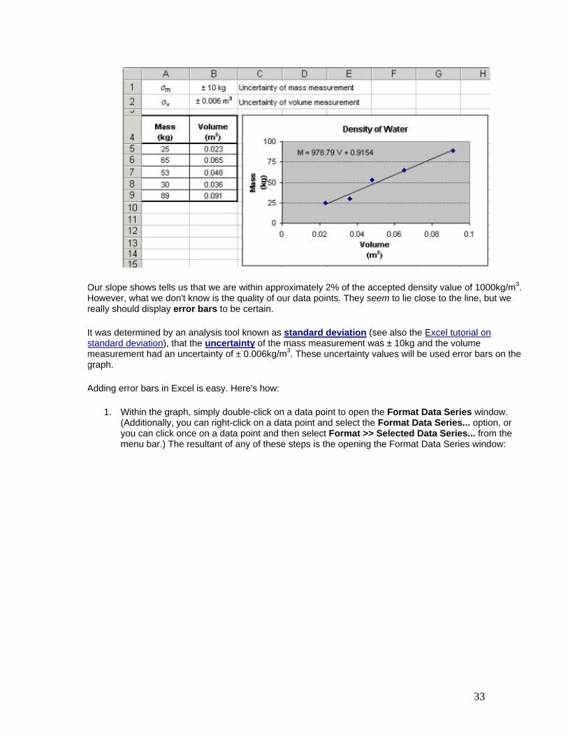
33
Our slope shows tells us that we are within approximately 2% of the accepted density value of 1000kg/m3. However, what we don't know is the quality of our data points. They seem to lie close to the line, but we really should display error bars to be certain.
It was determined by an analysis tool known as standard deviation (see also the Excel tutorial on standard deviation), that the uncertainty of the mass measurement was ± 10kg and the volume measurement had an uncertainty of ± 0.006kg/m3. These uncertainty values will be used error bars on the graph.
Adding error bars in Excel is easy. Here's how:
1. Within the graph, simply double-click on a data point to open the Format Data Series window. (Additionally, you can right-click on a data point and select the Format Data Series... option, or you can click once on a data point and then select Format >> Selected Data Series... from the menu bar.) The resultant of any of these steps is the opening the Format Data Series window:
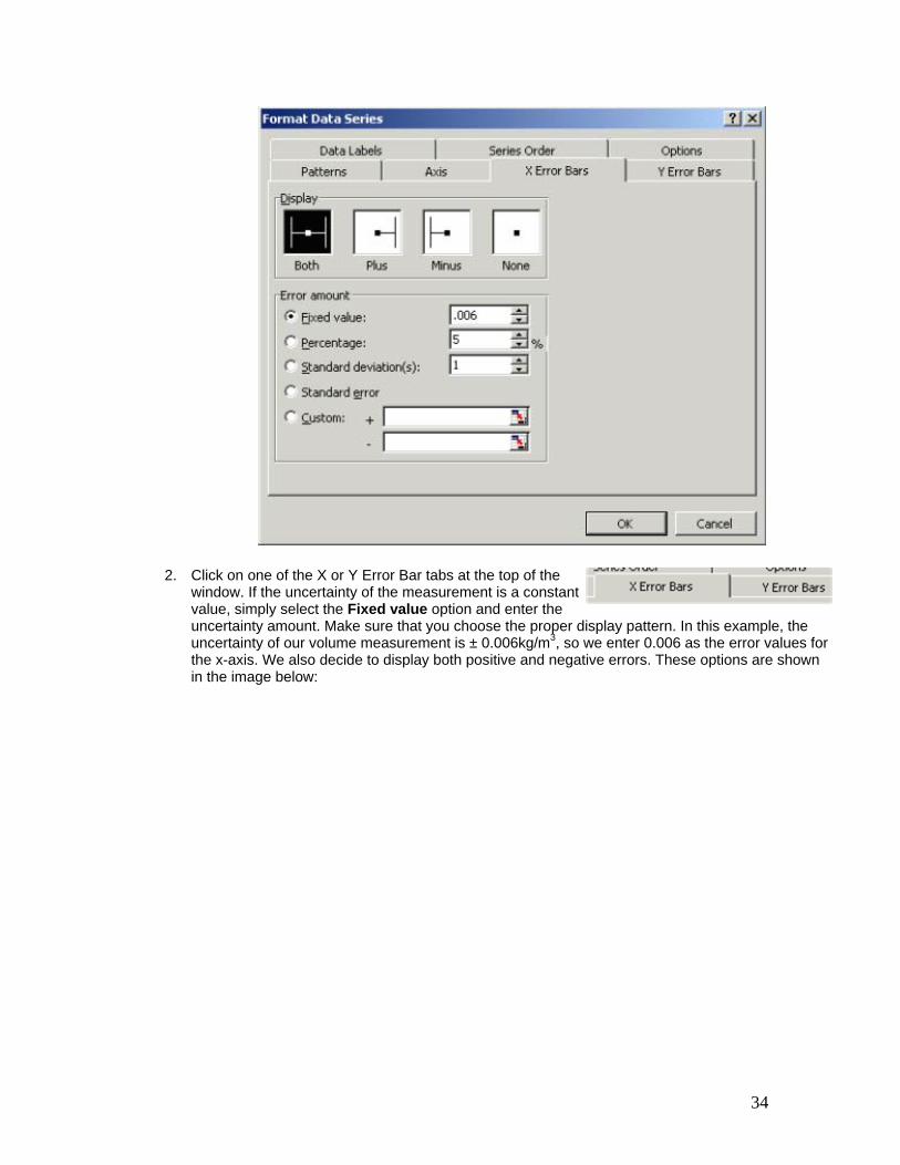
34
2. Click on one of the X or Y Error Bar tabs at the top of the window. If the uncertainty of the measurement is a constant value, simply select the Fixed value option and enter the uncertainty amount. Make sure that you choose the proper display pattern. In this example, the uncertainty of our volume measurement is ± 0.006kg/m3, so we enter 0.006 as the error values for the x-axis. We also decide to display both positive and negative errors. These options are shown in the image below:
35
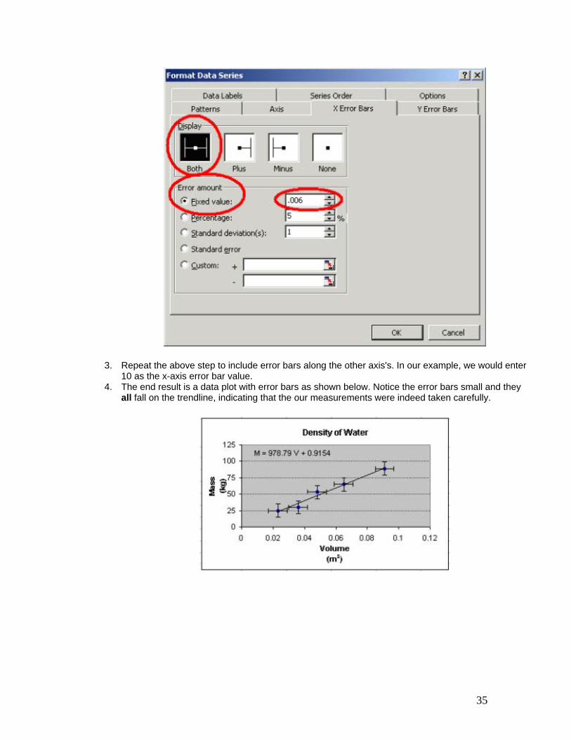
3. Repeat the above step to include error bars along the other axis's. In our example, we would enter 10 as the x-axis error bar value.
4. The end result is a data plot with error bars as shown below. Notice the error bars small and they all fall on the trendline, indicating that the our measurements were indeed taken carefully.

36
Advanced Topics In this tutorial we will discuss two topics that fall under the heading of useful but not often used. The first topic discusses creating user-defined constants. The second topic discusses the need to occasionally adjusting the graph's scale.
Creating user-defined constants.
As you know the built-in constant PI( ) is used when you wish to express the value of π. Excel also allows the user to define his or her own constants. For example, you will notice that many of the physics formulas you will encounter this year make use of many constants such as g, the acceleration due to gravity. At our latitude in Clemson, SC, we experience an acceleration due to earth's gravity which is g = 9.80 m/s2.
You will find that you will use the value for g throughout the year. When using Excel, rather than typing 9.80 each time you wish to express the acceleration due to earth's gravity, you can define the constant with a descriptive name or symbol, say in this case, 'g', to equal 9.80. Then simply use your defined constant, g, in your formulas.
Let us work a non-physics example to see how to define our own constants. Again, there are several ways to define constants, but this is one method that I think will be most helpful.
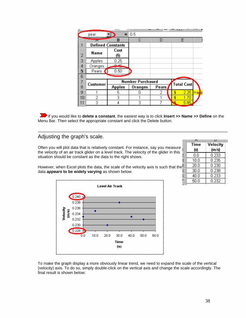
Say, for example that you are the owner of a produce stand and you wish to use Excel to calculate the amount each customer owes. This amount is dependent on the cost of each produce item and also the quantity purchased. Say, you sell apples for $0.25, oranges for $0.45, and pears for $0.65. These costs change on a daily basis, so it will be helpful to be able to quickly and easily change the costs of the produce without having to change any of your total cost formulas.
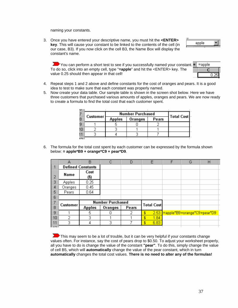
Your first step is to set up a data table like the one to the right. Notice that the words "Apples", "Oranges" and "Pears" appear next to their individual purchase cost. While this is not imperative, it is helpful to organize your table this way.
Also notice the Name Box is encircled in the screen shot to the right. This indicates that cell B3 has been clicked on. You should also be aware that the formula bar indicates that the value for cell B3 is 0.25. There is nothing new here.
Now we wish to define three constants that represent the cost of each produce item. Let us define our first constant as "apple" to represent the cost of an apple. To do this, follow the steps below:
1. Click on the cell that contains the numerical value which you would like to define with a constant. In our case, we clicked on cell B3 -- the cost of an apple.
2. Click on the drop-down arrow in the Name Box. This drop-down arrow is encircled on the screen shot to the right. Then type the desired name of your constant in the Name Box. Here we chose the name "apple".
Note that the naming of constants is not case sensitive, i.e., Excel does not distinguish between upper and lower case characters. See the Excel help menu for other guidelines regarding
37
naming your constants.
3. Once you have entered your descriptive name, you must hit the <ENTER> key. This will cause your constant to be linked to the contents of the cell (in our case, B3). If you now click on the cell B3, the Name Box will display the constant's name.
You can perform a short test to see if you successfully named your constant. To do so, click into an empty cell, type "=apple" and hit the <ENTER> key. The value 0.25 should then appear in that cell!
4. Repeat steps 1 and 2 above and define constants for the cost of oranges and pears. It is a good idea to test to make sure that each constant was properly named.
5. Now create your data table. Our sample table is shown in the screen shot below. Here we have three customers that purchased various amounts of apples, oranges and pears. We are now ready to create a formula to find the total cost that each customer spent.
6. The formula for the total cost spent by each customer can be expressed by the formula shown below: = apple*B9 + orange*C9 + pear*D9.
This may seem to be a lot of trouble, but it can be very helpful if your constants change values often. For instance, say the cost of pears drop to $0.50. To adjust your worksheet properly, all you have to do is change the value of the constant "pear". To do this, simply change the value of cell B5, which will automatically change the value of the pear constant, which in turn automatically changes the total cost values. There is no need to alter any of the formulas!
38
If you would like to delete a constant, the easiest way is to click Insert >> Name >> Define on the Menu Bar. Then select the appropriate constant and click the Delete button.
Adjusting the graph's scale.
Often you will plot data that is relatively constant. For instance, say you measure the velocity of an air track glider on a level track. The velocity of the glider in this situation should be constant as the data to the right shows.
However, when Excel plots the data, the scale of the velocity axis is such that the data appears to be widely varying as shown below.
To make the graph display a more obviously linear trend, we need to expand the scale of the vertical (velocity) axis. To do so, simply double-click on the vertical axis and change the scale accordingly. The final result is shown below:

39
Note that both graphs plot the same data! The only difference in the graphs is their scale.
Note that the axis maximum and minimum were entered manually as indicated by the red circles in the above screen shot.
Statistics
Excel has a wide variety of built-in statistics functions that give, for instance, the slope and y-intercept of a line, the standard deviation of a data sample, and the mean, median and mode of a set of values. In this tutorial we will cover a few of the more useful and popular statistics functions, but there are many more built-in statistics functions that you can learn about via Excel's help files.
Basic built-in functions. (AVERAGE, MEAN, MODE, COUNT, MAX, MIN)
We will use the familiar example of a class's grades to illustrate the use of some of the more basic Excel functions, like AVERAGE( ), MODE( ) AND MAX( ). Assume a class's grade distribution is as follows: 3, 0, 4, 4, 4, 2, 4, 1, 4, 0, 3, 3, 1, 1, 3. These grades are based on a 4-point scale with 4=A and 0=F and are entered into an Excel worksheet shown below. Using the AVERAGE( ) function, we find the class's average (or arithmetic mean) grade is a disappointing 2.47, or a mid-C. The syntax for this common function is =AVERAGE(number1, number2, ...) and is displayed in the screen shot below. For more
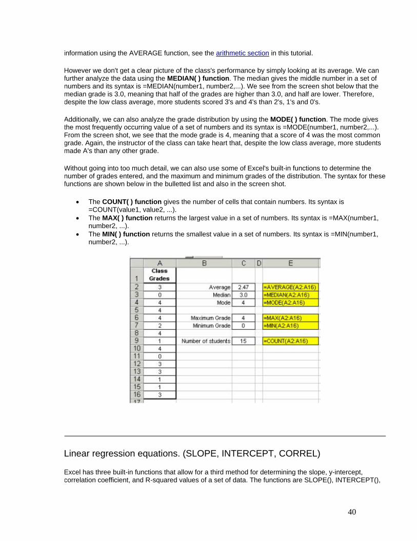
40
information using the AVERAGE function, see the arithmetic section in this tutorial.
However we don't get a clear picture of the class's performance by simply looking at its average. We can further analyze the data using the MEDIAN( ) function. The median gives the middle number in a set of numbers and its syntax is =MEDIAN(number1, number2,...). We see from the screen shot below that the median grade is 3.0, meaning that half of the grades are higher than 3.0, and half are lower. Therefore, despite the low class average, more students scored 3's and 4's than 2's, 1's and 0's.
Additionally, we can also analyze the grade distribution by using the MODE( ) function. The mode gives the most frequently occurring value of a set of numbers and its syntax is =MODE(number1, number2,...). From the screen shot, we see that the mode grade is 4, meaning that a score of 4 was the most common grade. Again, the instructor of the class can take heart that, despite the low class average, more students made A's than any other grade.
Without going into too much detail, we can also use some of Excel's built-in functions to determine the number of grades entered, and the maximum and minimum grades of the distribution. The syntax for these functions are shown below in the bulletted list and also in the screen shot.
• The COUNT( ) function gives the number of cells that contain numbers. Its syntax is =COUNT(value1, value2, ...).
• The MAX( ) function returns the largest value in a set of numbers. Its syntax is =MAX(number1, number2, ...).
• The MIN( ) function returns the smallest value in a set of numbers. Its syntax is =MIN(number1, number2, ...).
Linear regression equations. (SLOPE, INTERCEPT, CORREL)
Excel has three built-in functions that allow for a third method for determining the slope, y-intercept, correlation coefficient, and R-squared values of a set of data. The functions are SLOPE(), INTERCEPT(),
41
CORREL() and RSQ(), and are also covered in the statistics section of this tutorial.
The syntax for each are as follows:
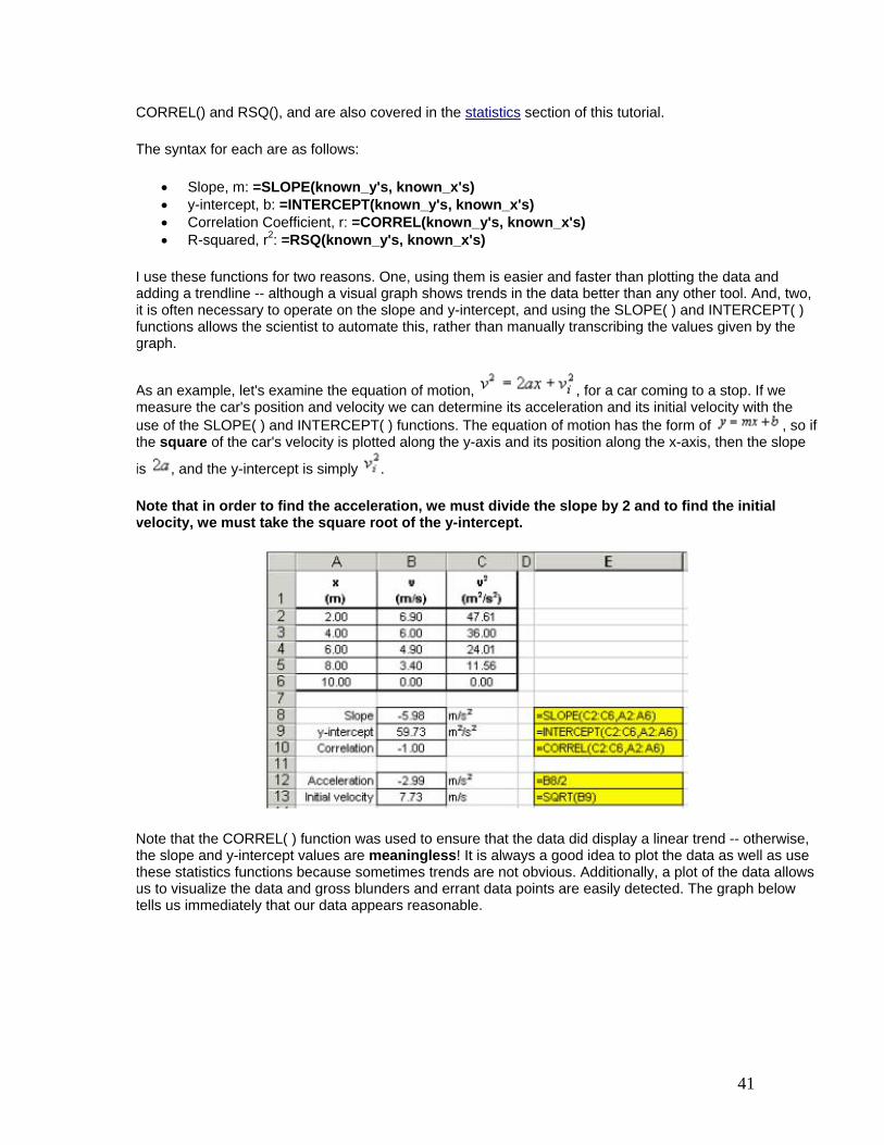
• Slope, m: =SLOPE(known_y's, known_x's) • y-intercept, b: =INTERCEPT(known_y's, known_x's) • Correlation Coefficient, r: =CORREL(known_y's, known_x's) • R-squared, r2: =RSQ(known_y's, known_x's)
I use these functions for two reasons. One, using them is easier and faster than plotting the data and adding a trendline -- although a visual graph shows trends in the data better than any other tool. And, two, it is often necessary to operate on the slope and y-intercept, and using the SLOPE( ) and INTERCEPT( ) functions allows the scientist to automate this, rather than manually transcribing the values given by the graph.
As an example, let's examine the equation of motion, , for a car coming to a stop. If we measure the car's position and velocity we can determine its acceleration and its initial velocity with the use of the SLOPE( ) and INTERCEPT( ) functions. The equation of motion has the form of , so if the square of the car's velocity is plotted along the y-axis and its position along the x-axis, then the slope
is , and the y-intercept is simply .
Note that in order to find the acceleration, we must divide the slope by 2 and to find the initial velocity, we must take the square root of the y-intercept.
Note that the CORREL( ) function was used to ensure that the data did display a linear trend -- otherwise, the slope and y-intercept values are meaningless! It is always a good idea to plot the data as well as use these statistics functions because sometimes trends are not obvious. Additionally, a plot of the data allows us to visualize the data and gross blunders and errant data points are easily detected. The graph below tells us immediately that our data appears reasonable.
42
You must always convince yourself of what the data is telling you.
Error analysis tools. (STDEV)
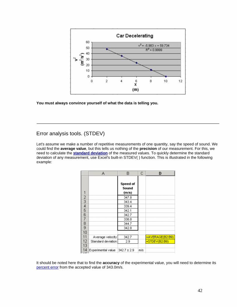
Let's assume we make a number of repetitive measurements of one quantity, say the speed of sound. We could find the average value, but this tells us nothing of the precision of our measurement. For this, we need to calculate the standard deviation of the measured values. To quickly determine the standard deviation of any measurement, use Excel's built-in STDEV( ) function. This is illustrated in the following example:
It should be noted here that to find the accuracy of the experimental value, you will need to determine its percent error from the accepted value of 343.0m/s.
43
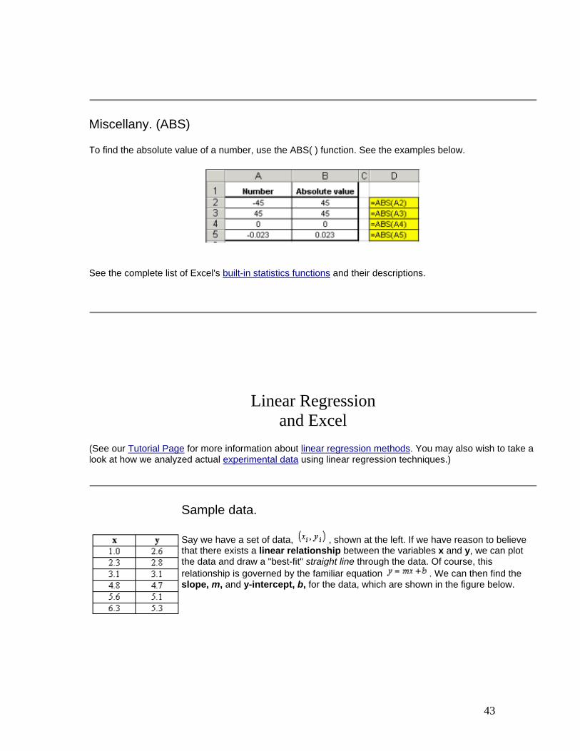
Miscellany. (ABS)
To find the absolute value of a number, use the ABS( ) function. See the examples below.
See the complete list of Excel's built-in statistics functions and their descriptions.
Linear Regression
and Excel
(See our Tutorial Page for more information about linear regression methods. You may also wish to take a look at how we analyzed actual experimental data using linear regression techniques.)
Sample data.
Say we have a set of data, , shown at the left. If we have reason to believe that there exists a linear relationship between the variables x and y, we can plot the data and draw a "best-fit" straight line through the data. Of course, this relationship is governed by the familiar equation . We can then find the slope, m, and y-intercept, b, for the data, which are shown in the figure below.
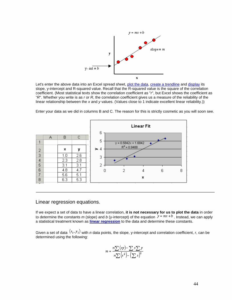
44
Let's enter the above data into an Excel spread sheet, plot the data, create a trendline and display its slope, y-intercept and R-squared value. Recall that the R-squared value is the square of the correlation coefficient. (Most statistical texts show the correlation coefficient as "r", but Excel shows the coefficient as "R". Whether you write is as r or R, the correlation coefficient gives us a measure of the reliability of the linear relationship between the x and y values. (Values close to 1 indicate excellent linear reliability.))
Enter your data as we did in columns B and C. The reason for this is strictly cosmetic as you will soon see.
Linear regression equations.
If we expect a set of data to have a linear correlation, it is not necessary for us to plot the data in order to determine the constants m (slope) and b (y-intercept) of the equation . Instead, we can apply a statistical treatment known as linear regression to the data and determine these constants.
Given a set of data with n data points, the slope, y-intercept and correlation coefficient, r, can be determined using the following:

45
(Note that the limits of the summation, which are i to n, and the summation indices on x and y have been omitted.)
Implicitly applying regression to the sample data.
It may appear that the above equations are quite complicated, however upon inspection, we see that their components are nothing more than simple algebraic manipulations of the raw data. We can expand our spread sheet to include these components.
1. First, add three columns that will be used to determine the quantities xy, x2 and y2, for each data point.
2. Next, use Excel to evaluate the following: Σx, Σy, Σ(xy), Σ(x2), Σ(y2), (Σx)2, (Σy)2. Recall that the symbol, Σ, means "summation". Additionally, the term xy is the product of x and y, that is: x * y. Also, the term Σ(x2) is very different than the term (Σx)2. Be careful with your order of operations!
3. Now use Excel to count the number of data points, n. (To do this, use the Excel COUNT() function. The syntax for COUNT() in this example is: =COUNT(B3:B8) and is shown in the formula bar in the screen shot below.
4. Finally, use the above components and the linear regression equations given in the previous section to calculate the slope (m), y-intercept (b) and correlation coefficient (r) of the data. If you are careful, your spread sheet should look like ours. Note that our equations for the slope, y-intercept and correlation coefficient are highlighted in yellow.

46
Linear regression with built-in functions.
It is plain to see that the slope and y-intercept values that were calculated using linear regression techniques are identical to the values of the more familiar trendline from the graph in the first section; namely m = 0.5842 and b = 1.6842. In addition, Excel can be used to display the R-squared value. Again, R2 = r2. From the graph, we see that R2 = 0.9488. From our linear regression analysis, we find that r = 0.9741, therefore r2 = 0.9488, which is agrees with the graph.
You should now see that the Excel graphing routine uses linear regression to calculate the slope, y-intercept and correlation coefficient.
Excel has three built-in functions that allow for a third method for determining the slope, y-intercept, correlation coefficient, and R-squared values of a set of data. The functions are SLOPE(), INTERCEPT(), CORREL() and RSQ(), and are also covered in the statistics section of this tutorial.
The syntax for each are as follows:
• Slope, m: =SLOPE(known_y's, known_x's) • y-intercept, b: =INTERCEPT(known_y's, known_x's) • Correlation Coefficient, r: =CORREL(known_y's, known_x's) • R-squared, r2: =RSQ(known_y's, known_x's)
Here is how we would analyze our data using these built-in Excel functions. Again, the equations for each calculation are highlighted in yellow.

47
So, to reiterate, we can determine the slope, y-intercept and correlation coefficient of any set of data using three Excel methods:
1. Plot the data and add a trendline 2. Implicitly use linear regression techniques 3. Use Excel's built in functions
Helpful Hints Well, you've come to end of the Excel tutorials for physics lab students. I hope that you have found them useful and informative. But before we conclude, let me offer you a few helpful hints that may make your lab experience a more satisfying one.
Work carefully. One of the exhilarating aspects of a physics lab course is that once your experiment has concluded and you have left the lab room, you can not double-check your recorded data. Take your time and make careful measurements and have all lab partners verify these measurements. (Here I am reminded of the old woodworker's rule: Measure twice, cut once.)
When recording values in your notebook or data table, be careful to transcribe the correct values. Confer with your lab partner(s) before leaving the lab that your recorded data is correct.
Neatly display your work. Use Excel to make your data and data analysis attractive and easy to read. Create titles and headings to clearly show what the data represents. Label your data columns with the correct units. Use the appropriate number of significant figures. Also emphasize important text by making it bold and adding borders. Shade cells that contain formulas.
48
Display sample formulas. Show your work by displaying sample formulas for each group of formulas. If you fail to do this, your TA will not be able to follow your work and correct your mistakes. Shade the cell to make the displayed formula even more noticeable.
Check your work by hand. Don't trust your Excel formula to spit out the correct answer. It is quite easy (and common) to improperly use a spread sheet to perform complicated calculations. To prevent careless mistakes, double-check each group of formulas by hand, or with a hand-held calculator.
Also, get in the habit of examining your final result by asking yourself, Does this answer seem reasonable?Although not every lab experiment will deliver small percent error values less than, say, 5%, it is safe to say that, if performed properly, your results should be within 50% of an accepted value. If your results showed huge error values, say 200%, chances are you either made a calculation error or did not perform the experiment properly. (See Hint #1 above.)
Printing tips. Here are some hints on printing your worksheet so your TA can easily grade your report (so you will get a good grade!).
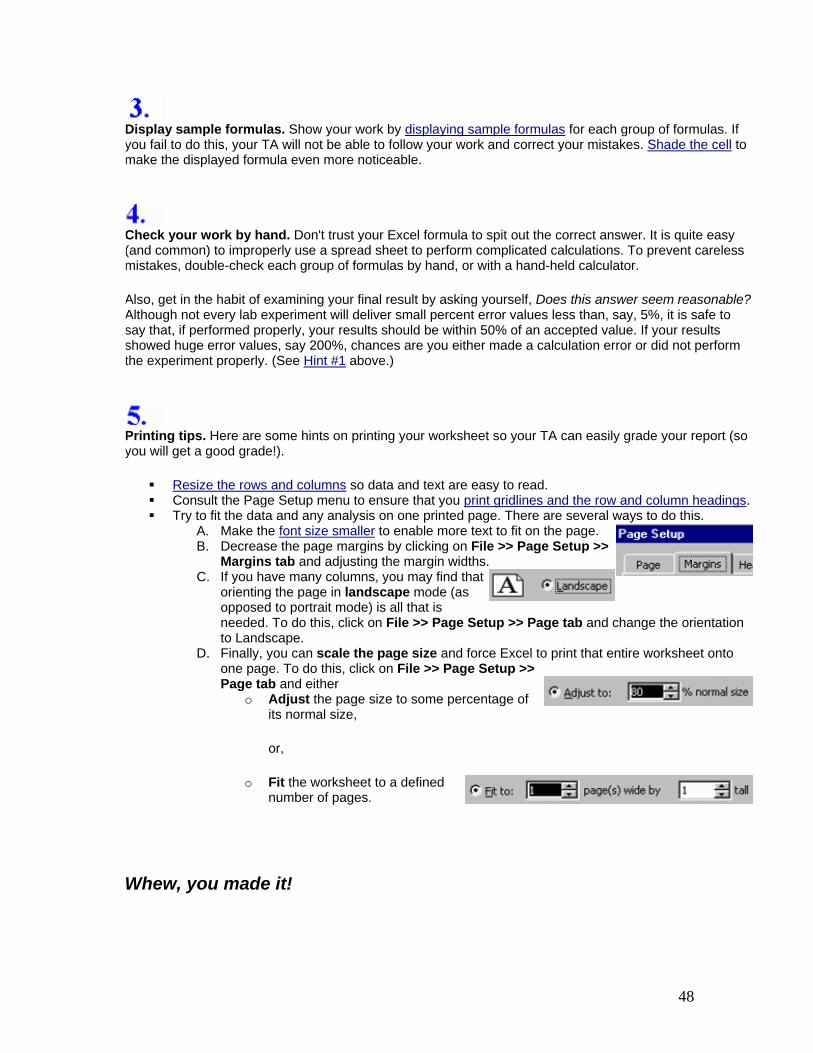
Resize the rows and columns so data and text are easy to read. Consult the Page Setup menu to ensure that you print gridlines and the row and column headings. Try to fit the data and any analysis on one printed page. There are several ways to do this.
A. Make the font size smaller to enable more text to fit on the page. B. Decrease the page margins by clicking on File >> Page Setup >>
Margins tab and adjusting the margin widths. C. If you have many columns, you may find that
orienting the page in landscape mode (as opposed to portrait mode) is all that is needed. To do this, click on File >> Page Setup >> Page tab and change the orientation to Landscape.
D. Finally, you can scale the page size and force Excel to print that entire worksheet onto one page. To do this, click on File >> Page Setup >> Page tab and either
o Adjust the page size to some percentage of its normal size,
or,
o Fit the worksheet to a defined number of pages.
Whew, you made it!

49