pictorial visualization system with patient portal for problem … · · 2017-04-19list of...
TRANSCRIPT

Pictorial Visualization System with Patient Portal for
Problem-based Electronic Medical Record
By
Jiaren Suo
Thesis submitted to the
Faculty of Graduate and Postdoctoral Studies
In partial fulfillment of the requirements for the degree
Master of Applied Science in Electrical and Computer Engineering
School of Electrical Engineering and Computer Science
Faculty of Engineering
University of Ottawa
©Jiaren Suo, Ottawa, Canada, 2017

ii
Abstract
The use of electronic medical records (EMRs) has yet to reach its potential for information
visualization and achieve corresponding expected outcomes. Current EMR systems show
numerous health data with large amounts of texts, which are sometimes integrated in various
tables. This type of presentation presents difficulties in promptly determining medical conditions
or quickly finding desired information given the volume of texts that needs to be read. Amid
these problems, researchers and developers have not explored the creation of easy and intuitive
user interfaces for visualizing EMRs.
To bridge the gap between current EMR and ideal EMR systems, we propose a prototype
web-based pictorial visualization system that can be used by both patients and doctors. The
system allows spatial interactivity through representations of human body images (front and back
views) and temporal interactivity through interconnected time axes. Medical histories are
classified using 11 physiological systems to enable efficient browsing of selected information.
This classification enables physicians to quickly understand patients’ health conditions and
accordingly make medical decisions, which are useful in emergency rooms and intensive care
units.

iii
Acknowledgments
First and above all, I praise God the Almighty for providing me this opportunity and
granting me the capability to proceed successfully. Thank you Lord for always being there for
me. I want to express my deep thanks to my supervisor, WonSook Lee, for the insightful
discussions, valuable advice and support during the entire period of my study. I appreciate your
allowing me to join the CG++ Research Laboratory and helping me find my interests.
I would also like to express my gratitude to my parents and little bother for their love and
encouragement and material and spiritual support in all aspects of my life. Without you, I would
never have been blessed with so many opportunities.
I am also very grateful to my friends, Menghan Chen, Wenjing Wang and Jingjing Liu.
Your friendship makes my life a wonderful experience. I am likewise indebted to Yang Pan, Rob
and Jennifer, Grace Su, Luling Lu and Lily for being sources of strength and motivation
throughout my life in Ottawa.
Finally, I would like to express my appreciation to Yongji Jin who contributed parts of his
system so that we can initialize the system for this thesis. I must also thank him for listening,
offering me advice and supporting me through this entire process.

iv
Contents
Abstract ii
Acknowledgments iii
Contents iv
List of Figures viii
List of Tables xii
Abbreviations xiii
Chapter 1. Introduction 1
1.1 Analysis of Current EMRs 2
1.1.1 Commercial EMR Systems 2
1.1.2 Prototype EMR Systems in the Literature 3
1.2 Motivation 4
1.3 Objectives 5
1.4 Contributions 6
1.5 Thesis Structure 8
Chapter 2. Literature Review 9
2.1 EMRs 9

v
2.1.1 Users and Components of an EMR System 10
2.1.2 EMR Structures 11
2.2 InfoVis 14
2.2.1 InfoVis Toolkits 15
2.2.2 InfoVis Techniques and Examples 18
2.3 Existing EMR Systems 23
2.3.1 Prototype Systems 23
2.3.2 Commercial EMR Systems 33
Chapter 3. System Design 41
3.1 System Overview 41
3.1.1 Requirements for Our System 41
3.1.2 System Workflow 42
3.1.3 System Architecture 43
3.2 Classification of Medical Data 45
3.2.1 Display for Multiple Physiological Systems 45
3.2.2 Laboratory Tests 48
3.2.3 Medical Imaging: Position Particular 49
3.3 User Interface 50
3.3.1 Spatial User Interface 50

vi
3.3.2 Temporal User Interface 55
3.3.3 Arrangement of Major Medical Events 59
3.4 System Technologies and Tools 60
3.4.1 REST Web Service 60
3.4.2 Node.js 61
3.4.3 Server Componentization with Express.js 61
3.4.4 EJS Template 62
3.4.5 MySQL Database 62
3.4.6 Google Charts API 63
3.4.7 D3.js 65
Chapter 4. Evaluation 66
4.1 Evaluation Criteria 66
4.1.1 InfoVis Evaluation Criteria Used for EMRs 66
4.1.2 EMR Evaluation Methods and Metrics for Usability 69
4.2 System Performance Checklist 71
4.3 Comparison with Existing EMR Systems 75
4.4 Information Comments 83
4.5 Examples to Use 86
4.5.1 Example for Physician Decision Making 86

vii
4.5.2 Example for Diabetes Complications 87
4.6 Discussion 88
Chapter 5. Conclusion and Future Work 90
5.1 Conclusion 90
5.2 Future Work 90
References 92

viii
List of Figures
Figure 2-1: A health information environment [24]. 10
Figure 2-2: User interface of Midgaard [30]. 13
Figure 2-3: Visualization of a simulated ion trajectory in a cubic ion trap using Improvise [41]. 16
Figure 2-4: Google API Toolkits was used to create this visualization of geocoded Wikipedia articles. The circles are
marker clusters. Users can conduct spatial queries on the map [43]. 17
Figure 2-5: Some interactive visualizations built with D3. Left to right: Calendar view, chord diagram, choropleth
map, hierarchical edge bundling, scatterplot matrix, grouped and stacked bars, force-directed graph clusters and
Voronoi tessellation [44]. 18
Figure 2-6: Treemap that displays Amazon’s digital camera offerings, grouped by manufacturer, sized by price,
colored by average customer rating [47]. 19
Figure 2-7: Parallel coordinates showing multivariate analysis of US counties, highlighting the 10 counties with the
largest populations [49]. 20
Figure 2-8: Sankey diagram showing Canada’s energy system in 2010 [54]. 21
Figure 2-9: Force-directed graph showing a sociology citation network [56]. 22
Figure 2-10: User interface for Lifelines [58]. 24
Figure 2-11: User interface for Lifelines2 [60]. Each row shows a record, with its ID on the left. Each record contains
several types of events listed below the ID. Each type is color coded, with a colored triangle on the timeline. 25
Figure 2-12: VIE-VISU [63]: (a) Visual encoding of medical variables in VIE-VISU. (b) Default VIE-VISU user
interface. 26
Figure 2-13: The VISITORS main interface for showing patient status [64]. (a) Lists of patients. (b) Lists of time
intervals. (c) Data on a group of patients’ white blood cell count raw concept (graph 1), data overview of monthly
distribution of platelet-state values (graph 2) and monthly distribution of the values of hemoglobin-state concept
(graph 3). (d) Medical ontology. 27

ix
Figure 2-14: Midgaard’s [66] (a) steps in resizing or zooming in on the representation of a data stream. (b)
Screenshot of the implemented prototype for intensive care and long-term patient treatment. 28
Figure 2-15: Screenshot of MIVA [69], with the control panel and data visualizations. Clinical and intervention notes
are entered by clinicians at the top, designated with icons above the visualization display. 29
Figure 2-16: Radial display with body map, along with ICD name in Five Ws system [71]. 30
Figure 2-17: Diagnostic reasoning display using color coding in the Five Ws system [71]. 31
Figure 2-18: WellMed Personal Health Record screen displaying current and past medication information [75]. 32
Figure 2-19: Patient diagnoses page in PatientKB [76]. 33
Figure 2-20: Professional EMR vendors as of July 2016 [77]. 34
Figure 2-21: Overall market share of EMR in 2015, provided by SK&A [78]. 35
Figure 2-22: Hospital meaningful use market share in 2014, provided by the CMS [79]. 35
Figure 2-23: User interface provided by EpicCare [81]. 36
Figure 2-24: EpicCare for patient records [81]. 37
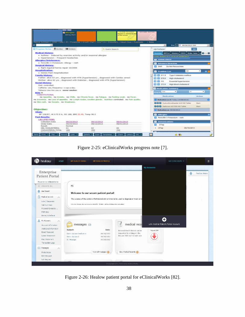
Figure 2-25: eClinicalWorks progress note [7]. 38
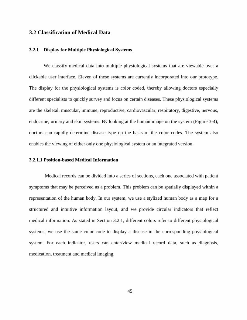
Figure 2-26: Healow patient portal for eClinicalWorks [82]. 38
Figure 2-27: Allscripts [6] assessment and plan after recurring order. 39
Figure 2-28: Timeline view of a patient record in the Allscripts iPad App [84]. 40
Figure 3-1: System paradigm. 42
Figure 3-2: High-level architecture of the system. 44
Figure 3-3: System architecture and technologies and tools 44
Figure 3-4: Display of integrated system and physiological systems in front and back views. The diseases are
partitioned into 11 physiological systems so that the information can be easily accessed on the basis of disease
groups. Left to right: integrated, skeletal [85], muscular [86], cardiovascular [87], digestive [88], nervous [89],
immune [90], respiratory [91], reproductive [92], endocrine [93], urinary [94] and skin systems [95]. 46
Figure 3-5: Position-based medical information on a 2D representation of the human body. (a) Whole-body
problem. 47

x
Figure 3-6: Laboratory test display provided by our system. Abnormal results are highlighted in red. 48
Figure 3-7: Graphics of trend display across time. For example, urine PH is represented when users select urine PH in
Figure 3-6. 49
Figure 3-8: Medical data related only to medical images are displayed. 50
Figure 3-9: EMR user interface for medical professionals. 51
Figure 3-10: PHR user interface for patients. The interface is very similar to that for EMR, except for (E) and (F). 52
Figure 3-11: Adding health records by clinking corresponding colored circular indicators for diagnosis, treatment
and medication (to be done by medical professionals). Colorful arrows illustrate that such medical events can be
added using each colored circle. 54
Figure 3-12: Adding symptoms, self-medication and self-treatment by clinking corresponding black circular
indicators (to be done by patients). 55
Figure 3-13: Displayed medical records for circular indicators (used by patients). 56
Figure 3-14: Displayed medical records for circular indicators (used by health care professionals). 56
Figure 3-15: Time-filtered pictorial interface for viewing medical records. (a) Medical information for 2016. The
patient has appendicitis problems, and the skeletal parts of the belly are shown. (b) Medical information for 2015.
The patient experiences problems in her right knee. 57
Figure 3-16: EMR timeline display. The horizontal line denotes time information, and the icons represent diagnosis,
treatment, medication, medical imaging and laboratory testing. This display has filters for physiological systems
and medicine events. The button at the bottom can be clicked to show or hide duration timelines and create and
show major diseases. 58
Figure 3-17: PHR timeline display. The timeline is very similar to that for EMR, but the difference is in the medicine
display. A continuous medication timeline is provided to show the days during which patients take their medication.
59
Figure 3-18: Major disease timeline display. An important medical event can be documented as a major event. For
example, events related to cancer can be selected to display the major event. 60
Figure 3-19: Entity relationship model of the database. 64

xi
Figure 4-1: Categories of information system success [109]. 67

xii
List of Tables
Table 1: Comparison with other systems by medical data types. 77
Table 2: Comparison by components. 79
Table 3: Questions for physicians 83

xiii
Abbreviations
2D Two Dimensional
3D Three Dimensional
ARF Align-Rank-Filter
CESAR Canadian Energy System Analysis Research
CMS Centers for Medicare and Medicaid Services
CPT Current Procedural Terminology
CSS Cascading Style Sheet
D3 Data Driver Document
DOM Document Object Model
EMR Electronic Medical Record
ER Emergency Room
HIMSS Health Information and Management Systems Society
HTML Hyper Text Markup Language
HTTP Hyper Text Transfer Protocol
ICD International Classification of Disease
ICU Intensive Care Unit

xiv
IO Input / Output
IOM Institute of Medicine
ISO International Organization for Standardization
InfoVis Information Visualization
NDC National Drug Code
PHR Personal Health Record
POMR Problem-oriented Medical Record
RDBMS Relational Database Management System
REST Representational State Transfer
RUQ Right Upper Quadrant
SOAP Subjective information, Objective information, Assessments and Plan
SQL Structured Query Language
SVG Scalable Vector Graphics

1
Chapter 1. Introduction
Medical records serve as a central repository of patients’ medical histories and play an
essential role in patient care. In recent years, electronic medical record (EMR) systems have
increasingly improved and contributed to medical efficiency and hospital productivity. An EMR,
which is a longitudinal electronic record of a patient’s health information, is considerably more
effective than paper-based documentation because of the advantages that it offers in terms of
storage, information sharing and information retrieval. A report from the Centers for Medicare
and Medicaid Services (CMS) indicated that approximately 80% of eligible hospitals and more
than 50% of professionals have adopted EMRs [1]. Nevertheless, their acceptance in clinical
practice continues to lag behind their potential and expected outcomes because the medical data
that accompany EMRs are often voluminous, complex, disorganized [2] and difficult to
integrate. Given the alarming rate at which the volume of medical records is growing, important
information is constantly difficult to obtain, thereby seriously hampering a physician’s diagnostic
reasoning and the efficiency with which he/she works. Because of the limited time that health
care professionals can devote to receiving data, reviewing and extracting the records that they
need in a few minutes are challenging tasks.
Current EMR systems have not realized their promising potential as digital information
sources from which medical data can be structured and visualized to maximize the convenient
extraction of target information. EMR systems should enable physicians to quickly incorporate
or retrieve various types of medical information, such as medication administration, physical
assessments, referrals, patient complaints (e.g., symptoms), medical histories, diagnoses, tests,

2
procedures, treatments, medications and discharge and immunization data. Information
visualization (InfoVis) is one method by which the value of electronically available medical data
can be increased [3]. Given that InfoVis presents medical data in intuitive, understandable,
recognizable, navigable, and manageable formats, users can rapidly extract useful information
from medical records.
Another important issue for consideration is the likelihood that patients will want to take
an active role in managing their health. Research has shown that two-thirds (65%) of patients are
interested in electronically accessing their own personal health information [4] and want to
monitor their illnesses through awareness of their symptoms, diagnoses, medications and
treatments. In such cases, a useful resource is the personal health record (PHR), which facilitates
patient involvement in health care. The problem is that many PHR systems are physician
oriented and do not offer practical functionalities for patients.
1.1 Analysis of Current EMRs
1.1.1 Commercial EMR Systems
Many commercial EMR systems combine text-based methods of record keeping with
modern table and graph formats. Most vendor systems support the completion of physicians’
daily clinical tasks and administrative tasks. Popular commercial EMR systems, such as
EpicCare [5], Allscripts [6], and eClinicalWorks [7], offer functionality for problem lists,
electronic prescriptions, allergy checks, medication management, order management and billing.
These systems therefore contain various texts, such as documents, orders and notes. A frequent
mode of visualization in commercial EMR systems is the flowsheet, which is widely used in

3
intensive care units (ICUs). It contains key medical variables for a single patient over a given
period and thus emphasizes trends and abnormal values. Numerous other systems, such as IBM
Watson Health [8] and Oracle Health Sciences [9], often include automated analysis techniques
that are based on machine learning and data mining.
Despite the advancements achieved with current systems, the availability of medical
information does not necessarily translate to effective support for health care providers in
complex daily tasks. Substantial medical information is classified in ways that fail to satisfy
physicians’ requirements. Many doctors complained that they are compelled to spend 1–2 more
hours on documentation-related activities during each shift, thus leaving them less time for actual
patient care with the use of EMRs [10]. Under this situation, physicians have no way of
determining a patient’s overall health problems in time. Current EMR systems facilitate the rapid
incorporation and collection of medical data but lack necessary functionalities for temporal
queries and exploratory analysis tasks.
1.1.2 Prototype EMR Systems in the Literature
A considerable number of EMR approaches have been proposed to support high-level
decision making and effective searching in the medical domain. LifeLines [11], the web-based
interactive visualization system (WBIVS) [12], KNAVE II [13], LifeLines2 [14], LifeFlow [15]
and OutFlow [16] are timeline-based tools used to organize and display medical records. These
tools use dots to indicate time events and line segments to represent periods at which medical
events occur along a horizontal time axis. Moving the mouse pointer over a line or double
clicking on any line enables access to more details, while graphical attributes, such as color and
line thickness, improve system display. Some other systems, such as Midgaard, focus on body-

4
centric data layouts that support patient data mapping with a template of the human body [17].
The Five Ws system [18] also uses a human body template presented at the center of a sunburst
visualization, which allows doctors to immediately determine which parts of a patient’s body are
diseased and evaluate disease severity on the basis of color codes [19].
Although prototype EMR systems enable physicians to retrieve medical data on demand
and provide valuable assistance for data analysis and decision making, most of these systems do
not offer spatial and temporal medical information combined with a configuration that reflects
within-medical record relationships. Few of these systems also support the classification of
information on diseases. Ultimately, these deficiencies hinder the physician-patient link that
enhances physicians’ views and observations of medical conditions and self-treatment practices.
1.2 Motivation
Existing usability problems in current EMR systems were identified by the Health
Information and Management Systems Society (HIMSS) [20] and typically revolve around the
failure to adhere to EMR design principles, such as simplicity, naturalness, consistency,
minimized cognitive load, efficient interactions, forgiveness and feedback, effective language
use, effective information presentation and context preservation. The problems highlighted by
the HIMSS underscore the need to find novel, integrated and intuitive ways of visualizing
medical records. Correspondingly, the main motivation behind this work is the desire to
determine a method of clearly displaying medical information in integrated views that show all
kinds of medical data and the relationships among these data. A system underlain by these
attributes is expected to enable a comprehensive description of patients’ health information so
that physicians can quickly understand their health conditions. The system would offer use

5
efficiency and reduce cognitive load—affordances that necessitate an easily perceivable and
uncluttered user interface that presents important medical information. Medical information is
typically inaccessible to patients, who are thus frequently under-informed about their own
treatment courses [21]. This work aims to address this problem by establishing a patient-centric
information display system. Our system focuses on providing an interactive display for doctors
to navigate and extract patient’s medical information easily, and for patients to record and track
their personal medical conditions and history.
1.3 Objectives
The core goal of this thesis is to design and implement a pictorial visualization system
that displays spatially and temporally classified medical information over a problem- and
position-based interface. An ideal EMR system should offer rapid and intuitive access to
information in easily digestible amounts and meaningful formats. The interfaces of our system
can resolve the inconvenience presented by longitudinal data and convert such data into
structured form that reflects patients’ medical histories, treatment plans and other related
information. The spatial arrangement of medical records aligns with the principles that underlie
the design of problem-oriented medical records (POMRs). Through our system, physicians can
communicate directly with patients and exchange information on medical issues. We also
provide a useful patient portal, which not only contains medical histories collated by health care
professionals but also allows patients to enter symptom, self-medication and self-treatment data
into the system.
The anatomical position-based display of the visualization system features clickable front
and back images of the human body as an interactive navigation interface, which links to a

6
description of health conditions to help patients/doctors quickly incorporate new records and
easily review medical data. The system also consists of two clickable/zoomable timelines that
show historical records on a common time axis. The first is the icon-based timeline, which
reflects spatial medical events (diagnosis, medication, treatment, medical imaging and laboratory
testing), and the second is the continuous timeline, which displays temporal data. Finally, the
system’s major disease display allows doctors to immediately obtain insights into important
issues from complex historical records.
1.4 Contributions
The position- and problem-based interactive visualization system features two integrated
displays, namely, the PHR and EMR interfaces, to enable physicians to view medical data,
communicate directly with patients, and exchange information on medical issues with them. The
contributions of this work are detailed as follows:
We design two user interfaces with different input and output functions accessible to patients
(i.e., PHR interface) and physicians (i.e., EMR interface) to ensure the simplicity and
usability of the visualization system. The viewing and information exchange enabled by the
system contributes to the derivation of health outcomes that can be better than those achieved
with existing PHR systems. With the system, patients can monitor their health by entering
symptoms (denoted by a dotted circular indicator) and self-medication/self-treatment data
(represented by a solid circular indicator) for mapping into a position in a 2D representation
of the human body.

7
Medical information is spatially structured in the system. We use a problem- and anatomical
position-based display with front and back views of a 2D representation of the human body.
The system supports the use of several circular indicators (solid colored circle for diagnosis,
dotted black circle for symptoms and solid black circle for patient self-medication/self-
treatment), which can be located in the front or back view. This feature enables physicians to
rapidly access and understand a patient’s history and determine the presence of diseases.
Our system contains an integrated physiological system and 11 individual physiological
systems separated by color codes. These enable disease classification and allow doctors to
survey and focus on certain diseases without delay. The individual physiological systems are
the skeletal, muscular, immune, reproductive, cardiovascular, respiratory, digestive, nervous,
endocrine, urinary and skin systems.
The system offers two clickable/zoomable timelines that show historical records on a
common horizontal time axis. The icon-based timeline shows spatial medical events that are
clickable to obtain related information (e.g., medicine name, dosage, disease severity,
treatment type). The continuous timeline displays temporal data from disease onset to
recovery.
Three types of information filtering are adopted to help users quickly access information.
o The time filter can be used to perform scroll bar-navigated viewing of medical
records for a selected year.
o The button for the physiological systems or that for medical events can be clicked to
access medical records on the basis of timelines. For example, users can apply

8
filtering so that they view only the medicines intended for the digestive system over a
given timeline.
o Our system provides a major disease timeline display. Some important medical events
can be recorded as a major disease, and the timeline shows the events related only to
major diseases.
1.5 Thesis Structure
The remainder of the thesis is organized as follows:
Chapter 2 provides a background to EMRs, including basic definitions, concepts, users and
components. It also presents an analysis of existing EMR systems and prototype PHR
systems. Some popular commercial EMR systems are also examined.
Chapter 3 discusses the system design and implementation. It begins with a description of the
system’s workflow and high-level architectural framework, after which it presents the
techniques/tools used in the proposed system. The chapter likewise details the system’s user
interfaces and components.
Chapter 4 presents users’ feedback for the system. We use criteria for the usability of
information visualization and the EMR criteria formulated by the HIMSS. Comments by two
physicians and the benefits and limitations of our system are discussed.
Chapter 5 concludes the thesis. It summarizes the components of the system and the
advantages derived from it and briefly presents potential future work.

9
Chapter 2. Literature Review
This chapter discusses related research on EMRs, InfoVis and existing prototype EMR
systems and commercial systems. First, we provide a background to EMRs, including EMR
definitions, users, components and structures. Second, we present relevant background regarding
InfoVis and visualization techniques. Finally, we discuss the advantages offered by existing
prototype EMR systems and commercial systems.
2.1 EMRs
EMRs are usually defined in accordance with the definition of the International
Organization for Standardization (ISO) [22]; that is, they are documents commonly used to
describe past, current and prospective patient conditions in digital form, which allows health care
professionals quickly and effectively to capture clinical data [23]. An EMR also includes
information regarding patient demographics and administration, scheduling, billing, decision
support, access control and policy management, order management, guidelines and terminology;
recording, querying and analysis of population health; recording, querying and analysis of the
services provided by health care professionals; recording, querying and analysis of business
operations; and resource allocation [22]. Figure 2-1 illustrates a workflow in an integrated health
information environment [24]. The figure should be read from the inside out, starting at the level
of the EHR environment, from which some basic information on patient health and identification,
drug data and e-prescriptions, among other data are available. The next level is the full
functionality dimension, which comprises other hospital services, such as decision support,

10
guidelines and protocols. The third level is the provider dimension, which presents additional
services for public or private health information facilities. Figure 2-1: A health information
environment presents the general landscape of EMR usage in a healthcare institution [22].
Figure 2-1: A health information environment [24].
2.1.1 Users and Components of an EMR System
EMRs are used by different health care professionals and some administrative staff,
depending on health care situations. EMR users include [23] physicians, nurses, radiologists,
pharmacists, laboratory technicians, clerk or administrative staff, secretarial staff and patients or

11
their family members. The specific EMR system components that are accessed by EMR users are
listed below.
Physicians: Referrals, symptoms, medical histories, physical examinations, diagnoses, tests,
procedures, treatments, medications, discharge data
Secretarial staff: Procedures, problems, findings, immunization data
Pharmacists: Medications
Nurses: Daily charting, medication administration, physical assessments, nurses’ admission
notes
Patients/family members: Histories, diaries, tests
2.1.2 EMR Structures
The structure of an EMR system has changed over time, with the earliest classification of
EMR systems provided by the American Nurses Association [25]. Existing structures can be
roughly categorized into three groups: time-oriented, source-oriented and problem-oriented
medical records [26]. The traditional source-oriented structure has been used in hospitals since
1900 [27], and the time- and problem-oriented structures emerged around 1970. Currently, most
EMR systems combine all three structures.
2.1.2.1 Source-oriented Medical Record
In a source-oriented medical record, data are grouped and organized in accordance with a
hierarchy that reflects suppliers or sources of information. Sources can be individuals, such as
physicians, nurses and secretarial employees, who are involved in a patient’s care process. They

12
can also be laboratory sources, such as tests (clinical chemistry, hematology, etc.), specimens
(blood, urine, etc.) and substances (sodium, potassium, etc.) [27]. Source-oriented medical
records facilitate the organization of medical information, but obtaining a complete medical
record of this structure for each patient is difficult because of the presence of fragmented and
separate medical providers.
2.1.2.2 Time-oriented Medical Record
By virtue of the label, time-oriented data are those related to time. Thus, a time-oriented
EMR contains data on medical histories and physical examinations in structured form, and all
medical data can be displayed in a flowsheet (2D data × time matrix) that enables the
visualization of health evolution over time [28]. Each patient’s medical data contain related
laboratory values, a drug list and a partial list of major clinical manifestations [29]. A time-
oriented summary can serve as the entire medical record, but access to detailed records is a
separate additional option. A number of existing EMRs allow users to interact with data and
time, as with browsing and searching with the help of a time axis. Figure 2-2 presents Midgaard
temporal data with medical events on three linked time axes [30]. The Midgaard system
integrates the display of different measurements (e.g., blood gas and blood pressure) and
corresponding temporal abstractions at the overview level.
2.1.2.3 POMR
POMRs, which were introduced by Lawrence Weed [31], contain an index list that
defines each medical problem. Specifically, notes are taken for each problem that corresponds to
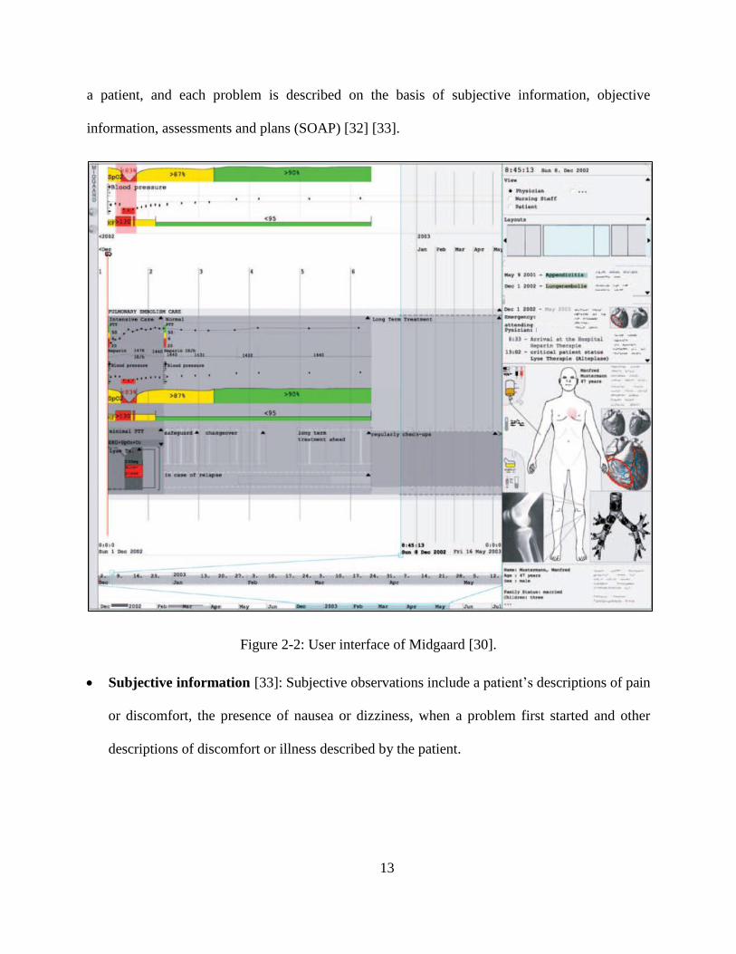
13
a patient, and each problem is described on the basis of subjective information, objective
information, assessments and plans (SOAP) [32] [33].
Figure 2-2: User interface of Midgaard [30].
Subjective information [33]: Subjective observations include a patient’s descriptions of pain
or discomfort, the presence of nausea or dizziness, when a problem first started and other
descriptions of discomfort or illness described by the patient.

14
Objective information [33]: Objective observations include symptoms that can be
measured, seen, heard, touched, felt or smelled. Included, as well, are vital signs, such as
temperature, pulse, respiration, skin color and swelling.
Assessments [33]: Assessments provide information on the diagnosis of a patient’s
condition. In some cases, the diagnosis may be clear, such as a contusion.
Plans [33]: A plan may include laboratory and radiological tests ordered for a patient,
medications prescribed, treatments performed, patient referrals, patient disposition, patient
directions and follow-up directions for the patient.
A POMR consists of a complete list of a patient’s problems and provides progress notes
related to each problem rather than the usual notes on present illness. Two principles underlie the
structure of a POMR. The first is focus on individual problems, which means that a set of
relevant medical data are associated with a single problem. For example, the associated medical
information displayed for a patient with diabetes mellitus [27] includes a selection of medical
data, such as blood glucose level and insulin medication. The second principle is that an SOAP
within a medical record should reflect a physician’s manner of thinking [27].
2.2 InfoVis
InfoVis focuses on representing data in a way that is easy to understand and manipulate
for such data to be useful in daily life. InfoVis is connected with interaction and visual
representation for improved interactive demonstration of data and information [34]. This section
briefly introduces InfoVis, after which it presents some popular InfoVis programming toolkits
15
(Improvise, Google Charts API, Google Map API and data-driven documents (D3)).
Representative InfoVis techniques and InfoVis examples are also discussed.
InfoVis is the study of visual representations of abstract and complex data; it reveals
hidden patterns for the purpose of reinforcing human cognition [35]. If a dataset is excessively
large and contains too much text, tracking ideas from the entire dataset will be difficult. A report
from the US Institute for Medicine (IOM 2011) stated that “information visualization is not as
advanced in parts of clinical medicine as compared with other scientific disciplines” [36].
Currently, InfoVis is widely used in many sectors that require data analysis [37], such as
business [38], science [39] and sports [40].
2.2.1 InfoVis Toolkits
InfoVis has attracted considerable research attention and development. Researchers have
introduced a number of tools that provide rich options for visually exploring data. This section
describes some programming toolkits that are popularly used to present live data and allow user
interaction.
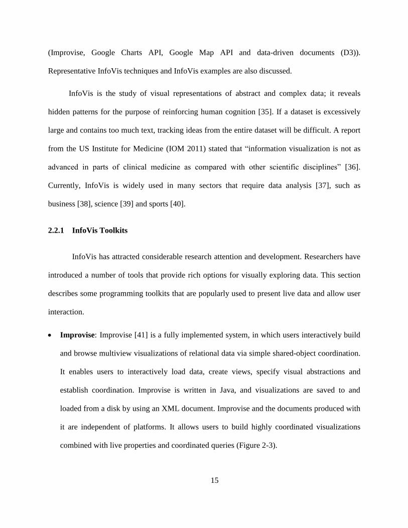
Improvise: Improvise [41] is a fully implemented system, in which users interactively build
and browse multiview visualizations of relational data via simple shared-object coordination.
It enables users to interactively load data, create views, specify visual abstractions and
establish coordination. Improvise is written in Java, and visualizations are saved to and
loaded from a disk by using an XML document. Improvise and the documents produced with
it are independent of platforms. It allows users to build highly coordinated visualizations
combined with live properties and coordinated queries (Figure 2-3).

16
Figure 2-3: Visualization of a simulated ion trajectory in a cubic ion trap using Improvise [41].
Google API: With Google Chart Tools, users can create charts from data sources and display
them on various browsers and platforms because Google Charts are based on HTML5.
Google API supports many basic chart types, including pie charts, scatter charts, gauge
charts, line charts, bar charts, treemaps, combo charts, line charts, bar charts, column charts
and area charts [42]. Google Charts can also be used to display other types of visualized
information, such as timelines. Users can create a variety of visualizations by combining
Google API toolkits. Figure 2-4 shows a visualization of geocoded data from Wikipedia
articles [43]. The designer intended to allow users to search and acquire directions to the
location of a Wikipedia article.

17
Figure 2-4: Google API Toolkits was used to create this visualization of geocoded Wikipedia
articles. The circles are marker clusters. Users can conduct spatial queries on the map [43].
D3: D3 is a very popular toolkit used to display InfoVis data on the web. It is a JavaScript
library that brings data to life by using HTML, SVG and CSS [44]. D3 enables the direct
inspection and manipulation of data for conversion into a Document Object Model (DOM)
that exposes the hierarchical structure of page content. For example, users can use D3 to
generate an HTML table from an array of numbers or use the same data to create an
interactive SVG bar chart with smooth transitions and interactions [45]. D3 ensures easy
dynamic visualization and fast implementation as well as supports large datasets and
dynamic behaviours for interaction and animation. Figure 2-5 shows interactive
visualizations built with D3.

18
Figure 2-5: Some interactive visualizations built with D3. Left to right: Calendar view, chord
diagram, choropleth map, hierarchical edge bundling, scatterplot matrix, grouped and stacked
bars, force-directed graph clusters and Voronoi tessellation [44].
2.2.2 InfoVis Techniques and Examples
InfoVis design highly depends on underlying data and then the best approach to
displaying the data is chosen. Different data have different characteristics and patterns, which
need specific techniques for visualization. In dealing with data, understanding information
distribution is usually key to solving many problems. In this section, we describe several popular
InfoVis techniques and InfoVis-based analyses of different data types.
• Treemap: In the 1990s, tree structures represented by node-link diagrams grew too large for
effective use, thus prompting the development of treemaps, which display trees in a space-

19
constrained layout [46]. A treemap displays tree-structured data by using a set of nested
rectangles. Each branch of the tree is shown in a rectangle, which can be divided into smaller
rectangles to illustrate sub-branches. Leaf nodes are often characterized by different size
attributes to show proportion and different colors to show specific data. A treemap enables
users to compare nodes and sub-trees even at varying depths in a tree, thereby affording users
the legibility required to simultaneously display thousands of items on a screen. A successful
application of treemaps for product search and display was achieved by Hive Group (Figure
2-6). The treemap provides daily updates on more than 34,000 products from Amazon.com,
thus allowing users to view all the products, compare prices and refer to customer ratings.
Such treemap can help users immediately find what they need to make a purchasing decision.
Figure 2-6: Treemap that displays Amazon’s digital camera offerings, grouped by manufacturer,
sized by price, colored by average customer rating [47].

20
• Parallel coordinates: Parallel coordinates were first designed by Alfred Inselberg [48] in the
1970s as a way of visualizing individual data elements in multivariate datasets. Only several
dimensions can be shown on most standard charts, but parallel coordinates can help illustrate
many dimensions. Each dimension is drawn with parallel lines on a vertical axis, and each
data element is represented as a polyline along dimensions [49]. Specifically, the lines in
parallel coordinates connect different variable values, which measure multiple aspects of an
item, such as home value, farm acreage and average income (Figure 2-7). Figure 2-7 consists
of 3,138 lines, one for each county in the United States. The parallel coordinates can be used
to compare and highlight the factors required in interactive analysis. In this case, a user can
look at the profiles of the 10 counties with the largest populations. Highlighting the values of
the populations automatically highlights the corresponding lines.
Figure 2-7: Parallel coordinates showing multivariate analysis of US counties, highlighting the
10 counties with the largest populations [49].

21
• Sankey diagram: A Sankey diagram is a type of flow diagram, wherein width illustrates
flow quantity. One of the early examples of a Sankey diagram is Charles Minard’s Map of
Napoleon’s Russian Campaign of 1812 [50]. Generally, a Sankey diagram visualizes energy
distribution and transformation processes. It presents directed weighted graphs that satisfy
flow conservation: the sum of incoming weights for each node is equal to outgoing weights
[51]. Canadian Energy System Analysis Research (CESAR) created Canada’s energy
systems [52] by using a Sankey diagram. The systems show sources and usages of energy
and emissions across Canada and therefore helps people understand the challenges that we
face and identify alternative pathways to a more sustainable future. Canada’s 2010 energy
system [53] is shown in Figure 2-8, where resources are positioned on the left-hand side of
the diagram, and services appear on the right-hand side.
Figure 2-8: Sankey diagram showing Canada’s energy system in 2010 [54].

22
• Force-directed graph: A force-directed graph interactively represents network visualization,
thereby enabling the easy rearrangement, filtering and exploration of connected data. A
force-directed graph is essentially a physics simulation. Because nodes possess a negative
charge, they repel one another; each link binds to its corresponding nodes and holds these
links together. The pushing and pulling forces work on the network to enable the
identification of spots where adjacent nodes can be positioned near, but not excessively
close, to one another [55]. Neal Caren [56], from the University of Carolina, generated a
network of sociology by using a force-directed graph to display the relationship of two works
cited in the same journal article (Figure 2-9). Each node in the network corresponds to a
paper that was cited in journals between 2008 and 2012. Links were created between the two
works when they were cited in the same article [57]. The graph serves as a good
representation of contemporary trends in sociology. Some of the areas involve large
quantities of works that are frequently mentioned together, whereas other areas are more
sparsely connected.
Figure 2-9: Force-directed graph showing a sociology citation network [56].
23
From several InfoVis toolkits and techniques in previous two chapters, InfoVis can
represents large dataset and convey meaningful information quickly. Since EMR system contains
a large amount of dataset, we adopt Google Visualization API and D3, which make our system
interactive for use.
2.3 Existing EMR Systems
Numerous visualization approaches have been proposed for medical patient records, and
new systems are emerging because of the extensive use of EMRs. This section describes state-of-
the-art prototypes of InfoVis systems for EMRs and PHRs and discusses interesting commercial
EMR systems, such as EpicCare, Allscripts and eClinicalWorks.
2.3.1 Prototype Systems
As previously stated, medical decision making is a complex process that requires
physicians to retrieve useful data from large amounts of information, such as patient status,
medical history and past and ongoing treatments. All this information is integrated in an EMR.
This section comprehensively describes the most representative prototypes of EMR and PHR
visualization systems, complete with figure descriptions.
2.3.1.1 Prototype EMRs
Lifelines: Lifelines was developed and released in the late 1990s by the University of
Maryland [58]. It is one of the earliest systems for visualizing patient data summaries, with
the system featuring graphical attributes, such as colors and lines, to show patient medical
events. On the basis of electronic health data, Lifelines provides a timeline of a single

24
patient’s historical events; time is displayed on a horizontal axis, and medical events
(problems, allergies, diagnoses, laboratory tests, imaging, medications, immunizations and
communications) are listed on a vertical axis [59]. The system centers on the display of many
medical variables on the same screen so that users can effectively retrieve information.
Figure 2-10: User interface for Lifelines [58].
Figure 2-10 shows 32 different events. Lines are segmented on a horizontal time axis, to
which users can zoom and pan to view more or fewer details; line color and thickness illustrate
relationships and significance, respectively. Users can also double click on any line segment to
access relevant documents and images. Along the vertical axis, people can choose different types
of events, such as notes, tests and medications.

25
Lifelines2 [60]: Lifelines2, an extension of Lifelines, enables the effective display, search
and querying of multiple patients’ medical records. Some researchers found that users are
more likely to see both numerical and categorical data when looking at patient records [61].
In Lifelines2, therefore, each patient record has a common timeline and a list of color-based
categorical variables (Figure 2-11). Users can switch timeline views from a range of periods
to absolute calendar views to see the number of events or detailed events. Lifelines2 also
comes with the Align-Rank-Filter (ARF) framework, which enables users to manipulate the
visualization of temporal event data [62]. For example, users can align all records by a
specific event type (e.g., heart attack), and every record’s documentation of a first heart
attack is aligned vertically. Other records that do not document heart attacks are filtered out.
Figure 2-11: User interface for Lifelines2 [60]. Each row shows a record, with its ID on the left.
Each record contains several types of events listed below the ID. Each type is color coded, with a
colored triangle on the timeline.

26
VIE-VISU [63]: VIE-VISU is a system that presents a patient’s status in the last 24 hours of
stay in ICUs. Metaphorical graphics are used to illustrate the highest number of parameters
(15 variables in total) for a patient’s situation. These parameters include circulation (blood
pressure, heart rate, etc.), respiration (breathing frequency) and fluid balance (total fluid
intake and output). Through repetition of a graphical object in 24 frames, an ICU patient’s
situation is presented in one display. Each glyph (Figure 2-12(a)) uses the same measures and
scale so that doctors can easily compare them and identify an abnormal situation. VIE-VISU
generally shows 24 glyphs, one per hour (Figure 2-12(b)).
Figure 2-12: VIE-VISU [63]: (a) Visual encoding of medical variables in VIE-VISU. (b) Default
VIE-VISU user interface.
• VISITORS [64]: VISulizatIon of Time-Oriented RecordS (VISITORS) is the first system
that focuses on groups of patients, for whom intelligent temporal analysis and InfoVis
techniques [65] are combined (Figure 2-13). The system fosters decision making based on
high abstractions and allows users to search raw data. The VISITORS system entails five

27
steps in accessing patient records: (1) specification, (2) retrieval, (3) visualization, (4)
interactive exploration and (5) knowledge-based analysis. The results of usability testing
indicated that the system is useful for exploring longitudinal data that physicians need to
make clinical decision [64]. The drawback to VISITORS is that its user interface needs
simplification because learning how to navigate the system usually entails a long time [59].
Figure 2-13: The VISITORS main interface for showing patient status [64]. (a) Lists of patients.
(b) Lists of time intervals. (c) Data on a group of patients’ white blood cell count raw concept
(graph 1), data overview of monthly distribution of platelet-state values (graph 2) and monthly
distribution of the values of hemoglobin-state concept (graph 3). (d) Medical ontology.

28
• Midgaard [66]: Midgaard is a visualization system designed for ICUs. It provides a time
visualization and navigation technique that connects overviews and details, pan and zoom
functions and focus and contextual features [67]. Depending on zoom level and available
screen area, Midgaard provides details (Figure 2-14(a)) over three visual formats: (a–b) a
colored background, (c) colored bars and (d) area charts or (e) augmented line charts. A time
series of blood pressure measurements, for example, can be abstracted to periods of normal
blood pressure (green), increased blood pressure (yellow) and critical blood pressure (red).
The system likewise provides three connected timelines to enable users to obtain both an
abstract data overview and a more finely structured view. At the bottom of the screen appears
a fixed overview of data and their full temporal range [68]. Finally, the Midgaard system
comes with a visualization method that connects patient medical records to a 2D
representation of the human body (Figure 2-14 (b)).
Figure 2-14: Midgaard’s [66] (a) steps in resizing or zooming in on the representation of a data
stream. (b) Screenshot of the implemented prototype for intensive care and long-term patient
treatment.

29
• MIVA [69]: The Medical Information Visualization Assistant (MIVA) provides valuable
assistance for large and diverse data analysis and decision making in ICUs. This system can
show medical data from related biometric devices that are used by health care providers in an
ICU; it also has a built-in decision-making process that displays abnormal data in visualized
form for improved response to a patient event that requires immediate attention [70]. Figure
2-15 is a MIVA screenshot, in which point plots show changes in numerical values over
time. The gray band in the background denotes the normal range of a variable, to which users
can zoom and pan. The clinical and intervention notes entered by clinicians at the top of the
screen are designated with icons above the visualization display.
Figure 2-15: Screenshot of MIVA [69], with the control panel and data visualizations. Clinical
and intervention notes are entered by clinicians at the top, designated with icons above the
visualization display.

30
• Five Ws: The Five Ws system [71] has become a popular EMR system because it presents
various medical history data, including current symptoms, history of present illness, previous
medication, previous and ongoing treatments, allergies, family history and other related
information. In the system, a patient is represented as a radial sunburst visualization that
captures all health data, which serve as a quick overview for an examining physician [59].
The patient’s body map functions as a navigational feature, to which users can zoom in to
access additional anatomical details. On the basis of a physician’s medical diagnostic chain,
the system captures all aspects of a patient’s medical data in narrative form that reflects the
who, when, what, where and why of the patient’s condition [72]. To summarize, this system
provides a hierarchical radial display with an integrated body outline (Figure 2-16) and a
sequential display for diagnostic chains (Figure 2-17) [71].
Figure 2-16: Radial display with body map, along with ICD name in Five Ws system [71].
31
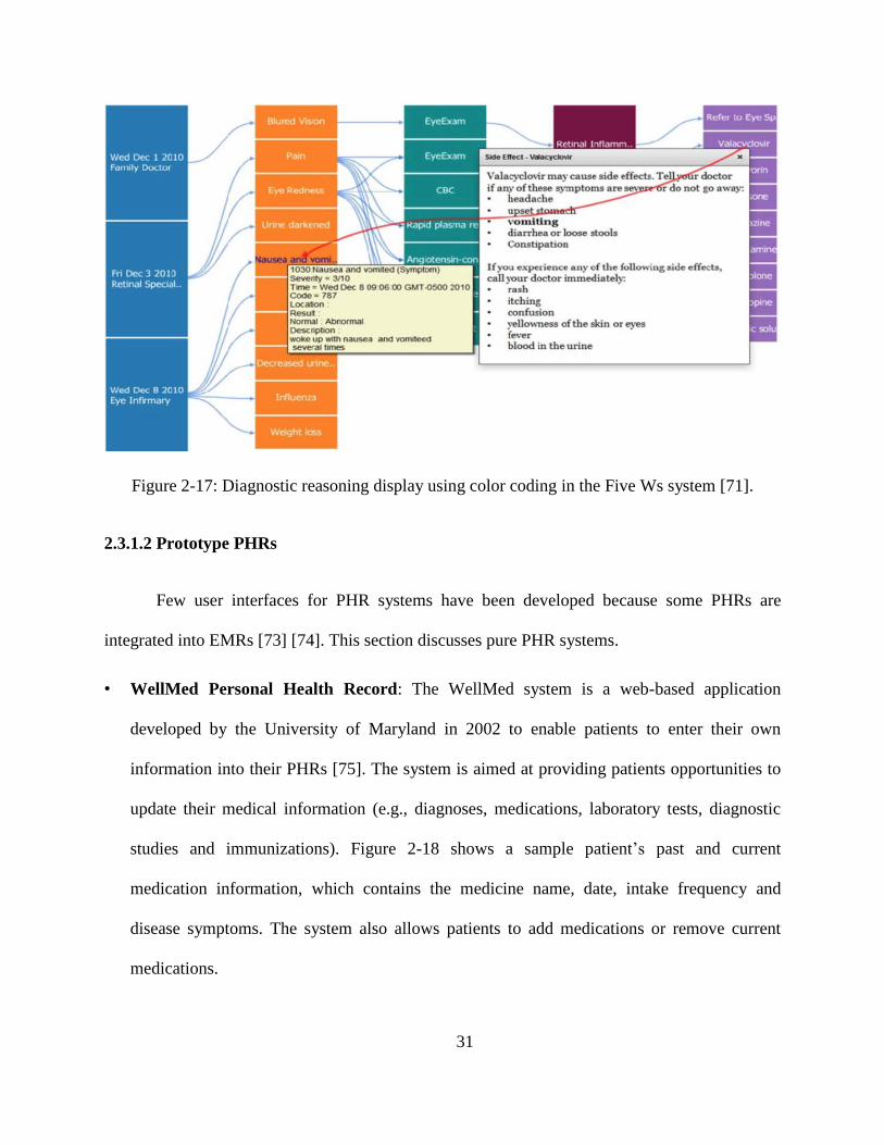
Figure 2-17: Diagnostic reasoning display using color coding in the Five Ws system [71].
2.3.1.2 Prototype PHRs
Few user interfaces for PHR systems have been developed because some PHRs are
integrated into EMRs [73] [74]. This section discusses pure PHR systems.
• WellMed Personal Health Record: The WellMed system is a web-based application
developed by the University of Maryland in 2002 to enable patients to enter their own
information into their PHRs [75]. The system is aimed at providing patients opportunities to
update their medical information (e.g., diagnoses, medications, laboratory tests, diagnostic
studies and immunizations). Figure 2-18 shows a sample patient’s past and current
medication information, which contains the medicine name, date, intake frequency and
disease symptoms. The system also allows patients to add medications or remove current
medications.

32
• PatientKB: Patient knowledge base (PatientKB) [76], developed in 2006, is a tool that links
data from a patient’s medical record with relevant health information. It is used to connect to
the ISCO patient database, from which patient numbers and diagnosis items can be extracted
and from which patients can simply and easily review medical information. The system helps
patients quickly understand their health conditions by providing medical summaries,
diagnostic and treatment data, appointment data and web search functionality. Figure 2-19
illustrates how patients are provided customized, secure and convenient access to medical
details (diagnoses) and relevant information.
Figure 2-18: WellMed Personal Health Record screen displaying current and past medication
information [75].

33
Figure 2-19: Patient diagnoses page in PatientKB [76].
2.3.2 Commercial EMR Systems
Extensive work has been devoted to examinations of scientific state-of-the-art
commercial EMR systems. The Electronic Health Records (EHR) Incentive Programs [77] noted
that as of July 2016, 337,432 health care providers have participated in the meaningful use of
certified EHR technology (Figure 2-20). The extensive adoption of EHR technology dictates an
inquiry into existing commercial systems. However, a number of difficulties are encountered in
describing and comparing commercial systems [68]. Many of them require payment and
adherence to legal requirements, thereby limiting access to medical professionals. They are
acquired from national or regional software providers and are unavailable to the public. Finally,
screenshots are not always available. Given these restrictions, access to the cases documented in
a system, internal evaluations or the acquisition of user population data are unlikely.

34
Figure 2-20: Professional EMR vendors as of July 2016 [77].
Despite these limitations, nonetheless, many materials [78] [79] and websites [80] [5]
provide general descriptions and user (e.g., professionals, nurses and administrative staff)
comments regarding commercial systems. This section presents an overview of the commercial
EMR systems available in the market and describes several popular systems.
Figure 2-21 illustrates the overall market share of EMR systems in 2015, as reported by
SK&A [80], which is a leading provider of US health care information solutions and databases.
The most popular EMR products have changed minimally over the course of a year.

35
Figure 2-21: Overall market share of EMR in 2015, provided by SK&A [78].
Figure 2-22: Hospital meaningful use market share in 2014, provided by the CMS [79].
The CMS provided an EMR system market share report based on hospital attestations
[79] (Figure 2-22). The top 10 account for over 90% of the market, and the top three alone

36
account for more than half of it. Numerous high-quality EMR systems are available in the
market. The most popular commercial systems are presented below.
• EpicCare: EpicCare, which accounts for the largest market share (11.6%) among the top
systems, comprises medical history data, test results, drug guides and new and old orders.
Epic is a private employee-owned corporation founded in 1979, making it one of the oldest
players in the healthcare IT sector (Figure 2-23) [5]. EpicCare is an application with multiple
modules that can be used by physicians and other health care professionals to deliver clinical
care to their patients. It is designed to create most of the workflows for patient care. It
includes module dashboards that combine and display clinical and financial metrics and have
the ability to create templates that are easily navigable between documents and notes (Figure
2-24) [81]. EpicCare also provides a patient portal and an e-prescription platform, supports
telemedicine options that allow doctors to communicate with patients via a video platform
and offers mobile and tablet functionality.
Figure 2-23: User interface provided by EpicCare [81].

37
Figure 2-24: EpicCare for patient records [81].
• eClinicalWorks: eClinicalWorks has become a leader in medical care, having a 10.2% share
in the market. It offers appointment management, e-prescription, a patient portal, the
eClinicalMobile feature, electronic health exchange and voice recognition (Figure 2-25) [7].
Health and Online Wellness or Healow [82] is the system’s patient portal (Figure 2-26Figure
2-25), which allows patients to input lifestyle and wellness data as well as health data from
mobile apps. Safety is guaranteed by the providers, stating that a patient’s health record and
personal profile can be securely transported and shared by the patient in his/her personal
health care network. Software Advice shared some very positive comments regarding this
system [82]. In an urgent care note for example, a user indicated that he uses eClinicalWorks
daily to drop claims, process electronic funds, make payments and perform overall functions
needed for day-job duties.
38
Figure 2-25: eClinicalWorks progress note [7].
Figure 2-26: Healow patient portal for eClinicalWorks [82].

39
• Allscripts: The market share of Allscripts is 8.7%. It is aimed at small to mid-size medical
practitioners and provides e-prescription, medical billing and patient scheduling functionality
[6]. The intuitive and interactive interface alerts physicians to potential allergies and
interactions. Pharmacies can send electronic refill requests directly to a provider (Figure
2-27). An important feature of Allscripts is the Dragon Medical speech recognition solution,
which enables a physician to complete patient documentation without clicking on a note [83].
For example, the system automatically captures dictated prescriptions without the need for
clicking. The user-friendliness of the design stems from its simultaneous display of all
relevant medical information and laboratory results (Figure 2-28).
Figure 2-27: Allscripts [6] assessment and plan after recurring order.

40
Figure 2-28: Timeline view of a patient record in the Allscripts iPad App [84].

41
Chapter 3. System Design
This chapter comprehensively explains the techniques used in our system design and
implementation process. It begins with an overview of the proposed system, including the system
workflow and the high-level architecture, and proceeds to a discussion of the technologies and
tools used to build the system. The chapter ends with a description of the system’s user interfaces
and components.
3.1 System Overview
In this section, we present the system’s workflow and high-level architecture. The
discussion encompasses the system structures (time-, source- and problem-oriented structures)
attached to the system.
3.1.1 Requirements for Our System
The main feature of our system is making an easier way for physicians to do their job
with the patients. Therefore, they can easily prescribe, track and update medications for
any patients. We have discussed and demonstrated old system designed by Yongji Jin
[98] with medical professionals, and collected some information in hospital as our system
requirements.

42
3.1.2 System Workflow
The basic requirements of the temporal and spatial interfaces are similar but characterized
by different workflow constraints for patients and physicians (Figure 3-1). A typical workflow in
the proposed system is as follows.
Figure 3-1: System paradigm.
For patients:
o Add symptom to the PHR system and communicate such to physicians.
o Review medical events, such as diagnoses, medications and treatments, in the
historical timeline.
o Add additional information on self-medication and self-treatment and convey this
information to physicians.

43
o Add information regarding the duration of the symptom to the PHR system.
For doctors:
o Observe symptoms.
o Make a diagnosis and prescribe medication, medical imaging, medical tests and/or
treatments if necessary.
o Verify and record allergies.
o Browse medical history records.
These steps may all be executed within one visit or may gradually progress over a given
period, but the overall workflow usually proceeds in this manner.
3.1.3 System Architecture
Figure 3-2 shows the high-level system architecture that allows the sharing of medical
information between the two interfaces. Figure 3-3 represents system architecture in technologies
and tools. The rules that govern the sharing of clinical data are described below.
A patient may always view EMR data if a physician allows it, but he/she cannot modify the
data. The patient has the option to add and modify a description of a symptom before
consulting a physician.
A physician may always view PHR data and modify some of the data upon patient consent.
A physician can view a duration-based timeline only after a patient has entered a recovery
time for a symptom in the system.

44
Figure 3-2: High-level architecture of the system.
Figure 3-3: System architecture and technologies and tools
45
3.2 Classification of Medical Data
3.2.1 Display for Multiple Physiological Systems
We classify medical data into multiple physiological systems that are viewable over a
clickable user interface. Eleven of these systems are currently incorporated into our prototype.
The display for the physiological systems is color coded, thereby allowing doctors especially
different specialists to quickly survey and focus on certain diseases. These physiological systems
are the skeletal, muscular, immune, reproductive, cardiovascular, respiratory, digestive, nervous,
endocrine, urinary and skin systems. By looking at the human image on the system (Figure 3-4),
doctors can rapidly determine disease type on the basis of the color codes. The system also
enables the viewing of either only one physiological system or an integrated version.
3.2.1.1 Position-based Medical Information
Medical records can be divided into a series of sections, each one associated with patient
symptoms that may be perceived as a problem. This problem can be spatially displayed within a
representation of the human body. In our system, we use a stylized human body as a map for a
structured and intuitive information layout, and we provide circular indicators that reflect
medical information. As stated in Section 3.2.1, different colors refer to different physiological
systems; we use the same color code to display a disease in the corresponding physiological
system. For each indicator, users can enter/view medical record data, such as diagnosis,
medication, treatment and medical imaging.

46
Figure 3-4: Display of integrated system and physiological systems in front and back views. The
diseases are partitioned into 11 physiological systems so that the information can be easily
accessed on the basis of disease groups. Left to right: integrated, skeletal [85], muscular [86],
cardiovascular [87], digestive [88], nervous [89], immune [90], respiratory [91], reproductive
[92], endocrine [93], urinary [94] and skin systems [95].

47
3.2.1.2 Non-localized Medical Information
Not all information can be localized on the basis of position, but for information that can
be organized in this manner, we encode data on a 2D representation of the human body, in which
information items are linked to appropriate body locations. To display problems that are
impossible to reflect on the basis of body location, our system offers a whole-body
representation. Figure 3-5 (a) shows a visualization that indicates whole-body itching.
Figure 3-5: Position-based medical information on a 2D representation of the human body. (a)
Whole-body problem.

48
3.2.2 Laboratory Tests
Laboratory testing, with reference to the processing of blood, urine or other bodily
substances, and reporting results to physicians are part of medical information documentation in
any electronic medical record. Laboratory data in EMRs advance the monitoring of a patient’s
health conditions and support fundamental clinical decision making [96]. To best serve users,
electronic laboratory data should be flexible and appropriately formatted. To prevent users from
missing medical data when rapidly viewing large tables, the proposed system highlights
abnormal results in red, thus directing attention to these results (Figure 3-6).
Trend monitoring is also possible with a click on a certain index. Specifically, data can be
selected for a graphical display of trends across time (Figure 3-7) after a physician’s selection of
an index.
Figure 3-6: Laboratory test display provided by our system. Abnormal results are highlighted in
red.

49
Figure 3-7: Graphics of trend display across time. For example, urine PH is represented when
users select urine PH in Figure 3-6.
3.2.3 Medical Imaging: Position Particular
As part of an EMR, medical images have always been important components that support
clinical decisions [97]. Medical imaging is usually prescribed for a position-based symptom but
can also be requested as part of a regular checkup. An image may reflect conditions related to a
particular physiological system but can also support the derivation of additional information on
the basis of that system. The proposed system therefore provides an extra means of collecting
and displaying all medical images on one webpage (Figure 3-8), and all of the medical imaging
are saved in database.

50
Figure 3-8: Medical data related only to medical images are displayed.
3.3 User Interface
3.3.1 Spatial User Interface
3.3.1.1 Medical Professionals
Figure 3-9 illustrates the interface for EMR viewing. Component (A) of the interface
shows the navigation bar that enables a user to switch between the different functionalities of the
system. Component (B) shows a patient’s information, medical profile and family medical
history. Component (C) displays the front and back views of the human anatomy, whose parts
are selected from 11 physiological systems (skeletal, muscular, etc.) and one integrated system.

51
The dotted black circles on the interface indicate symptoms, and the solid black circles reflect
whether a patient has engaged in self-medication or self-treatment. Diagnostic information is
denoted using a solid colored circle, wherein color reflects a specific physiological system.
Component (D) contains buttons that correspond to the physiological systems or the integrated
system. Clicking on these buttons changes the human anatomy views in Component (C).
Component (E) presents a button that enables doctors to add a colored circle to an anatomical
location on selected physiological human body images. Component (F) illustrates a doctor’s
management panel for medical events (symptom, diagnosis, medication, treatment and medical
imaging), and Component (G) is a year scroll bar with which users can view the anatomical
locations of symptoms and diagnoses for a selected year.
Figure 3-9: EMR user interface for medical professionals.

52
3.3.1.2 Patients
The user interface for PHR viewing is shown in Figure 3-10. This interface is similar to
the EMR interface, except for Components (E) and (F). Component (E) of the PHR interface
presents two options for a patient: the addition of a symptom with a black dotted circle and the
entry of information on self-treatment or medication with a black circle. Component (F) shows
detailed information for a circle on a human anatomy image. If the circle is created by a
physician (coloured circle), a patient can see related medical information, such as diagnosis and
medication. The patient can also add or modify symptom-related information, such as
descriptions, specific dates, severity and recovery time, with the option of sending these details
to a physician.
Figure 3-10: PHR user interface for patients. The interface is very similar to that for EMR,
except for (E) and (F).

53
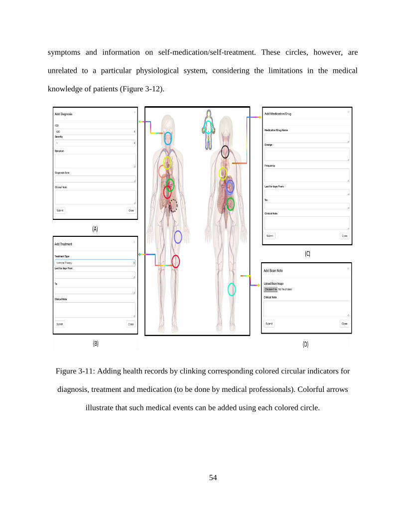
3.3.1.3 Recording and Inserting Medical Events Using Position-based Indicators
Continuing Yongji Jin’s work [98], our anatomy-based method of displaying medical
information (drawing circles on problem location) is a problem-oriented approach that affords
physicians access to more detailed clinical events related to a given problem. Physicians can add
a new colored diagnosis circle by clicking on the corresponding position in the 2D representation
of the human anatomy. After the button that adds medical events on a patient body in the panel is
clicked, the circle with a color that corresponds to a certain physiological system is added. Such
events include diagnosis, medication, treatment and medical imaging, which are entered into the
system by physicians (Figure 3-11). Clicking on a location activates a corresponding pop-up box,
in which new health data can be inputted. Users can then retrieve additional details by clicking
on the pop-up box for each of the circular indicators. Even when a new record is uploaded, all
records continue to be maintained automatically and transferred to the patient interface. The
system provides a summary that reflects all of a patient’s problems in human graphical views
with disease classification that enables health care professionals to better understand patient
health conditions. The system also comes with interactive navigation that shows problem details,
accessed by a single click on a circle or a double click that directs a user to anatomical views of a
given physiological system.
A patient’s well-being depends on correct diagnoses and treatments, indicating the value
of involving patients in their own health care. Our system provides two options (adding symptom
and adding self-medication/self-treatment data) on the panel that allows patients to enter
symptoms (including feelings, severity, duration, and recovery time) and self-medication/self-
treatment data. The black circles are to be manipulated by patients when they want to incorporate
54
symptoms and information on self-medication/self-treatment. These circles, however, are
unrelated to a particular physiological system, considering the limitations in the medical
knowledge of patients (Figure 3-12).
Figure 3-11: Adding health records by clinking corresponding colored circular indicators for
diagnosis, treatment and medication (to be done by medical professionals). Colorful arrows
illustrate that such medical events can be added using each colored circle.

55
Figure 3-12: Adding symptoms, self-medication and self-treatment by clinking corresponding
black circular indicators (to be done by patients).
Our system also provides different medical information for different users. Patients, for
instance, can add and edit information on symptoms and self-medication/self-treatment by
clicking on a specific black circular indicator (Figure 3-13 (a) and (b)). For colored circular
indicators, which are used by health care professionals (Figure 3-13 (c)), patients can access only
problem-based diseases and click on medical events to view details (Figure 3-13 (d)). A similar
process is displayed for health care professionals.
3.3.2 Temporal User Interface
Temporal data are time-stamped data, such as previous diagnoses, treatments,
medications, treatments, medical imaging and prescribed laboratory tests. These can be regarded

56
as events in the medical domain. Every medical event is assigned a time tag—a feature that
brings forth another user interface for reflecting events on a timeline.
Figure 3-13: Displayed medical records for circular indicators (used by patients).
Figure 3-14: Displayed medical records for circular indicators (used by health care
professionals).

57
3.3.2.1 Time Scroll Bar
A time scroll bar is displayed on the main page of the visualization system, and it
prompts users to select a specific year to filter medical events for that period.
Figure 3-15: Time-filtered pictorial interface for viewing medical records. (a) Medical
information for 2016. The patient has appendicitis problems, and the skeletal parts of the belly
are shown. (b) Medical information for 2015. The patient experiences problems in her right knee.
3.3.2.2 Historical Timeline
3.3.2.2.1 Historical Timeline for Medical Professionals
The system provides zoomable medical history displays with event- and duration-based
timelines. Diagnoses, medical imaging, treatments, medications and laboratory tests are
classified and represented as different icons. Figure 3-16 (b) shows a duration-based timeline that
is used when an event lasts for a certain length of time. The navigation buttons and

58
corresponding icons at the top of the page (Figure 3-16 (a)) help users quickly filter information
to limit displays to their selected physiological systems or medical events.
Figure 3-16: EMR timeline display. The horizontal line denotes time information, and the icons
represent diagnosis, treatment, medication, medical imaging and laboratory testing. This display
has filters for physiological systems and medicine events. The button at the bottom can be
clicked to show or hide duration timelines and create and show major diseases.
3.3.2.2.2 Historical Timeline for Patients
Our PHR system has an extra feature for supporting continuous medication timelines that
show medicine names, dosages and frequencies of intake. Such timelines remind patients to take
their medicines, as prescribed by a physician (Figure 3-17).

59
Figure 3-17: PHR timeline display. The timeline is very similar to that for EMR, but the
difference is in the medicine display. A continuous medication timeline is provided to show the
days during which patients take their medication.
3.3.3 Arrangement of Major Medical Events
Most severe disease events are documented and displayed as major medical events. When
doctors navigate a patient’s medical history, there are a great many of medical events. However,
the physicians are concerned primarily about major events, such as cancer, rather than minor
conditions, such as a cold or an ear infection. Our system provides a display for major diseases in
a historical timeline, thereby enabling doctors to define/document certain events under a major
medical occurrence. This definition/documentation, in turn, allows doctors to quickly obtain
insights into important issues should there be a need to do so at a later time. When a major event
is chosen, only related events are displayed (Figure 3-18).
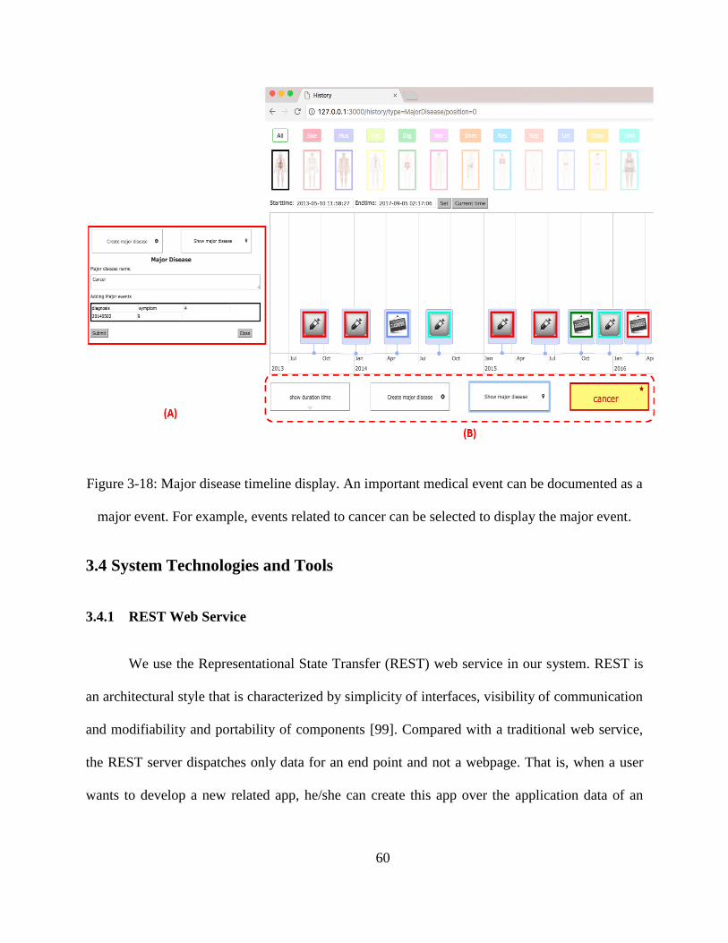
60
Figure 3-18: Major disease timeline display. An important medical event can be documented as a
major event. For example, events related to cancer can be selected to display the major event.
3.4 System Technologies and Tools
3.4.1 REST Web Service
We use the Representational State Transfer (REST) web service in our system. REST is
an architectural style that is characterized by simplicity of interfaces, visibility of communication
and modifiability and portability of components [99]. Compared with a traditional web service,
the REST server dispatches only data for an end point and not a webpage. That is, when a user
wants to develop a new related app, he/she can create this app over the application data of an

61
existing system. This is very convenient for the one-time creation of application logic and
consumption by clients.
3.4.2 Node.js
Node.js, also called Node, is a server-side JavaScript environment [100]. It is based on
Google’s runtime implementation (Chrome’s V8 JavaScript engine) that focuses on performance
and low-memory consumption. Unlike processes in most other modern environments, a Node
process does not rely on multithreading to support the execution of business logic; it is grounded
in an asynchronous I/O event model [101]. Node.js is used to implement the REST HTTP server.
All API calls are executed asynchronously. We use Node.js as a back-end framework for our
system because it provides an event-driven, non-blocking I/O model that makes for a very
lightweight and efficient application. Node also has a shallow learning curve because it is
basically a JavaScript framework that runs on the server side.
3.4.3 Server Componentization with Express.js
Express.js [102] is a Node.js web application server framework that provides a robust set
of features for web and mobile applications. Node.js is a low-level I/O mechanism, which means
that considerable work (e.g., parsing payload, cookies, storing sessions, selecting correct route
patterns) needs to be re-implemented [103]. We choose Express.js because it enables the easy
creation of web applications and services. For example, we can write a small REST API server in
plain Node.js and then write it in Express.js. The latter takes five to tenfold less time and fewer
lines of code.

62
3.4.4 EJS Template
Two popular view engines are available for Node.js: Jade and EJS. Jade is characterized
by short syntax, thereby allowing the fast and clean writing of code. However, it is not designer
friendly and does not differentiate between tags and variables, thus making code very confusing
[104]. Furthermore, HTML needs to be converted into Jade; if an HTML structure becomes
complicated, the corresponding code may be convoluted or difficult to follow. As for EJS, it is
very close to pure HTML and uses the same syntax. It therefore requires replacement of dynamic
components with the variables passed from Express.js items. The drawback of EJS is that it is
not as powerful as Jade and does not have blocks by default. Although Jade is a sophisticated
tool, we choose EJS for our system because its syntax is very easy to learn and understand.
3.4.5 MySQL Database
MySQL is a popular open-source relational database management system (RDBMS) that
was developed, distributed and supported by Oracle Corporation [105]. Similar to other
relational databases, MySQL stores data in tables and uses structured query language (SQL) for
database access. Our system uses MySQL because it is mostly used to store web applications and
runs on all major operating systems (Linux, Windows, OS X and UNIX). Figure 3-19 shows the
entity relationship model of databases in our system. Based on Yongji Jin’s work [98] (all of
tables he designed are highlighted in red), we provide 17 tables with internal connections. For a
patient’s table, we provide personal information, basic medical information and family history,
whereas for a doctor’s table, we provide the doctor’s name, hospital information and
specialization. In terms of problem location, table “s_position” refers to the symptom location
entered by patients, and table “d_position” refers to the location to which self-medication/self-

63
treatment is applied. Table “position_ doctor” refers to diagnosis locations edited by physicians.
Table “medication,” “diagnosis,” “lab_test,” “treatment” and “scanning” is designed for
physicians to insert new medical events. Table “scanning” refers to all of themedical images and
“lab_test” refers to blood tests and urine tests. Table “symptom” and table “p_diagnosis” are
intended for patients to add health conditions. Table “history” is for the collection of medical
events added by doctors and displayed in a point timeline. Table “symptom history” is intended
to document time data from symptom onset to recovery period; such data are displayed in a
duration-based timeline. Finally, table “major disease” collects data on severe medical events,
such as those related to medical imaging, diagnoses, treatments, medications and laboratory tests.
3.4.6 Google Charts API
As discussed in Chapter 2, Google Charts is a very popular InfoVis tool for improving
interactive user interfaces. We use Google Charts to display events in a timeline chart, which
visually depicts how a set of resources are used over time [106]. The timeline is developed in
JavaScript and can run in every browser without additional requirements. In the timeline, events
are presented in two formats, which can be displayed either on a single date or over a range of
days (start to end date). Users can freely move and zoom into the timeline by dragging and
scrolling [107]. The timeline provides an enhanced graphical interface because all medical
events are displayed in a time-oriented structure and require zooming in and out for access to
details.

64
Figure 3-19: Entity relationship model of the database.

65
3.4.7 D3.js
As indicated in Chapter 2, d3.js is a JavaScript library for manipulating and displaying
interactive data. It can help bring data to life by using HTML, SVC and CSS and attached data to
a DOM. Our system uses d3.js because it is easy to use in generating interactive and intuitive
charts and customizable and renderable graphics.

66
Chapter 4. Evaluation
In this chapter, we focus on the evaluation of our system. We introduce the evaluation
criteria for both InfoVis and the EMR interface and describe the process that underlies the
assessment. A case study is then presented, after which the decisions made regarding the
prototype system are discussed.
4.1 Evaluation Criteria
ISO 9244-11 standards [108] defined usability as the “effectiveness, efficiency and
satisfaction with which specified users can achieve specified goals in a particular environment.”
A critical requirement, then, is to evaluate whether a system is easily and effectively used in
accordance with appropriate criteria. Given that our system is a prototype visualization system
for EMRs, both InfoVis criteria and EMR evaluation methods and metrics are presented in this
section.
4.1.1 InfoVis Evaluation Criteria Used for EMRs
As the InfoVis field matures, researchers and practitioners have attempted to identify the
numerous factors that contribute to the success of InfoVis systems. Shannon and Weaver [109],
whose work expanded communication systems, stated that the success of an information system
can be measured at three levels, namely, the technical, semantic and effectiveness levels. The
technical level revolves around the accuracy and efficiency of a system that produces
information; the semantic level centers on the success with which information conveys intended

67
meaning; and the effectiveness level refers to the effect of information on end-users. Building on
these concepts, DeLone and McLean [110] sub-divided success measures into six distinct
categories, which constitute what is called the D&M IS success model. The model encompasses
system quality, information quality, usage, user satisfaction, individual impact and organizational
impact. System quality pertains to an InfoVis system itself in association with system quality
attributes (e.g., usability, ease of use). Information quality focuses on the attributes of system
output (e.g., accuracy, completeness). Usage measures the consumption of system output, with
attributes that include level of use and number of queries. User satisfaction measures users’
attitudes and responses to a system and the information that it conveys as well as both overall
and decision-making satisfaction. Individual impact has to do with the effects of information on
users, including understanding and improved individual productivity. Organizational impact
measures the effects of information on organizational performance. Figure 4-1 illustrates the
three levels of information put forward by Shannon and Weaver, along with DeLone and
McLean’s IS success model. With the given criteria, we measured system success on the basis of
various aspects, from system scalability to user satisfaction.
Figure 4-1: Categories of information system success [109].

68
A survey on EMR systems [23] analyzed a considerable number of EMR systems on the
basis of the information quality criteria [110] mentioned above. A more detailed discussion of
the criteria under Shannon and Weaver’s levels is provided below [109].
Technical level
o System quality: The most frequently used attributes in relation to system quality are
ease of use (record keeping time), ease of learning, usability and savings in
documentation and response times.
Semantic level
o Information quality: This type of quality is used to measure the input and output of
an information system. The most frequently used attributes in a communication
system are completeness, comprehensiveness, reliability, accuracy, legibility,
consistency, relevance, format and availability. In EMR systems, the most prevalently
adopted attributes are completeness and accuracy.
Effectiveness level
o Information use: This criterion measures end-users’ consumption of system output,
including level of use and number of queries.
o User satisfaction: This criterion measures end-users’ responses to the use of system
output. The most frequently adopted attributes are user friendliness and users’
attitudes toward a system.
o Individual impact: This criterion measures the effects of information on the
behaviours of end-users. The most frequently used attributes are improvements to

69
individual productivity and understanding of information. In EMR systems, these
criteria include changing clinical work patterns, changing documentation habits and
ensuring decision effectiveness.
o Organizational impact: The attributes most frequently employed in this regard are
investment and increased work volume. In EMR systems, the prevalently used criteria
are physician–patient interaction, effects on patient care and satisfaction with
radiology services.
4.1.2 EMR Evaluation Methods and Metrics for Usability
With respect to medical records, the HIMMS published EMR usability principles and
related evaluation methods, discussed as follows [111].
Simplicity: Simplicity refers to a design’s effectiveness in providing medical information in
a clear and convenient manner that allows physicians to quickly understand and incorporate
patients’ health conditions. Given the complexity of clinical information, displays that are
easy to read, important information that stands out and function options that are
straightforward are essential to efficiency and patient safety.
Naturalness: This principle refers to the reduction of cognitive load and errors so that users
can familiarize themselves with an EMR system in a short period. Naturalness applies, as
well, to terminology and the correspondence between workflow design and user tasks and
expectations [112].
Consistency: Consistency pertains to the extent to which a new system’s structure and
functions match a user’s experience with other relevant software. The greater the

70
applicability of a user’s prior experience to a new system, the higher the effectiveness of
usage and the fewer the errors committed.
Minimizing cognitive load: Such minimization refers to the reduction of the cognitive load
required to use an EMR system so that physicians have sufficient time to concentrate on a
task at hand. Two common methods of providing cognitive support to users are presenting all
information needed for a task and displaying information that is organized on the basis of
meaningful relationships [113].
Efficient interactions: This principle centers on minimizing the number of steps that need to
be taken to complete medical tasks. Examples of designs for efficient interactions include
auto tabbing, the use of good default values, the provision of sufficiently large lists and text
boxes that limit scrolling and the elimination of frequent switching between a keyboard and a
mouse.
Forgiveness and feedback: This principle denotes the provision of a system that can reduce
user errors and enable recovery when mistakes are made by users. This is especially helpful
under scenarios of limited training, wherein users commit errors in using a clinical
information system or when such system imposes considerable cognitive load.
Effective use of language: All language used in an EMR system should be concise and
unambiguous. A system should also support meaningful and familiar terminology, with no
terms related to computers, technology and databases (for example) included in the system.
Effective information presentation: A system should be characterized by information
readability for use in a complex clinical system. A substantial amount of relevant medical

71
information can be displayed on a single screen. A critical requirement, therefore, is for a
design to enable visualization at an appropriate density and with the use of meaningful color.
Preservation of context: This principle refers to the minimization of interruptions and the
delay of screen changes until a user has completed a task. A design must not compel a user to
shift visual attention away from an area on a screen that he/she is currently reading or
working on.
4.2 System Performance Checklist
We validated our system’s performance on the basis of the criteria discussed in Section 4.1.
InfoVis checklist
o Technical level (system quality): We used Node.js, which has a non-blocking event
loop, as our high-performance server and minimized the complexity of SQL, table
joins and data manipulation to guarantee improved performance. However, Node.js
features a main thread of execution, thereby enabling simple concurrency. Executing
thousands of requests per second is difficult; thus, we did not assess the system in
terms of concurrent requests and average response times. Because the proposed
system is a prototype, we are not in a position to discuss system quality in relation to
large medical datasets and measure savings in loading time with a huge number of
documents.
o Semantic level (information quality): Medical information is complex, and
estimating the completeness and accuracy of a prototype before testing with medical
professionals in real situations are challenging requirements. We consulted several

72
individuals regarding medical history components and collected medical information
from medical websites and other relevant EMR systems. As for EMR systems,
completeness was estimated on the basis of the number of clinical problems described
by a diagnostic code [114]. In some EMR systems, hierarchical codes (e.g., ICD,
CPT, and NDC) are used to describe the completeness and accuracy of medical
information. In our system, a number of clinical problems can be described by a
diagnostic code (e.g., ICD-10). Given that we focused on visualization, the quality of
medical information was minimally treated in our thesis. Additionally, our system is
not intended as a replacement for existing EMR systems but as an addition to user
interfaces and link to an existing database. In future work, we will invite clinical staff
to evaluate whether the classifications in our system can cover their databases and
whether the diagnostic codes are correct through actual medical tasks and scenarios.
o Effectiveness level:
Information use: Our system provides an interactive platform from which
users can view and insert medical information in a short period. We designed
both conventional buttons and clickable images of the human body as
navigational tools and three filters that enable the search of selected medical
records in a particular year. These features will enable physicians to
immediately obtain insights into a patient’s conditions as well as minimize
number of queries and level of use.
User satisfaction: Our system provides user-friendly and patient-centric
interfaces. We gather some information comments from physicians to
determine user satisfaction with the prototype.

73
Individual impact: We provided a clickable 2D representation of the human
body with physiological systems and a problem-oriented user interface that
enables physician to quickly and intuitively extract a patient’s medical history.
By directly clicking on circular indicators of different colors on an anatomical
location, physicians can visualize patient history data, such as medications,
diagnoses and procedures. Such data are also shown by timeline. We provided
zoomable medical history displays with event- and duration-based timelines,
which can contribute to physicians’ decision making.
Organizational impact: Our system contains both numerical medical data
(e.g., laboratory tests) and categorical medical data (e.g., diagnoses,
medications and treatments). These are stored in an organized manner, thus
enhancing physician–patient interaction.
EMR checklist
o Simplicity: Our system provides interactive navigation for users to insert or view
patient health conditions. Clicking on the 2D human image to access details is a
straightforward function that affords users ease of reading and understanding. A 2D
human image is also provided for patients to aid viewing and comprehension of their
medical conditions and treatments.
o Naturalness: Our system uses problem-, source- and time-oriented structures that
highly correspond with physicians’ workflows. Both physicians and patients can
therefore learn and familiarize themselves with our system.

74
o Consistency: Some of the timeline features (e.g., zoom in/out) can be manipulated,
similar to those of other EMR systems. Such features render our system highly
convenient. We likewise provided a functionality for inserting new records into a
given position on the human body representation.
o Minimizing cognitive load: We provided problem- and time-oriented medical
records, which are characterized by internal relationships. In the spatial interface,
users can click on a location on the human body to enter new medical records, which
are easy to understand. In the temporal interface, users can zoom in or out to view
medical events and click on event icons to obtain more details. These manipulatory
features are similar to a typical website, can reduce cognitive load.
o Efficient interactions: Our system comes with only two webpages. On the homepage,
after the selection of a particular patient, related information appears, complete with
problems indicators on the 2D body image. The other webpage presents all the data
related to a patient’s medical history on a horizontal time axis. These two webpages
can minimize the number of steps that need to be taken to complete medical tasks.
o Forgiveness and feedback: Currently, this principle is not incorporated into our
system. If health care providers click on the wrong button, the misunderstanding of
diagnostic indicators will be reflected on the body image.
o Effective use of language: Our system provides terminology, such as ICD-10, that
allows health care professionals to familiarize themselves with a given medical
context. A graphical user interface is also supplied to patients so that those with
limited medical knowledge can still understand their problems and health conditions.

75
o Effective information presentation: Our system supports color coding in the
presentation of the 11 physiological systems. Meaningful information, such as
diagnostic data, is denoted using circular indicators, wherein color reflects a specific
physiological system. This feature effectively enables physicians to distinguish
between diseases and make correct diagnoses.
o Preservation of context: We provided a minimum dialog box that allows users to
focus on the 2D human image for the incorporation of new medical information, and
we designed the time scroll bar in a way that helps physicians directly recognize
medical records in the spatial view. In addition, the temporal interface supports three
filters that can help users change models for different medical events or different
physiological problems. Our aim is to provide convenience that eliminates the need
for frequent changes in views.
4.3 Comparison with Existing EMR Systems
Given that medical events are priority EMR components, we strongly focused on the
comparability of our system with others in terms of effectiveness in presenting medical
information. A review by Kosara and Miksch [115] indicated that methods of measuring the
effectiveness of medical information presentation can be classified into three types: recording
measured data (e.g., blood glucose), recording incidents (e.g., seizures, pain attacks, etc.) and
treatment planning (e.g., therapeutic steps). For each task, the authors established requirements
and used these to assess visualization systems. We first briefly describe each task and then
compare our system with others (Table 1).

76
Measured quantitative data: Here, focus is directed mostly toward quantitative data and
only minimally on periods of symptom occurrence.
o Intuitiveness: Because measured data should effectively reflect patient status, a
necessary requirement is for a system to be as intuitive as possible so that even users
who are completely unfamiliar with an EMR system (but familiar with the EMR field)
can immediately understand the data.
o Focus+context data: InfoVis represents large data in a hierarchical manner, but
detailed views are equally important. F+C data can combine values in a way that
allows end-users to choose which ones to view.
o Viewing developments: For measured data, viewing how values change must be easy
to enable clinical staff to provide correct diagnoses and prescribe appropriate
treatments in time.
o Finding patterns: Sometimes, distinctive patterns in data (e.g., two weeks of fever)
can serve as hints that facilitate the identification of problems by physicians.
o Discovering intervals: Finding the intervals at which problems occur (e.g., every
Monday, every 2 hours) is necessary.
Incidents and symptoms: Apart from numerical data, incidents and periods of symptom
occurrence are also important factors for physicians to determine causes and make decisions.
The methods used in this regard are identical to those for recording data, except for viewing
developments.
77
Treatment planning: The most complex time visualization is needed for treatment planning.
The specifications of therapeutic plans are often indicated in certain or uncertain time
annotations and are accompanied with sub-plans, which are difficult to visualize.
o Allen’s relations: Visual representation should present all possible relationships
between intervals. Numerous situations, such as A before B, A meets B, A overlaps B
and A contains B, can occur.
o Temporal uncertainty: Plans that are characterized by temporal uncertainty should
be depicted in a way that eases data recognition while preventing neglect of data.
o Hierarchical decomposition: Hierarchical decomposition is important in structuring
a plan and ensuring the reusability of its parts because some plans may call for the
development of sub-plans. A system should also allow users to select the level of
information visible by simultaneously showing condensed and expanded levels.
o Different dimensions: Different kinds of information about the same object should
be visible at the same time. The option of choosing views of only certain tasks in a
project is useful and necessary in enabling users to capture only the tasks that they
need.
Table 1: Comparison with other systems by medical data types.

78
Aspects of
data Methods
Lifelin
es
MIV
A
Mid
gaard
VIE
-VIS
U
Lifelin
es2
VIS
ITO
RS
Fiv
e Ws
EpicC
are
eClin
icalWork
s
Allscrip
ts
Our sy
stem
Measured
data
Intuitiveness √ √ √ √ √ √ √ √ √
Focus+
context data √ √ √ √ √ √ √ √ √ √
Viewing
developments √ √ √ √ √ √ √ √ √
Finding
patterns √ √ √ √
Discovering
intervals √
Incidents
and
symptoms
Intuitiveness √ √ √ √ √
Focus+
context data √ √ √ √ √ √ √ √ √ √
Finding
patterns √ √ √ √ √ √ √ √
Discovering
intervals √ √ √ √
Treatment
planning
Allen’s
relations √ √ √ √ √
Temporal
uncertainty √ √ √ √ √
Hierarchical
decomposition √ √ √ √
Different
dimensions √ √ √ √ √ √ √ √ √ √

79
Another important comparison criterion is the effectiveness of exploratory search. This
feature cannot be analyzed in a standardized manner, but we delved into this component of
our system by comparing several other components that may affect exploration. The results
are presented in Table 2.
Table 2: Comparison by components.
Interactio
n w
ith
oth
er system
s
Med
ical data
disp
lay
System
operatio
n
Task
type
Patien
t portal
Mobile d
evice
Histo
rical record
disp
lay
Term
inolo
gy co
de
Diag
nostic
classification
Sym
pto
m d
isplay
Filter
Colo
r attributes
Nav
igatio
n
User in
terface
Com
ponen
ts
No
No
Lin
e segm
ent in
timelin
e
No
No
Tex
t
Choose tex
t, check
box
to sh
ow
med
ical even
ts
Show
norm
al or
abnorm
al states
Move m
ouse p
oin
ter
over a lin
e to read
a
long lab
el
Am
ount o
f texts an
d
num
ber o
f tables
Lifelin
es
No
No
Show
level o
f detail
along tim
e axis
No
No
No
Hierarch
ical disp
lay
show
s num
erical data
Show
norm
al or
abnorm
al states
Tim
eline d
raggab
le and
zoom
able
Tim
eline w
ith tex
t
Mid
gaard

80
Interactio
n w
ith
oth
er system
s
Med
ical data
disp
lay
System
operatio
n
Task
type
Patien
t portal
Mobile d
evice
Histo
rical
record
disp
lay
Term
inolo
gy
code
Diag
nostic
classification
Sym
pto
m
disp
lay
Filter
Colo
r attributes
Nav
igatio
n
User in
terface
Com
ponen
ts
No
No
Trian
gles in
zoom
able tim
e line
No
No
Tex
t
Ran
k, filter an
d sav
e results as a
new
gro
up o
f record
s
Show
norm
al or ab
norm
al states
Tim
eline an
d b
utto
ns
Am
ount o
f text an
d n
um
ber o
f
tables in
multip
le patien
ts
Lifelin
es2
No
No
Poin
t plo
ts to v
isualize ch
anges in
num
erical valu
es, zoom
and p
an
No
No
No
Variab
les can b
e added
from
a list or
re-ord
ered b
y
drag
and d
rop
Show
norm
al or ab
norm
al states
Butto
n an
d tim
eline
Poin
t plo
ts in tim
eline
MIV
A

81
Interactio
n w
ith
oth
er system
s
Med
ical data
disp
lay
System
operatio
n
Task
type
Patien
t portal
Mobile d
evice
Histo
rical
record
disp
lay
Term
inolo
gy
code
Diag
nostic
classification
Sym
pto
m
disp
lay
Filter
Colo
r attributes
Nav
igatio
n
User in
terface
Com
ponen
ts
No
No
Tem
poral ab
stractions am
ong
gro
ups o
f patien
ts
No
No
Tex
ts and tab
les
Draw
com
plex
sequ
ence o
f
even
t relation
ship
s,
inclu
din
g in
tervals an
d ab
sence
of ev
ents
Ind
icate no
rmal o
r abn
orm
al
health
cond
ition
s
Check
box to
select gro
ups o
f
patien
ts
Num
ber o
f line ch
arts in raw
num
erical data w
ith g
rou
ps o
f
data in
text
VIS
ITO
RS
No
No
Use d
iagnostic
reasonin
g
ICD
-10, C
PT
, ND
C
No
Sym
pto
m lo
cation
on th
e hum
an b
ody,
No
Ind
icate no
rmal o
r
abn
orm
al health
con
ditio
n
Butto
n
Sunburst d
isplay
with
a hum
an b
ody
Fiv
e Ws
Yes
Mobile an
d tab
let
With
text in
tables
ICD
-10
No
Tex
t
Butto
ns fo
r visits,
statemen
ts, pay
men
ts
No
Butto
n
Am
ount o
f text an
d
num
ber o
f tables
EpicC
are

82
Interactio
n
with
oth
er
system
s
Med
ical data
disp
lay
System
operatio
n
Task
type
Patien
t portal
Mobile d
evice
Histo
rical
record
disp
lay
Term
inolo
gy
code
Diag
nostic
classification
Sym
pto
m
disp
lay
Filter
Colo
r
attributes
Nav
igatio
n
User in
terface
Com
ponen
ts
Yes
Yes
show
diag
noses
and n
um
erical
data in
timelin
e
ICD
-10
No
Tex
t
check
box to
show
med
ical
even
ts
Show
charg
es and
pay
men
ts.
Butto
ns
Am
ount o
f text
and n
um
ber o
f
tables
Allscrip
ts
Patien
ts can in
put
their lifesty
le and
health
data
Yes
With
text in
tables
ICD
-10
No
Usin
g P
OM
R in
text
check
box to
show
patien
t appoin
tmen
ts
No
Butto
ns an
d tim
eline
Am
ount o
f text an
d
num
ber o
f tables
eClin
icalWork
s
Patien
ts can v
iew an
d in
sert health
conditio
n fo
r
physician
s
No
Poin
t even
t timelin
e intern
ally co
nnected
with
duratio
n tim
eline, click
ing fu
nctio
n to
find d
etails
ICD
-10
11 p
hysio
logical sy
stems
Circle as in
dicato
r in P
OM
R o
n 2
D h
um
an im
age
with
colo
r codin
g
Physio
logical an
d m
edical ev
ent filter, tim
e scroll
bar in
spatial in
terface and m
ajor d
isease filter
Disp
lay n
orm
al and ab
no
rmal statu
s (laborato
ry
tests) and d
istinct p
hysio
logical sy
stem (sp
atial
and tem
poral in
terfaces)
Click
ing o
n h
um
an b
ody
, timelin
es and n
orm
al
butto
ns
Tem
poral in
terface sho
ws h
istorical ev
ents, an
d
spatial in
terface show
s med
ical info
rmatio
n
Our sy
stem

83
4.4 Information Comments
To evaluate the usability and efficiency of our prototype, we invited physicians to
participate in the study. This section discusses the analysis methods and corresponding results.
The suggestions provided by the participants are also presented.
Inviting physicians to participate is difficult because their time is always stretched by
multiple demands for attention in medical environments. Therefore, we involved only five
physicians to give us information comments, none of whom have had previous experience with
our system. We initially delivered a 20-minute tutorial about our system and showed a video on
how to use the system, which contains basic functions (such as inserting new records and
filtering by year) and shows the related PHR system. Subsequently, we simulated a patient
situation, complete with a sample medical record that reflects more than 30 diagnoses, treatments
and medications. We then recorded the length of time spent by the participating physicians on
retrieving the medical information given in Table 3.
Table 3: Questions for physicians
Number Question
1 What are the most severe diseases of the patient?
2 What are the symptoms and treatments related to the skeletal system
(a particular problem on the patient body)?
3 How many different kinds of problems did the patient have in 2015?
4 What are the treatments that the patient had in the 2016?
84
All the physicians provided correct answers to all four questions at an average of 3.18 min
(individual times = 2, 3, 5, 3.5 and 2.4 min). This is regarded as a positive result given that they
have not previously encountered our system. Then, we received some feedback from these
physicians to help us improve our system in the future.
Four of the physicians stated that our system improves the visualization of EMRs by both
doctors and patients. Our system would allow them to promptly access patients’ diagnoses,
medical histories and laboratory tests. However, two of the physicians suggested reducing the
number of clicks for the insertion of medical descriptions. Our system requires two clicks: one to
activate the circular indicators and another to access medical events.
Three of the participants indicated the rapid acquisition and summarization of patients’
medical histories as powerful features. These would enhance their ability to identify problems
and determine treatment courses. However, the remaining physicians stated that the circular
indicators for location may result in confusion as to which organ corresponds to a given problem.
In the 2D representation of our system, organs are placed very close to one another, requiring
better localization. In the digestive system, for example, the stomach, liver and gallbladder are
very near one another. A single circle may encompass these organs.
All the physicians indicated that they would highly recommend the feature, which was
evaluated as improving the efficiency of medical practice and the satisfaction of patients. They
thought that the highly-visualized platform would allow patients to easily understand their
medical conditions and that the system would improve communication between doctors and
patients. They also regarded the system as facilitative of consultation. Patients would be able to

85
consult their doctors beyond regular business hours or even remotely. This feature is be
particularly useful for patients who are travelling and need health care in a country where a
different language is used. Doctors would easily extract patients’ medical histories with guidance
from patients in any region or country. The drawback identified by the participants was the need
to direct more focus toward security checks and guaranteeing the safety of patient information.
Overall, the feedback was positive, especially considering the fact that they used the
system after such a short tutorial. Almost all the participants felt immediately comfortable in
using our system. We also collected many valuable suggestions from the physicians:
We were asked to create two interfaces for both existing EMRs and the new platform to
allow doctors a choice before they decide on familiarizing themselves with the latter.
Our system should consider the legality of documentation. Thus, terms of use and patient
gateway privacy should be ensured for all patients who enroll in the patient health system.
Because our system provides patient history records over the Internet, the system can easily
inform family members of patients’ health conditions. Delineating the terms and conditions
for this situation is necessary.
o Security functionality should be incorporated into the system.
A function that allows physicians to determine new symptoms or new self-medication taken
by patients should be developed.
o In the current symptom platform, the spatial interface features only a yearly time
filter, and the temporal interface has a zoomable time scale up to a day. Symptoms
are not included in the timeline of our interfaces. This function can be easily
incorporated.

86
The indicators should be distinct from others so that physicians can easily differentiate
indicators.
o Adjustable circle sizes or segmented organ indicators may need to be incorporated
into the location-based disease visualization.
4.5 Examples to Use
This section discusses two examples that demonstrate the benefits of using our system.
4.5.1 Example for Physician Decision Making
One of the example can be used in an emergency room. In the scenario, a female patient
presented with acute pain in the right upper quadrant (RUQ)—a condition that can be caused by
a variety of factors. Quickly accessing patient medical history plays a key role in differential
diagnosis. The physician can use the system by clicking on several locations and circles in the
spatial interface and clicking on icons in the temporal interface to check the corresponding organ
diseases in the patient’s history. The detailed interaction between the physician and the system is
as follows:
1: Verify if there is a GREEN CIRCLE in the area of the RUQ in the digestive system to
determine disease history in the area. The circle indicates whether gallstones, which cause acute
pain at any time, that are most asymptomatic exist, and whether the patient suffers from irritable
bowel syndrome, chronic pancreatitis and other lesions that cause intestinal obstruction.
2: Verify if there is a YELLOW CIRCLE on the heart to determine disease history in the
area. The circle indicates whether the patient has had an angiogram that reflects coronary artery

87
blockage that may occasionally present as upper abdominal pain. It also indicates whether
congestive heart failure may stretch the liver capsule, thus causing pain in the RUQ.
3: Verify if there is a BLUE CIRCLE on the respiratory system to monitor recurrent
pulmonary embolism that causes infarction in the lower right lobe of the lung.
4: Verify if there is a PINK CIRCLE on the reproductive system to determine the presence
of chronic pelvic inflammatory disease that can cause sharp and pleuritic RUQ pain.
This situation demonstrates that color-coded circles on a human body map for different
physiological systems can advance diagnosis and assist a physician in sequencing relevant
medical history data.
4.5.2 Example for Diabetes Complications
The other example is that on a specific clinical case intended to demonstrate the
interactive system in action.
In the sample case, the patient is a 46-year-old female, whose mother suffered from
diabetes. The patient had gestational diabetes at age 25 but recovered from this condition. She
was found to have type 2 diabetes at age 30 and was prescribed Metformin to control her blood
sugar. She has had two episodes of angina, and a blood test showed that her blood sugar was not
well-controlled. Insulin was added as medication.
The scenario provided to the physician can be as follows: As the patient was cleaning at
home in her slippers, her feet was accidentally pierced by a wire, causing a small wound. The
wound was not deep or huge, so she simply cleaned it and covered it with plaster. The wound did

88
not hurt or itch, so she assumed it would be cured. After a few days, however, the patient
inexplicably developed a high fever, and her family sent her to the hospital.
The actions taken by the physician are as follows: To familiarize himself with the patient’s
history, the physician can click on the historical record and viewed the major diseases in the
system. At this stage, he can view diabetes and determined the cause as diabetic foot. The wound
caused serious ulceration of the foot, almost requiring amputation. Dealing with these
complications in time is critical because they are highly likely to cause vascular occlusion and
neuropathy when composition in blood sugar is high. Under such conditions, blood vessels
appear as though they are soaked in sugar.
The functionality that allows patients to update their health data, such as symptoms, self-
medication and self-treatment, helped avoid severe consequences. This case indicates that a
patient’s well-being depends on the timely provision of correct diagnosis and prescription of
appropriate treatment and that our system offers functionalities that helped the physician address
the case.
4.6 Discussion
Despite the positive results on user interaction with our system, several interesting and
important factors present room for improvement.
The current 2D human image with front and back views is non-zoomable. As previously
stated, the stomach, liver and gallbladder are positioned very closely in the digestive system,
thereby presenting difficulties in separately selecting the organs. Our system may need to
support organ segmentation or a zoomable spatial interface.

89
Our system provides severity information for a symptom, but not yet explicitly displayed in
spatial user interface. Also, physicians are not easy to extract new symptom dragging the
time scroll bar currently, in the future we can add a tracking change feature.
Our system is currently web based, yet at times, users may not have access to an Internet
connection. We therefore need to provide a new method of enabling certain operations (such
as viewing current health conditions) that do not depend on network connection. We can use
a cache to store resources that are accessible over a browser offline, granting users partial
access to the system.
Our system does not yet contain actual medical data and has not done formal software testing
Its scalability has not been tested. Many patients and doctors are interconnected, and medical
data are always voluminous. The system’s scalability should be enhanced for it to handle
large-scale operations, such as the frequent offloading of databases.Terms of use and a
patient privacy policy should be ensured for all patients who enroll in the system to reduce
the risk of unauthorized use. Our system should also consider the safety of patient
information in transfers via the Internet.
Currently, our prototype minimally conforms to the forgiveness and feedback principle in the
event of errors in data entry. We need to minimize the likelihood of user errors and determine
a way of reducing user errors and enabling effective recovery when mistakes are made while
editing their personal information such as address or telephone. Also, we need to do
validation of input. For example, typing F in blood type should not be approved.

90
Chapter 5. Conclusion and Future Work
5.1 Conclusion
We developed an interactive visualization system where medical data are navigated over
pictorial-based user interfaces. Clicking on the anatomical location that corresponds to a medical
problem enables the easy retrieval of related medical information, especially for physicians in
emergency rooms and trauma departments. The multiple physiological systems and clinical event
icons in the system represent categories of medical records. Our temporal and spatial graphical
user interfaces provide an interactive, intuitive and effective platform for displaying health
information. Our system is designed and implemented with a dynamic timeline, thus enabling the
filtering of information within a given period. This feature means that medical data can be easily
extracted. Our interface also boasts of access to a digestible amount of information. Through our
system, physicians and patients can communicate directly with each other, exchange medical
information and thereby improve the usability of EMRs.
5.2 Future Work
Notwithstanding the benefits of the proposed system, room for deepening our research and
developing our prototype still exists. Our future work may involve the following considerations:
To improve the accuracy of visual positioning for diseases, we can add multiple views or
organ segmentation on the human body map.

91
Currently, our system offers front and back view of female anatomy in spatial user interface.
The system should add male anatomy so that medical information can be displayed more
accurately. For babies, even though they have different body proportion, the anatomy is quite
similar to adults and it is better to keep adult anatomy so that we can keep records from birth
to death.
Once we accumulate adequate medical data, we would like to improve the security and
storage functionalities of our system so that it satisfies security and privacy requirements.
Patients’ family members can be involved in our future study to obtain insights that can
reinforce correct diagnoses and appropriate treatments.
Clinicians often use mobile devices or tablets as they perform rounds in a hospital. We can
develop a method of displaying patient medical records on mobile devices.
We can design an approach to integrating PHR administrative tasks, such as appointment
scheduling or prescription renewals.
We need to find a way to integrate our system with existing EMR databases.

92
References
[1] Centers for Medicare and Medicaid services, "Data show electronic health records
empower patients and equip doctors," July 2013. [Online]. Available:
https://www.cms.gov/Newsroom/MediaReleaseDatabase/Press-Releases/2013-Press-
Releases-Items/2013-07-17.html.
[2] Smith, Richard. "What clinical information do doctors need?" Bmj 313, no. 7064 (1996):
1062-1068.
[3] Chittaro, Luca. "Information visualization and its application to medicine." Artificial
intelligence in medicine 22, no. 2 (2001): 81-88.
[4] Markle Advancing America's Future, "Survey finds Americans want electronic personal
health information to improve own health care," November 2006. [Online]. Available:
https://www.markle.org/publications/1214-survey-finds-americans-want-electronic-
personal-health-information-improve-own-hea.
[5] "Top EHR Vendors for 2015," Biz Brain, March 2015. [Online]. Available:
http://www.bizbrain.org/top-ehr-vendors/.
[6] "Allscripts Professional EHR Software," Software Advice, [Online]. Available:
http://www.softwareadvice.com/medical/allscripts-ehr-profile/.
93
[7] "eClinicalWorks EMR Software," Software Advice, [Online]. Available:
http://www.softwareadvice.com/medical/eclinicalworks-profile/.
[8] IBM, "IBM Wastson Health," [Online]. Available: http://www.ibm.com/watson/health/.
[9] "Oracle Health Sciences," Oracle, [Online]. Available:
https://www.oracle.com/industries/health-sciences/index.html.
[10] Chen, Yunan. "Documenting transitional information in EMR." In Proceedings of the
SIGCHI Conference on Human Factors in Computing Systems, pp. 1787-1796. ACM,
2010.
[11] Plaisant, Catherine, Rich Mushlin, Aaron Snyder, Jia Li, Daniel Heller, and Ben
Shneiderman. "LifeLines: using visualization to enhance navigation and analysis of patient
records." In Proceedings of the AMIA Symposium, p. 76. American Medical Informatics
Association, 1998.
[12] Pieczkiewicz, David S., Stanley M. Finkelstein, and Marshall I. Hertz. "Design and
evaluation of a web-based interactive visualization system for lung transplant home
monitoring data." In AMIA Annual Symposium Proceedings, vol. 2007, p. 598. American
Medical Informatics Association, 2007.
[13] Shahar, Yuval, Dina Goren-Bar, David Boaz, and Gil Tahan. "Distributed, intelligent,
interactive visualization and exploration of time-oriented clinical data and their
abstractions." Artificial intelligence in medicine 38, no. 2 (2006): 115-135.
[14] Wang, Taowei David, Catherine Plaisant, Ben Shneiderman, Neil Spring, David Roseman,

94
Greg Marchand, Vikramjit Mukherjee, and Mark Smith. "Temporal summaries:
Supporting temporal categorical searching, aggregation and comparison." IEEE
transactions on visualization and computer graphics 15, no. 6 (2009).
[15] Wongsuphasawat, Krist, John Alexis Guerra Gómez, Catherine Plaisant, Taowei David
Wang, Meirav Taieb-Maimon, and Ben Shneiderman. "LifeFlow: visualizing an overview
of event sequences." In Proceedings of the SIGCHI conference on human factors in
computing systems, pp. 1747-1756. ACM, 2011.
[16] Wongsuphasawat, Krist, and David Gotz. "Outflow: Visualizing patient flow by symptoms
and outcome." In IEEE VisWeek Workshop on Visual Analytics in Healthcare, Providence,
Rhode Island, USA, pp. 25-28. American Medical Informatics Association, 2011.
[17] Bade, Ragnar, Stefan Schlechtweg, and Silvia Miksch. "Connecting time-oriented data and
information to a coherent interactive visualization." In Proceedings of the SIGCHI
conference on Human factors in computing systems, pp. 105-112. ACM, 2004.4.
[18] Zhang, Zhiyuan, Bing Wang, Faisal Ahmed, I. V. Ramakrishnan, Rong Zhao, Asa
Viccellio, and Klaus Mueller. "The five Ws for information visualization with application
to healthcare informatics." IEEE transactions on visualization and computer graphics 19,
no. 11 (2013): 1895-1910.
[19] Zhang, Zhiyuan, Faisal Ahmed, Arunesh Mittal, I. V. Ramakrishnan, Rong Zhao, Asa
Viccellio, and Klaus Mueller. "AnamneVis: a framework for the visualization of patient
history and medical diagnostics chains." In Proceedings of the IEEE visual analytics in
health care (VAHC) workshop. 2011.

95
[20] Belden, Jeffery L., Rebecca Grayson, and Janey Barnes. Defining and testing EMR
usability: Principles and proposed methods of EMR usability evaluation and rating.
Healthcare Information and Management Systems Society (HIMSS), 2009.
[21] Wilcox, Lauren, Dan Morris, Desney Tan, and Justin Gatewood. "Designing patient-
centric information displays for hospitals." In Proceedings of the SIGCHI Conference on
Human Factors in Computing Systems, pp. 2123-2132. ACM, 2010.
[22] Schloeffel, P. "Electronic Health Record Definition, Scope and Context. ISO." TC 215
(2002).
[23] Häyrinen, Kristiina, Kaija Saranto, and Pirkko Nykänen. "Definition, structure, content,
use and impacts of electronic health records: a review of the research
literature." International journal of medical informatics 77, no. 5 (2008): 291-304.
[24] ISO, TC. "215." International Organization for Standardization, Health Informatics, ISO
TS 18308 (2003).
[25] Averill, Carolyn B., Karen Dorman Marek, Rita Zielstorff, Julia Kneedler, Connie
Delaney, and D. Kathy Milholland. "ANA standards for nursing data sets in information
systems." Computers in nursing 16, no. 3 (1997): 157-161.
[26] Tange, Huibert J., Arie Hasman, Pieter F. de Vries Robbé, and Harry C. Schouten.
"Medical narratives in electronic medical records." International journal of medical
informatics 46, no. 1 (1997): 7-29.
[27] Tange, Huibert. "How to approach the structuring of the medical record? Towards a model

96
for flexible access to free text medical data." International journal of bio-medical
computing 42, no. 1-2 (1996): 27-34.
[28] Fries, James F. "Alternatives in medical record formats." Medical care (1974): 871-881.
[29] Whiting-O'Keefe, Quinn E., Donald W. Simborg, and Wallace V. Epstein. "A controlled
experiment to evaluate the use of a time-oriented summary medical record." Medical
care (1980): 842-852.
[30] Bade, Ragnar, Stefan Schlechtweg, and Silvia Miksch. "Connecting time-oriented data and
information to a coherent interactive visualization." In Proceedings of the SIGCHI
conference on Human factors in computing systems, pp. 105-112. ACM, 2004.
[31] Weed, Lawrence L. "Medical records that guide and teach." Clinical Problem Lists in the
Electronic Health Record (2014): 19.
[32] Petrie, James C., and Neil McIntyre, eds. The Problem Orientated Medical Record
(POMR): Its Use in Hospitals, General Practice and Medical Education. Churchill
Livingstone, 1979.
[33] SOAP Note Programs, "Physician SOAP Notes," [Online]. Available:
http://www.physiciansoapnotes.com/.
[34] Fekete, Jean-Daniel, Jarke J. Van Wijk, John T. Stasko, and Chris North. "The value of
information visualization." In Information visualization, pp. 1-18. Springer Berlin
Heidelberg, 2008.
[35] Kerren, Andreas, John Stasko, Jean-Daniel Fekete, and Chris North, eds. Information

97
visualization: human-centered issues and perspectives. Vol. 4950. Springer, 2008.
[36] Shneiderman, Ben, Catherine Plaisant, and Bradford W. Hesse. "Improving healthcare
with interactive visualization." Computer 46, no. 5 (2013): 58-66.
[37] Cao, Nan, Yu-Ru Lin, Xiaohua Sun, David Lazer, Shixia Liu, and Huamin Qu. "Whisper:
Tracing the spatiotemporal process of information diffusion in real time." IEEE
Transactions on Visualization and Computer Graphics 18, no. 12 (2012): 2649-2658.
[38] Koh, Kyle, Bongshin Lee, Bohyoung Kim, and Jinwook Seo. "Maniwordle: Providing
flexible control over wordle." IEEE Transactions on Visualization and Computer
Graphics 16, no. 6 (2010): 1190-1197.
[39] Ma, Joyce, Isaac Liao, Kwan-Liu Ma, and Jennifer Frazier. "Living liquid: Design and
evaluation of an exploratory visualization tool for museum visitors." IEEE Transactions
on Visualization and Computer Graphics 18, no. 12 (2012): 2799-2808.
[40] Pileggi, Hannah, Charles D. Stolper, J. Michael Boyle, and John T. Stasko. "Snapshot:
Visualization to propel ice hockey analytics." IEEE Transactions on Visualization and
Computer Graphics 18, no. 12 (2012): 2819-2828.
[41] Weaver, Chris. "Building highly-coordinated visualizations in improvise." In Information
Visualization, 2004. INFOVIS 2004. IEEE Symposium on, pp. 159-166. IEEE, 2004.
[42] Google, "Google Charts," [Online]. Available: https://developers.google.com/chart/.
[43] Zhu, Ying. "Introducing google chart tools and google maps API in data visualization
courses." IEEE computer graphics and applications 32, no. 6 (2012): 6-9.

98
[44] Bostock, Michael, Vadim Ogievetsky, and Jeffrey Heer. "D³ data-driven
documents." IEEE transactions on visualization and computer graphics 17, no. 12 (2011):
2301-2309.
[45] Mike Bostock., " Data-Driven Documents," 2015. [Online]. Available: https://d3js.org/.
[46] Ben Shneiderman, "Treemaps for space-constrained visualization of hierarchies Including
the History of Treemap Research at the University of Maryland," 26 Dec. 1998. [Online].
Available: http://www.cs.umd.edu/hcil/treemap-history/.
[47] Ben Shneiderman, "Discovering business intelligence using treemap visualizations.," B-
EYE-Network-Boulder, CO-USA, 2006.
[48] Alfred Inselberg, "Home Of Parallel Coordinates," Senior Fellow San Diego
Supercomputing Center, [Online]. Available: http://www.math.tau.ac.il/~aiisreal/.
[49] Few, Stephen. "Multivariate analysis using parallel coordinates." Perceptual edge (2006):
1-9.
[50] Minard, C. J. "1870." Tableaux graphiques et cartes figuratives.(Collection of graphic
works) École Nationale des Ponts et Chausées (ENPC). Fol 10975 (1844).
[51] Riehmann, Patrick, Manfred Hanfler, and Bernd Froehlich. "Interactive sankey diagrams."
In Information Visualization, 2005. INFOVIS 2005. IEEE Symposium on, pp. 233-240.
IEEE, 2005.
[52] Canadian Energy System Analysis Research, "Visualizing Canada's Energy Systems,"
2013. [Online]. Available: http://www.cesarnet.ca/visualization.

99
[53] Engaging Ideas for Canada's Future, "Energy Systems: A Very Big Picture Indeed,"
Canada Science and Technology Museums Corporation, [Online]. Available:
http://energy.techno-science.ca/en/blogs/353.php.
[54] Canadian Energy Systems Analysis Research, "Sankey diagrams of Canada's energy
systems," [Online]. Available: http://www.cesarnet.ca/visualization/sankey-diagrams-
canadas-energy-systems.
[55] McGuffin, Michael J. "Simple algorithms for network visualization: A tutorial." Tsinghua
Science and Technology 17, no. 4 (2012): 383-398.
[56] Neal Caren, "A network of sociology," [Online]. Available:
http://www.unc.edu/~ncaren/cite_network_full/cites.html.
[57] Neal Caren, "A Sociology Citation Network," [Online]. Available:
http://nealcaren.web.unc.edu/a-sociology-citation-network/.
[58] Plaisant, Catherine, Rich Mushlin, Aaron Snyder, Jia Li, Daniel Heller, and Ben
Shneiderman. "LifeLines: using visualization to enhance navigation and analysis of patient
records." In Proceedings of the AMIA Symposium, p. 76. American Medical Informatics
Association, 1998.
[59] West, Vivian L., David Borland, and W. Ed Hammond. "Innovative information
visualization of electronic health record data: a systematic review." Journal of the
American Medical Informatics Association 22, no. 2 (2015): 330-339.
[60] Wang, Taowei David, Catherine Plaisant, Alexander J. Quinn, Roman Stanchak, Shawn

100
Murphy, and Ben Shneiderman. "Aligning temporal data by sentinel events: discovering
patterns in electronic health records." In Proceedings of the SIGCHI conference on Human
factors in computing systems, pp. 457-466. ACM, 2008.
[61] Wang, Taowei David, Krist Wongsuphasawat, Catherine Plaisant, and Ben Shneiderman.
"Visual information seeking in multiple electronic health records: design recommendations
and a process model." In Proceedings of the 1st ACM International Health Informatics
Symposium, pp. 46-55. ACM, 2010.
[62] Wang, Taowei David, Catherine Plaisant, Ben Shneiderman, Neil Spring, David Roseman,
Greg Marchand, Vikramjit Mukherjee, and Mark Smith. "Temporal summaries:
Supporting temporal categorical searching, aggregation and comparison." IEEE
transactions on visualization and computer graphics 15, no. 6 (2009).
[63] Horn, Werner, Christian Popow, and Lukas Unterasinger. "Support for fast comprehension
of ICU data: Visualization using metaphor graphics." Methods Archive 40, no. 5 (2001):
421-424.
[64] Klimov, Denis, Yuval Shahar, and Meirav Taieb-Maimon. "Intelligent selection and
retrieval of multiple time-oriented records." Journal of Intelligent Information Systems 35,
no. 2 (2010): 261-300.
[65] Klimov, Denis, Yuval Shahar, and Meirav Taieb-Maimon. "Intelligent visualization and
exploration of time-oriented data of multiple patients." Artificial intelligence in
medicine 49, no. 1 (2010): 11-31.

101
[66] Bade, Ragnar, Stefan Schlechtweg, and Silvia Miksch. "Connecting time-oriented data and
information to a coherent interactive visualization." In Proceedings of the SIGCHI
conference on Human factors in computing systems, pp. 105-112. ACM, 2004.
[67] Aigner, Wolfgang, Katharina Kaiser, and Silvia Miksch. "Visualization methods to support
guideline-based care management." Studies in health technology and informatics 139
(2008): 140.
[68] Rind, Alexander, Taowei David Wang, Wolfgang Aigner, Silvia Miksch, Krist
Wongsuphasawat, Catherine Plaisant, and Ben Shneiderman. "Interactive information
visualization to explore and query electronic health records." Foundations and Trends® in
Human–Computer Interaction 5, no. 3 (2013): 207-298.
[69] Faiola, Anthony, Crystal Boston-Clay, Josette Jones, Michael Downey, and Christine M.
Newlon. "Managing patient health across diverse spaces: Using activity theory to model
pervasive decision support." (2012).
[70] Faiola, Anthony, and Chris Newlon. "Advancing critical care in the ICU: a human-
centered biomedical data visualization systems." In International Conference on
Ergonomics and Health Aspects of Work with Computers, pp. 119-128. Springer Berlin
Heidelberg, 2011.
[71] Zhang, Zhiyuan, Bing Wang, Faisal Ahmed, I. V. Ramakrishnan, Rong Zhao, Asa
Viccellio, and Klaus Mueller. "The five Ws for information visualization with application
to healthcare informatics." IEEE transactions on visualization and computer graphics 19,
no. 11 (2013): 1895-1910.

102
[72] Zhang, Zhiyuan, Faisal Ahmed, Arunesh Mittal, I. V. Ramakrishnan, Rong Zhao, Asa
Viccellio, and Klaus Mueller. "AnamneVis: a framework for the visualization of patient
history and medical diagnostics chains." In Proceedings of the IEEE visual analytics in
health care (VAHC) workshop. 2011.
[73] Tang, Paul C., Joan S. Ash, David W. Bates, J. Marc Overhage, and Daniel Z. Sands.
"Personal health records: definitions, benefits, and strategies for overcoming barriers to
adoption." Journal of the American Medical Informatics Association 13, no. 2 (2006): 121-
126.6.
[74] Kaelber, David C., Ashish K. Jha, Douglas Johnston, Blackford Middleton, and David W.
Bates. "A research agenda for personal health records (PHRs)." Journal of the American
Medical Informatics Association 15, no. 6 (2008): 729-736.
[75] Kim, Matthew I., and Kevin B. Johnson. "Personal health records." Journal of the
American Medical Informatics Association 9, no. 2 (2002): 171-180.
[76] Al-Busaidi, Asma, Alex Gray, and Nick Fiddian. "Personalizing web information for
patients: linking patient medical data with the web via a patient personal knowledge
base." Health informatics journal 12, no. 1 (2006): 27-39.
[77] The office of the national coordinator for Health Information Technology, "Health Care
Professional EHR Vendors," July 2016, [Online]. Available:
https://dashboard.healthit.gov/quickstats/pages/FIG-Vendors-of-EHRs-to-Participating-
Professionals.php.

103
[78] Becker's Healthcare, "Top 10 EHR vendors by overall market share," February 2015,
[Online]. Available: http://www.beckershospitalreview.com/healthcare-information-
technology/top-10-ehr-vendors-by-overall-market-share.html.
[79] Melissa McCormack, "EHR Meaningful Use Market Share," Software Advice, January
2015, [Online]. Available: http://www.softwareadvice.com/resources/ehr-meaningful-use-
market-share/.
[80] QuintileslMS, "SK&A databases," January 2016, [Online]. Available:
http://www.skainfo.com/.
[81] Software Advice, "EpicCare Software," January 2015, [Online]. Available:
http://www.softwareadvice.com/medical/epic-systems-epiccare-profile/.
[82] Madelyn Kearns, "healow Patient Portal," Medical Practice Insider, November 2013.
[Online]. Available: http://www.medicalpracticeinsider.com/news/healow-patient-portal.
[83] Capterra Medical Software Blog, "EHR Software Comparison: Brief Overview of the Top
10 EHRs," October 2015, [Online]. Available: http://blog.capterra.com/ehr-software-
comparison-brief-overview-of-the-top-10-ehrs/.
[84] Allscripts, "Juxly Timeline," March 2016, [Online]. Available: https://allscripts-
store.prod.iapps.com/applications/id-16004/Juxly_Timeline.
[85] Taylor, Tim. “Skeletal System.” InnerBody.com. HowToMedia, Inc., Oct 2012. Mon. 21
January 2017. [Online]. Available: http://www.innerbody.com/image/skelfov.html.

104
[86] Taylor, Tim. “Muscular System.” InnerBody.com. HowToMedia, Inc., Oct 2012. Mon. 21
January 2017. [Online]. Available: http://www.innerbody.com/image/musfov.html.
[87] Taylor, Tim. “Cardiovascular System.” InnerBody.com. HowToMedia, Inc., Oct 2012.
Mon. 21 January 2017. [Online]. Available:
http://www.innerbody.com/image/cardov.html.
[88] Taylor, Tim. “Digestive System.” InnerBody.com. HowToMedia, Inc., Oct 2012. Mon. 21
January 2017. [Online]. Available: http://www.innerbody.com/image/digeov.html.
[89] Taylor, Tim. “Nervous System.” InnerBody.com. HowToMedia, Inc., Oct 2012. Mon. 21
January 2017. [Online]. Available: http://www.innerbody.com/image/nervov.html.
[90] Taylor, Tim. "Immune and Lymphatic Systems," InnerBody.com. HowToMedia, Inc.,
Oct. 2012. Mon. 21 January 2017. [Online]. Available:
http://www.innerbody.com/image/lympov.html.
[91] Taylor, Tim. "Respiratory System," InnerBody.com. HowToMedia, Inc., Oct. 2012. Mon.
21 January 2017. [Online]. Available: http://www.innerbody.com/anatomy/respiratory.
[92] Taylor, Tim. "Female Reproductive System," InnerBody.com. HowToMedia, Inc., Oct.
2012. Mon. 21 January 2017. [Online]. Available:
http://www.innerbody.com/image/repfov.html.
[93] Taylor, Tim. "Urinary System," InnerBody.com. HowToMedia, Inc., Oct. 2012. Mon. 21
January 2017. [Online]. Available: http://www.innerbody.com/image/urinov.html.
105
[94] Taylor, Tim. "Endocrine System," InnerBody.com. HowToMedia, Inc., Oct. 2012. Mon.
21 January 2017. [Online]. Available: http://www.innerbody.com/image/endoov.html.
[95] Taylor, Tim., "Integumentary System," InnerBody.com. HowToMedia, Inc., Oct. 2012.
Mon. 21 January 2017. [Online]. Available:
http://www.innerbody.com/anatomy/integumentary.
[96] Marchevsky, Alberto M., and Mark R. Wick. "Evidence-based medicine, medical decision
analysis, and pathology." Human pathology 35, no. 10 (2004): 1179-1188.
[97] Ratib, Osman, Michael Swiernik, and J. Michael McCoy. "From PACS to integrated
EMR." Computerized Medical Imaging and Graphics 27, no. 2 (2003): 207-215.
[98] Jin, Yongji. "Interactive Medical Record Visualization based on Symptom Location in a
2D Human Body." PhD diss., Université d'Ottawa/University of Ottawa, 2016.
[99] Fielding, Roy T., and Richard N. Taylor. "Principled design of the modern Web
architecture." ACM Transactions on Internet Technology (TOIT) 2, no. 2 (2002): 115-150.
[100] Node.js, "Node.js," May 2009. [Online]. Available: https://nodejs.org/en/.
[101] Tilkov, Stefan, and Steve Vinoski. "Node. js: Using JavaScript to build high-performance
network programs." IEEE Internet Computing 14, no. 6 (2010): 80-83.
[102] Express, "Express Fast, unopinionated, minimalist web framework for Node.js," Nov
2010. [Online]. Available: http://expressjs.com/.
[103] Community Wiki, "What is Express.js," Stack overflow, Apr 2015. [Online]. Available:

106
http://stackoverflow.com/questions/12616153/what-is-express-js.
[104] Tan Nguyen, "What are the pros and cons of both Jade and EJS for Node.js templating,"
Stack Overflow, May 2013. [Online]. Available:
http://stackoverflow.com/questions/16513168/what-are-the-pros-and-cons-of-both-jade-
and-ejs-for-node-js-templating.
[105] MySQL, A. B. "MySQL-The World’s Most Popular Open Source Database (2011)."
[106] Google, "Google Charts: Timelines," Google, Feb 2017. [Online]. Available:
https://developers.google.com/chart/interactive/docs/gallery/timeline.
[107] Jos de Jong, "Timeline documentation," Chap Links Library, Nov 2015. [Online].
Available: http://almende.github.io/chap-links-library/js/timeline/doc/.
[108] Iso, W. "9241-11. Ergonomic requirements for office work with visual display terminals
(VDTs)." The international organization for standardization 45 (1998).
[109] Shannon, Claude E. "W. Weaver The mathematical theory of communication." Urbana:
University of Illinois Press 29 (1949).
[110] DeLone, William H., and Ephraim R. McLean. "Information systems success: The quest
for the dependent variable." Information systems research 3, no. 1 (1992): 60-95.
[111] Belden, Jeffery L., Rebecca Grayson, and Janey Barnes. Defining and testing EMR
usability: Principles and proposed methods of EMR usability evaluation and rating.
Healthcare Information and Management Systems Society (HIMSS), 2009.

107
[112] Nielsen, Jakob. Usability engineering. Elsevier, 1994.
[113] Bieber, Eric J., Frank M. Richards, and James M. Walker. Implementing an electronic
health record system. Springer-Verlag London Limited, 2005.
[114] Blanz, Volker, and Thomas Vetter. "A morphable model for the synthesis of 3D faces."
In Proceedings of the 26th annual conference on Computer graphics and interactive
techniques, pp. 187-194. ACM Press/Addison-Wesley Publishing Co., 1999.
[115] Keim, Daniel, Gennady Andrienko, Jean-Daniel Fekete, Carsten Görg, Jörn Kohlhammer,
and Guy Melançon. "Visual analytics: Definition, process, and challenges." In Information
visualization, pp. 154-175. Springer Berlin Heidelberg, 2008.