portfolio 2017
TRANSCRIPT

Salisbury International Arts Festival
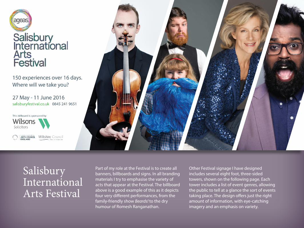
Part of my role at the Festival is to create all banners, billboards and signs. In all branding materials I try to emphasise the variety of acts that appear at the Festival. The billboard above is a good example of this as it depicts four very different performances, from the family-friendly show Beards! to the dry humour of Romesh Ranganathan.
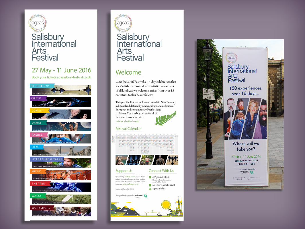
Other Festival signage I have designed includes several eight foot, three-sided towers, shown on the following page. Each tower includes a list of event genres, allowing the public to tell at a glance the sort of events taking place. The design offers just the right amount of information, with eye-catching imagery and an emphasis on variety.
C I R C U S
C O M E D Y
D A N C E
W O R K S H O P S
F A M I LY
F I L M
M U S I C
27 May - 11 June 2016Book your tickets at salisburyfestival.co.uk
E X H I B I T I O N S
Ockham’s Razor, City Hall, 30 May
Trygve Wakenshaw, Salisbury Playhouse, 3 June
L I T E R AT U R E & TA L K S
Kapa Haka Tale , Salisbury Playhouse, 7 June
Beards! Beards! Beards!, Godolphin School, 31 May & 1 June
Lord of the Rings Trilogy, Salisbury Arts Centre, 4 June
The Hot Sardines, Salisbury Playhouse, 6 June
W A L K S
T H E AT R E
Nga Tapuwae, Brockenhurst to Bulford, 27 May - 11 June
A Massed Haka Workshop, Cathedral Close, 4 June
Now Listen to Me Very Carefully, Salisbury Arts Centre, 10 & 11 June
Tristan Gooley, Salisbury Playhouse, 7 June
Call and Response, Wardrobe Museum Gardens, 27 May - 11 June
IN COLLABORATION WITH AGEAS SALISBURY INTERNATIONAL ARTS FESTIVAL
PRESENTED IN PARTNERSHIP WITH THE CHAPEL NIGHTCLUB AND SALISBURY PLAYHOUSE
Supported by Arts Council New Zealand Toi Aotearoa
“A WORK OF GENIUS. IT SHOULD BE OUR NEW NATIONAL FLAG” Metro “UTTERLY CHARMING...MUST-SEE” NZ Herald
”DARK, BEAUTIFUL AND COMPLEX” Pantograph Punch”EXQUISITE” Theatreview
Performed by Colleen Davis, Todd Emerson, Wesley Dowdell, Abraham Kunin, Stephanie Brown & Fen Ikner (LIPS)Photography & Film by Garth Badger. Original direction by Dena Kennedy
CROWDED HOUSE | BIC RUNGA | CHRIS KNOX | THE MINT CHICKS DAVE DOBBYN | THE EXPONENTS | DARCY CLAY | THE MUTTON BIRDSTH’DUDES | THE SENATORS | THE SWINGERS | BLAM BLAM BLAM | LIPSFEATURING SONGS BY
9-11 JUNE, 8PMTHE CHAPEL NIGHTCLUB34 MILFORD ST, SP1 2AP
AGES 13 PLUSFREE ENTRY TO CHAPEL ON DAY OF SHOW
Pull the cover off your favourite vinyl and travel through a landscape of live music and heart-aching theatre in this bittersweet love story about a teddy boy and a farm girl: their first meeting, their marriage
and the New Zealand pop-rock soundtrack that shapes their lives. THIS IS FAR MORE THAN BOY MEETS GIRL. THIS IS REAL LIFE ROMANCE – CHARTING CLASSIC KIWI HITS IN AN INDIE-ROCK CABARET.
Tickets via salisburyfestival.co.uk | 0845 241 9651 | 87 Crane St, SP1 2PU
(18+)
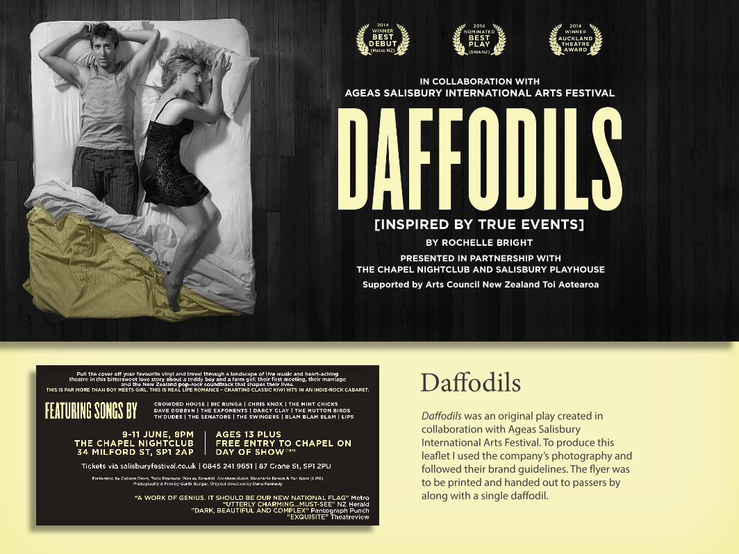
Daffodils was an original play created in collaboration with Ageas Salisbury International Arts Festival. To produce this leaflet I used the company’s photography and followed their brand guidelines. The flyer was to be printed and handed out to passers by along with a single daffodil.
Daffodils

In 2015 I lead on a campaign promoting the musical theatre piece Betrayal. The show drew inspiration from the music of Gesualdo di Venosa, a 16th-century composer who gained notoriety as a murderer. To promote the event I used Adobe Illustrator to design a 5ft stencil in the shape of a body. I then had it laser cut onto a large sheet of plastic and used chalk spray to transfer the stencil onto the pavement in locations across Salisbury. I also transformed an empty shop front on the High Street to look like a crime scene. The campaign proved highly effective, almost doubling ticket sales in the month before the event.
Betrayal

Thursday 15 - Sunday 18 September 2016www.salisburyfestival.co.uk
For five days in September, Salisbury International Arts Festival hosts the city’s annual Food & Drink Festival.
In 2016 I managed all marketing activity for the Food & Drink Festival. A key task was to write and redesign the event brochure, tieing it in with Arts Festival branding to encourage visitors to make the association between the two events. To achieve this I looked back at the Arts Festival banners and brochures I had designed earlier in the year and borrowed various design features, including fonts and diagonal image frames. On the back of the brochure I added the Arts Festival logo and further information about both events.
Salisbury Food & Drink Festival
i Click here to see the full publication

Thursday 15 - Sunday 18 September 2016
SALISBURY TASTE TRAIL
Kindly sponsored by
Discover Salisbury’s finest food and drink in a unique tasting experience...
Produced by Ageas Salisbury International Arts Festival
presents
Thursday 15 - Sunday 18 September 2016
TASTE TRAIL TOKEN
This year I helped to organise and promote the Salisbury Food & Drink Festival Taste Trail. Festival goers could work their way around the city’s finest cafes and restaurants at their own leisure, trading in Taste Trail tokens for sample dishes.
As well as designing the main brochure, I also created a taste trail leaflet containing a map and menu, which you can see to the left. To the right is the design for the Taste Trail tokens, and at the bottom of this page is a Facebook banner I designed to promote all aspects of the Food & Drink Festival.
Salisbury Taste Trail


A crucial member of a productive hive
Ingredients: innovation (52%), originality (36%), absurdity (12%)
Brewed by Browne Bitters Ltd3 Albion Road, Fordingbridge,
Hampshire, SP6 1EL2.5UK
units
Emily Browne 07909777784 [email protected]
Golden AleABV 5%500ml
e
Hop Back Brewery
This is a pitch design I worked on for Hop Back Brewery. I worked to Hop Back’s existing brand guidelines and included their signature yellow shield on the front. Another Hop Back trade mark is their use of Celtic scripts. For the Worker Bee logo I edited an existing Celtic font on Adobe Illustrator,
adding curls to the text to mimic the feelers of a honey bee. I also highlighted areas of the logo to help it stand out. Finally, I added my contact details to the back of the bottle so the company could get in touch should they like my design.

These illustrated book covers depict tales from Angela Carter’s Bloody Chamber anthology. I created the images using collage, ink and guache. Hand-made paper gives an interesting texture and a neutral, earthy background colour, contrasting nicely with the bright, bold guache.
The Bloody Chamber and Other Stories

Each of these book covers use symbolism to reflect the dark nature of Angela Carter’s book. For example, the illustration to the right depicts lillies, a symbol eployed in The Bloody Chamber to signify innocence and death. By including these flowers I have hinted at the eventual downfall of the lead character, the Marquis.
i Click here to see more of my illustration

Sparkling drinks receptionCarriages
6.30pm1.00am
Pearl BallSaturday 4 March
2017
The
CROWNE PLAZA GERRARDS CROSS OXFORD ROAD, BEACONSFIELD, HP9 2XE
PRESENTS
In celebration of our 30th Anniversary
raising money for life saving equipment
for Amersham, Stoke Mandeville,
Wycombe and Community Hospitals
TICKETS £100 IN ADVANCE FROM
SCANNAPPEAL.ORG.UK/EVENTS
01494 734 161
Scannappeal @Scannappeal
SCANNAPPEAL REGISTERED CHARITY NO. 296291
DRESS CODE: BLACK TIE (with a touch of pearl)
SPARKLING DRINKS RECEPTION 3 COURSE MEAL WITH WINE LIVE BAND CASINO AUCTIONS DANCING BAR
Recently I designed a set of social media banners, digital adverts and two posters for the charity Scannappeal in under two days. I was told the flyers had to look ‘elegant and classy’ and somehow incorporate pearls into the design. The client was extremely happy with the result, stating that I had stuck to the design brief, was easy to communicate with and was able to produce quality design work in a short amount of time.
Scannappeal

The word ‘quietude’ is defined as ‘a state of stillness, calm and quiet in a person or place’. This guided meditation app uses lanscape images and calming sounds to help ‘quiet the mind and soothe the soul’.
App Design:Quietude
The Quietude logo depicts a common meditation pose where the hands are placed together in a relaxed prayer position. The fonts and graphics are simple and minimalistic so as not to distract the user.

Logo design
TIM C BROWNEP H O T O G R A P H Y
Wildfire Galleries is an open studio/gallery initiative designed to foster creativity and promote new talent. For this logo I wanted to incorporate hand lettering to reflect the traditional artistic disciplines championed by the organisation, while retaining the style simplicity associated with a gallery space.
My brief for the logo to the right was to create something ‘tasteful and subtle’. The client liked the idea of incorporating the camera lens into the design.