presentation1
TRANSCRIPT

OF MY MUSIC MAGAZINE


I have learned that Photoshop is a useful program but that it is important to spend time on anything you do to get the most professional results.
My understanding of Photoshop and composition have developed significantly, ensuring I am now able to use this program confidently and to much greater effect.
Collage Mag
Music Mag
From the previous images it is clear to see that I can now use Photoshop in a far more effective way. In comparison with my preliminary task, I have show that I can create a far more professional product.
In the next slide I will compare both closely.
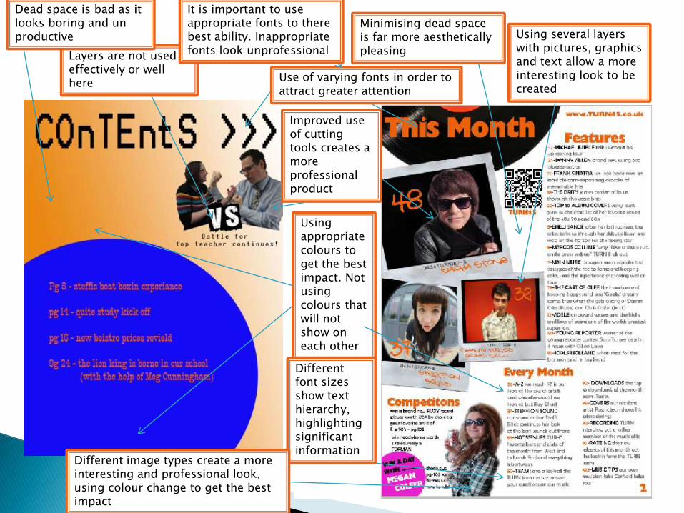
Use of varying fonts in order to attract greater attention
Improved use of cutting tools creates a more professional product
Layers are not used effectively or well here
Using several layers with pictures, graphics and text allow a more interesting look to be created
Using appropriate colours to get the best impact. Not using colours that will not show on each other
Dead space is bad as it looks boring and un productive
Minimising dead space is far more aesthetically pleasing
It is important to use appropriate fonts to there best ability. Inappropriate fonts look unprofessional
Different font sizes show text hierarchy, highlighting significant information
Different image types create a more interesting and professional look, using colour change to get the best impact

Q: How did you attract your audience?

I created a diagram to show my type of audience.
-Late twenties to early fifties males

Having established my audience I decided the best way to attract my chosen audience was to create a classy and clean cut magazine that had a stylish retro theme to it.
This is why I chose to use a black and white photo as I felt it had the classiest look as well as having the Polaroid look of the 1950’s 60’s and 70’s
I also used the vinyl record to link to the period

The original image
Black and white will attract my audience because it has a classier feel
I did this using Photoshop, I firstly cut out the background with the lasso tool, then moved it onto a fresh page. I feathered the edges and made alterations with the cutter to give the smoothest lines.I added a black and white filter before changing the colour balance until I was happy
Black and white also comes from my style model of the Emeli Sande cover as this is also in black and white.

I continued this look throughout my magazine to create the stylish image I wanted.
I drew inspiration from Michael Buble and Emeli Sande
This is how I decidedon my colour themeas the grey mixed with aflash of colour works.This will hopefully workTo attract the audience IWant.

Q: Who would be the audience for
your media product?

As I established my audience would be stylish young adults with an interest in jazz/swing/blues/soul music, my magazine is therefore cantered round these people.
For this reason I gave my magazine a mix of modern and retro that surrounds this type of music.
I described this in my audience profile diagram on an earlier slide.

Q: What kind of media institution might distribute
your media product and why?


Q: How does your media product represent
particular social groups?

My magazine represents my chosen audience in a positive and stylish way. Through the articles and language, there is nothing offensive in my magazine.
The price is high but competitive with others of this target audience. The prices of magazines directed at my audience are higher, this shows that they have enough disposable income.
The content is clearly directed at my target audience, with the content and type of images and texts used all reflect the status of my audience.
These things suggest an upper class stylish audience. Which is the audience I am aimed at.

It was important to create a positive image for my magazine and that the magazine represents the type of person who reads it and is represented by it because people will not buy a magazine that shows them in a negative light.
This links into the audience profile I was targeting.

Q: In what ways does your media
product challenge forms and
conventions of real magazine products?

My magazine fits to many of the conventions of a magazine that I noted during my research.
There are clear connections between my magazine and my style model.

However it does challenge the conventions of music magazines.
It challenges with the colour choice as not all magazines use black and white and the style of the cover lines is particular to certain magazines and is not a convention sheared by all
While my magazine does use influence from magazines like MOJO, MOJO itself breaks several conventions of a music magazine. The way of using particular colours to stand out is typical however using all the same type of cover lines is not. I chose to use these as my magazine is a special about ‘SACHA STONE’ and it is therefore based most around this, pulling the focus to this content.

It was important that I made my magazine individual and did not simply copy others. I took influence such as the type of image and the puff from others but intended to create a magazine that is clearly separate from others and has its own style.
Therefore in particular situations I chose to break these conventions in order to create a recognisable style and look that would make my magazine stand out from others in its field.

For example I used a plain background so that my image would stand out more.The same text size and font is used throughout, as I wanted to draw attention to the main article as well as listing a lot of content (this also links to my MOJO magazine).

Q: Looking back at your preliminary task, what have you learnt
in terms of progression from that
to the full product?


There is a clear improvement from my collage magazine to my music magazine
My final product is far more professional, this comes from a combination of a better understanding of the conventions of music magazines and a better knowledge and ability of Photoshop as a tool.
The use of cover lines specifically shows an improvement and allows my music magazine to look far more accomplished.

Overall I feel that I was successful in creating a professional looking product that will apply to the audience I chose to target, through its content and style. I made every choice with my target in mind, everything is directed at my audience.
I also feel I have learnt a lot about the media I used to create it. Photo shop, the cameras and text programs. My greater understanding is clearly shown in my final product.