pretty much black & white - the alberta society of artists
TRANSCRIPT

Larry Corsiatto; Penumbra; 1991; silver gelatin on paper
Collection of the Alberta Foundation for the Arts

PRETTY MUCH BLACK & WHITE
Interpretive / Educational Guide PRETTY MUCH BLACK & WHITE
Contents
Section 1 - Introduction About the Interpretive Guide 3 About the Alberta Foundation for the Arts 4 About the ASA and Partners Developing this Exhibition 4
Section 2 - Art Curator Comments 5, 6 About the Artists - Biographies & Statements 7 - 14 A Listing of Artworks 14
Section 3 - Educator’s Guide Introduction to the Educator‟s Guide 15 Visual Literacy 15 Visual Thinking Strategies 16, 17 Interactions 17 - 19 Activities 1. Detective Work 19, 20 2. Processing Printmaking: Linocut 20, 21 3. Processing Printmaking: Intaglio 21 4. From Positive to Negative: The Shapes In Between 21, 22 5. Processing Printmaking: Silkscreen 22, 23 6. Processing Printmaking: Collograph 23, 24 7. Value Contrast: Exploring Shades of Gray in Black & White 24, 25 Photographs 8. Texture Contrast: Analytical Cubism (Papier Colle and Paint) 25, 26 9. Nature Journaling: Tree Buddy 26, 27 10. Ant Farm! 27, 28 Gallery Games 28, 29 Glossary 29 - 33 Sources 34 Acknowledgements 34
Back Inserts Shipping Labels, Lading Bill, Reporting Forms
Press Release & Photo Reproduction Visual Inventory, Extra Title Cards (sheet)
We welcome comments or suggestions on all material presented here. If you would like more information on the Alberta Foundation for the Arts Travelling Exhibition Program please contact Program Manager / Curator, TREX Southwest
ALBERTA SOCIETY OF ARTISTS Crossroads Market, Suite 305, 1235 26 Avenue SE, Calgary AB T2G 1R7 Tel: 403.262.4669, Fax: 403.263.4610, Email: [email protected]
2

The Alberta Foundation for the Arts Travelling Exhibition Program (TREX) intends to bring you closer to Alberta's artists and collections. Since 1981, the Alberta Foundation for the Arts (AFA) has financially supported a provincial travelling exhibition program with the vision that all Albertans have an opportunity to experience visual art in their community. This Interpretive Guide has been specifically designed to complement the exhibition you are now hosting. It is one of several exhibitions distributed by the Alberta Society of Artists as part of the Alberta Foundation for the Arts Travelling Exhibition Program (Southwest Region). The suggested topics for discussion and accompanying activities can enhance the viewer's enjoyment and assist teachers in developing strategies to complement the exhibition. Questions have been included at both an elementary and advanced level for younger and older visitors.
The Interpretive Guide consists of three main sections:
Information about the Alberta Foundation for the Arts and the parties organizing this exhibition; a statement from the Curator and/or related commentary on the exhibit.
A listing of artworks with information about the participating artists.
Educational component for teachers written to coincide with the Alberta art curriculum. Please note there is a hard cover interpretive guide for public display that travels with the exhibition. Teachers or venue representatives will receive a soft cover interpretive guide prior to delivery of the exhibition. It is the venue’s option to either keep or return this soft cover guide after the display period. It is understood that reproduction of this material is for educational purposes only.
A Few Reminders for Venue Representatives As part of the soft cover interpretive guide, your venue should receive a press release, a photo reproduction for distribution to media outlets and shipping labels / lading bill to transport the exhibition to the next destination. At the conclusion of the exhibition, we request that you take a few moments to fill out the reporting forms. Please fax to the Alberta Society of Artists at 403.263.4610:
Artwork Condition Report: Arrival/Departure
Attendance and Visitor Feedback Form
An Evaluation Form will be faxed to you for completion at the end of the exhibition
PRETTY MUCH BLACK & WHITE
Interpretive / Educational Guide
We welcome comments or suggestions on all material presented here. If you would like more information on the Alberta Foundation for the Arts Travelling Exhibition Program please contact Program Manager / Curator, TREX Southwest
3

CURATOR COMMENTS
4
ALBERTA SOCIETY OF ARTISTS (ASA) www.artists-society.ab.ca
The Alberta Society of Artists was established in 1931 as an organization of professional artists. The ASA, operating as a registered charity, continues to promote the visual arts in Alberta through access and support to professional artists and their work. The Society also educates the public on the importance of the arts in their community by developing exhibitions that focus on aspects of Alberta’s cultural development. The ASA has a long history of producing and promoting local, regional and inter-provincial travelling exhibitions. The Society is currently contracted by the Alberta Foundation for the Arts to develop and circulate art exhibitions to venues throughout southern Alberta. The art works are intended for display in schools, libraries, museums and other public facilities. The southwest region of the AFA Travelling Exhibition Program is managed through the Calgary office of the ASA located on the third floor of the Crossroads Market.
The ASA undertakes a variety of educational initiatives such as awarding scholarships to Alberta high school students.
ALBERTA FOUNDATION FOR THE ARTS (AFA) www.affta.ab.ca The Alberta Foundation for the Arts (AFA) was established under the Alberta Foundation for the Arts Act, September 1/1991. The purposes of the Foundation are:
to support, promote and contribute to the development of literary, performing, visual and media arts in Alberta
to provide people and organizations with the opportunity to participate in the arts in Alberta
to foster and promote the appreciation of artworks by Alberta artists
to collect, preserve and display artworks by Alberta artists
to encourage Alberta artists in their work
The mandate of the AFA Travelling Exhibition Program (TREX) is to provide all Albertans with the opportunity to enjoy visual art exhibitions in their community. The TREX Program also strives to make the AFA’s extensive art collection available to Albertans. The growing art collection consists of over 8,000 art works showcasing the creative talents of more than 1,700 artists. As a major provincial art collection in Alberta, the AFA collection reflects the development of the vibrant visual arts community in the province and has become an important cultural legacy for Albertans.
Derek Besant; Jason / Tropic
vinyl ink digital image on paper
Collection of the Alberta Foundation for the Arts

For many young people today the thought of being immersed in a world of predominately black and white images is unfathomable. Our environment is saturated with color presented in many formats that can be delivered at a rapid pace. However, color technology struggled to be recognized from 1900 to 1950 – a golden age for black and white. For financial and aesthetic reasons this monochromatic system was accepted as the standard in print, photography and television until the late 1960s. Pretty Much Black & White presents historical and contemporary artists who use a black to white approach by choice to convey content and form. The photographs and prints from the collection of the Alberta Foundation for the Arts demonstrate that infinite gradations of gray can be viewed as nostalgic or timeless in character. People, places and common objects are boldly defined by theatrical light and incomparable visual texture. Color is not absent; rather it is muted, simplified and open to interpretation. The featured artists are Maxwell Bates, Dale Beaven, Larry Corsiatto, April Dean, Steven Dixon, Karen Dugas, Joel Feldman, Jeremy Mayne, Garry Newton, Stanford Perrott, David Reece, Clifford Robinson, Dana Shukster, John Snow and Richard Yates. Children at an early age are encouraged to use many colors to express perceptions of their environment. They may acquire a passion for visual art if sufficiently encouraged and later pursue courses in high school or possibly post-secondary training. In making pictures it is useful for a developing artist to learn how to record tonal relationships using a gray scale. In this way he or she may become adept at translating their perceptual field into value or tone, mimicking the degree of light emitted from objects and atmosphere. Many teachers encourage first year art students to use charcoal, graphite, lithographic grease sticks, soluble black (ink) and achromatic photography to assist in this process. Adhering to a gray scale may promote greater focus on rendering volume, texture and mystery without the added complexity or distraction of color. In his photograph Penumbra, Larry Corsiatto references a phenomenon of intense light and shadow caused by occluding bodies which in this case are glass marbles and metal springs. In astronomy, penumbra is associated with a solar eclipse which leaves the earth in degrees of dense shadow. The Latin derived term is also used to connote „gray areas‟ in the law which require further definition or illumination. Steven Dixon exploits directional light to focus on the remnants of dilapidated industrial sites. The exterior wall in Mine Site #17 has been significantly eroded by nature and human activity. The coiled water hose could represent our natural desire to create order out of chaos, but also calmly suggests that human ingenuity can only delay the inevitable decay of all earthly things. Karen Dugas also offers a subject with dramatic lighting from a mysterious external source. The cluttered cave like interior is dominated by a centrally positioned geyser or explosion as referenced in the title. In the background are dark notations on the wall that are semi-descriptive or evolving. The overall image appears cathartic, perhaps the artist‟s way of responding to turbulence in life or subliminal thoughts arising from the recesses of the brain. Pretty Much Black and White includes four prominent interdisciplinary artists whose careers converged during the 1950s. Maxwell Bates, Clifford Robinson, John Snow and Stanford Perrott were part of a generation of artists that introduced and cultivated modernist concepts in Alberta art. They travelled extensively and absorbed cultural influences that were to become part of their artistic mindset. For example Stanford Perrott’s portrayal of the Bowery, a district of New York named after an old road that connected farmland to the early settlements of lower Manhattan Island, shows the artist‟s eagerness to assimilate Cubist ideas. In visual art the concept of simultaneity or folding time can be traced back to the early twentieth century with the evolution of Cubism. Georges Braque and Pablo Picasso, within individual works of art, portrayed layers of sensory experience and shifting points of view related to objects in space over time. They consciously departed from a tradition of static pictorial perspective to achieve verisimilitude by suggesting there is more to reality than meets the eye.
Many artists today continue to explore simultaneity and folding time. In Equilbre [sic], Jeremy Mayne presents a mixture of scenes and motifs that are not easy to decipher. The artist includes hand written text which is backwards and legible only when held up to a mirror. This manner of camouflage is reminiscent of codices by Leonardo da Vinci. Renaissance artists and writers were often searching for balance between progress and tradition (intellectual honesty and superstition) because the dissemination of secular knowledge was sometimes dangerous, particularly if new ideas challenged church dogma or the status-quo within society. Even to suggest that the earth was round rather than flat caused controversy and resulted in persecution. Equilbre pays homage to scribes and illustrators who for centuries passionately preserved and spread valuable information across continents.
CURATOR COMMENTS
5

There is a rich tradition of representing the western Canadian landscape that dates back to the later part of the nineteenth century. The earliest artwork of this genre in Pretty Much Black & White was produced by Clifford Robinson. Alberta Scene portrays an agrarian lifestyle in 1942. The terrain leading to the Rocky Mountains appears accommodating, fertile and endless in its potential. The sepia tinted paper adds to a romantic view of humanity in harmony with nature. In contrast David Reece’s photographic portrait of the Badlands shows us a place less inviting to human habitation. The moonlit scene reveals an area mysteriously sculpted by endless movement of wind and water. Dinosaur Provincial Park is a world heritage site due to its remarkable topography and wealth of dinosaur deposits. Garry Newton takes us to another part of the world and demonstrates his keen interest in the diverse plant life of the Americas. In La Selva the artist has chosen to silhouette a spot of vegetation in the Ecuadorian (Amazon) jungle. For maximum contrast he uses black with minor detail and modulation of tone on a light background. Technically a silhouette has a featureless interior. The practice of silhouetting probably originated in prehistoric times with handprints and tracing shadows, but became popular in France during the eighteenth century via paper cutouts. Joel Feldman is an American artist who provides a humorous caricature of a thunderstorm being born. A robot equipped with feathered wings squeezes a cloud to bring forth moisture and lightning; like a protean god from ancient Greece whose technology provides a method for altering the course of nature. The artist offers further irony by crowning the robot with a shining halo. A recurring theme in Feldman‟s graphic works suggests that we have developed an unhealthy dependency on science and industry to engineer solutions to our problems. This is a relevant observation given our current „management‟ of climatic change, degrading environments and loss of biodiversity. (A reconnection with nature to find a better path to self sustaining and „gracious‟ technological innovation is championed by writer and lecturer Janine Benyus. Her research into biomimicry provides valuable information some of which is addressed further on in the interpretive guide.) In The Return by April Dean we are reminded of wondrous things that can be found in nature. A strange structure devoid of context hovers like an alien spacecraft. In reality it is unique architecture made by a colony of wasps. The artist states, “I worry a great deal about this very strange disconnect from the natural which many of us feel and how this distance affects our understanding of what it is to be human.”1 Dana Shukster and Dale Beaven take varied approaches in commenting on the human condition. These Faces That I Give To The World by Dana Shukster is a self portrait with eyes open and alert to the external world. At another glance the eyes may appear closed and withdrawn to an internal dimension. Every day we practice the art of estimating character by reading changes in facial expression caused by emotion and intellectual reflex. Below the surface resides a network of nerves that might resemble the entangled abstract notations in the etching by Dale Beaven. The title of her two part artwork is a famous line from Marmion by Scottish poet Sir Walter Scott. “Oh, what a tangled web we weave, When first we practice to deceive!” encapsulates the plot of Lord Marmion to undermine a relationship between lovers for his own benefit. To some degree most of us will at some point in life put on a mask to deceive or conceal desires of the heart and mind. Maxwell Bates and John Snow were pivotal figures in the development of printmaking in Alberta. They met shortly after World War II when Snow attended life drawings sessions conducted by Bates. Their friendship would result in a creative partnership that lasted for many years. The older Bates was an accomplished painter and architect who influenced Snow‟s early development as an artist. Their mutual interest in printmaking grew after experiments with rudimentary cutting tools on plywood salvaged from apple box cartons.2 In 1953, Snow purchased and refurbished two lithographic presses that would be instrumental in their ability to teach and assist others with the process. The prints by Snow and Bates in Pretty Much Black & White, produced during the 1950s, remain fresh and inspiring. Richard Yates would have been well aware of his predecessors while working in Alberta. Bow Wave Dream 2 is an example of the artist‟s fascination with boats and migratory journeys. His abstracted image is characterized by decisive bold lines, sharp contrast and densely inked shapes on virgin paper. Yates demonstrates that contemporary artists are continuing to use the monochromatic system of black & white with powerful and moving results. Curator Comments by Les Pinter 1 www.aprildeanart.com 2 Friends and Mentors; Curator comments by Richard White; Muttart Public Art Gallery; 1990
CURATOR COMMENTS
ABOUT THE ARTISTS
Biographies & Statements
6
CURATOR COMMENTS
ABOUT THE ARTISTS
Biographies & Statements
7
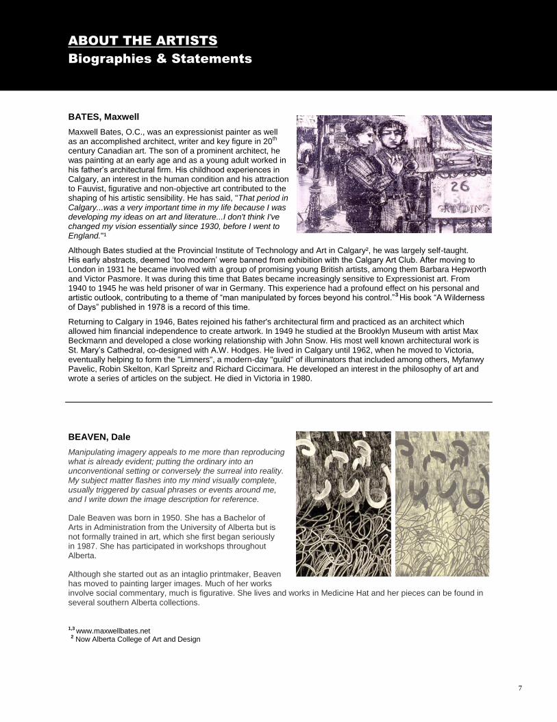
BATES, Maxwell
Maxwell Bates, O.C., was an expressionist painter as well as an accomplished architect, writer and key figure in 20th century Canadian art. The son of a prominent architect, he was painting at an early age and as a young adult worked in his father‟s architectural firm. His childhood experiences in Calgary, an interest in the human condition and his attraction to Fauvist, figurative and non-objective art contributed to the shaping of his artistic sensibility. He has said, "That period in Calgary...was a very important time in my life because I was developing my ideas on art and literature...I don't think I've changed my vision essentially since 1930, before I went to England."¹
Although Bates studied at the Provincial Institute of Technology and Art in Calgary², he was largely self-taught. His early abstracts, deemed „too modern‟ were banned from exhibition with the Calgary Art Club. After moving to London in 1931 he became involved with a group of promising young British artists, among them Barbara Hepworth and Victor Pasmore. It was during this time that Bates became increasingly sensitive to Expressionist art. From 1940 to 1945 he was held prisoner of war in Germany. This experience had a profound effect on his personal and artistic outlook, contributing to a theme of “man manipulated by forces beyond his control.”3 His book “A Wilderness of Days” published in 1978 is a record of this time.
Returning to Calgary in 1946, Bates rejoined his father's architectural firm and practiced as an architect which allowed him financial independence to create artwork. In 1949 he studied at the Brooklyn Museum with artist Max Beckmann and developed a close working relationship with John Snow. His most well known architectural work is St. Mary‟s Cathedral, co-designed with A.W. Hodges. He lived in Calgary until 1962, when he moved to Victoria, eventually helping to form the "Limners", a modern-day "guild" of illuminators that included among others, Myfanwy Pavelic, Robin Skelton, Karl Spreitz and Richard Ciccimara. He developed an interest in the philosophy of art and wrote a series of articles on the subject. He died in Victoria in 1980.
BEAVEN, Dale
Manipulating imagery appeals to me more than reproducing what is already evident; putting the ordinary into an unconventional setting or conversely the surreal into reality. My subject matter flashes into my mind visually complete, usually triggered by casual phrases or events around me, and I write down the image description for reference.
Dale Beaven was born in 1950. She has a Bachelor of Arts in Administration from the University of Alberta but is not formally trained in art, which she first began seriously in 1987. She has participated in workshops throughout Alberta.
Although she started out as an intaglio printmaker, Beaven has moved to painting larger images. Much of her works involve social commentary, much is figurative. She lives and works in Medicine Hat and her pieces can be found in several southern Alberta collections.
1,3 www.maxwellbates.net 2 Now Alberta College of Art and Design

DEAN, April
About her “Raw Materials” suite Dean says “Often formally concerned with aspects of minimalism, my works develop conceptually around themes of containment, isolation, intimacy and temporality. The objects I represent, often photographically, are transformed by the processes of printmaking, allowing these representations to read as both familiar and bodily as well as with aspects of estrangement and alienation. I have an overwhelming urge to clear out some white space, to bury urgency and contend with stillness. I worry a great deal about this very strange disconnect from the natural which many of us feel and how this distance affects our understanding of what it is to be human. I have an attraction to objects which seem worn and weathered by love. Objects whose fragile nature and delicacy force me to consider my own physical construction.”¹ April Dean is an inter-media and print artist currently living in Halifax, Nova Scotia where she is an MFA Graduate Student at NSCAD University. She maintains a diverse studio practice including drawing, video work and all things print related. She received her BA with distinction from the University of Alberta in 2008 and a diploma in photographic technology from the Northern Alberta Institute of Technology in Edmonton in 2002.
¹ www.aprildeanart.com
ABOUT THE ARTISTS
Biographies & Statements
ABOUT THE ARTISTS
Biographies & Statements
8
CORSIATTO, Larry Born in Olds, Alberta, in 1960, Larry Corsiatto currently lives in Red Deer. He received a Diploma with Honors in Photographic Technology from NAIT in 1991, as well as the Louise McKinney post secondary scholarship in recognition of academic achievement in photo technology. In 1998 he attended the Red Deer College „Series Workshop‟ on black and white photography and another „Series Workshop‟ focusing on monotype printmaking in 1993. During the late 80s and early 90s he exhibited his work in various Red Deer galleries. In 2002 , through the cultural services department of Red Deer, he established the Public Darkroom to provide work space, technical assistance and instruction for those pursuing photography. He taught there for eight years.

ABOUT THE ARTISTS
Biographies & Statements
DUGAS, Karen
Karen Dugas was born in Cornwall, Ontario and now lives in Tofield, Alberta. She graduated from Queen‟s University in Kingston, Ontario, with a BFA in 1979, and received an MVA from the University of Alberta in 1982. Aspects of the human figure, gender, the transient nature of human life, ecology, cultural anthropology, and socio-political issues all wrapped in a poetic and philosophical metaphor, are recurring topics in her photo-based print works. Her work can be described by a metaphoric character and a principle of breaking away from the traditional dimension of medium and artistic conventions.¹ Working with photographs of industrial environments, posed models and constructed maquettes, Dugas selects, enlarges and transposes photographs onto intaglio plates. She draws on the plate, manually manipulating components and highlighting or suppressing lines, forms and tonal gradations, changing the photographic image to conform to her artistic vision. The resulting digital prints carve out a photographically rooted world…acknowledged as allegorical, with its metaphor acted out by a protagonist and totemic items like spheres, ribbons, batons and tree limbs.² Her prints have been exhibited nationally and internationally and are collected across the United States, Canada and Europe. ¹ www.trianglegallery.com ² Printmaking in Alberta, Bente Roed Cochran
DIXON, Steven
Steven Dixon was born in Woodstock, New Brunswick in 1960. In 1983 he graduated from Mount Allison University with a Bachelor of Fine Arts degree. That same year he was the recipient of a Greenshield Foundation grant, an award given to young artists to assist in establishing their careers. He received his masters degree in printmaking from Arizona State University in 1995. He has exhibited his paintings and prints throughout Canada and internationally including in such countries as Bulgaria, India, Norway, Korea, Poland and China. Dixon's work is represented in numerous collections including the New Brunswick Art Bank, Owens Art Gallery, the Alberta Art Foundation, Aliant, the University of Alberta and the Museum of Contemporary Graphic Art, Frederickstad, Norway. He was also the recipient of the Ernst & Young's "Great Canadian Printmaking Competition". Steven Dixon is based in Edmonton and works as a technician in the Printmaking Department at the University of Alberta. He specializes in intaglio and relief printing techniques and photographic processes. Although he has experimented with a wide variety of alternative photographic processes, for the past decade he has worked almost exclusively with photogravure. He is known for his digital photographs of the orphaned factories, mines and mills dotted around Alberta's landscape.
ABOUT THE ARTISTS
Biographies & Statements
9

FELDMAN, Joel
Joel Feldman received a BFA in drawing and painting from Carnegie- Mellon University in 1965 and an MFA in printmaking in 1967 from the University of Indiana in Bloomington, Illinois. He currently lives in Lexington, Kentucky. He is Professor Emeritus of printmaking in the School of Art and Design of Southern Illinois University. He joined the faculty in 1973 and retired as a full professor in 2004. Feldman concerns himself with social commentary, and credits his maternal grandparents as a primary influence behind his adopting a role of social critic. His work, which is often satirical, documents the catastrophic social and political transformations affecting Eastern European nations. Woodcut is a medium often used to portray subjects of power, power conflicts and the fragility of political and other human systems. The battle of civilization versus nature is present in his work as a reflection of recent history. The birth, growth and decay of societies and the reality that mortality defines the human condition are themes writ large with his use of scale and iconography. He more recently has used the polaroid camera as a tool for expression, manipulating photographs to create fraught montages, which continue to deal with the human condition. Feldman is recognized nationally for his work which is represented in several prestigious collections in the United States. He has held fellowships from the Illinois Arts Council and the National Endowment for the Arts, and done numerous residencies and over 75 visiting artist lectures and workshops. In fall of 2009 he completed a residency with Three Shadows Photography Center in Beijing, China.
ABOUT THE ARTISTS
Biographies & Statements
MAYNE, Jeremy
In 1991 Jeremy Mayne received a BFA with distinction from the University of Calgary and his MFA in printmaking in 1993, during which time he also took part in an exchange program at the Royal College of Art in London, England. He is the recipient of grants and awards and his work is in many important collections. He is active in creating workshops for students using artistic context and local materials to explore creative means to problem solving, saying:
“…importantly, the open and questioning mind, necessary to create new ways of seeing the world, is a fundamental strength of the artistic approach and one that has led to many great discoveries in science and math”.
In print making Mayne relies to some extent on hand drawn mark-making. Instead of making a plate that is reproducible, the artist uses multiple printmaking techniques to create visually beautiful objects. These works are not created for the purpose of mass communication or to illustrate the process of printmaking, but are intended as objects to be held as icons. His work is characterized by technical virtuosity. His nuance of tone and line suggest an infinity of space and time.¹ ¹ Deborah Herringer, Out of Print; 2000,Triangle Gallery of Visual Arts
ABOUT THE ARTISTS
Biographies & Statements
10

ABOUT THE ARTISTS
Biographies & Statements
NEWTON, Garry
Medicine Hat artist Garry Newton‟s art practice spanned over forty years and involved production of works in media ranging from prints and marquetry (veneers inlaid in wood to create images), to drawings, sculptures and assemblages.
Born in York, England, Newton moved with his family to Medicine Hat in 1948. He studied zoology at the University of Melbourne, Australia, and received his Bachelor of Science from the University of Alberta. He travelled extensively as a young man, living abroad for extended periods before returning to Medicine Hat and pursuing a fulltime practice as an artist. Although participating in several print-making courses at Medicine Hat College, he was largely self-trained.
His scientific interests and observation skills underpinned a life-long passion for nature. This passion was first displayed in his early flower paintings, and later fuelled the development of suites of etchings exploring the beauty in both spirit and form, of various members of the plant family pancratioid amaryllids from the South American Andes. In 1991, Newton visited a number of wildlife refuges and national parks in Costa Rica, which led to the production of a significant number of stunning etchings on the birds, forests and flowers of the area. Newton‟s next nature-based project was the full illustration of the book Prairie River, containing images of the landscape, flora and fauna of the South Saskatchewan River. Other Newton works are rooted in surrealism and the exploration of an inner psychological world. As of the mid 1990s, Garry Newton turned to the practice of marquetry. In this medium he continued to develop his imagery and distinctive thematic concerns, while achieving a technical mastery characterized by both delicacy and strength. Newton died unexpectedly in May 2008. In 2009 the Esplanade Arts & Heritage Centre mounted a major retrospective of his work.¹
ABOUT THE ARTISTS
Biographies & Statements
PERROTT, Stanford
A prolific watercolorist and dedicated art educator, Stan Perrott has been regarded by art historians and critics as one of the most important figures in the development of art in Alberta during the post World War II period. Born in 1917 near Stavely, south of Calgary, Perrott graduated from the Provincial Institute of Technology & Art ² in 1939, and returned to teach at this school in 1946. In the mid 1950s, Perrott studied with famous Abstract Expressionist painter Hans Hofmann in Provincetown, Massachusetts and in New York with Will Barnet at Atelier 17 and the Art Students League. As head of the Alberta College of Art from 1967 to 1974, which were years of growth and development, he provided critical continuity and vision. In all, Perrott, who was a gifted educator, spent nearly forty years guiding a generation of Alberta artists. Under his unconventional tutelage, young artists learned to challenge the boundaries of regionalism and traditionalism and to embrace new artistic visions and expressions, whereas prior to his emergence on the scene, the prime influence on Alberta artists was European artists. His time was so occupied with teaching he often had no time himself to paint, but he believed strongly in the importance of teaching and did not resent the sacrifice. In any case, he did produce a significant body of work and his paintings have been exhibited around the world. In 1988, Stanford Perrott was awarded the Sir Frederick Haultain Prize for his outstanding contributions to art and education in Alberta. He is also the recipient of the Alberta College of Art Board of Governors' Award of Excellence, The Province of Alberta's Achievement Award and, in 1991, an Honorary Doctor of Laws from the University of Calgary. The Stan Perrott lecture theatre at ACAD is named in his honor. He died in 2001 at the age of 84. ¹ Courtesy Joanne Marion comments; Bon á tirer: Garry Newton retrospective, Esplanade Arts & Heritage Centre ² Now the Alberta College of Art and Design
11

REECE, David Since his days as a tour bus driver in the Rockies three decades ago, David James Reece has been photographing the Alberta and British Columbia landscape with both passion and precision. Through several later careers (founder of two specialized photography labs in Edmonton, and founder and president of a computer company in Calgary) he has evolved his singular perspective, or workflow, incorporating decades-old large format photographic techniques with state-of-the-art digital technology. His first large format digital prints were produced in 1993 and since then he has been continuously immersed in this emerging visual technology. Now working out of Bragg Creek, Alberta, he is currently writing a book on fine art printmaking using Photoshop and the new Epson archival pigment printers. “While these images begin their existence in a 40 year old wooden 8x10 Deardorff field camera, they are ultimately digitized in state-of-the-art computer equipment, and manipulated by me in more ways than it would be possible to imagine in the “wet” darkroom era. They are not photographs, per se, but rather visual projects built according to my plans for work in the field, with allowances for later serendipity at the workstation. The results reflect my intention more exactly, and in greater detail, than has heretofore been possible using traditional darkroom manipulations.”
ROBINSON, Clifford
Clifford Robinson was born in Bassano in 1917. He was a prolific artist intrinsically tied to the creative development of the Calgary and Alberta art scene. He was part of the early group of print artists in the 1930s and 1940s who initiated print activity in Calgary and a major proponent of modernism in Alberta print art. While he operated out of and retired in Calgary, he lived as well in B.C. and Europe for periods of time. He was a student at the Provincial Institute of Technology and Art in Calgary and the Banff School of Fine Arts. During the war he enlisted in the army and was posted to Vancouver to teach in the camouflage school at UBC. After the war he worked as the first television design director for CBC west of Toronto. In the 1950s he taught at the Vancouver School of Art and the Banff School of Fine Arts and worked as lecturer and arts and crafts director at UBC. A well known stage set designer, he taught summer sessions in stage design in the theatre program in Banff. His interest in printmaking had been spurred in the 1940s by Walter J. Philips, who helped with the mechanical aspects of creating prints, blocking and butting. One of the few early Alberta printmakers who used people as focal subject matter, possibly influenced by Maxwell Bates and Pablo Picasso, his is a brand of figurative art that exudes emotional content, a certain amount of suffering and in the case of his Doukhobor images, social statement. Alberta Scene is his largest and possibly best known print. He considered that his works “reflect a mood of the moment, but also a general interest in people and our environment. They are reflections of things as I have experienced them, sometimes very formalized, not conventional. I am not highly religious but I am interested in the Christian philosophy that came from my visits to Greece and that part of the world. My work is fairly esoteric. I have never arrived at a highly conventional style.”¹ Robinson died in Calgary in 1992.
¹ Printmaking in Alberta 1945 - 1985, Bente Roed Cochran
ABOUT THE ARTISTS
Biographies & Statements
ABOUT THE ARTISTS
Biographies & Statements
12

ABOUT THE ARTISTS
Biographies & Statements
SHUKSTER, Dana
Dana Shukster is a printmaker based in Medicine Hat Alberta. She completed her MFA in 2008 at Donau-Universität Krems in Austria. She is past chairman for the Medicine Hat Cultural Alliance and active participant in the Medicine Hat art community. Shukster‟s work has been exhibited across Canada and in the United States and Europe. It is supported by grants and awards from the Canada Council for the Arts and the Alberta Foundation for the Arts and is held in numerous public and private collections in Alberta and British Columbia. Currently, she is involved with exploring the fugitive aspects of light and its effect on how reality and illusion are perceived. She comments in her artist statement, “the shadow photographs are an attempt to visually represent traces of shifting states of being or altering states of reality.” She has taken her work to an unusual venue in a satellite project wherein an image is displayed on an outdoor billboard. “Dana Shukster’s process is almost scientific in its rationality, and yet the results are certainly poetic and even eerie. Her work gives us pause to wonder at the arbitrary nature of our perception of our fleeting world,” says Joanne Marion, curator of art for the Esplanade Arts & Heritage Centre, “so it is perfect for a temporary and transitory site like a billboard, which people pass daily.”
ABOUT THE ARTISTS
Biographies & Statements
SNOW, John
Dr. John Harold Thomas Snow was born in Vancouver in 1911. After a time in England, his family returned to the Olds / Innisfail area in 1919. The early days of what would become a distinguished forty-three year career with the Royal Bank of Canada, were interrupted by an overseas tour during the Second World War. It was on his return to Calgary after the war that he began his pursuit of art. From 1946 - 1948 he studied life drawing under the tutelage of Maxwell Bates. In 1953 after an unexpected opportunity had him taking receipt of two old lithograph presses and several limestone blocks, he, along with Bates, began experimenting with fine art lithography and developing the art form for which he is best known. Two summers working with Glen Alps, a printmaker from Seattle, further influenced his work and he quickly established himself as a master lithographer. He was to say that “There is something special about working with stone.”1 Alberta‟s international reputation as a printmaking centre is in no small part due to the pioneering work of John Snow, who had come to the profession initially with the desire to make art accessible to persons of all means. He produced in excess of 400 lithographs as well as assisting colleagues such as Illingworth Kerr, Maxwell Bates, Janet Mitchell and Pat Gordon with numerous print editions. His landscapes, figures, florals and still lifes have been described as moody and rich-hued, varied and venturesome, his unique artistic vocabulary evoking the prairie experience. He was a prolific artist and worked in watercolor, oil, mixed media, textiles, concrete sculpture and intaglio as well as lithography. His work has been exhibited widely. Among the many honors he received were an Honorary Doctor of Laws degree from the University of Calgary, the Centennial Award of Merit from the city of Calgary and the Alberta Order of Excellence. He organized the Calgary Film Society and served as its president. He was as well an accomplished musician and was instrumental in creating the New Works Calgary Society, which was dedicated to presenting new composition and has premiered many pieces of music. He designed and printed books of poetry. An exemplary citizen and by all accounts a generous, gentle, approachable man, he died in 2004 after several years of failing health. 1 willockandsaxgallery.com
13
INTRODUCTION TO THE EDUCATOR’S GUIDE
Prepared by Kate Schutz
ABOUT THE ARTISTS
Biographies & Statements
14
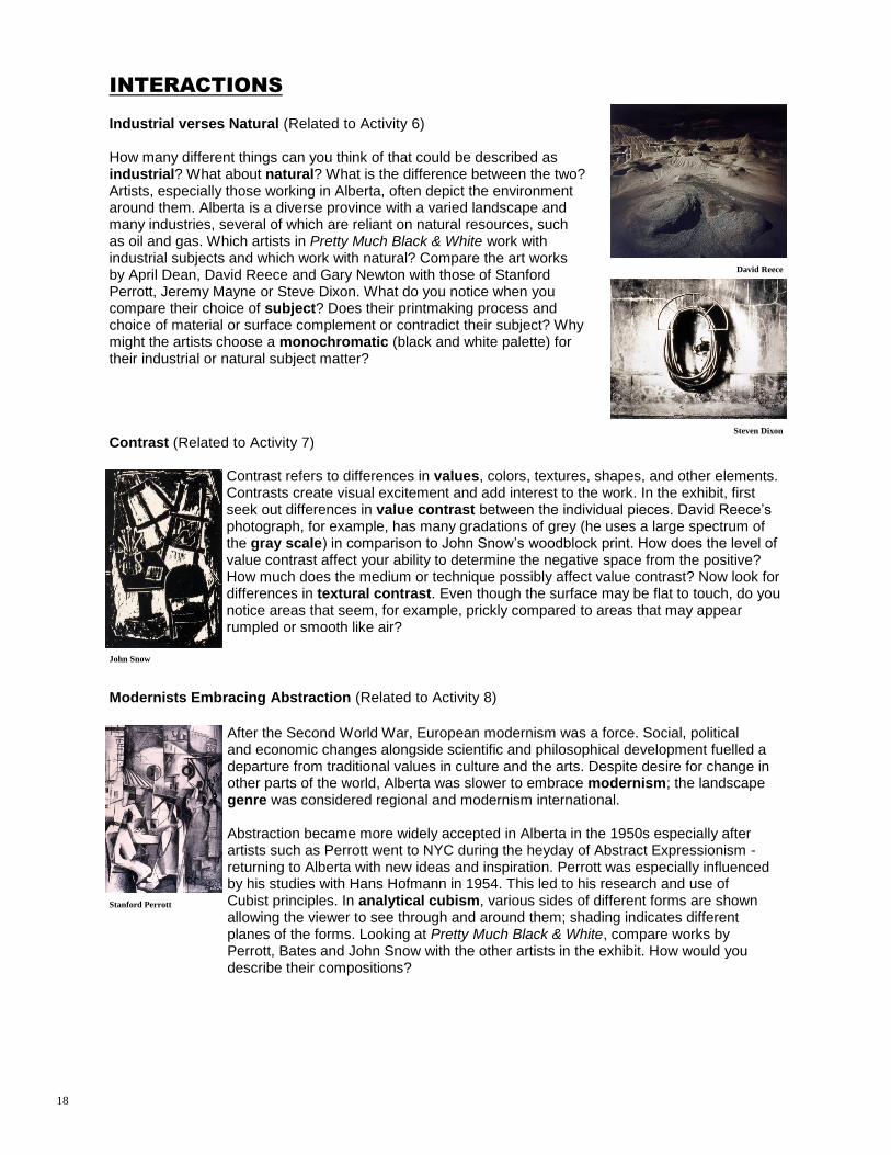
YATES, Richard
Richard Yates was born in Edmonton and began formal art studies at the Banff School in 1968. He received a BFA in 1973 and a diploma in Secondary Education in 1976 from the University of Victoria. In 1983 he received his MVA in printmaking from the University of Alberta and subsequently spent a year doing post-graduate studies in printmaking at Konsthogskolan, Stockholm. His preferred print technique is woodcut; his works differ from traditional block prints in that they can be very large, but adhere to tradition in that he rarely uses color. His abstracted images rely on decisive lines, sharp contrasts and the interplay between densely inked shapes and the clean surface of the paper.
PRETTY MUCH BLACK & WHITE
Inventory List
ALBERTA FOUNDATION FOR THE ARTS TRAVELLING EXHIBITION PROGRAM Southwest Region (ASA) Exhibition Title: Pretty Much Black & White Total # of Art Works: 15 Source of Art Works: Collection of the Alberta Foundation for the Arts Artist Title Medium Date BATES, Maxwell Two Boys lithograph on paper 1956 BEAVEN, Dale Oh What A Tangled Web We etching on paper 1987 Weave …. When First We Seek To Deceive CORSIATTO, Larry Penumbra silver gelatin on paper 1991 DEAN, April The Return woodblock, silkscreen, wax 2009 DIXON, Steven Mine Site #17 photogravure on paper 2001 DUGAS, Karen Exploding etching on paper 1989 FELDMAN, Joel How We Get T. Storms ... woodcut on paper 2002 MAYNE, Jeremy Equilbre lithograph on paper 1988 NEWTON, Garry La Selva intaglio, aquatint on paper 1991 PERROTT, Stanford Bowery lithograph on paper 1954 REECE, David Dinosaur Park #3 inkjet print on paper 2001 ROBINSON, Clifford Alberta Scene linocut on paper 1942 SHUKSTER, Dana These Faces That I Give To woodcut on paper 1988 The World, Self Portrait SNOW, John Studio woodcut on paper 1950 YATES, Richard Bow Wave Dream 2 linocut on paper 1981

The purpose of this guide is to assist educators with integrating this travelling exhibition into the visual arts curricula. It is a beginning for looking at and working with art. The ideas and activities can be used as a starting point for furthering appreciation and investigation into the visual arts. In this guide are suggestions for viewing the artworks, including gallery games, discussion ideas and studio activities. The Interactions section consists of questions that encourage discussion and deeper looking. The Activities section consists of studio-based art activities related to the artworks in the exhibition as well as the Interactions discussion questions. The Gallery Games section can be copied onto 3 x 5 cards and used as a framework for viewing these and other artworks in the future. This guide explores a variety of ways to increase visual literacy and art appreciation through inquiry and hands-on practice. All of these activities can be adapted to any age or grade level. Please take time to preview the educator's resource kit and enjoy the show!
CURRICULUM
This guide explores a variety of ways to increase visual literacy and art appreciation through inquiry and hands-on practice. The Alberta fine arts curriculum outlines four components for responding to art.
Reflection: Develop the ability to observe and respond to visual imagery; natural forms, designed objects and art. In this guide, responding to art via questioning and interactive discussions addresses this component.
Depiction: Use observations from the visual world to influence the development of personal imagery. By looking at the artworks included in this exhibition, students will learn to make artwork uniquely their own.
Composition: Organize the basic elements of design to create a unified artwork. Using the art-based activities in this guide addresses this component.
Expression: Use appropriate art materials and media to represent personal ideas and feelings. Using the artworks included in this exhibition as inspiration, students will make artwork uniquely their own. The interactions and activities in this guide are designed for beginning level students, but can be adapted for any grade level. Options for higher level students are included in some activities.
VISUAL LITERACY
We live in an increasingly visual culture. From art to television, to the emergence of the Internet, we are surrounded by images as a form of communication. The ability to understand and interpret these images helps us better understand the complexities of our world. Visual literacy is defined as not only the ability to understand communications composed of visual images, but the ability to create and use imagery in ways that advance thinking, decision making, communication and learning. We become visually literate by expressing our thoughts and ideas in visual form and also by translating and understanding the meaning of visual imagery from others. It is important to keep in mind that experiencing contemporary art is a personal experience and it is important to emphasize there is no wrong way to interpret the artworks.
INTRODUCTION TO THE EDUCATOR’S GUIDE
Prepared by Kate Schutz
15
ABOUT THE ARTISTS
Biographies & Statements

VISUAL THINKING STRATEGIES
We tend to look very quickly at art and objects leaving little time for contemplation and reflection. Asking thoughtful questions that guide students in finding the answers for themselves creates a meaningful relationship to the art, object or concept at hand and helps the students slow down and look deeply. It is helpful to develop tools that assist in the looking process. There is not just one way to approach a work of art; there are many tools to choose from to mediate the experience. One way to approach art is through a methodology called Visual Thinking Strategies (VTS). VTS is a visual arts program for elementary school students and teachers that uses art to teach thinking, communication skills and visual literacy. Growth is stimulated by three things: looking at art of increasing complexity, responding to developmentally-based questions and participating in group discussions that are carefully facilitated by teachers. From www.vue.org VTS encourages:
a personal connection to art from diverse cultures, times and places
confidence in one‟s ability to construct meaning from art
active class discussions and group problem solving
development of thinking and communication skills
development of writing skills
transfer of these skills to other subject areas
What Visual Thinking Strategies Look Like From www.vue.org Starting the Lesson Introduce the VTS: it allows students to examine art, to think, to contribute observations and ideas, to listen and to build understandings together. Ask students to recall these aspects of the process often. Call students‟ attention to the first image. Always give students a moment to look in silence before you invite them to speak. Asking the Questions After they have examined the image, ask the question, "What's going on in this picture?" Once students have learned this question, use variations. Whenever students make a comment that involves an interpretation (a comment that goes beyond identification and literal description), respond first by paraphrasing, and then ask, "What do you see that makes you say that?" In order to keep students searching for further observations, frequently ask them, "What else can you find?"
Responding to Students’ Comments Listen carefully to students, making sure you hear all of what they say and that you understand it accurately. Point to what they mention in the artwork. Be precise, even when it is a comment that has been repeated. Use encouraging body language and facial expressions to nurture participation. Paraphrase each comment. Change the wording, but not the meaning of what is said. In rephrasing, demonstrate the use of proper sentence construction and rich vocabulary to assist students with language.
16

What Visual Thinking Strategies Look Like (continued)
Responding to Students’ Comments Accept each comment neutrally. Remember this process emphasizes a useful pattern of thinking, not correct answers. Students are learning to make detailed observations, sorting out and applying what they know. Articulating their thoughts leads to growth even when they make mistakes. Link relatable answers even when there are disagreements. Show how the students‟ thinking evolves, how some observations and ideas stimulate others, how opinions change and build.
INTERACTIONS
Interactions are questions to encourage discussion and deeper looking. Definitions in bold type can be found in the Glossary section of this guide. What is printmaking? Why is it a good choice for black & white? (Related to Activities 1, 2 & 3) In fine art printmaking, the artist chooses a surface to be a printing plate - foam, metal, wood, cardboard, stone or linoleum, for example. The artist prepares the plate by cutting, etching, carving or drawing a design into the plate. The artist then applies ink or paint to the plate, presses paper onto the plate (by hand or a printing press), and pulls the paper with its transferred image from the plate. The artist can create multiple impressions by re-inking the plate and printing new pieces of paper in the same way. In fine art printing, each impression is numbered and signed by the artist. There are five principal printmaking techniques: relief, intaglio, lithography, screen printing and monotype. Each technique produces a distinct appearance; most require professional printing materials and ma-chines. Take a close look at the Pretty Much Black & White exhibit. How many different forms of printmaking can you find as described by the artwork title cards? Compare the different types of printmaking. For example, how is Karen Dugas‟ photogravure print different than Clifford Robinson‟s linocut? How are they similar? Look for and describe evidence of the printmaking process such as smudges or marks from tools verses hand drawn methods. How does the artist‟s choice of printing techniques affect how you look at the work? Why might printmaking be a good choice for working in black and white? Negative/Positive (Related to Activities 4 & 5) There are three basic elements of a composition: the frame (border), positive and negative space. The positive space is easiest to understand. Generally, it is the space occupied by your subject. Conversely, negative space is not your subject. Negative space is defined by the space between the edges of positive space and the frame (border) of the art work. This concept is clearly illustrated when you look at Dale Beaven‟s piece Oh What A Tangled Web We Weave …When First We Seek to Deceive. In one panel, the negative space is dark and the positive space is light and reversed in the second panel. When viewing Pretty Much Black & White, try to look from the point of view of composition. Can you notice where the negative space helps to define the subject? What is the role of the frame and/or the edge of the paper in the works? Do you think the composition is unified? Do the positive and negative shapes feel balanced? What makes it feel that way (or not)? Can you find the background? The foreground? What is some evidence that makes you differentiate between the two?
Dale Beaven
17
INTERACTIONS
Industrial verses Natural (Related to Activity 6) How many different things can you think of that could be described as industrial? What about natural? What is the difference between the two? Artists, especially those working in Alberta, often depict the environment around them. Alberta is a diverse province with a varied landscape and many industries, several of which are reliant on natural resources, such as oil and gas. Which artists in Pretty Much Black & White work with industrial subjects and which work with natural? Compare the art works by April Dean, David Reece and Gary Newton with those of Stanford Perrott, Jeremy Mayne or Steve Dixon. What do you notice when you compare their choice of subject? Does their printmaking process and choice of material or surface complement or contradict their subject? Why might the artists choose a monochromatic (black and white palette) for their industrial or natural subject matter? Contrast (Related to Activity 7)
Contrast refers to differences in values, colors, textures, shapes, and other elements. Contrasts create visual excitement and add interest to the work. In the exhibit, first seek out differences in value contrast between the individual pieces. David Reece‟s photograph, for example, has many gradations of grey (he uses a large spectrum of the gray scale) in comparison to John Snow‟s woodblock print. How does the level of value contrast affect your ability to determine the negative space from the positive? How much does the medium or technique possibly affect value contrast? Now look for differences in textural contrast. Even though the surface may be flat to touch, do you notice areas that seem, for example, prickly compared to areas that may appear rumpled or smooth like air?
Modernists Embracing Abstraction (Related to Activity 8)
David Reece
Steven Dixon
John Snow
Stanford Perrott
After the Second World War, European modernism was a force. Social, political and economic changes alongside scientific and philosophical development fuelled a departure from traditional values in culture and the arts. Despite desire for change in other parts of the world, Alberta was slower to embrace modernism; the landscape genre was considered regional and modernism international. Abstraction became more widely accepted in Alberta in the 1950s especially after artists such as Perrott went to NYC during the heyday of Abstract Expressionism -returning to Alberta with new ideas and inspiration. Perrott was especially influenced by his studies with Hans Hofmann in 1954. This led to his research and use of Cubist principles. In analytical cubism, various sides of different forms are shown allowing the viewer to see through and around them; shading indicates different planes of the forms. Looking at Pretty Much Black & White, compare works by Perrott, Bates and John Snow with the other artists in the exhibit. How would you describe their compositions?
18

INTERACTIONS
Nature as Teacher: Observing for Understanding (Related to Activity 9) Artists use their sensory skills to help others to see the world in atypical ways. Learning to become a careful observer is an essential skill in the creation of art and important to thinking like an artist. Many of the artists in Pretty Much Black & White are careful observers of our natural world. What evidence do you see in the exhibition of artists closely observing their environment? How do artists record what they see? How do those records get translated into works of art? How do the observations of nature in the piece by Karen Dugas compare to Joel Feldman‟s interpretations of our world? Which do you feel best describes your relationship to nature? Nature as Teacher: Biomimicry in the Classroom (Related to Activity 10) Biomimicry is a scientific movement which encourages sustainable innovation inspired by nature. It asks the essential questions: what can we learn from nature? How would nature solve this? Janine Benyus is a pioneer in this thinking and her work in biomimcry parallels many aspects of the artistic process. For example, one of the essential methods of biomimicry is careful observation (see Activity 9) followed by thoughtful questions. Students can discover how nature might solve some of the puzzles that come up in any discipline by using biomimicry in the classroom. Artworks can be visible evidence of the biomimicry process. What are some of the bigger ideas and topics that artists in Pretty Much Black & White are discussing through their work? (e.g. environmental change and humanity‟s influence on the natural world through machines). How have the artists in Pretty Much Black & White made the process of biomimicry visible?
ACTIVITIES
The following activities are studio-based art activities related to the artworks in the exhibition as well as the Interactions discussion questions. These lessons are designed to create a comprehensive final project based on the concepts and ideas in the exhibition Pretty Much Black & White. Few materials are required and each activity can be adapted easily to the age, grade level and needs of your students.
ACTIVITY 1 – DETECTIVE WORK Printmaking is a way of making art that has many possible processes. Refer to the glossary in this guide for definitions of the varied types of printmaking. Each process has unique qualities and features. Print artists choose the method that they feel best tells their story. For example, photogravure prints are more likely to have warm blacks and an amazing range of subtle gray shades, whereas linocut has a higher level of contrast.
Materials Magnifying glass, notebook / sketchbook and graphite pencils
Karen Dugas
Joel Feldman
19

ACTIVITIES
ACTIVITY 1 – DETECTIVE WORK (Continued) Procedures 1. Visit http://www.artshow.com/resources/printmaking.html and watch the short animated films on
several printmaking processes. 2. Make a list in your notebook about the similarities and differences between the different processes.
Which materials are used? Which tools? What types of surfaces are required to work on? What special skills does a printmaker need for each process?
3. Taking your magnifying glass, look closely at the prints in the exhibit. Be careful not to bump up against the frame or Plexiglas cover. Does the magnifying glass give you any further insight into the process?
4. Sketch what you see through the magnifying glass. You can even draw circles in your sketchbook and draw within those, representing the border of the magnifying glass.
5. Write a scientific description of what you have discovered in the work and label your drawing. For example: “It is quite easy to identify a photogravure print. Look at the print with a good magnifying glass and you will see a characteristic honeycomb appearance. This is caused by the grid used in the printing process. The image also appears soft and the dark areas seem pitted.” (Source: http://www.finerareprints.com/articles/photogravure.html)
Thinking Further Why do you think an artist might choose to work with multiples, as in printmaking, rather than with an individual piece like a painting? Compare the prints to other media in the exhibition. How are they similar and different in the way they are made? Do you think fine art printmaking is less valuable than work that is not produced in multiples? What is an artist proof? How does it compare in value to an edition of prints?
ACTIVITY 2 – PROCESSING PRINTMAKING: LINOCUT
This is a variation on linocut for all ages.
Materials Blocks of floral foam, cuticle sticks or short sharpened dowels, knife shaped vegetable peeler, masking tape, scrap paper, pencils, small pieces of dry sponge, paint trays, liquid tempera, scissors and paper for printing
Procedures 1. Wrap tape around the blade of the vegetable peeler, leaving the blunt end exposed. 2. Cut scrap paper to the size of the floral foam. 3. Draw a simple design on the scrap paper. 4. Hold the paper on the foam and trace the design using the cuticle stick or dowel. Make an
impression in the foam. 5. Use the vegetable peeler to carve around the design, scraping away excess foam. Push the tool
away from, rather than toward your body. 6. Prepare for printing by pouring paint into paint trays. Have a supply of printing paper nearby. 7. Dip a dry sponge into the paint and dab onto the foam design. 8. Place the design, paint side up on a flat surface. 9. Place a piece of printing paper on top of the design and gently rub with fingers. 10. Lift the paper carefully, exposing the printed design. 11. Make multiples by re-inking the foam and using new paper.
20

ACTIVITIES
ACTIVITY 2 – PROCESSING PRINTMAKING: LINOCUT (Continued)
Thinking Further Variation on the linocut process for older students: Use the same process to make soap bar prints. The soap is harder to carve than the foam, so reinforce safety procedures. Note that it may be necessary to add a drop of dishwashing detergent to the tempera to help it adhere to the soap stamp. Using floor linoleum as a surface to carve also works, but you will require printmakers tools.
ACTIVITY 3 – PROCESSING PRINTMAKING: INTAGLIO A variation on Intaglio for older students.
Materials Plexiglas, etching needles, paper, small paint roller or soft rubber brayers, wooden spoons, liquid tempera and spray bottles
Procedures 1. Make a drawing 2. Place a sheet of Plexiglas on top of your drawing 3. Use an etching needle to carefully trace the drawing onto the surface of the Plexiglas. 4. Use rollers or brayers to roll the paint onto the surface of the Plexiglas. Use a soft cloth or paper
towel to gently wipe off any excess. You can experiment with the degree to which you remove the paint
5. Evenly dampen a sheet of paper with water from the spray bottle. Don‟t soak it! Use a wooden spoon to press the paper onto the surface of the Plexiglas.
6. Carefully peel off the paper and let dry.
ACTIVITY 4 – FROM POSITIVE TO NEGATIVE: THE SHAPES IN BETWEEN Two simple activities to help students recognize the difference between negative and positive space in a composition.
Materials Digital camera, black marker (Sharpie), black paint, paper, pencils or black pencil crayons and tracing paper for younger students
Procedures 1. Use a digital camera to take photos of interesting buildings with distinct outlines. Photograph them
from a low viewpoint, ideally on a clear sky. 2. Upload the photos into a digital software viewing program or print them. 3. Make a positive drawing: Draw a simple line drawing of the object you photographed. Be sure to
focus on the proportion and drawing any features through which the background is visible such as columns. There is no need to draw decorative details. Younger students may trace the photo with tracing paper.
4. Make a negative drawing: Using the same subject, train your eye to take a different approach. Ignore the building and draw the abstract form the background makes around it, instead. This takes practice because the eye is naturally drawn to positive shapes in a composition.
4. Shade in the negative space with black paint and the positive form will emerge as a silhouette. 5. Compare your positive space drawing to your negative space drawing. If your observations have
been careful, your proportions will be the same on both.
21

ACTIVITIES
ACTIVITY 4 – FROM POSITIVE TO NEGATIVE: The Shapes In Between (Continued)
Procedures The Space In Between: This project will help you become familiar with looking for negative space between objects in a still life. 1. Choose a few simple items, like dishes, and arrange them in a group. They can overlap and be
close to each other. 2. Search and draw the spaces and abstract shapes in between the chosen objects. 3. Use a thick black line in paint or marker and the objects in the composition will slowly start to
emerge. 4. Paint the negative shapes in a solid color or be inspired by Pretty Much Black & White and use black
paint. The result is a semi abstract drawing with strong outlines. 5. Try introducing one color element and notice how this affects the emphasis / the center of interest.
Thinking Further For All Students: Research the Japanese art concept called Notan. How does Notan differ from Western art concepts of positive and negative space? Using black and white paper, explore Notan collage inspired by the student work at http://curriculum.new-albany.k12.oh.us/pmcdowell/JapaneseNotanDesigns.htm. For Older Students: Visit the Glenbow Museum‟s online interactive exhibition Artpad to discover contemporary Alberta artists. Check out the high school student interviews with Calgary ceramicist, Greg Payce: http://www.glenbow.org/artpad/en/explore/artist-interviews/greg-payce/details.html In Wake, how does Payce use three-dimensional objects to explore negative verses positive space? How might Payce need to work differently (or similarly) from the artists in Pretty Much Black & White?
ACTIVITY 5 – PROCESSING PRINTMAKING: SILKSCREEN Silk screening is a printing technique in which paint is pushed through a fabric screen to make a crisp design. Most decorated T-shirts are silk screened. A variation on silkscreen for younger students.
Materials Watercolor paper, paint brushes, embroidery hoop, clipboard, liquid tempera, a non-water soluble glue such as Modge Podge, curtain sheer material, masking tape and squeegee
Procedures 1. Choose an image that has good contrast or draw / paint your own in black and white. You could also
trace or draw the lines of an image and fill in the areas that you want dark with black marker. It may also be fun to do this on a computer with Adobe Photoshop and then print it.
2. Pull the sheer material tightly across the embroidery hoop and screw the hoop together. Lay the hoop on top of the drawing with the fabric flat against the paper and trace the image onto the screen‟s material with a pencil.
3. Turn the hoop over and paint in all the negative space (all the places you don‟t want the paint to go) with the glue.
4. Place a sheet of paper on the clipboard. As the glue dries, place the hoop onto the paper. 5. Squeeze some paint on one side of the screen and use the squeegee to push the ink through using
a swift motion onto the paper. 6. As with silk screening, you may add other colors on top. Allow the first layer of paint to dry on the
paper. You will need a new screen for each new color because the glue will not wash out. Save your original image to use as a template and mark the placement for the screen on the paper so you can line up the image for each subsequent color.
22

ACTIVITIES
ACTIVITY 5 – PROCESSING PRINTMAKING: SILKSCREEN (Continued)
Procedures
A variation on silkscreen for older students.
Materials Embroidery hoop, heavy cardboard, masking tape, liquid tempera, scrap paper, pencil, scissors, printing paper and squares of lightweight fabric like cotton organdy to fit the hoop
Procedures 1. Place fabric in embroidery hoop. Pull the edges taut - the fabric must be tight and wrinkle-free. 2. Make a squeegee by cutting the heavy cardboard into a four inch by two inch strip. 3. Cover one edge of the cardboard with masking tape. This keeps the cardboard from absorbing the
paint. 4. Draw and cut out a simple design from the scrap paper. Make sure this stencil is smaller than the
embroidery hoop. 5. Place the stencil on the printing paper. 6. Put the fabric in the embroidery hoop flat on top of the stencil, pressing down firmly. 7. Pour about 1 tablespoon of tempera into the hoop. 8. Spread the paint by pulling the squeegee across the paint several times. 9. The paint holds the stencil to the fabric in the embroidery hoop; a negative of the stencil is left on
the printing paper. Lift the hoop (with the stencil) and repeat to make another print.
Thinking Further Many artists have worked with silkscreen to explore positive and negative space, but perhaps none were as famous (or infamous!) as Andy Warhol. This summer 2011, a retrospective of Warhol‟s art, traveling from the Warhol museum in Pennsylvania, made its only Canadian stop in Edmonton at the Art Gallery of Alberta. Manufactured showed many of his silkscreen prints. Make your own virtual silkscreen in Warhol‟s unique pop art style by visiting: http://edu.warhol.org
ACTIVITY 6 – PROCESSING PRINTMAKING: COLLOGRAPH Collograph is a very simple form of printing that uses found materials arranged in a collage format.
Materials 1/8" to 1/4" illustration board, white glue / tacky glue or hot glue (hot glue is the best), a brayer or rolling pin or school hand printing press (school press is the best), printing inks or acrylic paints (black), brushes for the ink or paint (half inch to one inch wide), scissors and/or X-Acto knife, watercolor or thick bond paper for printing, newsprint or regular bond (this paper will be used to do a sample print or two) Various found materials that represent „industrial‟ and/or „natural‟, such as raffia, string, yarn, pencil shavings, rice, leaves, small dried flowers, reeds, burlap, tin foil or other textured materials will be glued onto your illustration board. Any material will work as long as it is not more than 1/8" high. If you have objects that are higher you will have trouble printing properly.
Procedures 1. Cut your illustration board to size using sharp scissors or a ruler and X-Acto knife. A smaller design,
10" x 10" or less, is preferable as it is difficult to apply pressure evenly with a brayer or rolling pin.
23

ACTIVITIES
ACTIVITY 6 – PROCESSING PRINTMAKING: COLLOGRAPH (Continued)
Procedures 2. The next step is to lay out your design. Determine if you want to make an industrial or nature
inspired collograph. Determine if you want to make an abstract or representational print. You can even take photos of the industrial and natural world around you and use them as inspirational sources.
3. Choose your materials and arrange them according to the decisions you made in the previous step. Which materials best describe „industrial‟? Which are more „natural‟? Glue the materials onto the illustration board. Make sure that everything is glued well. If you are using white glue let it dry completely. If you are using hot glue you will only have to wait a minute or so.
4. When you are happy with your design (and it is well glued) begin to apply the ink or inks. Dab the ink (or paint) on with a brush. Do not brush it on as you may damage the collage. Cover the entire surface thoroughly, but don't allow the ink to pool or become too thick. If this happens it will not print clearly. Ink dries fairly slowly so take the time and make sure that the surface is well covered. If you are using paint then you will probably have to work a bit faster.
5. You are now ready to print. Use a rolling pin, brayer or school press.
With a rolling pin: First lay a piece of test paper on top of your inked design and with even pressure roll the pin across the backside of the paper. Just make one or two passes but do not roll the pin back and forth as the image will blur. Peel the paper off the design and look at it. If it looks muddy then you probably have too much ink. It is possible make another print immediately using good paper and get the results you are looking for (the test paper having pulled the excess ink off). You can also try wiping some of the ink off carefully. If the print is too faint you may have to apply more ink or paint. In this type of printing you will usually have to apply ink after every print (or every other print). You may not get more than ten to twenty prints from your design as it is fragile.
With a brayer: Some brayers are not very wide and will require you to make a couple of passes in order to capture the whole design. If this is the case be very careful to apply pressure evenly. Do not make more than one or two passes (same reason applies here as with the rolling pin). The brayers may work better as they are often softer and will capture more detail than a hard rolling pin.
ACTIVITY 7 – VALUE CONTRAST: Exploring Shades of Gray in Black & White Photographs Many of the artists in Pretty Much Black & White work with black and white photography to express their ideas. Black and white photos are not new; they are the predecessor to color and can show a wide variety of value contrast despite what may initially seem as a limited palette. Today digital photography allows us to change images easily from color to gray scale and to every hue in between.
Materials Digital camera, basic photo editing software and ability to print photos in color or color magazine images, black and white photo copier and pencil crayons in a full spectrum of hues or paint
Procedures
1. Use your camera to take photographs of places and people that inspire you. Perhaps you are influenced by some of the subject matter in Pretty Much Black & White.
2. Print some of your choice photographs in color and print the same images in black and white by changing them in your photo editing software. If you are using magazine images instead, choose a selection of images that speak to you. Make black and white copies of your color images using the photocopier.
24

ACTIVITIES
ACTIVITY 7 – VALUE CONTRAST: Exploring Shades of Gray in Black & White Photographs (Continued)
Procedures
2. Squint at your color image. Can you see the shapes blur together and your eye begins to see value contrast? Notice which areas of the image are dark and which are light. Notice the subtle changes in value from one area of the image to another. Do the same with its black and white copy.
3. Taking the black and white image, choose colors from your pencil crayons (or paint palette) that are in the same monochromatic scale (various shades from dark eggplant to light mauve or purple). Determine which is the darkest shade of your color and which is the lightest. Arrange them in a row from dark to light. It may be beneficial to create a reference chart by coloring / painting each shade next to each other on a scrap piece of paper.
4. Paint or color on top of the black and white image. Start coloring over the darkest areas with your darkest hue. Work over the gray areas, adding the appropriate shade of color on top. When finished, you should have a multi-colored version of your black and white image.
Thinking Further Challenge yourself by using the same process on the black and white image but rather than working in a monochromatic color scale, try to duplicate the exact colors and shades of the original color image. Try to make an exact copy.
ACTIVITY 8 – TEXTURE CONTRAST: Analytical Cubism (Papier collé and Paint) Papier collé is a collage technique popularized by Georges Braque and Pablo Picasso, two of the pioneers of Analytical Cubism, in the early 1900s. Stanford Perrott, Maxwell Bates and John Snow, all working at the same time and slightly later, would have been heavily influenced by this international movement despite living in Alberta.
Materials
Photos from Activity 7, tracing paper, ruler, pencil, glue stick, illustration board or thicker bond paper, newspaper and other assorted papers, various pieces of construction paper, various black and white media (conte, charcoal, India inks, chalk), pencil crayons and/or paint in a monochromatic palette (grays and browns if inspired by historical analytical cubism and Pretty Much Black & White)
Procedures 1. Notice the many different types of visual texture in Pretty Much Black & White. Make a list of as
many adjectives you can think of to describe texture. Think about things in nature and industry, and the words you would use to describe them. Explore all your senses in this exercise. How would you describe the smell of a smoke stack or the taste of raindrops?
2. Using one of the images from Activity 7 and tracing paper, draw a contour line drawing of the photo (just like you did in Activity 4 when you made a “positive drawing”).
3. Take a ruler and draw straight lines on the tracing - bisecting it in some places to create new shapes within the drawing. Using the glue stick, fasten the tracing paper to the illustration board so that you can work with it further. Smooth out any wrinkles!
4. Like Stanford Perrott and Jeremy Mayne, draw pattern and texture within some of the new shapes created by the dissecting lines. Try many different forms of mark-making by looking at all the artists in Pretty Much Black & White and noticing how they depict texture. Experiment with different types of black and white medium such as ink or charcoal.
25

ACTIVITIES
ACTIVITY 8 – TEXTURE CONTRAST: Analytical Cubism (papier collé and paint) (Continued)
Procedures 5. Using a second piece of tracing paper, trace a few of the shapes of your drawing. Cut out the tracing
paper shapes and use them as stencils to cut the same shapes out of assorted papers. Glue those papers onto the drawing on the illustration board.
Thinking Further Explore the MOMA website on a recent exhibition of Picasso‟s cubist guitars: http://www.moma.org/interactives/exhibitions/2011/picassoguitars/index.php. Notice how Picasso took the process of analytical cubist drawing and made three dimensional sculptures. Can you re-imagine your drawing in three dimensions as a paper sculpture?
ACTIVITY 9 – NATURE JOURNALING: Tree Buddy Nature journaling is one of the simplest and most effective methods for connecting children to nature. It is the regular recording of observations, perceptions and feelings about the natural world. Where a diary records feelings about oneself and others, a nature journal primarily records responses to and reflections of the natural world. By focusing on one natural element, such as a tree in the community, students are given a simplified entry point to the vast world of natural observation.
Materials Unlined sketchbook or large roll of brown kraft paper, scissors, sketching materials such as pencil crayons, graphite sticks, vine charcoal & watercolor pencil crayons
Procedures Note: For some students less experienced with sketching, a blank, white sketchbook can be intimidating. Creating a brown paper accordion book can overcome initial fear. The quality of the paper is not precious or inexpensive and the format of the book can be added to so that the ideas never have to stop flowing. 1. To create an accordion book, roll out a length of brown kraft paper and cut it into thirds lengthwise.
Fold each third as an accordion. Each accordion becomes a book. You can add more pages by taping a second accordion book on to the end or you can extend the pages vertically by taping additional brown paper to the top and bottom of the book.
2. Now find yourself a tree that you can visit often! 3. Give your tree a name, sketch it and write why you chose it. What do you see? Estimate the height,
number of branches and age of your tree. Record your estimate. 4. There are many exercises that can be done to help better understand your tree. The more you visit it
with your journal, the better you will understand it. Try these activities:
Press a leaf from each season and glue it in the journal
Do a bark rubbing
Note any evidence of animal and insect visitors. Use a magnifying glass to search for claw marks, holes, gnawing etc.
Sit with your back against your tree buddy and write a poem about him or her.
Write a letter to your tree buddy. Try writing a letter to you from your tree buddy!
Sketch close up, individual parts of your tree. Sketch your tree from far away in the context of its environment.
Interview your tree buddy and ask it what it has seen lately, how it likes being where it is etc.
26

ACTIVITIES
ACTIVITY 9 – NATURE JOURNALING: Tree Buddy (Continued)
Thinking Further Some famous nature journalists are Leonardo da Vinci, John Muir, Charles Darwin and Rachel Carson. They were naturalists who valued the process of sketching as essential to their scientific work. In what other ways might naturalists keep records today? Research some of these famous naturalists to find inspiration in their recorded observations!
ACTIVITY 10 – ANT FARM! Some aspects of the natural world are difficult to observe because they are hidden from human view. Biomimicry focuses on the functions of nature and looks for a blueprint or recipe to solve human problems. Ant farms are an intimate way to observe an insect community at work and learn to make parallels to our own lives as humans. We have a lot to learn from these mini-problem solvers!
Materials Small glass bowl or jar, glass fishbowl, sand, loose soil, sugar, water, twenty ants (from the same colony), cheesecloth, rubber band, black construction paper, bread crumbs, masking tape, spiral notebook or composition book
Procedures
1. Begin this project with a scavenger hunt in your yard or neighborhood to collect at least twenty ants from the same colony or anthill. They must be from the same colony so that they will work together to form a community rather than fight each other.
2. Place a glass bowl or jar upside down in the center of the fishbowl. 3. Mix together sand and loose soil. Fill the space between the overturned bowl or jar and the sides of
the fishbowl with this sandy mixture. Leave the soil and sand loose so that the ants can dig easily. 4. Mix a small amount of sugar and water together and place several drops on the soil. 5. Carefully place the ants in the fishbowl. Again, it is crucial that they are from the same colony in
order to get the result you are looking for: teamwork, not fighting. 6. Cover the mouth of the fishbowl with the cheesecloth and secure the cloth with a rubber band. This
will prevent the ants from escaping into places where they are not welcome, like your classroom! 7. Cover the outside of the fishbowl with the black construction paper and tape it in place. This will
block out the light and make the ants think that they are underground. 8. Keep the fishbowl in a quiet area in your home at normal room temperature. 9. Each day, open the cheesecloth lid and place a few drops of water on the soil. Once a week, feed
the ants a few drops of sugar or some bread crumbs. Within just a few days, the ants will begin to build a nest, digging tunnels and making rooms in the sandy soil.
10. Remove the black construction paper for a short time each day to observe the ants at work. 11. Create an “Ant Observation Section” in your nature journal from Activity 9. To practice observation -
that key step in the biomimicry method - date each entry, draw a picture of the ant farm that day. As time passes, you may also want to begin to predict or “hypothesize” what the ant farm might look like the next time.
12. Introduce new elements to your ant farm. Consider and research what is a safe thing to do so as not to harm your ants. For example, what if you changed their food? What if you introduced a structure, such as a pumice stone or a stick? What if leaves fell on your ant farm? What do the ants do in light compared to darkness? Observe your ant farm under many conditions (in a windowsill, in the dark with a flashlight) and record your findings in your journal. Consider some elements that could be harmful to your colony and hypothesize in your journal (but don‟t actually do these things if you want your ants to be safe!) What if you introduced an ant from another ant hill? What if it the ant hill was stepped on? What if it never got dark?
27
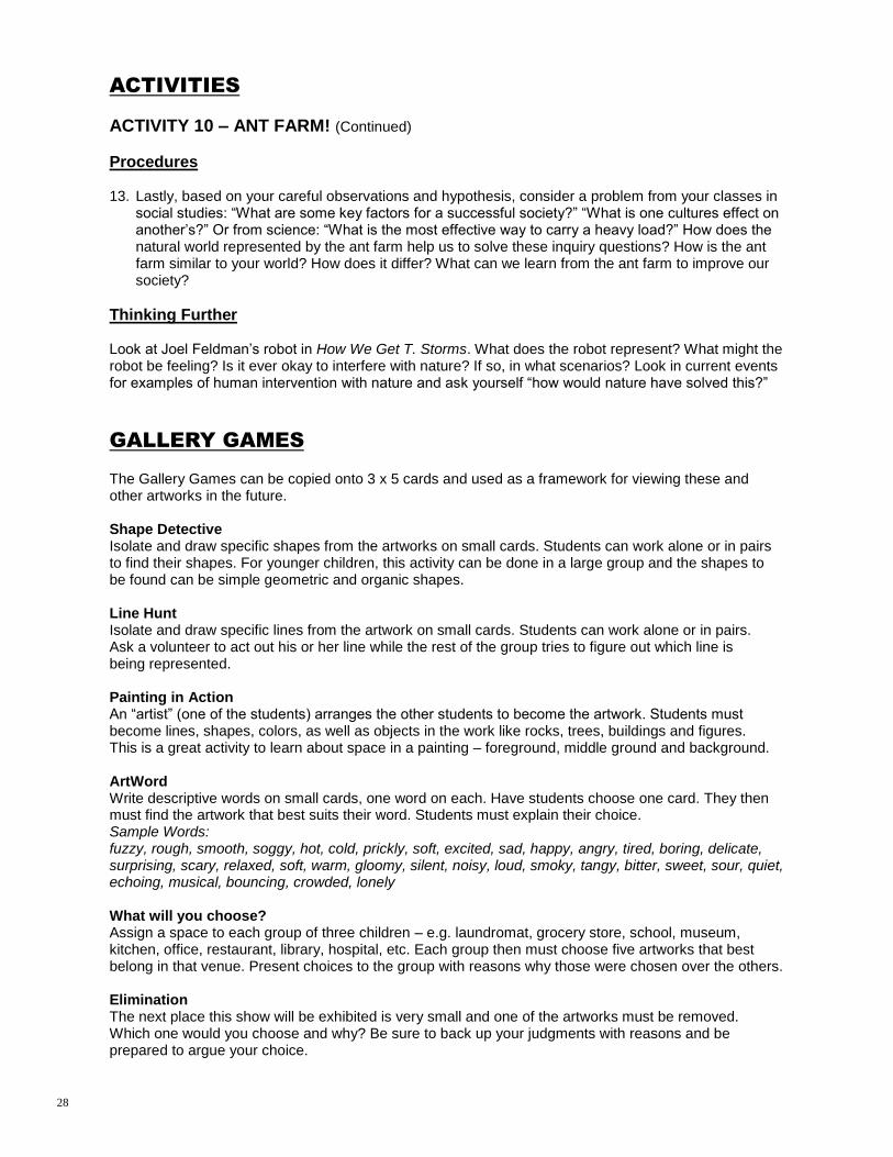
ACTIVITIES
ACTIVITY 10 – ANT FARM! (Continued)
Procedures 13. Lastly, based on your careful observations and hypothesis, consider a problem from your classes in
social studies: “What are some key factors for a successful society?” “What is one cultures effect on another‟s?” Or from science: “What is the most effective way to carry a heavy load?” How does the natural world represented by the ant farm help us to solve these inquiry questions? How is the ant farm similar to your world? How does it differ? What can we learn from the ant farm to improve our society?
Thinking Further Look at Joel Feldman‟s robot in How We Get T. Storms. What does the robot represent? What might the robot be feeling? Is it ever okay to interfere with nature? If so, in what scenarios? Look in current events for examples of human intervention with nature and ask yourself “how would nature have solved this?”
GALLERY GAMES
The Gallery Games can be copied onto 3 x 5 cards and used as a framework for viewing these and other artworks in the future. Shape Detective Isolate and draw specific shapes from the artworks on small cards. Students can work alone or in pairs to find their shapes. For younger children, this activity can be done in a large group and the shapes to be found can be simple geometric and organic shapes. Line Hunt Isolate and draw specific lines from the artwork on small cards. Students can work alone or in pairs. Ask a volunteer to act out his or her line while the rest of the group tries to figure out which line is being represented. Painting in Action An “artist” (one of the students) arranges the other students to become the artwork. Students must become lines, shapes, colors, as well as objects in the work like rocks, trees, buildings and figures. This is a great activity to learn about space in a painting – foreground, middle ground and background. ArtWord Write descriptive words on small cards, one word on each. Have students choose one card. They then must find the artwork that best suits their word. Students must explain their choice. Sample Words: fuzzy, rough, smooth, soggy, hot, cold, prickly, soft, excited, sad, happy, angry, tired, boring, delicate, surprising, scary, relaxed, soft, warm, gloomy, silent, noisy, loud, smoky, tangy, bitter, sweet, sour, quiet, echoing, musical, bouncing, crowded, lonely What will you choose? Assign a space to each group of three children – e.g. laundromat, grocery store, school, museum, kitchen, office, restaurant, library, hospital, etc. Each group then must choose five artworks that best belong in that venue. Present choices to the group with reasons why those were chosen over the others. Elimination The next place this show will be exhibited is very small and one of the artworks must be removed. Which one would you choose and why? Be sure to back up your judgments with reasons and be prepared to argue your choice.
28
GALLERY GAMES
Amazing Shrink Machine Imagine shrinking to the size of your thumb and you are now able to enter right into the artwork. Where would you enter into the picture? Where would you travel? How far would you go? What would get in your way? What sounds would you hear? What would you taste? What would you smell? Personal Taste Choose one of the artworks that would appeal to each of the following characters and describe why it would attract them: an elephant, a mosquito, a dancer, a baby, a teacher. Art Charades A volunteer chooses an artwork without revealing his or her choice. Without speaking the volunteer describes the artwork (lines, shapes, colors, and objects) through movements and actions. The rest of the group tries to guess which work was chosen. Curator Game Ask students if they know what a curator is; explain the job of selecting and defending works to be exhibited. In small teams, students are assigned a work of art (this is more challenging than if they choose one they already like). Students then place themselves in the role of the curator and write down some positive statements about the artwork and a statement on why it is included in the exhibition.
GLOSSARY
Abstract: A type of art done in lines, shapes and colors that separates the subject from concrete reality; subject matter reduced to essential aspects Abstract art: Imagery which departs from representational accuracy, to a variable range of possible degrees, for some reason other than verisimilitude. Abstract artists select and then exaggerate or simplify the forms suggested by the world around them. Artist Proof: One of a small group of prints set aside from an edition for an artist's use; a number of printer's proofs are sometimes also done for a printer's use. An artist's proof is typically one of the first proofs from a limited edition of prints, for the artist's own copyright use, and marked as an A.P., and not numbered. Artist's proofs generally draw a higher price than other impressions. The equivalent in French is épreuve d'artiste, abbreviated E.A. Biomimicry: The process of learning from and emulating Nature‟s genius to create more sustainable designs. Collage: A composition made by pasting together various materials such as newspaper, cloth, natural objects, printed text, illustrations or photos Collograph: A print made from a low relief collage assembled from glue and other material. The inked image is transferred from plate to paper and is simultaneously embossed. The name derives from collage. Composition: The art of combining the parts of a work of art to produce a unified and harmonious whole; the manner which the areas are related to each other Contrast: Contrast refers to differences in values, colors, textures, shapes, and other elements. Contrasts create visual excitement and add interest to the work. There are many forms of contrast:
Contrast in color intensity occurs when a pure, fully intense color is next to a muted or grayed color mixture. The pure color‟s strength and intensity seem to cause it to glow.
Shape contrast occurs when organic shapes are placed in a geometric environment. Or in an opposite way, a building in a landscape will produce shape contrast, as will a person in a city street.
29

GLOSSARY
Simultaneous contrast occurs when two pure complementary colors are placed side by side. Each will appear brighter than when placed next to any other hues. Visual vibration might occur.
Temperature contrast refers to the contrast of warm and cool colors. If small warm areas are placed in a dominantly cool painting, temperature contrast is evident.
Textural contrast is easily noted when artists use heavy textures to contrast with smoother areas in painting, sculpture, photography, architecture, or any of the crafts. Textural contrasts are found abundantly in nature.
Value contrast is most evident when black is next to white and when light values from one end of the gray scale are next to dark values from the other end. A black and white photograph is readable because of gray value contrasts.
Contemporary art: Art, current, belonging to the same period of time. Usually referring to our present time, but can refer to being current with any specified time. Cubism: Analytical Cubism (1909-11) and Synthetic Cubism (1912-14). In the „Analytical‟ phase, the relatively solid massing of their earliest Cubist paintings gave way to a process of composition in which the forms of the object depicted are fragmented into a large number of small, intricately hinged planes that fuse with one another and the surrounding space. This fascination with pictorial structure led to color being downplayed and the archetypal Analytical Cubist paintings are virtually monochromatic, painted in muted browns or warm grays. Braque introduced the use of stencil lettering, and by the following year he was experimenting with mixing materials such as sand and sawdust with his paint to create interesting textures. He refined this notion again by imitating the effect of wood graining. Later in the same year, 1912, Picasso took this a stage further when he produced his first collages, and Braque quickly followed with his own type of collage - the papier collé. These developments - marking a move away from the very cerebral near-abstraction of Analytical Cubism to a more relaxed and decorative art incorporating everyday ephemera - ushered in Synthetic Cubism. This reversed the compositional principle of Analytical Cubism, the image being built up (synthesized) from pre-existing elements or shapes rather than being created through a process of fragmentation. One consequence of this concern with greater surface richness was that Braque and Picasso reintroduced color to their paintings. Culture: The predominating attitudes and behavior that characterize the functioning of a group or organization. Curator: The individual responsible for selecting a theme or premise and choosing artwork for an exhibition Edition: A set of identical prints, sometimes numbered and signed, pulled by or under the supervision of the artist. Two numbers are often written at the lower edge of a print - the first indicating the print's place in the order of all prints in the edition, the second number indicating the total number of prints in the edition. Embossed: Embellished with a raised pattern created by pressure or embroidery Genre: Depiction of subjects and scenes from everyday life, ordinary folk and common activities. It achieved its greatest popularity in seventeenth century Holland (the Netherlands) with the works of Jan Steen (1626-1679) and Jan Vermeer (1632-1675). When used in the plural form, genres are the various categories of subject matter in the traditional academic hierarchy, in descending order of importance: history, megalography, mythology, religion, portraiture, genre (see the first sense above), landscape, still life, rhopography and vernacular. Gray Scale: The range of neutral values or shades of gray in an image. The gray scales of scanners and terminals are determined by the number of grays, or steps between black and white, that they can recognize and reproduce.
(Source: http://www.artlex.com/) 30

GLOSSARY
Horizontal: Straight and flat across, parallel to the horizon Hue: The name of any color as found in its pure state in the spectrum or rainbow, or that aspect of any color. Identity: The collective aspect of the set of characteristics by which a person is definitively recognizable or known; the set of behavioural or personal characteristics by which an individual is recognizable as a member of a group; the distinct personality of an individual regarded as a persisting entity; individuality Impression (as in printmaking): In printmaking, a single print made from a block, plate or stone; the act of impressing - the contact between the printing surface and surface on which the print is made. Sometimes refers more loosely to a mark left on a surface by pressing something against it like a single or initial coat of color. Industrial (Industry): The aggregate of manufacturing or technically productive enterprises in a particular field, often named after its principal product: the automobile industry; the steel industry. Intaglio: Intaglio (pronounced in TAL yo) comes from an Italian word meaning to incise or cut. In intaglio printing, the artist uses acid to cut into a metal plate. The artist covers the plate with ink and then cleans it so that the ink remains only in the cut grooves. The artist presses dampened paper on the plate to transfer the design. Engraving is an intaglio process commonly seen on fancy wedding invitations. Francisco Goya, Pablo Picasso, Rembrandt and Albrecht Durer produced intaglio prints. Interpretation: To find meaning in writing, artwork or an exhibition Linocut: A linoleum block or plate used for making relief prints. Linoleum is a durable, washable material formerly used for flooring as vinyl flooring is used today. It is usually backed with burlap or canvas, and may be purchased adhered to a wooden block. The linoleum can be cut in much the same way woodcuts are produced, however its surface is softer and without grain. Also refers to a print made with this method. Lithography: This technique, invented in 1798, uses the principle that oil and water don‟t mix. The artist draws a design on a flat surface with a greasy material such as a crayon or tusche, an oil -based paint. The artist dampens the surface of the plate with water, which is repelled by the grease. When the artist applies printer‟s ink to the plate, the ink sticks to the greasy design and not to the unmarked areas of the plate. European artists such as Pierre Bonnard, Henri de Toulouse-Lautrec, Edouard Manet, and Edvard Munch took advantage of the technique to make a great number of prints and posters from one design. Medium: In a general sense, the material an artist uses Modernism: An art movement characterized by the deliberate departure from tradition and use of innovative forms of expression that distinguish many styles in the arts and literature of the late nineteenth and early twentieth centuries. Modernism refers to this period's interest in new types of paints and other materials; expressing feelings, ideas, fantasies, and dreams instead of the visual world we otherwise see; creating abstractions, rather than representing what is real; a rejection of naturalistic color; a use of choppy, clearly visible brushstrokes; the acceptance of line, form, color and process as valid subject matter by themselves; a requirement that the audience take a more active role as interpreter. Each viewer must observe carefully and get information about the artist's intentions and environment before forming judgments about the work. Monochromatic: Consisting of only a single color or hue; may include its tints and shades. Monotype: Monotypes or mono-prints are designs that are transferred in a single impression. The artist creates a design on a surface, covers the design with a piece of paper and transfers the design in a mirror image. Mary Cassatt, known for her images of mothers and children, often created monotypes.
31

GLOSSARY
Natural: The material world, especially as surrounding humankind and existing independently of human activities; the natural world as it exists without human beings or civilization; the elements of the natural world, as mountains, trees, animals or rivers. Naturalist: A person who studies nature by direct observation of plants and animals. Negative space: Empty space in an artwork, a void. In Western culture, both „space‟ and „emptiness‟ suggest a lack or shortage of something. However, in Asian cultures the concept of negative space is one that is highly prized. In Japanese art, negative space is called ma. Relevant in every Japanese art form, ma is considered a valuable space, not seen as empty. Notan: Japanese term for the balance between light and dark. Papier collé (French - „pasted paper‟): A type of collage in which pieces of decorative or printed paper are incorporated into a picture or - when stuck on a ground such as canvas - themselves constitute the picture. The technique was invented by Braque in 1912 as seen in his Fruit-Dish and Glass and was almost immediately adopted by Picasso. Gris too made extensive use of papier collé, and Matisse's use of cut-out paper shapes in his late work is a development of the technique. Photogravure: Photogravure printing was invented in 1879 and the basic process is to photographically transfer an image to a metal plate, etch the image on the plate, then print from it. Pigment: Finely powdered color material which produces the color of any medium. Made either from natural substances or synthetically, pigment becomes paint, ink or dye when mixed with oil, water or another fluid (also called vehicles). When pressed into wax it becomes a crayon, pencil or chalk. Point of View: A position or angle from which something is observed or considered, and the direction of the viewer's gaze; a standpoint which is either a physical location or one in the mind. Examples of the points of view possible in a picture are: from below, inside, outside, above and so on. A manner of viewing things; an attitude. The attitude or outlook of a narrator or character in a piece of literature, a movie or another art form. In discussing art, to use the common synonym "perspective" may be confusing. Pop Art: An art movement and style that had its origins in England in the 1950s and made its way to the United States during the 1960s. Pop artists have focused attention upon familiar images of the popular culture such as billboards, comic strips, magazine advertisements and supermarket products. Leading exponents are Richard Hamilton (British, 1922-), Andy Warhol (American, 1928?1930?-1987), Roy Lichtenstein (American, 1923-1997), Claes Oldenburg (American, 1929-), Jasper Johns (American, 1930-) and Robert Rauschenberg (American, 1925-2008). Positive space: Positive space in an artwork that is filled with something, such as lines, designs, color or shapes. The opposite of negative space Printmaking: In fine art printmaking, the artist chooses a surface to be a printing plate such as foam, metal, wood, cardboard, stone or linoleum. The artist prepares the plate by cutting, etching, carving, or drawing a design into the plate. The artist then applies ink or paint to the plate, presses paper onto the plate (by hand or a printing press) and pulls the paper with its transferred image from the plate. The artist can create multiple impressions by re-inking the plate and printing new pieces of paper in the same way. In fine art printing, each impression is numbered and signed by the artist. There are five principal printmaking techniques: relief, intaglio, lithography, screen printing and monotypes. Each technique produces a distinct appearance; most require professional printing materials and machines. Proportion: A principle of art that describes the size, location or amount of one element to another (or to the whole) in a work. 32
GLOSSARY
Relief Printing: In this technique, the artist sketches a design on a wood or linoleum block and then cuts away pieces from the surface. This leaves a raised design that is printed. The artist applies ink or paint to the surface and transfers the image to paper. The resulting print is a mirror image of the original plate. Since there is no ink on the cut-away areas or background, the design is surrounded by white space. Relief prints typically are bold, with strong color contrast. Chinese artists have used woodcutting techniques since the ninth century, often in textiles. Look for relief prints by contemporary Asian artists and by Holbein the Younger, Katsukawa Shunsho, Katsushika Hokusai, William Blake, Vincent Van Gogh and James Whistler. Representational art: To stand for; symbolize; to depict or portray subjects a viewer may recognize as having a likeness; the opposite of abstraction Retrospective: Any exhibition or series of showings or performances, as of musical works or motion pictures, representing the work of an artist or performer over all or a major part of a career. Screen Printing / Silkscreen: Screen printing or serigraphy uses stencils of paper, fabric, plastic or plant leaves with designs cut, perforated or punched in the surface. The artist attaches the design to a piece of mesh that is stretched taut. The artist uses a squeegee to force paint or ink through the mesh onto paper or fabric. The uncovered areas of the screen allow the paint to transfer to the paper; the areas covered by the design do not. Screen printing became famous in the 1960s when Andy Warhol produced his Pop Art icons like the Campbell‟s soup cans. Other artists worth studying are Peter Max, Ben Shahn and Robert Guathmey. Silhouette: An outline filled with a solid color, typically black on a white ground, and most often for a portrait. Still Life: A picture of inanimate objects. Common still life subjects include vessels, food, flowers, books, clothing. Subject: That which is represented in an artwork. The subject of a work is one of its literal qualities. Symbol: A form, image or subject representing a meaning other than the one with which it is usually associated. Traditional art: Tradition is the passing along of culture from generation to generation, especially orally; a custom or set of customs handed down in this way. The idea of heritage is related to that of tradition. Any activity that is a pattern of celebration, ritual or other behaviour which becomes a precedent influencing comparable activities in the future. Tradition's opposite is reaction to it, change, variation from what's been done before, what is different, new or avant-garde. Translucent: Allowing some light to pass through, but greatly obscuring the image of objects on the other side Value: An element of art that refers to luminance or luminosity - the lightness or darkness of a color. This is important in any polychromatic image, but it can be more apparent when an image is monochromatic, as in many drawings, woodcuts, lithographs and photographs.
33

SOURCES & SUGGESTED READINGS
Print Alberta Elementary Fine Arts Curriculum Amy Edmonds Alvarado and Patricia R. Herr. Inquiry-Based Learning Using Everyday Objects. Thousand
Oaks, CA: Corwin Press, 2003. Leslie Walker and Clare & Roth E. Charles. Keeping A Nature Journal. North Adams, MA: Storey Publishing, 2000. Patricia Ainslie and Mary-Beth Laviolette. Alberta Art and Artists: An Overview. Alberta: Fitzhenry & Whiteside, 2007. Richard Louv. Lost Child In The Woods. New York: NY Workman Publishing, 2005. Rosemary Althours; M. Johnson; and S. Mitchell. The Colors Of Learning: Integrating The Visual Arts Into Early
Childhood Curriculum. New York: Teachers College Press, 2003. Lila Lasky and Rose Mukerji. Art: Basic for Young Children. Washington, DC: National Association for the Educa-
tion of Young Children. 1980. Robert Schirrmacher. Art and Creative Development for Young Children. Albany, N.Y.: Delmar. 1988. Websites Alberta Learning: www.learning.gov.ab.ca Alberta Printmakers Society: http://albertaprintmakers.ca
SNAP: http://www.snapartists.com/ Visual art videos, descriptions, examples and definitions: http://www.artshow.com/index.html Art Definitions: www.artlex.com Biomimicry: www.asktheplanetcd.org www.biomimicryinstitute.org www.asknature.org Cubism: " The Oxford Dictionary of Art. Ed. Ian Chilvers. Oxford University Press, 2004. eNotes.com. 2006. 17 Jun, 2011 http://www.enotes.com/oxford-art-encyclopedia/cubism Cybermuse, Artist Index: http://cybermuse.gallery.ca/cybermuse/search/artistz_e.jsp Details on the Photogravure process: http://www.finerareprints.com/articles/photogravure.html Maxwell Bates, Virtual Museum of Canada: http://maxwellbates.net/english/artwork_index.asp Notan: http://www.princetonol.com/groups/iad/lessons/middle/Lotte-Notan.htm Visible Thinking: Thinking Routines: pzweb.harvard.edu/vt/ Visual Thinking Strategies: www.vue.org
PRETTY MUCH BLACK & WHITE
is a presentation of the
Alberta Foundation for the Arts Travelling Exhibition Program
Developed by the Alberta Society of Artists Exhibition Curator, Les Pinter; Artist Profiles by Leslie Bell Art works from the Collection of the Alberta Foundation for the Arts Interpretive / Educational Guide prepared by Kate Schutz
FUNDING PROVIDED BY THE ALBERTA FOUNDATION FOR THE ARTS
ACKNOWLEDGEMENTS
34