process book 6
DESCRIPTION
Gallery Espresso Branding for Print Studio ITRANSCRIPT
Black PMS 187 C 65% Black
typography
bebas regularthe quick brown fox jumped over the lazy dog 1234567890
color palette
EDUCATION MFA Candidate (2010 - present)SavannahCollegeofArtandDesignGraphicDesign,3.5GPA
BFA (2009) UniversityofSouthAlabama Primary-GraphicDesign,Secondary-Painting.3.98GPA,SummaCumLaude
WORK EXPERIENCE Graphic Designer (June 2009 - present) Crown Products Responsibilitiesincludethedesignofallelectronicmediaincludingwebbannersand
graphics,e-mailmarketingandsocialmediamanagement.Additionally,Icreatespecialtyitemsincludingcustomdirectmarketingpiecesandhigh-endcatalogs.Otherdutiesincludeproductphotographyandproductdevelopmentdesign.
Art Director (June 2007 - present)Negative Capability Press Responsibilitiesincludeinteriorandexteriordesignandtypesettingofbooks.Additionally,
Iamresponsibleformostofthecompany’smarketingduties.
Student Assistant (June 2006 - May 2009)University of South Alabama Responsibilitiesincludedassistingstudentsandtroubleshootinggraphicdesignsoft-wareandMachardware.IalsooperatedseverallargeformatEpsonprinters.
ACHIEVEMENTS Silver Addy® Award(2010) PrintCollateral CrownProducts,AAFMobileBay
Silver Addy® Award (2010) InteractiveWebDesign(w/B.Davis) CrownProducts,AAFMobileBay
Progress Through Ideas Award(2010) EbscoIndustries Employee of the Quarter(2010) CrownProducts
SCAD Honors Scholarship Recipient
AFFILIATIONSAIGAAAFMobileBayGoldenKeyHonourSocietyPhiKappaPhiHonorSociety
TECHNICAL SKILLSAdobePhotoshopCS5AdobeIllustratorCS5AdobeInDesignCS5AdobeDreamweaverCS5AdobeFlashCS5AdobeAcrobatCS5XHTML/CSS
ADDITIONAL SKILLSCatalog&bookproductionWebsiteproductionE-blastcreationDigitalillustrationProductphotography&designCompetitiveanalysisCopywritingSocialmediamanagementQRcodedesign&optimizationResearch
Referencesavailableuponrequest.//M
EG
ANCARYg
raph
ic d
esig
ner
6711 Overlook Road // Mobile, Alabama // 36618 // 251 454 7510 // [email protected]
Megan Cary | GRDS 715-OL | Identity Design | Process BookIdentity Design
PROCESS BOOK 06

Megan Cary | GRDS 715-OL | Identity Design | Process BookIdentity Design
PROCESS BOOKBlack PMS 187 C 65% Black
typography
bebas regularthe quick brown fox jumped over the lazy dog 1234567890
color palette

3
Assignment 4
Market Research 5
Mood Board 8
Thumbnail Sketches 16
Rough Sketches 20
Digital Comps (Identity) 21
Revised Comps (Identity) 22
Identity Analysis 23
Final Identity Design 25
eBrochure Overview 26
Outline 27
Digital Comps (eBrochure) 28
eBrochure Analysis 33
Final eBrochure Design 34
CONTENTS
Megan Cary | GRDS 715-OL | Identity Design | Process BookIdentity Design

4
ASSIGNMENT
Overview: For this project we were given a client brief for Gallery Espresso, a café chain based in Savannah, GA, that is preparing for a national launch that will establish them in the U.S. Market. In order to do this they needed a new logo identity that would give them a strong national presence, work in all regions of the U.S. and differentiate them from the competition. In the first part of this project their new identity was creat-ed, for the second part we were asked to create an Identity Guidelines eBrochure that represents the identity guidelines for Gallery Espresso and captures the essence of its brand image.
Market Research Paper:You will conduct thorough research on your company’s market seg-ment, its target audience, and the competition. Based upon this re-search, you will write a summary and creative strategy that separates your company identity from the competition. This will serve as the stra-tegic foundation upon which your designs will be based.
Mood Board:Based on extensive research, you will create a multi-page PDF that or-ganizes and expresses the potential “look-n-feel” of your new compa-ny, including categories such as possible color palettes, font choices, image styles, etc.
Identity Design: You will create a logotype or combination mark that establishes your company’s brand identity and successfully represents its personality and services. It should be designed from a clear strategic foundation and accurately reflect that strategy.
Design Narrative:Upon the completion of the identity, you will write a one page design narrative that expresses your goals, process and design solution for you final identity.
Identity eBrochure: You will produce a multi-page PDF designed to view on-screen. This promotion-oriented eBrochure should represent your company’s iden-tity guidelines in a design that successfully captures the essence of your brand image.
Megan Cary | GRDS 715-OL | Identity Design | Process BookIdentity Design
5
MARKET RESEARCH
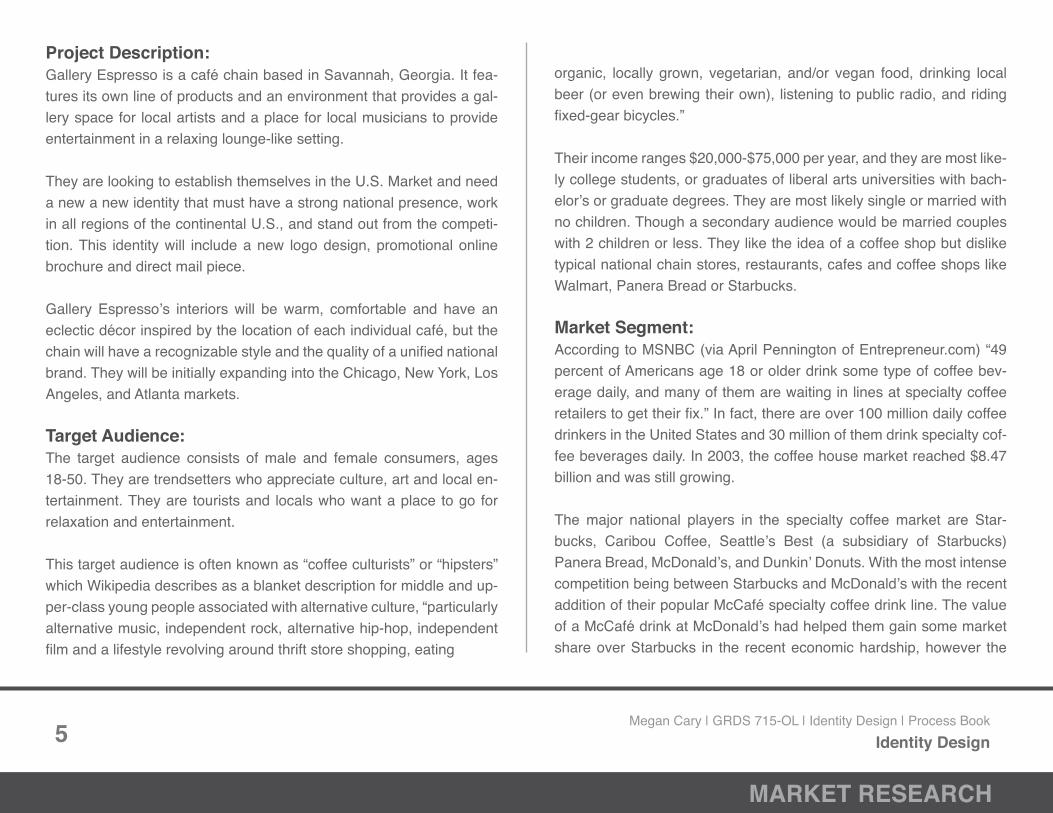
Project Description: Gallery Espresso is a café chain based in Savannah, Georgia. It fea-tures its own line of products and an environment that provides a gal-lery space for local artists and a place for local musicians to provide entertainment in a relaxing lounge-like setting.
They are looking to establish themselves in the U.S. Market and need a new a new identity that must have a strong national presence, work in all regions of the continental U.S., and stand out from the competi-tion. This identity will include a new logo design, promotional online brochure and direct mail piece.
Gallery Espresso’s interiors will be warm, comfortable and have an eclectic décor inspired by the location of each individual café, but the chain will have a recognizable style and the quality of a unified national brand. They will be initially expanding into the Chicago, New York, Los Angeles, and Atlanta markets.
Target Audience: The target audience consists of male and female consumers, ages 18-50. They are trendsetters who appreciate culture, art and local en-tertainment. They are tourists and locals who want a place to go for relaxation and entertainment.
This target audience is often known as “coffee culturists” or “hipsters” which Wikipedia describes as a blanket description for middle and up-per-class young people associated with alternative culture, “particularly alternative music, independent rock, alternative hip-hop, independent film and a lifestyle revolving around thrift store shopping, eating
organic, locally grown, vegetarian, and/or vegan food, drinking local beer (or even brewing their own), listening to public radio, and riding fixed-gear bicycles.”
Their income ranges $20,000-$75,000 per year, and they are most like-ly college students, or graduates of liberal arts universities with bach-elor’s or graduate degrees. They are most likely single or married with no children. Though a secondary audience would be married couples with 2 children or less. They like the idea of a coffee shop but dislike typical national chain stores, restaurants, cafes and coffee shops like Walmart, Panera Bread or Starbucks.
Market Segment: According to MSNBC (via April Pennington of Entrepreneur.com) “49 percent of Americans age 18 or older drink some type of coffee bev-erage daily, and many of them are waiting in lines at specialty coffee retailers to get their fix.” In fact, there are over 100 million daily coffee drinkers in the United States and 30 million of them drink specialty cof-fee beverages daily. In 2003, the coffee house market reached $8.47 billion and was still growing.
The major national players in the specialty coffee market are Star-bucks, Caribou Coffee, Seattle’s Best (a subsidiary of Starbucks) Panera Bread, McDonald’s, and Dunkin’ Donuts. With the most intense competition being between Starbucks and McDonald’s with the recent addition of their popular McCafé specialty coffee drink line. The value of a McCafé drink at McDonald’s had helped them gain some market share over Starbucks in the recent economic hardship, however the
Megan Cary | GRDS 715-OL | Identity Design | Process BookIdentity Design

6
MARKET RESEARCH
introduction of Starbucks VIA instant coffee brand and their Seattle’s Best subsidiary has revitalized Starbucks’ market share.
Data from the National Coffee Association of the U.S.A., Inc. supports this saying that in 2008 U.S. coffee consumption continued to grow, with an emphasis on consumers becoming more educated about dif-ferent coffee varieties and choosing quality coffee over value coffee.
Competitors:
Starbucks Founded in 1971 in Seattle, WA as a roaster and retailer of whole bean and ground cof-fee, tea and spices, Starbucks now has more than 16,000 locations in 50 countries. Their name is derived from the first mate in Herman Melville’s Moby Dick and their logo features a twin-tailed siren from Greek my-
thology. Most of their locations have a standard look with green and brown being the prominent color scheme; their ads often feature a sim-ilar color story and look to that of their retail outlets.
Starbucks products include coffee, hand crafted beverages, merchan-dise, food products, consumer grocery products, and several brands (Tazo tea, Ethos water, Seattle’s Best Coffee, and Torrefazione Italia Coffee). They tout themselves as a responsible company and promote their use of ethical sourcing, sustainable business practices and com-munity involvement.
McDonaldsMcDonald’s was founded in 1940 and is the world’s largest chain of hamburger fast food restaurants. There are over 32,000 locations serving more than 60 mil-
lion people in 117 countries daily. They launched their McCafé line of coffee shops in 1993 in Australia and by 2003 were the largest coffee shop brand in Australia and New Zealand. In recent years, McDonald’s stores in America have begun to offer McCafé specialty drinks in direct competition with Starbucks and other specialty coffee retailers.
McDonald’s drinks average 25% cheaper than comparable Starbucks’ drinks. In a tough economy, this has helped McDonald’s gain some ground on Starbucks’ market share. Their target audience does vary slightly though, with the average McDonald’s consumer having an in-come of less than $60,000 a year, whereas Starbucks’ is over $60,000 a year, a stark contrast.
Caribou CoffeeCaribou Coffee was founded in 1992 in Minneap-olis, Minnesota. It is the second largest retailer of specialty Coffee and espresso in the U.S., after Starbucks. They sell gourmet coffees and teas and offer baked goods. Their annual revenue in 2009 was $262 million and they have almost 500 locations in 16 states and in several countries.
Megan Cary | GRDS 715-OL | Identity Design | Process BookIdentity Design

7
MARKET RESEARCH
They define themselves as “a company that believes excellence is a product of hard work, and that life is too short for anything else.”
Like Starbucks, Caribou speaks frequently about social responsibility and sustainability in their business practices. According to Wikipedia, Caribou is planning to offer only coffees that are composed of 100% Rainforest Alliance certified beans by the end of 2011.
Differentiation: Though Gallery Espresso will become a national brand these unique, localized elements will set them apart from the competition. It will be recognizable as Gallery Espresso, but it take on characteristics of the setting each location is in. Also, its warm colors, lounge-like setting and trendy feel will appeal to the target audience they have defined.
As such, the branding elements will also be warm, inviting and com-fortable. The color scheme will reflect the interiors. The shapes should reflect the unique elements of Gallery Espresso, most likely art and music related, as well as prominently featuring the coffee aspect. Type should be contemporary with a
1http://money.usnews.com/money/blogs/alpha-consumer/2008/9/9/explaining-the-cof-fee-hipster-connection.html
2http://en.wikipedia.org/wiki/Hipster_%28contemporary_subculture%29
3 http://www.msnbc.msn.com/id/8841941/
4http://blogs.forbes.com/greatspeculations/2010/06/14/starbucks-looks-to-win-back-market-share-from-mickey-ds/
5http://www.ncausa.org/i4a/ams/amsstore/category.cfm?product_id=143 6http://www.starbucks.com/about-us/company-information 7http://en.wikipedia.org/wiki/McDonald%27s 8http://www.nydailynews.com/money/2009/02/03/2009-02-03_battle_of_the_value_meals_starbucks_vs_m.html?page=1 9http://www.time.com/time/business/article/0,8599,1702277,00.html 10http://en.wikipedia.org/wiki/Caribou_Coffee 11http://www.cariboucoffee.com/page/1/company-info.jsp
Megan Cary | GRDS 715-OL | Identity Design | Process BookIdentity Design

8
MOOD BOARD
After the market research process was completed, I cre-ated a mood board from my ideas, focusing on color, texture, type and imagery that would reflect the Gallery Espresso look.
I focused on rich textures like velvet, corduroy, wood, stone, and brick. I also added in copper and bronze metal accents that were contemporary, while staying within the warm color palette that was in the client brief. Interiors and imagery would reflect the unique nature of each location of Gallery Espresso, with hodge-podge décor that mixed textures and colors in a comfortable relaxing atmosphere.
I developed a color palette from these textures and in-teriors that consisted of reds, purples, browns, oranges, and shades of grey, that I felt would work well for various marketing purposes. I also began to explore typography options, focusing on clean bold sans serif type like Be-bas Regular that would provide strength and secondary script faces, like Lobster Font, that could compliment the strong type choices in print materials.
Megan Cary | GRDS 715-OL | Identity Design | Process BookIdentity Design

9
MOOD BOARD
Competitor’s Logos: • Starbucks • Biggby Coffee • Seattle’s Best • Barnie’s Coffee & Tea Company • Caribou Coffee • Atlanta Bread • Panera Bread • Peet’s Coffee & Tea • Dunkin’ Donuts • McDonald’s McCafé • Krispy Kreme Doughnuts
Megan Cary | GRDS 715-OL | Identity Design | Process BookIdentity Design

10
MOOD BOARD
Color Palette: To the right is a color palette that consists of warm, earthy colors pulled from the images and textures collected for Gallery Espresso. It consists of varying hues of warm reds, browns, greens, purples, and oranges.
Megan Cary | GRDS 715-OL | Identity Design | Process BookIdentity Design

11
MOOD BOARD
Type Studies: To the right is a typography palette that ex-plores various options for Gallery Espresso’s core identity. Display Option 1 explores using type to convey the unique quality of the brand, Display Option 2 uses clean strength to create more of a universal brand image. I have also considered combining aspects of Display Op-tion 1 and 2 to create an identity that express-es both ideas. The secondary type options would be ideal for taglines and body copy in addition to the branding.
display type option 1
gallery espresso
gallery espresso
gallery espresso
gallery espresso
Jellyka Wonderland Wine
Jellyka Cutty Cupcakes
Give You Glory
Doris Day
Bebas
Franchise Bold
Chocolate Box
Code Bold
display type option 2
gallery espresso
gallery espresso
gallery espresso
gallery espresso
secondary type options
gallery espresso gallery espresso
gallery espresso gallery espresso
MgOpen Moderna
Adobe Garamond
Anti Pasto
Helvetica Neue
Megan Cary | GRDS 715-OL | Identity Design | Process BookIdentity Design

12
MOOD BOARD
Image Palette: To the right is a collage of imagery that conveys the core brand essence of Gallery Espresso. They are warm, inviting and unique which are important considerations in branding for them. Decor is hodge podge – unique to each loca-tion, vintage illustrations are inspirations for branding, and warm woods, dark lighting, and images of comfort foods relax.
Megan Cary | GRDS 715-OL | Identity Design | Process BookIdentity Design

13
MOOD BOARD
Shape Palette: To the right is a collage of shapes that will be used for inspiration in the creation of Gallery Espresso’s new identity design. Inspirations are vintage labels, paint splatters, paint brush-es, coffee stains, coffee beans, coffee cups, filigree, and artwork frames. All of these are unique shapes that aren’t found in many com-petitor’s logos.
Megan Cary | GRDS 715-OL | Identity Design | Process BookIdentity Design

14
MOOD BOARD
Texture Palette: To the right is a collage of textures inspired by various surfaces that would be present in a Gallery Espresso location. The textures shown also fall within the color palette shown before. In general they are warm, unique, and expressive and allow people to feel their sur-roundings, strengthening the Gallery Espres-so experience. The textures include corduroy, wood, copper, paper, cardboard, leather, rust, brick, slate, limestone, glass and velvet.
Megan Cary | GRDS 715-OL | Identity Design | Process BookIdentity Design

word list
warm
coffee
food
relax
comfortable
inviting
red
wood
texture
dark
soft
lounge
music
art
expression
expressive
lifestyle
core
unique
personal
personality
friends
trendsetter
gathering place
trust worthy
gallery
productive
familiar
family
neighborhood
central
local
15
WORD LIST
Word List: To the right is a list of words or phrases that establish the personality of Gallery Espresso. They all relate to the core ideas of the brand and build upon them as well. Words include warm, unique, local, gathering place, expres-sive, music, art, and comfortable.
Megan Cary | GRDS 715-OL | Identity Design | Process BookIdentity Design

16
THUMBNAIL SKETCHES
Megan Cary | GRDS 715-OL | Identity Design | Process BookIdentity Design

17
THUMBNAIL SKETCHES
Megan Cary | GRDS 715-OL | Identity Design | Process BookIdentity Design

18
THUMBNAIL SKETCHES
Megan Cary | GRDS 715-OL | Identity Design | Process BookIdentity Design

19
THUMBNAIL SKETCHES
Megan Cary | GRDS 715-OL | Identity Design | Process BookIdentity Design

20
ROUGH SKETCHES
Megan Cary | GRDS 715-OL | Identity Design | Process BookIdentity Design

21
DIGITAL COMPS
Initial digital comps posted for feedback. The logos on the right were chosen.
Megan Cary | GRDS 715-OL | Identity Design | Process BookIdentity Design

22
REVISED COMPS
Revised comps presented to the class for feedback.
GALLERYESPRESSO
GALLERYESPRESSO
GALLERYESPRESSO
GALLERYESPRESSO
A B
C D
GALLERYESPRESSO
GALLERYESPRESSO
GALLERYESPRESSO
GALLERYESPRESSO GALLERYESPRESSOGALLERYESPRESSO
Red Grey
Light Purple Dark Purple
GALLERYESPRESSOGALLERYGALLERY
5/Grey 6/Grey
espresso espresso
GALLERYESPRESSOGALLERYGALLERY
5/Red 6/Red
espresso espresso
GALLERYESPRESSOGALLERYGALLERY
5/Purple 6/Purple
espresso espresso
GALLERY
7/Grey
espresso
GALLERY
7/Red
espresso
GALLERY
7/Purple
espresso
Megan Cary | GRDS 715-OL | Identity Design | Process BookIdentity Design

23
IDENTITY ANALYSIS
For this project we were given a client brief for Gallery Espresso, a café chain based in Savannah, GA, that is preparing for a national launch that will establish them in the U.S. Market. In order to do this they needed a new logo identity that would give them a strong na-tional presence, work in all regions of the U.S. and differentiate them from the competition.
The research process began with the client brief, from that I learned that Gallery Espresso is unique with their relaxed lounge-like setting, own line of products, gallery space for local artists to exhibit in and they offer a place for local musicians to play. I also learned their tar-get audience. I took this information and conducted market research of current competitors where I examined chains like Starbucks, Dunkin’ Donuts, McDonald’s, Caribou Coffee, and Seattle’s Best. I narrowed the target audience by considering their interests and habits and began to formulate ways to differentiate Gallery Espresso from the competition.
With this research in mind I created a mood board from my ideas, fo-cusing on color, texture, type and imagery that would reflect the Gal-lery Espresso look. I knew that they wanted a hip, trendy, lounge-like setting that was also warm and inviting. I focused on rich textures like velvet, corduroy, wood, stone, and brick. I also added in copper and bronze metal accents that were contemporary, while staying inthe warm color palette. Interiors and imagery would reflect the unique nature of each location of Gallery Espresso, with hodge-
podge décor that mixed textures and colors in a comfortable relaxing atmosphere. I developed a color palette from these textures and in-teriors that consisted of reds, purples, browns, oranges, and shades of grey, that I felt would work well for various marketing purposes. I also began to explore typography options, focusing on clean bold sans serif type that would provide strength and secondary script fac-es that could compliment the strong type choices in print materials.
From there I began to create thumbnail sketches inspired by my mood board and market research. I created over 100 pencil sketch-es that explored many ideas and options, including paint, frames, coffee stains, coffee beans, coffee cups, etc. This process was somewhat difficult for me, because while I do create many sketches for clients, 100 was a very daunting number. However, in the end the best sketches came from my final sketches so I felt it was a very worthwhile process. From those 100 sketches I began to create some hand drawn color comps of my favorite ideas.
Through the process I was particularly drawn to the strong sans serif type and simple shapes of the picture frame and coffee cup. Af-ter much consideration and discussion with my peers, I decided to move forward and create digital comps of the coffee cup designs. This resulted in several rounds of rough digital revisions where I wasable to play with type treatment, choice and stroke thickness of the coffee cup in particular. I was also deciding between bright red and rich purple as a secondary logo color.
Megan Cary | GRDS 715-OL | Identity Design | Process BookIdentity Design

24
IDENTITY ANALYSIS
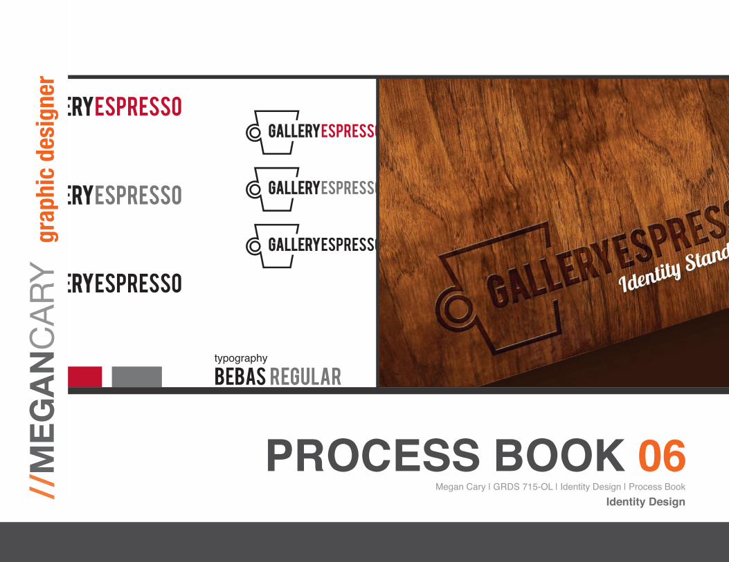
I had a very difficult time deciding between my final two logo choices – a very European looking logo that was completely bold and clean and a (still European looking) one that utilized a script face, Lobster Font, combined with the bold Bebas typeface. I considered my peers suggestions, printed out many, many versions to study and finally went with my gut and chose the completely clean version.
I honestly feel the final design is very strong and has a bold quality that will differentiate it from the competition, while giving the com-pany the flexibility it needs for branding. The color palette of black and bright red is a very bold choice, but completely versatile as it can easily be changed to black, white, or a combination of black and grey as needed. Also, individual locations of Gallery Espresso will be able to keep many unique local décor elements while utilizing the strength of this identity mark to enforce Gallery Espresso’s national presence in the community.
Black PMS 187 C 65% Black
typography
bebas regularthe quick brown fox jumped over the lazy dog 1234567890
color palette
Megan Cary | GRDS 715-OL | Identity Design | Process BookIdentity Design

25
FINAL IDENTITY DESIGN
Black PMS 187 C 65% Black
typography
bebas regularthe quick brown fox jumped over the lazy dog 1234567890
color palette
Megan Cary | GRDS 715-OL | Identity Design | Process BookIdentity Design

26
EBROCHURE OVERVIEW
Overview:For this project we were given a client brief for Gallery Espresso, a café chain based in Savannah, GA, that is preparing for a national launch that will establish them in the U.S. Market. In order to do this they needed a new logo identity that would give them a strong national presence, work in all regions of the U.S. and differentiate them from the competition. In the first part of this project their new identity was creat-ed, for the second part we were asked to create an Identity Guidelines eBrochure that represents the identity guidelines for Gallery Espresso and capture the essence of its brand image.
Research: The research process for the eBrochure went back to the original client brief, from which I learned that Gallery Espresso is unique with their relaxed lounge-like setting, own line of products, gallery space for local artists to exhibit in and they offer a place for local musicians to play. I remembered that they wanted to differentiate themselves from the competition and bring local flair to each unique location.
I had also learned their target audience consisted of male and female consumers, ages 18-50. They are trendsetters who appreciate culture, art and local entertainment. They are tourists and locals who want a place to go for relaxation and entertainment.
I then looked over the competition and then I began to look at other ex-amples of identity guidelines brochures available on the internet. While not always examples for coffee shops, the brochures still gave me a good idea of what should and should not be included and various tac-tics for expressing the essence of the Gallery Espresso brand.
As shown before, I had created a mood board color, texture, type and imagery that would reflect the Gallery Espresso brand essence.
In the mood board I focused on rich textures like velvet, corduroy, wood, stone, and brick. I also added in copper and other metal accents that were contemporary, while staying within the warm color palette that was in the client brief. Interiors and imagery reflected the unique nature of each location of Gallery Espresso, with hodge-podge décor that mixed textures and colors in a comfortable relaxing atmosphere.
Eventually my mood board led to a firm color palette and typography choices for the brand. Because I found this mood board so inspiring I went back to the colors and textures that I had explored when I began the design process for my eBrochure. I felt that these textures truly rep-resented the Gallery Espresso brand image that I wanted to convey.
Megan Cary | GRDS 715-OL | Identity Design | Process BookIdentity Design

Identity Guidelines Brochure Outline | Gallery Espresso | GRDS 715: Print Studio I
Prof. Henry | Fall 2010 | © Megan Cary, 2010
Front Cover
Table of Contents
I. Philosophy and Image
a. Brief History
b. Mission Statement
c. Vision
d. Brand Image
II. Identity
a. Logo
b. Logo Restrictions/Options
c. Typography Standards
d. Corporate Colors
III. Stationery System
a. Business Card
b. Letterhead
c. Envelope
d. Invoice
e. Catering Request Form
IV. Packaging
a. Coffee and Tea Packaging
i. Coffee Bag or Canister
ii. Tea box
b. Collateral Components
i. Gift Card
ii. Take Away Boxes
iii. Merchandise Bags
iv. Paper/Plastic Cups
v. Coffee Sleeves
V. Merchandising
a. Ceramic “Paper” Cups
b. Acrylic Tumblers with Straws
c. Sketch Book/Pencil Gift Set
d. T-Shirt
VI. Environmental
a. Window and Door Decals/Signage
b. Storefront Signage
c. Menu Board
27
OUTLINE
After reflecting on my research and re-examining my mood board I began to make a detailed outline of what to include in my eBrochure for Gallery Espresso.
I broke the brochure down into eight sections that I felt were necessary to cover – Philosophy and Image, Identity, Stationery System, Packag-ing, Merchandising, Environmental, Apparel and Transportation.
Each section in the outline provided a more detailed idea of what I planned to cover in the brochure. For example, Packaging was to in-clude Coffee and Tea Packaging and Collateral components like gift cards, take away boxes or bags, merchandise bags, paper cups and coffee sleeves. Apparel would include the basic uniform or clothing re-quirements for the staff of each location as well as any additional re-quirements for their appearance.
Megan Cary | GRDS 715-OL | Identity Design | Process BookIdentity Design
28
DIGITAL COMPS
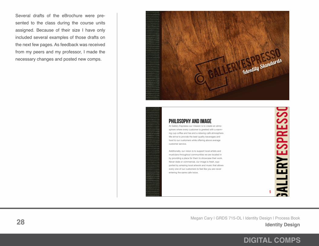
Several drafts of the eBrochure were pre-sented to the class during the course units assigned. Because of their size I have only included several examples of those drafts on the next few pages. As feedback was received from my peers and my professor, I made the necessary changes and posted new comps.
At Gallery Espresso our mission is to create an atmo-
sphere where every customer is greeted with a warm-
ing cup coffee and tea and a relaxing café atmosphere.
We strive to provide the best quality beverages and
food to our customers while offering above average
customer service.
Additionally, our vision is to support local artists and
musicians throughout communities we are located in
by providing a place for them to showcase their work.
Never stale or commercial, our image is fresh, sup-
ported by amazing local artwork and music that allows
every one of our customers to feel like you are never
entering the same cafe twice.
5
philosophy and image
Megan Cary | GRDS 715-OL | Identity Design | Process BookIdentity Design

29
DIGITAL COMPS
The Gallery Espresso logo is the most important part of
our brand identity.
It is fresh, clean, and easily adaptable to many different
types of applications. The standard format, as seen
below, is horizontal. The typeface is Bebas, and the
colors are black and PMS 187 C.
Bebas Regular
Black
PMS 187 C
7
Logo
Megan Cary | GRDS 715-OL | Identity Design | Process BookIdentity Design

30
DIGITAL COMPS
The standard Gallery Espresso logo should be used
whenever possible. However, we do understand that
sometimes exceptions must be made. Here are a list of
acceptable and unacceptable uses.
acceptable alternatives
Black/65% Black
Black
Reversed to White
PMS 187 C
Do not use unapproved corporate colors.
Do not remove the brand mark (coffee cup).
Do not stretch or distortthe logo in any way.
*Some marketing materials may vary from these guidelines. Please contact [email protected] for more information. 8
Logo restrictions & options
Megan Cary | GRDS 715-OL | Identity Design | Process BookIdentity Design

12
Standard invoices, catering forms and other
collateral forms will be issued for each Gallery
Espresso location. These standard forms are
utilized throughout the company in order to
establish thorough and unique system of
organization among our locations.
All forms are printed on Gallery
Espresso stationery, 100% PC
Cream White Smooth 80 text which
is made with windpower from 100%
post consumer waste fibers. This
makes our paper trail not only stylish
but environmentally friendly too.
Invoices and formsCATERING AGREEMENT
8822 Ocean Boulevard . Miami . Florida . 68220 . (251) 888 8900
At every point in handling your catering order, Gelato’s believes that clear communication is key to ensuring that your event is a delight. To help ensure that Gelato’s fulfills all of our clients expectations to the last detail, we ask that our clients provide and/or verify the following information in regards to each specific catered event.
Client Information
Client: ____________________________
Client’s Primary Contact number: ________________
Client’s onsite Contact number: __________________
Order Information
Order Placed: ______________
Date of Event:______________
Event Location: _______________________________________
Caterer’s arrival time: _______________
Serving time (start and end): _____________________________
Menu Information
Menu choices: ________________________
Minimum servings: ____________________
Client’s flavor Choices: _________________
Client’s topping choices: ________________
Transaction Information
Total Cost of Order: ___________________
Cancellation Policy: ___________________
Payment Type: _______________________
Client’s Signature: ____________________________________________________
The information provided in this document is deemed confidential and is intended for the internal use of Gelato’s only. This document is for communication purposes only and does not constitute a contract or any express warranty associated with the catered event to which this document refers.
INVOIC
E
0001 / Coffee Group
000.00 000.00
30 days 00.00
000.00
0002 / 12 Dozen Pastrie
s
000.00 30 days
0
000.00
0003 / Room Rental
000.00 30 days
0
000.00
0004 / Gratuities
Bill to
Contact Name / Accounts Payable
Title
Company Name
123 Any Street
Suite 1
Any Town, USA 00000-000
000-000-0000
Invoice #:
Date:
Customer ID:
Customer PO:
Proposal #:
Delivered to
Contact Name
Title
Company Name
123 Any Street
Suite 1
Any Town, USA 00000-000
000-000-0000 Main
Service Description
ID / Description
Rate / Unit
PriceTerms
Tax
Amount Due
Total this Invoice
0000.00
Sales Tax
00.00
Total Amount Due
0000.00
8822 Ocean Boulevard . Miami .
Florida . 68220 . (
251) 888 8900
31
DIGITAL COMPS
Megan Cary | GRDS 715-OL | Identity Design | Process BookIdentity Design

20
In order to simplify choices for our customers, menu
boards are standard across all locations. Below is an
example of a standard Gallery Espresso menu board
(items will be altered seasonally).
menu boards
32
DIGITAL COMPS
Megan Cary | GRDS 715-OL | Identity Design | Process BookIdentity Design

33
EBROCHURE ANALYSIS
For this project we were given a client brief for Gallery Espresso, a café chain based in Savannah, GA, that is preparing for a national launch that will establish them in the U.S. Market. In order to do this they needed a new logo identity that would give them a strong na-tional presence, work in all regions of the U.S. and differentiate them from the competition. In the first part of this project their new identity was created, for the second part we were asked to create an Identity Guidelines eBrochure that represents the identity guidelines for Gal-lery Espresso and capture the essence of its brand image.
Because of my previous research I conducted when creating Gal-lery Espresso’s new logo identity, I was very familiar with the brand image I had created. I went back and referenced my mood board, market research and logo for inspiration. I also did some internet searches for other companies identity guideline brochures. Doing this allowed me to quickly identify the areas I wanted to focus on for Gallery Espresso’s identity guidelines eBrochure.
From my research I was able to narrow the focus of my brochure into a detailed outline that described the contents and order of my ebro-chure. The sections I decided were necessary for inclusion were philosophy and image, identity, stationery system, packaging, mer-chandising, environmental, apparel and vehicle application.
When I began the design process I identified the fact that first and foremost I needed to clearly present guidelines and restrictions for Gallery Espresso’s branding and image. But I also wanted to show-case who Gallery Espresso was and translate why these guidelines were important. My mood board was really my inspiration from the beginning for my branding and identity. It was the one thing that I felt captured the essence of Gallery Espresso. I pulled textures from the mood board and used it in my design to help convey that essence throughout the brochure.
I also wanted the logo identity to have a strong prescence through-out the brochure so I utilized the logo on every page. The colors stayed within the warm and rich color palette that I established from the beginning and the type is clean and within my brand typography palette. Overall I am very satisfied with the outcome.
Megan Cary | GRDS 715-OL | Identity Design | Process BookIdentity Design

34
FINAL EBROCHURE DESIGN
Final eBrochure Cover (finished piece is 26 pages)
Megan Cary | GRDS 715-OL | Identity Design | Process BookIdentity Design

35
FINAL EBROCHURE DESIGN
14
We take great pride in our excellent packaging for
Gallery Espresso branded coffees and teas. Coffee
is available in a one pound aluminum canister in dark
roast, medium roast and decaffeinated flavors.
Specialty tea is packaged in 4oz. “Tea for Two”
boxes in a variety of flavors such as Earl Grey
and Brit Grey.
In keeping with Gallery Espresso’s commitment
to environmentally friendly practices all of the
packaging for our coffees and teas can be
recycled including the aluminum canister,
cardboard boxes and paper wrappers.
coffee & tea packaging
Coffee & TeaPackaging
At Gallery Espresso our mission is to create an atmo-
sphere where every customer is greeted with a warm-
ing cup coffee or tea and a relaxing café atmosphere.
We strive to provide the best quality beverages and
food to our customers while offering above average
customer service.
Additionally, our vision is to support local artists and
musicians throughout the communities we are located
in by providing a place for them to showcase their
work. Never stale or commercial, our image is fresh,
and supported by amazing local artwork and music
that allows every one of our customers to feel like you
are never entering the same cafe twice.
5
philosophy and image
Da Vinci’s Cappuccino Gallery Espresso Atlanta
24
All Gallery Espresso locations are provided with two
catering delivery vehicles. The “short” delivery vehicle
is available for small deliveries and the “Grande” deliv-
ery vehicle is excellent for larger catering deliveries.
transportation
Short Delivery VehicleCustom Mini Cooper
Grande Delivery VehicleCustom Honda Element
Various pages from Final eBrochure Design (see PDF for all pages)
Megan Cary | GRDS 715-OL | Identity Design | Process BookIdentity Design