process mapping - simple improvement mapping.pdf · process mapping a simple approach to...
TRANSCRIPT

Process Mapping
A simple approach to improvement by making a process visible
An article by Dr. Mike Bell C.Sci., C.Chem., F.R.S.C.Simple Improvement [email protected]
www.simpleimprovement.co.uk [email protected] ! Page 1 of 11

Process MappingA simple approach to improvement by making a process visible
1. What is Process Mapping?All work can be described as a series of individual tasks or steps. The point of mapping these steps is to make them visual, making the connections and feedback loops obvious, with the aim of improving the overall process.
“If you can’t describe your work as a process, you don’t know what you are doing”W. Edwards Deming
Mapping a process simply entails drawing a box for each step and connecting the boxes to show the Jlow of the work. An example makes it easier to see; when cash machines were Jirst introduced, the banks Jigured out quite quickly that it was costing them lots of money to replace lost cards. Looking at a process map, it is obvious where the problem was…
Process Map -‐ Money from the Cash Machine
The initial sequence of steps involved getting the cash out of the machine before the card was returned. Most people were focussed on the money, so, once they had the notes in their hand, they turned away, leaving their card still in the cash machine. Simply by reversing the order of those two steps solved the problem -‐ people had to remove their card before they got their money.
www.simpleimprovement.co.uk [email protected] ! Page 2 of 11

The majority of organisations need nothing more complicated than a basic process map. Although there are many more sophisticated variants out there, this article will stick to the process mapping within the Practical Process Improvement (PPI) program and based on these principles1…
Logical simplicityPractical tools and methodsInvolve everyone
Process maps become useful in driving improvement when they are simple and visual, allowing everyone to understand them and see possible ways to do things better. In my experience it is best to start with a simple map that everyone can follow and use that to build on successive layers of detail; e.g. value stream maps show not just the process steps but the material and information Jlow, along with the people required at each stage. Jumping straight to a complex map (and most people do not understand value stream maps), misses the opportunity to involve everyone and beneJit from their ideas for improvement. And you will Jind only a few cases where the additional complexity is needed. Keeping process maps simple leads to the best improvement ideas.
1.1 The 30,000 foot viewIt is best to start with a high level map of your process. Ed Zunich deJines2 this as the 30,000 foot view; i.e. imagine that you are in a plane cruising at 30,000 feet and are looking down a the ground below. You can see a town all the way down there but can only see the general topography, not the detail. But this view allows you to focus on the big picture, how the town is laid out, where the railway is and the river, the main roads etc. It is really important to get this overview before descending into the detailed view.Start by drawing out the 30,000 foot view for your process. Initially, you need to limit the map to only 4-‐7 steps. Almost everyone is tempted to add additional detail but it much better to restrict the steps to 7 at the most (less than 4 shows you very little). As a general rule, the best people to map and improve a process are the people working in that process (not the managers or supervisors).
There are only 3 symbols used in a simple process map or Jlowchart…
An oval to signal the start and stop of the processA rectangle for each process stepA diamond for a decision
www.simpleimprovement.co.uk [email protected] ! Page 3 of 11
1 Ed Zunichʼs PPI (Practical Process Improvement) program, see www.ppiresults.com and www.simpleimprovement.co.uk
2 See PPI 2020 p96 by Ed Zunich for more information on flowcharts

Here is a simple example of a 30,000 foot process map, showing how to boil a couple of eggs for breakfast...
30,000 foot Flowchart -‐ Eggs for Breakfast
1.2 The 500 foot viewOnce you have completed the 30,000 foot view, it is time to tackle the more detailed view, the 500 foot process map. The concept is that you strap on your parachute and jump out of the plane, descending down to the 500 foot level. Now you can see a lot more detail. You can see the houses in the town, the streets, the intersections, the cars, some people etc. Having gained the overview, you can now understand how people would get to the railway station or cross the river. However, it is critical to stay at the 500 foot level and not to descend down to the 1 foot view, where the level of detail is overwhelming. Continuing the analogy, this would be like crashing down in your parachute into a small forest on the edge of town, where you literally could not see the wood from the trees.Usually the folk who know the process can map the 30,000 view while sat in a training or meeting room, after all it is only 4-‐7 steps. However, once you descend into the detail, mapping becomes much easier if the team goes and walks the process, talking to the individuals involved in running it and tries to Jind out how things actually operate. The idea is to map the process as it is currently, warts and all, not how we would like them to be or the sanitised version written into the standard operating procedure. Once all of the information has been collected, get the team together around a large empty wall space and have plenty of Post-‐it notes to hand. Mapping at the 500 foot level takes quite a bit of time, so it may be necessary to break it down into sections and give the team plenty of breaks.
www.simpleimprovement.co.uk [email protected] ! Page 4 of 11

Here is a 500 foot view of the same eggs for breakfast process that was shown at 30,000 feet. There is a lot more detail, but not so much that the process is hard to follow. This type of view is commonly used in procedural training, particularly for workers new to a process.
500 foot Flowchart -‐ How to Boil Eggs for Breakfast
There are a couple of ways to move from the 30,000 foot view down to the 500 foot level. You could just map the entire process at 500 feet or you could map each of the 30,000 foot steps at 500 feet. Both ways work, but you may Jind one better in one situation, whereas the other approach works in a different process. Using Post-‐it notes allows changing between the two without too much additional work. Taking photos at regular intervals allows you to look back and see how the Jinal view developed.1.3 Deployment FlowchartsIt can be useful to transfer your 500 foot basic Jlowchart onto the swimlanes of a deployment chart. This adds a little more complexity but does give a different and often useful view. Select the parties responsible for the steps in the process; this can be individuals, departments or even including the supplier and customer. Draw lanes for each grouping, either horizontally or vertically, and simply move the task into the correct lane. Joining the tasks together shows the Jlow of the work from one area of responsibility to another.
Here is a supply chain for apples mapped using a deployment Jlowchart..
www.simpleimprovement.co.uk [email protected] ! Page 5 of 11

Deployment Flowchart -‐ Apple Supply Chain
1.4 RACI ChartsA further layer of detail can be obtained by drawing up a RACI chart, showing who is Accountable, Responsible, Consulted or Informed. First, list the tasks down the side of the page, mirroring the order from the 500 foot Jlowchart. Then along the top of the page list all the possible job functions involved in the process, including suppliers, customers and management, as appropriate. Completing the RACI chart should be done as a team activity and does take some time. For each task the team needs to decide who is Accountable (one person only, the buck stops here), Responsible (who actually does the task, can be several people), Consulted (prior to the task being done) and Informed (told speciJically about the task, everyone gets general information). This can be a very valuable exercise in building team consensus and clarity around the work they do.At the end of this process mapping, everyone will have a clear overview of the process (30,000 foot Jlowchart), the detailed steps (500 foot Jlowchart) and the responsibilities of all roles (deployment Jlowchart and RACI chart).
www.simpleimprovement.co.uk [email protected] ! Page 6 of 11

2. Aim of the SystemThe mapping exercise gives a good picture of how the processes are operating at the moment , the warts and all view, and provides an excellent starting point for process improvement. Every system should have an aim; i.e. what is it trying to achieve. Write this down in simple terms that everyone can understand (avoiding nonsense terms such as shareholder value or customer excellence etc.). Then get the team to assess the process against this aim. If this is the Jirst time the end to end process has been mapped, it will look like a mess. Do not worry, all processes get this way over time simply through entropy. It is no-‐one’s fault, so do not be tempted to criticise individuals. Look at the convoluted, tangle Jlow as an opportunity for improvement2.1 Strategic, Core and SupportUp until now, we have considered only a single process. However, an organisation should look at all their processes and see how they link and interact, to ensure correct prioritisation of limited improvement resources. Also, any gaps or overlaps in the processes become obvious. It is helpful to categorise the processes and into Strategic, Core or Support.
An organisation would have, typically, between 5 and 10 processes. If you come up with less or more than that, it might be worthwhile revisiting the list.3. VariaKonAll processes exhibit routine variation. It does not take the same amount of time to get to work each day, due to the weather, slow vehicles, road works, trafJic lights and a whole host of other possible reasons. Therefore, the commuting time is variable. And this is true for all the processes that we use at work. It is very useful to capture and show this variation on the process maps and we do this by recording the times for each step. For example, the time to approve a document can be 1 hour but sometimes takes 3 days. This highlights an opportunity for improvement. What do we need to change to ensure that document approval always happens in one hour?This is an example from a PPI project team looking at urgent blood tests from an Accident and Emergency ward (Currently, urgent blood tests take too long). Looking at the 30,000 foot Jlowchart we can see immediately where some of the issues are.
www.simpleimprovement.co.uk [email protected] ! Page 7 of 11
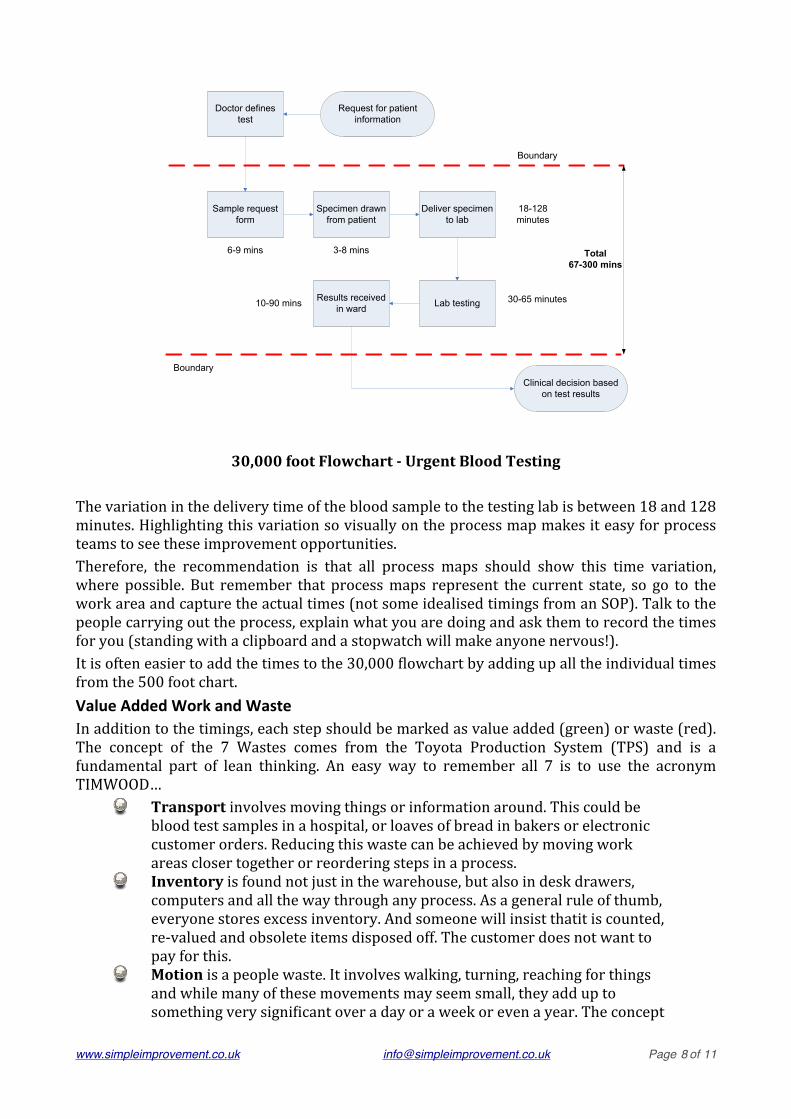
30,000 foot Flowchart -‐ Urgent Blood Testing
The variation in the delivery time of the blood sample to the testing lab is between 18 and 128 minutes. Highlighting this variation so visually on the process map makes it easy for process teams to see these improvement opportunities.Therefore, the recommendation is that all process maps should show this time variation, where possible. But remember that process maps represent the current state, so go to the work area and capture the actual times (not some idealised timings from an SOP). Talk to the people carrying out the process, explain what you are doing and ask them to record the times for you (standing with a clipboard and a stopwatch will make anyone nervous!).It is often easier to add the times to the 30,000 Jlowchart by adding up all the individual times from the 500 foot chart.Value Added Work and WasteIn addition to the timings, each step should be marked as value added (green) or waste (red). The concept of the 7 Wastes comes from the Toyota Production System (TPS) and is a fundamental part of lean thinking. An easy way to remember all 7 is to use the acronym TIMWOOD…
Transport involves moving things or information around. This could be blood test samples in a hospital, or loaves of bread in bakers or electronic customer orders. Reducing this waste can be achieved by moving work areas closer together or reordering steps in a process.Inventory is found not just in the warehouse, but also in desk drawers, computers and all the way through any process. As a general rule of thumb, everyone stores excess inventory. And someone will insist thatit is counted, re-‐valued and obsolete items disposed off. The customer does not want to pay for this.Motion is a people waste. It involves walking, turning, reaching for things and while many of these movements may seem small, they add up to something very signiJicant over a day or a week or even a year. The concept
Request for patient information
Doctor defines test
Specimen drawn from patient
Deliver specimen to lab
Lab testingResults received in ward
Clinical decision basedon test results
Boundary
Boundary
3-8 mins
18-128 minutes
10-90 mins 30-65 minutes
Sample request form
6-9 mins Total67-300 mins
www.simpleimprovement.co.uk [email protected] ! Page 8 of 11
is to supply what ever it is that people need in a process directly to their Jingertips.Waiting hardly needs any explanation. But remember that it is most often not the people that wait, they are very busy, but material and information waits.Overprocessing is doing too much and usually a sign of lack of trust in a process. Incoming goods tests are done even though the sample was made by another part of the company and they did a test before despatch. The form has 5 signatures for approval. A manager has to release this particular batch.Overproduction is making too much or making something too soon. This is the worst waste of all because it generates many of the other wastes. If more is produced than is needed right now, then you have to move it somewhere and store it and probably count and test it. However, this is probably the hardest one of the 7 Wastes for people to accept. How can it be a problem to get ahead, do things early because we will need them later?Defects are things that the customer does not want and generates rework or scrap – very expensive in any process.
For a step to be value added, it must pass all three of these tests…1. The customer is willing to pay for it2. The item being worked on physically changes3. It is done right the Jirst time
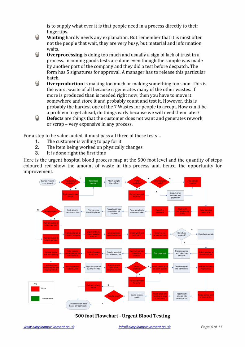
Here is the urgent hospital blood process map at the 500 foot level and the quantity of steps coloured red show the amount of waste in this process and, hence, the opportunity for improvement.
Sample request form (paper)
Pholobotomist available?
Take blood sample
Find nurse to take sample
Attach sample tube to form
Porter available?
Put out tanoy call for porter
Take samples down to lift
Other samples ready?
Collect other samples and paperwork
Find sample container
Wait for lift(no samples by
stairs)
Take lift to basement
Place samples in reception bucket
Receptionist logs sample into lab
computerSample urgent?
Wait for analyst to collect samples
Wait for analyst to collect samples
Analyst exits lab to check for samples
Urgent and non-urgent samples
enter lab
Centrifuge required?
Print bar code identifying labels
Apply label to sample and form
Check samples against computer
Check which test is required
Separate out urgent samples Centrifuge sample
Prepare sample and inject into
analyserRun blood test
Remove sample tubes from analyser
Results recorded in LIMS computer
Print off results from LIMS
Take sample result print out for
authorisation
Sample results wait for checking
Lab Supervisor checks results and
signs print out
Lab Supervisor updates LIMS
Approved print off put into out-tray
Analyst moves print off to
reception out-tray
Porter carries print out back upstairs
Porter available?
Put out tanoy call for porter
Test result goes into ward in-tray
Test results wait to be picked up
Nurse leaves ward to check in-tray
Test results entered into
patient record
Nurse takes test results and goes
to find doctor
Doctor checks resultsResults clear?
Clinical decision made based on test results
Call lab to clarify resultsWaste
Value Added
Key
Y
N
Y
Y
Y
Y
Y
N
N
N
N
N
Collect batches of similar samples
Y
N
500 foot Flowchart -‐ Urgent Blood Testing
www.simpleimprovement.co.uk [email protected] ! Page 9 of 11

4. MetricsIt is critical to measure the performance of your processes, to check that everything is running well or to track improvements. KPI’s are preferable to KRI’s…
KPI -‐ Key Performance Indicators give information in real time about the process; e.g. new sales orders for exportKRI -‐ Key Results Indicators give information about how things ended up and are often an amalgamation of several different factors; e.g. proJit
5. Step by Step Guide
Gather lots of Post-‐it notes and book a meeting room with plenty of free wall spaceAssemble a team of people who are familiar with the processOutline the mapping process and the three symbols usedDeJine the aim of the system (this could be the Mission Statement for the organisation)Prioritise the processes to map at 500 foot level (this can take a lot of time)Add the times to the Jlowcharts and mark the value add and waste steps (green and red, respectively)DeJine metrics for each process, preferably KPI’s
www.simpleimprovement.co.uk [email protected] ! Page 10 of 11
Remember that the aim of making a process visible to everyone is to drive improvement. Therefore, the Jinal stage is to identify problems within the process maps and establish project teams to solve those problems.
6. Mistakes MadeToo detailed, too early -‐ start with the 30,000 foot view, in 4-‐7 steps, and do not move on until you have agreement that this represents the processMapping what you want to see -‐ it is critical that the process map represents the current situation, not some idealised view or what is written in the procedure. So talk to the people involved, get their input as to what really happens. It is impossible to map a process correctly from a meeting room (you might get away with this at the 30,000 foot level, but not at 500 feet)Leaving Post-‐it notes on the wall and assuming that they will still be there in the morning. Post-‐its are not sticky and have a habit of falling off, so take plenty of photos at every stage in the mappingCreating an electronic version of the maps and failing to post these where people can see them -‐ anything in a computer is hiddenFailing to drive improvement -‐ process mapping takes time to complete, but this will be wasted unless the maps are used to highlight areas for improvement and action is taken
7. SummaryKeep process mapping simple and visual and it can be a catalyst for improvement in any organisation, any work environment. It is probably the best way to engage a team and make sustainable improvements. All a leadership team has to do is map the process at 30,000 feet and ask their teams to map the detailed view at 500 feet. Reviewing the results and deJining the areas of opportunity are made much easier by the simple view, meaning that beneJits can be realised very quickly. A small investment of time can afford incredible results.
Dr. Mike Bell runs Simple Improvement Ltd. a continuous improvement training and coaching business based in Scotland. He uses Ed Zunichʼs Practical Process Improvement (PPI) program to help organisations establish a simple continuous improvement system where they can realise quick results and build an in-house capability to train and coach their own staff.
www.simpleimprovement.co.uk or e-mail at [email protected]
www.simpleimprovement.co.uk [email protected] ! Page 11 of 11