pwhite c presentation
DESCRIPTION
uoonuonolTRANSCRIPT

+
Project B
Patrick White001570769DRAW-101-OL/Winter/2013Prof. Dawn Peterson

Old Master
François Boucher (29 September 1703 – 30 May 1770) was a French painter, known for his idyllic and voluptuous paintings on classical themes, decorative allegories representing the arts, or pastoral occupations, intended as a sort of two-dimensional furniture. –www.wikipedia.com

Contemporary Influences
Jeremy Lipking
David Kassam
Adi Granov
Experience
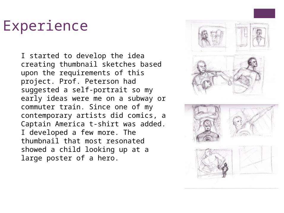
I started to develop the idea creating thumbnail sketches based upon the requirements of this project. Prof. Peterson had suggested a self-portrait so my early ideas were me on a subway or commuter train. Since one of my contemporary artists did comics, a Captain America t-shirt was added. I developed a few more. The thumbnail that most resonated showed a child looking up at a large poster of a hero.

Process
I started gathering reference materials. My initial large drawing was OK but I wanted a more dynamic composition and a bit of humour. So I reworked it a couple of times until I was content with the arrangement of objects. Here is the idea: The kid is a reflection of me in the past, pre-color TV world with aspirations of being the hero (contemporary me) in the full-colour movie poster. He is also looking to the stage door which represents his future life in this world.

Reference

Process
I blocked in the shapes and shadows. I replaced the full body with a cropped upper body to increase the scale the contrast between the boy and the hero. I realized the head on was too large so I made it smaller.

Process
I started to lay in earthy tones building values layering with colour pastels. I wasn’t pleased with my attempts at typography so I removed the characters and filled in the background. After I refined the colour part, I added the lighter and darker details to the black and white area and refined the details.

Finished
I then took a photograph and edited in in Photoshop. I added the typography and enhanced the contrast since the pastels were not intense enough for a comic book style.
Critique
I am very happy with my drawing. I wanted to incorporate the skills and techniques learned in the course including subtractive drawing, linear perspective, atmospheric perspective, sfumato, layering, using limited and full palettes, hatching and layering colours, and using complementary color schemes.
To improve, I would further increase the contrast with pastels and make the words completely disappear from the background. I also might change the angle of the hero in order to make the composition more dynamic and give the illusion of flight.
• Thanks to my classmates for their support and encouragement.
• Thank you Professor Dawn Peterson for your guidance and instruction. I’ve learned a lot in Drawing II.