question 1
TRANSCRIPT

In what ways does your media product use, develop or challenge forms and conventions of real media products?
Alex Roberts


At the beginning of a trailer, an ident (or multiple idents) will be shown to identify the companies associated with the films creation. As of recent years, idents have been adapted to the genre of the film in order to match its mood and atmosphere more. For example, the Warner Bros. idents below are clearly different – the one on the right is the standard, regular ident featuring a light blue sky and shiny logo, whilst the ident on the left is from the latest Hobbit film’s teaser, and is darker, with a more worn and textured logo to bring a darker atmosphere and theme that reflects on the film.
Our ident follows that convention and tries to create a sinister atmosphere with the dark blue colours and black font. Thunder generally creates a feeling of tension and suspense, synchronizing well with our horror genre that tries to put the audience on edge. The lightning creates a feeling of danger to make the audience feel unsafe.
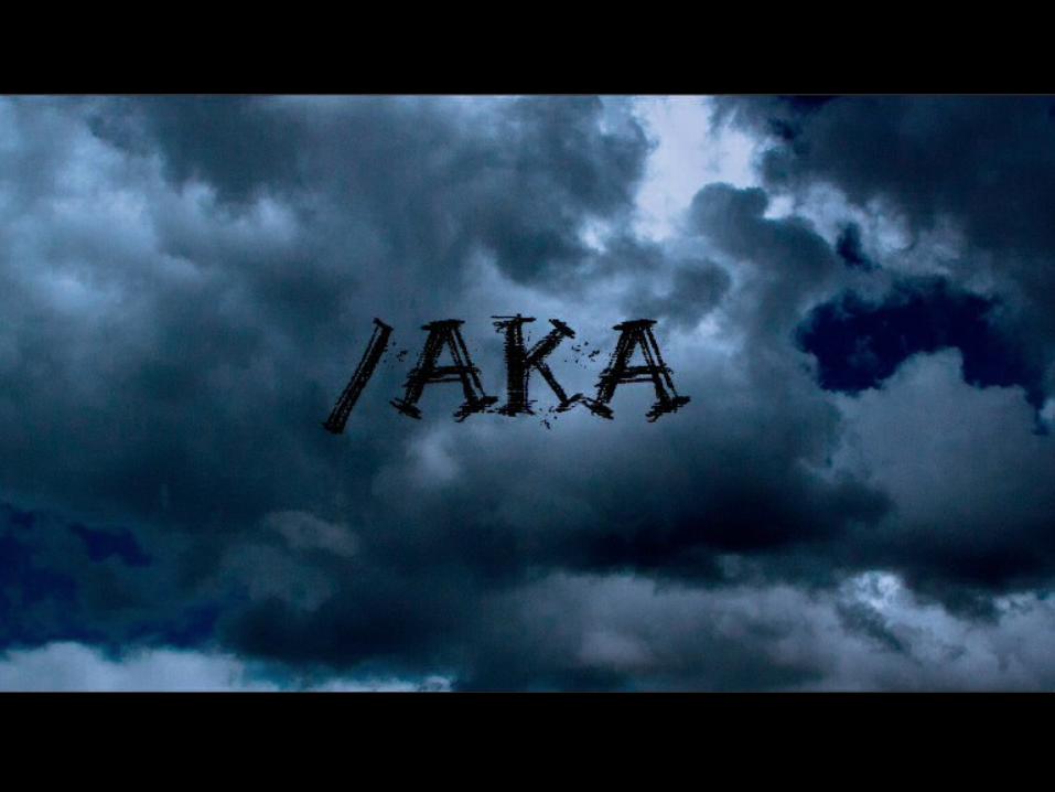
IDENT

As well as in our trailer, we included our logo on our movie poster at the bottom. Unlike the ident, the font was white in order to be visible on the black background.
In this media the logo isn’t even close to being the center of attention and so it doesn’t need to be wildly altered to fit a style. It keeps continuance in font choice but is otherwise completely different from the ident.
IDENT
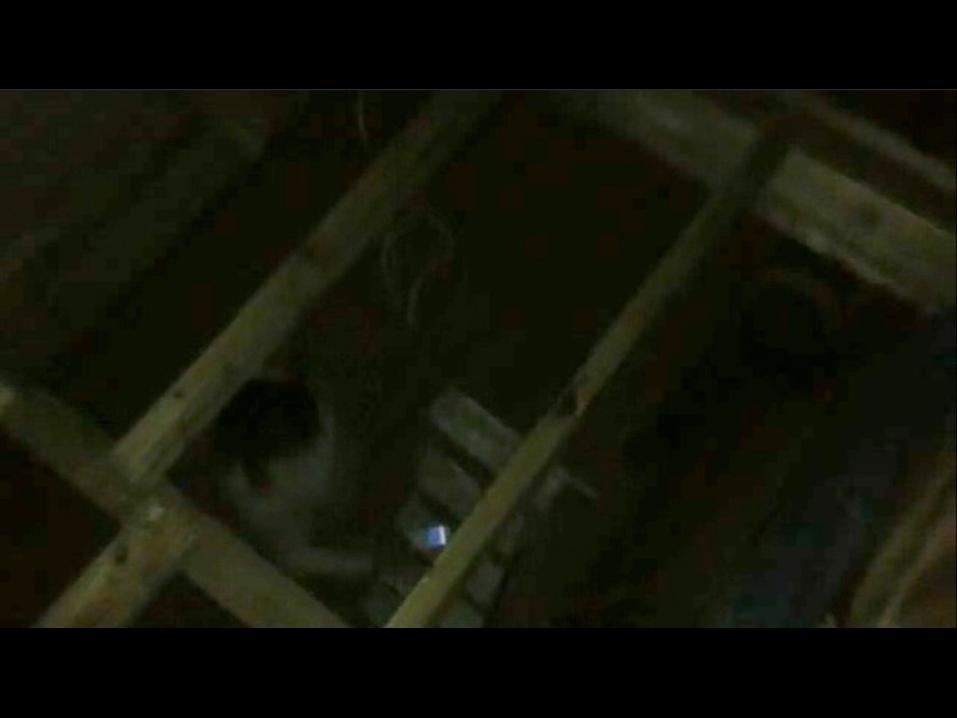
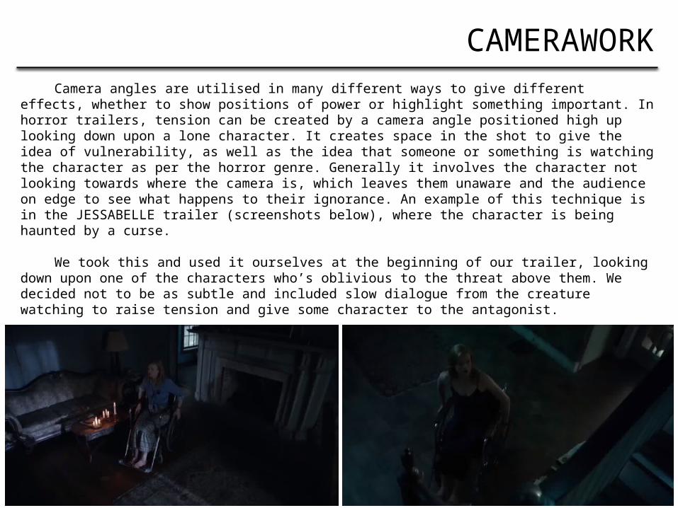
Camera angles are utilised in many different ways to give different effects, whether to show positions of power or highlight something important. In horror trailers, tension can be created by a camera angle positioned high up looking down upon a lone character. It creates space in the shot to give the idea of vulnerability, as well as the idea that someone or something is watching the character as per the horror genre. Generally it involves the character not looking towards where the camera is, which leaves them unaware and the audience on edge to see what happens to their ignorance. An example of this technique is in the JESSABELLE trailer (screenshots below), where the character is being haunted by a curse.
We took this and used it ourselves at the beginning of our trailer, looking down upon one of the characters who’s oblivious to the threat above them. We decided not to be as subtle and included slow dialogue from the creature watching to raise tension and give some character to the antagonist.
CAMERAWORK

Camerawork is used in our other media, too. In our movie poster we use a head-on shot of the doll to have it looking directly at the viewer in order to create discomfort. This is a typical convention of horror movie posters, that more often than not feature the antagonist staring forward at the audience, as exampled below.
Meanwhile in our magazine cover we used an image of Alden looking to the side, choosing this angle to connote the character being unable to face the fear-inducer in the film. This is further implied by the image of the doll incorporated into the back of his head that he’s turned away from, and the style of the image leaving Alden with black-filled ‘blind’ eyes.
CAMERAWORK


It’s quite a common convention to split up different shots within a teaser trailer with different types of credits. Usually they state the month and/or year that the movie will be released, exampled below by the “This May” screenshot from the ‘Avengers: Age of Ultron’ trailer. Other times they will name the director, or refer to them by their previous work experiences. In the example from the latest Hobbit trailer, it makes reference to the “director of The Lord of the Rings trilogy” which is a memorable film series that gives status to the director.
We used this convention in our trailer, breaking up the scene at the start with a credit title for our director. Our movie and director aren’t well-known and are relatively new to the industry, so we simply named the director instead of using a previous film title to show prior accomplishments. The font we used is easy to read and stands out appropriately from the black background.
CREDITS
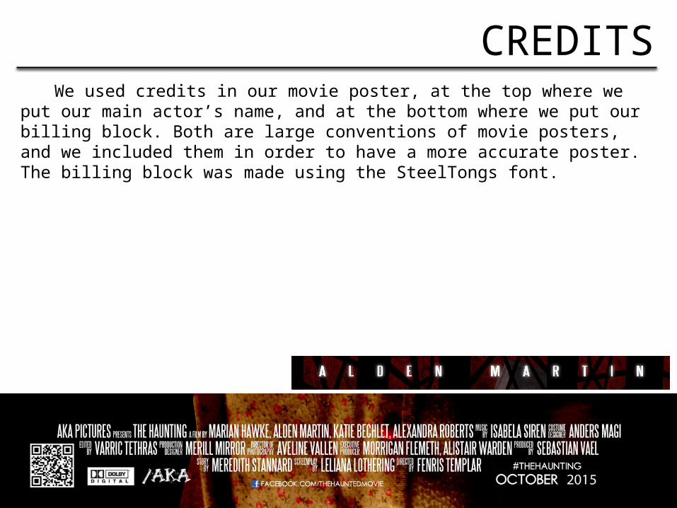
We used credits in our movie poster, at the top where we put our main actor’s name, and at the bottom where we put our billing block. Both are large conventions of movie posters, and we included them in order to have a more accurate poster. The billing block was made using the SteelTongs font.
CREDITS