raki glass packaging designs introduced into the...
TRANSCRIPT

RAKI GLASS PACKAGING DESIGNS INTRODUCED INTO THE TURKISH
MARKET AFTER THE PRIVATIZATION IN 2004: A STUDY ON DESIGNERS’
PRACTICES IN RELATION TO DESIGN GOALS
A THESIS SUBMITTED TO
THE GRADUATE SCHOOL OF NATURAL AND APPLIED SCIENCES
OF
MIDDLE EAST TECHNICAL UNIVERSITY
BY
SELMA KADİROĞLU
IN PARTIAL FULFILLMENT OF THE REQUIREMENTS
FOR
THE DEGREE OF MASTER OF SCIENCE
IN
INDUSTRIAL DESIGN
FEBRUARY 2015


Approval of the thesis:
RAKI GLASS PACKAGING DESIGNS INTRODUCED INTO THE
TURKISH MARKET AFTER THE PRIVATIZATION IN 2004: A STUDY ON
DESIGNERS’ PRACTICES IN RELATION TO DESIGN GOALS
Submitted by SELMA KADİROĞLU in partial fulfillment of the requirements for
the degree of Master of Science in Industrial Design Department, Middle East
Technical University by,
Prof. Dr. Gülbin Dural Ünver
Dean, Graduate School of Natural and Applied Sciences ________________
Prof. Dr. Gülay Hasdoğan
Head of Department, Industrial Design ________________
Assist. Prof. Dr. Fatma Korkut
Supervisor, Industrial Design Dept., METU ________________
Examining Committee Members:
Prof. Dr. Gülay Hasdoğan
Industrial Design Dept., METU ________________
Assist. Prof. Dr. Fatma Korkut
Industrial Design Dept., METU ________________
Assist. Prof. Dr. Naz A. G. Z. Börekçi
Industrial Design Dept., METU ________________
Assist. Prof. Dr. Çağla Doğan
Industrial Design Dept., METU ________________
Assist. Prof. Dr. Gülçin Cankız Elibol
Interior Arch. and Env. Design Dept., Hacettepe University ________________
Date: February 3, 2015

iv
I hereby declare that all information in this document has been obtained and
presented in accordance with academic rules and ethical conduct. I also declare
that, as required by these rules and conduct, I have fully cited and referenced
all material and results that are not original to this work.
Name, Last name : Selma Kadiroğlu
Signature :

v
ABSTRACT
RAKI GLASS PACKAGING DESIGNS INTRODUCED INTO THE TURKISH
MARKET AFTER THE PRIVATIZATION IN 2004: A STUDY ON DESIGNERS’
PRACTICES IN RELATION TO DESIGN GOALS
Kadiroğlu, Selma
M.S., Department of Industrial Design
Supervisor: Assist. Prof. Dr. Fatma Korkut
February 2015, 178 pages
As of 2014, there are more than 70 rakı brands in the Turkish market which emerged
after the privatization following the abolishment of the state monopoly in 2004; only
four rakı brands were available beforehand. With the sharp increase in the number of
brands, an intense market competition begun among the companies: They started
extending their product lines and invested on packaging design by hiring design
sources; therefore, packaging design has gained a significant role in product
differentiation in the rakı market. This study aims to investigate the designers’
practices for developing glass packaging designs for rakı introduced into the Turkish
market after the privatization in 2004, and to identify the design elements in relation
to the design goals aimed to achieve. In this regard, the study surveys the glass
packaging designs for rakı before and after the privatization, documents the
development of rakı glass packaging historically, and presents the findings of the
field study which covered five interviews conducted with the local designers of five
different rakı brands. The conducted research revealed that while label design was
observed as more prominent and significant aspect of glass packaging design in the
past, with the impact of privatizaton, structural design has gained more importance.
The study also discusses shared practices of designers observed in the design process
by dividing into phases and the use of structural design and graphic design elements

vi
in relation to the design goals, and contributes to the process of further glass
packaging design for rakı.
Keywords: Glass packaging design, glass packaging for rakı, design process, design
elements, Turkish designers

vii
ÖZ
2004’TEKİ ÖZELLEŞTİRME SONRASI TÜRKİYE PİYASASINA ÇIKAN RAKI
AMBALAJ TASARIMLARI: TASARIM HEDEFLERİ DOĞRULTUSUNDA
TASARIMCILARIN UYGULAMALARI ÜZERİNE BİR ÇALIŞMA
Kadiroğlu, Selma
Yüksek Lisans, Endüstri Ürünleri Tasarımı Bölümü
Tez Yöneticisi: Yrd. Doç. Dr. Fatma Korkut
Şubat 2015, 178 sayfa
Devlet tekelinin kalkmasını takiben 2004’teki özelleştirme sonrasında, Türkiye
piyasasında öncesinde sadece dört rakı markası bulunurken, 2014 itibariyle 70’ten
fazla rakı markası bulunmaktadır. Marka sayısındaki bu hızlı artış ile, firmalar
arasında yoğun bir rekabet ortamı oluşmuştur: Firmalar ürün çeşitliliklerini
arttırmaya başlamışlardır ve tasarımcılar ile çalışıp ambalaj tasarımına yatırım
yapmışlardır; böylece ambalaj tasarımı rakı piyasasında ürün farklılaşması anlamında
daha önemli bir rol kazanmıştır. Bu çalışma tasarımcıların 2004’teki özelleştirme
sonrasında piyasaya çıkan rakı cam ambalaj tasarımlarını geliştirme süreçlerindeki
uygulamalarını incelemeyi ve hedeflenen tasarım amaçları doğrultusunda tasarım
unsurlarının nasıl kullanıldığını belirlemeyi amaçlar. Bu bağlamda, çalışma
özelleştirme öncesindeki ve sonrasındaki rakı cam ambalaj tasarımlarını inceler, rakı
ambalajlarının tarihsel gelişimini belgeler ve de beş farklı rakı markasının yerel
tasarımcılarıyla gerçekleştirilen görüşmelerden edinilen çıkarımları sunar. Yürütülen
araştırma ile geçmişte ambalaj tasarımının daha baskın ve önem verilen boyutunun
etiket tasarımı olduğu anlaşılırken, özelleştirmenin etkisiyle yapısal tasarımın daha
fazla önem kazandığı görülmüştür. Çalışma aynı zamanda tasarımcıların tasarım
süreçlerinde ortak olduğu gözlemlenen yöntemlerini ve yapısal tasarım ile grafik
tasarım unsurlarının tasarım hedefleri doğrultusunda kullanımını tartışır ve
gelecekteki rakı cam ambalaj tasarım süreçlerine katkı sağlar.

viii
Anahtar Kelimeler: Cam ambalaj tasarımı, rakı için cam ambalaj, tasarım süreci,
tasarım unsurları, Türk tasarımcılar

ix
To My Mom

x
ACKNOWLEDGEMENTS
First and foremost, I would like to express my deepest gratitudes towards to Assist.
Prof. Dr. Fatma Korkut, for her never-ending support, advice and encouragement
throughout this study.
I would like to thank all the designers who participated in the field study of this
thesis for their valuable contributions: Eda Yılmaz, Gamze Güven, İpek Torun,
Orhan Irmak and Oya Akman. I also want to express my appreciations to Elda İçecek
ve Enerji Hizmetleri A.Ş., Sarper İçecek San. ve Tic. A.Ş., Anadolu Alkollü
Alkolsüz İçecekler İth. İhr. San. ve Tic. Ltd. Şti. and Nilay Yılmaz for sharing
information with me.
I would like to express my sincere thanks to Rakı Koleksiyonerleri Kulübü for their
contributions, and particulary Ümit Başyazgan who shared the images of his precious
rakı collection with me.
Special thanks are given to Sabina Mamedova and Neslihan İvit for their valued help
and friendship. Also, I am very grateful for his continuous suggestions and help
during the preparation of this thesis to Gerçek Dorman who always supports me, and
to my cat, Simba for his pure love.
Eventually, I would like to thank my mum, I am deeply indepted to her for
continuous support, belief and love.
xi
TABLE OF CONTENTS
ABSTRACT..................................................................................................................v
ÖZ...............................................................................................................................vii
ACKNOWLEDGMENTS...........................................................................................x
TABLE OF CONTENTS............................................................................................xi
LIST OF TABLES.....................................................................................................xiv
LIST OF FIGURES....................................................................................................xv
CHAPTERS
1. INTRODUCTION…………………………………………………………………1
1.1. The Goal and Research Questions of the Study…………….……………….3
1.2. Structure of the Thesis................................………………..………………...3
2. LITERATURE REVIEW.……................................………………………………5
2.1. Introduction: Rakı………………………….….…………………………..…5
2.1.1. Production of Rakı………………………..…………………....7
2.1.2. Types of Rakı………………………………………….…….....8
2.1.3. Rakı Rituals…………………………………………………….9
2.2. Historical Background of Rakı and Rakı Industry in Turkey………..….….13
2.2.1. Etymological Origin of Rakı……………………………….…13
2.2.2. History of Rakı as a Drink…………………………………....14
2.2.3. Early History of Rakı Industry…………………………….….15
2.2.4. Companies and Rakı Brands Introduced into the Turkish Market
after the Privatization in 2004…………………………………….…19
2.2.4.1. Mey………………………………………………….20
2.2.4.2. Elda………………………………………………….21
2.2.4.3. Burgaz……………………………………………….22
2.2.4.4. Tariş-Tat…………………………………………….23
2.2.4.5. Sarper………………………………………………..24
2.2.4.6. Antalya……………………………………………...25
2.2.4.7. Anadolu……………………………………………..25
2.2.4.8. Alcosan……………………………………………...26

xii
2.2.4.9. Neva……………..………..…………………………….......26
2.2.4.10. Hürol……………………………………………………....26
2.3. Glass Packaging Designs for Rakı……………………………….………...27
2.3.1. Glass Packaging Designs for Rakı in Early History………………….27
2.3.2. Glass Packaging Designs for Rakı Introduced into the Turkish Market
after the Privatization in 2004..…………………………………………………….41
2.3.2.1. Glass Packaging Designs of Mey Brands……………..…....42
2.3.2.2. Glass Packaging Designs of Elda Brands…………………..50
2.3.2.3. Glass Packaging Designs of Burgaz Brands………………..53
2.3.2.4. Glass Packaging Designs of Sarper brands…………………56
2.3.2.5. Glass Packaging Designs of Antalya brands………………..57
2.3.2.6. Glass Packaging Designs of Anadolu brands……………….59
2.3.2.7. Other Companies’ Glass Packages with No Design Source
Information…….……………………………………………………………60
2.4. Glasses and the Karafaki as Accoutrements of Rakı……………..………...62
2.5. Packaging Design………………………………………………….……….67
2.5.1.Packaging Design Process…………………………….………………68
2.5.2. Packaging Design Elements………………………….……….…...…70
2.5.3. Glass Packaging Design for Alcoholic Beverages……..….................73
3. FIELD STUDY…......…………………………………………………..….…....79
3.1. Aim and Methodology of the Field Study…………………………….…....79
3.2. Selection of the Designers to be Interviewed………………………….…...80
3.3. Interview Schedule…………………………………………….……….…..82
3.4. Conduct of the Interviews……………………………………………….….82
3.5. Data Analysis…………………………………………….……….…..….…84
3.6. Findings and Discussion……………………………………………………85
3.6.1. Background of the Designers…………………...…………………...86
3.6.2. An Overview of the State Monopoly Period………………………...87
3.6.3. The First Contact with the Client……………………………………88
3.6.4. The Brief Given by the Client……………………………………….89
3.6.5. Target Consumer Groups……………………………………………90

xiii
3.6.6. The Goals and Expected Outcomes The Client Planned to Achieve
through Packaging Design…..…………………………………………91
3.6.7. Design Research Process………………………………………….…96
3.6.8. Concept Development and Visualization……………………….…...99
3.6.9. Finalization Process……………………………………………...…111
3.6.10. The Design Elements Employed by the Designers to Achieve Design
Goals…………………………………………………………….……117
3.6.10.1. Structural Design…………………………………………...118
3.6.10.2. Graphic Design……………………………………………..123
3.6.11. Problems Encountered by the Designers During the Design
Process………………………………………………………………..136
3.6.11.1. Problems Related with Technical Constraints……………..136
3.6.11.2. Problems Related with Clients and Marketing Teams…......137
3.6.11.3. Problems Related with Graphic Design and Structural
Design…………………………………………………………..138
3.6.11.4. Other problems…………………………………………..…138
3.6.12. The Feedback Received after the Launch of the Product………….139
3.6.13. Designers’ Current Evaluations of Their Designs…………………141
4. CONCLUSION………………………………………………………..……….143
4.1. Research Questions Revisited……………………………….…….….…..143
4.2. Implications of the Research…...……………………………….….……..155
4.3. Limitations of the Research..………………………………….……..……156
4.4. Recommendations for Further Research…………………………….…....157
REFERENCES…………………………………………………………………….159
APPENDICES
A. INTERVIEW GUIDELINE………………………………………………..171
B. CONSENT FORM …………………………………………………….…..177

xiv
LIST OF TABLES
TABLES
Table 2.1: Mey rakı brands………………………………………………………….21
Table 2.2: Elda rakı brands………………………………………………………….22
Table 2.3: Burgaz rakı brands……………………………………………………….23
Table 2.4: Tariş-Tat rakı brands……………………………………………………..24
Table 2.5: Sarper rakı brands………………………………………………………..24
Table 2.6: Antalya rakı brands………………………………………………………25
Table 2.7: Anadolu rakı brands……………………………………………………...25
Table 2.8: Alcosan rakı brands…………………………………………………...…26
Table 2.9: Neva rakı brands…………………………………………………………26
Table 2.10: Hürol rakı brands……………………………………………………….27
Table 3.1: Interviewees of the Field Study………………………………………….81
Table 4.1: Rakı brands launched after privatization in 2004, and their designers…145
Table 4.2:The design goals aimed to achieve for glass packaging designs for rakı.150
Table 4.3: Design elements in relation to design goals……………………………152
Table A.1: Interview guideline in English…………………………...…….………171
Table A.2: Interview guideline in Turkish…………………………………………174
Table B.1: Consent form prepared in English for interviews……………………...177
Table B.2: Consent form prepared in Turkish for interviews……………………...178

xv
LIST OF FIGURES
FIGURES
Figure 2.1: Aniseed………………………………………………………………..…6
Figure 2.2: Toasting the glasses, Yeni Rakı advertisement…………………………11
Figure 2.3: An example to rakı table with meze…………………………………….12
Figure 2.4: Kızkulesi label…………………………………………………………..28
Figure 2.5: The “Mystique of the East” label………………………….....................28
Figure 2.6: Elif Rakı………………………………………………………………...28
Figure 2.7: Two different labels for Ağa Rakı……………………………………...29
Figure 2.8: Hususî Âlâ Rakı label…………………………………………………..29
Figure 2.9: Hususî Fevkalâde Rakı glass packaging………………………………..30
Figure 2.10: Hususî Fevkalâde Rakı label…………………………………………..30
Figure 2.11: Üzüm Kızı Rakı glass packaging……………………………………...31
Figure 2.12: Üzüm Kızı advertisement……………………………………………...31
Figure 2.13: Çavuş Rakı glass packaging…………………………………………...31
Figure 2.14: Efendi Rakısı glass packaging…………………………………………31
Figure 2.15: Dimitakopulo Rakısı glass packaging…………………………………32
Figure 2.16: Bilecik Rakısı beach umbrella and glass packaging design…………...33
Figure 2.17: Baküs Rakı glass packaging…………………………………………...34
Figure 2.18: Baküs Rakı advertisement …………………………………………….34
Figure 2.19: Various rakı brands’ glass packaging from the early history………….34
Figure 2.20: Various rakı brands’ labels …………………………………………....35
Figure 2.21: Kulüp Rakısı label designs………………………………………….…36
Figure 2.22: Kulüp Rakısı glass packaging designs from the archive of Selahattin
Sönmez and Gürbüz Doğan Ekşioğlu……………………………………………….36
Figure 2.23: Yeni Rakı glass packaging designs in the early history……………….38
Figure 2.24: İyi Rakı glass packaging ………………………………………………39
Figure 2.25: İyi Rakı label………………………………………………………..…39
Figure 2.26: Tek Rakı label design……………………………………………….…40
Figure 2.27: Tek Rakı glass packaging………………………………..………….…40

xvi
Figure 2.28: Altınbaş Rakı glass packaging………………………………………...40
Figure 2.29: Altınbaş Rakı label design…………………………………………….40
Figure 2.30: Tekirdağ Rakısı glass packaging, designed in 2000…………………..41
Figure 2.31: Yeni Rakı extensions glass packaging designs ……………………….43
Figure 2.32: Yeni Rakı graphic design redesigned by Landor Agency……………..44
Figure 2.33: Kulüp Rakı and Altınbaş Rakı glass packaging designs ……………...45
Figure 2.34: Mey brands’ glass packaging designs I………………………………..46
Figure 2.35: Mey brands’ glass packaging designs II…………………………….…46
Figure 2.36: Tekirdağ Rakısı extensions glass packaging designs…….……………47
Figure 2.37: Yeni Rakı Beykoz glass packaging designs…………………………...48
Figure 2.38: Yeni Rakı Rastgele and Tekirdağ No 10 glass packaging designs…....49
Figure 2.39: Yeni Rakı graphic redesigns for limited editions……………………...49
Figure 2.40: 45 Derecelik Yeni Rakı, nostalgia series………………………………50
Figure 2.41: Elda brands’ glass packaging designs I……………………….……….51
Figure 2.42: Elda brands’ glass packaging designs II…………………………….…52
Figure 2.43. Efe 5 Yıllık advertising………………………………………………..53
Figure 2.44: The first glass packaging design and the redesigned glass packaging for
Burgaz Rakı by Orhan Irmak……………………………………………………..…54
Figure 2.45: Burgaz brands’ glass packaging designs I………………………….…54
Figure 2.46: Burgaz brands’ glass packaging designs II…………………………....55
Figure 2.47: The first glass packaging of Ata Rakı ………………………………...55
Figure 2.48: Sarper brands’ glass packaging designs I …………………………….56
Figure 2.49: Sarper brands’ glass packaging designs II ………………….………...57
Figure 2.50: Topkapı Rakı family glass packaging designs…………………….….58
Figure 2.51: Abbas Rakı brands’ glass packaging designs ………………………...58
Figure 2.52: 7 Rakı glass packaging design ……………………………….……….58
Figure 2.53: Anadolu brands’ glass packaging designs……….………….………...59
Figure 2.54: Tariş-Tat brands’ glass packaging designs ……………………….…..60
Figure 2.55: Alcosan brands’ glass packaging designs.…………………………….61
Figure 2.56: Neva brands’ glass packaging designs.………………………………..61
Figure 2.57: Hürol brands’ glass packaging designs...……...………………………62
Figure 2.58: Various rakı glasses…..……………………………………………...63

xvii
Figure 2.59: A modern karafaki used by a brand: The ehlikeyif……………………64
Figure 2.60: Anadolu Rakı and its glass ……………………………………………65
Figure 2.61: Yeni Rakı and its glass ………………………………………………..65
Figure 2.62: Tekirdağ Rakısı and its glass…………………………….…………….65
Figure 2.63: Rakı accoutrements of a brand………………………………………...66
Figure 2.64: Secondary packages for rakı, boxes …………………………………..67
Figure 2.65: Design process phases………………………………………………....69
Figure 2.66: Bottle morphology……………………………………………………..74
Figure 2.67: Wine glass packaging………………………………………….………75
Figure 2.68: Bottle shapes ………………………………………………………….76
Figure 2.69: Brandy glass bottle…………………………………………………….77
Figure 2.70: Glass packaging design of Johnnie Walker……………………………77
Figure 3.1: Glass packaging designs which were analyzed in the field study………81
Figure 3.2: An image from the transcription and data analysis phase……………....85
Figure 3.3: Copper carafe..….……………………………………………………..100
Figure 3.4: Copper bucket...……………………………………………………….100
Figure 3.5: Tulip shape tea glass……………………………………………….….101
Figure 3.6: Moser glass products as a source of inspiration……………………….102
Figure 3.7: Glass products as a source of inspiration……………………………...103
Figure 3.8: The dome of Topkapı Palace and its stylization by Eda Yılmaz………105
Figure 3.9: Typography alternatives prepared by Torun…………………………..107
Figure 3.10: Tekirdağ Rakısı graphic design alternatives by Torun……………….108
Figure 3.11: Tekirdağ Rakısı Altın Seri graphic design alternatives by Torun……109
Figure 3.12: Tekirdağ Rakısı Trakya Serisi graphic design alternatives by Torun..110
Figure 3.13: The neck stuctures of Yeni Rakı and Mercan Rakı…………………..119
Figure 3.14: Smooth shoulder lines of Kulüp Rakı glass packaging design……...120
Figure 3.15: The inlaid areas formed by the collar detail and aniseed stylization…122
Figure 3.16: The moiré effect on the label of Burgaz Rakı………………………..124
Figure 3.17: The labels of Tekirdağ Rakısı glass packaging………………………128
Figure 3.18: The back label of Tekirdağ Rakısı…………………………………...129
Figure 3.19: Tekirdağ Rakısı Altın Seri and Tekirdağ Rakısı Trakya Serisi glass
packaging designs………………………………………………………………….130

xviii
Figure 3.20: New Tekirdağ Rakısı family…………………………………………132
Figure 4.1: The phases of design process for rakı glass packaging………………..148

1
CHAPTER 1
INTRODUCTION
Rakı is a widely known traditional Turkish alcoholic beverage. Although it seems an
ordinary spirit to others, it is more than a drink for Turkish people; it is a dining
ritual, and the most consumed spirit in Turkey. Rakı differentiates itself from other
alcoholic beverages as the only drink that has built up its own food culture. Being
produced with the distillation of grapes and raisins, flavored with aniseed, and the
whitening when water is added make it distinctive. Rakı is also a registered
geographical indication.
Rakı is one of the cultural symbols of Turkey and it is part of Turkish culture for
more than six centuries. According to Kürkçü, it is hard to detach rakı culture from
Turkish culture since rakı is a part of daily life, and affects sociological behavior of
Turkish people; that is why when one thinks about Turkey, rakı is one of the first
things which come to one’s mind (2005). Rakı was produced by various civilizations
that lived in this geography and it became a shared cultural legacy as described in
Rakı Ansiklopedisi (2010).
Today, there are more than 70 brands in the rakı market which emerged after the
privatization following the abolishment of the state monopoly in 2004, whereas only
four rakı brands were available beforehand. With the sharp increase in the number of
rakı brands, an intense market competition begun among companies. They started
extending their product lines and invested on packaging design by hiring design
sources and therefore, packaging design has gained a significant role in product
differentiation in the rakı market.
Companies have used various promotional strategies such as advertising, sponsored
organizations and events as well as launching new rakı sorts and packaging designs.
This trend continued until the new alcohol legislation issued by the government in

2
2013, which restricted the communication and advertising in alcoholic beverage
sector completely. Since then, it has been quite difficult to get news about rakı sector.
With the impact of government regulations, the companies neither share any
information about their products in their websites or media, nor sponsor events or
organizations. Consequently, consumers become aware of new brands mostly when
they come across glass packages of those brands on store shelves. Packaging design
plays a more active role; currently, it is the only strategic tool remained to attract
consumers’ attention and persuade them to change or maintain their purchasing
habits.
Packaging for rakı has also an economic significance; according to Geleneksel
Alkollü İçki Üreticileri Derneği (GİSDER), 94.3 million USD was used just for
packaging including glass package, label, cap and other packaging materials as of
2013 (n.d.a). On the other hand, GİSDER also signifies the problems for the supply
of glass bottles as follows: Limited number of suppliers that manufacture glass
packages used for alcoholic beverages; low manufacturing capacity of suppliers; the
high cost of import, and the inferior quality issues in small-scale manufacturers
(GİSDER, n.d.b).
Despite the fact that there are many studies on the quality of rakı in terms of its
chemistry, the studies on glass packaging designs for rakı are quite limited and they
focus on specific designs of some well-known brands and designers only. A study by
Kürkçü focuses on the branding rakı as a geographic identity for agrindustrial design
(2005) and a thesis work which focused on women designers mentions a rakı glass
package briefly (Eti, 2005). A comprehensive study by Kaygan (2007) focuses on
Yeni Rakı bottle with an iconological analysis, and how its bodily curves were related
with the tulip shape and oriental curves. Besides that Irmak’s dissertation titled
“Development Patterns of Packaging Design in Turkey since 1945” includes a case
study with one of the leading companies in the rakı sector (2011). Apart from this,
Cartier and Akbulut (2012) conduct a study on the promotional glasses provided to
restaurants and the reasons lie behind the preference of restaurants.

3
1.1 The Goal and Research Questions of the Study
The main goal of this research is to investigate the designers’ practices for
developing glass packaging designs for rakı introduced into the Turkish market after
the privatization in 2004, and to identify design elements in relation to design goals
aimed to achieve from the designers’ perspective.
The research questions to be addressed in this study are as follows:
What are the earlier examples of glass packaging designs for rakı in
Turkey prior to 2004?
What are the glass packaging designs for rakı introduced into the Turkish
market after the privatization in 2004?
What are the phases of design process for developing these glass
packaging designs?
What are the design goals aimed to achieve through these rakı glass
packaging designs?
What are the design elements employed by the designers to achieve these
design goals?
1.2 Structure of the Thesis
This thesis includes four chapters. Chapter 1 presents a brief introduction pointing
out the significance of the study, and the goal along with the research questions.
Chapter 2 presents the literature review. It starts with a brief overview of product
properties of rakı, and documents the historical development of glass packaging
designs for rakı before and after the privatization. Then, it continues with presenting
packaging design, design process, design elements along with glass packaging design
for alcoholic beverages.
Chapter 3 starts with the methodology of the field study which can be told as the
major part of this study. It summarizes the research method for this study, focusing
on qualitative research methods and technique used for the analysis of data along
with findings and discussions.

4
Chapter 4 includes and summarizes the overall conclusions considering the findings
from the field study and literature review by revisiting the research questions. Then,
it discusses the implications of the study for design, and presents its limitations and
recommendations for further research.

5
CHAPTER 2
LITERATURE REVIEW
Since this study mainly focuses on glass packaging designs for rakı which were
introduced into the Turkish market after the privatization, it is useful to explore rakı
itself, its early history, how glass packaging designs for rakı have evolved in time,
and the companies and brands.
2.1 Introduction: Rakı
Rakı is a well-known traditional Turkish drink in the entire world. Although it seems
a common spirit to others, for Turkish people, it is more than a drink; it is a cultural
symbol as well. As described in Rakı Ansiklopedisi, it is a shared cultural legacy of
civilizations who lived in this region, and the only drink that has built up its own
food culture; whereas wine, for example, is selected based on the type of food will be
eaten (2010). Rakı has a different consumption style, it is more than a drink in
Turkish dining culture, and it has a significant value on tables compared to other
alcoholic beverages.
Rakı has a significant place in Turkish culture. Kürkçü tells that rakı is peculiar to
Turkish culture when its product properties, ingredient herbs, production process and
history were considered (2005).
According to Turkish Food Codex (2005), it is defined as a twice distilled traditional
spirit which is produced in 5000 litre or smaller sized copper alembics; produced
from only suma and ethyl alcohol of non-agricultural origin, and flavored with
aniseed (pimpinella anisum, Figure 2.1). The raw materials are grapes, raisins or a
combination of both. In order to be called “rakı”, it must contain at least 40%
alcohol and has to be produced from at least 65% grape suma. In addition to these,
the most important provision of being “rakı” is to be produced only in the borders of

6
Turkey (Turkish Food Codex, 2005). Moreover, its raw materials must grow in
Turkey, as well. According to a registration certificate by Turkish Patent Institute
(TPE), Turkish Rakı is the protected geographical indication in the field of spirit
drinks since 2009 (TPE, 2009).
On the other hand, rakı has a financial value for Turkey by making up 85% of the
spirits supplied to the domestic market and 95% of the exported spirits (TPE, 2009).
As of 2013, the value of rakı export is indicated as 25.3 million USD, while it is 3.2
billion USD for the domestic rakı market (GİSDER, n.d.a).
Figure 2.1: Aniseed (reproduced from Rakı Ansiklopedisi, 2010).
There are many drinks in global market which use aniseed as a flavor: Absinthe in
France, sambuca and Galliano in Italy, aguadiente in South America, Herbsaint in
New Orleans, allasch in Russia, ouzo in Greece, pastis in France and arak in Syria
(Yücesoy, 2011; Alden, n.d.). They differentiate with each other by their production
process and their consumption styles. As stated by Galip Yorgancıoğlu who is the
CEO of Mey İçki Sanayi ve Ticaret A.Ş. (hereinafter referred to as Mey), the main
difference of other anise-based drinks is the production technique in which grapes

7
are not processed in the first distillation, and the aniseed plant is used just as an
essence; the distinction of rakı comes from the use of “Turkish grapes and Turkish-
grown anise seed plants” for producing rakı (Yorgancıoğlu, 2013).
Concerning the consumption of rakı, it must be cold, and adding water or drinking
nate is definitely up to the consumer’s preference. However, whereas rakı is
transparent while drinking nate, its color changes when added water, and “becomes a
milky white”, and so it obtains a distinct pleasant taste (“Turkish national drink,
Raki,” n.d.). Its milky white color is also one of the reasons why rakı is called as
“lion’s milk” (aslan sütü in Turkish). However, this milk seems to belong to “king of
beasts, the lion”; therefore, “the metaphor lion’s milk” emerges (E. Zat, 2012). Rakı
is known as giving courage to its drinker.
2.1.1. Production of Rakı
The production of rakı is described in several sources in detail (TPE, 2009; Gürsoy,
2007; the Ministry of Health, 2008). To explain briefly, the production process
includes mainly two steps: suma production and rakı production. For the first step,
fresh grapes, dried grapes or the combination of both are crushed and then mixed
with water. Afterwards the mixture is pasteurized and left to fermentation. When the
fermentation is done, the liquid is distilled and processed into suma. Secondly, after
suma is flavored with anise and diluted with water, it is distilled one more time in
copper alembics, diluted with drinking water, and sugar is added, and finally left to
aging for at least one month (TPE, 2009; Gürsoy, 2007; The Ministry of Health,
2008).
Distillation of alcohol is a dangerous process for non-experts. It needs a professional
knowledge, frequent control and care during process and if the requirements (proper
equipment and controlled environment) are not fulfilled, its consumption may cause
damage to organs or even death. In 2000s, Turkey witnessed a number of cases
where people lost their ability to see and even their lives just because they consumed
improperly and illegally produced rakı called as “counterfeit rakı”.

8
2.1.2. Types of Rakı
In today’s market, rakı varieties are based on several factors: the grape variety they
have, production technique used and the additives preferred (Yücesoy, 2011).
Firstly, there is a classification based on the grape variety it contains: a) Fresh grape
rakı which is produced only from fresh grapes, b) dried grape rakı which is produced
only from dried grapes and also known as classic or regular, and c) the combination
of both fresh grapes and dried grapes. As also explained by E. Zat, the preference of
raisins or fresh grapes either alone or a combination of them affects the product’s
characteristics (2012). In recent times, organic rakı emerged, which highlights being
produced from completely organic raw materials.
Secondly, the production technique is considered as significant while defining
distinctive features of a rakı brand. There are three parts of production processes as
fermentation, distillation and dilution described in Turkish Food Codex in 2005;
ageing, filtration and bottling are the important steps in order to enhance the quality
of the rakı at the end (as cited in Yücesoy, 2011). It is observed that there are various
brands which stress its distillation times as twice or triple and the aging in barrels
since it influences the consumer about the taste and quality. It can be said that since
distillation affects the levels of alcohol within rakı, distillation time can change the
classification of brands as well. On the other hand, if a brand is aged for more than
one month as specified in Turkish Food Codex (2005), then it stresses this feature
while launching. Besides these, göbek rakısı also differentiates from others with its
production technique which does not require the use of the first and the last distillates
in production process (E. Zat, 2010).
Thirdly, rakı can include various additives: flavorful seeds, aniseed, sugar, mastic,
and other sweetening products (Yücesoy, 2011). Since all of the additives can change
the taste, it might change the classification of rakı. As mentioned earlier, rakı is
flavored with aniseed and therefore obtains its distinctive taste; however, aniseed is
not the only herb used in rakı production in history and rakı has been flavored also
with different herbs since its beginning. Expressing that banana, pomegranate,
cinnamon, carnation and mastic rakı types were produced, Gürsoy indicates that
mastic-flavored rakı produced in Chios (Sakız Adası in Turkish) was one of the most

9
popular rakı types and called as mastika (2007, p.23). Of course, mastika does not
contain only mastic but anise as well. Therefore, stating that if only aniseed was used
as a flavour in production, E. Zat point outs that it was called as douziko which
means “straight rakı” (düz rakı in Turkish) and not containing any mastic, and after
1870s, douziko became popular and people started to call it simply as “rakı” (2012).
Dusiko, douzico and duziko were the terms also used for referring to straight rakı,
and hereinafter duziko will be used throughout this study.
On the other hand, stating that Evliya Çelebi mentioned about rakı types in the 17th
century, E. Zat (2012) explains: “Basil, cinnamon, firna, mustard, date, imamiyye,
clove, mint, linden, sudina, sûşnâr, and poloniyye arak” were used for rakı
production, and concludes: “The choice of anise came after many years of experience
with different flavors” and “anise-emerged victorious”.
2.1.3. Rakı Rituals
“First of all, you have to consider rakı as a presence in your table - one that you need
to respect. You need to respect the drink and the rituals of the drink. Unlike wine, the
rakı bottle never stays at the centre of the table. It has to be at the end of the table.
You have to treat the rakı bottle like a person sitting at the table” says Galip
Yorgancıoğlu, in his interview titled “‘The Spirit of İstanbul’ goes nicely with
friends and meze” (Yorgancıoğlu, 2013). This shows that rakı has a significant value
on the rakı tables, like a person.
Rakı is described by V. Zat as “a milestone for boys in the family,” and it is seen as a
link between father and son: “For the father, he feels his son is ready to drink raki.
And for the son, he feels respected by his father” (as cited in Mattis, 2014).
Drinking rakı seems different from drinking other alcoholic beverages. There are
several rules of rakı table; additionally, where, when and with whom to drink rakı are
as important as how to drink.
The rituals of rakı are described by many authors, rakı drinkers and brand managers.
But, at first, the place of drinking rakı must be explained. Rakı is consumed in
homes, restaurants, clubs, hotels and outside, particularly in picnics and vacations.
However, rakı is known as being consumed in meyhane, Turkish drinking house.

10
Although meyhane is a place where rakı and also other sprits can be consumed, it is
seen as a significant part of the rakı ritual. E. Zat explains in his book that the word
“meyhane” is known as a place to drink rakı; in fact, it is a derivation of the word
mey (wine) and hane (home) from the Persian language, and then the usage of word
broadened and now meyhane turned to a place where all kinds of alcoholic beverages
can be consumed (2012).
According to Yorgancıoğlu, “Rakı is a social drink”; which means that rakı is
consumed with friends, and hours of conversation is one of the significant details in
rakı drinking (Yorgancıoğlu, 2013). It can be said that drinking alone is not fit to the
rituals of rakı. According to Gürsoy, while drinking, business cannot be the subject
of conversation; calming topics are selected such as football, politics in particular
“how to save the country” or just chatting (2007). Moreover, he points out that rakı is
not consumed as fast or shot, and the rakı drinker should not leave the rakı table
early; it must be consumed slowly in a time as long as possible. The appropriate time
to consume rakı is specified as sunset by Gürsoy (2007).
Rakı is consumed as cold; however, water should also be cooled before drinking. If
ice will be added, then water must be used first due to the fact that the anise
suspended can be crystallized and cause spoilage of flavor (E. Zat, 2012). As
described by Aydın Boysan, who is famous for his rakı knowledge and drinking,
firstly water should be poured and then, rakı should be added; by doing so, the real
taste of rakı can be understood (as cited in Kesmez & Aydın, 2013).
One of the rituals of rakı table is raising the rakı glasses. In general, the leader or the
oldest person of the rakı table raises the first glass and says “Şerefe!” which is
similar to “Cheers”, but has a meaning of “To honor!”, and adds a wish about love,
health or success; and then, all of the people join this ritual and raise their glasses and
toast too (Arditi, 2013; E. Zat, 2012). As it can be seen in Figure 2.2, one of the rakı
brands says goodbye to consumers after the new alcohol legislation issued by the
government which restricted the communication and advertising in alcoholic
beverage sector in 2013, by using the ritual of toasting the glasses, and saying “Stay
always new my brother!” as a wish.

11
Figure 2.2: Toasting the glasses, Yeni Rakı advertisement (retrieved and adapted from:
http://listelist.com/yasaklardan-sonra-alkol-firmalarinin-yayinladigi-son-reklamlar/yeni-raki-
hep-yeni-kal-kardesim/).
As emphasized by Aydın Boysan, rakı must be smelled before drinking in order to
feel the aniseed odor, and then the drinker should take a sip and swallow it slowly (as
cited in Kesmez & Aydın, 2013). In order to lessen the burning effect of rakı, water
is drunk later. The main reason of this consumption style is the high alcohol content
of rakı which can make a person drunk easily when consumed fast. In relation to this,
Yorgancıoğlu declares: “A good rakı drinker never gets drunk. He or she knows how
to drink the beverage” (Yorgancıoğlu, 2013).
After taking the first sip of rakı and water, the food on the rakı table is eaten.
Consuming rakı with food is another important detail which differentiates it from
other alcoholic beverages. In order to drink rakı, a rakı table is prepared firstly. This
ritual is called setting a çilingir sofrası which means “locksmith's table is renowned

12
for unlocking the secrets of any heart” (Arditi, 2013; E. Zat, 2012). Çilingir sofrası
signifies a rakı table prepared with various types of meze, appetizer (Figure 2.3). In
fact, çilingir sofrası evolved from çeşnigir sofrası; çeşnigir is used as a metaphor in
referring to personnel in the Ottoman palace kitchen, and also çeşni means a mix of
spices and flavors, as explained by E. Zat (2012). There are various types of meze in
Turkish food culture: cheese, melon, seafood, Mediterranean herbs, vegetables with
olive oil, humus and so on. Gürsoy mentioned that rakı drinkers do not eat too much
at the rakı table and mostly meze is preferred (2007). Besides meze, fish is
indispensable part of rakı table, since it seems a complementary pair to rakı.
However, it seems important that any taste of food should not suppress the pleasant
taste of rakı. After drinking and eating all evening long, the night usually ends with a
soup and Turkish coffee which are consumed in order to prevent upset stomach and
to ease indigestion (E. Zat, 2012).
Figure 2.3: An example to rakı table with meze (retrieved on December 12, 2014, from:
http://gecce.com/restoran/haber/raki-meze-keyfine-hazir-misiniz).
In the rituals of rakı, music has a significant place. In generally, classical Turkish
music is preferred with classical Turkish instruments such as ud and kanun, string
instruments, and if a music band was hired for meyhane, traditional tunes are played
(Arditi, 2013). Although Gürsoy (2007) says that if there is a live music program in a
drinking house, it cannot be called as rakı table; Yorgancıoğlu declares that music is
an important part of the ritual only if it is not too loud, but cannot be said as

13
definitely required (2013). In today, it is possible to see these bands in each
meyhane while rakı drinkers are enjoying the music as joining with their dances, or
singing only.
2.2. Historical Background of Rakı and Rakı Industry in Turkey
2.2.1. Etymological Origin of Rakı
Although it is not very certain, there are various stories about where the word rakı
comes from, its etymological origin. However, it is accepted that it emerged from
Ottoman lands (Efe Rakı, 2013a).
Stating that there are many linguists who think that rakı was evolved from the Arabic
word arak which means sweat, E. Zat explains as follows:
The word is a metaphor that alludes to their first experience in producing
alcoholic beverages, with the final product dripping slowly from the still
distillation likened to dripping sweat. (2012)
According to Gürsoy, this story is more logical since its production technique is
close to this metaphor (2007, p.11). Pointing out the usage of arak, E. Zat also brings
a new approach to the “lion’s milk” myth, and tells that it is emerged from this word:
“Whoever drinks this liquor, sweats!” He also explains that arak refers in Turkish
sources, to kımız which is a drink produced from mare’s milk in the Central and
North Asian plateaus (E. Zat, 2012).
Indicating the same etymologic structure they have with arak, Gürsoy (2007)
mentions about its derivatives used in Near East: araki, ariki and rakı. There is
another popular story about its origin that it might have been produced in Iraq and
comes from the word “Iraqi” which refers to its geographical indication, and then
extended the world (Kürkçü, 2005). However, Gürsoy (2007) objects to this claim by
explaining that there was not any country named as Iraq in the 16th
century (p.11).
Another claim related with rakı is that it takes its name from an aniseed drink
produced from Razaki grapes which are large, long and thick-skinned. Gürsoy states
that there is a relation between Razaki and rakı in pronunciation (2007). Related with
this, Vefa Zat indicates that its similarity in pronunciation gives a possibility to this
story, as well (2012).
14
2.2.2. History of Rakı as a Drink
Rakı is known as the traditional alcoholic beverage of Turkish people for years and it
has a significant place in Turkish culture. Although there is not exact information
about the very first rakı production place and time, it is possible to find clues about
the historical background of rakı from various sources.
According to E. Zat, rakı history extends back to 2000 B.C., and people distilled
alcohol obtained from the fermentation of grapes in those times since pottery vessels
used for producing small quantities of alcohol for perfume making were found in
archaeological excavations (2012). In ancient times, Arabs were known with their art
of perfumery, preserving the fragrances of plants in the alcohol distilled primitively;
alcohol is an Arabic origin word which spread all over the world (E. Zat, 2012).
However, he adds later that rakı evolved in time and formed into “today’s perfected
product” in the 19th
century.
In the 5th
century, there was an alcoholic drink which was similar to rakı in the East-
Roman Empire, and “the recipe of which the Turkish people learned in the
11th
century; it was introduced to Anatolia and Rumelia by mostly Bektashi descent
people” (Efe Rakı, 2013a).
When the history of distillation technology was investigated, it is indicated by E. Zat
that Arab and Persian chemists developed it first in the 8th
and 9th
centuries (2012).
The first chemist worked on the distillation of alcohol from wine was Jabir ibn
Hayyan who was a Persian chemist lived in Urfa in the 13th
century and also known
as the “Hippocrates of Chemistry”. In addition, there is a written source İmbik
(derived from Arabic word al-ambic) by Hayyan (V. Zat, 2012). In the 11th
century, a
Persian poet Omar Khayyam (1048-1131) reflects his appreciation for rakı culture in
his poems, and due to the similar last names of Khayyam and Hayyan and their
shared interest area, a metaphor is popular: “Wine from Khayyam, Rakı from
Hayyan” (E. Zat, 2012).
Considering the findings about the history of rakı, most of them extend six centuries
back. In this point, alcohol prohibitions should be mentioned as significant incidents
of the time. As stated by E. Zat (2012), before the 15th
century, alcohol consumption
was not restricted in the Ottoman society; however, after the adoption of Islam, it

15
was forbidden for a few short periods: Sultan Suleiman the Magnificent (1520-1566),
Ahmet I (1602-1617) and, the last one, Murat IV (1623-1640). In these periods,
drinking houses were closed; drunk people were caught and beaten. Gürsoy (2007)
indicates that rakı was being consumed in İstanbul in 1573, considering a provision
sent by 2. Selim who was the Sultan of the Ottoman Empire following his father
Sultan Suleiman the Magnificent and lift the prohibition. In this period, Evliya
Çelebi used the words arak and rakı in his famous travelogue Seyahatname, and
mentioned about rakı as not only a drink called “lion’s milk” but also its high number
of producers in İstanbul. In addition to this, another poet Aşık Kerem used the word
rakı in his poem in the 16th
century (Gürsoy, 2007).
In the late 19th
century, mastika was indicated as a very popular drink in İstanbul due
to its characteristic flavor and generic name; however, according to a writer of that
period, everything changed in the 1870s and people started to consume more duziko
than mastika, because of its harder taste and satisfying effect on consumers while
drinking (E. Zat, 2012).
2.2.3. Early History of Rakı Industry
In the 19th
century, industrial alcohol production of private brands was allowed by
the Ottoman government which was under excessive pressure of debts, either
domestic or foreign, as explained by E. Zat (2012). Therefore, they generated a
solution for discharging as imposing a tax on alcoholic beverage consumption;
however, the pressure of foreign governments increased on paying debts, and forced
Sultan Abulhamit II to pay them particularly from a single center, and so the Turkish
Tobacco Monopoly (Reji İdaresi) was established (E. Zat, 2012). Then, imposing
taxes resulted with tax registration of rakı brands, and the first official rakı brand of
Ottomans, Umurca Rakı was produced in the Umurca Rakı Factory. It was also the
first rakı factory established in 1880 by Sultan Abdülhamit’s chief and the Finance
Minister Sarıcazade Ragıp Paşa. Stating that consumption of alcohol was not
supported in Ottomans due to being Muslim, E. Zat declares that the trade and
consumption of alcohol was not prohibited except during the certain periods as
mentioned before (2012).

16
Other than Umurca Rakı, there was another brand mentioned as important in the late
19th
century: Fertek Rakı. According to E. Zat, Fertek Rakı which was a straight rakı
(douziko) had the name of its production region, a town in Cappadocia (2012). He
adds that Fertek Rakı was sold in a new format for rakı market with the competition,
in containers which had a volume of 3.5 and 19 litres.
At the beginning of the 20th
century, there was an increase in the number of brands
including Zarakosta Rakı, Çavuş Rakı, Elif Rakı, Ağa Rakı, Dimitrakapula Rakı, and
Tenedos Rakı (also known as Denizkızı). However, in 1920, the Republican period,
the trade and consumption of alcohol were banned with a law by the first parliament
of Turkey due to the conditions of Turkish War of Independence (V. Zat, 2012).
With this ban, alcohol consumption were quite lowered down, but not completely
stopped.
Six years later, when the law of alcohol prohibition was lifted; the state institution of
Alcohol and Alcoholic Drinks of Turkey, (İnhisarlar İdaresi Türkiye İspirto ve
Meşrubatı Küuliye İnsisarı, later renamed as Tekel) was established in 1926 in order
to manage the rakı market (E. Zat, 2012). It must be mentioned that this institution
did not only govern alcohol production but also tobacco, salt, gun powder and so on
(Irmak, 2011). In this period, another significant detail was that Paşabahçe Glass
Factory was established by the state institution of Alcohol and Alcoholic Drinks of
Turkey, and started to produce glass packages for alcoholic beverages (E. Zat, 2012).
The state institution of Alcohol and Alcoholic Drinks of Turkey was not only a
control institution for private brands; it also marketed its own rakı brands: The first
one was Türkiye İspirto ve Meşrubatı Küuliye İnsisarı Rakısı which was a cheap rakı
and also the carrier of the name of the institution, and the second one, Aliyul Âlâ
Arakı Türki Hususî (renamed after the alphabet change in 1928 as Hususi Aliyulâlâ);
then, Hususi Alâ and Hususi Fevkalâde were added to the brands (F. Doğruel & S.
Doğruel, 2000). It must be told that there were also private brands in the rakı market,
other than the brands of the state institution. Zeybek Rakısı, Filurya Rakısı, Yaluva
Rakısı, Ilgaz Rakısı and İnebolu Rakısı were some of the private rakı brands (Rakı
Ansiklopedisi, 2010). E. Zat mentions that Atatürk, the founder of Turkey, sent many
gifts to an American foreign policy journalist Grace Walvel who had visited Turkey
in 1928, and these gifts included several rakı brands: Üzüm Kızı, Sefahat, Sulh, Şifa,

17
Sefa and Keyif (2012). In the 1930s, Kulüp Rakısı was produced and today, it is the
oldest brand in the rakı market (Rakı Ansiklopedisi, 2010).
In 1938, it has been recorded that there were 48 private rakı manufacturers that
produced rakı under the control of the state (F. Doğruel & S. Doğruel, 2000). Before
the establishment of the state institution of Alcohol and Alcoholic Drinks of Turkey,
rakı production was not seen as qualified enough. However, this control enhanced
the rakı quality since it affected private rakı manufacturers and increased the quality
of alcoholic beverage production in general (F. Doğruel & S. Doğruel, 2000).
On the other hand, the state institution of Alcohol and Alcoholic Drinks of Turkey
increased the sizes of rakı glass packages to two liters in order to lower down the
consumption rates for a while prior to 1940 (F. Doğruel & S. Doğruel, 2000). In
addition to this, beer consumption was promoted also against consumption of high
content alcoholic beverages, as directly related with rakı. In 1944, the state institution
of Alcohol and Alcoholic Drinks of Turkey was renamed as Tekel, and rakı started to
be produced by only Tekel, known as the state monopoly (F. Doğruel & S. Doğruel,
2000). With this radical change, private rakı manufacturers were not only under the
control of Tekel, but also they had to buy suma from the state monopoly (E. Zat,
2012). Therefore, the quality of suma also became standard.
In the same year, a new area was opened with the launch of Yeni Rakı. Yeni Rakı,
literally “New Rakı”, was launched as targeted people in every sense with a slogan
“the most consumed rakı in Turkey” (E. Zat. 2012). According to F. Doğruel and S.
Doğruel (2000), the brands produced by the institution of Tekel in the 1950s were as
follows: İyi Rakı, Yeni Rakı and Kulüp Rakısı. In the 1960s, İyi Rakı was ended, and
so Yeni Rakı and Kulüp Rakısı were the only brands remained in the market. In
1967, Altınbaş Rakı and Tek Rakı started to be produced; however, Tek Rakı which
was a mastika was not found desirable by consumers and lifted in 1975 (F. Doğruel
& S. Doğruel, 2000).
In 2000, Tekel launched its last brand before the privatization in 2004, Tekirdağ
Rakısı which was only produced in Tekirdağ Rakı Factory (Rakı Ansiklopedisi,
2010). Although Tekirdağ Rakısı was marketed in a higher price when compared to

18
other rakı brands, it was in high demand due to its smooth taste, and it was preferred
by women as well (Şen, 2000).
Stating that Tekel was a powerful state company, E. Zat indicates that it established
many factories in İstanbul, Ankara, İzmir, Bilecik, Çanakkale, Diyarbakır, Gaziantep
and Tekirdağ, and even these do not include the factories which suma was produced
as well (2012). He states: “The characteristic specifications of rakı, today an
internationally trademarked alcoholic beverage, were arrived at through many years
of scientific efforts” (2012). So, it can be said that Tekel increased not only the mass
production of rakı, but also improved its quality and brought its distinctive recipe
today. It has been a long journey for rakı to obtain the significant value in our tables
it has.
In 2003, the law governing the production of rakı changed and privatized the
alcoholic drinks division of Tekel, and so a new period has begun for rakı industry
(Superbrands Türkiye, 2005). The privatization opened the way to new private
companies to produce their own rakı brands. In this point, it is important to mention
the dynamics that lie behind the privatization, and how packaging design was
affected.
To begin with a general socio-economic view briefly, Turkish economy in the prior
to 1980 was described as semi-controlled and mixed economy which included both
public and private companies, and import was discouraged along with foreign
investment, until 1980s (Boyacı & Tokatlı, 1998). However, a new period started
with the neo-liberal policies in domestic market in 1980s. Firstly, a market-based and
open economy was adopted, and constraints to trade were reduced substantially
(Boratov & Yeldan, 2001). The main aim in these foreign trade reforms was to
introduce domestic industrial products to global markets; therefore, in the presence
of importing international brands, government subsidies were given to Turkish
companies very generously to increase their exports of goods (Boratov, 2012) and
insert their brands into the global market.
Due to the pressure on European and American companies to expand into new
markets with a reason of the global competition and the support on Turkish
companies to co-operate with international alliances after liberal policies and

19
outward-oriented industrialization strategy, a partnership between Turkish and
international companies was established (Tokatlı & Eldener, 2004). Related with this
period, Tokatlı and Boyacı mentions about the establishment of supermarkets,
hypermarkets and shopping centers, the internationalization of Turkish retailers, the
privatization and the encouragement of private investments as well (1998).
Following the first phase of liberalization reforms in the post-1980 period, Turkey
implemented a customs union agreement with the European Union in 1995 (Boratov
& Yeldan, 2001). Since this caused an increase in the expansion of global brands into
domestic market, an intense competition started among global and domestic brands.
Consequently, packaging design gained importance more than before and Turkish
companies updated their packaging designs, considering consumer trends, shopping
behaviors, social and aesthetic trends (Karamullaoglu, 2005). As also Irmak
declared, design became more important and, either outsourced or local, many design
offices were established in the post 1980 period (2011). Design education has
become popular, and universities started to opened design departments. Then,
Industrial Designers’ Society of Turkey (ETMK) was established in 1988. Apart
from this, in 2004 “Turquality design support program was initiated by the Republic
of Turkey Ministry of Economy (n.d.) and it works for supporting “companies in
their brand-building efforts and skills" and works for creating “awareness on the
internationally accepted values like quality and novelty” as an accreditation system.
This is one of the reasons for why packaging design gained importance in this period,
as also pointed out by Karamullaoğlu (2005) and Irmak (2011).
In prior to 2004, promotion of rakı by Tekel was quite limited in the global market;
however, this is changing now in order to increase the popularity of rakı. According
to the results of a study conducted by Tobacco and Alcohol Market Regulatory
Authority of Turkey (TAPDK), it can be said that the export of rakı is increasing
since 2004, slowly but with a constant acceleration (GİSDER, n.d.c).
2.2.4. Companies and Rakı Brands Introduced into the Turkish Market after
the Privatization in 2004
In 2004, Mey acquired Tekel; and therefore, it became the first private rakı
manufacturer in Turkey. Following Mey, many private companies established and

20
launched various alcoholic beverage brands in a very short time. Correspondingly,
total alcohol consumption increased in the post-2004 period; however, TAPDK
expects consumptions to lower down in 2014 as reported in the webpage of GİSDER
(n.d.d).
Nevertheless, many company websites do not contain any information about their
brands and launch dates due to the legal restrictions about alcoholic beverage
promotions; therefore, previous sources in literature which included the names of
rakı brands were used in this section, and they were updated based on newspaper
articles and brands available on the stores, and if available, company websites.
2.2.4.1. Mey
Mey was established in 2004, right after the privatization of the alcoholic drink
division of Tekel, and Diageo which is a top alcoholic beverage manufacturer of the
world has acquired Mey in 2011 (Mey, n.d.). Since then Mey has been working
under the umbrella of Diageo. Mey is the leading producer in the rakı market
(Diageo, 2011), with a broad range of rakı brands as seen in Table 2.1.
The CEO of Mey, Yorgancıoğlu states that when Mey started business, sentiments
about rakı were not the same as they are now, and the younger generation was
finding rakı boring, mostly elderly people were consuming it (2013). As repositioned
by Mey, rakı became revived and popular as it was in past. Besides that, Mey also
worked for reinforcing its significance in the Turkish dining culture. He also
describes target consumer groups of some Mey rakı brands as follows:
Yekta Rakı and İzmir Rakı target the price-conscious consumers who
purchase the products frequently and want value for money. Yeni Rakı targets
everyone, and is considered “the Rakı brand to buy”. Tekirdağ, Yeni Rakı and
Yeni Seri target women, and is positioned as beverages with the “legendary
smooth taste”. Kulüp, Tekirdağ Altin Seri, Altinbaş are premium labels for
the wealthy consumers who want “heritage brands that offer the best rakı
drinking pleasure”. (Yorgancıoğlu, 2013)
According to Yorgancıoğlu, Mey is not a company which cares for financial gain
only, but also carrying on cultural traditions to coming generations is important for
21
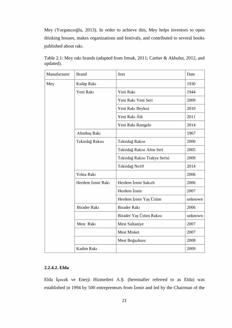
Mey (Yorgancıoğlu, 2013). In order to achieve this, Mey helps investors to open
drinking houses, makes organizations and festivals, and contributed to several books
published about rakı.
Table 2.1: Mey rakı brands (adapted from Irmak, 2011; Cartier & Akbulut, 2012, and
updated).
Manufacturer Brand Sort Date
Mey Kulüp Rakı 1930
Yeni Rakı Yeni Rakı 1944
Yeni Rakı Yeni Seri 2009
Yeni Rakı Beykoz 2010
Yeni Rakı Âlâ 2011
Yeni Rakı Rastgele 2014
Altınbaş Rakı 1967
Tekirdağ Rakısı Tekirdağ Rakısı 2000
Tekirdağ Rakısı Altın Seri 2005
Tekirdağ Rakısı Trakya Serisi 2009
Tekirdağ No10 2014
Yekta Rakı 2006
Herdem İzmir Rakı Herdem İzmir Sakızlı 2006
Herdem İzmir 2007
Herdem İzmir Yaş Üzüm unknown
Birader Rakı Birader Rakı 2006
Birader Yaş Üzüm Rakısı unknown
Mest Rakı Mest Sultaniye 2007
Mest Misket 2007
Mest Boğazkere 2008
Kadim Rakı 2009
2.2.4.2. Elda
Elda İçecek ve Enerji Hizmetleri A.Ş. (hereinafter referred to as Elda) was
established in 1994 by 500 entrepreneurs from İzmir and led by the Chairman of the

22
İzmir Chamber of Commerce Mr. Ekrem Demirtaş, and then obtained a permission
to produce alcoholic beverages in 2002 (Efe Rakı, 2013b). At first, it marketed Efe
Rakı in August 2004 in Germany, and then in Turkey. In a local periodical article
titled “Our meals delight: Efe Raki” in 2007, Egemen Demirtaş who is the CEO of
Elda evaluated the radical change in rakı market as follows:
For years Tekel was the only player in the market, deeming any kind of
marketing activity unnecessary. Competition increased as the number of
players increased. We had to work on our marketing activities in order to gain
the upper hand in this competitive environment. (Behramoğlu, 2007a)
Efe Rakı has a significant role in rakı history since it was the first private rakı brand
in the industry. After Efe Rakı was launched in December 2004, its extensions and
new brands were manufactured later (Table 2.2).
Table 2.2: Elda rakı brands (adapted from Irmak, 2011 and updated).
Manufacturer Brand Sort Date
Elda Efe Rakı Efe Klasik 2004
Efe Yaş Üzüm 2005
Efe 3 Distile 2006
Efe Organik 2007
Efe 5 Yıllık 2013
Sarı Zeybek Sarı Zeybek 2005
Çilingir Xtra Çilingir Xtra 2005
Çilingir Xtra Yaş Üzüm unknown
1907 Rakı 2007
Alem Rakı Alem Rakı 2008
Alem Yaş Üzüm Rakısı 2008
2.2.4.3. Burgaz
Burgaz Alkollü İçkiler Sanayi ve Ticaret A.Ş. (hereinafter referred to as Burgaz) was
established in Lüleburgaz, Kırklareli in 2004, and started the production of the
brands Burgaz Rakı, Burgaz Yaş Üzüm Rakısı, Ata Rakı and Rakı Turka

23
(Behramoğlu, 2007b). Other Burgaz rakı brands were introduced into the market in
time (Table 2.3).
Table 2.3: Burgaz rakı brands (adapted from Irmak, 2011 and updated).
Manufacturer Brand Sort Date
Burgaz Burgaz Rakı Burgaz Rakı 2004
Burgaz Yaş Üzüm Rakısı 2005
Burgaz Klasik 2008
Burgaz Klasik Yaş Üzüm 2008
Burgaz Göbek Rakısı unknown
Ata Rakı Ata Rakı 2005
Ata Yaş Üzüm Rakısı 2007
İki Tek Rakı 2006
Rakı Turka 2006
In 2011, Burgaz was taken over by one of the competitors, Antalya Alkollü İçecek
Sanayi ve Ticaret A.Ş. (“Rekabet Kurulu’ndan vize çıktı, Burgaz Rakı Antalya’nın
oldu,” 2011).
2.2.4.4. Tariş-Tat
Tariş-Tat Alkollü İçkiler Sanayi ve Ticaret A.Ş. (hereinafter referred to as Tariş-Tat)
started to produce rakı in 2005 in Manisa as the fourth private rakı manufacturer in
the rakı market (“Tariş-Koç venture suspends production,” 2008). It was the
partnership of Tariş and Tat (a branch of Koç Group); grapes were provided by Tariş,
while the marketing of brands were done by Koç Group.
There were three brands produced by Tariş-Tat: Mercan Rakı, Fasıl Rakı (or Fasıl
Türk Rakısı in some sources) and Fasıl Yaş Üzüm Rakısı (Table 2.4). Whereas
Mercan had an intense taste and a higher price, Fasıl Rakı was launched with a
slogan “Turkish Rakı with smooth draught” and in a smoother taste with a reasonable
price (Yalçın, 2006). Then, Fasıl Yaş Üzüm Rakısı which was produced from
Sultaniye grapes (known as the most qualified seedless grape) was added to the
brands (“Tariş-Tat’tan yaş üzüm rakısı,” 2006).

24
Table 2.4: Tariş-Tat rakı brands (adapted from Cartier & Akbulut, 2012 and
updated).
Manufacturer Brand Sort Date
Tariş-Tat Mercan Rakı Mercan Rakı 2005
Fasıl Rakı Fasıl Rakı 2005
Fasıl Yaş Üzüm Rakısı 2006
It was aimed to position Fasıl Rakı to the second place as following Yeni Rakı which
is the market leader (Tosyalı, n.d.). However, sales did not go as planned and Tariş-
Tat stopped the production of rakı in 2008.
2.2.4.5. Sarper
Sarper İçecek Sanayi ve Ticaret A.Ş. (hereinafter referred to as Sarper) which was a
well-known company in tobacco sector started to produce rakı in Manisa Akhisar in
2007, as the sixth private company (Sarper, 2007). At first, Beylerbeyi Rakı was
launched as a triple distilled rakı with a slogan, “rakı of gentlemen” (Molla, 2007),
and then other brands were launched in time (Table 2.5). It must be told that Sarper
also produces rakı for Kipa supermarkets, with the Kipa Ege Rakı brand.
Table 2.5: Sarper rakı brands (adapted from Irmak, 2011 and updated).
Manufacturer Brand Sort Date
Sarper Beylerbeyi Rakı Beylerbeyi Rakı 2007
Beylerbeyi Yaş Üzüm Rakısı 2007
Beylerbeyi Göbek Rakısı 2013
Beyoğlu Rakı 2007
Baba Rakı unknown
Keyf-i Ege Rakı Keyf-i Ege Rakı unknown
Keyf-i Ege Rakı Yaş Üzüm unknown
Eko Rakı unknown
Kipa Ege Rakı Kipa Ege Rakı unknown
Kipa Ege Rakı Yaş Üzüm unknown

25
2.2.4.6. Antalya
Antalya Alkollü İçecek Sanayi ve Ticaret A.Ş. (hereinafter referred to as Antalya)
was founded in 2005 by 32 businessmen from Antalya and they started to produce
Topkapı Rakı brand in 2008 (Topkapı İçecek Dağıtım Pazarlama, n.d.). After that
many rakı, liquor, gin and vodka brands were added to production line of the
company (Table 2.6). Besides Topkapı Rakı, Abbas Rakı and 7 Rakı extensions,
Antalya started to produce Burgaz brands, after the takeover of Burgaz in 2011
(“Rekabet Kurulu’ndan vize çıktı, Burgaz Rakı ‘Antalya’nın oldu,” 2011).
Table 2.6: Antalya rakı brands (adapted from Irmak, 2011 and updated).
Manufacturer Brand Sort Date
Antalya Topkapı Rakı Topkapı Rakı 2008
Topkapı Rakı Yaş Üzüm 2008
Topkapı Mir Rakı 2008
Abbas Rakı Abbas Rakı 2008
Abbas Yaş Üzüm Rakısı 2008
7 Rakı 7 Rakı 2008
7 Rakı Yaş Üzüm unknown
2.2.4.7. Anadolu
Anadolu Alkollü Alkolsüz İçecekler İthalat İhracat Sanayi ve Ticaret Ltd. Şti.
(hereinafter referred to as Anadolu) was producing rakı in Manisa since 2006, and
became partner with Livadi Group in 2013 (Anadolu Alkollü İçecekler, 2014).
Anadolu rakı brands can be seen in Table 2.7.
Table 2.7: Anadolu rakı brands (adapted from Irmak, 2011 and updated).
Manufacturer Brand Sort Date
Anadolu Anadolu Rakı Anadolu Rakı 2008
Anadolu Yaş Üzüm Rakısı 2009
Anadolu Rakı Sıfır Seri 2014
Sohbet Rakı Sohbet Rakı 2008
Rakı 2000 2008

26
2.2.4.8. Alcosan
Alcosan İçecek Sanayi ve Ticaret Limited Şirketi (hereinafter referred to as Alcosan)
was established in Manisa, under the umbrella of Sezer Holding (Sezer Holding,
2015). Following vodka and liquor, rakı was produced and marketed in 2013.
Alcosan rakı brands which are adapted from Wikipedia can be seen from Table 2.8
(“Saki Rakı,” n.d.).
Table 2.8: Alcosan rakı brands.
Manufacturer Brand Sort Date
Alcosan Sâki Rakı Sâki Klasik Rakı 2013
Sâki Yaş Üzüm Rakısı 2013
Sâki Siyah Üzüm Rakısı 2013
Sâki Rakı Altın Seri 2013
2.2.4.9. Neva
Neva Alkollü İçkiler Sanayi ve Ticaret A.Ş. (hereinafter referred to as Neva) was
established by six businessmen in Manisa in 2013 and started to produce rakı (Omur,
2013). Following the brand Demlen Rakı, they also produced Sırdem Rakı and its
fresh grape extension (Table 2.9) besides vodka and liquor brands.
Table 2.9: Neva rakı brands.
Manufacturer Brand Sort Date
Neva Demlen Rakı 2013
Sırdem Rakı Sırdem Rakı 2013
Sırdem Yaş Üzüm Rakısı unknown
2.2.4.10. Hürol
Hürol İçecek Tarım Gıda İnşaat Taahhüt Sanayi ve Ticaret Limited Şirketi
(hereinafter referred to as Hürol) was producing rakı in Dinar, Afyon, and it was
estimated that it started to production in last year, 2014 based on a project report

27
prepared by Enpark Çevre Enerji Maden Müh. Dan. ve Müşavirlik (2013). Hürol rakı
brands can be seen in Table 2.10.
Table 2.10: Hürol rakı brands.
Manufacturer Brand Sort Date
Hürol Rakı 34 Rakı 34 2014
Rakı 34 Yaş Üzüm Rakısı 2014
Yeniçeri Rakısı Yeniçeri Rakısı 2014
Yeniçeri Rakısı 2014
Yedikule Rakı 2014
2.3. Glass Packaging Designs for Rakı
When rakı packaging designs in history were investigated, it is observed that the
differentiation of glass packages was achieved through graphic design. However,
there are also remarkable structural design examples to present. Besides these, it is
also possible to see some examples of packaging designs from brands’
advertisements in that period. In order to present a clear understanding, glass
packaging designs were classified according to the time period they belong to.
2.3.1. Glass Packaging Designs for Rakı in Early History
While the structural design of rakı glass packaging was not considered as a
differentiation tool for brands due to having no competition in the rakı market in the
early history, it was seen that label design was used mostly in order to differentiate
from competitors.
At the beginning of the 20th
century, only two brands used sealed glass packages, and
the other ones were sold in containers in several sizes and unsealed glass packages
(E. Zat, 2012). Stating that the main reason of the other brands not preferring the
sealed glass packages was the high cost, E. Zat explains that it changed in the first
quarter of 20th
century, and the brands generated a deposit system to reuse the glass
packages (2012). Therefore, old style containers such as carboys (damacana) and
and pot (testi) were used for years for distribution of rakı in this deposit system.

28
To illustrate glass packaging design examples in history, the label designs of duziko
brands is indicated at first. As mentioned in the previous section, duziko (straight
rakı) became popular in the early 20th
century, and there were many duziko brands
not only in the Ottoman market, but also in the foreign market such as Kızkulesi in
(Figure 2.4.) which was marketed in Germany as well (E. Zat, 2012). As can be seen
in Figure 2.5, one Ottoman waiter who wears a fez is serving rakı, with a mosque
silhouette at the background in the “Mystique of the East” duziko brand, while
Kızkulesi brand uses directly the figure of Kızkulesi.
Figure 2.4: Kızkulesi brand label
(reproduced from E. Zat, 2012).
Figure 2.5: The “Mystique of the East” brand
label (reproduced from E. Zat, 2012).
Figure 2.6: Elif Rakı (reproduced from E. Zat, 2012).
29
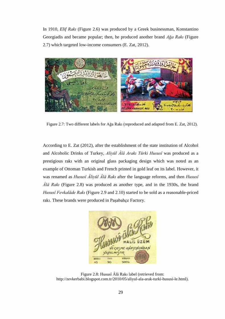
In 1910, Elif Rakı (Figure 2.6) was produced by a Greek businessman, Konstantino
Georgiadis and became popular; then, he produced another brand Ağa Rakı (Figure
2.7) which targeted low-income consumers (E. Zat, 2012).
Figure 2.7: Two different labels for Ağa Rakı (reproduced and adapted from E. Zat, 2012).
According to E. Zat (2012), after the establishment of the state institution of Alcohol
and Alcoholic Drinks of Turkey, Aliyül Âlâ Arakı Türki Hususî was produced as a
prestigious rakı with an original glass packaging design which was noted as an
example of Ottoman Turkish and French printed in gold leaf on its label. However, it
was renamed as Hususî Âliyül Âlâ Rakı after the language reforms, and then Hususî
Âlâ Rakı (Figure 2.8) was produced as another type, and in the 1930s, the brand
Hususî Fevkalâde Rakı (Figure 2.9 and 2.10) started to be sold as a reasonable-priced
rakı. These brands were produced in Paşabahçe Factory.
Figure 2.8: Hususî Âlâ Rakı label (retrieved from:
http://zevkerbabi.blogspot.com.tr/2010/05/aliyul-ala-arak-turki-hususi-le.html).
30
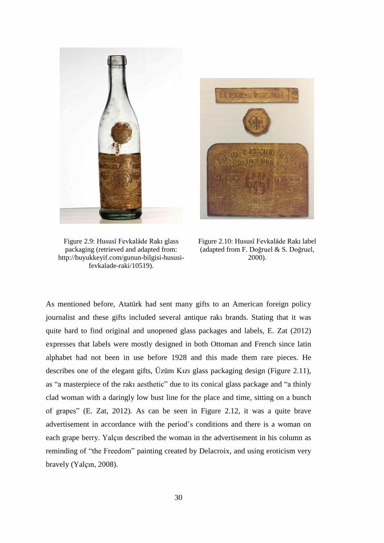
Figure 2.9: Hususî Fevkalâde Rakı glass
packaging (retrieved and adapted from:
http://buyukkeyif.com/gunun-bilgisi-hususi-
fevkalade-raki/10519).
Figure 2.10: Hususî Fevkalâde Rakı label
(adapted from F. Doğruel & S. Doğruel,
2000).
As mentioned before, Atatürk had sent many gifts to an American foreign policy
journalist and these gifts included several antique rakı brands. Stating that it was
quite hard to find original and unopened glass packages and labels, E. Zat (2012)
expresses that labels were mostly designed in both Ottoman and French since latin
alphabet had not been in use before 1928 and this made them rare pieces. He
describes one of the elegant gifts, Üzüm Kızı glass packaging design (Figure 2.11),
as “a masterpiece of the rakı aesthetic” due to its conical glass package and “a thinly
clad woman with a daringly low bust line for the place and time, sitting on a bunch
of grapes” (E. Zat, 2012). As can be seen in Figure 2.12, it was a quite brave
advertisement in accordance with the period’s conditions and there is a woman on
each grape berry. Yalçın described the woman in the advertisement in his column as
reminding of “the Freedom” painting created by Delacroix, and using eroticism very
bravely (Yalçın, 2008).

31
Figure 2.11: Üzüm Kızı Rakı glass
packaging (adapted from E. Zat, 2012).
Figure 2.12: Üzüm Kızı advertisement
(adapted from: Rakı Ansiklopedisi, 2010).
One of the popular brands in the 1930s, Çavuş Rakı (Figure 2.13) was produced by
Mihail Zarakosta in his manufacturing plant in Galata (E. Zat, 2012).
Figure 2.13: Çavuş Rakı glass
packaging (reproduced from E. Zat,
2012).
Figure 2.14: Efendi Rakısı glass packaging
(retrieved and adapted from:
http://buyukkeyif.com/gunun-bilgisi-efendi-
rakisi/7173).

32
As seen in Figure 2.14, another brand of this period, Efendi Rakısı had a design
which reminds of water flasks (Rakı Ansiklopedisi, 2010).
Another well-known brand of the period, Dimitrakopulo Rakı (Figure 2.15) was
produced in the late 1920s; however, it continued as a wine brand after the
monopolization of rakı production. Latterly the Aral Family bought the company and
carried on the business, when its Greek owners had migrated to Greece (Löle, 2009).
E. Zat also mentions about the interesting promotions by Dimitrakopulo Brothers
such as pocket mirror and coaster. It shows that the brand had used promotions
strategies to compete with other brands in the early history.
Figure 2.15: Dimitakopulo Rakısı glass packaging (retrieved on December 15, 2014, from:
http://www.msa.com.tr/kampus/muze-galeri/1/demetrakolpulo-biraderlerin-doz-
rakisi.aspx#img).
Another example to the brands that used this strategy was Bilecik Rakısı. Besides
being also known as “King of Rakıs”, E. Zat (2012) points out that it was a luxury
brand produced by Istepan Berberyan who was an Armenian businessman from
Bilecik, and famous with its own beach umbrellas manufactured as a promotion
(Figure 2.16). Although its alcohol content was 50%, it was known as a pleasure-
draught drink since it was produced from Çeşme aniseed and aged later; however, its
production was ended with the state monopoly (Rakı Ansiklopedisi, 2010).

33
Figure 2.16: Bilecik Rakısı beach umbrella and glass packaging design
(adapted from E. Zat, 2012).
Baküs Rakı was one of the leader brands in the luxury rakı category containing 50%
alcohol, and had an eye-catching and elegant glass package (Figure 2.17) mentioned
by E. Zat; it was a well-known brand because of its racist language used in the
advertisements against Non-Muslims and its suggestion to use Turkish products with
stressing Turkish nationality, in order to differentiate from others (2012). However, it
had once been produced in French-Greek name, Douziko Bacchus which is ironic (E.
Zat, 2012), and one of the advertisements of Baküs Rakı can be seen in Figure 2.18.
Besides these, it is also possible to see various glass packaging designs used for rakı
in the early history in Figure 2.19. Although the label designs of most are not
possible to recognize, it is seen that brands generally used the similar glass packages
for containing rakı within.

34
Figure 2.17: Baküs Rakı glass packaging
(adapted from E. Zat, 2012).
Figure 2.18: Baküs Rakı advertisement
(retrieved from: http://buyukkeyif.com/
etiketler/bakus-raki).
Figure 2.19: Various rakı brands’ glass packaging from the early history
(adapted from E. Zat, 2012).

35
In Figure 2.20, seven labels of some popular rakı brands of the period are presented.
Figure 2.20: Various rakı brands’ labels (adapted from Rakı Ansiklopedisi, 2010).

36
Figure 2.21: Kulüp Rakısı label designs
(retrieved and adapted from
http://lcivelekoglu.blogspot.com.tr/2012
/02/kulup-rakisi-etiketinin-sehir.html).
Figure 2.22: Kulüp Rakısı glass packaging
designs from the archive of Selahattin
Sönmez and Gürbüz Doğan Ekşioğlu
(adapted from Irmak, 2011).
İhap Hulusi Görey (1898-1986) worked 35 years for Tekel, and the well-known label
design of Kulüp Rakısı was created by him (“Biyografi,” 2009). He illustrated two
elegant men who wear bowties and tuxedos, and drink rakı at a table. One of the men
was himself, while the other one was his close friend Fazıl Ahmet Aykaç (F. Doğruel
& S. Doğruel, 2000). However, the label of Kulüp Rakısı was modified by Tekel for
several times, as seen in Figure 2.21 as detailed, while Figure 2.22 provides to see its
glass packages with its new name, Kulüp Rakı, changed by Tekel.
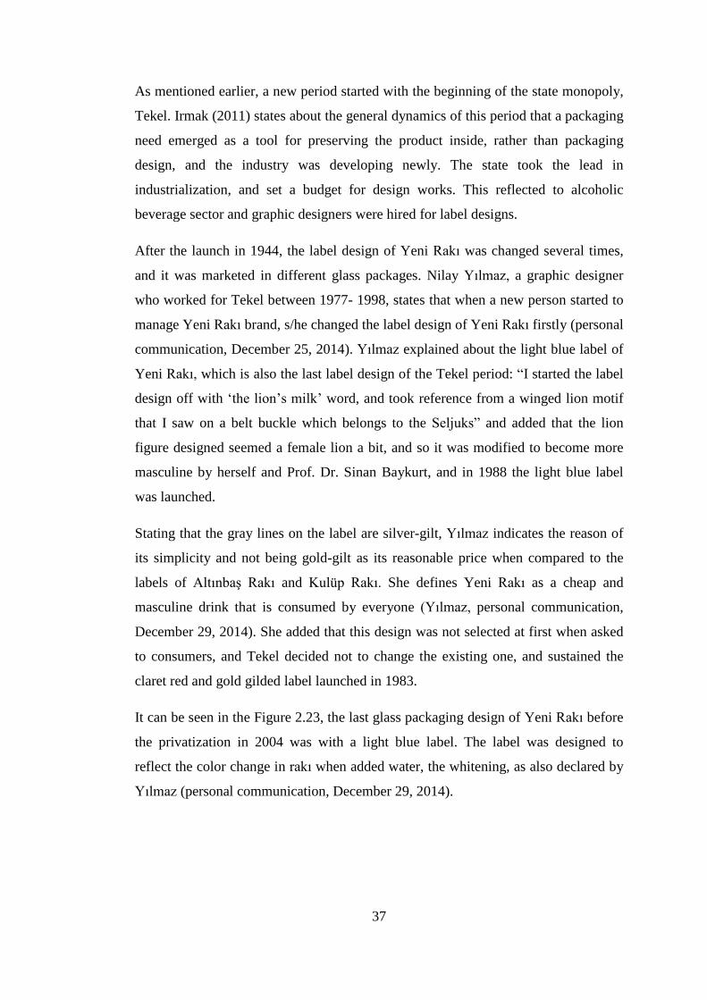
37
As mentioned earlier, a new period started with the beginning of the state monopoly,
Tekel. Irmak (2011) states about the general dynamics of this period that a packaging
need emerged as a tool for preserving the product inside, rather than packaging
design, and the industry was developing newly. The state took the lead in
industrialization, and set a budget for design works. This reflected to alcoholic
beverage sector and graphic designers were hired for label designs.
After the launch in 1944, the label design of Yeni Rakı was changed several times,
and it was marketed in different glass packages. Nilay Yılmaz, a graphic designer
who worked for Tekel between 1977- 1998, states that when a new person started to
manage Yeni Rakı brand, s/he changed the label design of Yeni Rakı firstly (personal
communication, December 25, 2014). Yılmaz explained about the light blue label of
Yeni Rakı, which is also the last label design of the Tekel period: “I started the label
design off with ‘the lion’s milk’ word, and took reference from a winged lion motif
that I saw on a belt buckle which belongs to the Seljuks” and added that the lion
figure designed seemed a female lion a bit, and so it was modified to become more
masculine by herself and Prof. Dr. Sinan Baykurt, and in 1988 the light blue label
was launched.
Stating that the gray lines on the label are silver-gilt, Yılmaz indicates the reason of
its simplicity and not being gold-gilt as its reasonable price when compared to the
labels of Altınbaş Rakı and Kulüp Rakı. She defines Yeni Rakı as a cheap and
masculine drink that is consumed by everyone (Yılmaz, personal communication,
December 29, 2014). She added that this design was not selected at first when asked
to consumers, and Tekel decided not to change the existing one, and sustained the
claret red and gold gilded label launched in 1983.
It can be seen in the Figure 2.23, the last glass packaging design of Yeni Rakı before
the privatization in 2004 was with a light blue label. The label was designed to
reflect the color change in rakı when added water, the whitening, as also declared by
Yılmaz (personal communication, December 29, 2014).

38
Figure 2.23: Yeni Rakı glass packaging designs in the early history
(adapted from: Rakı Ansiklopedisi, 2010).
In this period, there was another rakı brand produced in the same year with Yeni
Rakı: İyi Rakı (Figure 2.24 and Figure 2.25). According to V. Zat, it was launched
with a reasonable price; however, it was not preferred by consumers and so, its
production was stopped in the 1950s (as cited in Rakı Ansiklopedisi, 2010).

39
Figure 2.24: İyi Rakı glass packaging
(retrieved and adapted from:
http://buyukkeyif.com/gunun-bilgisi-
iyi-raki/9372).
Figure 2.25: İyi Rakı label (retrieved from:
http://www.habertempo.net/arastirma/bir-iki-
cesit-rakidan-40-cesit-rakiya-h1593.html).
The second graphic designer mentioned by Irmak (2011) was Atıf Tuna who started
to work for Tekel in 1945. He designed the labels of Tek Rakı (Figure 2.26) and
Altınbaş Rakı (Figure 2.28). Altınbaş Rakı was planned to be the highest quality and
the top brand of the rakı category in 1967 symbolizing the power, the superior
quality and the selectivity (Rakı Ansiklopedisi, 2010). The label of Altınbaş Rakı
was designed by Atıf Tuna and then its glass package in Figure 2.28 was produced in
Paşabahçe glass manufacturer. Besides that, he also designed another label design
(Figure 2.27) for glass packaging of Tek Rakı which was sold as mastika until 1975
(Rakı Ansiklopedisi, 2010).

40
Figure 2.26: Tek Rakı label design
(adapted from: Irmak, 2011).
Figure 2.27: Tek Rakı glass packaging
(adapted from: Rakı Ansiklopedisi, 2010).
Figure 2.28: Altınbaş Rakı glass packaging
(Image courtesy of Ümit Başyazgan
Collection).
Figure 2.29: Altınbaş Rakı label design
(adapted from: F. Doğruel & S. Doğruel,
2000).

41
The last rakı brand launched by Tekel, Tekirdağ Rakısı was designed by Oya Akman
and Emre Günal in 2000 (Figure 2.30).
Figure 2.30: Tekirdağ Rakısı glass packaging, designed in 2000
(Image courtesy of Ümit Başyazgan Collection).
In the following section, glass packaging designs for rakı which were introduced into
the Turkish market after 2004 are presented.
2.3.2. Glass Packaging Designs for Rakı Introduced into the Turkish Market
after the Privatization in 2004
As declared earlier, in order to increase competition in market, government left the
monopoly structure of alcoholic division, and it was the beginning of a new era for
private rakı manufacturers, packaging manufacturers and designers. Today there are
more than 70 brands in the rakı market although it is not possible to see all of them in
one place. They differentiate from each other with not only their taste but also their
packaging designs. As a simple example, whereas some of them target women with a
tall and slim form of the package, some of them want to have a modern image with
cornered form (Çelebi, 2008). Companies give attention to their glass packaging
designs since they understood its significance in the competitive market, and so they
take design solutions from local design sources or prefer to use foreign design
sources.
42
Packaging for rakı has also a financial significance; according to GİSDER, 94.3
million USD was used just for packaging including glass package, label, cap and
other packaging materials by 2013 (n.d.a).
For this section, glass packaging designs for rakı introduced into the Turkish market
in the post-2004 period were categorized based on their companies. While presenting
the glass packaging designs, unfortunately, some of them were not presented below,
because some of them were not available in the market at the time of the study, and
did not have any images available on the internet. In addition to this, designer
information of some, again, was not available and it was not possible to learn
through contacting companies due to either the companies or brands not being
available anymore or that they did not want to share any information. If a company
does not have design source information for its all brands, the glass packages of that
company were given together with other companies’ glass packages with no design
source information.
2.3.2.1. Glass Packaging Designs of Mey Brands
After the state monopoly Tekel was ended, many private companies emerged and
launched their brands after working on their glass packages and labels; and this
caused Mey to consider packaging design as a marketing strategy. According to
Irmak (2011), one of the reasons of this was also the previous marketing director of
Mey, Cihan Kırımlı, who has a design education background.
Kırımlı says that Tekel was using the same three glass packages which were bought
from Şişe Cam (the biggest glass manufacturer, mentioned previously as Paşabahçe
which is a sub-brand of Şişe Cam now) for all kinds of products (as cited in Irmak,
2011). He also points out that packaging design is one of the most important tools for
alcoholic beverage marketing strategies, since the liquid form of rakı takes the shape
of its container which is glass package. Then, he stresses that with the impact of the
restrictions on communication in the alcoholic beverage marketing, packaging gains
a more important role; therefore, this was the main reason behind Mey to give
importance to packaging design and use as a strategy. After investigating the brands
which consumers mostly preferred, the brands to redesign were specified, and started
with Yeni Rakı which was seen as the most critical one due to its history. After that,

43
it was seen that consumers found glass packaging of Yeni Rakı as classic and not
having a unique form; so, Mey determined to redesign it and prepared a detailed
brief. Stating that the most significant issue stressed in the brief was “a rakı
packaging design”, not “Yeni Rakı glass packaging design”; Kırımlı points out that
the new design would give its character to rakı, by giving vodka, wine and gin glass
packaging design examples (as cited in Irmak, 2011).
The glass packaging of Yeni Rakı (Figure 2.31) was redesigned by Gamze Güven
and Mete Ahıska in 2004, after a design competition organized by Mey.
Yorgancıoğlu stresses that the redesign of Yeni Rakı glass packaging was a
revolutionary and risky move but it was resulted with achievement at the end
(Yorgancıoğlu, 2013). The design was defined as follows:
Strong but modest, marked by a thin waist, making the bottle easy to hold
while giving it an elegant appearance. The simple graphic design and the
transparent and label-free view highlight the translucency of the product.
Preservation of the brand’s unpretentious aesthetic was the most important
design criteria. At last, Yeni Rakı takes its place at the head of the table in a
more aesthetic and modern bottle while preserving its familiar and welcome
look. (Superbrands Türkiye, 2005)
Figure 2.31: Yeni Rakı extensions glass packaging designs (retrieved and adapted from:
http://www.pirim.com.tr/marka-detay.asp?MarkaID=256). From left to right: Yeni Rakı,
Yeni Rakı Yeni Seri, and Yeni Rakı Âlâ.

44
Yeni Rakı glass packaging design is seen as an example for an exotic form which is
used to “reflect the local color while the materials, production techniques and the
aesthetics of these objects relate to a modern or Western context qualifying as a
cross-cultural design” (Emgin, 2007). The structural design of Yeni Rakı glass
packaging latterly used for its extensions, as seen in Figure 2.31.
In 2013, graphic design of Yeni Rakı was redesigned by Landor Associates Dubai in
2013 in order to remind consumers of its being the best and the leader in the rakı
category (Landor Associates, 2014). Besides stressing its being “an icon of Turkish
culture and a powerful symbol of tradition”, it was described as a representation of
“truth, sincerity, sharing, togetherness, and uniting the generations”. In this new
design (Figure 2.32), its heritage which includes stories and craftsmanship of rakı
peculiar to Turkish culture was reflected through an illustration that depicts local
ingredients and the distillation process of rakı (Landor Associates, 2014).
Figure 2.32: Yeni Rakı graphic design by Landor Agency (retrieved and adapted
from: http://www.wearealive.me/yeni-raki--wearealive!.html).
For Yeni Rakı Yeni Seri brand, Pearlfisher which is a design agency from England is
responsible for the graphic design in Figure 2.31 (The Dieline, 2010).

45
Figure 2.33: Kulüp Rakı and Altınbaş Rakı glass packaging designs (retrieved and adapted
from: http://www.diageo.com/en-sc/newsmedia/pages/resource.aspx?resourceid=738).
Kulüp Rakı glass packaging design (Figure 2.33) was redesigned by Oya Akman in
2007 (MediaCat, 2007) and its label which was designed by İhap Hulusi Görey was
maintained.
For Altınbaş Rakı, the calligraphic gold logo was designed by Atıf Tuna and its
existing glass packaging were maintained for its historical value, while redesigning it
to an innovative, modern and strong character in 2010 (“Altınbaş Rakı - Rakı Şişesi
Ambalajı,” n.d.). Starting transparent from the base in order to show the pure color of
rakı within, it was painted to organic black color as degraded, and so it reflected the
distinctive taste of rakı which comes from containing 50% alcohol. Gamze Güven
and Kayhan Erdeğirmenci are the responsible designers for Altınbaş Rakı glass
packaging design as seen in Figure 2.33.
Mest Rakı (Figure 2.34) was known as “the first monosepaj rakı” which has a
meaning of being produced from a single type of grape. In an article, it was
expressed by Yorgancıoğlu that Mest Rakı preserves the smooth taste and aroma of
the grape used, and so they aimed to reflect this distinctive feature to its packaging
design (“Tek üzümle rakı yaptık, kadınlar “Mest’ olacak,” 2007). In another article,
its target consumer group was declared as women and young consumers between 20-
30 years old, and its glass packaging design was created in France as “slender blue-

46
and-white” with a cork stopper, instead of a usual cap like other rakı brands (“Red
grape rakı on the shelves”, 2008).
Figure 2.34: Mey brands’ glass packaging designs I (Image courtesy of Ümit Başyazgan
Collection). From left to right: Mest Rakı Sultaniye, Herdem İzmir, Herdem İzmir Sakızlı,
Herdem İzmir Yaş Üzüm.
Figure 2.35: Mey brands’ glass packaging designs II (Image courtesy of Ümit Başyazgan
Collection). From left to right: Kadim Rakı, Yekta Rakı, Birader Rakı, Birader Yaş Üzüm
Rakısı.

47
Glass packaging of Tekirdağ Rakısı was also redesigned; Gamze Güven designed its
glass packaging, and İpek Torun worked for its graphics. All extensions of Tekirdağ
Rakısı were redesigned to maintain a family resemblance, as seen in Figure 2.36. It
was mentioned to have superior quality, prestige and luxury image which was
achieved through its sandblasted glass and gold leaf printing of the logo, and all other
graphic design elements. The glass packaging was defined in an explanation
published by Tasarımüssü as follows:
The innovative bottle design has been achieved by the transparent (not
sandblasted) elliptical cavities which support a user comfort by leading to
easily handling and a firm grip as well as a sophisticated production
technique. Different from its culture, on purposely with this design, “raki”
drink has succeeded to become a part of the bars and nightclubs like the
prestigious whiskey or vodka brands”. (“Gamze Güven DDN final,” n.d.)
Figure 2.36: Tekirdağ Rakısı extensions glass packaging designs (retrieved and adapted
from: http://www.diageo.com/en-sc/newsmedia/pages/resource.aspx?resourceid=738).
From left to right: Tekirdağ Rakısı, Tekirdağ Rakısı Altın Seri, and Tekirdağ Rakısı
Trakya Serisi.

48
Yeni Rakı Beykoz was designed for the celebration of İstanbul-2010 Europe Capital
of Culture, by Gamze Güven and Fahriye Özbey (“Yeni Rakı Beykoz,” n.d.). For its
graphic design, Fahriye Özbey created various motifs, and three of these gold motifs
(Figure 2.37) were hand painted on 50000 glass packages. The reason of using
Beykoz glass decors on design was related with Yeni Rakı which was filled in
Beykoz factory in the past, and Beykoz was one of the regions where the art of glass
developed. Again, the same structural design of Yeni Rakı glass packaging was used.
Figure 2.37: Yeni Rakı Beykoz glass packaging designs (retrieved and adapted from
http://www.tasarimussu.com.tr/portfolyo_amb_11.php).
In 2014, two new brands were launched (Figure 2.38): Yeni Rakı Rastgele and
Tekirdağ No10. Glass packaging designs for these two brands were created by
Gamze Güven and her design office, as revealed in the portfolio in the website of
Tasarımüssü (Tasarımüssü, 2014).
Mey also redesigns the graphics of its brands for limited editions or exports. As seen
in Figure 2.39, graphic design of Yeni Rakı was redesigned for several times with
specific themes: New Year, opening of fish season, Kapadokya and so on.

49
Figure 2.38: Yeni Rakı Rastgele and Tekirdağ No10 glass packaging designs
(Image courtesy of Ümit Başyazgan Collection).
Figure 2.39: Yeni Rakı graphic redesigns for limited editions
(Image courtesy of Ümit Başyazgan Collection).

50
Besides these limited editions, it is also possible to see old glass packaging designs
from the early history on store shelves. Described as nostalgia series, 45 Derecelik
Yeni Rakı was launched in 2012 as a limited edition which maintains its graphics
design as in 1950s (Figure 2.40).
Figure 2.40: 45 Derecelik Yeni Rakı, nostalgia series (retrieved and adapted from:
http://www.dijimecmua.com/collection/7995/index/1460681_yeni-raki-yani-raki-sise-
koleksiyonu-nostaljik-siseler/).
2.3.2.2. Glass Packaging Designs of Elda Brands
Graphics of Efe Klasik, Efe Yaş Üzüm, Efe 3 Distile, Efe 5 Yıllık, Sarı Zeybek Rakı
and 1907 Rakı were designed by Taylor International Brand which is a British design
agency, as declared by Tuncay Yalçınkaya who works as a designer for Elda
(personal communication, December 1, 2014). He also pointed that secondary
packaging designs were created in the internal design department of the company.
Although Efe brand extensions share the same structural design of glass packaging,
they vary with their graphics designs, as can be seen in Figure 2.41.

51
Figure 2.41: Elda brands’ glass packaging designs I (retrieved and adapted from:
http://www.basinbulteni.com/resimler/efe___r__nleri.jpg). From left to right: Sarı Zeybek,
Efe 3 Distile, Efe Organik, Efe Yaş Üzüm, Efe Klasik.
For glass packaging design of Sarı Zeybek, it was inspired by Seljuk motifs and it
had a luxurious capsule which looks similar to the ones used in Scotch whisky boxes,
and it can be given as a gift, as mentioned in a newspaper article titled “Rakıcılar
bölünecek!” (Yalçın, 2006).
1907 Rakı was marketed as a limited edition rakı brand for the celebration of 100th
anniversary of Fenerbahçe Sports Club in 2007 containing fresh grape rakı inside
(İzmir, 2007). Therefore, it was designed in the colors of club while the same
structural design was used (Figure 2.42).

52
Figure 2.42: Elda brands’ glass packaging designs II (Image courtesy of Ümit Başyazgan
Collection). From left to right: 1907 Rakı, Çilingir Xtra Yaş Üzüm, Çilingir Xtra, Alem
Rakı, and Alem Yaş Üzüm Rakısı.
Lastly, Efe 5 Yıllık was marketed with a limited number as it was aged in barrels for
5 years and planned not only as a drink on the rakı table but also as an aperitif drink
like whisky or cognac as seen in Figure 2.43 (Kara, 2013). Its distinctive label was
designed by Taylor International Brand, and the clear-cut glass bottle was brought
from France. This column also contains comments of several rakı authorities about
the glass packaging design of Efe 5 Yıllık. To illustrate, it was found similar to
whisky bottle and Vefa Zat expresses that conventional rakı drinkers do not like
radical changes, and although the whisky bottle appearance is not appropriate for
rakı, Efe 5 Yıllık generates a new presentation style. On the other hand, a restaurant
owner explains that since rakı is not purchased only by conventional rakı drinkers
and only in the boundaries of Turkey; therefore, he supports the innovative ideas for
presentation of rakı (Kara, 2013).

53
Figure 2.43: Efe 5 Yıllık advertising (retrieved from:
http://www.gasteci.net/wp-content/uploads/efe_5_yillik.jpg).
2.3.2.3. Glass Packaging Designs of Burgaz Brands
In 2004, glass packaging for Burgaz Rakı was marketed firstly with a different
graphic and structural design than the existing one today; the graphics of glass
packaging was redesigned by Orhan Irmak in 2006 (Figure 2.44). Then, the structural
design of glass packaging was changed; however, it still maintains the graphic design
which is created by Irmak, as can be seen in Figure 2.45. Other brands’ glass
packaging designs can be seen in Figure 2.45 and Figure 2.46.

54
Figure 2.44: The first glass packaging design and the redesigned glass packaging for Burgaz
Rakı by Orhan Irmak (Image courtesy of Orhan Irmak Design Archive).
Figure 2.45: Burgaz brands’ glass packaging designs I (Image courtesy of Ümit Başyazgan
Collection). From left to right: Burgaz Klasik Yaş Üzüm Rakısı, Burgaz Klasik Rakı,
Burgaz Yaş Üzüm Rakısı, Burgaz Rakı, Burgaz Göbek Rakısı.
Concerning designs, it must be mentioned that Burgaz used same glass package for
other rakı brands and products as well. The structural design of Burgaz Rakı was

55
previously used for Ata Rakı (Figure 2.47); then it was changed to the current one
(Figure 2.46). Secondly, the structural design of Rakı Turka glass packaging was also
used for another product, Burgaz Vodka.
Figure 2.46: Burgaz brands’ glass packaging designs II (Image courtesy of Ümit Başyazgan
Collection). From left to right: Ata Rakı, Ata Yaş Üzüm Rakısı, İki Tek Rakı and Rakı
Turka.
Figure 2.47: The first glass packaging of Ata Rakı (retrieved from:
http://www.cnnturk.com/2004/ekonomi/sirketler/12/20/ata.raki.yilbasinda.piyasada/59534.0
/index.html).

56
2.3.2.4. Glass Packaging Designs of Sarper Brands
As explained by a company employee, a Dutch design firm was hired for the
structural design and the label design (Nagihan Bulut, personal communication,
December 12, 2014). Although the name of design firm was not shared on purpose
by company, it is available from the website of design firm and open to the public.
While graphic design and strategy for Beylerbeyi Rakı extensions (Figure 2.48)
belongs to KesselsKramer which is a communication agency, structural design of the
glass package was designed by Tjep, an Amsterdam based design firm (Tjep, n.d.).
Figure 2.48: Sarper brands’ glass packaging designs I (Image courtesy of Ümit Başyazgan
Collection). From left to right: Beylerbeyi Yaş Üzüm Rakısı, Beylerbeyi Rakı, Beylerbeyi
Göbek Rakısı, Beyoğlu Rakı, and Beyoğlu Rakısı.
As seen in Figure 2.48, Beyoğlu Rakı was redesigned, and the brand name is
appearing as Beyoğlu Rakısı on its new label. Glass packaging design for other
brands of Sarper can be seen in Figure 2.49. As easily recognized, they all use same
glass packaging with slightly different graphics, but Baba Rakı and Eko Rakı differs
from others in their labels.

57
Figure 2.49: Sarper brands’ glass packaging designs II (Image courtesy of Ümit Başyazgan
Collection). From left to right: Keyf-i Ege Rakı Yaş Üzüm, Keyf-i Ege Rakı, Baba Rakı,
Kipa Ege Rakı, Kipa Ege Rakı Yaş Üzüm and Eko Rakı.
2.3.2.5. Glass Packaging Designs of Antalya Brands
Although there is not any information about the designer of Abbas Rakı and 7 Rakı
glass packaging designs, Topkapı Rakı (Figure 2.50) was designed by Eda Yılmaz
who works for Anadolu Cam (one of the major glass packaging producers in Turkey)
as an industrial designer (“Topkapı Rakı,” n.d.). As indicated in the description for
Design Turkey 2010 Awards, Topkapı Rakı glass package was designed to have a
classic but innovative form inspiring by Topkapı Palace. It also shows that a mass-
produced glass can be used as an elegant design example in spite of all problems
faced with in the design, manufacturing, filling, printing, marketing and sales
processes (“Topkapı Rakı,” n.d.).

58
Figure 2.50: Topkapı Rakı family glass packaging designs (retrieved and adapted from:
http://topkapi.playground.frumatic.com/). From left to right: Topkapı Mir Rakı, Topkapı
Rakı and Topkapı Rakı Yaş Üzüm.
Figure 2.51: Abbas Rakı brands’ glass packaging
designs (retrieved and adapted from:
http://topkapiicecek.en.ecplaza.net/product.asp).
Figure 2.52: 7 Rakı glass packaging
design (retrieved and adapted from
Antalya Alkollü İçecek, n.d.).

59
Another brand of Antalya, 7 Rakı is only produced in 100 cl glass package for
marketing to on trade consumers which are hotels and restaurants in touristic regions,
as explained in the company website (Antalya Alkollü İçecek, n.d.). The brands of
Burgaz belong to Antalya now; therefore, they were not indicated here since they
were presented earlier.
2.3.2.6. Glass Packaging Designs of Anadolu Brands
As declared by Çağıl İmre who is a member of board and the daughter of the founder
of Anadolu, glass packaging designs of Anadolu rakı brands (Figure 2.53) belong to
Rubin Investment JSC, a glass manufacturer in Bulgaria (personal communication,
December 15, 2014). She explained that they work with an advertising agency from
İzmir, Konseptiz Advertising Agency and Brand Consultancy for all graphic design
works.
Figure 2.53: Anadolu brands’ glass packaging designs (retrieved and adapted from:
http://foto.bilgibende.com/raki_resimleri/21289). From left to right: Anadolu Rakı, Anadolu
Rakı Yaş Üzüm, Rakı 2000 and Sohbet Rakı.

60
2.3.2.7. Other Companies’ Glass Packages with No Design Source Information
Tariş-Tat. As mentioned before, Tariş-Tat launched three brands: Mercan Rakı, Fasıl
Rakı and Fasıl Yaş Üzüm Rakısı. Glass packaging designs of brands can be seen
below in Figure 2.54; however, there is not any information about their designers.
Figure 2.54: Tariş-Tat brands’ glass packaging designs (Image courtesy of Ümit
Başyazgan Collection). From left to right: Mercan Rakı, Fasıl Rakı, Fasıl Yaş Üzüm
Rakısı.
Mercan Rakı was planned to target conventional rakı consumer, and so the company
took the conventional rakı consumer into consideration for each stage of production
and at the end a classic rakı was produced. Consumers would find anything they
wanted by drinking Mercan Rakı, but the hardest part was persuading them to drink
this brand (Seyhan, 2005).
Alcosan. Alcosan brands which are Saki Siyah Üzüm Rakısı, Saki Rakı Altın Seri,
Saki Rakı Yaş Üzüm and Saki Rakı can be seen in Figure 2.55.

61
Figure 2.55: Alcosan brands’ glass packaging designs (Image courtesy of Ümit Başyazgan
Collection). From left to right: Saki Rakı Siyah Üzüm Rakısı, Saki Rakı Altın Seri,
Saki Rakı Yaş Üzüm, Saki Rakı.
Neva. Glass packaging designs of Neva brands which are Demlen Rakı, Sırdem Rakı
and its fresh grape extension can be seen in Figure 2.56.
Figure 2.56: Neva brands’ glass packaging designs (Image courtesy of Ümit Başyazgan
Collection). From left to right: Demlen Rakı, Sırdem Rakı 70cl, Sırdem Rakı 100cl, Sırdem
Yaş Üzüm Rakısı.

62
Hürol. It is possible to see glass packaging designs of Hürol brands in the Figure
2.57. While green and blue degraded glass packages were used for Yeniçeri Rakı and
Rakı 34, Yedikule Rakı glass packaging is available in market with a sandblasted
texture.
Figure 2.57: Hürol brands’ glass packaging designs (Image courtesy of Ümit Başyazgan
Collection). From left to right: Rakı 34 Yaş Üzüm Rakısı, Rakı 34, Yedikule Rakı, Yeniçeri
Yaş Üzüm Rakısı, Yeniçeri Rakı.
2.4. Glasses and the Karafaki as Accoutrements of Rakı
Rakı is mainly consumed in a tall, cylindrical glass which has 18 cl volume. For
many years, consumers drank their rakıs in the only type of glass and therefore this
cylindrical glass is matched with rakı by consumers. The main reason of rakı’s being
matched with cylindrical glass is actually a historical habit. In those times, there was
only one glass manufacturer, Paşabahçe and the only mass produced glass was
lemonade glass which was cylindrical and tall. Since every drinking house bought
these glasses, rakı was served in them; and so, consumers got used to see their rakıs
in these glasses.
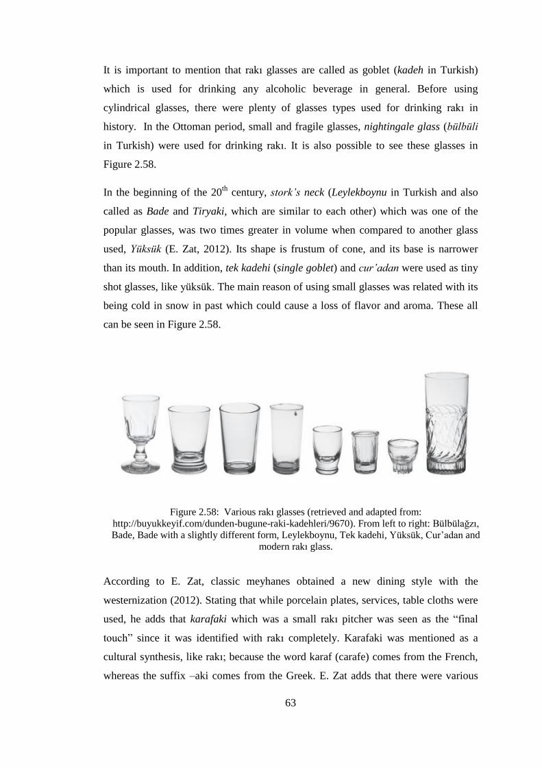
63
It is important to mention that rakı glasses are called as goblet (kadeh in Turkish)
which is used for drinking any alcoholic beverage in general. Before using
cylindrical glasses, there were plenty of glasses types used for drinking rakı in
history. In the Ottoman period, small and fragile glasses, nightingale glass (bülbüli
in Turkish) were used for drinking rakı. It is also possible to see these glasses in
Figure 2.58.
In the beginning of the 20th
century, stork’s neck (Leylekboynu in Turkish and also
called as Bade and Tiryaki, which are similar to each other) which was one of the
popular glasses, was two times greater in volume when compared to another glass
used, Yüksük (E. Zat, 2012). Its shape is frustum of cone, and its base is narrower
than its mouth. In addition, tek kadehi (single goblet) and cur’adan were used as tiny
shot glasses, like yüksük. The main reason of using small glasses was related with its
being cold in snow in past which could cause a loss of flavor and aroma. These all
can be seen in Figure 2.58.
Figure 2.58: Various rakı glasses (retrieved and adapted from:
http://buyukkeyif.com/dunden-bugune-raki-kadehleri/9670). From left to right: Bülbülağzı,
Bade, Bade with a slightly different form, Leylekboynu, Tek kadehi, Yüksük, Cur’adan and
modern rakı glass.
According to E. Zat, classic meyhanes obtained a new dining style with the
westernization (2012). Stating that while porcelain plates, services, table cloths were
used, he adds that karafaki which was a small rakı pitcher was seen as the “final
touch” since it was identified with rakı completely. Karafaki was mentioned as a
cultural synthesis, like rakı; because the word karaf (carafe) comes from the French,
whereas the suffix –aki comes from the Greek. E. Zat adds that there were various
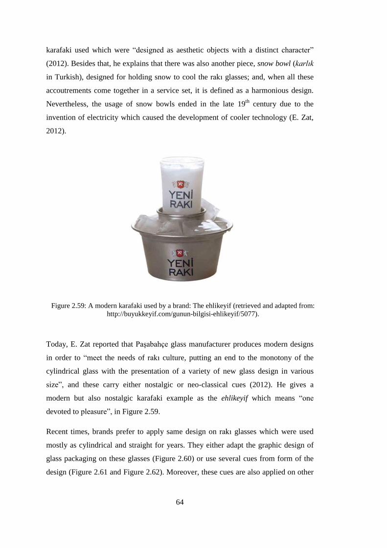
64
karafaki used which were “designed as aesthetic objects with a distinct character”
(2012). Besides that, he explains that there was also another piece, snow bowl (karlık
in Turkish), designed for holding snow to cool the rakı glasses; and, when all these
accoutrements come together in a service set, it is defined as a harmonious design.
Nevertheless, the usage of snow bowls ended in the late 19th
century due to the
invention of electricity which caused the development of cooler technology (E. Zat,
2012).
Figure 2.59: A modern karafaki used by a brand: The ehlikeyif (retrieved and adapted from:
http://buyukkeyif.com/gunun-bilgisi-ehlikeyif/5077).
Today, E. Zat reported that Paşabahçe glass manufacturer produces modern designs
in order to “meet the needs of rakı culture, putting an end to the monotony of the
cylindrical glass with the presentation of a variety of new glass design in various
size”, and these carry either nostalgic or neo-classical cues (2012). He gives a
modern but also nostalgic karafaki example as the ehlikeyif which means “one
devoted to pleasure”, in Figure 2.59.
Recent times, brands prefer to apply same design on rakı glasses which were used
mostly as cylindrical and straight for years. They either adapt the graphic design of
glass packaging on these glasses (Figure 2.60) or use several cues from form of the
design (Figure 2.61 and Figure 2.62). Moreover, these cues are also applied on other

65
accoutrements of rakı, concerning a promotion strategy, and given to specific
restaurants or sold in stores.
Figure 2.60: Anadolu Rakı and its glass (retrieved and adapted from:
http://volpeypir.com/wallpaper.asp?id=3672).
Figure 2.61: Yeni Rakı and its glass
(retrieved and adapted from:
http://www.tasarimussu.com.tr/portfolyo_
amb_01.php).
Figure 2.62: Tekirdağ Rakısı and its glass
(retrieved and adapted from:
http://www.etsm.org.tr/etsm/c_images/107_0
3.jpg).

66
In Figure 2.63, karafaki, ehlikeyif, napkin holder and glass are seen with sharing the
same visual cues with the glass packaging design.
Figure 2.63: Rakı accoutrements of a brand (Image courtesy of Müfit Tezerişir Collection).
According to a research conducted by Cartier and Akbulut, in a restaurant, which
brands’ glasses will be used is decided by considering “the customers’ attitude and
expectations, and the restaurant’s financial resources and agreements” (2012, p. 139).
Usually, the glasses are given as promotion with an agreement which does not let
competitors’ promotional glasses.
According to Cartier and Akbulut (2012), the consumers’ preference of glasses is
mostly related with their ages; while classical and old style glasses preferred by elder
consumers, younger consumers do not give importance to design so much. They
mention that consumers regard the thickness of the base, texture and the shape of the
glasses as significant, and the glass of Tekirdağ Rakısı is popular due to its
ergonomics. The design of the logo, emblem, form, texture of glass is changed in

67
time by brands in accordance with the consumers’ preferences (Cartier & Akbulut,
2012).
Companies also prefer to use secondary packaging to sell their products within. As
seen in Figure 2.64, there are various boxes designed in accordance with the glass
packaging design within.
Figure 2.64: Secondary packages for rakı, boxes (Image courtesy of Ümit Başyazgan
Collection).
2.5. Packaging Design
According to Packaging Manufacturers Association in Turkey (ASD), “packaging is
a precious material that protects the product within, allows for it to reach you in the
most hygienic and safest conditions and makes it easier to transport and store it"
(ASD, n.d.). As described also by ASD, functions of packaging are as follows:
Containment, protection and storage, transportation and handling, and information
and promotion.
With the increase in the competition in the market, packaging became a strategic tool
for brands. It is not just containing and preserving the product within, it also promote
in on store shelves. According to Ambrose and Harris, recently, packaging design
joined the marketing mix which consists of the activities to increase the product
68
awareness and sales (2011). It is also known with the ‘four Ps’: Product, price,
promotion and place, and now packaging is the fifth P’ (Ambrose & Harris, 2011).
Brands give importance to packaging in order to highlight the product qualities more
than ever since it is one of the key factors in purchase decisions which “establish a
point of difference” from the competition in the stores, the first point where
consumers meet with the brand (Ambrose & Harris, 2011). As described by Irmak,
brands should concern shared factors between packaging design and branding as
follows:
Aesthetic values: style, form, character, color and etc.
Technical values: manufacturing method, cost, material and etc.
Functional values: usage, containment, display and etc.
Emotional values: emotion, communication, loyalty, cultural differences and etc.
(2011).
According to Karamullaoğlu (2005), packaging should attract consumers’ attentions
in 3 seconds, transmit the essential information about the product within and create
an emotional bond with consumers in order to persuade them to purchase. Packaging
is defined as the “silent salesman” by Meyers and Lubliner, since it works for selling
the product within and providing brand appeal on the market shelf (1998, p. 250).
The package is the medium through which a product image is created; therefore, “the
package is the product” (Meyers & Lubliner, 1998, p. 1). Packaging design can be
used for new products, redesigning an existing brand and brand line extensions.
Next, packaging design process is presented.
2.5.1. Packaging Design Process
Design is described by Ambrose and Harris as a “process that turns a brief or
requirement into a finished product or design solution”, and design process mainly
consists of several stages (2011, p. 60). There are different models of design process
in the literature. One of them provides a four-stage model of the design process
which includes exploration, generation, evaluation and communication (Cross,
2005), while another four-stage model describes it as gathering information,

69
development of preliminary concepts, preparation of the comprehensive, preparation
of the production mechanical (Roth, 1990). On the other hand, Ambrose and Harris
(2011) describe a more detailed version of the design process, as seen in Figure 2.65.
Figure 2.65: Design process phases (adapted from Ambrose and Harris, 2011).
Like any other design project, packaging design process starts with research in order
to collect information about the product, the market conditions, the target consumer
group and the competitive brands’ packaging designs, and design problem is
explored in detail. Then, the marketing team prepares a brief which consists of
several details such as demographics and socioeconomic profile, age group, gender,
purchasing behavior, lifestyle, personality, brand awareness and loyalties (Stewart,
1996), and then that this information is given to design sources they hired.
Companies can select one of the various design sources: design consultancies,
individual designers, and internal design departments of themselves (Meyers &
Lubliner, 1998). Advertising agencies and packaging suppliers are also seen as
design sources.
Following the brief, the design team analyzes the client’s and competitors’ packages,
explores the history of design problem, conducts user research and interviews. After
brainstorming, the design team generates ideas and develops design concepts. These
Defining the need Researching the
problem Generating design concepts and ideas
Design idea development and
prototyping
Design concept selection
Design implementation
Feedback to provide a learning
mechanism from the process

70
ideas and concepts are selected for further development, and best of them are
developed into prototypes which can be used for consumer feedback from either
interviews or focus groups, followed by a presentation to the client. As also
expressed by Meyers and Lubliner, the client reviews the proposed design solutions
against the design brief and selects the final concepts for further development (1998).
Based on the feedback taken from the review of the client and consumers on the
design concept, the design team makes modifications and develops prototypes. The
prototypes can be used for market research in order to take feedback for selecting the
final design. As described by Meyers and Lubliner (1998), when the final design is
selected, production test is conducted with package suppliers, color separators and
printers, and later it is adapted to additional packaging sizes and produced, then
transported to the distributors.
According to Ambrose and Harris (2011), when the design project is completed, the
feedback obtained from the client and consumers about the package design become a
valuable source for designers to improve their skills and performance.
2.5.2. Packaging Design Elements
“Design is a composite of the designer’s vision and the expression of that vision
using some or all of the elements of design”, Calver says (2004, p. 68). The
appearance of a package consists of several design elements. These various design
elements can transmit different messages to the consumers; however, their goal can
be said to be similar to each other at the point of purchase which is to communicate
the brand image which is created by the company, designers and features for the
product inside.
Despite the fact that there is not an exact grouping for design elements, some sources
basically divide design elements into two categories; however, there are also
different approaches such as a simple list. Stewart suggests that there are only five
design elements which designers can manipulate: Material, shape, color, texture and
graphics (1996). On the contrary, according to Meyers and Lubliner (1998), package
design consists of two parts: structural design and graphic design. While structural
design includes physical packaging elements such as form, materials, dimensions,
and weight; graphic design includes logo, symbols, shape, product descriptors,

71
typography, photography and illustrations. Calver also suggests a similar
categorization as structural elements and surface graphics, but adds that this
categorization is artificial, because it is not possible to isolate one from the other.
This study adopts the usage of Calver (2004) and Meyers and Lubliner (1998), and
takes packaging design as a combination of structural design and graphic design
(surface graphics).
Structural design. In spite of stating that everything about the package has a
significant role, Meyers and Lubliner (1998) express that the package form
communicates images which affect consumer perception and emotions and create a
desire before consumers notice and read the label. Unique packaging shape and
ergonomics are thought as significant for manipulating “the imagery and positioning
of a product”. As a part of structural design, they can influence consumer perception
and their purchase decisions, and can create strong brand recognition. It is possible to
create packaging in many diverse forms with various materials and technologies
available and its form or shape helps to communicate the brand narrative; to
illustrate, “curves suggest sensuality, while straight lines suggest modernity”
(Ambrose & Harris, 2011, p. 140).
Apart from these, another design element, material must be considered at the
beginning of design process since it contains the products within, and also affects the
use of other design elements. While selecting the material, designers firstly consider
the preservation, protection, transportation, display of the product (Calver, 2004).
There are various materials such as paper, cardboard, steel, aluminum, plastics and
glass; these are selected based on their strength, cost and their ease of application
(Ambrose & Harris, 2011).
As declared by Meyers and Lubliner (1998), packaging creates various perceptions
through its structural design. For example, a short, squat beer bottle creates a
different perception than a tall, long-necked beer bottle; rice in a carton creates a
different image than rice in a film pouch.
Graphic design. Graphic design is described as “the visuals that decorate the surface
of the package” by Meyers and Lubliner (1998). Brands can communicate their
informative and emotional messages. Whereas the informative messages on the label

72
are indicated as brand identity, product name, product description, flavor or variety
identification, promotional messages, size and contents, warning or caution
statements and so on; the emotional messages are described as more subliminal
which can be communicated through logo and copy styling, symbols, icons, colors,
textures, photography and illustrations (Meyers & Lubliner, 1998).
Color as a significant design element can have different roles on packaging; it can be
a background color or a complete package color, or identify specific flavors or a
distinctive feature of the product inside (Meyers & Lubliner, 1998). In addition, it
can be a part of illustrations and photographs used. There are many generalizations
about color such as identifying mood and feelings, indicating product varieties and
flavors, and associating specific meanings. With the consistent use of a color and
over time, it “becomes ‘owned’ by a brand to such an extent that when a consumer
sees the color, they immediately associate it with the brand” (Calver, 2004, p. 146).
Apart from this, one of the brands can generate a color-coding system to differentiate
its products and this system can be a norm for the category.
According to Ambrose and Harris, photography is seen as one of the most significant
design elements since it directly shows consumers the product or its usage; however,
it provides more sophisticated appearance and affects their emotions (2011).
Photography is described as being immediate, powerful and long-lasting (Calver,
2004). It can differentiate one brand from another through the selection of the
content, style of photography, cropping of the image, selection of color or black-and-
white reproduction.
For featuring an image on packaging, illustration is the primary method historically;
however, the use of illustrations was reduced with the invention of photography and
the developments in printing technologies lasting (Calver, 2004). On the other hand,
Meyers and Lubliner (1998) explain that illustration is mostly used for products
which do not have any appeal or self-explanation such as instant soups or washing
powders. Besides that, illustration is defined as a tool which makes the product more
desirable, and which informs consumer as none of the other elements can do.
Typography is an essential element for packaging design. It is described as the
selection and arrangement of typeface in accordance with the specific goals (Roth,

73
1990). The name of product, descriptors, benefits, ingredients, warnings and
ownership details need to be presented on the package in a legible manner so that
consumers can read and understand all details (Calver, 2004). The pack size,
information extent and the printing method are the factors which affect the selection
of the typeface. Information layout and hierarchy are also important factors to
consider while designing.
When the design of surface graphics is completed, the next step becomes transferring
them to the packaging surface via several methods. According to Sonsino, basic label
types and methods are divided into two groups: Applied labelling and direct labelling
methods (1990). While applied labeling methods include plain paper and wet gluing,
pressure sensitive labelling, heat seal labelling, glued labeling, in-mould labeling and
shrink sleeving; direct labelling methods consist of colour printing, embossing and
enameling (1990). It must be told that although enameling method includes many
types, the most used one is screen-printing, or sometimes called as serigraphy. On
the other hand, Ambrose and Harris (2011), calls these methods “print finishing
methods” which include burning, screen-printing (serigraphy), hand painting,
embossing, foil blocking, shrink-film labels, adhesive labels are just a few of them
(2011). As stated by Calver (2004), designers can employ foil blocking, varnishes,
laminates, embossing, die-cutting which are called as ‘finishes and effects’; these can
make consumers feel the quality, exclusivity and luxury when touched by hands or
just seen.
2.5.3. Glass Packaging Design for Alcoholic Beverages
Despite not being the lightest material for packaging, glass is usually selected for its
benefits, which include strength, a shiny and clean appearance, and its being
reusable. Besides that, it provides a form for liquid products which do not have a
form by themselves. There is a great variety of glass packages used for cosmetic,
medical, food and beverage, and so on. However, glass bottles are the most
extensively used type among glass packages (Roth, 1990). Due to health issues,
marketing purposes and government regulations particularly, companies usually use
glass bottles for alcoholic beverages. Companies can prefer either to use stock bottles
or a customized shape, an original concept (Roth, 1990).

74
Concerning the requirements of the product like light sensitive products, material can
be preferred as colored glass other than flint glass while designing. Besides that
glass texture can also be preferred as frosted or sandblasted by designers.
Glass bottle is described through terms which identify specific parts of the structural
design such as heel, base, neck, shoulder and body. The terminology given in Figure
2.66 is the one commonly used to describe the physical attributes of a typical bottle,
and it is also called as the morphology of a bottle, as mentioned by Lindsey (2014).
Figure 2.66: Bottle morphology (retrieved on December 5, 2014, from:
http://www.sha.org/bottle/morphology.htm).
In general, glass manufacturers produce standard glass packages, and so brands
basically use similar forms. Whereas there is not a shared set of design
characteristics within the rakı category pointed out in the literature, glass packaging
for other alcoholic beverages such as wine, vodka, whisky, brandy and gin carry
some common characteristics. Wine bottles have more limited variety than other
alcoholic beverages in general since they have mostly cylindrical and tall forms;

75
square or rectangular forms are not conventional, and so they mostly differentiate
from each other through their labels. On the other hand, there seems to be a
classification based on the form of glass bottles and the type of wine. Specific glass
bottles are matched with particular types of wines such as Bordeaux Style, Burgundy
Style and Champagne Style (Lindsey, 2014). Bordeaux Style glass bottle is defined
with straight sides and tall stature with high rounded shoulders, while Burgundy
Style, which can be also matched with a cognac bottle, has “gently sloping shoulders
and a slightly wider body than the rest” (Wine Ponder, 2012). According to Lindsey,
in spite of being morphologically quite similar to the Burgundy Style, Champagne
bottle is wider and heavier because of its being carbonated which affects its internal
pressure (2014). Besides these, most of wine and champagne bottles are produced in
similar colors such as olive green, amber and aqua/colorless.
Figure 2.67: Wine glass packaging (retrieved and adapted from:
http://www.sha.org/bottle/wine.htm#Bordeaux Shape). From left to right: Bordeaux Style,
Burgundy Style, and Champagne Style.
In the Glassrite database, a list is provided to define the shapes of bottles, and the
generic shapes are listed as follows: “Round, square, rectangular (including book
shape), oval (sometimes referred to as an Oval Flask) and flask (sometimes referred
to as Concave)” (Glassrite, n.d.).
Although it is not strictly dominated, there are several bottle shapes which are
typically associated with certain spirits. While classic whisky and vodka are known

76
with round bottles, rectangular bottles with square book-shaped shoulders are known
with gin (Glassrite, n.d.). Despite both having round bottles, whisky and vodka
bottles differentiate from each other with the closure detail. While vodka has a screw
top closure, whisky bottle has a cork closure (Figure 2.68).
Screw top
closure Cork closure
Round bottles Square bottles Rectangular bottles
Figure 2.68: Bottle shapes (retrieved and adapted from:
http://glassrite.wrap.org.uk/documents/GlassriteBottleShapesAndDefinitions.pdf).
Apart from these, sometimes competitor brands adopt design characteristics of a
brand and replicate its design. As told by Ambrose and Harris, “copycat or me-too”
brands often mimic or replicate the shape and/or colors of brand leader” because they
want to attract consumers attention more and even accidentally buy their products
while shopping (2011). A well-known cognac (a type of brandy) glass packaging is
given as an example to this (Figure 2.69); its curved shape is typically associated
with the brandy category and competitor brandy brands use its shape.
Sometimes, a popular brand stands out although its packaging design does not share
the category cues. In the whisky category, there is an iconic example with its square
glass packaging design which stands out more than others. The well-known whisky
brand Johnnie Walker created a global icon through its form launched in 1860, as
seen in Figure 2.70 (John Walker & Sons, 2014).

77
Figure 2.69: Brandy glass bottle
(retrieved from http://ecx.images-
amazon.com/images/I/41qWWrnCrAL.
_SY300_.jpg).
Figure 2.70: Glass packaging design of
Johnnie Walker (retrieved from:
http://www.crownwineandspirits.com/johnn
ie-walker-black-label-12-year-blended-
scotch-whisky-1l/).
Although there are specific bottle types corresponding to specific alcoholic
beverages, there is no bottle type peculiar to rakı in the literature. However, when we
look at the glass packaging designs for rakı introduced into the Turkish market after
the privatization in 2004, it can be seen that most of the examples are cylindrical
bottles, and since nearly all of them have universal anti-counterfeit caps, the cap
details are similar.
Since the competition among the companies has a 10 years of history after the
privatization in 2004, packaging design as a strategy is quite new for the rakı market.
In this ten-year period, the companies have used packaging design as a strategy for
achieving product differentiation, and hired design sources in order to develop
attractive structural and/or graphic designs.
At the beginning of the design process, companies set design goals in reference to
packaging design considerations; these considerations are related with aesthetic
values, functional values, technical values and emotional values of the package. In
order to achieve design goals, structural design elements and graphic design elements
are employed in accordance with these design considerations; therefore, it is
important to further investigate design considerations in relation to design goals. The

78
following chapter presents the field study conducted for this purpose. The field study
covers five interviews conducted with local designers in order to understand the
designers’ practices for developing rakı glass packaging designs for five different
brands.

79
CHAPTER 3
FIELD STUDY
This chapter presents the aim and methodology of the field study firstly, and then
explains design and the conduct of the field study. After that the procedure followed
for data analysis is described, and the findings and discussions are presented.
3.1. Aim and Methodology of the Field Study
As it was mentioned in the introduction chapter of the thesis, the main goal of this
research is to investigate the designers’ practices for developing glass packaging
designs for rakı introduced into the Turkish market after the privatization in 2004,
and to identify design elements in relation to design goals aimed to achieve from the
designers’ perspective.
A qualitative approach was adapted for the field study since it investigates the
subjective experiences of designers. It aims at a better understanding of behaviors
and experiences, and also meaning making process (Bogdan & Biklen, 1998, p. 38).
Amongst the qualitative research methods, interview was selected for this field study,
since it supports collecting first hand and in-depth data which there is not an
alternative way to do (Gilham, 2000).
Interviews can be conducted in three types: structured, semi-structured and
unstructured as mentioned by Gilham (2000); and for this study, semi-structured
interview was selected, and a set of open-ended questions were prepared. It is known
that open-ended questions explore in detail and provide comprehensive information.
Besides that, they do not restrict the interviewee, and obtain to hear interviewees’
own voices (Crounch & Pearce, 2012).

80
According to Gilham (2000), this study can be defined as an elite interview, with a
focus on a particular type of interviewee, because all the participants were
professionals on the subject of this study, and they could give answers with insight.
3.2. Selection of the Designers to be Interviewed
All rakı brands which are available in the Turkish market after the privatization in
2004 were listed in Chapter 2. After listing the brands, the information about their
design sources were listed with the results of the literature survey. Some of the
information was missing, and therefore the researcher tried to gather them by
contacting the companies. However, mostly they were not reached due to the fact
that companies gave up on the business; some of the companies did not prefer to
share any information or considered them confidential.
Availability was the main consideration while identifying the designers to be
interviewed with. The other selection criterion was the availability of packaging
design in the market; the brands introduced after the privatization but ended later
were not considered for the field study. Another criterion was that if there was a
specific design consultancy responsible from the packaging design, the head designer
of the consultancy was contacted. The foreign design sources which are located
abroad were not contacted for interview due to practical considerations.
The designers who were interviewed with were Gamze Güven, İpek Torun, Orhan
Irmak, Oya Akman and Eda Yılmaz. The designers and the related designs are given
in Table 3.1 and Figure 3.1. İpek Torun and Orhan Irmak were the graphic designers
of Tekirdağ Rakısı and Burgaz Rakı respectively. There was no information
concerning the graphic design sources for Yeni Rakı and Topkapı Rakı.1 The graphic
design for Kulüp Rakı was based on the original one developed by İhap Hulusi
Görey.
There was one local graphic agency, Konseptiz, which developed graphic designs for
Anadolu rakı brands, but since this information was reached after the completion of
the field study, this graphic agency was not included in the field study.
1 During the field study Gamze Güven indicated Rafineri as the graphic design agency of Yeni Rakı.
No information was obtained during the field study concerning the graphic design agency of Topkapı
Rakı brands.

81
Table 3.1: Interviewees and brands included in the field study.
Interviewee Brand Design Year
Gamze Güven Yeni Rakı (structural design)
(Graphic design source was not known prior to the
interview)
2004
Orhan Irmak Burgaz Rakı (graphic design)
(Structural design source not known)
2006
Oya Akman Kulüp Rakı (structural design)
(Original graphic design by İhap Hulusi Görey)
2007
Eda Yılmaz Topkapı Rakı (structural design)
(Graphic design source not known)
2007
Gamze Güven Tekirdağ Rakısı (structural design) 2008
İpek Torun Tekirdağ Rakısı (graphic design) 2008
Figure 3.1: Glass packaging designs which were analyzed in the field study.

82
3.3. Interview Schedule
The researcher prepared open-ended questions in order to ask them to the designers
in the interviews conducted. The interview consists of seven parts that focus on the
design process of glass packaging designs for rakı which can be seen in Appendix A.
The first part focuses on the designer’s professional experiences and investigates
his/her experiences with packaging design in general, and alcoholic beverage
packaging design in particular.
The second part focuses on how the first contact with the client happens, and
explores the brief. Here the designers are asked to indicate the design goals and
expected outcomes specified in the brief.
The third part focuses on the initial stages of the design process: Design research,
concept development, elimination of design alternatives for proposing to the client.
Questions in this part aim to explore the initial ideas.
The fourth part focuses on the later stages of design process which is finalization,
production trial and problems they faced with.
The fifth part focuses on the structural design and the graphic design of packaging,
how the design elements were used in order to achieve design goals.
The sixth part focuses on the time after the design was launched. Here the designers
are requested to tell the feedback taken from consumers, the design community and
the business world, and if possible, what the designers would change in their designs.
And the last part focuses on the differences between designing rakı packaging and
other alcoholic beverage packaging, and anything they want to add.
3.4. Conduct of the Interviews
After specifying the designers to be interviewed with, they were contacted by
telephone or email firstly. First, the researcher introduced herself then she explained
the aim of the study and the product subjected to the interview and after all asked for
an appointment if they accepted to be interviewed with. Some of the designers
preferred contacting and confirming through email in order to discuss the interview

83
details (i.e. place, time) and some of them wanted to learn detailed information about
the interview focus.
It was quite difficult to arrange interview appointments with designers since they
were extremely busy and it was summer period. The appointment dates were set to a
date which was at least two weeks later, after the first contact with designers. The
exact time of some of the interviews needed to be confirmed by telephone the day
before the appointment. On the other hand, some of the appointments were
postponed several times.
At first, a pilot study was conducted with one of the designers. According to
feedback taken the interview schedule was reevaluated. No significant changes were
made.
Three of the interviews were conducted at the designers’ own offices as they
preferred it to be so. Two of the interviews were conducted in a public place. The
interview with İpek Torun was conducted at the Bahçeşehir University where she
works as a lecturer, and the interview with Eda Yılmaz was conducted at a cafe in
Mecidiyeköy, İstanbul. Two of the designers preferred to be interviewed after the
working hours.
At the beginning of each interview, the handout (Appendix B) was given to the
designers in order to introduce the researcher and explain the aim of the study. This
handout was also a consent form since their permission was requested for using
information gathered through interviews by citing the names of designers.
Each interview session was voice recorded by a mobile phone and audio visually
recorded by a video camera simultaneously in case of any data loss. The interviews
were planned to last 60 to 90 minutes; however, the shortest duration of the
interviews was 1 hour 20 minutes and the longest duration was nearly 4 hours.
The interviews which were conducted during working hours were interrupted several
times with colleagues and/or phones. During these interruptions recording was
stopped and it was observed that designers had difficulty in concentrating.
One of the interview sessions was an extreme case since it took far longer time than
recordings due to the number of packaging designs discussed; thus, a small break

84
was given. In this break, memories about the design period were discussed mostly
and then the interview continued.
The interviews were conducted in the designers’ native language, Turkish. It must be
stated that additional questions were asked depending on the flow of the interview.
All parts of the interviews were completed despite the interruptions.
3.5. Data Analysis
Qualitative data analysis was defined by Bogdan and Biklen as follows:
Working with data, organizing it, breaking it into manageable units,
synthesizing it, searching for patterns, discovering what is important and what
is to be learned, and deciding what you will tell others (1982, p. 145).
In order to transcribe verbatim, the records were listened to more than ten times.
While typing, the record was paused at the end of a sentence and listened again for
the completion of the sentence. After the transcriptions were completed, the records
were listened once again in order not to miss any words. It lasted two to three days
to decipher each interview.
The transcriptions were printed out and read carefully for two times. Then, the parts
which were thought to be significant were highlighted (Figure 3.2). Hence, this
helped to determine the keywords and sub-headings to ease the analysis.
Then the significant parts were labeled with these keywords, key phrases (brief,
goals, research, design elements, constraints, feedback, problems, the state monopoly
period, the privatization period, designers’ general evaluation about their designs,
and etc.) and presented under the specified headings.
It is significant to specify that sometimes the designers got ahead of the question
asked and some of the answers given for the question were related with other
questions in the same time. The main reason of this was because of the open ended
questions asked to them. The researcher did not interrupt this kind of chain of
arguments and evaluated them under not only for the question asked, but also for the
related question. During the data analysis, designers were contacted again via email
if the researcher needed any additional information or clarification.
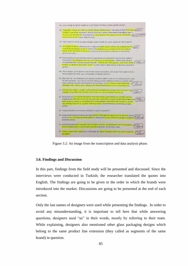
85
Figure 3.2: An image from the transcription and data analysis phase.
3.6. Findings and Discussion
In this part, findings from the field study will be presented and discussed. Since the
interviews were conducted in Turkish; the researcher translated the quotes into
English. The findings are going to be given in the order in which the brands were
introduced into the market. Discussions are going to be presented at the end of each
section.
Only the last names of designers were used while presenting the findings. In order to
avoid any misunderstanding, it is important to tell here that while answering
questions, designers used “us” in their words, mostly by referring to their team.
While explaining, designers also mentioned other glass packaging designs which
belong to the same product line extension (they called as segments of the same
brand) in question.

86
3.6.1. Background of the Designers
At the beginning of the interview, designers were asked to give some information
about their backgrounds.
Gamze Güven graduated from METU Industrial Design Department in 1987 and
completed her MSc in the Faculty of Architecture at the same university in 1990. She
worked for several projects and designed office furniture, lighting, kitchen
appliances, etc. She founded İdol Tasarım which was a design consultancy in 1996
with her associate İnci Mutlu. Güven took over the company and renamed it as
Tasarımüssü in 2000. Güven and Tasarımüssü have many international and national
awards. She served as the vice president of ETMK (Industrial Designers Society of
Turkey) İstanbul Branch. Güven did not work on a packaging design project before
designing Yeni Rakı. Then, she continued to work for the client, Mey and designed
Altınbaş and Tekirdağ No10. For Yeni Rakı Yeni Seri, Yeni Rakı Ala, Yeni Rakı
Beykoz and Yeni Rakı Rastgele, the structural design of same glass packaging was
used with different graphic designs.
Orhan Irmak graduated from METU Industrial Design Department. He studied for
his master degree at Bilkent University, Department of Interior Architecture and
Environmental Design. Then, he founded Orhan Irmak Design with his brother in
2004. After that, he continued his academic study on packaging design and got his
PhD degree from İstanbul Technical University Industrial Design Department on
packaging design. Currently, he is continuing to work at Orhan Irmak Design, an
accredited design office by Turquality. The design team has many international and
national awards. He stated that he worked for packaging design projects before
Burgaz Rakı.
Oya Akman graduated from Istanbul State Academy of Fine Arts, Industrial Design
and Interior Design Department (İstanbul Devlet Güzel Sanatlar Akademisi Endüstri
Tasarımı ve İç Mimarlık Programı) with a master’s degree, and then studied on
semiology and corporate identity for her dissertation at the same institution (renamed
as Mimar Sinan Üniversitesi in 1981 and later as Mimar Sinan Güzel Sanatlar
Üniversitesi in 2004). She has been working as a professional designer for more than
40 years and for different industries such as textile, ceramics, plastics and glass. In

87
addition to this, she also worked as an academician in İstanbul Technical University
Department of Industrial Product Design for 12 years. Currently, she is working as a
consultant for Anadolu Cam and also managing her own design company, Oya
Design. As stated by her, she had many experiences in packaging design: Tekirdağ
Rakısı glass packaging design (2000), milk and fruit juice bottles, Tekel whisky glass
packaging design.
Eda Yılmaz graduated from Anadolu University Industrial Design Department in
2005. After graduation, she first started to work as a freelance designer for Anadolu
Cam and after six months, she started to work as a full time designer there. Since
2011, she has been working as the chief of product design department. She
mentioned that she had many experiences in packaging design before designing the
glass packaging for Topkapı Rakı.
İpek Torun graduated from Bilkent University Graphic Design Department. Then she
started the MA program at Anadolu University Animation Department. Now, she is
working as a lecturer at Bahçeşehir University Faculty of Communication, Visual
Arts and Visual Communication Department. In addition to this, she works as a
freelance designer. She reported that she had no experience in packaging design
before designing the graphics of Tekirdağ Rakısı.
3.6.2. An Overview of the State Monopoly Period
In this section, an overview of the state monopoly period was presented from the
designers’ point of view. During the interview, designers mentioned about the state
monopoly period and how the need for new designs emerged after the abolishment of
the state monopoly.
Yılmaz told that rakı glass packaging designs were mostly cylindrical and straight
and not elaborated, and there was no need to change the existing packaging design
until Yeni Rakı. Likewise, Güven explained that before redesigning Yeni Rakı, it
was possible to see nice labels designed from time to time; however, same glass
package had been used for different alcoholic beverages products: rakı, vodka and
ethyl alcohol. Because of the state monopoly, there was no need for packaging
design or any other marketing activities. As also pointed out by Irmak, there was not
a matter of consumers’ brand, product or quality preference. Then, a design need

88
emerged due to the strong competition in the alcoholic beverage market that grew
rapidly after the state monopoly ended. In this period, consumers were conservative
about the brand they were used to, Yeni Rakı, and did not want to change their
purchasing habits at first. As stated by most, brands needed to analyze consumers,
their competitors and rakı consumption ritual deeply.
3.6.3. The First Contact with the Client
In this section, the designers were requested to mention about how the first contact
with the client happened.
Yeni Rakı
Güven stated that Cihan Kırımlı, who was the marketing director in 2004, called her
to tell that Mey had established in 2004 after the state monopoly ended; and they
decided to redesign Yeni Rakı glass package. He invited Gamze Güven to the design
contest with four other designers. Although she had not worked for a packaging
design before, she accepted the invitation.
Burgaz Rakı
Irmak expressed that the printing house gave their contact details to the client. He
added that Burgaz had not been satisfied with their existing packaging design and
seeking for a new designer to redesign it. After the client got in touch with Orhan
Irmak Tasarım, they started to work on Burgaz Rakı packaging design in 2006.
Kulüp Rakı
Akman was called for redesigning the glass packaging for Kulüp Rakı by the client,
Mey and invited for a meeting in 2007. She did a presentation and introduced her
previous projects, and then they started to work together.
Topkapı Rakı
Yılmaz told that the client Antalya applied to Anadolu Cam Design Center where
Yılmaz works, and they started to work on Topkapı Rakı glass packaging design in
2007.

89
Tekirdağ Rakısı
Mey organized a design contest for one of its brands, Tekirdağ Rakısı, in 2008. Two
designers were invited to this contest and one of them was Güven. The other designer
of Tekirdağ Rakısı, Torun joined the team as a project based graphic designer.
3.6.4. The Brief Given by the Client
Concerning the question of whether a brief was provided by the client, all designers
said “yes”, but not all of the given briefs had been detailed, except for the one for
Topkapı Rakısı. Most of the designers expressed that briefs were verbal mostly,
included some keywords about the client’s goals and expected outcomes. The briefs
also included the glass packaging’s sizes (mentioned by Akman), colors to be used
(mentioned by Torun), cap details and the product line extensions to be designed
(mentioned by Yılmaz and Güven).
In some cases, the design features which were definitely undesired were also
specified in the briefs, Irmak mentioned that the technical problems related to the
competitors’ packaging designs and the “undesirable values” for the new graphic
design were specified in the Burgaz Rakı brief. Yılmaz mentioned that the Topkapı
Rakı brief had been a result of high-detailed analysis, and the client had explained
what they wanted precisely.
Almost all designers think that the clients’ briefs for rakı packaging design have
detailed information more than other design briefs in Fast Moving Consumer Goods
(FMCG) sector which they worked for previously. On the other hand, alcoholic
beverage sector was quite new in marketing and the brands were not successful about
expressing what they aimed correctly through briefs, as stated by Irmak.
When the designers were asked if possible for them to share the brief with the
researcher, they did not prefer to, due to the strict contracts with their clients or not
keeping it anymore.

90
3.6.5. Target Consumer Groups
Yeni Rakı
Güven said that the target consumer group of Yeni Rakı was specified as everyone at
every age from all social classes who drink classic rakı. She added that she had
thought a man with wide shoulders, highly confident, standing strong and someone
who knows rakı culture including rituals (rakı adabı).
Burgaz Rakı
Irmak asserted briefly that the target consumer group of Burgaz Rakı was people
who drink Yeni Rakı.
Kulüp Rakı
Akman stated that the target consumer group of Kulüp Rakı was people who were
older than 40 mostly, mature; qualified and classic people who drink rakı with
pleasure, people who know rakı and its culture were considered as the target
consumer group. She gave an example for the target consumer group: Men who wear
tuxedos and bowties as shown on the label of Kulüp Rakı (Figure 2.21).
Topkapı Rakı
Yılmaz said that Topkapı Rakı targeted the classic rakı drinkers. She also gave
information about the target consumer group of Topkapı Mir Rakı (known also as
“Altın Seri”): Men who have sophisticated taste, give importance to quality and
prestige, and tourists were also mentioned as an additional target group of Topkapı
Mir Rakı.
Tekirdağ Rakısı
Güven stated that due to the high number of competitors in the market, Tekirdağ
Rakısı aimed at not losing its existing consumers, and also it targeted the consumers
of the competitors which produce fresh grape rakı. Torun stated that people who
were price insensitive were the target group of Tekirdağ Rakısı. Güven also
mentioned that Tekirdağ Rakısı Trakya Serisi was gourmet, delicious and easy to
drink, and it targeted younger consumers in particular, and Tekirdağ Rakısı Altın
Seri was a high segment rakı with a specific target consumer group.

91
Discussion
All designers described the target consumer as significant for conceptualizing the
design. When they specified the gender they all referred to men as the target
consumers. Additionally, there is a “classic” rakı consumer to whom designers often
gave reference.
It is also observed that designers stereotyped their target consumer groups as in Yeni
Rakı and Kulüp Rakı cases. Whereas Güven described a strong man with wide
shoulders and high confidence, and someone who knows rakı culture, Akman
characterized a mature man who is qualified, classic and knows rakı culture, as
illustrated on the label. The common point in Güven’s and Akman’s descriptions is
the emphasis on men who know rakı culture.
The designers mostly defined target consumer groups socio-economically. Thus, it
can be said that being price insensitive, gourmet or having a sophisticated taste imply
a consumer from a higher socio-economic class, as expressed by Torun, Güven and
Yılmaz. Akman’s descriptions, being “qualified and classic” can also be included in
this group. On the contrary, in the case of Yeni Rakı and Topkapı Rakısı, the target
consumer groups described as “everyone”, “classic rakı drinkers” correspond to the
middle and lower socio-economic class consumers who care for affordable price.
It is also possible to say that the target consumer group was defined in reference to
the competitors in the market. As both Güven and Irmak mentioned, a competitor
brand was selected, and its consumer group was targeted; since Yeni Rakı was the
market leader, Burgaz Rakı aimed to reach the competitor’s consumer group, and
Tekirdağ Rakısı targeted the consumers of the competitors which produce fresh
grape rakı.
3.6.6. The Goals and Expected Outcomes the Client Planned to Achieve through
Packaging Design
In relation to the brief given by the client, the designers were asked what the goals
and expected outcomes stated in the brief were. In order to talk about this deeply and
also as a reminder, three sub-questions inquired whether there were any goals such as
creating brand loyalty, reflecting taste, and price and quality.

92
Yeni Rakı
According to Güven, after the state monopoly ended, the competition started among
brands, and Mey did not want to lose its market share to new competitors, and
decided to redesign it.
As she expressed, it was mentioned in the brief that the design was expected to
become a symbol for the product itself; when “rakı” was said, a specific unique form
should come to mind. Additionally, she gave an example of wine and whisky glass
packages; whisky is associated with square bottles, and wine with sloped shoulders
and cylindrical glass bodies. In a similar way, the main goal was to design a rakı
glass package with a unique shape and identity in order to differentiate it by its form
from other alcoholic beverages. While explaining the desired outcome, she
particularly used the words “iconic” and “cult”. Creating brand loyalty was
considered to be related with the goal of an iconic and unique design, as stated by
Güven. She asserted that creating a norm for the category was aimed to achieve, and
added that it was not written in the brief, but she aimed it personally. Creating a
norm meant that other brands’ packaging designs were expected to accept the norm
and follow the visual cues that Yeni Rakı created.
She mentioned about the plans of creating a self-confident, strong but modest male
character with wide shoulders. Being moody or feminine was specified as undesired
since rakı is a manly drink. Moreover, this male character had to know rakı culture.
She continued by saying that the packaging design was to reflect this male character
like sitting around a table in a meyhane; befitting rakı culture was a concern. Young-
looking or a premium appearance was specified as undesirable for Yeni Rakı,
considering its target consumers; it was expected to be affordable, as she declared.
She had also considered this design as an opportunity to introduce a local product
from our own culture, peculiar to us and this geography to the global market. She
asserted finally that the existing glass package of Yeni Rakı had not given the value
to rakı it deserved.

93
Burgaz Rakı
Irmak told that packaging design of Burgaz Rakı was expected to stand out on the
shelves and have a memorable visual identity in order to remind itself to the
consumer through its distinguishable design.
Another significant goal aimed at was to persuade consumers about the quality of
Burgaz Rakı. Consumers should perceive that Burgaz Rakı had the same quality as
the brand they are used to, and he added: “Maybe even higher quality”. In addition to
this, breaking the brand loyalty of Yeni Rakı was aimed so that it could be possible
to take a piece of the pie (market share) from the market leader.
The design was expected to communicate the localness (that is, its being Turkish rakı
and a traditional Turkish drink) visually. He declared that it had to stress its Turkish
identity and its being something which comes from the Turkish essence. In addition,
it aimed to take over the “image of being Turkish Rakı” which Yeni Rakı had.
He declared that the goal of reflecting “taste” had not been an issue while
redesigning it: “Market was not segmented as it is today” implying the limited types
of rakı in that period.
Additionally, he asserted that packaging design for alcoholic beverages was quite
new for Turkey and it was a good experience for them to work in a project with one
of the powerful actors in the market.
Kulüp Rakı
Akman stated that the client wanted a classic and elegant design, and a modern style
was specified as definitely undesired. The design had to stand as a premium glass
body at the rakı table and persuade consumers about its premiumness and superior
quality by reflecting its being high-priced rakı. Thus, reflecting price and superior
quality was asserted by the client as a design goal.
The client especially wanted the glass package to be taller than other competitors on
the shelves. By doing so, consumers would think that there was more rakı inside;
however, Akman criticized here that she never believed its accuracy; and added that
consumers look at the quantity of rakı within, not its length.

94
Since the label design has a characteristic and historical value for brand, the client
wanted to keep it same. Therefore she had to take the label into consideration, and
design a glass packaging in harmony with the label.
For the question of brand loyalty, she said that it must be the first factor to consider.
Although she told that she had not exactly been remembering the details, she
commented that there was a certain sales expectation declared by the client.
In addition to these, she mentioned about her personal goal, which was declared as
her way of working in general, that the design had to look like a global product, and
it should not look awkward and even that it must stand out everywhere in the world.
Topkapı Rakı
For the Topkapı Rakı brand, the main goal was to design a packaging which reminds
of Topkapı Palace. When consumers saw the bottle, they were expected to feel the
splendour of the Palace (saray esintisi) and majesty. Yılmaz continued that people
who live in İstanbul could easily visualize Topkapı Palace in their minds; but, it was
hard for people who have never seen İstanbul and Topkapı Palace. While carrying
several cues from Topkapı Palace, it must have modern lines, and should not create a
perception of mosque which can be a problematic issue.
Topkapı Rakı was not planned to be sold at an expensive price; therefore, it was
expected to reflect its price and in the meantime also look elegant at the rakı table.
Changing the existing purchasing habits was also aimed with this design.
Yılmaz also added that she aimed personally to have minimum problem in the
production or filling line to complete the packaging design project successfully.
Tekirdağ Rakısı
For Tekirdağ Rakısı glass packaging design, both of its designers, Güven and Torun,
mentioned that it was expected to have a strong and prestigious image. It was
expected to have a modern style, and looking completely traditional and simple was
definitely undesired.Torun criticized that simplicity was always matched with
modern style, but it was not right.

95
As mentioned before, Yeni Rakı aimed at creating a norm with its design in the rakı
category. Following the norm created was important for both Güven and the client
while designing glass packaging for Tekirdağ Rakısı.
According to its designers, announcing and stressing its being a fresh grape rakı was
significant; the main reason for this was the strategy of the competitor, Efe Yaş
Üzüm which was launched as “the first fresh grape product” in the rakı category. As
Güven said, the first fresh grape rakı was Tekirdağ Rakısı, but consumers were not
aware of that.
Güven pointed out that they wanted the glass package to look like a woman who
belongs to an aristocratic family from Istanbul having their origins in Ottomans and,
and added that everyone admired that woman.
For Tekirdağ Rakısı Altın Seri glass packaging design, reflecting its distinctive
smooth taste and yellowish color which comes from the distillation process and oak
barrels was declared as a design goal. In addition, superior quality, prestigious and
luxury image was aimed. For Tekirdağ Rakısı Trakya Serisi, on the other hand,
reflecting its gourmet, smoother taste, which comes from the Semillon and Papaz
Karası grapes of Trakya Region, was aimed in order to widen its consumers by
influencing younger consumers.
Standing out on the shelves was also important, but it also had to preserve the
existing values of old design, because consumers were used to seeing it since 2000
and they could find the new design odd, and alienate easily.
Güven declared that the client had wanted the body to have a larger label area for
communication. Related with the label, Torun stated that the client had wanted a
typographic design solution on the label since the beginning of the design process.
Technical considerations like manufacture, filling, ergonomics, and increasing sales
were important factors in the design process, as Güven expressed.
Discussion
Brand image. Three of the brands (i.e. Yeni Rakı, Tekirdağ Rakısı and Kulüp Rakı)
which were available in the rakı market before the privatization, did not want to lose
their market share and increase; whereas the new introduced brands wanted to
96
increase their market shares. Since Yeni Rakı was the mainstream brand for years, as
Irmak implied, “the brand consumers were used to” was Yeni Rakı; therefore,
Burgaz Rakı wanted to become one of the market follower, and this might be the
reasons of the similar strategies they used: They both aimed to stress their local
identity (Turkishness), targeted everyone with an affordable price. In addition to this,
it seems that the product quality of Yeni Rakı was considered as important and so,
Irmak also took into account the reflection of its product quality for the competition.
It can be inferred that this competition was a factor contributing to increase the
quality of the product itself and its packaging design, or at least pushed the brands to
improve their product qualities.
Taste differentiation. All of the brands aimed to stand out on the shelves, create
brand loyalty, and increase their market share. Only one of the brands aimed to
reflect the taste and color that the product has, which is related with the time it was
redesigned. Whereas there were not so many types of rakı at first after the
privatization, new brands were introduced to the market in time, and they provided a
taste difference by producing various types of rakı; as a marketing strategy, this taste
differentiation was reflected to the packaging design to announce product qualities as
well.
Iconic design. Güven aimed at developing an iconic design which will set a new
standard or “norm” for the structural design in the rakı category. Developing an
iconic design for rakı glass packaging was considered as a significant goal for
achieving product differentiation through form, not only in comparison to the
competitor brands, but also in comparison to other alcoholic beverages.
3.6.7. Design Research Process
For this section, it was aimed to find out which topics designers did research on, and
which methods, sources and tools they used for exploration and idea generation.
When it was asked to designers which topics they did research for, almost all of them
mentioned about similar topics.
Güven told that while designing; the origin of rakı, rakı culture and similar drinks to
rakı (i.e. arak, uozo, sambuca and other anise-based products) was researched. The
other questions were researched as follows: Whether similar drinks’ packaging

97
designs had norms, which drinks were identified with which countries, how the
brands became cult. She scanned all the sources about rakı such as books and several
internet platforms. Participant observations were conducted at drinking houses.
Besides that, she also asked people around which brands they preferred, with
reasons, and what they cared about mostly while purchasing. In addition to these, she
also conducted research on other alcoholic beverages’ packaging designs such as
vodka and whisky, and packaging design in general. While developing the packaging
design of Tekirdağ Rakısı, she used the feedback received from the packaging design
of Yeni Rakı and the focus group studies conducted for Tekirdağ Rakısı;
additionally, comments about the existing Tekirdağ Rakısı packaging design was
also investigated.
Irmak expressed that the research topics for Burgaz Rakı design had been packaging
design in general; vodka, whisky, gin packaging designs; how a gin package
differentiates from a vodka package. In addition to these, the sector dynamics, the
global competition, how global brands and foreign designers work were explored by
his design firm. Besides that, they conducted observations and store visits out of
Turkey, and used printed sources about drinking culture, packaging design, and
particularly alcoholic beverage packaging along with research data provided by
firms.
Akman mentioned that she had gathered information about glass packaging for rakı
and ouzo, alcoholic beverage packaging design in general, and how they evolved in
time along with their weights and volumes. She also investigated who drinks rakı,
how rakı is preferred in drinking ritual, and additionally the rakı ritual in general by
asking around. Moreover, the origins of rakı, its product qualities, ingredient herbs,
production steps were stated as significant research topics. She mentioned about
using a magnifying glass as a research tool to observe the tiny particles of herbs used
as ingredient in the rakı production. She expressed that she did not attend any focus
group studies conducted for Kulüp Rakı, since she thought that focus group studies
were quite misleading for the design decisions based on her previous experiences.
Yılmaz told that since the client had given them a detailed brief about glass
packaging design for Topkapı Rakı, there was no need to conduct research for same
topics. It was told that they had taken information from Anadolu Cam marketing

98
department and investigated for people’s perceptions about Topkapı Palace and rakı
separately, and what elements evoke rakı. In particular, how to describe Topkapı
Palace to someone who has never seen was explored. Besides that, store visits,
observations were conducted, and ordinary tools such as internet and books were
used.
Torun told that she had investigated on Ottoman patterns and how they could be used
for surface graphics. In addition to these, sophisticated, vintage and calligraphic
typographies were investigated for the graphic design of Tekirdağ Rakısı. Moreover,
she thought about how the graphics of the old packaging design could be changed,
and investigated on the competitors’ packaging designs and who drinks rakı. While
investigating, books about packaging design, suppliers’ catalogues, internet and
particularly “The Dieline” (an internet database about packaging design), and market
research data provided by the client were used.
Discussion
Answers show that designers focused on several topics while doing design research
and these can be categorized as follows: Research into rakı which consists of the
origin of rakı, rakı culture and rakı production process and ingredients (which can be
told as related with product qualities of rakı), similar drink to rakı (other anise-based
products); research into packaging design which includes the packages of the client,
the packages of the competitors, other alcoholic beverages’ packaging designs (i.e.
vodka, whisky and other anise-based products), and research into consumers’
preferences. It was seen that observations and informal interviews with rakı drinkers
at the drinking houses were found important to explore with an aim to understand the
ritual of rakı and the reasons of consumers’ purchase decisions and preferences by all
designers.
All of the designers mentioned that they had analyzed rakı and other aniseed based
products’ and the competitors’ packaging designs. Market research data provided by
firms (e.g. the client, research firms or their own firms’ sectorial knowledge) were
valuable resources for designers, and so they did not investigate the same topics as
Yılmaz and Torun declared. Güven was the only designer who attended focus group
studies, and expressed that she had found them valuable for achieving a successful
99
design, whereas Akman did not think so. This is an important detail to mention since
it shows how designers’ previous experiences affect their way of working in the
design research phase.
3.6.8. Concept Development and Visualization
In this part, the designers were asked about how the initial design ideas were
developed and what the leading themes were. Then, two additional questions
inquired about the number of the alternatives they designed and how the design
alternatives were eliminated before presenting them to the client, in order to
investigate the selection process of alternatives.
Yeni Rakı
Güven declared that:
When “wine” is said, a smoother shoulder comes to mind. When “whisky” is
said, the square bottle section comes to mind, probably created by Johnny
Walker. We looked for the form which will create a norm or when “tequila”
is said, a fancy, embossed rectangle comes to mind. These are the cult glass
packages of some specific brands which are mostly advertised and sold.
She thought about how to create a norm for rakı like those alcoholic beverages have
for their packaging designs, and conceptualized the body which would be a norm for
the rakı category.
As declared earlier, Güven had imagined a modest male character with wide
shoulders, and wanted to reflect it through the glass packaging design. In order not to
create an exaggerated and fancy look for this character, print finishing details were
considered in the beginning stages of the design process: It was thought that
serigraphy could match with rakı.
As one of the initial design ideas, they used colors in glass: Çeşmi Bülbül (a
glassware type with a meaning of "nightingale's eye” in Turkish) patterns could be
matched with the packaging design for rakı, she thought; however, this idea was not
developed for the finalization process.

100
In order to explain how she developed concepts, she told: “While questioning other
countries’ forms, I thought of a form which they did not use, and which reflects our
half-Eastern identity”, and then expressed that a concave form could create a norm
for Turkish traditional drink, as she found out subconsciously. While thinking about
the concave forms, she realized that she was influenced by traditional products such
as carafe (güğüm) in Figure 3.3, and copper bucket (bakraç) in Figure 3.4 that have
concave forms.
She emphasized that while designing, she did not consider the tulip shaped glass in
Figure 3.5 (ince belli bardak) as her source of inspiration, although it was stated
otherwise in the press.
Figure 3.3: Copper carafe (retrieved
and adapted from:
http://urun.gittigidiyor.com/antika-
sanat/antika-bakir-kucuk-
boy-gugum-130432358).
Figure 3.4: Copper bucket (retrieved
and adapted from:
http://www.rugandrelic.com/Products/Anti
que-Copper-Bucket__HA0507-044-2.aspx).

101
Figure 3.5: Tulip shape tea glass (retrieved from:
http://www.pasabahcemagazalari.com/yasam/cabare/ince-belli-cay-bardagi-24-lu-paket-
/u-11965-16-827).
Initial ideas were developed into sketches and then modeled. For this stage, she told
that she had received feedback from her team. In order to select alternatives for
presentation to the client, firstly they evaluated themselves within the team.
However, she added that it was preferred to present alternatives as many as there
were so that the client could select what they wanted exactly.
Burgaz Rakı
Irmak told that since the glass packaging design was cylindrical, it was difficult to
use horizontal logotype for a powerful and stressed design area. They wanted to keep
it simple, but also eye-catching on the shelf. Hence, they decided to use the logotype
vertically, and on a larger area. He added that the design must not keep distance with
people, and people should think that it was the rakı which they have consumed for
years. On the other hand, reflecting the whitening of rakı when water is added was
considered, and solutions were generated for this.
In order to create brand recognition, they worked with colors and typographic
solutions. As he said, they had to own a color first for Burgaz Rakı which was not
commonly used in the rakı category, and then developed typography alternatives to
reflect Turkishness. He underlined that there were not so many elements to use on
the label design referring the previous Yeni Rakı glass packaging design; there were
not various visual elements on its label, just the Yeni Rakı logotype. It was also a

102
concern that consumers could refuse the design if any unfamiliar element was used
for the design.
They developed sketches for the concept development phase, and then they prepared
mock-ups in order to see how they look on the shelf. There were four or five
alternatives designed. When he was asked from whom they received feedback in this
phase, he answered that they were in contact with the marketing team and the
company owner all the time.
Kulüp Rakı
Akman declared that she had considered harmonizing rakı culture with the quality,
since a classic and superior quality glass packaging design was aimed. As explained
by her, for the design of Kulüp Rakı glass packaging, the client had brought several
examples for glass packaging from a French supplier at the beginning of the design
process. Baccarat crystals of France were also a source of inspiration for Akman. To
explain in more detail, she told: “The perception of classic and superior quality is
provided by crystal cuts in accordance with a circular form which reflects light well.”
She also mentioned about the crystal glass producers such as Moser, Saint Louis, Val
Saint Lambert, and gave examples about the usage of these crystals for the old
alcoholic beverage glasses such as wine and whisky glasses which have wide cuts,
carves and gold details (Figure 3.6 and Figure 3.7).
Figure 3.6: Moser glass products as a source of inspiration
(Image courtesy of Oya Akman).

103
Figure 3.7: Glass products as a source of inspiration (Image courtesy of Oya Akman).
As she expressed, rakı production process and its ingredient herbs were explored
firstly; then, she worked on geometric solutions: Whether different geometries fit
goals and meanings in silhouettes of geometric transitions were initial ideas in the
concept development stage.
Even though the client did not demand, she also designed more elegant, modern,
different alternatives. They included various forms other than cylindrical body: A
rounded square, a twisted square and a form that starts as cylindrical and then turns
into a square.

104
After modeling 15 or 20 alternatives with her team, she presented all of them as
“ready to manufacture”. She underlined that she always used parametric modeling
because of its being functional for applying any revisions. The design alternatives
were categorized for presentation to the client as “modern”, “ultra-modern”,
“classic”, etc., as each category had two or three alternatives. At this point, Akman
pointed out that the alternative chosen by the client to produce was not the one she
preferred; she criticizes that other alternatives were modern, but still classic and
elegant when they were compared to the one selected.
Akman also expressed her way of working while mentioning about the concept
development process: For Kulüp Rakı glass packaging design, she had worked with a
mechanical engineer, and she did not prefer to have full time members in her team
since she needed members with different specialties for each project concerning
technical calculations such as pressure analysis, thickness, and weight of the specific
product. As a feedback source in the design process, she mentioned about her
designer sister.
Topkapı Rakı
Since one of the significant goals for glass packaging design was to remind of
Topkapı Palace, Yılmaz explained that the client had given them a few illustration
examples of Topkapı Palace at the beginning of the process, but also told them not to
focus on those examples only, and feel free for concept development. She worked on
visualizing her ideas with an aim of making people feel the Topkapı Palace when
they read the brand name so that people could visualize Topkapı Palace when they
look at the glass package.
She declared that the design had to look integrated not only with the product within,
but also the brand. According to her, there were quite limited elements that can be
used to achieve design goals: It was because the usage of a universal cap, the base
and the cylindrical body were already certain; therefore, there were only the shoulder
and the neck structure left.
For the concept development, firstly she thought to use four cuts on the shoulder as a
stylization of Topkapı Palace; however, it did not give the look she wanted. Then,
she developed another alternative by increasing the number of cuts (Figure 3.8).

105
Figure 3.8: The dome of Topkapı Palace and its stylization by Eda Yılmaz (Image courtesy of
Eda Yılmaz).
After initial ideas were developed, all sketches and initial design alternatives were
shared with the marketing department, the manufacturing department and the mold
design group of Anadolu Cam, and other units related with the production process
(i.e. cooler, quality) were also asked for their feedback. Prior to presenting them to
the client, the alternatives were evaluated firstly by these groups at Anadolu Cam
Design Center based on the criteria of technical constraints and the brief, and then
reduced to seven or eight alternatives. After this evaluation, essential modifications
were done; the alternatives were modelled parametrically and presented to the client
with all details as they would look “on the shelf”.
Tekirdağ Rakısı
Güven asserted that the design process of Tekirdağ Rakısı had been longer and more
difficult than the design process of Yeni Rakı, since everyone had expected better for
that time, and there were many parameters to be fulfilled.
Güven told that they had worked on the application of colors both in glass and label
while developing initial design ideas. They developed several alternatives which
have concave cavities because she wanted a place for grabbing body easily by hand
and share similar cues with the glass packaging design of Yeni Rakı.

106
The initial design ideas were sketched and modeled in order to present to the client
for their feedback; although there were many successful ones among 50 design
alternatives; the client was not persuaded with most, and eliminated them because of
finding them quite similar to Yeni Rakı glass packaging design, as Güven told. She,
on the contrary, expressed that since they had wanted to maintain the norm they
created for Yeni Rakı, the same neck structure was intentionally used for Tekirdağ
Rakısı glass packaging design.
The client also wanted the glass package to have a label and so, the form and the
surface were conceptualized as straight and label-applicable. In the meantime, she
continued to develop new design alternatives. Different than her previous design
method, she took a styrofoam and started to sculpt it without sketching beforehand.
When she generated a new concept with this method, she thought that it could fulfill
all design goals, and this was the one selected by the client.
Güven also explained that graphic design agency was working on the graphics, at the
beginning; however, none of them were appreciated by participants of a focus group
study. She stated that “The participants thought that the graphic design did not fit
glass package, and then Mey told us to do it (the graphic design) after that point”.
Thus, this was the time Güven realized that they should start to work on graphic
design along with structural design, and then they started to develop concepts not
only for structural design but also the graphic design for Tekirdağ Rakısı.
The concept development stage had started with logotype for the graphic design, as
Torun expressed; firstly, typographic solutions were generated for logotype and she
also worked on a concept similar to “laces” by changing the original form of the
typeface, and adding some ornaments which reminds of aniseed, and while doing it,
she did not want it to look feminine at the same time. She also used modern
typefaces and tried to give them a sophisticated look (Figure 3.9).

107
Figure 3.9: Typography alternatives prepared by Torun (retrieved and adapted from
http://www.ipektorun.com/2010/category/packaging).
For the shape of the label, Torun said that the space between the elliptical cavities
was used as a reference in order to develop label alternatives. According to her, the
glass body was bringing a centered block design to mind already. They had
developed different shaped alternatives such as semi-circle and drop shape (Figure
3.10), and then printed out in order to see the shape of the design on the styrofoam
prototype. By doing so, the limits of the readability on the packaging were
investigated. She told that there had been more than 10 or even 20 alternatives for
tested by printing out. Many of them were not proposed to the client but she
uploaded some of them to her website.
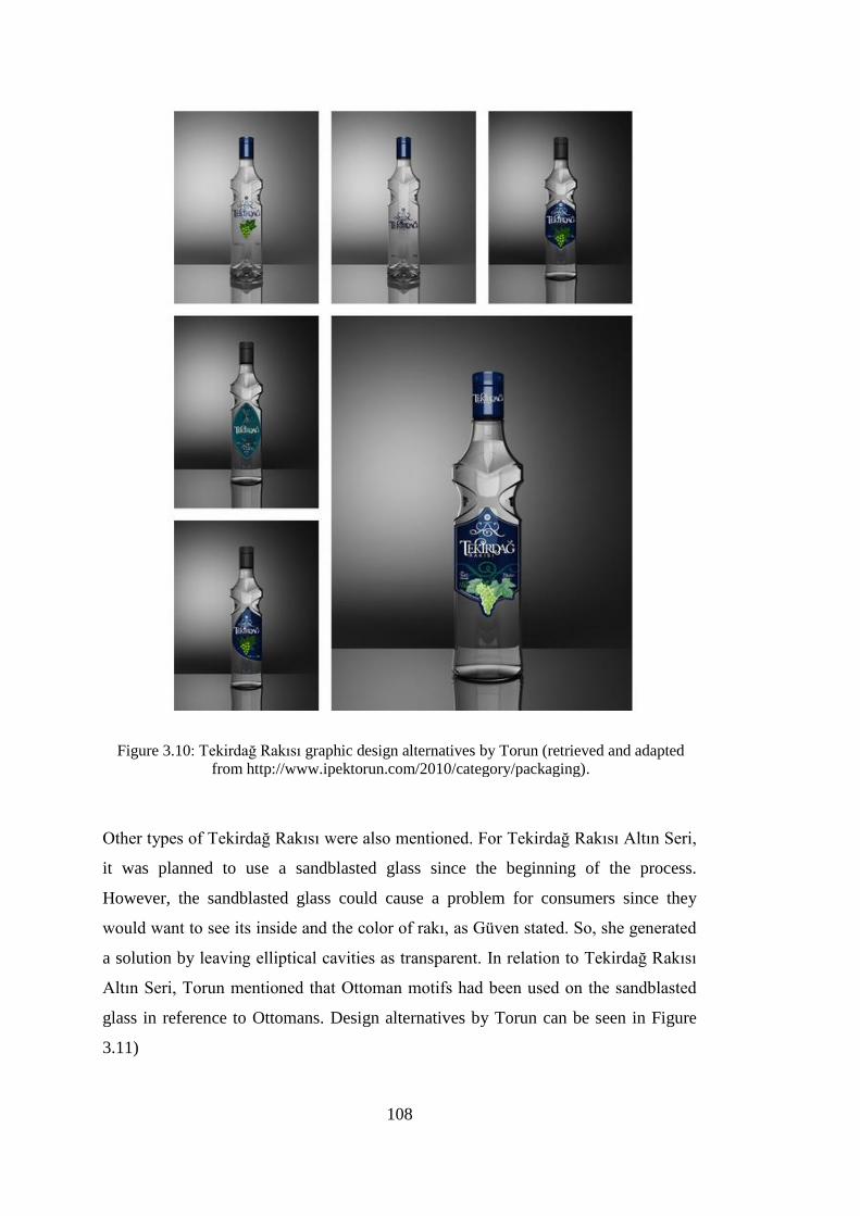
108
Figure 3.10: Tekirdağ Rakısı graphic design alternatives by Torun (retrieved and adapted
from http://www.ipektorun.com/2010/category/packaging).
Other types of Tekirdağ Rakısı were also mentioned. For Tekirdağ Rakısı Altın Seri,
it was planned to use a sandblasted glass since the beginning of the process.
However, the sandblasted glass could cause a problem for consumers since they
would want to see its inside and the color of rakı, as Güven stated. So, she generated
a solution by leaving elliptical cavities as transparent. In relation to Tekirdağ Rakısı
Altın Seri, Torun mentioned that Ottoman motifs had been used on the sandblasted
glass in reference to Ottomans. Design alternatives by Torun can be seen in Figure
3.11)

109
Figure 3.11: Tekirdağ Rakısı Altın Seri graphic design alternatives by Torun (retrieved and
adapted from http://www.ipektorun.com/2010/category/packaging).
Torun defined Tekirdağ Rakısı Trakya Serisi as a “greener” version, and told that she
had developed “a poison concept” (iksir konsepti) inspired by computer games
(Figure 3.12).
Güven mentioned about their usual elimination process: Before proposing to the
client, the first evaluation was made within the design team, and if she strongly liked
a design alternative which was eliminated by her team, she could present it to the
client anyway. After the eliminating process of Tekirdağ Rakısı, they had the

110
alternatives manufactured as plastic, transparent prototypes as a first for Güven’s
design office, and these prototypes were used for the presentation to the client.
Figure 3.12: Tekirdağ Rakısı Trakya Serisi graphic design alternatives by Torun (retrieved
and adapted from http://www.ipektorun.com/2010/category/packaging).
During the design process, Torun mentioned that she had taken feedback directly
from Güven, and communicated with the client indirectly, since she did not like to be
in contact with the client as always.
Discussion
In this section, designers were requested to show their initial sketches and models if
possible; however, they did not want to share their sketches, models or documents
due to their agreements with the client. Another reason for this was also not keeping
them anymore; only Torun told that some of the design alternatives were available to

111
see on her website. On the other hand, Yılmaz and Güven mentioned about the
website of Turkish Patent Institute in order to see other registered alternatives
besides the selected one. It is important to mention that almost all of the designers
did not remember the exact numbers of alternatives and they all gave a range for the
number of alternatives; of course, it can be related with the time passed.
It was observed that designers cared about the packaging requirements, the design
goals and expected outcomes, the rituals of rakı and ergonomics in the concept
development phase. They employed contextual scenarios and visualized the glass
packages on the rakı table and during serving as part of the rakı ritual. It was
observed that three of the designers (i.e. Akman, Güven and Yılmaz) who created the
structural designs of glass packaging were concerned about interaction between
product and consumer while pouring rakı and grasping the glass body comfortably.
There are various sources of inspiration and themes used by the designers for idea
generation. Local, traditional and historical elements such as traditional copper
buckets (Güven), Topkapı Palace architecture (Yılmaz), and Ottoman motifs and
laces (Torun); and the “classic” examples in glass, the Baccarat crystals (Akman)
were among the ones indicated by the designers. “Turkish rakı” and “Turkishness”
were stressed by both Irmak and Güven.
3.6.9. Finalization Process
For the finalization of the design, how the process was developed was asked to the
designers. Then, an additional question inquired about whether they did a production
trial. If they did, they were requested to specify if any technical problems occurred
during this production trial. If yes, the designers were requested to mention about
what kind of modifications they did with reasons after this trial. The designers’
general comments were obtained about the design process if they mentioned.
Yeni Rakı
As mentioned previously, Mey invited five designers to the design contest they
organized and each designer presented the alternatives they had developed and
selected for presentation. Then, all of the presented alternatives were evaluated by
the client and reduced to a limited number for the final evaluation. In this manner,

112
Güven told that they had presented ten alternatives, and the client had selected three
among them. After that, focus group studies were conducted for the final evaluation.
She declared that focus group studies were very helpful to explore the subconscious
of consumers, by asking them if the glass packaging design was a person, how it
would be, and the alternative emerged from the focus group studies were declared as
the most favorable alternative for rakı, which was one of Güven’s designs.
Then, the client arranged a meeting with Güven and agreed to work on other sizes of
glass packaging design as well; then, another meeting was held with Anadolu Cam,
the glass packaging supplier for receiving feedback about its manufacture. Since the
glass bodies would proceed in production line with a high rate, it was possible to
encounter several problems such as clashes, tensions, cracks and outages; therefore,
she was suggested to modify the shoulder and the heel of the design as a solution for
all technical constraints. However, she did not want to modify the design in the first
place, and showed them several examples of similar shoulders from other countries.
In addition, she explained her concerns about whether the character of the design
would change if the shoulder and the heel became rounded. Although the packaging
supplier did not want to take any risk, it was agreed not to do a radical modification
on the design considering both sides’ demands; the shoulder and the heel radii were
increased slightly and rounded accordingly. Güven pointed out that modification on
the shoulder had not caused a change in the character of the glass packaging design,
and even made it more characteristic.
After modifications applied, a production trial was done to see whether any problem
would occur. As she noted, there was not any significant problem in the production
trial, since the supplier had already taken all limits into account, and guaranteed each
detail. However, she did not exactly remember if any changes happened later, and
told that they might have increased the heel radius more.
When she was asked whether any problem was encountered with, she answered
positively and mentioned about the label design. While designing the glass body,
they also thought about the graphic design, and expressed their opinions about the
serigraphy as the printing method to the client. However, the client did not like the
idea of serigraphy at first, and met with several label manufacturers in order to take
their feedback on labelling instead, but none of the label manufacturers accepted to

113
print a label to the concave form of the glass body due to the fact that it was not easy
to print a label without any shrinkage or wrinkling. Consequently, it was decided to
use the serigraphy method, which was what Güven hoped for.
Burgaz Rakı
For the presentation to the client, Irmak told that they had developed and presented
four or five alternatives. While talking about the alternatives if possible to share, he
told that the files were not kept for the projects older than 3 years, except the photos
of the final designs.
He pointed out that when they presented the alternatives at the first place, the concept
development stage had not finalized, and they continued to work on alternatives by
applying revisions. At this point, he expressed that although the client already
selected one of the alternatives proposed at the first presentation; they wanted to be
sure about their choices at that time in order not to face with any problem, as he
learnt later.
When the revised alternatives were proposed, the client evaluated very carefully, and
the graphic design currently used in the market for Burgaz Rakı (Figure 2.44) was
selected among the proposed alternatives. After the selection, they specified the exact
print area and bleed requirements by considering technical constraints of the
supplier, and then the selected design was tested in a production trial. In addition,
they continued to work on the other packaging sizes to be designed.
After this trial, the only problem they have encountered was related with the color
adjustment as pointed by Irmak. The density of white color on the label appeared as
quite transparent, and did not provide opacity to cover enough; therefore, they
decided to increase the density of paint. After testing different chemicals in order to
solve that problem, they finally obtained the density they wanted. As the next step,
the back label of the glass packaging was designed. After finalizing the placing of the
back label information, the legal approval was taken.
During this period, they had worked not only for packaging design but also POP
(point of purchase) elements used in the retail shops for Burgaz Rakı.

114
Kulüp Rakı
Akman stated that she had presented all the alternatives she designed to the client
since she had found all of them were appropriate to manufacture and fitting the brief.
She did not remember the exact number of alternatives, but told to be about 15 to 20.
The client selected the final design according to the criteria mentioned in the brief.
While mentioning about the final selection, Akman stated that she had found it too
classic, but not modern, and she would prefer another alternative over the selected
one.
For the glass packaging design of Kulüp Rakı, Akman reported that they had not
needed a production trial since they had designed by considering all technical factors
such as pressure, weight, technical constraints, and calculated all the required data
for sending the glass packaging design directly to the manufacture without any trial.
She added that she always worked in a similar way, because if the required
calculations were not done, the suppliers would calculate them and do some
modifications, and it would not be the exactly her planned design anymore.
Topkapı Rakı
Yılmaz reported that seven or eight alternatives were proposed to the client. Then she
highlighted that all of the alternatives proposed were “manufacturable”. The client
took time to evaluate themselves, and then informed Yılmaz which design alternative
was selected.
For the question about whether any modifications were done after the selection, she
told that they had done a small modification and explained it in detail. Since there
were several mandatory texts such as the mandatory health warnings, information
about the company, the production and expiration date, and information about the
product inside the packaging, they had to provide all of them on the label. However,
the client did not like the placement of these texts since it was thought that the
placement of these texts affected the overall image of the glass package too much
and asked for placing them elsewhere; therefore, a small panel was opened at the
lower body to carry these texts. Then the client did not want to use it for texts, but it
stayed still. As Yılmaz said, this panel worked to prevent clashes between glass

115
packages on product line, and the labels were not damaged due to the friction (Figure
2.50).
For the graphic design of Topkapı Rakısı glass packaging, an advertising agency
worked at the same time. The advertising agency gave the dimensions they need for
the communication. Yılmaz explained that they did small adjustments in order to
give the area the agency wanted. Furthermore, the agency was informed about the
meaning of each detail related with the glass packaging design concept by Yılmaz,
and also the agency informed Yılmaz about the graphic design concept. It was a co-
operative work, she said, so the graphic design and the structural design worked in a
harmony.
When it was asked to her whether any production trial was done, she answered as
they did, but they did not encounter any problem with the design; they only added
that panel after the final design was selected.
She highlighted that the glass packaging design for Topkapı Rakısı was “a successful
process” since they had produced the same glass packaging design which the client
selected among the proposed alternatives.
Tekirdağ Rakısı
Güven expressed that they had prepared more than 50 design alternatives and
eliminated within the design team, and then eight or ten of the alternatives were
presented to the client. After that, the client eliminated the alternatives in order to use
for the focus group studies. The first focus group conducted ended with a negative
result since the selected alternatives by participants were not proper for labelling.
Then, Güven continued to work on developing new alternatives by taking the
feedback into consideration from the first focus group. After the second focus group
was conducted, one of the proposed alternatives was selected as the final design.
For the graphic design alternatives prepared by Güven and Torun, another focus
group study, the fourth one, was conducted; at this focus group, there were three or
four alternatives proposed for the evaluation.
Güven explained that she had attended most of the focus groups, and listened to the
participants; since she believed that the feedback received from focus group studies

116
was an important source, and she learnt much about rakı culture and packaging
design owing to the focus group studies. She declared that she had listened to the
consumers and watched the video records for more than 200 hours. In addition to
these, consumers’ perceptions about glass packaging for rakı were also learnt from
these focus groups by inquiring whether the design discussed fit the rakı category. As
she said, the participants had expressed that rakı glass package would be just as the
glass packaging design of Yeni Rakı. However, she told that focus group discussions
continued by asking other questions:
If it fit the rakı category, this time, was the glass packaging a woman or a
man, young or old? Then, there are many analyses related with
personification. It is not just this, for example, is it cultured or educated,
working lady or housewife? And etc. Or is it a strong character? Or a young
and dynamic character?
After selecting the graphic design and structural design, the technical constraints
were discussed with the supplier. The supplier wanted to make the shoulders and the
heel more rounded by increasing the radii of them.
When it was asked whether they did a production trial, both Güven and Torun
answered positively. However, as Torun said, there were no major changes done
after this production trial, and added that they had thought about printing Ottoman
motifs onto the sandblasted glass package; but after trial, they gave up the idea since
it did not result as they expected. Güven told that they had conceptualized the
elliptical cavities onto the design as transparent (not sandblasted) like a window
through which consumers could see the inside of the glass packaging; however, the
supplier did not accept, and the transparent cavities were manufactured as
sandblasted like all body.
For the finalization of process, Torun told that the process was not finalized actually
and added: “Whereas one series was printed, we were also working on the export
packaging designs. While working on the export packaging designs, the client liked
an idea there and wanted to apply to the original packaging. So, we never thought as
it ended.” She added that she could still see the small changes on the packaging
design.

117
Discussion
When the concept generation and the finalization process were interpreted together,
it can be observed that there are many similarities between designers’ practices.
Firstly, it was seen that designers gave importance to not only the aesthetics of the
design but also production methods and technical constraints. Secondly, they did not
prefer to present a quite limited number of alternatives. As Güven explained, this was
preferred in order to fulfill the expectations of the client completely, whereas Akman
proposed all the alternatives she designed because they were all proper to
manufacture, and so none of them was eliminated by her.
The results signify that the final design was selected either by the client directly, or
by the help of focus group studies conducted. Then a production trial was done. After
the production trial, some of the alternatives were not successfully manufactured, and
so they were modified based on the received feedback from the production trial. The
only designer who did not do a production trial was Akman, because all the
necessary calculations were done by her team member, they did not need to do a
trial.
3.6.10. The Design Elements Employed by the Designers to Achieve Design
Goals
In this part, the designers were asked to mention about the glass packaging design
firstly. If s/he is the designer of the glass packaging, s/he was asked how this form
was developed and whether s/he worked in collaboration with the graphic designer.
If s/he is the designer of the graphics, s/he was asked how this graphic design was
developed and whether s/he worked in collaboration with the designer of the glass
packaging. Then, another question inquired how the design goals influenced the
design process.
Designers were also requested to explain how the design elements were employed in
accordance with the design goals and the expected outcomes. There were sub
questions which were asked to remind the design elements. Lastly, designers were
asked how they achieved the design goals.
118
As mentioned in Section 2.5.2., the structural design refers to the form of the
packaging design for this study. Therefore, the answers of the designers were
categorized under separate headings as “structural design” and “graphic design”.
3.6.10.1. Structural Design
Yeni Rakı
Güven stated that the glass body of Yeni Rakı had wide shoulders with a thin waist
body, and a look of standing firmly, and it reflected the male character: A strong,
modest man who knows rakı culture, and its being a manly drink. By doing so, the
design was prevented to be moody and feminine which was told as undesired in the
brief.
According to her, the glass packaging design has a concave body form which is a
traditional, local feature “peculiar to our own culture” and she added:
I designed it considering that these concave forms belonged to us. A little bit
“Eastern” but simple, I mean, both modern and Eastern content, without
being fancy or exaggerated. I thought this identity like that. Both Eastern and
Western. It has the simplicity of the West and the dynamic lines of the East,
about the concave lines.
In order to explain in detail what was obtained with a concave form, she pointed out
that this form had not been used for any glass packaging design until then, firstly.
Secondly, it was a synthesis of Eastern and Western qualities of Turkish culture.
Thirdly, the body form created a “macho perception” implying “a woman held by a
man from her waist” (belinden kavranılan kadın). Since the body had a thin waist, it
helped to make it easy to hold by hand and created a haptic perception. Güven
asserted that another woman designer, one of the five designers competed for the
design contest, had said: “You developed a very macho design”. According to
Güven, it was related with the thin waist since it supported “the macho image of a
woman held by a man from her waist”. In addition to these, the form was defined as
“modern”, “simple” and “modest” by Güven. She also used concave lines for the
neck structure of the glass package, and told that the neck had been matched with
rakı, and later also used by another rakı brand, Mercan Rakı as seen in Figure 3.13.

119
a.
b.
Figure 3.13: The neck stuctures of Yeni Rakı and Mercan Rakı
(retrived from: a. http://www.etsm.org.tr/etsm/index.php?r=collection/view&id=7
b. http://basinbulteni.sirkethaberleri.com/ files/news/30754/ low_document1.JPG).
In addition to these, she emphasized that creating a norm for rakı had been achieved
through the concave form of the glass package, and consequently become a unique
and cult object, which was the design goal.
Burgaz Rakı
When the structural packaging designer of the Burgaz Rakı was asked to Irmak, he
told that the structural design was designed at the supplier by following the directions
of the company owner.
Irmak expressed that it was an advantage for them to have a quite wide area on the
glass body left for the label. He explained about form as: “There exists a cut on the
body, planned or unplanned, but turns into a sharp pointed moon” (Figure 2.44).
According to him, similarly there were also sharp pointed elements in the Burgaz
logotype that Irmak designed, and therefore it created a harmony between the graphic
design and the structural design; despite not conveying a direct visual message to the
consumers, they could perceive it subconsciously.
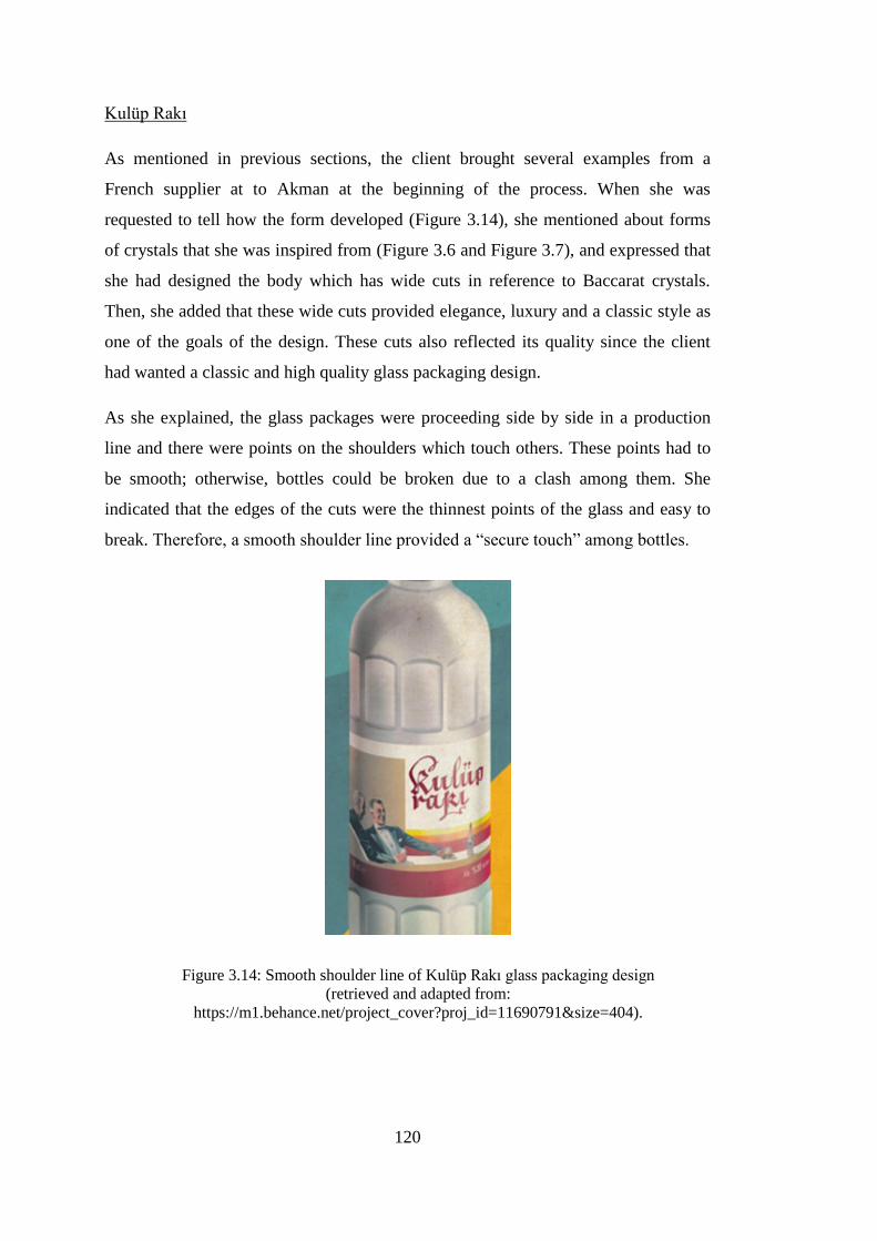
120
Kulüp Rakı
As mentioned in previous sections, the client brought several examples from a
French supplier at to Akman at the beginning of the process. When she was
requested to tell how the form developed (Figure 3.14), she mentioned about forms
of crystals that she was inspired from (Figure 3.6 and Figure 3.7), and expressed that
she had designed the body which has wide cuts in reference to Baccarat crystals.
Then, she added that these wide cuts provided elegance, luxury and a classic style as
one of the goals of the design. These cuts also reflected its quality since the client
had wanted a classic and high quality glass packaging design.
As she explained, the glass packages were proceeding side by side in a production
line and there were points on the shoulders which touch others. These points had to
be smooth; otherwise, bottles could be broken due to a clash among them. She
indicated that the edges of the cuts were the thinnest points of the glass and easy to
break. Therefore, a smooth shoulder line provided a “secure touch” among bottles.
Figure 3.14: Smooth shoulder line of Kulüp Rakı glass packaging design
(retrieved and adapted from:
https://m1.behance.net/project_cover?proj_id=11690791&size=404).

121
Related with a cylindrical body form, she told that it was easy to grab by hand and fit
consumers’ palms. She left a larger label area on the straight body in order to ensure
readability of the label.
Topkapı Rakı
According to Yılmaz, it was obvious that they would not develop a square section
form such as vodka, since it was not possible to deviate from habits that the existing
consumers had. Besides that, they also did not want to encounter any problems with
the design on the production line; therefore, a cylindrical form was developed.
Since the main goal was to design a package reminding of Topkapı Palace, the
shoulder was developed as a spherical, dome form in accordance with the dome of
Topkapı Palace. She explained that the sphere form consisted of six cuts; indeed,
these cuts were a stylization of Topkapı Palace (Figure 3.8). They provided
dynamism and shining to the design by generating refractions.
She defined the glass packaging design to have a modern style; avoiding an old
fashioned and retro look with “Arabic lines” was stressed. She added that it had to
look modern while reminding of the cues from Topkapı Palace. According to her, the
glass packaging design (Figure 2.50) achieved its major goal, reminding of Topkapı
Palace. Apart from this, the panel created at the lower body minimized the label
damage considering the friction in the production line.
The design also achieved to reflect its price; since the client specified the segment of
the product as economy, the manufacturing cost was taken into account as a
significant factor and after all, the glass packaging of Topkapı Rakı did not have a
look of an ultra-premium package and it did not create a perception of
expensiveness.
She pointed out that the elements such as the design’s shoulder detail, narrow body
and a total harmony reflected its distinctive character. The narrow body also
provided an ease for holding and pouring rakı, and the shoulder detail reflected its
inspiration source which is Topkapı Palace.

122
Tekirdağ Rakı
Güven explained that she had continued to work on the female body metaphor by
giving weight to the character of “the woman held by a man from her waist”, which
started in the Yeni Rakı glass packaging design; they wanted the body looked like a
woman who has a sophisticated look. Therefore, she conceptualized the collar detail,
nearby the shoulder, as having a unique movement. Besides that, the inlaid areas
formed by the collar nearby the shoulder (Figure 3.15), described as elliptical
cavities by her, also reflected that sophisticated look, as she stated.
Since she planned to maintain the norm created for the rakı category with Yeni Rakı,
the same neck structure with concave lines was used for Tekirdağ Rakısı glass
packaging design. In addition to this, a sharper shoulder detail and a collar detail
integrated with the label design developed.
Figure 3.15: The inlaid areas formed by the collar detail and aniseed stylization
and adapted from: http://www.diageo.com/en-
sc/newsmedia/pages/resource.aspx?resourceid=738).
According to Güven, providing an easily handling was significant; therefore, she
improved the substantial grip through its inlaid areas and a narrow body. Hereby, the
glass packaging design provided a strong haptic feeling for consumers.

123
She said that being proper for labelling was a significant detail specified in the brief
and the client wanted them to take into consideration technical constraints. Although
Güven wanted to maintain the norm by designing a concave body as she did for Yeni
Rakı, the glass body of Tekirdağ Rakısı was designed as straight. The inlaid areas
(elliptical cavities) were not used at the waist particularly; she preferred to use them
nearby the shoulder in order to provide a larger label area as desired by the client.
According to her, this innovative form made the glass packaging of Tekirdağ Rakısı
an iconic design, as desired.
3.6.10.2. Graphic Design
Yeni Rakı
Güven told that the graphic design of Yeni Rakı became integrated with the
structural design. Since one of the main considerations about Yeni Rakı was
reflecting its price, it was not designed as a high-cost glass packaging. As she
described, it could not have any coatings or patterns printed on the surface so that its
cost would not become high and everybody could afford to buy it. Güven expressed
that Rafineri Agency had worked for the graphics of Yeni Rakı.
For the printing method, serigraphy was preferred by Güven. According to her,
serigraphy matched up with rakı more compared to labelling. She added that
serigraphy printing had given lightness to the design and become integrated with the
glass body as well.
Güven also mentioned about the story of Yeni Rakı Beykoz glass packaging design
which has the same glass body with Yeni Rakı. When Mey wanted to launch a
limited edition premium rakı for The European Capital of Culture in 2010, Güven
thought about using Beykoz motifs (local motifs) on design, and found Fahriye
Özbey who is a traditional decorative (handicraft) artist. Ten different design
alternatives were prepared in gold color as hand-painted, and proposed to the client;
three of them were launched (Figure 2.37). As she declared, rakı had been produced
in Beykoz in the past, and also there had been a glass manufacture factory in Beykoz;
so these all became integrated and the story of Yeni Rakı Beykoz emerged. Many
consumers liked it and used it as a collection piece in their glass cases.

124
She also mentioned about the new graphic design of Yeni Rakı which was
redesigned by Landor Associates Dubai in 2013 (Figure 2.32). She told that it had
been targeting global markets as the reason for redesign so that the new design could
reveal the heritage of rakı. She commented that glass packaging design had not lost
its essence, which was important.
Burgaz Rakı
Irmak told that they aimed to stress the Turkish culture, its being traditional Turkish
drink, and something which comes from Turkish essence through its graphic
language. In this manner, they prominently used the red color for the logotype along
with black, and used white for the background. These colors were used only for
small details like lion details on Yeni Rakı previously; however, red was not a color
owned and used dominantly in the rakı category. After that, he asserted: “We had to
own a color first, as Burgaz Rakı. So, we chose red. It was a conscious choice in
order to empower the Turkish image.”
Figure 3.16: The moiré effect on the label of Burgaz Rakı
(Image courtesy of Orhan Irmak Design Archive).
Then, he expressed that they wanted to reflect the whitening of rakı when water was
poured to the glass and the “the moiré” (hare) on the label. As mentioned by him, the
moiré was identified with the color transition of rakı from transparent to white. They
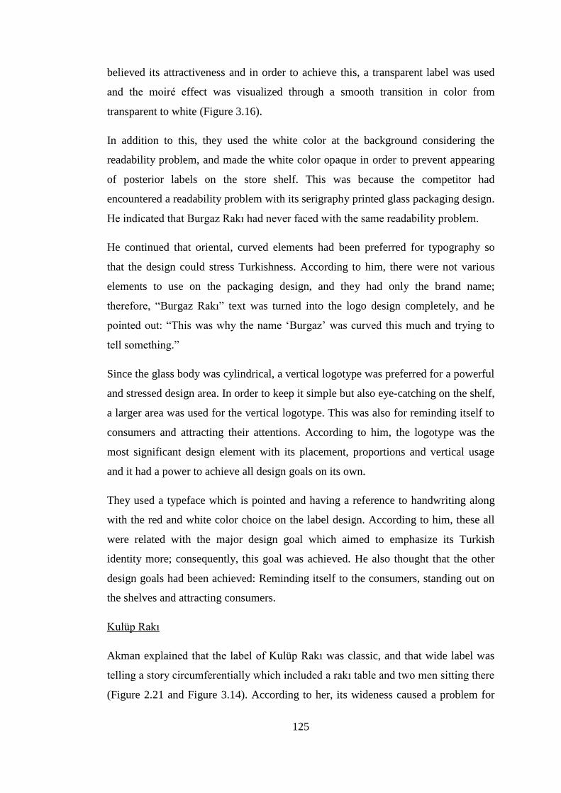
125
believed its attractiveness and in order to achieve this, a transparent label was used
and the moiré effect was visualized through a smooth transition in color from
transparent to white (Figure 3.16).
In addition to this, they used the white color at the background considering the
readability problem, and made the white color opaque in order to prevent appearing
of posterior labels on the store shelf. This was because the competitor had
encountered a readability problem with its serigraphy printed glass packaging design.
He indicated that Burgaz Rakı had never faced with the same readability problem.
He continued that oriental, curved elements had been preferred for typography so
that the design could stress Turkishness. According to him, there were not various
elements to use on the packaging design, and they had only the brand name;
therefore, “Burgaz Rakı” text was turned into the logo design completely, and he
pointed out: “This was why the name ‘Burgaz’ was curved this much and trying to
tell something.”
Since the glass body was cylindrical, a vertical logotype was preferred for a powerful
and stressed design area. In order to keep it simple but also eye-catching on the shelf,
a larger area was used for the vertical logotype. This was also for reminding itself to
consumers and attracting their attentions. According to him, the logotype was the
most significant design element with its placement, proportions and vertical usage
and it had a power to achieve all design goals on its own.
They used a typeface which is pointed and having a reference to handwriting along
with the red and white color choice on the label design. According to him, these all
were related with the major design goal which aimed to emphasize its Turkish
identity more; consequently, this goal was achieved. He also thought that the other
design goals had been achieved: Reminding itself to the consumers, standing out on
the shelves and attracting consumers.
Kulüp Rakı
Akman explained that the label of Kulüp Rakı was classic, and that wide label was
telling a story circumferentially which included a rakı table and two men sitting there
(Figure 2.21 and Figure 3.14). According to her, its wideness caused a problem for

126
consumers since it was not possible to see the label at a glance. In this point, she had
suggested that the brand name could have been closer to the side of men, and the
background could have been changed in order to make it sharp, but not resulted.
Topkapı Rakısı
Although Yılmaz did not mention about the graphic design in detail, she declared
briefly that the graphic design of Topkapı Rakı fit to its structural design. The glass
packaging was launched as serigraph printed. Colors, its cap and all design elements
did not distort the key concept of the packaging design. According to her, the graphic
design and the structural design were talking in the same language.
When requested to talk about the texture, she explained briefly that the body had
been designed as flint, and then secondary operations had been applied later (Figure
2.50). For the glass packaging of Topkapı Rakı Yaş Üzüm, the same glass body was
manufactured from a green degraded glass. The reason for this was highlighting its
being a fresh grape rakı. For the design of Topkapı Mir Rakı, a sandblasting
operation was applied. According to Yılmaz, the packaging design had positioned
itself in the right place and become distinctive among rakı brands and provided a
difference to rakı culture and markets.
Tekirdağ Rakısı
Torun told that they had taken the triangle space (Figure 3.17) emerged with the
collar form nearby the shoulder as a reference point. As stated by her, they worked
on most of the elements by considering the arches on edges and the tiny triangle
space emerged, and they mostly worked on this space. Following the outline defined
by the collar form, they designed the shape of the label. Torun added that form of the
glass packaging was also a reference for them which associated with a centered block
design.
Güven mentioned that there was an undefined space when the two cavities met with
the logo, and she decided to integrate the logo with that space, and suggested Torun
to use something to make the triangle meaningful; thus, a symbol (Figure 3.17) was
placed in the one corner of the triangle. According to Güven, that symbol reminds of
aniseed prominently along with the sun and the sunflower fields of Trakya. She

127
stressed that if that symbol was not used, the design could not have been completed
visually.
Güven told they designed the logo between two cavities and added that:
Actually, this was not the first logo. There is a kind of a mountain stylization,
a triangle space in the first logo. Above it, there is a snow particle or a
character symbolizing the sun. I wanted this particularly, because it was
defining this triangle space. Logo, that mountain, a move for symbolization of
the mountain of Tekirdağ and, kind of stylization of the sun, aniseed, etc.,
defined it in the middle of those two cavities and ending the story.
As mentioned by Güven, the client wanted particularly a bigger grape illustration
when compared to its previous design due to the goal of stressing its being a fresh
grape rakı. In addition, Torun told that the detailed illustration of a bigger grape
(Figure 3.17) fit the identity of label design.
Güven mentioned that the current graphic design in the stores was redesigned in
2011. Before that, in 2008, the glass packaging of Tekirdağ Rakısı was designed with
a label and flint glass, whereas the glass packaging of Tekirdağ Rakısı Altın Seri was
designed as sandblasted and serigraphy printed. As told by Güven, there were a curve
above “K” letter and an ornament -the mountain stylization- above the logo (Figure
3.17), which made the design look extremely traditional; on the contrary, a modern
and younger look was desired by the client. After designing the packaging of
Tekirdağ Rakısı Trakya Serisi as sandblasted and serigraphy printed, they decided to
revise each of them, and create a family resemblance among all Tekirdağ Rakısı
extensions. During this revision, the curve ornament above “K” and the stylization
were removed from the label, while changing the labelled flint glass bodies to
serigraph printed sandblasted glass ones (Figure 3.17). She added that during this
redesign process, she never considered removing the aniseed stylization in spite of
the client’s suggestion, because it defined the triangle space which was integrated
with the cavities. The logo was purified and enlarged.

128
a. b.
Figure 3.17: The labels of Tekirdağ Rakısı glass packaging, designed in a.2008 and b.2011
(retrived and adapted from: a. http://www.diageo.com/en-sc/newsmedia/pages /resource.
aspx?resourceid =738, b. http://www.pirim.com.tr/imagestore/tekirdag-rakisi-70-cl.jpg).
In order to mention about typography, Güven told that typography had both
calligraphic and modern, characteristic elements since the design was planned to
have an Ottoman and aristocratic look. Related with this, Torun declared that
typography had a rooted reference, and reminded.
According to Torun, the triangle space emerged with elliptical cavities was not
appropriate to use a huge typeface horizontally. She declared that she had used a serif
typeface, Gaudi Old Style, which had two-weight letter styles in order to give a
sophisticated vintage prestigious look, as design goal. Torun declared that graphic
design had a quite modest and traditional look, not a remarkably modern look. She
had used two-weight letter styles which have curves getting thinner and thicker
within typeface, Gaudi Old Style; as mentioned before, she wanted to make it to look
similar to laces.
The other typeface used in the front label was sans serif, and she explained the
reason that two typefaces could work better in a contrast, whereas it could cause a
complexity when two similar ones were used. For the back label, she preferred a
condensed, sans-serif typeface for communication since the back label had a limited

129
area for placing mandatory texts. In addition to this, the font size was selected as five
or six by considering the constraints of printing and readability problems (Figure
3.18).
Figure 3.18: The back label of Tekirdağ Rakısı.
For Tekirdağ Rakısı Trakya Serisi, Torun told that there were three different
handwritten typefaces used on the label; she admitted that although she did not want
to use these typefaces together, the client insisted on using them. She added that it
did not become a problem since the design was addressing the target consumer group
as planned.
Torun said that the client wanted to maintain the same navy blue color used on the
old packaging design of Tekirdağ Rakısı (Figure 2.30), and so the same pantone
color was given in order to use while designing. As she said, navy color might have
been used because of its association with masculinity and it had not been associated
with femininity, based on the client’s research.
Güven explained that regular rakı brands used the blue color; fresh grape rakı brands
used green color. The reason of using green color was because of the categorization
created by the competitor; therefore, the same categorization was followed.
According to Güven, economy segment rakı brands preferred the red color based on
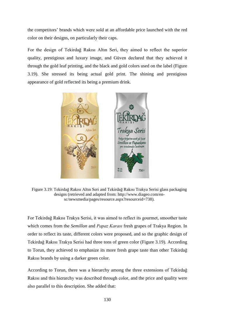
130
the competitors’ brands which were sold at an affordable price launched with the red
color on their designs, on particularly their caps.
For the design of Tekirdağ Rakısı Altın Seri, they aimed to reflect the superior
quality, prestigious and luxury image, and Güven declared that they achieved it
through the gold leaf printing, and the black and gold colors used on the label (Figure
3.19). She stressed its being actual gold print. The shining and prestigious
appearance of gold reflected its being a premium drink.
Figure 3.19: Tekirdağ Rakısı Altın Seri and Tekirdağ Rakısı Trakya Serisi glass packaging
designs (retrieved and adapted from: http://www.diageo.com/en-
sc/newsmedia/pages/resource.aspx?resourceid=738).
For Tekirdağ Rakısı Trakya Serisi, it was aimed to reflect its gourmet, smoother taste
which comes from the Semillon and Papaz Karası fresh grapes of Trakya Region. In
order to reflect its taste, different colors were proposed, and so the graphic design of
Tekirdağ Rakısı Trakya Serisi had three tons of green color (Figure 3.19). According
to Torun, they achieved to emphasize its more fresh grape taste than other Tekirdağ
Rakısı brands by using a darker green color.
According to Torun, there was a hierarchy among the three extensions of Tekirdağ
Rakısı and this hierarchy was described through color, and the price and quality were
also parallel to this description. She added that:

131
If you say that we compared this with other brands, again, particularly the
gold color and its derivatives were preferred for expensive products mostly.
Pale colors are preferred for cheaper products. So do the other brands. At that
point, I guess, the material and color used become a code for that.
According to Güven, the all extensions’ designs achieved to look more prestigious
through their colors as aimed so, “The holistic design of the packaging” was stated as
important, and she highlighted to solve each design problem as three dimensional, to
complete the design process successfully. The logo became integrated with body
form and the inlaid areas, and the design was completed through the aniseed symbol
which defined the space as a triangle. Güven told that she could not think of the
structural design and graphic design separately and all of design elements were in a
harmony.
About the surface finish, Güven told that they firstly designed glass packaging for
Tekirdağ Rakısı as flint, without sand-blasted. In addition to this, the client also
wanted labelling for the design, not serigraphy printing; so, the form and the surface
were conceptualized as straight and label-applicable (Figure 3.17). On the other
hand, Güven designed the glass packaging of Tekirdağ Rakısı Altın Seri as
sandblasted in order to create a smoother effect and look sophisticated for a high
segment, premium rakı. When the sandblasted glass met with the yellowish color,
which comes from the distillation process and aging in oak barrels, it achieved to
reflect the smooth taste, delicious draught and the color of rakı within, which was a
design goal.
Although Tekirdağ Rakısı Altın Seri was planned to be the only sandblasted glass
package, the client decided to make all of the Tekirdağ Rakısı types sandblasted and
serigraphy printed, after the design of Tekirdağ Rakısı Trakya Serisi sandblasted and
serigraphy printed; thus, the new Tekirdağ Rakısı family was created in 2011 (Figure
3.20).

132
Figure 3.20: New Tekirdağ Rakısı family, designed in 2011 (retrieved and adapted from:
http://www.tasarimussu.com.tr/portfolyo_amb_04.php).
Discussion
It can be said that all designers took into consideration the design goals and expected
outcomes, and thought at the end that they were successful in achieving design goals.
They all aimed to fulfill aesthetic, emotional, functional and technical values which
were set as design goals.
Structural and graphic designs. All of the designers gave importance to the harmony
between the structural design and the graphic design. Two designers (Akman,
Yılmaz) mentioned the order in which the structural and graphic design should be
developed; according to these designers, structural design should precede graphic
design in the design process, not only because of technical and economic
considerations, but also not to limit designers’ creativity while designing a critical
design element, form.

133
Yılmaz stated that concerning the structural design, possibilities were limited.
According to her, there seems to be only shoulder and neck design left since the
other elements were either universal or strongly dominated by the category or client.
It was observed that the base, cap details (i.e. the finish, lip and collar), and the
cylindrical glass body remains similar in the structural designs. The only non-
cylindrical alternative designed by Akman had not been selected by the client in the
case of Kulüp Rakı.
Communicating product qualities. It can be seen that reflecting taste of the product
only came up in the case of Tekirdağ Rakısı, and the designers of other brands did
not mention about the taste of the product. The main reason of this was that the
market was not diversified yet with various tastes of rakı immediately after the
privatization; accordingly, only Güven and Torun mentioned about the goal of
reflecting taste through design. The use of a bigger grape illustration when compared
to the previous design was related with the goal of stressing its being fresh grape
rakı, and also targeting the competitors’ consumers. In addition, the use of gold color
and sandblasted glass texture was related with the goal of reflecting its smooth taste
and delicious draught of Tekirdağ Rakısı Altın Seri. For Tekirdağ Rakısı Trakya
Serisi, its gourmet, smoother taste was reflected on the design by using three tons of
green color and it differentiated from other segments of Tekirdağ Rakısı. Designers
also used references to its ingredient herb, aniseed, and the color transition (the
whitening of rakı). In the case of Burgaz Rakı, the whitening of rakı was reflected
through a “moiré effect” in color on the label. In the case of Tekirdağ Rakısı, there
are aniseed stylization and grape illustration in reference to the ingredients of rakı.
Communicating aesthetic values: Reflecting style. Designers also mentioned about
the aesthetic values that the client requested. As Güven and Torun mentioned,
“having a modern look” was stressed as a goal whereas looking completely
traditional and simple was told as undesired, and they achieved this through form and
surface graphics in the case of Tekirdağ Rakısı. On the contrary, the glass packaging
design of Kulüp Rakı was avoided to have a modern style, while aiming at having a
classic and elegant look; therefore this was achieved through form which has wide
cuts like crystals. Yılmaz also pointed out that the client wanted Topkapı Rakısı to
134
have a modern look while carrying several cues from Topkapı Palace; and this was
achieved through the shoulder detail of form.
Communicating aestetic values: Developing an iconic design. The goal of
developing an iconic design or a norm for the rakı category was declared only in the
case of Yeni Rakı. Additionally, sustaining the iconic design developed for Yeni
Rakı was aimed while designing the glass packaging of Tekirdağ Rakısı. Yeni Rakı
has a concave body which reminds of traditional forms; concave lines were also used
for the neck structure of the design. The same neck structure was used for the
Tekirdağ Rakısı for sustaining the norm. Güven believes that the neck matched with
rakı since a competitor brand used it as well. As she emphasized, serigraphy printing
was believed to fit rakı culture and was used for not only Yeni Rakı packaging
design but also for Tekirdağ Rakısı packaging design.
Maintaining a family resemblance for product line extensions. For product line
extensions of Tekirdağ Rakısı, while form, sandblasted glass and serigraphy printing
creates a family resemblance, surface graphics helps differentiation within the brand
family.
Communicating emotional values: Character and product gender. Designers created
their packaging designs by conceptualizing it on the rakı table. Firstly, the glass
packaging was designed to have a presence at rakı table in the cases of Kulüp Rakı
and Yeni Rakı. Akman wanted the Kulüp Rakı glass packaging look elegant on the
rakı table, while Güven conceptualized Yeni Rakı as a manly drink and as a character
which stands firmly on the rakı table. This also implies that genderedness was an
issue in design; female body metaphors and male body metaphors were employed in
the cases of Tekirdağ Rakısı and Yeni Rakı respectively.
Communicating emotional values: Reflecting brand value and segment. Reflecting
price through design was mentioned as a significant factor by all designers except
Irmak. In the cases of Yeni Rakı and Topkapı Rakısı, it was aimed to reflect its price
in order to look affordable; therefore, the packaging design of Yeni Rakı did not have
any coatings or patterns printed as Güven told. The manufacturing of Topkapı Rakı
packaging design did not cost high, as stated by Yılmaz. The packaging design of
Kulüp Rakı, on the other hand, had the aim of reflecting its high price, and Akman

135
believes that the form with wide cuts provided a luxury and superior quality
appearance.
Furthermore, price hierarchies and product segments are defined with color codes.
For the packaging design of Tekirdağ Rakısı Altın Seri, the actual gold shining leaf
printing, the black and gold colors on the label were determined in order to achieve
the goal of reflecting its being a premium, luxury and superior quality drink as
Güven declared. As it can be seen in the cases of Tekirdağ Rakısı Altın Seri, Topkapı
Mir Rakı and Yeni Rakı Beykoz; gold colors and its derivatives are used on premium
and high-priced packaging designs. The green color was used in Efe Rakı to
highlight being “fresh grape” rakı for the first time in the rakı category as mentioned
by Güven and Torun. The economy segment brands, on the other hand, preferred the
red color, particularly for their caps as indicated by Güven. Red color was used for
Burgaz Rakı packaging design which is a lower-priced brand; however, since its
designer did not mention this directly, it is not clear whether using the red color has a
relation with reflecting the economy segment. As Irmak told, red was not a color
used dominantly in the rakı category before they redesigned the Burgaz Rakı graphic
design in 2006; but, it might have led the category and coded “red” as an economy
segment color, and so the other economy segment brands, which were launched after
Burgaz Rakı, might have followed this coding system and use the red color in
reference to the economy segment.
Communicating emotional values: Reflecting local identity. Another design goal
mentioned by two of the designers can be told as related with the notion of
“Turkishness” since they stressed “Turkish culture”, “Turkish drink”, “Turkish
essence”, and “this geography”. In the cases of Yeni Rakı and Tekirdağ Rakısı, there
were concave lines used as told by Güven as “peculiar to our own culture” and a
synthesis of Eastern and Western qualities of Turkish culture. In the Burgaz Rakı
case, Irmak used oriental, curved elements for logotype and red-white colors in order
to emphasize its Turkish identity. The shoulder of Topkapı Rakısı glass packaging
was designed as a spherical, dome form in reference to Topkapı Palace.
Functional values: Easy handling. It was seen that all of the designers, who work on
the structural design of packaging, took user-product interaction into account. In the
Topkapı Rakı case, the narrow body was designed to provide an ease in holding and

136
pouring rakı, as Yılmaz declared. Akman told that the glass body of Kulüp Rakı must
be grabbed by hand easily and fit consumers’ palms. On the other hand, in the case
of Yeni Rakı, the thin waist glass body was designed to be grabbed easily and so
created not only a haptic perception but also a “macho perception” by implying “a
woman held by a man from her waist”.
Functional values: Ensuring readability and a larger label area. In order to stand
out on the store shelf, designers followed various strategies. In the Burgaz Rakı case,
Irmak preferred a vertical use of logotype for a larger label area, and adhesive label
for ensuring readability. In the case of Tekirdağ Rakısı, the elliptical cavities nearby
the shoulder provided a larger label area and small font, condensed, sans-serif
typeface used for ensuring readability. In the case of Kulüp Rakı, a larger straight
area was used for label and ensuring readability.
3.6.11. Problems Encountered by the Designers during the Design Process
In this part, it was investigated to learn the problems that designers had encountered.
Different to the previous section, brand categorization was not used here. Instead of
that, their responses were categorized and presented under the headings of technical
problems, client and marketing team related problems, graphic design and structural
design related problems, and other problems.
Four of the designers, except Yılmaz, mentioned about the problems they have
encountered with during design process. Yılmaz told that there had not been any
problem; it was a successful example in all manners. According to her, the client was
very conscious, the advertising agency was successful; hence, they did not have any
problem.
3.6.11.1. Problems Related with Technical Constraints
As previously mentioned, Irmak declared that they had a color adjustment problem.
Although it was planned to reflect the whitening of rakı by using a color transition in
the label design, they had to try several times until they reached a smoother color
transition. The reason was that the white paint looked too much transparent than they
planned to have and it was not enough opaque to cover. They investigated “how to
do the color denser” and tried to obtain a smoother transition between colors.

137
Güven pointed out that the shoulders and the heel of the Yeni Rakı glass packaging
design had been rounded by increasing the radii of them. The main reason for this
was also the supplier’s technical constraint for manufacture in those days. She added
that more sharp shoulders had been manufactured for the following glass packaging
design projects (Tekel Cin and Tekel Votka) after the manufacture of Yeni Rakı
glass package. She said that “The suppliers are open to all innovations and can
exceed the limits a bit now”.
In addition, Güven mentioned that persuading a supplier to manufacture the design
with all details was difficult both in the design process of Yeni Rakı and Tekirdağ
Rakısı. The inlaid areas nearby the shoulder (elliptical cavities) which was planned to
be transparent could not be manufactured due to the technical constraints of the
supplier.
Güven told that one of the Yeni Rakı glass packaging sizes, 50 cl, had been
manufactured at the supplier by the client without informing her, and this caused a
failure in its proportions and the 50 cl became the plumpest one of the family.
Akman also criticized that the supplier had not done successfully the transitions
between the shoulder and the cuts for the glass packaging of Kulüp Rakı.
3.6.11.2. Problems Related with Clients and Marketing Teams
Irmak asserted that the client had not been successful about the design management
and added that it might not also be true to expect the opposite, since it was a Turkish
firm and their first experience in this sector; on the contrary, it could be different if it
was a food or personal care brand. Irmak reported that the client’s limited experience
was normal for them; however, after the end of project, they had also faced with
another problem related with the payments. Thus, it was stated that they had
proceeded against the client and it had been resulted positively for Irmak.
Güven told that although they considered serigraphy as the printing method of Yeni
Rakı packaging design, the client wanted to change it to labelling. After all, none of
the suppliers could do labelling onto the concave form of the glass packaging.
Most of the designers mentioned that the marketing teams of the clients were
changing very fast in a short time. Whereas Güven told that it brought dynamism to

138
the firms, Akman stated that she did not believe that the marketing teams gave right
decisions because of this fast change; their limited experience and interference could
affect the designer negatively. To exemplify, Torun declared that when agreed on a
detail with a marketing team member, another one could want to change it. Akman
declared that they could not have given either a right brief or a right decision while
selecting among the design alternatives.
Torun stated that she would have never used three similar handwritten typefaces on a
small area by implying the label of Tekirdağ Rakısı; however, she had to do it since
the client insisted on having those typefaces in particular. She added that since her
specialization was on typography, she was more sensitive about that. She pointed out
that all designers had this problem in the sector.
3.6.11.3. Problems Related with Graphic Design and Structural Design
Only one of the designers, Akman, mentioned about a problem she faced with.
According to her, using an existing label was a significant constraint while designing
a new glass packaging. She told that the label was previously used on a wider glass
body and it had specific dimensions which could not be changed even slightly. Since
the label was circumferential and had a story of two men around a rakı table, the
details of the label should have been perceived all at once; therefore, it needed a
wider area on the glass body. On the other hand, the widening of the glass packaging
meant to be shorter which was told as definitely undesired in the brief.
3.6.11.4. Other Problems
Güven mentioned that consumers started to complain about the anti-counterfeit cap
as it was not easy to pour rakı after the launch of the Yeni Rakı glass packaging
design, although it was a universal cap used for many alcoholic beverages; some of
the consumers even broke the glass packages while trying to pour. As she explained,
Mey had investigated the reason and found that the plastic type of the cap had a
chemical interaction with rakı particularly. When another plastic type was used for
the cap, the problem was fixed.
It is observed that there were several problems in all of the design processes, except
Topkapı Rakısı design process. Three of the designers (i.e. Torun, Irmak and
139
Akman) were uncomfortable about the client’s way of working. Marketing teams’
having limited experience and knowledge were observed as the main reason for these
problems, and this can be summed up as the clients’ not having a successful design
management.
Technical constraints that designers faced with also affected designers by restricting
their creativity, and caused several modifications on their designs.
3.6.12. The Feedback Received after the Launch of the Product
In this section, the designers were asked to mention about the feedback received
from consumers, the design society, and the business world.
Yeni Rakı
Güven answered the question as the feedback was mostly positive, and added that
there was a small group of people who did not like it as well. Then, she explained
that most of the people said: “Rakı deserved this and it attained a more characteristic
glass body.” She asserted that she read comments at social platforms such as
ekşisözlük, itüsözlük and so on. In addition to this, she took positive feedback from
the client and the results of focus group studies conducted. The participants of the
focus group for Tekirdağ Rakısı told that a rakı glass packaging design for rakı
became like Yeni Rakı, with a thin waist.
Güven repeated that the glass body was designed as a male character to be perceived
as a woman held by a man from her waist; however, this was perceived as a macho
design. There were also lots of articles published in several magazines and
newspapers; one of them included a comment of Deniz Gürsoy (an author who writes
on rakı and also Turkish cuisine): “The previous glass body was our wife, this
became our mistress.” In addition to this, some of the comments in press had
highlighted that Yeni Rakı had a thin waist glass packaging design in similar to the
tulip shaped tea glass, as mentioned previously.
Burgaz Rakı
Irmak told that the feedback received for the aesthetics of Burgaz Rakı had been
positive, the client had never encountered a problem with its communication; the
packaging design explained and reminded itself to the consumers, and the red color
140
code was used as the main color for other communication tools as well, which
showed the appropriation of the design.
Kulüp Rakı
Akman declared that one of the newspaper articles she read was congratulating her
on Kulüp Rakı glass packaging design which fit its nostalgic label. Besides that, she
had learnt from the client that the design goals specified in brief were succeeded, and
after all, the design was appreciated by everyone.
She stated that she had seen the poster of Kulüp Rakı in another client’s office: The
head of office hanged the poster without knowing its designer, and he would not
have ever hanged an ordinary poster on, according to Akman.
Topkapı Rakı
According to Yılmaz, the design was appreciated, because she attended the “40
Designers Under 40” exhibition with Topkapı Rakı glass packaging design. Besides
that, an interview conducted with her on Topkapı Rakı and its design process was
broadcasted in a TV program. She also said that the client had been pleased and they
had not changed anything on the design till then.
Tekirdağ Rakısı
Torun expressed that she had never heard any negative criticism and added; family
and friends had commented positively. According to her, people liked the new design
since its previous design was bulky a bit. Not only consumers but also designers
appreciated the design, and glass packaging design of Tekirdağ Rakısı received many
design awards. As stated by her, when the client stopped requesting any changes, it
was seen as a proof that the client appreciated the design. However, she also pointed
out that the only person who felt uncomfortable about the design was her herself due
to its typographic selections.
Discussion
It was understood that when the client do not want revisions anymore, it means
successs for the designer. Besides these, columns, internet platforms, exhibitions and

141
the feedback received from family and friends were significant for designers in order
to understand whether they succeeded.
3.6.13. Designers’ Current Evaluations of Their Designs
Designers were asked to tell what they would change on the packaging design if they
had a chance now.
Yeni Rakı
Güven declared that she would not change anything about the structural design of
Yeni Rakı; however, she would want to work for its graphic design as well which
might result better. On the other hand, she would have wanted to design its 50 cl size,
which was manufactured without asking her.
Burgaz Rakı
Irmak declared: “Today, consumers are used to seeing various elements on the rakı
packages now; they accept dynamic elements more, they accept novelties more, they
are open.” If it was a new project, he could turn the moiré into a figurative form, add
dynamism, and the Burgaz Rakı logotype would not be that much bigger, because
rakı brands do not have any concerns as they had beforehand.
Kulüp Rakı
Akman criticized that she would have changed the glass packaging design
completely and design it to look modern. She added that she had already developed
modern design alternatives; but, the client did not select them. According to her, the
design could have both classic and modern style which would result better.
She also added that she had a totally new perspective now, and the new design could
generate a new way of using and new additional functions, if it had been possible to
design it. She also implied that instead of conventional thin and tall rakı glass, a new
glass could be designed.

142
Topkapı Rakı
According to Yılmaz, manufacturing a product without applying radical changes
meant the achievement for a designer. She asserted that it was a successful design
process in every manner and explained:
It has been six years; we can reinterpret again many designs which were
designed six years ago, but this fit well, another could not be done, it was
positioned correctly, designed correctly. I would not do anything since it
includes all elements correctly. I would make it manufactured as same if it
was today.
Tekirdağ Rakısı
Güven declared that before its turning into serigraphy print in 2011, she had always
wanted to change labelled glass body to the printed one; thus, there is no need to
change anything now since it happened already.
As previously mentioned, Torun expressed that there were three different
handwritten typefaces used on the Tekirdağ Rakısı Trakya Serisi label design since
the client had wanted to use them on the label particularly. According to Torun,
using three handwritten typefaces on a small area was not a correct choice from her
design point of view, and if any changes could be done now for graphic design of
Tekirdağ Rakısı, she would change the typographic selections.
Discussion
It can be summarized that three of the designers (i.e. Irmak, Torun and Akman),
answered as positively on whether they would apply any changes to their designs.
Two of the designers, Torun and Irmak, mentioned that they would change some
parts of the designs, typography and logotype; whereas Akman would change the
design completely, and prefer another alternative she designed. Irmak mentioned
about the changed market conditions as the reason behind this desire; however, the
other two would change their designs due to their current evaluations about their
designs which are negative, and this was mostly related with the preference of the
clients.

143
CHAPTER 4
CONCLUSION
In this chapter, firstly the conclusions of the study are presented through revisiting
the research questions. Secondly, the limitations of the study are stated together with
the implications of the study and recommendations for further research.
4.1. Research Questions Revisited
As declared before, the main goal of this research is to investigate the designers’
practices for developing glass packaging designs for rakı introduced into the Turkish
market after the privatization in 2004, and to identify design elements in relation to
design goals aimed to achieve from the designers’ perspective.
What are the earlier examples of glass packaging designs for rakı in Turkey
prior to 2004?
To answer this question, the literature was reviewed in detail and the findings on the
earlier history of rakı were presented along with glass packaging designs prior to
2004 in Chapter 2. It was seen that while many label designs for rakı brands are
available in the literature, the same thing cannot be said for structural designs of
them. The number and diversity of structural designs in the literature are quite
limited.
On the other hand, the cost and size of glass packaging was always an important
consideration for rakı manufacturers. As explained by E. Zat, the high cost of glass
packaging was the reason for using a deposit system in the early 1900s, and the
manufacturers reused glass packages along with the old style and large size
containers (2012). With regard to size, the state institution of Alcohol and Alcoholic
Drinks of Turkey increased the volume of rakı glass packages to two liters in order to
lower the consumption rates for a while prior to 1940.

144
During the Tekel period, graphic design was regarded as a more important tool for
differentiation than structural design of glass packaging. As also stated by Irmak
(2011), it is the identity of graphic designers (i.e. İhap Hulusi Görey and Atıf Tuna),
rather than the brand identity of Tekel itself, which dominated the early history of
design in the rakı market. Instead of using an original design peculiar to one brand,
three generic glass packages were used for all rakı brands and even for some other
products of Tekel as explained by Kırımlı (as cited in Irmak, 2011).
Therefore, it can be said that in comparison to structural design, label design was a
more prominent and significant aspect of glass packaging design for rakı in the early
history. Cost considerations, technological limitations, demand of the market and the
governmental regulations all contributed to the imbalance between the number and
diversity of label designs, and the limited number and variety of structural designs in
glass packaging design in the early history.
What are the glass packaging designs for rakı introduced into the Turkish
market after the privatization in 2004?
As discussed in the literature review, with the impact of privatization in 2004, a rapid
transformation was experienced in the rakı market; several private companies were
established, and they launched a great variety of brands in a short span of time. In
order to show the radical change in the rakı market after the privatization, 10
companies (as opposed to one, Tekel) and 74 rakı brands (as opposed to four) were
identified and most of the glass packaging designs were presented in Chapter 2.
Therefore, it can be said that glass packaging design gained more importance due to
the increased competition among the brands. According to the literature review and
the field study, design consultancies, individual designers, advertising and
communication agencies, and packaging suppliers’ design offices have been
responsible from these glass packaging designs for rakı in the post-2004 period
(Table 4.1).
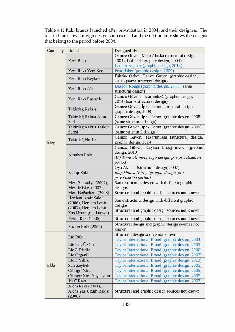
145
Table 4.1: Rakı brands launched after privatization in 2004, and their designers. The
text in blue shows foreign design sources used and the text in italic shows the designs
that belong to the period before 2004.
Company Brand Designed By
Mey
Yeni Rakı
Gamze Güven, Mete Ahıska (structural design,
2004), Rafineri (graphic design, 2004),
Landor Agency (graphic design, 2013)
Yeni Rakı Yeni Seri Pearlfisher (graphic design, 2009)
Yeni Rakı Beykoz Fahriye Özbey, Gamze Güven (graphic design,
2010) (same structural design)
Yeni Rakı Ala Dragon Rouge (graphic design, 2011) (same
structural design)
Yeni Rakı Rastgele Gamze Güven, Tasarımüssü (graphic design,
2014) (same structural design)
Tekirdağ Rakısı Gamze Güven, İpek Torun (structural design,
graphic design, 2008)
Tekirdağ Rakısı Altın
Seri
Gamze Güven, İpek Torun (graphic design, 2008)
(same structural design)
Tekirdağ Rakısı Trakya
Serisi
Gamze Güven, İpek Torun (graphic design, 2009)
(same structural design)
Tekirdağ No 10 Gamze Güven, Tasarımüssü (structural design,
graphic design, 2014)
Altınbaş Rakı
Gamze Güven, Kayhan Erdeğirmenci (graphic
design, 2010)
Atıf Tuna (Altınbaş logo design, pre-privatization
period)
Kulüp Rakı
Oya Akman (structural design, 2007)
İhap Hulusi Görey (graphic design, pre-
privatization period)
Mest Sultaniye (2007),
Mest Misket (2007),
Mest Boğazkere (2008)
Same structural design with different graphic
designs
Structural and graphic design sources not known
Herdem İzmir Sakızlı
(2006), Herdem İzmir
(2007), Herdem İzmir
Yaş Üzüm (not known)
Same structural design with different graphic
designs
Structural and graphic design sources not known
Yekta Rakı (2006) Structural and graphic design sources not known
Kadim Rakı (2009) Structural design and graphic design sources not
known
Elda
Efe Rakı Structural design source not known
Taylor International Brand (graphic design, 2004)
Efe Yaş Üzüm Taylor International Brand (graphic design, 2005)
Efe 3 Distile Taylor International Brand (graphic design, 2006)
Efe Organik Taylor International Brand (graphic design, 2007)
Efe 5 Yıllık Taylor International Brand (graphic design, 2013)
Sarı Zeybek Taylor International Brand (graphic design, 2005)
Çilingir Xtra Taylor International Brand (graphic design, 2005)
Çilingir Xtra Yaş Üzüm Taylor International Brand (graphic design, 2005)
1907 Rakı Taylor International Brand (graphic design, 2007)
Alem Rakı (2008),
Alem Yaş Üzüm Rakısı
(2008)
Structural and graphic design sources not known

146
Table 4.1: Rakı brands launched after the privatization, and their designers (Cont’d).
Burgaz
Burgaz Rakı Orhan Irmak (graphic design, 2006)
Structural design source not known Burgaz Yaş Üzüm Rakısı
Burgaz Klasik (2008),
Burgaz Klasik Yaş Üzüm
(2008), Burgaz Göbek
Rakısı (not known)
Same structural design with different graphic
designs
Structural design and graphic design sources
not known
Ata Rakı (2005), Ata Yaş
Üzüm Rakısı (2007)
Same structural design with different graphic
designs
Structural design and graphic design sources
not known
İki Tek Rakı (2006) Structural design and graphic design sources
not known
Rakı Turka (2006) Structural design and graphic design sources
not known
Tariş-Tat
Mercan Rakı (2005) Structural and graphic design sources not
known Fasıl Rakı (2005), Fasıl
Yaş Üzüm Rakısı (2006)
Sarper
Beylerbeyi Rakı Kesselskramer (structural design, 2007)
Tjep (graphic design, 2007)
Beylerbeyi Yaş Üzüm
Rakısı Tjep (graphic design, 2007)
Beylerbeyi Göbek Rakısı Tjep (graphic design, 2013)
Beyoğlu Rakı (2007)
Same structural design with different graphic
designs
Structural design and graphic design sources
not known
Baba Rakı (not known)
Keyf-i Ege Rakı, Keyf-i
Ege Rakı Yaş Üzüm (not
known)
Eko Rakı
Kipa Ege Rakı, Kipa Ege
Rakı Yaş Üzüm (not
known)
Antalya
Topkapı Rakı Eda Yılmaz (Anadolu Cam) (structural design,
2008)
Graphic design sources not known
Topkapı Mir Rakı
Topkapı Rakı Yaş Üzüm
Abbas Rakı (2008), Abbas
Yaş Üzüm Rakısı (2008)
Same structural design with different graphic
designs
Structural and graphic design sources not
known
7 Rakı (2008), 7 Rakı Yaş
Üzüm (not-known)
Same structural design with different graphic
designs
Structural and graphic design sources not
known
Anadolu
Anadolu Rakı Rubin Investment JSC (structural design, 2008)
Konseptiz (graphic design, 2008)
Sohbet Rakı Konseptiz (graphic design, 2008)
Rakı 2000 Konseptiz (graphic design, 2008)
Anadolu Rakı Yaş Üzüm Konseptiz (graphic design, 2009)
Anadolu Rakı Sıfır Seri Konseptiz (graphic design, 2014)

147
Table 4.1: Rakı brands launched after the privatization, and their designers (Cont’d).
Alcosan
Saki Klasik Rakı
(2013), Saki Yaş Üzüm
Rakısı (2013), Saki
Siyah Üzüm Rakısı
(2013), Saki Rakı Altın
Seri (2013)
Same structural design with different graphic
designs
Structural and graphic design sources not known
Neva
Demlen Rakı (2013)
Structural and graphic design sources not known Sırdem Rakı (2013),
Sırdem Yaş Üzüm
Rakısı (not known)
Hürol
Rakı 34 (2014), Rakı 34
Yaş Üzüm Rakısı
(2014)
Same structural design with different graphic
designs
Structural design and graphic design sources not
known Yedikule Rakı (2014)
Yeniçeri Rakısı (2014),
Yeniçeri Yaş Üzüm
Rakısı (2014)
Same structural design with different graphic
designs
Structural design and graphic design sources not
known
As it can be observed in Table 4.1, the companies predominantly preferred working
with local designers or agencies for structural designs in general, and in some cases
with foreign design agencies for graphic designs in particular. It can also be noted
that using the same structural design with new graphic designs is the most common
strategy used for product line extensions, or in some cases the companies with low
market share used the same strategy for all the brands they have.
What are the phases of design process for developing these glass packaging
designs?
In the literature, there are different models to describe the phases of design process
(Ambrose & Harris, 2011; Cross, 2005; Roth, 1990); however, they mainly address
actions and phases (sometimes with different terms) similar to the ones indicated in
Figure 4.1. The findings of the field study indicates that the design process for glass
packaging for rakı can be described as consisting of the following phases: Receiving
brief, design research, concept development, presentation to the client, revisions and
finalization, and production (Figure 4.1).

148
Design Process
Phases Practices Actors involved
Receiving
Brief
• Client contact
• Understanding the need, target consumer
groups, design goals and expected outcomes
• Client’s
marketing team
• Design team
Design
Research
• Research into rakı itself (product qualities,
ingredients and production process, origin,
culture and rituals, similar drinks to rakı)
• Research into packaging design (the glass
packages of the client, the competitors, other
alcoholic beverages, and packaging design
in general)
• Conducting store visits, observations,
interviews and focus group studies
• Design team
• Client’s
marketing team
• Consumers
Concept
Development
• Generating initial design ideas
• Visualization (sketching, mock-ups,
technical drawing, models, prototypes)
• Generating a broad range of design
alternatives
• Critical analysis and selection of design
alternatives
• Design team
(in touch with
client’s
marketing team)
Presentation
to the Client
• Proposing the design alternatives
• Evaluation and selection of design
alternatives
• Receiving feedback from the client
• Receiving consumer feedback (i.e. focus
group studies)
• Design team
• Client’s
marketing team
• Consumers
Revisions and
Finalization
• Revisions of the selected design alternatives
based on the feedback received
• Selection of the final alternative
• Production trials
• Adaptation to other sizes
• Design team
• Client’s
marketing team
• Packaging
supplier
Production • Production and printing
• Packaging
supplier
• Design team
Figure 4.1: The phases of design process for rakı glass packaging.

149
The first phase of the design process, receiving brief, starts with the first contact with
the client, and then the brief, either verbal or written, is given to the designers. The
brief mainly contains the target consumer group information, the goals and expected
outcomes. The second phase, design research, starts with the research into rakı itself.
Designers focus on the product qualities, the main ingredients and the production
process of rakı along with its origin, culture and rituals. Similar drinks to rakı are
also considered as an important topic to explore. Apart from these, research into
packaging design and conducting store visits, observations, interviews and focus
group studies in order to understand consumers’ preferences are observed in this
phase. The third phase, concept development, includes generating initial design ideas
and concepts, and visualization of them, and then selection of the design alternatives
within the design team. The fourth phase which is presentation to the client consists
of proposing the design alternatives, evaluation and the selection of the alternatives
and receiving feedback from the client and/or consumers. The fifth phase, revisions
and finalization, includes revisions of the selected design alternatives based on the
feedback received and the selection of the final alternative along with production
trial and adaptation to other sizes. The last phase includes production and printing.
Concerning the actors involved in the design process, the marketing team had the
most dominant role on the client’s side; however, in rare cases the company owner,
engineers or sales team were involved as well.
What are the design goals aimed to achieve through these rakı glass packaging
designs?
As discussed in the literature and the field study, the design goals were found related
with the aesthetic, emotional, functional, technical values of packaging, and the
product qualities, and these are presented in Table 4.2 to show the relation between
packaging design considerations and design goals.
As declared earlier, many companies were established after the privatization in 2004
and launched new brands. The brands (i.e. Yeni Rakı, Tekirdağ Rakısı, Altınbaş Rakı
and Kulüp Rakı) which were available in the rakı market before 2004 did not want to
lose their existing market share, and aimed to increase it; whereas the new launched
brands wanted to take market share from the leading companies. Product

150
differentiation and influencing consumers’ purchase decisions are the major goals for
all glass packaging designs discussed in the field study. They all aimed at standing
out on the market shelf, attracting consumers’ attention and creating brand
recognition. Besides these shared goals, there are many design goals observed which
were found related with design considerations as seen in Table 4.2.
Table 4.2: The design goals aimed to achieve for glass packaging designs for rakı.
The texts in italic are the design goals identified in the literature review.
Packaging design considerations Design goals
Product qualities (PQ)
(Rakı production process,
ingredients, etc.)
Reflecting the product qualities, qualities of
of rakı as a drink
- whitening, color, taste, ingredients
-translucency
Aesthetic values (AV)
(Style, form, character, color, etc.)
Preserving a brand’s previous aesthetic values
Maintaining a family resemblance for product
line extensions
Developing an iconic design
Reflecting designers’ sources of inspiration
Reflecting style
- modern, classic or traditional style
Avoiding a retro, old-fashioned look
Reflecting a sophisticated or vintage look
Achieving a harmony between structural
design and graphic design
“Owning” a color
Emotional values (EV)
(Emotion, communication, loyalty,
cultural differences, etc.)
Reflecting local identity (Turkishness,
Turkish culture)
Reflecting or fitting product (i.e. rakı) culture
Reflecting product gender, reflecting the
quality of manly drink
-Male body metaphor
-Female body metaphor
Reflecting brand value (segment)
-Luxury, premiumness, superior quality,
elegance, prestige
-Affordability
A collectible package
Functional values (FV)
(Usage, containment, display, etc.)
Easy handling
Ensuring readability
A larger label area
Technical values (TV)
(manufacturing method, cost,
material, etc.)
Minimum problem in production and filling
lines
Label-applicable structural design

151
Although a categorization was used to present the relation, there are not exact, strict
boundaries between these categories; in some cases, the same goal was found
matched to other categories as well.
In the literature, there is not any study which matches design goals with packaging
design considerations; therefore, this categorization can be assessed as a contribution
to the literature for packaging design considerations.
Under the packaging design considerations, there are categories such as aesthetic
values, emotional values, functional values and technical values, but there is not any
category as product qualities concerning the product within the package. The main
ingredients, the production process and the product properties of rakı are also crucial
for rakı packaging design; in this manner, this study presents a new category for
packaging design considerations. Table 4.2 was developed particular to a specific
product, rakı, but all the entries in this table can also be used and enriched for other
products.
What are the design elements employed by the designers to achieve these design
goals?
For this question, Table 4.2 was adapted to present the relation between design goals
and design elements based on the findings from literature and the field study. In
Table 4.3, to provide a comprehensive understanding on relations, design
considerations were also attached by using their abbreviations, and related figure
numbers were given.
It was observed that structural design plays a significant role to achieve a broad
range of design goals by itself. As a structural design element, form is manipulated
by designers to reflect aesthetic values like styles and sources of inspirations, and
emotional values such as Turkishness, culture, manly drink, male or female body
metaphors, luxury or superior quality. Designers conceptualize the form of body
concerning the user-product interaction, since holding bottle for serving rakı is a part
of drinking ritual. Besides that, form directly affects the selection of labelling or
printing method in the design process; spherical forms are not preferred due to the
difficulties in the application of labelling or serigraphy printing, instead of a
cylindrical and straight body. It can be seen in Table 4.3 that the body, the shoulder,

152
and the neck structure reveal as the most used parts of glass package. Overall form or
silhouette of the glass package is a strategic tool in product differentiation. The
design goals related with the product qualities, on the other hand, were not observed
to be achieved through structural design.
Table 4.3: Design elements in relation to design goals. The text in italic is the design
goals and elements identified in the literature review.
Str
uct
ura
l d
esig
n
Design elements Design goals
Form
The neck with wide shoulders
Thin waist body
Concave lines
Figure 3.13
(EV) Reflecting the quality of
manly drink: Male body
metaphor
(EV) Reflecting local identity,
Turkishness, Turkish culture
(AV) Developing an iconic
design
(AV) Reflecting designers’
sources of inspiration
“Collar” nearby the shoulder Figure 3.15
(EV) Reflecting the quality of
manly drink: Female body
metaphor
Body with wide cuts
Figure 3.14, Figure 2.33
(AV) Reflecting a classic style
(EV) Reflecting luxury,
elegance, superior quality
(AV) Reflecting designers’
sources of inspiration
Dome form with (six) cuts around the
shoulder Figure 3.8, Figure 2.50
(AV) Reflecting designers’
sources of inspiration
(AV) Reflecting modern style
Avoiding not having a retro
and old-fashioned look
Cylindrical body
Inlaid areas formed by the collar
nearby the shoulder Figure 3.15
(FV) Easy handling
Smooth shoulder line providing
“secure touch” among bottles as they
proceed side by side in product
filling line Figure 3.14
(TV) Minimum problem in
production and filling lines
Straight body Figure 3.15 (TV) Label-applicable
structural design
Elliptical cavities nearby the shoulder Figure 3.15
(FV) A larger label area
(AV) Maintaining the iconic
design
A larger straight area on the body Figure 3.14
(FV) A larger label area
(FV) Ensuring readability

153
Table 4.3: Design elements in relation to design goals (Cont’d).
Gra
ph
ic d
esig
n
Color
Using green and its tones on the
label Figure 3.19
(PQ) Reflecting the fresh
grape taste
Moiré effect (transition from
transparent to white) on the label Figure 3.16, Figure 2.23
(PQ) Reflecting the whitening
of rakı
Maintaining previous color on the
label Figure 3.17, Figure 2.30
(AV) Preserving a brand’s
previous aesthetic values
Red and white colors on the label Figure 3.16
(EV) Reflecting local identity,
Turkishness, Turkish culture
(AV) Owning a color
(FV) Ensuring readability
Gold and black colors on the label Figure 3.19
(EV) Reflecting premiumness,
prestigious, superior quality
(PQ) Reflecting smooth taste
Typography
Sharp pointed typeface, curved
typography Figure 3.16
(EV) Reflecting local identity,
Turkishness, Turkish culture
Old style, two-weight letters Figure 3.19
(AV) Reflecting a
sophisticated or vintage look
(EV) Reflecting prestige
Small font size, condensed, sans-
serif typeface Figure 3.18 (FV) Ensuring readability
Vertical use of logotype Figure 2.44
(FV) A larger label area
Illustrations
or
photographs
Grapes Figure 3.17 (PQ) Reflecting the fresh
grape taste
Aniseed stylization Figure 3.15 (PQ) Reflecting aniseed
Distillation process, ingredients of
rakı, cultural elements such as
musical instruments Figure 2.32
(PQ) Reflecting the product
qualities of rakı
(EV) Reflecting rakı culture
Labelling
and printing
(adhesive
label or
serigraphy)
Serigraphy, transparent and label-
free view Figure 2.31
(AV) Maintaining a family
resemblance for product line
extensions
(PQ) Reflecting the
translucency of rakı
(EV) Fitting rakı culture
Adhesive label Figure 3.16 (FV) Ensuring readability
Actual gold leaf printing, which is
shining Figure 3.19
(EV) Reflecting luxury,
superior quality
The label form follows the outline
defined by the “collar” nearby the
shoulder Figure 3.15
(AV) Achieving a harmony
between structural design and
graphic design
Surface
finish (flint
or
sandblasted)
or texture
Sandblasted surface Figure 3.20
(AV) Maintaining a family
resemblance for product line
extensions
(PQ) Reflecting the color,
taste of rakı
Hand painting Figure 2.37 (EV) A collectible package
Having no coating Figure 2.31 (EV) Reflecting affordability
154
Compared to structural design, graphic design elements were observed to be
employed by designers to reflect more specific values about the product within.
While structural design does not aim at reflecting any product qualities of rakı, the
graphic design stands out as a strategic tool and particularly the main ingredients,
taste, color and whitening of rakı are emphasized by graphic design elements. This
may be due to the variety of graphic design elements that designers can manipulate:
Illustration and photography, color, labelling and printing, and surface finish. These
elements, actually, are used in a composite way to achieve design goals, and cannot
be isolated from each other.
Illustration was used for the goals related with the product qualities of rakı stressing
the main ingredients through stylizations; on the other hand, it was also used to
depict a certain emotional value which is reflecting rakı culture through indicating
production process and cultural elements like musical instruments.
Color was used in various ways. It can stress local, cultural values and brand values
which can affect directly consumers’ purchase decisions. The most observed visual
cues among designs are the use of green to stress fresh grapes and the use of gold to
stress luxury which depicts luxury, superior quality, premiumness; it can be inferred
that there are color codes in the category which designers follow.
There is a balance between the number of design goals aimed by structural design
and graphic design (surface graphics, and finishes). Form is the only element of
structural design working for creating overall impression itself; graphic design, on
the other hand, consists of several elements that designers can employ in various
compositions in order to achieve specific goals. If a harmony between the structural
design and label is achieved, it gives a strong character to package and makes it stand
out.
It was found significant that surface finish and printing creates a family resemblance
among product line extensions, whereas color and illustration enhance the product
differentiation.
Although this study explored the shared cues among glass packaging designs, it is
important to emphasize that all design elements play an active role in achieving
design goals.

155
4.2. Implications of the Research
The post-2004 period is quite remarkable in terms of design. Before the privatization
in 2004, there was not any significant development observed in the design of rakı
glass packaging; the same glass package was being used for all products Tekel had,
and there was no demand for design, due to the monopoly conditions. However, a
new period begun with the privatization. Whereas only four brands were available in
the rakı market prior to 2004, it extended rapidly, and today there are more than 70
brands. It can be said that the strategic use of packaging design has added value to
the rakı brands, repositioned them and increased their sales.
This study also provides a chance to see various designers’ way of working on glass
packaging design for a specific product. Findings from the field study and the phases
of the design process developed here can be used as a guide or learning tool for
designing a glass package for a new brand or redesigning an existing package.
Additionally, it can be also valuable for people who have a special interest to rakı
culture.
It was observed that there are several problems observed among marketing teams,
designers and manufacturers. In order to improve the design process and glass
packaging designs for rakı, several points can be noted as follows:
It was important to mention than the detailed design briefs simplified the
designers’ works and enhanced the design process. Therefore, marketing
teams should analyze their needs in depth and provide a detailed brief for
designers, so they do not face with any problems including disagreement with
designers and the design concepts proposed; otherwise, revisions or creating
totally new concepts instead of proposed ones can result in loss of time for
both designers and the company.
Particularly, the communication problems between designers and marketing
teams should be solved, and since marketing teams do not have expertise in
design, caution is necessary when interfering with design decisions. If a
marketing team member has a design background, on the other hand, the
significance given to design increases.

156
Industrial designers should take part in glass packaging design projects more;
graphic design is not the only tool for product differentiation through
packaging design.
Industrial designers and graphic designers should be in touch with each other
and understand each other’s goals starting from the beginning of design
process.
Since glass is the most widespread packaging material for rakı, the
constraints or the possibilities suppliers have are also important. Technical
constraints may play a negative role on the qualities of structural design.
Although new designs bring new challenges to suppliers, they may have a
significant impact on product differentiation in the market.
Visual cues from glass packaging designs are directly used in the design of
accoutrements of rakı offered as promotional items to consumers and restaurants, and
they are on the rakı table together with the glass package itself. Accoutrement design
can be considered an extension of packaging design.
4.3. Limitations of the Research
Problems related with confidentiality were an important limitation. Companies were
rather reluctant to share information about their brands, glass packaging designs and
design sources they used. Similarly, designers did not want to share some
information due to the confidentiality agreement they had with their clients.
It was not possible to reach all of the brands’ glass packaging designs at retail stores
and the images available on the internet were limited due to the communication
restrictions imposed by the national regulations put into force by 2013.
The field study provided rich data based on the designers’ opinions only. This study
does not cover the opinions of suppliers, manufacturers, or consumers. Another
limitation was related with the fact that the interview questions was about the past
assignments designers did; sometimes they had difficulty in remembering in details
or the sequence of events. In some cases, the total lack or poor documentation of the
design process was another challenge, and had a negative impact on designers’
memory.
157
Another important limitation was the language in which the interviews were
conducted. Since all the interviews were conducted in the designers’ native language,
Turkish, the data obtained from the interviews had to be translated into English by
the researcher later, which caused the lack of designers’ original voice in the
manuscript.
4.4. Recommendations for Further Research
Considering the findings and conclusions of this study, several recommendations for
further research can be mentioned.
Firstly, the field study was conducted with five designers about five different glass
packaging designs. This research can be extended as to investigate practices of more
designers and more packaging designs for rakı.
This study focuses on the designers’ practices in reference to glass packaging design
for rakı. Consumers’ perceptions of glass packaging designs for rakı are another area
for further research. Similar studies can also be conducted to understand the
suppliers’ or the manufacturers’ opinions and perspectives.
Turkish rakı is an exported local product and communicates geographical and
cultural values as well. Therefore the findings of this study can also be beneficial for
investigating packaging designs for products with similar qualities. For example,
glass packaging design for olive oil may be another potential area for further
research.

158

159
REFERENCES
Alden, L. (n.d.). Anise-flavored liqueurs. Retrieved December 12, 2014, from
http://www.foodsubs.com/LiqueurAnise.html
Altınbaş Rakı - Rakı Şişesi Ambalajı. (n.d.). Retrieved December 20, 2014,
http://www.etsm.org.tr/etsm/index.php?r=collection/view&id=329
Ambrose, G., & Harris, P. (2011). Packaging the brand: The relationship between
packaging design and brand identity. Lausanne: Ava Publishing SA.
Anadolu Alkollü İçecekler. (2014). Hakkımızda. Retrieved January 2, 2015, from
http://www.anadoluicecek.com.tr/kurumsal
Antalya Alkollü İçecek. (n.d.). 7 Rakı. Retrieved December 20, 2014, from
http://topkapi.playground.frumatic.com/products/on-trade/01.php
Arditi, T. (2013, Agust 13). How to drink raki: A crash course in Turkey’s signature.
drink. CNN Travel. Retrieved December 20, 2014, from
http://travel.cnn.com/crash-course-raki-turkeys-signature-drink-918521
ASD. (n.d.). What is packaging? Retrieved April 29, 2011, from
http://www.ambalaj.org.tr/en/environment-what-is-packaging.html
Behramoğlu, B. (2007a, April). Our meals delight: Efe Raki [Interview with Egemen
Demirtaş]. TURSAB Magazine, 277, 42-45. Retrieved November 11, 2014,
from http://www.tursab.org.tr/yayin/15/277_15_3246819.pdf

160
Behramoğlu, B. (2007b, January). The first beverage producer to manufacture.
TURSAB Magazine, 274. Retrieved November 30, 2014, from
http://www.tursab.org.tr/yayin/12/274_12_3206375.pdf
Biyografi. (2009). Biyografi: İhap Hulusi Görey (1898-1986). Retrieved December
10, 2014, from http://www.ihaphulusi.gen.tr/ihaphulusi.html
Bogdan, R. C., & Biklen, S. K. (1982). Qualitative research for education: An
introduction to theory and methods. Boston: Allyn and Bacon, Inc.
Bogdan, R. C. & Biklen, S. K. (1998). Qualitative research in education: An
introduction to theory and methods (3rd ed.). Needham Heights, MA: Allyn
& Bacon.
Boratav, K. & Yeldan, E. (2001). Turkey, 1980-2000: Financial liberalization,
macroeconomic (in)-stability, and patterns of distribution. Retrieved January
2, 2015 from http://yeldane.bilkent.edu.tr/B&YCEPA2002.PDF
Boratav, K. (2012). Türkiye iktisat tarihi: 1908-2009 (16th ed.). Ankara: İmge.
Calver, G. (2004). What is packaging design? Mies, Switzerland; Hove, UK:
RotoVision.
Cartier, P. & Akbulut, D. (2012). The design and characteristics of promotional rakı
glasses. In Agrindustrial Design: 2nd International Product and Service
Design Congress and Exhibition on Agricultural Industries - Mediterranean /
Food / Design Proceedings (pp: 132-144). Retrieved November 10, 2014,
http://kutuphane.ieu.edu.tr/wp-content/AGRI2012_ebook.pdf

161
Cengiz, D. (2013, February 13). Fıçı da 5 yıl sabretti rafta 2 hafta kalamadı. Hürriyet
Ekonomi. Retrieved December 20, 2014, from:
http://www.hurriyet.com.tr/ekonomi/22584347.asp
Çelebi, M. (2008, August 9). Rakı şişesinde tasarım olsam. Milliyet. Retrieved
December 20, 2014, from http://www.milliyet.com.tr/raki-sisesinde-tasarim-
olsam/pazar/haberdetay/10.08.2008/976616/default.htm
Crouch, C. & Pearce, J. (2012). Doing research in design. London ; New York :
Berg.
Demirtaş, E. (2007). Our meals delight: Efe Raki [Interview By Türsab]. Türsab
Magazine, Issue 277, 2007, p. 42-45, Retrieved September 12, 2014, from
http://www.tursab.org.tr/yayin/15/277_15_3246819.pdf
Diageo. (2011). Mey içki fact sheet [PDF document]. Retrieved December 10, 2014,
from http://www.diageo.com/en-
row/newsmedia/Pages/resource.aspx?resourceid=739
Doğruel, F., & Doğruel, A. S. (2000). Osmanlı'dan günümüze Tekel. İstanbul: Tekel.
Efe Rakı. (2013a). History of raki. Retrieved December 2, 2014, from
http://eferaki.com/rakinin-tarihi
Efe Rakı. (2013b). About us. Retrieved December 2, 2014, from
http://www.eferaki.com.tr/hakkimizda
Emgin, B. (2007). Framing the East: Cultural representation in contemporary Turkish
product design. Retrieved November 18, 2014, from http://inter-

162
disciplinary.net/ati/diversity/multiculturalism/mcb1/emgin%20paper.pdf
Enpark Cevre Enerji Maden Müh. Dan. ve Müşavirlik. (2013). Alkollü içecek üretim
tesisi proje tanıtım dosyası [PDF]. Retrieved December 29, 2014, from
http://eced.csb.gov.tr/ced/jsp/ek1/656#
Eti, M. (2005). A critical analysis of the role of women designers in the progress of
industrial product design in Turkey since the 80s (Master's Thesis). Retrieved
December 20, 2014, from http://hdl.handle.net/11147/3301
Gamze Güven DDN final. (n.d.) [bulletin]. Retrieved December 2, 2014, from
http://www.tasarimussu.com.tr/pdf/gamzeguven_DDNfinal.doc
Gillham, B. (2000). The research interview. London; New York : Continuum.
GİSDER. (n.d.a). Ekonomik önemi. Retrieved December 29, 2014, from
http://www.gis-der.org/onem.html
GİSDER. (n.d.b). Sektörel sorunlar. Retrieved December 29, 2014, from
http://www.gis-der.org/sektorel.html
GİSDER. (n.d.c). İhracat. Retrieved December 29, 2014, from
http://www.gis-der.org/ihracat.html
GİSDER. (n.d.d). Pazar büyüklüğü. Retrieved December 29, 2014, from
http://www.gis-der.org/pazar.html
Glassrite. (n.d.). Bottle shapes and definitions for glassrite. Retrieved December 1,
2014, from http://glassrite.wrap.org.uk/documents/ GlassriteBottleShapes

163
AndDefinitions.pdf
Gürsoy, D. (2007). Çilingir sofrasında rakı. (9th ed.).İstanbul: Oğlak Yayıncılık
Irmak, O. (2011) 1945'den günümüze Türkiye'de ambalaj tasarımının gelişme
dinamikleri (Doctoral dissertation). Retrieved from Turkey Council of Higher
Edication Thesis Center (No: 310697).
İzmir, B. Ş. (2007, April 28). Fener, 100. yılında Elda ile 'Efe'leniyor. Milliyet
Ekonomi. Retrieved December 20, 2014, from http://www.milliyet.com.tr
John Walker & Sons. (2014). Our heritage. Retrieved November 15, 2014, from
http://www.johnniewalker.com/global/timeline
Kara, B. (2013, January 23). Bu şişe delikanlıyı bozar mı? Vatan Pazar. Retrieved
from http://pazarvatan.gazetevatan.com/haberdetay.asp?hkat=1&hid
=19865
Karamullaoğlu, N. (2005). Mapping out socio-cultural transformations through food
packaging design in Turkey: A case study (Master's Thesis). Retrived
November 17, 2014, from http://www.thesis.bilkent.edu.tr/0002816.pdf
Kaygan, H. (2007). Nationality inscribed: An iconological analysis of Turkish
design. In The 7th International Conference of the European Academy of
Design: Dancing with Disorder, 11–13 April 2007, Izmir University of
Economics.
Kesmez, M. & Aydın, M. S. (2013). Rakı cep kitabı. İstanbul: Overteam Yayınları.

164
Kürkçü, B. (2006). Branding rakı as a product with geographical identity and a case
study: Efe Rakı. In Agrindustrial Design: 1st International Product and
Service Design Symposium and Exhibition on Agricultural Industries: Olive
Oil, Wine and Design Proceedings (pp: 136-141). Retrieved April 20,
2014, from
http://kutuphane.ieu.edu.tr/wp-content/06AgrindustrialDesign20063.pdf
Landor Associates, (2014). 2014 winners & shortlists. Retrieved December 18, 2014,
from http://www.dubailynx.com/winners/2014/design/ entry.cfm?
entryid=2011&award=99&order=0&direction=1
Lindsey, B. (2014). Bottle typing/diagnostic shapes. Retrieved January 1, 2015, from
http://www.sha.org/bottle/wine.htm
Löle, A. (2009, May 27). Dimitrakopulo dünya markası oluyor. Akşam. Retrieved
December 20, 2014, from http://aksam.medyator.com/2009/05/27/haber/
ekonomi/2057/dimitrakopulo_dunya_markasi_oluyor.html
Mattis, A. (2014, February 6). At raki nights, conversation and community reign.
Retrieved November 11, 2014, from
http://www.journalismwithoutwalls.com/istanbul2014/index.php?id=107
MediaCat. (2007, May 1). Kulüp Rakı’nın şişesi yenilendi. Retrieved December 20,
2014, from http://www.mediacatonline.com/kulup-raki%C2%92nin-sisesi-
yenilendi/
Mey. (n.d.). Our company. Retrieved December 20, 2014, from
http://www.mey.com.tr/en-US/about-us/Pages/our-company.aspx

165
Meyers, H. M., & Lubliner, M. J. (1998). The marketer's guide to successful package
design. Lincolnwood (Chicago), Ill.: NTC Business Books.
Molla, K. (2007, July 20). Akhisar Organize Sanayi bölgesine Sarper' den 20 milyon
dolar yatırım! Akhisar Haber. Retrieved December 12, 2014, from
http://www.akhisarhaber.com/akhisar-organize-sanayi-bolgesine-sarper-den-
20-milyon-dolar-yatirim-1801h.htm
Omur, M. T. (2013, May 22). 19 milyon Euro’ya ‘Demlen’ecek. Hürriyet Ekonomi.
Retrieved December 20, 2014, from
http://www.hurriyet.com.tr/ekonomi/23338233.asp
Oygur, I. & Blossom, N. (2010). Design and the user experience: The Turkish
context. Design Issues, 26(4), 72-84.
Rakı Ansiklopedisi. (2010). İstanbul: Overteam Yayınları.
Red grape rakı on the shelves. (2008, June 19). Hürriyet Daily News. Retrieved
December 20, 2014, from http://www.hurriyetdailynews.com/default.
aspx?pageid =438&n=red-grape-raki-on-the-shelves-2008-06-19
Rekabet Kurulu’ndan vize çıktı, Burgaz Rakı ‘Antalya’nın oldu. (2011, July 11).
Hürriyet Ekonomi. Retrieved December 2, 2014, from
http://www.hurriyet.com.tr/ekonomi/18191742.asp
Roth, L. (1990). Packaging design: An introduction. New York: Van Nostrand
Reinhold.
Saki Rakı. (n.d.) In Wikipedia. Retrieved on December 1, 2014, from

166
http://tr.wikipedia.org/wiki/Saki_rak%C4%B1
Sarper. (2007). About us. Retrieved November 10, 2014, from
http://www.sarper.com/eng/hakkimizda.html
Seyhan, Ö. (2005, December 16). Aslan sütünde aslan payı 'Yeni' nin. Radikal
İnternet Baskısı. Retrieved November 12, 2014, from
http://www.radikal.com.tr/haber.php?haberno=173018&tarih=16/12/2005
Sezer Holding. (2015). Hakkımızda. Retrieved on December 1, 2014, from
http://www.sezerholding.com.tr/index2.php?SH=hakkimizda
Sonsino, S. (1990). Packaging design: Graphics materials technology. London:
Thames and Hudson.
Superbrands Türkiye. (2005). Yeni Rakı. Retrieved December 3, 2014, from
http://www.superbrands.com/turkeysb/trcopy/files/yenirakiing_3934.pdf
Şen, L. (2000, September 21). Tekel'in Tekirdağ Rakısı başarısı. Sabah Ekonomi
online. Retrieved December 20, 2014, from
http://arsiv.sabah.com.tr/2000/09/21/e01.html
Tariş-Tat’tan yaş üzüm rakısı. (2006, August 16). Hürriyet Ekonomi. Retrieved
November 11, 2014, http://www.hurriyet.com.tr/ekonomi/4928037.asp
Tariş-Koç venture suspends production. (2008, January 22). Hürriyet Daily News
Economy. Retrieved December 20, 2014, from
http://www.hurriyetdailynews.com/default.aspx?pageid=438&n=taris-koc-
venture-suspends-production-2008-01-22

167
Tasarımüssü. (2014). Portfolio. Retrieved December 20, 2014, from
http://www.tasarimussu.com.tr/portfolyo_amb_22.php
Tek üzümle rakı yaptık, kadınlar ‘Mest’ olacak. (2007, February 7). Hürriyet
Ekonomi. Retrieved December 20, 2014, from
http://www.hurriyet.com.tr/ekonomi/
The Dieline. (2010, October 17). Yeni Raki ilk hasat. Retrieved on December 1,
2014, from http://www.thedieline.com/blog/2010/10/17/yeni-raki-ilk-
hasat.html
The Ministry Of Health. (2008). Turkish Cuisine. Retrieved December 17, from
http://beslenme.gov.tr/content/files/yayinlar/ingilizce_yayinlar/books/turkish_
cuisine1.pdf
The Republic of Turkey Ministry of Economy. (n.d.) Objectives of Turquality.
Retrieved January 18, 2015, from http://www.turquality.com/about-
us/objectives-of-turquality?__r=8d203437b0e947d
Tjep. (n.d.). Beylerbeyi. Retrieved December 20, 2014, from
http://www.tjep.com/projects/works/packaging/beylerbeyi
Tokatlı, N., & Boyacı, Y. (1998). The changing retail industry and retail landscapes:
The case of post-1980 Turkey. Cities, 15(5), 345-359. doi:10.1016/S0264-
2751(98)00030-4.
Tokatlı, N., & Eldener, Y. B. (2004). Upgrading in the global clothing industry: the
transformation of Boyner Holding. Competition and Change, 8(2), 173-193.

168
Topkapı Rakı. (n.d.). Retrieved November 10, 2014, from
www.etsm.org.tr/etsm/index.php?r=collection/view&id=333
TPE. (2009). Coğrafi tescil belgesi [PDF document]. Retrieved December 20, 2014,
from http://www.tpe.gov.tr/TurkPatentEnstitusu/resources/ dosyalar/
cografitescil/136.pdf
Topkapı İçecek Dağıtım Pazarlama. (n.d.). Hakkımızda. Retrieved January 2, 2015,
from http://topkapi.playground.frumatic.com/kurumsal.php
Tosyalı, M. (n.d.). Koç, Tariş-Tat'ı Parlatıp Satacak. Para Dergi. Retrieved
November 18, 2014 from
http://www.paradergi.com.tr/hab108,[email protected]
Turkish Food Codex. (2005). Türk Gıda Kodeksi Distile Alkollü İçkiler Tebliği
(Publication No: 2005/11). Retrieved November 18, 2014 from
http://mevzuat.basbakanlik.gov.tr/Metin.Aspx?MevzuatKod=9.5.7993&
sourceXmlSearch=2005/11&MevzuatIliski=0
Turkish national drink, Raki. (n.d.). Retrieved November 18, 2014 from
http://www.raki.com/raki.asp
Wine Ponder. (2012, February 6). Wine bottle shapes and sizes [Web log comment].
Retrieved December 2, 2014, from http://www.wineponder.com/about-wine-
ponder/
Yalçın, M. (2006, February 11). Rakıcılar bölünecek! Milliyet. Retrieved November
11, 2014 from http://www.milliyet.com.tr/2006/02/11/pazar/yazyalcin.html
169
Yalçın, M. (2008, February 29). "Üzüm Kızı" na özlem. Milliyet. Retrieved
November 24, 2014, from
http://www.milliyet.com.tr/2008/02/29/pazar/yazyalcin.html
Yeni Rakı Beykoz. (n.d.). Retrieved November 24, 2014
http://www.etsm.org.tr/etsm/index.php?r=collection/view&id=328
Yorgancıoğlu, G. (2013). 'The Spirit of Istanbul' goes nicely with friends and meze
[Interview]. The Worldfolio. Retrieved December 1, 2014, from
http://www.theworldfolio.com/interviews/galip-yorgancioglu-ceo-of-mey-
icki-turkey-n2470/2470/
Yücesoy, D. (2011). Authentication and prediction of some quality parameters of
alcoholic beverage rakı with infrared spectroscopy (Master's Thesis).
Retrieved November 2, 2014, from
http://library.iyte.edu.tr/tezler/master/gidamuh/T000912.pdf
Zat, E. (2012). Rakı: The spirit of Turkey [e-book]. İstanbul: Overteam. Retrieved
December 3, 2014, from http://www.dr.com.tr/
Zat, V. (2012). Biz rakı içeriz (5th ed.). İstanbul: Overteam Yayınları.

170

171
APPENDIX A
INTERVIEW GUIDELINE
English Version
Table A.1: Interview guideline in English.
Introduction: Glass Packaging Designs for Rakı
I am Selma Kadiroğlu, a M.Sc. student at the Department of Industrial Design,
METU. Before the study, I would like to give you information about the aim of the
research I conduct within the context of my master’s thesis. This study aims to
understand designers’ practices in relation to design goals in the process of glass
packaging designs for rakı. The data received during the interview will only be used
for educational purposes, thesis work and journal publications and presentations. It
will be beneficial to discuss the findings of the study with using designer’s name;
however, if you wish, your personal information will be kept confidential. The
sessions will be audio-visually recorded in order to remember exactly what is told
throughout the sessions. The session will take approximately half an hour. Thank
you for your time. Do you have any questions before starting the session?
1. Designers professional background
Would you mention about your professional background briefly? Until today, in
which sectors, on which kind of designs have you worked on?
Did you have any experience on glass packaging design prior to the glass
packaging for (Name of the brand)?
-Would you tell me please about for which products you designed glass
packaging?
-Which alcoholic beverage brands did you design glass packaging for
until today?
2. The first contact with the client and briefing
How was the first contact with the client happened?
Have they prepared a brief for (Name of the brand)?
-Which information was specified in the brief?
-What were the goals and the expected outcome of the client through this
packaging design?
-Was there any goal related with brand loyalty?
-Was there any goal related with reflecting taste, price and
quality?
-What were the goals of yours through this glass packaging design as a
designer?

172
Table A.1: Interview guideline in English (Cont’d).
3. Design process
How was the design process started?
-On which topics did you conduct research and which methods did you
use?
-Did you conduct any research on target consumer group?
How was the initial design ideas developed?
-What were the leading themes?
-How many alternatives did you create in this process?
-Is it possible to look at your sketches or models together and discuss on
the basis of them?
How did you evaluate the concepts you created? Would you tell me how the
process continued?
-Which methods did you use while evaluating the concepts?
4. Later stages of design process
In which stages, from whom did you receive feedback?
-Did you conduct any consumer research?
-Was the feedback received reflected on design after consumer research?
How was the finalization process developed?
-What were the radical revisions and what were the reasons of them?
-Did you conduct a production trial?
-Did you apply any revisions on the design after this production trial?
What were the problems that you encountered with during the design process?
-Problem related with production
-Problems related with the harmony between structural design and
graphic design
-Problems related with communication with the client
-other problems
5. Structural design and graphic design
Did you work with graphic designer/industrial designer together? If did,
how was the process developed, what kind of decisions did you take together?
How did the graphic design/ the structural design affect your way of working?
Would you mention about the glass body (form)/ graphic design of the package?
-Was there any information related with form/graphic design in the
brief?
How did you employ the design elements in relation to design goals?
-How was the form developed?
-How did you decide on label shape and labeling method?
-What factors were important in choice of color?
-What were the design goals that you aimed at with this typography
design?
How was the design goals related with brand loyalty, reflection of taste, price
and quality, and your specific goals achieved through design elements?
Would you want to tell anything about the relation between graphic design and
structural design of packaging?

173
Table A.1: Interview guideline in English (Cont’d).
6. Post evaluations
What kind of feedback was received from consumers, the design society and
the business world after the launch of glass packaging design? What are your
general impressions?
Was there any research conducted in order to understand consumers’
perceptions about this packaging design?
-Who conducted this research and which methods were used?
When looking back now, if you wanted to revise the glass packaging design,
what kind of revisions would you apply? Why?
7. Additional information
When you consider other alcoholic beverages that you designed, what would
you say about their design process? What were the main differences?
Is there anything on (Name of the brand) that you think it was not mentioned in
a detail manner?
Is there anything that you want to add?
Would you suggest anyone who can contribute to my research that I can talk?
Would you want me to send a summary of findings of this study?
e-mail:
or
Address:
Thank you for your contributions to this study. If you want to ask or add
something related with this study, you can reach me from my e-mail or telephone.

174
Turkish Version
Table A.2: Interview guideline in Turkish.
Giriş: Rakı Cam Ambalaj Tasarımları
Benim adım Selma Kadiroğlu, ODTÜ Endüstri Ürünleri Tasarımı Bölümünde
yüksek lisans öğrencisiyim. Görüşmeye başlamadan önce, size yüksek lisans tezi
kapsamında yaptığım araştırmadan kısaca bahsetmek isterim. Araştırmanın amacı,
tasarımcıların 2004’teki özelleştirme sonrası piyasaya çıkan rakı cam ambalaj
tasarımlarını geliştirme süreçlerindeki yöntemlerini araştırmak ve hedeflenen
tasarım amaçları doğrultusunda tasarım unsurlarının nasıl kullanıldığı belirlemektir.
Bu görüşme sırasında konuşulanları sadece bilimsel amaçlarla, tez araştırmalarında,
bilimsel yayınlarda ve sunuşlarda kullanılacaktır. Bu araştırmanın sonuçlarını
tasarımcının kimliğini belirterek tartışmam çok faydalı olacak ama dilerseniz gizli
tutulacaktır. Görüşme sırasında konuşulanları daha sonra tam olarak
hatırlayabilmek ve gözden geçirebilmek için görüşme görsel ve işitsel olarak
kaydedilecektir. Görüşmemiz tahminen bir buçuk saat sürecektir.
Başlamadan önce sormak istediğiniz bir şey var mı?
1. Tasarcımcıların mesleki deneyimleri
Biraz mesleki deneyimlerinizden bahsedebilir misiniz? Bugüne kadar hangi
sektörlerde ne gibi tasarımlar üzerinde çalıştınız?
(Marka ismi) için yaptığınız cam ambalaj tasarımından önce ambalaj tasarımı
konusunda bir tecrübeniz var mıydı?
-Hangi ürün gruplarında ambalaj tasarımları yaptığınızı anlatır mısınız?
-Bugüne dek hangi alkollü içecek markaları için cam ambalaj
tasarladınız?
2. Müşteri ile ilk iletişim ve iş tanımı
Müşteri ile ilk iletişim nasıl gerçekleşti?
(Marka ismi) için iş tanımı hazırlamışlar mıydı?
-İş tanımında neler vardı?
-Müşterinin bu ambalaj tasarımı ile ilgili hedefleri, beklentileri nelerdi?
-Marka bağlılığı ile ilgili bir hedef var mıydı?
-Tat, fiyat, kalite gibi unsurların tasarıma yansıtılması
hedeflenmiş miydi?
- Sizin tasarımcı olarak bu tasarımla ilgili ne gibi hedefleriniz vardı?

175
Table A.2: Interview guideline in Turkish (Cont’d).
3. Tasarım süreci
Tasarım süreci nasıl başladı?
- Tasarım sürecinde hangi konularda hangi metodlarla araştırmalar
yaptınız?
- Hedef kitleye dair araştırmalar yaptınız mı?
İlk tasarım fikirleri nasıl gelişti?
- Bu fikirlerde öne çıkan temalar nelerdi?
- Bu süreçte kaç değişik alternatif tasarladınız?
- Mümkünse çizimlere veya modellere birlikte bakıp bunların üzerinden
konuşabilir miyiz?
Sonrasında, bu hazırlamış olduğunuz alternatifleri nasıl değerlendirdiniz?
Sürecin nasıl devam ettiğini anlatabilir misiniz?
- Alternatifler arasından seçim yaparken ne gibi yöntemler izlediniz?
4. Tasarım sürecinin ilerleyen aşamaları
Tasarım sürecinde hangi aşamalarda kimlerden geribildirim aldınız?
-Kullanıcı araştırması yaptınız mı?
-Kullanıcı araştırması sonrası alınan geribildirimler tasarıma yansıdı
mı?
Tasarımın finalize edilme aşamasında nasıl bir süreç izlendi?
-Bu süreçte yapılan en önemli değişikler nelerdi? Nedenleri nelerdi?
-Deneme üretimi yaptınız mı?
-Bu üretim sonrasında değişiklik yaptınız mı?
Tasarım sürecinde karşılaştığınız en büyük güçlükler, sorunlar neler oldu?
-üretim teknikleri ilgili güçlükler
-yapısal tasarım ve grafik tasarımı uyumu ile ilgili güçlükler
-müşteri ile iletişim sorunları
-diğer sorunlar
5. Yapısal tasarım ve grafik tasarım
Bu süreçte grafik tasarımcı/endüstriyel tasarımcı ile birlikte çalıştınız mı?
-Birlikte çalıştıysanız süreç nasıl işledi, birlikte ne gibi kararlar aldınız?
Grafik tasarım/yapısal tasarım sizin çalışmanızı nasıl etkiledi?
Ambalajının yapısal tasarımından (formundan)/ grafik tasarımından biraz
bahsedebilir misiniz?
- İş tanımında gövdenin formuna/grafik tasarımına dair bahsedilen
konular var mıydı?
Öngörülen tasarım hedefleri doğrultusunda, tasarım unsurlarını nasıl
kullandınız?
-Bu form nasıl ortaya çıktı?
-Etiketin şekline ve metoduna nasıl karar verdiniz?
-Renk seçiminde önemli olan faktörler nelerdi?
-Yazı karakterini tasarlarken ulaşmak istediğiniz hedefler nelerdi?
Marka bağlılığı, tat, fiyat ve kaliteyi yansıtmak ve de kişisel hedefleri tasarım
hedefleri tasarım unsurlarını kullanarak nasıl elde edildi?
Ambalajın yapısal tasarımı ile grafik tasarımı arasındaki ilişki konusunda neler
söylemek istersiniz?

176
Table A.2: Interview guideline in Turkish (Cont’d).
6. Sonraki değerlendirmeler
Piyasaya çıktıktan sonra tüketicilerden, bayilerden, tasarım camiasından ya da
iş dünyasından ne gibi geribildirimler aldınız? Genel izlenimleriniz neler?
Bu cam ambalaj tasarımının tüketiciler tarafından nasıl algılandığı konusunda
herhangi bir araştırma yapıldı mı?
- Bu araştırmayı kim yaptı ve araştırma için hangi yöntemler
kullanıldı?
Şimdi geriye dönüp baktığınızda; bu tasarımda bazı değişiklikler yapmak
isteseydiniz, bunlar neler olabilirdi? Neden?
7. Ek bilgiler
Tasarladığınız diğer alkollü içecek ambalajlarını düşündüğünüzde onların
tasarım süreçlerine dair neler söyleyebilirsiniz? En belirgin farklılıklar nelerdi?
(Marka adı) tasarımı ile ilgili olarak yeterince konuşmadığımızı
düşündüğünüz bir şey var mı?
Eklemek istediğiniz başka herhangi bir şey var mı?
Araştırmama katkı sağlayabilecek başka kimlerle görüşmemi önerirsiniz?
Araştırma tamamlandıktan sonra sonuçların bir özetini size iletmemi ister misiniz?
Elektronik posta:
veya
Adres:
Araştırmaya katkıda bulunduğunuz ve zaman ayırdığınız için çok teşekkür ederim.
Eğer daha sonra görüşmeye ilişkin herhangi bir şey sormak ya da söylemek
isterseniz, bana mail ya da telefonumdan ulaşabilirsiniz.

177
APPENDIX B
CONSENT FORM
English Version
Table B.1: Consent form prepared in English for interviews.
Informed Consent Form
This research is conducted within the context of the master’s thesis in the
Department of Industrial Design at METU. The aim of this research is to investigate
the designers’ practices for developing glass packaging designs for rakı introduced
into the Turkish market after the privatization in 2004. Data received during the
interview will only be used for educational purposes, thesis work and journal
publications and presentations. The participants’ personal information will be kept
confidential, if they wish. The sessions will be audio- visually recorded in order to
remember exactly what is told and performed. The session will take approximately
half an hour.
Your signature on this form indicates that you have understood the information
regarding the aim of this research study and agreed to participate as a research
subject. Signing this form does not mean that you waive your legal rights. Your
participation is voluntary. The research does not contain any risk for participants.
You may ask for any explanation or more detail at the beginning of interview or any
time. You may withdraw from the study at any time without any excuse. Thank you
for your contribution to the study.
Participant Signature Date
Researcher
Selma Kadiroğlu
M.Sc. student
Middle East Technical University
Tel: 0543---
Thesis Advisor
Assist. Prof. Dr. Fatma Korkut
METU, Faculty of Architecture
Department of Industrial Design
Tel: 0312 210 22 14

178
Turkish Version
Table B.2: Consent form prepared in Turkish for interviews.
Katılımcı İzin Formu
Bu araştırma ODTÜ Endüstri Ürünleri Tasarımı Bölümü yüksek lisans tezi
kapsamında yapılmaktadır. Araştırmanın amacı özelleştirme sonrası piyasaya çıkan
rakı cam ambalajlarının tasarım süreçlerini ve tasarımcıların ambalajı tasarlarken
tasarım hedefleri doğrultusunda nasıl çalıştıklarını öğrenmektir. Görüşme sırasında
elde edilen veriler yalnızca bilimsel amaçlarla, tez çalışmasında, bilimsel yayınlarda
ve sunuşlarda kullanılacaktır. Katılımcıların kimlik bilgileri dilerlerse saklı
tutulacaktır. Konuşulanları daha sonra tam olarak hatırlayabilmek ve gözden
geçirebilmek için görüşme görsel ve işitsel olarak kaydedilecektir. Görüşme
yaklaşık bir buçuk saat sürecektir.
Bu formu imzalayarak yapılacak araştırma konusunda size verilen bilgiyi
anladığınızı ve görüşme yapılmasını onayladığınızı belirtmiş oluyorsunuz. Formu
imzalamış olmanız yasal haklarınızdan vazgeçtiğiniz anlamına gelmemektedir.
Çalışmaya katılım gönüllülük esasına dayanır. Araştırma, katılımcılar açısından
herhangi bir risk taşımamaktadır. Görüşme sürecinin başlangıcında veya herhangi
bir aşamasında açıklama yapılmasını veya bilgi verilmesini isteyebilirsiniz.
İstediğiniz zaman gerekçe belirtmeksizin görüşmenin durdurulmasını talep
edebilirsiniz. Araştırmaya katkıda bulunduğunuz için teşekkür ederiz.
Katılımcının adı soyadı İmza Tarih
Araştırmacı
Selma Kadiroğlu
Yüksek Lisans Öğrencisi
ODTÜ
Tel: 0543---
Tez Danışmanı
Yrd. Doç. Dr. Fatma Korkut
ODTÜ, Mimarlık Fakültesi Endüstri
Ürünleri Tasarımı Bölümü
Tel: 0312 210 22 14