responsive web design and sharepoint
TRANSCRIPT

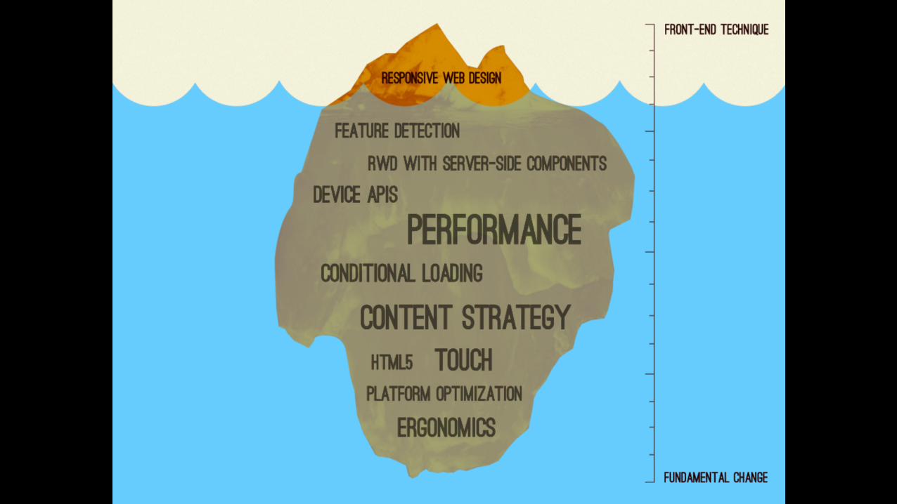
ResponsiveWeb Design

MOBILE TABLET DESKTOP


It is NOT about DEVICES

It is aboutCONTENT & CONTEXT


Ethan MarcotteResponsive Web Design – A list apartMay 25, 2010

FLUIDGRID
FLEXIBLEMEDIA
MEDIAQUERIES

Origin of
GRID SYSTEMSPrint DesignGraphic DesignSwiss Design

Divides the available space
verticalGRID COLUMNS
horizontalGRID ROWS
space betweenGUTTER

Grid systems in web design
FIXED
Column width in px - pixels
Example:• 960.gs
• Optimized for 1024px
FLUID
Column width in%
vw - View Widthvh - View Height
em, rem
Example:• 13 of the best responsive grid
system• countless
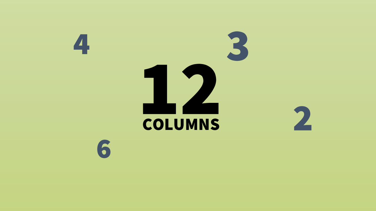
4 3
6212
COLUMNS

Benefit of Grid SystemsClarity / Order
Grids bring order to a layout making it easier for visitors to find and navigate through information.
EfficiencyGrids allow designers to quickly add elements to a layout because many layout decisions are addressed while building the grid structure.
EconomyGrids make it easier for other designers to work and collaborate on the design as they provide a plan for where to place elements.
Consistency / HarmonyGrids lead to consistency in the layout of pages across a single site or even several sites creating a structural harmony in the design.
Source:Why grid?

FLEXIBLEMEDIA
IMAGESVIDEOS
TYPOGRAPHY

Responsive Media - Images

Technical – Responsive Image - Basics
• Mobile device: slow loading image• Desktop: Bad image quality on desktop

<picture> - Better Responsive Images

Responsive Media - Images

Responsive Media – Images - optimised

Responsive Media – Images -SVGScalable Vector Graphics
XML based definition of a vector graphics
Native drawing in browser
Scales without getting blurry
Replacement for: GIF, Icon Fonts

Example – Office 365 Logo
RectangleCircleEllipsesPolygonPolylinePathTextStroke

How to use SVG in HTML• Directly embed in HTML• Use it as background in CSS• <img> tag• <object> embedding• Data embed
Base64data:image/svg+xml;base64,PHN2ZyB4bWxucz0iaHR0cDovL...
UTF-8, not encodeddata:image/svg+xml;charset=UTF-8,<svg ...> ... </svg>
UTF-8, optimized encoding for compatibilitydata:image/svg+xml;charset=UTF-8,%3Csvg xmlns='http://...’
Fully URL encoded ASCIIdata:image/svg+xml;charset=US-ASCII,%3Csvg%20xmlns%3D%...

Icon Fonts vs SVG Symbol Set
Web fontWOFF, TTF, EOT, SVG Font
Every letter is a glyph<g>
USE:content(‘�’)
CONS:Accessibility problemsHard to debug in code
Seren Davies: Death to icon fonts
SVG Symbol SetSVG
Every icon is a<symbol id=“Office365Icon”>
USE:url(’icons.svg#Office365Icon');
PRO:Treated as an image
more on symbol
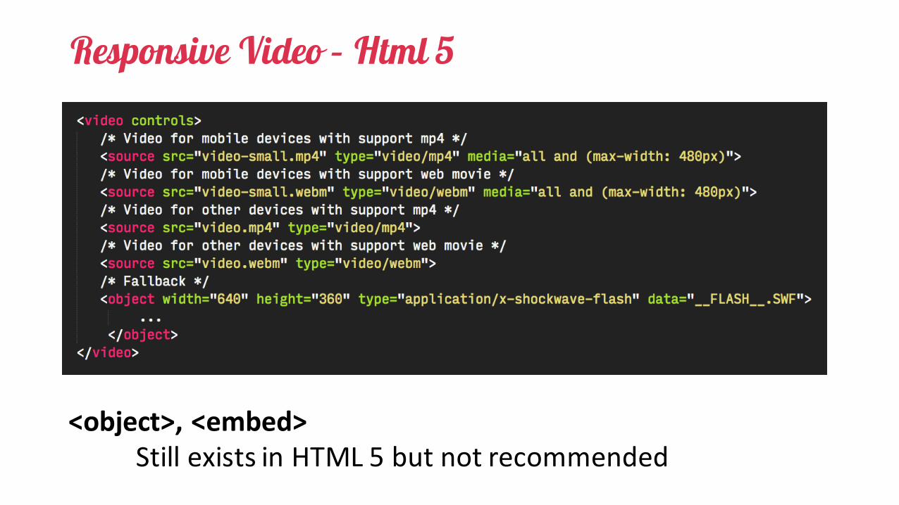
Responsive Video – Html 5
<object>,<embed>StillexistsinHTML5butnotrecommended

Responsive Video – Html 5
Based on IFRAMEShttp://embedresponsively.com
YouTube, Vimeo, …


Responsive Typography
Choose the right font size for content & context
Fluid content size
RESPONSIVE TYPOGRAPHY: THE BASICS
RESPONSIVE TYPOGRAPHY IN ACTION
Units: em, rem, %

Media Queries

Media Queries•Exists since 2002• "print”, "screen", "aural", "braille", "handheld",
"projection", "tty", "tv”•CSS 3•width, height• device-width, device-height• orientation• aspect-ratio, device-aspect-ratio• color, color-index, monochrome• resolution, scan, grid

How it works – Print
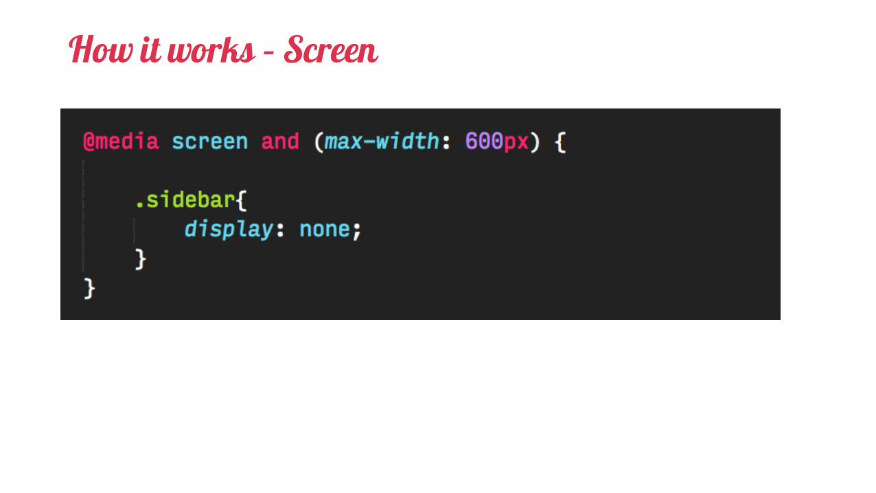
How it works – Screen

Responsive FrameworksSimple Frameworks• The 1140 CSS Grid• cssgrid.net• Golden Grid System• Mueller Grid System• Responsive Grid System• Titan• Responsive Grid System• Less Framework 4• Gridiculo.us• Columnal• Ingrid• 960.gs• Base
Complete Frameworks• Bootstrap• Foundation• Skeleton• YAML• Tuktuk• Gumby• Kube• Groundwork• ResponsiveAeon• Office UI Frabric

FRAMEWORKS ARE GREAT BUT …

Framework potential pitfalls
• One-size-fits-all• Lookalike issues• Potential for bloat/unneeded stuff (approx. 5% needed for SP)• Might not do everything you need• Compatibility with existing sites• Subscribe to someone else’s structure, naming, style• Technological changes / Structural changes• Learn the framework but not CSS• Lack of accesibilty

SharePoint

SharePoint - Bootstrap
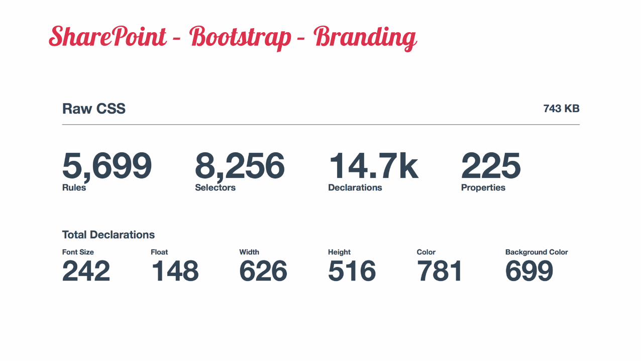
SharePoint – Bootstrap – Branding

Avoid pitfalls with Frameworks
I need a burger menu and a grid system?
Trim framework to your needs
Architect your CSS and Branding
Developer your own reusable components