rosalyn halford portfolio
TRANSCRIPT
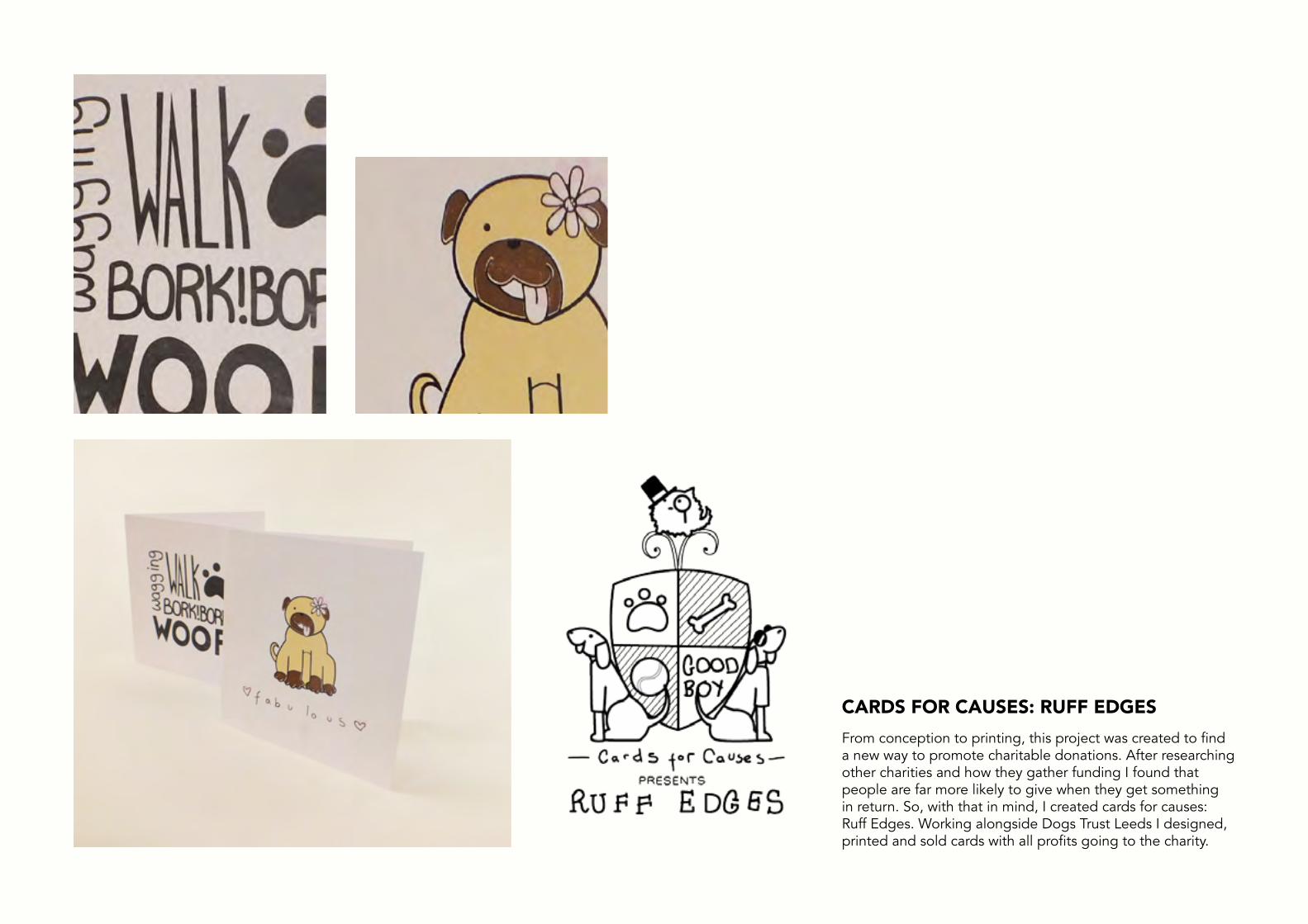
From conception to printing, this project was created to find a new way to promote charitable donations. After researching other charities and how they gather funding I found that people are far more likely to give when they get something in return. So, with that in mind, I created cards for causes: Ruff Edges. Working alongside Dogs Trust Leeds I designed, printed and sold cards with all profits going to the charity.
CARDS FOR CAUSES: RUFF EDGES
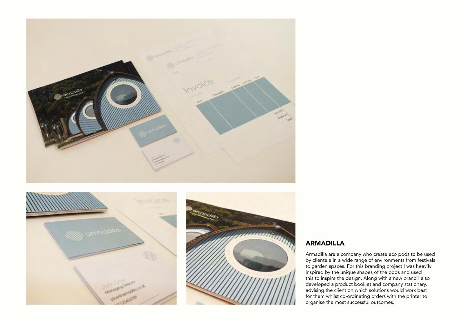
Armadilla are a company who create eco pods to be used by clientele in a wide range of environments from festivals to garden spaces. For this branding project I was heavily inspired by the unique shapes of the pods and used this to inspire the design. Along with a new brand I also developed a product booklet and company stationary, advising the client on which solutions would work best for them whilst co-ordinating orders with the printer to organise the most successful outcomes.
ARMADILLA
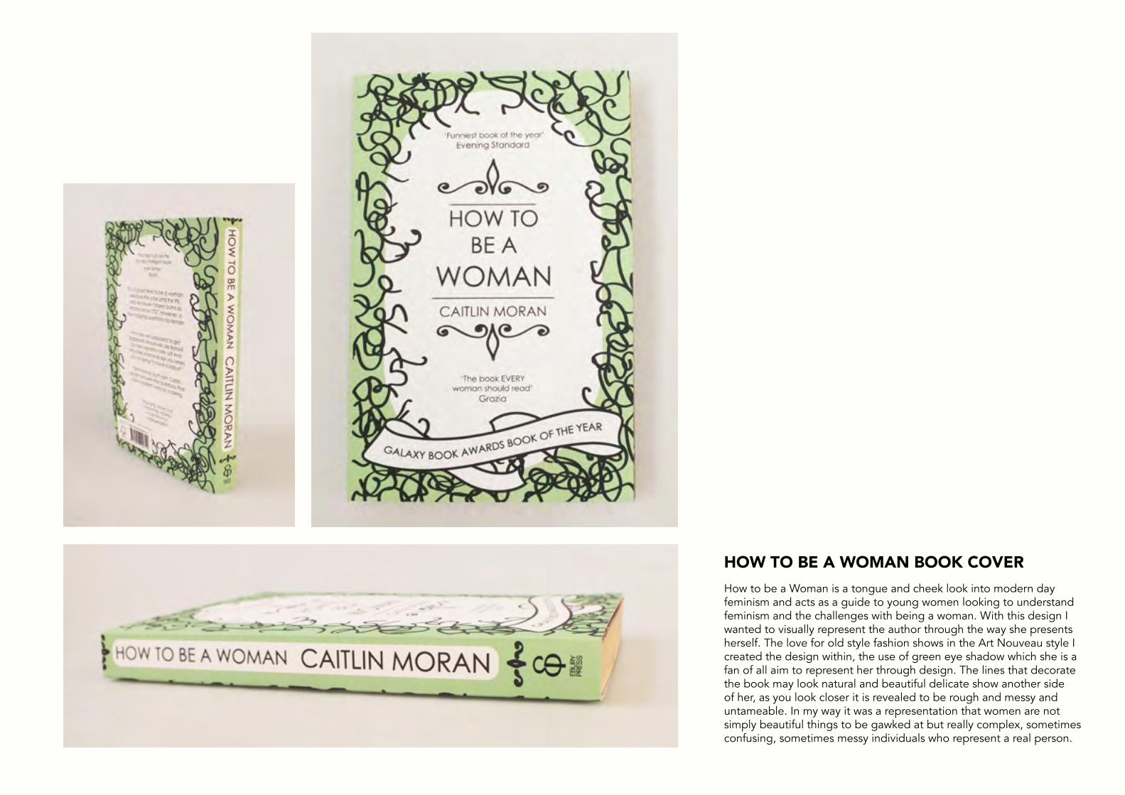
How to be a Woman is a tongue and cheek look into modern day feminism and acts as a guide to young women looking to understand feminism and the challenges with being a woman. With this design I wanted to visually represent the author through the way she presents herself. The love for old style fashion shows in the Art Nouveau style I created the design within, the use of green eye shadow which she is a fan of all aim to represent her through design. The lines that decorate the book may look natural and beautiful delicate show another side of her, as you look closer it is revealed to be rough and messy and untameable. In my way it was a representation that women are not simply beautiful things to be gawked at but really complex, sometimes confusing, sometimes messy individuals who represent a real person.
HOW TO BE A WOMAN BOOK COVER
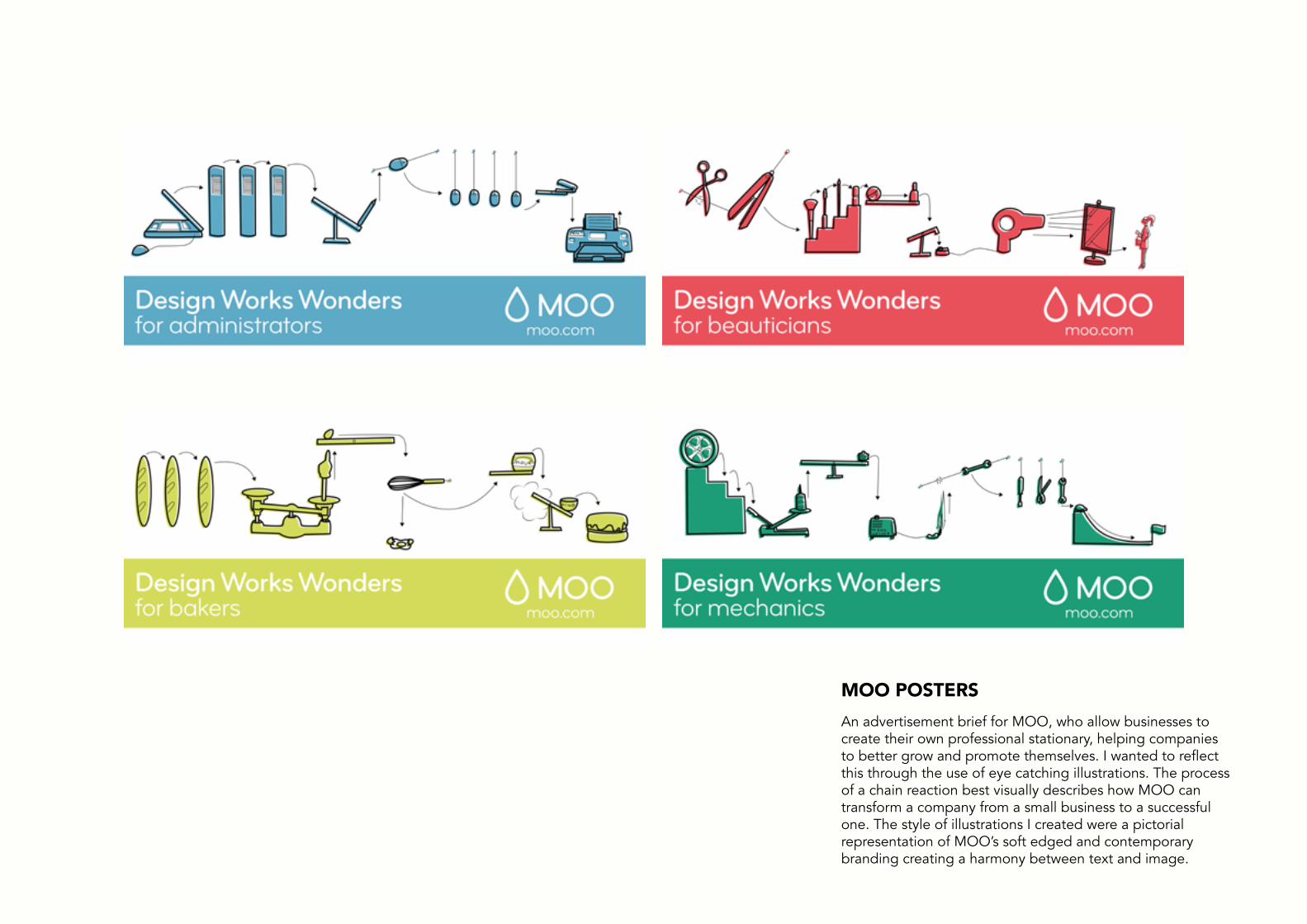
An advertisement brief for MOO, who allow businesses to create their own professional stationary, helping companies to better grow and promote themselves. I wanted to reflect this through the use of eye catching illustrations. The process of a chain reaction best visually describes how MOO can transform a company from a small business to a successful one. The style of illustrations I created were a pictorial representation of MOO’s soft edged and contemporary branding creating a harmony between text and image.
MOO POSTERS
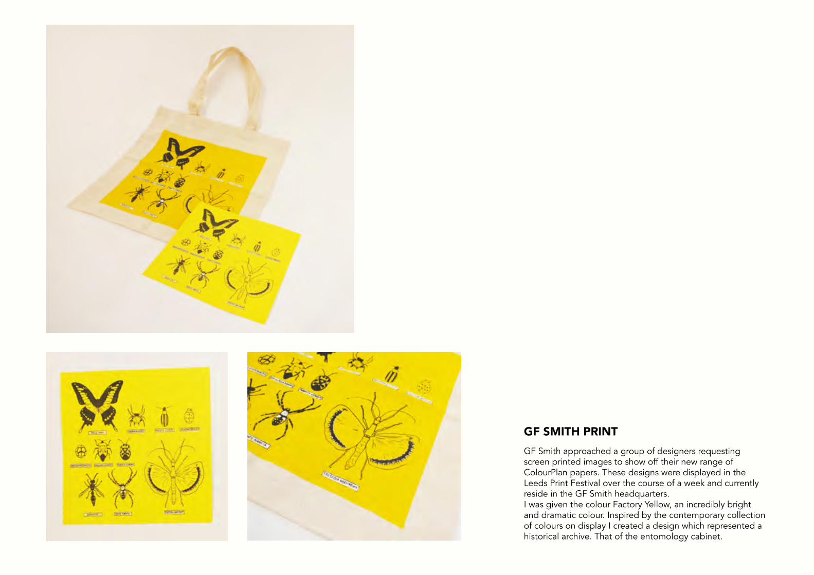
GF Smith approached a group of designers requesting screen printed images to show off their new range of ColourPlan papers. These designs were displayed in the Leeds Print Festival over the course of a week and currently reside in the GF Smith headquarters. I was given the colour Factory Yellow, an incredibly bright and dramatic colour. Inspired by the contemporary collection of colours on display I created a design which represented a historical archive. That of the entomology cabinet.
GF SMITH PRINT

The main focus for this design was to produce a poster full of fun and personality. Using hand rendered typography successfully adds a unique and friendly flair to the finished design. As the key feature of the quote is based around a “Land Mermaid” I was certain to illustrate her in a style which harmonised the styles of type. However, in order to find an appropriate balance between text and image I transformed the Land Mermaid design into a pattern, supporting the uplifting and positive tone of the quote without distracting the from the typography. The overall look of the piece creates a personal and positive final design.
INSPIRATIONAL QUOTE POSTER

A brief set by the DBA, Hyperloop was an opportunity to brand the new era of transport and redesign how people interacted with public transport. The main concept focused on the development of a ‘loop’, a wearable band ticket which linked to an app. As a part of this brief I developed the loop ticket, ensuring it worked with the brand. I also designed and illustrated the proposed look for the station environments and public areas. Through my work I wanted a natural ad organic feel to prevail through the designs. Within the Loop I achieved this by employing curves inspired by nature and within the station I wanted to blur the lines between inside and out, applying the curved look of the bands to various bits of architecture used on site.
HYPERLOOP

A branding project to create an identity for You be You. An application which provides support and a social network for teens and young adults dealing with a variety of issues. From bullying to sexual identity You be You matches users with those going through similar problems giving them a safe space to talk through their issues. For the identity I worked closely with the UX designer and developed a look which appeared calming and gentle. The use of blue and soft edges makes this brand gentle on the eyes yet not distinctly biased to one specific audience.
YOU BE YOU

Smart Grid Consultancy work with businesses to make them more energy efficient and help reduce their environmental impact. When approached to create a new brand and stationary for the company I placed the main emphasis on the environmental benefits. Employing a touch of green brings an intentionally eco-friendly feel to the whole design whilst keeping it strictly within the company guidelines. The brand as a whole had to fit in with the utilities industry and so the final design needed a polished and professional finish.
SMART GRID CONSULTANCY

Using the existing branding for the Leeds College of Art I produced a new proposed a new way-finding system to be used within the college. The whole project was a massive undertaking not only working with brand restrictions but site restrictions. I performed a full site analysis and navigational surveys, working with new and existing students to fully understand the wayfinding issues people dealt with within the building. From this I developed a full system, constantly seeking feedback to make sure each sign clearly and directly communicated what was needed.
LEEDS COLLEGE OF ART WAYFINDING DESIGN

All Work Unless Stated Otherwise is © Rosalyn Halford
THANK YOU!