royal society of chemistry brand guidelines 2019_tcm18-246471.pdf · chemistry is at the centre of...
TRANSCRIPT

Royal Society of ChemistryBrand identity guidelines
v1.0 | March 2019

Contents
1 Introduction
1.1 Brand proposition
1.2 Brand narrative
1.3 Brand values
1.4 Brand personality
2 Tone of voice
2.1 How we speak
2.2 Using our name
2.3 How to use some of our key words and phrases
3 The brand
3.1 The core elements that make up the brand
3.2 The logo
3.3 The logo – safe area and minimum size
3.4 Positioning the logo
3.5 Don’t do this with the logo
3.6 The logo with partner brands
3.7 The logo with accreditations
3.8 RSC local sections and interest groups
3.9 Social media
4 The colour palette
4.1 The colour palette
4.2 The colour palette applied – premium applications
4.3 The colour palette applied – corporate and teaching audience
4.4 The colour palette applied – education and student audience
4.5 The colour palette – colour breakdowns
5 Typography
5.1 Headline font
5.2 Display font
5.3 Body copy fonts
5.4 The fonts in use – print
5.5 eComms/HTML fonts
5.6 The fonts in use – digital
6 The graphic device
6.1 The graphic device explained
6.3 The graphic device template
6.4 Creating the graphic device
6.6 Don’t do this with the graphic device
7 Imagery
7.1 Photography – people
7.2 Photography – applications
7.3 Photography – abstract
7.4 Illustration
7.5 Patterns
7.7 Iconography
8 Bringing it together – the brand in practice
8.1 Accessibility
9 Further information
Royal Society of Chemistry | Brand identity guidelines
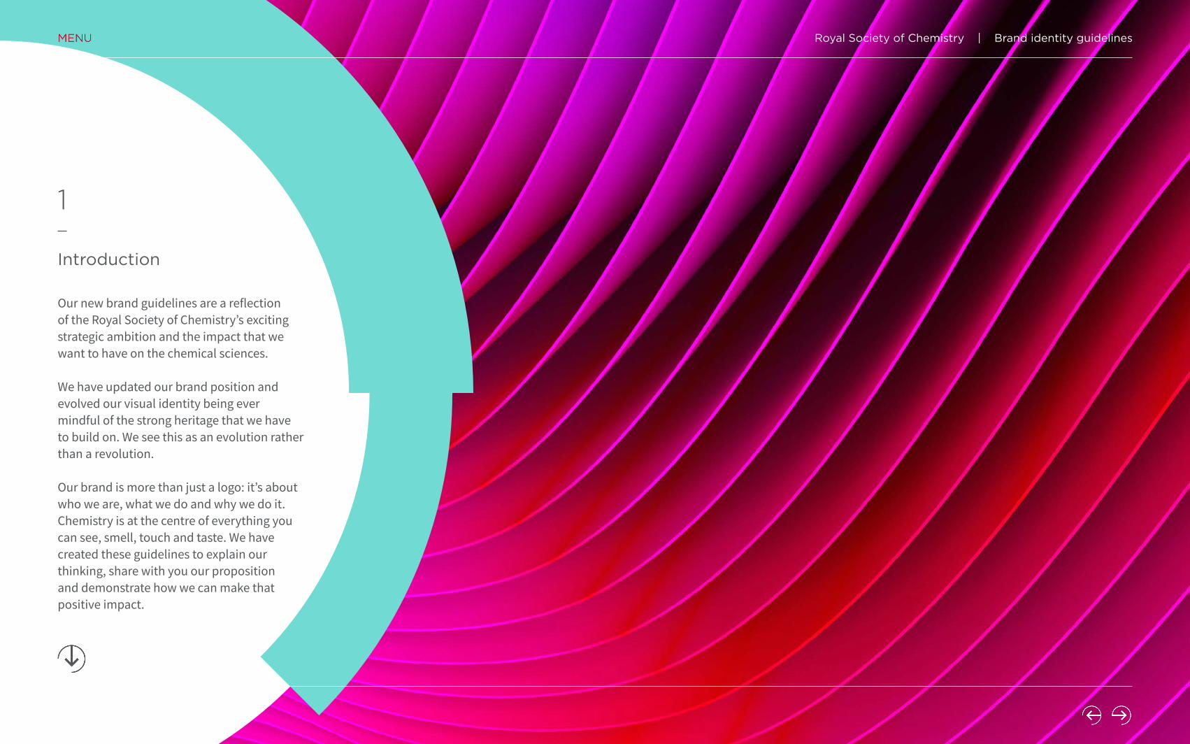
Introduction
1
Our new brand guidelines are a reflection of the Royal Society of Chemistry’s exciting strategic ambition and the impact that we want to have on the chemical sciences.
We have updated our brand position and evolved our visual identity being ever mindful of the strong heritage that we have to build on. We see this as an evolution rather than a revolution.
Our brand is more than just a logo: it’s about who we are, what we do and why we do it. Chemistry is at the centre of everything you can see, smell, touch and taste. We have created these guidelines to explain our thinking, share with you our proposition and demonstrate how we can make that positive impact.
Royal Society of Chemistry | Brand identity guidelines

Brand proposition
1.1
Why?
How?
What?
Connecting the world of science to advance chemical knowledge for a better future.
By advancing chemical knowledge and understanding, working with the scientists who make it all happen.
By upholding professional standards and supporting the chemical sciences community, we enable the exchange of ideas and facilitate collaboration, making sure chemistry’s voice is heard.
This is our simple articulation of the RSC brand – it answers what we do, why we do it and how we do it. It is our internal ‘sense check’ which ensures we are all on the same page.
Royal Society of Chemistry | Brand identity guidelines

Brand narrative
1.2
Chemistry is at the centre of everything you can see, smell, touch and taste.
Whether studying the chemistry of life, or developing the advanced science behind modern technology, chemical scientists use their expertise to improve our health, our environment and our daily lives.
Collaboration is essential. We connect scientists with each other and society as a whole, so they can do their best work and make discoveries and innovation happen.
We publish new research. We develop, recognise and celebrate professional capabilities. We bring people together to spark new ideas and new partnerships. We support teachers to inspire future generations of scientists. And we speak up to influence the people making decisions that affect us all.
We are a catalyst for the chemistry that enriches our world.
Our brand narrative is how we express ourselves and connect with our customers, it is how we introduce and describe ourselves to partners, members and all other stakeholders.
This section should be used as a guideline for any introduction to the Royal Society of Chemistry.
Royal Society of Chemistry | Brand identity guidelines

We’re respectful:We recognise people’s diverse skills,
knowledge and experience, embracing different styles and always ensuring
their dignity.
We’re dedicated:We make a personal difference in all
we do, and value the purpose and heritage of our organisation.
We’re enabling:We drive productive relationships and
empower others to achieve the best for the chemical sciences.
We’re professional:
We hold ourselves accountable for the results of our activities
and demonstrate authoritative, evidence-based thinking.
Brand values
1.3
Our core values are our guiding principles.
Royal Society of Chemistry | Brand identity guidelines

Inspirational:By connecting the world of
science we advance its knowledge of chemistry and
shape a better future.
Curious:We’re courageous and
passionate about scientific discovery, with the confidence
to challenge assumptions and drive innovation.
Ambitious:We believe that every mind in the chemical sciences should feel
empowered to succeed. We set standards and provide platforms
to help every person in chemistry to realise their
potential.
Relevant:Our enthusiasm for our
science is infectious and boundless. We make chemistry
relevant to every audience, both within and outside the
scientific community.
Forward-looking:
Our heritage and reputation give us global credibility and
inspires trust. It is our job to use that experience to look ahead and consider the future – both
in how we think and in what we say.
Brand personality
1.4
Royal Society of Chemistry | Brand identity guidelines

Tone of voice
2
Together we are the Royal Society of Chemistry and so our communication, across all platforms, needs to sound like it comes from one voice. This is hugely important when it comes to communicating our brand.
Our work and our tone of voice should be reflective of our passion and our dedication. Regardless of our different audiences we should express our brand personality in everything we do, and our underlying tone should remain consistent.
Royal Society of Chemistry | Brand identity guidelines

How we speak
2.1
• Everyone here is passionate about chemistry. Let it show in what you say and do.
• Look for the possibility in everything – even the most ordinary.
• Think differently – use words and phrases that are unexpected.
• The chemical sciences connect everyone – invite everyone to be part of the chemistry conversation.
• It should always feel like a conversation – encourage a response by addressing everyone directly.
• We speak with confidence, using language that is relevant to the audience.
• Use language that makes every message clear. The ideas we share may be complex – the way we express them is not.
Beexciting:
Beinvolving:
Beauthentic:
Bepositive:
• We address serious issues calmly and practically, seeking solutions instead of just stating problems.
• We approach every challenge with confidence and an open mind.
Voice is defined by what we decide to say. Tone is defined by how we say it – the language and phrasing we choose to express the thoughts and ideas that make up our brand personality.
The words we use to communicate are as important as our visual identity.
Royal Society of Chemistry | Brand identity guidelines
Using our name
2.2
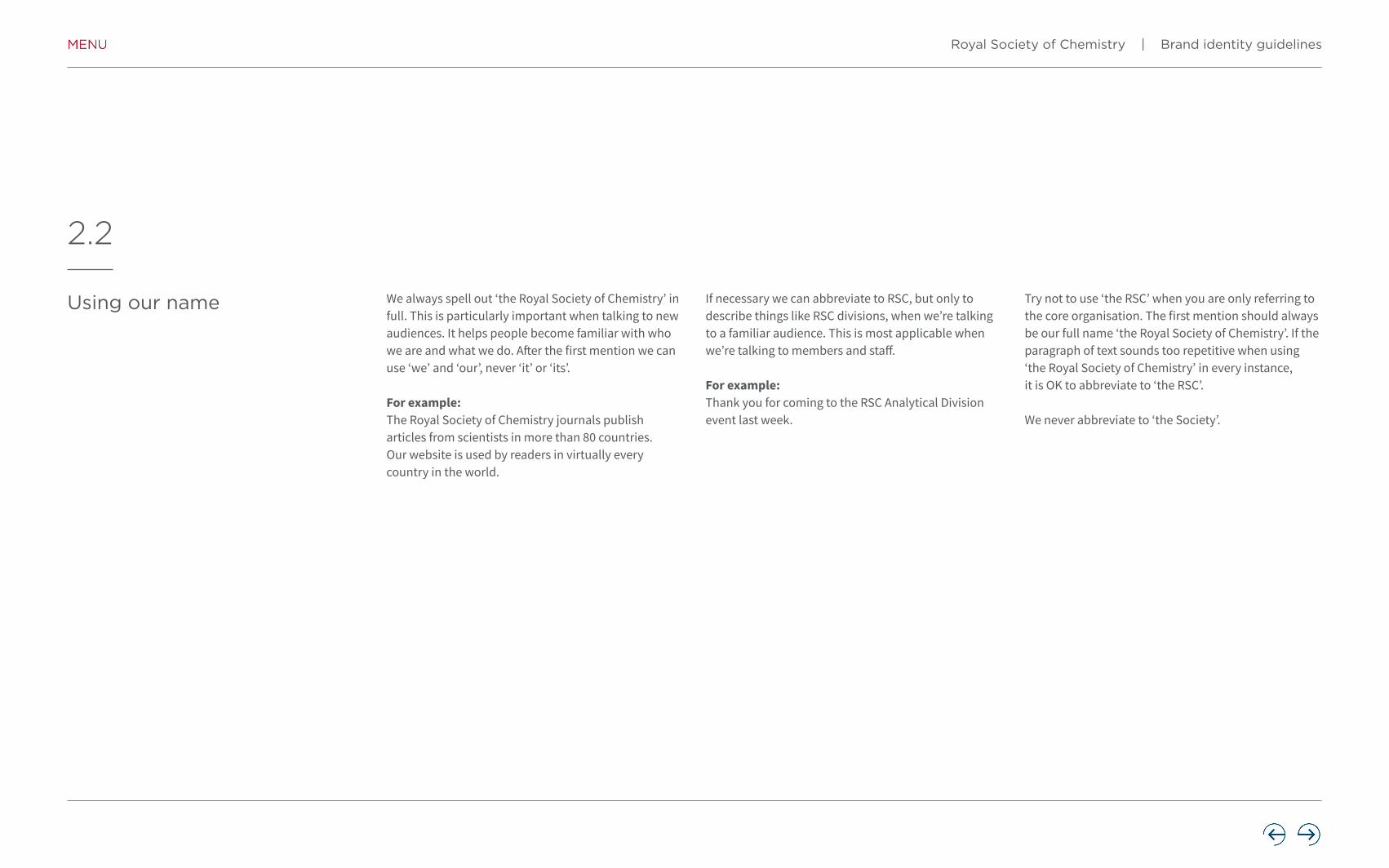
We always spell out ‘the Royal Society of Chemistry’ in full. This is particularly important when talking to new audiences. It helps people become familiar with who we are and what we do. After the first mention we can use ‘we’ and ‘our’, never ‘it’ or ‘its’.
For example:The Royal Society of Chemistry journals publish articles from scientists in more than 80 countries. Our website is used by readers in virtually every country in the world.
If necessary we can abbreviate to RSC, but only to describe things like RSC divisions, when we’re talking to a familiar audience. This is most applicable when we’re talking to members and staff.
For example:Thank you for coming to the RSC Analytical Division event last week.
Try not to use ‘the RSC’ when you are only referring to the core organisation. The first mention should always be our full name ‘the Royal Society of Chemistry’. If the paragraph of text sounds too repetitive when using ‘the Royal Society of Chemistry’ in every instance, it is OK to abbreviate to ‘the RSC’.
We never abbreviate to ‘the Society’.
Royal Society of Chemistry | Brand identity guidelines

How to use some of our key words and phrases
2.3
Chemistry/the chemical sciencesContext is the key to which you should use. There will be situations where the use of ‘chemistry’ or ‘chemical science’ just makes more sense in the context of the communication. We should be flexible about this as it reflects the interdisciplinary nature of science in the 21st century. As a general guide:
Chemistry• Use when talking about the subject of chemistry,
and with all of our education audiences (from primary school pupils and teachers through to undergraduate level).
• Use when talking about relevant prizes and awards (subject to any changes recommended by the Recognition review).
The chemical sciences• Use as a first choice where possible in everything
else. Especially when talking about the application of chemistry and its impact on the wider world.
• Use to reflect the breadth of our activities across the whole of the chemical sciences community, and the interdisciplinarity of modern chemistry.
International/global/worldwide
Use:
International to describe our organisation – to showwe work across and between countries.
Global to talk about concepts, e.g., ‘global concerns’ or ‘chemical sciences on a global scale’. It’s also fine to use it in the context of ‘global reach’ in the case of our journals.
Worldwide might describe something happening all over the world, e.g. ‘a worldwide network’ or a ‘worldwide community’. It is not interchangeable with ‘international’. We can rightly claim to be an international organisation, but not yet a worldwide one.
Not-for-profit/non-profit/charity
Use:
Not-for-profitAs a not-for-profit organisation, we invest our surplus income to achieve our charitable objectives in support of the chemical science community.
Avoid using the word ‘charity’ as a way to describe ourorganisation – we are a not-for-profit organisation butnot a charity in the same sense as Oxfam or Macmillan.The word ‘charity’ can be ambiguous, suggestinganything from a small bake sale to mass fundraisingcampaigns. It can sound ‘less professional’ to someaudiences. ‘Not-for-profit’ is a more accurate description.
Royal Society of Chemistry | Brand identity guidelines

The brand
3
We are excited and proud about the journey we have been on to refresh the brand. We have evolved our logo and visual identity to reflect our updated brand proposition and tone of voice. For a seamless customer/stakeholder experience all communications should follow our guidelines – this will help to ensure consistency and increase our impact.
Royal Society of Chemistry | Brand identity guidelines

The core elements that make up the brand
3.1
Bree Serif Gotham
Source Sans Source Serif
Typography Graphic device
Graphic imageryPhotographic imagery
The logo Colour palette
Royal Society of Chemistry | Brand identity guidelines

The logo
Reversed logo
Primary logo
White logo
Mono logo
3.2
The primary and reversed versions of the logo should be used wherever possible. They are designed to work in conjunction with the colours in the colour palette, as well as working on top of photography and illustrations.
The mono and white versions of the logo should be used sparingly, and should always be seen as secondary options to the primary and reversed logos.
Royal Society of Chemistry | Brand identity guidelines

The logo – safe area and minimum size
The logo needs clear space around it to allow it to stand out wherever it appears. It’s important not to allow text or other graphic elements to encroach into this space.
The safe area is equal to half the height of the C marque (as shown on the right). Please bear in mind this is the minimum safe area – more space around the logo is always a good thing.
To ensure maximum legibility, the logo should not be reproduced smaller than the sizes shown below right.
3.3 1/2x
x
1/2x
129 pixels
164 pixels
36 pixels72 pixels
Digital – trimmed(without safe area)
Digital – (including safe area)
25mm
Royal Society of Chemistry | Brand identity guidelines

Positioning the logo
The logo can be positioned in any of the corners of a piece of communication, whether printed or digital. The safe area for the logo (page 3.3) shows the minimum space that should be allowed. The table below shows the optimum spacing and logo widths for a number of commonly-used document sizes.
If your piece of collateral falls outside of these dimensions, choose the closest media size/logo width/safe area combination from the table below and scale up or down to the dimensions you need.
Recommended logo sizes
Media size Logo width Optimum safe area
A3 70mm 17mm
A4 50mm 12mm
A5 40mm 8mm
A6 30mm 6mm
DL 38mm 7mm
3.4
Royal Society of Chemistry | Brand identity guidelines

Don’t do this with the logo
Always use the artworked versions of the Royal Society of Chemistry logo – don’t create your own or alter the artwork. Using the correct version of the logo is key to maintaining the integrity of the brand.
Don’t skew it
Don’t place the logo on a solid fill of any of the primary palette colours – the parts of the C marque that use these colours will vanish
Don’t recolour it Don’t stack the elements
3.5
Don’t resize any of the elements Don’t change the font
Don’t place the logo on a busy photographic or patterned
background
Royal Societyof Chemistry
Don’t add any effects
Royal Society of Chemistry | Brand identity guidelines

The logo with partner brands
3.6
When we work in partnership with other brands, we should always be visually represented. By using our logo in this way, we show true connection and collaboration.
When pairing the Royal Society of Chemistry logo with partner brands, the spacing and relationship between the two is fixed to ensure neither the Royal Society of Chemistry logo or that of the partner brand overwhelm one another.
Partner logo
1/2x1/3x 1/3x
x
1/2x
Please note: partner logos should not exceed the height of the Royal Society of Chemistry logo
Examples
Royal Society of Chemistry | Brand identity guidelines

The logo with accreditations
3.7
We have developed special logos to be used by individuals and organisations which will help you to ensure our brand is represented consistently and correctly.
When pairing the Royal Society of Chemistry logo with accreditation text, the grid to the right should be used to maintain consistency.
The accreditation text should appear in Gotham Book and in all capitals, with the X height of the accreditation text matching that of the lines of text within the logo.
Examples
Gotham Book
ACCREDITEDDEGREE
ACCREDITEDQUALIFICATION
APPROVEDTRAINING
LINE 1LINE 2
1/2x1/3x 1/3x
x
1/2x
Royal Society of Chemistry | Brand identity guidelines

RSC INTEREST GROUPENERGY SECTOR
RSC INTEREST GROUPHIGH THROUGHPUT CHEMISTRY& NEW TECHNOLOGIES GROUP
RSC INTEREST GROUPSHORT TITLE
RSC INTEREST GROUPLONG TITLE ONTWO LINES
RSC local sections and interest groups
3.8
We have a special version of our logo for the exclusive use of our divisions, local sections and interest groups.
They are represented by a cut-down version of the logo using the C marque alone. The spacing between the C marque and the text is the same as that in the primary logo.
Two versions have been designed to allow for short and long titles.
RSC LOCAL SECTIONSHORT TITLE
RSC LOCAL SECTIONLONG TITLE ONTWO LINES
RSC LOCAL SECTIONEAST ANGLIA
RSC LOCAL SECTIONEDINBURGH &SOUTH EAST SCOTLAND
Examples
Examples
Royal Society of Chemistry | Brand identity guidelines
Social media
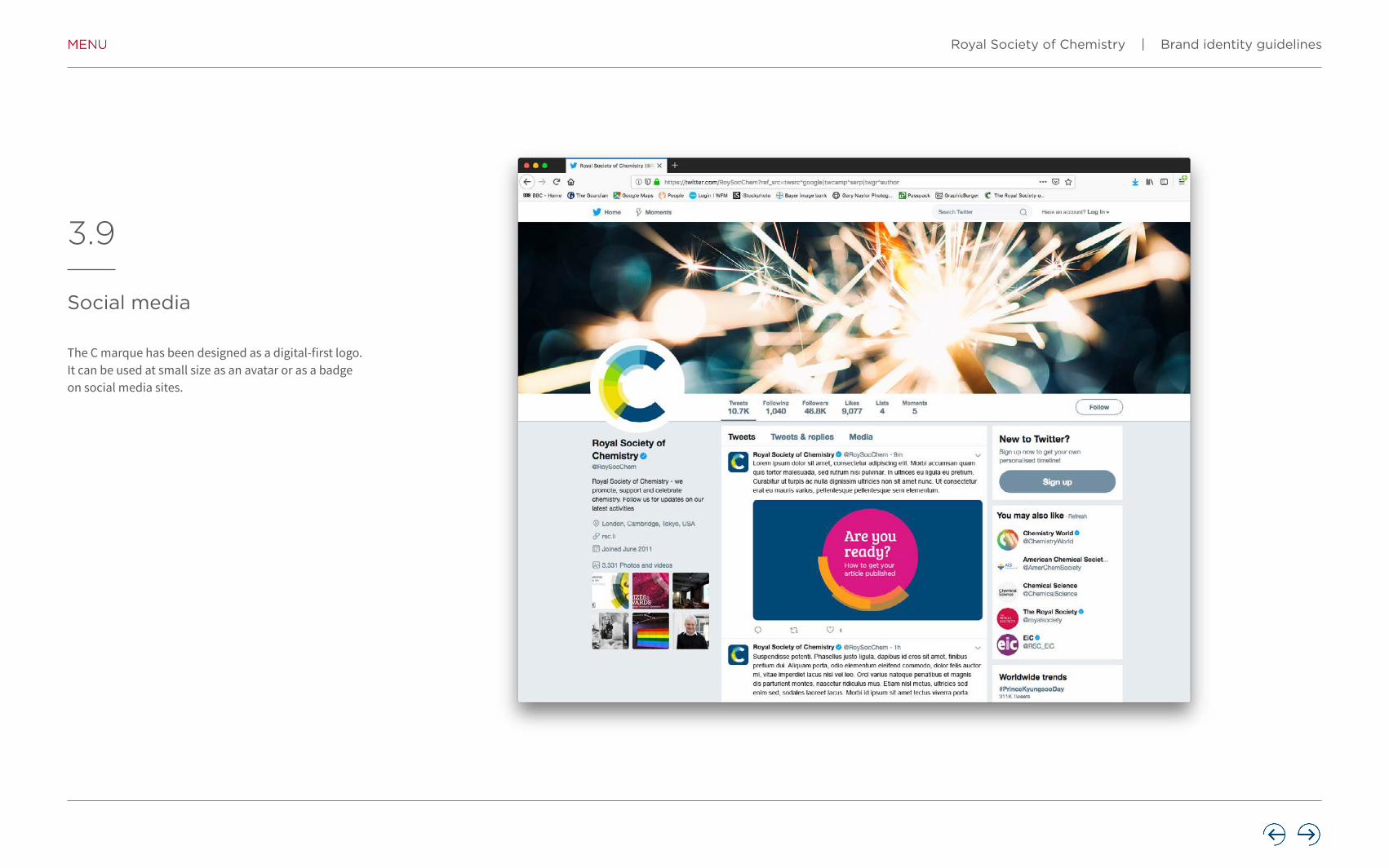
3.9
The C marque has been designed as a digital-first logo. It can be used at small size as an avatar or as a badge on social media sites.
Royal Society of Chemistry | Brand identity guidelines

The colour palette
The palette has been designed to give maximum flexibility across the broad spectrum of materials produced by the Royal Society of Chemistry.
4
Royal Society of Chemistry | Brand identity guidelines

The colour palette
The palette is divided into three sections – Hero, Primary and Secondary.
The hero colour is RSC Dark Blue and forms the basis of the brand colours. The reversed out version of the logo can sit on RSC Dark Blue.
The primary palette consists of the colours that make up the logo along with RSC Dark Blue.
The logo cannot sit on a block of any of the primary palette colours.
The secondary palette consists of nine colours to give maximum flexibility. The logo can sit on any of these colours.
4.1HERO PRIMARY SECONDARY
RSC Dark Blue RSC Sky Blue RSC Yellow RSC Lime RSC Fuchsia RSC Plum RSC Tangerine
RSC Burnt Orange RSC Scarlet RSC Jade
RSC Forest RSC Turquoise RSC Graphite
Royal Society of Chemistry | Brand identity guidelines

The colour palette – colour breakdowns
4.2
RSC Fuchsia RSC Plum RSC TangerineRSC Burnt
OrangeRSC Scarlet RSC Jade RSC Forest RSC Turquoise RSC Graphite
PANTONE 219 7648 1375 1655 186 562 5473 3242 425
RGB 218/24/132 153/30/102 255/158/27 252/76/2 200/16/46 0/111/98 17/94/103 113/219/212 84/88/90
HEX DA1884 991E66 FF9E1B FC4C02 C8102E 006F62 115E67 71DBD4 54585A
CMYK 1/92/4/0 22/100/0/16 0/45/94/0 0/73/98/0 2/100/85/6 85/12/53/36 86/20/32/51 44/0/20/0 48/29/26/76
RSC Dark Blue RSC Sky Blue RSC Yellow RSC Lime
PANTONE 7693 7702 3965 375
RGB 0/73/118 72/169/197 238/220/0 151/215/0
HEX 004976 48A9C5 EEDC00 97D700
CMYK 100/57/9/47 68/1/8/8 7/0/100/0 46/0/90/0
ASE files of the RGB and CMYK palettes have been created to allow you to easily import the full palette colours into your work without having to specify them.
Royal Society of Chemistry | Brand identity guidelines

Typography
5
The typefaces we use are an important part of our visual brand identity and integral to our communications. Typography plays a key part in conveying our personality and brand strengths.
Royal Society of Chemistry | Brand identity guidelines

Headline font – Bree Serif
Our headline font is Bree Serif Regular. This font should be used when you want to create impact – it’s great for headlines and pull-out quotes.
It’s designed to go large – you wouldn’t use it when there are too many words or when your text gets small – that’s what the display font (Gotham) is for.
Bree Serif is an open source font and is available as both a web font and a print font.
Please use the version from Google Fonts (fonts.google.com/specimen/Bree+Serif) as some of the character shapes are different in versions from other sources.
A note on ligatures – please switch off ligatures when using Bree Serif.
AaBbCcABCDEFGHIJKLMNOPQRSTUVWXYZabcdefghijklmnopqrstuvwxyz1234567890!@£$%^&*()
5.1
Royal Society of Chemistry | Brand identity guidelines

Display font – Gotham Bold Book
The display font is Gotham, a clean sans serif font. It’s the primary font for the majority of typographic content – both as a support for the headline font as well as for larger blocks of text.
It can be used in either of the four weights shown here for maximum flexibility.
Gotham is not suitable for body copy due to the circular shape of the characters –we have two specific body copy fonts (Source Sans Pro and Source Serif Pro).
AaBbCc AaBbCcABCDEFGHIJKLMNOPQRSTUVWXYZabcdefghijklmnopqrstuvwxyz1234567890!@£$%^&*()
ABCDEFGHIJKLMNOPQRSTUVWXYZabcdefghijklmnopqrstuvwxyz1234567890!@£$%^&*()
Medium Light
AaBbCcABCDEFGHIJKLMNOPQRSTUVWXYZabcdefghijklmnopqrstuvwxyz1234567890!@£$%^&*()
AaBbCcABCDEFGHIJKLMNOPQRSTUVWXYZabcdefghijklmnopqrstuvwxyz1234567890!@£$%^&*()
5.2
Royal Society of Chemistry | Brand identity guidelines

Body copy fonts
Source Sans Pro and Source Serif Pro have been chosen for body copy online and within publications as they have a high degree of readability and legibility when used in dense blocks.
Please use the version from Google Fonts:
fonts.google.com/specimen/Source+Sans+Pro
fonts.google.com/specimen/Source+Serif+Pro
5.3
AaBbCcABCDEFGHIJKLMNOPQRSTUVWXYZabcdefghijklmnopqrstuvwxyz1234567890!@£$%^&*()
AaBbCcABCDEFGHIJKLMNOPQRSTUVWXYZabcdefghijklmnopqrstuvwxyz1234567890!@£$%^&*()
Source Sans Pro Source Serif Pro
Royal Society of Chemistry | Brand identity guidelines

The fonts in use – print
5.4 Bree Serif – headline
Gotham – display
Source Sans Pro – body copy
Royal Society of Chemistry | Brand identity guidelines
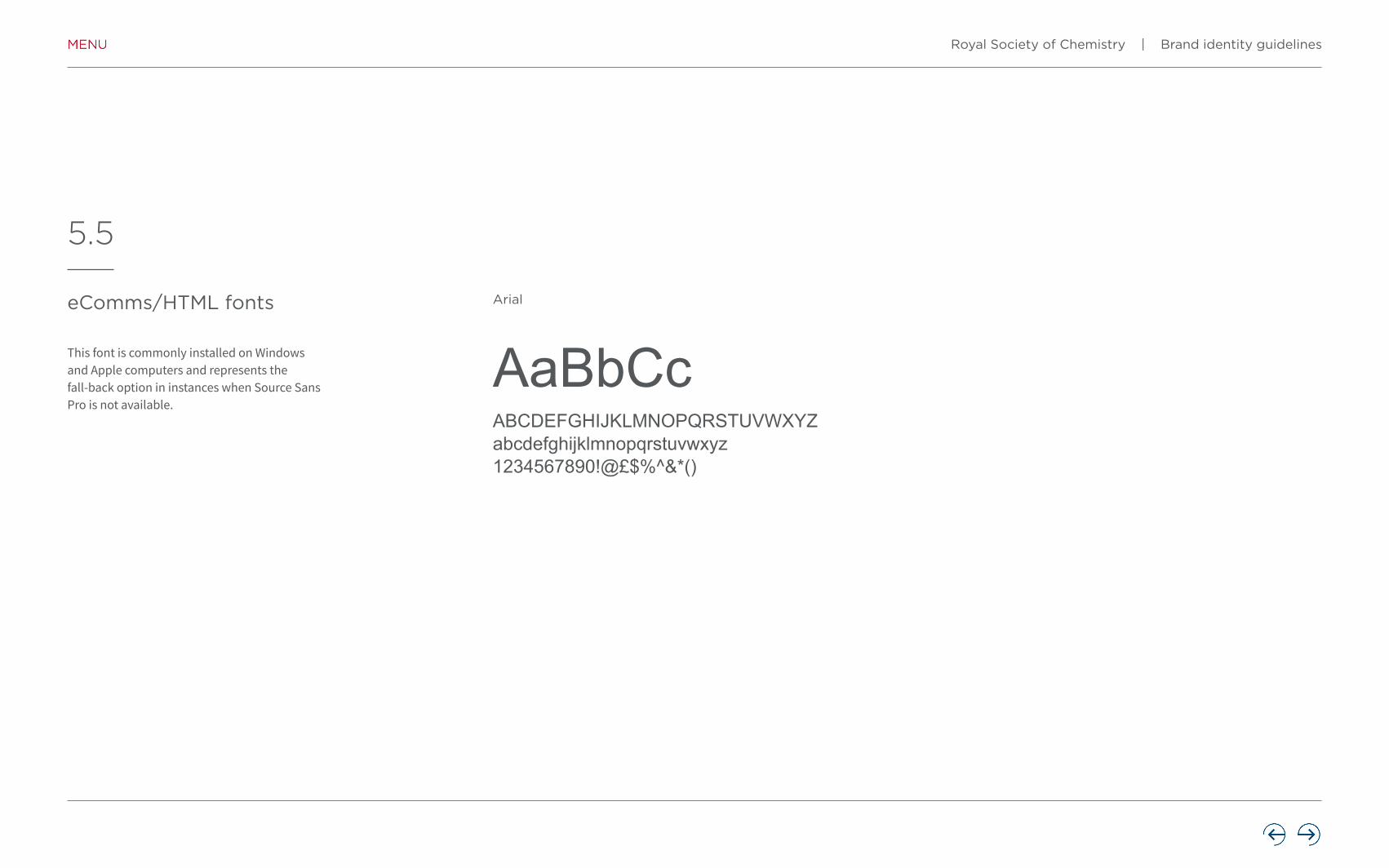
eComms/HTML fonts
This font is commonly installed on Windows and Apple computers and represents the fall-back option in instances when Source Sans Pro is not available.
5.5
AaBbCcABCDEFGHIJKLMNOPQRSTUVWXYZabcdefghijklmnopqrstuvwxyz1234567890!@£$%^&*()
Arial
Royal Society of Chemistry | Brand identity guidelines

The fonts in use – digital
5.6Navigation – Gotham Medium
H2 – Bree Serif
H1 – Bree Serif
Lead paragraph – Gotham Book
Lead paragraph – Gotham Book
Primary link – Gotham Bold
(use secondary palette)
Hyperlink – Gotham Medium
(use secondary palette)
Body copy – Source Sans Pro
Royal Society of Chemistry | Brand identity guidelines
The fonts in use – digital
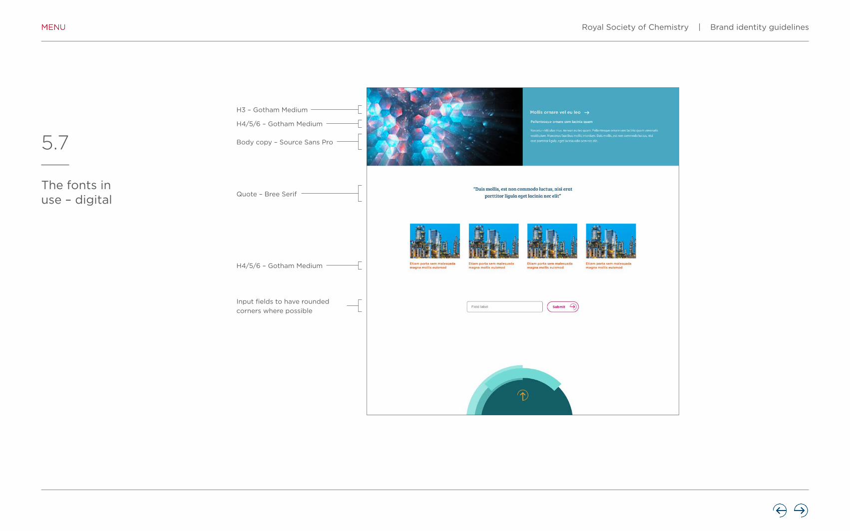
5.7
H3 – Gotham Medium
H4/5/6 – Gotham Medium
H4/5/6 – Gotham Medium
Input fields to have rounded
corners where possible
Body copy – Source Sans Pro
Quote – Bree Serif
Royal Society of Chemistry | Brand identity guidelines

The graphic device
6
The graphic device helps enrich our visual style and is key to our identity – it represents everything that we represent in chemistry. We have outlined a clear way to adapt and use the graphic device on a variety of platforms – digital and non-digital.
Royal Society of Chemistry | Brand identity guidelines

6.1
The graphic device explained
The graphic device is made of three elements – the primary and secondary devices, which work around a circle. The width of the two devices relates to the circle (see page 6.3).
The primary and secondary devices are made on a grid of eight equal sections of 45° around the circle. A master grid has been created to enable you construct the graphic device, the use of which is explained on page 6.3.
The primary device is always a quarter of the circle’s circumference, and is always shown in as a solid colour. It can be located at eight positions around the circumference of the circle in 45° increments.
The secondary device sits on top of the primary device and can vary in length from one section (45°) to half of the circle (180°). It is not a solid colour – it is a 70% tint, so has an element of transparency.
Primary device
Circle
Secondary device
Royal Society of Chemistry | Brand identity guidelines
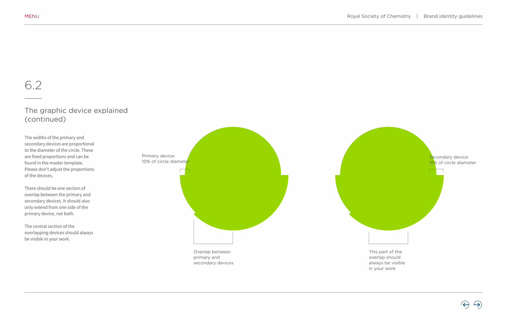
6.2
The graphic device explained (continued)
The widths of the primary and secondary devices are proportional to the diameter of the circle. These are fixed proportions and can be found in the master template. Please don’t adjust the proportions of the devices.
There should be one section of overlap between the primary and secondary devices. It should also only extend from one side of the primary device, not both.
The central section of the overlapping devices should always be visible in your work.
Primary device:10% of circle diameter
Overlap between primary and secondary devices
This part of the overlap should always be visible in your work
Secondary device:15% of circle diameter
Royal Society of Chemistry | Brand identity guidelines

6.3
The graphic device template
A range of preset graphic devices have been created to enable you to get started with creating your communications. However, if none of these are suitable for your work, a template has been made in Adobe Illustrator to allow you to create your own graphic devices.
Base circleThis sits at the bottom of the stack of layers. It’s locked so that it doesn’t get selected by accident. Unlock this after you’ve made your selections of the primary and secondary devices.
Primary deviceThere are eight layers containing the primary device in each of the locations around the circumference of the circle.
Secondary deviceThe secondary device sits at the top of the stack as it overlaps the primary device. This is set up as a continuous circle with anchor points where the guides intersect the circle.
Royal Society of Chemistry | Brand identity guidelines

6.4
Creating the graphic device
Use the direct selection tool in Adobe Illustrator to delete the sections of the secondary device you don’t want.
Hit delete to remove the unwanted sections.
Select the secondary device and use the eyedropper tool (I) to choose a colour from the secondary colour palette (located to the right of the pasteboard). Then lock the layer.
Choose the primary device you want to use. Once you’ve chosen, lock the layer (to avoid accidentally selecting it in the next step).
Step 1 Step 2 Step 4Step 3
Continued
Royal Society of Chemistry | Brand identity guidelines

6.5
Creating the graphic device (continued)
Select the primary device and use the eyedropper tool (I) to choose a colour from the primary colour palette (located to the left of the pasteboard).
Unlock the base circle layer and choose a Fill colour for the circle from the Swatches palette. Make sure the Stroke is set to None.
All of the layers (except the guides) should now be unlocked, allowing you to select the three parts of your graphic device.
You can now save your graphic device or export it into your design software for use.
Step 5 Step 6 Step 8Step 7
Unlock the secondary device layer, select both the secondary and primary layers and go to Object – Path – Outline Stroke. This turns the devices into outlined shapes, preventing their widths being accidentally adjusted.
Royal Society of Chemistry | Brand identity guidelines

6.6
Don’t do this with the graphic device
The graphic device has been designed for maximum flexibility. However, there are certain rules that should be adhered to when using the it in your work. The key consideration is to maintain the integrity of the graphic device shapes in your design.
Don’t use the graphic device as decoration. It should always have a purpose in your design – to house text or an image, for example.
Don’t crop into the graphic device too tightly – the cross over point in the devices should always be visible.
Don’t rotate the devices to the wrong angles – they should be rotated in increments of 45°.
Don’t use the primary and secondary devices to house images or patterns – these can go in the circle or outside of the graphic device.
Intermolecular Interactionsin CrystalsFundamentals ofCrystal Engineering
Edited by Juan J Novoa
Biocatalysis inOrganic SynthesisThe RetrosynthesisApproach
Nicholas J Turner
and Luke Humphreys
The Chemistry ofPlants and InsectsPlants, bugsand molecules
Margareta Séquin
EngineeringHealthHow BiotechnologyChanged MedicineEdited by Lara Marks
Royal Society of Chemistry | Brand identity guidelines

7
Imagery
An important part of our brand journey and vision is the imagery we use. The right images can tell a powerful story, highlight our personality and help us to engage with our audience in a meaningful and relevant way.
Royal Society of Chemistry | Brand identity guidelines

7.1
Photography – people
When we use images of people, we want it to look natural, not posed or forced. The image should be inviting and representative of our connection with the chemistry community as well as the wider public. Key considerations should be the authenticity of the shot, as well as showing the diversity of chemical sciences community.
Wherever possible, the point of focus when depicting people should be on their expression (particularly the eyes) – this will make the images feel more engaging.
Royal Society of Chemistry | Brand identity guidelines

7.2
Photography – applications
The Royal Society of Chemistry is connected to and collaborates with the world of science and this should be reflected. This is in line with our core intention to be a focal point for chemistry communications, not just within our industry but also with the wider world.
The applications of chemistry are many and varied, and this should be considered when choosing images. Even if a familiar subject is being depicted, try to choose images that show the subject from an unusual angle. This can be achieved with the whole image or with clever cropping.
Royal Society of Chemistry | Brand identity guidelines

7.3
Photography – abstract
We use abstract imagery when we want to express concepts so this imagery should be colourful, intriguing and visually interesting. It is representative of the potential in our organisation and our ideas.
Royal Society of Chemistry | Brand identity guidelines

7.4
Illustration
Our illustrations range from highly technical to simple and abstract. We set the highest standards for industry so we should be mindful of creating relevance and excitement through our illustrations.
When an illustration is commissioned, the illustrator should work within the colour palette. Likewise, when an illustration is used from an image library, it should be selected for its simplicity and clarity. The colours should reflect the colour palette. Should the illustration be made of vector graphics, these can be modified to bring them in line with the colour palette.
Royal Society of Chemistry | Brand identity guidelines

7.5
Patterns
Our primary brand and secondary patterns allow us to extend our visual brand presence beyond our logo and device.
Two types of patterns have been developed for use with the other elements of the brand. Both types of pattern can be used in conjunction with the full colour palette.
Type 1 circular patternsThese are designed to work in conjunction with the graphic device in applications such as brochure covers and social media. They can be used to introduce texture and interest over large areas of solid colours.
These patterns should be used sparingly – don’t use them in instances where they add visual clutter. They also should not interfere with any content that is laid over them.
Type 1 patterns
Royal Society of Chemistry | Brand identity guidelines

7.6
Patterns (continued)
Type 2 box copy patternsThese are similar to Type 1 patterns but are not dependent on working with a central circular device. They can be used as backgrounds for box copy where you want to add interest to a solid colour.
Type 2 patterns
Royal Society of Chemistry | Brand identity guidelines

7.7
Iconography
We use icons to express visual interest to our communications. They are an integral part of the brand look and feel and are an extension of our brand property.
The icon style is very simple and works in conjunction with the other elements of our brand.
A 70x70 pixel grid is used when designing new icons, with the line weights fixed at 3px for the external circle and 6px for the internal elements. All icons should be produced on this grid as vectors – they can then be scaled to any size.
There is an internal safe area of 40x40 pixels (square and circular) to contain the inner element of the icon. Make sure the inner element doesn’t get too close to the outer circle and crowd the space – simplicity is the key to successful icon design.
Where possible, part of the inner element should be extended to meet the outer circle. This makes the icon style recognisably ours, but is not a requirement if it doesn’t work in a particular design.
Social media iconsIn instances where social media icons are required, you should refer to the social media channel’s brand guidelines for usage instructions.
Facebook en.facebookbrand.com/#brand-guidelines-assets
LinkedInbrand.linkedin.com
Twitterabout.twitter.com/en_gb/company/brand-resources.html
Instagramen.instagram-brand.com
YouTubewww.youtube.com/intl/en-GB/yt/about/brand-resources/#logos-icons-colors
This is the icon grid – hover over to see how an icon fits to this grid.
Royal Society of Chemistry | Brand identity guidelines

Bringing it together – the brand in practice
8
Our brand guidelines have been created to ensure that together we are maintaining one voice and consistency across our communications. Our passion for chemistry and the chemical sciences will resonate through everything we do.
Royal Society of Chemistry | Brand identity guidelines

Accessibility
8.1
Designing accessible communications can present a real challenge. Our communications need to be visually interesting to engage a reader and legible for all our audiences. Accessibility isn’t just about type size – clear space, uncluttered design, good navigation, colour contrast, leading and alignment are all equally important. You should aim to make our communications accessible to as many people as possible, while balancing this with the need to be effective, powerful and visually stimulating.
Type sizeWe recommend a minimum size of 9pt for body copy.
Capital lettersCopy is generally set in upper and lower case. Setting text in large amounts of capital letters can be harder to read than lower case letters. Using capital letters for headlines and emphasising single words is acceptable.
ItalicsThese should be treated in a similar way to capital letters. Some audiences can find them difficult to read so they should be used minimally. Using bold copy or a strong colour to add emphasis is a good alternative.
LeadingLeading (or linefeed) is the space between one line of type and the next, measured from baseline to baseline. If leading is too narrow or too wide, the text will be difficult to read. As a basic rule, the leading should be a minimum of two point sizes larger than the type size.
Word spacingChanging the spacing between letters or words and altering the proportion of the letters (horizontal scaling) are often used to fit more text onto a line. This should be avoided as too little or too much space can make text illegible. As a general rule never track type less than -3pt or more than +3pt.
AlignmentLeft-aligned body copy with a ragged right-hand margin is the most legible as it is easier to find the start and finish of each line. The spaces between each word are also equal.
ContrastThere should always be high tonal contrast between the text and the background. Contrast is greatest when dark colours are combined with very pale colours or white. Black or very dark coloured copy on a white background is the most accessible.
Reversing out copyThe background colour should be as dark as possible. White copy reversed out of black is the most legible. Attention should be paid to type size and very light weights of type to ensure copy is always legible.
CopywritingCopy should reflect our personality, drawing the reader in, and be informative and concise. Well-crafted copy and clear, effective, modern design allows us to engage with our target audiences.
Royal Society of Chemistry | Brand identity guidelines

More information
9
If you have any questions after reading these guidelines then please get in touch with us.
For all enquiries about the use of our brand:Brand and Communications [email protected]
For all enquiries about the application of our brand:Creative and Production [email protected]
Royal Society of Chemistry | Brand identity guidelines

Thomas Graham House Science Park, Milton Road,Cambridge CB4 0WF UK T +44 (0)1223 420066
Burlington House Piccadilly, London W1J 0BA , UKT +44 (0)20 7437 8656
International OfficesBerlin, GermanyBeijing, ChinaShanghai, ChinaBangalore, IndiaTokyo, JapanWashington, USAPhiladelphia, USA
www.rsc.org
Registered charity number: 207890© Royal Society of Chemistry 2019