runs of homozygosity analysis tutorial · 2019-08-28 · runs of homozygosity analysis tutorial,...
TRANSCRIPT

Runs of Homozygosity AnalysisTutorial
Release 8.7.0
Golden Helix, Inc.
March 22, 2017


Contents
1. Overview of the Project 2
2. Identify Runs of Homozygosity 6Illustrative Example . . . . . . . . . . . . . . . . . . . . . . . . . . . . . . . . . . . . . . . . . . . . . . . 9Examining Results of the Analysis . . . . . . . . . . . . . . . . . . . . . . . . . . . . . . . . . . . . . . . 9
3. Perform Regression with ROH Covariates 18
4. Examine Loss of Heterozygosity 22
i

ii

Runs of Homozygosity Analysis Tutorial, Release 8.7.0
Updated: March 22th, 2017
Level: Intermediate
Version: 8.7.0 or higher
Product: SVS
Dr. Todd Lencz, Associate Director of Research at The Zucker Hillside Hospital, working in collaboration with Dr.Christophe Lambert of Golden Helix, has developed a novel analytic approach that first identifies patterned clusters ofSNPs demonstrating extended homozygosity (runs of homozygosity or “ROHs”) and then employs both genome-wideand regionally-specific statistical tests for association to disease. This approach can identify chromosomal segmentsthat may harbor rare, penetrant recessive loci.
Using a simulated dataset, this tutorial will lead you step-by-step through the workflow for finding runs of homozy-gosity outlined in Dr. Lencz’s paper.
Note: This tutorial will not cover the data importing and quality control procedures Dr. Lencz employed in his study,most of which can be done with SNP & Variation Suite 8. To learn more about these procedures, please refer to themanual.
Requirements
To complete this tutorial you will need the following:
DownloadROH_Tutorial.zip
We hope you enjoy the experience and look forward to your feedback.
Contents 1

1. Overview of the Project
• From the main SVS welcome screen, select File >Open Project. Navigate to the Runs of HomozygosityTutorial folder you just downloaded and select the Runs of Homozygosity Tutorial.ghp file. Click Open tofinish.
The project should already have three spreadsheets.
The first is the 500K HapMap - Sheet 1 with mapped genotypic information for the 270 HapMap samples (Figure 1).
Figure 1. Genotype Spreadsheet
The second spreadsheet is the Phenotype Dataset - Sheet 1 and it has phenotypic information including aCase/Control column and a Population column (Figure 2).
The final spreadsheet, B Allele Frequencies - Transposed - Sheet 1 (Figure 3), contains B Allele Frequencies foreach SNP in the HapMap data. This spreadsheet, unlike the genotypic and phenotypic information, which you shouldhave before any analysis, was obtained separately by importing Affymetrix CEL files, then using the Affymetrix BAllele Frequency Calculation add-on script.
The process to calculate B Allele Frequencies is somewhat long and complicated; you can read more about the script
2

Runs of Homozygosity Analysis Tutorial, Release 8.7.0
Figure 2. Phenotype Spreadsheet
in its documentation, also the CNV Tutorial provides more information about obtaining this spreadsheet from yourown data. This spreadsheet will be explained further when it is used to examine loss of heterozygosity at the end ofthe tutorial.
There are two versions of the ROH tool available in SVS one specific to SNP data which this tutorial will run fromGenotype > Runs of Homozygosity for GWAS.
There is another dialog under the DNA-Seq menu called Runs of Homozygosity for NGS. To run this feature, thespreadsheet’s marker map must contain a Reference allele field.
Below are some examples of what the NGS data can look like, these datasets are not included with the tutorial dataset.
This menu varies slightly from the GWAS version.
The differences include the option in how missing genotypes are treated, with the NGS version the options allow forcustomization where missing genotypes can be treated as homozygous reference calls or to be kept as missing. TheGWAS version always treats them as missing. Also, the options for the maximum gap between SNPs in a run andthe maximum density of run have been removed. These options were removed as NGS data can be more sparse thanGWAS data.
3

Runs of Homozygosity Analysis Tutorial, Release 8.7.0
Figure 3. B Allele Frequency Spreadsheet
Figure 4.1. Example NGS Data
4 1. Overview of the Project

Runs of Homozygosity Analysis Tutorial, Release 8.7.0
Figure 4.2. NGS Dialog
5

2. Identify Runs of Homozygosity
• To identify runs of homozygosity, open 500K HapMap - Sheet 1 and select Genotype > Runs of Homozygos-ity for GWAS. The Runs of Homozygosity window will appear.
• Choose the Distance: radio button under Minimum run length: and enter 1500. Leave 25 in the second box asthe min # SNPs:.
• Select the Allow runs to contain up to... radio button under Heterozygotes and enter 1. Check the twocheckboxes under this. Enter the values 5, 10, and 5 in the boxes.
• Select the Allow runs to contain up to... radio button under Missing Genotypes and enter 5 in the box. Checkthe ...consecutive missing genotype(s) option and enter 3 in the box.
• Check Maximum gap between SNPs in a run and enter 100.
• On the Output Options tab, select everything under Output Runs.
• Check Output Cluster of Runs for Association Studies and enter 10 for the # samples in a cluster.
Once dialogs look like Figure 5.1 and 5.2 Click Run to start the algorithm.
Note: For sparse data, it is recommended that the minimum SNP density on the first dialog should be adjusted, thisvalue could be computed by going to Genotype > Quality Assurance and Utilities > SNP Density.
For an explanation of the parameters on this window see the Runs of Homozygosity section in the SVS Manual.
The algorithm will begin by sweeping through the data row-wise for each sample and then internally create a binarymatrix. It then runs through the binary matrix column-wise, looking at each SNP’s corresponding binary value todetermine whether or not a given SNP falls in a common ROH.
Within each column the algorithm counts how many samples have a ‘1’ for each SNP. For this example, to define acluster of SNPs that fall in ROHs, there must be at least 10 samples with a ‘1’ for each SNP, and runs may includemultiple SNPs. That is, a run starts at the first SNP with 10 or more ‘1s’ in the binary matrix and extends until a SNPis found having fewer than 10 ‘1s’.
Another run would begin when another SNP is found with ten or more ‘1s’ in the binary matrix. The algorithm willalso create Optimal and Haplotype Similarity clusters. These are created from the original clusters, but are meant totry to narrow down the clusters or split them apart into more narrowly defined and more accurate clusters.
Please see the Optimal and Haplotype Similarity Clusters section in the SVS Manual to read more about these algo-rithms.
6

Runs of Homozygosity Analysis Tutorial, Release 8.7.0
Figure 5.1. ROH for GWAS Parameter Options
7

Runs of Homozygosity Analysis Tutorial, Release 8.7.0
Figure 5.2. ROH for GWAS Output Options
8 2. Identify Runs of Homozygosity

Runs of Homozygosity Analysis Tutorial, Release 8.7.0
Illustrative Example
Consider the following abbreviated example of five samples. Let’s say the input parameters are 10 for minimum runlength and 3 for minimum # of samples. For each sample, a horizontal run of 10 or more homozygous SNPs aredenoted with a ‘1’. The highlighted regions are vertical clusters of at least 3 samples with a ‘1’ in the matrix.
Having completed this matrix, the algorithm then computes the fraction of ‘1s’ within each run for every sample. Theexample matrix above would produce the table below as the First Column – Cluster of Runs . . . spreadsheet wherethe label ROH1 will be the first SNP label in the first ROH.
For more information about the ROH algorithm, see the Runs of Homozygosity Formulas section in the SVS Manual.
Examining Results of the Analysis
As a result of running Runs of Homozygosity, sixteen spreadsheets are created and explained below.
• Close all of the spreadsheets from the Project navigator by selecting Window >Close All.
• Open First Column – Cluster of Runs....
The First Column - Clusters of Runs... spreadsheet (Figure 6) is analogous to the example table above. It containsthe first SNP of each cluster where common ROHs were found. Each column represents a cluster of SNPs labeled bythe first SNP’s name. Each row represents a sample from the HapMap spreadsheet. Each column in the spreadsheetshows the fraction of SNPs in the cluster that are members of common ROHs for each sample.
Compared to the Every Column - Cluster of Runs... spreadsheet, which contains every SNP in the run, this formatis better for association testing as there is a reduction in the total number of tests, and therefore, fewer multiple testingcorrections are required.
Notice column one, which indicates that 10 or more of the 270 samples in the dataset had a run of at least 25 SNPsof at least 1500kb in length. This cluster begins at SNP_A-2076482 and if you click on the green MAP button in thetop-left corner you will see that it starts at the physical position 35100862 on Chromosome 1. Keep this spreadsheetopen.
• Now open the Cluster of Runs. . . spreadsheet (Figure 7.1).
Illustrative Example 9

Runs of Homozygosity Analysis Tutorial, Release 8.7.0
Figure 6. First Column Cluster of Runs Spreadsheet
Figure 7.1. Cluster of Runs spreadsheet
10 2. Identify Runs of Homozygosity

Runs of Homozygosity Analysis Tutorial, Release 8.7.0
This spreadsheet displays the clusters identified by the previous spreadsheet. Take notice of how there are 24 rowslabeled by Cluster ID. These 24 rows correspond to the 24 columns in the First Column - Cluster of Runs... spread-sheet.
This can be verified by clicking on the green Map button in the top-left corner of the First Column - Cluster of Runs...spreadsheet and comparing the chromosome and start position to each cluster in the Cluster of Runs spreadsheet.
There will also be a similar set of spreadsheets for the Optimal First and Haplotype Similarity clusters.
Comparing the First Column output between the original clusters and the Optimal clusters, there are more 1’s in thecolumns, meaning the columns overlap with the markers included better than the original clusters.
Comparing the two spreadsheets, the overlap seems better in the Optimal spreadsheet.
• Close all these spreadsheets.
• Open the Homozygous Runs... spreadsheet (Figure 8).
This spreadsheet is similar to the Cluster of Runs spreadsheet but contains details of all the ROHs found, not just theones common among at least 10 samples. Displayed is information for the chromosome, start and end positions of theruns in terms of both physical position in the genome (Start Position) and column number from the marker mappedspreadsheet (Start Index), the run length in number of SNPs and base pairs, the number of missing genotypes in therun and the number of heterozygous markers. Each row represents one ROH and is labeled by the sample name. Theremay be more than one row for a sample if that sample contains more than one ROH.
• Open the Every Column – Cluster of Runs spreadsheet (Figure 9).
• Create a heat map of this spreadsheet by choosing GenomeBrowse >Heat Map.
This information is analogous to the First Column – Cluster of Runs spreadsheet, but has information repeated foreach SNP in every cluster. This format is best for visualization of the data in a heat map.
• Within the plot select the Heat Map node in the Plot Tree. Then choose the Display tab on the Controls dialogwe will want to create a 2 color heat map.
– Uncheck the Auto-Compute Color Values option.
– Delete all three of the middle color options by right clicking and selecting Delete
– Change the value for the top option to 0 and the value for the bottom to 1 by right clicking and selectingEdit.
– Click on the top color box to change it to white and bottom color box and change it to green. This plotshows you where the clusters are located on the genome (Figure 10.1).
We can compare the optimal and original heat maps by plotting the Optimal Every Column - Clusters of Runsspreadsheet in the same GenomeBrowse window.
• Click the Plot button in the upper left corner of the GenomeBrowse window.
• Then click the Project button on the resulting dialog.
• From the project select the Optimal Every Column - Clusters of Runs spreadsheet
• Select Heat Map under the plot options
• Should look similar to Figure 10.2, then click Plot & Close.
Examining Results of the Analysis 11

Runs of Homozygosity Analysis Tutorial, Release 8.7.0
Figure 7.2. Comparing Original and Optimal Clusters
12 2. Identify Runs of Homozygosity

Runs of Homozygosity Analysis Tutorial, Release 8.7.0
Figure 8. Homozygous Runs spreadsheet
Figure 9. Every Column Cluster of Runs spreadsheet
Examining Results of the Analysis 13

Runs of Homozygosity Analysis Tutorial, Release 8.7.0
Figure 10.1. Common ROH Heat Map
Figure 10.2. Adding Optimal Cluster to Plot
14 2. Identify Runs of Homozygosity

Runs of Homozygosity Analysis Tutorial, Release 8.7.0
The optimal clusters will have smaller bounds than the original clusters, this method tries to split clusters into smallergroupings that contain more similar SNPs than before.
• On the new heat map adjust the color scheme to match the Every Column... results.
• Zoom into a region of chromosome 7 to see the differences by entering the following (7: 106,977,699 -129,397,700) into the address bar at the top of the GenomeBrowse window.
Figure 10.3. Comparing Heat Maps
• Close this plot and spreadsheet.
• Open the Incidence of Common Runs per SNP spreadsheet (Figure 11). This spreadsheet contains the numberof runs that each SNP is included in, along with the column number that corresponds to the columns from themarker mapped spreadsheet. The chromosome in which the SNP is located is also included.
• Close this spreadsheet.
• Now open the last spreadsheet, Binary ROH Status. . . (Figure 12). This spreadsheet is the binarized versionof the HapMap data, with a 1 corresponding to a homozygote and a 0 to a heterozygote as in the illustrativeexample above. This spreadsheet is also useful for heat map visualization.
• Select GenomeBrowse > Heat Map and change the color scheme as you did before.
This plot (Figure 13) differs from the previous heat map because it shows all homozygous runs, not just the ones foundin clusters among samples. Also take notice that there is more white space along the bottom of the map (Sample index> 180).
Examining Results of the Analysis 15

Runs of Homozygosity Analysis Tutorial, Release 8.7.0
Figure 11. Incidence of Common Runs spreadsheet
Figure 12. Binary ROH Status spreadsheet
16 2. Identify Runs of Homozygosity

Runs of Homozygosity Analysis Tutorial, Release 8.7.0
Figure 13. All ROH Heat Map
In the HapMap data, the large sample indexes correspond to the African (YRI) population. Africans are known to bemore diverse genetically and therefore contain less homozygosity on average than the other HapMap groups.
Since we are testing for association based on homozygosity, it is important to consider population stratification in yourown analysis as we will in this tutorial. Close this plot and spreadsheet.
Examining Results of the Analysis 17
3. Perform Regression with ROHCovariates
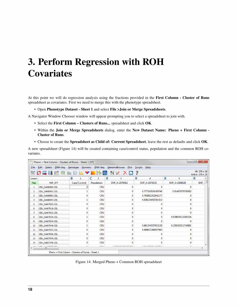
At this point we will do regression analysis using the fractions provided in the First Column - Cluster of Runsspreadsheet as covariates. First we need to merge this with the phenotype spreadsheet.
• Open Phenotype Dataset - Sheet 1 and select File >Join or Merge Spreadsheets.
A Navigator Window Chooser window will appear prompting you to select a spreadsheet to join with.
• Select the First Column – Clusters of Runs... spreadsheet and click OK.
• Within the Join or Merge Spreadsheets dialog, enter the New Dataset Name: Pheno + First Column -Cluster of Runs.
• Choose to create the Spreadsheet as Child of: Current Spreadsheet, leave the rest as defaults and click OK.
A new spreadsheet (Figure 14) will be created containing case/control status, population and the common ROH co-variates.
Figure 14. Merged Pheno + Common ROH spreadsheet
18

Runs of Homozygosity Analysis Tutorial, Release 8.7.0
You can now perform association using Numeric Association Analysis or Regression Analysis. We will choose theRegression Analysis in order to control for population stratification in the second step.
• Left-click the Case/Control column header to set the column as the dependent variable (magenta).
• Select Numeric >Numeric Regression Analysis and choose the radio button Regress on each of the 24 nu-meric columns under Selection Parameters.
• Next select the Output Parameters tab and check Output data for P-P/Q-Q plots (Output –log10(P) will bechecked automatically). Your window should match Figure 15. Click Run.
Figure 15. Regression Parameters
A Regression Results spreadsheet will appear.
• Right-click on the –log10 Full-Model P column header (2) and select Plot Variable in GenomeBrowse. Theresulting plot (Figure 16) will show association on chromosome one. As mentioned earlier, population is apossible confounding factor so we should control for it in our analysis.
• Close the plot and the regression results spreadsheet.
• Open the Pheno + First Column - Cluster of Runs - Sheet 1 spreadsheet and select Numeric >NumericRegression Analysis.
• Under Regress on each of the 24 numeric columns check Correct for covariate(s). The Reduced ModelCovariates section becomes active.
• Click on Add Covariate and select Population from the list. Click Add and then Close. Verify that yourwindow matches Figure 17 and click Run.
• Now to compare the two sets of regression results, open the previously created plot Plot of Column -log10Full-Model P from Regression Results
19

Runs of Homozygosity Analysis Tutorial, Release 8.7.0
Figure 16. P-value Plot
Figure 17. Full vs. Reduced Model Parameters
20 3. Perform Regression with ROH Covariates

Runs of Homozygosity Analysis Tutorial, Release 8.7.0
• Select File >Plot then click the Project button. Select the second Regression Results spreadsheet and checkmark the –log10 FvR Model P and click Plot & Close
The plot (Figure 18) shows that population stratification explains some of the variation in our data, however even aftercontrolling for the confounding variable, we still see significant association.
Figure 18. P-value Plots with and without Covariates
21

4. Examine Loss of Heterozygosity
We can confirm the validity of the run detection algorithm by examining loss of heterozygosity. In fact, runs ofhomozygosity (calculated on genotypes) can serve as a proxy for loss of heterozygosity (calculated on B allele fre-quencies).
The B Allele Frequency spreadsheet in the project represents the B allele frequencies calculated for each marker bythe Affymetrix B Allele Frequency Calculation script. This script first combines quantile normalized SNP A and Bprobe intensities for each marker into a theta value. It then calculates B allele frequencies for each marker. If we locatea run of homozygosity in the heat map containing all ROHs, we can confirm that the algorithm worked correctly byplotting the B allele frequency for the same sample that contained the run.
• Open the Heat Map of Binary ROH Status. . . and notice the long run on Chromosome 1. For a better view,double click on Chromosome 1 in the Full Domain View to zoom into chromosome 1.
• Click on the long green run to find out which sample it belongs to (it may be easier to zoom into the run to ensureyou click on the correct sample). The sample information will appear in the Console window in the bottom leftcorner. The the data console will contain some information about the sample. Make sure you’ve selected sampleNA12874.
Now we can add a plot of the B allele frequencies for this sample.
• Go to File >Plot then click the Project button and select the B Allele Frequencies – Transposed – Sheet 1.
• In the Search: box, enter the sample number you identified earlier (NA12874). Check the appropriate sampleand click Plot & Close.
If you zoomed in to select the sample, zoom back out to chromosome one by double clicking on it in the Full DomainView. Your plot should look like Figure 19.
B Allele frequencies (y-axis) close to 1 or 0 correspond to homozygous SNPs whereas a frequency closer to .5 suggestsheterozygous SNPs. Notice over the same section as the long run from the heat map (essentially the whole q arm ofChromosome 1), the B allele frequency plot contains relatively few markers in the middle. Alternatively, where thereare no runs of homozygosity for this given sample (p arm of Chromosome 1), the data are reasonably distributedbetween 0, .5 and 1.
22

Runs of Homozygosity Analysis Tutorial, Release 8.7.0
Figure 19. Heat Map with added B Allele Frequencies
23