sceyelines magazine #2 (2003)
DESCRIPTION
Interviews + Features: Pictoplasma, Marc Newson, Spotleid, Erotic Dragon, Jan Meininghaus, Ivy´s Bar Comics, Flash Konferenz 2003, Scene 360, GameOn Videogame Exhibition, Büro Discount, Blue Man Group, Klee, Gottfried Helnwein, Philippe Starck, Satoshi Matsuzawa + many more...TRANSCRIPT

sceyelinesdesign & lifestyle magazine
Product of Dirk Behlau : Pixeleye InteractiveDigital. Free. Made in Germany
Issue 2 : September 2003
Includes Features & Interviews with:
Blue Man Group // Rian HughesGottfried Helnwein// Philippe StarckGreat Escapes Africa // Laurent FetisGameOn Videogame ExhibitionErotic Dragon // Ivy´s Bar ComicsPictoplasma // Scene 360 // KleeSoul Calibur 2 // Büro Discount Satoshi Matsuzawa // Marc Newson Flashforum Konferenz // Verner Panton Exhibition // Jan Meininghaus // SpotleidBrazil Inspired // Concept Car CS&S
セイエラインズ マガジン, イシュー2プロダクト オブ ダーク べーロゥ:ピクセルアイ インタラクティブ

Ballchair designed by Eero AarnioPhotographs by Yavuz Aslan
Available at: www.sevenzero.de
Sceyelines is a product of Dirk BehlauPortfolio Website: www.pixeleye.netE-Mail: [email protected]
Published in September 2003. All rights reserved. All layouts & interviews by Dirk Behlauexcept page 36-39 text & layout by Jens Franke
Magazine Website: www.sceyelines.deE-Mail: [email protected]
This is Sceyelines Issue 2Erotic Dragon page 3-5Blue Man Group page 6Rian Hughes page 7-11Great Escapes Africa page 12-14Soul Calibur 2 page 15Jan Meininghaus page 16-19Philippe Starck page 20-22GameOn Videogame Exhibition page 23-25Klee page 26Satoshi Matsuzawa page 27-28Spotleid page 29-30Concept Car CS&S page 31-32Scene 360 page 33-34Marc Newson page 35-38Flashforum Konferenz page 39-42Verner Panton Exhibition page 43-46Büro Discount page 47Pictoplasma page 48-50Ivy´s Bar page 51-54Brazil Inspired page 55Gottfried Helnwein page 56-59Laurent Fetis page 60


Tite
l: M
erm
aid
(exc
lusi
ve d
raw
n fo
r Sce
yelin
es)
After graduating from Tama Art University, she had some jobs in the advertisement industry and finally founded Furi Furi Company with Ryosuke Tei in 1998.
In 2001 she started working as Erotic Dragon which is her solo project as well as being a member of Furi Furi Company.
Erotic Dragon does unique illustration and graphic design with a fusion of inspirations from art and culture mostly of Asian countries and a sensitivity grown up by Japanese pop culture.
The creations of Erotic Dragon keep growing up and flying high like a dragon by absorbing the essence of music, fashion, fine art, manga and animation.
www.eroticdragon.com
MIHO TEI

Titel: Lotus (2002)
Titel: In bloom (2003)
Selected Artwork from Miho TeiFavourite Artists:
I don’t write the artists’ name here, because I have so many favourites that I cannot mention them all. I like expression which are powerful, solid and decorative. Furthermore i am fascinated by pictures like traditional religious art which in stable composition with many splendid decorations.
I also like illustrations in Japanese Manga-Style for young girls which were drawn in the 1960~70s. These kinds of illustrations look ultra-decorative, kitschy and little bit freaky. Favourite Movies:
„Ghost in the shell“, „Patlabor - The movie 2“ by MamoruOshii, „L’ annèe derrière Marienbad“ by Alain Resnais, „Offret sacrificatio“ and „Solaris“ by Andrei Tarkovsky, „Se-ven Samurai“, „Sanjuro“ and „Ran“ by Akira Kurosawa
Favourite Music/Group:
I also cannot mention them all... i like to hear rock music, techno, ambient... especially I like techno music, electroni-ca, and industrial sounds.
I consider myself as an enthusiast of these genres!
Favourite Videogames:
„Giftpia“ of the Nintendo Gamecube that I played recently. And I like „Pokèmon“, too. I played many video gamesin the past, but these days, I have not enough time to play...
Favourite Links:
I saw a lot of websites related to graphic design, fashion and so on. But I use www.amazon.co.jp mostly.
Tite
l: G
odde
ss o
f mon
ey (2
001)

Blue Man Group is a creative organization dedicated to creating exciting and innovative work in a wide variety of media.
Blue Man Group is best known for its award-winning theatrical productions which critics have described as „ground-breaking“, „hi-larious“, „visually stunning“ and „musically powerful.“ These perfor-mances feature three enigmatic bald and blue characters who take the audience through a multi-sensory experience that combines theatre, percussive music, art, science and vaudeville into a form of entertainment that is like nothing else.
People from all over the world, from all walks of life and from all age groups have become fans of Blue Man Group‘s show in New York, Boston, Chicago and most recently Las Vegas.
Blue Man Group is also known for its unique style of music which is played on a variety of invented instruments. Blue Man Group‘s debut album, AUDIO was nominated for a Grammy in the category „Best Pop Instrumental Album.“ In addition to live shows and music, Blue Man Group has created installations, „happenings“, „unusual ads“, and a number of television-specific performances for „The Tonight Show“, several of which were nominated for Emmy awards.
Blue Man Group is currently working on a show that is set to pre-miere at Musical Theater Potsdamer Platz (www.stageholding.de), Berlin in May 2004. This show in Berlin is the first European produc-tion for Blue Man Group.
Don´t miss them! You have never seen anything like this before.
www.blueman.com

RIAN HUGHESWho are you? Please describe yourself...
I am an artificially bred symbiont amalgam of ascended Yogic master and DNA from a 1960‘s Soho commercial printer retrieved from a jun-ked Heidelberg.
I have four-colour blood and IntraJack (TM) cortical hard/wetware interface implants for straight - to - physical real-world concept exter-nalisation.
Where are you located?
Twelve levels above Astral and left of Kew Gardens.
What are you currently working on?
A series of covers for a Japanese interiors ma-gazine and an animation series.
Who are your customers?
People who phone me and propose interesting collaborations.
How do your characters come to life?
Brain > Sketch > Illustrator.
Please explain your design style. How was it developed? Are you a fan of the 60s and 70s Space Age Period?Do you collect stuff from that era?
I collect toys and comics, science fiction image-ry and gangster pulps
Do you plan to release your Animations and Films on a DVD?
Possibly in the future.
All images © Rian H
ughes 2003 : All rights reserved
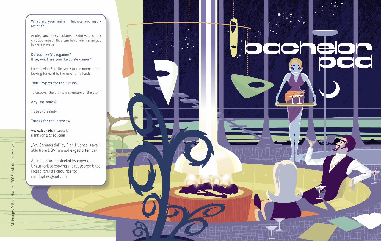
What are your main influences and inspi-rations?
Angles and lines, colours, textures and the emotive impact they can have when arranged in certain ways.
Do you like Videogames?If so, what are your favourite games?
I am playing Soul Reaver 2 at the moment and looking forward to the new Tomb Raider
Your Projects for the Future?
To discover the ultimate structure of the atom.
Any last words?
Truth and Beauty.
Thanks for the interview!
„Art, Commercial“ by Rian Hughes is avail-able from DGV (www.die-gestalten.de)
All images are protected by copyright.Unauthorised copying and reuse prohibited.Please refer all enquiries to:[email protected]
All i
mag
es ©
Ria
n H
ughe
s 20
03 :
All r
ight
s re
serv
ed

������������ ����������������������������������������������� ������������ ���������������� ������������������������������������������������ ����� ������������������������ ����������������������������������� ��������
��������� ������������������������������� ������������ ��������
��
RIAN HUGHESAll im
ages © Rian Hughes 2003 : All rights reserved
THE CO
NIN
GSBY GALLERY - 30 TOTTEN
HAM
STREET, LON
DON
W1 9PN
Mon - Sat 10.00am
- 5.30 pmCO
NTACT AN
DREW CO
NIN
GSBY TEL:0207 636 7478. FAX:0207 580 7017W
EB: ww
w.coningsbygallery.com
/rianh.html
EMAIL: debutart@
coningsbygallery.demon.co.uk

All images © Rian H
ughes 2003 : All rights reserved
Rian Hughes is one of the most copied and influential illustrator/designers of recent years.Internationally known for his colourful stylised vector sans ligne work, he routinely ignoresthe boundaries between illustration, design and typography.
On leaving London‘s LCP, Rian Hughes worked for Smash Hits, i-D magazine, an advertising agency, and a series of record sleeve design companies. Under the name Device he is now involved in the design and illustration of advertising campaigns, record sleeves, book jackets, games, graphic novels and television idents. For Belgium´s Magic Strip he co-wrote and drew a graphic novel titled “The Science Service”, published in five languages. Since setting up Device he has worked extensively for the British and American comic, advertising and music industries as both designer, typographer and illustrator.
His advertising typography earned a Campaign Press Awards Silver in 1996 and a Merit Award from the New York Art Director’s Club in 2000. He has contributed to numerous international exhibitions, lectured widely both in the UK and internationally, and a one-man show of his work was held at Londons Smiths Gallery.
He has an extensive collection of Thunderbirds memorabilia, a fridge full of vodka, and a stack of easy listening albums which he plays very quietly.
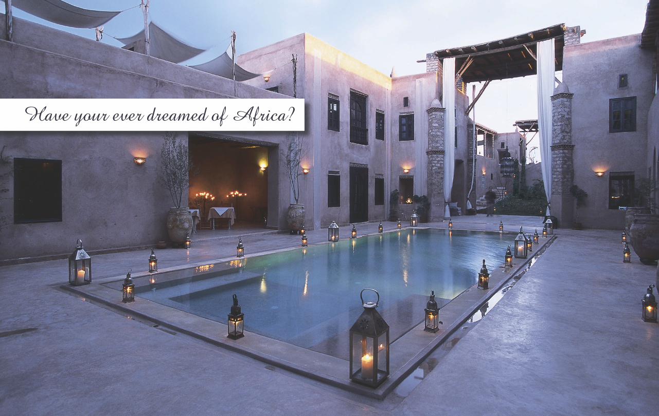
Have your ever dreamed of Africa?

Have your ever dreamed of Africa?

Organic luxuryWhether you’ve always dreamed of a vacation in Africa or never even considered it, take one look through this book and you’ll be planning your next five holidays before you know it. Our selection of the most splendid getaway havens nestled throughout the con-tinent is sure to please even the most finicky would-be voyagers.
Everything you need to know about each hotel, including pricing, services, contact information, and reading recommendations, is provided alongside opulent interior and exterior photographs.
Who minds sleeping under a mosquito net when it’s royally draped over your bed in a lush Kenyan open-walled hut fashioned from tree trunks and shielded from the sun by a sumptuous that-ched roof? Or how about your very own South African A-frame beachside bungalow made of bamboo stalks? Seeing is believing, for sure, but even with the photos as evidence these places are not to be believed….
The Hotel Book. Great Escapes AfricaEdited by: Taschen, AngelikaAuthor: Cassidy, Shelley-MareeHardcover, 238 x 302 mm, Pages: 400www.taschen.com

Soul Calibur II is the ultimate sequel to one of the most revered weapons-based fighters of all time. Improved game play, state-of-the art graphics, and exclusive console game features make it the must-have fighting game for 2003.
The greatest 3-D weapons-based fighter provide non-stop action, excitement and surprises as you go one-on-one against your favorite challengers.
13 historic fighters plus all new combatants including Necrid, specially designed by Todd McFarlane Pro-ductions, Inc. Unique special guest fighters for each platform include Link, Heihachi, and Todd McFarlane‘s Spawn
7 modes of play including Arcade, Vs, Time Attack, Sur-vival, Team Battle, Practice and Weapon Master
Collect 200 different weapons in the all-new mission-complete Weapon Master mode
Publisher:Namco Hometek Inc.
Developer:Namco Ltd.
Plattforms:PS2, Xbox, GameCube
www.soulcalibur2.comwww.namco.com
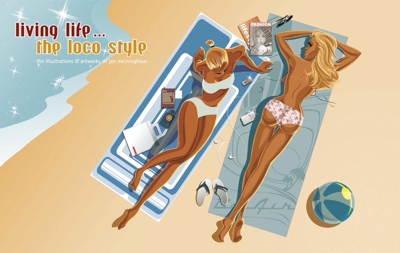
living life the loco Style
the illustrations & artworks of jan meininghaus
...

Some clients of Jan Meininghaus:SONY walkman, EMI, BMG / G.U.N.-Records, Virgin rec., Edel rec., RTL-online, Metal Blade Records, Springer & Jacobi, Zum goldenen Hirschen, Projekt Kochstrasse, 20th Century Fox Germany, Blue Byte Software, Bahlsen, Opel DTM, Wirtschaftswoche, „blond“ mag,“GQ“ mag, „Mädchen“ mag, „Rock Hard“ mag, „Sonic Seducer“ mag, Nastro-vje Potsdam, Homeboy clothing... hot babes & gasoline

Jan Meininghaus - Biography:
1973 born in Tarbela/Pakistan1988 / ´89 first commercial artwork for german metalbands1990 -´93 Coverartworks for underground metallabels1994 production-design and motion-ctrl.-photgraphy Panasensor in Frankfurt1995 atttending the university for visual communication1996 illustrations for sports- & streetwear-clothing, HipHop & Hardcore-recordlabels 1997 more CD-Covers, booklets, Shirts, Coverartworks for PC-Games & Books1998 inking & layout for the comic-project ‚Die Vergessenen‘1999 design & layout for mag ‚Splash!‘, „Underdogz“-comic for metal mag „Rockhard“2000 interview & step by step for „Airbrush Art & Action“, Coloring for “Helden“, Inks for “Die Siedler“, ,Inks for “Demonworld“, cover,-booklet-Illustration2001 Web-Design, Titus-Skateboard-Visuals, Titus-Magalog Comics Issue & 5pg Inter view, Production Design 2002 Various cover-artworks, Sony/run for fame, webdesign under the flag of screenstylers 2003 bi-weekly comicpage in „Sonic Seducer“ musicmag, bi-weekly illustrations in „Mädchen“ youthmag, feature in „Freistil - best of german commercial illustration“, autograph series“-CD for „digital vision“
www.loco-style.com [email protected]
pure eye candy

Question & Answers
Who are you? A short description of yourself
Jan Meininghaus, 29 years old, Freelance-Illustrator
Where are you located?
Essen, Germany
What are you currently working on?
Production designs for a SciFi-Computer game, several CD-covers,HotRod-babe calender for 2004
Which type of music do you listen to?
Nearly everthing besides techno and bubblegum-pop (The latest CDs I bought were „The Donnas“, „Elvis No.1 Collection“, „Metallica“, „The White Stripes“, „The Detroit Cobras“)
Any favourite movies?
Classic STAR WARS on top of the list! Aliens, Taxi Driver, American Graffiti, All of David Fincher, Back to the future, True Romance, Carlito‘s Way, Blade Runner, Matrix, Blues Brothers,...
What are your main influences? Do you have any idols? Which other Illustrator do you like?
Music and movies always gave me a lot of motivation and inspira-tion for my work as an illustrator. Also the real life of course. I like the work of some other illustrators like Jason Brooks, Rian Hughes and a lot of the WestCoast LoBro-artists like Derek Hess, Von Dutch, Marco Almera, the Pizz. And I admire all the artists involved in creating the StarWars-universe- especially George Lucas of course (though he‘s a bad director...)
Do you play videogames? If so, which are your favourite ones?
No, the last VideoGames I played were 1984 on my C-64...

From plastic fantastic to Mitterrand‘s palace and from kettle to metal.
There is no one way to describe Philippe Starck - architect, inventor, „popstar“, philosopher, celebrity, and all of these par excellence. But it is as a designer that he has made such a huge impact on contemporary culture.
Without doubt the pre-eminent maker and shaper of our times, Starck has turned his hand to reinventing almost everything we encounter in our public and private lives. From toothbrush to desk lamp, water bottle to chairs, he accepts nothing and succeeds, it seems, at everything.
In 1980, after working for Pierre Cardin, he set up his own company to make and distribute his creations. This meant that he never had to compromise, and his unique eye for the inherent aesthetic potential in the most mundane items has seen his name become a byword for a chic that works.
Combining brilliant form with effective function, he sees his mission as nothing less than the re-imagining of our relationship to objects. From plastic fantastic to Mitterrand‘s palace and from kettle to metal, Starck‘s energy is a force of nature.
With no sign of Philippe Starck slowing down, the future‘s so bright it‘s time to wear shades!
Quickbio:Born on January 18th 1949 in Parisfather André Starck (airplane conceptor)mother Jacqueline Lanourissefather of Ara, Oa and K.Studied in Ecole Nissim de Camondo in Paris (France)Creation of Starck Products in 1979 Creation of UBIK in 1983www.philippe-starck.com
The book:Starck by StarckAuthor: Doze, PierreFlexi-cover, 196 x 258 mmPages: 576www.taschen.com
PHILIPPE STARCKIm
age
take
n fr
om th
e TA
SCH
EN b
ook
„Sta
rck
by S
tarc
k“

M.I.S.SCassina & Sonyby Starck
© Ph
ilipp
e St
arck
200
3 : A
ll rig
hts
rese
rved

STARCK BY STARCKImages taken from the TASCHEN book „Starck by Starck“

GAME ON: VIDEOGAME EXHIBITIONAll photos taken by Dirk Behlau at the Faxx, Tilburg, Holland
The show presents a definitive overview of the past, present and future of games, from the earliest ancient board games through to the latest advances of blue-sky technologies and thought controlled interaction. The exhibition features the earliest games computer, vintage arcade games and consoles, original games artworks, networked multi-player areas, profiles of key creatives from the UK, USA and Japan and a range of contemporary newly commissioned artworks from leading artists and designers. Mostly all games are fully playable.
Following the Barbican, Game On went to the National Museum of Scotland, Edinburgh, then to Faxx, Tilburg and will then go to venues internationally.
www.gameonweb.co.uk

HAVE YOU PLAYED ATARI TODAY?

shoot em up !

KLEEIn his abstract and colourful paintings, Paul Klee (1879-1940), one of the most famous German painters, has managed to maintain a childlike inno-cence. The same characteristic feature is true for German pop band Klee and the magic of their songs. On the other hand, the band’s name (it translates into ‚clover’) calls forth associations with lush summer meadows and happi-ness, two notions which are equally true. The songs of Klee evoke the feeling of a unique but never-ending summer.
But the three band members of Klee are by no means an unknown quantity within the German music scene... After the first promising band experiences of Sten Servaes and Tom Deininger hopes were rising for a glamorous music career in an anglophile context. But then fate intervened. When they happe-ned to meet Suzie Kerstgens at a party, the cards were shuffled anew. Suzie, with her cool clothes, sweetheart appearance, big heart and fairy tale voice fascinated the boys and soon after they started the band Ralley with Suzie as their perfect lead singer.
From the very beginning, Ralley explored the fields of what they dared dreaming of: flowery guitar pop with German lyrics. Their songs were beau-tifully dream-like, intoxicatingly happy and marvellously romantic. Carried by the luscious and feminine voice of Suzie, they developed their distinctive innocent but coquettish sound, a new Lolita charm for the end of the 20th century.
After a severe car accident (the three of them on the way to a video shoo-ting) and an intermittent compulsory break, they started from scratch again in summer 2001, with a radical new approach based on a much stronger electronic influence to their music. To mark this new chapter in their career, they renamed the band into Klee. While painstakingly refining their music to perfection in the studio, the band explores another dimension live.
Klee in their idealistic, romantic approach are full of hope. Whoever has such a playful way with the forms, facets and colours of shining pop music, such as Klee prove with every single heart-felt beat of their songs, must be convinced that the world can be good and true and invulnerably beautiful.
www.kleemusik.de

Artwork by Satoshi M
atsuzawa
Satoshi Matsuzawa (born 1967 in Japan) mainly works on illustrations for CD covers, magazines and posters as well as designing websites.
His inspiration comes from 60‘s and 70‘s movies, especially the 007 series and a variety of 70‘s blacksploitation movies. He is also inspired by soul, jazz and lounge music. In other words, his fingers draw musics.
www.salboma.com
Satoshi Matsuzawa
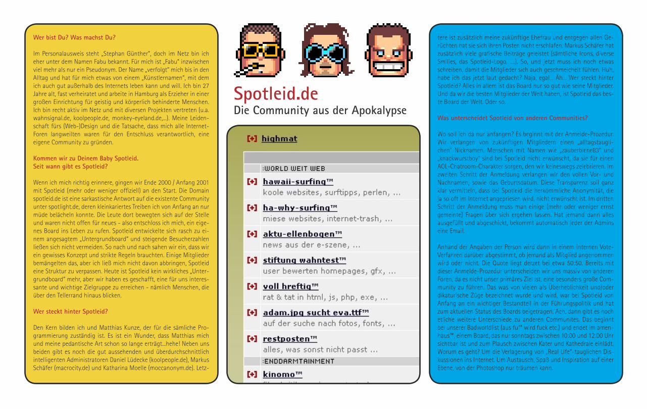
Spotleid.deDie Community aus der Apokalypse
Wer bist Du? Was machst Du?
Im Personalausweis steht „Stephan Günther“, doch im Netz bin ich eher unter dem Namen Fabu bekannt. Für mich ist „Fabu“ inzwischen viel mehr als nur ein Pseudonym. Der Name „verfolgt“ mich bis in den Alltag und hat für mich etwas von einem „Künstlernamen“, mit dem ich auch gut außerhalb des Internets leben kann und will. Ich bin 27 Jahre alt, fast verheiratet und arbeite in Hamburg als Erzieher in einer großen Einrichtung für geistig und körperlich behinderte Menschen. Ich bin recht aktiv im Netz und mit diversen Projekten vertreten (u.a. wahnsignal.de, koolpeople.de, monkey-eyeland.de,...). Meine Leiden-schaft fürs (Web-)Design und die Tatsache, dass mich alle Internet-Foren langweilten waren für den Entschluss verantwortlich, eine eigene Community zu gründen.
Kommen wir zu Deinem Baby Spotleid. Seit wann gibt es Spotleid? Wenn ich mich richtig erinnere, gingen wir Ende 2000 / Anfang 2001 mit Spotleid (mehr oder weniger offiziell) an den Start. Die Domain spotleid.de ist eine sarkastische Antwort auf die existente Community unter spotlight.de, deren kleinkariertes Treiben ich von Anfang an nur müde belächeln konnte. Die Leute dort bewegten sich auf der Stelle und waren nicht offen für neues - also entschloss ich mich, ein eige-nes Board ins Leben zu rufen. Spotleid entwickelte sich rasch zu ei-nem angesagtem „Untergrundboard“ und steigende Besucherzahlen ließen sich nicht vermeiden. So nach und nach sahen wir ein, dass wir ein gewisses Konzept und strikte Regeln brauchten. Einige Mitglieder bemängelten das, aber ich ließ mich nicht davon abbringen, Spotleid eine Struktur zu verpassen. Heute ist Spotleid kein wirkliches „Unter-grundboard“ mehr, aber wir haben es geschafft, eine für uns interes-sante und wichtige Zielgruppe zu erreichen - nämlich Menschen, die über den Tellerrand hinaus blicken.
Wer steckt hinter Spotleid?
Den Kern bilden ich und Matthias Kunze, der für die sämliche Pro-grammierung zuständig ist. Es ist ein Wunder, dass Matthias mich und meine pedantische Art schon so lange erträgt...hehe! Neben uns beiden gibt es noch die gut aussehenden und überdurchschnittlich intelligenten Administratoren Daniel Lüdecke (koolpeople.de), Markus Schäfer (macrocity.de) und Katharina Moelle (moccanonym.de). Letz-
tere ist zusätzlich meine zukünftige Ehefrau und entgegen allen Ge-rüchten hat sie sich ihren Posten nicht erschlafen. Markus Schäfer hat zusätzlich viele grafische Beiträge geleistet (sämtliche Icons, diverse Smilies, das Spotleid-Logo, ....). So, und jetzt muss ich noch etwas schreiben, damit die Mitglieder sich auch geschmeichelt fühlen. Huh, habe ich das jetzt laut gedacht? Naja, egal... Äh... Wer steckt hinter Spotleid? Alles in allem ist das Board nur so gut wie seine Mitglieder. Und da wir die besten Mitglieder der Welt haben, ist Spotleid das bes-te Board der Welt. Oder so.
Was unterscheidet Spotleid von anderen Communities?
Wo soll ich da nur anfangen? Es beginnt mit der Anmelde-Prozedur. Wir verlangen von zukünftigen Mitgliedern einen „alltagstaugli-chen“ Nicknamen. Menschen mit Namen wie „zauberbiene83“ und „knackwurstboy“ sind bei Spotleid nicht erwünscht, da sie für einen AOL-Chatroom-Charakter sorgen, den wir keineswegs zelebrieren. Im zweiten Schritt der Anmeldung verlangen wir den vollen Vor- und Nachnamen, sowie das Geburtsdatum. Diese Transparenz soll ganz klar vermitteln, dass bei Spotleid die herkömmliche Anonymität, die ja so oft im Internet angepriesen wird, nicht erwünscht ist. Im dritten Schritt der Anmeldung muss man einige (mehr oder weniger ernst gemeinte) Fragen über sich ergehen lassen. Hat jemand dann alles ausgefüllt und abgeschickt, bekommt automatisch jeder der Admins eine Email.
Anhand der Angaben der Person wird dann in einem internen Vote-Verfahren darüber abgestimmt, ob jemand als Mitglied angenommen wird oder nicht. Die Quote liegt derzet bei etwa 50:50. Bereits mit dieser Anmelde-Prozedur unterscheiden wir uns massiv von anderen Foren, da es nicht unser primäres Ziel ist, eine besonders große Com-munity zu führen. Das was von vielen als Überheblichkeit und/oder dikaturische Züge bezeichnet wurde und wird, war bei Spotleid von Anfang an ein wichtiger Bestandteil in der Führungspolitik und hat zum aktuellen Status des Boards beigetragen. Ach, dann gibt es noch etliche weitere Unterschiede zu anderen Communites. Das beginnt bei unserer Badworldlist (aus fu** wird fuck etc.) und endet im amen-haus™, einem Board, das nur sonntags zwischen 10:00 und 12:00 Uhr sichtbar ist und zum Plausch zwischen Kater und Kathedrale einlädt. Worum es geht? Um die Verlagerung von „Real Life“-tauglichen Dis-kussionen ins Internet. Um Austausch, Spaß und Inspiration auf einer Ebene, von der Photoshop nur träumen kann.

Gibt es so etwas wie Konkurrenz für Spotleid?
Konkurrenz im eigentlichen Sinne gibt es nicht, da Spotleid in seiner Art (Humor, Führungspolitik, ...) einzigartig ist und es wohl auch blei-ben wird. Diese ausgeprägte Art fungiert zweifellos als Filter und sorgt dafür, dass sich primär Menschen registrieren, die einen ähnlichen Humor haben und sowohl austeilen als auch einstecken können. Wir haben bei Spotleid auch kein Problem mit Umgangssprache, Off-Topic und Meiningsverschiedenheiten, solange sich alles in einem gewissen Rahmen bewegt. Andere Communities leiden oftmals unter eben ge-nannten Faktoren - bei Spotleid sind die das Salz in der Suppe.
Was hälst Du von anderen Communities wie DMIG? Außer DMIG (designmadeingermany.de) besuche ich keine weiteren Communities. Dort allerdings bin ich beinahe täglich und erlabe mich am Leid der anderen...hehe! Ne, ich stehe eigentlich ganz gut zu DMIG und der dortigen Chefetage. Wir respektieren, tolerieren und unter-stützen uns gegenseitig auf einer ziemlich entspannten Ebene. Meiner Meinung nach geht‘s dort oftmals etwas trocken und schwul („Ich trage Sandalen von Gucci.“) zu, aber das ist schon okay - schließlich lebt ein Großteil der Zielgruppe vom Pixelschubsen... und da kann man schon mal den Bezug zur Realtität verlieren! ;-)
Was sind das für Leute, die bei Spotleid posten?Wie viele Mitglieder gibt es? Bei uns posten Grafikdesigner, Programmierer, Mediengestalter, Schüler, Jura-Studenten, Zivis, Schwerverbrecher, Schwerenöter, Ar-beitlose und Außerirdische. Das durchschnittliche Spotleid-Mitglied ist 24 Jahre alt, überdurchschnittlich intelligent, wohnt in der Mitte Deutschlands, fährt einen Ford Taunus (aus Leidenschaft), hört Musik fernab der Bravo-Charts, liest Bücher (ohne Bilder!), hat ein Auge für Farben und Formen, einen ausgewogenen Humor, leichtes Überge-
wicht und ein selbstbewusstes Auftreten. Theoretisch hat Spotleid über 1000 Mitglieder - praktisch jedoch nur um die 250, da wir vor kurzem 750 Profile gelöscht haben (Mitglieder mit 0 Postings, unzu-mutbaren Nicknames, ...).
Es gibt bei Spotleid diese speziellen Ausdrücke wie „free-sör™“ oder „voll hreftig™“ Wer hat sich das warum wofür ausgedacht?
Diese Boardnamen sollen verdeutlichen, dass Wortwitz innerhalb der Community eine große und wichtige Rolle spielt. Ich fand‘s halt ein-fach stumpf, ein Board „HTML-Tipps“ oder „Stammtisch“ zu nennen. Spotleid war von Anfang an etwas besonderes und davor machen auch die Bezeichungen der jeweiligen Foren nicht halt. Das exzessive Nutzen vom ™ ist meine Art - bewusst überzogen - auf die Exklusivi-tät der Community aufmerksam zu machen. Äh... kann ich dir einen T™ anbieten?
Was sind gumbo$?
Für jedes Posting wird dem jeweiligem Schreiber 1 Gumbo$ gut-geschrieben. Postings in den Boards Free-sör™ und Test-ament™ werden nicht ‚vergütet‘, da sich über den intellektuellen Wert der dort eröffneten Themen hin und wieder streiten lässt...hehe! Es ist geplant, Gumbo$ (sprich: Gumbodollar oder auch Gumbos) als eine Art Zah-lungsmittel ins Forum zu integrieren (z.b. für virtuelle Einkäufe). Wann und wie das geschehen wird, steht noch in den Sternen.
Worüber wird denn so gequatscht? Über alles zwischen Typographie, Photoshop, Surftipps, aktuellen Kinofilmen, Politik, der Lindenstraße und einem in der Autotür einge-klemmten Hodensack (schlimme Geschichte, aber der Geschädigte ist heute Vater von 500 gesunden Postings!)...
Schreitet der Rektor ein, wenn es zu wild wird?
Wir haben uns überlegt, wie wir Störenfriede relativ stilvoll und mit Humor ausbremsen können. Unsere Lösung: das Rektorzimmer. Dabei handelt es sich um ein für alle Mitglieder sichtbares Unterboard, in das wir Störenfriede sozusagen verbannen. Die Verbannten dürfen dann eine vom Admin festgelegte Zeit ausschließlich im Rektorzim-mer posten. Somit verlagern wir aufkommende Stress an den „Spiel-
feldrand“ und können nebenbei die eine oder andere Gehirnwäsche austeilen...hehe! Hin und wieder sind die Mitglieder auch unserer Will-kür ausgeliefert und werden für Lapalien ins Rektorzimmer geschickt.
Aber das gehört dazu, denn schließlich hat das Rektorzimmer auch einen gewissen Unterhaltungswert für die Zuschauer (in dem Board dürfen nur Admins und aktuell Verbannte posten). Mit dieser Art des Maßregelns vermitteln wir deutlich und spielerisch zugleich, wer im Forum die Hosen an hat. ;-)
Spotleid hatte vor kurzem ein Usertreffen? Ist es nicht komisch, die Leute dann auch noch in natura zu ertragen?
Keine Ahnung - aus Angst vor Anschlägen habe ich ein Double von mir hingeschickt. Fiel gar nicht auf, da er sich eh ständig gemeinsam mit meiner Freundin auf dem Hotelzimmer befand. Warte mal... da stimmt doch was nicht...?!
Was bringt die Spotleid Zukunft?
Viele kleine Fabus. Und weitere faszinierende Features, über die ich an dieser Stelle natürlich nicht spreche darf und will. Die To-Do-Liste ist jedenfalls prall gefüllt.
Ein letztes Wörtchen...
Vielen Dank für die Aufmerksamkeit.
Gern geschehen :) Vielen Dank für das Interview
www.spotleid.dewww.fabuland.de

CS&S - Into the futureThe CS&S represents a next generation vehicle concept for Toyota’s Hybrid Synergy Drive technology. Positioned between the Celica and MR2, it’s a mid-engined 2+2 open sports car. Toyota’s Hybrid Synergy Drive techno-logy combines intelligently a 1.5-litre petrol engine that drives the rear wheels, with an electric motor that drives the front wheels.
The CS&S was designed at the Toyota ED2 studio near Nice, France, and is reminiscent of some of the old Porsche Speedster language with lines from Ghia’s open Focus (Turin 1992) and combines it with unexpected straight lines for a unique design language. The designers also want to demonst-rate their latest interior tricks. A system called Space Touch uses hologram projections which the driver is to ”touch” to activate certain sub-systems like air condition or infotainment. And in case you wondered: CS&S means Compact Sports and Speciality.
www.toyota.com
All i
mag
es ©
Toy
ota
: All
right
s re
serv
ed

Brave New World

Who are you? Please describe yourself...
I am Adriana de Barros, a girl from Portugal. In a longer descrip-tion, I am founding editor of Scene360.com, and co-owner of a family business where I work in fashion and advertising design in Caldas da Rainha, Portugal. I enjoy writing - fiction and poetry, web designing, drawing, painting, practicing sports as a hobby; and I’ve been studying drumming at the Conservatory for three years. Basically, I’m very active, and I usually keep entertained with the many things I like.
What are you interested in? What are you favourite artists?
I am interested in film, art, music, literature, and more. I like different art forms and movements, to name just some painters: Salvador Dali, Turner, Edward Hopper, Andy Warhol, Roy Lichten-stein, Michelangelo, Albrecht Dürer, and Caspar David Friedrich. And other artists i like from various fields: Gottfried Helwein, Cindy Sherman, Floria Sigismondi, Sagmeister, David Fincher, and others.
What is the concept behind Scene360? Why did you started the site?
The concept is to combine various art forms into one site. Having an eclectic showcase from around the world. Exhibiting artists from various fields, and cultures, and showcasing their talented artwork online. But importantly keeping the content focused with the individuality of each art form/artist. It was a personal project of mine, mostly subject matters I was fascinated with in film, art, music and literature. It quickly evolved into a team project with the inclusion of important editorial members. Scene 360 is about entertainment, but it is meant to be an art & film resource where visitors can find information about a specific style of art, artist, film, or filmmaker.
Is it about Design, Movies, Art in general or a mixture of all cre-ative sections?
We have defined sections, Art Direction (for art in general), Di-rectors Chair (for films, profiles on directors, screenwriters, etc. We are trying to include all professions from the film industry),
and Editing Rolysis features, which combines/mixes the creative sections. I.e. we analyze a topic, and reveal its influences in li-terature, music, film and/or art). Also, we have column features, and the portion of literature comes into Story Bites (with poetry, fiction, and more).
We have plans to reorganize some of the sections next year, make it even more defined in the four areas (film, art, music, and literature), and attempt to improve by expanding even further into each field. We are doing this right now, every issue is about finding artists we haven’t explored and different art styles, but there may be a slight restructure for organization of content as we have a lot more articles now since our launch.
What are your favourite movies and actors? Why?
I sometimes am quite discreet about who I like in cinema, so I don’t influence contributing writers at Scene 360. I’ve been asked several times from some of them who I like, but I don’t want to base articles on my preferences only of films, actors, and directors; because sometimes there are great directors, actors and films I’m not familiar with, and I try to be open at all costs. I like versatility.
Here are some films that come to mind:
Films: Silence of the Lambs, Pulp Fiction, Se7en, The Shawshank Redemption, As Good as It Gets, Good Will Hunting, Moulin Rouge, The Matrix, Chicago, Billy Elliot, Scent of a Women and Bound.
Actors: Jodie Foster, Robert DeNiro, Edward Norton, Susan Sara-ndon, Samuel Jackson, Al Pacino, Robin Williams, Gary Oldman and Natalie Portman.
Please comment a few movies in short words:
Once upon a time in America It’s been a while since I saw this. I enjoyed it at the time.
Fear and Loathing in Las VegasNot my cup of tea.

why is everyone always talking about news tragedies and negative things, it seemed like a lot was going wrong in the world, and with people around me, that I thought why not take a moment to think about the “good” in our lives. Even I, get caught up with my own life issues. But sometimes the little things in life help us overcome or bear the negative stuff. I sometimes write very dark poems, so I thought maybe I’d do a positive project, and the love book came out from this.
Why not do something positive? I wanted to unite artists and writers in a simple book, it was a small project, but Julia and I worked on it for various months, and with all the fantastic submissions it really made a special publication. It became bigger than what I had planned, and everyone evoked the message very well. And I felt happy to be a part of something positive too. Love is so banal, but we sometimes we are in search of it, need it, and if we care enough about life and others, why not show the things we care about – whatever they are.
I’m happy with the result of it. It was a bit complicated getting fini-shed during its time period, as we had gone to the SXSW in march and we were preparing an issue simultaneously – it was challenging. But, when you love art, a project, sharing and collaborating with others, the final product really makes everything worthwhile, and that’s how I feel. I’m not sure about a sequel yet. We are just finishing up a design competition with nervousroom.com, Everyday Life Competition...so possibly next year we’ll do something more. I’m not sure what yet. But if we did one, we’d choose another theme.
What can we expect from Scene360 in the future?
Updates. We are trying to improve each issue, it’s been our goal from start, and we plan on continuing. We hope to have some exclusi-ve interviews within members in the film industry (e.g. The Art of Screenwriting with independent directors/screenwriters), since it’s something we’ve had less of, in comparison to art interviews.
Any last words...
Thanks for the interview; and to those reading take a look at our site.
www.scene360.comwww.breathewords.com
Tatt
oo D
esig
n by
Adr
ina
de B
arro
s DelicatessenI watched this when I was taking a filmmaker course, and it was part of the study to watch it. I like its surrealist quality, art direction and ci-nematography are great. The story is a bit bizarre, but it’s intriguing. Leon - The ProfessionalI liked the choice of actors in this one, Jean Reno, Gary Oldman, Na-talie Portman (promising child actor). Lots of action and a good plot, much enjoyed.
CasinoAnother mafia film. I remember watching it and not being totally pleased with it. It became a bit dull at one point, and I guess I expec-ted more out of this film. A good point was Sharon Stone’s acting, especially since there was controversy at the time, saying she was only a babe and not an actress (I never believed this was true) – she definitely proved the critics wrong, which was pleasing. A strong cast in this film.
The Good, the bad and the UglyI’ve seen many many Clint Eastwood films, but I sometimes forget film titles, so I’m not sure about this one without seeing a bit of it again. I probably have seen it.
What is the worst film(s) you have ever seen? Do you like Trash/B-Movies?
I try to forget the worst ones. So, I’m having trouble remembering them, but a few are Charlies Angels, Avenging Angelo, and Oscar. The other day I was watching Burton’s “Ed Wood,” I guess if you do really shitty films, you can become popular in some niches. It’s a characte-ristic style in some directors, who knows? Laugh. I‘m not interested in parodies for example, all those American parodies to me are more directed to a target audience in North America. I don’t like them at all. I like comedy, but I don’t like extreme exaggeration, such as a forced punch-line in every frame.
Let´s talk about the „Love within us“ digital book. How did it come to life? What is the ideas behind it and do you have any plans for a sequel?
The love book came from a personal idea of mine. One day, I thought,

marc newsonMarc Newson is one of the most accomplished and influential designers of this generation. Always innovative, he is also prolific and astonishingly versatile: his creations range from household objects, furniture, restau-rants and watches to aviation interiors. His aesthetic vision and uncom-promising originality have won Australian-born Newson international acclaim, as well as a clientele that includes Flos, Cappellini, Magis, Nike, Alessi, Samsonite, Qantas and Ford, for whom he designed the O21C concept car. His works are in the permanent collections of the Museum of Modern Art, Design Museum and the Musée National d‘Art Moderne, Centre Georges Pompidou.
www.marcnewson.com
All i
mag
es ©
Mar
c N
ewso
n 20
03 :
All r
ight
s re
serv
ed

syn recording studio/tokyodesigned by marc newson
All images © M
arc New
son 2003 : All rights reserved
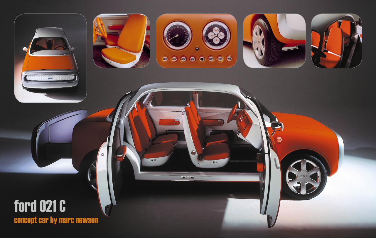
ford O21 Cconcept car by marc newson

pod bar/tokyo
designed by marc newson
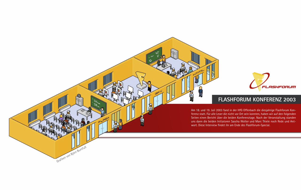
Am 18. und 19. Juli 2003 fand in der HfG Offenbach die diesjahrige Flashforum Kon-ferenz statt. Für alle Leser die nicht vor Ort sein konnten, haben wir auf den folgenden Seiten einen Bericht über die beiden Konferenztage. Nach der Veranstaltung standen uns dann die beiden Initiatoren Sascha Wolter und Marc Thiele noch Rede und Ant-wort. Diese Interview findet ihr am Ende des Flashforum-Special.
FLASHFORUM KONFERENZ 2003
Grafiken von Björn Buntfuß

FLASHFORUM KONFERENZ 2003 - Bericht
Inzwischen ist Flash als Applikation nicht mehr aus dem Arbeitsalltag von Entwicklern und Designern wegzudenken. Somit war es nur logisch, dass auch dieses Jahr wieder eine Konferenz vom Flashforum veranstaltet werden sollte. Organisiert und geleitet wurde die mittlerweile dritte Kon- ferenz von Sascha Wolter, dem Gründer des Flashforums, und MarcThiele. Als Veranstaltungsort konnte man die Hochschule für Gestaltung in Offenbach als Partner gewinnen. Dies ermöglichte es die Eintrittspreise auf ein faires Minimum zu reduzieren. Kommen wir aber nun zu der Ver-anstaltung selbst.
Nach den einleitenden Worten des Dekan der HfG Offenbach in der Aula, gab Sascha Wolter einen groben Einblick in den Ablauf der beiden Konferenztage. In zwei verschiedenen Räumen sollten Vorträge gehalten werden. In einem weiteren Raum gab es im Anschluss an den Vortrag die Möglichkeit einer Question & Answer Session. Nun musste man nur noch die Keynote von Stefan Prestele von Macromedia überstehen und dann konnte es richtig losgehen. Aber es muss gesagt werden, dass es wirklich keine reine Werberede von dem „Werbefutzi von Macromedia“ war, wie er im Vorfeld schon deklariert wurde.
Danach ging es gleich in den kleineren Raum, welcher ungefähr für 150 Leute Platz bot. Als erster Vortrag war „OOP I – Einführung in die Objektorientierung“ von Matthias Kannengieser angekündigt. Mal abgesehen davon, dass schon zu diesem Zeitpunkt in dem Raum absolut keine Luft mehr vorhanden war, musste man der Zuhörerschaft auch noch
mitteilen, dass Matthias bis jetzt noch nicht eingetroffen ist und man keinerlei Informationen von ihm bekommen hatte. Leichte Ernüchterung machte sich im Publikum breit. Man hatte mit Saban Ünlü aber schnell Ersatz gefunden, welcher ohne große Vorbereitung eine sehr feine Einleitung in die Thematik gab.
Gleichzeitig fand im Olymp (Aula) ein Beitrag zum Flash Communication Server von Sascha Wolter statt. Teilweise war es so, dass man sich gar nicht entscheiden konnte welchen Beitrag man sich zu Gemüte führen soll, weil eigentlich alle viel Spannendes versprachen. So hörte man dann in den Pausen von anderen Besuchern wie klasse der Vortrag im anderen Raum war. Um einen Überblick über die Themen des ersten Konferenztages zu bekommen, gibt es hier eine kleine Agenda:
_Obj. Programmierung_Einführung & Profi_Flash Comm. Server _Actiongames Konzepte_Flash Remoting und PHP Remoting_Anwendungsentwicklung mit MVC_Flash & Affereffects_Tilebased-Game-Engines
Zu den reinen flashbezogenen Themen kamen aber auch noch Vorträge die eher für die Designer gedacht waren, so zum Beispiel das Referat „Elf Designer für Deutschland“ von Klaus Hesse und „Was ist eigentlich ein Designer?“ von Ulrich Leschak.
Das Fazit des ersten Veranstaltungstages ist schnell gezogen. Sehr gut vorbereitete Referenten zeigten der Flasher-Community, was alles mit Flash möglich ist, und ebenso Ausblicke über den Tellerrand hinaus. Den ein oder anderen Redner merkte man zwar an, dass sie noch nicht oft vor so großem Publikum referiert haben, aber das trübte die guten Beiträge
nicht. Die Zuhörer wurden von allen sehr schön mit einbezogen und die Referenten waren offen für jede Frage. Als besonders
gelungen ist der „OPP I“ Vortrag von Saban Ünlü zu nennen. Trotz des ein wenig schwierigen Starts
der Vortrag zu „MVC“ von Ralf Bokelberg. merkte man einfach, dass da jemand
referiert, der zur Elite derFlashcoder in Deutschland zähl-en kann. Er berichtet über Ab-straktion und Vorgehensweise im täglichen Programmieralltag, um einen effizienteren Workflow zuerhalten und weniger fehler-
anfällig zu programmieren.
Aber auch der sich selber als „Hobbyflasher“ bezeichnende Thorsten Diessner zeigte Erstaunliches
in seinem Vortrag zu „Tilebased-Game-Engines“.

Der Abend wurde dann, wie bereits schon die Mittagspause, dazu ge-nutzt die Personen hinter den Nicknamen im Forum kennen zu lernen, ein kleines Fachgespräch zu führen oder um sich einfach mal auf einer realen Basis auszutauschen. Natürlich wurde der Abend ein wenig länger und am nächsten Morgen sah der ein oder andere doch noch ein wenig „matschig“ aus, aber man wollte ja nicht die zusätzlichen angesetzten Vorträge für den frühen Morgen verpassen.
Am Samstag gab es dann folgende Vorträge:
_Flash Remoting und PHP Remoting II_Flash Solutions_Mathematische und physikalische Grundlagen für Flash Komponenten_Dramaturgie durch Sounddesign_Codedesign und Testen_Flash auf der Überholspur – Was kommt nach den Rich Internet Applications?
Auch an diesem Konferenztag wurden die eher flashspezifischen Vorträge mit einigen designorientierten Referaten aufgelockert. Die Highlights dieses Tages waren ohne Frage der Beitrag zum Thema „Codedesign und Testen“ von Ralf Bokelberg, der Komponenten-Vortrag von Saban Ünlü und Thorsten Diessners Vortrag zu „Mathematische und (pseudo) physikalische Grundlagen für Flash“, bei dem wieder, wie es bekanntlich für eine Hochschule üblich ist „Thorstens Tafel“ zum Einsatz kam.
Der Abschlussvortrag von Thomas Wagner von Design Assembly sollte sicherlich auch noch genannt werden. Abgesehen davon, dass die Arbeiten seiner Agentur erste Sahne sind, hielt er ein hinreißendes Plädoyer an die Adresse von Macromedia, dass man Flash als Entwicklertool nicht so einschränken und ihn doch bitte ein SDK geben soll. Er würde damit aufzeigen wollen, was man noch alles mit Flash entwicklen könnte. Zum Beispiel bestände die Möglichkeit Aplikationen für die Playstation 2 zu realisieren, was für den 80er Jahre Videospielfan ein lang ersehnter Traum wäre.
Das sich durch den Wegfall der „künstlich“ einge-bauten Bremsen von Macromedia weitere ganz neue Türen für die Entwicklergemeinde öffnen würde, braucht hier wohl nicht mehr genannt zu werden. Am Ende gab es noch eine Verlosung bei der attraktive Preise auf die Gewinner warteten.
FAZIT:
Eine rundum gelungene Veranstaltung. Die HfG gab der Konferenz einen klasse Rahmen. Eine schöne Flashforum-Lounge am ersten Abend, Videoinstallation in der Mittagspause und für Trinken und Essen war seitens der HfG immer gesorgt. Die anfänglichen Klimaprobleme wurden schnell behoben. Sitzplätze waren fast immer ausreichend vorhanden und der Blick auf die Leinwände war von allen Plätzen gegeben. Die Vertonung der Referenten war auch meist ausgezeichnet bis auf kleinere Schwierigkeiten mit Thorsten Diessners Laptops. Im Vorraum der Aula waren von den bekannten Verlagshäusern Bücherstände aufgebaut, bei denen man zu günstigen Konditionen Fachliteratur erwerben konnte. Ebenfalls präsentierte das MX-Magazin seine zweite Ausgabe, welche sehr gut beim Publikum ankam.
Ein Lob muss auf jeden Fall an die beiden Organisatoren gehen, ohne die diese Veranstaltung sicherlich nicht so reibungslos abgelaufen wäre. Weiterhin müssen die guten Referenten genannt werden, vor allem Saban Ünlü, der ein wirkliches Mammutprogramm absolviert hat. Für die Zukunft kann man nur hoffen, dass auch im nächsten Jahr wieder ein Kongress statt findet, aber das dürfte nach der diesjährigen gelungen Veranstaltung sicherlich kein Problem sein. Vielleicht könnte man auch noch den einen oder anderen Referenten dazu gewinnen, zum Beispiel Claus Wahlers, der seit längeren mit seinem Deng-Browser für aufsehen gesorgt hat oder Andre Michelle von Extrajetzt, welche mit ihrem Spiel zum „Tag der Arbeit“ sicherlich ein Highlight im Bereich Flashgames im ersten Halbjahr 2003 gesetzt haben und auch sonst schon spannende Applikationen entwickelt haben.
FLASHFORUM KONFERENZ 2003 - Interview mit den beiden Initiatoren Sascha Wolter und Marc Thiele
Im Vorfeld habt ihr lange auf diese Konferenztage hingearbeitet. Gebt uns bitte einen kleinen Einblick wie viel Zeit ihr für die Konferenz auf-gebracht habt und welche Schwierigkeiten es bei der Realisierung gab.
trace(“Marc“);Bereits mit dem Ende der vorherigen Konferenz haben wir aktiv über die nächste Konferenz nachgedacht und dann im November 2002 mit der konkreten Planung begonnen. Anfänglich müssen Räume besichtigt, Partner gefunden und Referenten engagiert werden. Sobald diese groben Punkte geklärt sind, starten wir die Öffentlichkeitsarbeit und Informieren die Interessenten gemeinsam mit unseren Partnern. Die letztendlich noch zu erledigen Einzelheiten beschäftigen uns dann die letzten Monate bis zur Konferenz rund um die Uhr.
/* Welche Intention steckt hinter der Flashforum-Konferenz? */
trace(“Sascha“);Die ursprüngliche Absicht hinter der Konferenz war ein Treffen mit Qualitativ hochwertigen Inhalten für Flash begeisterte Entwickler und Gestalter. Mittlerweile ist aber eine Verschiebung vom Produkt hin zu Ideen und Technologien seitens der Teilnehmer gewünscht, wodurch unsere Konferenz mittlerweile die Ausmaße eines Kongresses für inte-raktive Medien angenommen hat. Der Community-Gedanke stand und steht dabei aber weiterhin im Vordergrund, was die sehr günstigen

trace(“Sascha“);Aus diesem Grund arbeiten wir gerade an Veranstaltungen, die wir rund um diese jährlich stattfindende Konferenz etablieren möchten. Wir erhoffen uns so, auch kurzfristig auf neue Erkenntnisse und Entwicklungen reagieren zu können. Diese Veranstaltungen werden dann aber sicherlich in einem kleineren Rahmen ablaufen.
/* Wird es immer ein rein deutscher Kongress bleiben oder kann man inZukunft vielleicht auch mit Gastrednern aus anderen Ländern rechnen? */
trace(“Marc“);Es ist durchaus denkbar, dass in Zukunft auch internationale Redner dabei sind. Auch für dieses Jahr gab es zahlreiche Gespräche mit nam-haften Flashentwicklern.
trace(“Sascha“);Und mit Andrew Morrison hatten wir bereits dieses Jahr einen interes-santen englischsprachigen Vortragenden, der bereits überall in der Welt gearbeitet und geforscht hat.
/* Ein letztes Wort von Euch: */
trace(“Marc“);Mir hat es riesigen Spaß gemacht die vielen Leute einmal zu treffen. Der Stress im Vorfeld ist schnell vergessen, wenn man die gute Laune und die Stimmung erlebt. Danke!
trace(“Sascha“);Ich kann mich Marc da nur Anschließen. Denn was wäre eine Konferenz ohne diese Gemeinschaft enthusiastischer Entwickler. Dank der vielen gut gelaunten Teilnahme war die diesjährige Konferenz ein wahres Feuerwerk der Eindrücke.
/* Vielen Dank für das Interview und bis zur nächsten Konferenz. */
Eintrittspreise zeigen./* Habt ihr zu nach der dritten Flashkonferenz ein persönliches Fazit? */
trace(“Sascha“);Trotz aller Widrigkeiten ist dies die erste Konferenz in deren Anschluss ich dank der tollen Teilnehmer und Helfer sagen kann, dass ich mich bereits auf die nächste Veranstaltung freue. Ich hoffe aber, dass ichdann auch mal einige der Vorträge selber sehen kann…
trace(“Marc“);Die Resonanz ist durchweg positiv, was mich sehr stolz macht. Es ist ein wirklich schönes Gefühl, wenn die Leute sich dafür bedanken, wie schön die zwei Tage waren und wie gut wir und die Helfer unseren Job gemacht haben. Wir sind jetzt schon sicher, dass es spätestens auch 2004 wieder eine Flashforum-Konferenz geben wird.
/* Was für eine Resonanz habt ihr von den Teilnehmern erhalten? War die Mischung aus eher techniklastigen und den designorientierten Vorträgen genau richtig oder sollte man in Zukunft eher dahin gehen und eine reine Entwicklerkonferenz machen? */
trace(“Sascha“);Das Internet ist ein vielseitiges Medium, dass mit Flash ein interdiszipli-näres Werkzeug bietet. Gute Gestaltung und gute Programmierung alleine genügen heutzutage nicht mehr, um ein überzeugendes Ergebnis zu liefern. So ist es nicht verwunderlich, dass wir diesen Anforderungen Tribut zollen und die Themen genauso vielseitig Gestalten wie den realen Workflow.
trace(“Marc“);Die vorherigen Konferenzen haben gezeigt, dass die Teilnehmer diese Vielseitig fordern. Es uns wichtig eine Mischung zu schaffen, sodass auch pure Entwickler einmal über den Tellerrand hinaus schauen und etwas Gestaltungsluft schnuppern können. Wir haben in den Gesprächen nach der Konferenz schon viele neue Inspirationen für evtl. nächste Events bekommen.
/* Gibt es Dinge, wo ihr im nachhinein sagt, dass ist nicht so gelaufen, wie ihr es euch vorgestellt habt? */
trace(“Sascha“);Alles in allem sind wir mehr als Zufrieden, denn es gibt nur wenige Kleinigkeiten, die Verbesserungswürdig sind. Das Ausbleiben von Re-ferenten und das Wetter liegen dabei leider nicht in unserer Gewalt.
trace(“Marc“);Außerdem konnten die Teilnehmer gerade deshalb sogar einen weiteren hervorragenden Vortrag von Saban Ünlü verfolgen und es sich auf der Terrasse in den Pausen bei kühlen Getränken gut gehen lassen.
/* Viele Beiträge waren so interessant, dass man sie gerne zu hause noch einmal nachlesen und nachbauen möchte. Wird es im Flashforum ein Bereich geben, in dem alle Vorträge zu finden sein werden? Wäre es vielleicht nicht möglich in Zukunft eine CD bzw. DVD jeden Teilnehmer nach der Konferenz anzubieten auf der alle Vorträge nochmals als Video oder zumindest die Vortagdatei komplett gesammelt sind? */
trace(“Marc“);Wir werden die Referenten dazu anhalten, Ihre Vorträge im Internet für die Teilnehmer zu veröffentlichen und darauf im Flashforum hinweisen. Schon in den nächsten Tagen sollten die ersten Inhalte online stehen.
trace(“Sascha“);Und einige Vorträge wurden auf Video aufgezeichnet. Unser Partner, die Hochschule Offenbach, wird dieses Material aufbereiten und dann wahrscheinlich ebenfalls für alle Teilnehmer zur Verfügung stellen.
/* Gibt es Pläne die Konferenz vielleicht mehrmals jährlich zu veranstalten wie andere international Flashevents? */
trace(“Marc“);Es ist in Deutschland sehr schwer realisierbar, Ereignisse mit solchen Besucherzahlen mehrmals im Jahr zu veranstalten.

Verner Panton - Vision & Play includes highlights from the designer‘s essential production of furniture, lighting and texti-les and, not least, the fantasy landscapes that challenge all our senses.
Exhibition Date: 21 June - 21 October 2003
Verner Panton, Vision & Play Exhibition
Danish Design CentreHC Andersens Boulevard 271553 Copenhagen, Denmarkwww.ddc.dk
Verner PantonVision & Play Exhibition, Denmark
The visionary and original Danish designer Verner Panton‘s (1926-98) had the rare capacity to create his own unique design universe, where his uncompromising exploration of form, colour and, not least, light resulted in a number of timeless products. For the first time, the entire exhibition space of the building is occupied by one single exhibition.

Verner PantonPlus-linje collectionSales exhibition,Zürich, 1960

Visiona II: Life of tomorrowA futuristic view of the next millenium
Phantasylandscape / 3D CarpetOccassion: International Möbelmesse
Location: Cologne, Germany, 1970, Period: 4 daysCounted Visitors: 24.000
Setting: Loreley Ship on the Rhine RiverConcept: „Wie wohnen wir morgen“
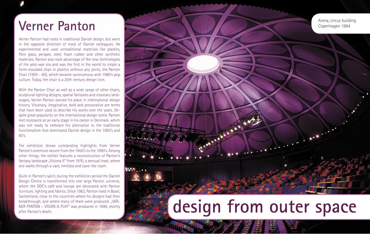
Verner PantonVerner Panton had roots in traditional Danish design, but went in the opposite direction of most of Danish colleagues. He experimented and used untraditional materials like plastics, fibre glass, perspex, steel, foam rubber and other synthetic materials. Panton also took advantage of the new technologies of the post-war era and was the first in the world to create a form-moulded chair in plastics without any joints, the Panton Chair (1959 – 60), which became synonymous with 1960‘s pop culture. Today, the chair is a 20th century design icon.
With the Panton Chair as well as a wide range of other chairs, sculptural lighting designs, spatial fantasies and visionary land-scapes, Verner Panton earned his place in international design history. Visionary, imaginative, bold and provocative are terms that have been used to describe his works over the years. De-spite great popularity on the international design scene, Panton met resistance at an early stage in his career in Denmark, which was not ready to embrace his alternative to the traditional functionalism that dominated Danish design in the 1950‘s and 60‘s.
The exhibition shows outstanding highlights from Verner Panton‘s extensive oeuvre from the 1950’s to the 1990’s. Among other things, the exhibit features a reconstruction of Panton‘s fantasy landscape „Visiona II“ from 1970, a sensual treat, where one walks through a vast, limitless and cave-like room.
Quite in Panton‘s spirit, during the exhibition period the Danish Design Centre is transformed into one large Panton universe, where the DDC‘s café and lounge are decorated with Panton furniture, lighting and fabrics. Since 1963, Panton lived in Basel, Switzerland, close to the countries where his designs had their breakthrough, and where many of them were produced. „VER-NER PANTON – VISION & PLAY“ was produced in 1999, shortly after Panton‘s death. design from outer space
Arena, circus buildingCopenhagen 1984
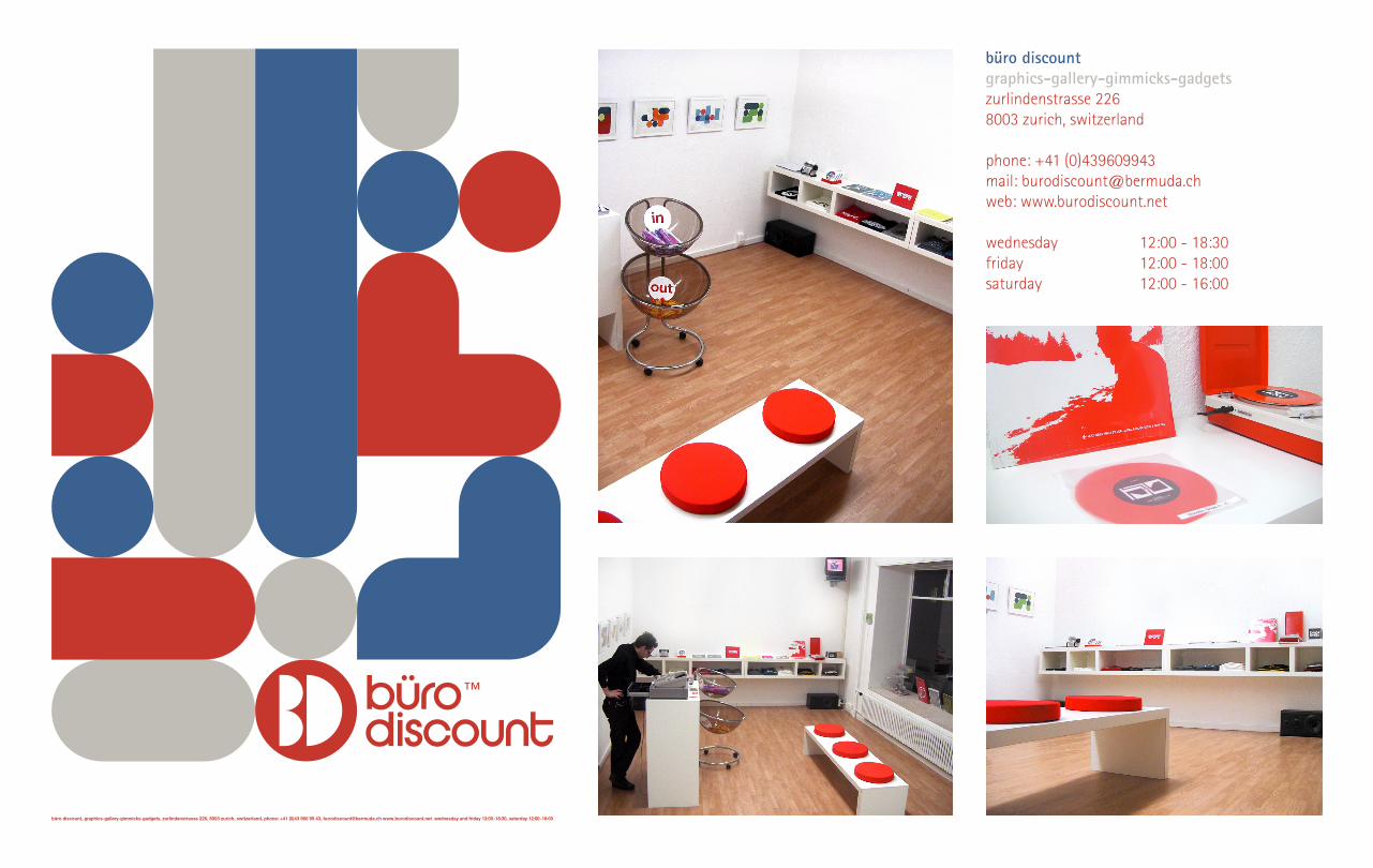
büro discountgraphics-gallery-gimmicks-gadgetszurlindenstrasse 2268003 zurich, switzerland
phone: +41 (0)439609943mail: [email protected]: www.burodiscount.net
wednesday 12:00 - 18:30friday 12:00 - 18:00saturday 12:00 - 16:00

Who are you? Please tell us something about yourself...
Well, I started off studying film, and soon went on to concentrate on hand drawn animation. I worked as a classical character animator for feature films and shorts, but after a few years I got extremely bored and exhausted by the lame characters and stories I had to animate. I started to work as a director for music videos and „real action“ com-mercials, trying to avoid animation as much as possible. Nevertheless, I ended up running a small animation company here in Berlin, and of course I got involved in pictoplasma.
What´s is the idea behind Pictoplasma? Who are the people behind Pictoplasma? When and why did you start the project?
The idea for pictoplasma came to us at the end of 1999. It all started as a reaction to an overwhel-ming flood of extremely weak iconographic figures featured on websites, billboards and in animation. We wanted to set a well thought-out, stylistically sure-footed, high-quality collection of figures against the daily overdose of random mascots and annoying sympathy seekers. What interested us was using character design to create a memorable, up-to-date and universal language that does not have to rely on out-dated, standardised clichés.
The 9,000 plus figures showcased in our archive and publications demonstrate the enormous ran-ge of possibilities for achieving a high degree of recognition with fewer characteristic features. We understand characters as signs in an independent, graphic language. The project was, is and always will be run on a non-commercial basis. Of course,
the copyrights stay with the artist / license holder, we only ask for the right to exhibit the characters on our site or in our publications. So basically, the people behind pictoplasma are the 600 or more participating artists, designers and companies world wide, who prove with their work, that cha-racters address viewers directly, emotionally and independently of their cultural background. And they do it with style.
The new Pictoplasma 2 book will be released soon. What is the difference to the first book?Or is it just some kind of „Part 2“? Please de-scribe the concept behind the new book.
As „pictoplasma I“ was a general overview of cha-racter visualisations, techniques and styles, this time we‘re taking a closer look at character ap-plications, focussing strongly on their wider usage off the printed page. Therefore, in addition to new graphical or illustrative character design trends, we are concentrating on objects, sculptures, dolls, toys, street- and fine art.
Pictoplasma 2 is the distillation of over 8,500 works of art that we have gathered together especially for the second book. Participating artists include: David Choe, Devilrobots, Eliezer Sonnenschien, Friends with you, Genevieve Gauckler, James Jarvis, Love Ablan, Mari chan, Marie Caillou, Medicom Toy, Paul McCarthy, Pete Fowler, Risa Sato, Sanrio, She-pard Fairy, Sony Creative Products, Takashi Mura-kami, The London Police, and many, many more...
All in all, I have the feeling that pictoplasma 2 is more mature and darker than the first book. Apart from that, it´s still all about the power of character visualisation.
Pictoplasma 2 (Die G
estalten Verlag 2003)

Pict
opla
sma
2 (D
ie G
esta
lten
Verla
g 20
03)
What about the game characters, for example Mario or Donkey Kong from Nintendo...is it dif-ficult to get the official permissions from these companies to use it in the book and web site?
Strangely enough, it only took one phone call to get permission from Nintendo. One week later we received 5 CDs full of high quality print files.
But it usually isn‘t that easy. For example, indepen-dent designers, who are just starting their profes-sional career can be overly careful when it comes to their own work and their copyrights. Sometimes it even seems as if they don¹t want their work to be viewed publicly at all, in order to prevent others from copying their style. The more experienced they get, the more they loosen up. Most of the big stars of the scene have absolutely no problems about sharing their creations with a wide audience.
Where do you get new characters from? Do the characters find you or are you always searching for new ones? How can artist contribute new characters? Wouldn´t it be easier to implement some kind of Upload formular on the website?
Often participating artists lead us to other work and artists, that they find inspiring. More and more designers and artists are contacting us on their own. Nowadays probably only about 25% of the new entries are the fruit of our own research.
The popularity of pictoplasma is increasing steadily and the feedback is overwhelmingly positive, which proves that there is a huge interest out there. Our goal is to provide a forum for the artists as well as a powerful platform for high quality, contemporary character art and design, and our biggest hope is that daring companies and potential customers will contact the represented artists directly. Any-way, things have become a bit complicated lately. Our databank system is simply not designed for the
amount of files and requests it has to handle. We are currently thinking of reorganising the whole system, which would mean we wouldn¹t be able to accept any new entries for some time.
But no matter how much work it would take, under no circumstances would we want to implement a public upload formular on the site. Pictoplasma is not trying to be a complete, but rather a well-dosed and curated collection of contemporary cha-racter art and design. We allow ourselves to make a subjective selection from the submitted artwork, and only after viewing all of the new entries, do we decide which characters to include in our archives. Otherwise the site wouldn¹t make much sense, and would probably be an unbearable mess of styles and ideas.
Do you have a favourite character?
That‘s impossible to answer. I generally relate more to reduced and abstract design than to arabesque and detailed/naturalistic illustrations. But the next day I get excited about some artist doing collages, or super detailed vector work, or cut outs...
Do you like Actionfigures? Which Character would you like to have as an Actionfigure?
What I find highly interesting is to see the graphical work of artists and designers who have been with pictoplasma since the beginning, transformed into dolls, urban vinyl and action figures. In some cases the shift to 3D works incredibly well, in others I prefer the initial graphical solution. It seems to be an overall trend that designers want to be able to actually touch or cuddle their creations, rather than just staring at them on a screen or printed page. During my research for the second book I was sent a lot of little gadgets and gifts along with the print files, so for the moment, I¹m more than satisfied.

Do you like Videogames? If so, what are your favourite alltime games and consoles?
I do like video games, but the ones I like the most usually don¹t include any characters at all. The only exception might be Super Mario. I guess he¹s my all time favourite game hero ugly as he is.
We¹re beginning to organise a pictoplasma confe-rence, which will take place in Berlin in early 2004, and will include various exhibitions, an animated short film festival and several workshops.
At the moment I¹m trying to get Shigeru Miyamoto involved, who is the inventor and mental father of Mario. Like no other, he creates character-driven games, which establish their own system, logic and a world of their own. That¹s generally when a character seems to work best, when its emotion, motivation and boundaries merge with its physical appearance.
Any last words...
If you know of a provider, who might be willing to help us with some free hosting and unlimited traffic, that would be a great help! Otherwise, good luck for your magazine.
Thanks for the interview!
The new Pictoplasma 2 book will be availble from DVG (www.die-gestalten.de) soon. Pictoplasma 1 is also still available.
© Koji Takeuchi / ASTRO graphica © Monkeypuzzle
© 2000, Cynthia Martinez
© Rolito
© Me Company
© Starlet Deluxe
© Cynthia Martinez © Claudia Blum / Kabeljau
© Nintendo © Rinzen © Rolito
© Syrup Helsinki © Clan.Drei © [email protected]

Text
& Il
lust
ratio
nen
by S
ven
K.
IVY´S BAR : COMICSIvys Bar ist die Comic-Reihe von Sven K. aus Köln über einige ver-rückte Kneipengäste um die dreißig: „Die Twen-Zeit ist überstanden, die krassen Fehler gemacht - jetzt kann‘s nur besser werden - aber warum stehen wir eigentlich immer noch an derselben Theke?“ Man kokettiert mit den Jüngeren, ist endlich respektlos vor der Blasiertheit der Älteren und säuft den Gedanken daran weg, dass „die Hälfte vom Leben rum ist“, denn eigentlich fängt‘s erst jetzt an, richtig Spaß zu machen!
Wer ist Ivy?Pippi Langstrumpf wird erwachsen... Ivy ist zeitlos, bindungslos und distanziert - aber immer involviert, ihren Gästen als Freunden verpflichtet und hat für jedes Problem eine Lösung, kurzum: sie ist die ideale Thekenchefin. Und Ivy hat die Ruhe weg: Die Bar und den Unterhalt auf Lebenszeit hat sie von ihrem Papa zum 18. bekommen, bevor der sich auf Reisen verabschiedete - und nie wiederkam...
Ivy über Ivy - Eine Comicfigur erzählt über sichIch wurde 1990 am Tresen der Kölner Kneipe „Subbido“ geboren. Seitdem zeichnet Sven Strips mir als Hauptfigur. 1990 war noch viel Kampftrinken angesagt also ging Sven mit meinen Zeichnungen um, wie besoffene Kerls glauben, dass Frauen es gern hätten: sie wurden schnell und planlos gleich in der Kneipe hingeworfen. Naja, jedenfalls flossen die Dialoge aus Svens Stammkneipen so direkt in die Skiz-zenbücher und - wurden total weltfremd: voll trunkener Logik führte Sven sie nämlich zielsicher in zwei bis sechs Bildern zur Pointe. Ey! Wann passiert das bitte im Leben?...
2001. Sven hat sich endlich darauf festlegen lassen mir ein Alter zu geben: ich bin „um die dreißig“. Das Gute an mir als Comicfigur ist dabei, ist: ich bleibe es. Ich kann mir hundertmal die Krätze fangen, an Kerls verzweifeln und mir die Leber wegsaufen: ich bin ewig um die dreissig und seh aus wie Mitte zwanzig. Nur kein Neid Leute - dafür nehme ich immerhin willig die Launen meines Zeichners auf mich, wenn er mir zum Beispiel in Unkenntnis der weiblichen Anatomie und der damit verbundenen Anfälligkeit für Blasenentzündungen mal wieder das Kleidchen kürzt. Was solls, dafür kann ich mich ja über ihn lustig machen, wenn ich immer noch das blühende Leben bin während er irgendwann alt und sabbernd im Seniorenheim sitzt. Ist nur die Frage, was er mich dann für Geschichten durchleben lässt.
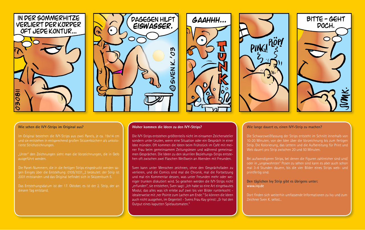
Wie sehen die IVY-Strips im Original aus?
Im Original bestehen die IVY-Strips aus zwei Panels, je ca. 19x14 cm und sie entstehen in entsprechend großen Skizzenbüchern als unkolo-rierte Strichzeichnungen.
„Unter“ den Zeichnungen sieht man die Vorzeichnungen, die in Gelb ausgeführt werden.
Die Panel-Nummern, die in die fertigen Strips eingedruckt werden sa-gen Einiges über die Entstehung: 0105/1031_2 bedeutet: der Strip ist 2001 entstanden und das Original befindet sich in Skizzenbuch 5.
Das Entstehungsdatum ist der 17. Oktober, es ist der 2. Strip, der an diesem Tag entstand.
Woher kommen die Ideen zu den IVY-Strips?
Die IVY-Strips entstehen größtenteils nicht im einsamen Zeichenatelier sondern unter Leuten, wenn eine Situation oder ein Gespräch in einer Idee münden. Oft kommen die Ideen beim Frühstück im Café mit mei-ner Frau beim gemeinsamem Zeitungslesen und während gemeinsa-men Gesprächen. Die Ideen zu den skurrilen Beziehungs-Strips entste-hen oft zwischen zwei Flaschen Weißwein an Abenden mit Freunden.
Sven kann unter Menschen zeichnen, ohne den Gesprächsfaden zu verlieren, und die Comics sind mal die Chronik, mal die Fortsetzung und mal ein Kommentar dessen, was unter Freunden mehr oder we-niger trunken diskutiert wird. So gesehen werden die IVY-Strips nicht „erfunden“, sie entstehen, Sven sagt: „Ich habe so eine Art eingebautes Modul, das alles was ich erlebe auf zwei bis vier Bilder runterkocht - idealerweise mit ‚ner Pointe zum Lachen am Ende.“ So können die Ideen auch nicht ausgehen, im Gegenteil - Svens Frau Kay grinst: „Er hat den Output eines kaputten Spielautomaten.“
Wie lange dauert es, einen IVY-Strip zu machen?
Die Schwarzweißfassung der Strips entsteht im Schnitt innerhalb von 10-20 Minuten, von der Idee über die Vorzeichnung bis zum fertigen Strip. Die Kolorierung, das Lettern und die Aufbereitung für Print und Web dauert pro Strip zwischen 20 und 50 Minuten.
Bei aufwendigeren Strips, bei denen die Figuren zahlreicher sind und/oder in „ungewohnten“ Posen zu sehen sind kann es aber auch schon mal 3-4 Stunden dauern, bis die vier Bilder eines Strips web- und printfertig sind.
Den täglichen Ivy Strip gibt es übrigens unter:www.ivy.de
Dort finden sich weiterhin umfassende Informationen zu Ivy und zumZeichner Sven K. selbst...


Wie werden die IVY-Strips fürs Web aufbreitet?
Die Strips werden per Strichscan in einer Auflösung von 300dpi ein-gescannt. In diesem Modus wird die gelbe Vorzeichnung vom Scanner nicht erkannt und die Konturen ohne Kantenglättung erfasst, was fürs saubere Kolorieren relevant ist.
Jetzt geht es in Photoshop 7 weiter. Zuerst wird die Datei dann in den RGB-Modus umgewandelt und die Panels im Layout von 4091x1200 Pixeln bei 300dpi Auflösung ausgerichtet. Dann werden die Einzelbilder in den Panels ausgerichtet und über das Ebenenstilmenü mit Rahmen versehen.
Die ausgerichteten Panels werden im Anschluss mit dem Füllwerkzeug anhand einer festen Palette von „IVY-Farben“ koloriert. Schließlich werden die Farben in einer Photoshop-Ebene isoliert und mit einem ebenfalls festgelegten Effekt versehen, der den Farbflächen einen leichten organischen 3D-Effekt gibt. Bei Bedarf wird bei den Szenen in der Bar daraufhin noch das Hintergrundblau der Fenster dupliziert,
leicht über die Tonwertkorrektur leicht aufgehellt und mit einem Re-flexeffekt versehen. Dazu werden per Polygonauswahltool Reflexstrei-fen angelegt und in einer Ebenenmaske gespeichert. Die Ebenenmaske wird mit dem Effektfilter „Wellen“ bearbeitet, dadurch erscheinen sie leicht geschwungen.
Schlussendlich kommt das Lettering: Das Lettering der Originalzeich-nungen wird ausgeblendet und die Strips werden mit der Schrift „Jack Armstrong“ nachgelettert. Abschließend werden Panel-Nummer, Co-pyrightvermerk und Signatur im Strip verankert.
Der nun fertige Strip wird jetzt gleich mehrfach gespeichert: als TIFF in 300dpi/CMYK-Modus für die Verwendung in Printmedien und als weboptimiertes GIF (wichtig: Dithering ein) im Format 600x176 Pi-xel auf 72dpi/RGB (nachdem Kontur und Farbebenen verschmolzen wurden, das ist wichtig, damit beim Skalieren die Farbeffekte nicht „mitskaliert“ werden).
Noch Fragen?...E-Mail an: [email protected]
Sven K. - Die Quickvita
1994-96...hält sich Sven K. als Kneipenzeichner über Wasser. In diver-sen Kölner Kneipen erhält Sven Freibier gegen Cartoons und verbringt die meisten seiner Tage vom Milchkaffee am Mittag bis zur Neige der Wodkaflasche zeichnend an den Tresen der Domstadt.
1997...wird die Kölner TV-Produktionsfirma Brainpool auf Sven K. auf-merksam. Er wird Chef des Bildarchivs der SAT.1 „Wochenshow“ und später der Grafikchef dieses und anderer Formate von Brainpool. Voll in seinem Element baut er Parodien von Filmplakaten und parodiert sich so bis Ende 1999 durch die Produkt-welt des nationalen Privatfernsehens.
2001...Sven K. macht weiter Grafik und an-sonsten nur noch IVY. Kunden sind Typen wieetwa Kabarettist Ingo Appelt oder ComedianBastian Pastwka. Nebenbei macht das Leben Spaß...
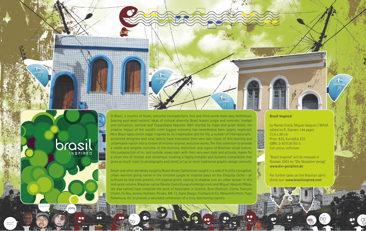
In Brasil, a country of brash, colourful contradictions, first and third world make easy bedfellows. Soaring past most nations’ ideas of cultural diversity, Brasil boasts jungle and concrete, football and corruption, carnival and Copacabana beauties. Well charted by maps and guide books, the creative impact of the world’s ninth biggest economy has nevertheless been largely neglected. Here Brasil takes centre stage: inspired by its irrepressible zest for life, a number of internationally-acclaimed designers and local talents have translated their very own vision of this bustling and untameable nation into a stream of entirely original, exclusive works. The first collection to provide a visible and tangible overview of the diversity, distinction and vigour of Brazilian visual culture, this juxtaposition of in- and outside views, each with their very own style and attitude, makes for a clever mix of tension and consensus, creating a highly complex and dynamic compilation that gives as much room to photography and street art as to more traditional graphic design ventures.
Smart and often decidedly naughty, Brasil shows Catholicism caught in a web of fruitful corruption, urban warriors going native in the concrete jungle or inspired plays on the Chiquita cliché – all suffused by that ever-present, rich tropical green, casting its shadow over an urban sprawl. In this mid-price volume, Brasilian native Nando Costa (hungryfordesign.com) and Miguel Vasquez (Masa, see also Latino) have compiled the work of Associates in Science, Buro Destruct, Cisma, François Chalet, Hi-Res, Jeremy Hollister, Rinzen, MK 12, State Design, Trollback & Co, Weworkforthem, Yugo Nakamura, etc to provide a saturated celebration of a truly fascinating country.
Brasil Inspired
by Nando Costa, Miguel Vasquez / MASA edited by R. Klanten 144 pages21,9 x 28 cmPrice: $35, Euro29.9, £23ISBN: 3-931126-93-5 full colour, softcover
“Brazil Inspired” will be released in October 2003 by “Die Gestalten Verlag”www.die-gestalten.de
For further takes on the Brasilian spirit check out: www.brasilinspired.com

GOTTFRIED HELNWEINThe Art of
All i
mag
es ©
Got
tfrie
d H
elnw
ein
2003
: Al
l rig
hts
rese
rved
Selected moments of Gottfried Helnwein:
2002Helnwein establishes a studio in downtown Los Angeles. He starts the collaboration with Marilyn Manson on a series of visual projects.
1997-1998Photosessions with Rammstein, Cover + Portraits for „Sehnsucht“ Longplayer
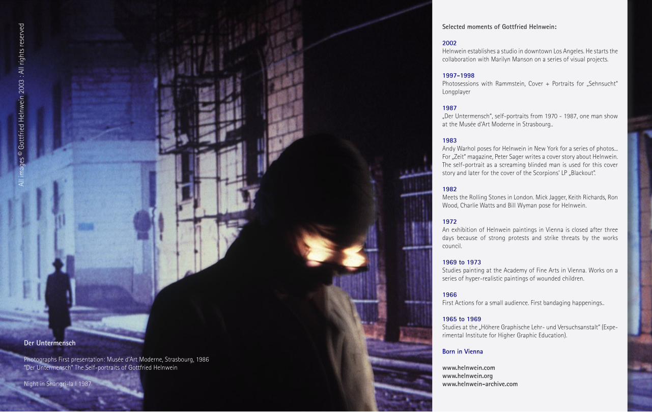
1987„Der Untermensch“, self-portraits from 1970 - 1987, one man show at the Musée d‘Art Moderne in Strasbourg..
1983Andy Warhol poses for Helnwein in New York for a series of photos... For „Zeit“ magazine, Peter Sager writes a cover story about Helnwein. The self-portrait as a screaming blinded man is used for this cover story and later for the cover of the Scorpions‘ LP „Blackout“. 1982Meets the Rolling Stones in London. Mick Jagger, Keith Richards, Ron Wood, Charlie Watts and Bill Wyman pose for Helnwein.
1972An exhibition of Helnwein paintings in Vienna is closed after three days because of strong protests and strike threats by the works council.
1969 to 1973Studies painting at the Academy of Fine Arts in Vienna. Works on a series of hyper-realistic paintings of wounded children.
1966First Actions for a small audience. First bandaging happenings..
1965 to 1969Studies at the „Höhere Graphische Lehr- und Versuchsanstalt“ (Expe-rimental Institute for Higher Graphic Education).
Born in Vienna
www.helnwein.comwww.helnwein.orgwww.helnwein-archive.com
Der Untermensch Photographs First presentation: Musée d’Art Moderne, Strasbourg, 1986 “Der Untermensch” The Self-portraits of Gottfried Helnwein
Night in Shangri-la I 1987
All i
mag
es ©
Got
tfrie
d H
elnw
ein
2003
: Al
l rig
hts
rese
rved

Helnwein‘s ‚Mickey‘(1995, oil and acrylic on canvas, 83“ x 122“) at the San Francisco Museum of Modern Art
All images © G
ottfried Helnw
ein 2003 : All rights reserved

The Golden Ageof GrotesquE
Marilyn Mansonwww.marilynmanson.com
Photography by Gottfried Helnwein
All images © G
ottfried Helnw
ein 2003 : All rights reserved

Laurent Fetis
Who are you?Laurent Fetis, Art Director Where are you located?Paris
Who are your clients?Beck, Dj Hell, Mellow, Micronauts, Tahiti 80, M83, MTV, Metro Goldwin Mayer, Orange, American Zoetrope, Daimler Chrisler, French Ministry of Culture, Centre Pompidou, Bless, Vogue The Face, Dazed&Confused, Universal, Sony, Virgin, JVC...
How would you describe your style?No style
Your works often has a touch of the 60/70s. Why?My works depends of commisionners‘ demand. I‘ve done some works related to this period and was noticed for that, but I have no particular fascination for this period.
What are your main influences? Any favourite artists?Today I‘d say Elisabeth Arkhipoff, Helmut Newton, Wolfgang Weingart, Francis Bacon
Are you a videogamer? If so, what are your Top5 Consoles & Games?Yes, my top Console is Vectrex. My Top vectrex games are:
1 Bedlam2 Scramble3 Rip Off4 Solar Quest5 Cosmic Chasm
www.laurentfetis.com
Illus
trat
ions
by
Laur
ent F
etis
take
n fr
om: „
ABC+
“ (Di
e G
esta
lten
Verla
g 20
02)

Sceyelines: Visual Design & Lifestyle Magazine
Website: www.sceyelines.de
Publisher/Editor: Dirk BehlauWebsite: www.pixeleye.netContact: [email protected]
Editor: Jens FrankeWebsite: www.jensfranke.comContact: [email protected]
Idea, Concept, Interviews, Theme Selection, Logodesign, Magazine Layout, Website:Dirk Behlau
Sceyelines Website (Flash Components), Flashforum Feature & Interview: Jens Franke
Graphics/Pictures/Illustrations by:Büro Destruct, Björn Buntfuß, Die Gestalten Verlag, Dirk Behlau, Miho Tei (Erotic Dra-gon), Rian Hughes (Device), Jan Meining-haus (Loco Style), Peter Thaler (Pictoplasma) Klee, Laurent Fetis, Blue Man Group, Philip-pe Starck, Marc Newson, Satoshi Matsu-zawa, Spotleid, Adriana de Barros (Scene 360), Gottfried Helnwein, Sven K., NAMCO, TASCHEN Verlag, Toyota, Yavuz Aslan
Words by:Dirk Behlau, Jens Franke, Klee, Danish Design Museum, Sven K., Gottfried Helnwein, Toyota, NAMCO, Marc Newson, TASCHEN Verlag, RianHughes
Special thanks:My girlfriend Ariane for her inspiration and her big love; Jens Franke for the Flashforum Feature + the Interview, PR-Support + Flash Programming; Helga Beck (Die GestaltenVerlag) for the support and help with severalartists; Christine Waiblinger (TASCHEN Ver-lag); Stefan D´Amore (MX Magazin) for his great support (this issue and the first issue of Sceyelines will be included on the next MX Magazin CD-ROM - out in October 2003); Torsten Bergler/Martin Rack (DMIG), DanielHarrington (Nervousroom) and Peter Reich-ard (Spatium) for the „Sceyelines“ interviews,PAGE, Novum, Cyril Helnwein and all parti-cipating artists + all design portals who support(ed) us!
More free projects by Dirk Behlau:www.spaceinvaders.dewww.designbooks.netwww.behlau.netwww.pixeleye.de/fontdiver/
All rights reserved. Copyright 2003Release Date: 15.09.2003
Attention please:We are looking for artists, illustrators, pho-tographers, animators, musicians, bands, performer etc. from all over the planet. If you think your work is outstanding enough to be featured in a future issue, don´t hesi-tate to contact us:
Official Sceyelines Supporter:
Sceyelines is a product of:
sceyelinesdesign & lifestyle magazine
Ballchair designed by Eero AarnioPhotograph by Yavuz Aslan
Available at: www.sevenzero.de