security analysis -prof.dr suyash bhatt. introduction technical analysis is the attempt to forecast...
TRANSCRIPT

Security AnalysisSecurity Analysis
-Prof.Dr Suyash Bhatt

Introduction
Technical analysis is the attempt to forecast stock prices on the basis of market-derived data.
Technicians (also known as quantitative analysts or chartists) usually look at price, volume and psychological indicators over time.
They are looking for trends and patterns in the data that indicate future price movements.
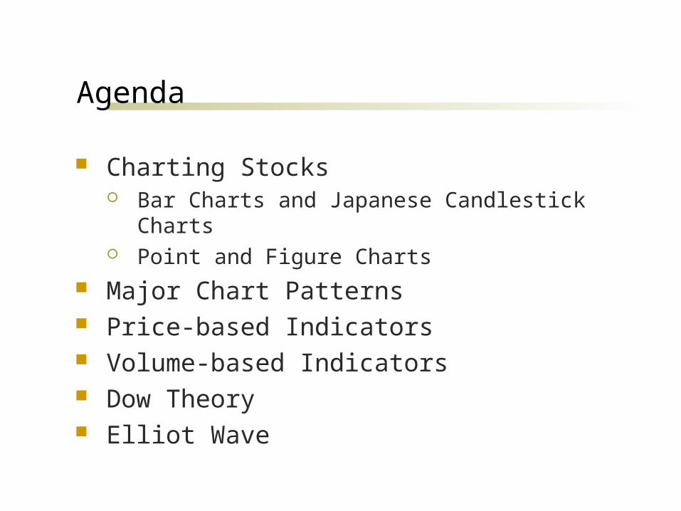
Agenda
Charting Stocks Bar Charts and Japanese Candlestick Charts Point and Figure Charts
Major Chart Patterns Price-based Indicators Volume-based Indicators Dow Theory Elliot Wave

Charting the Market
Chartists use bar charts, candlestick, or point and figure charts to look for patterns which may indicate future price movements.
They also analyze volume and other psychological indicators (breadth, % of bulls vs % of bears, put/call ratio, etc.).
Strict chartists don’t care about fundamentals at all.
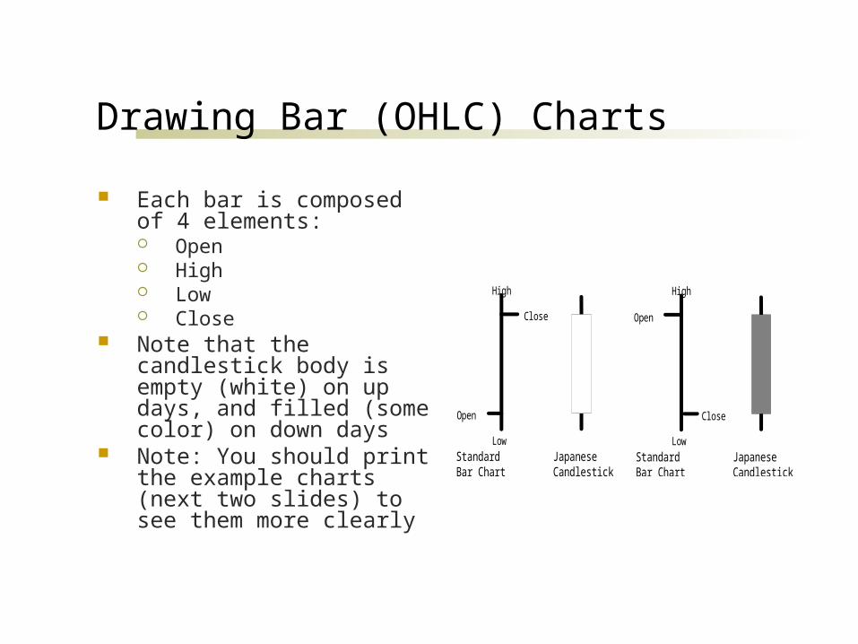
Drawing Bar (OHLC) Charts
Each bar is composed of 4 elements: Open High Low Close
Note that the candlestick body is empty (white) on up days, and filled (some color) on down days
Note: You should print the example charts (next two slides) to see them more clearly
Open
Close
High
Low
StandardBar Chart
JapaneseCandlestick
Open
Close
High
Low
StandardBar Chart
JapaneseCandlestick
Basic Technical Tools
Trend Lines Moving Averages Price Patterns Indicators Cycles
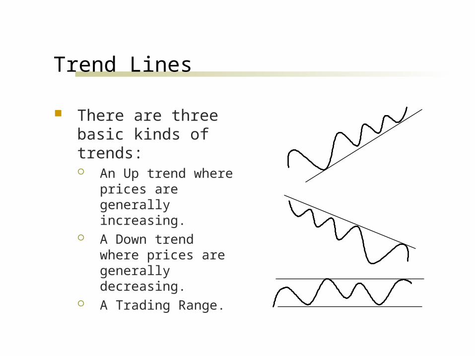
Trend Lines
There are three basic kinds of trends: An Up trend where prices
are generally increasing. A Down trend where
prices are generally decreasing.
A Trading Range.
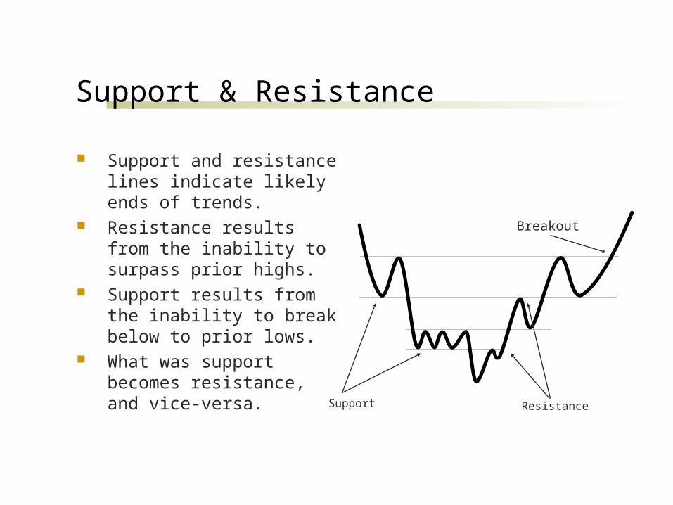
Support & Resistance
Support and resistance lines indicate likely ends of trends.
Resistance results from the inability to surpass prior highs.
Support results from the inability to break below to prior lows.
What was support becomes resistance, and vice-versa.
Support Resistance
Breakout
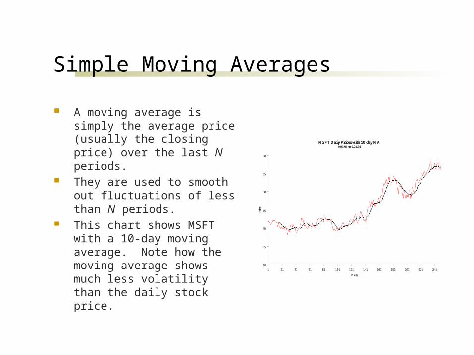
Simple Moving Averages
A moving average is simply the average price (usually the closing price) over the last N periods.
They are used to smooth out fluctuations of less than N periods.
This chart shows MSFT with a 10-day moving average. Note how the moving average shows much less volatility than the daily stock price.
MSFT Daily Prices with 10-day MA9/23/93 to 9/21/94
30
35
40
45
50
55
60
1 21 41 61 81 101 121 141 161 181 201 221 241
Date
Pri
ce

Price Patterns
Technicians look for many patterns in the historical time series of prices.
These patterns are reputed to provide information regarding the size and timing of subsequent price moves.
But don’t forget that the EMH says these patterns are illusions, and have no real meaning. In fact, they can be seen in a randomly generated price series.
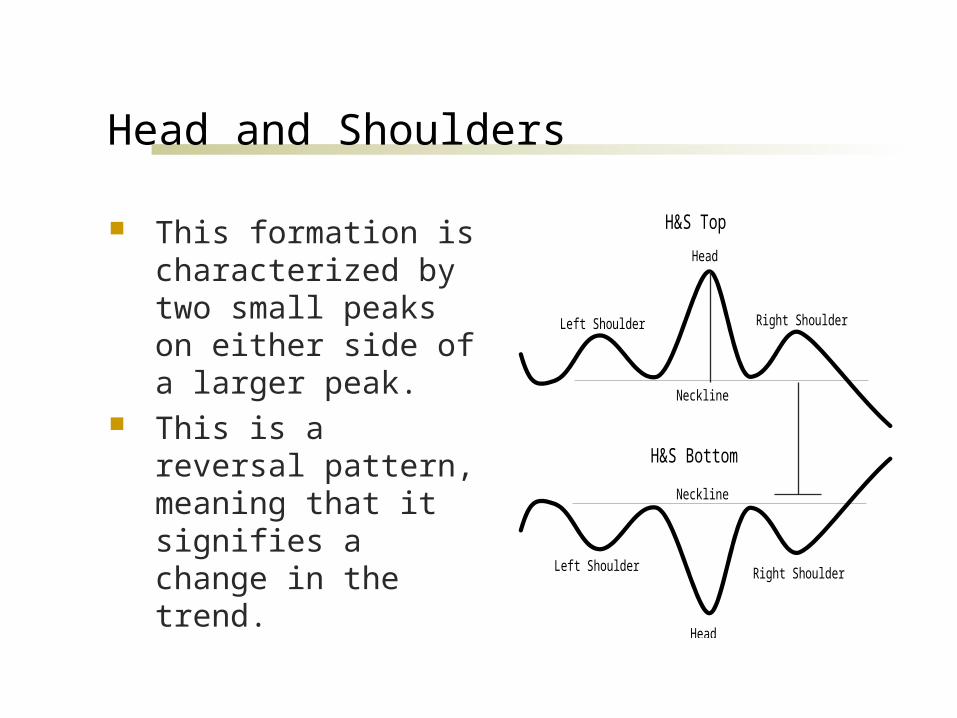
Head and Shoulders
This formation is characterized by two small peaks on either side of a larger peak.
This is a reversal pattern, meaning that it signifies a change in the trend.
Head
Head
Left Shoulder
Left Shoulder
Right Shoulder
Right Shoulder
Neckline
Neckline
H&S Top
H&S Bottom
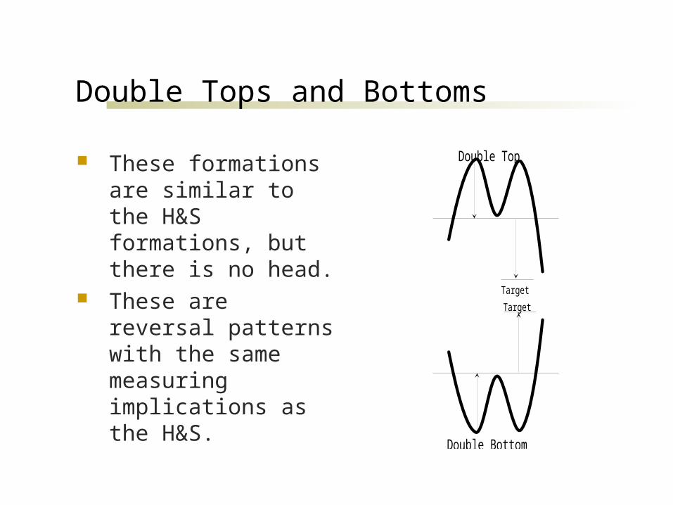
Double Tops and Bottoms
These formations are similar to the H&S formations, but there is no head.
These are reversal patterns with the same measuring implications as the H&S.
Target
Double Top
Double Bottom
Target
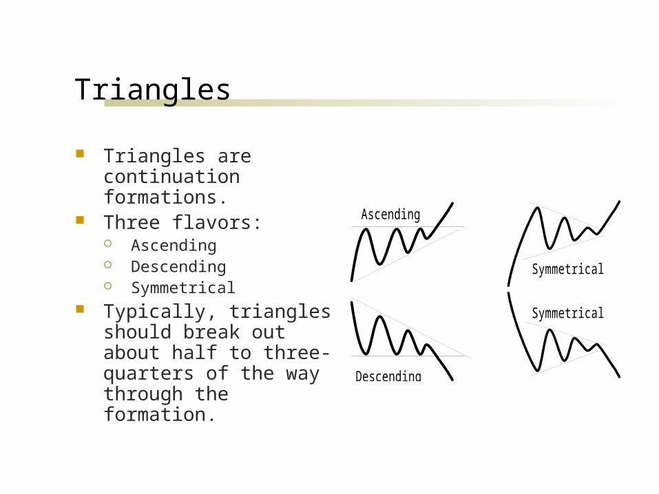
Triangles
Triangles are continuation formations.
Three flavors: Ascending Descending Symmetrical
Typically, triangles should break out about half to three-quarters of the way through the formation.
Ascending
Descending
Symmetrical
Symmetrical

Rounded Tops & Bottoms
Rounding formations are characterized by a slow reversal of trend.
Rounding Top
Rounding Bottom

Broadening Formations
These formations are like reverse triangles.
These formations usually signal a reversal of the trend.
Broadening Tops
Broadening Bottoms

Technical Indicators
There are, literally, hundreds of technical indicators used to generate buy and sell signals.
We will look at just a few that are use: Moving Average Convergence/Divergence (MACD) Relative Strength Index (RSI) On Balance Volume Bollinger Bands
MACD
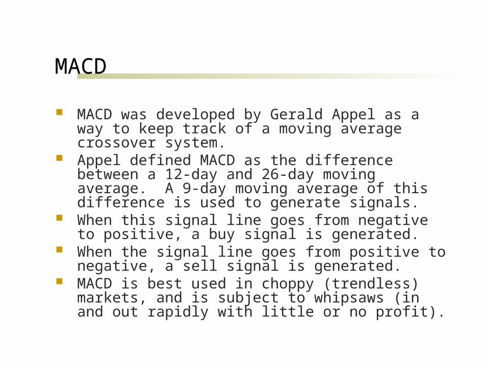
MACD was developed by Gerald Appel as a way to keep track of a moving average crossover system.
Appel defined MACD as the difference between a 12-day and 26-day moving average. A 9-day moving average of this difference is used to generate signals.
When this signal line goes from negative to positive, a buy signal is generated.
When the signal line goes from positive to negative, a sell signal is generated.
MACD is best used in choppy (trendless) markets, and is subject to whipsaws (in and out rapidly with little or no profit).

MACD Example Chart

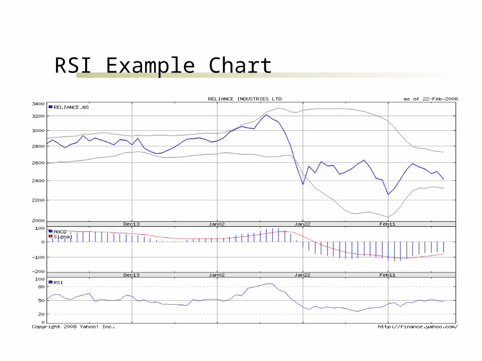
Relative Strength Index (RSI)
RSI was developed by Welles Wilder as an oscillator to gauge overbought/oversold levels.
RSI is a rescaled measure of the ratio of average price changes on up days to average price changes on down days.
The most important thing to understand about RSI is that a level above 70 indicates a stock is overbought, and a level below 30 indicates that it is oversold (it can range from 0 to 100).
Also, realize that stocks can remain overbought or oversold for long periods of time, so RSI alone isn’t always a great timing tool.
RSI Example Chart
OversoldOverbought

On Balance Volume
On Balance Volume was developed by Joseph Granville, one of the most famous technicians of the 1960’s and 1970’s.
OBV is calculated by adding volume on up days, and subtracting volume on down days. A running total is kept.
Granville believed that “volume leads price.” To use OBV, you generally look for OBV to show a
change in trend (a divergence from the price trend). If the stock is in an uptrend, but OBV turns down, that is
a signal that the price trend may soon reverse.
Bollinger Bands
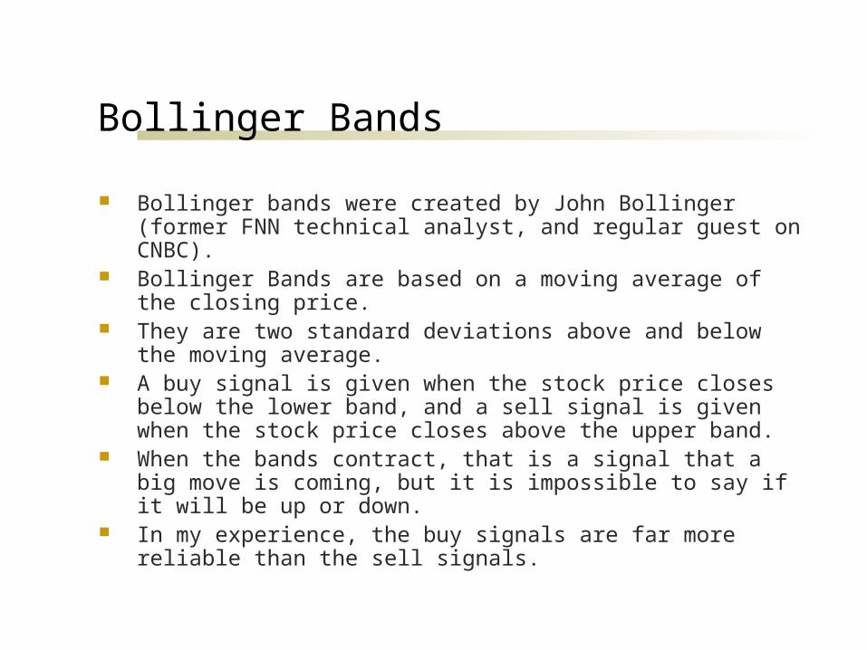
Bollinger bands were created by John Bollinger (former FNN technical analyst, and regular guest on CNBC).
Bollinger Bands are based on a moving average of the closing price. They are two standard deviations above and below the moving
average. A buy signal is given when the stock price closes below the lower
band, and a sell signal is given when the stock price closes above the upper band.
When the bands contract, that is a signal that a big move is coming, but it is impossible to say if it will be up or down.
In my experience, the buy signals are far more reliable than the sell signals.

Bollinger Bands Example Chart
Sell signal
Buy signals
Sometimes, the buysignals just keep coming andyou can go broke!
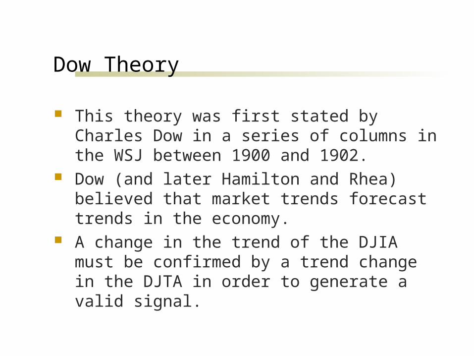
Dow Theory
This theory was first stated by Charles Dow in a series of columns in the WSJ between 1900 and 1902.
Dow (and later Hamilton and Rhea) believed that market trends forecast trends in the economy.
A change in the trend of the DJIA must be confirmed by a trend change in the DJTA in order to generate a valid signal.

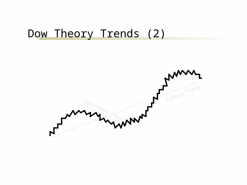
Dow Theory Trends (1)
Primary Trend Called “the tide” by Dow, this is the trend that
defines the long-term direction (up to several years). Others have called this a “secular” bull or bear market.
Secondary Trend Called “the waves” by Dow, this is shorter-term
departures from the primary trend (weeks to months) Day to day fluctuations
Not significant in Dow Theory
Dow Theory Trends (2)
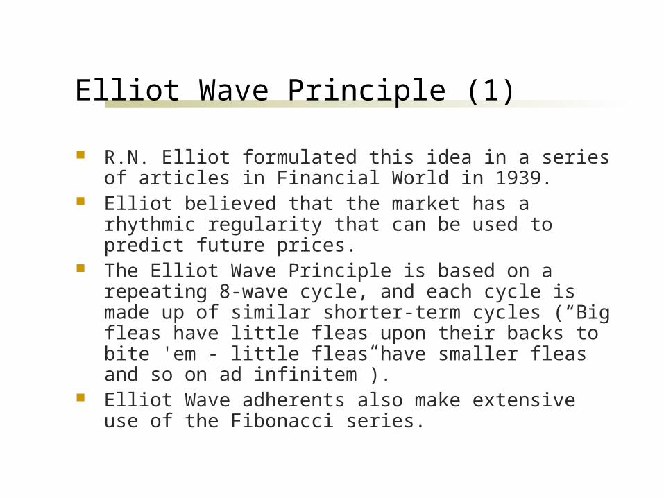
Elliot Wave Principle (1)
R.N. Elliot formulated this idea in a series of articles in Financial World in 1939.
Elliot believed that the market has a rhythmic regularity that can be used to predict future prices.
The Elliot Wave Principle is based on a repeating 8-wave cycle, and each cycle is made up of similar shorter-term cycles (“Big fleas have little fleas upon their backs to bite 'em - little fleas have smaller fleas and so on ad infinitem”).
Elliot Wave adherents also make extensive use of the Fibonacci series.
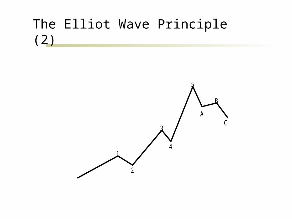
The Elliot Wave Principle (2)
1
2
3
4
5
A
B
C

Fibonacci Numbers
Fibonacci numbers are a series where each succeeding number is the sum of the two preceding numbers.
The first two Fibonacci numbers are defined to be 1, and then the series continues as follows: 1, 1, 2, 3, 5, 8, 13, 21…
As the numbers get larger, the ratio of adjacent numbers approaches the Golden Mean: 1.618:1.
This ratio is found extensively in nature, and has been used in architecture since the ancient Greeks (who believed that a rectangle whose sides had the ratio of 1.618:1 was the most aesthetically pleasing).
Technical analysts use this ratio and its inverse, 0.618, extensively to provide projections of price moves.

Thank You…