ss · rudolf arnheim abstract-the structural relations between pairs of tertiary colors are used to...
TRANSCRIPT

http://www.jstor.org/stable/1578333
Your use of the JSTOR archive indicates your acceptance of JSTOR's Terms and Conditions of Use, available athttp://www.jstor.org/page/info/about/policies/terms.jsp. JSTOR's Terms and Conditions of Use provides, in part, that unlessyou have obtained prior permission, you may not download an entire issue of a journal or multiple copies of articles, and youmay use content in the JSTOR archive only for your personal, non-commercial use.
Please contact the publisher regarding any further use of this work. Publisher contact information may be obtained athttp://www.jstor.org/action/showPublisher?publisherCode=mitpress.
Each copy of any part of a JSTOR transmission must contain the same copyright notice that appears on the screen or printedpage of such transmission.
JSTOR is a not-for-profit organization founded in 1995 to build trusted digital archives for scholarship. We work with thescholarly community to preserve their work and the materials they rely upon, and to build a common research platform thatpromotes the discovery and use of these resources. For more information about JSTOR, please contact [email protected].
The MIT Press is collaborating with JSTOR to digitize, preserve and extend access to Leonardo.
http://www.jstor.org
Progress in Color Composition
Rudolf Arnheim
Abstract-The structural relations between pairs of tertiary colors are used to explore concord and discord in color composition. Recent demonstrations by Garau have extended these color relations to those between foreground and background, thereby enabling him to apply the structural relations between tertiaries to the conditions generating perceptual transparency. An example of paradoxical transparency in modern painting is given.
I. INTRODUCTION The organization of color in pictorial design relies on the dynamic relations between colors: similarities and dif- ferences, mutual completion, concord and discord. In the theory of music, analogous relationships between tones have been studied and formulated for centuries. By contrast, in the visual arts the rules for color relations have been limited to a few suggestions on how to obtain 'harmony', that is, colors that do not clash. Some recent developments lead a few steps beyond this unsatisfactory situation.
II. MISUNDERSTANDINGS Before I report on these developments,
it will be advisable to anticipate certain misunderstandings that continue to inter- fere with communication in this area. When it comes to the theory and practice of color relations, there is still a widespread lack of distinction between two problems. One of these problems concerns the question of how the colors we see come about physically or physiologically. The other asks how colors, once they have been produced in whatever manner and exposed to the eyes, behave phenomenally when they are looked at in their inter- relation, for example, in pictorial com- position. The first problem deals with the chemistry of pigment mixtures and the physical optics of color analysis and color combination. It also deals with the physiological mechanisms by which the eyes and the nervous system record and process light stimuli. It is an approach that studies receptor mechanisms, after- images, contrast, color fusion, etc. The second problem has nothing to do with how colors come about. Whether produced
Rudolf Arnheim (psychologist), 1113 South Seventh Street, Ann Arbor, MI 48103, U.S.A.
Received 5 October 1985.
RY
RB
B
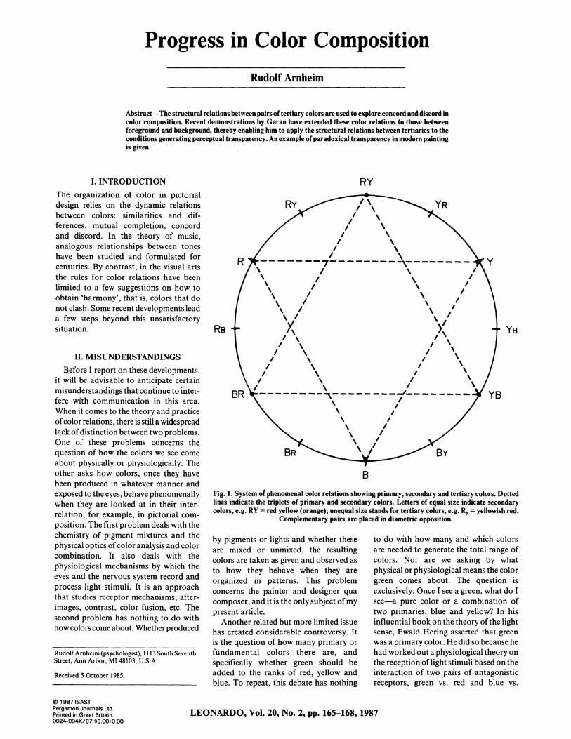
Fig. 1. System of phenomenal color relations showing primary, secondary and tertiary colors. Dotted lines indicate the triplets of primary and secondary colors. Letters of equal size indicate secondary colors, e.g. RY = red yellow (orange); unequal size stands for tertiary colors, e.g. Ry = yellowish red.
Complementary pairs are placed in diametric opposition.
by pigments or lights and whether these are mixed or unmixed, the resulting colors are taken as given and observed as to how they behave when they are organized in patterns. This problem concerns the painter and designer qua composer, and it is the only subject of my present article.
Another related but more limited issue has created considerable controversy. It is the question of how many primary or fundamental colors there are, and specifically whether green should be added to the ranks of red, yellow and blue. To repeat, this debate has nothing
to do with how many and which colors are needed to generate the total range of colors. Nor are we asking by what physical or physiological means the color green comes about. The question is exclusively: Once I see a green, what do I see-a pure color or a combination of two primaries, blue and yellow? In his influential book on the theory of the light sense, Ewald Hering asserted that green was a primary color. He did so because he had worked out a physiological theory on the reception of light stimuli based on the interaction of two pairs of antagonistic receptors, green vs. red and blue vs.
? 1987 ISAST Pergamon Journals Ltd. Printed in Great Britain. 0024-094X/87 $3.00+0.00
LEONARDO, Vol. 20, No. 2, pp. 165-168,1987
YB

yellow. This mechanism induced him to propose by analogy that a similar system of four fundamental elements governs color perception. It is important to observe that this is an entirely pheno- menological matter. When Hering main- tains that "no color is both yellowish and bluish at the same time", the statement is based on no other authority than on what he says his eyes tell him [ 1]. A physiological mechanism of how colors come about does not prescribe the looks of what is perceived. It so happens that the assertion made by Hering and his followers is opposed by the majority of painters, who can be expected to know something about how colors look and who, from Philip Otto Runge and Delacroix to Paul Klee and Johannes Itten, have based their color systems on red, blue and yellow as the pure primaries and on purple, green and orange as the secondary combinations. The following presentation is based on this well-established pictorial tradition.
III. TERTIARIES RELATED When the circle of perceptual hues
(Fig. 1) is divided into 12 colors, a hierarchy of three levels is obtained: (1) the three primaries, red, blue and yellow, which are pure hues and therefore unrelatable to one another, except by their adding up to a complementary triad; (2) the three secondaries, purple, orange and green, each of which consists of two of the primaries and therefore creates a bridge between them; (3) whereas in the secondaries two primaries are represented in an equal ratio and therefore are stably balanced, the six tertiaries combine the primaries unequally; for example, a bluish red or a reddish yellow. Being thus unbalanced, the tertiaries are highly dynamic, prone to interact with other colors and, for this reason, particularly inviting for pictorial composition.
In my book Art and Visual Perception [2], I singled out the special case of the tertiary colors and explored the visual dynamics resulting from their pairing. I suggested that such pairing generates four principal types of dynamic relations. If, for simplicity's sake, one selects the ratio 1:2 for the relation between the two hues in each tertiary color, one can show the combinations in the manner re- presented in Fig. 2. Of the four pairs, two are balanced and concordant; the other two, unbalanced and discordant.
1. Full Inversion involves only two of the primaries in each color. By combining them in inverse ratio-e.g. a bluish red and a reddish blue-the two tertiary colors are symmetrically related to a secondary, in this case, purple. This
Balanced concord
D
Full inversion
H
Shared subordinate
Unbalanced discord
I
Partial inversion Shared dominant Fig. 2. Structural relations between pairs of tertiary colors. Black, white and grey stand for the three primary colors. The quantitative relation between dominant and subordinate in each tertiary is given
the arbitrary ratio of 1: 2.
makes for the balance of two closely interconnected colors, which share a bridge between the same two primaries, in this case, that between red and blue.
2. When the share of one of the primaries is inverted and combined with the other two, one obtains Partial Inversion, an asymmetrical combination of all three primaries; for example, a yellowish red and a reddish blue. The result is a distinctly discordant clash between two unbalanced tertiaries, which share no common axis in the hue circle.
3. Whenever all three primaries are combined in a pairing of tertiaries, no true symmetry is obtainable. The pairing called Shared Subordinate, however, combines two tertiaries in a symmetrical position around a common primary, for example, a bluish yellow and a bluish red around the axis of blue. The two dominant hues, of course, are not symmetrical, but they are connected by the blue tinge they both possess. Being placed opposite each other in the hue circle, the two tertiaries are also comple- mentaries, i.e. they add up to the full range of the color system-the most powerful bond available between colors.
4. When the two tertiaries share a hue that is not subordinate but dominant- e.g. when a yellowish red and a bluish red are both dominated by the red primary- the dynamic situation of SharedDominant
is that of two neighbors who are torn in two different directions and thereby create considerable tension.
IV. FOREGROUND AND BACKGROUND
What I have presented up to this point, with the benefit of some hindsight, is as far as I had gotten by intuitive inspection when the revised edition of my book was published in 1974. Some years ago I learned to my great satisfaction that Augusto Garau, an Italian abstract painter and art educator, was picking up the problem of color composition where I had left off and was carrying it to more complex applications. Garau involved me in a lively correspondence, which enabled me to act as a consultant for his book Le armonie del colore [3]. The richly illustrated demonstrations of the book apply my four dynamic pairings to two principal subjects-the color relations between figure and ground and the phenomenon of perceptual transparency.
Garau has undertaken to support the paired tertiaries with suitable surround- ings, thereby creating a perceptual situation in which each pair is seen as a 'figure' before a 'ground'. In the simple case of full inversion, where only two primaries are involved, the third primary can be used as background, e.g. yellow as
Arnheim, Progress in Color Composition 166

Y
I I RB BR
Il .- m-- -
I 1
F- I RB BR
sYB ______ YRI YB YR
,,m,, i ,
Fig. 3. Full inversion of tertiaries on (a) a unitary background of the third primary color and (b) a background split in two halves interrelated by shared dominant and creating within each half of the
pattern the relation of shared subordinate.
ground for a figure made up of a bluish red and a reddish blue (Fig. 3a). The yellow completes the range of the hue system for the primaries.
A more complex pattern is obtained when the ground, too, is split in half and each side of the figure is set against its complementary hue (Fig. 3b). This connects each half of the figure with its half of the background by the firm bond of shared subordinate. But it also creates the discord of shared dominant among the halves of the ground, thereby counter- acting the strong tie between the two tertiaries of the figure.
When all three primaries are preempted by the figure pair, the constellation of Fig. 3b can be inverted. Figure 4 shows the shared dominant in the foreground and full inversion in the background. In this case, the discord within the frontal figure is counteracted by the strong structural tie between the halves of the ground.
What would be a suitable ground for a pair of tertiaries sharing the subordinate? Since any two such colors are comple- mentary, a background based on comple- mentarity would offer a mere reversal. Garau explored the effect of connecting foreground and background by partial inversion, for example, a bluish yellow with a reddish blue on one side, a bluish red with a yellowish blue on the other (Fig. 5). This makes for shared dominant in the background, i.e. it detaches the two halves of the ground from one another
and leaves the relation within the figure pair as the only concordant tie.
V. EARLY WORK ON TRANSPARENCY
With examples such as these, Garau's analysis of tertiaries approaches the intricate complexity of connections and separations that characterizes actual cases of pictorial composition. In his book, Garau uses a few paintings by Cezanne, Matisse and Picasso to show the dynamic relations in action. He then proceeds to a second and related problem, the pheno- menon of transparency. Perceptual transparency had been discussed by gestalt psychologists in two ways. It was shown to come about when shapes overlap in such a way that the partial shapes seen as located on separate spatial planes-for example, the two squares A and B in Fig. 6-make for a structurally simpler figure than the pattern ACB, as a whole, presents in a unitary plane. The strong tendency of the shapes to come apart forces the shared area C to split up into two superposed planes and therefore to separate its color into the sum of two components. This latter requirement presupposes color conditions that were formulated for monochromatic brightness relations by an application of the Talbot law: Optimal transparency is obtained when the luminosity of the shared area equals the arithmetic mean of the luminosities in the two contributing areas [4].
This was the state of the art when Italian psychologists took over. In 1955, Gaetano Kanizsa observed that, under the conditions studied until then, trans- parency tended to be only partial, namely limited to the area shared by the over- lapping planes [5]. The background on which the pattern appeared had been ignored, and therefore only the over- lapping area of the frontal plane could be expected to look transparent. Since the brightness conditions required for the transparency effect were not the same for the two sections of the frontal plane, they had to be taken care of separately. This led to the exploration of the pattern shown in Fig. 7. Instead of dealing with two overlapping shapes, one of which was partially transparent, research now aimed at a percept that displayed one transparent foreground shape of uniform brightness in front of a background split into two areas of different shades of grey. To establish the conditions for transparency, the brightness relations between the four areas had to be studied.
A suitable formula was developed by Fabio Metelli [6], who found that the foreground figure CD (Fig. 7) looks transparent when the brightness difference between C and D is smaller than that between A and B, provided the brighter of the two halves is on the same side in both pairs. The result stands to reason: the transparent figure is perceived as a veiled version of the ground. These conditions, established for monochromatic vision, are "necessary but not sufficient", says Garau, for the transparency of colored patterns. His findings are briefly summarized as follows.
Fig. 6. Transparency as a perceptual concession to overlapping shapes.
Fig. 4. A pair of tertiaries sharing the dominant Fig. 5. A pair of tertiaries sharing the on a background of two fully inverted colors, subordinate on a background of shared creating within each half of the pattern the dominant, creating within each half of the
relation of shared subordinate. pattern the relation of partial inversion.
Fig. 7. A pattern adopted to obtain mono- chromatic transparency of a frontal pattern by
means of a split background.
Arnheim, Progress in Color Composition
ii
167
VI. TRANSPARENCY IN COLOR Pure primaries can be used for the
ground, in which case the third primary serves as the local color of the transparent frontal shape. In the example illustrated in Fig. 8, yellow and blue are the colors of the ground, whereas red is the local color of the figure. The dynamic relation between foreground and background, however, has to be the same for both sides; for example, the background color must be dominant in both tertiaries of the transparent pair-a reddish yellow and a reddish blue in our example. This unites the sections of the transparent square by the bond of shared subordinate.
The pairs of tertiary colors, observes Garau, lend themselves particularly well to creating transparency because of the strong dynamic effects of concord and discord obtainable by their unbalanced structure. The color shared by the two combinations in the foreground serves as the local color of the transparent figure. The degree of transparency depends on the degree to which the local color of the figure is represented in the two tertiaries of the superpositioned areas. When the local color serves as the subordinate-for example, the red in Fig. 8 in the reddish yellow and the reddish blue-the trans- parency effect will be strong, because in this case the major share of the two tertiaries is akin to the background colors, which shine through strongly. Weak transparency comes about in the opposite case.
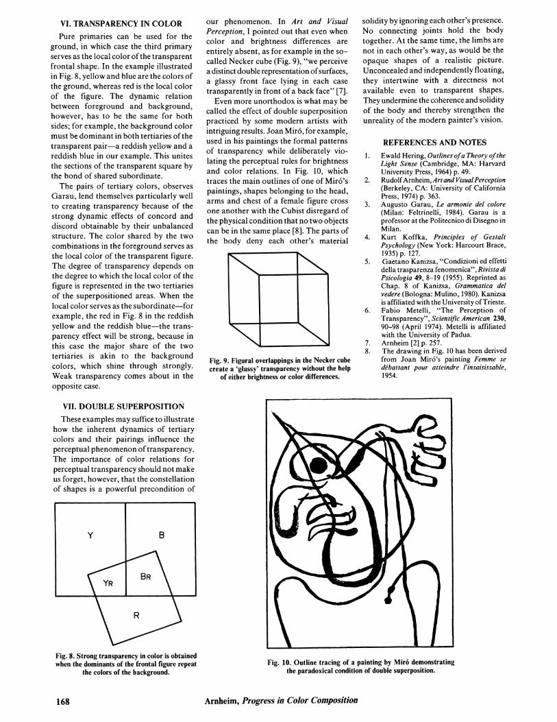
our phenomenon. In Art and Visual Perception, I pointed out that even when color and brightness differences are entirely absent, as for example in the so- called Necker cube (Fig. 9), "we perceive a distinct double representation of surfaces, a glassy front face lying in each case transparently in front of a back face" [7].
Even more unorthodox is what may be called the effect of double superposition practiced by some modern artists with intriguing results. Joan Mir6, for example, used in his paintings the formal patterns of transparency while deliberately vio- lating the perceptual rules for brightness and color relations. In Fig. 10, which traces the main outlines of one of Miro's paintings, shapes belonging to the head, arms and chest of a female figure cross one another with the Cubist disregard of the physical condition that no two objects can be in the same place [8]. The parts of the body deny each other's material
I
Fig. 9. Figural overlappings in the Necker cube create a 'glassy' transparency without the help
of either brightness or color differences.
solidity by ignoring each other's presence. No connecting joints hold the body together. At the same time, the limbs are not in each other's way, as would be the opaque shapes of a realistic picture. Unconcealed and independently floating, they intertwine with a directness not available even to transparent shapes. They undermine the coherence and solidity of the body and thereby strengthen the unreality of the modern painter's vision.
REFERENCES AND NOTES 1. Ewald Hering, Outlines of a Theory of the
Light Sense (Cambridge, MA: Harvard University Press, 1964) p. 49.
2. Rudolf Arnheim, Art and Visual Perception (Berkeley, CA: University of California Press, 1974) p. 363.
3. Augusto Garau, Le armonie del colore (Milan: Feltrinelli, 1984). Garau is a professor at the Politecnico di Disegno in Milan.
4. Kurt Koffka, Principles of Gestalt Psychology (New York: Harcourt Brace, 1935) p. 127.
5. Gaetano Kanizsa, "Condizioni ed effetti della trasparenza fenomenica", Rivista di Psicologia 49, 8-19 (1955). Reprinted as Chap. 8 of Kanizsa, Grammatica del vedere (Bologna: Mulino, 1980). Kanizsa is affiliated with the University of Trieste.
6. Fabio Metelli, "The Perception of Transparency", Scientific American 230, 90-98 (April 1974). Metelli is affiliated with the University of Padua.
7. Arnheim [2] p. 257. 8. The drawing in Fig. 10 has been derived
from Joan Mir6's painting Femme se debattant pour atteindre l'insaisissable, 1954.
VII. DOUBLE SUPERPOSITION These examples may suffice to illustrate
how the inherent dynamics of tertiary colors and their pairings influence the perceptual phenomenon of transparency. The importance of color relations for perceptual transparency should not make us forget, however, that the constellation of shapes is a powerful precondition of
Fig. 8. Strong transparency in color is obtained when the dominants of the frontal figure repeat
the colors of the background. Fig. 10. Outline tracing of a painting by Miro demonstrating
the paradoxical condition of double superposition.
Arnheim, Progress in Color Composition
\:I
168