static-content.springer.com10.1186... · web view1574.0 1575.0 1576.0 1577.0 1578.0 1579.0 1580.0...
TRANSCRIPT
Plague dynamics is controlled by the synergistic effect of climatic indices
Table S1. Results of Augmented Dickey-Fuller test
Table S2. Difference level and Akaike’s information criterion lag of casual linkages
Table S3. Simple regression result for temperature and aridity index association
Figure S1. Time series of precipitation, AD1347–AD1760
Figure S2. Wavelet transform of the time series of (A) plague outbreak; (B) temperature; (C) PDSI; and (D) precipitation.
Figure S3. Multiple wavelet coherence (MWC) analysis, which demonstrates the synergistic effect of temperature anomalies and precipitation on plague dynamics in Europe.
Figure S4. Wavelet analyses of the phase and frequency of the climate-plague nexus in Europe in AD1347–1760. With the time series of plague outbreak normalized by historical population figures from McEvedy and Jones [1]. (A) WTC analysis of temperature and plague. (B) WTC analysis of aridity index and plague. (C) MWC analysis of temperature, aridity index, and plague. (D) PWC analysis of temperature and plague, with the effect of aridity index controlled. (E) PWC analysis of aridity index and plague, with the effect of temperature controlled. The color code for the spectrum refers to the significance of the relationship, ranging from dark red (high values) to dark blue (low values). Region with significant coherency (p < 0.05) against red noise is indicated by the black contour line. In the graph, the cone of influence indicates regions not influenced by edge effect.
Figure S5. MWC analysis of the climate-plague nexus in the five countries in Western Europe in AD1347–1760. With the time series of plague outbreak adjusted by historical population figures in the corresponding country from McEvedy and Jones [1]. (A) UK, (B) France, (C) Germany, (D) Italy, and (E) Spain. The color code for the spectrum refers to the significance of the relationship, ranging from dark red (high values) to dark blue (low values). Region with significant coherency (p < 0.05) against red noise is indicated by the black contour line. In the graph, the cone of influence indicates regions not influenced by edge effect.
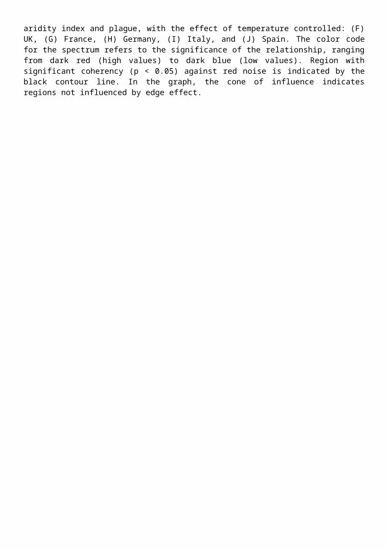
Figure S6. PWC analysis of the climate-plague nexus in the five countries in Western Europe in AD1347–1760. With the time series of plague outbreak adjusted by historical population figures in the corresponding country from McEvedy and Jones [1]. Panels in the left column are the PWC analysis of temperature and plague, with the effect of aridity index controlled: (A) UK, (B) France, (C) Germany, (D) Italy, and (E) Spain. Panels in the right column are the PWC analysis of aridity index and plague, with the effect of temperature controlled: (F) UK, (G) France, (H) Germany, (I) Italy, and (J) Spain. The color code for the spectrum refers to the significance of the relationship, ranging from dark red (high values) to dark blue (low values). Region with significant coherency (p < 0.05) against red noise is indicated by the black contour line. In the graph, the cone of influence indicates regions not influenced by edge effect.
SI Text

SI text:
Data description for precipitation:
Data of historical precipitation comes from the dataset created by Büntgen et al. [2]. The annual resolution precipitation of Europe is derived from 7284 series of European oak chronologies. Further, the anomaly of AMJ precipitation is reconstructed with respect to the 1901–2000 period. Figure S1 also shows the time series of precipitation over Europe from AD1347 to AD1760.
Data description for historical population and its use:
Data of historical population comes from the dataset by McEvedy and Jones [1]. The population data provides data resolution up to country scale. Any missing data is interpolated by assuming exponential growth of population in history. In Figure S4–S6, the time series of plague outbreak is divided by the corresponding population figure at the same geographical unit to control the effect of population growth in history.
Table S1. Results of Augmented Dickey-Fuller test
Time Series ProbabilityNo difference
Plague outbreak 0.0012Temperature 0.0003Aridity index 0.0000Precipitation 0.0000
Table S2. Difference level and Akaike’s information criterion lag of casual linkages
Group Difference level AIC lagTemperature Plague outbreak No difference 5Aridity index Plague outbreak No difference 5Precipitation Plague outbreak No difference 4
Table S3. Simple regression result for temperature and aridity index association
Coefficient F-value R2
Temperature-aridity index association -0.169* 4.66 0.0112Note: n = 414; * significant at 0.05 level

1347 1397 1447 1497 1547 1597 1647 1697 17470
50
100
150
200
250
300
350
400
Year
Pre
cip
itat
ion
(m
m)
Figure S1. Time series of precipitation, AD1347–AD1760
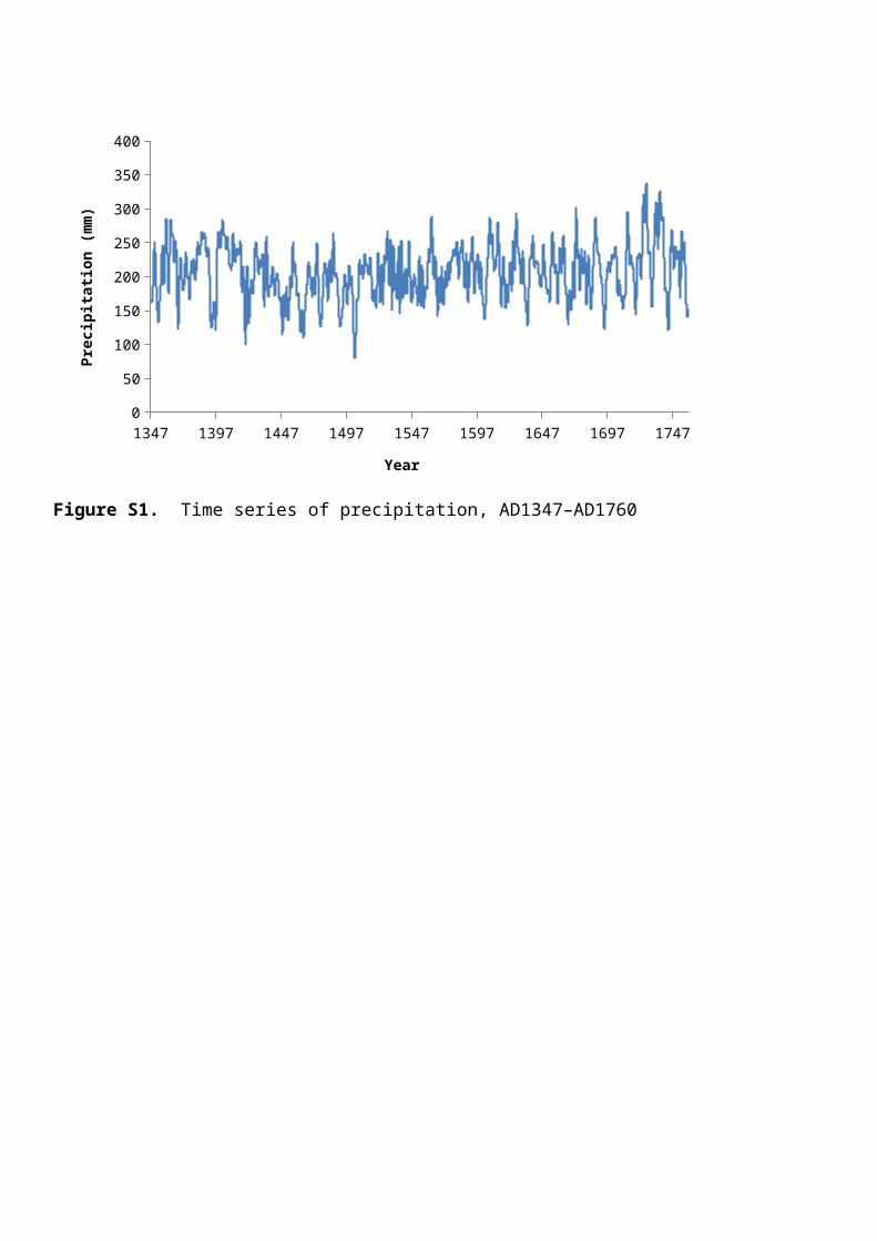
Figure S2. Wavelet transform of the time series of (A) plague outbreak; (B) temperature; (C) PDSI; and (D) precipitation.

Figure S3. Multiple wavelet coherence (MWC) analysis, which demonstrates the synergistic effect of temperature anomalies and precipitation on plague dynamics in Europe.
Note: The result indicates a consistent coherent band between the combined effect of temperature anomalies and precipitation with plague dynamics at 64 year periodicities from AD1440–1540. Small area of Covariance can also be spotted at 8–16 year cycle and 4–32 year cycle in AD1450–1520 and AD1550–1640 respectively. By comparison to the significant region of temperature/PDSI–plague relationship (Figure 3), the temperature/precipitation–plague relationship is comparatively smaller. As suggested by Ng and Chan [3], the temperature/PDSI–plague relationship provides a better explanation to plague dynamics and its modeling.
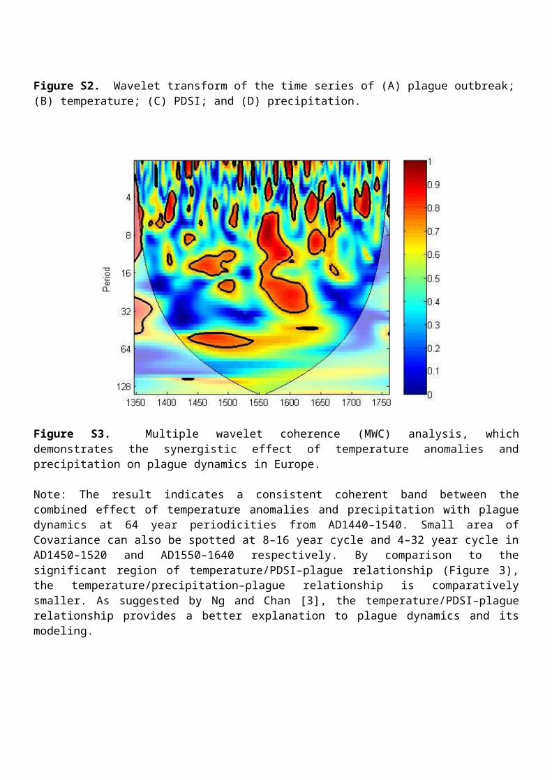
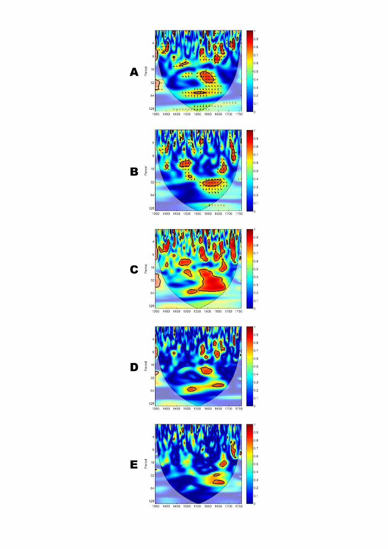
Figure S4. Wavelet analyses of the phase and frequency of the climate-plague nexus in Europe in AD1347–1760. With the time series of plague outbreak normalized by historical population figures from McEvedy and Jones [1]. (A) WTC analysis of temperature and plague. (B) WTC analysis of aridity index and plague. (C) MWC analysis of temperature, aridity index, and plague. (D) PWC analysis of temperature and plague, with the effect of aridity index controlled. (E) PWC analysis of aridity index and plague, with the effect of temperature controlled. The color code for the spectrum refers to the significance of the relationship, ranging from dark red (high values) to dark blue (low values). Region with significant coherency (p < 0.05) against red noise is indicated by the black contour line. In the graph, the cone of influence indicates regions not influenced by edge effect.


Figure S5. MWC analysis of the climate-plague nexus in the five countries in Western Europe in AD1347–1760. With the time series of plague outbreak adjusted by historical population figures in the corresponding country from McEvedy and Jones [1]. (A) UK, (B) France, (C) Germany, (D) Italy, and (E) Spain. The color code for the spectrum refers to the significance of the relationship, ranging from dark red (high values) to dark blue (low values). Region with significant coherency (p < 0.05) against red noise is indicated by the black contour line. In the graph, the cone of influence indicates regions not influenced by edge effect.
Figure S6. PWC analysis of the climate-plague nexus in the five countries in Western Europe in AD1347–1760. With the time series of plague outbreak adjusted by historical population figures in the corresponding country from McEvedy and Jones [1]. Panels in the left column are the PWC analysis of temperature and plague, with the effect of aridity index controlled: (A) UK, (B) France, (C) Germany, (D) Italy, and (E) Spain. Panels in the right column are the PWC analysis of aridity index and plague, with the effect of temperature controlled: (F) UK, (G) France, (H) Germany, (I) Italy, and (J) Spain. The color code for the spectrum refers to the significance of the relationship, ranging from dark red (high values) to dark blue (low values). Region with significant coherency (p < 0.05) against red noise is

indicated by the black contour line. In the graph, the cone of influence indicates regions not influenced by edge effect.
Reference:
1. McEvedy C, Jones R: Atlas of world population history. Penguin Books Ltd, Harmondsworth, Middlesex, England.; 1978.
2. Büntgen U, Tegel W, Nicolussi K, McCormick M, Frank D, Trouet V, Kaplan JO, Herzig F, Heussner K-U, Wanner H: 2500 years of European climate variability and human susceptibility. Science 2011, 331:578-582.
3. Ng EK, Chan JC: Geophysical applications of partial wavelet coherence and multiple wavelet coherence. Journal of Atmospheric and Oceanic Technology 2012, 29:1845-1853.