systems analysis and design powerpoint presentation derived from dennis, wixom & tegarden...
TRANSCRIPT

Systems Analysis and DesignSystems Analysis and Design
PowerPoint Presentation derived from Dennis, Wixom & Tegarden
Systems Analysis and DesignJohn Wiley & Sons, Inc.
Derived from original slides by Fred Niederman for 2nd Edition,with additional slides from 3rd Edition
Further additions by Dr. Sara Stoecklin & Ted Baker
Most slides Copyright 2001 © John Wiley & Sons, Inc. All rights reserved.
Slide 1

User Interface Design Process
Chapter 12 (2nd Ed)Chapter 11 (3rd Ed)
PowerPoint Presentation for Dennis, Wixom & TegardenSystems Analysis and Design
Copyright 2001 © John Wiley & Sons, Inc. All rights reserved.
Slide 2
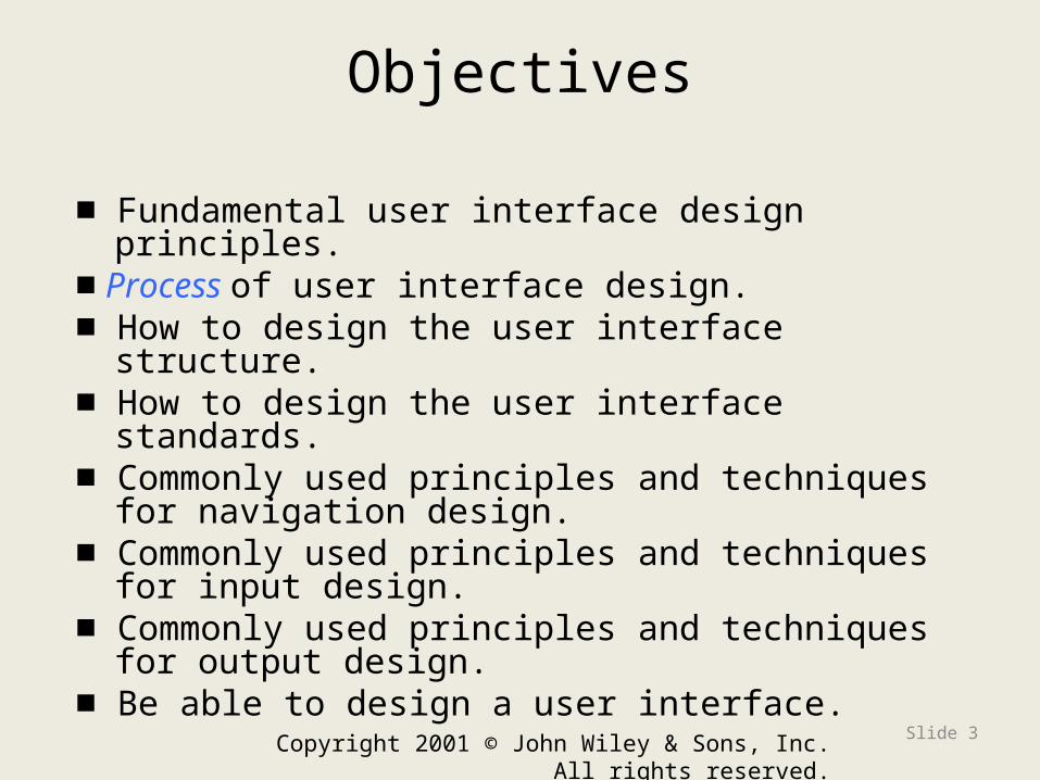
Objectives
■ Fundamental user interface design principles.■ Process of user interface design.■ How to design the user interface structure.■ How to design the user interface standards.■ Commonly used principles and techniques for
navigation design.■ Commonly used principles and techniques for
input design.■ Commonly used principles and techniques for
output design.■ Be able to design a user interface.
Copyright 2001 © John Wiley & Sons, Inc. All rights reserved.
Slide 3

Copyright 2001 © John Wiley & Sons, Inc. All rights reserved.
Slide 4
Context
• Interface Design formalizes the interaction of the system with external entities– System Interfaces are machine-machine
and are dealt with as part of systems integration
– User Interfaces are human-computer and are the focus of this chapter

Copyright 2001 © John Wiley & Sons, Inc. All rights reserved.
Slide 5
User Interface Design Principles

Interface Design
Easy to use?
Easy to understand??
THE OBJECTIVE
Easy to learn?
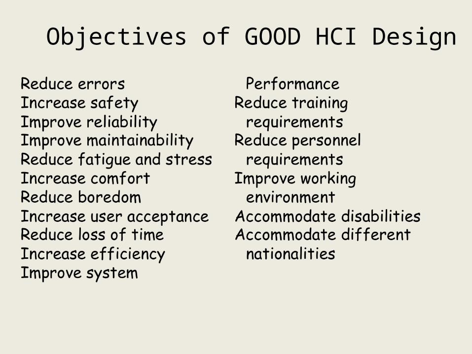
Objectives of GOOD HCI Design

Typical Design Errors
•lack of consistency•too much
memorization•no guidance / help•no context sensitivity•poor response•arcane/unfriendly•too many steps,
motions

Golden Rules
• Place the user in control• Reduce the user’s memory load– short term– long term
• Make the interface consistent

Place the User in Control
• Define interaction modes in a way that does not force a user into unnecessary or undesired actions.
• Provide for flexible interaction.
• Allow user interaction to be interruptible and undoable.
• Streamline interaction as skill levels advance and allow the interaction to be customized.
• Hide technical internals from the casual user.
• Design for direct interaction with objects that
appear on the screen.

Reduce the User’s Memory Load
• Reduce demand on short-term memory.
• Establish meaningful defaults.
• Define shortcuts that are intuitive.
• Base visual layout of the interface on a real world metaphor.
• Disclose information in a progressive fashion.

Make the Interface Consistent
• Allow the user to put the current task into a meaningful context.
• Maintain consistency across a family of applications.
• If past interactive models have created user expectations, do not make changes unless there is a compelling reason to do so.

Key Definitions
• The navigation mechanism provides the way for users to tell the system what to do
• The input mechanism defines the way the system captures information
• The output mechanism defines the way the system provides information to users or other systems
Copyright 2001 © John Wiley & Sons, Inc. All rights reserved.
Slide 13

Key Definitions
• The graphical user interface (GUI) is the most common type of interface students are likely to use personally and for developing systems.
PowerPoint Presentation for Dennis, Wixom & Tegardem Systems Analysis and DesignCopyright 2001 © John Wiley & Sons, Inc.
All rights reserved.
Slide 14

Copyright 2001 © John Wiley & Sons, Inc. All rights reserved. Slide 15
HCI Requirements HCI Specifications
Standards
MIL-H-46855B AFSC-DH 1-3
MIL-STD-1472 MIL-HDBK-759A
FactorsNoise, Lighting, Temperature, Humidity, Air Flow, Vibration, G-Forces, Motion, Reduced Oxygen, Air Pressure

Copyright 2001 © John Wiley & Sons, Inc. All rights reserved. Slide 16
Principles of User Interface Design
• Layout• Content Awareness• Aesthetics• User Experience• Consistency• Minimal User Effort

Principles
PowerPoint Presentation for Dennis, Wixom & Tegardem Systems Analysis and Design Copyright 2001 © John Wiley & Sons, Inc. All rights reserved.
Slide 17
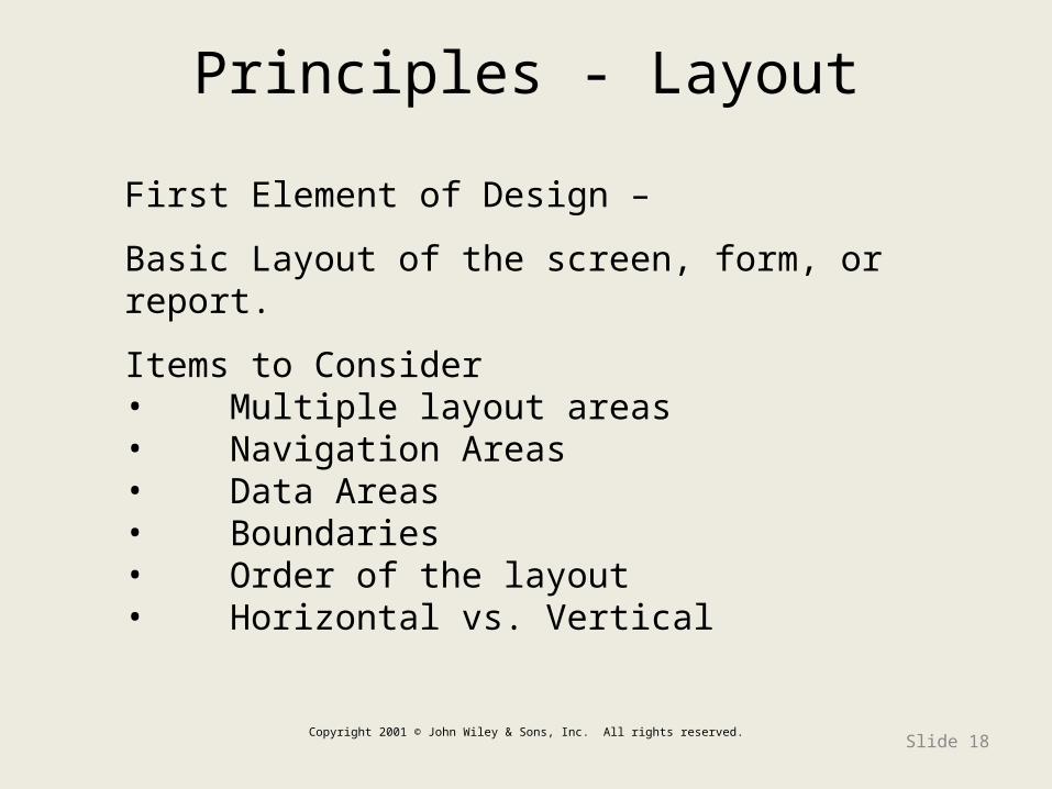
Principles - Layout
Copyright 2001 © John Wiley & Sons, Inc. All rights reserved.Slide 18
First Element of Design –
Basic Layout of the screen, form, or report.
Items to Consider• Multiple layout areas• Navigation Areas• Data Areas• Boundaries• Order of the layout• Horizontal vs. Vertical
Copyright 2001 © John Wiley & Sons, Inc. All rights reserved. Slide 19
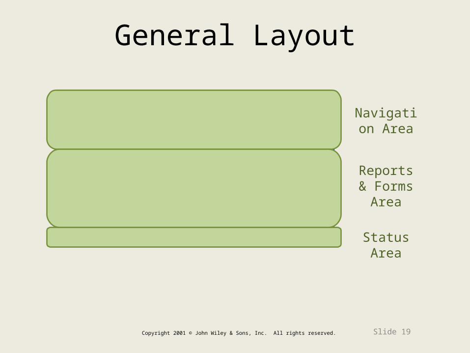
Navigation Area
Status Area
Reports & Forms Area
General Layout

Copyright 2001 © John Wiley & Sons, Inc. All rights reserved. Slide 20
Layout
• Each area may be further subdivided• Each area is self-contained • Areas should have a natural intuitive
flow– Users from western nations tend to read
from left to right and top to bottom– Users from other regions may have
different flows

Principles – Content Awareness
Copyright 2001 © John Wiley & Sons, Inc. All rights reserved.
Slide 21
Content Awareness – ability of a user interface to make the user aware of the information it contains with the LEAST amount of effort.
All elements in the design need to be considered when making sure this principle is followed. Items such as navigation, fields, areas, information, graphics, all need to be considered.

Copyright 2001 © John Wiley & Sons, Inc. All rights reserved.
Slide 22
Content Awareness
• Intuitively answers the users’ questions:– Where am I?– What am I supposed to be doing here?
• Content awareness applies to sub-areas within a form or window– Related form fields (e.g. address information) are
grouped together– Related report information (e.g. records) are
grouped together

Form Content Awareness
Phone Numbers Area
Name Area
Copyright 2001 © John Wiley & Sons, Inc. All rights reserved.
Slide 23

Report Content Awareness
First Record Area
Second Record Area
Copyright 2001 © John Wiley & Sons, Inc. All rights reserved.
Slide 24

Aesthetics
• Interfaces should be functional, inviting to use, and pleasing to the eye
• In most cases, less is more (minimalist design)
• White space is important– makes the eye feel comfortable searching for
items.• Acceptable information density is
proportional to the user’s expertise– Novice users prefer less than 50% density– Expert users prefer more than 50% density

Use of Color
• Use Color to express what you intend to communicate
• Use backgrounds that are white or light colored• Use colors in a consistent manner for all GUI’s• Use color sparingly. 5-7 colors plenty• Use color for a purpose other than aesthetics• Be aware all monitors do not display colors the
same• Never rely on color alone to convey information
– 5-8% of males, and about 1% of females, are color-blind
– screens/pages must be intelligible in greyscale

Design Principles : Color Usage
Which is better?
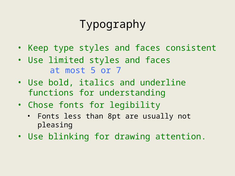
Typography
• Keep type styles and faces consistent• Use limited styles and faces
at most 5 or 7• Use bold, italics and underline functions
for understanding• Chose fonts for legibility• Fonts less than 8pt are usually not pleasing
• Use blinking for drawing attention.

Other Principles
• Allow users to select components, colors, locations if possible.
• Do not rely solely on a mouse for navigation.
Which is better?

Principles – User Experience
PowerPoint Presentation for Dennis, Wixom & Tegardem Systems Analysis and Design
Copyright 2001 © John Wiley & Sons, Inc. All rights
reserved.
Slide 30
There are two types of users– those with experience using user interfaces and those without.
You have to present your interfaces as if they had no experience.
But also provide for growing experience.
Make quick access to well-known functions.
Keep it simple.

Good or Bad?
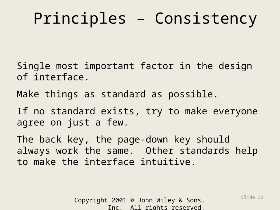
Principles – Consistency
Copyright 2001 © John Wiley & Sons, Inc. All rights reserved.
Slide 32
Single most important factor in the design of interface.
Make things as standard as possible.
If no standard exists, try to make everyone agree on just a few.
The back key, the page-down key should always work the same. Other standards help to make the interface intuitive.
Consistency
• All parts of the system work in the same way
• Key areas of consistency are– Navigation controls– Terminology
• Probably most important concept in making the system simple because it allows the users to predict what is going to happen
Copyright 2009 © John Wiley & Sons, Inc. All rights reserved.
Slide 33

User Experience
• Ease of learning– Significant issue for inexperienced users– Relevant to systems with a large user
population
• Ease of use– Significant issue for expert users–Most important in specialized systems
• Sometimes ease of learning and use of use go hand in hand
Copyright 2009 © John Wiley & Sons, Inc. All rights reserved.
Slide 34

Minimal User Effort
• Interfaces should be designed to minimize the effort needed to accomplish tasks
• A common rule is the tree-clicks rule– Users should be able to go from main
menu of a system to the information they want in no more than three mouse clicks
Copyright 2009 © John Wiley & Sons, Inc. All rights reserved.
Slide 35
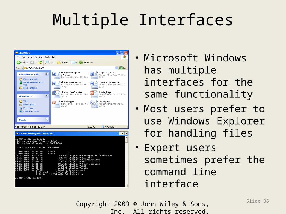
Multiple Interfaces
• Microsoft Windows has multiple interfaces for the same functionality
• Most users prefer to use Windows Explorer for handling files
• Expert users sometimes prefer the command line interface
Copyright 2009 © John Wiley & Sons, Inc. All rights reserved.
Slide 36

USER INTERFACE DESIGN PROCESS
Copyright 2009 © John Wiley & Sons, Inc. All rights reserved.
Slide 37

PowerPoint Presentation for Dennis, Wixom & Tegardem Systems Analysis and Design
Copyright 2001 © John Wiley & Sons, Inc. All
rights reserved.
Slide 38
We have defined use cases, objects and their relationships through object diagrams and sequence diagram to define interactions between objects.
We are now ready to define and design our screens. Perhaps we need a method of specification.

Copyright 2001 © John Wiley & Sons, Inc. All rights reserved.
Slide 39
5-Step UI Design Process
Step 5 Step 1
Step 2
Step 3
Step 4

Step 1: Use Scenario Development
PowerPoint Presentation for Dennis, Wixom & Tegardem Systems Analysis and Design
Copyright 2001 © John Wiley & Sons, Inc. All
rights reserved.
Slide 40
Step 2
Step 3Step 4
Step 5Analyst examines use cases and use case descriptions (we have not yet developed sequence diagrams in our methodology).
Analyst interviews users to determine their needs to perform the necessary actions quickly and smoothly
Use Scenarios Development

Use Scenario Development
Copyright 2001 © John Wiley & Sons, Inc. All rights reserved.
Slide 41
• Use scenarios outline the steps performed by users to accomplish some part of their work
• A use scenario is one path through an essential use case
• Presented in a simple narrative description• Document the most common cases so
interface designs will be easy to use for those situations

The structure defines the basic components of the interface and shows their functionality.
Step 2: Interface Structure Design
PowerPoint Presentation for Dennis, Wixom & Tegardem Systems Analysis and Design
Copyright 2001 © John Wiley & Sons, Inc. All rights reserved.
Slide 42
Step 2
Main Menu
Edit Screen
Select edit
Esc, backSave Dialog
Select save
Esc
Interface Structure Design

Copyright 2001 © John Wiley & Sons, Inc. All rights reserved.
Slide 43
Use Scenario Development
The structure defines the basic components of the interface and shows their functionality.
Screen Main Menu Edit Screen Save Dialog
Main Menu N/A Select Edit ------
Edit Screen Esc, back N/A Select save
Save Dialog ------ esc N/A
Interface Structure
Design

Interface Structure Design
Copyright 2001 © John Wiley & Sons, Inc. All rights reserved.
Slide 44
• The interface structure defines – The basic components of the interface– How they work together to provide
functionality to users
• Windows Navigation Diagrams (WND) show – how all the screens, forms, and reports used by
the system are related – how the user moves from one to another
Copyright 2001 © John Wiley & Sons, Inc. All rights reserved.
Slide 45
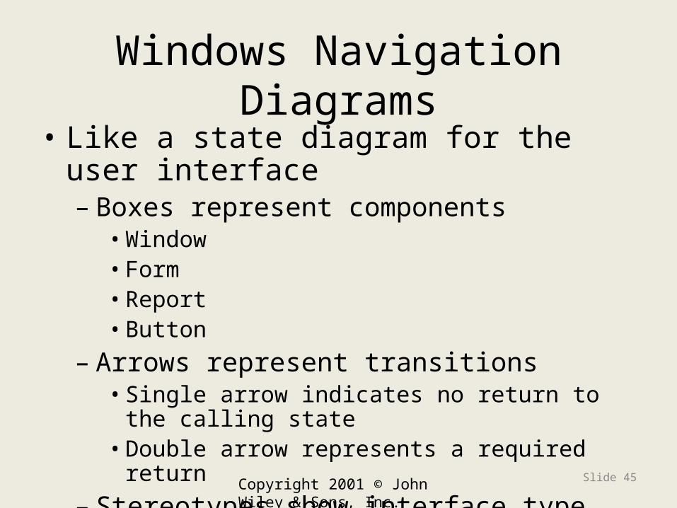
Windows Navigation Diagrams
• Like a state diagram for the user interface– Boxes represent components• Window• Form• Report• Button
– Arrows represent transitions• Single arrow indicates no return to the calling state• Double arrow represents a required return
– Stereotypes show interface type

Copyright 2001 © John Wiley & Sons, Inc. All rights reserved.
Slide 46
Sample WND

Window Navigation Diagram
PowerPoint Presentation for Dennis, Wixom & Tegardem Systems Analysis and Design
Copyright 2001 © John Wiley & Sons, Inc. All
rights reserved.
Slide 47

Step 3: Interface Standards Design
Copyright 2001 © John Wiley & Sons, Inc. All rights reserved.
Slide 48
Step 1
Step 2Step 5
It is used to define those items common to most of the user interfaces.
This process is done after some of the more common user interfaces have been defined and designed.
Interface Standards
Design

Copyright 2001 © John Wiley & Sons, Inc. All rights reserved.
Slide 49
Interface Standards Design
• Interface standards are basic design elements found across the system user interface
• Standards are needed for:– Interface metaphor– Interface objects– Interface actions– Interface icons– Interface templates

Step 4: Interface Design Prototyping
PowerPoint Presentation for Dennis, Wixom & Tegardem Systems Analysis and Design
Copyright 2001 © John Wiley & Sons, Inc. All rights reserved.
Slide 50
Step 1
Step 2Step 5
Getting user signoff as you go is much easier than one big splash at the end.
This process is done again iteratively after a few and then more screens are designed.
Interface Design
Prototyping
What is prototyping?
• The process of building a model of a system.
• For an information system, prototypes are employed to help system designers build an information system that is intuitive and easy to manipulate for end users.

When is prototyping used?
• Prototyping is an iterative process that is generally used in the analysis workflow.
• However, you can do a prototype for various reasons. You might want to prototype the use of a database management system (DBII, Oracle), prototype the use of a session management tool or other software that you may use.

Copyright 2001 © John Wiley & Sons, Inc. All rights reserved.
Slide 53
Advantages of Prototyping
• Reduces development time. • Reduces development costs. • Requires user involvement. • Developers receive user feedback early
enough to use.• Helps implementation
users know expectations.• Results in higher user satisfaction.

Copyright 2001 © John Wiley & Sons, Inc. All rights reserved.
Slide 54
Prototyping Disadvantages
• Can lead to insufficient analysis. • Users expect the performance of the ultimate
system to be the same as the prototype. • Developers can become too attached to their
prototypes. • Can cause systems to be left unfinished and/or
implemented before they are ready. • Sometimes leads to incomplete documentation. • If sophisticated software prototypes (4th GL or CASE
Tools) are employed, the time saving benefit of prototyping can be lost.

Copyright 2001 © John Wiley & Sons, Inc. All rights reserved.
Slide 55
Prototyping Usage
• In the early 1980's, organizations used prototyping approximately thirty percent (30%) of the time in development projects. • In the early 1990's, its use had doubled to sixty percent (60%).
• The use of object-oriented technology has slowed down this trend since developers are spending more of their time on OO concerns.

Copyright 2001 © John Wiley & Sons, Inc. All rights reserved.
Slide 56
When should I use prototyping?
1.When users are able to actively participate in the project. 2.When developers have prototyping experience or training. 3.When users have be informed on the purpose of prototyping. 4.When experimentation and learning are needed before there can be full commitment to a project.5.When cost is an issue for driving out requirements.
Copyright 2001 © John Wiley & Sons, Inc. All rights reserved.
Slide 57
Analysis and Prototyping
GOAL:
Produce the most reasonable interface within practical business constraints.

Copyright 2001 © John Wiley & Sons, Inc. All rights reserved.
Slide 58
Benefits of early Analysis & Prototyping of GUIs
•Keeps ultimate product vision in sight •Allows definition of base functionality•Helps scope out critical features•Makes management more committed•Helps to avoid misinterpretation or oversights •Allows clarification of details •Helps to develop release criteria •Aids to establish minimum and target goals

Copyright 2001 © John Wiley & Sons, Inc. All rights reserved.
Slide 59
Interface Design Prototyping
• Mock-ups or simulations of computer screens, forms, and reports
• Four common approaches– Storyboard– Windows layout diagram– HTML prototype– Language prototype

Interface Design Prototyping
• Storyboard– Simplest technique– Paper-based with hand drawn mock up
screens on paper– Navigation is done by the story teller
flipping thru the screens as you would a cartoon tale.
PowerPoint Presentation for Dennis, Wixom & Tegardem Systems Analysis and DesignCopyright 2001 © John Wiley & Sons, Inc.
All rights reserved.
Slide 60

Copyright 2001 © John Wiley & Sons, Inc. All rights reserved.
Slide 61
Sample Storyboard
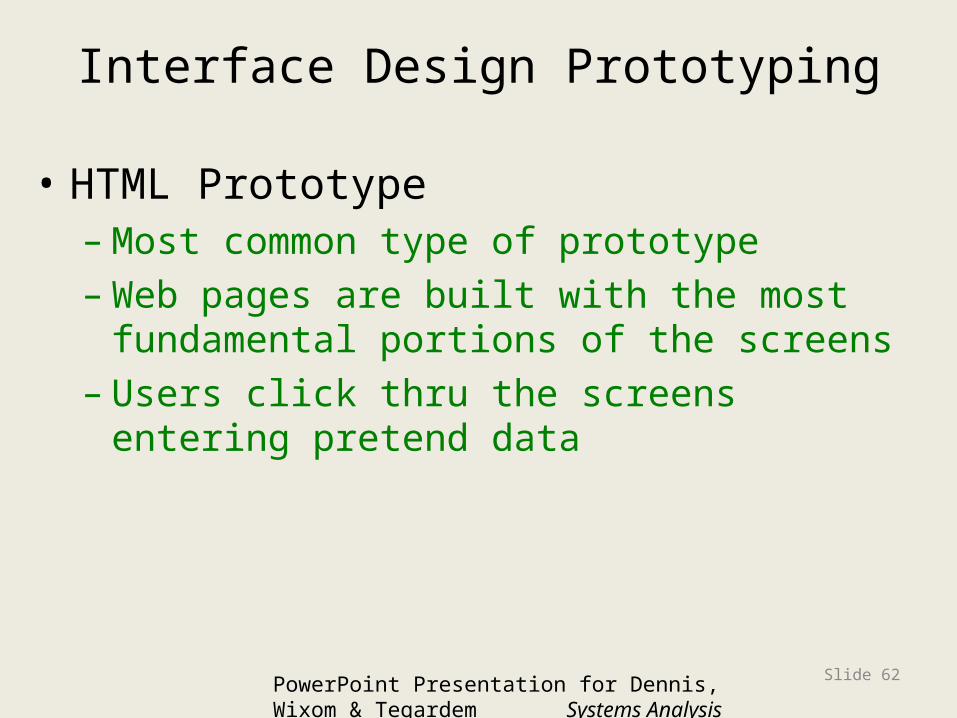
Interface Design Prototyping
• HTML Prototype–Most common type of prototype–Web pages are built with the most
fundamental portions of the screens– Users click thru the screens entering
pretend data
PowerPoint Presentation for Dennis, Wixom & Tegardem Systems Analysis and DesignCopyright 2001 © John Wiley & Sons, Inc.
All rights reserved.
Slide 62

Interface Design Prototyping
• Language Prototype– Built using a prototype language or tool to
build the screens and navigation. – Users can move thru the screens with no
real processing behind the screen.– These screens can be exactly as the user
will eventually use them.
PowerPoint Presentation for Dennis, Wixom & Tegardem Systems Analysis and DesignCopyright 2001 © John Wiley & Sons, Inc.
All rights reserved.
Slide 63

Interface Design Prototyping
• Selecting the right technique– Storyboard is simplest and cheapest but
least like the real screens– Language is expensive but is the most
detailed and most like the real screens– HTML is not cheap but not expensive and
makes the screens seem real.
PowerPoint Presentation for Dennis, Wixom & Tegardem Systems Analysis and DesignCopyright 2001 © John Wiley & Sons, Inc.
All rights reserved.
Slide 64

Step 5: Interface Evaluation
• Need several (10 or more) users
• Should be as complete as possible
• Four techniques– Heuristic–Walkthrough– Interactive– Formal Usability Testing
PowerPoint Presentation for Dennis, Wixom & Tegardem Systems Analysis and DesignCopyright 2001 © John Wiley & Sons, Inc.
All rights reserved.
Slide 65
Interface Evaluation
Copyright 2001 © John Wiley & Sons, Inc. All rights reserved.
Slide 66
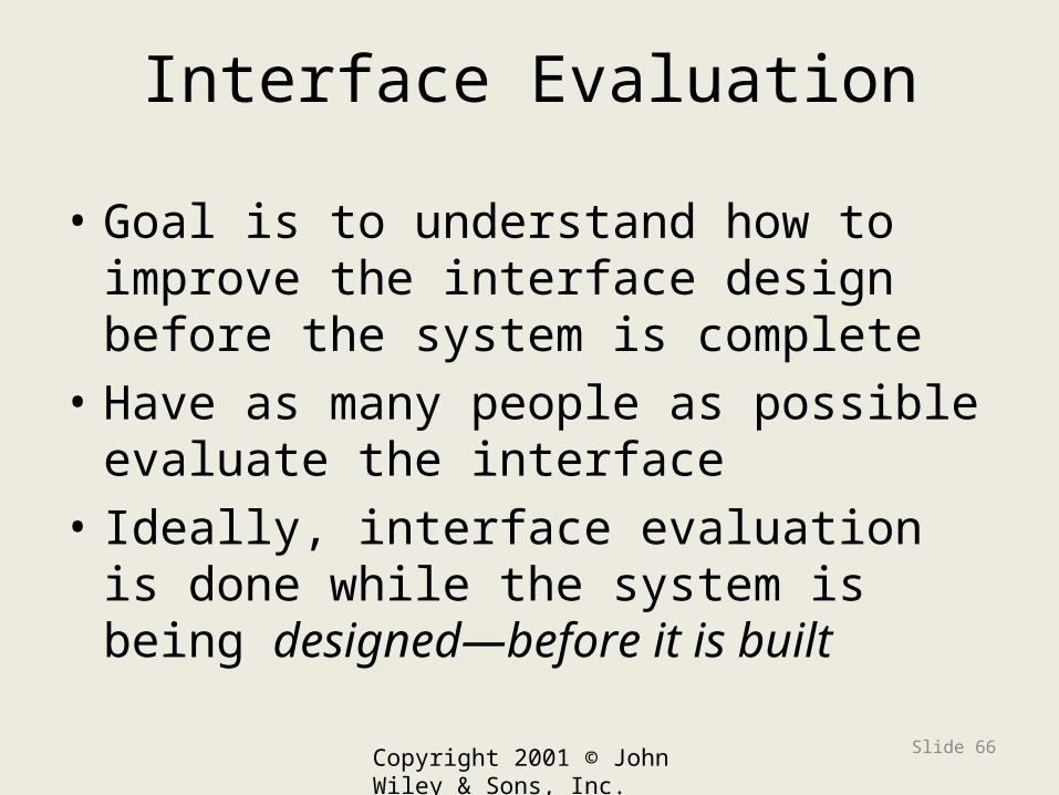
Interface Evaluation
• Goal is to understand how to improve the interface design before the system is complete
• Have as many people as possible evaluate the interface
• Ideally, interface evaluation is done while the system is being designed—before it is built

Interface Design Evaluation
• Heuristic evaluation– evaluates by some principles of interface
design – – team develops a checklist of principles
about navigation, input and output design and assures the interface meets the checklist requirements.
PowerPoint Presentation for Dennis, Wixom & Tegardem Systems Analysis and DesignCopyright 2001 © John Wiley & Sons, Inc.
All rights reserved.
Slide 67
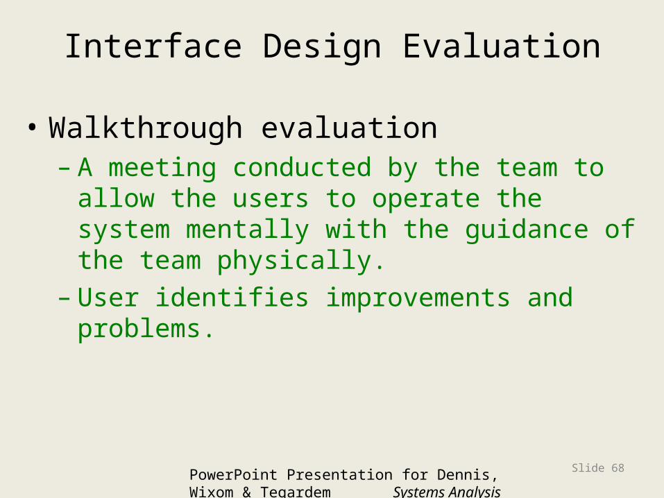
Interface Design Evaluation
• Walkthrough evaluation– A meeting conducted by the team to allow
the users to operate the system mentally with the guidance of the team physically.
– User identifies improvements and problems.
PowerPoint Presentation for Dennis, Wixom & Tegardem Systems Analysis and DesignCopyright 2001 © John Wiley & Sons, Inc.
All rights reserved.
Slide 68
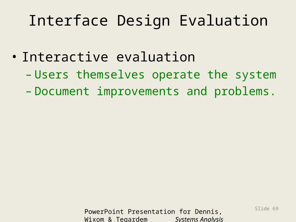
Interface Design Evaluation
• Interactive evaluation– Users themselves operate the system – Document improvements and problems.
PowerPoint Presentation for Dennis, Wixom & Tegardem Systems Analysis and DesignCopyright 2001 © John Wiley & Sons, Inc.
All rights reserved.
Slide 69

Interface Design Evaluation
• Formal Usability Testing– A formal walkthru of the user interface
with recordings of keystrokes, errors, etc. – The interface either fails or passes the test
done by the user. The user never fails– Usually the user is a professional tester.
PowerPoint Presentation for Dennis, Wixom & Tegardem Systems Analysis and DesignCopyright 2001 © John Wiley & Sons, Inc.
All rights reserved.
Slide 70

NAVIGATION DESIGN
Copyright 2001 © John Wiley & Sons, Inc. All
rights reserved.
Slide 71
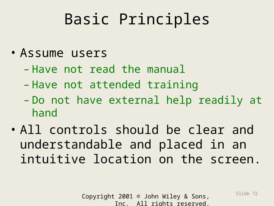
Basic Principles
• Assume users– Have not read the manual– Have not attended training– Do not have external help readily at hand
• All controls should be clear and understandable and placed in an intuitive location on the screen.
Copyright 2001 © John Wiley & Sons, Inc. All rights reserved.
Slide 72

Basic Principles
• Prevent mistakes– Limit choices– Never display commands that can’t be
used (or “gray them out”)– Confirm actions that are difficult or
impossible to undo
• Simplify recovery from mistakes• Use consistent grammar order
Copyright 2001 © John Wiley & Sons, Inc. All rights reserved.
Slide 73
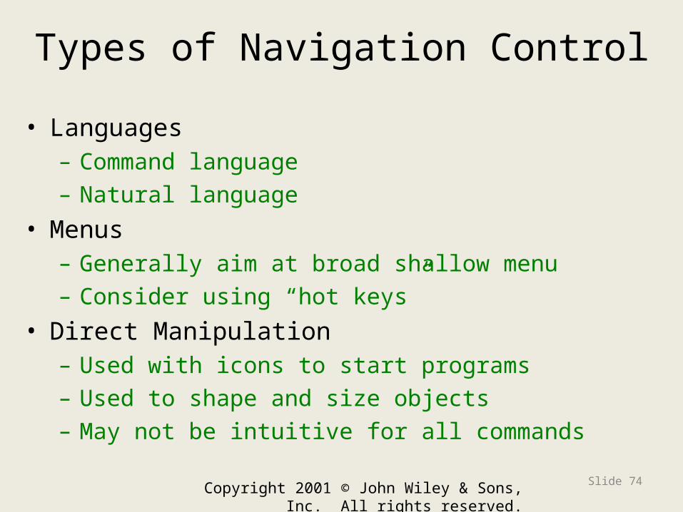
Types of Navigation Control
• Languages– Command language– Natural language
• Menus– Generally aim at broad shallow menu– Consider using “hot keys”
• Direct Manipulation– Used with icons to start programs– Used to shape and size objects– May not be intuitive for all commands
Copyright 2001 © John Wiley & Sons, Inc. All rights reserved.
Slide 74

Copyright 2001 © John Wiley & Sons, Inc. All rights reserved.
Slide 75
Example Navigation Menu
Menu bar
Grayed-out commands
Drop-down menu
Cascading menu

A Traditional Menu in a UNIX System
PowerPoint Presentation for Dennis,
Copyright 2001 © John Wiley & Sons, Inc. All
rights reserved.
Slide 76

Menu Tips
Copyright 2001 © John Wiley & Sons, Inc. All
rights reserved.
Slide 77
Menus should be broad and shallow rather than narrow and deep.
Most information is presented initially requiring less keystrokes
One menu should contain no more than 8 items and take no more than two clicks to perform an action (BB should have read this)
Menus should put together like items so the user can intuitively guess what each contains. Better to group them by types of objects

Common Types of Menus
PowerPoint Presentation for Dennis, Wixom & Tegardem Systems Analysis and Design
Copyright 2001 © John Wiley & Sons, Inc. All
rights reserved.
Slide 78
Menu Bar
Drop Down Menu
ToolBar

Example of an Image Map
Copyright 2001 © John Wiley & Sons, Inc. All
rights reserved.
Slide 79

Types of Menus
PowerPoint Presentation for Dennis, Wixom & Tegardem Systems Analysis and Design
Copyright 2001 © John Wiley & Sons, Inc. All
rights reserved.
Slide 80
Types of Menus
Menu barDrop-down menuPop-up menuTab menuToolbarImage map
WhenWould YouUse Each ofThese MenuTypes?
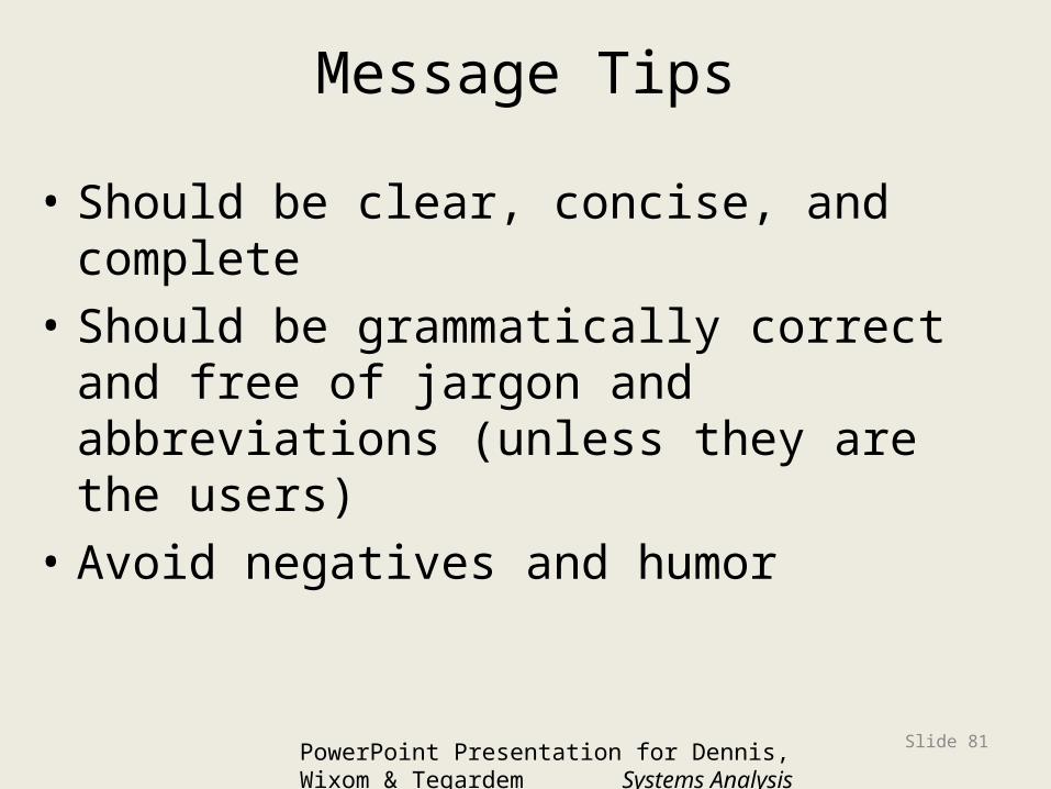
Message Tips
• Should be clear, concise, and complete• Should be grammatically correct and
free of jargon and abbreviations (unless they are the users)
• Avoid negatives and humor
PowerPoint Presentation for Dennis, Wixom & Tegardem Systems Analysis and DesignCopyright 2001 © John Wiley & Sons, Inc.
All rights reserved.
Slide 81

Types of Messages
PowerPoint Presentation for Dennis, Wixom & Tegardem Systems Analysis and Design
Copyright 2001 © John Wiley & Sons, Inc. All
rights reserved.
Slide 82
Types of Messages
Error messageConfirmation messageAcknowledgment messageDelay messageHelp message
WhenWould YouUse Each ofThese MessageTypes?

Crafting an Error Message
Copyright 2001 © John Wiley & Sons, Inc. All
rights reserved.
Slide 83

INPUT DESIGN
PowerPoint Presentation for Dennis, Wixom & Tegarden Systems Analysis and Design
Copyright 2001 © John Wiley & Sons, Inc. All
rights reserved.
Slide 84

Basic Principles
• The goal is to simply and easily capture accurate information for the system
• Reflect the nature of the inputs• Find ways to simplify their collection
PowerPoint Presentation for Dennis, Wixom & Tegardem Systems Analysis and DesignCopyright 2001 © John Wiley & Sons, Inc.
All rights reserved.
Slide 85

Online versus Batch Processing
• Online processing immediately records the transaction in the appropriate database
• Batch processing collects inputs over time and enters them into the system at one time in a batch
• Batch processing simplifies data communications and other processes, but means that inventory and other reports are not accurate in real time
PowerPoint Presentation for Dennis, Wixom & Tegardem Systems Analysis and DesignCopyright 2001 © John Wiley & Sons, Inc.
All rights reserved.
Slide 86

Capture Data at the Source
• Reduces duplicate work• Reduces processing time• Decreases cost• Decreases probability of error
PowerPoint Presentation for Dennis, Wixom & Tegardem Systems Analysis and DesignCopyright 2001 © John Wiley & Sons, Inc.
All rights reserved.
Slide 87
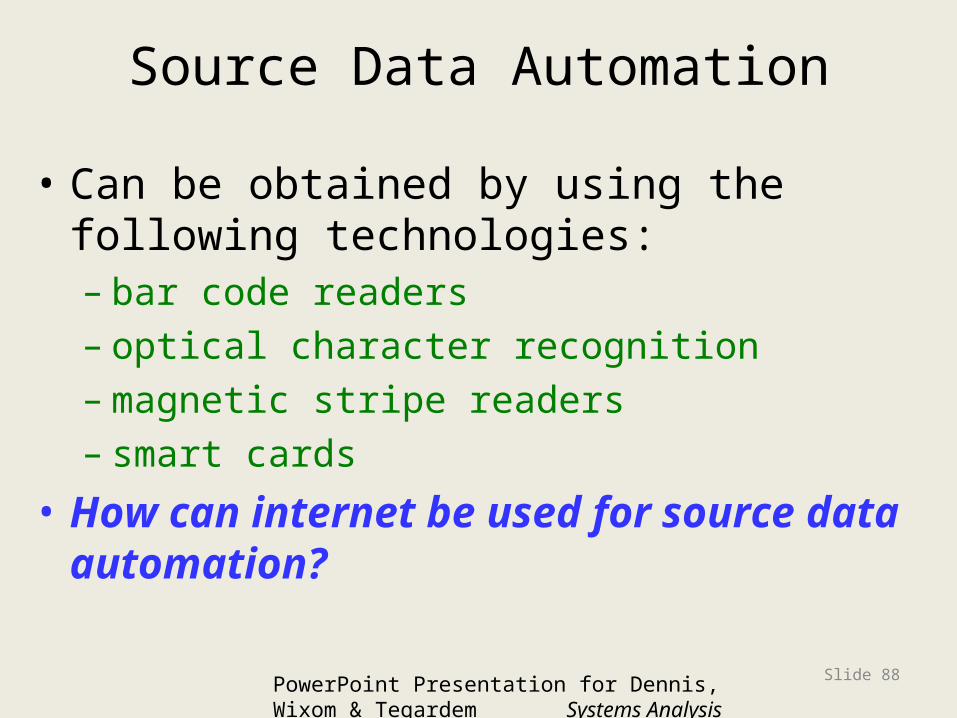
Source Data Automation
• Can be obtained by using the following technologies:– bar code readers– optical character recognition–magnetic stripe readers– smart cards
• How can internet be used for source data automation?
PowerPoint Presentation for Dennis, Wixom & Tegardem Systems Analysis and DesignCopyright 2001 © John Wiley & Sons, Inc.
All rights reserved.
Slide 88
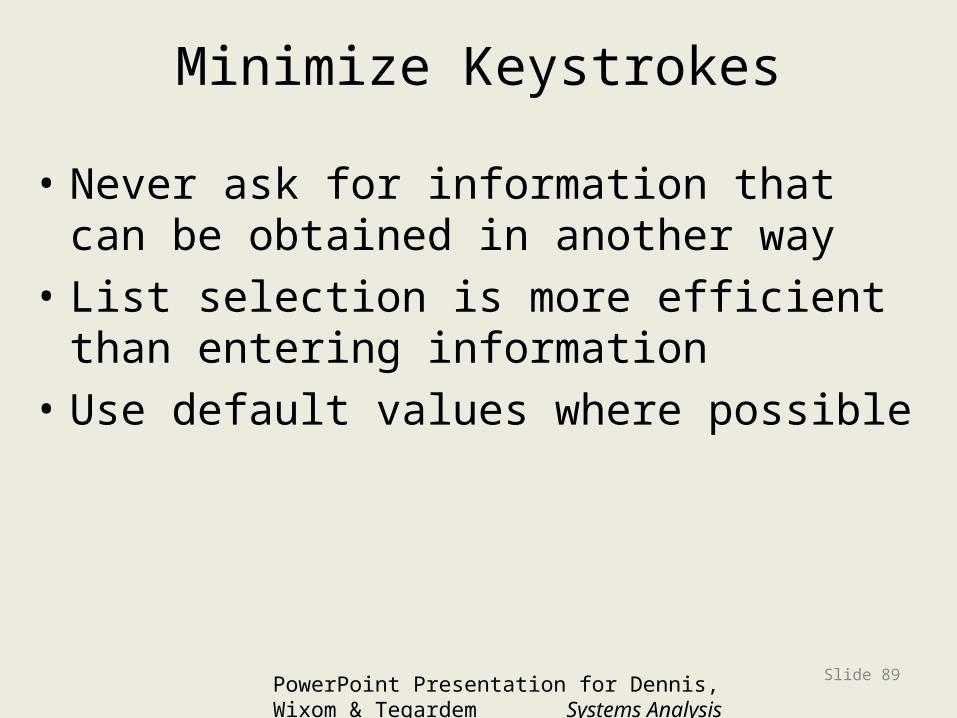
Minimize Keystrokes
• Never ask for information that can be obtained in another way
• List selection is more efficient than entering information
• Use default values where possible
PowerPoint Presentation for Dennis, Wixom & Tegardem Systems Analysis and DesignCopyright 2001 © John Wiley & Sons, Inc.
All rights reserved.
Slide 89

Types of Inputs
• Data items linked to fields• Text• Numbers• Selection boxes
PowerPoint Presentation for Dennis, Wixom & Tegardem Systems Analysis and DesignCopyright 2001 © John Wiley & Sons, Inc.
All rights reserved.
Slide 90

Types of Input Boxes
PowerPoint Presentation for Dennis, Wixom & Tegardem Systems Analysis and Design
Copyright 2001 © John Wiley & Sons, Inc. All
rights reserved.
Slide 91
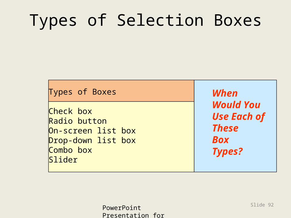
Types of Selection Boxes
PowerPoint Presentation for Dennis, Wixom & Tegardem Systems Analysis and Design
Copyright 2001 © John Wiley & Sons, Inc. All
rights reserved.
Slide 92
Types of Boxes
Check boxRadio buttonOn-screen list boxDrop-down list boxCombo boxSlider
WhenWould YouUse Each ofThese BoxTypes?

Types of Input Validation
PowerPoint Presentation for Dennis, Wixom & Tegardem Systems Analysis and Design
Copyright 2001 © John Wiley & Sons, Inc. All
rights reserved.
Slide 93
Types of Validation
Completeness checkFormat checkRange checkCheck digit checkConsistency checkDatabase checks
WhenWould YouUse Each ofThese ValidationMethods?

Copyright 2001 © John Wiley & Sons, Inc. All rights reserved.
Slide 94
Input Validation Types
OUTPUT DESIGN
PowerPoint Presentation for Dennis, Wixom & Tegarden Systems Analysis and Design
Copyright 2001 © John Wiley & Sons, Inc. All
rights reserved.
Slide 95

Basic Principles
• Understand report usage– Reference or cover-to-cover?– Frequency?– Real-time or batch reports?
• Manage information load– All needed information, no more
• Minimize bias
PowerPoint Presentation for Dennis, Wixom & Tegardem Systems Analysis and DesignCopyright 2001 © John Wiley & Sons, Inc.
All rights reserved.
Slide 96

Bias in Graphs
Copyright 2001 © John Wiley & Sons, Inc.
All rights reserved.
Slide 97
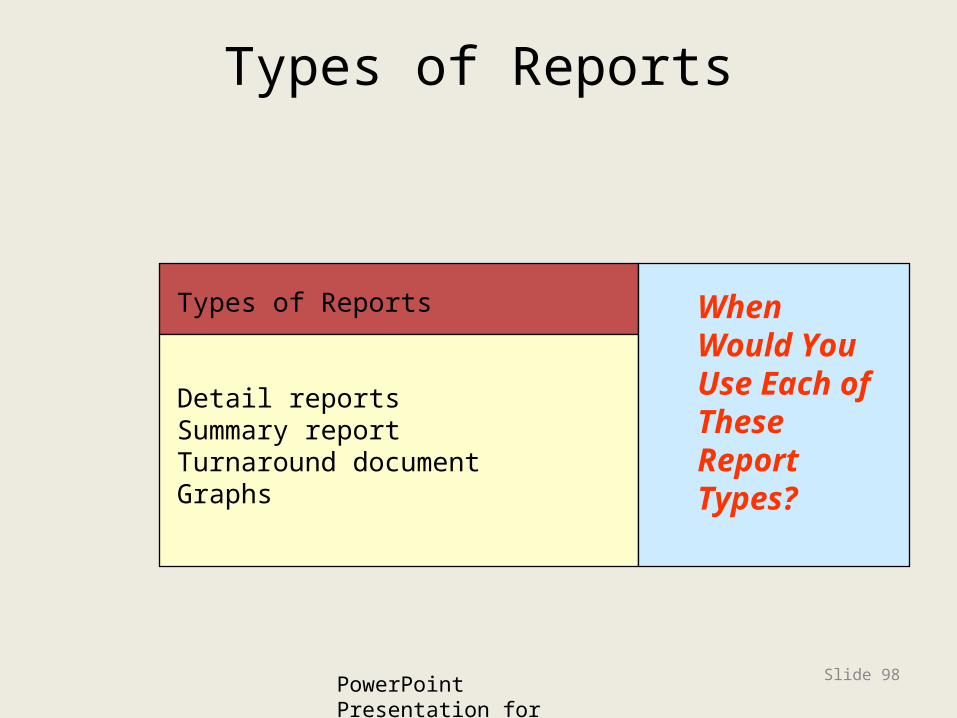
Types of Reports
PowerPoint Presentation for Dennis, Wixom & Tegardem Systems Analysis and Design
Copyright 2001 © John Wiley & Sons, Inc. All
rights reserved.
Slide 98
Types of Reports
Detail reportsSummary reportTurnaround documentGraphs
WhenWould YouUse Each ofThese ReportTypes?

Report Media
PowerPoint Presentation for Dennis, Wixom & Tegardem Systems Analysis and Design
Copyright 2001 © John Wiley & Sons, Inc. All rights reserved.
Slide 99
Versus Paper
Electronic

Copyright 2001 © John Wiley & Sons, Inc. All rights reserved.
Slide 100
Nonfunctional Requirements

Copyright 2001 © John Wiley & Sons, Inc. All rights reserved.
Slide 101
Non-Functional Requirements
• Operational Requirements– Technologies that can be used (e.g. GUI,
mouse)
• Performance Requirements– User interface tool kit speed and capacity
• Security Requirements– Restricted user interface (e.g. an ATM
machine)
• Political & Cultural Requirements– Date formats, colors and icons

Summary
• The fundamental goal of navigation design is to make the system as simple to use as possible
• The goal of input mechanism is to simply and easily capture accurate information
• The goal of the output mechanism is to provide accurate information to users that minimize information overload and bias
PowerPoint Presentation for Dennis, Wixom & Tegardem Systems Analysis and Design
Copyright 2001 © John Wiley & Sons, Inc. All rights reserved.
Slide 102

Expanding the Domain
• For many years, the University of Maryland has been a leader in research for ideas in human-computer interfaces. For more information investigate:
• http://www.cs.umd.edu/hcil/
PowerPoint Presentation for Dennis, Wixom & Tegardem Systems Analysis and DesignCopyright 2001 © John Wiley & Sons, Inc.
All rights reserved.
Slide 103