test shoot one
TRANSCRIPT

Test shoot onefor images for contents page
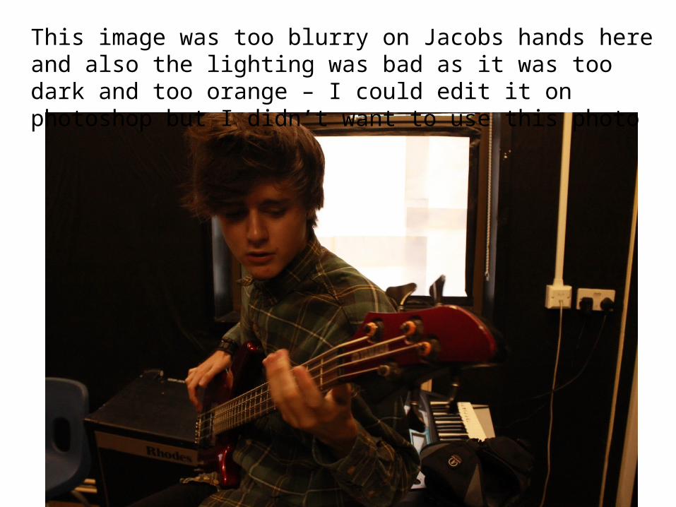
This image was too blurry on Jacobs hands here and also the lighting was bad as it was too dark and too orange – I could edit it on photoshop but I didn’t want to use this photo
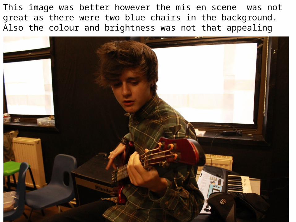
This image was better however the mis en scene was not great as there were two blue chairs in the background. Also the colour and brightness was not that appealing
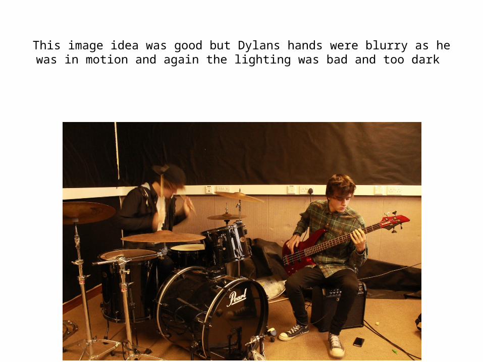
This image idea was good but Dylans hands were blurry as he was in motion and again the lighting was bad and too dark
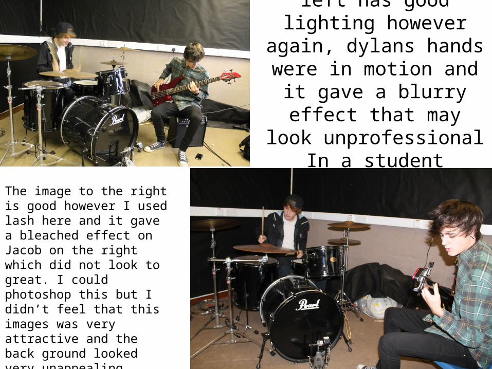
The image to the left has good lighting however again, dylans hands were in motion
and it gave a blurry effect that may look
unprofessional In a student magazine
The image to the right is good however I used lash here and it gave a bleached effect on Jacob on the right which did not look to great. I could photoshop this but I didn’t feel that this images was very attractive and the back ground looked very unappealing
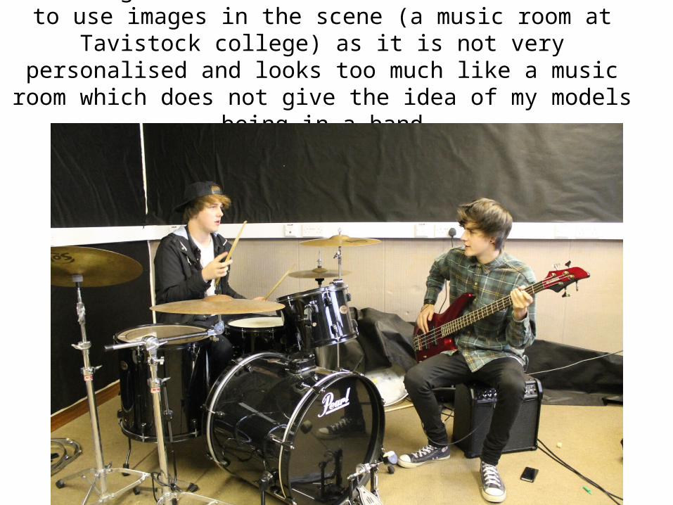
This image is better but I do not think I want to use images in the scene (a music room at Tavistock college) as it is not very
personalised and looks too much like a music room which does not give the idea of my models being in a band
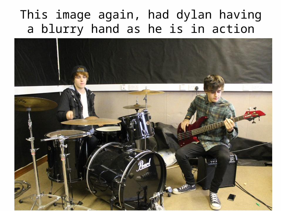
This image again, had dylan having a blurry hand as he is in action
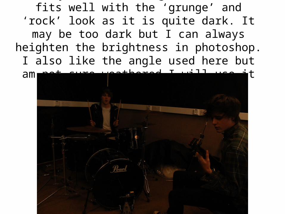
really like this image, I think it fits well with the ‘grunge’ and ‘rock’ look as it is quite dark. It may be too dark but
I can always heighten the brightness in photoshop. I also like the angle used here but am not sure
weathered I will use it in my magazine contents page
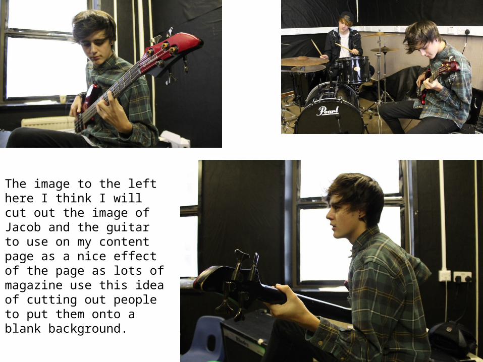
The image to the left here I think I will cut out the image of Jacob and the guitar to use on my content page as a nice effect of the page as lots of magazine use this idea of cutting out people to put them onto a blank background.