the australian roadsign test - robmorgan · the australian roadsign test version 1 - may 2014 page...
TRANSCRIPT

Robert Morgan is a traffic engineering and road safety engineering consultant, based in Melbourne. Since 1984
he has been an active member of Standards Australia’s MS12 committee responsible for AS 1742, the Manual of
Uniform Traffic Control Devices and AS 1743 and AS 1744.
This document is © Robert Morgan. It may be reproduced in full and made available free of charge without
further permission. Extracts may be used or quoted, so long as adequate reference is made to the source and
author. An electronic copy may be downloaded from robmorgan.com.au
The Australian
Roadsign Test
THE TEST YOU NEED TO OVERTAKE PASS
BEFORE YOU DESIGN, ORDER, CHECK OR ROAD
SAFETY AUDIT ANY TRAFFIC OR PARKING SIGNS - from freeway signs to street name signs
by Robert Morgan, B.Eng.(Civil), M.Eng.Sc.(Transport), F.I.T.E., M.A.I.T.P.M., A.R.P.S.
VERSION 1 - MAY 2014
When you look
at this photo
you may find it
hard to believe
there are
national
standards for
the design of
traffic signs
and for where
they should be
located. Take
this test and
understand
what are the
ten serious
signing errors
here. And
learn scores of
other traffic
signing tricks.

The Australian Roadsign Test Version 1 - May 2014
CONTENTS Page
How to Take This Test 1
The Test Questions 1
Part 1: Some of the Basic Principles 1
Part 2: Street Name Signs 3
Part 3: Warning Signs 4
Part 4: Direction Signs (Guide Signs) 7
A. Arrows on Direction Signs 7
B. General Direction Sign Issues 9
C. Freeway Interchange Signs 11
D. Advanced Issues with Direction Signs 12
Part 5: Intersection Control Signs 14
Part 6: Parking Control Signs 15
Part 7: More Regulatory and Other Signs 18
Part 8: Standard and Non-standard Signs 21
Author Information, Acknowledgements, Ways to Use This Test 24
Answers to the Test Questions 25
Part 1: Some of the Basic Principles 25
Part 2: Street Name Signs 27
Part 3: Warning Signs 28
Part 4: Direction Signs (Guide Signs) 30
A. Arrows on Direction Signs 30
B. General Direction Sign Issues 33
C. Freeway Interchange Signs (and answers for front page image) 35
D. Advanced Issues with Direction Signs 38
Part 5: Intersection Control Signs 40
Part 6: Parking Control Signs 43
Part 7: More Regulatory and Other Signs 48
Part 8: Standard and Non-standard Signs 50
Your Score Sheet 53

The Australian Roadsign Test Version 1 - May 2014
Page 1
HOW TO TAKE THIS TEST For different ways to use this test, see Page 24. This test is based on Australian Standard AS
1742, the Manual of Uniform Traffic Control Devices. Queensland has its own MUTCD, based on
AS 1742. In a perfect world the traffic signing manuals of every state & territory road authority
would be based on the national standard1.
To take this test, copy or remove the Score Sheet which starts on Page 53. The test is 23 pages
long, starting on Page 1; it has 90 questions. While taking the test, you will need to look for many
answers in AS 1742. Please do so. One aim of the test is to improve familiarity with the national
standard. Once you have completed the test, check your answers against the ‘Answers to the Test
Questions’, starting on Page 25. I have provided reasons and references for my answers.
What is the pass mark for this test? It’s an open-book test, so I reckon you need a score of 75% to
claim that you know enough to design, order, check or road safety audit signs. If you are only
doing the test for particular types of signs (e.g. only parking signs or only direction signs) you
probably need to know the correct answers to all or almost all the relevant questions, plus Part 1.
But remember that the one common experience of successful people is that they failed early on –
so don’t worry if you don’t get every question correct on your first try!
Robert Morgan ([email protected])
THE TEST QUESTIONS
PART 1: Some of the Basic Principles
Q1.1 What is the name of the primary resource document for traffic signing in Australia?
Q1.2: There are 14 Parts to AS 1742 (Numbered 1 to 15, with Part 8 withdrawn). Part 1 of AS
1742 is titled ‘General introduction and index of signs’. It shows all the sign types in the
other parts of AS 1742. Can Part 1 be used by itself, without using the other Parts?
Q1.3: Here are two signs. At the same distance before them, which is more legible, Sign 1 or
Sign 2? (Legibility means the ease with which the words on the sign can be read)
Q1.4: Here are two pieces of legend from traffic signs. Both legends are the same height and
the same font style, though one is wider and the other is narrower. Is one legend more
legible than the other? If so, which one?
1 The current editions of each part of AS 1742 are listed on Page 64. Also, be aware that state manuals and
standard drawings cover some signs which by their localised nature are not in the Standard.
Above is Size B (450 x 300 mm)
On right is Size D (900 x 600 mm)
Sign 1
Sign 2
Legend 1 Legend 2
Imag
es from the Standard.
See
** footnote on pg. 24
Imag
es from the Standard.
See
** footnote on pg. 24

The Australian Roadsign Test Version 1 - May 2014
Page 2
Q1.5: Here are two symbols for the same thing, taken from different traffic signs. Is
there any difference in the legibility of the symbols, if they are approximately the same
height? If so, which is legible at the greater distance when approaching it along the road?
(Legibility means the ease with which the symbol can be understood).
Q1.6: Listed (a) to (h) below are some combination legend colours and background colours
(Let’s say they are options for street name signs).
Which combination is the most legible?
Which other combinations have adequate contrast to be legible?
Which combinations do not have adequate contrast to be legible?
(Legibility means the ease with which the legend can be read against the background)
(a) Black letters on a White background
(b) Blue letters on a White background
(c) White letters on a Black background
(d) Yellow letters on a Red background
(e) Yellow letters on a White background
(f) Yellow letters on a Green background
(g) Black letters on a Blue background
(h) Brown letters on a Blue background
Q1.7: ‘Retroreflective’ material is used on most traffic signs (except parking control signs) so
they can be seen and read at night time, using the light of vehicle headlights.
(a) You have a sign with a dark coloured background (not black) and light coloured
lettering. Which do you reflectorise - the background, or the lettering, or both?
(b) You have a sign with a light coloured background and black lettering. Which do
you reflectorise - the background, or the lettering, or both?
Q1.8: ‘Retroreflective’ material for sign faces comes in different classes of reflectivity. These
are described in AS/NZS 1609.1 as Class 1W, Class 1 and Class 2
(a) Which of these three classes of retroreflectivity is the poorest for shining light
back to a driver?
(b) What is the usual warranty for this poorest class of material (i.e. for how many
years is the warranty and what percentage of its original brightness is expected to
be retained by that time?
(c) In what situations would you use Class 1W instead of Class 1 material?
Note: information on these matters is in AS 1609.1 and not in AS 1742 - or check information on
the internet.

The Australian Roadsign Test Version 1 - May 2014
Page 3
PART 2: Street Name Signs
Q2.1: Which part of AS 1742 deals with street name signs?
Q2.2: Here are some possible requirements for street name signs. Which are actually genuine
requirements that should be achieved?
(a) They should be located where they are visible and conspicuous
(b) The colour combinations on the signs should make them legible
(c) They should be made of retroreflective material or internally illuminated
(d) They should be installed at every intersection where motor traffic intersects
(e) They should be legible at a distance that allows a driver to take the desired action
Q2.3: Here are four different font styles on some street name signs. Which of these is permitted
in AS 1742.5? Select as many as you think are permitted.
Q2.4: What is the Letter Series and minimum Letter Height required for a street name sign
pointing along a 50 km/h local street from a 60 km/h arterial road?
Q2.5: Here are two street name signs. The one on the left has Series C letters, 120 mm high.
The one on the right has the wider Series D letters, but only 100 mm high.
At the same distance before them, which is more legible? (Try AS 1744, Appendix A)
Q2.6: What grade of retroreflective material should be used on street name signs?
Q2.7: Here is a street name sign. What aspects do not conform with AS 1742?

The Australian Roadsign Test Version 1 - May 2014
Page 4
Q2.8: You need to install
a street name sign at
a T intersection off
a major road,
naming the minor
street. From your
reading of AS 1742
you decide only one
sign is warranted.
Do you install it at
Position 1 or
Position 2?
Q2.9: You need to install a street name sign at a T intersection, naming the side street. Both
streets are straight, but the side street is at an angle of 60 degrees / 120 degrees (in plan) to
the through street. On what alignment do you point the sign?
(a) Directly along the side street
(b) At right angles to the through street
Q2.10: At one intersection you need to install a street name sign and two community facility
signs (e.g. pointing to a church and to the railway station) on the one post. Do you install
the street name sign above or below the other signs? Is there any other matter to consider
about where the signs are positioned on the post, relative to each other?
PART 3: Warning Signs
Q3.1: You need to install a warning sign in advance of a hazard. There are different size
warning signs (typically Sizes A, B and C). Where in AS 1742 do you find the
information on which size sign to install?
Q3.2: You now need to decide how far before the hazard this sign needs to be installed. Where
in AS 1742 do you find this information?
Q3.3: Here is a Crossroad warning sign.
Where are you permitted to use it?
(a) Only on either of the two the
major approaches to a cross
road.
(b) Only on either of the two
minor (sign controlled)
approaches
(c) On any of the four approaches
(d) On none of the four
approaches
Imag
e from the Standard.
See
** footnote on pg. 24
Minor street
1. 2.

The Australian Roadsign Test Version 1 - May 2014
Page 5
Q3.4: Here are two intersections where you want to install a warning sign on one of the major
road approaches because some drivers are not anticipating that vehicles can emerge from
the side roads. For each case, select which you think is the most suitable standard
intersection warning sign, based on the principles in Clause 2.9 of AS 1742.2.
Q3.5: There is a two lane, two way rural road, with a
marked centre line. On this road is a bridge.
Do you need to use this sign to warn drivers
about this bridge - or more particularly, where
in AS 1742 do you find out when to use this
sign?
Q3.6: There is a separate issue at this bridge. During winter, conditions can get very cold and
on some nights the bridge can get slippery because moisture settles on the bridge and
turns to ice. This is a hazardous condition, because the road is on a slight curve and
vehicles have been known to skid on the ice on the bridge. Which of the listed warning
signs - sign combinations - would be the most suitable?
(a) Slippery (symbolic) on its own
(b) Slippery WHEN FROSTY
(c) Slippery WHEN ICY
(d) Slippery ON BRIDGE
(e) Slippery ON BRIDGE WHEN ICY
(f) Slippery ON BRIDGE WHEN FROSTY
Imag
es from the Standard.
See
** footnote on pg. 24
Imag
e from the Standard.
See
** footnote on pg. 24
**
**

The Australian Roadsign Test Version 1 - May 2014
Page 6
Q3.7: On a gravel road there is a tight
curve and you propose to install a Curve
warning sign. What about the speed around
the curve? Should you install a
supplementary plate under the Curve sign,
with an advisory speed?
Q3.8 With which of the following warning signs
does AS 1742 let you use a supplementary
plate under it, with an advisory speed?
(a) W1 Alignment series (curves and bends)
(b) W2 Intersection series – on a straight road
(c) W3-3 Signals Ahead
(d) W2-7 Roundabout Ahead
(e) W3-4 Road Humps Ahead
(f) W5-20 Slippery
(g) W6-1 Pedestrians
(h) W6-4 SCHOOL
Q3.9: (a) In what situations is this sign used?
(b) What supplementary plate must
always be used with it?
(c) This sign is unusual in that it can be
installed in two quite different ways.
What are they?
Q3.10: Supplementary plate W8-22 has the legend ‘CROSSING
AHEAD’. Which of the following purposes can it be used for?
(a) Under a W6-3 ‘Children’ sign to warn that children may cross
the road ahead
(b) Under a W6-3 ‘Children’ sign to warn that there is a marked
Childrens Crossing ahead
(c) Under the W3-3 ‘Signals Ahead’ sign to warn that there is a mid-block set of signals
for pedestrians
(d) Under the W5-38 ‘Stock’ sign to warning that stock may cross the road ahead
The speed value here
is only an example
Imag
e from the Standard.
See
** footnote on pg. 24
Imag
e from the Standard.
See
** footnote on pg. 24

The Australian Roadsign Test Version 1 - May 2014
Page 7
PART 4: Direction Signs (Guide Signs) A. ARROWS ON DIRECTION SIGNS
Q4.1: When choosing which orientation and shape of arrow(s) to use on a direction sign …
(a) What part of AS 1742 should you use?
(b) Within that part, what clause and table should you follow?
Q4.2: Here is a Direction sign over a freeway. What is the problem with the positioning of the
arrows?
Q4.3: On the type of overhead direction sign which has a separate arrow displayed over each
lane, is it permitted to use downward pointing arrows?
Q4.4 Here are four side-mounted advance direction signs for intersections. For the specified
destinations on each sign, indicate whether that destination is reached by (i) continuing
ahead on this road, (ii) turning left off this road, or (iii) turning right off this road
(a) 1 Betley (b) 1 Holley
(a) 2 Maldon (b) 2 Sunnyside
(c) 1 Templestowe (d) 1 Blackwood
(c) 2 Doncaster (d) 2 Appleton
Imag
e from the Standard.
See
** footnote on pg. 24
Imag
e from the Standard.
See
** footnote on pg. 24

The Australian Roadsign Test Version 1 - May 2014
Page 8
Q4.5: Here is a sign located directly over the left
lane on a multi-lane freeway. It provides
information about the impending exit.
What is wrong with this sign?
Q4.6 Here is a sign located directly over a double
right turn lane at a signalised intersection.
Are the arrows correct?
If not, what type of arrows should they be?
Choose one of the following, to answer:
(a) As per sign: Curved (b) Angled (c) Horizontal (d) Elbow
Q4.7 What is wrong with this sign?
(Remember – this section is about arrows)

The Australian Roadsign Test Version 1 - May 2014
Page 9
Q4.8 This is a side mounted sign on the median
of an arterial road, advising that parking at
the shopping centre can be accessed at the
next three median breaks. At each median
break there is a separate right turn lane.
Is this use of curved arrows the right way
to sign this information? If not, what is
the correct way (according to AS 1742)?
Q4.9: Here is a pair of advance exit
signs, mounted overhead. In
the distance you can see that
the two left lanes exit left to
Ipswich, etc. Is there
anything wrong with the
arrows on the signs in the
foreground? If so, what
correction should be made?
B. GENERAL DIRECTION SIGN ISSUES
Q4.10: Some side-mounted direction signs have an arrow and some have a chevron. What is the
different purpose (or purposes) for the two different types of signs?
Q4.11: Route numbers were originally in shields (see signs in Question Q4.10 above). Route
numbers are generally being converted to alphanumeric (M, A, B & C) (see sign in
Question Q4.15). AS 1742 no longer includes shield-style route numbers. Alphanumeric
route numbering allows many more routes to be numbered. What is another benefit for
sign designers and motorists with adoption of alphanumeric routes instead of shields?

The Australian Roadsign Test Version 1 - May 2014
Page 10
Q4.12: This sign is located on a freeway-
standard road. What problem
does it have that makes it difficult
to understand?
(Ignore that the sign edges have
shifted and are uneven)
Q4.13: On this freeway sign, drivers are advised that more than one lane can be used for the exit.
Is this way of indicating multiple lanes correct? If not, what should it be?
Q4.14: This advance lane designation sign is
being installed beside a divided road, in
advance of a traffic signal-controlled
intersection. Where the sign is to be
located, there are two traffic lanes in this
direction (equivalent to the centre two
arrows on the sign). Much closer to the
intersection an additional left turn lane and
additional right turn lane develop. So at
the intersection there is a left turn slip
lane, plus three lanes controlled by the
signals. All three lanes turn right, though
you can also go straight ahead from the
left hand lane of these three.
There are at least four distinct things wrong with this sign design. What are they?
Q4.15: In diagrammatic direction signs for a roundabout
there is a gap in the anulus. What is the reason for
this gap?

The Australian Roadsign Test Version 1 - May 2014
Page 11
C. FREEWAY INTERCHANGE SIGNS Q4.16: At a typical isolated freeway interchange, how many direction signs are usually provided
in each direction on the freeway, for each exit?
Q4.17: At the exit itself, leading off the freeway, where is the exit direction sign located? Think
about its position in relation to features at the exit like the start of the exit ramp taper, the
gore (the nose between the ramp and the main lanes), etc.
Q4.18: When additional destinations or attractions need to be signed on a freeway, in advance of
the applicable exit, there are three types of signs that can be used:
GE1-8-1 ‘. . . THIS EXIT’,
GE1-8-2 ‘. . . NEXT EXIT’,
and
GE1-8-4 ‘USE . . . EXIT’
In what circumstances is each of these legends used
- THIS EXIT, NEXT EXIT or USE … EXIT?
Q4.19: (i) Are interchange exits on freeways numbered sequentially (1, 2, 3, …) or
by km (distance) along the road?
(ii) Where is the exit number sign located, relative to the advance exit sign and the exit
direction sign?
Q4.20: Which of the options below does this sign
mean:
(a) If you want to take this exit, you can
only do it from the left lane. It’s a
normal left lane that continues past the
exit.
(b) The left lane only goes to Williamstown
Road and does not continue past the
exit.
(c) Other (please describe).

The Australian Roadsign Test Version 1 - May 2014
Page 12
D. ADVANCED ISSUES WITH DIRECTION SIGNS
If you are designing or auditing major freeway signing schemes, sometimes the Standard does not
have specific answers. Judgement, based on experience and a broader understanding of signing
principles is required. An understanding of the reasons behind some Standard treatments can help
you apply these principles to more complex signing schemes.
Q4.21: A new urban freeway is terminating at an existing freeway, the M80. The two lanes in
this direction on the new freeway are going to proceed on and merge in with one direction
on the M80, while a left exit will provide a ramp to connect with the other direction on the
M80. The overhead signs 1 km and 500 m before the left exit are shown below. At each
position, these are the only signs. There are no other close interchanges.
These look like standard advance direction signs for an urban freeway exit (e.g. see Figure
3.10 in AS 1742.15), but do you foresee any problem for unfamiliar drivers?
Q4.22: Here is a sign in advance of a
roundabout that provides access to
the two ramps going onto a freeway-
standard road. Do you envisage any
problems for drivers selecting which
ramp to take?
Q4.23: Here are consecutive signs for a freeway exit. In this jurisdiction toll roads have direction
signs with yellow legend on a blue background. As a driver you need to exit to Police
Road. About 500 m before the exit you see Sign 1 from your position in one of the right
hand lanes, then you get yourself in position before Sign 2 to exit. Glance (quickly) at
Sign 2 and answer this question: From how many lanes can you exit to Police Road?
Sign 1 Sign 2

The Australian Roadsign Test Version 1 - May 2014
Page 13
Q4.24: Here is the signing at two closely spaced freeway exits
(a) Signing and layout at the first exit (b) Sign just before the second exit
At the first exit, with the signing shown in photo (a), what problem do you think may
happen? In what basic way is the signing at this location not in accordance with AS
1742? Does this contribute to the problem you think may happen? (To answer, ignore the
non-standard sign colours for the toll road).
Q4.25: Here are some advance direction signs
for roundabouts. Each is trying to
advise drivers that they need to get into
a particular lane before they reach the
roundabout, in order to use a particular
exit. Which are the most successful and
least successful signs at doing this?
Discuss why.
(a) Newcastle →
(b) Albany (c) Brisbane
(d) Elizabeth (e) Bendigo

The Australian Roadsign Test Version 1 - May 2014
Page 14
PART 5: Intersection Control Signs
Q5.1: The R1-1 STOP sign and the R1-2 GIVE WAY sign have a similar purpose: to instruct
drivers on the ‘minor’ road to give way to traffic on the intersecting ‘major’ road (They
have uses at some other non-intersection locations also). But drivers must always stop at
a STOP sign before proceeding.
Which of the following conditions will warrant the use of a Stop sign instead of a Give
Way sign? (Select one or more)
(a) The major road is an Arterial Road
(b) The sight distance along the major road is restricted by an amount that’s specified
(c) The angle of intersection is acute (say, less than 60 degrees)
(d) There is a history of right angle collisions
Q5.2: There is a quiet crossroad in a local residential area.
(a) Can I leave it without any control signs and let ‘Give Way to the Right’ apply?
(b) Can I install Give Way signs or Stop signs on all four legs?
Q5.3: A Give Way sign needs to be installed on two minor legs at a crossroad within a local
residential area. The corner kerb radius is about 8 m. Give way markings have been
applied to the road surface, in line with the kerb along the major street. On one minor
approach there is a street tree in the nature strip about 10 m back from the give way line.
Where should the Give Way sign be installed? Options may include (a) as close as
possible to the give way line, (b) at the start of the corner kerb curve, or (c) in front of the
tree.
Q5.4: Here are two signs associated
with roundabouts.
(a) What is the purpose of each
sign and where should each be
located?
(b) Is it necessary to use each of
these signs at every roundabout?
If not, which can be deleted?
Q5.5: There is a crossroad in a rural area. It is controlled by a Give Way sign on two opposite
approaches. There have been complaints that some drivers are not giving way after dark.
There may be many factors affecting this, but for this test let us say that you are interested
in two particular issues:
(a) The size of each Give Way sign (because bigger signs can be detected at greater
distances). They are Size A (height = 750 mm). Is that big enough?
(b) The age of the sign (because signs degrade over time and lose their ability to
reflect light). They are ten years old (taken from the date stamped on the back).
Are they too old to be effective?
Sign 1 Sign 2
Im
ages from the Standard.
See
** footnote on pg. 24

The Australian Roadsign Test Version 1 - May 2014
Page 15
PART 6: Parking Control Signs
Q6.1: When designing or installing parking control signs, which part of AS 1742 should you
refer to for details?
Q6.2: Here are two parking control signs – or more
accurately, here are two panels on one
parking control sign.
(a) Name the restriction that each of these
symbols means.
(b) What are the details of each restriction?
In other words, what is it that a driver
can or can’t legally do in the location
covered by each panel?
Q6.3: Here are two parking
control signs. Each has
two elements which
should never be seen
together on a single
parking control sign.
What are those two
elements?
Q6.4: ‘Linear’ parking control signs contain an arrow, which points approximately along the
edge of the road or along the kerb line. (These signs are also used with centre-of-road
parking, where the arrows point along the centre of the road, but ignore that for the
moment). When installing these signs along the edge of the road, what orientation should
the signs be, in relation to the road edge or kerb?
(a) Parallel to the kerb
(b) Approximately parallel to the kerb
(c) Some other angle (Please specify the angle)
Q6.5: There are five different types of control that can be applied using Linear parking control
signs. What are these five types?
Q6.6: With ‘ZONE’ signs there are seven different types. What are they?
Q6.7: There are three different types of control that can be applied using Area parking control
signs. What are these three types?

The Australian Roadsign Test Version 1 - May 2014
Page 16
Q6.8: You have to install signs along a length of road to create a Clearway. Consider one side
of the road only. The Clearway is to apply all day, every day. The Clearway is 2 km
long. It starts and ends at major signal-controlled intersections and there are several
minor side roads in between.
(i) Which of the following signs would you use to create the Clearway, as per AS 1742?
You’ll need more than one. (Whether the sign has an arrow or not is important to
consider, so if say you want a sign with an arrow, but the example doesn’t have one,
don’t select it. But ignore whether the arrow shown is one way or two way: e.g. if an
arrow is shown as one way on one of the examples below and you want that sign with
a two way arrow, that’s OK: select that sign).
(a) (b) (c) (d)
(e) (f) (g) (h) (i) (j)
(k) (l) (m) (n)
(ii) For each of the selected signs, how would you use it? I.e. specify (A) Is it roughly
parallel to the kerb or at right angles - or some other angle? (B) Where along the road
would you use it? Options are: at the start of the Clearway, at the end of the
Clearway, near side road intersections along the road, and at midblock locations along
the road. Each sign type may be needed at more than one of these options.

The Australian Roadsign Test Version 1 - May 2014
Page 17
Q6.9: You need to install some Linear parking controls. The signs for these contain an arrow
(e.g. see the signs in Question Q6.2). The arrow must point to something. What are the
permitted options for what the arrow must point to?
Q6.10: Elsewhere, you want to install an Area parking control scheme to cover an off-street car
park, rather than using Linear parking control signs to cover every marked bay. The
scheme will be for a Parking Area (Say it’s 2P during business hours).
(a) In what section of AS 1742.11 do you find out how to introduce an Area parking
control scheme and find out what signs you need to include?
(b) What are the essential signs you need to include, so that the proposed Parking Area
conforms with AS 1742 and the Australian Road Rules – and where will you locate
them?
(c) What other signs may you also need to include in the scheme and where should they
be located?
Q6.11: You need to introduce some short term parking, say about 15 or 20 minutes duration. The
suggestions you have heard are ¼ P, P 15 Minute and P 20 Minute. Which of these would
you choose if it is to comply with AS 1742.11?
Q6.12: The parking control sign shown here has two
panels. Start by looking at the right half (No
Parking), then the left half (Parking). Are there
any aspects which do not conform with AS
1742.11? Most of the answers can be found by
looking at Appendix C, Clauses C1 and C2 in AS
1742.11.

The Australian Roadsign Test Version 1 - May 2014
Page 18
Q6.13: Literally, what does each of the three signs below mean?
(a) (b) (c)
Q6.14: The two-panel sign shown here was
installed after 1999. There are several
aspects which do not match the
requirements of AS 1742.11. List as
many of them as you can.
PART 7: More Regulatory and Other Signs
Q7.1: Here is a laneway along the back of shops. It
has two signs; one with ‘ONLY’ on it and one
with ‘ONE WAY’ on it.
Which of the following statements is true?
(a) Both these signs mean the same thing
(b) The preferred sign on a one way laneway
is the ‘ONLY’ sign
(c) The preferred sign on a one way laneway is
the ‘ONE WAY’ sign
(d) Only one of these signs is an Australian
Standard sign.

The Australian Roadsign Test Version 1 - May 2014
Page 19
Q7.2: Below, on the left is a black and yellow ‘CAM’ or Chevron Alignment Marker. On the
right is a black and white ‘hazard marker’.
(a) What is the only type of location
on the road system where a CAM
is permitted to be used?
(b) At what types of locations can
black and white hazard markers
be used?
Q7.3: When installing ‘CAMs’ (Chevron Alignment Markers), where is the first one located
and where is the last one located?
Q7.4: Here are two signs. What does each of them mean?
Q7.5: Is the sign combination below correct or is it legal anyway to U turn where the right turn
is banned?
Q7.6: You are required to design a traffic signing scheme for a multi-storey car park. To
provide guidance to car drivers for them to drive out of the car park, do you use the term
‘EXIT’ or ‘WAY OUT’ ? (You will need to refer to a different Standard)
Imag
es from the Standard.
See
** footnote on pg. 24

The Australian Roadsign Test Version 1 - May 2014
Page 20
Q7.7: There is a lane drop (lane reduction) on a rural highway – two lanes in one direction are
reducing to one lane.
(a) Which clause and which diagram in AS 1742 Part 2 do you use for the signs and line
marking required for the lane drop?
(b) At how may separate locations (both before and at the lane drop) will you need to
install signing?
(c) Do you need to use pavement arrows with this scheme? If so, how many and what
type?
Q7.8: Here are some examples of ‘times of operation’. Three are on supplementary plates
installed below a regulatory sign, while others are times of operation shown on parking
control signs. This question is about what information you include and how you display
it, to indicate the times of operation . The same answers apply to both types of signs –
regulatory traffic signs and parking control signs.
Which of the following signs correctly displays the time(s) of operation? For those that
have any incorrect element, describe what that is (there may be more than one problem).
(a) (b) (c)
(f)
(d) (e)
(i)
(g) (h)
(j) (k)

The Australian Roadsign Test Version 1 - May 2014
Page 21
PART 8: Standard and Non-standard Signs
This section looks at some standard signs and symbols, as well as some non-standard re-designs
done by individual road authorities.
Q8.1: AS 1742 has permitted the borders on G series and GE series Guide signs to consist of
either a single white edge strip, or a narrower white edge line positioned in from the edge.
Is there any advantage or disadvantage with either option?
Q8.2: Here are two Clearway signs,
with Tow Away conditions
indicated. The one on the left is
the R5-39 and R5-50 sign in AS
1742.11. The one on the right
was developed by one road
authority some time after the
standard sign was developed. Is
there any advantage or benefit
with the sign on the right?
Q8.3: Here are two different ways of
advising that a Clearway is in
effect all the time. The one on the
left is the way it is prescribed in
AS 1742.11. The one on the right
was developed by one road
authority some time later. Is there
any advantage or benefit with the
way it is described on the right?
Q8.4: Temporary signs for roadwork
generally have black legend or
symbols on a yellow background. One
road authority decided that for night
time roadwork these colours should be
reversed, so the background is black
and the legend is yellow. Is there any
advantage or disadvantage with this?

The Australian Roadsign Test Version 1 - May 2014
Page 22
Q8.5: Standard symbolic parking control signs were introduced in 1989. Symbols using P or S
with a slash replaced No Parking and No Standing (now No Stopping). ‘TWO HOUR
PARKING’ was replaced with ‘2P’, amongst other changes. These symbols are now
incorporated into the Australian Road Rules. In a few jurisdictions signs are installed
which include some of the ‘old’ wording, explaining the meaning of the signs (see below).
Is there any advantage in doing this?
Q8.6: On the left is the standard No Stopping symbol, as detailed in AS 1742.11. Other non-
standard symbols sighted on signs around Australia are shown to the right. Is there any
reason any of these others would be preferred over the standard symbol?
(a) (b) (c) (d)
Q8.7: The standard method of providing route numbers is through the ‘alphanumeric system’
(e.g. with route numbers like A12, B12 and M5). This has replaced the previous system
of shield-based route numbers, as illustrated in Question Q4.10.
On the left is an example of the AS 1742 standard way of displaying an alphanumeric
route number. On the right is an alternative method, displaying the route number within
an outline white box. What are the advantages and disadvantages (if any) of displaying
the route number in a box, rather than directly onto the background?

The Australian Roadsign Test Version 1 - May 2014
Page 23
Q8.8: On the left is the standard Bus Lane symbol. The other two symbols are other ways that
have been used at times on signs in Australia to establish a Bus Lane. Is there any benefit
in either of the other methods?
Q8.9: On the left is the standard layout for a G9-43 multiple direction lane designation sign. On
the right hand sign is an alternative design for the patch in the bottom left hand corner,
which is used to show that an extra lane is created after the sign position. This change
from a patch to an outline elbow was made by one road authority as it was considered the
standard all-white patch would be too bright. Is this a worthwhile or valuable change?
Q8.10: Here are some signs where an additional, coloured backing board has been added, to
highlight the importance of the sign’s message at each particular location. Is there any
benefit in doing this? Is there any possible problem?
[End of the Test]
Imag
e from the Standard.
See
** footnote on pg. 24

The Australian Roadsign Test Version 1 - May 2014
Page 24
Author information
Robert Morgan is a traffic engineering and road safety engineering consultant, based in Melbourne. Since
1984 he has been an active member of Standards Australia’s MS12 committee responsible for AS 1742, the
Manual of Uniform Traffic Control Devices and AS 1743 and AS 1744. Many aspects of revisions to these
standards over this period have developed from proposals Robert initiated. During the late 1980s he was the
principal designer of the new-style parking control signs which first appeared in AS 1742 Part 11 in 1989.
Other current signing principles initiated by him include how arrows are displayed on direction signs and
the combining of intersection and curve warning signs. Robert is also one of Australia’s most experienced
road safety auditors and principal author of the first two editions of Austroads’ Road Safety Audit guide.
Feedback, including suggestions and corrections, is welcome. Please contact the author on 0419 884 269 or
email: [email protected]
Acknowledgements
Robert wishes to thank members of the Standards Australia MS12 committee for their comments and
feedback during the development of this test. They, like me, hope that the test is widely used and that it
helps practitioners develop their skills for designing traffic and parking signs. The design of traffic sign-
face layouts and traffic signing schemes is a specialist skill, based on these standards. It is a skill that
requires experience.
Nonetheless, the views expressed in this document are those of the author and do not necessarily represent
the views of Standards Australia, any road authority or any other organisation or individual. Practitioners
who make use of the advice in this document should avail themselves of all relevant information and also
use their own engineering judgement in making decisions.
Images are © Robert Morgan, except as follows:
� Standards Australia (in AS 1742, 1743 or 1744): Questions – 1.3, 1.4, 3.3, 3.5, 3.6 (On Bridge; On
Bridge When Frosty), 3.7, 3.9, 4.4 (signs (b) and (d)), 5.4, 7.2, 8.8 (left). Answers – 1.5 (two left
symbols), 1.6, 4.21 (lower two signs). See footnote** which also covers quotes from the Standards.
� National Transport Commission in Australian Road Rules: Questions - 8.8 (centre sign).
� VicRoads: Questions – 1.5, 4.14, 8.9.
� Department of Planning, Transport and Infrastructure, South Australia: Question – 4.25 (sign (d)).
Answers – 3.3, 3.4.
� Google in Google Maps Street View: Question – 4.8.
The author wishes to thank the above organisations for allowing use of these images (or for their specific
permission).
Thanks also to the following practitioners for their comments and feedback on the draft: Mr Bob Cumming,
Mr Ron Koorengevel, Mr Daniel Cassar.
Ways to Use This Test
This test is designed as an ‘open book’ test, requiring you to have access to the parts of AS 17422. The
following Answers to the Questions provide references to AS 1742 and reasons for my answers. It is
probably better for you to try and find the answers yourself first, rather than going straight to my Answers
Ways this test can be used include:
� Undertaking the test yourself – either all of it, or sections relevant to your work.
� In a road authority, when a person joins a team that deals with signs, having them undertake the test.
� Before you prepare a signing scheme or you design an important sign, doing the test for that type of
sign, as a prompt for the issues you may need to know about.
� Referring back to the Answers at any later time, to find a reference to AS 1742, to understand why
particular signs are used the way they are, or to check the signing principles.
� Using it as part of road safety audit training. If an audit team is expected to audit a traffic signing
scheme, at least one person on the team needs a good knowledge of the relevant parts of AS 1742. If
people become aware of this test during audit training, they are more likely to refer back to it later.
The fourteen parts of AS 1742 contain an enormous amount of useful information. Use this test as an
introduction to the Standard, to encourage yourself and other practitioners to read the Standard and find out
more. Road users will benefit if we do this.
** Reproduced with permission from SAI Global Ltd under Licence 1405-c046.
2 In Queensland, for ‘AS 1742’ read your own state Manual of Uniform Traffic Control Devices.
The Australian Roadsign Test Version 1 - May 2014
Page 25
ANSWERS TO THE TEST QUESTIONS
These answers have been reviewed by members of the committee responsible for AS 1742 and
other practitioners. Nonetheless the author takes full responsibility for these answers
ANSWERS PART 1: Some of the Basic Principles
Q1.1: Australian Standard AS 1742, the Manual of Uniform Traffic Control Devices. In
Queensland this has been reproduced, with some alterations, as the Queensland MUTCD.
Q1.2: If you know the purpose of each sign you can use Part 1 of AS 1742 to give a quick
reference to its Sign Number (e.g. R1-2). Otherwise Part 1 should not be used by itself.
The note on the bottom of each page in Part 1 states ‘Each sign on this page has a specific
purpose and should not be used contrary to the principal references listed in each case’.
These references are to the other part(s) of AS 1742 which provide details about purpose,
use, etc.. The purpose and uses for each sign need to be understood.
Q1.3: Obviously, the higher the letters (Sign 2), the more legible they are at a given distance.
Q1.4: Less obviously, the width of letters affects their legibility. Wider letters (Legend 1) are
more legible than narrower letters at a given distance. Also see Answer to Question Q2.5.
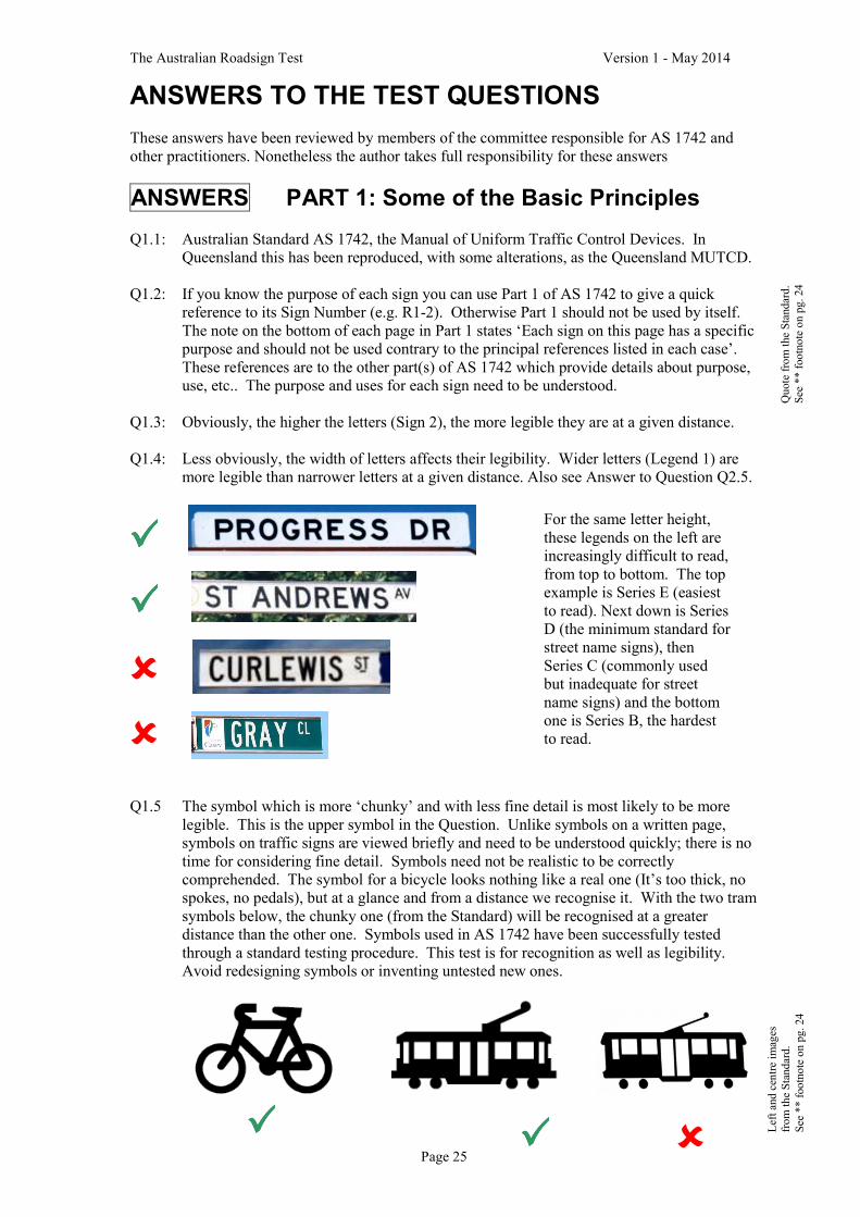
Q1.5 The symbol which is more ‘chunky’ and with less fine detail is most likely to be more
legible. This is the upper symbol in the Question. Unlike symbols on a written page,
symbols on traffic signs are viewed briefly and need to be understood quickly; there is no
time for considering fine detail. Symbols need not be realistic to be correctly
comprehended. The symbol for a bicycle looks nothing like a real one (It’s too thick, no
spokes, no pedals), but at a glance and from a distance we recognise it. With the two tram
symbols below, the chunky one (from the Standard) will be recognised at a greater
distance than the other one. Symbols used in AS 1742 have been successfully tested
through a standard testing procedure. This test is for recognition as well as legibility.
Avoid redesigning symbols or inventing untested new ones.
For the same letter height,
these legends on the left are
increasingly difficult to read,
from top to bottom. The top
example is Series E (easiest
to read). Next down is Series
D (the minimum standard for
street name signs), then
Series C (commonly used
but inadequate for street
name signs) and the bottom
one is Series B, the hardest
to read.
����
����
����
�
�
�����
Left an
d cen
tre im
ages
from the Standard.
See
** footnote on pg. 24
Quote from the Standard.
See
** footnote on pg. 24

The Australian Roadsign Test Version 1 - May 2014
Page 26
Q1.6: See AS 1742 Part 5, Table 2.2:
Most legible:
(a) Black letters on a White background
Adequately legible:
(b) Blue letters on a White background (unless the blue fades)
NOT adequately legible:
All the other combinations (though see next paragraph).
Do not use Red except for standard signs. White letters on
a Black background fail because the sign itself will not be
sufficiently conspicuous. This is why this old-style One
Way sign was abandoned in the Standard.
Note also that some colours with the same name vary with the class of retroreflective
material. E.g. Class 1W ‘Yellow’ is more lemon-coloured than Class 1 ‘Yellow’ which is
a little more orange in tone. Now route numbers are displayed in yellow on direction
signs, Class 1W yellow route numbers have better contrast against green (or blue)
backgrounds and are thus easier to read; Class 1 yellow should be avoided in this case.
For street name signs a green background results in poor sign conspicuity.
Q1.7: See AS 1742 Part 5, Clause 2.6 and Table 2.2:
(a) Reflectorise the light coloured lettering (which is preferably white). Reflectorise a
dark green or dark blue background. Do not use Red. Black is not reflectorised.
Brown may or may not be reflectorised.
(b) Reflectorise the light coloured background. Never reflectorise black.
Q1.8: (a) The poorest grade of retroreflective material is Class 2, otherwise known as
‘Engineering Grade’. When viewed up close, it usually has an appearance like
sandpaper, whereas Class 1 and other higher grade materials have an obvious pattern
(e.g. honeycomb or another regular pattern).
(b) Class 2 material is typically guaranteed for seven years, at which time it has retained
only 50% of its original brightness. A sign made with this material probably needs to
be replaced about every seven to ten years, depending on site conditions.
By contrast, higher grade materials (Class 1 and Class 1W) are typically guaranteed
for ten years or more, at which time they have retained 80% of their original
brightness. It is thus false economy to use Class 2 material, except on signs that are
not expected to last long (though these days even roadworks signing is typically
required to be Class 1, not Class 2). Levels of brightness on Class 1 signs start out
higher and then retain much more brightness, so they are better for safety over the
(longer) life of the sign. Critical signs like intersection control signs should never be
made with Class 2 material. State and territory specifications typically prescribe the
class of material for various types of traffic signs.
(c) The ‘W’ in Class 1W means ‘wide’, meaning that this material provides much more
reflected light back to the driver at much wider angles of light hitting the sign from
the headlights. So it is much better for overhead signs or signs well to the side of
approaching vehicles: the light from headlights continues to illuminate the sign as the
vehicle gets closer and closer to the sign (i.e. when the angle of the light from the
headlights to the sign gets wider and wider).
More recently, Class 1X material has been developed. This is much more effective at
reflecting light, and at a greater range of angles. It is not yet covered by AS 1906.1.
�
Imag
e from the Standard.
See
** footnote on pg. 24

The Australian Roadsign Test Version 1 - May 2014
Page 27
ANSWERS PART 2: Street Name Signs
Q2.1: AS 1742 Part 5: Street name and community facility name signs
Q2.2: All options (a) to (e) are correct, except that with option (d), street name signs need to be
installed for pedestrians and cyclists, as well as drivers. So if a road is closed to motor
traffic at an intersection, it still needs a street name sign to assist pedestrians.
Q2.3: Only the ‘St Andrews Av’ sign conforms with AS 1742.5. While ‘Younger St’ uses the
standard highway alphabet, it is Series C, which is narrower and harder to read. The first
two serifed fonts are not designed for traffic signs and are harder to read (unless the signs
are very big). Even thinner lettering or fatter lettering (see below) is untested and harder
to read. This is made worse by the narrow spacing between letters3.
Q2.4: Letter Series D, 100 mm high (see AS 1742.5, Clause 2.5)
Q2.5: Both signs have the same legibility. The benefit of the higher letters is reduced by the
narrower font4. Here is a table developed by the author, showing legibility distances (i.e.
how far before the sign can it be read) for various letter heights and letter series:
Letter Height ����
AS 1744 Series �
75 mm
90 mm 100 mm 120 mm 130 mm 140 mm
Series B 30 m 36 m 40 m 48 m 52 m 56 m
Series C 38 m 45 m 50 m 60 m 65 m 70 m
Series D 45 m 54 m 60 m 72 m 78 m 84 m
Series E 49 m 59 m 65 m 78 m 85 m 91 m
E Modified
Capitals only
56 m 68 m 75 m 90 m 98 m 105 m
*E Modified &
Lwr Case (‘Letter Height’ = top to bottom)
41 m
Caps = 55 mm
49 m
Caps = 65 mm
55 m
Caps = 73 mm
65 m
Caps = 87 mm
71 m
Caps = 95 mm
76 m
Caps = 102
mm
Notes to the Table:
� Table is based on Clause 1.6.4 of AS 1742.1 (2003) and the original research on which it was based
[Kneebone DC (1964) Sign Legends, Proc. 2nd ARRB Conference, Vol. 2, Pt 1, pp542-557].
� * E Modified/Lower Case is included for comparison only. Lower case letters are not permitted to be
used for street names: they are reserved for destination names.
� The pink shaded cells indicate options which fail to match the legibility distance achieved by 100 mm
high series D lettering. These options should not be used.
� These legibility distances are reduced if a sign has poor colour contrast between background and letters,
the sign is set further back on the approach street, or non-standard letter styles are used.
� Non-standard letter styles (e.g. thick letters, thin letters or serifed letters) have not been tested for
legibility, but they typically result in a significant reduction in legibility distance.
3 Using untested fonts may seem like a trivial issue. Directly it affects legibility.
More broadly, it indicates a lack of appreciation that designing traffic or parking
signs is not the same as knowing about ‘graphic design’. There are worrying
examples of local government entities making their own traffic signs using basic
sign-design equipment, rather than buying from traffic sign professionals. The
results can be unrecognisable, compared with standard signs (see examples here) 4 Narrow lettering is the cause of so many legibility problems with signs (not just street name signs). Avoid
narrow legends like Series B and Series C where at all possible.
��
� �

The Australian Roadsign Test Version 1 - May 2014
Page 28
Q2.6: Class 1 retroreflective material (see AS 1742.5, Clause 2.7).
Q2.7: (a) The lettering is too narrow and not Series D (see AS 1742.5, Clause 2.5)
(b) The colour combination (brown/burgundy on yellow) provides inadequate contrast
(see Clause 2.6)
(c) The sign has an indication of direction (a chevron). Also, the sign does not have a
square end (see Clauses 2.3 and 2.2)
(d) Although not obvious, the retroreflective material was Class 2, not Class 1
(see Clause 2.7)
Q2.8: Position 1 (see AS 1742.5, Clause 2.9.3(b)). It is important to consistently install street
name signs on the same side of the major road as that side street, so drivers know where
to search for the sign.
Q2.9: (b) At right angles to the through street, so it can be seen by drivers on both approaches
along the through street. See AS 1742.5, Clause 2.10.
Q2.10: The street name sign should always be installed above any other sign on the same post. A
clearance of at least 150 mm is needed between the bottom of the street name sign and the
top of any other sign (see AS 1742.5, Clause 3.4)
ANSWERS PART 3: Warning Signs
Q3.1: AS 1742 Part 2 (2009), Appendix B
Q3.2: AS 1742 Part 2 (2009), Appendix D. Table D1 and Figure D1 show the distances
required in different speed zones and for different levels of speed reduction for safe
negotiation of the hazard.
Q3.3: Strictly the answer is ‘(d) On none of
the four approaches’, because the sign
shown with the Question is no longer in
AS 1742. It has been replaced by the
sign shown on the right here, which may
be used only for condition (a). Answer
(a) is correct for existing installations.
Answers (b) and (c) are definitely
wrong.
Existing cross road warning signs of the style
shown with the Question can remain on the
major road approaches (which have right of
way). When replaced, the replacement should be the sign shown here.
Under no circumstances should this sign or the one with the Question be used on a minor
(sign controlled) approach. If required, warning on these approaches should be either the
W3-2 Give Way Sign Ahead sign or W3-1 Stop Sign Ahead sign.
Every cross road (that’s not controlled by signals or a roundabout) must have major/minor
control by use of Give Way or Stop signs (see AS 1742.2, Clause 2.5.1) The only
exception is possibly where two unsealed roads intersect in a remote area (as defined in
AS 1742.2). In this case the sign shown with the Question should be installed on all four
approaches. In my view it would make more sense (cheaper and provides consistency) to
apply Give Way control on two legs and avoid the exception.
����
The ‘new’
W2-1 sign

The Australian Roadsign Test Version 1 - May 2014
Page 29
Q3.4 (a) There is no specific warning sign for a cross road at an angle. Clause 2.9.2.1 in AS
1742.2 advises ‘side roads are only shown [on warning signs] at right angles to the main
road as it is considered unnecessary and possibly confusing to alter symbols when side
roads enter at other angles’. Do not try to illustrate on the sign the fine details of the
intersection, as this may lead drivers to expect that level of detail everywhere*. The
general arrangement at this site is a cross road and sign W2-1 is the appropriate warning
sign (see it in the Answer to Question Q3.3).
* Below is another example about avoiding fine detail on intersection warning signs. The
sign on the left (not from Australia) shows details and angles of streets intersecting on
both sides of a curved road, including how two of them meet near the intersection. This
level of detail is not necessary or helpful. To accord with the intent of AS 1742.2, the
appropriate sign in this situation would be W2-11(L), shown below, on the right.
(b) There is a warning sign for two side roads
on the same side, but it’s for a straight road
(W2-13(L)). Otherwise the applicable curve
warning sign has only a single side road
(W2-9(R)). Is it important to warn of the
curve? If so, use W2-9(R). The important
message is to warn drivers that vehicles may
emerge on the left (or oncoming vehicles may
be turning right) and W2-9(R) conveys this.
Q3.5: This is Sign W4-1 Narrow Bridge, so it is only used when the bridge is narrow. AS 1742
Part 2, Clause 4.6.6.3 sets out the conditions where this sign should be used.
Q3.6: The problem with bridges in very cold conditions is that ice forms on their road surface
because cold air circulates under the bridge. Typically, the road on the approaches does
not get slippery because the ground retains the daytime warmth and the road remains
unfrozen. The slippery conditions only happen on the bridge and are not anticipated on
the approach. So the warning signs need to be specific about the bridge.
The correct sign combination is
(f) Slippery ON BRIDGE WHEN FROSTY (W5-20 / W8-29).
The Slippery (W5-20) sign alone would be misleading, suggesting that if the approach
road is not slippery, neither will the bridge be. The ON BRIDGE sign is black on white
(G9-49) and is not for use with any warning sign. ‘WHEN ICY’ is not a standard term
and is also misleading: it refers to the road condition - which drivers cannot assess, or
may assess wrongly if the approach road is not freezing. ‘WHEN FROSTY’ refers to the
atmospheric conditions and is the correct term. W8-29 connects this term specifically
with the bridge. See AS 1742 Part 2 (2009), Clause 4.11.2.10.
Q3.7: Never use an advisory speed sign on a gravel road, as the safe speed can change
dramatically between wet and dry conditions. See AS 1742.2, Clause 4.4.6.1.
W2-13(L) W2-9(R)
���� ����
�����
Quote from the Standard.
See
** footnote on pg. 24

The Australian Roadsign Test Version 1 - May 2014
Page 30
Q3.8: The answer is (a) and (e) only. W8-2 Advisory speed signs are limited to use with W1
Curve and Turn series signs, the W5-9 DIP sign and the W5-10 Road Hump sign. See AS
1742.2, Clause 4.4.6.3 (c). Because it advises a speed which is considered safe in normal
(non-emergency) conditions, it should not be used where general caution is required or
where a driver may have to stop in typical conditions (e.g. approaching an intersection
control sign – R1-1 STOP, R1-2 GIVE WAY or R1-3 Roundabout control).
Q3.9: See AS 1742.2, Clause 3.5 (d) (ii).
(a) This sign W5-35(L) is used where a ramp or lane
enters in expressway conditions and traffic on the
ramp has its own lane which continues without
merging.
(b) Supplementary plate W8-26 ADDED LANE must
always be installed with this sign.
(c) W5-35(L) may be rotated 90 degrees anticlockwise
and located on the left turn slip lane island at a
freeway entry ramp, to face left turning traffic, in
conditions where the left turning traffic has its own
lane on the ramp (see image at right)
Q3.10: Supplementary plate W8-22 ‘CROSSING AHEAD’ may only be used in conjunction with
two signs: (b) the W6-3 ‘Children’ sign and only to warn that there is a marked Childrens
Crossing ahead. It is to warn of a marked crossing, not the fact that people
(or animals) may be travelling across (i.e. ‘crossing’) the road. The
relevant W5 and W6 signs do that by themselves, without the need for a
supplementary plate (see AS 1742.10, Clause 11.3(ii)).
(c) the W3-3 ‘Signals Ahead’ sign and only at mid-block pedestrian signals
(see AS 1742.10, Clause 11.2(a)).
Also note that the following pedestrian-related warning signs (and no other signs) are now
required to be made of fluorescent yellow/green retroreflective sheeting (as specified in
AS/NZS 1906.1), rather than the usual (non-fluorescent) yellow:
� W6-1 Pedestrians
� W6-2 Pedestrian Crossing Ahead
� W6-3 Children
� The W6-3 (Children) and W8-22 CROSSING AHEAD sign assembly for marked
Childrens Crossings
� The W3-3 (Signals Ahead) and W8-22 CROSSING AHEAD sign assembly for mid-
block pedestrian signals
� The W8 Series supplementary plates for pedestrian situations: PLAY GROUND,
SCHOOL, AGED, BLIND, DISABLED, PRESCHOOL, REFUGE ISLAND (see AS
1742.10, Clause 11.3(3))
ANSWERS PART 4: Direction Signs (Guide Signs)
A. ARROWS ON DIRECTION SIGNS
Q4.1: (a) Part 15 : Direction signs, information signs and route numbering
(b) Clause 1.6.9 Use of arrows and Table 1.3 - Use of Arrows on Direction Signs
All arrows on direction signs should conform with Table 1.3 of AS 1742.15 regarding
their alignment, orientation and shape.
����
�
�

The Australian Roadsign Test Version 1 - May 2014
Page 31
Q4.2: Each arrow should be centred over the middle of each lane (AS 1742.15, Clause 3.4.5(b)).
The four-lane example shown with the Answer to Question Q4.21 is correct.
Q4.3: Generally the answer is ‘No’. Downward arrows are for signs that restrict the use of a
lane to particularly vehicle types.
The basic rule is:
� Upward arrows for destinations (i.e. on Direction signs, which typically have a green
background and white border and legend), and
� Downward arrows for Regulatory and Traffic Instruction signs (e.g. No Trucks; Bus
LANE). These will usually be signs with a white background, black edge line and
black (plus possibly red) legend. [see Sign R5-7; Sign R5-6-4 in AS 1742 Part 1]
In complex situations where it is necessary to remind drivers to be in a certain lane for a
certain destination (e.g. for a specific exit) and where ‘LEFT LANE’ or ‘RIGHT LANE’
would be misleading, a single overhead sign with ‘THIS LANE’ and a downward vertical
arrow can be considered (in my view). This will be extremely rare, not usual. The sign
would be in the style of a GE1-13 sign, plus an arrow.
Q4.4: (a) Betley and Maldon
If Table 1.3 of AS 1742.15 has been applied, you travel straight ahead to Betley and turn
left off this road to Maldon. This sign is actually wrong, as the through route curves left
to Maldon. In this case the arrow for the route to Maldon should be curved (see (A)
below) and the arrow for the route to Betley (turning off the main road) should be slightly
angled (see (B) below)
(A) (B)
(b) Holley and Sunnyside
For Holley travel straight ahead. The road curves in the vicinity of the intersection. For
Sunnyside turn left off this road
(c) Templestowe and Doncaster
There is a dilemma with this sign: no through route is shown. Does
this mean it’s a terminating road? It is impossible to tell. Actually
there is a through route (to Doncaster) and this example illustrates
the dilemma for unfamiliar drivers when a straight, angled arrow is
used for a through route: on a multi-lane road how does a driver
know if the lane she/he is in will continue through at this
intersection? Table 1.3 in AS 1742.15 requires the through route to
be indicated by either a straight vertical arrow (not applicable here)
or a curved arrow that has the bottom of the arrow shaft vertical (see
example here). This is what’s required for the Doncaster direction.
The arrow for Templestowe is correct.
���� ����

The Australian Roadsign Test Version 1 - May 2014
Page 32
Another dilemma example is shown here
with an overhead sign. Which is the exit?
As set out in Table 1.3 in AS 1742.15, the
start of the shaft of each of these three
arrows needs to be vertical. As the left lanes
are for an exit, these will be curved arrows.
The M2 Motorway is the through route and
should have vertical arrows – like the arrow
shapes in the sign in Question Q4.2
(d) Blackwood and Appleton
Appleton is reached by turning left off this road. The right turn elbow-shaped arrow for
Blackwood indicates that there is some form of staggered / offset intersection (such as at a
freeway interchange) and Blackwood is reached by turning right off this road, but after
the left turn to Appleton5. Table 1.3 in AS 1742.15 shows the uses for this right turn
arrow, depending on whether it is in advance of an intersection or at an intersection.
Q4.5: The sign is over the left lane and it is telling us this lane is
‘ONLY’ going to High Street. The arrow should thus be
curved with the bottom of shaft vertical (see right hand
column of Table 1.3 in AS 1742.15). Regarding the
[ONLY] patch, see the last paragraph in the Answer to
Question 4.20.
Q4.6: The correct arrow type is (d) with an elbow (see Table 1.3 in AS 1742.15)
Q4.7: The sign shows four traffic lanes, but there are
three lanes at the sign position and at the signals.
The number of arrow shafts at the bottom of the
sign must equal the number of lanes at the sign
position (not at the intersection) – see AS
1742.15, Clause 2.3.2. The example here shows
how to display the situation where an extra lane
develops (in this case on the right side) after the
sign position.
Also, there are two types of ‘multiple direction/
lane type’ signs. This is the large G9-42 type.
The smaller G9-43 type is usually used for side-
mounted signs (see Question Q4.14 and its
Answer).
Q4.8: To provide information about turns off a through route, this type of arrow is wrong (see
Table 1.3 in AS 1742.15). It suggests that the through route curves. But then the
repetition of arrows makes no sense. This is an example of a sign designer using arrows
when another message will be more effective, like ‘Shopping Centre NEXT 3 TURNS →’
(or Shopping Centre NEXT 3 SIGNALS →). Note that in this answer the arrow is straight
and horizontal, consistent with Table 1.3 in AS 1742.15. Alternatively a diagrammatic
sign like a GE1-12 could be used (see sign with Question Q4.12), but it may be confusing,
showing all three side roads going to the same place.
5 Note that the offset of the side roads needs to be ‘substantial’ if you are going to use an elbow arrow (see
the reference to Figure 2.1(d) in Clause 2.2.2(a) in AS 1742.15). Where the offset is minor (e.g. where the
side roads at a crossroad have been given a small stagger for side road safety), a horizontal arrow should be
used for both side roads.
����
�

The Australian Roadsign Test Version 1 - May 2014
Page 33
4.9: All four arrows are correct in so far as
the bottom of every arrow shaft is
vertical and the arrows are over the
centre of each lane (see Table 1.3 in AS
1742.15). However both pairs of arrows
are straight and vertical. As the left pair
of arrows is over two lanes that exit left,
these two arrows need to be curved, like
the ones shown here. Note also that the
arrows in the Question are very short
(unlike anything for that purpose in AS
1742.15) and are harder to read than the
arrows on the sign here.
B. GENERAL DIRECTION SIGN ISSUES
Q4.10: In general, side mounted signs with an arrow are used in advance of an intersection, while
signs with a chevron are used at the intersection. Signs with an arrow may be used at the
intersection where space for the sign is limited, or where a straight, diagonal arrow would
provide better advice than a chevron.
Q4.11: The major benefit of alphanumeric route numbers is legibility: larger legend can be
provided within the available sign space. Compare them in the signs in Questions Q4.2
and Q4.4(a) and (c): the alphanumeric route numbers are more legible.
Q4.12: The main problem is that there is no separation - or spacing - of the information for each
direction. It is not possible to tell whether the C702 and Werribee are accessed from the
first or second exit. AS 1743: Road signs – Specifications (including in Appendix A)
provides advice on the layout of made-to-measure signs.
Q4.13: Where more than one left or right lane
is available for an exit or left or right
turn, the number of lanes must be
specified on the sign. So the sign with
the Question is not correct. See AS
1742.15, Clause 3.4.1. The correct
way is shown here. As with the
Answer to Question Q4.7, the number
of lanes is that at the sign position.
Also note: (1) The correct legend is ‘2 LEFT LANES’ and not ‘LEFT 2 LANES’
because the first option is easier for drivers to scan and see the number of
lanes. The number is not ‘hidden’ within the line.
(2) If you are using a G9-8 sign above or beside a right lane on a divided
arterial (i.e. normal condition: no trap lane) in advance of a multi-lane right
turn indentation, the correct term is the singular ‘RIGHT LANE’ (see AS
1742.15, Clause 3.5.1, first sentence of last paragraph).
Q4.14: (i) The number of arrow shafts at the bottom of the sign must match the
number of lanes at the sign position, not at the intersection, i.e. two lanes in
this case (see AS 1742.15, Clause 2.3.2, discussion of G9-43 signs). It is
also consistent with the references in the answers to Questions Q4.7 and
Q4.13 about numbers of lanes mentioned on an advance sign. Added lanes
after the sign are indicated by a white patch in the relevant lower corner of
the sign. The style of patch is shown at the right here (in this case where a
double right turn lane to two different destinations develops after the sign
����
����
����
�

The Australian Roadsign Test Version 1 - May 2014
Page 34
position; if the double right turn lane was turning to a simple, single destination, only one
right turn arrow would be needed on this sign). Keep it simple and remember the
purpose of this sign: it’s to tell drivers what lane(s) to get into and whether they need to
change lane to do it.
(ii) The sign is a G9-43 type. It needs to include lane lines between the arrows.
(iii) The patch at the bottom should be green, not red (see AS 1742.15, Figure 2.6). Red is
reserved for conditions involving safety hazards, as seen in other signs in the standard.
(iv) The white patch in the top left hand corner is not required. It is intended to show that
there is a left turn slip lane. But that is irrelevant to the purpose of this sign, which is to
advise drivers which lane goes where. Delete it.
The required corrections to the sign in the Question are shown below:
The other important point with G9-42 and G9-43 signs is that they should not be used
where conditions are ‘normal’ (see AS 1742.15, Clause 2.3.2, last paragraph). Normal
conditions, not requiring the sign, include where all lanes beside the sign continue straight
ahead and any left or right turns are made from the left or right lane or from a
conventional left turn or right turn lane6 that develops after the sign. Here are two
examples where this type of sign is not required:
Q4.15 The gap in the anulus is to show drivers
that they cannot simply turn right to reach
the destination on the right: they must
circulate around the roundabout. The
example on the right here is wrong, as
traffic travels on the left. Also the name
of the originating road ‘TiTree Rd’ should
not be included.
6 A single turn lane or multiple turn lanes.
(Left) Access to Col Drewe Drive is
via a conventional right turn lane
(Right) The condition is conventional; the sign
is too close to the intersection, where the right
turn lane has already developed. White patch
not required. Lower patch should be green, not
red. Double arrow head for right turn is fussy
and confusing advice about a double turn lane
�
��

The Australian Roadsign Test Version 1 - May 2014
Page 35
C. FREEWAY INTERCHANGE SIGNS
Q4.16: At a typical isolated freeway interchange, signing is provided at four locations: two at
approach positions (the advance exit signs), one at or near the exit point (the exit sign)
and one in the gore or exit nose (the exit gore sign). See AS 1742.15, Figures 3.9 and
3.10.
Q4.17: The correct position for the exit direction sign is at the start of the exit taper (see Figures
3.9 to 3.12 in AS 1742.15 (2007). The previous edition had these signs located half way
between the start of the exit taper and the start of the painted nose at the gore (i.e. half
way along the dashed line across the exit). This former position is actually still suitable
where the approach road is straight or on a right hand curve, but is no good for a left-
curving approach road, as invariably the sign is hidden behind structures or vegetation.
The place where you definitely do
not install the sign is in the gore (i.e.
the nose area between the through
lane and the exit). At this location
the sign is too far away, so legibility
is reduced (unless the legend size is
significantly increased). More
importantly, a sign (and post) in the
gore is a needless roadside hazard.
The gore area needs to be flat and
free of hazards – including concrete
barriers and crash cushions, unless
on an elevated structure where it
can’t be avoided.
Q4.18: See AS 1742.15, Clause 3.5.1.
(a) Use the ‘THIS EXIT’ legend if the sign is to be located after the first advance exit
sign. In other words, the normal advance signs are already mentioning the exit, so use
the word ‘THIS’
(b) Use the ‘NEXT EXIT’ legend if the sign is to be located before the first advance exit
sign. If you are using this sign, it makes sense to locate it well before the first
advance exit sign, so they cannot both be seen together.
(c) AS 1742.15, Clause 3.5.1 mentions the ‘USE … EXIT’ sign but is silent about its use7.
The following is this author’s advice on the use of this sign:
(i) Do not use it at simple interchanges where the ‘THIS EXIT’ or “NEXT EXIT’
signs can be used. The reason is that it takes drivers less time to process the
message from these two standard signs. If a sign says ‘USE Smith St EXIT’ a
driver then has to take time to check/think if the signing for the impending exit
includes ‘Smith St’.
(ii) Use this sign if the exit is a distant one, not the next one. For example, the next
exit may be ‘Goulburn Road’, but the designated route to the town of Goulburn
is one or two interchanges further on. In this case a sign advising ‘Goulburn
USE Smith Rd EXIT’ or ‘Goulburn USE EXIT 18’ would be useful.
(iii) See next page
7 This type of sign was not in the earlier edition. Because it has been regularly used in NSW in lieu of the
standard signs (for no obvious benefit) it is now listed. So see (i) , (ii) and (iii) in the Answer about how to
use it to good effect, rather than just ‘everywhere’.
�

The Australian Roadsign Test Version 1 - May 2014
Page 36
(iii) Use this sign to advise about a supplementary destination at a complex
interchange, where ‘THIS’ or ‘NEXT’ will be confusing - for example where
there are two closely spaced exits. If this situation is present, the exits should
already be numbered, so a sign like ‘Airport USE EXIT 18’ or ‘Airport USE
EXIT 18B’ is the best solution.
Under no circumstances should
the word ‘USE’ be added to
‘THIS EXIT’ or ‘NEXT EXIT’
legend. It is superfluous.
The example here shows where
the legend under the symbols on
the services sign should be
‘THIS EXIT’, and not a repeat
of the ‘LEFT LANE’ instruction
on the main advance exit sign.
In the example below, the supplementary destination is ‘Ballarat’. This shows another
‘wrong’ way to sign supplementary information, using the word ‘VIA’. If the information
has to be located here, the middle sign should be ‘Ballarat USE EXIT W9’. The sign
should not include an arrow. The M80 route should not be included, as it is the Ring Road
route number, not the route number to reach Ballarat. The legend size for Ballarat should
be bigger.
Note also in this example that the yellow ‘M1’ is much eaiser to read than the ‘M80’. The
M1 is made of Class 1W material, while the M80 is made of Class 1 material (see the
answer to Question Q1.6). Class 1W yellow has a much better contrast against the green
background.
Q4.19: If interchange exits are numbered, it must be sequentially8 (see AS 1742.15, Clause 3.3.4).
Experience from other countries is that sequential exit numbers are more likely to be
quoted by road users than exit numbers using the km or mile distances. The GE2-6 Exit
number sign is located above the applicable direction sign, or within it on diagrammatic
signs. For a left hand exit, the GE2-6 sign is to the left side; for a right hand exit it is to
the right side (see AS 1742.15, Clause 3.3.5 and Figure 3.1).
8 Some interchanges in Queensland were numbered by km before AS 1742.15 (2007) was published.
�
�
�

The Australian Roadsign Test Version 1 - May 2014
Page 37
Q4.20: What the sign actually means is: ‘(a) If you want to take this exit, you can only do it from
the left lane. It’s a normal left lane that continues past the exit.’ But that is not the
situation at this site, where the left lane is a trap lane that exits. The other lanes continue
ahead, without the option of exiting.
The use of ‘ONLY’ on signs causes great grief (though it needn’t), so designers need to
be wary of this word.
For the sign in the Question there are secondary issues about getting ‘Scienceworks
Museum’ off the exit direction signs for simplicity and signing that attraction with a
‘THIS EXIT’ or ‘NEXT EXIT’ sign (see the Answer to Question Q4.18), but the main
issue is how to sign and line mark a trap lane. Neither Figure 2.10 (single arterial trap
lane) or Figure 3.5 (shared and trap lanes off freeway) in AS 1742.2 are directly aplicable.
But they do offer the required elements: (a) R2-19(L) LEFT LANE MUST EXIT’ signs
must start soon after this sign and be repeated until the exit point; (b) The lane line needs
to be a continuity line; (c) Exit arrows need to be marked on the left lane, starting at this
sign; and (d) [LEFT LANE ONLY] needs to be replaced with the standard white on green
‘LEFT LANE’. Not as exciting or special, but effective! As there are structures in place
for speed limits and lane controls, fixed or variable lane control signs in the style of
Figure 4.30 in AS 1742.2 could be used over each lane as well (not instead)9.
Consider the following sign seen over a wash basin at a shop: ‘Hand wash ONLY in this
sink’. Does it mean this sink is for handwashing and no other purpose, or does it mean if
you are going to wash your hands this is the only sink you are permitted to use? The sign
is ambiguous and it is not possible to tell. This can be the problem with ‘ONLY’ on
traffic signs: if not properly applied it can mean two different and conflicting things to
different drivers.
Consider what value the [ONLY] patches have on the signs in Question 4.5 and in the
Answer to Question Q4.9. Would the sign provide the same information if these patches
were removed? The current signing convention is that on GE1-14 style signs (and not on
GE2-6 signs like the one in Question 4.20) [ONLY] is used with an arrow over any trap
lane. This is inferred in AS 1742.15, though it is not specifically stated.
Part 4 answers continue on the next page …
9 Another option is LEFT LANE Williamstown Rd [ONLY]. But this still has the potential for ambiguity
about the second lane.
FRONT PAGE
Here are the author’s answers to what is wrong in the photo on the front page. Maybe you’ve identified more.
1. Spacing: signs jammed too close together, so messages cannot be read in time (see AS 1742.2, Appendix D
and Table D1). In addition, signs are so close together that they obstruct vision to subsequent signs (see AS
1742.2, Clause 1.7.1(f))
2. ‘Speed limit AHEAD’ sign should be black and white only (see AS 1742.4, Clause 3.1.2(c))
3. ‘Speed Limit AHEAD’ sign is for the ramp, but is visible on the through lanes (see AS 1742.2, Clause 1.7.1)
4. ‘< EXIT’ exit gore sign is non-standard (see the correct one in AS 1742.15, Clause 3.4.4)
5. Position of ‘LEFT LANE ENDS, MERGE LEFT →’ sign assembly is far too late (see AS 1742.2, Fig. 4.16)
6. Black (or is it red?) on orange sign has inadequate contrast between the legend and the background (see
Answer to Question Q1.6), has too many words to be read and is partly obstructed by No Bicycles sign (see
AS 1742.2, Clause 1.7.1).
7. ‘START VARIABLE SPEED ZONE’ sign (obscured) is unnecessary. Overhead speed limit signs are
obvious (see AS 1742.2, Clause 1.7.1(a)).
8. ‘FORM 3 LANES’ sign is the wrong sign to have at a ‘Lane Change’ with pavement arrows and a continuity
line. Should be ‘MERGE RIGHT →’ (see AS 1742.2, Figure 4.16).
9. Position of incorrect ‘FORM 3 LANES’ sign is wrong. Should be at start of lane taper. Pavement arrow
positions also wrong. They should end at start of lane taper (see AS 1742.2, Figure 4.16(b))
10. White on blue advance exit sign has incorrect legend ‘USE NEXT EXIT’. See Answer to Question Q4.18.

The Australian Roadsign Test Version 1 - May 2014
Page 38
D. ADVANCED ISSUES WITH DIRECTION SIGNS
Q4.21: The third and final sign, at the exit ramp is shown below:
It is only at this point that unfamiliar drivers are made aware that both directions (ahead
and exit) lead to the ‘M80 Western Ring Road’. If drivers only know that ‘I need to go
along the Ring Road’, they may exit in error or hesitate with the dilemma. The wrong
type of exit signing scheme has been selected by the signing designer. This scheme is
intended for an arterial road exit and is not applicable for a freeway-to-freeway
interchange. AS 1742 Part 15 does not specifically include freeway-to-freeway
interchange signing. However it does include examples of advance direction signs which
show through destinations / routes as well as exit destinations / routes (see below) and
these are options to use in advance of freeway-to-freeway interchanges.
Q4.22: Drivers will go clockwise around the roundabout. The information is displayed on the
sign in the opposite order to the order the ramps are encountered. There is a great risk
that, for example, a driver wishing to go to Ballina will take the first exit off the
roundabout. Is there any need for a driver approaching the roundabout to know there is a
loop on one of the ramps?
Q4.23: Police Road can only be accessed from the left-most lane but it is likely that you and a
number of real-life unfamiliar drivers will think Police Road can be accessed from both
exit lanes, because the colour of the panel for ‘Police Rd’ (white on green) is the same as
the colour for both arrows on Sign 2 – and different from Ringwood.
These signs were developed and tested using ‘innovative’ techniques as it was considered
the situation was not covered by ‘existing signing conventions’ (i.e. AS 1742.15). This
wrong assertion led to this obvious signing fault. Even though AS 1742.15 does not cover
complex arrangements, the ‘conventions’ in Part 15 and Part 2 of AS 1742 were still
applicable. Standard signing practice would seek to simplify the signing: remove Police
Road from the conventional exit signs so the blue colour can be applied simply. Between
the standard overhead advance exit signs (see AS 1742.15, Figure 3.11) install a
supplementary advance sign ‘Police Rd THIS EXIT’ (side mounted, possibly oversize).
After the second advance exit sign provide a side mounted sign ‘Police Rd LEFT LANE
[ONLY]’ and repeat it after Sign 2. A standard sign at Sign 2 would have only a single
arrow; pavement arrows would be marked in both lanes to match it (see AS 1742.15,
Figure 3.11)
�
��������
Imag
es from the Standard.
See
** footnote on pg. 24

The Australian Roadsign Test Version 1 - May 2014
Page 39
Q4.24 Closely spaced freeway exits are difficult to sign and if at all possible should be avoided
in the design of any freeway-standard road. This example illustrates the problems.
The problem that’s likely to happen is that drivers wishing to reach the second exit’s
destinations will take the first exit because of the curved arrow over the left-hand through
lane (i.e. the lane with [ONLY] over it). The matter of non-compliance with AS 1742 that
is leading to this problem is that the large sign on the right is at the same position along
the freeway as the exit direction sign for the first exit. Figure 3.12 in AS 1742.15 (2007)
clearly shows that the exit direction sign on the left should be at the start of the first exit
taper and the signing for the second exit should be after the first exit. The reason this
separation was included in Figure 3.12 was precisely to avoid this problem. Possibly
prompted by a wish to save the cost of one extra gantry, this site has had ongoing
problems, leading to a complete re-signing, as illustrated below.
Revised signing at the first exit (left photo) and the second exit (right photo)
Yet this revised signing swaps one problem for another. The first sign now wrongly
indicates that the second exit can only be reached from one lane, leading to needless lane
changing - all because the separation of the signs for the first and second exits has not
been done as required by AS 1742.15, Fig 3.12
Even with the signs correctly positioned, closely spaced exits – or exits partway off other
exit ramps – can be problematic: the risk remains that drivers will take the exit before the
one they want (Possibly they get ‘Exit’ in their head and take the first one, or they are
distracted by traffic conditions). Logic suggests that the way to reduce this problem is to
reconfirm that the first exit only goes to Abc (and by inference not to Def). There is no
standard way to achieve this. Such signing should be lower, nearer driver eye height than
the overhead signs. Two options exist (and one or both may be required)
(a) Replace the standard GE2-3 ‘EXIT �’ sign
in the gore (see photo at right) with
‘Montague St EXIT [ONLY] �’
(NB: [ONLY] is black on a yellow patch)
(b) Opposite the gore sign – or just before it (say
half way along the exit taper) - on the
outside of the ramp add a similar sign
without the arrow: ‘Montague St EXIT
[ONLY]’
These signs will supplement the cantilevered
GE2-1-1 exit direction sign at the exit. They
don’t replace it.
�����
The Australian Roadsign Test Version 1 - May 2014
Page 40
Q4.25: It can be easy when designing a sign to lose sight of the purpose of the sign or, worse
still, not have a clear idea of the purpose in the first place10. The main purpose of each of
these signs is to advise drivers that they need to get into a particular lane before they
reach the roundabout, in order to use a particular exit. Four of the five also alert drivers
to the fact that there is a roundabout; the (e) Bendigo sign doesn’t and probably needs a
separate warning sign, unless roundabout control is obvious. This is not a problem, as
alerting drivers to the presence of a roundabout is simple and commonplace.
The signs I believe achieve the main purpose best are (d) Elizabeth and (e) Bendigo:
(d) Elizabeth: (Ignore for the moment that lane designation is probably not needed as both
lanes go through and the left and right turns are conventional). The layout is simple and
uncluttered with the information about each destination well separated. The space
between the two parallel arrows is at least twice the width of the arrow shafts – a good
rule of thumb for adequate visual separation. The representation of a roundabout is simple
and does not conflict with or detract from the lane information.
(e) Bendigo: The designer has ‘thought outside the square’, yet kept to the sign layout
principles in AS 1742 - and has identified that the main purpose of the sign does not need
to show the roundabout shape. It is clear the sign is about two lanes, as a lane line stripe is
included. The information about each destination is well separated.
(a) Newcastle: This is the worst as it takes the longest amount of thinking time to connect
the approach lane to the exit direction. The stylised geometric layout does not allow the
eye to easily follow each line. The space between the parallel lines is only a single line
width – inadequate for visual separation. Imagine how much easier it would be to follow
if it was designed like (d) Elizabeth.
(b) Albany: There is effectively no separation of the parallel lines: one line looks like the
shadow of the other. Again, the stylised geometric layout does not allow the eye to easily
follow each line. The information for some of the destinations is not well separated.
(c) Brisbane: The lines are smooth like in (d) Elizabeth and the information about each
destination is well separated (both good aspects), but the sign fails to work because of the
layout of the lines: the space between the parallel lines is only half the line width –
inadequate for visual separation. As if that is not bad enough, a third line is introduced
close to the other two, to distract and mislead.
ANSWERS PART 5: Intersection Control Signs
Q5.1: The warrants for the use of a Stop sign instead of a Give Way sign on a minor approach to
a major road are based purely on sight distance. See Clauses 2.5.1(d) and 2.5.4 and
Figure 2.2 in AS 1742.2. In this context, the terms ‘major’ and ‘minor’ are only
references to uncontrolled and controlled legs, respectively; in a local traffic area both
streets may be minor in function, yet in terms of traffic control at the intersection, one will
be major and the other minor. Considering the options in the question:
10 The dilemma every sign designer needs to keep in mind is this: as the sign designer, you have knowledge
of the answer you want to convey. So it is impossible for you to view your sign from the point of view of an
unfamiliar driver. You cannot be ‘unfamiliar’. You know what you mean, but there is a risk that it may not
be the exact, unambiguous message the driver needs to take in. That’s why it is so important to (a) have a
clear idea of the true purpose of any sign you design (What is it that you want the road user to do in
response to the sign?) and (b) have any signing scheme checked or ‘tested’ by someone independent. That
independent person needs to check on whether your idea of the true purpose is correct, and whether your
sign actually achieves the required purpose or whether it is misleading or ambiguous.

The Australian Roadsign Test Version 1 - May 2014
Page 41
(a) No. A Stop sign is not warranted simply because the major road has a high traffic
function.
(b) Yes. See the first paragraph of the answer (on the previous page). The amount of the
sight distance deficiency is given in Figure 2.211 in AS 1742.2.
(c) No. However, it is worth noting that more acute intersection angles at left turn slip
lanes are associated with higher crash rates. Design standards require left turn slip
lanes to be angled at 70 degrees or squarer. Similarly new intersections should have
intersection angles no more acute than 70 degrees (see Austroads Guide to Road
Design, Part 4A, Figures 3.4 and 3.5). Thus angles more acute than 70 degrees could
be considered deficient, requiring drivers to stop in order to check further over their
shoulder. Does this mean a Stop sign is warranted? After all, drivers are at liberty to
stop at Give Way signs (see last sentence in the footnote for item (b) above). And if a
Stop sign were deemed to be warranted at acute angles, at what extreme of acute
angle would a Stop sign be unhelpful? An angle of, say, 30 degrees or less probably
requires either a merge or otherwise caution, observation primarily via a wing mirror,
and then a slow entry (depending on downstream conditions). Rather than using a
Stop sign, all these conditions will usually benefit from realignment, advance
warning, larger Give Way signs and/or duplicated Give Way signs.
(d) No. See the note at the end of Clause 2.5.4 in AS 1742.2. Instead of installing a Stop
sign, the causes of the crashes need to be understood and a remedial treatment
implemented that specifically targets those causes.
Q5.2: The answer to both (a) and (b) is No. The first comment is that, for reasons of safety12, no
new crossroad should ever be created unless it is controlled with traffic signals or a
roundabout. Where a crossroad exists, Clauses 2.5.1(a) and (d) of AS 1742.2 apply and it
is not permitted to leave an intersection uncontrolled if it has four or more legs.
Therefore, even though the Australian Road Rules include a ‘Give Way to the Right’ rule,
AS 1742 does not permit this as a normal or permanent condition. Clause 2.5.2(a) of AS
1742.2 states that at every controlled intersection (i.e. where Give Way or Stop signs
provide control) exactly two legs of the intersection must be uncontrolled and together
they form the major road through the intersection. Thus it is not permitted to control all
four legs of a crossroad with Give Way or Stop signs. It is noted that some local four-way
Stop sign intersections exist, contrary to this. Only in Queensland (and only
unintentionally) do that state’s Road Rules allow conflicts at such intersections to be
resolved in law. Elsewhere the Australian Road Rules do not provide advice about right
of way between vehicles on intersecting roads where all legs are controlled by Give Way
or Stop signs. It is this author’s advice that in the context of Australian intersection
control rules (which are notably different from those in the USA and Canada), the
promotion of Four Way Stop signs will ultimately reduce safety. At existing ‘four way
Stop sign’ sites, the sight distance warrant for Stop signs is not met: the control should be
Give Way, and the way to provide this type of control on all legs – and do it safely - is by
building a roundabout.
11 The values in Figure 2.2 were adopted nationally across Australia in 1994. They are based on the values
used in the United Kingdom which were derived empirically and result in about 5% or fewer control signs
being Stop. Prior to 1994 Australia used values from the USA. The critical issue is the distance back along
the minor leg from which to check the lines of sight. In the UK it is generally 3 m; in the USA it is 10 m.
The 10 m value results in about 90% of control signs being Stop signs. From experience, this level of Stop
signing is not needed for safety; in fact it is counterproductive as it masks sites that really do need Stop
signs. Experience in the UK shows that when Give Way is the most common form of control there is a
preparedness by drivers to routinely stop at Give Way signs. 12 A study in Melbourne in 1970 found that crossroads had seven times the accident rate of staggered T-
junctions. Harper BSC (1970) Design of the local street System, in NF Clark (ed) Analysis of Urban
Development (Proc. Tewkesbury Symposium).

The Australian Roadsign Test Version 1 - May 2014
Page 42
Q5.3: AS 1742.2, Clause 2.5.5(a) states that the Give Way sign ‘shall be positioned on the left
side of a two way roadway, facing approaching traffic and at, or as close as practicable to,
the point where approaching vehicles are required to stop’ and further ‘At intersections,
the sign shall be erected as close as practicable to the edge of the intersecting roadway,
consistent with it still being in view near the edge of the minor road for approaching
traffic.’
With an 8 m radius on the corner, a Give Way sign positioned where the give way line
meets the major road kerb will be too far to the left to still be within the field of view for
approaching drivers. Actually seeing the Give Way sign is the most critical factor. The
give way lines give additional information about where to stop. It is likely that a position
just before the street tree is the best place for the sign. However if there is plenty of space
between the street tree and the minor road kerb, a sign located after the tree may still be
seen from the left side of the minor road on the approach.
Q5.4: Sign 1 is the regulatory ‘Roundabout’ sign R1-3. Its purpose is tell motorists about to
enter the roundabout of their obligation to give way to any vehicle within the roundabout.
It is located ‘on the immediate approach’ to the roundabout (see AS 1742.2, Clause
2.6.2(a)), meaning at or just before the give way line at the entry. It is not located any
distance ahead of the roundabout.
Sign 2 is the warning sign ‘Roundabout Ahead’ W2-7. Its purpose is to alert approaching
drivers to the presence of a roundabout where this is not readily apparent. It is located a
distance ahead of the roundabout. That distance is determined using Table D1 in
Appendix D of AS 1742 Part 2.
Sign 1 is a regulatory sign. It is used to define the island or group of islands as a
roundabout, rather than anything else (e.g. a pair of median breaks) which has different
priority / give way rules. See Australian Road Rule 109. Every entry into a roundabout
must have at least one of these signs. This includes any private property driveway leading
directly into the roundabout (e.g. from a house or a car park). Sign 2 is a warning sign. It
should not be used on any approach where the presence of the roundabout is obvious. It is
also not used on any approach that has a diagrammatic advance direction sign (G1-5) –
see AS 1742.2, Clause 2.9.3(a).
Q5.5: (a) Sign size A (750 mm high) is not big enough. In Appendix B of AS 1742.2 ‘Sign Size
Selection’, Clause B3(a) states ‘For regulatory, warning and traffic instruction signs
the A size should normally be used - … (i) only where the 85th percentile approach
speed is less than 70 km/h.’
(b) See the Answer to Question Q1.8: So long as the signs were made from Class 1 (or
better) retroreflective material, they should still be effective and have sufficient
brightness after ten years.
Also see the Answer to Question 5.1(d).
�
The wrong sign has been
installed at the entry into
this roundabout.
Quote from the Standard.
See
** footnote on pg. 24
Quote from the Standard.
See
** footnote on pg. 24

The Australian Roadsign Test Version 1 - May 2014
Page 43
ANSWERS PART 6: Parking Control Signs
Q6.1: Part 11, Parking controls. Part 11 contains much more detail about the design of signs
than other parts of AS 1742. The types of signs, the layout of elements within a panel, the
spacing and edge distances, the letter size and series, how to display times, etc. are all
described in this standard.
Q6.2: (a) The sign on the left is ‘No Stopping’ which used to be called ‘No Standing’. The sign
on the right is ‘No Parking’ (see AS 1742.11, Figure 3.3).
If you are in NSW this answer may not make sense, because you are
used to the sign here being used for ‘No Stopping’. While all other
jurisdictions had just ‘No Standing’ and ‘No Parking’, NSW invented
‘No Stopping’ a few decades ago (when all parking control signs used
words, not symbols) and made a distinction between it and ‘No
Standing’. When nationally uniform Road Rules were promulgated in
the late 1990s, NSW agreed to return to just two restrictions (to be
called No Parking and No Stopping) and all other jurisdictions agreed
to rename their No Standing to No Stopping. The ‘S’ symbol with a
slash had been in use for No Standing since AS 1742.11 was first
published in 1989. With the national Road Rules introduced in the late
1990s, NSW was obliged to adopt the ‘S’ symbol with a slash for ‘No
Stopping’. 15 years later it is yet to do so.
(b) No Stopping means you are not permitted to stop at all, except where traffic conditions
prevent you from proceeding. No Parking means you may stop, but only for the purpose
of picking up or setting down people or goods. If there is no time specified on the sign,
the time limit for stopping is two minutes (refer to Australian Road Rules). AS 1742.11 is
silent on how other time limits should be indicated on No Parking signs.
Q6.3: The two elements seen on both these two signs are (a) an arrow, and (b) a border. Every
parking control sign must have one of these, but never both. Linear parking control signs
have an arrow but no border (see AS 1742.11, Clause 3.1(b) & Table 3.1). This includes
the linear signs along a Clearway. Area parking control signs - and Clearway start and
end signs – have a border but no arrow (see AS 1742.11, Clause 4.3.2 and Table 5.1).
Q6.4: Linear parking control signs (i.e. those with an arrow) should not be mounted parallel to
the kerb. They should be oriented at 30 degrees ± 10 degrees to the kerb to partially face
oncoming traffic (see AS 1742.11, Clause B2.4 in Appendix B). One of the most
prevalent errors in sign installation is with linear parking control signs being installed
parallel to the kerb.
Q6.5: The five different types of control that can be applied using linear parking control signs
are: Parking, Zone, No-stopping, No-parking and Clearway (see AS 1742.11, Table 3.1)
Q6.6: All zone signs are linear parking control signs.
The seven different types of ‘Zone’ signs
permitted are: Bus zone, Taxi zone, Permit zone,
Loading zone, Truck zone, Works zone and Mail
zone (see AS 1742.11, Table 3.2 and Clause
3.3.2(b)). So you are not permitted to invent
Construction zones, Police zones, Local Bus
zones, ‘Bus & Taxi’ zones, etc. They are not
enforceable. �
�

The Australian Roadsign Test Version 1 - May 2014
Page 44
Q6.7: The three different types of control that can be applied using
area parking control signs are: Parking Area, No Parking Area
and No Stopping Area (see AS 1742.11, Clause 5.1). Again,
you are not permitted to invent other types of Area controls,
such as cobbling together some kind of Zone control and using
it with Area signing (see sign at right). It is not enforceable.
And the second paragraph of Clause 5.3.3(b) in AS 1742.11
says don’t do it.
Appendix E in AS 1742.11 provides advice on how to develop
signing for Area parking controls. This includes the use of
internal reminder signs. Where Area parking control applies to
a street network, the standard R5-62, R5-72 or R5-82 signs
need to be used. When Area parking control applies within a
multi-storey car park, it may be more practical to install more,
smaller reminder signs on the building columns, using standard
225 x 450 mm parking sign plates (see example at right).
Q6.8: The signs you need for this Clearway are (a), (e) and (l). See AS 1742.11, Figure 4.1.
See the table below for detailed answers:
Sign
No.
(i)
Required
for this
Clearway?
(ii)(A) At right
angles or
at 30 degrees
to kerb?
(ii)(B) Where is it used?
[Or other comments if it’s not required]
(a) YES At right angles At the start of the Clearway and repeated at intervals of
600 m max, including after major intersections.
(b) no -- [This sign has no legal meaning]
(c) no (At right angles) [Non-standard sign used in NSW.
See the answer to Q8.2 for further comment]
(d) no -- [This sign has no legal meaning. Results from confusion
between sign type (a) and sign type (e)]
(e) YES At 30 degrees Midblock and near intersections, continuously along the
Clearway, at a maximum spacing of 75 m. Like sign (h), if
it applies all the time, no times of operation are stated.
(f) no (At 30 degrees) [‘At all times’ is not used on the linear signs along a Clearway.
It is only used on sign type (a): R5-50]
(g) no (At 30 degrees) [No Stopping signs are not used as the linear signs along a
Clearway. ‘Anytime’ is not used on any parking control signs –
its use ceased with the introduction of symbolic signs in 1989]
(h) no (At 30 degrees) [No Stopping signs are not used as the linear signs along a
Clearway]
(i) no (At 30 degrees) [Non-standard sign used in NSW.
See the answer to Q6.2 for further comment]
(j) no (At 30 degrees) [Non-standard sign used in NSW]
(k) no (At right angles) [This sign is for use at the exit from an area covered by No
Stopping Area signing, not for linear restrictions]
(l) YES At right angles At the end of the Clearway
(m) no (At right angles) [You would only consider using this sign at the end of the
Clearway if immediately beyond it another Clearway with a
shorter duration commenced]
(n) no (At right angles) [This sign was superseded by the simpler Sign (l) in 1989]
�
����

The Australian Roadsign Test Version 1 - May 2014
Page 45
There is some confusion with Clearway signs, which would be overcome if practitioners
referred to AS 1742.11 more often. The basic scheme for signing a Clearway is
illustrated in Figure 4.1 of AS 1742.11. It shows that there are two separate components:
� There are signs installed at right angles to the kerb at the start, the end and at intervals
of 600 m in between. They are the R5-50 and R5-51 signs. If the Clearway applies
all the time, the legend in the R5-50 signs is the word ‘CLEARWAY, the C symbol
and the legend ‘AT ALL TIMES’ (see AS 1742.11, Clause 4.3.2)
� There are also Linear signs installed at 30 degrees ± 10 degrees to the kerb, at
intervals of no more than 75 m (see AS 1742.11, Clause B2.1). These are installed
like other Linear signs such as No Stopping. They are typically 225 x 450 mm with a
C symbol and an arrow (and times of day and week if not applying at all times). They
can be 450 x 225 mm where they are placed over the top of signs that apply at other
times of day (see left hand section of Figure 4.1 in AS 1742.11)
Q6.9: The arrow on a Linear parking control panel must point to an intersection (where if
nothing else, a statutory No Stopping restriction applies), a dead end or another parking
control panel with the same information, but with the arrow pointing back to the first sign
(see AS 1742.11, Clause 3.1(c)).
Note that Australian Road Rule 332 is a little different and paraphrasing, it states that the
sign applies to a length of road between the sign and the nearest of another sign, a yellow
edge line (which means No Stopping) or the end of a road (T-intersection or dead end).
So, for example, you cannot install a single parking control sign at the start of an indented
section of parking, without installing another similar sign at the end of the indented
section – unless there immediately follows a yellow edge line or the end of the road.
Road Rule 334(1) appears to conflict with Road Rule 332 in this regard, but it appears
unintentional.
Q6.10: (a) Part 5 (Clauses 5.1 to 5.3) and Appendix E of AS 1742.11.
(b) The essential signs you need to include in an Area parking control scheme are an
Entry sign (R5-60 or R5-61) at every vehicular entry into the controlled area and an End
sign (R5-63) at every vehicular exit from the controlled area.
Thus, signs like this (on the right) installed at the
start of a street, without any other signs along
the street or at the end of the street do not
comply with AS 1742.11 or the Road Rules, as
they have neither an arrow (for Linear control)
or the word AREA and an END AREA sign at
the far end (for Area control). They are
unenforceable.
(c) Depending on the size of the controlled area, you may need to include Internal
Reminder signs (R5-62) within the area. Where to use them is described in Note 5 to
Figure E1 in Appendix E of AS 1742.11. Linear parking controls (for different types of
control within an Area parking control scheme) can also be implemented and are
described in Clauses 5.3.3(a) and (b). If these different Linear controls are to be used, the
Entry signs (R5-60 or R5-61) and the Internal Reminder signs (R5-62) need to include the
words ‘EXCEPT AS SIGNED’.
�

The Australian Roadsign Test Version 1 - May 2014
Page 46
Also note that these requirements also apply to No Parking area control schemes and No
Stopping area control schemes and the equivalent signs are described in the second half of
Table 5.1 and in Note 2 to that Table (in AS 1742.11).
Q6.11: The only option that complies with AS 1742.11 is (a) ¼P. P 20 MINUTE is not permitted
(see AS 1742.11, Clause 3.3.2(a)). Nor is P 15 MINUTE permitted. The assessment made
by ARRB when ¼ P was selected instead of P 15 MINUTE in the late 1980s was that there
is absolutely no difference in the public’s perception of either option. So it is odd there is
such widespread misuse of P 15 MINUTE.. The P 20 MINUTE example also does not meet
the requirements of AS 1742.11 because the legend is in a non-standard, less legible font.
Q6.12: Both signs are a standard panel size of 225 x 450 mm (see AS 1742.11, Clause 3.5).
(a) The No Parking sign: The No Parking symbol is correct size and shape. The times of
day are in the correct font, at the correct size. The 6 pm time includes ‘00’, which is
wrong (see AS 1742.11, Clause 3.3.3(b) (i)). The arrow is the old style which was
standard from 1989 until the revised edition in 1999. It was then superseded by the
‘Belgian arrow’. The Belgian arrow has a more obvious arrow head, so it is much easier
to see at a distance whether the arrow is two way or one way (and which way).
Jurisdictions that continue to use the old-style arrow fail the meet the legibility standard in
place since 1999.
(b) The Parking sign: This sign fails one of the
most basic objectives in AS 1742.11: legibility.
All the legend and arrows are far smaller than
the standard requires and are very inadequate13.
The sign also has two different restrictions, 2P
and 4P, which must be in two separate panels,
with a line between. Instead they are both
squashed into the space of one standard panel.
It is also essential for the credibility of parking
control signs that extra wording that is already
taken care of in road rules or regulations is not
included on the sign. If there are some
conditions where additional explanation is
desired, it can be provided via a sticker on
the pole below the sign.
13 Prior to the first edition of AS 1742.11 in 1989, old-style parking control signs used words. Even though
signs were typically bigger (300 x 450 mm, c.f. 225 x 450 mm now) there was no restriction on minimum
legend size and lengthy wording was put on numerous signs. This excessive wording and lack of legibility
was one of the reasons behind calls for a standard, which developed as AS 1742.11 (1989). AS 1742.11
specifies legend sizes to ensure adequate legibility. So there is really no excuse for signs like the left one in
Question Q6.12 – not even in the capital city of the most populous state in the nation. After 25 years of
tiny legends on tiny parking control panels there, that city deserves recognition. Of course, if the state had
stronger legislation requiring general adherence to AS 1742.11 the problem is unlikely to have arisen.
Queensland and Victoria do have such legislation and far more parking control signs in those two states
accord with AS 1742.11, than elsewhere.
The Belgian arrow
A pre-1989
parking sign
� �
����
Examples of needless extra wording →

The Australian Roadsign Test Version 1 - May 2014
Page 47
Q6.13: (a) The letter P alone is used to indicate that parking is permitted and is not restricted in
duration (see AS 1742.11, Clause 3.3.2(a)). This applies to vehicles ‘6 m or under’. But is
that length, height or width? It’s unstated, so the sign is meaningless. Say the sign
mentioned length: what of vehicles longer than 6 m? The sign makes no restrictions on
them, so the general permission to park applies (unless any other regulatory restriction
applies, e.g. with parking close to traffic signals). So the sign does not actually restrict
parking for any type of vehicle.
Also note a regular mistake with indicating exceptions on a green Parking sign. AS
1742.11, Clause 3.3.4(a) (ii) prohibits an exception to a parking time limit being
indicated on a green P sign. This is to avoid confusion with permissions vs. exceptions.
So the sign below on the left does not conform with AS 1742.11 and is potentially
unenforceable. The image on the right shows one way to correctly advise an exception.
AS 1742.11, Figure 3.6 shows other acceptable ways. With green P signs don’t include
any exception within the sign panel: ‘only use ONLY’.
(b) Literally, this sign means the No Stopping restriction only applies to Council vehicles;
all other vehicles can be parked there without restriction. The word ‘ONLY’ is wrong; it
should be ‘EXCEPTED’, as the restriction is meant to apply to all vehicles except
Council vehicles.
(c) This sign means nothing. It has no symbol or words to suggest that it’s a parking
control sign, so it’s just a piece of metal with writing. Parking here is free and unlimited.
Q6.14: An arrow on any multi-panel parking sign must point directly to one of the edges of the
sign and not into an adjacent panel. To achieve this with this sign, the two panels should
be wide format and one on top of the other, not narrow format as shown. Red panels
usually go on top of green panels (see AS 1742.11, Clause 3.4.2). In this case the left
hand green sign appears of no value, as it simply states the general permission to park
(unless parking is not normally permitted there, e.g. on the right side of a one way
carriageway). It may be possible to delete it. The No Stopping sign incorrectly has ‘00’
minutes with the whole hours (see AS 1742.11, Clause 3.3.3(b) (i)). AM and PM are
wrongly written on the two lines of times. The legend for SCHOOL DAYS is too small
(see AS 1742.11, Clause C2.3). The arrows are old-style, superseded in 1999 by the
Belgian arrow (see answer to Question Q6.12)
Note: Other Traps with Parking Control Signs
� AS 1742.11 contains much more detail on sign design than the other parts of AS 1742. See
Appendices C and D in particular.
� On wide format signs the arrow always goes under the symbol for the restriction, not under
the times of operation. With a left pointing or two way arrow the symbol and arrow are on the
left side (Optionally, if it’s a full time red sign they can be centred). With a right pointing
arrow the symbol and arrow are on the right side of the sign.
� ����

The Australian Roadsign Test Version 1 - May 2014
Page 48
ANSWERS PART 7: More Regulatory and Other Signs
Q7.1: The only true statement is (c). Responses to each statement are:
(a) They don’t mean the same thing.
(b) The R2-7 ‘ONLY ↑’ sign does not mean ‘one way’. It is the ‘No Turns’ sign and is
for use at intersections to ban both left- and right-hand turns.
(c) The R2-17 ‘↑ ONE WAY’ sign is (obviously) for use along one way roadways.
(d) Both these signs are Australian Standard signs.
Q7.2: (a) The D4-6 Chevron Alignment Marker (CAM) is only permitted to be used around the
back of substandard curves (see AS 1742.2, Figure 4.6 for warrants and Figures 4.7
and 4.8 for application). A minimum of three CAMs is required. Do not use CAMs
to delineate hazards or islands. See AS 1742.2, Clause 4.4.7.11.
(b) Black and white hazard markers – with a single chevron or multiple chevrons – are
used to delineate hazards or islands (see AS 1742.2, Clause 4.6.7)
Q7.3: See AS 1742.2, Figures 4.7 and 4.8. In each direction, the first CAM is located in line
with the centre line (for a left curve) or the left edge of the traffic lane (for a right curve)
on the straight approach. The last CAM is located at the end of the curve. As shown in
Figure 4.8, this means that not all post positions will have two CAMs back to back: at
each end of the curve there will be only one CAM on one or more posts.
Q7.4: The upper (near) one means ‘No Right Turn’. It is a standard R2-6(R) sign. The lower
(more distant) one has no legal meaning. It is not in AS 1742 and it is not in the
Australian Road Rules. It has been wrongly made.
Q7.5: This sign combination is correct if you want to permit U turns. A No Right Turn sign
bans U-turns as well as right turns, unless the lower sign is installed (Australian Road
Rule 91 (2) and (3)).
Q7.6: The standard (in AS 2890.1) is: ‘WAY OUT’ for vehicles and ‘EXIT’ for pedestrians.
This is because ‘EXIT’ has for decades been the standard for pedestrians in all buildings.
The distinction is made so that in an emergency pedestrians are not misled into taking the
vehicular exit.
Q7.7: (a) AS 1742.2, Clause 4.7.2 and Figure 4.16. The clause lets you decide the
conditions that apply: what speed limit and length of the extra lane (if
applicable). This example is in a rural area, so the speed is 90 km/h or
more and Figure 4.16(b) applies (see Clause 4.7.2(b)). Example
arrangements are then used in Figures 4.18 and 4.2014.
(b) Signs are required at three separate locations (see Figure 4.16(b))
(c) Because you are applying Figure 4.16(b), you do need pavement arrows
(see Note 2 to the Figure). The type of arrow is the ‘Lane Change
Pavement Arrow’ in Figure 5.11. You must use exactly three of them,
evenly spaced (see Clause 5.5.2.4). As illustrated in Figures 4.18 and
4.20, the nose of the first arrow is in line with the second sign assembly
(W4-9 ‘LEFT LANE ENDS’, W8-15 ‘MERGE RIGHT →’) and the
nose of the third arrow is in line with both the third sign assembly (G9-
73 ‘MERGE RIGHT →’) and the start of the lane drop taper.
14 When AS 1742.2 (2009) was developed, great effort was taken to make the ‘zip merge’ signs and lines
look distinctly different from the ‘lane change’ case, as different driver responses are required. It is thus
important that where existing rural overtaking lanes end, any G9-15 ‘FORM 1 LANE’ signs are replaced
with a G9-73 ‘MERGE RIGHT →’ sign. Sharp-eyed practitioners will note that the ‘zip merge’ has no
signs saying ‘Merge’, while the ‘lane change’ case does. After lengthy angst by the committee it was
decided that this is the best and simplest solution, and is in line with the public’s perceptions.
Pre-2009 sign & lines at the end
of a high speed lane drop …
Current sign & lines at the end
of a high speed lane drop …

The Australian Roadsign Test Version 1 - May 2014
Page 49
Q7.8:
Sign
No.
Are Times of
Operation
Expressed
Correctly?
Comments Comments on the
Legend Fonts
(a) Yes AM or PM not repeated on the same line15.
SCHOOL DAYS in letters that a large enough16
Correct font with
Series E numbers17.
(b) No AM and PM wrongly applied (If correctly
written they should not be repeated on the same
line). Even hours wrongly displayed using ‘00’
(see Sign (g) also). SCHOOL DAYS legend small.
Numbers in Series D
(too narrow). Should
be Series E18.
(c) No If the restriction applies ‘7 DAYS’ (i.e. on all
days) you do not make mention of the days – see
Sign (d) for correct way to do it19.
Numbers in Series D
(too narrow). Should
be Series E.
(d) Yes The times apply every day. It correctly does not
mention days.
Correct font with
Series E numbers.
(e) No AM and PM wrongly repeated on the same line
This makes it harder to distinguish the period.
When not repeated it is quickly obvious it’s only
an AM or a PM restriction. (see footnote
reference in next column)
Font for numbers on
supplementary plates
can be narrower than
on parking signs.
Series C is OK here20.
(f) No For even hours you do not include ‘00’
minutes21. With no ‘00’ it is designed to make it
easier to distinguish between full hours and half
hours.
Correct font with
Series E numbers.
(g) No ‘00’ wrongly used for even hours. The layout
designed in AS 1742.11 for 12 noon not used
(poorer legibility)22. Sign made by ‘backyarder’
without the right equipment23.
Non-standard alphabet
used, indicating that
sign was made by
cheaper ‘backyarder’
(h) No There is no such time as ‘12 AM’. AS 1742.11
includes a design for showing 12 noon and
midnight, in Clause C2.3.
Correct font with
Series E numbers.
(i) Almost Almost right, except it includes dots between the
hours and minutes. This used to be standard, but
was deleted as it is superfluous.
Correct fonts for
supplementary plate24
(j) No This legend is red and was on a linear parking
control sign. It is wrong to include an indication
of times (e.g. ‘At all times’) when a sign applies
all the time. The only exception is the R5-50
Clearway sign (see Question Q6.8)
Not applicable here,
but font is very legible
(Series E).
(k) No There is no standard sign that uses the term
‘ANYTIME’ (or ANY TIME)25.
Font is Series E and
very legible.
15 AS 1742.11, Clause 3.3.3(b) (v)
16 AS 1742.11, Clause C2.3
17 AS 1742.11, Clause C2.3
18 Note that if ‘00’ had not been used and AM and PM not repeated, there is room for Series E numbers
19 AS 1742.11, Clause 3.3.3, first paragraph
20 See AS 1743 specification for signs R9-1-1 and R9-1-2
21 AS 1742.11, Clause 3.3.3(b)
22 AS 1742.11, Clause 3.3.3(b) (vii)
23 Because the fonts used are not the standard alphabets in AS 1742 and AS 1744, this sign does not
conform to AS 1742.11. In jurisdictions where conformity is legally required, parking control signs with
non-standard fonts (such as Helvetica) are potentially unenforceable. Apart from that they are less legible. 24 See AS 1743 specification for signs R9-1-1 and R9-1-2
25 ‘Anytime’ used to be used on old word-style No Standing signs, but these were superseded in 1989

The Australian Roadsign Test Version 1 - May 2014
Page 50
ANSWERS PART 8: Standard and Non-standard Signs
Preamble to the Answers
One aim of having standards for road signs is to provide the road-using public with consistent sign
designs, so that signs are readily recognised and any confusion, distraction and time spent trying
to understand signs are minimised. The aim is not to stifle innovation. Some originally non-
standard signs have been innovative and useful and are now part of the Standard26. But most of
the examples in this part reflect a lack of understanding of the principles behind effective traffic
signing. In my experience the members of the committee responsible for AS 1742 are always
ready to give others’ alternative signing ideas their earnest consideration. This, after all, was how
I was requested to join the committee in 1984. The worst thing any road authority (state or local)
can do is allow signs to be designed by people who don’t understand enough principles and who
don’t subject their sign designs to scrutiny by people who do have a good understanding27. If a
signing idea departs from the Standards’ principles but is not subjected to scrutiny, it is just one
person’s untested idea. Got an idea for a change to traffic signing? Contact the MS12 committee.
Symbols on Australian standard road signs have been tested for comprehension, through a
standard test procedure set out in ‘AS 2342.3 Test procedures for evaluating graphic symbols and
symbol signs’. Avoid developing new, untested symbols.
At all levels of government there are some people who are committed to national standards and
their improvement, and there are others who are not. Let’s see if the following answers improve
your commitment to robust national signing standards.
The Answers
Q8.1: To answer this, the purpose of the border must be considered: why have borders at all?
After all, Linear parking signs don’t. The border is there to provide contrast with the
background environment. This is usually more of a problem with dark and mid-tone signs
getting ‘lost’ against a dark or mid-tone background environment. There are fewer white
environments for white signs to get lost against, except in snow areas.
On dark signs the border needs to be as light as possible (i.e. white). The standard method
with borders was historically as per the right hand sign, with a white border and a dark
‘edge strip’. One state road authority proposed making the whole border white through to
the edge, to save manufacturing costs and to provide a more obvious strip of contrast.
This option was incorporated into the Australian Standard (see AS 1743, Clause 8(a) (ii)).
Personally I believe this to be a superior treatment of borders. But over some decades it
has not been taken up by any other state road authority. In the interests of national
uniformity the originating road authority has decided to revert to the original standard (see
sign on the right in the Question).
Q8.2: It is fairly obvious that there is no advantage or benefit with the sign on the right. Why
would anyone spend even five minutes redesigning the sign? Who would imagine a red
tow truck is better than a black one? Perhaps the same person who uses a less legible tow
truck symbol (see Answer to Question Q1.5) and repeats ‘PM’ on the one line (see
Answer to Question Q7.8(a) and (e)) – that’s who. Too much fussy detail. Tellingly, the
alternative design was not presented to the national roadsigns committee28.
26 For example the Roundabout control sign and advance lane designation signs. By contrast, green anulus
regulatory signs were seen to not offer benefits and their use has not been included in AS 1742. 27 To my mind there is no excuse for a major road authority to change standard signs or develop new styles
of important signs and not put those new ideas to the national roadsigns committee for peer scrutiny or
endorsement. Sadly, it happens. Road users and taxpayers are the poorer for it. 28 Can this be right? It is rumoured that the same team is considering changing the background colour on
full-time Clearway signs from white to yellow ‘so they will stand out’. Yellow? Does that make them warn-
ing signs? See the Answer to Question Q8.10 regarding non-standard colours to highlight particular signs.

The Australian Roadsign Test Version 1 - May 2014
Page 51
Q8.3: Yes, the same team as Question Q8.2. No, there’s no advantage or benefit with
the sign on the right. The meaning of ‘AT ALL TIMES’ is obvious. ‘24 hours 7 days’ is
jargon with dubious legal meaning: ‘Well, Your Honour I saw the sign a while ago. I
waited 24 hours, then I waited another 8 days just to make sure, then I parked there’.
Once heading down this road of untested ‘innovation’
it’s hard to stop. It’s only a short bus ride from ‘24
hours 7 days’ to just using ‘24 hours’ coz it looks so
good. But if a sign (except an R5-50 sign – see the
Answer to Question Q7.8(j)) operates all the time, times
of operation should not be mentioned. Otherwise,
what’s next – ‘KEEP LEFT 24 hrs’ ?
Q8.4: If there is any advantage with reversed colours on temporary signs for night time
roadwork I have not yet heard it. There are major disadvantages. Firstly two sets of signs
are required (for daytime and for night time use). More importantly, signs with a black
background are much harder to see29. This is a clear example of a solution looking for a
problem to attach itself to. What was the problem with standard black on yellow
temporary signs for night time works – why do they need to be identified differently from
daytime works? They don’t – or if they do, they’ll need to be more conspicuous at night
time, not less conspicuous.
Q8.5: All these examples look like the mayor/chief minister/councillor/alderman got booked for
illegal parking and won’t accept responsibility. When the symbolic parking control signs
came into use after 1989, it was about the biggest ‘non-event’ I’ve seen in my
professional career. People understood what the (tested) symbols meant, partly due to
context. And if Kiwis can understand what 120P means, surely no one here has a problem
with 2P. The Road Rules cover the meanings also.
The two signs on the left are 300 x 450 mm (which
used to be a common size in all jurisdictions except
NSW before 198930), instead of 225 x 450 mm.
Why persist with these more expensive signs?
In the same jurisdiction signs for pay parking
have a blue background instead of simply having
the standard word ‘TICKET’ or ‘METER’. Who
has time to invent this type of thing? It’s time that
could have been spent understanding that the Road
Rules explain how signs that apply on only certain
days don’t apply on public holidays, and that No
Parking means pick up and set down only.
Q8.6: There is no good reason why one of the other symbols would be selected31. The two on
the right are not using the standard highway font and the signs have been made by
‘backyarders’, one of whom does not know which way the slash is oriented (see the
footnote to the Answer to Question Q2.3). Here is an example of one sign (or symbol)
getting the message across just as well as another, so why would anyone spend time and
effort on a non-standard version that has no better effect?
29 New Zealand used to have black coloured signs with yellow borders (warning signs) or red borders
(regulatory signs). New Zealand changed to more conventional sign colours because these black signs were
very difficult to see, especially at night. 30 The author of this test was the principal designer of the parking control signs that first appeared in AS
1742.11 in 1989. Though a Victorian, he saw the merit of using the NSW size of 225 x 450 mm. 31 The new symbols in AS 1742.11 underwent testing and extensive discussion in the roadsigns committee
before being adopted in 1989. When the No Stopping symbol was about to be introduced in Victoria,
someone in a position where they could be a nuisance in the state road authority thought the symbol looked
like a dollar sign and wasted a lot of people’s time calling for a change before wiser heads prevailed.
��
�

The Australian Roadsign Test Version 1 - May 2014
Page 52
Q8.7: See the Answer to Question 4.11. Alphanumeric route numbers are more legible than
route numbers in shields, as both the height and width of the font can be greater within the
typical sign space available. It thus makes no sense to put an alphanumeric route number
within a shield, as shown in the ‘Gundagai’ example. The only possible advantage is that
the rectangular shield may help a driver locate where on the sign the route number
information is. But even that is questionable, and using Class 1W yellow material for the
route number, instead of Class 1, will have much greater beneficial effect in this regard.
Having to put the route number in a box results in shorter and
narrower legend – both of which reduce legibility and make the
actual route number harder to read. Harder to read = longer to
read = more time with eyes taken off the road = less safe. The
‘Goomeri / Gayndah’ example is much more legible.
There was plenty of prior experience in this regard.
On the right is an example from Victoria where the
state road authority sought to comply with the ill-
conceived Commonwealth requirement to retain
shields on nationally-funded roads. See how much
more legible the B340 is, than the narrow M39
(stand back from the page to see which is easier to
read). Then consider the extra sign height needed for
the shield. The narrow legend is almost lost inside
the box, as good separation between the box and the
legend is difficult.
Q8.8: No, there is no benefit in either of the other two ways of signing for a Bus Lane.
What is sometimes not recognised by people who wish to develop (or defend) alternatives
to standard sign and line marking layouts is that often it does not matter which option is
chosen – two or more ways may be equally effective. The important thing is to decide on
one of the options and get everyone to stick to it. That way, drivers and other road users
see consistent and recognisable signs and lines. There may be differences in construction
or maintenance costs, but in terms of how effective they are at getting the message across
to road users, often it does not matter. So stick to the standard. Examples include:
� ¼P v. P 15 minute on parking signs (Standard is ¼P)
� Continuous v. dashed lines for pedestrian crosswalks at signals (Standard is dashed)
� Bus LANE v. bus in green annulus (Standard is Bus LANE)
� Clearway sign options in Question Q8.2 (Standard is the one on the left)
� ‘LEFT LANE ENDS MERGE RIGHT →’ as a black on white rectangular sign v. the
standard system with black on yellow Warning signs
Q8.9: No, it is not a worthwhile or valuable change. Glare has not been shown to be a problem.
What the ‘redesigner’ possibly didn’t consider is that the ‘elbow line’ is another line that a
driver needs to distinguish from the arrow line and the lane lines – and there’s green at the
bottom of the added lane. With the standard sign, it’s more quickly obvious which are the
two lanes at the sign position. This road authority has now reverted to the standard layout.
Q8.10: The obvious benefit is that the sign is more conspicuous, but this is only true if relatively
few are treated this way. Inevitably this treatment will become overused and considered
‘normal’ by drivers. What then for untreated signs? Are they less important? These signs
are in conflict with colour advice in Clause 1.7.2.1 in AS 1742 .2. Unlike European signs
with red borders that can blend into the background, Australian signs typically have high
contrast borders. The sensible alternative is to use a larger standard sign and/or an
advance warning sign. In the case of Stop signs it is also important to ensure that the Stop
sign warrant (see the Answer to Question Q5.1) is rigorously applied across the road
network so there are relatively few Stop signs - and so compliance at them will be high.
�
����
�

The Australian Roadsign Test Version 1 - May 2014
Page 53
The Australian Roadsign Test
YOUR SCORE SHEET
Name: _________________________________ Organisation: _________________________
Date the test was taken: ____ / ____ / ________
PART 1: Some of the Basic Principles
Q1.1 …………………………………………………………………………………………
Q1.2 …………………………………………………………………………………………
…………………………………………………………………………………………
Q1.3 � Sign 1 � Sign 2 (Tick one)
Q1.4 � Legend A � Legend B � Both the same (Tick one)
Q1.5 …………………………………………………………………………………………
…………………………………………………………………………………………
…………………………………………………………………………………………
Q1.6 Most legible combination: ….…………………………………………………………
Other adequate combinations: …………………………………………………………
Inadequate combinations: ………...……………………………………………………
Q1.7 (a) ………………………………………………………………………………………
(b) ………………………………………………………………………………………
Q1.8 (a) ………………………………………………………………………………………
(b) ………………………………………………………………………………………
(c) ………………………………………………………………………………………
………………………………………………………………………………………
Scoring …
Correct = 2
Partly right = 1
Wrong = 0
Score:
_____
_____
_____
_____
_____
_____
_____
_____
_____
_____
_____
_____
_____
Subtotal score
for this page:

The Australian Roadsign Test Version 1 - May 2014
Page 54
PART 2: Street Name Signs
Q2.1 …………………………………………………………………………………………
Q2.2 …………………………………………………………………………………………
…………………………………………………………………………………………
Q2.3 (List the street names of styles permitted) ……………………………………………
…………………………………………………………………………………………
Q2.4 Letter Series: ………………… Letter height: ………………………………
Q2.5 More legible? Left or right option: …………………………………………………...
Q2.6 Grade of material: ...……………………………………………………………………
Q2.7 …………………………………………………………………………………………
…………………………………………………………………………………………
…………………………………………………………………………………………
Q2.8 � Position 1 � Position 2 (Tick one)
Q2.9 …………………………………………………………………………………………
Q2.10 Street name sign above or below: ...……………………………………………………
Other matter of placement: ...……………………………………………………………
PART 3: Warning Signs
Q3.1 …………………………………………………………………………………………
Q3.2 …………………………………………………………………………………………
Q3.3 � (a) � (b) � (c) � (d) (Tick one)
Q3.4 (Use a Sign number,
or sketch it) (a) (b)
Q3.5 …………………………………………………………………………………………
Q3.6 � (a) � (b) � (c)
� (d) � (e) � (f) (Tick one)
Q3.7 � Yes � No (Tick one) Subtotal score
for this page:
Score:
_____
_____
_____
_____
_____
_____
_____
_____
_____
_____
_____
Score:
_____
_____
_____
_____
_____
_____
_____

The Australian Roadsign Test Version 1 - May 2014
Page 55
Q3.8 � (a) � (b) � (c) � (d) (Tick all
� (e) � (f) � (g) � (h) permitted options)
Q3.9 (a) ………………………………………………………………………………………
(b) ………………………………………………………………………………………
(c) ………………………………………………………………………………………
………………………………………………………………………………………
Q3.10 � (a) � (b) � (c) � (d) (Tick one or more)
PART 4: Direction Signs (Guide Signs) A Arrows on Direction Signs
Q4.1 (a) ………………………………………………………………………………………
(b) ………………………………………………………………………………………
Q4.2 …………………………………………………………………………………………
…………………………………………………………………………………………
Q4.3 � Yes � No (Tick one)
…………………………………………………………………………………………
Q4.4* (a) 1 Betley � Continue ahead � Turn left � Turn right
(a) 2 Maldon � Continue ahead � Turn left � Turn right
(b) 1 Holley � Continue ahead � Turn left � Turn right
(b) 2 Sunnyside � Continue ahead � Turn left � Turn right
(c) 1 Templestowe � Continue ahead � Turn left � Turn right
(c) 2 Doncaster � Continue ahead � Turn left � Turn right
(d) 1 Blackwood � Continue ahead � Turn left � Turn right
(d) 2 Appleton � Continue ahead � Turn left � Turn right
* If you think it’s impossible to determine, draw a line through all three options on that line.
Q4.5 …………………………………………………………………………………………
…………………………………………………………………………………………
Q4.6 � (a) Curved � (e) Angled � (c) Horizontal � (d) Elbow
(Tick the correct one) Subtotal score
for this page:
Score:
_____
_____
_____
_____
_____
_____
Score:
_____
_____
_____
_____
_____
_____
_____
_____
_____
_____
_____
_____
_____
_____

The Australian Roadsign Test Version 1 - May 2014
Page 56
Q4.7 …………………………………………………………………………………………
…………………………………………………………………………………………
Q4.8 …………………………………………………………………………………………
…………………………………………………………………………………………
…………………………………………………………………………………………
Q4.9 …………………………………………………………………………………………
…………………………………………………………………………………………
…………………………………………………………………………………………
B General Direction Sign Issues
Q4.10 With arrow: ……………………………………………………………………………
…………………………………………………………………………………………
With chevron: …………………………………………………………………………
…………………………………………………………………………………………
Q4.11 …………………………………………………………………………………………
…………………………………………………………………………………………
Q4.12 …………………………………………………………………………………………
…………………………………………………………………………………………
Q4.13 …………………………………………………………………………………………
…………………………………………………………………………………………
Q4.14 (1) ………………………………………………………………………………………
(2) ………………………………………………………………………………………
(3) ………………………………………………………………………………………
(4) ………………………………………………………………………………………
………………………………………………………………………………………
Q4.15 …………………………………………………………………………………………
…………………………………………………………………………………………
Subtotal score
for this page:
Score:
_____
_____
_____
Score:
_____
_____
_____
_____
_____
_____
_____
_____
_____
_____

The Australian Roadsign Test Version 1 - May 2014
Page 57
C Freeway Interchange Signs
Q4.16 …………………………………………………………………………………………
Q4.17 …………………………………………………………………………………………
…………………………………………………………………………………………
Q4.18 THIS EXIT: ……………………………………………………………………………
……………………………………………………………………………………….…
NEXT EXIT: ………………………………………………………………………….
……………………………………………………………………………………….…
USE _ _ _ EXIT: ..……………………………………………………………………
……………………………………………………………………………………….…
Q4.19 (i) ………………………………………………………………………………………
(ii) …...…………………………………………………………………………………
…………………………………………………………………………………………
Q4.20 � (a) � (b) � (c) - describe (Tick one)
…………………………………………………………………………………………
D Advanced Issues with Direction Signs
Q4.21 …………………………………………………………………………………………
…………………………………………………………………………………………
…………………………………………………………………………………………
Q4.22 …………………………………………………………………………………………
…………………………………………………………………………………………
…………………………………………………………………………………………
Q4.23 …………………………………………………………………………………………
…………………………………………………………………………………………
Q4.24 Problem: ….……………………………………………………………………………
……………………………………………………………………………………….…
Doesn’t accord with AS 1742: ..……………………………………………………….
……………………………………………………………………………………….…
Subtotal score
for this page:
Score:
_____
_____
_____
_____
_____
_____
_____
_____
_____
Score:
_____
_____
_____
_____
_____

The Australian Roadsign Test Version 1 - May 2014
Page 58
Contributes to Problem?: ………………………………………………………………
……………………………………………………………………………………….…
Q4.25 Most Successful: …….…………………………………………………………………
……………………………………………………………………………………….…
Least Successful: …….…………………………………………………………………
……………………………………………………………………………………….…
PART 5: Intersection Control Signs
Q5.1 � (a) � (b) � (c) � (d) (Tick one or more)
Q5.2 (a) ………………………………………………………………………………………
(b) ………………………………………………………………………………………
……………………………………………………………………………………..……
Q5.3 …………………………………………………………………………………………
…………………………………………………………………………………………
Q5.4 (a) Purpose / Location – Sign 1: ………………………………………………………
- Sign 2: .…………………………………………………………………………..……
(b) Always required? – Sign 1: ………………………………………………………..
- Sign 2: .………………………………………………………………………...……
Q5.5 (a) Size OK?: …………………………………………………………………………
(b) Age OK?: .…………………………………………………………..………….…
PART 6: Parking Control Signs
Q6.1 …………………………………………………………………………………………
Q6.2 (a) S/ symbol means: …………………………………………………………...………
P/ symbol means: …………………………………………………………………..…..
(b) S/ symbol – driver can: ……….…………………………………………………….
……………………………………………………………………………………..……
P/ symbol – driver can: .…………………………………………………………………
……………………………………………………………………………………..……
Q6.3 ………………………………………… & ……………………………………………
Subtotal score
for this page:
Score:
_____
_____
_____
Score:
_____
_____
_____
_____
_____
_____
_____
_____
_____
_____
Score:
_____
_____
_____
_____
_____
_____

The Australian Roadsign Test Version 1 - May 2014
Page 59
Q6.4 � (a) � (b) � (c) – describe the angle (Tick one)
…………………………………………………………………………………………
Q6.5 (1) …………………………………… (2) .……………………………………………
(3) …………………………………… (4) .……………………………………………
(5) ……………………………………..
Q6.6 (1) …………………………………… (2) .……………………………………………
(3) …………………………………… (4) .……………………………………………
(5) …………………………………… (6) .……………………………………………
(7) ……………………………………..
Q6.7 (1) …………………………………… (2) .……………………………………………
(3) ……………………………………..
Q6.8 Use the table to answer (i) and (ii)
Sign
No.
(i) Tick if
required
for this
Clearway
(ii)(A) At right
angles or
at 30 degrees
to kerb?
(ii)(B) Where is it used?
(a)
(b)
(c)
(d)
(e)
(f)
(g)
(h)
(i)
(j)
(k)
(l)
(m)
(n)
Subtotal score
for this page:
Score:
_____
_____
_____
_____
_____
_____
_____
_____
_____
_____
_____
_____
_____
_____
_____
_____
_____
_____

The Australian Roadsign Test Version 1 - May 2014
Page 60
Q6.9 …………………………………………………………………………………………
…………………………………………………………………………………………
…………………………………………………………………………………………
Q6.10 (a) ………………………………………………………………………………………
(b) ………………………………………………………………………………………
……………………………………………………………………………………..……
(c) ………………………………………………………………………………………
……………………………………………………………………………………..……
Q6.11 …………………………………………………………………………………………
…………………………………………………………………………………………
Q6.12 …………………………………………………………………………………………
…………………………………………………………………………………………
…………………………………………………………………………………………
Q6.13 (a) ………………………………………………………………………………………
……………………………………………………………………………………..……
(b) ………………………………………………………………………………………
……………………………………………………………………………………..……
(c) ………………………………………………………………………………………
……………………………………………………………………………………..……
Q6.14 …………………………………………………………………………………………
…………………………………………………………………………………………
…………………………………………………………………………………………
Score:
_____
_____
_____
_____
_____
_____
_____
____
_____
_____
Subtotal score
for this page:

The Australian Roadsign Test Version 1 - May 2014
Page 61
PART 7: More Regulatory and Other Signs
Q7.1 � (a) � (b) � (c) � (d) (Tick one or more)
Q7.2 (a) CAMs: ………………………………………………………………………………
……………………………………………………………………………………..……
(b) Hazard Markers: ……………………………………………………………………
……………………………………………………………………………………..……
Q7.3 …………………………………………………………………………………………
…………………………………………………………………………………………
…………………………………………………………………………………………
…………………………………………………………………………………………
Q7.4 Top (bigger) sign: ………………………………………………………………………
……………………………………………………………………………………..……
Bottom (smaller) sign: .…………………………………………………………………
……………………………………………………………………………………..……
Q7.5 …………………………………………………………………………………………
…………………………………………………………………………………………
Q7.6 � EXIT � WAY OUT (Tick the correct one)
…………………………………………………………………………………………
Q7.7 (a) Clause: ...……………………………………………………………………………
Diagram: …………………………………………………………………………..……
(b) ………………………………………………………………………………………
(c) � Yes � No (Tick one)
If yes, how many and what type?
.………………………………………………………………..……
Subtotal score
for this page:
Score:
_____
_____
_____
_____
_____
_____
_____
_____
_____
_____
_____
_____

The Australian Roadsign Test Version 1 - May 2014
Page 62
Q7.8 Times of operation. Use the table to answer the question.
Sign
No.
Are Times of
Operation
Expressed
Correctly?
If Not Correct – Describe the errors
(a)
(b)
(c)
(d)
(e)
(f)
(g)
(h)
(i)
(j)
(k)
Subtotal score
for this page:
Score:
_____
_____
_____
_____
_____
_____
_____
_____
_____
_____
_____

The Australian Roadsign Test Version 1 - May 2014
Page 63
PART 8: Standard and Non-standard Signs
Q8.1 …………………………………………………………………………………………
…………………………………………………………………………………………
…………………………………………………………………………………………
…………………………………………………………………………………………
Q8.2 …………………………………………………………………………………………
…………………………………………………………………………………………
…………………………………………………………………………………………
…………………………………………………………………………………………
Q8.3 …………………………………………………………………………………………
…………………………………………………………………………………………
…………………………………………………………………………………………
…………………………………………………………………………………………
Q8.4 …………………………………………………………………………………………
…………………………………………………………………………………………
…………………………………………………………………………………………
…………………………………………………………………………………………
Q8.5 …………………………………………………………………………………………
…………………………………………………………………………………………
…………………………………………………………………………………………
…………………………………………………………………………………………
Q8.6 …………………………………………………………………………………………
…………………………………………………………………………………………
…………………………………………………………………………………………
…………………………………………………………………………………………
Q8.7 …………………………………………………………………………………………
…………………………………………………………………………………………
…………………………………………………………………………………………
………………………………………………………………………………………… Subtotal score
for this page:
Score:
_____
_____
_____
_____
_____
_____
_____

The Australian Roadsign Test Version 1 - May 2014
Page 64
Q8.8 …………………………………………………………………………………………
…………………………………………………………………………………………
…………………………………………………………………………………………
…………………………………………………………………………………………
Q8.9 …………………………………………………………………………………………
…………………………………………………………………………………………
…………………………………………………………………………………………
…………………………………………………………………………………………
Q8.10 …………………………………………………………………………………………
…………………………………………………………………………………………
…………………………………………………………………………………………
…………………………………………………………………………………………
Total achievable score is 306. Your final % score is thus _____________ %
If you achieved a score of 75% + for the overall test, or 90% + for an individual section, congratulations!
Subtotal score
for this page:
Score:
_____
_____
_____
Total score =
Current Editions of the Standard
Unless otherwise mentioned, any reference to a part of AS 1742 is to the current edition, as follows:
AS 1742.1 General introduction and index of signs (2003) New edition is imminent in 2014
AS 1742.2 Traffic control devices for general use (2009)
AS 1742.3 Traffic control devices for works on roads (2009)
AS 1742.4 Speed limits (2008)
AS 1742.5 Street name and community facility name signs (1997)
AS 1742.6 Service and tourist signs for motorists (2004) New edition is imminent in 2014
AS 1742.7 Railway crossings (2007)
AS 1742.8 Freeways (withdrawn and now incorporated into Parts 2 and 15)
AS 1742.9 Bicycle facilities (2000)
AS 1742.10 Pedestrian control and protection (2009) AS 1743 Road signs – specifications (2001)
AS 1742.11 Parking controls (1999) New edition is imminent
AS 1742.12 Bus, transit and truck lanes (2000) AS 1744 Standard alphabets for road signs
AS 1742.13 Local area traffic management (2009) (1975) New edition being developed
AS 1742.14 Traffic signals (1996) New edition is imminent in 2014
AS 1742.15 Direction signs, information signs and route numbering (2007)