the decline, rebound, and further rise in snap enrollment ... · jeffrey b. liebman, harvard...
TRANSCRIPT

The Decline, Rebound, and Further Rise in SNAP Enrollment:
Disentangling Business Cycle Fluctuations and Policy Changes
Peter Ganong, Harvard University
Jeffrey B. Liebman, Harvard University and NBER1
December 2014
Abstract
1-in-7 Americans received benefits from the Supplemental NutritionAssistance Program in July 2011, an all-time high. We analyze changesin SNAP enrollment over the past two decades. Business cycle fluc-tuations correlate strongly with SNAP take up, with a sustained onepercentage point increase in the unemployment rate raising SNAP en-rollment by 18 percent. Policy changes had different impacts in differentperiods. From 1994 to 2001, coincident with welfare reform, take-upfell from 75 percent to 54 percent of eligible people, with this declineattributable to both the strong economy and to welfare reform. Thetake-up rate then rebounded, and, following several policy changes toimprove program access, stabilized at 69 percent in 2007. At least halfof the increase in take-up during this period was policy-driven. Finally,take-up rose dramatically in the Great Recession, reaching 87 percentin 2011. We find that changes in local unemployment can explain 73percent the increase in enrollment during the Great Recession and tem-porary rule changes that are triggered when unemployment is high canexplain another 10 percent. Permanent state-level policy expansions canexplain only 8 percent. Thus most of the recession-era increase in SNAPenrollment was the result of the program’s automatic stabilizer features.
JEL codes: E24, E62, H53, I38Keywords: SNAP, Food Stamps, Great Recession, Unemployment
1Email: [email protected] and [email protected]. We thank MichaelDePiro at USDA for providing us with county-level SNAP enrollment. We thank JohnCoglianese, Wayne Sandholtz, and Emily Tisdale for excellent research assistance and GabeChodorow-Reich, Ben Hebert, Simon Jäger, Larry Katz, John Kirlin, Josh Leftin, BruceMeyer, Jeff Miron, Filippos Petroulakis, Mikkel Plagborg-Møller, and James Ziliak for help-ful comments. Ganong gratefully acknowledges funding from the NBER Pre-Doctoral Fel-lowship in Aging and Health.

1 Introduction
In July 2011, 45.3 million people were enrolled in the Supplemental Nutri-tion Assistance Program (SNAP), fifteen percent of the US population.2 Thiswas a sharp increase from 26.6 million and nine percent of the population inJuly 2007. There has been considerable debate about the growth in SNAPenrollment in the aftermath of the 2007-2009 recession. Researchers at the USDepartment of Agriculture (Hanson and Oliveira (2012)) analyzed nationalannual time series evidence and concluded that the increase in unemploymentrates can explain most of the growth, while Mulligan (2012) found that changesin SNAP policies played a central role. In this paper, we examine the impactof both local economic conditions and state-level SNAP policies in an attemptto explain trends in SNAP enrollment over the past twenty years and to bringnew data to bear on the debate over recent SNAP enrollment.
This analysis is also important for understanding the extent to which SNAPenrollment should be viewed as an “automatic stabilizer,” rising directly in re-sponse to unemployment, or, alternatively, as a deliberate fiscal policy responseto the recession. In the aftermath of the 1996 conversion of cash assistanceto a block grant, SNAP has emerged as one of the most important auto-matic stabilizers in the US safety net (Bitler and Hoynes (2013)). There is awide consensus among economists that automatic stabilizers are good policyfor responding to business cycles, but there is considerable disagreement overthe usefulness of discretionary fiscal policy.3 Blanchard et al. (2010) distin-guish between two kinds of automatic stabilizers – progressive tax-and-transferschedules, which have permanent fiscal costs and incentive consequences, andtemporary policies which respond to unemployment, which they view as “more
2The 2008 Farm Bill changed the program name from the “Food Stamp Program” tothe “Supplemental Nutrition Assistance Program.” We use SNAP throughout the paper torefer to this program, regardless of time period. Similarly, we use the term “cash assistance”to refer to both Aid to Families with Dependent Children and Transitional Aid to NeedyFamilies.
3See Auerbach (2003) for a critique of fiscal policy responses and Blinder (2006) for aresponse to the critics of fiscal policy.
2

promising.” Blundell and Pistaferri (2003) and Gundersen and Ziliak (2003)estimate the consumption insurance provided by SNAP, which fits Blanchard’sfirst type of automatic stabilizer, while this paper highlights the response ofSNAP to unemployment, consistent with Blanchard’s second kind of stabilizer.In other recent work, McKay and Reis (2013) argue that SNAP is particularlyeffective as an automatic stabilizer.
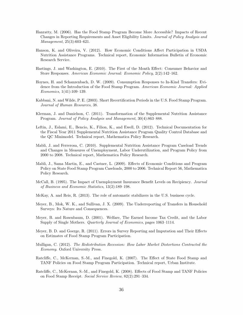
Figure 1 shows the percent of the US population enrolled in SNAP andestimates of the SNAP take-up rate. A household’s eligibility for SNAP isdetermined administratively on a monthly basis. Because monthly householdincome is volatile and not all of the information needed to establish eligibilityis available in household surveys, it is quite difficult to estimate the numberof people who are eligible for SNAP at a point in time. Mathematica PolicyResearch (Eslami et al. (2012)) produces estimates of eligibility using dataon annual income in the March Current Population Survey, combined withadjustment procedures for a variety of program requirements including legalresidency, asset tests, and work requirements. While this procedure clearlyinvolves some measurement error, changes in estimated take-up closely trackchanges in the percent of the population enrolled in SNAP, a calculation thatcan be done more directly by combining administrative data on enrollmentand Census Bureau estimates of the overall US population. Take-up fell from75 percent in 1994 to 54 percent in 2001. It then rebounded up to 69 percentin 2006. Finally, take-up rose significantly in the recent recession, reaching 85percent in 2011.
After providing an overview of the SNAP program in Section 2, we beginour analysis in Section 3 where we examine the relationship between unem-ployment and SNAP enrollment at the county level for the entire 1992-2011time period. Using both OLS regressions and Bartik-style IV regressions thatinstrument for local unemployment with changes in industry shares, we demon-strate that there is a tight connection between local unemployment and SNAPenrollment. A sustained 1 percentage point increase in the unemployment rateleads to an 18 percent increase in SNAP enrollment.
3

Next, we compare predicted changes in the SNAP enrollment rate basedupon these regression estimates with actual changes in the SNAP enrollmentrate. Variation in unemployment rates can explain most of the variation inSNAP enrollment during the 1992-2000 welfare reform period and the 2007-2011 Great Recession period, but not during the 2000-2007 period. We usethis observation to motivate our analysis in Section 4 of the impact of policychanges on SNAP enrollment in three different time periods: Welfare Reform,Bush-Era Modernization, and the Great Recession.
In the early 1990’s, states began experimenting with their cash assistancepolicies, culminating in the passage of federal welfare reform in 1996. Cashassistance receipt declined dramatically, from 14.0 million individuals in 1994to 5.6 million in 2000; SNAP receipt among families with children, as wellas among adults who were newly subjected to SNAP time limits by federalwelfare reform, declined concurrently. We demonstrate that states with biggerdeclines in cash assistance receipt had bigger declines in SNAP receipt amongfamilies with children. We further show that the change in SNAP enrollmentfor families with single mothers over this period can be decomposed into twoequally important factors. First, there was a decrease in the number of eligibleindividuals because of rising incomes. Second, among eligible individuals, therewas an increase in the fraction of individuals with significant earnings, andthere has historically been a much lower take-up rate of SNAP benefits amongpeople who are working.
As mentioned above, SNAP take up increased from 54 percent to 69 percentbetween 2001 and 2006. We show that increased unemployment can explainonly a small portion of this increase, motivating a closer examination of policychanges during this period. Beginning in 2001, with encouragement from theUS Department of Agriculture (USDA), states implemented a series of policychanges designed to improve access to SNAP for working families. Statesrelaxed vehicle ownership rules, redesigned income reporting requirements, andpromoted phone interviews in lieu of face-to-face interviews for establishingand maintaining eligibility. We examine the relationship between these policies
4
changes and change in SNAP enrollment at the state level and find that thesepolicy changes can explain one-half of the increase of enrollment during thisperiod. In addition, we find evidence of a “bounce-back” from welfare reform –states with bigger declines in cash assistance in the 1990’s experienced biggerincreases in SNAP receipt several years later.
During the 2007-2011 Great Recession period, we find that local area un-employment can explain 73 percent of the increase in SNAP enrollment. Wealso examine in detail the eligibility expansions and policy changes which mayalso have increased SNAP enrollment during the recession years. We find thatstates’ adoption of relaxed income and asset limits (“Broad Based CategoricalEligibility”) accounts for 8 percent of the increase in enrollment over this pe-riod. Another feature of SNAP is that program rules for Able-Bodied AdultsWithout Dependents (ABAWDs) are temporarily relaxed in places with highunemployment. Expanded eligibility for ABAWDs during the recession can ex-plain 10 percent of the increase in enrollment. Finally, the temporary increasein SNAP benefits in the Recovery Act may have raised take-up, although weare unable to quantify its impact. We conclude, therefore, that most of the risein SNAP enrollment in the recession era was the result of SNAP’s automaticstabilizer features.
Section 5 collects results from the prior two sections to explain aggregatetrends in SNAP enrollment from 1992 to 2011. Section 6 concludes.
2 Program Overview
2.1 Program Description
SNAP helps low-income households buy food. A household unit is peoplewho “purchase and prepare food together.” Eligibility is typically determinedby three tests:
• a gross income test – household income must be less than 130 percent ofthe poverty line (in FY2015, 130 percent of poverty is $1,265/month for
5

one person and $2,584/month for four people).
• a net income test – household income minus deductions must be lessthan 100 percent of the poverty line. There is a standard deduction of$155 for households with 1 to 3 members (with higher amounts for largerhouseholds), a 20 percent earned income deduction, a medical expensededuction for households with elderly or disabled members, a child carededuction, and a deduction for households with very high shelter costs.
• an asset test – assets must be less than $2,250, excluding the recipient’shome and retirement accounts. All states also exclude at least a portionof the value of the household’s primary vehicle when determining assets.
Households with a disabled person or a member whose age is 60 or above needto pass only the net income test (not gross income), and face a less stringentasset threshold of $3,250. Able-Bodied Adults Without Dependents who areworking less than half time or do not meet certain work requirements arelimited to receiving benefits for 3-months out of each 36-month period.
Program applicants must participate in an interview and provide docu-mentation of legal residency, income, and expenses. Then, recipients need tocomplete a recertification on a recurring basis every 6 to 24 months.
Households receive an electronic benefit transfer card, which can be used topurchase food at supermarkets, grocery stores, and convenience stores. About84 percent of benefits are spent at supermarkets (Castner and Henke (2011)).A household’s benefit is equal to the maximum benefit, minus 30 percent ofits net income. In FY2013, the maximum monthly benefit was $189 for oneperson (mean $148) and $632 for four people (mean $480).
States administer the program, determining eligibility and issuing benefits.The cost of benefits is paid entirely by the federal government, through USDA.Administrative costs are split between the state and federal government. Eachyear, about 50,000 active cases are randomly selected for audits through the
6

Quality Control (QC) system, and the results are used to calculate a state’spayment error rate. In FY2013, the official national overpayment error ratewas 2.6 percent, and the underpayment error rate was 0.6 percent. Stateswith persistently high error rates incur financial penalties. The QC samplesare representative of the national SNAP caseload and are used to produceannual public use micro data files. We make use of these data in some of ouranalyses below.
Economists have done substantial research on the impacts of SNAP onrecipients. The most important feature of SNAP is that benefit levels areset below likely food expenditure needs, meaning that the benefits should beequivalent to cash transfers from a theoretical perspective. Empirically, Whit-more (2002) studies two experiments from the early 1990s and finds that mosthouseholds treat SNAP benefits and cash equivalently. A recent series of pa-pers by Hilary Hoynes, Diane Whitmore Schanzenbach, and coauthors usesthe county-level rollout of SNAP to study the program’s long-term impacts.Almond et al. (2011) find that program exposure raised birth weights, andHoynes and Schanzenbach (2009) find that the program raised food expendi-tures, but only by an amount equal to the marginal propensity to consume outof incremental income. Program recipients face significant cash constraints,with lower caloric intake at the end of the monthly benefit cycle (Shapiro(2005)). Hastings and Washington (2010) show that supermarket prices re-spond modestly to changes in demand by benefit recipients; apparently, theprice responses are small because recipients shop alongside non-recipients.
3 Unemployment and SNAP Receipt
3.1 Analysis Using County Unemployment Rates
We begin our analysis by estimating the relationship between local unem-ployment and SNAP receipt using county-level data from 1990 through 2011.While an extensive literature analyzes the effect of labor market conditions
7
on SNAP enrollment at the state level, we are the first to our knowledge toexamine this relationship at the county level.4
For this analysis, we assembled annual county-level data from July of eachyear on unemployment from the Bureau of Labor Statistics (BLS) and onSNAP enrollment from the Food and Nutrition Service (FNS).5 The BLS con-structs its estimates of county-level unemployment by combining state-leveldata from the CPS household survey with county-level counts of UI claimants.While the county-level approach provides a much larger sample size and, there-fore, the potential for significantly more precise estimates of the relationshipbetween local unemployment and SNAP receipt, there is likely to be substan-tial measurement error in the county-level unemployment estimates, whichcould result in attenuation bias. We use two complementary strategies toaddress the measurement error. First, we provide OLS estimates that usemultiple measures of the unemployment rate (state and county, with two lagsof each). By including multiple lags and two levels of aggregation, we reducethe measurement error associated with any particular CPS survey and any par-ticular administrative count of UI receipt. Second, we provide IV estimatesusing a Bartik instrument for changes in the county unemployment rate. TheIV estimates are our preferred specification because they address measurementerror in the dependent variable and eliminate the bias that could potentiallyoccur if SNAP policy changes simultaneously raise SNAP enrollment and cre-ate disincentives for employment.
Specifically, we estimate the following OLS model:
logSNAP
ijt
= ↵+
⇣�0 �1 �2
⌘
0
BBB@
U
jt
U
jt�1
U
jt�2
1
CCCA+⇣�0 �1 �2
⌘
0
BBB@
U
ijt
U
ijt�1
U
ijt�2
1
CCCA+⌘
i
+'
t
+"
ijt
(1)4For state-level analysis, see Currie and Grogger (2001); Klerman and Danielson (2011);
Mabli et al. (2009); Mabli and Ferrerosa (2010); Ratcliffe et al. (2008); Ziliak et al. (2003).5Details on construction of this sample are in Appendix A.2 and summary statistics are
in Appendix Table 1. Not all states report county-level enrollment (data are available for80-85 percent of SNAP enrollment at the county level).
8

where SNAP
ijt
is the number of SNAP recipients, Ujt
is the unemploymentrate in state j in year t, U
ijt
is the unemployment rate for county i, ⌘i
is acounty fixed effect and '
t
is a year fixed effect. The results are reported inTable 1. In our first specification, we weight each county equally and findthat the sum of all ˆ
� and �̂ estimates is 0.10, meaning that in a state inwhich every county experiences a persistent one percentage point increase inthe unemployment rate, the model predicts an increase in SNAP enrollmentreaching 10 percent after three years. When we weight each county by itspopulation (column 2), the effect of unemployment is even larger, producinga 12 percent cumulative increase in enrollment.
One striking feature of these estimates is that lags of unemployment arequantitatively important, indicating that unemployment has highly persis-tent impacts on SNAP enrollment.6 Some commentators have raised concernsthat SNAP receipt remained high even after the unemployment rate peakedin June 2009 (Furchtgott-Roth (2012)). In fact, our estimates indicate thatpersistently-elevated SNAP receipt in the aftermath of a recession is the norm.
We provide robustness checks to our OLS specification in Appendix Table2. First, we report estimates from a specification without year fixed effects '
t
(columns 1 and 2). Unsurprisingly, when the national unemployment rate ishigher, SNAP enrollment rises as well, and so this specification yields largercoefficients. Second, we use the share of the population receiving SNAP asthe dependent variable (columns 3 and 4) and find results that are similar inmagnitude to those shown in Table 1.
As a further robustness check, appendix Table 3 replicates Table 1 usingthe nonemployment rate rather than the unemployment rate. Using a broadermeasure of unemployment that incorporates discouraged workers could pro-vide a tighter link between economic distress and SNAP enrollment. However,county-level data on the number of discouraged workers is not available. andfinds a similar pattern of results. We prefer the unemployment-based results to
6Ziliak et al. (2003) also find a persistent impact of unemployment on SNAP enrollment.
9

the nonemployment-based results for two reasons: first, changes in the nonem-ployment rate may reflect retirement patterns driven by local demographics,and second, Bartik shocks based on national industrial trends may raise thenonemployment rate without raising SNAP receipt if the people affected haveoutside options like retirement and college enrollment which are unlikely toinvolve SNAP receipt.
As noted above, measurement error could be a serious issue with the countyunemployment data. Intuitively, when the unemployment rate is difficult tomeasure, it will be harder to detect statistically a relationship between unem-ployment and SNAP receipt. In addition to a priori concerns about the BLScounty estimates, there are two pieces of evidence in our data that suggesta role for measurement error. First, measurement error in unemployment islikely to be larger for counties with small populations, and we find that weight-ing each county by its population leads to larger point estimates. Second, if weknew the true county-level unemployment rate, and there were no spillover ef-fects from nearby counties, then the coefficients on state-level unemploymentshould be zero. In fact, we find that they are even larger than the countycoefficients.
To address the measurement error in unemployment, we use a Bartik-styleinstrumental variable approach based on industry share. We examine changesover a 3-year horizon because, in our OLS regressions, we found that one- andtwo-year lags of the unemployment rates had a statistically significant impacton enrollment.7 For each county, we calculate the change from year t � 3 toyear t in employment in county i due to national industrial trends as:
dlog(Emp
it
)� log(Emp
i,t�3) =X
k
(log(Emp
kt
)� log(Emp
k,t�3))wik,t�3 (2)
where k indexes 3-digit NAICS industries, log(Emp
kt
) � log(Emp
k,t�3) isthe three-year national change in employment in industry k, and w
ik,t�3 is7National industry trends have too much serial correlation to allow us to separately
instrument for single years of unemployment in the original lag specification.
10

the share of the county employed in sector k in year t � 3. Changes inthis county-level measure are highly predictive of changes in the unemploy-ment rate. In Figure 2, we stratify predicted changes in county employment,
dlog(Emp
it
)� log(Emp
i,t�3), into twenty equally-sized bins, conditional on yearand county fixed effects. In the top panel, we plot the conditional means forthe change in the unemployment rate for each of these twenty bins. Predictedemployment growth of 1 percent leads to an unemployment rate which is about0.16 percentage points lower, with an F-statistic of 66.
In the bottom panel, we plot the change in SNAP enrollment versus thechange in predicted unemployment for each of the twenty bins. Increasedunemployment due to national industrial trends is strongly associated withincreased SNAP enrollment. We show two stage least squares estimates incolumn 3 of Table 1:
�U
it
= ↵1 +
d� log(Emp
it
) +
i
+ '
t
+ "
it
(3)
� logSNAP
it
= ↵2 + ⇡�U
it
+
i
+ '
t
+ �
it
(4)
We estimate that an increase of one percentage point in the unemploymentrate over a 3-year period is associated with an 18 percent increase in SNAPenrollment over the same time horizon. Recall that the OLS estimate was10-12 percent. This pattern of results in consistent with measurement errorleading to attenuation bias in the OLS results.
These regressions estimate the causal impact of having a higher local un-employment rate on SNAP enrollment. An increase in the local unemploymentrate will increase SNAP enrollment by increasing the number of eligible house-holds and their degree of economic need. It may also alter local SNAP imple-mentation policies – an increase in client to caseworker ratios may lengthenprocessing time, making it harder to enroll, or governments may change admin-istrative procedures in ways that make it easier to enroll. The combined effectof all of these channels is the parameter of interest for our research question– understanding whether the path of SNAP enrollment within a given time
11
period is in line with historical patterns. Our estimate does not, however,isolate the causal impact of unemployment or area-level economic distress onenrollment holding local program implementation policies fixed.
3.2 Predicting SNAP Enrollment with UnemploymentAlone
Figure 3 displays actual changes in SNAP enrollment as a share of the USpopulation for each year from 1992 through 2011 along with predicted changesgiven the actual pattern of unemployment rates and our Bartik IV modelcoefficient estimates. For each county year, we predict the annual change inenrollment from the prior year:
d�SNAP
Unemp
it
=
✓⇡̂
�u
it,t�3
3
◆SNAP
it
(5)
where ⇡̂ is the coefficient from equation 4 and �u
it,t�3 is the change fromthree years prior in the county unemployment rate, divided by three to gener-ate a predicted annual change. To predict the change in the national SNAPenrollment rate relative to a base year, we sum over all the counties:
d�SNAP
pop
post,pre
⌘postX
t=pre
1
pop
t
X
i
d�SNAP
Unemp
it
(6)
The figure highlights three different time periods and presents the cumulativechange in the SNAP enrollment rate measured from the beginning of each timeperiod. During the 1992 to 2000 welfare reform period, changes in unemploy-ment explain a large fraction of the change in SNAP enrollment, but actualenrollment was lower than the unemployment-based model predicts. From2000 to 2007, there were large increases in SNAP enrollment, and unemploy-ment rates explain only a small portion of the increase. During the 2007-2011Great Recession period, rising unemployment can explain most, but not all,of the increase in SNAP enrollment. The next section of the paper examinespolicy changes in each of these three time periods to understand the extent to
12

which the policy changes can explain the gap between the actual changes inSNAP enrollment and the changes predicted given the path of unemployment.
4 Policy Changes and SNAP Receipt
In this section, we analyze three sets of policy changes that had the potential toaffect SNAP enrollment: welfare reform, state-level adoption of SNAP policyoptions, and Great Recession era expansions of SNAP eligibility.
4.1 Welfare Reform
From 1993 to 2000, the number of cash assistance recipients in the US fell by58 percent. An unusually strong labor market and expansions of the EarnedIncome Tax Credit led single mothers to transition from cash assistance receiptto work (Meyer and Rosenbaum (2001)). Welfare reform played an importantrole as well: the first major waivers for changes in state welfare policy weregiven in 1992. By the time President Clinton signed the Personal Responsibil-ity and Work Opportunity Reconciliation Act (PRWORA) in 1996, 37 stateshad already received waivers.
SNAP receipt also plummeted during this period, falling by 36 percent. Aportion of the drop is unremarkable. Some single mothers making the transi-tion from welfare to work ended up with income above the SNAP eligibilitylimits, and PRWORA eliminated SNAP eligibility for some legal immigrantsand able-bodied childless adults. What is remarkable is that take-up of SNAPamong eligible households fell from 75 percent to 54 percent.
State-level evidence points to a link between the intensity of welfare re-form and the decline in SNAP receipt.8 Because the timing of welfare re-form varied across states, we define t(peak) as the year in which a state j
8We estimate this relationship at the state level rather than the county level becausecash assistance receipt is not available at the county level.
13
reached its maximum number of cash assistance recipients. For 41 states,this peak occurred between 1992 and 1994. We measure all of our vari-ables as the change from the peak year to five years later (�X
j,t(peak)+5 ⌘X
j,t(peak)+5 � X
j,t(peak)). We measure the intensity of welfare reform as thechange in the log of the number of cash assistance recipients from the peakto five years later (� logCash
j,t(peak)+5). The top panel of Figure 4 plots therelationship between the intensity of welfare reform and the change in SNAPreceipt. For every, 10 log point decrease in cash assistance there is a 2.9 logpoint decrease in SNAP receipt with a standard error of 1.1. To evaluatethe relationship between welfare reform and SNAP receipt controlling for thebusiness cycle, we regress
� logSNAP
j,t(peak)+5 = ↵ + �� logCash
j,t(peak)+5 +�U
j,t(peak)+5 + "
j
(7)
where U is the unemployment rate and SNAP is enrollment for families headedby single mothers. We find a similarly strong, statistically significant corre-lation: a 10 log point decrease in cash assistance receipt is associated witha 2.6 log point decrease in SNAP receipt and a standard error of 1.0.9 Thissuggests that at the state level, the intensity of welfare reform was correlatedwith changes in SNAP receipt. We do not believe that this relationship re-flects merely changes in state economic conditions for two reasons: (1) we havecontrolled for the change in the unemployment rate and (2) when we regresschanges in cash assistance caseloads on changes in SNAP receipt for childlessadults and seniors – populations that were less affected by state-level welfarereform activities – we find a smaller and statistically insignificant coefficient.
There are several potential explanations for why take-up of SNAP by el-igible households declined so significantly during the welfare reform period.First, narrative accounts of welfare reform implementation suggest that when
9We drop Idaho, which is an extreme outlier in its change in cash assistance. An alter-native specification uses a common time period, of 1994 to 1999. Here, we find a coefficientof 0.12, which is statistically significant at a 10 percent level. We find this specification lessattractive because it does not account for heterogeneity in when states began changing theirwelfare programs, as discussed above.
14
people lost eligibility for cash assistance they often did not realize (and welfareoffices made little effort to tell them) that they remained eligible for SNAP(Government Accountability Office (1999)). Second, the stigma associatedwith receiving benefits may have increased because of anti-welfare sentiment.Third, the shift in the composition of the SNAP-eligible population to includemore households with labor earnings may have played a role. In particular,SNAP take up among working single mothers has always been lower than take-up among those without jobs. We calculate using the QC files that as cashassistance recipients transitioned to work, the share of SNAP recipients withchildren reporting earned income rose from 30 percent to 45 percent.
To distinguish among these explanations, we use the March CPS togetherwith the QC files to study SNAP enrollment by single mothers with childrenin 1993 and 2000 (we also include results for 2011 to motivate the discussionin Section 4.2 of policy efforts to increase take-up during the 2000s). First, wedivide the sample of single mother headed families in the CPS by whether ornot family income was below 130 percent of poverty each year – indicative ofwhether the family was likely to be eligible for SNAP. We then sub-divide thelikely-eligible sample into three groups indexed by k: “Cash Assistance”, “NoCash, Working”, or “No Cash, Not Working”. We define a family as “working”if the family has annual earnings equal to at least 25 percent of the annualpoverty line and as “receiving cash assistance” if the family reports assistanceequal to at least 10 percent of the annual poverty line. The bottom left panel ofFigure 4 shows that the number of people in families receiving cash assistancedeclined by approximately 4.9 million between 1993 and 2000. Approximately2.8 million fewer people in single mother households had incomes above the130 percent of poverty threshold by 2000 and are not shown in the figure.In addition, there was an increase in the number of single mothers who wereworking, as well as an increase in the number who are neither working norreceiving cash assistance.
Next, we calculate the SNAP “take-up ratio” as the ratio of enrolled to
15

eligibles for each of the three groups in the bottom right panel of Figure 4.10
These ratios are not bounded from above by 1 since the numerator and de-nominator come from different datasets and cash assistance is underreportedin the CPS.11 The ratio is highest for the Cash Assistance group and lowestfor the Working group. What is striking in these figures is the stability ofthe ratios between 1993 and 2000. These data suggest that take-up rose a bitamong cash assistance families and fell a bit among non-cash working families,but that, overall, there was little change in take-up within categories. It ap-pears, therefore, that declining take-up during the welfare reform period wasprimarily the result of people shifting out of the high take-up cash assistancestatus and into the lower take-up working status.
More formally, we can decompose the change in SNAP receipt by singlemother families during this period into the changes in the number of eligiblesfor SNAP (income < 130% of poverty) evaluated at the overall take-up ratefor 1993 and changes in take-up ratio among eligibles households, multipliedby the number of eligibles in 2000.12
SNAP2000 � SNAP1993 = �NumElig2000,1993 ⇤ TakeUp1993 (8)
+ �TakeUp2000,1993| {z }Decomposed in eq’n 9
⇤NumElig2000
In addition, the change in the take-up rate, can be further decomposed todistinguish between the role of reallocation across cells k (“Cash Assistance”,“No Cash, Working”, and “No Cash, Not Working”) with different take-up
10There are two ways to measure the take-up ratio: the ratio of CPS recipients to CPSeligibles and the ratio of QC recipients to CPS eligibles. The CPS enrollment measure isattractive because the take-up ratio is less than one, but unattractive because SNAP receiptis underreported in the CPS. The QC enrollment measure is attractive because its recipientcount is based on administrative data, but it is unattractive because the accounting periodfor the QC files is monthly, whereas the eligibility count from the CPS is based on annualinterview data.
11See Data Appendix A.4 for details on how we handle this and other data issues.12These decompositions do not require the take-up ratios to be less than one, only that
cell shares sum to 1 (P
k Sharekt = 1)
16
ratios and the role of within-cell changes in take-up ratios.
�TakeUp2000,1993 =X
k
�Share
k
2000,1993⇤TakeUp
k
1993+�TakeUp
k
2000,1993⇤Sharek2000(9)
Appendix Table 4 shows the results of this decomposition. The first columnshows our preferred QC-based estimates. Overall, of the 4.9 million decreasein SNAP enrollment among single mother families, a bit more than half (2.84million) was the result of reductions in eligibility (an increase in the numberof families with income above 130 percent of poverty). Almost 60 percent(2.74 million) was the result of the shift, among eligible families, from thehigh take-up category of only receiving cash assistance to the two lower-takeup categories of work only and neither work nor cash assistance. Changes inwithin-cell take up of SNAP actually raised enrollment, holding everything elseconstant(which is why the percentage accounted for in the two other categoriesexceeds 100 percent) The results in column 2 with the CPS-based measure ofSNAP receipt are similar. In terms of the theories outlined in this section, wefind this evidence to be most consistent with the theory that it was the shift ofso many families from welfare to work that led to the decline in SNAP take up.While increased welfare-related stigma and administrative ordeals may havebeen part of the reason that so many families shifted from welfare to workduring this period, there does not appear to have been an increase in SNAP-specific stigma or administrative ordeals that reduced SNAP enrollment ontop of the changes that induced families to transition from welfare to work.
4.2 Econometric Evidence on State Policy Adoption
The decline in SNAP take-up prompted the Bush administration to give statesseveral new policy options to make it easier to combine work and SNAP receipt.In 2001, Department of Agriculture Undersecretary Eric Bost testified beforeCongress:
17

Concerns have grown that the program’s administrative burdenand complexity are hampering its performance in the post-welfarereform environment. There is growing recognition that the com-plexity of program requirements – often the result of desires totarget benefits more precisely – may cause error and deter par-ticipation among people eligible for benefits... These burdens areparticularly significant for the working families that comprise anincreasing portion of the Food Stamp caseload. Caseworkers areoften expected to anticipate changes in their income and expenses –a difficult and error-prone task, especially for working poor house-holds whose incomes fluctuate... (Bost (2001))
Most of these policy changes were implemented by giving states waivers fromprogram rules.
In Figure 5, we show maps for the number of policy options implementedfor various years, as reported in the SNAP Policy Database.13 From 2001to 2007, most states adopted at least two of the policies described below.The states adopting the largest number of policies by 2007 – Washington,Texas, Massachusetts, Pennsylvania, and South Carolina – are not clusteredin any single geographic region of the country, and are a mix of Republican-and Democratic-leaning states, suggesting that political ideology was not anoverriding factor in these policy choices.
Three particularly important changes were made to income reporting, re-certification periods, and interview structure that may have raised the take-uprate:
• Simplified Reporting – Under default program rules in 2001, SNAP re-cipients were required to report any change in income. USDA first gavestates waivers requiring the reporting of only significant income changes(e.g. a $100 change in monthly income). This culminated in simplifiedreporting, where SNAP recipients were required to report income changes
13Appendix Table 5 shows the number of policies adopted as of 2001, 2007 and 2011. Thesedata are available at http://www.ers.usda.gov/data-products/snap-policy-database.aspx
18
between six-month recertification dates only if the income changes madethem ineligible for benefits. By 2007, 47 states had adopted simplifiedreporting.
• Recertification Lengths – After welfare reform, many states had imple-mented recertifications of three months or shorter, meaning that peoplehad to re-state their income and expenses to the state very frequently.Recertifications likely have the biggest impact on people whose life cir-cumstances change frequently, such as people marginally attached to thelabor force. Longer intervals between recertifications for people withearnings reduce the cost of participating in the program. Kabbani andWilde (2003) and Ribar et al. (2008) study the impact of recertificationintervals on SNAP take-up. In 2001, 25 states were using certificationintervals of three months or less for many people with earnings, but by2007, all 50 states and DC had stopped using such short intervals.
• Interview Format – Under default program rules in 2001, SNAP appli-cants were required to do a face-to-face interview to establish eligibilityand for every recertification, unless the household had demonstrated dif-ficulty with completing such an interview. Over time, USDA gave stateswaivers allowing phone interviews, first for recertification, and then laterfor initial certifications. By 2007, 22 states had received a waiver of theface-to-face requirement for recertifications.
Other innovations during this period include the establishment of call centers(20 states by 2007), online applications (14 states by 2007), and the Sup-plemental Security Income Combined Application Project (SSI CAP), whicheased enrollment procedures for SSI recipients (12 states by 2007).14
In addition, there were rule changes which may have raised enrollment byexpanding eligibility, but should not directly have affected take-up:
14Dickert-Conlin et al. (2011) analyze the effect of radio ads and Schwabish (2012) analyzesthe effect of online applications.
19
• Vehicle Exemptions – Under default program rules in 2001, the value ofa family’s vehicles above an exemption counted towards the asset test.For example, the exemption threshold was $4,650 in 2003. Over time,states were given flexibility to revise their vehicle policies. By 2007, 46states exempted at least one vehicle completely from the asset test.
• Broad-Based Categorical Eligibility (BBCE)15 – We describe BBCE indetail in Section 4.3. By 2007, 13 states had implemented some form ofBBCE.
We regress the percent of the state population enrolled in SNAP on each of thestate-level policies described above. Empirically, it is difficult to isolate theeffect of each policy simultaneously with statistical precision, so we analyzeeach policy separately using indicator variables. With j indexing states, l
indexing policies and t indexing years, we use the specification:
100⇥ SNAP
Pop
jt
= ↵ + �Policy
jlt
+ U
jt
+ ⌘
j
+ '
t
+ �
jlt
(10)
with U
jt
as unemployment in state j and year t, ⌘j
as a state fixed effect and '
t
as a year fixed effect. We also use an alternative specification with the take-uprate, rather than the enrollment rate, as the dependent variable in equation10. If states adopted policies randomly, then � would identify the causal effectof policy adoption on enrollment. Conversations with program administra-tors have led us to believe that the most important factors in adoption werenot structural factors such as a state’s unemployment rate or the politicalorientation of its governor, but idiosyncratic factors such as whether it wasimplementing a new database system or otherwise redesigning human servicesdelivery, whether it was making changes to respond to a recently high errorrate (because policy adoption typically led to lower error rates), and whetherthe state needed approval from the state legislature to make changes to its
15“Broad-Based Categorical Eligibility” is used to distinguish this new policy from a long-standing “Categorical Eligibility” policy, which made people already receiving cash assistanceautomatically eligible for SNAP.
20
SNAP program. For the period from 1996 to 2008, a state’s unemploymentrate appears to have been an unimportant factor in policy adoption.16
We report estimated coefficients in Table 2. We find that BBCE, simplifiedreporting, and ending short recertifications have a significant and positiveeffect on enrollment.17 Next, we construct an omnibus adoption measure asthe mean of all eight policy indicators, ranging from 0 to 1:
Policy
jt
⌘ 1
8
X
l
Policy
ljt
(11)
We re-estimate equation 10 for the index. For this specification, we havesufficient precision to also include a lag of the policy index, which is desirablebecause it is possible that a policy introduced in year t would not have its fullimpact until the following year.
100⇥ SNAP
Pop
jt
= ↵ + �1Policy
jt
+ �2Policy
j,t�1 + U
jt
+ ⌘
j
+ '
t
+ �
jlt
(12)
The results are shown in Table 3. In column 1 the coefficient on the con-temporaneous policy index is 1.93 indicating that a state that switched fromadopting none of the policies to adopting all of the policies would experience1.9 percentage point increase in the share of the state’s population receivingSNAP. The impact of the summary index of all the policies is substantiallylarger than any individual policy measure. This suggests that each individualpolicy is measured with substantial error, but that a collection of policies im-plemented together can affect SNAP enrollment. When we include the lagged
16A regression of PoliciesAdoptedjt = ↵ + �Ujt + ⌘j + 't + �jt yields a statisticallyinsignificant coefficient of 0.025. This coefficient is larger during the Great Recession, asdiscussed below.
17An extensive literature estimates the effect of state SNAP policies on enrollment rates.Most papers find insignificant coefficients for most policies. Klerman and Danielson (2011),Mabli and Ferrerosa (2010), and Mabli et al. (2009) report that a state’s adoption of BBCEhad a statistically significant impact on enrollment raising it by 6 percent and simplifiedreporting raised enrollment by about a statistically significant 4 percent. These estimatesare slightly smaller than the coefficients reported here.
21

policy index (column 2), the coefficients imply that policies implemented in theprior year are more important than policies implemented in the current year,and the cumulative impact of adopting all eight policies rises to 2.6 percentagepoints, by the end of year t, from a sample mean of 9.0 percent.
In interpreting these results, three caveats are in order. First, even thoughpolicies and enrollment vary at the state-year level, there is significant measure-ment error in identifying the exact date of adoption of some of these policies.18
This means that our estimates are likely to be lower bounds on the true effectsof these policies. Second, the top panel of Figure 4 shows that states thatimplemented welfare reform most aggressively and had the largest declines incash assistance during the 1990s, had the largest bounce backs in SNAP en-rollment after 2000. It is possible that states implementing new policies werealso doing other activities to encourage take-up – for example outreach efforts.If so, then the policy impacts we estimate might not be solely the result ofthe measured policies. They could also be the result of other unmeasuredpolicies implemented at the same time. Thus, we interpret our findings inthis section as establishing that deliberate policy actions designed to increasetake-up among SNAP-eligible families did in fact increase SNAP enrollment.However, we do not believe we are on strong ground in parsing out the relativeimportance of particular policies.
4.3 SNAP Policies in the Great Recession
Next, we examine the role of policies which expanded SNAP eligibility in theGreat Recession. We focus in particular on two policies: increased state-level adoption of Broad-Based Categorical Eligibility (BBCE) and temporarywaivers on time limits for Able-Bodied Adults Without Dependents (ABAWDs).Unlike the policies analyzed in the previous section, people eligible under thesepolicies can be counted directly using the SNAP QC micro data, which are
18For example, Trippe and Gillooly (2010) and Government Accountability Office (2012)disagree on the date of BBCE adoption for 7 states.
22
a random sample of 50,000 SNAP cases released on annual basis. We countthe number of people eligible under each policy in 2007 and again in 2011.Some of the increase in enrollment reflects increased take-up of SNAP amongpeople who were eligible even before the policy expansions, and some is theresults of the policy expansions. The identifying assumption we use to mea-sure the portion that is the result of the policy expansions is that absent anyrule changes, enrollment for a given policy (BBCE or ABAWDs) would havegrown at the same rate as enrollment for those eligible under standard rules.Let SNAP
lt
be the number of people enrolled under policy l in year t, with 0
denoting people enrolled under the standard rules: The contribution of policyl to enrollment growth from 2007 to year t is calculated as:
d�SNAP
lt
⌘ SNAP
lt
� SNAP
l,2007SNAP0,t
SNAP0,2007(13)
The results are summarized in Table 4.
BBCE is a state policy option introduced in 2001. Under default SNAPprogram rules, eligibility involves a gross income test, a net income test, andan asset test as described in Section 2. BBCE allowed states to eliminate thenet income and asset tests, and also to raise the threshold for the gross incometest to up to 200 percent of poverty. While this policy sounds like a dramaticexpansion of eligibility, a careful examination of SNAP program rules revealsthat this is not the case. A household’s SNAP benefit is the maximum benefitminus 30 percent of net income, even under BBCE. So even if the net incomeeligibility test is waived, a household with significant net income will receiveno SNAP benefits. For example, in 2013, a household with four members andnet income at 100 percent of poverty would receive a monthly benefit of $92,but a household with net income of 116 percent of poverty or higher would notreceive any benefits. This benefit calculation rule sharply limited the scope ofthe eligibility expansion; the group most affected is those with substantiallyhigher gross incomes than net incomes, such as fathers paying child support.
USDA administrators issued a memo in September 2009 (Shahin (2009))
23

encouraging states to start using BBCE, and by 2011, 41 states had adoptedBBCE. Using the QC files, we estimate that in 2011, 1.7 million people (3.9percent of total enrollment) lived in households whose income was too high tobe SNAP-eligible under normal program rules and who therefore were enrolledonly because of BBCE. As explained above, we construct a counterfactual byassuming that enrollment for people with excess income would have grown atthe same rate between 2007 and 2011 as enrollment of people eligible understandard rules. Under this assumption, new adoption of BBCE raised enroll-ment of people with excess income by 1.0 million. In other words, we estimatethat of the 1.7 million individuals eligible because of BBCE in 2011, 700,000were eligible based on pre-2007 state adoption of BBCE and 1,000,000 wereeligible because of recession-era adoption.
BBCE also allowed states to raise or eliminate asset limits. Because case-workers do not record assets in BBCE states, we cannot count enrollmentwith excess assets using the QC files. In 2011, Idaho and Michigan reinstatedasset limits of $5,000 and caseloads fell by 1 percent in Michigan and lessthan 1 percent in Idaho (Government Accountability Office (2012)). Based onthis evidence, we estimate that adoption of BBCE during the recession raisedenrollment of people with excess assets by 560,000 (details are in the DataAppendix)
Welfare reform (PRWORA) subjected ABAWDs who are working less thanhalf time or not meeting employment-training requirements to a 3-month timelimit on SNAP benefits during any 36-month period. However, the legisla-tion established a waiver of time limits in places with elevated unemployment.Without time limits, more people are eligible, and there is greater incentive toapply, given the potential for a longer duration of receipt. Conceptually, be-cause state eligibility for ABAWD waivers mechanically expands and shrinkswith the unemployment rate, these waivers have a lot in common with con-ventional automatic stabilizers, even though they require a state decision toapply for the waivers for them to go into effect.
In 2007, about one-third of the SNAP enrollment was in places with a
24
waiver. As the country headed into recession, nearly all places became eligiblefor waivers. In 2011, we estimate that 4.3 million SNAP recipients (9.5 percentof total enrollment) were potential ABAWDs using the QC files. If enrollmentfor this group had instead grown at the same rate as enrollment of people eligi-ble under standard rules, there would be about 2.4 million potential ABAWDsreceiving SNAP. Under this assumption, the recession-induced waivers raisedenrollment by 1.9 million people.
Finally, the Recovery Act temporarily raised the maximum SNAP benefitby 13.6 percent. The Recovery Act’s benefit change increased the incentive toenroll and remain enrolled and may therefore have raised take-up among thealready eligible. It is difficult to quantify the impact of this change becauseSNAP benefits are set at the federal level. However, a series of papers estimat-ing the take-up elasticity for unemployment insurance, another program whichserves people with temporary economic need, finds values between 0.19 and0.59.19 Applying this range to the 18 percent increase in average householdSNAP benefits implies an increase in enrollment of 3 percent to 11 percent.
5 Explaining Aggregate Trends in SNAP Re-ceipt
At the end of Section 3, we presented Figure 3 which showed that variationin unemployment rates could explain most of the variation in SNAP take-upduring the 1992-2000 welfare reform period and the 2007-2011 Great Recessionperiod, but not during the 2000-2007 period. In this section, we combine ourestimates of unemployment impacts with our estimates of policy impacts toprovide an overall accounting of changes in SNAP enrollment in each period.We also compare our results to those in two other recent papers that have
19McCall (1995) uses the CPS Displaced Worker Survey to estimate a that a 10 percentincrease in UI benefits raises benefit expenditure through takeup by 1.9 percent-3.0 percent.Anderson and Meyer (1997) use administrative data from six state UI programs to estimatean elasticity between 0.39 and 0.59.
25
addressed some of the same issues.We do not make an attempt to quantitatively combine our welfare reform
results with our unemployment results because we do not think that there is aconvincing way to separate the portion of the increase in single mother laborsupply that was the result of welfare reform and changes in EITC policy fromthe portion that was the result of the strong economy during the 1990s. Itis worth noting, however, that the overprediction of SNAP enrollment duringthe welfare reform period shown in Figure 3 is roughly commensurate with ourback-of-the-envelope guess at welfare reform’s impact on SNAP enrollment.Appendix Table 4 shows that there was a reduction in SNAP enrollment of4.9 million people in single parent families between 1993 and 2000. Meyer andRosenbaum (2001) attribute about 80 percent of the increase in labor supplyamong single mothers during this period to policy changes and about 20 per-cent to declining unemployment. This would imply that about 4.0 million ofthe 4.9 million decline in SNAP enrollment in single mother headed familieswas attributable to policy – accounting for essentially all of the gap in Fig-ure 3 between the decline in SNAP enrollment predicted by the employmentregressions and the observed decline in enrollment.
5.1 County-Level Unemployment and State Policy Op-tions – 1992-2011
We begin by combining our county-level estimates of the relationship betweenunemployment and SNAP enrollment with our state-level estimates of therelationship between policies and SNAP enrollment. We assume that the state-level policy changes have an equal impact across all counties within a state.We predict the change in enrollment rates in each county i on the basis of theindex of policy adoption in state j defined in equation 11, multiplied by theestimated coefficients from equation 12:
26
d�SNAP
pop
Policy
ijt
=
ˆ
�1�¯
Policy
jt
+
ˆ
�2�¯
Policy
jt�1 (14)
We combine this with our prediction of d�SNAP
Unemp
ijt
from equation 5. Be-cause the policy prediction is of the change in the enrollment rate while theunemployment prediction is of the change in enrollment levels, we multiply thecounty enrollment rate change predictions by the county populations so thatboth components are in the same units. Then we sum over all of the counties.Finally we divided by the U.S. population to produce a national enrollmentrate prediction:
d�SNAP
pop
post,pre
⌘postX
t=pre
1
pop
t
X
ij
0
@pop
ijt
d�SNAP
pop
Policy
ijt
+
d�SNAP
Unemp
ijt
1
A
(15)
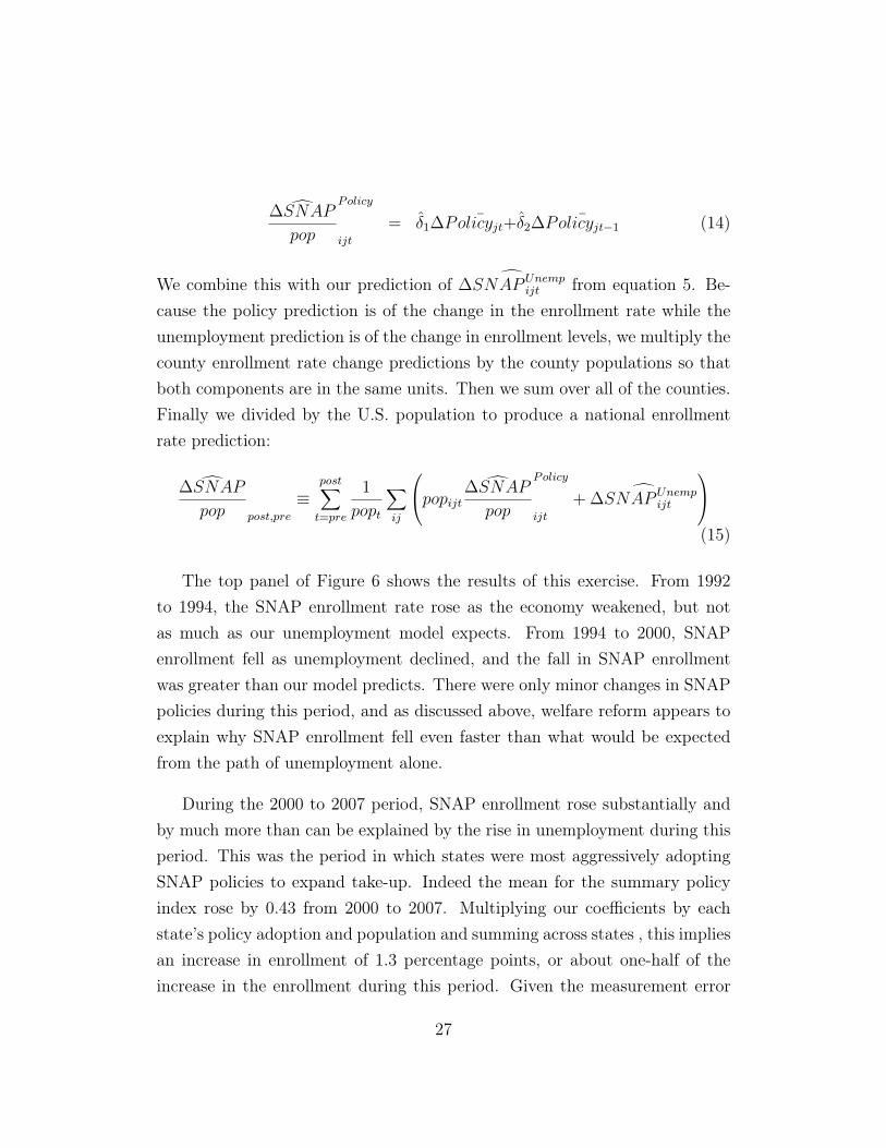
The top panel of Figure 6 shows the results of this exercise. From 1992to 1994, the SNAP enrollment rate rose as the economy weakened, but notas much as our unemployment model expects. From 1994 to 2000, SNAPenrollment fell as unemployment declined, and the fall in SNAP enrollmentwas greater than our model predicts. There were only minor changes in SNAPpolicies during this period, and as discussed above, welfare reform appears toexplain why SNAP enrollment fell even faster than what would be expectedfrom the path of unemployment alone.
During the 2000 to 2007 period, SNAP enrollment rose substantially andby much more than can be explained by the rise in unemployment during thisperiod. This was the period in which states were most aggressively adoptingSNAP policies to expand take-up. Indeed the mean for the summary policyindex rose by 0.43 from 2000 to 2007. Multiplying our coefficients by eachstate’s policy adoption and population and summing across states , this impliesan increase in enrollment of 1.3 percentage points, or about one-half of theincrease in the enrollment during this period. Given the measurement error
27
regarding the timing of implementation, these estimates are likely to be a lowerbound on the impact of state-level policy changes on SNAP take-up during thisperiod. From 2007 to 2011, enrollment rose rapidly and most of the increasecan be explained by the rise in unemployment during the recession. As the toppanel of Figure 6 shows, there was also further adoption by states of policiesto encourage SNAP take-up that can also explain a portion of the increaseduring this period. Because most of the specific policies that states adoptedduring this period are ones where we can observe their impact directly in themicro QC data, we perform a more detailed decomposition for this period inthe next section.
5.2 Detailed Analysis of the Great Recession
The Great Recession coincided with a dramatic increase in SNAP receipt –from 26.6 million recipients in July 2007 to 45.3 million recipients in July2011.20 Hanson and Oliveira (2012) used national time series data to exam-ine the correlation between the unemployment rate and SNAP receipt, andconcluded that the increase in SNAP participation during the recent recessionwas “consistent with the increase during previous periods of economic decline.”In contrast, Mulligan (2012) focuses on policy changes, noting “[m]illions ofhouseholds received safety net benefits in 2010 that would not have been el-igible for benefits in 2007 even if their circumstances had been the same inthe two years, because the rules for receiving safety net benefits had changed.”Mulligan calculates that the BBCE and other eligibility changes are responsi-ble for “66 percent of the growth of SNAP household participation in excessof family (125 percent) poverty growth between fiscal years 2007 and 2010.”Our results enable us to distinguish between these competing views.
20These estimates are the national monthly totals published by USDA. In Table 4, wereport the average monthly caseload for Q3 in the QC files, which is 26.04 million recipientsin 2007 and 45.14 million in 2011. Appendix D of Leftin et al. (2012) explains that theQC counts are slightly lower than the national monthly totals because they omit familiesreceiving Disaster SNAP and cases which were found to be ineligible for SNAP.
28

The bottom panel of Figure 6 summarizes our enrollment results for un-employment and eligibility expansions together. The first contributing termis d
�SNAP
Unemp
ijt
, already aggregated to the national level and analyzed inSection 5.1. The second contributing term d
�SNAP
lt
comes from Section4.3, which identified three different policies which expanded eligibility: excessincome, excess assets and potential ABAWD status.
d�SNAP
pop
post,2007
⌘postX
t=2008
1
pop
t
X
ij
d�SNAP
Unemp
ijt
+
X
l
d�SNAP
lt
(16)
SNAP enrollment rose by 19.1 million people from July 2007 to July 2011.The county unemployment regressions can explain 73 percent of this increase.We find that expanded adoption of BBCE raised enrollment by 1.57 millionpeople, and automatic waivers of time limits raised enrollment by 1.87 millionpeople, for a total of 3.44 million. So together, these two changes can accountfor 18 percent of the total increase in enrollment over this period. Thus incombination, our unemployment and policy analyses can explain 91 percentof the increase in SNAP enrollment. This analysis also indicates that therise in enrollment was mostly the result of the program’s built-in automaticstabilizer features operating as usual in the midst of a very severe recession.Indeed, given that the ABAWD waivers (responsible for 10 percent of theincrease) are explicitly designed to apply whenever unemployment is high, ouranalysis suggests that 83 percent of the increase was the result of business-cyclesensitive features of the program.
There are two additional pieces of evidence that support the conclusionthat the rise in SNAP enrollment during the Great Recession was mostly theresult of the program’s automatic stabilizer features operating as usual. First,when we estimate the relationship between SNAP receipt and unemploymentlimiting the sample to the pre-recession 1990-2007 period, we obtain some-what larger coefficients and actually slightly over-predict the rise in SNAPenrollment that occurred during the Great Recession.
Second, family-level data show a tight link between long-term unemploy-
29

ment and SNAP receipt. Using data from the Survey of Income and ProgramParticipation (SIPP), we estimate the fraction of time that a family’s laborforce participants were unemployed over the past sixteen months.21 This distri-bution is shown in the top panel of Figure 7. Next, we compute the probabilityof SNAP receipt for families by time spent unemployed. The bottom panel ofFigure 7 shows that the probability of SNAP receipt in 2007 is rising sharplyby unemployment status, from 5 percent of people in families with no unem-ployment to about 60 percent of people in families with unemployment forsixteen consecutive months. Multiplying the share of the population in eachunemployment duration category in 2011 by the SNAP enrollment rate foreach unemployment category in 2007 and summing, we calculate a predictedSNAP enrollment rate of 12.0 percent. National SNAP receipt rose from 8.9percent to 14.5 percent during the analysis period, so using family-level vari-ation in unemployment rates alone, we can explain about half of the increasein SNAP receipt among the entire US population.
Why are these family-level estimates from the SIPP smaller than thecounty-based estimates developed in Section 3? Presumably, when a recessionhits an entire region, it becomes more difficult to turn to neighbors, family,and friends for financial support. An extensive literature in economics (e.g.Townsend (1994)) documents that people rely on local networks to smoothidiosyncratic shocks, suggesting that the impacts of unemployment durationon SNAP enrollment will be larger when aggregate unemployment is higher.In addition, during the recession, economic distress could occur without mea-sured unemployment, if a worker remained employed but had his or her hoursor wage-level reduced. Indeed, we calculate using the SIPP that 27 percent ofthe aggregate increase in SNAP receipt from 2007 to 2011 occurs in families inwhich no member experienced an unemployment spell and at least one mem-ber was in the labor force. Given that many families without unemploymentspells experienced increased economic hardship during the recession and that
21This sample includes all families, regardless of whether children are present. See Ap-pendix A.5 for details on sample construction and how we adjust the SIPP estimates ofSNAP receipt to account for underreporting.
30
the recession may have increased economic hardship even among those witha given unemployment duration, it is remarkable that half of the increase inSNAP enrollment can be accounted for simply by the family-level increase inunemployment durations.
5.3 Reconciliation with Literature
Mulligan (2012) estimates that post-2007 policy changes accounted for 20 per-cent of overall SNAP enrollment in 2010.22 Our comparable number is thatthese changes account for 7.5 percent of enrollment in 2011.
There are three categories of policy changes to consider: changes in howvehicles and retirement assets are treated in determining eligibility, waiving oftime limits for ABAWDs, and expansions of BBCE. Mulligan (pages 79-81)assumes that state-level adoption of relaxed vehicle policies and other changesin asset policies in the 2008 Farm Bill raised SNAP participation during therecession by 12 percent. There are two issues with this estimate. First, the12 percent figure is much larger than most estimates in the literature.23 Sec-ond, Mulligan assumes that this policy was adopted nationwide during therecession. In fact, the SNAP Policy Database shows that by 2007, 46 stateshad already adopted relaxed vehicle policies, and only 3 adopted these policiesduring the recession. Moreover, the 2008 Farm Bill’s changes in asset policieslikely had a negligible impact on eligibility. The Bill excluded retirement ac-
22Table 3.4 in his book reports actual per capita spending in 2010 of $205 and spendingof $164 if the program reverted to 2007 eligibility rules. This implies that holding benefitsfixed, SNAP enrollment would be 20 percent lower without eligibility changes.
23Mulligan cites Ratcliffe et al. (2007) as finding that exempting a vehicle from the assettest raises participation by 8-16 percent, and takes the midpoint of 12 percent as his estimate(see Ratcliffe et al. (2008) for the published version). Ratcliffe et al. (2007) use SIPP datain their analysis. Other papers have found much smaller point estimates. Another paperusing the SIPP, Hanratty (2006), reports that exempting one vehicle changed enrollment bynegative 5.5 percent to positive 7 percent. Estimates for the impact of vehicle exemptionsusing state-level administrative enrollment counts are: 0.8 percent-1.2 percent from Mabliet al. (2009) and 0.4 percent-0.9 percent from Klerman and Danielson (2011). In Table 2,we estimate with state-level data that exempting at least one vehicle raises enrollment by0.1 percent.
31
counts and 529s from the asset test and, as discussed in the Data Appendix,asset limits rarely bind on potential recipients. We therefore attribute noincrease in SNAP receipt to these policies.24
In assessing the impact of waiving ABAWD time limits, Mulligan doesa QC-based calculation that is quite similar to ours. He concludes that thewaiver of time limits raised enrollment by 2.3 percent, which is smaller thanour estimate of 4.1 percent.
Finally, Mulligan estimates that BBCE raised enrollment nationally by5.7 percent, which is larger than our estimate of 3.5 percent. His estimatecomes from noting that enrollment rose 9 percent faster among states thathad adopted BBCE by 2010 relative to the ones that had not. This estimateis then multiplied by the enrollment share of BBCE-adopting states to get5.7 percent. However, if state economic conditions affect the decision to adoptBBCE, then this estimate will conflate the impact of those conditions with theimpact of the eligibility expansion. States with BBCE by 2010 had unemploy-ment rates averaging 9.2 percent, while the unemployment rate in non-BBCEstates averaged 7.6 percent. Thus, it seems quite possible that part of thedifferential SNAP enrollment by BBCE states was a reflection of their greatereconomic distress. In contrast, our estimates directly count the number ofindividuals who were eligible under the eligibility expansions but would nothave been eligible in their absence. In Table 5, we provide a side-by-side com-parison of our estimates and Mulligan’s which summarizes the discussion inthis section. Overall, our estimate that policy changes account for 7.5 percentof enrollment during this period implies that they can explain about 18 per-cent of the increase in enrollment during the recession. In contrast, Mulligan’sestimates would imply that 48 percent of the increase in enrollment was theresult of policy.
Another recent contribution on this topic comes from Bitler and Hoynes24Even if we did use Mulligan’s 12 percent estimate and applied it to the 3 states which
adopted vehicle policies during this period – Florida, Minnesota, and Wyoming – we wouldonly expect a national increase in enrollment of 0.8 percent.
32

(2013). The paper examines how poverty, living arrangements, and a widerange of safety net programs responded during the Great Recession. The au-thors find that a one percentage point increase in the state unemployment rateraises SNAP caseloads by 3.4 percent and conclude “the safety net programsreceiving the most attention through the Great Recession (Food Stamps andUI) exhibit adjustments very consistent with their behavior during previoushistorical cycles.” This 3.4 percent estimate is similar to other estimates ofthe relationship between SNAP enrollment and unemployment using annualstate-level data such as Mabli and Ferrerosa (2010), but it is much smallerthan our estimate that a sustained one percentage point increase in the unem-ployment rates raises SNAP enrollment by 18 percent. From trough to peak,the US unemployment rate rose by 5 percentage points during the recent re-cession, so their estimate would imply a 17 percent increase in enrollment. Infact, SNAP enrollment increased by 73 percent. In other words, the Bitler andHoynes (2013) results imply that unemployment can only explain a small por-tion of the increase in SNAP enrollment in the Great Recession. As discussedabove, a concern that annual state-level analyses might understate the actualrelationship between unemployment and SNAP is what motivates our use ofcounty-based unemployment data and a three-year time horizon. With thisalternative model, it is not surprising that we find a larger impact of unem-ployment on SNAP receipt. Note that Bitler and Hoynes (2013)’s analysis ismuch broader than ours, covering a wide range of dependent variables, mostof which are not systematically available at the county level. As a result, weview our results as complementary to theirs.
6 Conclusion
In this paper, we have shown that that there is a strong relationship betweenlocal economic conditions as measured by the unemployment rate and SNAPenrollment rates. In particular, a sustained 1 percent increase in unemploy-ment leads to a 18 percent increase in SNAP enrollment. We also analyze the
33

relationship between policy changes and SNAP enrollment. We show that astrong economy and welfare reform contributed to falling enrollment in thesecond half of the 1990’s, and policy efforts to make the program more acces-sible to workers caused enrollment to rise between 2001 and 2007. During theGreat Recession, SNAP enrollment rose from 27 million to 45 million people.We find that the increase in unemployment during the recession can explain73 percent of this increase, temporary business-cycle sensitive rule changesfor adults without children can explain 10 percent, and permanent state-levelpolicy expansions can explain only 8 percent. Thus, most of the increase inSNAP enrollment during the Great Recession was the result of the program’sautomatic stabilizer features.
34

ReferencesAlmond, D., Hoynes, H. W., and Schanzenbach, D. W. (2011). Inside the War on Poverty: The
Impact of Food Stamps on Birth Outcomes. Review of Economics and Statistics, XCIII(2):387–403.
Anderson, P. and Meyer, B. D. (1997). Unemployment Insurance Take-up Rates and the After-TaxValue of Benefits. Quarterly Journal of Economics, 112(3):913–937.
Auerbach, A. J. (2003). Is There a Role for Discretionary Fiscal Policy? In Rethinking StabilizationPolicy, pages 109–150. Federal Reserve Bank of Kansas City.
Bitler, M. and Hoynes, H. (2013). The More Things Change, the More They Stay the Same: TheSafety Net, Living Arrangements, and Poverty in the Great Recession.
Blanchard, O., DellAriccia, G., and Mauro, P. (2010). Rethinking Macroeconomic Policy. Technicalreport, International Monetary Fund Staff Position Note.
Blinder, A. (2006). The Case Against the Case Against Discretionary Fiscal Policy. In Kopcke,R. W., Tootell, G. M., and Triest, R. K., editors, The Macroeconomics of Fiscal Policy, pages25–61. MIT Press.
Blundell, R. and Pistaferri, L. (2003). Income volatility and household consumption: The impactof food assistance programs. Journal of Human Resources, 38.
Bost, E. (2001). June 27, 2001 Testimony before the House Committee on Agriculture.
Castner, L. and Henke, J. (2011). Benefit Redemption Patterns in the Supplemental NutritionAssistance Program. Technical report, Mathematica Policy Research.
Cunnyngham, K. and Smith, J. (2013). Technical Working Paper: Development of the 2010 CPS-Based Eligibility Estimates, SNAP QC-Based Participation Estimates, and SNAP ParticipationRates. Technical report, Mathematica Policy Research.
Currie, J. and Grogger, J. (2001). Explaining Recent Declines in Food Stamp Program Participation.Brookings-Wharton Papers on Urban Affairs, pages 203–244.
Dickert-Conlin, S., Fitzpatrick, K., and Tiehen, L. (2011). The Role of Advertising in the Growthof the SNAP Caseload.
Eslami, E., Leftin, J., and Strayer, M. (2012). Supplemental Nutrition Assistance Program Partic-ipation Rates: Fiscal Year 2010. Technical report, Mathematica Policy Research.
Furchtgott-Roth, D. (2012). The Food Stamp Recovery: The Unprecedented Increase in the Supple-mental Nutrition Assistance Program. Technical report, Manhattan Institute for Policy Research.
Government Accountability Office (1999). Food Stamp Program: Various Factors Have Led toDeclining Participation.
Government Accountability Office (2012). Supplemental Nutrition Assistance Program: ImprovedOversight of State Eligibility Expansions Needed. Technical report.
Gundersen, C. and Ziliak, J. P. (2003). The Role of Food Stamps in Consumption Stabilization.Journal of Human Resources, 38.
35
Hanratty, M. (2006). Has the Food Stamp Program Become More Accessible? Impacts of RecentChanges in Reporting Requirements and Asset Eligibility Limits. Journal of Policy Analysis andManagement, 25(3):603–621.
Hanson, K. and Oliveira, V. (2012). How Economic Conditions Affect Participation in USDANutrition Assistance Programs. Technical report, Economic Information Bulletin of EconomicResearch Service.
Hastings, J. and Washington, E. (2010). The First of the Month Effect: Consumer Behavior andStore Responses. American Economic Journal: Economic Policy, 2(2):142–162.
Hoynes, H. and Schanzenbach, D. W. (2009). Consumption Responses to In-Kind Transfers: Evi-dence from the Introduction of the Food Stamp Program. American Economic Journal: AppliedEconomics, 1(41):109–139.
Kabbani, N. and Wilde, P. E. (2003). Short Recertification Periods in the U.S. Food Stamp Program.Journal of Human Resources, 38.
Klerman, J. and Danielson, C. (2011). Transformation of the Supplemental Nutrition AssistanceProgram. Journal of Policy Analysis and Management, 30(4):863–888.
Leftin, J., Eslami, E., Bencio, K., Filion, K., and Ewell, D. (2012). Technical Documentation forthe Fiscal Year 2011 Supplemental Nutrition Assistance Program Quality Control Database andthe QC Minimodel. Technical report, Mathematica Policy Research.
Mabli, J. and Ferrerosa, C. (2010). Supplemental Nutrition Assistance Program Caseload Trendsand Changes in Measures of Unemployment, Labor Underutilization, and Program Policy from2000 to 2008. Technical report, Mathematica Policy Research.
Mabli, J., Sama Martin, E., and Castner, L. (2009). Effects of Economic Conditions and ProgramPolicy on State Food Stamp Program Caseloads, 2000 to 2006. Technical Report 56, MathematicaPolicy Research.
McCall, B. (1995). The Impact of Unemployment Insurance Benefit Levels on Recipiency. Journalof Business and Economic Statistics, 13(2):189–198.
McKay, A. and Reis, R. (2013). The role of automatic stabilizers in the U.S. business cycle.
Meyer, B., Mok, W. K., and Sullivan, J. X. (2009). The Underreporting of Transfers in HouseholdSurveys: Its Nature and Consequences.
Meyer, B. and Rosenbaum, D. (2001). Welfare, The Earned Income Tax Credit, and the LaborSupply of Single Mothers. Quarterly Journal of Economics, pages 1063–1114.
Meyer, B. D. and Goerge, R. (2011). Errors in Survey Reporting and Imputation and Their Effectson Estimates of Food Stamp Program Participation.
Mulligan, C. (2012). The Redistribution Recession: How Labor Market Distortions Contracted theEconomy. Oxford University Press.
Ratcliffe, C., McKernan, S.-M., and Finegold, K. (2007). The Effect of State Food Stamp andTANF Policies on Food Stamp Program Participation. Technical report, Urban Institute.
Ratcliffe, C., McKernan, S.-M., and Finegold, K. (2008). Effects of Food Stamp and TANF Policieson Food Stamp Receipt. Social Service Review, 82(2):291–334.
36

Ribar, D. C., Edelhoch, M., and Liu, Q. (2008). Watching the Clocks: The Role of Food StampRecertification and TANF Time Limits in Caseload Dynamics. Journal of Human Resources,43(1).
Schwabish, J. A. (2012). Downloading Benefits: The Impact of Online Food Stamp Applications onParticipation.
Shahin, J. (2009). Improving Access to SNAP through Broad-Based Categorical Eligibility. Tech-nical report, USDA Food and Nutrition Service.
Shapiro, J. (2005). Is There a Daily Discount Rate? Evidence from the Food Stamp NutritionCycle. Journal of Public Economics, 89(2-3):303–325.
Townsend, R. (1994). Risk and Insurance in Village India. Econometrica, 62(3):539–591.
Trippe, C. and Gillooly, J. (2010). Non Cash Categorical Eligibility For SNAP: State Policies and theNumber and Characteristics of SNAP Households Categorically Eligible Through Those Policies.Technical report, Mathematica Policy Research.
Whitmore, D. (2002). What Are Food Stamps Worth?
Ziliak, J. P., Gundersen, C., and Figlio, D. N. (2003). Food Stamp Caseloads over the BusinessCycle. Southern Economic Journal, 69(4):903–919.
37
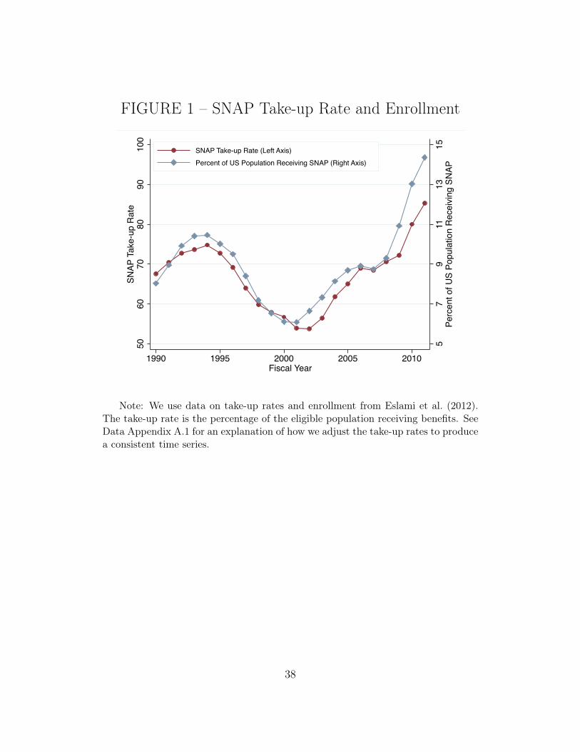
FIGURE 1 – SNAP Take-up Rate and Enrollment
57
911
1315
Perc
ent o
f US
Popu
latio
n R
ecei
ving
SN
AP
5060
7080
9010
0SN
AP T
ake-
up R
ate
1990 1995 2000 2005 2010Fiscal Year
SNAP Take-up Rate (Left Axis)Percent of US Population Receiving SNAP (Right Axis)
Note: We use data on take-up rates and enrollment from Eslami et al. (2012).The take-up rate is the percentage of the eligible population receiving benefits. SeeData Appendix A.1 for an explanation of how we adjust the take-up rates to producea consistent time series.
38

FIGURE 2 – Unemployment & SNAP Enrollment
-.4-.2
0.2
.4U
nem
ploy
men
t t - U
nem
ploy
men
t t-3
-2 -1 0 1 2Predicted (Log(Employmentt) - (Employmentt-3) Based on Local Industry Mix
First Stage Coef: -.1619 SE: .0217, Includes Year and County FEsFirst Stage -- 3-Year Horizon
Notes: We estimate the impact of unemployment on SNAP enrollment using aBartik industry share instrument. We compute each county’s predicted 3-year em-ployment change based on national employment trends across three-digit industriesand the distribution of industry employment in each county. We winsorize thesepredicted changes at the 5th and 95th percentile and then stratify them into twentyequally-sized bins, conditional on year and county fixed effects. In the top panel, weplot conditional means for the change in the unemployment rate for each of thesetwenty bins. In the bottom panel, we plot conditional means for the change in SNAPenrollment in twenty bins. A one percentage point increase in unemployment due tonational industrial trends leads to an 18 percent increase in SNAP enrollment.
39
FIGURE 3 – Projected Enrollment Changes Based on
Unemployment
Notes: Figure 2 and Table 1 show the estimated impact of a sustained one per-centage point increase in the unemployment rate on the share of the US populationenrolled in SNAP. We multiply this coefficient by the change in the unemploymentrate in each county to compute the projected change in SNAP enrollment in eachcounty and then sum across all counties. See Section 3.2 for details.
40

FIGURE 4 – Welfare Reform and SNAP Enrollment
Notes: The top panel examines state-level variation in the intensity of welfare reform.tpeak is the year in which a state had its maximum number of cash assistance recipients.The x-axis is the change in the number of welfare recipients (expressed in logs) from tpeak
to tpeak + 5. The y-axis is the change in the number of SNAP recipients (expressed inlogs) in families with children, from the QC files. The bottom panels analyze changesin SNAP enrollment for individuals living in families headed by single mothers. In thebottom left panel, we count three different types of eligible individuals based on whethertheir familiesreceive cash assistance and whether their families have earned income. In thebottom right panel, we compute “take up ratios” – the ratio of the number of people enrolled(measured in administrative data) to the number of eligibles (measured in the CPS). Becausethese statistics come from different sources, the ratio is sometimes larger than 1. See Section4.1 for details.
41
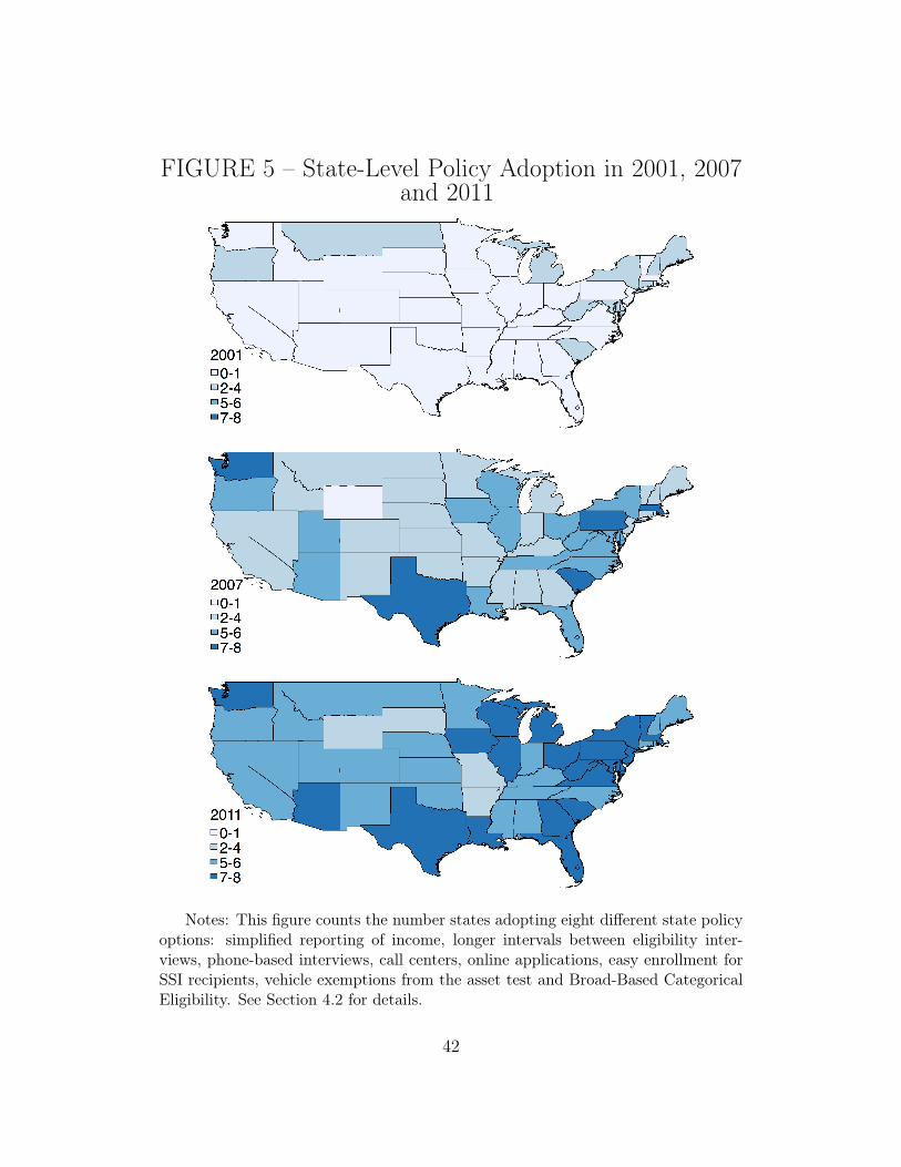
FIGURE 5 – State-Level Policy Adoption in 2001, 2007
and 2011
Notes: This figure counts the number states adopting eight different state policyoptions: simplified reporting of income, longer intervals between eligibility inter-views, phone-based interviews, call centers, online applications, easy enrollment forSSI recipients, vehicle exemptions from the asset test and Broad-Based CategoricalEligibility. See Section 4.2 for details.
42

FIGURE 6 – Accounting for SNAP Enrollment Changes
Notes: The top panel combines the estimates for the impact of the unemployment rateon SNAP enrollment from Figure 3 with the estimates for the impact of state-level policychanges from Table 2. See Section 5.1 for details. During the Great Recession, many statesadopted relaxed income and asset thresholds and elevated unemployment triggered waiversof time limits for Able Bodied Adults Without Dependents. The bottom panel shows a morein-depth analysis of this period using QC microdata summarized in Table 3. See Section5.2 for details.
43

FIGURE 7 – Family-Level Effect of Unemployment on
SNAP Enrollment
0.00
00.
025
0.05
00.
075
0.10
0Sh
are
of U
S Po
pula
tion
0.0 0.2 0.4 0.6 0.8 1.0Unemployed (Family-Level, Share of Last 16 Months Unemployed)
Jul-Oct 2007Apr-Jul 2011
0.00
00.
200
0.40
00.
600
0.80
0Sh
are
Rece
iving
SNA
P
0.0 0.2 0.4 0.6 0.8 1.0Unemployed (Family-Level, Share of Last 16 Months Unemployed)
Jul-Oct 2007Apr-Jul 2011
Notes: We analyze the impact of family-level unemployment on SNAP receiptusing the SIPP. We estimate the fraction of time that a family’s labor force partici-pants were unemployed over the past sixteen months. In the top panel, we plot theshare of the US population in families with different amounts of time spent unem-ployed. Always-employed families are 63 percent of the population in 2007 and 54percent in 2011. Families with no labor force participation are 14 percent in both2007 and 2011. See Section 5.2 for discussion.
44
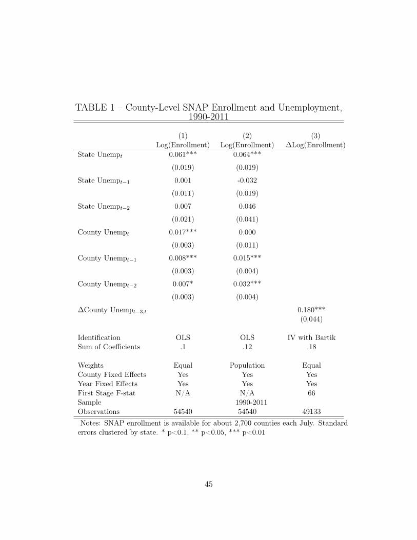
TABLE 1 – County-Level SNAP Enrollment and Unemployment,1990-2011
(1) (2) (3)Log(Enrollment) Log(Enrollment) �Log(Enrollment)
State Unempt
0.061*** 0.064***
(0.019) (0.019)
State Unempt�1 0.001 -0.032
(0.011) (0.019)
State Unempt�2 0.007 0.046
(0.021) (0.041)
County Unempt
0.017*** 0.000
(0.003) (0.011)
County Unempt�1 0.008*** 0.015***
(0.003) (0.004)
County Unempt�2 0.007* 0.032***
(0.003) (0.004)
�County Unempt�3,t 0.180***
(0.044)
Identification OLS OLS IV with BartikSum of Coefficients .1 .12 .18
Weights Equal Population EqualCounty Fixed Effects Yes Yes YesYear Fixed Effects Yes Yes YesFirst Stage F-stat N/A N/A 66Sample 1990-2011Observations 54540 54540 49133Notes: SNAP enrollment is available for about 2,700 counties each July. Standard
errors clustered by state. * p<0.1, ** p<0.05, *** p<0.01
45

45
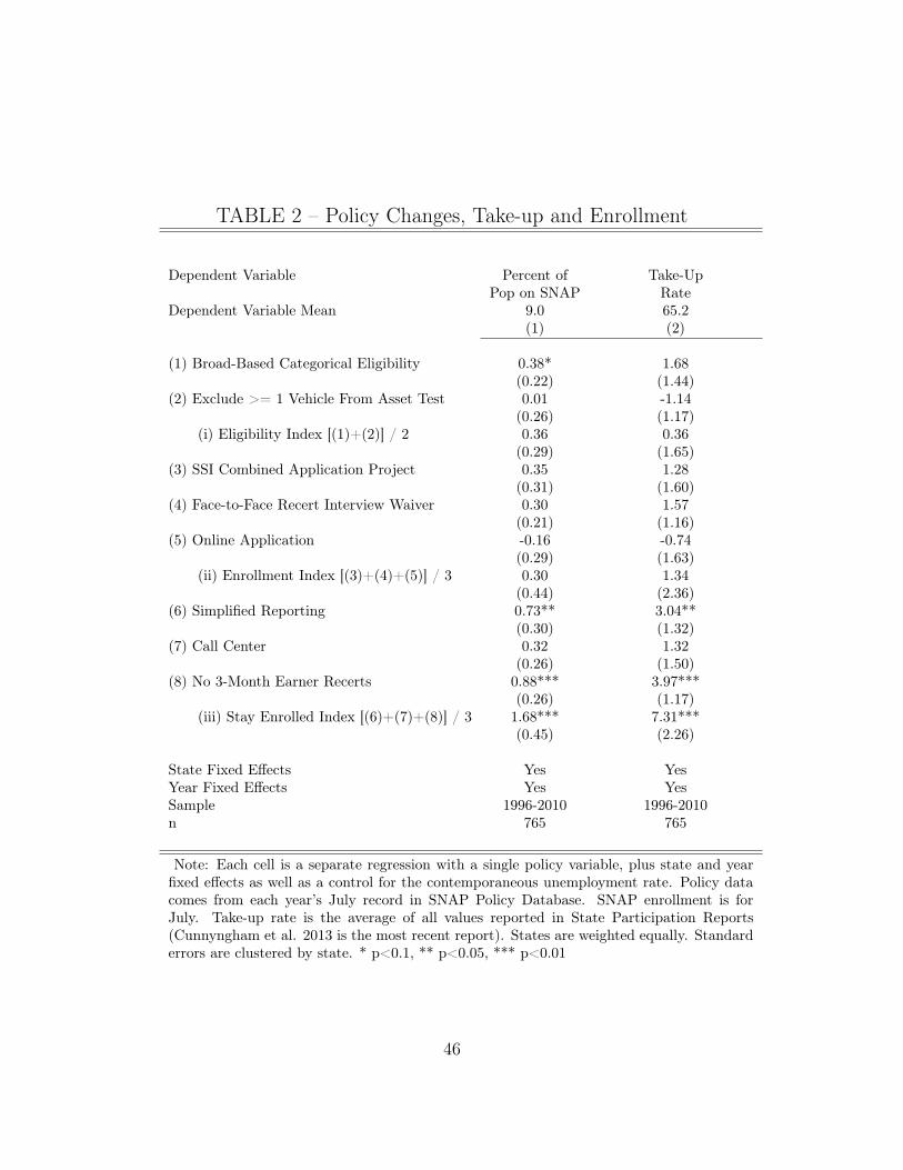
TABLE 2 – Policy Changes, Take-up and Enrollment
Dependent Variable Percent of Take-UpPop on SNAP Rate
Dependent Variable Mean 9.0 65.2(1) (2)
(1) Broad-Based Categorical Eligibility 0.38* 1.68(0.22) (1.44)
(2) Exclude >= 1 Vehicle From Asset Test 0.01 -1.14(0.26) (1.17)
(i) Eligibility Index [(1)+(2)] / 2 0.36 0.36(0.29) (1.65)
(3) SSI Combined Application Project 0.35 1.28(0.31) (1.60)
(4) Face-to-Face Recert Interview Waiver 0.30 1.57(0.21) (1.16)
(5) Online Application -0.16 -0.74(0.29) (1.63)
(ii) Enrollment Index [(3)+(4)+(5)] / 3 0.30 1.34(0.44) (2.36)
(6) Simplified Reporting 0.73** 3.04**(0.30) (1.32)
(7) Call Center 0.32 1.32(0.26) (1.50)
(8) No 3-Month Earner Recerts 0.88*** 3.97***(0.26) (1.17)
(iii) Stay Enrolled Index [(6)+(7)+(8)] / 3 1.68*** 7.31***(0.45) (2.26)
State Fixed Effects Yes YesYear Fixed Effects Yes YesSample 1996-2010 1996-2010n 765 765
Note: Each cell is a separate regression with a single policy variable, plus state and yearfixed effects as well as a control for the contemporaneous unemployment rate. Policy datacomes from each year’s July record in SNAP Policy Database. SNAP enrollment is forJuly. Take-up rate is the average of all values reported in State Participation Reports(Cunnyngham et al. 2013 is the most recent report). States are weighted equally. Standarderrors are clustered by state. * p<0.1, ** p<0.05, *** p<0.01
46
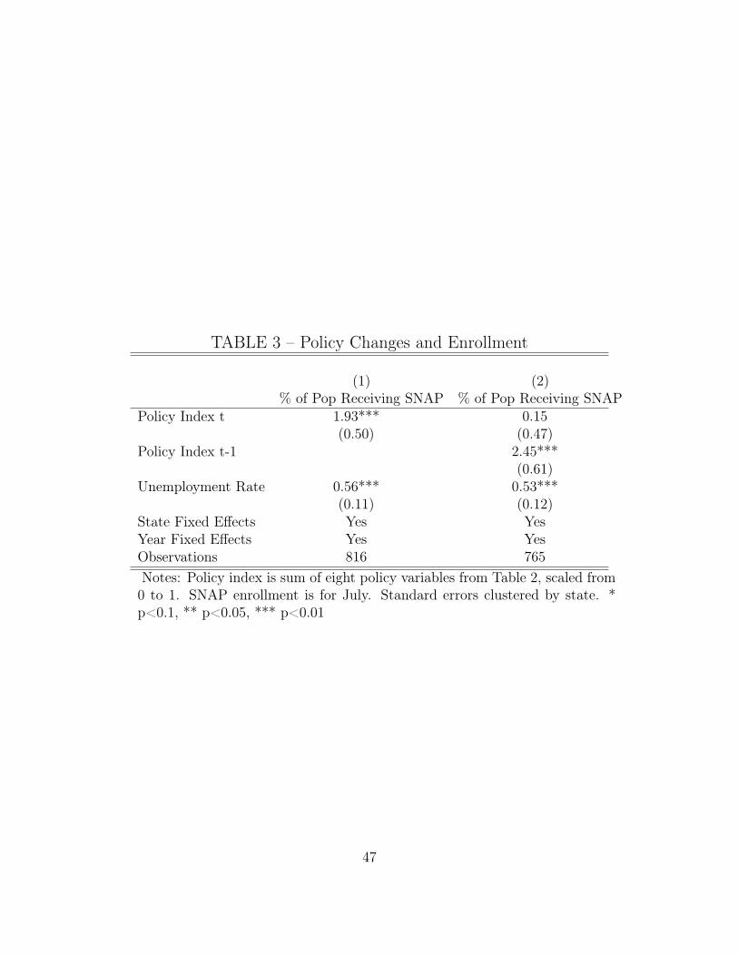
TABLE 3 – Policy Changes and Enrollment
(1) (2)% of Pop Receiving SNAP % of Pop Receiving SNAP
Policy Index t 1.93*** 0.15(0.50) (0.47)
Policy Index t-1 2.45***(0.61)
Unemployment Rate 0.56*** 0.53***(0.11) (0.12)
State Fixed Effects Yes YesYear Fixed Effects Yes YesObservations 816 765Notes: Policy index is sum of eight policy variables from Table 2, scaled from0 to 1. SNAP enrollment is for July. Standard errors clustered by state. *p<0.1, ** p<0.05, *** p<0.01
47

TABLE 4 – SNAP Enrollment and Eligibility Changes
Enrollment(Millions of Recipients)
Actual Counterfactual Policy-Induced(2)-(3)
2007 2011 2011 2011(1) (2) (3) (4)
Total Enrollment 26.04 45.14
(1) Eligible under Standard Rules 24.01 38.46
(2) Relaxed Income and Asset LimitsIncome > Standard Threshold 0.42 1.68 0.67 1.01Assets > Standard Threshold 0.09 0.71 0.15 0.56
(3) Waiver of Time Limits forChildless Adults 1.52 4.30 2.43 1.87
Total Enrollment Change, 2007-2011 19.10 3.44
Share Attributed to Eligibility Changes 0.18
Note: We calculate a no-eligibility-change counterfactual by assuming that enrollmentfor these groups grew at the same rate as enrollment for people eligible under standardrules. Policy-induced enrollment is the difference between 2011 actual enrollment and 2011counterfactual enrollment. Two eligibility policies expanded notably from 2007 to 2011:Relaxed Income and Asset Limits In 2007, 13 states had adopted some version of Broad-Based Categorical Eligibility, and by 2011, 41 states had adopted it.Waiver of Time Limits for Able-Bodied Adults Without Dependents Under standard pro-gram rules, there is a 3-month time limit on SNAP receipt for this group if they are notworking full time and not participating in an employment training program.Enrollment counts are average monthly caseload for Q3 in QC files. See Data Appendix fordetails.
48
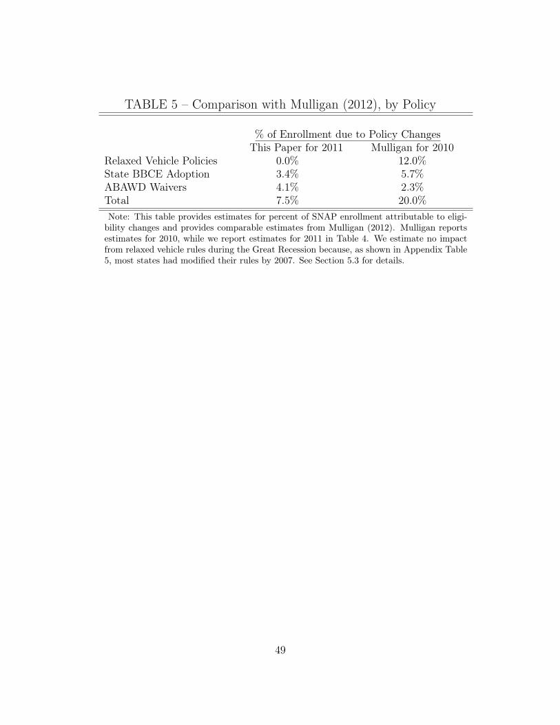
TABLE 5 – Comparison with Mulligan (2012), by Policy
% of Enrollment due to Policy ChangesThis Paper for 2011 Mulligan for 2010
Relaxed Vehicle Policies 0.0% 12.0%State BBCE Adoption 3.4% 5.7%ABAWD Waivers 4.1% 2.3%Total 7.5% 20.0%Note: This table provides estimates for percent of SNAP enrollment attributable to eligi-
bility changes and provides comparable estimates from Mulligan (2012). Mulligan reportsestimates for 2010, while we report estimates for 2011 in Table 4. We estimate no impactfrom relaxed vehicle rules during the Great Recession because, as shown in Appendix Table5, most states had modified their rules by 2007. See Section 5.3 for details.
49
A Data Appendix – For Online Publication
A.1 SNAP Take-Up Rate Time-seriesEslami et al. (2012) of Mathematica Policy Research estimate the take-up rate asaverage monthly SNAP enrollment using administrative data, divided by the numberof people estimated to be eligible using data on annual income from the MarchCPS, combined with adjustment procedures for a variety of program requirementsincluding legal residency, asset tests, and work requirements. Cunnyngham andSmith (2013) provide a detailed description of the methodology for 2010.
Mathematica does not publish a consistent time series for take-up and haschanged its methodology at least five times. We splice together estimates fromdifferent years by assuming that the changes in methodology cause only an additiveshift in the estimated take-up rate. Specifically:
• The first methodology change occurred in 1994 . Under the old methodol-ogy, the take-up rate was 61.4 percent in 1994 and under the new methodol-ogy, it was 74.8 percent. For estimates prior to 1994, we compute Take
t
=
Take
old methodt
+ 74.8� 61.4.
• Mathematica changed its methodology in 1999 and 2002, but those changesaffected the estimated take-up rate by no more than half a percentage point,and we make no adjustment for these methodology changes.
• Mathematica changed its methodology again in 2010, Figure 1 of Eslami et al.(2012) shows a consistent timeseries where the take-up rate rose from 72.2percent in 2009 to 80 percent in 2010.
• Mathematica changed their methodology again for 2011. This revision, likethe 2010 revision led to a lower published take up rate. Under this most recentmethodology, the take-up rate was estimated as 73.6 percent in 2010 and 78.9percent in 2011. We estimate Take2011 = Take2010 + (78.9 � 73.6) = 85.3percent.
A.2 Area-Level Data on Unemployment and SNAPWe link data from the Local Area Unemployment Statistics (LAUS) series publishedby the Bureau of Labor Statistics to administrative data on SNAP enrollment fromthe Food and Nutrition Service (FNS) at USDA.
SNAP Enrollment State SNAP offices report monthly enrollment to FNS at theproject level each January and July. We use the July data from the fifty states plusDC. States have discretion over the geographic definition of “project.” Many statesreport enrollment at each SNAP office with a 7-digit id of which the first 5 digits
50
are a county FIPS code. We collapse the data to the county level using 5-digit FIPScodes. AK, CT, ME, MA, NH, OR, RI, UT, VT, WV, and WY never report county-level enrollment. NY and ID stop reporting county-level enrollment in January 1992.We drop all these states from the sample. Missouri stops county-level reporting in2007, Nebraska stops in 1994, Montana stops in 2002, and Washington stops in 2003;for these states, we use county data in the years it is available.
We drop tribal geographies in Minnesota and Arizona. We drop 12 county-yearpairs where enrollment exceeds county population, and another 16 county-year pairswhere enrollment jumps to at least 40 percent of the population for one year andthen immediately falls again.
In 1990, we have county-level data for 85 percent of SNAP enrollment in ourcleaned sample, and by 2007, after some states have stopped reporting, we havecounty-level data for 80 percent of SNAP enrollment.
Unemployment LAUS estimates monthly state-level and county-level unemploy-ment rates. The state-level estimates are controlled to match results from the Cur-rent Population Survey (CPS). Because the CPS samples relatively few householdsper state (from about 800 per month in Mississippi to about 4,300 per month inCalifornia), and the unemployment rate typically varies from around 5 percent to10 percent, it is quite difficult to precisely estimate state unemployment rates, es-pecially in small states. LAUS then uses administrative data on the place of res-idence of unemployment insurance recipients to allocate the CPS-based state un-employment estimates county-by-county. See http://www.bls.gov/lau/laumthd.htmfor details on estimation methodology. We use flat files from 1990-2012 postedat ftp://ftp.bls.gov/pub/time.series/la/. For about 500 county geographies labeledwith series_id “PA” or “PS”, LAUS reports a geographic identifier which is not avalid 5-digit county FIPS code. We use data from http://www.bls.gov/lau/laucnty12.xlsto crosswalk these LAUS geographies to county FIPS codes. We observe July SNAPenrollment in year t, and we construct annual unemployment in year t using datafrom the preceding 12 months (the average unemployment rate from July in yeart� 1 to June in year t).
Population We use annual population estimates from the Census Bureau postedat http://www.census.gov/support/USACdataDownloads.html
Merged County Data We merge the county-level datasets using year and 5-digitFIPS codes. Every observation in the unemployment dataset also appears in thepopulation dataset. There are 7 fips codes from FNS that do not match the countyunemployment file; they account for 0.01 percent of enrollment. We have 47,940observations between 1990 and 2007 with nonmissing, positive SNAP enrollmentand a county-level estimate of the unemployment rate. Our analysis sample has42,169 observations, because we require two lags of the local unemployment rate.
51
A.3 SNAP Quality Control Files
These data can be downloaded from http://hostm142.mathematica-mpr.com/fns/.Below, we detail how we measure specific eligibility categories.
BBCE Income We classify a household as exceeding standard income limits dueto BBCE if (1) they are not receiving pure cash assistance (because in that casethey are already categorically eligible) and (2) they have net income > 100 percentof poverty. We also flag households with gross income > 130 percent of poverty ifthey do not have a senior or a disabled person. Our estimates are very similar tothose reported by Government Accountability Office (2012) (Table 2) and Trippeand Gillooly (2010) (Table C4.2).
BBCE Assets Idaho and Michigan re-introduced asset limits of $5,000 in 2011,and about 1 percent of cases were closed due to excess assets (GAO 2012). AbsentBBCE, the default rule is that people with liquid assets of $2,000 or more are ineligi-ble for SNAP. Using the Survey of Consumer Finances, we estimate that asset limitsof $2,000 would have caused caseloads to fall twice as much as a $5,000 limit. Basedon this fact, we assume that people with excess assets account for 2 percent of thetotal caseload in BBCE states. In 2007, the 11 states without asset tests accountedfor 18 percent of SNAP enrollment and in 2011, the 39 states without asset tests in2011 accounted for 79 percent of total SNAP enrollment. (Although 13 states hadinstituted some form of BBCE in 2007 and 41 states in 2011, these counts includetwo states which relaxed income limits but not asset limits.) We calculate the totalnumber of individuals affected as .02 x (.79-.18) x 45 million. This could be anoverestimate if the true impact of the Idaho and Michigan policy changes analyzedby the GAO was less than 1 percent rather than equal to 1 percent. Because welack micro data on these asset limit changes, in constructing an annual pattern ofthe impact of these changes for Figure 6 we assume that enrollment for cases withexcess assets grew linearly from 2007 to 2011.
Potential ABAWDs We classify a person as a potential ABAWD if they are: ages18-49, have no children in the household, are working less than 30 hours a week, andare not disabled. Following Leftin et al. (2012), we define a person as disabled if(1) they have SSI income, (2) the household has no elderly members and a medicaldeduction, or (3) the person is exempt from work registration due to disability, andhas income from Social Security, veterans’ benefits, or workers’ comp. We classifythese people as “potential” ABAWDs because many had enrolled within the previousthree months, and likely had not exhausted their time limits. For example, 29 percentof potential ABAWDs in FY2011 had enrolled within the last three months.
A.4 Current Population SurveyAmong income eligible families (families with income less than 130 percent of thepoverty line), we estimate the number receiving cash assistance and the number who
52

are working. We then sub-divide the likely-eligible sample into four groups: “ReceivesCash Assistance”, “No Cash Assistance and Working”, or “No Cash Assistance andNot Working”. We define a family as “working” if they have annual earnings equalto at least 25 percent of the annual poverty line and as “receiving cash assistance”if they report assistance equal to at least 10 percent of the annual poverty line.Cash assistance receipt is underreported in the CPS. Meyer et al. (2009) calculatedollar reporting rates of AFDC/TANF in the CPS and report the results in Table2. As a rule of thumb, about half of underreporting comes from households whodo not report receipt and half of underreporting comes from households who reportreceipt but underreport the dollar amount of the transfer. With r
jt
as the dollarreporting rate estimated in Meyer et al. (2009), we adjust upward the number ofpeople receiving cash as N
adjusted
cash,t
= N
raw
cash,t
/(1� 12(1� r
jt
)). We adjust the numberof people not receiving cash downward by the same amount in order to preservea constant number of eligible families. Effectively, this assumes that there is nodifferential reporting of earnings in the CPS among cash assistance recipients ascompared to non-recipients.
A.5 Survey of Income and Program ParticipationWe use the Survey of Income and Program Participation (SIPP) to analyze family-level unemployment and SNAP receipt in 2007 and 2011. The unit of observation isalways a person, with cross-sectional person weights (wpfinwgt). We observe enroll-ment in cash assistance and SNAP at the individual level. We assign all individualsin the same family the same status for potential SNAP eligibility (family income <130 percent of poverty), unemployment, and family earnings.
A.5.1 Family-Level Data on Unemployment and SNAP
We use waves 8-11 of the 2004 SIPP and waves 6-9 of the 2008 SIPP. We use familydefinitions which include subfamilies as part of the same unit (rfid) from month 4of the final wave of the analysis sample.
Unemployment We construct a person-level measure of unemployment over theprevious four waves. The SIPP records weekly labor force status for people age 15or higher. Of people in this age group in wave 11 of the 2004 panel and wave 9of the 2008 SIPP, a complete retrospective sixteen-month history is available forabout 81 percent of people. We compute an individual’s unemployment status usingall available months, including those individuals for whom data on some monthsis missing. We compute the unemployment rate as the number of weeks unem-ployed (rmwklkg), divided by the number of weeks the person was in the labor force(rmwklkg+rmwkwjb). We aggregate this measure to the family level by taking asimple average of unemployment rates across family members.
53
SNAP Receipt We use self-reported SNAP receipt rcutyp27 (ignoring observa-tions where SNAP receipt is allocated, a27amt) from the fourth reference month,which is the month preceding the interview. Meyer et al. (2009) document under-reporting of transfer program receipt in household surveys. In wave 11 of the 2004SIPP, which covers SNAP receipt from July to October 2007, 6.3 percent of peoplereport receiving SNAP, while administrative data show that the average monthlycaseload was 8.9 percent. In wave 9 of the 2008 SIPP, which covers SNAP receiptfrom April to July 2011, 9.8 percent of people report receiving SNAP, while admin-istrative data show that the average monthly caseload was 14.5 percent. Meyer andGoerge (2011) link administrative data on SNAP receipt to the ACS and CPS. Theyfind that the false negative rate (report no SNAP receipt in survey when adminrecords do show SNAP receipt) is much higher than the the false positive rate.
Formally, we want to know the relationship between unemployment duration U
and SNAP receipt. If there are only false negatives, then Pr(ReportSNAP |ReceiveSNAP ) =71% in 2007 and 68 percent in 2011. To match administrative totals, we recode eachperson-level indicator of SNAP receipt to 1.41 in the 2007 sample and 1.48 in the 2011sample. Formally, such a modification is equivalent to assuming Pr(ReportSNAP |ReceiveSNAP,U)is equal for all U . Intuitively, it says that people with long unemployment durationsare as likely to underreport SNAP receipt as people with short unemployment du-rations. Meyer and Goerge (2011) estimate the relationship between unemploymentstatus and the false negative rate (report no SNAP receipt when admin recordsdo show SNAP receipt) in the CPS and ACS. In three out of four specificationsthey find no statistically significant relationship. In the fourth, they find that thefalse negative rate is higher for people who are unemployed; if this is true, thenour method understates the strength of the relationship between unemployment andSNAP receipt.
54
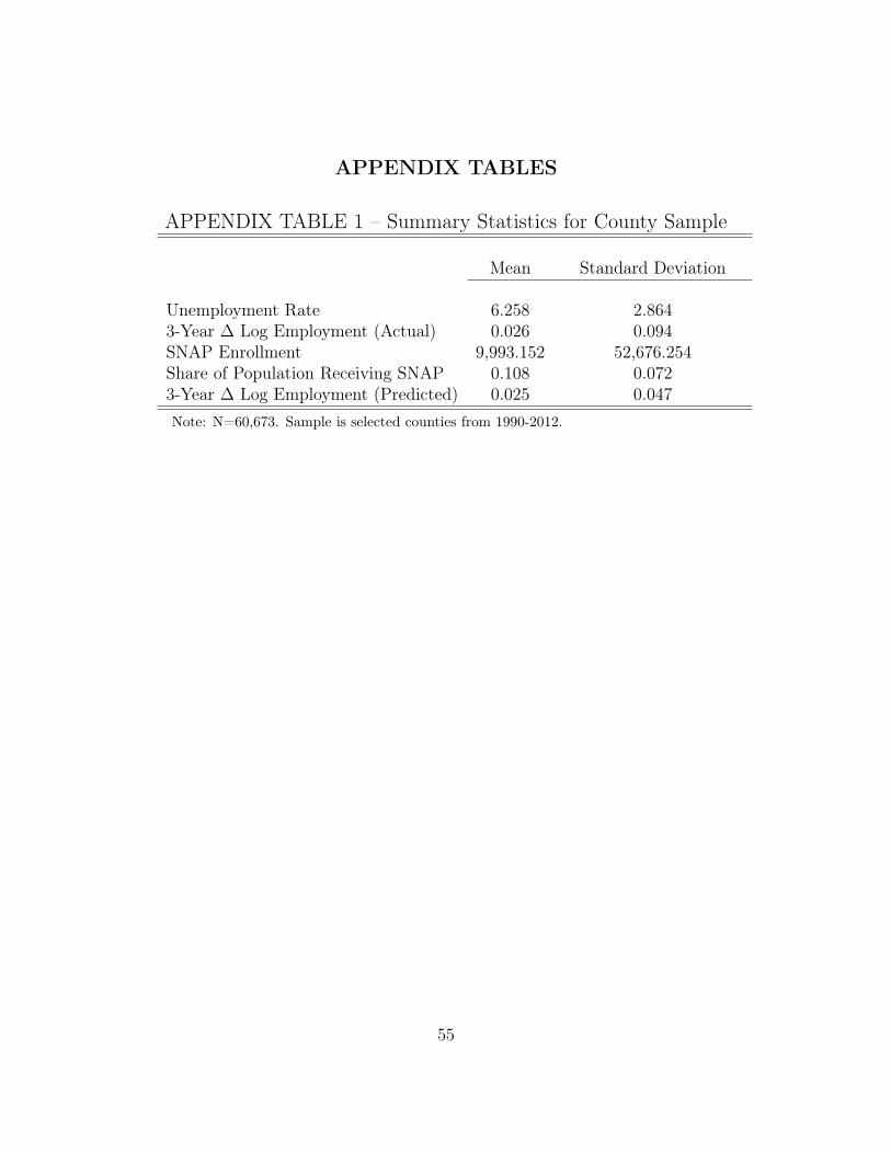
APPENDIX TABLES
APPENDIX TABLE 1 – Summary Statistics for County Sample
Mean Standard Deviation
Unemployment Rate 6.258 2.8643-Year � Log Employment (Actual) 0.026 0.094SNAP Enrollment 9,993.152 52,676.254Share of Population Receiving SNAP 0.108 0.0723-Year � Log Employment (Predicted) 0.025 0.047Note: N=60,673. Sample is selected counties from 1990-2012.
55

APPENDIX TABLE 2 – Unemployment and SNAP Enrollment
Log(SNAP) SNAP/Pop Log(SNAP) Log(SNAP)(1) (2) (3) (4) (5) (6) (7) (8)
State Unempt 0.169* 0.198* 0.005* 0.000 0.035* 0.032*
(0.012) (0.012) (0.002) (0.002) (0.009) (0.012)
State Unempt�1 -0.042* -0.083* -0.000 -0.003 0.005 0.011
(0.020) (0.024) (0.001) (0.002) (0.007) (0.007)
State Unempt�2 0.061* 0.057* 0.003 0.009* 0.048* 0.058*
(0.020) (0.024) (0.002) (0.003) (0.009) (0.022)
County Unempt 0.011* 0.002 0.003* 0.004* 0.034* 0.024*
(0.004) (0.012) (0.000) (0.000) (0.002) (0.007)
County Unempt�1 0.003 0.012* 0.001* 0.002* 0.011* 0.011*
(0.003) (0.004) (0.000) (0.000) (0.001) (0.004)
County Unempt�2 -0.001 0.031* -0.002* -0.002* 0.006* 0.042*(0.003) (0.004) (0.000) (0.000) (0.002) (0.010)
Coef Sum .2 .217 .0104 .0103 .05 .077 .088 .101E(Share SNAP) .0982 .0825Ratio Coef Sum to Share SNAP .1059 .1248
Obs Level County County County County County County State StateWeights Equal Pop Equal Pop Equal Pop Equal PopCluster SE Level State State State State County County State StateArea FEs Yes Yes Yes Yes Yes Yes Yes YesYear FEs No No Yes Yes Yes Yes Yes YesSample 1990-2011
Observations 54,540 54,540 54,540 54,540 54,540 54,540 1,071 1,020
Notes: SNAP enrollment is available for about 2,700 counties each July. * p<0.05
56

APPENDIX TABLE 3 – County-Level SNAP Enrollment andNonemployment, 1990-2011
(1) (2) (3)Log(Enrollment) Log(Enrollment) �Log(Enrollment)
State Nonempt
0.038** 0.043***
(0.014) (0.014)
State Nonempt�1 0.021 0.040*
(0.020) (0.021)
State Nonempt�2 -0.030* -0.021
(0.017) (0.019)
County Nonempt
0.015*** 0.015***
(0.002) (0.003)
County Nonempt�1 0.004*** 0.010***
(0.001) (0.003)
County Nonempt�2 -0.007*** -0.015***
(0.002) (0.004)
�County Nonempt�3,t 0.100***
(0.020)
Identification OLS OLS IV with BartikSum of Coefficients .04 .07 .1
Weights Equal Population EqualCounty Fixed Effects Yes Yes YesYear Fixed Effects Yes Yes YesFirst Stage F-stat N/A N/A 129Sample 1990-2011Observations 52075 52075 49126Notes: SNAP enrollment is available for about 2,700 counties each July.
Standard errors clustered by state. * p<0.1, ** p<0.05, *** p<0.01
57
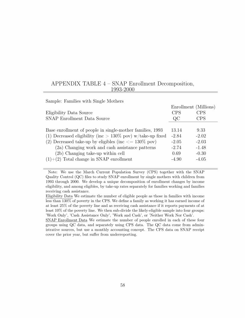
APPENDIX TABLE 4 – SNAP Enrollment Decomposition,1993-2000
Sample: Families with Single MothersEnrollment (Millions)
Eligibility Data Source CPS CPSSNAP Enrollment Data Source QC CPS
Base enrollment of people in single-mother families, 1993 13.14 9.33(1) Decreased eligibility (inc > 130% pov) w/take-up fixed -2.84 -2.02(2) Decreased take-up by eligibles (inc <= 130% pov) -2.05 -2.03
(2a) Changing work and cash assistance patterns -2.74 -1.48(2b) Changing take-up within cell 0.69 -0.30
(1)+(2) Total change in SNAP enrollment -4.90 -4.05
Note: We use the March Current Population Survey (CPS) together with the SNAPQuality Control (QC) files to study SNAP enrollment by single mothers with children from1993 through 2000. We develop a unique decomposition of enrollment changes by incomeeligibility, and among eligibles, by take-up rates separately for families working and familiesreceiving cash assistance.Eligibility Data We estimate the number of eligible people as those in families with incomeless than 130% of poverty in the CPS. We define a family as working it has earned income ofat least 25% of the poverty line and as receiving cash assistance if it reports payments of atleast 10% of the poverty line. We then sub-divide the likely-eligible sample into four groups:’Work Only’, ’Cash Assistance Only’, ’Work and Cash’, or ’Neither Work Nor Cash’.SNAP Enrollment Data We estimate the number of people enrolled in each of these fourgroups using QC data, and separately using CPS data. The QC data come from admin-istrative sources, but use a monthly accounting concept. The CPS data on SNAP receiptcover the prior year, but suffer from underreporting.
58

APPENDIX TABLE 5 – Policies to Increase SNAP Accessibility
2001 2007 2011Broad-Based Categorical Eligibility 7 13 41Exclude At Least One Vehicle From Asset Test 9 46 49SSI Combined Application Project 1 12 15Face-to-Face Recertification Interview Waiver 0 22 47Online Application 0 14 30Simplified Reporting 4 47 49Call Center 7 21 32Do Not Certify Earners Every 3 Months 26 50 50
Summary Index Mean .13 .55 .77
Source: SNAP Policy Database in July of each year for 50 states plus DC.Vehicle exemptions, simplified reporting, and call centers are missing in 2011,and we use the 2010 values. The summary index is the sum of all the policyindicators, divided by 8.
59