the executiveinsite report - archdiocese of milwaukee us census bureau, synergos technologies inc.,...
TRANSCRIPT

Sources: US Census Bureau, Synergos Technologies Inc., Experian, DecisionInsite/MissionInsite Page 1
The ExecutiveInsite ReportPrepared for: Archdiocese of Milwaukee RCStudy area: Deaneries: Racine-Kenosha
Base State: WISCONSINCurrent Year Estimate: 2017
5 Year Projection: 2022Date: 8/3/2017
Semi-Annual Projection: Spring
This ExecutiveInsite Report has been prepared for Archdiocese of Milwaukee RC.Its purpose is to “tell the demographic story” of the defined geographic studyarea. ExecutiveInsite integrates narrative analysis with data tables and graphs.Playing on the report name, it includes 12 “Insites” into the study area’s story. Itincludes both demographic and beliefs and practices data.
ExecutiveInsite is intended to give an overview analysis of the defined geographicstudy area. A defined study area can be a region, a zip code, a county or somecustom defined geographic area such as a radius or a user defined polygon. Thearea of study is displayed in the map below.
THE STUDY AREA
THE 12 I NSITES More Information INSITE PAGE Please refer to the last page of the report for additional notes and interpretation
aides in reading the report.Insite #1: Population, Household Trends 2
Insite #2: Racial/Ethnic Trends 3 Not all of the demographic variables available in the MI System are found in thisreport. The FullInsite Report will give a more comprehensive view of an area'sdemographics. Also, the Impressions Report adds additional social, behavioral views and theQuad Report provides a detailed view of religious preferences, practices andbeliefs.
Insite #3: Age Trends 4
Insite #4: School Aged Children Trends 6
Insite #5: Household Income Trends 7
Insite #6: Households and Children Trends 9
Insite #7: Marital Status Trends 10
Insite #8: Adult Educational Attainment 11
Insite #9: Employment and Occupations 12
Insite #10: Mosaic Household Types 13
Insite #11: Charitable Giving Practices 14
Insite #12: Religious Program Or Ministry Preferences 15

Sources: US Census Bureau, Synergos Technologies Inc., Experian, DecisionInsite/MissionInsite Page 2
INSITE #1: POPULATION AND HOUSEHOLD TRENDSPopulation: Households:The estimated 2017 population within the study area is 268,438. The2022 projection would see the area grow by 8,664 to a totalpopulation of 277,102. The population within the study area isgrowing somewhat faster than the statewide growth rate. While thestudy area is projected to grow by 3.2% in the next five years, thestate is projected to grow by 2.8%. The study area’s estimatedaverage change rate is 0.6%.
The households within the community are growing faster than thepopulation, thus the average population per household in 2010 was2.60 but by 2022 it is projected to be 2.60. Compare this to thestatewide average which for the current year is estimated at 2.49persons per household.
Population Per Household Family Households:Population per Household: The relationship between population andhouseholds provides a hint about how the community is changing.When population grows faster than households, it suggests anincrease in the persons per household. This can only happen whenmore persons are added either by birth or other process such asyoung adults in multiple roommate households or young adultsreturning to live with parents. In some communities this can occurwhen multiple families live in the same dwelling unit.
Family households provide an additional hint about the changingdynamics of a community. If family household growth followspopulation growth, then it would be reasonable to assume that theincreasing population per household comes from additional children.This is the case within the the study area. Family households aregrowing as fast as the population suggesting that the increasingpopulation per household is from additional children.
Population/Households & Family Trends 2000 2010 2017 2022 2027Population 252,002 267,124 268,438 277,102 286,616 Population Change 15,122 1,314 8,664 9,514 Percent Change 6.0% 0.5% 3.2% 3.4%
Households 95,588 102,545 103,138 106,593 110,361 Households Change 6,957 593 3,455 3,768 Percent Change 7.3% 0.6% 3.3% 3.5%
Population / Households 2.64 2.60 2.60 2.60 2.60 Population / Households Change -0.03 0.00 0.00 0.00 Percent Change -1.2% -0.1% -0.1% -0.1%
Families 65,118 67,583 67,506 69,970 Families Change 2,465 -77 2,464 Percent Change 3.8% -0.1% 3.7%
NOTE: Family Household data is not projected out 10 years.
Population, Household & Family Trends
2000 2010 2017 2022 2027
0
50,000
100,000
150,000
200,000
250,000
300,000
350,000
Population
Households
Families*
0.7%
0.6%
0.5%
0.4%
0.3%
0.2%
0.1%
0.0%2010 2017 2022 2027
Average Annual Percentage Change Between Reported Years

Sources: US Census Bureau, Synergos Technologies Inc., Experian, DecisionInsite/MissionInsite Page 3
INSITE #2: RACIAL-ETHNIC TRENDSThe US population’s racial-ethnic diversity is continually adding newand rich cultural mixes. This data considers the five groups forwhich trending information is available. Please note that severalgroups are aggregated into a single category due to their smallersize. Those persons who indicated Hispanic or Latino ethnicity alongwith a racial category have been separated into a Hispanic or Latinocategory.
The Population: Racial/Ethnic Trends table provides the actualnumbers and percentage of the total population for each of the fiveracial/ethnic categories. Pay special attention to the final column onthe right. This will quickly indicate the direction of change from the lastcensus to the current five year projection.
The Racial Ethnic Trends graph displays history and projectedchange by each racial/ethnic group.
This chart shows the percentage of each group for the current yearestimate.
The percentage of the population…Asian (Non-Hisp) is projected to remain about the same over the nextfive years.
White (Non-Hisp) is projected to remain about the same over the nextfive years.
Black/African American (Non-Hisp) is projected to remain about thesame over the next five years.
Hispanic or Latino is projected to remain about the same over the nextfive years.
2010 2017 2022 2010% 2017 % 2022 % 2010 to 2022 %pt ChangeRace and EthnicityAsian (NH) 3,849 3,905 4,288 1.44% 1.45% 1.55% 0.11%Black/Afr Amer (NH) 31,288 31,142 31,898 11.71% 11.60% 11.51% -0.20%White (NH) 186,654 187,734 193,452 69.88% 69.94% 69.81% -0.06%Hispanic/Latino 38,333 38,699 40,190 14.35% 14.42% 14.50% 0.15%P Is/Am In/Oth (NH) 7,000 6,958 7,274 2.62% 2.59% 2.63% 0.00%
Totals: 267,124 268,438 277,102
200,000
150,000
100,000
50,000
02010 2017 2022
Racial-Ethnic Population Trends
Asian (NH) Black/Af Am (NH)
White (NH) Hisp/Latino
P Is/Am In/Oth (NH)
1%
12%
70%
14%3%
Racial/Ethnicity as Percentage of Pop: 2015
Asian (NH) Black/Af Am (NH)
White (NH) Hisp/Latino
P Is/Am In/Oth (NH)

Sources: US Census Bureau, Synergos Technologies Inc., Experian, DecisionInsite/MissionInsite Page 4
INSITE #3: AGE TRENDSA community’s age structure and how it is changing is an importantpart of its story. Overall, the American Population has been aging asthe Baby Boomers progress through each phase of life. This has beenabetted by episodes of declining live births. However this picturemay particularize differently from community to community. Thereare communities in the US where the average age is lower than someothers. In other cases, there is a clear shift toward senior years asthe Boomers enter their retirement years.
The Age Trend Insite explores two variables: Average age and Phase ofLife.Average Age Trends provides five important snapshots of acommunity from five data points; the 2000 census, the last census,the current year estimate, the five year projection and the ten yearforecast. These five numbers will indicate the aging direction of acommunity.The Phase of Life Trends breaks the population into seven life phasesthat the population passes through in its life time.
AGEAverage Age Trends 2000 2010 2017 2022 2027Average Age: Study Area 35.89 36.61 38.76 39.91 40.92Percent Change 2.0% 5.9% 3.0% 2.5%
Average Age: WI 36.74 37.99 39.92 40.99 41.92Percent Change 3.4% 5.1% 2.7% 2.3%Comparative Index 98 96 97 97 98
Median Age: Study Area 34 35 37 38 39
Summary of Average Age Findings:The Average Age Trend chart shows both history and projection ofthe change in average age in the study area. The average age ofthe study area has been rising for several years. It is projected torise over the next five years.
A comparison to the average age of the state helps to contextualizethe significance of the average age of the study area and its historyand projection. In the graph above, the study area and state are laidout side by side. The state's average age is estimated to be aboutthe same as the study area.
424038363432302826242220
2000 2010 2017 2022 2027
Study Area Average Age Trend Ave. Age Comparison: Study Area to State
2000 2010 2017 2022 2027
32
34
36
38
40
42
44
Study area WI
Sources: US Census Bureau, Synergos Technologies Inc., Experian, DecisionInsite/MissionInsite Page 5
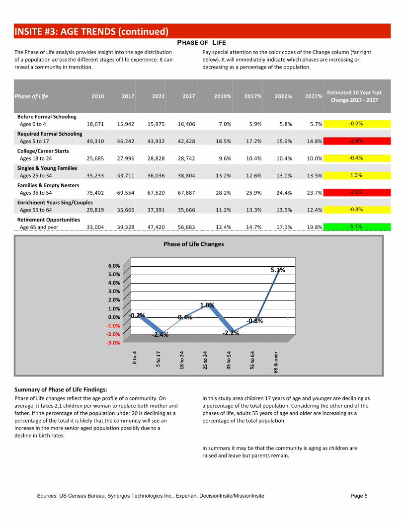
INSITE #3: AGE TRENDS (continued)PHASE OF L IFE
The Phase of Life analysis provides insight into the age distributionof a population across the different stages of life experience. It canreveal a community in transition.
Pay special attention to the color codes of the Change column (far rightbelow). It will immediately indicate which phases are increasing ordecreasing as a percentage of the population.
Phase of Life 2010 2017 2022 2027 2010% 2017% 2022% 2027%Estimated 10 Year %pt
Change 2017 - 2027
Before Formal SchoolingAges 0 to 4 18,671 15,942 15,975 16,406 7.0% 5.9% 5.8% 5.7% -0.2%
Required Formal SchoolingAges 5 to 17 49,310 46,242 43,932 42,428 18.5% 17.2% 15.9% 14.8% -2.4%
College/Career StartsAges 18 to 24 25,685 27,996 28,828 28,742 9.6% 10.4% 10.4% 10.0% -0.4%
Singles & Young FamiliesAges 25 to 34 35,233 33,711 36,036 38,804 13.2% 12.6% 13.0% 13.5% 1.0%
Families & Empty NestersAges 35 to 54 75,402 69,554 67,520 67,887 28.2% 25.9% 24.4% 23.7% -2.2%
Enrichment Years Sing/CouplesAges 55 to 64 29,819 35,665 37,391 35,666 11.2% 13.3% 13.5% 12.4% -0.8%
Retirement OpportunitiesAge 65 and over 33,004 39,328 47,420 56,683 12.4% 14.7% 17.1% 19.8% 5.1%
Summary of Phase of Life Findings:Phase of Life changes reflect the age profile of a community. Onaverage, it takes 2.1 children per woman to replace both mother andfather. If the percentage of the population under 20 is declining as apercentage of the total it is likely that the community will see anincrease in the more senior aged population possibly due to adecline in birth rates.
In this study area children 17 years of age and younger are declining asa percentage of the total population. Considering the other end of thephases of life, adults 55 years of age and older are increasing as apercentage of the total population.
In summary it may be that the community is aging as children areraised and leave but parents remain.
-0.2%
-2.4%
-0.4%
1.0%
-2.2%
-0.8%
5.1%6.0%5.0%4.0%3.0%2.0%1.0%0.0%
-1.0%-2.0%-3.0%
0 to
4
5 t o
17
18 to
24
25 to
34
35 to
54
5 5 to
64
65 &
ove
r
Phase of Life Changes

Sources: US Census Bureau, Synergos Technologies Inc., Experian, DecisionInsite/MissionInsite Page 6
INSITE #4: SCHOOL AGED CHILDREN TRENDSChildren are the future! Understanding their specific populationdynamics is critical for all planners of social and/or educationalservices. The “School Aged Children” variable is a subset of the“Required Formal Schooling” segment in the Phase of Life profile. Itallows one to zoom in more closely on the children who are offormal schooling age.
The School Aged Children variable provides a snapshot of three levelsof the population that comprise school age children. The three levelsroughly correspond to the following.
· Elementary grades
· Intermediate/Middle School gradesThe school aged population includes all school aged childrenincluding those enrolled in public and private schools, those homeschooled and children in institutions.
· High School Grades
School Aged Children 2010 2017 2022 2010% 2017% 2022%Estimated 5 Year %ptChange 2017 - 2022
Early ElementaryAges 5 to 9 18,768 17,271 15,973 38.1% 37.3% 36.4% -1.0%
Late Elementary-Middle SchoolAges 10 to 14 19,082 17,880 17,014 38.7% 38.7% 38.7% 0.1%
High SchoolAges 15 to 17 11,460 11,091 10,945 23.2% 24.0% 24.9% 0.9%
Summary of School Aged Children Findings:Early Elementary children ages 5 to 9 are projected to decline as apercentage of children between 5 and 17 by -1.0%.
High School aged children 15 to 17 are increasing as a percentage ofchildren between 5 and 17 by 0.9%.
Late Elementary to Middle School aged children ages 10 to 14 areincreasing as a percentage of children between 5 and 17 by 0.1%.
Overall, children are aging through but not being replaced at theyounger levels.
150
100
50
0
-50
-100
Early Elem Late Elem/Mid High School
Comparative Index: Study Area to State by Level
2017 to 2022 Change
40%
35%
30%
25%
20%
15%
10%
5%
0%Early Elem Late
Elem/Mid High School
School Aged Children Trends: By Levels
2017% 2022%

Sources: US Census Bureau, Synergos Technologies Inc., Experian, DecisionInsite/MissionInsite Page 7
INSITE #5: HOUSEHOLD AND FAMILY INCOME TRENDSAVERAGE HOUSEHOLD INCOME AND PER CAPITA INCOME
Average Household Income and Per Capita Income indicate the levelof financial resources within a community. Average Householdincome reflects the average income for each household, whetherfamily or non-family.
Per Capita Income is a measure of the average income of all personswithin a household. For family households, this would include allchildren. It does not mean that each person actually contributes to theaverage income from work. It is calculated by dividing the aggregatehousehold income by the population.
In this study area, the estimated current year average householdincome is $68,381. The average household income is projected togrow by 7.7% to $73,625.
The estimated per capita income for the current year is $26,273. ThePer Capita Income is projected to grow by 7.8% to $28,321.
Income Trends 2010 2017 2022 2010% 2017% 2022%Estimated 5 Year %ptChange 2017 - 2022
HouseholdsLess than $10,000 6,599 6,743 6,123 6.4% 6.5% 5.7% -0.8%$10,000 to $14,999 5,218 5,237 5,165 5.1% 5.1% 4.8% -0.2%$15,000 to $24,999 12,186 10,931 10,370 11.9% 10.6% 9.7% -0.9%$25,000 to $34,999 12,519 11,189 10,919 12.2% 10.8% 10.2% -0.6%$35,000 to $49,999 14,326 14,022 13,670 14.0% 13.6% 12.8% -0.8%$50,000 to $74,999 20,411 20,450 20,865 19.9% 19.8% 19.6% -0.3%$75,000 to $99,999 13,217 13,177 14,059 12.9% 12.8% 13.2% 0.4%$100,000 to $149,999 12,120 13,902 15,849 11.8% 13.5% 14.9% 1.4%$150,000 to $199,999 3,466 4,637 5,514 3.4% 4.5% 5.2% 0.7%$200,000 or more 2,484 2,850 4,059 2.4% 2.8% 3.8% 1.0%
Totals 102,546 103,138 106,593
Average Household Income Trend
2010 2017 2022
58000
60000
62000
64000
66000
68000
70000
72000
74000
76000
Per Capita Income Trend
2010 2017 2022
22500
23500
24500
25500
26500
27500
28500
29500

Sources: US Census Bureau, Synergos Technologies Inc., Experian, DecisionInsite/MissionInsite Page 8
INSITE #5: HOUSEHOLD AND FAMILY INCOME TRENDS (continued)FAMILY INCOME
Family income is a sub-set of household income. It excludes non-family households. Family households include two or more personswho are related and living in the same dwelling unit. Children aremore likely to live in family households. Non-family households arehouseholds in which two or more persons live in the same dwellingunit but are unrelated.
The number of families with annual incomes above $100,000 isprojected to decline over the next five years. For the current year, it isestimated that 27.1% of all family incomes exceed $100,000 per year.In five years that number is projected to be 26.9%.
Income Trends 2017 2022 2017% 2022%Estimated 5 Year %ptChange 2017 - 2022
FamiliesLess than $10,000 3,480 3,527 5.2% 5.0% -0.11%$10,000 to $14,999 2,147 2,154 3.2% 3.1% -0.10%$15,000 to $24,999 4,783 4,877 7.1% 7.0% -0.12%$25,000 to $34,999 5,850 6,772 8.7% 9.7% 1.01%$35,000 to $49,999 8,815 9,025 13.1% 12.9% -0.16%$50,000 to $74,999 14,109 14,505 20.9% 20.7% -0.17%$75,000 to $99,999 10,001 10,274 14.8% 14.7% -0.13%$100,000 to $149,999 11,920 12,272 17.7% 17.5% -0.12%$150,000-$199,999 3,906 4,002 5.8% 5.7% -0.07%$200,000 or more 2,495 2,562 3.7% 3.7% -0.03%
Totals 67,506 69,970
MEDIAN INCOME BY RACE AND ETHNICITYMedian income by race and ethnicity is a subset of householdincome. Median income is that point where there are as manyhouseholds with incomes greater than the median as there arehouseholds with incomes less than the median.
Median Income by Race and Ethnicity 2017
Asian Household Income 58,940Black/ African American Household Income 27,281Hispanic/Latino Household Income 38,078White/Anglo Household Income 59,697P Is, Am Indian Other Household Income 43,831

Sources: US Census Bureau, Synergos Technologies Inc., Experian, DecisionInsite/MissionInsite Page 9
INSITE #6: HOUSEHOLDS AND CHILDREN TRENDSDiversity of child rearing environments is increasing along with themany other types of growing diversity in the US. To understand this,we begin with the types of households that exist in a community.There are…
The concern of this analysis is family households with children under18. Of the types of family households with children there are…
• family households with children under 18 • Married couple families• family households without children under 18 • Single parent families (father or mother)
These two are reported for the study area in the table below.
Households 2010 2017 2022 2010% 2017% 2022%Estimated 5 Year %ptChange 2017 - 2022
Households with Children under 18Married Couple 20,658 18,915 19,269 59.7% 59.9% 59.3% -0.6%Single Parent 13,947 12,645 13,233 40.3% 40.1% 40.7% 0.6%
Of the households with children under 18, married couplehouseholds are decreasing as a percentage while single parenthouseholds are increasing. The graph to the right illustrates this.Bars above the 0% point indicate a family type that is increasingwhile bars below 0% is decreasing. This provides "insite" into howfamily households and structures with children are changing in thestudy area.
A comparison to the state reveals to what extent this community issimilar or dissimilar to the state as a whole. The study area'smarried couple households with children are dissimilar to thestate's profile. The percentage of single parent households withchildren is greater than the state.
-0.6%
0.6%1%1%0%
0%0%
-0%-0%
-1%-1%
Married Couple Families
Single Parent Families
Households with Children: Projected Change
70%
60%
50%
40%
30%
20%
10%
0%Family:
Married-coupleFamily:
Single Parent
Households with Children Under 18 Compared to State
2017% WI 2017% of Total
59.9%
40.1%
Percentage of Households with Children by Type
Married Couple Single Parent

Sources: US Census Bureau, Synergos Technologies Inc., Experian, DecisionInsite/MissionInsite Page 10
INSITE #7: MARITAL STATUS TRENDSMARITAL STATUS BY TYPE
Population by Marital Status considers the number andpercentage of persons 15 years of age and greater by theircurrent marital status. Both trend information as well as acomparison to the study area’s state marital status typesprovides two different views of this social reality.
Marital types reported include..• Never Married (Singles)• Currently Married• Divorced• Separated• Widowed
2010 2017 2022 2010% 2017% 2022% 2010 to 2022 %pt ChangePopulation by Marital Status: Age 15+Never Married 65,871 71,530 75,607 30.7% 32.3% 32.6% 1.9%Married 108,641 107,596 112,577 50.7% 48.6% 48.6% -2.1%Divorced 24,100 25,705 26,652 11.2% 11.6% 11.5% 0.3%Separated 3,555 3,271 3,369 1.7% 1.5% 1.5% -0.2%Widowed 12,120 13,069 13,515 5.7% 5.9% 5.8% 0.2%
In this community, the current year estimate of marital statusreveals a community of adults less likely to be married than thestate average for adults. The percentage single, never married inthe study area is higher than the state average for adults 15 yearsand older. Divorce is more prevalent than the state wide average.
The graph to the right illustrates the marital status comparison ofthe study area to the state . Bars above the 0% point line indicatea marital status type that is more prevalent than the state averagewhile bars below the 0% are below the state average. The lengthof the bars represent the strength of the difference. They are notpercentages.
MARITAL STATUS BY FEMALE AND MALE
Who is more likely to be unmarried, women or men in thiscommunity? Consider these findings about this study area:
Women 15 years and older are less likely to be single, nevermarried than men.
Women 15 years and older are more likely to be divorced than men. Women 15 years and older are more likely to be widowed thanmen.
150
100
50
0
-50
-100Never
Married Married Divorced Separated Widowed
Marital Status: Comparison to the State
80%
60%
40%
20%
0%Divorced Never Married Widowed
Single Female and Male Comparison by Type (CY)
Female
Male

Sources: US Census Bureau, Synergos Technologies Inc., Experian, DecisionInsite/MissionInsite Page 11
INSITE #8: ADULT EDUCATIONAL ATTAINMENTThe level of educational attainment of a community’s adultpopulation is an important indicator of its opportunities andchallenges. This analysis will look at the Adult EducationalAttainment from three perspectives
First, it looks to see if the level of educational attainment for adultsis rising or not. Second, it compares the level of attainment to thatof the state of WISCONSIN. (If this is a state report, the comparisonwill be to itself.) Finally, the table provides the percentages from2010.
EDUCATIONAL LEVEL ATTAINMENT CHANGE
The educational attainment level of adults has declined over thepast few years. It is projected to rise over the next five years by0.8%.
EDUCATIONAL LEVEL COMPARED TO THE STATE
2010 2017 2022 WI 2017%2017 Study Area-State Comp
Index
The overall educationalattainment of the adultsin this community islower than the state.Population by Educational Attainment: 25+
Less than 9th Grade 4.2% 4.0% 4.0% 3.1% 128Some HS 9.1% 8.0% 7.7% 5.8% 137HS Dipl or GED 33.5% 30.4% 29.9% 31.9% 95Some College 21.5% 23.4% 23.4% 21.1% 111Associate Degree 8.5% 9.4% 9.7% 10.1% 93Bachelor's Degree 15.3% 16.3% 16.7% 18.5% 88Grad/Profess Deg 7.9% 8.5% 8.6% 9.4% 90
-0.4%
0.8%0.01
0.005
0
-0.005
HS or Less Assoc Degree or Greater
Projected Change in Adult Educational Attainment
0.35
0.3
0.25
0.2
0.15
0.1
0.05
0Less than 9th Grade Some HS HS Dipl
or GEDSome
CollegeAssociate Degree
Bachelor's Degree
Grad/Profess Deg
Comparison of Study Area to State
2017%
WI 2017%

Sources: US Census Bureau, Synergos Technologies Inc., Experian, DecisionInsite/MissionInsite Page 12
INSITE #9: POPULATION BY EMPLOYMENTLike educational attainment, an analysis of a community by itsemployment types and categories provides an important “insite”into its socio-economics. This analysis looks at two factors.
First is a report of the employed population 16 and over by thetraditional “blue collar” and “white collar” occupations and comparesthese to the state. Second, it looks at the community by the sevenstandard census bureau occupations and compares them to thestate.
EMPLOYED POPULATION : BLUE COLLAR OR WHITE COLLAR
On the chart to the left, the study area is compared to the state ofWISCONSIN. This study area is close to the state average forWhite Collar workers. It is is close to the state average for BlueCollar workers.
EMPLOYED C IVILIAN POPULATION BY OCCUPATION2017 WI 2017 Comp. Index Interpretation
Employed Civilian Pop 16+ by OccupationBldg Maintenance & Cleaning 3.3% 3.4% 99 At about the state average.Construction 7.4% 7.5% 99 At about the state average.Farming, Fishing, & Forestry 0.6% 1.0% 58 Well below the state average.Food Preparation Serving 6.4% 5.7% 111 Well above the state average.Healthcare Support 2.9% 2.8% 100 At about the state average.Managerial Executive 12.7% 14.1% 91 At about the state average.Office Admin 14.3% 13.4% 106 At about the state average.Personal Care 3.9% 3.4% 115 Well above the state average.Production Transportation 17.8% 16.8% 106 At about the state average.Prof Specialty 19.7% 20.5% 96 At about the state average.Protective 2.1% 1.6% 125 Well above the state average.Sales 9.0% 9.6% 93 At about the state average.
70%
60%
50%
40%
30%
20%
10%
0%Blue Collar White Collar
Comparison of Blue and White Collar Employment
2017% WI 2017%

Sources: US Census Bureau, Synergos Technologies Inc., Experian, DecisionInsite/MissionInsite Page 13
INSITE #10: MOSAIC SegmentsMosaic is a geo-demographic segmentation system developed byand for marketers. Instead of looking at individual demographicvariables, a segmentation system clusters households intogroups with multiple common characteristics. Demographicvariables that generally cluster together would include income,educational levels, presence of children and occupations amongothers.
This database is developed by Experian. Some find the informationhelpful because it presents a multi-dimensional view of acommunity.In the report below, the top 15 Mosaic Segments of the study areaare provided. (If less than 15, rows will be blank.)
NOTE: For a full description please see the DI Demographic SegmentGuide (Mosaic) under the Help menu on the Documents gallery.
2017 2017% State % Comp Index Relative to the WI State Ave.Mosaic Segments
J34 Autumn Years - Aging in Place 9,248 9.0% 5.6% 160 Well above the state average
L42 Blue Sky Boomers - Rooted Flower Power 9,084 8.8% 4.1% 213 Well above the state average
I31 Family Union - Blue Collar Comfort 8,653 8.4% 2.1% 391 Well above the state average
C11 Booming with Confidence - Aging ofAquarius
5,732 5.6% 4.8% 116 Somewhat above the state average
R66 Aspirational Fusion - Dare to Dream 5,482 5.3% 1.8% 299 Well above the state average
O51 Singles and Starters - Digital Dependents 4,590 4.4% 4.7% 95 Somewhat below the state average
K40 Significant Singles - Bohemian Groove 4,068 3.9% 3.6% 110
E20 Thriving Boomers - No Place Like Home 3,981 3.9% 2.7% 144 Well above the state average
Q65 Golden Year Guardians - SeniorDiscounts
3,711 3.6% 3.1% 116 Somewhat above the state average
O55 Singles and Starters - Family Troopers 3,689 3.6% 2.1% 171 Well above the state average
P56 Cultural Connections - Mid-scale Medley 3,223 3.1% 0.8% 376 Well above the state average
R67 Aspirational Fusion - Hope for Tomorrow 3,164 3.1% 1.9% 163 Well above the state average
Q64 Golden Year Guardians - Town Elders 2,659 2.6% 4.7% 55 Well below the state average
C14 Booming with Confidence - Boomers andBoomerangs
2,315 2.2% 1.6% 144 Well above the state average
Q62 Golden Year Guardians - ReapingRewards
2,225 2.2% 2.0% 109 About average for the state
Learn about your Mosaic HouseholdsTo access Mosaic Portrait data click on: Mosaic USA E-Handbook by Experian (To open in a new Tab hold Control key when you click on the link)Handbook includes Mosaic Overview and two graphic pages for each of the 19 Groups and 71 Segments.
To access the Mosaic application guide click on: Mission Impact Mosaic Application Guide by Bandy (To open in a new Tab hold Control key when you click on the link)

Sources: US Census Bureau, Synergos Technologies Inc., Experian, DecisionInsite/MissionInsite Page 14
INSITE #11: CHARITABLE GIVING PRACTICESCharitable giving practices data provide three perspectives aboutgiving in the study area. First, they indicate how extensive givingis within a study area by showing the percentage of householdsthat are likely to contribute $200 or more dollars per year tocharitable causes.
Interpreting the Table
As the table is studied look at two factors; the number of people orhouseholds and the index. The first will provide a sense of thenumber strength in the study area. The second shows how giving toone of the 10 charitable targets compares to the state. Any “index”over 100 means the study area gives more to a charitable targetthan is true for the state as a whole.
Second, they project the direction of giving. Giving data isprovided across 10 sectors of charity giving. Each communityhas its own distinctive pattern.
Finally, they show how the study area gives across the 10sectors in comparison to the state of WISCONSIN. An area maycontribute modestly to a charitable sector in terms of actualprojected households but it may be well above the state-wideaverage for such giving.
To make the interpretation of this easier, the following table issorted by Index. However, be sure to look at the “% of Households”column. A particular charitable sector may have a low index butstill a larger percentage than some other of the 10 sectorsrepresented here.
Hholds % of HH Index InterpretationCharitable Contributions Last Yr: $200 Or MorePublic Television-$200 Or More 569 0.6% 136 Well above the state ave.Social Services/Welfare-$200 Or More 7,468 7.2% 131 Well above the state ave.Health-$200 Or More 5,123 5.0% 127 Well above the state ave.Public Radio-$200 Or More 311 0.3% 120 Somewhat above the state ave.Religious-$200 Or More 25,393 24.6% 110 About average for the state.Political Organization-$200 Or More 626 0.6% 109 About average for the state.Education-$200 Or More 4,100 4.0% 107 About average for the state.Other-$200 Or More 5,015 4.9% 100 About average for the state.Environmental-$200 Or More 586 0.6% 98 About average for the state.Private Foundation-$200 Or More 3,556 3.4% 89 Somewhat below the state ave.
Summary of Charitable Contribution Findings: More specific findings include:Overall, it is estimated that households in this study area aresomewhat above the state average in their contributions tocharities.
The number of charitable sectors where giving is well above thestate average: 3.
The number of charitable sectors where giving is somewhat belowthe state average: 1.
The number of charitable sectors where giving is well below thestate average: 0.

Sources: US Census Bureau, Synergos Technologies Inc., Experian, DecisionInsite/MissionInsite Page 15
INSITE #12: RELIGIOUS PROGRAM OR MINISTRY PREFERENCES
This information is from the recent survey conducted by MissionInsite of US Religious Preferences, Practices and Beliefs called the Quadrennium Project.While general religious data is available through various organizations, only MissionInsite can provide local geography projections that are current. Thecomplete survey results are available in the Predesigned Quad Report. The Quadrennium White Paper is available on the web site.
Study Area US Average Comparative Index
Modestly Important
Very Important
Modestly Important
Very Important
Modestly Important
VeryImportant
Personal Growth 32.5% 8.6% 32.6% 9.0% 100 96
Addiction support groups 26.4% 9.8% 26.9% 10.0% 98 99
Health/weight loss programs 35.0% 8.8% 33.9% 9.1% 103 97
Practical training seminars 36.0% 7.3% 37.1% 8.0% 97 91
Family Support and Intervention Services 35.5% 13.9% 35.0% 14.8% 102 95
Daycare/After-School Programs 24.5% 9.3% 24.3% 10.6% 101 88
Crisis support groups 41.2% 14.1% 41.7% 14.3% 99 99
Family oriented activities 40.0% 22.8% 39.5% 24.0% 101 95
Marriage enrichment 36.5% 12.6% 35.3% 13.7% 103 92
Parenting development 30.5% 11.2% 29.6% 11.7% 103 96
Personal/family counseling 40.5% 13.6% 39.6% 14.2% 102 96
Community Involvement and Advocacy Programs 47.7% 15.8% 47.7% 16.1% 100 98
Adult social activities 52.5% 16.5% 51.8% 17.0% 102 97
Involvement in social causes 48.2% 15.2% 48.6% 15.5% 99 98
Social justice advocacy work 38.8% 11.4% 39.3% 11.6% 99 98
Opportunities for volunteering in the community 51.4% 20.1% 51.1% 20.4% 100 99
Community Activities or Cultural Programs 41.9% 16.0% 42.3% 16.6% 99 97
Cultural programs (music, drama, art) 43.3% 12.2% 45.2% 12.8% 96 95
Holiday programs/activities 48.3% 18.0% 49.0% 18.0% 99 100
Seniors/retiree activities 42.5% 16.0% 41.8% 16.7% 102 96
Youth social activities 33.7% 17.9% 33.0% 18.8% 102 95
Religious/Spiritual Programs 35.2% 18.5% 34.2% 19.0% 103 97
Alternative spiritual practices (meditation, yoga,etc.)
27.7% 7.3% 28.2% 8.0% 98 91
Bible or Scripture study/prayer groups 34.5% 19.8% 32.5% 21.6% 106 92
Christian education for children 29.2% 22.2% 27.8% 22.0% 105 101
Contemporary worship services 42.2% 17.3% 40.2% 17.0% 105 102
Spiritual discussion groups 40.5% 13.9% 40.1% 15.0% 101 93
Traditional worship services 37.0% 30.4% 36.8% 30.3% 100 100

Sources: US Census Bureau, Synergos Technologies Inc., Experian, DecisionInsite/MissionInsite Page 16
Supporting Information
Interpreting the ReportThe ExecutiveInsite report is designed for easyreading. But there are several tools provided in thetables that make this easier.
Indexes: Some variables will have a column called"Comparative Index." An index is an easy way tocompare a study area with a larger area. For this report,all comparisons are with the state or states within whichthe study area falls. The indexes can be interpreted asfollows.
Change over time: Several trend tables have a columnindicating a change over time. Generally these tablesbegin with the last census, include the current yearestimate, a five year projection and if available, a 10year forecast. The data in each cell represents apercentage change up or down.
• Indexes of 100 mean the study area variable is thesame as its base area.• Indexes greater than 100 mean the study area variableis above the base area. The higher the number, thegreater it is above the base.
Color Coding: Both the "Change over Time" and"Comparative Indexes" columns are color coded toeasily spot any change and the direction of thatchange.
• Indexes less than 100 mean the study area variable isbelow the base area. The lower the number, the greaterit is below the base.
Change: Increasing Stable DecliningIndex: Above Ave Ave Below Ave.
Variable Definitions SupportFull variable definitions can be found in the MIDemographic Reference Guide. Download it free from the Help/Documents menu located on the mapscreen of your study area on the MissionInsitewebsite.
If you need support with this report, please emailMissionInsite at [email protected].