the international typographic...
TRANSCRIPT

The International Typographic Style

Ernst Keller was one of the pioneers of Swiss design. His work used symbolic imagery, simplified geometric forms and vibrant contrasting color.
Poster for the Rietberg Museum, 1952
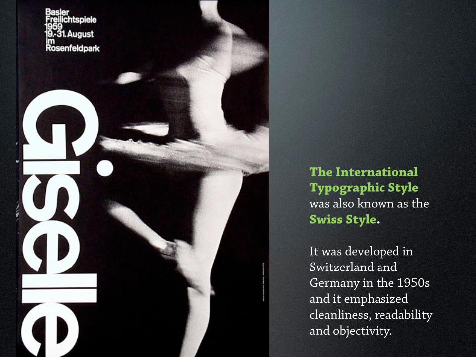
The International Typographic Style was also known as the Swiss Style. It was developed in Switzerland and Germany in the 1950s and it emphasized cleanliness, readability and objectivity.

The International Typographic Style
Hallmarks of the style are: • asymmetric layouts • grids • sans-serif type • flush-left, ragged-right text

The International Typographic Style This style shows a preference for photography in place of illustrations or drawings.

The International Typographic Style In many cases, the primary design element is simply the text alone. This is where this style gets its name.

Théo Ballmer studied briefly at the Dessau Bauhaus in the late 1920s and applied De Stijl’s principles in an original way, using an arithmetic grid of horizontal and vertical alignments.
Poster for an office professions exhibition, 1928

Théo Ballmer studied briefly at the Dessau Bauhaus in the late 1920s and applied De Stijl’s principles in an original way, using an arithmetic grid of horizontal and vertical alignments.
Poster for an office professions exhibition, 1928

Théo Ballmer studied briefly at the Dessau Bauhaus in the late 1920s and applied De Stijl’s principles in an original way, using an arithmetic grid of horizontal and vertical alignments.
Poster for an office professions exhibition, 1928
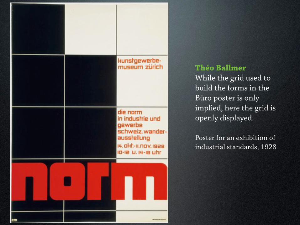
Théo Ballmer While the grid used to build the forms in the Büro poster is only implied, here the grid is openly displayed.
Poster for an exhibition of industrial standards, 1928

Max Billstudied at Bauhaus and moved to Zurich, Switzerland.
He used mathematical precision in his layouts, using asymmetry and linear divisions of space as typographic tools.

Exhibition on American Architecture poster, 1945
Max BillIn Switzerland he formulated his manifesto of art concrete: mathematical proportion, geometric spatial division, and he relied on sans-serif Akzindenz Grotesk type.

Anton StankowskiVisual patterns and forms from his abstract paintings found their way in his graphics. He saw no difference between fine art and the applied arts.
Use of Graphic Artists, Job and Tasks, 1959

Anton Stankowski created designs that became symbols for complex scientific and engineering concepts.
This 1953 trademark for Standard Electric Lorenz AG represents communication transmission and reception.
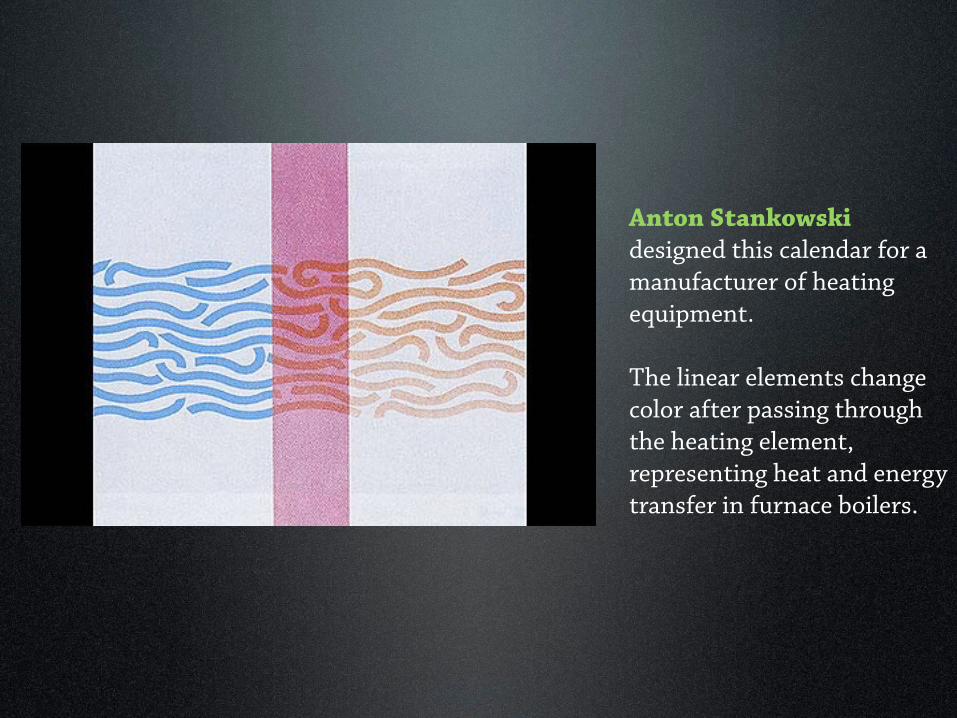
Anton Stankowski designed this calendar for a manufacturer of heating equipment.
The linear elements change color after passing through the heating element, representing heat and energy transfer in furnace boilers.

Anton StankowskiInstead of designing a trademark or unique typographic logo to unify his layouts, Stankowski developed a tectonic element for consistent use on all material.
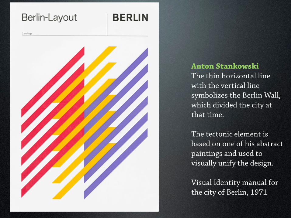
Anton StankowskiThe thin horizontal line with the vertical line symbolizes the Berlin Wall, which divided the city at that time.
The tectonic element is based on one of his abstract paintings and used to visually unify the design.
Visual Identity manual for the city of Berlin, 1971

UniversThe International Typographic Style was exemplified by new sans serif typefaces designed in the 1950s. Univers, designed by Adrian Frutiger, was a throwback to Akzidenz Grotesk.

UniversTwenty-one visually related fonts all carry the same x-height and baseline, and all ascenders and descenders are the same length. Each font was identified by a number.

UniversWhen combined, all 21 variations can be used together to achieve dynamic contrasts of weight, tone, width, and direction.

Herman Zapf typefacesHerman Zapf began his career as an apprentice retoucher at age 16. Calligrapher, book and type designer, he combined the classical traditions with 20th century attitude.
PalatinoMelior Optima

Armin HofmannDesigned the logotype for the Basel Civic Theater in 1954.He taught at the Basel School of Design and ran his own design studio.
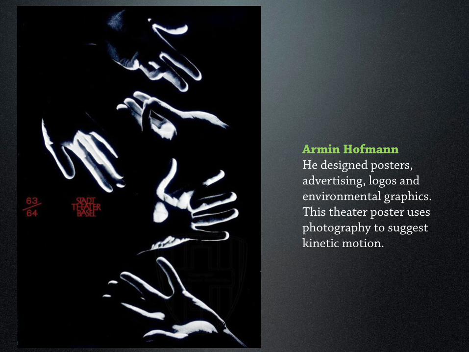
Armin HofmannHe designed posters, advertising, logos and environmental graphics. This theater poster uses photography to suggest kinetic motion.

Armin HofmannHis aesthetic values and understanding of form evolved into his design philosophy that replaced pictorial ideas with modernist designs.
Poster for Herman Miller furniture, 1962

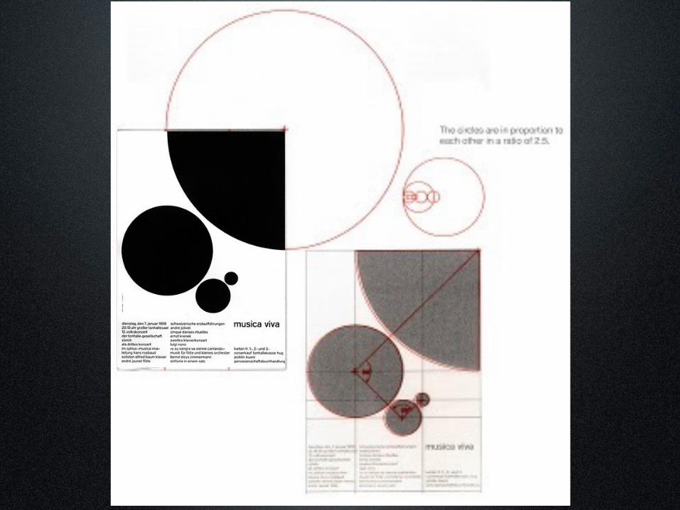
Josef Muller-BrockmannA leading design theorist in Zurich, worked extensively with mathematical grid structures.

Josef Muller-BrockmannThis Film Exhibition poster from 1960 approximates the grid structure of the golden mean rectangle.

Josef Muller-BrockmannAt a ratio of 3:5, the Greeks considered the golden mean to be the most beautifully proportioned rectangle.
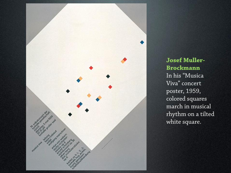
Josef Muller-BrockmannIn his “Musica Viva” concert poster, 1959, colored squares march in musical rhythm on a tilted white square.

Josef Muller-BrockmannHis “Musica Viva” concert poster series was designed with underlying grid structures.

Josef Muller-BrockmannHis “Musica Viva” concert poster series was designed with underlying grid structures.

Josef Muller-BrockmannHis “Musica Viva” concert poster series was designed with underlying grid structures.


Siegfried Odermatt His work was characterized by ordinary objects turned into engaging photographs through careful cropping, scale and lighting.
Ad for a cough syrup.

Siegfried Odermatt Somestimes he would change the ordinary appearance of text in his layouts.

Siegfried OdermattMuch of his work was typographical. And he believed one-color design can achieve the visual impact and power of full-color graphics by use of form, space, shape and tone.

Rosemarie Tissi + Siegfried OdermattSharing Odermatt’s uninhibited use of type and elements of playfulness, Rosemarie Tissi joins his studio in the early 1960s.

Rosemarie Tissi + Siegfried OdermattTogether they mark the beginning of a break with the traditions of Swiss design.

The International Typographic Style in AmericaIn 1950, the Massachusetts Institute of Technology establishes a graphic design program that serves the publishing needs of all areas of the university.
Ralph Coburn, 1972
Dietmar Winkler, 1969
Jacqueline S. Casey, 1970

Massachusetts Institute of Technology (MIT) based its graphic design program on a commitment to the grid and sans-serif typography.
The letterforms become the illustration in this poster advertising a introductory course to computer programming .
Dietmar Winkler, 1969

Jacqueline S. Casey, 1970
Massachusetts Institute of Technology
Typography as art becomes the design standard as in this art exhibit poster titled “Six Artists” in 1970.

Massachusetts Institute of Technology
A poster for the MIT jazz band depicts a staccato of letterforms of the word JAZZ to animate the space in musical sequences.
Ralph Coburn, 1972