the non-linear income-growth relation - asia-pacific … · 2015-06-28 · the non-linear...
TRANSCRIPT
11/3-2015
1st version
The non-linear income-growth relation A new look at a much analyzed relation
Erich Gundlach, Department of Economics, Hamburg University and GIGA, Germany1
Martin Paldam, Department of Economics and Business, Aarhus University, Denmark2
Abstract:
The paper considers all pairs of initial income and growth in the updated Maddison data from
1950 to 2010. The analysis confirms the well-known fact that the income-growth relation has
low explanatory power, but when it is analyzed by kernel regression techniques, a highly
significant hump-shaped relation does appear. It gives the long-run dynamics of the incomes
of the countries of the world. Further, a moving measure of variation is developed for the
growth rate. It is shown that the income-variation relation has a large fall from middle income
to high income.
1. Address: Von-Melle-Park 5, D-20146 Hamburg. E-mail: [email protected]. URL: http://www.erichgundlach.de. 2. Address: Fuglesangs Allé 4, DK-8210 Aarhus V. E-mail: [email protected]. URL: http://www.martin.paldam.dk.
1
1. The income-growth relation
Few relations in economics have been researched as much as the income-growth relation. It
considers initial income and growth (yi(-), gi).3 Income is defined as the logarithm to GDP per
capita, in fixed PPP prices; see the appendix. The relation is often illustrated by a diagram
with initial income at the horizontal axis and growth at the vertical one. In large data-sets the
(yi(-), gi)-pairs scatter wildly, but the scatter hides an ‘underlying’ income-growth relation that
points to the transition from a traditional to a modern steady state.
The paper studies the relation by kernel regression. This technique has two advan-
tages: (a1) It does not require a model from economic theory. Therefore, it reaches results that
all growth theories should be able to replicate. (a2) It works with stacked and sorted data, so
that all other country differences than income are randomized.
These advantages come at two disadvantages. (d1) The study merges data across time
and countries. This assumes equivalence: Long-run and cross-country data tell the same story.
(d2) The kernel-technique is a semi-graphical univariate technique. Obviously the world has
more dimensions. However, we consider a near-consistent set of N = 8,874 (yi(-), gi)-pairs of
observations. This is enough data so that it could be broken up in many ways, giving some
insight in other dimensions.
The kernel has a robust path, which proves highly non-linear. Under the equivalence
assumption the path gives the long-run dynamics of the population of countries in the world.
Hence, it does answer some much discussed questions, of which we look at two: The first is if
a low level equilibrium trap exists. This is the case if the relation has a low income interval,
where the curve has a negative slope and falls below the y-axis. The second question deals
with convergence: Do the poor countries catch up with the rich ones? It is the case if the
income-growth relation has a negative slope. Convergence may occur throughout or locally at
some income interval.
The content of the rest of the paper is: Section 2 looks at the theories. Section 3
describes the data and argues that they are rather representative. Section 4 looks at the pattern
in the data. Section 5 considers the development in the variation in the data. Finally, section 6
concludes. This paper is written on the basis of a longer paper, which documents many
additional results, see Paldam (2015).
3. The data comes from a (yjt-1, gjt)-panel, where j and t are indices for country and time. The data is stacked and sorted to the (yi(-), gi)-data set where i is an index for the income order. Time only appears as (-) indicating that each data pair is from the same country and the two time periods t and t-1. In the literature gi is often an average gni, where gnjt = (gjt + gjt+1 +... + gjt+n-1)/n. See the appendix on definitions.
2
2. Growth regressions and transitions
The theory and empirics of economic growth is a large field, covered by numerous textbooks,
and a massive four volume handbook (Aghion and Durlauf 2005, 2013). Thus, a few notes on
a couple of central themes of relevance will suffice. For ease of presentation the World Bank
terminology of LICs, MICs, and HICs is used. It refers to Low, Middle, and High Income
Countries respectively.
2.1 Growth regressions
Much of the discussion of the (yi(-), gi)-relation starts out from the empirical observation that
long run time series for income, y, often look amazingly linear – perhaps with one or two
kinks. This is often taken to represent a Solow model growing along a steady state path.
From this theoretical backbone a large wave of growth regression was started by Barro
(1991) and the ensuing textbook Barro and Sala-i-Martin (1995, 2003). It demonstrates how
the model leads to a basic estimation model in two versions:
(1) gnjt = α1 + β1 yjt-1 + ε1jt, the ε’s are the noise terms
(2) gnjt = α2 + β2 yjt-1 + [γ1 z1jt + … + γk zkjt] + ε2jt, the z’s are k controls
Indices j and t are for countries and time, while n indicates an average over n years.
Equation (1) tests for absolute convergence. It occurs if β1 < 0. The standard result is
that β1 > 0 but insignificant, so convergence is rejected.4 Most data sets used to estimate (1)
give quite wild point scatters, so the F-test for the regression (1) is often insignificant, and R2-
scores are low indeed.
Equation (2) tests for conditional convergence, which occurs if β2 turns significantly
negative for a reasonable and robust z-set of controls for country heterogeneity. It already
happens when the z-set is fixed effects for countries. Thus, countries would converge, if they
were the same. It is almost a tautology, and it is surely not a statement about the real world.
However, it is fairly easy to find more interesting control-sets making β2 negative, as already
reported in Barro (1991).
These equations have been estimated in many ways and on many data sets, both in
pure cross-country versions (where t is fixed) and in panel versions (where both t and j
4. In our set of N = 8,874 observations β1 becomes significantly positive. The divergence is 0.15 per logarithmic point, or 0.75 percentage points over the 5 point income range (see Figures 2-4). It will be shown that this is a misleading picture.
3

varies).5 About 400 z-variables have been tried in many combinations,6 and the relation has
been adjusted for simultaneity using many sets of instruments. Many n’s have been examined,
lags have been included, etc.
Since Baumol (1986) it has been known that the HICs converge to the same steady
state. This is termed club convergence. It is dubious if other clubs than the HIC club exists.
2.2 Two steady states and the Grand Transition
Ever since Rostow (1960) economic historians have pointed out that the most common steady
state throughout history has been a traditional one with low income and no growth. This is
confirmed by the large efforts of data collections put together by Maddison (2001). It is a
steady state in the sense that it is stable, which is due to very slow technical progress. It is a
LIC club if a low level equilibrium trap exists, so that the LICs converge to the same (low)
level.
Thus, it is a basic observation that two steady states exists: A modern and a traditional.
The modern started to develop about 200 years ago. The present HICs gradually moved away
from their old traditional level and in the last half century converged to much the same
income level. There is still a group of LICs, but it is debated if there is convergence at the
bottom. If the top of the distribution grows faster than the bottom, the ‘bridge’ between the
two keeps growing. We term the bridge the Grand Transition as it consists of many transi-
tions.
Nearly all socio-economic variables have different levels in the traditional and modern
steady state and a fairly well-defined path as the country moves between the two states.
(3) z = F(y), with the levels zT in the traditional and zM in the modern steady state.
In other work we have shown how the transition paths look for some transitions.7 Equation
(3) models the causal effect y ⇒ z, while equation (2) models the causal effect z ⇒ g ≈ ∆y.
So that estimates of both (2) and (3) have to be adjusted for simultaneity.
The definition of a steady state is that all ratios in the economy stay constant, and this
5. See Gundlach and Paldam (2015) on the interaction of growth theory and the many estimators tried. 6. It is only possible to include a handful or two of the 400 variables so billions of choices are possible. Each of these gives an estimate of β2, resulting in a large range of possible estimates. See chapter 12.5 of Barro and Sala-i-Martin (2005). 7. The reader will think of the agricultural and the demographic transitions. We have shown that there is also a democratic transition (see Gundlach and Paldam 2009b and Paldam and Gundlach 2012), a religious transition (see Paldam and Gundlach 2013), a transition of corruption (Gundlach and Paldam 2009a), and a transition in the preferences for socialism (Bjørnskov and Paldam 2010).
4
is precisely what they fail to do! When the bridge between the LIC and the HIC steady states
is a transition, with structural changes in all fields, it becomes rather unclear if this leads to a
linear aggregate path. Large-scale structural change creates all kinds of tensions and uncer-
tainties. Political alliances break up and new have to be formed. This may involve changes of
the political system. It follows that it is likely that: (i) Growth becomes more variable during
the transition. Also, the transition is the period where some MICs catch up with the HICs, i.e.,
technological catch-up may happen. Once that starts, it is likely that (ii) growth can become
particularly fast. So we look for a middle income peak. From this peak to the high end of the
income scale, the income-growth curve must have a negative slope resulting in the HIC-club.
2.3 Growth models with two sectors
One way to catch some of the transition is by a two sectors model with a traditional and a
modern sector. In the beginning all is traditional, and then the transition is shown as a process
where the modern sector gradually replaces the traditional one. This idea goes back to Lewis
(1954) and Ranis and Fei (1960), and many formalizations have been made. The model has
also been generalized to more sectors. A key feature of these models is that early development
leads to large gaps in productivity between the sectors, giving rise to strong tensions in the
economies. As development progresses, the gaps close and tensions are reduced.
This model catches a growth process that starts slowly as the modern sector has no
weight, but then it becomes gradually more important and able to account for more growth. In
the process large differences between the productivity in the sectors emerge. That may lead to
large social tensions causing growth to stall in the middle, so that the variability is likely to be
much higher in MICs than in the HIC, where a steady state has been reached.
However, even when the two-sector model may catch some of the transition, the
Grand Transition is a much more comprehensive process: It includes a large fall in corruption,
democratization, a large fall in religiosity, etc. These changes contribute to growth, but they
may not be smooth, so they may add political instability that affects investment.
2.4 Two cases: Old west and oil countries
The transition started 200 years ago in a group of ‘old’ western countries, who are the largest
group of HICs today. The transition was a gradual process, so it is easier to describe as a log-
linear process, where technical progress was randomly distributed throughout the economy.
The growth process in these countries will be termed the case of the old west. They never had
as large tensions between the sectors as the MICs today. This is a qualification to equivalence
5

All countries earn some resource rent. It is typically 1 to 2% of GDP only, but some
countries have abundant resources and resource rent becomes a major part of GDP. Such
countries may reach HIC income levels exclusively from resource rent, without going through
the Grand Transition. For long they remain LICs in the structure of society and its institutions,
but gradually they start to change structure, to conform to income. The most extreme version
of this case of development is the oil countries as an oil sector is a small international enclave
in the country, employing few people and using a foreign technology. Such sectors are
normally carefully fenced and heavily guarded so they are indeed an enclave. Their effect on
the rest of the economy is the tax on the resource rent that flows into the treasury. We use
OPEC membership as our proxy for the oil-case.
6
3. The data: (yi(-), gi) pairs
The data used is from the Maddison-project where the annual data starts in 1800 and (p.t.)
ends in 2010. We include data for the present countries as soon as possible. Data for Sub-
Saharan African starts in 1950, where all but three counties were colonies. Data for the
successor states of Yugoslavia starts in 1952, while data for the successor states of the USSR
starts in 1990, and so they does for the successor states of Czechoslovakia. In these cases the
data for the ‘old’ country is stopped, when the new data starts.
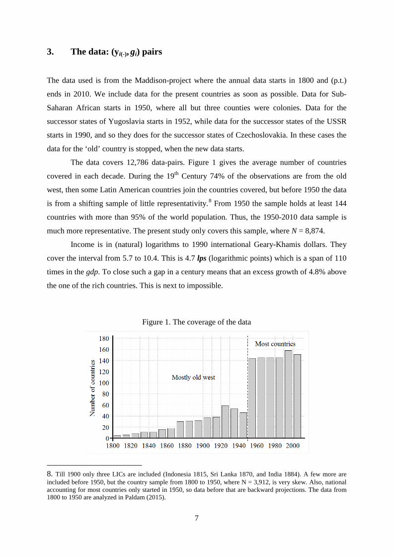
The data covers 12,786 data-pairs. Figure 1 gives the average number of countries
covered in each decade. During the 19th Century 74% of the observations are from the old
west, then some Latin American countries join the countries covered, but before 1950 the data
is from a shifting sample of little representativity.8 From 1950 the sample holds at least 144
countries with more than 95% of the world population. Thus, the 1950-2010 data sample is
much more representative. The present study only covers this sample, where N = 8,874.
Income is in (natural) logarithms to 1990 international Geary-Khamis dollars. They
cover the interval from 5.7 to 10.4. This is 4.7 lps (logarithmic points) which is a span of 110
times in the gdp. To close such a gap in a century means that an excess growth of 4.8% above
the one of the rich countries. This is next to impossible.
Figure 1. The coverage of the data
8. Till 1900 only three LICs are included (Indonesia 1815, Sri Lanka 1870, and India 1884). A few more are included before 1950, but the country sample from 1800 to 1950, where N = 3,912, is very skew. Also, national accounting for most countries only started in 1950, so data before that are backward projections. The data from 1800 to 1950 are analyzed in Paldam (2015).
7
3. The scatter of the (yi(-), gi)-points analyzed by kernel-curves
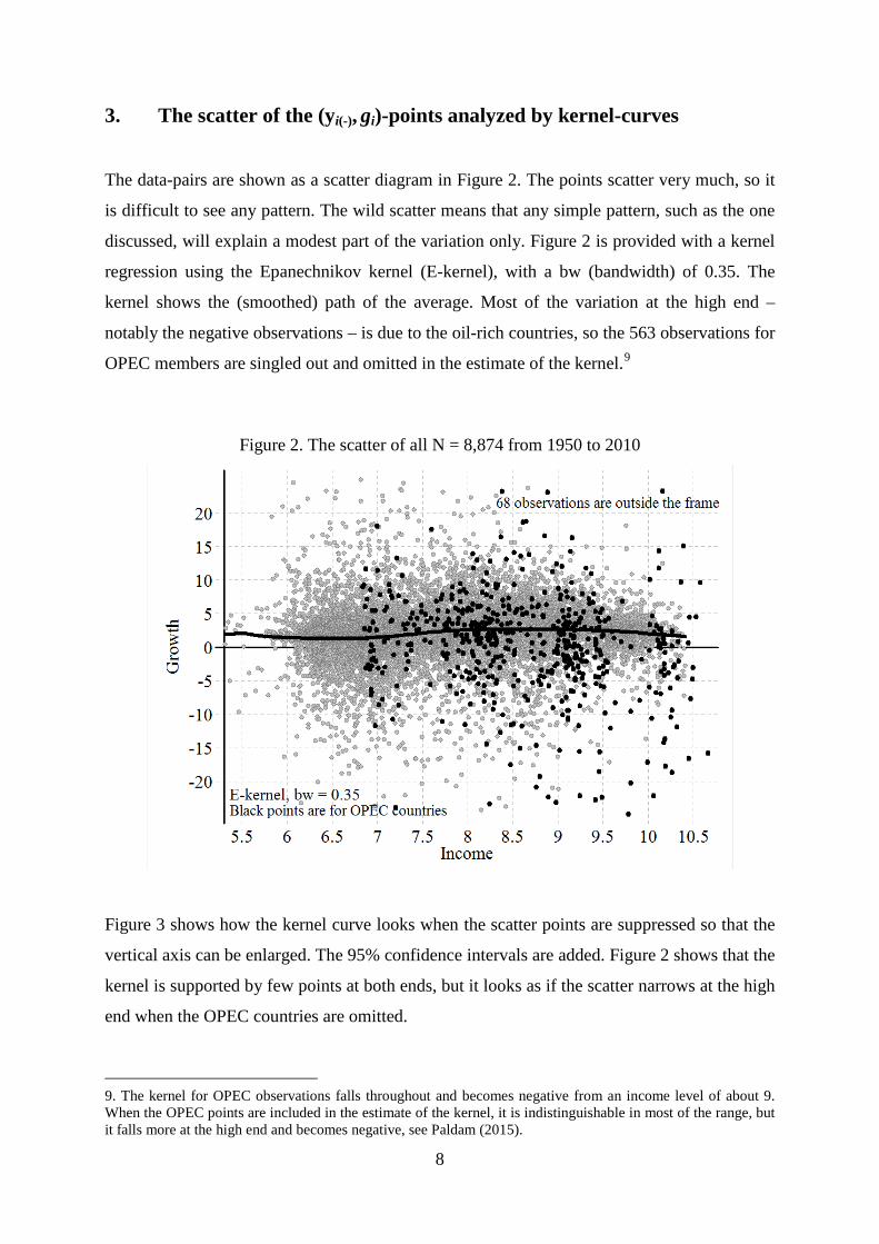
The data-pairs are shown as a scatter diagram in Figure 2. The points scatter very much, so it
is difficult to see any pattern. The wild scatter means that any simple pattern, such as the one
discussed, will explain a modest part of the variation only. Figure 2 is provided with a kernel
regression using the Epanechnikov kernel (E-kernel), with a bw (bandwidth) of 0.35. The
kernel shows the (smoothed) path of the average. Most of the variation at the high end –
notably the negative observations – is due to the oil-rich countries, so the 563 observations for
OPEC members are singled out and omitted in the estimate of the kernel.9
Figure 2. The scatter of all N = 8,874 from 1950 to 2010
Figure 3 shows how the kernel curve looks when the scatter points are suppressed so that the
vertical axis can be enlarged. The 95% confidence intervals are added. Figure 2 shows that the
kernel is supported by few points at both ends, but it looks as if the scatter narrows at the high
end when the OPEC countries are omitted.
9. The kernel for OPEC observations falls throughout and becomes negative from an income level of about 9. When the OPEC points are included in the estimate of the kernel, it is indistinguishable in most of the range, but it falls more at the high end and becomes negative, see Paldam (2015).
8
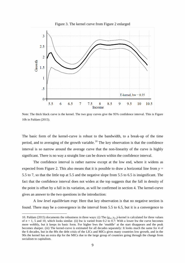
Figure 3. The kernel curve from Figure 2 enlarged
Note: The thick black curve is the kernel. The two gray curves give the 95% confidence interval. This is Figure
10b in Paldam (2015).
The basic form of the kernel-curve is robust to the bandwidth, to a break-up of the time
period, and to averaging of the growth variable.10 The key observation is that the confidence
interval is so narrow around the average curve that the non-linearity of the curve is highly
significant. There is no way a straight line can be drawn within the confidence interval.
The confidence interval is rather narrow except at the low end, where it widens as
expected from Figure 2. This also means that it is possible to draw a horizontal line from y =
5.5 to 7, so that the little top at 5.5 and the negative slope from 5.5 to 6.5 is insignificant. The
fact that the confidence interval does not widen at the top suggests that the fall in density of
the point is offset by a fall in its variation, as will be confirmed in section 4. The kernel-curve
gives an answer to the two questions in the introduction:
A low level equilibrium trap: Here that key observation is that no negative section is
found. There may be a convergence in the interval from 5.5 to 6.5, but it is a convergence to
10. Paldam (2015) documents the robustness in three ways: (i) The (gni, yi(-))-kernel is calculated for three values of n = 1, 5 and 10, which looks similar. (ii) bw is varied from 0.2 to 0.7: With a lower bw the curve becomes more wobbly, but it keeps its basic form. For higher bws the ‘muddle’ at the start disappears and the peak becomes sharper. (iii) The kernel-curve is estimated for all decades separately: It looks much the same for 4 of the 6 decades, but in the 80s the debt crisis of the LICs and MICs gives many countries low growth, and in the 90s the kernel has an extra dip for the MICs due to the large group of countries going through the change from socialism to capitalism.
9
6.5, where growth becomes faster. It also means that the traditional steady state of a stable
income is not visible in the data from 1950 onwards. Countries grow at all income levels.
Convergence or divergence: The kernel-curve has a significant hump in the middle.
The countries diverge before the hump and converge after. It looks as if the hump has a rather
flat top, which peaks somewhere between 7.8 and 9.5.
It is important that that the curve is positive throughout – the average of all points used
to calculate Figure 3 is 2.05% p.a., and as can be seen, it is 1.6% at the two ends and
approximately 2.6% at the flat top of the hump. So MICs grow by 1% more than the HICs.
This closes the gap by 1 lp each century. The gap between the LICs and the HICs is 3.5 to 4
lps. So here the catch-up needs 4-5 centuries in average.
10
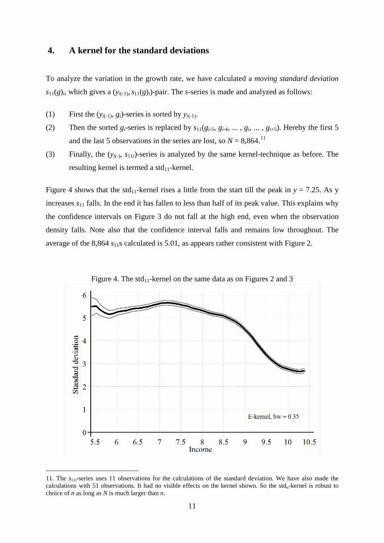
4. A kernel for the standard deviations
To analyze the variation in the growth rate, we have calculated a moving standard deviation
s11(g)i, which gives a (yi(-1), s11(g)i)-pair. The s-series is made and analyzed as follows:
(1) First the (yi(-1), gi)-series is sorted by yi(-1).
(2) Then the sorted gi-series is replaced by s11(gi-5, gi-4, ... , gi, ... , gi+5). Hereby the first 5
and the last 5 observations in the series are lost, so N = 8,864.11
(3) Finally, the (yi(-), s11i)-series is analyzed by the same kernel-technique as before. The
resulting kernel is termed a std11-kernel.
Figure 4 shows that the std11-kernel rises a little from the start till the peak in y = 7.25. As y
increases s11 falls. In the end it has fallen to less than half of its peak value. This explains why
the confidence intervals on Figure 3 do not fall at the high end, even when the observation
density falls. Note also that the confidence interval falls and remains low throughout. The
average of the 8,864 s11s calculated is 5.01, as appears rather consistent with Figure 2.
Figure 4. The std11-kernel on the same data as on Figures 2 and 3
11. The s11i-series uses 11 observations for the calculations of the standard deviation. We have also made the calculations with 51 observations. It had no visible effects on the kernel shown. So the stdn-kernel is robust to choice of n as long as N is much larger than n.
11

8 Conclusions
The above analysis is done using a technique chosen to assume as little theory as possible. We
hope the reader will agree that the analysis builds on very few assumptions. This will allow us
to draw at least one rather strong conclusion about economic theory: It does appear that there
is a transition in the growth rate: From moderate to higher and back again to moderate. Thus
the one-sector steady state perspective on economic growth is problematic.
In addition our findings tell a story about the long-run dynamics of income of the
world system of countries:
Poor countries (LICs) have a low and unstable growth. However, the growth is still at
an average rate of 1.6% per year. The stagnating traditional economy is all but gone today.12
Rich countries (HICs) have a growth rate of 1.6% p.a. as well. The instability of this
growth is half the one of the LICs.
Middle-income countries (MICs) have, in average, 1 percentage point higher growth
than in the LICs and HICs. The peak is rather flat between y = 7.7 and 9.5. During that period
the variability of the growth rates falls.
An excess growth of 1 percentage point – as is found for the MICs – accumulates to
one logarithmic point over a century. This means that many MICs will actually catch up with
the HICs during the next century. It will take considerably longer for the LICs.
Due to the high variability of the growth of the LICs and MICs some countries will
catch up much faster than others.
12. The world has about 10 countries with a gdp (GDP per capita) that is lower in 2010 than in 1950.
12
References: Aghion, P., Durlauf, S.N., eds., 2005. Handbook of Economic Growth. Vol 1A & B. North-Holland, Amsterdam
Aghion, P., Durlauf, S.N., eds., 2013. Handbook of Economic Growth. Vol 2A & B. North-Holland, Amsterdam
Barro, R.J., 1991. Economic growth in a cross section of countries. Quarterly Journal of Economics 106, 407-
43
Barro, R.J., Sala-i-Martin, X., 1995, 2003. Economic Growth (1st and 2nd ed.). MIT Press, Cambridge, MA
Baumol, W.J., 1986. Productivity growth, convergence, and welfare: What the long-run data show. American
Economic Review 76, 1072-85
Bjørnskov, C., Paldam, M., 2010. The spirits of capitalism and socialism. A cross-country study of ideology.
Public Choice 150, 469–98
Gundlach, E., Paldam, M., 2009a. The transition of corruption: from poverty to honesty. Economics Letters
103, 146–8
Gundlach, E., Paldam, M., 2009b. A farewell to critical junctures: Sorting out long-run causality of income and
democracy. European Journal of Political Economy 25, 340–54
Gundlach, E., Paldam, M., 2015. Socioeconomic transitions. A pattern over time and across countries. P.t. draft
Lewis, A.,1954. Development with unlimited supply of labour. The Manchester School 22, 139-92
Lucas, R.E.Jr., 2009. Trade and the diffusion of the industrial revolution. American Economic Journal: Macroeconomics 1, 1–25
Maddison, A., 2001. The World Economy: A Millennial Perspective. OECD, Paris.
Paldam, M., 2015. Documentation: The non-linear income-growth relation.
URL: http://www.martin.paldam.dk/Papers/Growth-trade-debt/Docu- income-growth.pdf
Paldam, M., Gundlach, E., 2012. The democratic transition. Short-run and long-run causality between income
and the Gastil index. European Journal of Development Research 24, 144–68
Paldam, M., Gundlach, E., 2013. The religious transition. A long-run perspective. Public Choice, 156, 105–23
Ranis, G., Fei, J.C.H., 1961. A Theory of Economic Development. American Economic Review 51, 533-65
Rostow, W.W., 1960. The Stages of Economic Growth: A Non-Communist Manifesto. Cambridge University
Press
Data source is the Maddison Project downloaded in November 2014:
Bolt, J., van Zanden, J. L., 2013. The First Update of the Maddison Project; Re-Estimating Growth Before 1820.
Maddison Project Working Paper 4. Maddison Project has URL: http://www.ggdc.net/maddison/maddison-project/data.htm Maddison, A., 2003. The world economy: Historical statistics. OECD, Paris.
13
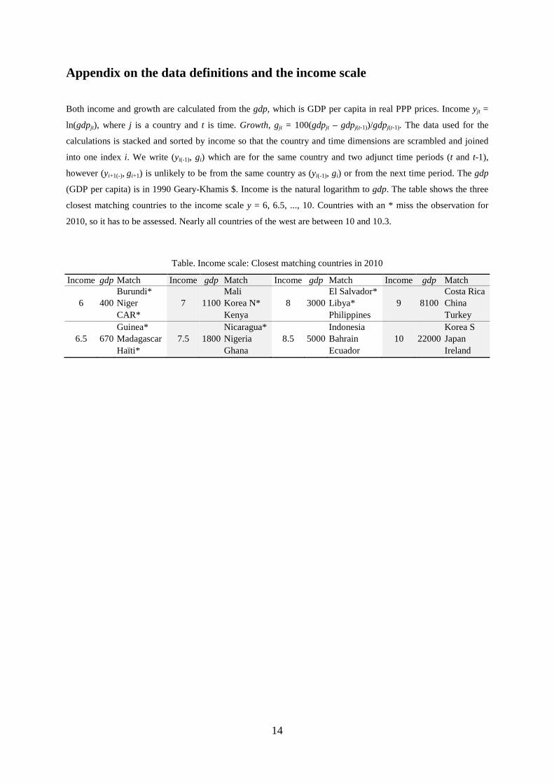
Appendix on the data definitions and the income scale
Both income and growth are calculated from the gdp, which is GDP per capita in real PPP prices. Income yjt =
ln(gdpjt), where j is a country and t is time. Growth, gjt = 100(gdpjt – gdpj(t-1))/gdpj(t-1). The data used for the
calculations is stacked and sorted by income so that the country and time dimensions are scrambled and joined
into one index i. We write (yi(-1), gi) which are for the same country and two adjunct time periods (t and t-1),
however (yi+1(-), gi+1) is unlikely to be from the same country as (yi(-1), gi) or from the next time period. The gdp
(GDP per capita) is in 1990 Geary-Khamis $. Income is the natural logarithm to gdp. The table shows the three
closest matching countries to the income scale y = 6, 6.5, ..., 10. Countries with an * miss the observation for
2010, so it has to be assessed. Nearly all countries of the west are between 10 and 10.3.
Table. Income scale: Closest matching countries in 2010
Income gdp Match Income gdp Match Income gdp Match Income gdp Match
Burundi* Mali El Salvador* Costa Rica
6 400 Niger 7 1100 Korea N* 8 3000 Libya* 9 8100 China
CAR* Kenya Philippines Turkey
Guinea* Nicaragua* Indonesia Korea S
6.5 670 Madagascar 7.5 1800 Nigeria 8.5 5000 Bahrain 10 22000 Japan
Haïti* Ghana Ecuador Ireland
14
Documentation: The non-linear income-growth relation
Martin Paldam, Department of Economics and Business, Aarhus University, Denmark13
This paper is documentation to the following main paper:
Erich Gundlach and Martin Paldam
The non-linear income-growth relation A new look at a much analyzed relation
Available in latest version from: Main: http://www.martin.paldam.dk/Papers/Growth-trade-debt/Income-growth.pdf
The present: http://www.martin.paldam.dk/Papers/Growth-trade-debt/Docu-income-growth.pdf
The main paper and the present both study growth as a function of income and show that the
relation is non-linear. The premium results are taken to be Figures 10b and 11c. The main
paper repeat these graphs and brings most of the theoretical discussion and all references. The
technique used is rather space intensive, so the robustness tests and other ‘auxiliary’
calculations are documented in the present background paper.
Data source: http://www.ggdc.net/maddison/maddison-project/-home.htm
(downloaded 15/11-2014). See also:
Bolt, J., van Zanden, J.L., 2013. The First Update of the Maddison Project; Re-Estimating
Growth Before 1820. Maddison Project Working Paper 4.
13. Address: Fuglesangs Allé 4, DK-8210 Aarhus V. E-mail: [email protected]. URL: http://www.martin.paldam.dk.
15
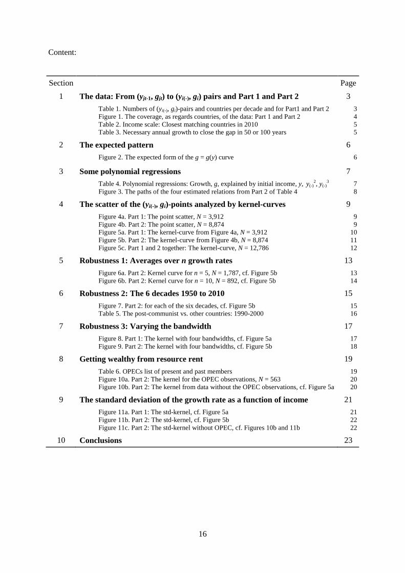
Content:
Section Page 1 The data: From (yjt-1, gjt) to (yi(-), gi) pairs and Part 1 and Part 2 3 Table 1. Numbers of (yi(-), gi)-pairs and countries per decade and for Part1 and Part 2
Figure 1. The coverage, as regards countries, of the data: Part 1 and Part 2 Table 2. Income scale: Closest matching countries in 2010 Table 3. Necessary annual growth to close the gap in 50 or 100 years
3 4 5 5
2 The expected pattern 6 Figure 2. The expected form of the g = g(y) curve 6
3 Some polynomial regressions 7 Table 4. Polynomial regressions: Growth, g, explained by initial income, y, y(-)
2, y(-)3
Figure 3. The paths of the four estimated relations from Part 2 of Table 4 7 8
4 The scatter of the (yi(-), gi)-points analyzed by kernel-curves 9 Figure 4a. Part 1: The point scatter, N = 3,912
Figure 4b. Part 2: The point scatter, N = 8,874 Figure 5a. Part 1: The kernel-curve from Figure 4a, N = 3,912 Figure 5b. Part 2: The kernel-curve from Figure 4b, N = 8,874 Figure 5c. Part 1 and 2 together: The kernel-curve, N = 12,786
9 9
10 11 12
5 Robustness 1: Averages over n growth rates 13 Figure 6a. Part 2: Kernel curve for n = 5, N = 1,787, cf. Figure 5b
Figure 6b. Part 2: Kernel curve for n = 10, N = 892, cf. Figure 5b 13 14
6 Robustness 2: The 6 decades 1950 to 2010 15 Figure 7. Part 2: for each of the six decades, cf. Figure 5b
Table 5. The post-communist vs. other countries: 1990-2000 15 16
7 Robustness 3: Varying the bandwidth 17 Figure 8. Part 1: The kernel with four bandwidths, cf. Figure 5a
Figure 9. Part 2: The kernel with four bandwidths, cf. Figure 5b 17 18
8 Getting wealthy from resource rent 19 Table 6. OPECs list of present and past members
Figure 10a. Part 2: The kernel for the OPEC observations, N = 563 Figure 10b. Part 2: The kernel from data without the OPEC observations, cf. Figure 5a
19 20 20
9 The standard deviation of the growth rate as a function of income 21 Figure 11a. Part 1: The std-kernel, cf. Figure 5a
Figure 11b. Part 2: The std-kernel, cf. Figure 5b Figure 11c. Part 2: The std-kernel without OPEC, cf. Figures 10b and 11b
21 22 22
10 Conclusions 23
16
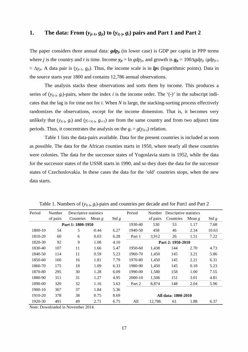
1. The data: From (yjt-1, gjt) to (yi(-), gi) pairs and Part 1 and Part 2
The paper considers three annual data: gdpji (in lower case) is GDP per capita in PPP terms
where j is the country and t is time. Income yjt = ln gdpjt, and growth is gjt = 100∆gdpjt /gdpjt-1
≈ ∆yjt. A data pair is (yjt-1, gjt). Thus, the income scale is in lps (logarithmic points). Data in
the source starts year 1800 and contains 12,786 annual observations.
The analysis stacks these observations and sorts them by income. This produces a
series of (yi(-), gi)-pairs, where the index i is the income order. The ‘(-)’ in the subscript indi-
cates that the lag is for time not for i. When N is large, the stacking-sorting process effectively
randomizes the observations, except for the income dimension. That is, it becomes very
unlikely that (yi(-), gi) and (yi+1(-), gi+1) are from the same country and from two adjunct time
periods. Thus, it concentrates the analysis on the gi = g(yi(-)) relation.
Table 1 lists the data-pairs available. Data for the present countries is included as soon
as possible. The data for the African counties starts in 1950, where nearly all these countries
were colonies. The data for the successor states of Yugoslavia starts in 1952, while the data
for the successor states of the USSR starts in 1990, and so they does the data for the successor
states of Czechoslovakia. In these cases the data for the ‘old’ countries stops, when the new
data starts.
Table 1. Numbers of (yi(-), gi)-pairs and countries per decade and for Part1 and Part 2
Period Number Descriptive statistics Period Number Descriptive statistics of pairs Countries Mean g Std g of pairs Countries Mean g Std g
Part 1: 1800-1950 1930-40 530 53 1.17 7.68 1800-10 54 5 -0.44 6.27 1940-50 458 46 2.34 10.63 1810-20 60 6 0.03 6.28 Part 1 3,912 26 1.51 7.22 1820-30 92 9 1.08 4.10 Part 2: 1950-2010 1830-40 107 11 1.66 5.47 1950-60 1,438 144 2.70 4.73 1840-50 114 11 0.59 5.23 1960-70 1,450 145 3.21 5.86 1850-60 160 16 1.81 7.79 1970-80 1,450 145 2.21 6.31 1860-70 175 18 1.09 6.33 1980-90 1,450 145 0.18 5.23 1870-80 295 30 1.28 6.09 1990-00 1,580 158 1.00 7.55 1880-90 311 31 1.27 4.95 2000-10 1,506 151 3.01 4.81 1890-00 320 32 1.16 5.63 Part 2 8,874 148 2.04 5.96 1900-10 367 37 1.84 5.36 1910-20 378 38 0.75 8.69 All data: 1800-2010 1920-30 491 49 2.71 6.75 All 12,786 61 1.88 6.37
Note: Downloaded in November 2014.
17
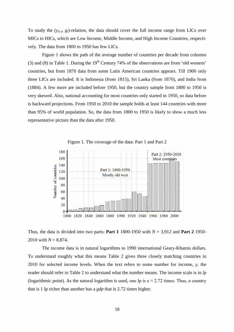
To study the (yi(-), gi)-relation, the data should cover the full income range from LICs over
MICs to HICs, which are Low Income, Middle Income, and High Income Countries, respecti-
vely. The data from 1800 to 1950 has few LICs.
Figure 1 shows the path of the average number of countries per decade from columns
(3) and (8) in Table 1. During the 19th Century 74% of the observations are from ‘old western’
countries, but from 1870 data from some Latin American countries appears. Till 1900 only
three LICs are included. It is Indonesia (from 1815), Sri Lanka (from 1870), and India from
(1884). A few more are included before 1950, but the country sample from 1800 to 1950 is
very skewed. Also, national accounting for most countries only started in 1950, so data before
is backward projections. From 1950 to 2010 the sample holds at least 144 countries with more
than 95% of world population. So, the data from 1800 to 1950 is likely to show a much less
representative picture than the data after 1950.
Figure 1. The coverage of the data: Part 1 and Part 2
Thus, the data is divided into two parts: Part 1 1800-1950 with N = 3,912 and Part 2 1950-
2010 with N = 8,874.
The income data is in natural logarithms to 1990 international Geary-Khamis dollars.
To understand roughly what this means Table 2 gives three closely matching countries in
2010 for selected income levels. When the text refers to some number for income, y, the
reader should refer to Table 2 to understand what the number means. The income scale is in lp
(logarithmic point). As the natural logarithm is used, one lp is e ≈ 2.72 times. Thus, a country
that is 1 lp richer than another has a gdp that is 2.72 times higher.
18
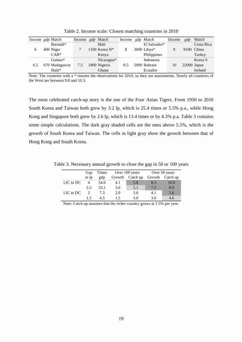
Table 2. Income scale: Closest matching countries in 2010
Income gdp Match Income gdp Match Income gdp Match Income gdp Match
Burundi* Mali El Salvador* Costa Rica
6 400 Niger 7 1100 Korea N* 8 3000 Libya* 9 8100 China
CAR* Kenya Philippines Turkey
Guinea* Nicaragua* Indonesia Korea S
6.5 670 Madagascar 7.5 1800 Nigeria 8.5 5000 Bahrain 10 22000 Japan
Haïti* Ghana Ecuador Ireland
Note: The countries with a * missies the observations for 2010, so they are assessments. Nearly all countries of the West are between 9.8 and 10.3.
The most celebrated catch-up story is the one of the Four Asian Tigers. From 1950 to 2010
South Korea and Taiwan both grew by 3.2 lp, which is 25.4 times or 5.5% p.a., while Hong
Kong and Singapore both grew by 2.6 lp, which is 13.4 times or by 4.3% p.a. Table 3 contains
some simple calculations. The dark gray shaded cells are the ones above 5.5%, which is the
growth of South Korea and Taiwan. The cells in light gray show the growth between that of
Hong Kong and South Korea.
Table 3. Necessary annual growth to close the gap in 50 or 100 years
Gap Times Over 100 years Over 50 years in lp gdp Growth Catch up Growth Catch up LIC to DC 4 54.6 4.1 5.6 8.3 10.0 3.5 33.1 3.6 5.1 7.3 8.9 LIC to DC 2 7.3 2.0 3.6 4.1 5.6 1.5 4.5 1.5 3.0 3.0 4.6 Note: Catch up assumes that the richer country grows at 1.5% per year.
19
2. The expected pattern
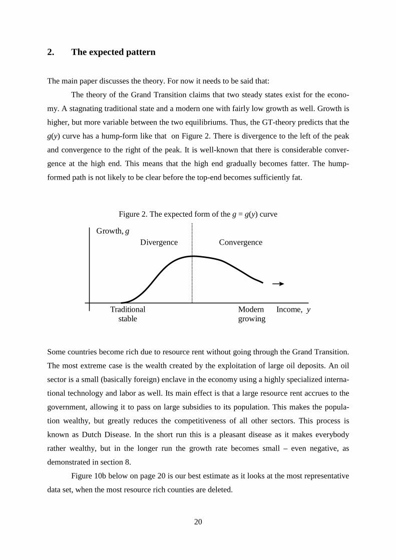
The main paper discusses the theory. For now it needs to be said that:
The theory of the Grand Transition claims that two steady states exist for the econo-
my. A stagnating traditional state and a modern one with fairly low growth as well. Growth is
higher, but more variable between the two equilibriums. Thus, the GT-theory predicts that the
g(y) curve has a hump-form like that on Figure 2. There is divergence to the left of the peak
and convergence to the right of the peak. It is well-known that there is considerable conver-
gence at the high end. This means that the high end gradually becomes fatter. The hump-
formed path is not likely to be clear before the top-end becomes sufficiently fat.
Figure 2. The expected form of the g = g(y) curve
Some countries become rich due to resource rent without going through the Grand Transition.
The most extreme case is the wealth created by the exploitation of large oil deposits. An oil
sector is a small (basically foreign) enclave in the economy using a highly specialized interna-
tional technology and labor as well. Its main effect is that a large resource rent accrues to the
government, allowing it to pass on large subsidies to its population. This makes the popula-
tion wealthy, but greatly reduces the competitiveness of all other sectors. This process is
known as Dutch Disease. In the short run this is a pleasant disease as it makes everybody
rather wealthy, but in the longer run the growth rate becomes small – even negative, as
demonstrated in section 8.
Figure 10b below on page 20 is our best estimate as it looks at the most representative
data set, when the most resource rich counties are deleted.
20
Growth, gDivergence Convergence
Traditional Modern Income, y stable growing

3. Some polynomial regressions
One way to study the non-linearity in the income-growth relation is to run sets of polynomial
regressions as done in Table 4. The set starts by the linear regression, and then terms of higher
power are gradually added:
(1) gi = α + β1 yi(-) + u1i
(2) gi = α + β1 yi(-) + β2 yi(-)2
+ u2i
(3) gi = α + β1 yi(-) + β2 yi(-)2
+ β3 yi(-)3
+ u3i
(4) gi = α + β1 yi(-) + β2 yi(-)2
+ β3 yi(-)3
+ β4 yi(-)4 + u4i
...
These regressions have been run up to (8). What happens is that after a certain number the
power-terms become too collinear and start to eat the significance of each other. Once it
happens, it does not work to add additional power-terms.
The first observation is that the R2-score is very low throughout as the reader will
expect from the literature. However, significant coefficients are still found. They are quite
different in Part 1 and Part 2 of the data. When all data is merged Part 2 dominates, but the fit
decreases.
The regressions for Part 1 are not improved by adding power-terms to (1). Thus, it is
clear that the regressions show a linear relation with a negative coefficient. There is conver-
gence throughout.
Table 4. Polynomial regressions: Growth, g, explained by initial income, y(-), y(-)2, y(-)
3
Nr Constant y(-) y(-)2 y(-)
3 y(-)4 R2
Part 1: Data shown on Figure 4a, N = 3,912 (1) 4.902 (3.6) -0.451 (-2.5) 0.002 (2) 5.163 (0.4) -0.520 (-0.1) 0.005 (0.0) 0.002
Part 2: Data shown on Figure 4b, N = 8,874. The estimates are depicted of Figure 3
(1) 0.865 (1.9) 0.149 (2.6) 0.001 (2) -19.09 (-5.8) 5.219 (6.3) -0.316 (-6.1) 0.005 (3) 72.79 (3.3) -29.84 (-3.5) 4.085 (3.9) -0.182 (-4.2) 0.007 (4) 164.54 (1.2) -76.95 (1.1) 13.06 (1.0) -0.935 (1.1) 0.023 (0.7) 0.007
All data: N = 12,786 (1) 1.001 (2.3) 0.113 (2.0) 0.000 (2) -9.093 (3.2) 2.682 (3.4) -0.161 (-3.2) 0.001 (3) 69.73 (3.2) -27.42 (3.3) 3.625 (3.5) -0.157 (-3.7) 0.002 (4) -86.57 (-0.7) 52.76 (0.8) -11.65 (-0.9) 1.124 (1.1) -0.040 (1.2) 0.002
Note: Bold coefficient estimates are statistical significant at the 5% level.
21
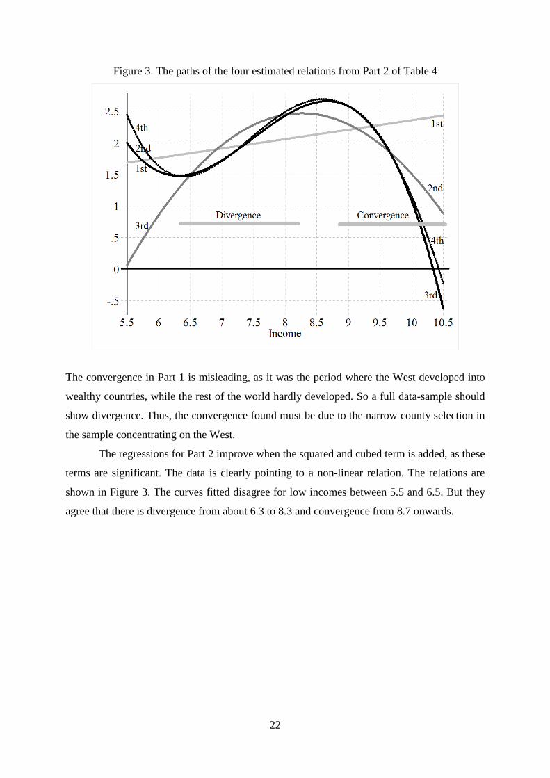
Figure 3. The paths of the four estimated relations from Part 2 of Table 4
The convergence in Part 1 is misleading, as it was the period where the West developed into
wealthy countries, while the rest of the world hardly developed. So a full data-sample should
show divergence. Thus, the convergence found must be due to the narrow county selection in
the sample concentrating on the West.
The regressions for Part 2 improve when the squared and cubed term is added, as these
terms are significant. The data is clearly pointing to a non-linear relation. The relations are
shown in Figure 3. The curves fitted disagree for low incomes between 5.5 and 6.5. But they
agree that there is divergence from about 6.3 to 8.3 and convergence from 8.7 onwards.
22
4. The scatter of the (yi(-), gi)-points analyzed by kernel-curves
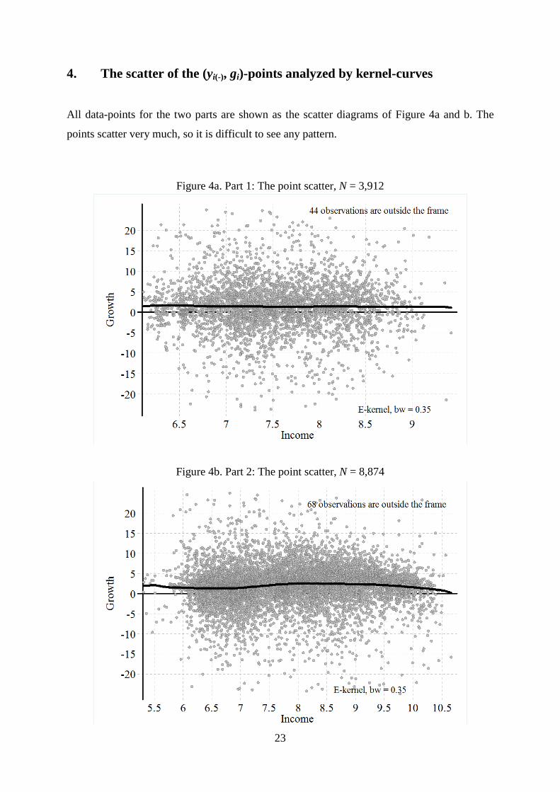
All data-points for the two parts are shown as the scatter diagrams of Figure 4a and b. The
points scatter very much, so it is difficult to see any pattern.
Figure 4a. Part 1: The point scatter, N = 3,912
Figure 4b. Part 2: The point scatter, N = 8,874
23

The wild scatter means that any simple pattern, such as the one discussed, will explain a
modest part of the variation only. This was amply confirmed by the 10 polynomial regres-
sions in Table 4, which certainly obtain very low R2 scores.
The point scatters on Figures 4a and b are provided with a kernel regression using the
Epanechnikov kernel (E-kernel), with a bandwidth of 0.35 (bw = 0.35). TYhis is the bold
black curve. Other bandwidths are analyzed in section 7. The kernel shows the (smoothed)
path of the average – using a fixed bandwidth. In spite of the wild scatter the graphs confirm
the regressions in Table 4 and add some points for further investigation:
To see these points more clearly, Figure 5a and b are presented. They delete the points
of the scatter and concentrate on the kernel. This allows a great enlargement of the vertical
axis, and the 95% confidence interval is added. It is the gray lines around the kernel.
For Part 1 the kernel shows a rather straight line with a negative slope. However, the
slope is barely significant as it is almost possible to draw a horizontal line within the 95%
confidence lines. This is precisely the same as found by the regression analysis.
However Figure 5b is another matter. Thanks to the large data-sample the 95%
confidence interval around the curve is rather narrow. There is no way to draw a straight line
within the confidence interval. The non-linear curve has four features:
Figure 5a. Part 1: The kernel-curve from Figure 4a, N = 3,912
24
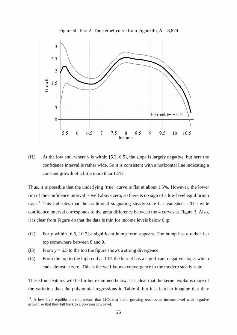
Figure 5b. Part 2: The kernel-curve from Figure 4b, N = 8,874
(f1) At the low end, where y is within [5.3, 6.5], the slope is largely negative, but here the
confidence interval is rather wide. So it is consistent with a horizontal line indicating a
constant growth of a little more than 1.5%.
Thus, it is possible that the underlying ‘true’ curve is flat at about 1.5%. However, the lower
rim of the confidence interval is well above zero, so there is no sign of a low level equilibrium
trap.14 This indicates that the traditional stagnating steady state has vanished. . The wide
confidence interval corresponds to the great difference between the 4 curves at Figure 3. Also,
it is clear from Figure 4b that the data is thin for income levels below 6 lp.
(f2) For y within [6.5, 10.7] a significant hump-form appears. The hump has a rather flat
top somewhere between 8 and 9.
(f3) From y = 6.5 to the top the figure shows a strong divergence.
(f4) From the top to the high end at 10.7 the kernel has a significant negative slope, which
ends almost at zero. This is the well-known convergence to the modern steady state.
These four features will be further examined below. It is clear that the kernel explains more of
the variation than the polynomial regressions in Table 4, but it is hard to imagine that they
14. A low level equilibrium trap means that LICs that starts growing reaches an income level with negative growth so that they fall back to a previous low level.
25
have a R2-score above 0.03, so we are still dealing with a small level of explanatory power.
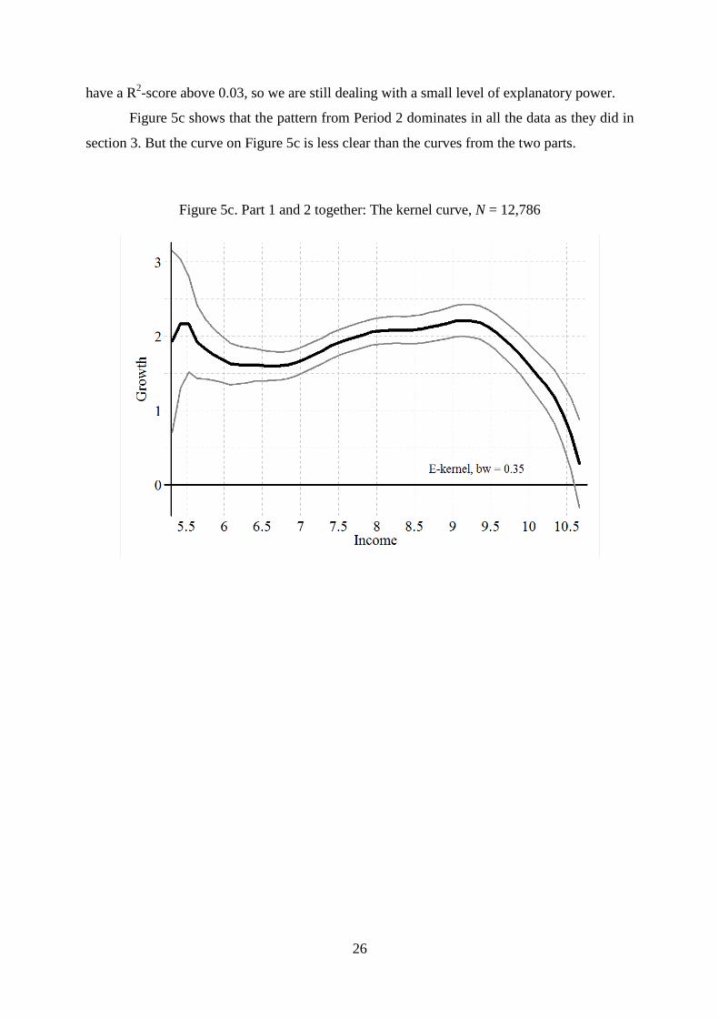
Figure 5c shows that the pattern from Period 2 dominates in all the data as they did in
section 3. But the curve on Figure 5c is less clear than the curves from the two parts.
Figure 5c. Part 1 and 2 together: The kernel curve, N = 12,786
26
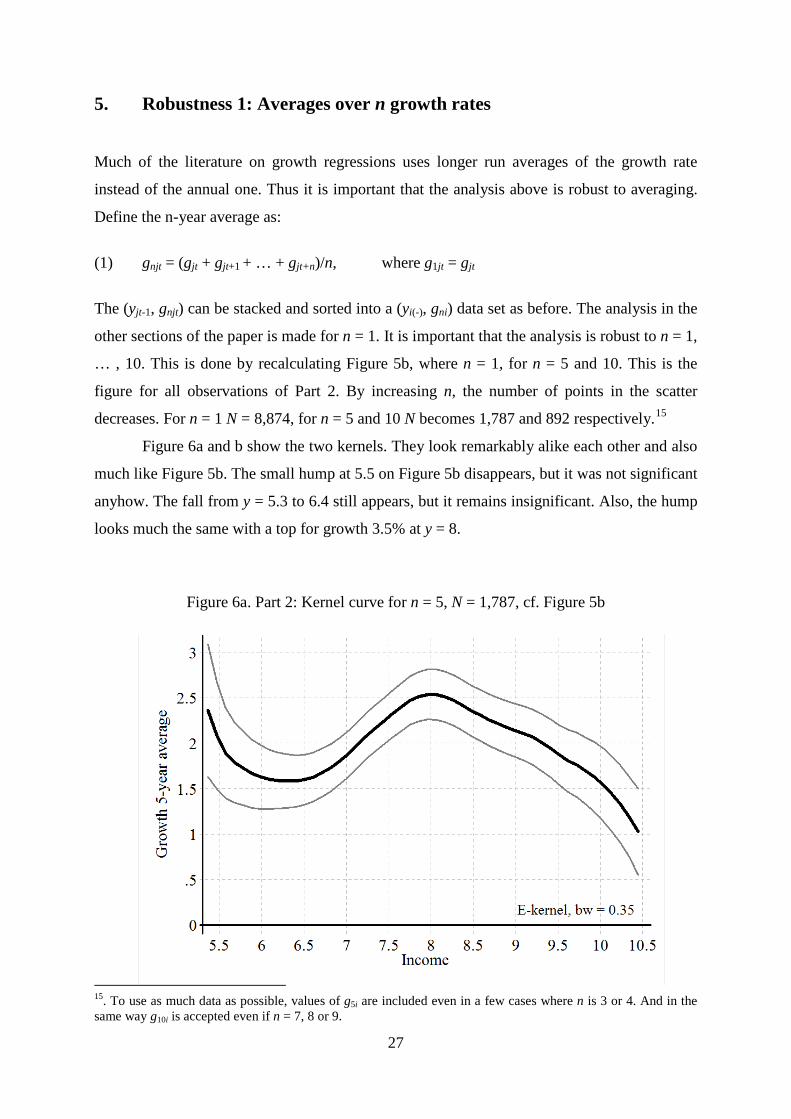
5. Robustness 1: Averages over n growth rates
Much of the literature on growth regressions uses longer run averages of the growth rate
instead of the annual one. Thus it is important that the analysis above is robust to averaging.
Define the n-year average as:
(1) gnjt = (gjt + gjt+1 + … + gjt+n)/n, where g1jt = gjt
The (yjt-1, gnjt) can be stacked and sorted into a (yi(-), gni) data set as before. The analysis in the
other sections of the paper is made for n = 1. It is important that the analysis is robust to n = 1,
… , 10. This is done by recalculating Figure 5b, where n = 1, for n = 5 and 10. This is the
figure for all observations of Part 2. By increasing n, the number of points in the scatter
decreases. For n = 1 N = 8,874, for n = 5 and 10 N becomes 1,787 and 892 respectively.15
Figure 6a and b show the two kernels. They look remarkably alike each other and also
much like Figure 5b. The small hump at 5.5 on Figure 5b disappears, but it was not significant
anyhow. The fall from y = 5.3 to 6.4 still appears, but it remains insignificant. Also, the hump
looks much the same with a top for growth 3.5% at y = 8.
Figure 6a. Part 2: Kernel curve for n = 5, N = 1,787, cf. Figure 5b
15. To use as much data as possible, values of g5i are included even in a few cases where n is 3 or 4. And in the same way g10i is accepted even if n = 7, 8 or 9.
27
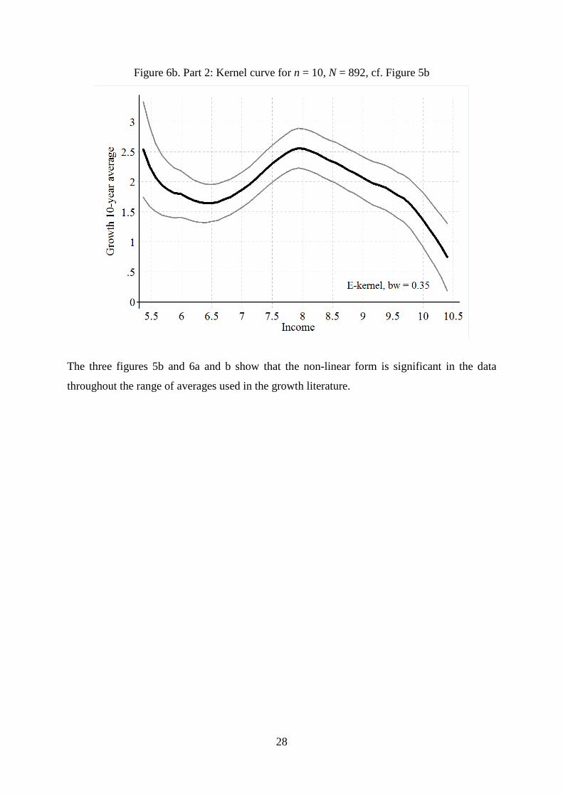
Figure 6b. Part 2: Kernel curve for n = 10, N = 892, cf. Figure 5b
The three figures 5b and 6a and b show that the non-linear form is significant in the data
throughout the range of averages used in the growth literature.
28

6. Robustness 2: The 6 decades 1950 to 2010
The pattern on figure 5b is broken up in the 6 decades on the 6 small graphs of Figure 7. The
hump-form is much as in Figure 5b and Figures 7a, b, c and f. The four curves support the
idea that the average is flat for low y-values. The last two decades are special.
Figure 7. Part 2: For each of the six decades, cf. Figure 5b
7a. Decade 1950-60 7b. Decade 1960-70
7c. Decade 1970-80 7d. Decade 1980-90
7e. Decade 1990-2000 7f. Decade 2000-10
29
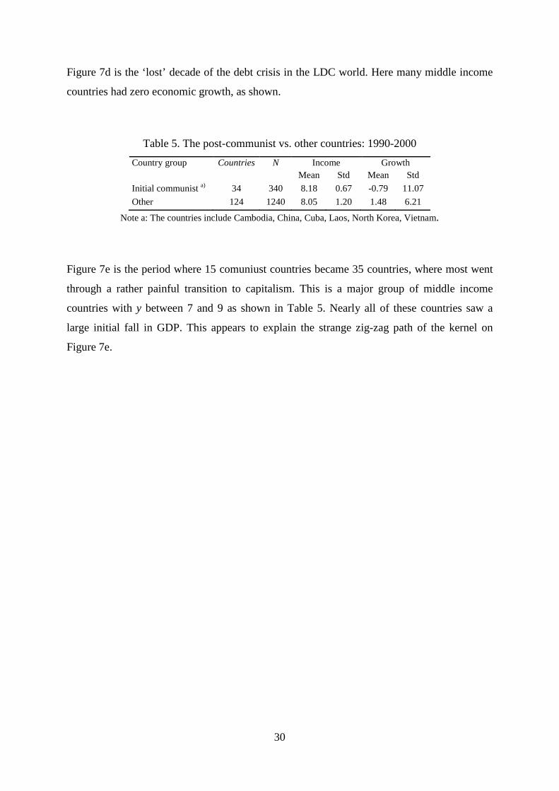
Figure 7d is the ‘lost’ decade of the debt crisis in the LDC world. Here many middle income
countries had zero economic growth, as shown.
Table 5. The post-communist vs. other countries: 1990-2000
Country group Countries N Income Growth Mean Std Mean Std Initial communist a) 34 340 8.18 0.67 -0.79 11.07 Other 124 1240 8.05 1.20 1.48 6.21
Note a: The countries include Cambodia, China, Cuba, Laos, North Korea, Vietnam.
Figure 7e is the period where 15 comuniust countries became 35 countries, where most went
through a rather painful transition to capitalism. This is a major group of middle income
countries with y between 7 and 9 as shown in Table 5. Nearly all of these countries saw a
large initial fall in GDP. This appears to explain the strange zig-zag path of the kernel on
Figure 7e.
30
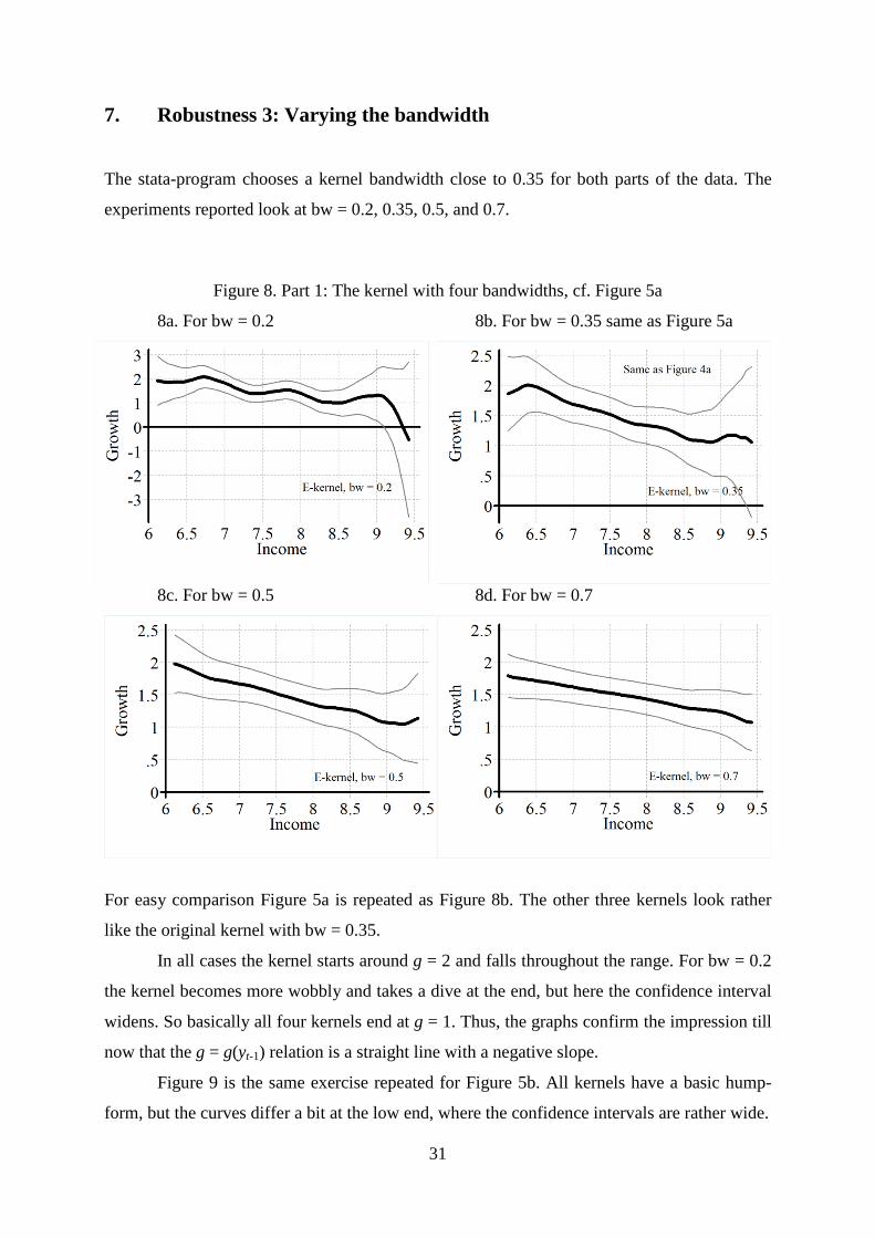
7. Robustness 3: Varying the bandwidth
The stata-program chooses a kernel bandwidth close to 0.35 for both parts of the data. The
experiments reported look at bw = 0.2, 0.35, 0.5, and 0.7.
Figure 8. Part 1: The kernel with four bandwidths, cf. Figure 5a
8a. For bw = 0.2 8b. For bw = 0.35 same as Figure 5a
8c. For bw = 0.5 8d. For bw = 0.7
For easy comparison Figure 5a is repeated as Figure 8b. The other three kernels look rather
like the original kernel with bw = 0.35.
In all cases the kernel starts around g = 2 and falls throughout the range. For bw = 0.2
the kernel becomes more wobbly and takes a dive at the end, but here the confidence interval
widens. So basically all four kernels end at g = 1. Thus, the graphs confirm the impression till
now that the g = g(yt-1) relation is a straight line with a negative slope.
Figure 9 is the same exercise repeated for Figure 5b. All kernels have a basic hump-
form, but the curves differ a bit at the low end, where the confidence intervals are rather wide.
31
Figure 9. Part 2: The kernel with four bandwidths, cf. Figure 5b
9a. For bw = 0.2 9b. For bw = 0.35 same as Figure 5b
9c. For bw = 0.5 9d. For bw = 0.7
In all cases the top of the kernel is around 8. The convergence of the rich countries is rather
strong throughout, but the divergence to the left of the top is a bit less clear. However, for the
two largest bandwidths the wobble for the poorest countries goes away.
As Stata chooses 0.34 it is worth to consider this choice. Clearly a higher choice such
as 0.5 makes the kernel simpler in form and thus easier to read, while lower bws make the
kernel more wobbly. It is interesting if the extra wobbles makes sense. However, the key
observation is that the basic picture is almost the same from 0.30 to o.0.5 and fairly similar all
the way from 0.2 to 0.7.
32

8. Getting wealthy from resource rent
As mentioned in section 2, some countries become rich from resource rent without a Grand
Transition. Above we have considered the univariate relation gi = g(yi(-1)). Now one more
variable enters. It is, ri, the share of y generated by resource rent. It enters in a complex way,
as resource rent typically enters through the treasury as a resource tax. It is partly passed on to
people in the form of transfers, and partly used to finance some parts of the transition, i.e., it
accumulates in the form of physical capital, such as buildings and infrastructure, and
gradually also in the form of human capital. However, the full accumulation of skills and the
transition in all fields that constitutes the Grand Transition is a very complex process. Thus, it
requires detailed data to explain how the resource rent enters into the relation analyzed.
To stay within the simple framework used, we have simply used OPEC membership to
sort the data. Table 6 lists the present and past members of OPEC. 563 observations of the
8,878 from Part 2 are for OPEC countries.
The OPEC observations are used for Figure 10a. 563 observations are too few for a
full randomization of countries and time, so it is less reliable than the other kernel-curves
reported. The OPEC kernel shows a rather clear case of convergence: It has a negative slope
throughout, and it even intersects the horizontal axis a little above the middle, so the conver-
gence is to y = 9.3. Clearly, oil-countries have a growth problem. It explains the difference
between Figure 5b and Figure 10b.
When the OPEC observations are deleted from the data, Figure 10b results. It is
almost the same as Figure 5b, except at the high end. The non-oil kernel does not go down as
much as when data includes all countries. As the high end is where the most resource rich
countries are concentrated, this is precisely where the difference should appear. In the rest of
the range the oil-countries are just a few observations among many.
Table 6. OPECs list of present and past members
Country From To Country From To Algeria 1969 Now Kuwait 1960 Now Angola 2007 Now Libya 1962 Now Ecuador 1973 1992 Nigeria 1971 Now Ecuador 2007 Now Qatar 1961 Now Gabon 1975 1995 Saudi Arabia 1960 Now Indonesia 1962 2009 UAE 1967 Now Iran 1960 Now Venezuela 1960 Now Iraq 1960 Now 15 countries 563 observations
Source: OPEC home page at URL: http://www.opec.org/opec_web/en/about_us/24.htm.
33
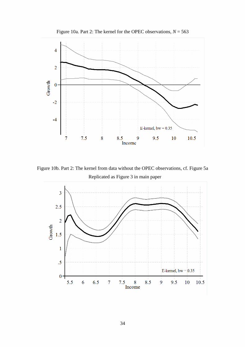
Figure 10a. Part 2: The kernel for the OPEC observations, N = 563
Figure 10b. Part 2: The kernel from data without the OPEC observations, cf. Figure 5a
Replicated as Figure 3 in main paper
34

9. The standard deviation of the growth rate as a function of income
To analyze the variation in the growth rate, we have calculated a moving standard deviation
(yi(-), gi), where n is the number of observations used in the calculation. Below we use n = 11.
The (yi, sni)-series is made and analyzed as follows:
(1) The (yi(-), gi)-series is sorted by y as before.
(2) Then the gi-series is replaced by the standard deviation s11(gi-5, gi-4, ..., gi, ..., gi+5).
Hereby the first 5 and the last 5 observations in the series are lost.
(3) Finally, the (yi, s11i)-series is analyzed by the same kernel-technique as before.
Note that the (yi, s11i)-series uses 11 observations for the calculations of the std. We have also
made the calculations with 51 observations, but it had no visible effects on the std-kernels
shown. We first look at the std-kernel corresponding to Figure 5a.
Here the pattern is rather dull. Though it is not a fully flat and horizontal curve, it does
not deviate much. However, when the same exercise is repeated for Part 2 of the data, an
interesting pattern appears. The std-kernel has a clear path. It increase till the peak that occurs
at y = 7.2, well before the growth peak, and then it falls.
Figure 11a. Part 1: The std-kernel, cf. Figure 5a
35
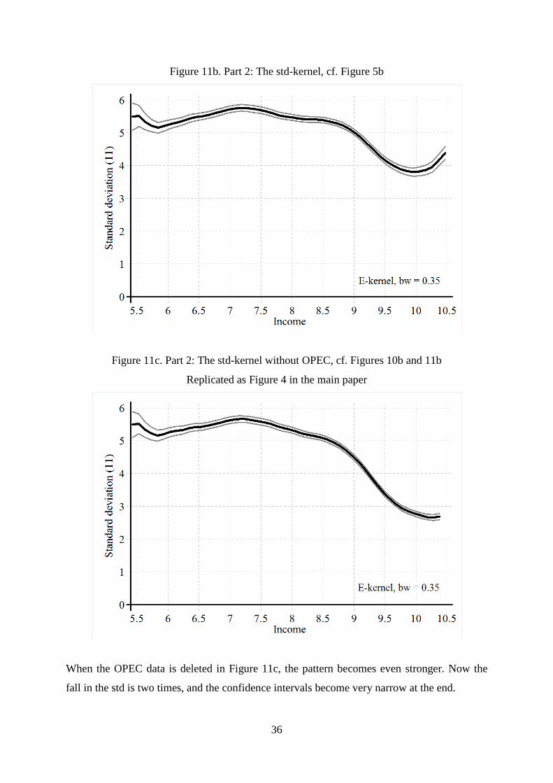
Figure 11b. Part 2: The std-kernel, cf. Figure 5b
Figure 11c. Part 2: The std-kernel without OPEC, cf. Figures 10b and 11b
Replicated as Figure 4 in the main paper
When the OPEC data is deleted in Figure 11c, the pattern becomes even stronger. Now the
fall in the std is two times, and the confidence intervals become very narrow at the end.
36
10 Conclusions
The above analysis is done using a technique chosen to be as a-theoretical as possible. We
hope the reader will agree that the analysis builds on few assumptions. This allows us to draw
rather strong conclusions about economic theory.
Part 1 of the data, before 1950, is a sample of countries that is heavily concentrated on
Western countries. It is therefore unrepresentative as shown.
Part 2 of the data, after 1950, is a rather full sample covering countries with more than
95% of the world population. Here the data shows a rather strong transition that is especially
clear when the OPEC countries are deleted: this gives Figures 10b and 11c that are the
‘premium’ figures in the paper.
Poor countries (LICs) have a moderate and unstable growth. However, the growth is
still at an average rate of 1.6% per year. So the stagnating traditional economy is all but gone
in the world of today.16
Rich countries (HICs) have a growth rate of much the same 1.6 as well. The variation
around that growth is much smaller than the one for the LICs and the MICs.
Middle-income countries (MICs) have higher growth with on average 1 percentage
point. The peak is rather flat, and on Figure 9a and Figure 10b it appears that it is somewhere
between y = 8 to 9. Here growth is rather variable, but rapidly falling as income increases.
An average excess growth rate of 1% reduces the gap to the top by 2.7 times over a
century, which is 1 logarithmic point. The difference from the poorest to the richest countries
is 4 logarithmic points. So the full process will take 400 years. However, the variation is
large, so some countries do it much faster and others not at all.
With all said, our analysis shows why the group of high income countries keeps
increasing.
16. However, the world still has about 10 countries where gdp is lower in 2010 than in 1950.
37