the packaging issue | caffeine | eng
TRANSCRIPT

Periodic journal focused on issues related to marketing, communication and design. Every
new season, a different topic analyzed by MADFACTORY.
MADFACTORY is an independent marketing research and design agency, active in the fields of marketing, international qualitative market research, branding and visual communication.
T H E PA C K A G I N G I S S U E
“This object is constituted of a series of modulated containers in the form of an orange section placed in a circle around a central vertical axis on which each section rests on its straight side, with all the curved
sides turned towards the outside, giving the whole a global form, a kind of sphere”.—
BRUNO MUNARI, THE PERFECT PACKAGING
Outer packing
Exact and definitive placement of the
modulated containers
Free form seed
Padding layer
WINTER 2013—2014
CAFFEINE2 THE PACKAGING ISSUE
Index INTRO In-store consumer behaviour is not only aimed at finding information but also those feelings and sensations linked to purchase and consumption expectations: therefore, the packaging design should be given particular importance as well as its effectiveness in communicating this set of feelings to consumers. The perceived value builds a strong mental image, reinforcing the
shopping experience, the moment of consumption and, ultimately, customer fidelization towards the product and the brand.This issue is dedicated to packaging: a capital design tool that marketing experts could use to inform people and make them aware of the product or brand and, above all, fundamental to build and strengthen brand identity.
14 Practical utility, aesthetic quality and sustainability: these are the new packaging design
12 Packaging and Christmas: when the product dresses up for an important occasion
16 Music Packaging Design: turning an object into an experience
3 Packaging in pharmacies: a key element in the purchase process and complex planning system
6 Living an experience: a sensorial immersion between marketing and packaging
8 Product Line Extension of Private Labels: a picture of the shelf
18 PAK© — PACKAGING AID KIT: a new service by MAD FACTORY. Based on the User Centered Design approach, it is addressed to those companies who are willing to re-design or refine their products packaging, with no loss of resources, money, time.

3 CAFFEINETHE PACKAGING ISSUE
by adopting marketing and communication tools typical of other sectors. Within the scope of a continuously evol-ving marketing mix, packaging becomes a tool for quality sa-les: it supports both the pro-duct and brand in the posi-
tioning process, covering an essential role in the customer’s purchase phase.
The pharmacy is definitively a difficult place whe-re to spur sales, because the relationship con-sumer-product is generally less confidential and communicative: the quite formal environment
The pharmacy: once a health resort, where peo-ple looked for a remedy for their illnesses, today a real wellness shop, where satisfying the heal-th fanatic tendency of Italian people is possible. Inserted into a competitive crowded and varied arena, the pharmacy, therefore, had to adapt to this new idea of conceiving purchases
Packaging has become an important distinctive element in the choice of products. Its importance becomes fundamental where the differences among consumers needs, legislative obligations, demand for drugs and doctors and the priorities of companies are various and different one from the other.
Packaging in pharmacies: a key element in the purchase process and complex planning system.
4 CAFFEINETHE PACKAGING ISSUE
PACKAGING IN PHARMACIES: A KEY ELEMENT IN THE PURCHASE PROCESS AND COMPLEX PLANNING SYSTEM.
into choices not always easily understandable without knowing the background from which they originate.
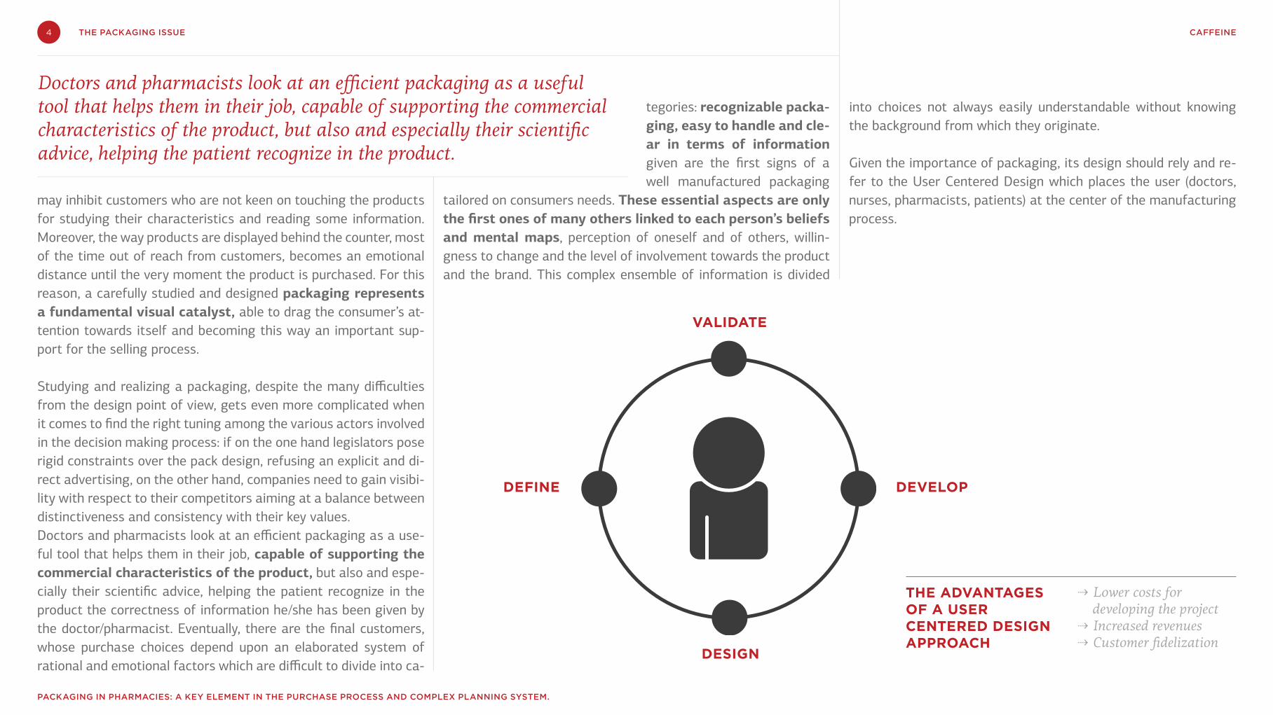
Given the importance of packaging, its design should rely and re-fer to the User Centered Design which places the user (doctors, nurses, pharmacists, patients) at the center of the manufacturing process.
may inhibit customers who are not keen on touching the products for studying their characteristics and reading some information. Moreover, the way products are displayed behind the counter, most of the time out of reach from customers, becomes an emotional distance until the very moment the product is purchased. For this reason, a carefully studied and designed packaging represents a fundamental visual catalyst, able to drag the consumer’s at-tention towards itself and becoming this way an important sup-port for the selling process. Studying and realizing a packaging, despite the many difficulties from the design point of view, gets even more complicated when it comes to find the right tuning among the various actors involved in the decision making process: if on the one hand legislators pose rigid constraints over the pack design, refusing an explicit and di-rect advertising, on the other hand, companies need to gain visibi-lity with respect to their competitors aiming at a balance between distinctiveness and consistency with their key values. Doctors and pharmacists look at an efficient packaging as a use-ful tool that helps them in their job, capable of supporting the commercial characteristics of the product, but also and espe-cially their scientific advice, helping the patient recognize in the product the correctness of information he/she has been given by the doctor/pharmacist. Eventually, there are the final customers, whose purchase choices depend upon an elaborated system of rational and emotional factors which are difficult to divide into ca-
tegories: recognizable packa-ging, easy to handle and cle-ar in terms of information given are the first signs of a well manufactured packaging
tailored on consumers needs. These essential aspects are only the first ones of many others linked to each person’s beliefs and mental maps, perception of oneself and of others, willin-gness to change and the level of involvement towards the product and the brand. This complex ensemble of information is divided
VALIDATE
DESIGN
DEVELOPDEFINE
THE ADVANTAGES OF A USER CENTERED DESIGN APPROACH
⇢ Lower costs for developing the project
⇢ Increased revenues⇢ Customer fidelization
Doctors and pharmacists look at an efficient packaging as a useful tool that helps them in their job, capable of supporting the commercial characteristics of the product, but also and especially their scientific advice, helping the patient recognize in the product.
5 CAFFEINETHE PACKAGING ISSUE
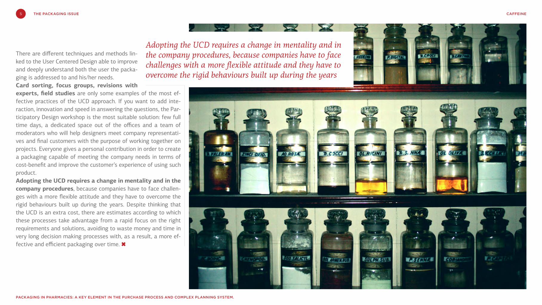
Adopting the UCD requires a change in mentality and in the company procedures, because companies have to face challenges with a more flexible attitude and they have to overcome the rigid behaviours built up during the years
There are different techniques and methods lin-ked to the User Centered Design able to improve and deeply understand both the user the packa-ging is addressed to and his/her needs. Card sorting, focus groups, revisions with experts, field studies are only some examples of the most ef-fective practices of the UCD approach. If you want to add inte-raction, innovation and speed in answering the questions, the Par-ticipatory Design workshop is the most suitable solution: few full time days, a dedicated space out of the offices and a team of moderators who will help designers meet company representati-ves and final customers with the purpose of working together on projects. Everyone gives a personal contribution in order to create a packaging capable of meeting the company needs in terms of cost-benefit and improve the customer’s experience of using such product. Adopting the UCD requires a change in mentality and in the company procedures, because companies have to face challen-ges with a more flexible attitude and they have to overcome the rigid behaviours built up during the years. Despite thinking that the UCD is an extra cost, there are estimates according to which these processes take advantage from a rapid focus on the right requirements and solutions, avoiding to waste money and time in very long decision making processes with, as a result, a more ef-fective and efficient packaging over time. ✖
PACKAGING IN PHARMACIES: A KEY ELEMENT IN THE PURCHASE PROCESS AND COMPLEX PLANNING SYSTEM.
6 CAFFEINETHE PACKAGING ISSUE
In a market context where consumption responds mainly to irrational impulses, the purchase is caused by various emotional, psychological and subjective factors that influence the choice path.
Walking through a supermarket’s aisle, the eye may fall for a nice color package, lively, which may drive us to stop. We stare at it to under-stand its content, we feel visually attracted and tempted. The naming is large and fun, the pi-cture of a nice golden cookie and drops of hot chocolate make us wonder when our palate will meet that sweet taste.
This is called synesthesia: making people day-dream through a picture, tempting with words, causing to taste with the mind, creating certain expectation at the very moment we grab the packaging.
But what exactly is synesthesia? The word comes from the Greek “syn” = together and “ai-sthanestai” = perceive. The meanings are diver-se: physiological, psychological, linguistic – and they go around the concept of contamination
of the senses in per-ception: it indicates a phenomenon of fun-ctional synchronism
between two organs of the senses after stimu-lating only one of them. Synesthesia becomes a rhetorical figure in literature: a clear example is used by the hermetic poet Salvatore Quasi-modo in the verse of the poem On the Willow Branches when he talks about the «black howl of the mother»: the phrase, interrupted by two enjambment, contains the synesthesia "black howl" to represent the terrible and gloomy pain of a mother who finds the body of her dead son. The scream is associated with a color, i.e. a vi-sual reference instead of auditory, as one would usually expect from the description of a sound. The choice of a dark, grim color can effectively convey the sense of anguish, pain and agony the woman felt.
The latest marketing theories give synesthesia a prominent place in terms of purchasing: in a market context where consumption responds
mainly to irrational impulses, the purchase is caused by various emotional, psychological and subjective factors that influence the choice path. Therefore, companies have a powerful tool to build and consolidate their own image in the mind of consumers, fascinating them not only in the functional and product area, but also, and mainly through their sensorial sphere, i.e. the one more deeply sensitive to external stimuli. For a long time, the theory has promoted a bro-ader Marketing vision, together with the tradi-tional studies about Emotional and Multisensory Marketing. The former tries to show, stimulate and understand the most hidden and sometimes unconscious desires of the human being, modi-fying them in terms of demands and primary ne-eds and individualizing the perceptive universes created by consumers around products, servi-ces and brands. The second one is based on the sensorial stimuli activated in the consumer at the decision making moment and on its strategic effort. Multi sensorial communication widens and extends its own focal point, stimula-ting the five senses of the consumer with a dee-
Living an experience: a sensorial immersion between marketing and packaging

7 CAFFEINETHE PACKAGING ISSUE
LIVING AN EXPERIENCE: A SENSORIAL IMMERSION BETWEEN MARKETING AND PACKAGING
Even packaging can translate synesthetic language into emotions: through the correct use of the intrinsic stimuli, the packaging may tell beautiful, fascinating stories and with many suggestions
per cognitive plan.
Multisensory communication usually resorts to the use of syne-sthetic languages, relating two or more sensorial systems: copywri-ters usually play with expressions that elicit emotions in the consumer, who is immediately driven to create subjective mental connections and associations that are related to their own mood. A classic example of this is the “velvety wine” association, where the tactile adjective “velvety” creates in the mind of the consumer the image of tasting with intensity a soft wine with body, just as if they were already tasting it, and thus driving the mind to a he-donistic pleasure. Even video advertising takes good advantage of synesthetic language to create a deeper and more emotio-nal relationship with the viewer: thanks to emotional contami-
them should be able to describe the same world with coherence and balance. Images are usually the main characters of the packa-ging, with their ability to capture the look and the attention of the people, spreading their own message and having an influence of the consumption expectations of the product. Last, but not least, the material used to make the packaging: the tactile percep-tion, in harmony with the above mentioned elements, should give a pleasant feeling able to cause the desire for the product and the impulse to buy. Through tact, the material of which the product is made, talks with the consumer, providing feelings and gi-ving information such as handmade production, what’s genuine in the case of food, modern character and reliability in a hi-tech production or precision and exclusiveness in the case of a luxury product.
Baudelaire said: “sounds respond to colors, colors to perfumes”.All of this for that unique moment when the product will be placed on a shelf and will have to be chosen, one among so many. ✖
nation and to the affective/sensorial strings, the ra-tional receptors of judg-ment are brought, and the psycho-physical desires of the individual are stimulated (shivering, the need to eat, the desire for hot or cold, thirst, the desire for a nice contact). In this case, the stimulus can also be brought with greater success and charm by the sound that accompanies it and which is sometimes the real center.
Sounds represent a very effective tool to create and define the shopping experience: their stimulation may leverage and elevate the purchasing moment, bringing past emotions, consolidated in time. Smells, for instance, are powerful means of communication thanks to their capacity to linger in memory: a very intense me-mory, which often goes back to childhood, usually associated to positive and authentic memories.Music is also undoubtedly interrelated with emotions, with a uni-que evocative strength: many times, it’s thanks to the melody that brands leave a mnemonic mark in the mind of the consumer, elici-ting empathy and identification. Even packaging can translate synesthetic language into emotions: through the correct use of the intrinsic stimuli — i.e. naming and design — the packaging may tell beautiful, fascinating stories and with many suggestions: the naming should be tempting and it should explain the product; the design should be adequate to the chromatic and typographic choices and it should give a well-de-fined identity to the brand and product. The colors of the pack must be chosen carefully, thinking about the emotions and me-anings they elicit; the material used and the smells coming from
8 CAFFEINETHE PACKAGING ISSUE
Born in the 80’s , during the Economic English Crisis, with only one value for the consumer, na-mely saving money, Private Labels have grown along a path marked out, compared with the most historic brands, most of the time, with suc-cess. After more than 30 years of their entry into the market, they are newly faced with another economic crisis leading many families to make them turn to cheaper segments of expenditure.Despite of this, the nowadays Private Labels face the market with a new look: the obsole-te White Label that simply used to illustrate the type of product with no further indication or ae-sthetic appeal, became, through the years, more complete: with the addition of nutritional infor-mation , usage tips , and other explanations re-garding the product. Packaging becomes, even for Private Label, a fundamental element of communication, able to create value and in-crease its visibility on the shelf . A competition
which is no longer based only on the price , but well on the aesthetics of the product: the Private Label conveys , throu-
gh the packaging and its communication , new value to the consumer who becomes more aware and looks at the brand with a critical eye. The brands, indeed, place themselves in a broa-der view of the market, where consumers have, a long time ago, started to figure out a new line of consumption: on the one hand, there is the downshifting tendency and the Low Cost philo-sophy as a real lifestyle and, on the other hand, there is an ongoing search for personal gratifica-tion , quality, premiumness. Every single purcha-se and its value is weighted by the consumer on the basis of economic, qualitative, emotional and useful parameters.
In this scenario, putting aside the strategy that consisted in copying the leading brands in the market, Private Labels are now trying to as-sert their own communication identity.On the basis of this introductory statement, it
is interesting to investigate the line extension procedure that the main Italian brands have been pursuing over the years. A brief analysis shows a common feature to all Pri-vate Labels: they have indeed expanded their pro-duct range over the years , starting from the basic range of products to more specific and strategic ones as for example organic and functional food, premium range, the range dedicated to childhood and the one dedicated to health condition.
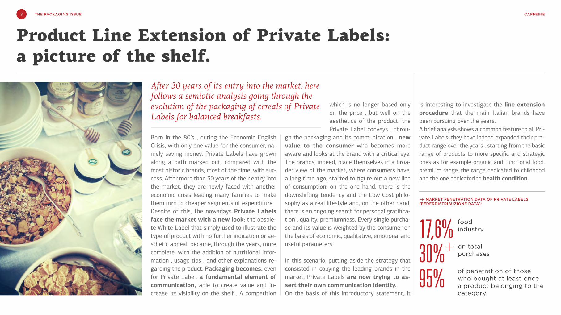
After 30 years of its entry into the market, here follows a semiotic analysis going through the evolution of the packaging of cereals of Private Labels for balanced breakfasts.
Product Line Extension of Private Labels: a picture of the shelf.
⇢ MARKET PENETRATION DATA OF PRIVATE LABELS [FEDERDISTRIBUZIONE DATA]:
food industry
on total purchases
of penetration of those who bought at least once a product belonging to the category.
17,6%30%+
95%

9 CAFFEINETHE PACKAGING ISSUE
PRODUCT LINE EXTENSION OF PRIVATE LABELS: A PICTURE OF THE SHELF.
Thanks to this product line extension, the private labels evolved and consequently, they are no longer associated to the logic of first price . If we take the wellness product range for example, it is obvious that despite the economic crisis, the health issue is still one of the main criteria that influences the Italian consumer’s behavior.
While observing the breakfast cereals category, it doesn’t take that much to realize the big efforts the private labels are making in this sector to differentiate themsel-ves from leading brands. Her follows an analysis of the fol-lowing packs : Kellogg's Spe-cial K , leader on the market in terms of market share, brand awareness but also solid com-munication and, products of the leading supermarket brands on the Italian territory like Benesì of Coop Supermarket, Equili-brio of Esselunga and PiacerSì of Conad
All the four brands present their product in a cardboard box that protects the internal plastic envelope containing the flakes. The presence of the box is not only functional but also a visual (primary area) whi-ch function is to persuade the
create and strengthen the relationship with its consumers throu-gh informal communication, eye-catching elements and tips dedi-cated to them. One can determinate the premium value and the leading position of a brand on the market by observing this secon-dary area which is, most of the time, well-finished and is very de-tailed. The Special K case study proves this theory: the secondary area of this product has been filled in down to the last details and it contains a wide range of additional visual elements.
A first important element con-nected to the strategic marke-ting positioning is the huge im-portance given to the name of the product. Kellogg's proposes one single name to the product which is then declined in seve-ral variations according to dif-ferent taste and different kind of product (flakes and bars), and it exploits the historic va-lue of the brand: although dif-ferent, the product name is clo-sely connected with the brand. It originates from a direct no-minal-linguistic “recall” through the use of the same lettering and trick to define it: Special K = Special Kellogg's.Private labels products have no identification names and they distinguish themselves through
consumer and present the brand, the logo and the name of the product through visual elements would them be of figurative natu-re (eg. Conad) or abstract one (eg. Esselunga). The product images pull for the selling , by stimulating - in a more or less effective way - the buying intention of the consumer. As the secondary area is concerned, the one located in the back of the box, it performs an informative function about war-ranty and information about how to use the product at its best: the more sophisticated brands successfully exploit this space to

10 CAFFEINETHE PACKAGING ISSUE
the product descriptor. This choice is aimed in reducing their own identity and therefore increasing the strength of the product ran-ge of the brand distributor. The private labels keep a strategy that strengthens the identity of the line extension towards their com-petitors. So, identity as well as the guarantee value transmitted by the brand are more important than the product self. Consequently, they do not present any “independent” product that might over-come the brand. Another difference concerns the naming of the category : in the case of Special K, there is an obvious will to link it mnemonically to the brand without giving any information about its reasonwhy, but well to focus on its being special. The naming of the private labels, on the contrary, need to be much more di-rectly linked to their reasonwhy and therefore they focus as much as possible on the wellness, health and care concepts: here, the purpose is to strengthen the image of the whole wellness range of products, a strategy directly required by the market self.
Very interesting the analysis of colors and graphics : in this case, the private labels preferred to go for very different graphic symbols from the brand leader ones. They do not chose a “me too” strategy but instead, they try to give a real communication identi-ty to their own wellness product range. The same graphic symbols are then present on the whole range of products, along the diffe-rent market segments in which they compete.In Special K, red is the predominant color, although in different nuances throughout the product line: red is the color of the product
info-graphic style that gives to the product a sense of scientific nature and authoritativeness.By using such a color code and visual elements, we have a more asep-tic, formal and less empathetic communication than the one used by the above leading brand. No sensory stimuli to the taste, the sight and the sound (e.g. crunchness typical of this category). The Be-nesì-Coop pack isn’t therefore that much poly-sensorial and it seems that it positions itself between wellness product and functional food. This strategy is even strengthen by the explanation (bottom ri-ght) where one can read the benefits of the product self; a description that pushes the boundaries of its reasonwhy to the specific products
name and the logo , borrowed from the Kellogg's brand, and from the brand sectors that enclose the benefits of the pro-duct. The red color has a value
strongly focused on the brand and serves to keep one’s attention focused on the "more good" characteristic which indicates how tasty the product is but tasty in the sense of healthy rather than greedy. It is also important to emphasize the meaning of the red stripe on the lower part of the box, right side: these information seem to be there to increase the health and genuine value of the product, recalling at the same time the visual effects of a tasty product. The image that Special K conveys is the one of a compromise between health and taste , which is based on the quality in the sense of genuinity , practicity , safety and versatility. The position of the ingredients on the box stren-gthens and consolidates this communication aspect : the product, placed on the spoon, is the perfect synthesis between the genui-neness and tastiness of the raw material ( as recalled by the grain in the lower part-left side) as well as the greediness and natural abundance of the product variety ( red fruit / chocolate in the ri-ght window). Compared with the former pack, here, the feminine silhouette is only mentioned which adds an aesthetic sweetness , softness and sinuosity effect.
Bene-Sì of Coop has somehow adopted the opposite strategy : we have a more minimal design but at the same time in-novative, with “2D” graphism that conveys a sense of modernity but little dynamism. The color code is white , with some shades of blue that are well suited to the blue color of the logo of the brand. The images represent illustrative elements of the product , in an
The private labels keep a strategy that strengthens the identity of the line extension towards their competitors. So, identity as well as the guarantee value transmitted by the brand are more important than the product self.
PRODUCT LINE EXTENSION OF PRIVATE LABELS : A PICTURE OF THE SHELF.

11 CAFFEINETHE PACKAGING ISSUE
The product lines extension and the work done in terms of graphi-cs and communication of Private Labels is the starting point of a new strategic plan that will necessarily be based on the one hand on branding and communicational integration, and on the other hand on awareness and listening to the consumer. What emerges from the analysis of the consumers’ trolleys is that Private Labels are gaining more and more constant and more engaged consu-mers at a ratio-functional level , but not yet totally inspired by "stories" that these brands are able to narrate. ✖
Piacersi of Conads’pack hovers between simplicity and confu-sion : it chooses a not too risky visual and narrative codification which is immediately interpretable: no graphic originality or inno-vation in the figures. In this contest we find some key-visuals : the product and its reference dominate on the box as well as the female figure whose role is to convey the same values shared by the said product category (light weight , wellness, femininity ). The choice of pastel blue for the background color goes in the same
stereotypical direction : it confirms weak personality that seems to want to be hidden on the shelf to avoid the risk of making mi-stakes. An easy way to “fish” inside the semantic tank of the said product category and within its imaginary , but that doesn’t suc-ceed in reaching any primary objective , neither the sensory and hedonistic one nor the functional and specific one: it only emerges the Conad guarantee that lies on the product as a seal only known to the consumer as belonging to the wellness category.
category.
The Equilibrio of Esselunga pack also appears as being fresh and innovative. Unlike its Coop competitor, Esselunga focuses on lightness , brightness , fun and vivacity concepts while not lo-sing a sense of modernity and simplicity. The color codes selected are warm, welcoming and offer to the pack a lot of visibility on the shelf . Even the font of the name is modern and bright, rein-forcing the psycho-physical idea of balance, almost like a yoga ses-
sion; everything is then further strengthened by the decision to use a milky white color as the background color which also guarantees and communicates a sense of lightness, femininity (core target) and allows the other graphic elements to stand out and catch the atten-tion of the consumer. Unlike Coop and Special K , the product is not collected in any spoon : this trick allows the brand to communicate abundance and hedonistic pleasure and at the same time, to balan-ce a pack that otherwise would appear "not very tasty".
PRODUCT LINE EXTENSION OF PRIVATE LABELS : A PICTURE OF THE SHELF.
12 CAFFEINETHE PACKAGING ISSUE
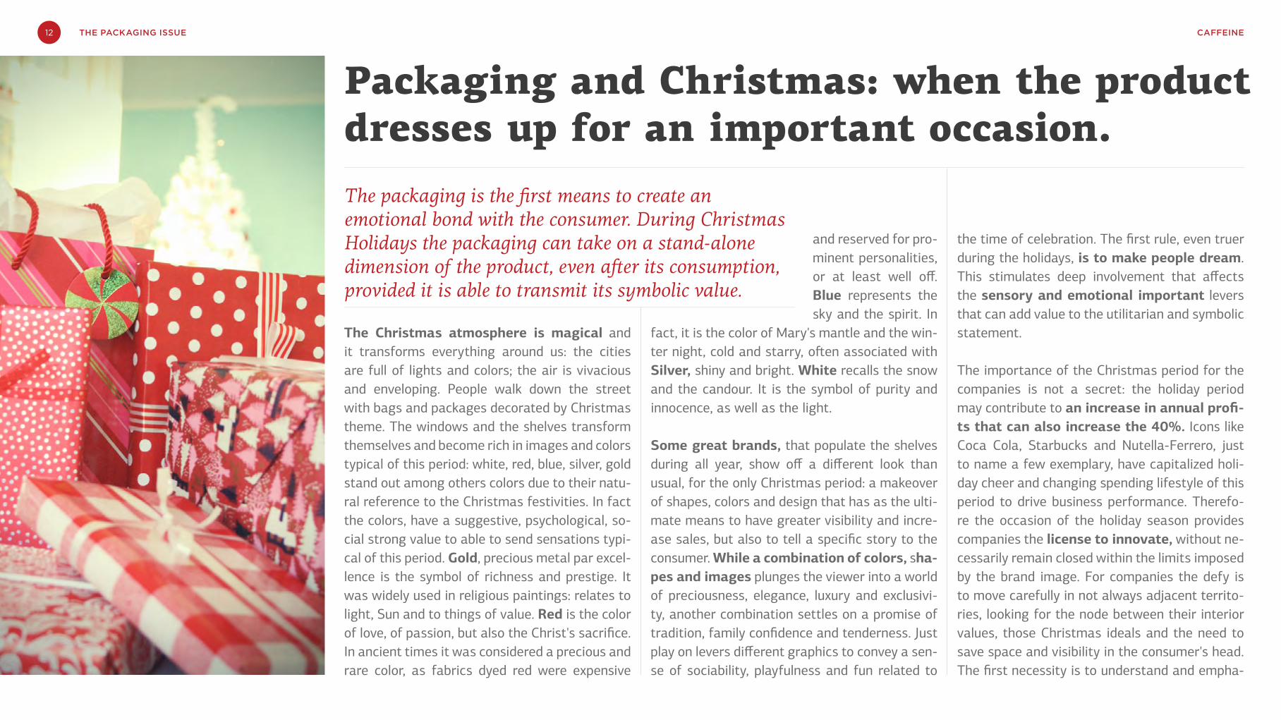
The Christmas atmosphere is magical and it transforms everything around us: the cities are full of lights and colors; the air is vivacious and enveloping. People walk down the street with bags and packages decorated by Christmas theme. The windows and the shelves transform themselves and become rich in images and colors typical of this period: white, red, blue, silver, gold stand out among others colors due to their natu-ral reference to the Christmas festivities. In fact the colors, have a suggestive, psychological, so-cial strong value to able to send sensations typi-cal of this period. Gold, precious metal par excel-lence is the symbol of richness and prestige. It was widely used in religious paintings: relates to light, Sun and to things of value. Red is the color of love, of passion, but also the Christ's sacrifice. In ancient times it was considered a precious and rare color, as fabrics dyed red were expensive
and reserved for pro-minent personalities, or at least well off. Blue represents the sky and the spirit. In
fact, it is the color of Mary's mantle and the win-ter night, cold and starry, often associated with Silver, shiny and bright. White recalls the snow and the candour. It is the symbol of purity and innocence, as well as the light.
Some great brands, that populate the shelves during all year, show off a different look than usual, for the only Christmas period: a makeover of shapes, colors and design that has as the ulti-mate means to have greater visibility and incre-ase sales, but also to tell a specific story to the consumer. While a combination of colors, sha-pes and images plunges the viewer into a world of preciousness, elegance, luxury and exclusivi-ty, another combination settles on a promise of tradition, family confidence and tenderness. Just play on levers different graphics to convey a sen-se of sociability, playfulness and fun related to
the time of celebration. The first rule, even truer during the holidays, is to make people dream. This stimulates deep involvement that affects the sensory and emotional important levers that can add value to the utilitarian and symbolic statement.
The importance of the Christmas period for the companies is not a secret: the holiday period may contribute to an increase in annual profi-ts that can also increase the 40%. Icons like Coca Cola, Starbucks and Nutella-Ferrero, just to name a few exemplary, have capitalized holi-day cheer and changing spending lifestyle of this period to drive business performance. Therefo-re the occasion of the holiday season provides companies the license to innovate, without ne-cessarily remain closed within the limits imposed by the brand image. For companies the defy is to move carefully in not always adjacent territo-ries, looking for the node between their interior values, those Christmas ideals and the need to save space and visibility in the consumer's head. The first necessity is to understand and empha-
The packaging is the first means to create an emotional bond with the consumer. During Christmas Holidays the packaging can take on a stand-alone dimension of the product, even after its consumption, provided it is able to transmit its symbolic value.
Packaging and Christmas: when the product dresses up for an important occasion.
13 CAFFEINETHE PACKAGING ISSUE
PACKAGING AND CHRISTMAS: WHEN THE PRODUCT DRESSES UP FOR AN IMPORTANT OCCASION.
size the field occupied by the brand, to avoid disrupting the bond that it has created over time. A joint approach to analysis of the sector and by competitors from one side creates listening and constant interaction with consumers, on the other hand allows you to find new languages to create value, surprise, and to dream people.
There are no precise and default rules. Each case requires its as-sessment and personal investigation. Christmas is coming and it brings goodness and generosity. Here some hints for compiling the objectives of the next design of Christmas packaging.
⇢ Christmas = WinterYou do not need to symbolize the Christmas transmit its values. The winter has already brought a symbolic important that, unlike the Christmas, has a shelf life longer. The effect of values extends to the early spring.
⇢ Christmas = TaleThe packaging can provide the right space to tell a story that helps consumers create rituals around the brand.
⇢ Christmas = TraditionsThe packaging can easily become itself an element of communi-cation of family traditions
⇢ Christmas = PresentCustomizing today has an increasingly important role in promo-ting a product. During Christmas period even more. The unique-ness and / or the beauty of the pack Christmas can be the lever of purchase.
⇢ Christmas = SeasonalityThe limited-edition packaging is a big margin sale because they create urgency (enormity) of purchase, due to that they live on the shelf for a limited period. Regardless of the product category, the limited-edition allows entry into the premium segment.
⇢ Christmas ≠ ClichésIf the total market uses the same iconography to explain the Christmas, it may be helpful to identify timbre or visual treatmen-ts can convey the values and feelings of the season in a different way, only to differentiate themselves and stand.
⇢ Christmas = ExperiencesThe experience of Christmas period and its led does not end with the packaging. Create the perfect shopping experience, accom-panying the consumer within the story you want to tell through all the levers of marketing (product, packaging, communication and store) can be an effective way to engage people and bring them to feel closer to the brand.
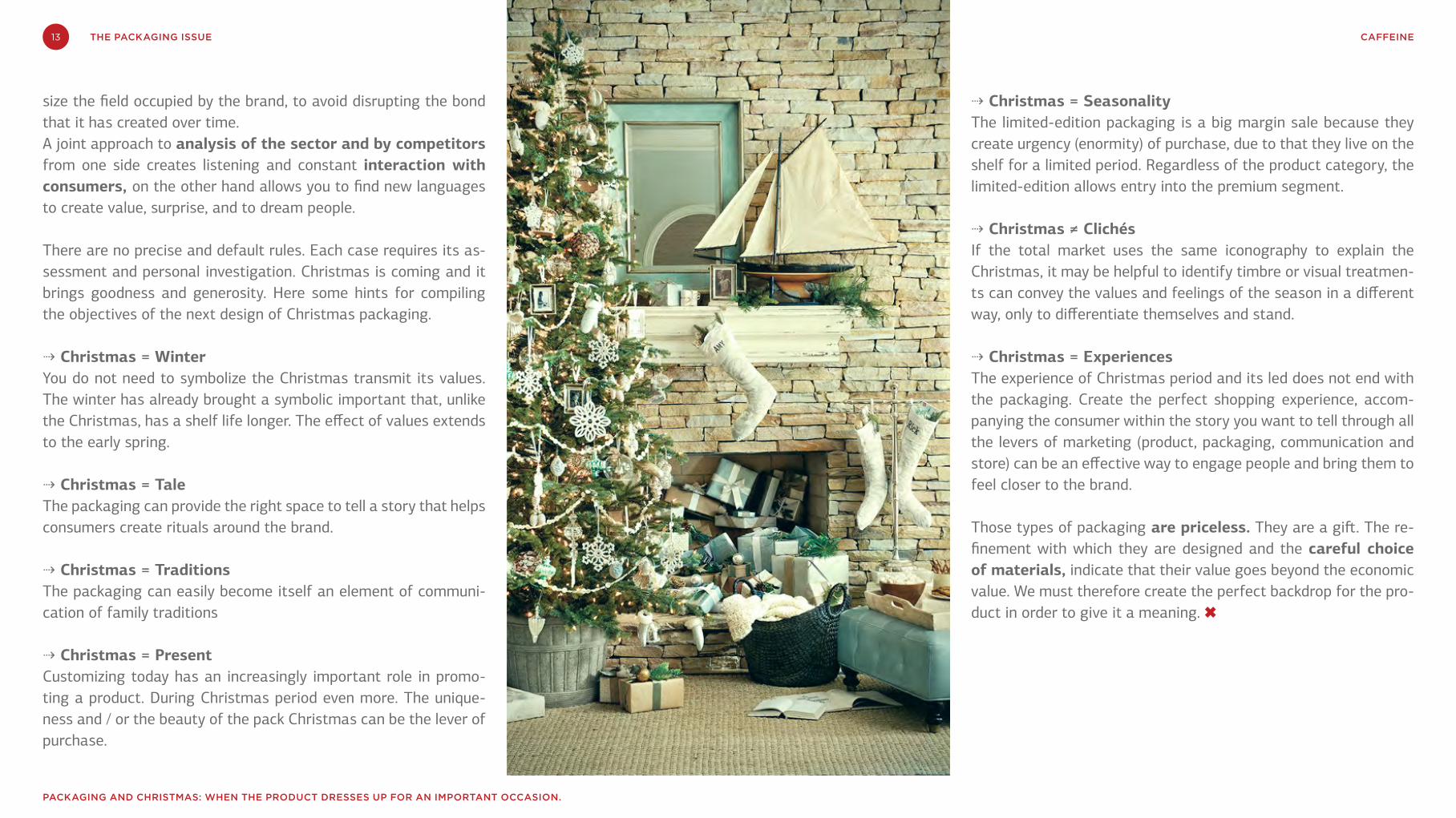
Those types of packaging are priceless. They are a gift. The re-finement with which they are designed and the careful choice of materials, indicate that their value goes beyond the economic value. We must therefore create the perfect backdrop for the pro-duct in order to give it a meaning. ✖
14 CAFFEINETHE PACKAGING ISSUE
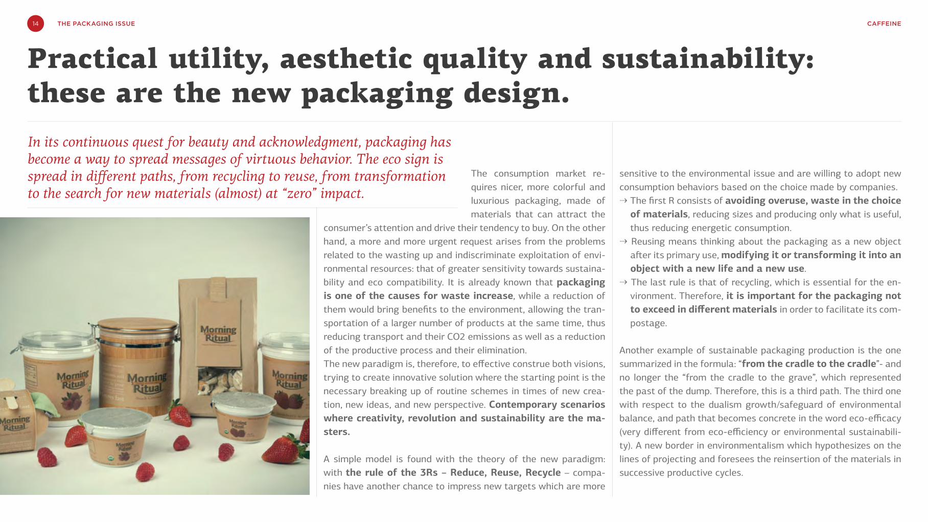
The consumption market re-quires nicer, more colorful and luxurious packaging, made of materials that can attract the
consumer’s attention and drive their tendency to buy. On the other hand, a more and more urgent request arises from the problems related to the wasting up and indiscriminate exploitation of envi-ronmental resources: that of greater sensitivity towards sustaina-bility and eco compatibility. It is already known that packaging is one of the causes for waste increase, while a reduction of them would bring benefits to the environment, allowing the tran-sportation of a larger number of products at the same time, thus reducing transport and their CO2 emissions as well as a reduction of the productive process and their elimination.The new paradigm is, therefore, to effective construe both visions, trying to create innovative solution where the starting point is the necessary breaking up of routine schemes in times of new crea-tion, new ideas, and new perspective. Contemporary scenarios where creativity, revolution and sustainability are the ma-sters.
A simple model is found with the theory of the new paradigm: with the rule of the 3Rs – Reduce, Reuse, Recycle – compa-nies have another chance to impress new targets which are more
sensitive to the environmental issue and are willing to adopt new consumption behaviors based on the choice made by companies. ⇢ The first R consists of avoiding overuse, waste in the choice
of materials, reducing sizes and producing only what is useful, thus reducing energetic consumption.
⇢ Reusing means thinking about the packaging as a new object after its primary use, modifying it or transforming it into an object with a new life and a new use.
⇢ The last rule is that of recycling, which is essential for the en-vironment. Therefore, it is important for the packaging not to exceed in different materials in order to facilitate its com-postage.
Another example of sustainable packaging production is the one summarized in the formula: “from the cradle to the cradle”- and no longer the “from the cradle to the grave”, which represented the past of the dump. Therefore, this is a third path. The third one with respect to the dualism growth/safeguard of environmental balance, and path that becomes concrete in the word eco-efficacy (very different from eco-efficiency or environmental sustainabili-ty). A new border in environmentalism which hypothesizes on the lines of projecting and foresees the reinsertion of the materials in successive productive cycles.
In its continuous quest for beauty and acknowledgment, packaging has become a way to spread messages of virtuous behavior. The eco sign is spread in different paths, from recycling to reuse, from transformation to the search for new materials (almost) at “zero” impact.
Practical utility, aesthetic quality and sustainability: these are the new packaging design.

15 CAFFEINETHE PACKAGING ISSUE
processes, through innovative actions in conditions of impro-ving the operations of storage, display, loading in pallets and in transport means, and of op-timization of the relationship
between primary, secondary and tertiary packaging.5) Facilitation of recycling activities: simplification of the
phases of packaging recovery and recycling, as well as the realization of one-material packaging.
6) Simplification of the packaging system: thanks to the in-tegration of various functions in one packaging component, the system becomes lighter and is rationalized.
Based on the new paradigm, eco-design becomes a projective approach that considers the environmental aspects of the entire lifecycle of a product /services in an integrated view in regard to the rest of the variables to Project, from the extraction of the necessary raw materials to their production during the pha-se use, to reach the final destination at the end of the useful life. The result is opposite to boring, shallow, or of little visual impact. Rather, the adoption of environmentally friendly measures lead to the idea and creation of attractive and emotionally fascinating packaging. For some time already, some companies have understood the potential of eco-design as a purchasing drive and consolidation of the brand identity: new opportunities for the environment and for the companies who are able to propose more innovative, eco-sustainable and virtuous solutions. ✖
La terza via rispetto al dualismo crescita/salvaguardia degli equilibri ambientali, una via che si concretizza nella parola d’ordine della eco-efficacia. Una nuova frontiera dell’ambientalismo che ipotizza la progettazione di filiere che prevedano il reinserimento a monte dei materiali in successivi cicli produttivi.
Therefore, which roads is it necessary to take back in order to pro-duce sustainable packaging?
1) Savings in raw materials: refrainment of the consumption of raw materials used in the production of packaging and the subsequent reduction in weight, achieving the same product and functionalities.
2) Reuse: multiple reuse of the packaging, either for an identi-cal use or for a different one from its original purpose. In this sense, Stanley Honey and Organic Yogurt Strained set the example: the former promotes the use of a honey jug that once finished can be reused as a flower pot, turning the cork lid into a practical plant pot tray; the latter proposes bamboo packs that are renewed into accessories for the house and jars.
3) Use of recycled material: replacement of one part or the entire virgin raw material with recycled materials to contri-bute to a reduction of resource extraction. This has been at-tempted by Ecover, a Belgian company, with its idea of using plastic waste found at sea and on the coasts in order to cre-ate packaging with low environmental impact. In collabora-tion with Logoplaste, they are also working on the creation of Plantastic, a material similar to plastic that comes from sugar cane and is totally eco -friendly.
4) Optimization of logistics: restructuring of the logistic

16 CAFFEINETHE PACKAGING ISSUE
Pearl Jam fans’ jaws dropped when they first got their hands on the band’s album No Code. The first reason was the material: instead of the usual cold, clear, plastic case, the CD came in a case made entirely out of paper (obviously this was nothing revolutionary: paper Digipaks had been around for some time). The second reason was the design: nowhere on the packaging did the artist’s name or the tit-le of the album appear. Instead, there were only 144 tiny Polaroid photos. When they unfolded the package to open it, album owners discovered that the 144 tiny Polaroids formed a larger image of an eye inside a triangle. The package held the CD and a random assortment of real-size Polaroids, with the lyrics to a song printed on the back of each, but each album came with only nine Polaroids and there were 14 songs on the album, meaning the
band had left it up to their most avid fans to find a way to get the missing ones. It was 1996, and the compact disc (in terms of design) had finally grown up.
Similarly to what had occurred a few decades earlier to its vinyl predecessors (e.g., the Beatles’ Sgt. Pepper album and its iconic cover bursting with pop culture references), CD cases became extensions of the music that they held inside, and, like the music, were destined to last over time, becoming vehicles for feelings and emo-tions in their own right.For compact discs, like LPs, the key was no longer for the packaging to protect the mu-sic (or its support), or to store or transport it. Now the essential thing was that all the senses were gratified. Hearing alone no longer sufficed.
We have always been used to seeing music and its container two parts of a whole, at least — or especially — when the packaging is well designed. A package is a marketing lever that, when used with savvy, creates unique experiences and forges unbreakable bonds with listeners. But what does this mean today?
Music Packaging Design: turning an object into an experience.
Up until then, music had depended on its phy-sical support. But now, the piquing of multiple senses was crucial to building strong emotional connections, which are the most effective. Inde-ed, over the decades, the packaging of music — its material aspect — has contributed to forging a strong connection between those making the music and those listening to it. Moreover, tradi-tional music collections were a way in whi-ch one expressed and – why not? – presented oneself. Which albums to keep and which to take off the shelf, what to put on display and what to hide, and in what format: these are (were?) all aspects that revealed something about music listeners.But what has happened now that music is even more ethereal? Technological developments and the dematerialisation of supports, re-placed by the cloud, most likely mean we need to look towards new horizons. To begin, let us consider that technological con-vergence around the Internet is shifting — and blurring — boundaries between industrial sec-tors. The very nature of products and services is

17 CAFFEINETHE PACKAGING ISSUE
MUSIC PACKAGING DESIGN: TURNING AN OBJECT INTO AN EXPERIENCE.
way music is enjoyed.Being able to listen to an album anywhere on any device is already extraordinary, but wouldn’t it be even better if, for example, we could access songs from a television connected to the Internet and watch a series of music videos as we listened to them? And what if desktop and web-based music apps (like iTunes, Spotify and Pandora) gave us access to actual interactive booklets with texts, video interviews and live chats with the artists, clips of performances, e-book essays and more? Not only that: each album could be a sort of hub for the social activities surroun-ding a (new) release. In this way, a music ar-tist’s project would be a cross-media portal to her world: everything that happens outside the album (on forums, blogs and social networks) could be integrated and ramped up exponentially in this new kind of experience. It would create a profound link between the artist and the listener, and would constitute a significant marketing le-ver, but also the definitive step from music as a product to music as a service, with a whole new spectrum of possibilities to explore. ✖
changing. Whereas different technologies once served different sectors, now one new single matrix serves them all: the Web. This is as ob-vious as it is important. First, because it helps us identify the new playing field. And second, be-cause it helps us focus on the substantial chan-ge in the way music products are enjoyed. As a result of the dematerialisation of music and the progressive shift towards the Internet, music is now omnipresent in our lives, both in terms of its availability for listening and in terms of the widespread availability of listening devices. Li-steners find themselves in a continuous usage flow (unlike the previous “spot” enjoyment when music was stored on physical supports). Sounds, images and interaction with other users now come together, making music less a product than a service.
Packaging has multiple functions, but the fact that the logistics and protective require-ments of music packaging are disappearing does not mean that the communications and practi-cal functions of packaging must also go by the wayside. It only means that they must be met another way, such as through interaction design. Music has moved to the cloud and this gives us a chance to rethink music packaging, which does not entail merely replicating the creativity of co-vers that framed the buying experience. Instead, it is a unique opportunity to improve the very
Technological developments and the dematerialisation of supports, replaced by the cloud, most likely mean we need to look towards new horizons.

CAFFEINE18 THE PACKAGING ISSUE
PAK Packaging Aid KitWhether it is a “simple” label or a more complex project, the packaging design (or redesign) is a layered and demanding process. Before the final phase of production is reached, several steps among the client, the market research institute and the design agency need to be pursued. After approval, the initial concept is tested on consumers; the research results lead to significant changes and optimizations, bringing back the process to initial phases. This method is often disorganized and not efficient at all.
MAD FACTORY has structured a cost-efficient system, becoming the hub of all activities needed to achieve the final packaging design: 1-mont time from brief to optimization of designs, including qualitative test on consumers.
The PAK service enables an important reduction and optimization on time and costs. Moreover, an effective design is achieved, thanks to the co-operation between marketers, designers and active consumers who work together in real-time to build the new packaging.
For more information, write us [email protected] or call us at +39 02 3653 5347
BRIEF CONCEPT TEST DESIGN

T H E E N DSEE YOU ON NEXT ISSUE