the page in print: designing better documents with desktop
TRANSCRIPT

Edith Cowan University Edith Cowan University
Research Online Research Online
ECU Publications Pre. 2011
1997
The page in print: designing better documents with desktop The page in print: designing better documents with desktop
publishing: second edition publishing: second edition
Sue Stoney
Jan Herrington
Follow this and additional works at: https://ro.ecu.edu.au/ecuworks
Part of the Graphic Design Commons
Stoney, S., & Herrington, J. (1997). The page in print: designing better documents with desktop publishing: second edition. Perth, Australia: Edith Cowan University. This Book is posted at Research Online. https://ro.ecu.edu.au/ecuworks/6769

Edith Cowan University
Copyright Warning
You may print or download ONE copy of this document for the purpose
of your own research or study.
The University does not authorize you to copy, communicate or
otherwise make available electronically to any other person any
copyright material contained on this site.
You are reminded of the following:
Copyright owners are entitled to take legal action against persons
who infringe their copyright.
A reproduction of material that is protected by copyright may be a
copyright infringement.
A court may impose penalties and award damages in relation to
offences and infringements relating to copyright material. Higher
penalties may apply, and higher damages may be awarded, for
offences and infringements involving the conversion of material
into digital or electronic form.

!36 22544 TO
EDITH COWAN UNIVERSITY PERTH WESTERN AUSTRALIA
The Page in Print . i Second edition
Sue Stoney and Jan Herrington

The Page • 10
Designing better documents with desktG>p publishing
Second edition
J
~k,A'"'\A/--
\
.t=\,'\A,~·.ZA~'«f"~·
Sl!e Stoney and Jan Herrington
EDITH COWAN UNJVERSJTV , ' LIBRARY
EDITH COWAN UNIVERSITY PERTH WESTERN AUSTRALIA

' (
The Page in Print:
Designing better doc';lments with desktop publishing (2nd edit,ion)
Sue Stoney and Jan Herrington
ISBN 0-7298-0341-4
Page design and desktop publishing
Jan Herrington
Graphic art
Keith Burton
Trademarked flames have been used only for r , ,.c~natior:t and to the benefit of the
copyright owners, with no intention to infringe the copyright.,
© 1997, Edith Cowan University

'/ Contents
Preface v
ONE The desktop publishing revolution
TWO Hardware and software 5
THREE. Introduction to typography 13
FOUR Layout: Planning a~d design 21
FIVE Designing and desktop publishing: 37
How to be better
SIX Common mistakes beginners 47
often make
SEVEN Preparation for printing: Producing 57
the master
EIGHT Designing a presentation 63
NINE Newsletters 67
TEN El.ectronit Publishing 7·1
. References 75
-...
( .


PREFACE
·."f. ,._ /
~
.\~'·
The ready ~vailability and sheer power of desktpp publishing has forced -- ' ___.. /)
many users andproducers of documents to look beyond tpe mere
presentation of words on a page. Eyen the most rudimentary of word
processors gives the user the power to produce professional documents that
command the reader's attention.
This book was originally published in 1994 in response to the growing /
demand for guidahce in producing documents in the face of an abundance of
choice. This new edition has included extra material on electronic publishing,
including a chapter on designing electronic documents for applications such
as the World Wide Web. The book has been produced to offer an easy and
painless introduction to desktop publishing and its principles, regardless of ., the medium. The Page in Print: Designing Better Documents withDesktop
Publishing is supported by the' smaller 1reference book A Thumbnail Guide to
· Desktop Publishing whichprovides a ready reference guide to terminology
and concepts central to document production.
"Although designed to work together, both books can be used independently
as a standalone resource. The package has been produced for anyone wno
regularly works with words and images oli a page or screen: business people,
students, lecturers, teacher~, an:d writers. r
1 Sue Stoney ~nd Jan Herr4J.gton
v


CHAPTER 1
The p-esktop Publishing Revolution , ·
0 ver the last ten years,the computer-or more specifically, desk-top
pu.blishing-has radically changed the way businesses and institutions
create documents. The desktop publishing revolution has JilOved the
traditional typewriter, scissors, glue and ruler from the desk into the computer.
The capabilities of desktop publishing software allow ;;tnyone with a computer to
access the power of the press without the prior training given to graphic designers,
and often without the skills and knowledge required to be effective. /
· Businesses and institutions in the '90s need to compete and this means that the " I
8uality of their documents has to improve to give them a competitive edge, and
provide a more professional image. Roughly 8%-10% of the costs of~ average
_business are spent on printing and desktop,publishing has provided the impetus
necessary to achieve high quality publications for a relatively low cost. For
exami)le, a br<?chure printed by traditional means ten yeats ago that cost a
business$?5-000 would now cost in the r~gioh of $2,000----=a huge,saving. The
savings average between 50l:o 99% depending on the size of the job and the
.desired qu~lity of the finished product. Some desktop publishing jobs will cost
nothing b-pt the paper they are printed on! I
Li~hty (1994) claims that over 150 QOO newsletters are puJ?lishe1 on a regular basis
and tha~ this figure is expected to grow by 40% per year. The implications of this· , 1
are enormous.
Who are the, people producing these newsletters? Who are the writers? Who are
the designers? One and the same, in all probability.
1
2 THE PAGE IN PRINT
The revolution
Desktop publishing evolved with the advent of the Apple Macintosh computer ,
the Laserwriter printer, the mouse, scanner and appropriate software. Almost
every personal computer is now capable of producing typeset quality documents.
This means that every business and institution, no matter what its size, has the
capability and potential to produce many of its publicati~ms in house for enormous
cost savings. As the cost of hardware continues to fall and the. capabiliti~s continue
to rise, more and more offices, individuals and groups are purchasing the
equipment to give them the facility to produce their own documents to a
publishable standard.
Desktop publishing software is one of the most popular and faste: browing
applications for personal computers available today. Almost anyone who has a
computer on their1
desk could be asked to produce an advertisement, abrochure, a
newsletter, a training manual or even a book!
These people need to understand the modern conventions of layout, design and
typography.
Typewriting conventions
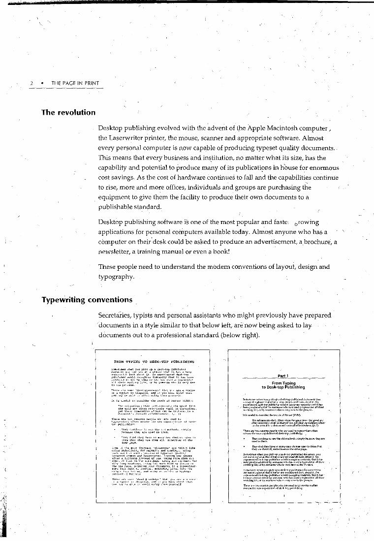
Secretaries, typists and personal assi$tants who might previously have prepared
/documents in a style similar to that below left, arenow being asked to lay
documents out to a professional standard (below right).
L
FROM TYPING TO DESK-TOP PUBLISHING
!>'<:•n•~tlme& whti'n you pick up a de::;k-top puhlish<"d dc.c>1ment y,,u ;;<ut :HH• at a <;~lance that it has a v"rY amat<>Ul il::h loo~. about it. An experiencud desk-top publi,;her wouhl t'!'Co<Jnis"' instantly that it has been vn'<lu~·e.l either by someone who ha:; used a typti'writer <r.ll their worldn<;~ life, or by someona who 1::; v.:.ry naw t•:> the J•H•CQSS.
1'her .. ara some "<lead yiveaways• that y(•ll ar .. ,.a navic., or a typi»t in dh;qui&e, anti if you know a\1o11t' them. yrou m""Y b .. ablC> t" avoid using them y~·un,nlf
It i,; u:..eful t<:> c·>lloJlder thO? word!: ,,f Pa.rk~·r (1989):
ThE' rt•finements t.h~t diff,.tantiat<> the 'Jr .. at frvm thE' good an• vften rE'lattV<'ly ,;mall i.n tlwm•,£'1V<;>~. y<;>t theitc cun.ulativo;o .efll':ct ;:-an b" critic:o.l to a document's """rall "ffeC'tiv"'n"s". lp. I)
Thl.'re ar" twr~ lE'al'(•n!l j)fo'<CJPl" whc• ar., :ls<>d t<> typ ... writ.en.; often misu,;e thE' new <;"-l'abil iti"" .:.f de!lk· top pulJll!lhing: ·
The'j cvntinu" tc• \1:.;& Lhe o!rt m<~thC'·fl£> ~dmply hE<cqu,;e th2y are u~E'cl to them.
1"hP'f tin'! they have so milnY n"w chui,os ''PPn to them th.lt they use them a~l. sv~1E!tlnws un th,• samo pa<J.:>.
S•.·me "l ttw mo,,t frequent "<Jiveaway,;• at& thin<Jr: l1.ke u:::in<I un,larlining fc.r li'mphasis and h .. ¥1ings, usin11 l.OC'h .. uri f~ .. >t marks instli'.!.d <..>f r;yp<~-<oet quality inverted c<'lll!llaS <>nd apostrvphas, leavino;~ twv spaces atto:.r a full!ltop J.no;;tE'ad of ona. U!linQ mora than two:> cypo!l c>r font on'th<? same ·p11.ge, u.sin11 all capit<ll.s fur very l,•n'J heading,;, U!llnQ too rnu...,h hold or i.t<illc on t.h .. on£> paqo, p!·intin\1 your documents in a typ<?wriLertYf'<> fo:•t.t ~uch a,. c·~urier, ext<>nrHng hcX"!l int·~ th<1 n~<lrgin '"""' h<>l•)W). and •wit•~· a,;;t.,rulk>l or byph~n" ltWt<·n<l c.( hull~t».
Thoir~· drt' ,.,,m..- "rlaacl 'J1Vai\W'IY<>" th"'l you <lr<.> a llovic .. ''' a rypi:..t l:> .h:..gut!.o<?, a.n•l it you ~.1\<.o'-' 'lt<..>n'. Lh.,m, ".'"'" on•Y b., abl;,o t-: <~void U!li.ng tlwm S'Nlr,;.,lf
Part 1
From Typing to Desk-top Publishing
S.Ultt'hml'S wht'll you p1~k up.1 dl"!>k·lvp put>li~ht'J du(um~nt r"u
~~~~~:~~~:JJ~k~,:~~a~:~~~~~~rv~':':u~~~~~~:~~~~·~:~~~~~~~;t 111~~~~~ hOL~ •" b~ll rru..Ju.,;;,od l'!tiWT bV Sl.>lllt'Ullt>. whu lt.ll\ U~ a lypt'writ .. T JJI th .. ir
•~nrt..m~: \ift', \>T by M>llt~>nt' >vhu ts \'t>TY tlt'W tu llw prn.:l'S!>.
It is useful h• Wlt~idt'r II)!! Whrds uf l'ark .. r (\'J8'J):
Tiw rt'fimml!!l11~ thJI diff,.rl'ntiatl! lhl' )lr!!al twm tlw )IVOd ilft' \>ftl,n rl!]:lt~wly snt::~11 in th<!ntse]\'e.., wt tlwi.r ~umul:ltiw <lffect .:Jn btl crihcallu :1 dP.:um!!nt's uv!!raflt.'ff<!<:h\'t'd~!!o.'>. (p. I)
~::..:~J:;~~~~<l::;:~b,JW;rt;r'd:~~:~~~~~t:~~~t';writ .. rs uft!!ll
llwy n•ntinu .. tu use the uld lllt'th<.><b. Simply b<!<:aUS!! th .. y art> USl'dlulht>m.
11wy 11nd lhl'y h:11 <! "'"' manv llt'IV du>1•e: upt>n tv tht'm th.11 tht'V U!;t' them all, st>lllt'ltntl!!i \lll the san111 p.l)lt'
~~~~."~~ w~~~,~J~h~f~~~~:f::~ J\~~;k~~·~·~~~r~!~~:kd~~~~;~~~J,~u eXp<>ri!!llC;}ldi'!ik-tup publisher wuui,J rect>gnise instantly. that it h:ll. been produc..d l!ilh!!r by sum,.vn"' wh<l has used o1 typewnter a11 Uwir wnrk1ng \if.,., ur by somt!'Oil!! whu1s Vt'ry rn.>W tu tlw pruc~s.
~:~~~~~ ~~~J:~~f;i~~~:!'a av~~.k;~','f,r~~~!\~~k~b~~~::'J,~u . ~~~r~~~~~c~J'!i~':J: ~~~::r,~~~~\:~~~ ~~·~= ~~~~~~~::~/11 ~~~~r wt>rktng lift', ur by :-.o.>ml!ut\!! who io; V!!ry IWW tu tlw pn>c!!l\.o;.

THE DESKTOP PUBLISHING -REVOLUTION • 3 '
Some of the problems being encountered are to do with the fact that many
secretaries have been traditionally trained on typewriters( Typing conventions are.
quite different from desktop publishing conventions; from details such as spacing
after punctuation, spacingbetween paragraphs and the use of typographi~al conventions.
The single-handed publisher
There is also an mcreasing trend for individual workers to produce
documents-from conception to publication-single-handedly. It is no longer I /
the norm to hahd-write pages; give them to a typist or word processor operator, '-
proof read them, make changes, and so on until they are reasonably happy with
the result. Many peopleLnow choose to compose all their documents on
computers because they have computers on th~ir desks, because they can write
and edit until they are happy with the final product, and most importantly,
because they use the computer as an aid to the writing process.
The flow-on effect of training people in the conventions of desktop publishing is
that every document produced should have improved readability, legibility and
appearance-a result which can· only ehhance the professional image~ and possibly
the productivity, of the orgartisation . . I

4 • THE PAGE IN PRINT

CHAPTER
Hardware
\ \
2 /M11.14-
'!( ,., '
+-- " '1if
Hardware and Software
Acomputer system is made up of two main components: the hardware and
~ the software: The hardware is the physical equipment and includes items
such as the keyboard, mouse, monitor, processing unit and printer. ·
Software is application programs-generally bought off-the-shelf-which proyide
the means by which the text and graphics can be laid out and arranged.
Hardware comes in a inultitude of configurations, and choice depends upon
personal preference, ability to handle ne~essary software, price, usability and·
upgradability. There are two main categories of computers used by desktop
publishers: Macintosh and Windows-based personal computers.
When considering hardware for desktop'publishing, you may find that existing
computing equipment is adequate for most requirements. Onc;::e projects become
more challenging, if may be necessary to upgdde existing facilities to include
more memory, a bigger hard disk, a CD-ROM drive and a larger, higher resolution ,
mop.itor. Internet access may also be important to acce~s resources and publish ort
the Web.
Random Access Memory (RAM)
The famous adage, coined by the Duchess of Windsor, is that you can never be too
rich or too thin. You ca_n add t~ this that you can never have too much RAM(
Random Access Memory is the part of the computer which stores programs and
data until it is saved to disk, or until the computer is switched off. The minimum
RAMthat you should look at for desktop publishing is 8 megabyte (Mb). This
5
6 THE PAGE IN PRINT
minimum is fast becoming 32Mb. Most new machines are capable of being
upgraded to 64 and 120Mb-bigger than some hard disks in current use!
Generally speaking, you should buy the biggest RAM size that you can afford, or at
least ensure that the -qpgrade facility is substantial. RAM size has become a crucial
issue as the software programs are becoming huge and are requiring mor1e and
more memory to hold them. A cheap method of increasing RAM size is to buy a
piece of proprietary software which can double the size. Be very careful when
selecting such an option as many of these can be incompatible with applications
software which you may be running.
Hard disk (
Large disk or hard disk storage is required to store the data, documents and files
t~at you have created, and also the application programs. You will find that many
projects consume/hard disk space at a terrifying rate, especially graphics and
photographs. Again, buying the biggest you can afford is a wise move. The min
imum you should be considering is 80Mb, but 500Mb would be considerably better.
' There are software programs around whieh effectively double the size of your
hard disK by compressing the data, but again a word of caution-some can have
diabolical results on existing programs, particularly telecommunications. Disk
compression software can often slow your system down to a c/awl and is often not
considered worthwhile. There are however, 9ne or two very good (and more
expensiv~) programs on the market which compress and decompress your data
'on the fly' with/a negligible effect on speed. Make sure you choose a system which
does notalter your data in any way (known as lossless compression).
CD drives
You may find that much of the software vnu would like to have to enhance your
documents comes on CD-ROM disks. Cu-ROM stands for Compact Disk Read Only
Memory. They are much like the CDs we are familiar with for music recordings.
CD-ROMs are capable of storing many hundreds of megabytes of data,~ and require
a special CD-ROM cutter to press them. CD-ROM is 'write once' technology-they
cannot be written over many times. Many of the software houses are now using
CD-ROM because the size of software programs are becoming enormous. Clip Art _
and fonts are also being packaged on CD-ROMs, again because of the capacity. This
is a very useful facility because it allows you to copy only what you need on to
your ha:rd disk, whilst having the option of hq.ving the rest readily to hand.
When buying a CD-ROM drive buy the fastest you can afford and che~k out the
technology of the day (it changes frequently). CD-ROMs have a variety of different -
HARDWARE AND SOFTWARE" • 7
standards and it is important that you buy one which can read as many'differ~nt formats as possible. · . ( ,·
A very useful CD-ROM technology is the PhotoCDs. The Photo CD allows you to
have your photographs embedded on the CD~ ROM for integration mto your \ ' • I
documents. The CDs are capable of holding 100 photographs, but you do not have
to add tl;le:rr all-afonce. They can be added incrementally as you take them. A
disadvantage is that the resolution of the photographs is much lower than using
35mm ~d full pre-press facilities. 1
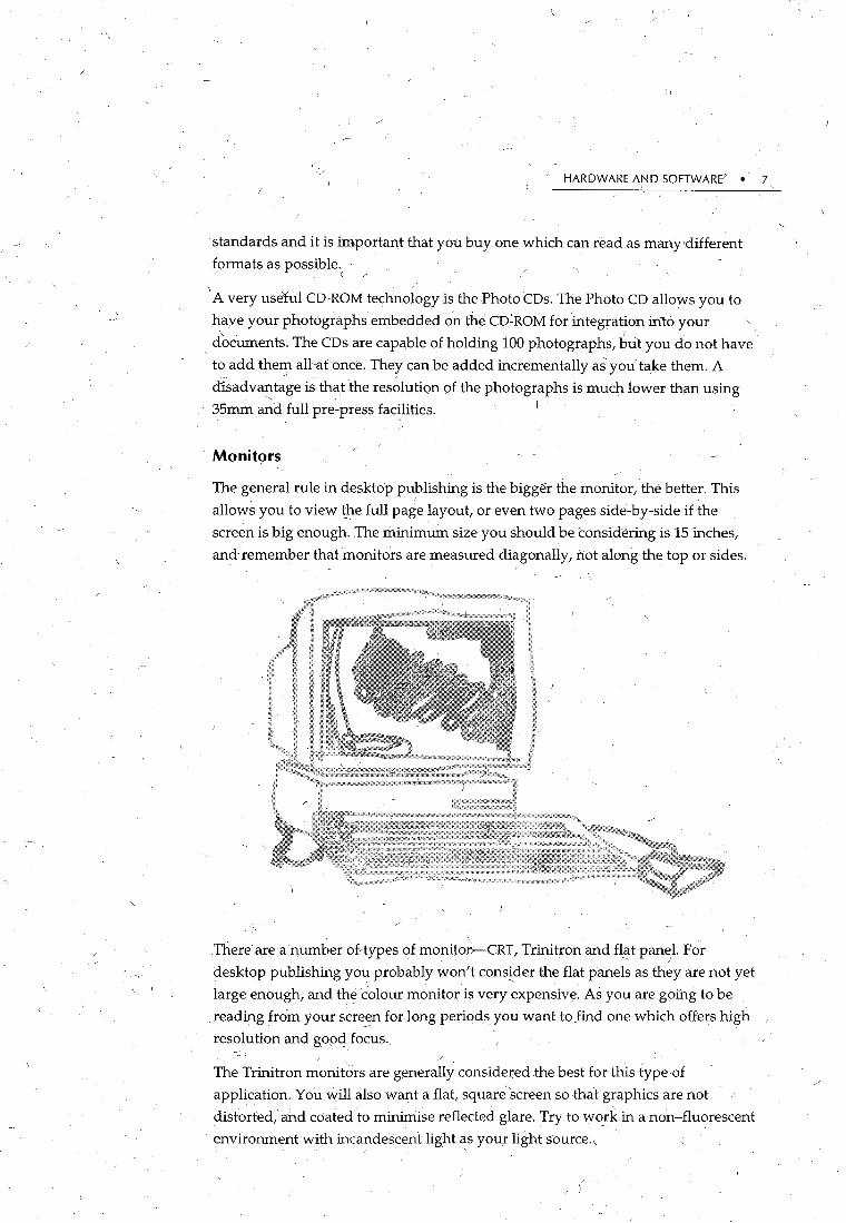
Monit9rs
The general rule in desktop publishing is the bigger themonitor, the better. This
allows you to view t_he full page layout, or even two pages side-by-side if the
screen is big enough. The minimum size you should be considering is 15 inches,
and-remember that monitors are measured diagonally, not along the top or sides. I, \
. \ . There are a number ofrtypes of monitor.-CRT, Trinitron and fl(it panel. For
desktop publishing you probably won't consider the flat panels as they are not yet ' .
large enough, and the colour monitor is very expensive. As you are going to be
. reading from your scre~n for long periods you want to find one which offers high
resolution and good focus.
The Trinitron monit~rs are generally considered the best for this type of
application. You will also want a flat, squani screen so that graphics are not
distorted, and coated to minimise reflected glare. Try to work in a non-fluorescent -· .
environme.nt with incandescent light as your light source.,
B THE PAGE IN PRINT
Scanners
There are two major types of scanners used by novice desktop publishers-the
flatbed scanner and the hfJ.rid-held scanner. Black and white and colour scanners
are available, but most users will want to be able to scari a coloured image.
A scanner will allow you to put images from an external source irito your
document. The scanner works a little like a photocopier, except that it will digitise
the image to disk and from there you can manipulate it, crop it, change colours of
elements and so on. There il.re two typ~s of scanning software-image and otR (Optical Charac_ter Recognition). The image software will scan anything iri as an
image only, and you can manipulate it as an image. If you want to be able to scan
in text and edit it with a word processor, you will need OCR software.
Digital cameras
There are now digital cameras which work in conjunction with a PC or Maciritosh
computer. These cameras use a battery for power and have a mini memory built
into them to store the images. Price will vary, depending on how many high
resolution imagefi the camera can store.
Once the· photographs have been taken, the camera can be connected to the
computer with a cable, and the images downloaded into memory. They can then
be imported into documents or edited as if they had been scanned in. The
advantage of the digital camera is that i:t can take the photograph and download it
straight to the computer, unlike the scanner wh~re the photograph has to Se taken,
processed and then scanned. For many applications, digital cameras can have a
very useful role. _
Printers
There are three main types of printers used by most small to medium
organisations fpr their desktop publishing-dot matrix, ink jet and laser. ' -
/
The dot matrix gives the poorest resolution, and although it is a cheap means of
printing, the printed output vxill always look amateurish. The ink jet method of
printing continues to improve and is a cheaper option than laser printing, but can
lack the crisp look of the laser. Whilst th,e resolution is generally around 360dpi . '
(dots per inch-the more the better) the ch~uacters can be thick and somewhat
fuzzy. They are also frustratingly slow, particularly when printing pictures. Colour
ink jet printers are now affordable and are a reasonable option for the Small
Office, Home Office (SOHO) user, but if you want the very best image for text at a
reasonable cost then the laser printer is the one to buy. Laser printer resoluti'on . I
starts at 300dpi and goes up to 2400 dpi (with a proportional costincrease, of

HARDWARE AND SOFTWARE- 9
course!). Printing costs are less than you would pay a commercial printer and
printing speed is markedly higher. ' "
Colour printers I '
Thermal transfer printers are generally fairly low resolution and work ~ a similar
fashion to dot matrix in that they have a series of pins which ;:tre heated and which
-melt four different colours from thermal wax sheets on to the paper. These printers
have a prillting standard of 300dpi. The four colours used are blended (or dithered)
tq produce other colours. The advantage of fhe thermal transfer printer is that they
are generally fairly cheap with an average print cost orso cents per page. One of
the major problems with thermal transfer is thatthe coloured wax can rub off .
. Dye sublimation printers are mid price printers. The printing process is very
_similar to the thermal transfer in that there are multicoloured sheets .of cling film
which are advanced over the paper one colour at agme and the dye is sublimated
on to the paper. This method ofyrinting is good for high quality drafts or for final
prints when high resolution is ~tit necessary.·
Coloured ink jet printers are now totally afforda~le for the SOHO en_yironment.
The printer is fitted witl; a number (usually three or four) of different cartridges of
coloured ink which are again dithered to produce the final blended colours. It is
important to note that three car1ridge printers blend yellow, red and blue to make
black. As 90% of most printing is black, this is .~ expensive method. Four cartridge
colour printers may cost more to run but they are less expensive to run. The cost
per page varies between 90 cents and $1.30, and the final output 1s very good for
solid graphics, but .not so 9qod for half tone photographs. Ink jet printers are very
good for short run jobs, for example, menus, and the finish is permanent.·
The wax jet priitter is similar to the ink jet, except that blobs of wax are blown on to
the paper:_ The waxcolours are held in, separate containers which can be plugged
in as needed. The printer is not as cheap as an ink jet. The final output is 300dpi,
and the printer can produce a page of coloured printing fairly quickly, which,
together with the low cost, makes it good for high volume jobs. The quality is not I -
tJ;e highest ;but it is certainly good enQugh for final proofs if very high resolution
is not called for
Overall, the thermal wax is the mqst co~j>istent, but the highest quality colour \ ' '
printing employs a system of separated film-a separatelnegative for each of the
colours to be printed, either for spot colour or for four process colour printing. The
colour is produced by having overlapping screens of fine dots which form /' -.
overlapping rosettes which blend the final colours together.

10 • THE PAGE IN PRINT
Software
The software required for desktop publishing consists of page layout software,
graphic design and illustration software, photograph manipulation: software and
occasionally some software allowing the user to manipulate type into shapes. It is
possible for the novke to use just the page layout software to complete a job, but
once the projects become more ambitious, some of the other, more sophistic~ted,
software will become, necessary. Page layout software comes in a variety of
capabilities, ranging from Aldus Pagemaker and Quark XPress for the high end user,
to Framemaker which is considered mid-range to Home Publisher for the SOHO user. ' I
Examples of graphic design and illustration software include Aldn<; Freehand and
Adobe Illustrator. Photograph manipulation software includes At.. ~e's Photoshop
for high end users and Apple's Photoflash for low end users. Broderbund's
Typestyler is one example of software allowing the user to fashion headings and
single words into shapes, including pennants, circles and squares.
It is possible to produce very good quality documents using some of the high-end
word processing packages currently available. Most of these allow graphic
manipulation and importation, text layout into columns, a variety of styles using
stylesheets and different formats. It is important to ensure that your software
allo.ws a WYSIWYG (what you see is what you get)Niew, otherwise you will have
to be constantly printing to ensure that your document looks the way you want it.
Text handling \
There are many desktop publishing software programs on the market, ranging
from very cheap to very expensive. What are the differences? The biggest
variations between tl}e programs are in the text handling capabilities, and very
often you will need to evaluate these wlien choosing your software. However, you
will find that some of the cheaper programs have a surprising number of the.text
handling abilities of their more expensive counterparts. Some of the more useful
text handling features are listed below:
• Column grids
Many programs are able to generate or~.-screen guidelines or grids which
allow you to specify margins, column widths and spaces between columns. I
Grids also allow you to place elements on the same place on each page.
• Free rotation
This is a feature found in many of the new packages whichpreviously
required a drawing package. A f~ee rotation tool allows you to rotate text and
graphics through 360" allowing yo1.,1 to make text into a gJ.:aphic element. I

~
HARDWARE AND SOFTWARE • 11 ~
• ,Stylesheets
Styles simplify repeat jobs and provide consistency throughout a document.
Instead of formatting ~aCh type of te~t separately, one~ you are happy with
theformatting, you can make it a style and apply the group of char~cteristics . '/ -
with a single command,
• Textwrap
Some software applications impose severe restrictions on text wrap. Text
wrap is the ability to shape text around a graphic, and is a useful feature for'
adding graphic interest. It can also be used to shape text for appeal in layout. ·
• Filters
Filters allow you to import your text from a word processing document
complete ~ith formatting. Check that your word processing software is
supported by the page l~yout software.
• Page masters
It is useful to set up a mastE3:. page so that key elements, such as page
number, docyment title, logos and so on, appear in the same place on every I
page. If you intend l,!Sing facing pages, check that the master page handling
ca!l cope ~ith this.
• Table of Contents
Some programs will automatically generate tables of contents and indexes.
• Document le~gtli
Some of the cheaper software programs have serious document length
re~trictions. If you ar~ planning a b~ok, check out this. text handling ability.

12 • THE PAGE IN PRINT
• Autoflow
If your imported text block i~ too big for the page or column, autoflo~ capability will add extra pages to hold the remaining text.
• Internet
Some packag~s allow you to convert text to a form which is readable on the
Internet (such as HTML). This enables users to download the document
directly into an Internet format without having to manually add all the
formatting codes~ which is a tedious and time-consuming task.
)

CHAPTER
Typefaces
3
Introd-uction to Typography } ' . ',
- '
0. ne of the most important element~ ~f desltoppublishing is typography,
the assembly of type and letterforins. to present the printed word. Good
- 1 • _ typography-can make an enormous difference to the way a page presents,
as well as increasing the readability and le,gibility of the document. Good
-typography will not only make it easier for the read~r to read the document, but
will also make the reader want to read it.
In order to make informed choices on formatting characters, it is necessary to
understand the mechanics of typography and some of the terminology.
CQ:tnptfters have helped in the evolution of type. Modem type is much more
readable than the type of Gutenberg's day. There is also a vas_! array of typefaces
~vailablE~ for-every type _pf document and desired image. Typ~faces also includes
the more esoteric characters such as Dingbats which can add graphic appeal to
documents. There are also specialist typefaces available for applications such as
~riting music and illustrating maps. Software tools are available which allow the
users to c!eate their own tYpestyles based on st(!Jldard fonts. Thl.s is a boon to the
desktop publisher as it is then possible to create original looking graphical effects
trom_ existing fonts. Some_ of tlzle tool~ generate random looks to the type.
Page for!I!_atting is-ail important element•of typQgraphy. The ll10re appealing and . '.J . --'
well laid out the page, the more likely it is to he read. There is an art in combining
text and graphics in such a way that the readability and legibility of the page is
enhanced. \
13
I_

14 -• THE PAGE IN PRINT
Postscript fonts
Postscript is an essential piece of software whiCh is used to 'describe the appear
ance of text, graphical shapes, and sampled images on ptinted or displayed pages'
(White, 1994, p. 41). Postscript is a language which can be used on any computer
platform and is used to describe the appearance of ~page as a whole. Text
characters are treated as graphical shapes which allow them to be manipulated in a
variety of ways (scaled, resized and distorted). The Postscript files are sometimes
installed in the printer, but they can also b~ held in the computer.
Postscript allows high resolution printers to produce high quality type without
individual files for each size. Postscript is a well established desl<top publishing
standard, with huge selections of typefaces available. Postscript itself is a
programming language used for printing graphics. Your document is converted'
into a program which draws the images onto paper with .a laser beam.
TrueType fonts
!Developed by Microsoft and Apple, True Type is a font technology built into the
Apple System 7 software. True Type and Postscript are converging to become
totaliy compatible. TrueType fonts don't rely on postscript and can therefore be
used with the computer's sfstem fonts. They also allow type to be set at any size
without distortion and allow the user to see an accurate repre$entation of the font
on the screen.
Bitmapped fonts
Bitmapped fonts have characters which are formed in particular patterns of dots.
In order to use them, the computer needs to have a full range of fonts in every size
and style, requiring large amounts of storage. Some software can scale the fonts,
but the result is often unattractive jagged edges. Bitmapped fonts do not smooth
out the edges like outline fonts. They arc: generally not suitable for desktop
publishing because they do not allow sufficient range of sizes and sometimes
styles. They are often found on freeware or shareware diskettes. If you are not sure
whether a particlllar font is bitmapped, test it at an unusual point size, for
example, 19.3. If it is bitmapped it willlookvery unattractive.
1 Anatomy of type \
Characters are generally measured in point sizes, but some typefaces appear
smaller on the page than others, even though the point sizes are the same. This is
because the x-height of forits vary. It is the'x-height of a font which is critical for
legibility. The diagram opposite shows the various components of c;:haracters.
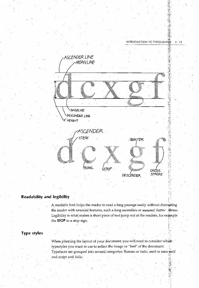
(
ASCENDER LINE · MEANUNE
MSfLJNE
DESCfNDfR LINE:. ·x'HEIGHT
r!F: ; .. {~
i~; (f.
INTRODUCTION TO TYP0GRAP'1¥ • 15
~~,;&1&Wbt0#i' D£.SCENDE~ ..
Readability and legibility . I,
Type styles
A readable font helps the reader to read a lo9g passage easily without distr¥iting
the reader With unusual features, such a long ascenders or IA.'l»SbV..C.(fette'l ~rms. Legibility is wha~)nakes a short piece of text j~mp out at the readers, for ex~ple
the STOP in a stop sign. : · -I I
When plarining the layout of your document, you win need to cons~der whi~ '
typestyles you want to use to reflect the image or "feel" ofthe docum~nt. I Typefaces are grouped into several categories: Roman or italic, serif or sans $erif and script and italic. · . t:~
/ l ;~.

16. • THE PAGE-IN PRINT
Roman
Roman fonts are a classification which have normal w~ight with thick and thin, no slant or tilt and are generally fairly formal. (This isTimes Roman.)
Italic \
Italic typefaces, with their vertical tilt, contrast with ·straight or Roman typefaces and are often U$ed where emphasis is required. (This is Palatino italic.)
Serif and Sans Serif
Fonts used for general docurrtents come in two bro~d styles, serif and sans serif. . ' ' Serif fonts have little strokes,/or feet at the end of each part of the letter. Sans serif
fonts are without these strokes. For example, compare the two words below:
Serif
Sans serif
WET
WET
i --.... '
Serif fonts, with the strokes, are best used in long passages of text because they are
more comfortable to read and are more recognisable. For example, look at this
word:
Ill This sans serif combination could easily be mistaken for the Roman 3. The serifs in
the example below, however, show clearly that it is the word Ill.
Ill A child reading Aladdin could re~d one of the character's names :
I ago asLago. The capital I could easily be mistaken for a lower case L. A serif font
makes the initial !etter beyond doubt:
I ago

INWODUCTION TO TYPOGRAPHY • 17
By changing thJ body style of your document to a typeset font with serifs, you
immediately have a better looking, more inviting and readable document.
Sans serif is' considered to be a modem, ~lean looking and functiqnal typeface and
, is very useful for headings or smallbodies of text. While serif f~:mts are more
readable, sans serif fonts axe more legible, that is, more recognisable.
For example, compare the following for instant recognisability:
DAN'GER DANGER Sans serif fonts are best for shorter blocks of texf with a lot of white space around
them which makes them ideal for headings. ,' '-
Script
Script types represent handwriting or calligraphy and can be very elegant used in
invitations and announcements. They should be used selectively and not for
general text. And they sh~uld tzever be used in all capitals!
' '
~d td a tHYJ?-' ft~ma~ and e&pant d(JF~t foce. ,
mljts is an olb QI:ngltslj ljeabp script stple .
. Th15 i5 a childlike 5tfjle which 5im\]late5 hand printing.' ' '-
%is is a verg·robust, /6utfonnaf s~ript styfe .
. This is a very functional. style which pDssibly could be used for text in the right document.

I_ /
Decorative
Decorative type can add beauty and distinction to a page. They are most often
used for headlines or display text, but are considered too difficult to read for the -
main body of text.
Th15 d~cotot1v~ roc~ 15 1Y-1t~ ch11d15h.
'I,IIIS f)NI~ IS I .. IIil~ ll S'I,I~Nf~II .. ~ ~LQ Q L ~ , ~ lmO~ o~ ® '¥'®r~ ~mt~tmlf<i~ ®tm®Q
---............ -- .... -............ ----- - .. -- .. - . . -.. - --- -- -- ----- - / _,_ -- - -.. .... --- ........ -------· --- .... ---- ------.. .... ------- ------·- - -- - -- - - --- - - .
ThtcS i8 exLt 1eme~ ele()clnL and l1Qlll8Jllic.
-tr.i~ e-~ i~ Ve'\-i( ca~f.. ·
\
( ·"

INTRODUCTION TO TYPOGRAPHY • 19
·Pi fonts
Pi fa~es cover all the fonts which contain no alphanmll.eric characters, but instead
include small graphics which can be used to decorate or add graphical elements to
your document. They are particularlyuseful for bullet points. I
The most con;unon Pi Fonts are Wingdings and Zap£ Dingbats and the range of
graphics include those bela~:
/
~~in<Pit.-v--..-1 ..,...,...,11 11tt@-o•~$~®s~t*; ~ '
SeleCting a typeface _/
Using all your favourite typefaces in one document is like wearing all your
·favourite clothes at once! Some will be of a lighter w~ight than others,'the length
may not comf>lement the other clothes you are wearing, and may al§o giv~ the ,
wrong colour combination. Combining fonts will create exactly the same problems
unless Y()U c~9ose with ~are and ensure that your fonts comp1eme~t each other ,
and give t]:le requ!red look and fee(
/ \

> 20 • THE PAGE IN PRINT
Do not fall into the trap of selecting a typeface bec~use you 'Particularly like it or
because it is unusual. Typefaces must be in harmony with the subject matter about
which you are writing, otherwise they become distracting. For example:
french Restaurant \ '
A French restauran~ being,advertised with an oriental style font causes a conflict.
Similarly, there is a real conflict in the meaning of the phrase and the typeface used
here:
The feel of this announcement is quite different to its meaning: it's a serious
meeting but the mood is pure cocktail party!
'Many decorative typefaces are often difficult to read and should only be used for
headlines or display. Used badly they can destroy your document. But used
selectively and effectively, they can transform the ordinary to the dynamic.
The final ~ord on selecting a typeface is that you must think about you~ objectives
and 'your readers. For example, if you want to catch your reader's eye, use a / ' '
display font for headings or outquotes.
If in doubt, exercise restraint. Print off some samp!es and ask yourself if this is the
look you really want.

,' j
CHAPTER 4
it{ Pi'.' ~'
:<;>-' ~'-
/f'l'!f
Layout,: Planning and Design
The key to successful document design is to plan. Planning, not only involves
how_the finished document will look, but also takes into consideration such
fundamentals as siz~of paper, type of paper, colour, ink colour, and the size
and shape of the finished document. ) '
Thumbnail sketches
The first step in the planning process is to roughly sketch your ideas out on paper. . ' \ (
ExCIQlple are shown below:
~ 21

22 • THE PAGE IN PRINT
(
These 'thumbnail' sketches, as they are known, shquld be executed quickly and
should show such things as placement of various articles, headings and graphics.
Once the thumbnail is designed to your satisfaction, laying out the pagebecomes a
very simple matter.
I /
Anatomy of a page
. The following di§tgram shows the basic design elements of most documents. Each
page will have common elements such as headers and footers, marg,ins, gutters,
and design features such as outquotes and graphics. The terms used are defined in
the accompanying booklet A Thumbnail Guide to Desktop Publishing .
. $
l[.~l ... ~ ' '··" ·.. ; ; . \ . ___......1
-1-
Measurements /
The fig~re below illusffates thewarious measurement preferences that can be used
when setting up the layout of your docum~nt. ' .
Inches 1- /
, Measurement Units: Ce nti meters Points
· Picas -.
/

\ /
LAYOUT: PLANNING AND DESIGN • 23
Traditionally graphic designers have used thepoint system, with 1 point being 1;72
inch, and picas 1; 6 inch. With more lay people using desktop publishing, many
programs allow the use of more traditional methods of linear measurement, that is,
centimetres and inches. · / '
Specifying type size
Type size is generally described with a point system wfth 72:points equalling 1 \ ./ ,·
inch. In general, 72 points is considered very large and 6 points very small.
This is 72 pt. This is 6 point. It's tiny isn't it! You can hardly read it without your glasses.
This is 11 point. This is quite good for the body of your'text.
This is 14 point. This is good for headings in your text. ' / .
Page propo~fions
When designing your page size, the proportions coij:sidered to be most pleasing to / (
the eye are 1: 1.618. This is the ratio most often used in art and architecture.
However, fo_t ease of calculation, a ratio of 2:3 works well ..
*---~- -------.X.--------·-- -

24 • THE PAGE IN PRINT
Page layouts
I When laying out your page, it is important to think about the difference between
the true centre and the optical centre. People-who are trained as typists were often
taught to place things in the dead centre of the page, with the result that they often
look dull. The optical centre of the page is the spot to which the eye automatically
/gravitates, and is approximately one-third of the way from the top of the page.
Centred 0 -
Centred layouts are the most traditional. Again, people trained as typists were
always taught to horizontally centre display type. This type of layout is pleasing to
the eye and simple to design, but the result is often static and can befairly
uninteresting.
Off-centred
Asymmetrical layouts are used to create interest or a sense of movement in a page.
They are-'designed around an imaginary axis which is off-centre on thejJage, the
most common being one-third of the width of the page from one of the margins.
This dividing ofthe page into one-third and two-thirds means that an effort has to , '
be made ,to balance the elem~nts in tenns of graphics, colour and weight of type.

LAYOUT: PLANNI~G AND DESIGN • 25
"Tr~v~" OW-W ..
Grids
A grid help~ layout the document, by showing the column guides, number of r
columns, spacing between columns, double side and facing pages. This makes
graphic and text placement much easier. Grids help to bring order and balance to
the page and also help to ensure that consistency is maintained between editions
of the document. Grids are such an important design element that books have been
written on the topic (see Hurlburt, 1978 forexamples).
26 • THE PAGE IN PRINT
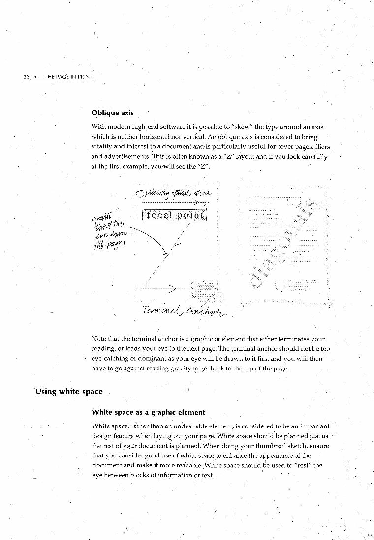
Oblique axis
With modern high::end software it is possible to "skew" the type around an axis
whkh is neither horizontal nor verdcal. An oblique axis is considered to bring
vitality and interest to a document and'is particularly useful for cover pages, fliers
and advertisements. This is often known as a "Z" layout and if you look carefully I
at the first example, you will see the "Z".
i';
. Note that the terminal anchor is a graphic or el~ment that either terminates your
reading, or leads your eye to the next page. The term~al anchor should not be too
eye-catching or"dominant as your eye will be drawn to it first and you will then
have to go ~gainst reading gravity to get qack to the top of the page.
Using white space 1
White space as a graphic element
White space, rather than an undesirable element, is considered to be an important
design f~ature when iayin~ out yourpage. White space should be planned just as
the rest ofyour document is planned. When doing your thumbnail sketch, ensure
that you consider good use of white space to enhance the appearance of the
document and mC:ke it more readable. Wh.ite space should be used to "rest" the \
eye between blocks of information or text.

Spacing
LAYOUT: PLANNING AND DESIGN • 27
Margins
For general text documents, margins should be 10% to 15% of the, page width on
each side,~fess you are using variable margins for special effect. Top margins
should be slightly larger than the side margins and the bottom margin should be
_slightly larger than the top margin (to account for the optical centre). Margins
which are too small makes the document looked cra~p~d and difficult to read.
Line Length
The general rule for full page-width line length is no more than 2 1h alphabets (65
characters). Anything longer orshorter reduces the readability of the text.
/
I )"--(
Spacing is another important element of document design. The earlier versions of
desktop publishing software lacked ~e finer d,egrees of control for spacing which
were available with typesetting, but this has been remedie<;i in later versions of
high end word processing and desktoprpublishing software.
Letter spacing
Add extra space,around words entirely in upper case or in words with a high x
height. Bold rounded characters need more space as do large characters. Your
software will have a dialogue box which will allow you f() expand type by a ' \ / \
specified number of points, for example:
Font
Font ~ J , Character Spacing l
( J OK Spacing: !Expanded 1~1 By: 13 p~ I~ ( Cancel ) -
Position: !Normal ITI By: I I~ [ Default... ) - ( Help, ' ) '
/ 0 Kerning for Fonts: I --,!~,Points and Above- · ' '
/ r;·· r1
I
· 1 Palamo
/ ~
'-
-- ' I -· /
/
-

28 • THE PAGE IN PRINT
•. Letter spacing can look really effective in headings, particularly in uppercase, as in
the example belmy:
THIS ISAN UPPER CASE HEADING
THIS IS AN UPPER CASE HEADING EXPANDED BY 3 POINTS
TH.IS IS AN UPPER CASE HEADING CONDENSED BY 1.5 POINTS
Line spacing
Line spacing is another way of enhancing the readability of your document. Lme
spacing or leading can change the 'colour' of your document, as close line spacing
will make thepage appear darker and open line spa7ing will make it appear
lighter .. '
· This paragraph is 11 point type on 13 point leading. Notice that the lines are so close together that the ascenders and the descenders touch each other. Notice also that the whole thing also looks fairly black and it's not that inviting to read.
This paragraph is 11 point type on 20 point leading.
Notice that the lines are just too far apart. It looks too
disjointed and spread'out to be very effective. It's too
light when it's printed on a whole page, although it
could be used in certain passages for effect.
This paragraph is 11 point type on 14 point leading. This is much more appealing. The eye is much more comfortable in .finding the start of the next line, and the text,colou! is not too dark or light. It's just right!

LAYOUT: PLANNING AND DESIGN • 29
\\ /
Justifi~ation
Justifying text is a matter. of personal preference, but b~wa~e of large spaces
between words and rivers of white space. One way to overcome this problem is to
lengthen the line slightly and increase the leading fractionally.
Paragraph Formatting
Drop Caps
\
An alternative to having paragraphs formatted with a blocked left alignment and 6
or 12 points space between is' to indent the first line. A desktop publishifl_g . '
convention is to mal<e_the indent a multiple of the leading, eg al10poiitt leading
should have a 10 or 20 point _indent. If you browse through some texts and . . . '. ·.
magazines you will notice that they d.on't indent. the first paragraph of a chapter or
story, but indent all subsequent paragraphs. This is because the indents are a clue - 0
to the beginning of a paragraph, but it is obvious with the first paragraph, because
it is the first. You will a1so notice that.some designers put the first word or phrase
'of a new chapter or story into small capitals. This is supposed to catch the reader's - ' eye and make them want to read on. .
Have a look through some of your favourite articles and decide what you do and
don't like, and why. You can then adopt or modify,features to suit the style of your . .
document.
These are another way of beginning a chapter. Beware of using them for every new
story in a newslet!er-they can look overdone very quickly. Use a decorative
typeface for your drop cap, or even a contrasting-one (such as a sans-serif for serif
text). The World Wide Web has a number of sites with some beautifully d'ecorated
alphabets ideal for drop or initial c~itals. :.
/Don't' restrict yourself to §etting the drop c~p next to your text\grey it ~ut, mak~ ·
it huge and St!perimpose it ov~f the rest of the text. However, make sure your first '
-paragraph is still reada_l;>le! Another technique is to kern a standard drop cap so
thatis iines up nicely with subsequent lines-use your eyeJo do this. /\ .
30 • THEPAGE IN PRINT
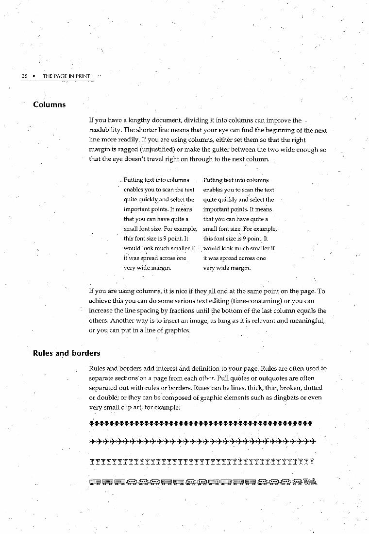
Columns
If you have a lengthy document, dividing it into columns can improve the
readability. The shorter line means that your eye can find the beginning of the next
line more readily. If you are using columns, either set them so that the right
margin is ragged (unjustified) or make the gutter between the two wide enough so
that the eye doesn't travel right on through to the next column .
. ~ Putting text into columns
enables you to scan the text ' quite quickl¥. and select the
important points. It means
that you can have quite a
.small font size. For example,
this font size is 9 point. It
would look much smaller if ' I
it was spread across one
very wide margin.
Putting text into colullli\S
enables you to scan the text
quite quickly and select the
important points. It means
that you can have quite a
small font size. For example1·
' this font size is 9 point_. It
· would look much smaller if
it was spread across one
very wide margin.
If you are using columns, it is nice ~f they .all end at the same point on the page. To
achieve this you can do some serious text editing (time-consuming) or you can
increase the line spacing by fractions until the bottom of the last column equals the
others. Another way is to insert an image,- as long as it is relevant m:td meaningful,
or you can put in a line of graphics.
Rules and borders
Rules and borders add interest and definition to your page. Rules are often used to
separate sections on a page from each othAr. Pull quotes or outquotes are often
separated out with rules or borders. RUles can be lines, thick, thin, broken, dotted
or double; or they can be composed of graphic elements such as dingbats or even
very small clip art, for example:
++++++++++++++++++++++++++++++++++
!!!!!!!!!!!!!!!!!!!!!!!!!!!I!!!!!!!!!!Y!!

Artwork
LAYOUT: PLANNING AND DESIGN • 31
/~
~~~~~~~~~~~~~~~~,~~~~~~,~~~
~~~~~~-~-~~--~IW~~~
~~~~~~~~~~.~~ Borders can also be made up of lines: single, double, dotted, thick or th4l, and they
can also be rounded (for use with rounded type), although square corners are
easier to use successfully.
The border style should complement the conten!s of the box and it is possible to
use decorative borders, for example:
This border gives the appearance of having been cut out
This border would need to display something very simple
This border would be useful for displaying a photograph
\ . ' '
There is a wide ~ariety-of clip art and .artwork available, either bundled in with
software, or through shareware deals: Artwork is also.~vailable commercially and
if you are interested in colo1,1~ yoU: will have to be prepared to pay for it. Artwork
may also be scanned into digital or computer readable form. 'This is the ideal way '

32 • THE PAGE IN PRINT
I - . to reproduce,photographs or line drawings. This form of artwork canbe very
expensive on memory and disk space, however. Ariother way o£ incorporating
artwork intoyour work is to draw it yourself, if youhave the talent!'There are
many drawing programs on the market with a wide range of prices. The World
Wide Web (WWW) is another rich source of artwork, but beware of copyright
restrictions.
Clip Art I
There is a vast selection of clip art available for use in almost any type of
document. There is also clip art for every budget, from freeware to shareware to
cpmmercially produced: black and white to colour. Some examples of clip art are
presented below:
!. \

LAYOUT: PLANNING AND DESIGN ',• 33
/ ~
The key to using clip art successfully is to be aware of what is constantly used by
everyone. This <;:an cause the graphic' to lose any impact it might have: A good
technique is to customise the clip art in ~orne way, bY; cutting parts out and adding
. other things to it. one way of doing thi~ is to take it into a drawing package, but
there are software tools around which will allow you to do amazing things to yo.!,lr
graphics, frbm stretching, squeez;ing, twisting, distorting or :r:norphing. Of course,
j£ you have ac.cess to a digitaL camera, you can use-reaLpictures which can make
your work much more engaging. /
Clip art saves time and m~ney, but use it sparingly. ~o~ much is distracting and
makes 'the page look confusing. '
Graphics formats
~ i
~It is useful to understand graphics fo~mats so that you can choose the correct / . option when scanning or buying pre-packaged graphics. There are quite a variety
of graphicJile formats, the most common being TIFF, PICT and Postscript.
. TIFF and PICT are bitmapped formats, wl:tich means they are measured in pixels. !
I
For example, most VGA monitors have a resolution of 640 by 480 pixels and when
designing for computer displays, this is"the standard you should aim for.
TIFF • I •
Tagged linage File Format (TIFF) is a common bitmap file format which is useful to
use if you are transferring data between Macintosh and PC platforms.
PICT (
PICT is a Macintosh file form~t, although some PC programs can read it. PIO:r
-supports 24 bit colour and can be aut~matically compressed when saving.
~
'Postscript
U~like the above two formats, Postscript files are vector based rather than / -
bitmapped ana are the standard for file exchange: Vector based means that the
image is defined by its position and size depending on the output device, and the
"J postscript program tells the output device whether to tum its pixels~n and off,
and what colour to make them, depending on the resolution required. The higher
the resolution, the smoother the edge ofthe gFaphic.
If yov use a piece of software like Photoshop to create or manipulate your images, : -., ., 'I' I ~
you will find lhat you can choose an optiop called "anti-aliasing" which uses ~
de~rees of ~hading to give the impression of Sffi()S>ther edges. The illustration ~ '

34 • THE PAGE IN PRINT
Screen tints
below demonstrates this. Notice how the picture on the right.has smoother edges
·than the picture on the left. This is because the picture on the right has been ~tialiased. The third picture is a close up of the picture on the left and demonstrates
the anti-aliasing.
You will often see the format EPS (Encapsulated Postscript Files) which includes a
small preview of the graphic. Postscript files are usually large as they are not 1
compressed. You may have trouble importing EPS files into y:our word processing
program, as they usually need to be converted to either TIFF or PICT.
Screen tints are a way of adding colour to your document. Many DTP programs ·
can generate screen .tints, usually as tints, reverses and solids. Solids are black type
on white background, reverses are white on black background, fo;-example:
This is reverse print

Layout
I.
LAYOUT: PLANNING AND:DESIGN • 35
T~ts use a pattern of dots to simulate grey colours, for ~xample:
./ -'
This is a tint8d backgto~nd'_
IIDm®.~~ (~}~~
': .
When reyersing out, a sans-serif font gives the most legible type. Do not reverse
out more tha,n a small amount of text as it is difficult to read.
Templates
These help to keep the page to page layout consistent. A template or master page
template means that repeated element~ are automatically printed on every page in
the document. It is useful to haveseparate pages for left and ;ight,rages.
Templates can be bought commercially or they are available from: shareware. For
example, there is a publishing kit available which includes letterheads, business
cards, envelopes, postcards, presentation layouts, award layouts, newsletter and
bulletin layouts. Templates for invitations, follow-up cards and envelopes are also
available. ' I
Importing graphics
If you wish to import graphics from a variety of sources, en~ure'that you have the
software to cope with this. M~st of the latest programs will allow you to use all the
common graphic fpe formats, including K:od~k Photo CD format, which is a great
way of getting photographic clip art, or of digitising your own photographic
material into a document.
_ Rotation
Look out for software which allows you to do this. Rotation Cat! be useful for cover ' .
,_ pages or for creating decorativ;e headings.

. \
36 • THE PAGE IN PRINT
j/
Layout: The look and feel
Layqut is an important stage where, again, you have to consider the 'look and feel'
you want for your document. Once your words, or copy, and graphics have been ·
determined, you can decide how you want the finished product to look. Your
components can then be 'fitted' onto the page.
I tis important to remember that many of the docum>nts ~ou plan w~ll have future
editions (e.g., newsletters, reports, etc.) so it is important to think ahead and create
something which ·can be used as a template for further issues. \
;,

CHAPTER 5
Desig~ing- your Documents: How to be Better
There are a number of simple principles that you can employ in both the
design and the desktop publishing of your docume~t. The following hints
and tips will ensure thatyou have ~more visually pleasing professional
document every time.
Use white space creatively
I~
Many people treat white space as a waste of space. And yet your use of space is
· one of the most powerful tools you have available to you as a desktop publisher.
FROM TYPING TO DESK-TOP PUBLISHING
~~~:!~is Y~~e~a~o~8~i~~ ~P a1a~~=k~~~~ ~~b~!~h=d~ery amat.eurish look about it.. An exparienco:td d"'sk-top publisher would recognise instantly t.h.it it has been produced lilither by someone who h.is used a typo>W!'iter all their working life, or by someone who is very new to the process.
There are some "dead giveaways• that you are a novice or a typist in disguise. and if you lmow about them .. you may be able to avoid using them yourself.
It is useful to consider the words of Park:iir (1969): /
The refinements that (ii·ffenmtiate the great from the good are often relatively small in themselves, yet their cumulative effect can be critical to a document's overall effectivoimess. {p. 1)
There are two reasons pe.::.ple who are used to ' typewriters often misuse the new capabilities o[ desk-top publis~ing:
They continue t<;> use the old methods, simply because they are used to them.
· They find they-:_!1ave so many nE<w choices opgn to them that/they use them all, sometimes on the same page. -- •
Some of the most r'requent ~dtveaways• are things like using underlin1.ng for emphasis and headings, using inch and foot marks instead! of type-set quality inverted 'commas and apostrophes, leaving two ;:paces ~fter a fullstop instead of one, using
:~~e c;~~~ai:o f~~=~;f l~~~t h~~di~~s~~=i~:g~~o u:~~~ bold or italic on the one page, printing your documents iffll tyPewriter-type font such-a.s c,ourier, extending boxes into the margin {see below), and using asterisks or hyphens instead of bullets.
37
From Typing to Desk-top
Publishing
, :=:,~ ~~.;~eP;i: ~Fa~~U!'~:~r ~~~li:~~ amateurish look about it. A~ experienced desk-top publisher would recogr¢;e mstantly thai it has been produced either by somoNlne who has used a typewriter all their. working life, or by someone who is very new to the process.
It Is usefultocoll.<rider ~wOrds of Parker (1.989): ·
The refinementS that differentiate the great from the good are often relaliV'i!ly small in themselves, yet their cumulative effect can be cf)tkallo a document's overo~U effectiveness.{p.l)
~=~~=:;~;;:~:;..,lSc~~:~~~~~~o~~~~;s They continue to use the old methods, simply because they are used to them.
~% ~~~ ~: =~~mmall.yso"!~,f~~c:n ~re~~e page.
~=~: y~~~~:!a~~ ~ra:..:~e:;~~r ~~~li~~:: amall'wish look about II. An experienced desk-top publisher would recognise instantly that it has been produced either by someone who has used a typewriter aU their working life, or by someone who is very n1M to the process.
:~:~Y~~~~X:l~~~ ~fa~c~~~:~r ~~~li:~~ amalewish.look about it. An experienced desk-top publlsh.er would recognise insta,ntly th.at it h.as been produced either by:som~ne wtio has used a typewriter all their working bfe. or by someone who is very new to theprocess. ·
~=~~=;~~=c~~\~ti:ofJ~~o~CjWd~~ The refinements that differentiate the great from the good are often relatively small in themselves, yet their
-- 9

38 THE PAGE IN PRINT
Wllite space allows your readers access to the message, and you can also use it to
create beautifully presented page designs. _If you are concerned that you will be
wasting paper, be assured that by using space creatively, you can often fit more on·
the page. This can be achieved by using such devices as font selection, ana. the l1se
of narrower columns which allow you to reduce line spacing and type size.
Design your page layouts as a double-page spread
Most documents are prmted on both sides of the-paper, and this gives you so
much more scope to design an interesting layout. You can include a gutter
measurement which gives you extra space on the inside edge to allow for binding.
You can vary the design to give you a mirror image rather than identical pages.
Most programs have a setting to automatically achieve this effect.
From Typing to Desk-top
Publishing
:~e~~fs y:~~~J~ r;,~ka ~fa~ced~h~i'~f h~~b~~~~~~ ~~bt\~h~~':v~~~~ :~,~~~i~~ t~tae~tf;r:h~iei~ ~::kb~~ produced either by someone who has used a typewriter all their working life, or by wmeone who il> very new to theprocess. ·
It is useful to consider the words of Parker (1989):
The refinements that differentiate the great from the good
~::n~{~~i~e r:r'r!~itv:!~ b:',~\~ici~ t~h:d~~~~ntr:~ ... 1~r~itl eff('cliveness.(p.l) , 1
~=~e :S!~:~h!"::s~~\ii~!0ofd~~~o ~~~:~~~ They continue to use the old methods, simply because they are used to them.
They find they have so many fll'W choices open to them that they use them alL. sometimes on the same page.
~::":~:0~5 y~~ec~J'~~ ~~~ ~fa!ed~h~;t~f h~b~i~~~~ ~~~~~~h~~5~v~':t~~ :!~~~~~ ;;:tae~t~:C~h~~ei~ ~::~~~ produced either by someone who has used a typewriter all their working hfe, or by someone who is very new to theproc~.
~~u~:n~s y~~ec~J'~~ P~{~ ~a~c:~~~it\f h~~b~i~~~~ ~~~~~~h~i:~~':t]~ ::C~~i:~ ~~tae~S;r:h~~e~ ~::k~~~ producOO eit~er by someone who has used a typewriter all their workmg hfe, or by someone who is very new to theproci!SS.
:!!'ee r:n~mre:l~u~:l'ydi~~r:l~tif~e :~:£"s~~:myt~,e fh~ ~ cumulative effect can be critical to a document's overall effectiveni!SS.(p.l)
Use formatting and diagrams to create visual interest,
~~e~:,~s y~~ec'!J~~e P~tc~ ~fa:ced~h~it?f h~~b~i~~~~ ~~biti~h~~~~~~~ :!:~~~~t~ ~~~a~~f;r:h~~e~ ~::kb!~~ produced either by someone who has Used a typewriter aU their working life, or by someone.who is very new to the proci!SS.
I It is usefu.ltocohsider the words of l'arker(1989):
The refinements that differentiate the great from the
!h~~ a:~::~i:u~~!a'~ff!~tsn::~ 1be1h;:r,~~~ei/e; document's over.lll effectiveness. (p. I)
~=~e !:~:~h~~s;':C~6i\~t~~rad!sk~:p~~~~tf:hi~i!~rs They continue to use the old methods, simply because they are used to them. ,
\ They find they have so many new choices open to them that they use them all, sometimes on the same page.
~~ue~:,~s y~~ec~r!~~e ~itc~ ura:ced~~tt?f h~~b~i~~~ ~~blti~h~irshw~':l~ ~c~~~u~~ t~t~~~f;r:h~~e~~ ~::kb!~~ r~~~~ki~~iir~: ~~;;o~:-n~~ ~h~~ v~:rn:.,n:~rth~ proci!SS.
Sometimes when you pick u{; a desk-top published
~~~~~uer~!hY~~~a~~:~t a:t.a Jna~c: !~~tn~~Sade~k~~~; publisher would recognise instantFy that it has been produced either by romoone who has ~a typewriter all their working life, or by someone who 1s very new to the proci!SS.
~ee r;f~~m:e'l~tit~:t~:r:~ti~'~e !~~~r!.~~~~my~~ ~~i~. cumulative effe.:t can be critical to a document's overall
Reasons for misuse,
_ Some designers of documents believe that the page layout can be terribly boring
because it fs just words, They resort to inappropriate clip art to provide some
visual interest. But this is unnecessary, and often annoying to readers. Use
fo~matting, h~adings, tables, diagrams and white space to give your document
impact. Read the text and think about what you can do with it:
v Is there some information that could be p~esented visually, for exa~ple, in
the form of a graph or diagram?
V IE; there a list that could be separated from the text with bullets or ticks?

HOW TO BE BETTER • "39
V' Is there any anecdotal text that could be highlighted or boxed?
V' Are there any quotes that could be highlighted with the body of the text
wrapping( around? I\ .
V' Is there any information which could be put into a table?.
Consider using more than one column on the page, not for newspaper-like
columns, but to position headings and textual material more effectively. For
example, you could have one narrow and one wide column-the wider_columnJor
the text, the narrower one for headings, quotations, definitions, or visuals. You
also have the facility to extend the full width of the page for some items', I
Learn to use styles 1 '· r ~ _
Styles, or style sheets, are used to repeat a certain combination of character and J \.
paragraph formats to a selected paragraph. In other words, you might have spent - .
some time getting your heading just right by executing these six commands:
Changing the font t? Avant Garde:
This is thErmajor heading
Increasing. the size to 22 pt: . \
This is th·e major heading Applying bold:
/ This is the major heading. Adjusting the paragraph spacing to 16 pt above and 8 pt below:
This is the major heading Centring the text:
This is the major heading Applying a rule underneath:
This is ,the major heading '', I •• /
40 • THE PAGE IN PRINT
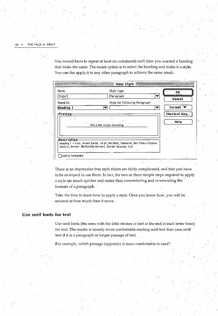
• You would have to repeat at least six commands .each time you wanted a heading
that looks the same. The easier option is to select the heading and make it a style.
You can the apply it to any other paragraph to achieve the same result.
I New.St le
Style Type: : J Name: ( OK
I Stylell !!Paragraph 1 ... 1 ( Cancel ) Based On: Style for FolloVIi ng Paragraph:
IHeadi ng 1 1 ... 11 1 ... 1 Format ..- l Previe¥ -· (Shortcut Keg ... )
)
/
\ / This is the major heading
- ( Help
Desc ri pti on Heading 1 +Font: Avant Garde, 16 pt, Not Bold, Centered, Not 'Widow/Orphan Control, Border: Bottom(No Border), Border Spacing: 2 pt
1
0Add to Template
There is.·an impression that style sheets are fairly complicated, and that you have
to be an expert to use them. In fact, the two or three simple steps required to _apply
q. style are much quicker and easier than remembering andre-executing the-·
formats of a paragraph.
Take the time to learn how to apply a style. Once you know how, you will be
amazed at how much time it saves.
Use serif fonts for text
Use serif fonts (the ones with the·little strokes or feet at the end of each letter form) . J'
for text. The reader is usually more comfortable reading serif text tha.•1 sans serif
text if it is a ~aragraph or longer passage of text. _
For example, wh1ch passage (opposite) is more comfortable to read?
--""' /

HOW TO BE BETTER • 41
Sometimes when you pick up a 1desktop published document you can see at a glance that it has a very amateurish look about it. An experienced desktop publisher would recognise ' instantly that it has been , produced either by someone who h9s used a typewriter all their working life, or by someone who is .very new to th_e process. (Serif font)
Someti'mes when you pick up a desktop published document you can see, at a glance that it
Use sans serif fonts for headings
, has aVer'{ amateurish look . about it. An experienced desktop publisher woulc;J-recognise instantly that it has been produced either by someorie who has used a typewriter all thE* w~rking life; or by someone who is very new to the process. (San~ serif font)
''
While not ideal for text, sans serif fonts really come into their own in headings and
very short passages of text. The combination of serif text and sans serif headings
works v,ery well. Notice this combination ofHelvetica and New Century
Schoolbook:
Space your headings
From Typing to Desktop Publishing: Common Mistakes
~~~~e~~s ::~~;:~/~~~ ~fa~~ee~~!~~fh~~i!h:e~DTP) amatcuris~ look about it. An experienced desk-top publisher would recognise instantly thflt it has been produced by someone who has used a typewriter all their working life, or is~ry new to the process. There are some
/ ~baudtfk:~=ibs~~t :~:~~are a typist in disgu~!>e. You
· It is useful to ~·onside~ the words of Parker ( 1989):
'[!~r~~n:~~~~et~ft~~i~j~~iJ~~~es~:Ifi~at themselves, yet their cumulative effect can be critical to ... overall effectiveness. (p. ~l
Reasons for the misuse of DTP There are two reasons people who are used to typewriters ~ften,misuse the new capabilities ofDTP: .
They continue to use the old methods, simply because they are used to them. They find they have so many new choices open to them that they use tl)em all.
Comm_on mistakes
ffk~~~i~~~fndto:~~f~~te!ta·~~i~~:ia~ ~·~J:e~!:tt~~~fi~y inverted commas and apostrophes, using underlining for emphasis and headings, and using more than two
~l{~-~~c~:o~~~:d~si;t~~~~ffe~~~i!~rlaJibci8d~::l~~ Jo faces),
· Leave a larger space above a heading than bdow it. This moves it closer to .the text
to whkh it relates and gives it the prominence that it deserves. A ratio of about 2 to \ /
f (2 above, 1 below) is a useful standard. Notice the spacing in the example above.

42 • THE PAGE IN PRINT
Refine your heading's p~ncfuation
Punctuation in headings, such as colons, apostrophes, semi-colons, inverted
commas and exclamation marks, can often look too prominent <if it is the same
point size as the words. Reduce the size of punctuation by one or two points. ' .
Notice the. colon and. apostrophe in the example below, and then the difference . ' \
when they are reduced by 2 points:
De~ktop Publishing: How it's done
Desktop Publishing: How it'~ do·ne I
Don't put full stops at the end of headings. It makes·them more lh~- text, and has
the psych,ological effect of stopping the reader from reading on.
Use 'formats to determine your heading hierarchy \ ·,
/Use formatting creatively to give you levels of headings, rather than indenting into
the text ~rea. Some documents are indented so far with headings, sub-headings
andsub-sub-h~adings that they are pushed right into the centre of the page, in a
very ineffective layout. Instead of indenting, use character formats such as point
size, bold and italic, and paragraph fornpts, such as space before and after to ' ' '
d,etermine your heading hierarchy.
Use proportionally spaced fonts
Many documents are typed'in a style which s'uggests that they have been I
produced on a typewriter. They might use a typewriter font, like Courier. A font
like Courier is designed for each lel:ter to take up exactly the same ampunt of
space. But other fonts are proportionally spaced. For example, compare the two
fonts below:
Courier million Bookman million
Notice that the Bookman m takes up much more space, and the i and the l much
less space, because this font uses proportional spacing .. '

/ I
HOW TO BE BETTER • 43
Match the font to the printer
City-named fonts such as Ge1,1eva, Chicago, New YorK,' and Monaco were
originally designed to belused on a dot matrix printer and may not give you the ' ~
quality you could achieve with fonts specifically designed for the laserjninter.
Av:oid these fonts unless you are sure you have a laser version or the document 1
will be printed on a dot matrix printer. ~
Thi!s is a city ·named font called· Monaco. Notice how Monaco just doesn't look good., If you had a "Whole p:ige of it instead of just a paragraph, you'd ve:ry quickly see its limitations. It's not nice. It's. pot designed for laser-printing.
This is a city named font tailed Chicago. 'Notice . -
how ~hicago dpesn't lool<-sogopd either.
-Mind you, on a dot matrix printer, they look very stylish.
Divide long documents into ~ number of shorter fil~s
If you are writing or desktop publishing a long document, such as a report, thesis.
or book, divide each section into a separate file.
1 o items
a " ~ a. PreTitle p.c.ges - Title p.c.ges
·a Introduction
Ch.c.pter 4 Ch.c.pt,er 5
Ch.c.pter 2
-Ch.c.pter 6
4 76 .1 MB in disk
·~. ~-
Ch.c.pter 3
~ . ~ .
References

44 • THE PAGE IN PRINT
You will find most commands work much more quickly with a short docume~t,
for example, the spelling check, print preview, routine saving and moving around
·.within the document. You can link these shorter documents for pag~ation and
print¢g in sequence. The better software allows fo~ multiple file compilation, ,
bringing multiple files together forprintingwith automatic page numbering and
irldex generation.
Use tables for te~t
Tables are traditionally used for figures, but you can also use them creatively with
text to give you a high degree of control over where words, lines and shading
appear 0n the page. H6wever, they can be a little slow to move around in, so don't
use them for whole documents.
Use the spelling check / ~
' \
Because it is harder tO" see errors on the screen than it is on paper, itis always
worthwhile running the spelling/ check over your finished document.
Use the speling <:heckCJI
Becaus e.it.i>.ha:!de~ ·to ·see·eno~s on the·sc~een ·thm ·it.is on·
Spelling: English (RUS)
Not in Dictionary: ~:::.ls""'peo.:.l.:.:i n.::.~g------------------,-----'---' Change To: J spelling Suggestions: spelling -o-
spieling
~ spili ng spalli ng spilling spewing .-' ~
Add Words To: Jcustom D1ct10nary
AutoCorrect ( Options ... ) ( Undo Lnst ) ( Cancel, ) ( Help
The check will also brfi1g up spacing errors, where two words have not been
- separated by .a sp~ce, and advise you if you have inadvertently repeated a word.
Of course, you still ne~d to proofread to eliminate spelling errors which ac~ually spell a •real word, such as meal instead of mean, their instead of there, took instead of
book and so on.

HOW rp BE BETTER • 45
Save, save, save
Learn the commands or function key-that saves and try to use it automatically, _
whenever you pause for thought or at the end of a sentence. If your document
consists )Jlainly ()f words (not many graphics or pictures), it will take only a second
or two tc;) save it, which may save you a lot of anguish if your computer crashes or
·there is a power failure. ,
If you are the forgetful type, you can ask your word processor to save
autori!_atically. You simply select how often you want it to save by typing in the
number of minutes, and it will do it automatically.
Save J Spelling I Grammar ~I ' AutoFormat
Save 0 pti o ns
€ ..
OK 0Always Create Backup Copy (3JAllow Fast Saves- \ \ ( Cancel 0Prompt for Summary Info
/
( Help 0 Prompt to Save Normal - (
~
0 Save Native Picture For mats 0 n 1 y -D Embed True Type Fonts Osave Data Only for Forms [8]Automatic Save Every: 110 ~~Minutes '
Don't use bold in text for emphasis I I
D ) )
The 'tendency when you want to einpha,sise ·something, is to use bold. Too much
bold, such as-a whole sentence or even a phrase, can be annoying. Try
using italics instead. Bold is better if you have an embedded heading. . ~
Reduce the size of acronyms
If you type acronyms (all capitals) in the same size as your text, they tend to
. dominate and-stan9- out much more than they shoufd. Reduce their size by one
pomt and they blend in to the page.
For example, notice ~he acrqnym UNESCO ii1 this ten point type. It seems too big., I• •
However, UNESCO looks like this when reduced by one point. M11ch ~etter. This
tip really makes a difference ifyou work for th,e Govemmept and· you have
acronyms all over the page.
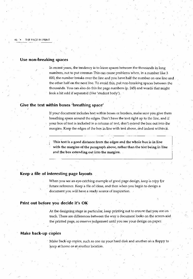
46 • THE PAGE IN PRINT
Use non-breaking spaces
I In recenf years, the tendency is to leave spaces between the thousands in long
numbers, not to put commas This can cause problems when, in a number like 3
\
000, the number breaks over the line and you have half the number on one line and,
the other half on the next line. To avoid this, put non-breaking spaces between the
thousands. You can ~lso do this for page numbers (p. 245:) and words that might
look a bit odd if separated (like 'student body'). '
/
Give the text Within boxes 'breathing space' ( '
;
If your document includes text within boxes or borders,)make sure you give them
breathing space around the edges. Don~t have the text right up to the line, and if
1 your box of text is. included in a column of text, don't e/xtend the box out into the
margins. Keep the edges of the box in line with text abqve, and indent within it.
This text is a good distance from the edges ~nd the whole box is in line
with the margins of the paragraph above, rather than the text being in line
and the box extending out into the margins.
Keep-a file of interesting page layouts
When you see an eye-catching example of good page design, keep a copy f9r
future reference. Keep a file ofideas, and then when you begin to design a
document you will have: a ready source of inspiration.
Print out before you decide it's OK '- ,' /
At the designing stage in particular, keep printing out to ensure that .yov are on
track. There are differences between the way! a document looks on the screen and,
the printed page, so reserve judgement until you see your design on paper.
Make back-up copies
Make oack~up copies, such as one on your hard disk and another on a floppy to
l)eep at home or at/nother location.

~-
CHAP~ER 6
Common Mistake~ Beginners Often Make' \ / · ·
0 nee you begin to become familiar with good practice in desktop
publishing, y~u will quickly be able to spotthe kinds of bad practic~ which beginners, and people who have learnt their skills on the
typewriter, often make .
. Below are listed 20 'mistakes' that you will often find in beginners' work. How do . /
you measure up?
Returns at the end of-kvery line
Beginners who come to desktop publishing from the typewriter will often put a
return (like a carriage return) 'at the end of every line. I
I
The wraparound featur~ of word processors enables you to concentrate (:m the
sense an,d .content of the writing without having ,to worry about line endings. The
worcl_s will automatically flow to the next line.
1 Overuse of returns ,-, '
Beginners often use returns to space out headmgs and to position items on the
page. They might use a return between paragraphs, returns around headings, and
a whole column of retu.r~s to move anitem close to the bottom ?f the page. Use the
paragraph and framing commands_ to give you much more control.
47 -
I

48 THE PAGE IN PRINT
Over- or under-cautious with choice of f.onts
When you see five or six different fonts used ineffectively on the one page, you
know th~ workhas been produced by a beginner.
From Typing to Desktop
Publishing: ~~
Sometimes when you pick up a desktop published (DTI') document you can see at a glance that It has a very amateurish look about Jt. An experienced desk-top publisher
:a~~~~~~c~~~lhea~~~~dt~ g~el~~~~:r5a~nh1e~):~t~~~~gbfire. or Is very new to the process. There are some 'dead giveaways' that you are a typist in disguise. You should know about them.
·, It Is useful.to consider the words of Parker ( 1989):
7'~ uj~-u d.ecqj~u. ~ ~e tr- de. ')liM <I.V 4/'- ..daewd.t, UN<ttl Vc t.(_,..uWu, -,el fk4 ~~
ell~ e..t<l k CIUtadL u. ~W-.tt t//~4.1 (p. I)
Reasons for the misuse of DIP There are ~wo reasons people who are used to typewriters often misuse the new capabllll\es of DTI':
They continue to use the old methods. simply because they ·are used to them. They rtnd they have so many new choices open to them that they use t11em all.
Common mistakes Some or the most rrequent ·itveaways' in DTI' are lhtng:s like using: Inch and root marks Instead or type-sel quality Inverted commas and apostrophes. using underlining ror emphasis
~~~~~~~~~~~~1~h::~da~:Wt'e:~~~et~~~J~~~~d ~~~l~~~~ fr~~~~o;1e design house orrers 0\'er IQ 000 display races).
Because word processors offJr such a range of fonts, the temptation is to use too
·many at once. Limit yourself to two or three at the most within a document, and
capitalise on their differences.
The other danger with fonts is to limit yourself to a single, reliable font such as
Times and use it forheadings~ text, everything! Times looks particularly bad in
headings~and it is much more effective to contrast the headings with the text font.
Use of underlining to create lines and rules
Beginners often use underlinin~ to produce a horizontal line or border. Try using
the borders feature for a line which won't wrap around if you change the margins
You will also have much more control ovedts placeme~t, such as its distance frorn
the text.
Thfs is underlining. It's really inadequate.
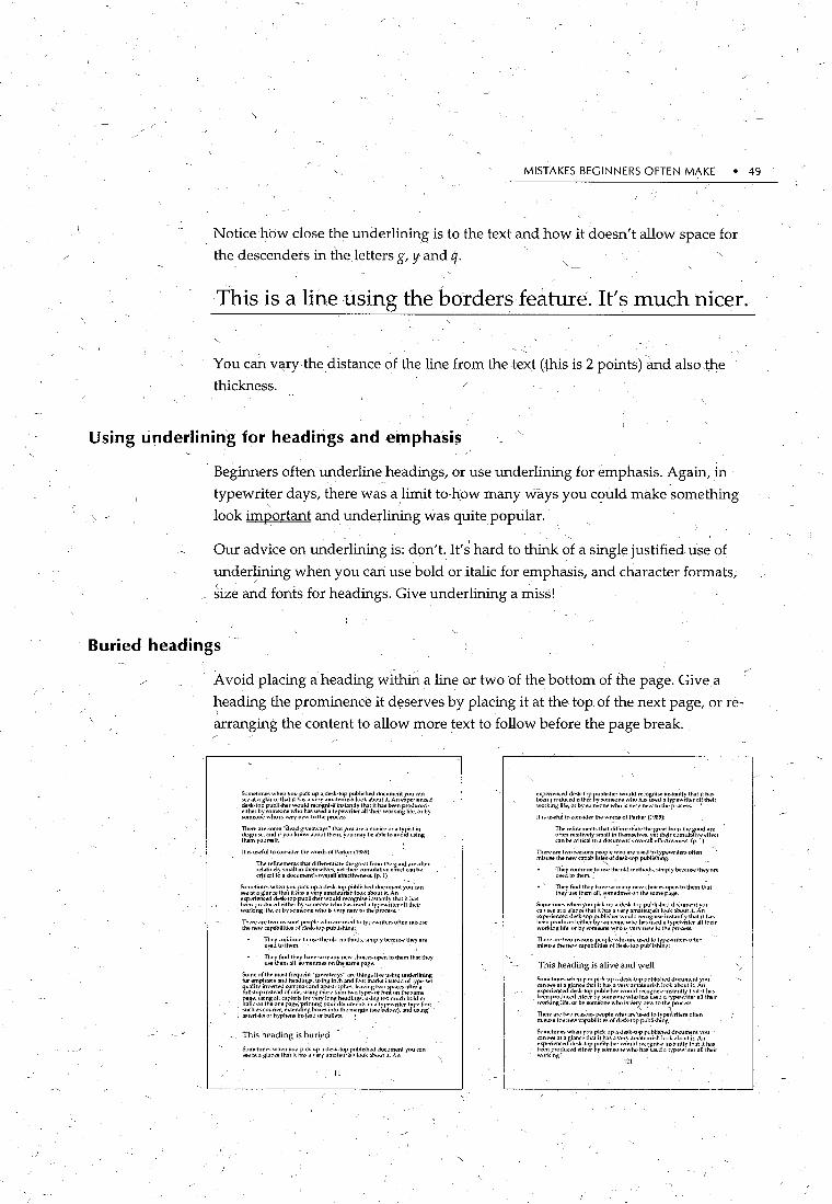
MISTAKES BEGINNERS OFTEN MAKE • 49
Notice how close the underlining is to the text and how it doesn't allow space for
the descenders in the letters g, y and q.
This is a line using the borders feature. It's much nicer.
You can vq.ry thedistance of the line from the text (,this is 2 points) and also t~e
thickness.
Using underlining for headings and er11phasis
Beginners often underline headings, or use underlining for emphasis. Again, in
typewri!er days, there was a limit to how many ways you could make something
look important and underlining was quite popular.
Our advice on und~rlining is: don't. It's hard to think of a single justified use of
underlining when you can use bold or italic for emphasis, and character formats1
~ize ~d fonts for headings. Give underlining a miss!
Buried headings
Avoid placing a heading within a line or two of the bottom of the page. Give a
heading the prominence it deserves by placing it at the top of the next page, or re
~rranging the content to allow more text to follow before the page break.
Surm•times when you pick up a de:>k·top published do..:umenl yuu can Sl!t.' at a gl<~ncl' that it ha~ a very <~milteurish lu<>k il~out rt. An 11xperienc.m dt>Sk·lop publistll'r would rl.'l:ogni!'ifinst;mtly that rt .has lwen product;>d• eith~r by ~m~r\e who hn..o; uSdl a typewrih•r all !herr working life, or by 5Uffit'(>l11.' who rs Vl'ry rww tu the proc...ss.
llrerl' are some hd .. ad giveawaysN that Y<".l an.• a novke ora ty.pist in di.~gui~. al\d ify<lll knnw about thl'm, Y''u may~ ilble to a\'<Ud using them yourself.
llrs useful to wn.o;ider thewnrd~ of l'ar~~er (l<JtN):
.;~,~~~"~r:~ri~11~~~~r\~.~~~ \~~.r:~::~y~j~.~~ff~,~~~ b!,ttm cr!~icnl toil document's \>~all eff~tivt>ness. {p. 1)
Somt>times when ~·uu pick up a desk-top publisht>d do~-_um•mt you cnn ~ill a glanct> that it has a very amalt>urish louk about 11. An
~rr:~~~~c!es._.~j~fr ~;.·~~~~n~~~l~, ~~~.!te ~~;~~~:::ril!lilt :he!r W\lfking lif11, or by somt'<.>nt> who is \'t-ry nt-w tu.thli' process.
~"':~~~~;~~~:~~~~~'i:e~(~~~~~~~~~~~'-~" typt>writll'r.. t>ftt>n misus..
, ~.:J ~:·:~:~~-"' tu USl' theu[d mli'tl{n\l~. sim~ly ~ilUM> the~ are
I Tiwy find th11y h.1vo: s..• many nli'w .:hokes Uf""ll to thll'm that tlwy UM' tht>nJ alL sumehmt!S un tht samt> pagt>.
Somli' uf tlw m1-.:;t frll'quli'nt ~gi\'t'.l\vays" are things likll' using Wlderlin.i.ng for emphasis and ht;>adings, using in.:h and foul mark.-; irl.o;tend of tyf""-sel
tlf!:~vpir~~~~"'3 ~f'~~,·;,il~s~.·l,; ~~~~~~~~~~~;~(~f"f~~~r~~~~r~~.. ,
ft~n~· \::~~~~~ ~.~.~;~i~~~:~,~;~i' )~~~~ s(~~~,~~t~ui~1~~\~;:~~~r-~~~ f~.l~t such _as wun .. r, li'XIIit"U.fing bux~ mtn tht> margm (see h\>l1•W), and using ·•
I ilSII/nsk.o; <>r hyplwn.~ instead of bullt>ts. I
This heading is buri1ed
Sunwhmes wlwn y1•U p.ck up .1 d..-...k-tup_ pubhshll'd document yuu cnn -at a gl.1n.:e thalli has J vtory Jlllillt'un~h luuk abuut it. An
11
~r~~~~~~'~;~;~J: g~~:~:.~;~~~~: !:~~~ ~·~;~~~~~u'!':!1V ~~~r work•ng life, or by s..nnt'ont> whn isvtory ""'-"' tu the pt\Xt'SS. '
It IS US@fu[tocunsider the words of Parker {1989):
~~:;:~~~~~=~~t~~~~\ ~~f~j~~:::~~~~~e ft~h~f:~~:~~ilw;;~ff .. ~"a can bt> uitkal to a do..-untetll'~overa~ t>fft>.:liveni"'\s. (p. 1)
- - ' ~=~~;~~!~~~"'::;~~i~~~~/~:k~~~ru;!.tit~~r~:writtors often _
T~y contmue.to u~ tht>old methods, simply bt>cause lht'y art> u!>edtothem. _
• ' Tiley find th"'Y h.wt-M>many nt>w.:hoicesopt!tll\> them that they u~!hem nil, 7>mt>tim.._.. on tlw snme p.1ge.
Sometime!- Wht'n )'OU pick up a Jt'Sk-top publi~hl'd doi:umt>nl you can see ill a glan.:"' that it has a veryamateu~ish lt•nk ab<.1ut 11. An
=~~~e:c~t!St>~;~~~ g~~~:~;~·~~~ rh~~·~:d ~~~~~~•t'!':!t\' ~~~r workmg hft>, or by l'l'mt><llll' who IS very ntow tu the pn>et'SS.
~:~::~h~~~~~e:;~~~i~~~~/d~~~f~:~bjj~~i~tvriter.. oFten
This heading is alive and ~ell
Somli'times whton you pick up J desk-top pubhsht>d di>CUmt'nt you can s.:e at il glancli' !hilt it has .1 very :llllillli'urb~ look :l~>ul it. A_n
=rp~~~tudc~ie~i~'rr g~~:~~"~-~~~ ~:~l~~d ~~.~~~~rii~~!~V S,~~r work111g life, or by someone who1s Ve_z n~w tot~ prt>Ct'l\.~.
~~~~:~~!~~~~~~:~:%i~!~~rd:k~r~~u~i~~f~~:~rit .. rs uften
S..~mt'11mes wht>n vnu pick up a desk-ll•p publisht>d document vou ' .:nn see at a glanc~ that it has a \'ery amatli'unsh look about it. An
~~~~~J~~~de~i~~~ b~~:~:~~~~{~~l,(~ ~~~·~~d ~·~;~~~~~~~t!~1~N t~~~l' workmgl
121

'·
so • THE PAGE IN PRINT
Evenly spaced headings
Often you will see a heading with one return before it and another return after it . . '
Instead ~fusing returns to allow space betw:een paragraphs and headings, use the~
paragraph features to define the exact space.
You can allow say lipoints above a heading and 6 points after. This will position
the heading closer to the text it relates to, and is a much m?re pleasing spacing.
Widow and orphan lines
A 'widow' line is the first line of~ paragraph at the bottom of a p<'~o-e. An'orphan'
line is the last line of a paragraph at the top of a page. Beginners 1 • .iy notice
.. them. With both, you have a single line separated from the remainder of the -- \ /
paragraph.
Many word-processing packages provide an optional widow control, which
prevents both widows and orpr~ans occurring in your document
S.>mt>tun~ wht>n you p!(k lfp a d~k-~np. publbh .. J d1x.ument you can !'>t'"<ll:lgla~Kt'\h.ll!llwsa.veryo~m:~teunshlookaboullt.An
~r~~~~~c~d:~~:: ~~~:~'!~n:':~~~.~:~·~~ ~~~~~~~~~~~!i11 t1h~:r wnrk1n~ hft', or by !o(>mt'<.>ill:' who is very 11"W to the prtX\'S.'\,
~lt>tt> .u ... !>um.l' hd .. aJ gi\'l'aways" that yuu :Itt' a nnvin~ or .:1 typi~t in tliS!!>uiw, .mJ 1f y~>u know abuut them, you may be abh.• In avt•i<l using lhl'ln)'tllll'!-<'lf.
Sumt>linw~ wh .. n you pick up a J ... sk-tor. p\lblislwd do.:.urnt'nt yuu .:om !ot't' ;~,I a glaaK" tllilt it ha.,a very ama\I'Urtsh look about 1\. An
~r~~~~~~,:~~i~:fr ~~~~~:~~~.~:~~~ ~~·~~j' ~~~~~~~~it1:ra~N ~~~~r' wt>rkm~ lifo!. or ~y ,.om..,>nt! who •~ w~ry llt'W to tlw pn>e~~
llWrl' .1ft' Mllll; "de.IJ Ki\'t'aways" that you are a lll>l'!(t' vr .I typ1st ill d1sgmSt', and 1f yuu know abnut them, yuu may bl> .1b!t' to .1\'tlld IL~in)l tlwm~our~lf.
It ,.,·u~ful to consJ,It'r tht' wurds of 1'.-rkt'r (IIJIIIJ):
l11t' rt'fmements that ~hfft.>wnhillellw greilt frum tlw g~>O<,\ ~rt' uflt>n rt.>l.ltiwly !<milllm tllt'mselvl"", vet tht'lf o:umuliiiiVt' t>ffed .:.~nbeHiti.:altoildo.:umt>nt'sowraf!t>fft>cll\'<'11~"-{P.l)
~~ .. ~.::~~;:;,r~t,~'~f~(~~~~~~:.blf. .. h~: tu t)· 1~wnt.-r.. ''""n ·~J~~~~
llwy .:~>nllllUI'Iu u:-;e lht'old mt.>thods, s1mply bt'.:iluSI" tht>y .,,., u~dtoth .. m.
lllt'Y find tht>y have SO many ll<'W choJCt'S <lp<'ll to ltlt!m that lht'\1 U'il:' tlwm all, M>mt>lin_lt'S on tlw :<amt' pagt'. ·
S<>mt' ·~f tht.> nwst fl"t'l.lll~nt ~giVt'ilways" ar" thh1g~ hh u .. ing undt'rhning for emph.ls1s and headings, •~o;ing in.:h and fu<>t marl....o; il\.'itead of typo>-:-et quality inwrt<'d .:ummas_and apu!.tn>phes,l .. aving twu spacesaftt'r a fullstop insteild u~ une, usmg more th.1n two types of
~~~~t~~~,~~'t~~~,~~il17~ ~~·tr; ..... !,1.~~~~~~~ ~~r.~r.~y ~::~~ ~~:!~:;.~~~~·s typt>writt>r-lypt' ft>~t such a'> wun.-r. e~tendinjl io~es mtothl• r'nargin (""e ~low), illlll us,nga~eri~k·(ur h~plwn.., il\.~lt'ild of bullet~.
S..>Oit'hm..s you might like tu Sl"parat" !o<>nw tt'xl frum the main
Orphan line~
(---Widow line
morethilnonecolmml. • i
~~!~~~ ~~~~J:hul:~~uyila\'~~k;~ft~~~!~~:kd~~~j~t..{~u ~rn'~~~J~,~es!i~?r ~~~~~~~~~~ •. ha~~= ~~;t;~~;itt!':~tilt has their Wl>rkmg life, or by someone who IS vt.>ry new to the process.
There_aresom_e "dead giveaways" tl~t you ilrt: a novice or a ty_pist in Jisgu1se, 01nd 1f you k11ow about them, vuu may bt' .lble tu .IVOid usinglhl'myourself. ·
ltiSUS!"full\l(llllSiderthewordsofl'arko.'r(l'JI\9):
The rl'finemt'nls that ~fferenhilte tho.' gre011 from the go<.>d are
~!:~~~1~::~:11~~~d~~·;:~!~~~~~~~~fi~r~:ti{\.~~';.~~(~~·rlerf&t S..1metnnes when you piCk up a desk-toP pu~JisheJ d\">Cum:nt you <an"":" at a glance th01t it h~o; a Vl'ry illnilteuri.<;h look alx>ut 11. An
~~~r~~~e~~~~d~i~J: ~~~~;~.~~~~~\~, ~~~~'~!~ ~~:;t~~~:~;1~tlt t~~~r working life, or by someom.> wlu> i~ wry nt'W to the process.
There are Sl>me "dead gi\' .. aw.,ys" that yuu are 01 novice or a typ1st in di~glliS<>. and if y<>u k1u>w abo.•ul them,~'''" may be able t•> avt•iJ us•ng tlwmyourself. -
~::~~:~~~~~~~~ .. ~;~~bihti~~~rd~'k~~~~~~~b:~~i~:"''i'"r.> ,,rte•:
They n>lltintle tu use the <>ld methl'CIS, Simply be.:a1lo;.e ·uw~ are uwdtulhl'm.
They find they hav" ...,, ~any n"w d1nice~ <>po>n to Uum1 that they u~ them all, Sllntebmes on tilt' same page.
S..•me of the 01<1!'1 frequt'nl "~:,>iveaways" ilr": thi~lgs like using ~nderl1ning for emph<~sisilnd headings, u~•ng mch and loot milrks. Jm•t .. ad of tyi""'Sl't quality inwrtt.>d com mils 0111d apt~trophes,
~:~·~~~~rf:,~";~.~~; :.,~~s~~~~~~!7~i ~~ ~~~;,~i~·mr"~.~~~ \~~~~ headings, us•ng tuo much bu_l.fur it:~lk on the one pag~. prmtfn~ ~~~~~':'.:."~~~';~!~C.,'W;;:~~~);~~~~~~i~~c~:~;ri~J:!r:::_h~~h~n.~11K msteilJofbullets. -
The same principle ~an also be extended to the number of words on a line. Some
expert desktop publishers fiddle about until they ha~e a least ~ third. of a line to
finish off a paragraph. They most certainly would not put up with a finish like
this!

MISTA,KES BEGINNERS OFTEN MAKE • 51
Over use of character formats
When you first start using a word-processor, the temptation-is there to use the
·, character formats, such as bold, italic, shadow and outlining, to excess .. Each
format has its strengths and is very effective when used correctly, but don't use / )
them all at the one time.
Bold is often used for emphasis, but
· italic should be the first choice. Bold is ~~st for , headings and is particularly useful for highlighting headings embedded in text; It is also useful for the question, b.1 question and answer formats. c.
, Underlining is a fairly useless , feature in desktop publishing. It is hard to think of an example whicp couldn't be done better using italic or bold (foii \. emphasis) or borders (for rules). Use with caution.
Use of tabs to indent
Italic is possibly the best way of emphasising'. words and phrases. It can be effective, combined with bold, for headings, and of· course for names of books and journals in text and. reference lists.
OutllilTille ihS~ wrerry refrlfie1C1bi:'lr11:; fr~Jllr , §hrorrt Jbtle,f:ltldl~n,gs fum <dki)l'clLmrml<tn,1t§ i.CDIL~ lflliirtll3'·9 IQ:Jr ifioJ1r
ftce:mt.uoog . )Pi8ll!11:Jl cc uliwr
WliJlltYcJl§" li1t ll§ Jl1li\JJ1t 1effrexctiv<e funt li«Yng lbliock§ \Qljf 1tce;;;::rt
SMAJ;.,L CAPS GNE
YOU CAPITALS
WHICH~~OT
MUCH BIGGER
THAN THE LOWER I
CASE EQUNALENT
OF THE LETTER.
'ifHIS OPTION IS
NOT SUITABLE
FOR LARGE
BLOCKS OF TEXT.
Slht,SJ.(dl<a>w ll® g!Ql!Qlrdl 1f<!l>Jr JP.><!l>S1l:<elr'.® ;ElJ.l1lrdJ.
illlll <ell'®. 1bnll1l: lls lffi<!l>1l: ~iflFe<e1l:llw<r:: m 1]:1e~L Us~ ll1l: m:ru.;alllmilly wll1l:lht S<aurll®S<eJrll!f I
Jf<!l>lr!l.1l:S • <Bl.S 1]:Jht lf:
®~~ rd[IQ) lr!l.<!l>1l: lC<!l>JP.>if: ~Y~t:Jlll wJ11]:Jht
slhtSJ. rdl !QlWS.
Another hangover from the typewriter days is to use tabs to indent the lines of a
numbered or bulleted paragraph. This is totally unnecessary when you can,u~e hanging. indents, and a disaster if you change the margins-you have tab marks all
over the place.

52 • THE PAGE IN PRINT
Use of tabs to line up columns I
An ev~n worse 'use of the muc;h maligned tab is to line up columns of text. In this
instance you would type a few words of one paragraph, then tab, and a few word§>
of the next paragraph and So on across the page. Then on the next line you would
continu~ the process. A much more efficient way is to use tables. You can type
entire paragraphs at once and then position them accurately on the page.
Upper case letters for headings ~ \~-
Even beginners know that you would never type whole paragraphs of text in all . '
upper case (capitals), but many continue to use them for headings. Avoid all
capitals altogether if you can, or if you must, use them for contrast with a lower
case subheading, for example:
CHAPTER l :. The Beginning
Two spaces after a fullstop instead of one
Fullstop, space space. Beginners can't help themselves., They often do it
automatically. But one space is plenty. One space means you have nicer looking -
text, no danger of 'rivers' through your paragraphs and an added bonus is you
might fit more on the page.
This is an example of a river. Can you see it? It
snakes through the paragraph. YoiJr eye can slip
off the text and run down the river. You might
even lose your reader altogether. It also looks
very tatty having all those gaps. We all read
newspapers. They don't do it. Often, they might
not even leave one space.- You don't see two
spaces in newspapers. You really need only one - I
space for ~ffec:t. How long can I keep this up? T
Fashions in desktop publishing are as fickle as fashions for anything. One of the
fashion victims is justification. Justification has been very fashionable" but is now
beginning to lose favour, designers preferring a more readable ragged left margin
tq. the very structured, but less readable, look of justified text.

' \
MISTAKES BEGINNERS OFTEN MAKE I • 53
' ' Justifying usually adds spaces Q_etween words in order to force text to fit to the
rigKt margin and these sp9-ces can interrupt the smooth flow of reading. This
problem is exacerbated in both short and long line lengths, a line length of between 8 and 10 ems being considered the optimum depending on the size of
your font.
Printing -on _multicoloured paper for document sections
Beginners oftenuse overkill in their attempts to help their readers find their way
around in the document: At all costs avoid a multicoloured, one colour to a
chapter, document, which uses colour to indicate content. From a design point of
view they are garish, and there are far better ways to help people find their way in
the document.
By all means use colour to sep11rate sections, but print the text on white.
Asterisks and hyphens for points
Asterisks or hyphens when Fsting points is a dead giveaway.that you are a
' beginner. Bullets or dingbats are a much better alternative.
A bullet is a simple round dot. Dingbats you might consider using are arrows,
pomting fingers and ticks. You could even match the dingbat to the subject matter
as in the example below:
Dietary guidelines include:
tf Providirig nutritio~ education arld encouraging all
Australians to eat a nutritious diet
Reducing the incidence of obesity /
Decreasing total fat consumption
. Increasing consumption of complex carbohydrates and
dietary fibre (wholegrain cereal, veg~tables and frui~s)
Reducing alcohol consumption .
Decreasing the consumption of salt.
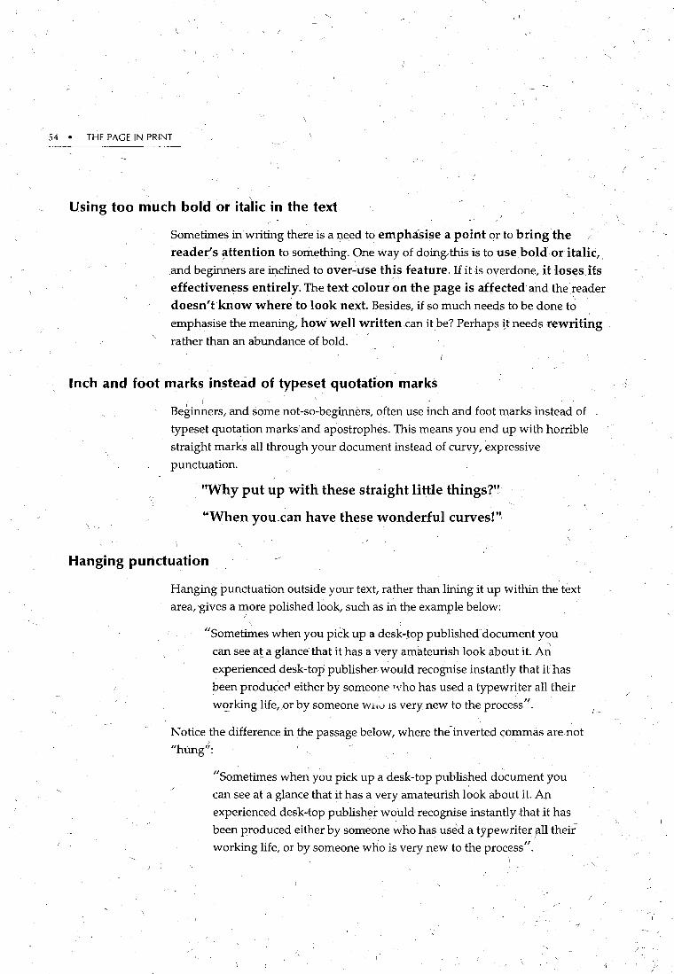
54 • THE PAGE IN PRINT
Using too much bold or it~lic in the text
Sometime9 in writing there is a need to emphasise a point or to bring the reader's ~ttention to something. One way of doing, this is to us~.bold or italic, and beginners are inclined to over..:use thi~ feature. If it is overdone, it los~sJfs effectiveness entirely. The text colour on the page is affected and the reader
doesn't know where to look next. Besides, if so much needs to be done t~ I
emphasise the meaning, how well written.can it be? Perhaps tt needs rewriting rather than an abundance of bold.
Inch and foot marks instead of typeset quotation marks ( I . ·. . ..
Beginners, and some not-so-beginners, often use inch and foot marks instead of
typeset quotation marks~ and apostrophes. This means you end up with horrible
straight marks all through your document instead of curvy, expressive
punctuation.
"Why put up with these straight little things?"
"When you can have these wonderful curves!"·
Hanging punctuation
Hanging punctuation outside your text, rather than lining it up within the text
area, 'gives a more polished look, such as in the example below: ' .
"Sometimes when you pick up a desk-top published document you ' can see at a glance that it has a very amateurish look about it. An
experienced desk-top publisher would recognise instantly that it has
been producerl either by someone 'Vho has used a typewriter all their
wc>rking life,or by someone Wltu 1s very new to the process''.
Notice the difference in the passage below, where the-inverted commas are not
"hung'':
"Sometimes when you pick up a desk-top published d~cument you
can see at a glance that it has a very amateurish look about it. An
experienced desk-top publisher would recognise instantly that it has
been produced either by someone who has used a typewriter all their
working life, or by someone who is very new to the process".
/

MISTAKES BEGINNERS OFTEN MAKE • 55
Using a single column of text from margin to margin /
Margins don't need to be confined to the edges of the page, but beginners often·
design every page as if they did. Creating wider margins gives you more flexibility
in your page design and adds an important design feature: white space. W~ite
space can be used to provide contrast. and to give a clean, uncluttered look.
~
~ 00(5 .....,-:
c •liM- 1M-/
w 0 --<> 0
Using hyphens instead of em and en dashes
Beginners often use hyphen~ for dashes. A hyphen joins (e.g., easy-to-understand)
while a dash separates (e.g., A solid corporate image will make it easier to ' '
·advertise-and sell-your product). Dashes, like brackets, often come in pairs.
They can be a very powerful device in your writing.
Don't use a hypl:)en with a space on either side for a dash, when you can use an em
dash(-).
This - a mere hyphen- simply cannot do the job of an em dash.
This-a pair of commanding em dashes.-works perfectly.
56 • THE PAGE IN PRINT
An en dash(-) is a bit longer than a hyphen and abit shorter than an em dash, and
is useful in situations like dates and other numbers, for example: 22--23 December,
18-20 months.
J
If you can remember to apply these si~ple principles, effectively and consistently
to your desktop published documents, the quality of your work will improve
dramatically and you will no longer be mistaken for a beginner.
· Typewriter fonts
Courier is a monospaced (every letter takes ud the same ' amount of space) typeface. Just look~ng at it reminds you of
typewriters. .
.
Avoid using monospaced fonts unleiss you are trying to
demonstrate the old-fashioned way type used to be handled.
Certainly do riot use it for text, unless for special effect~.

CHAPTER
Proofreading
7
Prepar_ation for Printing: Produci~g the Maste~
T. he preparation of the final master copy and the selection of printing options ..
are the finalsta&es in the production of a finished printed document. This
., can be the most exciting stage in the process, but it can also be the time
where you lose control of the document and the way it looks. /.
It is important to be aware of the choices available to you to avoid disappointment '/
in the finished prQduct.
Before you commit yourself to print the final master copy, ensure that you have
proofread the document fuor:oughly. Use the spelling check routinely, and check / -
. the.text for accuracy both on screen and also on a paper vedio_n; .
Using proofreaders' marks
The publishing industry uses a common set of proofreaders' marks. Proofreaders'
marks facilitate the correction of typescript& and if correctly used, aid the
communication process between the printer, author and graphic designer.
For a list of common proofreaders' marks, and their use in the text, see Standard
proofreaders~ marks overleaf.
57-

58 • THE PAGE IN PRINT
Standard proofreaders' marks
' Marginal mark Text mark Meaning'-
Editing Marks ' ' / 'None Correction obvious
STET _!,gaug .O:.S _5ll=i)5il'la~ Leave as originally -
WF ~ Wrong font ---
sp out Twelve~ Spell out
al;g11 rhis is an example of lines of type not aligned vertically Align vertically \ l----7 when they obviously should be. I
,. Align ~ially Align horizontally · ZU!§/1
f------
N.P lastftirst ~
New paragraph
las!;> - Runori. run or <first (
g~. Transpose
trs )ndly the issue '
1----F~themain
[ _j ~entr;] Centre
Punctuation r----· -----
® Because of the noise he couldnt concentr,#e on his wory Insert full stop, comma, f) etc .
1 ell/ 199¥994 . En dash
~-j_en:_L An advertise!Jl.erior a brochur>J\\T_ould do Em dash
.< (I) An advertisemer;.y'or a brochur>}vould do Brackets
7ra~se by 3pts 37 lower by3pts Ii6p0? Superior, Inferior
'~" ~~
ljnsert quot~ v [/ Insert quotes
Type styles '
YOJ·n Make~a!i) Make Roman
ita! . Emphasise this word Italicise
I
bl ~thisword Boldface
bf i fr::t.! Bold and italicise this~ Bold and italic -
--------~------ --_
lc ~OWERC~E) Lowercase I [-:;c '~P'" . !!£!"""' Capitals
cap_s J title case Upper and lower case I
---~- ---- ------ -;:::; ' :::;.-

PREPARATION FOR PRINTING • 59
C~oosing paper
The quality of the paper you choose has a profound effect on the way ink dries. ,; ' / !
Some paper allows ink to dry on the surface, whereas poorer quality paper absorbs
the ink causing 'bleeding' of the ink, obscuring the clarity of the. characters. This is
·an import~nt factor to take into account when mahlng the choice of typefaces and
ink colours.
Paper categories
Colour
There are two/main categories of paper, these are offset or uncoated, and coated.
Offset or uncoated
Uncoated paper is th~ most ~ften used paper, anP. is the/common stock for
newsletters, fliers and brochures. However, it is not good for halftone
photographs ..
Coated
Coated paper is often used fm\ catalogues, magazines and upmarket brochures.
Coated or glossy papers come mainly in white to allow for colour printing. The
quality of coated papers varies from A3 foAl withAl being the highest quality. It
is also possible to get non-glare coated which reduces the amount of reflected light I '
and allows it to be easily written on.
Paper Colour
There is no standard for paper colours.\Each paper manufacturer has their own set·
of colours and each varies. It is therefore important to check out several mills if
you want to find a specific colour or sl)ade.
Fashion aictates paper colour as it does other trends. Currently earthy tones are
fashionable, butinnovative designers are always attempting to forecast changes in / -
paper colour trends. • I •
When selecting colour, consider the effect and feel you are aiming for and
rememlfer that a slight off white will reduce reflected glare thereby increasing ease of'reading./

60 • THE PAGE IN PRINT
Ink Colour
This is an important issue to consider when selecting both inks and paper. Unlike
. paper, ink colours are standard and some dgsktop puplishing packages come with
a complete range of Pantone colours so that the e.ffect of ink colours.can be checked
with the document before p~inting. However, it is importantto remember that ink
is partly transparent, particularly thelighter shades and can therefore be affected
by the colour of the background pftper.
Foil
A cheap bufeffective way of using colour on documents or parts of documents
such as invitatio~s, business cards and advertising materials is to use foil. The use
of foil cah add a great deal of impact to your work very simply. Use it for headings
or for the whole document. All you need to do is print the d?cument in black and
white, tape the foil over the top of the part to which you wish to apply the colour,
<;md either run it back through the laser printer or through a photocopier. The foil
is fused on and the effect is instantaneous.
Foil can be purchased by the sheet, in rolls like ribbon or in packets from some
specialty shops and mail order companies. It comes in a ~ultitude of colours ~d ~styles, such as shiny, matte, embossed and glitter: Although foilis not cheap to ,
buy, for a short print run it is much more economical than using a commercial
printshop.
Textured papers
Textured papers are used for particular looks and some suit special applications,
suth as business cards and invitations. There are four main categories of textured
papers: woven, laid, felt and linen.
Woven
Woven paper has a very slight pattern left by the mesh screen during the
manufacturing process. Although known as patterned, it is a smooth paper and
can be used for almost any purpose, including correspondence.
Laid is the most common pattern for a textured paper with lines laid out in both
directions.
);
Cutting c6sts
PREPARATION FOR PRINTING • 61
Felt
When making felte~ papers, manufacturers u~e fabric coated rollers to impress the
pa!tem while paper is still 80% water. ·
Linen
The linen look is etnbosse<;i onto gry paper with steel rollers as a separate
manufacturing.step.
Add-free
Acid-free paper is an expemsive option at this stage, but very nice to both handle
and read.
· When selecting paper, remember that paper is costed according to the weight. It is
possible to save considerable cost by s'electing a lighter paper stock, for example
llOgsm (grams per square metre) instead of 150gsm. The same can b~ applied to
c6vers, selecting 210gsm instead of 240rgsm. If you are using your own printer and
photocopier, ensure it C'41 handle your chosen paper weights and types.
Recycled paper
Printi.ng
/ . Environ:i:nental issues aside, recycled paper h~ become a fashionable look to have
for particular types of documents, particularly brochures and fliers, even though
costs are generally higher. The range of r~cycled paper is increasing steadily,
although it needs to be selected with care as the ink absorption levels are greater - / _)
than with new sto\2ks. ·
When considering recycled paper, it is importan~ to note thCJ.t white recyCled paper
tends to look off-white because!of .the inks and dyes that are not bleached out in
the manufacturing process. It is also difficult to match colours as no two batches of
paper are the same, therefore sufficient paper needs to be selected from the qne
dye lot at the beginning of the job.
\
The final look of a public~fion is determineCi by the budget set in the planning
stages. The planning process wilLdetermine whether the printing will be black and _/
white or colour. The more colour introduced, the. greater the cost. Images such as j
photographs~ will also increase the cost._
' 62 • THE PAGE-IN PRINT-
Finishing
' It is a good idea to obtain quotes froin a nuinber of printers as costs vary. It is,
however, important to be specific on requirements. ' ~ '
It is worth visiting the printer after your initial document design. He or she will be
able to show you how to cut, costs, how to avoid errors (shading may loof good .
out of your printer, but the copying process may make it look very uneven) .. The ' '
printer will also be able to give you an idea ,of turn-around time, costings, ~d
even how to improve on your design.
Colour is another factor to consider. Colour c~ stimulate 40% more interest than
black and white (Berry & Martin, 1991),but obviously costs a lot 11\ore to produce.
An alternative is to choose "spot" colour which is premixed and printed in one or
two places on your document. Spot colour is used to highlight and emphasise and
is a cheap way of creatjng interest.
Process colour is where four colours (Cyan, yellow, magent~ and'black-also
known as CYMK) are printed and overprinted separately to produce colour' I , -
variations. Photographs are printed this way.'Process colour is quite eX:pens!ve due
to the complex and lengthy procedures n:volved.
Halftone colour
Halftones are used for printing photographs in a single colour. Because halftone J
printing does not use the full strength of the ink, the paper colour will show
through which can completely alter the character of tl)e uriage. Again, it pays to
check these details with your printer before selecting ink and paper colours.
Dot gain
You may specify an ink strength (or allow your desktop publishing program to do
it) and when you get the final product ba~k, find the colour much darker than you
envisaged. This is called dot gain-thr · . can spread on uncoate.d paper. Talk to
you! printer and p~rhaps lighten the ink colour to accommoc!;ate the problem.
The last stage of the process is the finishing which involves binding, guillotining,
and sometimes folding. Simple binding methods, such as stapling can be easily
done in house, but more complex methods 9uch as perfect bind!ng may need to be I
sent out,to a professional binding organisation.
CHAPTER
35mm slides
8
Desig~ing a\ Present~tion
G iving a talk or presentation 10 or 12 years ago, your visuals would have 1
been limited to hand written overhead transparencies or 35mm slides. It
is much more appropriate today to use domputer technology to ,
supplement your presentation.
You can use desktop publishing techniques to design effective overhead
transparel;lcies, or you can use software which enables you to give presentations
direct from the computer.
When designing a presentation consider the audience, the topic and th~ room in I '
which you are going to pfesent. Each ofthese. elements will have an influence on
the type of presenta;ion format you will cho,ose.
Slides are still used occasionally today, in spite of the plethora of new ways to
present visuals, and they work well in a large room. As the room needs to be
darkened to get the best effect, the presentation shoulc! be short or you may find
the audi~nce getting sleepy! Keep in mind too, that notetaking is noJ possible with I
this style of presentation. '-.
·Slide presentations tend to be formal, but haver the useful facility of the projector
being able to be operated by remote control. Rear projection is also possible with
slides, which prevents the audience being distracted by the projector. Slides are
difficult to update, as each one has to be rephotographed.
63 )

64 • THE PAGE IN PRINT
Computer presentations
With ,modern technology l.t is possible to use the computer as the presentation
medium. Create the slides on the s~reen and use a datasnow to project the image
on to a screen. Again. the room needs to be darkened to get the best effect. With
presentation software some very interesting effects cc;m be obtained such as builds,
dissolves and multiple images. With this method the presentation is easy to update
instantly, even during the presentation!
Overhead projector transparencies
These are perhaps the cheapest, easiest and most common means by which to.
communicate information to an audience. The lighting can stay at near normal
strength, allowing the speak:r to communicate directly to the audience and
allowing the audience to take notes. Parts of transparencies can be covered over,
allowing 'builds' or gradual uncoverl.ng of information. They can also be written
on as the presentation progresses.
Design fundamentals
V" Include only key words, save the text for your taik r,
V" Highlight points with bullets, dingbats or checkboxes
V" Use the 3:2 format with a landscape orientation for slid~s or a 4:3 format for
overheads. This ensures that all the information fits on the projector and
limits the amount of information can be contained on the visual
V" As with other documents, choose an appropriate typeface. Keep in mind that
sans-seriftypefaces work well for short presentati<?ns as they enhance
legibility.
V" As with.all your documents, be consistent. If you repeat infor¥lation have it
~ the same position. so as to lessen distraction to the audience.
V" Overhead transparencies need a minimum of 24 point typeface althoug_!l
larger is better.
V" Put a border round each visual, this provides the audience with,a focus and
neatly confines the information.
II' Try to get good visual contrast. Make titles larger, don't embolden all the
text, only the key thmgs such as headings.

,DESIGNING A PRESENTATION ' • 65
.,... When using colour, keep in_mind fhat light backgrounds~ with dark text work
best on overheads, and da~k backgrounds with light text work best on slides.
Black and white always provi<:les good visual acuity. Yellow b_ackground
with black text has been shown to provide excellent readability whilst
improving retention. A void red, blue and green for text. Blue is an excellent
background colour with yellow text. '
When using your colour monitor to create your slides and transparenCies
keep in mind that what looks good on the screen can fade enormously when
projected onto a large screen.
When using colour, don't go overboard. Remember the less is more rule.
Choose one or two colours and stick to them. . '
Limit graphics to those which add something to the presentation. If they are
not relevant, don't use t}:tem. They will only c!istract .
.,... When scanning images for on-screen presentation, restrict the image to 72 dpi
as this is the maximum that a computer can display. It has the added
advantage of keeping the file size smaller.

THE PAGE IN PRINT \
/
. '
I

9
Newsletters
A newsletter is a cheap, efficient way to advertise a business, organisation or
product. It does take however, a great deal of planning to get the format
an.d the layout right. A newsletter is designed to be read by a specific • I
group of people, and whether it is advertising· goods or services, or simply. \ . .
informing on past, present .and future occurrences, it should be easy to read,
concise, interesting and leave a lasting impression.
When planning a newsletter production, several issues should be kept in mind:
v Who is the intended readership? /
V Are their ne~ds already being met by an existing newsletter or
publication?
V What are the newsletter's long-term goals?
V . How much money is av~ilable to spend on production? Is there enough for
colour, or o11ly black and white?
V What is the pwpose of the newsletter-to inform, to advertise or a . '
combination of both?
V What ar~ the deadlin_es for the newsletter?
V Who will be responsible for. tl_le articles, the compilation of materials.a'nd the .
overall production of the newsletter?
v What is the format ?f the newsletter-the number and size of pages, method
of fixing pages together.
67

68 • THE PAGE IN PRINT_
When planning the newsletter it is a g?od idea to create some dummies. This_
means that decisions can be made as to how many columns, what fype of artwork
and its placement, the size and style of the newsletter.
Another thing to keep in mind is whether the ne\.vsletter is to go through the post
and will therefore need.a self-mailing section. If so, this willrteed to be part of the
overall design.
Once a final dummy has been designed, a name and b~er can be designed. If the
newslet~er is going to sit on a rack or in a1 newsstand the banner ~eeds to be at the
top of the front page and be large enough to grab attention. If the newsletter is
·produced on behalf of an organi~ation, it may just adopt that organisation's name
and logo on its banner, buUf it is for a society or small business, then it may need
to have its own identity. If the newsletter is not g?ing to sit in a ~ews rack, the
banner can be positioned down the side for visual interest.
Once the type of paper, colour of the ink and general format of the newsletter have
been decided, the design needs to be refined and a grid developed. M~y desktop
publishing software systems hav~ built fu grids which can be used. When selecting
· a grid several things need· to be kept in mind:
V Keep it simple
V Make it flexible enol!gh to cope with different length articles and variable
sized graphics.

DESIGNING A PRESeNTATION '• 69
' V Remember the issues of visual hierarchy. Where will the eye be drawn first,
what visual map will ~t follow on the page? .
V Select an app-ropriate typefqce and typesize.
V - Two to three c.olumns are easier to lay out- than four or five, a!ld are generally
easier to read.
V To eliminate the need to copyfit exactly to the bottom of the p~ge, it is ~sually easier to h21v~a ~agged bottom margin. This saves having to change the
leadi1g to make texfmatch evenly along the bottom of ~qch column.
V . It is usual to print a small contents box on the first page to draw reader's
interest. If your newsletter is in magazine format with a separate front cover,
the contents can be laid out on the cover V\Tith accompanying pictures,
photographs, clip art and page 1f.umbers.
V Design a style sheet to maintain consistency throughout the newsletter and
between newsletters. ·
With more and more of the employed pbpulation dealing with information on a I ,
day to day ba_sis, ari efficient means of dissemination, b~th formal and informal is
, becoming increasingly important. Newsletters ~re one such''method, and their
import~nce as a communication device should not be overlooked. As such, as
much care should be lavished bn their production as on a company report or
adv~rtising brochure.

70 THE PAGE IN PRINT
( I'~
CHAPTER
El~ctronic publishing
As more and more of the world gets "on-line", we will see a growth in
electronicpublishing; Electronic publishing allows us to use computers to.
capture and disseminate information. All parties invoJved in the process
need to use computers and can ~all~ to each other dynamically or at a distance. This , I
will allow you to have newspapers and magazines delivered to your computer
which focus on the thing;that interest you, rather than paying for all the things
that don't.
From a desktop publishing point of view, businesses are going to be under
increasing pressure to produce their advertising materials on-line .. Imagine an
electronic brochure for a product, which not only shows images of the product, but
may run a short video showing how ifs 1f11ade; give you the .(listory of the
company when you clickon a button; orgive~you testimonials from satisfied I
customers at the click of another button.
Some companies are now producing CD-ROMs for their product line and
distributing them through the mail, rather than paper brochures. It is estimated\
that,l% of the paper brochuh~s are read, but at leastJO% of the CD-ROMs ~re
looked at,~ which is an overwhelming response in.m9.rketing terms.·
Another means of electronic publishing is, oJ course, via the Internet. The
distribution of material can be worldwide, even if the product is aimed at a specific " ' '
segment of the market. Counters can be put on the first page of the electronic
brochure so that everyon~ who browpe$ the pages is counted and .the company can~
determme whether the cost of maintaining the electronic pages is worth it. ' \ > / I "'
Whilst' an initial r~action might be that the cost of electronic puplishing is 1too high,
, the Internet is increasingly being seen as the way to broaden the advertising focus. , r
71
,' __ _

72 • THE PAGE IN PRINT
Benefits
The cost of CDc ROMs is also dropping and a CD with many extra features, can
probably be produced for much the same cost as a glossy, full-colour brochure.
We are now beginning to see annual reports being dropped onto CDs and it will
not be long before they are on the Internet .. In the long term shareholders will no
longer receive annu9-l reports through the mail, but will be expected to access them ~ ~ '
on-line. Orc:lckCorporation (a big software company) distributes their annual
report on CD and are able to incorporate ss>me interactive .features which make it
much more irtteresting and informative than a paper-based annual report.
. Readers benefit enormously from electronic publishing. They can receive an
overview of articles or papers and select only those which interest them, and they r ,
can search by topic, author or keywords from both current and past issues .
. Readers can also access materials from other organisations and institutions,
. therebyexpanding their knowledge base. The aim is to tell the reader what they
want or need to know. Drafts of documents can be circulated and commented
upon, and the whole process is sync.hronised by an administrafor. I
Just about allprinted material is able to be published electronically, saving on
printing and paper costs, as well as-clutter on your desk. We are going to see the
electronic publication and distribution of minutes of meetings, newsletters,
gazettesand marketing materials. These documents will also become more
"interactive" with readers able to ask questions and make suggestions, and they
can access the published materials at their convenience.
, The documents the~selves ca~ become more exCiting with the inclusion of video
and sound and this ability then allows documents to become training tools.
Designing for electronic publishing
Just as there are/specific_rules for designing for print based media, design rules for
electronic publishing are emerging. As most_ readers will be viewing documents on
their screens, it must be remembered that monitors deliver text at between 72 dpi
(Macintosh) and 96dpi (Windows), and you cannot pre-:determine what resolution . \ - . --
your readers are going to have their computers set to. A document viewed on a
. · 1024 x 768 resolutio~ is going to look much better than a document viewed at640 x
480resolution. Aiming for the lowest commondenominator (that is, 640 x 480)
may not do your work justice, but is probably the safest way of accommodatmg
these differences. If you use non::standard fonts which the reader doesn't hav~in
their machine, the s~bstitution font may look terriole! A way of ove;coming this is
to turn your type into a graphic which then can be displayed on any monitor. The

I ,
ELECTRONIC PUBLISHING • 73
problem with this, however, is that these graphics transmit slowly. Sofi\e ' ·.
document programs, such as Adobe Acrobat, have their own means of embedding
fonts so thavthe reader reads the docume9t in the intended font. This has
copyright implications of course, so beware! As we see more and more documents ·
electronically published we will see an upsurge in type foundries producing fonts
suitable for electronic "'iewing.
" Making the text readable is another key issue. Try using 14 or 16 point rather than '.
10 or 12 point. Although it appear$' large to people used to print-based materials, it
is much easier to read on the screen. Sans-serif fonts are also easier to read as serifs
often don't show up properly on low resolution screens. Try to choose a typeface
which has an even weight rather than radical thick/ thin transitions, thick strokes
wilfthicken even more on screen, and thin strokes tend to disappear. Select a
typeface with a large ~-height and nice open counters, but choose extra leading to
.. a~commodate this; and try loosening the tracking between the charaCters so that
they don't run into each other on screen. Look; for a font designed for electronic - . . presentation, such as Lucida Fax. Times New Roman is not suitable for on-scr~en
viewins as it has a small x-height, and the characters tend to'bump into-each other.
A font growing in popularity fo~ electronic publishing is Univers, becaus,e of its
legibility and clarity.
Finally, restrict the length of the line as a long line can be very tiring for the reader
_ to follow. Breal<_ing your text into columns is a good way of overcoming this
problem, or ha:ve a narrow colurri.nnext to a wider column if your docume~t' allows such a layout.
When designing your electronic document keep the following points in mind, but
·also explore some of your favourite web sites with a view to analysing their
design. You will probably-find that the techniques outlined are common to most of
them:
•
•
•
•
•
•
•
•
Use a sans-serif font
Try to use a font designed for electronic displqy
Make it larger than usual
No radical thick/thin transitions
Large x-height and open counters
Extra leading (as much as 5 poin~s extra)
Extra tracking betweep characters
Break large documents into columns . . (

74 • THE PAGE IN PRINT

- I I,
-References and I Useful Texts • I ,
Berry, S., & Martin, J. (1991). Designing with colour, London: Quarto Publishing.
Burke, C. (1990). Type from the desktop. Chapel Hill, NC: Ventcma.
f Collier, D., & Cotton, B. (1989). Designing for desktop publishing. London: Quarto.
Herrington, J. (11
992). 50 ways to improve th~ quality of printed documents. In J. Herrington (Ed.), Distance education: Future visions (pp. 23-38). Perth: WADEC.
' Hurlburt, A. (1978). The Grid: A modular system for the design and production of
newspaper!i, magazines and books~ NY: Van Nostrand Reinhold. . . I
Green,. C. (1993). The desktop publisher~s idea book. New York: Bantam. ' I
Lichty, T. (1994). [)esign principles for desktop publishers-(2nd ed.) Belmont, Ca:Wadsworth ·
Marlow, A.J._(1990). Gooddesignfor DTP users.-Oxford: NC<::: Blackwell. -·
Mitchell, J.P. (1987). The new writer: Techniques for writing well with a computer. Washington: Microsoft Preiss; /
Nelson, R.P. (1991). Publication design (5th ed.). Dubuque, IA: WCB Publishers. I
/ Parker, R.C. (1989). The ma~eover book: 101 design solutions for desktop publishing. Chapel Hill, NC:.Ventana Press.
Parker, R.O: (1990). Looking good in print: A gt.tide to basic design in desktop publishing · (2nd ed.). Chapel Hill, NC: Ventana Press. '
'-Parker, R.C. (1991). Newsletters from the desktop. Chapel Hill, NC: Ventana Press.
Tinker, M.A. (1965). Bases for effective reading. Ames: Io~a State University Press. _ .
White, I. (1991)· The ghost in the:m'achine, Desktop, 7(82), 40-46. \ , F I
Williams, R. (1990). The Mac is riot a typewriter. Berkeley, Ca: Peachpit Press .• I
Ziegfeld, R., & Tarp, J. (1989f Desktop publishing for the writer: Designing, writing, developing. Washington: IEEE Computer Society Press. '
75
,/ ' >

J
....
"\ L
I
I
i
lo!
JOONDALUP CAMPUS 100 Joondalup Drive, Joondalup Western Australia 6027 Telephone (08) 9400 5555
(/)
1-z: LLJ 1-z: 0 u
+l Q) .--~ 0 0
...0
..-I
MOUNT LAWLEY CAMPUS 2 Bradlord Street, Mount Lawley Western Australia 605Q Telephone (08) 9370 6t11
CHURCHLANDSCAMPUS Pearsori Street, Churchlands Western Australia 6018 Telephone (08) 9273 8333.
--------(
<;LAREMONTCAMPUS Goldsworthy. Road, Claremont
.WesternAuslralla6010 • Telephone {08) 9422 1333
I . li
I
I I
I SUNBUrY CAMPUS Robert~on Drive, Bunbury Westen'! Australia 6230 Teleph~ne (08) 9780 777.7
~~--
r
ci ..
( .. , :\/
\ __.,.-"'
1 . --~l·t,
.,_
r/
,._ \.
J.' -- \
----;.,-· ,_
'/
J
[l