the science drawing - uniroma1.it
TRANSCRIPT

GIULIA PETTOELLO
DOCENTE: GIULIA PETTOELLO ANNO 2018/2019
THE SCIENCE OF DRAWING IIGIULIA PETTOELLO
Lezione N. VI (11‐03‐19)
LESSON N. VITHE COLOR (PART II)
FACOLTA’ DI LETTERE E FILOSOFIA‐CORSO INTERNAZIONALE FASHION STUDIES LM‐65

DOCENTE: GIULIA PETTOELLO ANNO 2018/2019
Basic Color Theory
Color theory encompasses a multitude of definitions, concepts anddesign applications. However, there are three basic categories ofcolor theory that are logical and useful :
The color wheel; color harmony and the context of how colorsare used.
Color theories create a logical structure for color.The Color Wheel
A color circle, based on red, yellow and blue, is traditional in thefield of art. Sir Isaac Newton developed the first circular diagram ofcolors in 1666. Since then, scientists and artists have studied anddesigned numerous variations of this concept. Differences ofopinion about the validity of one format over another continue toprovoke debate. In reality, any color circle or color wheel whichpresents a logically arranged sequence of pure hues has merit.
DOCENTE: GIULIA PETTOELLO ANNO 2018/2019
Color HarmonyHarmony can be defined as a pleasing arrangement of parts, whether it bemusic, poetry, color, or even an ice cream sundae.
In visual experiences, harmony is something that is pleasing to the eye. Itengages the viewer and it creates an inner sense of order, a balance in thevisual experience. When something is not harmonious, it's either boring orchaotic. At one extreme is a visual experience that is so bland that theviewer is not engaged. The human brain will reject under-stimulatinginformation. At the other extreme is a visual experience that is sooverdone, so chaotic that the viewer can't stand to look at it. The humanbrain rejects what it cannot organize, what it cannot understand. The visualtask requires that we present a logical structure.
In summary, extreme unity leads to under-stimulation, extreme complexityleads to over-stimulation. Harmony is a dynamic equilibrium.

DOCENTE: GIULIA PETTOELLO ANNO 2018/2019
EXAMPLES OF Color Harmony

DOCENTE: GIULIA PETTOELLO ANNO 2018/2019
Color ContextHow color behaves in relation to other colors and shapes is acomplex area of color theory. Compare the contrast effects ofdifferent color backgrounds for the same red square.
Red appears more brilliant against a black background and somewhatduller against the white background. In contrast with orange, the redappears lifeless; in contrast with blue-green, it exhibits brilliance.Notice that the red square appears larger on black than onother background colors.

DOCENTE: GIULIA PETTOELLO ANNO 2018/2019
Johannes Itten (11 November 1888 – 25March 1967) was a Swiss Expressionistpainter, designer, teacher, writer andtheorist associated with theBAUHAUS (Staatliches Bauhaus) school.Together with German-Americanpainters and German sculptors , under thedirection of German architect WalterGropius, Itten was part of the core ofthe Weimar Bauhaus.

DOCENTE: GIULIA PETTOELLO ANNO 2018/2019
‐ THE « BRUNO» (2 PARTS OF RED + 1 OF LIGHT BLU)‐THE «CITRONE» (2 PARTS OF YELLOW + 1 of RED+ 1 OF LIGHT BLU)‐THE «OLIVA» (2 OF LIGHT BLU+ 1 OF YELLOW+ 1 OF RED)
COMBINING THE 3 PIMARY COLORS YOU OBTAIN «colored GRAYS»

DOCENTE: GIULIA PETTOELLO ANNO 2018/2019
CONSTRUCTION OF THE CHROMATIC CIRCLE
DRAW A CIRCLE BUILD THE DIAMETER TRACE the first MIDDLE CIRCUMFERENCE
BUILD THE SECONDMIDDLE CIRCUMFERENCE
BUILD THE TRIANGLE BUILD THE HEXAGON MAIN LINESCONNECT THE TWO POINTSLIKE IN THE FIGURE ABOVE
CONNECT THE OPPOSITE TWO POINTSAS WELL
OBTAIN THE DIVISION OF THE TRIANGLE IN 3 PARTS
DRAW A SECOND CIRCUMFERENCE
PONT THE COMPASSIN THE POINT A(opening measure of compass isthe radiusof first circ)
PONT THE COMPASSIN THE POINT AAND OBTAIN POINTS a1 and a2
PONT THE COMPASSIN THE POINT BAND OBTAIN POINTS b1 and b2
PONT THE COMPASSIN THE POINT CAND OBTAIN POINTS c1 and c2
CONNECT WITH THE CENTER
EXTEMPORE

DOCENTE: GIULIA PETTOELLO ANNO 2018/2019
THE CHROMATIC CIRCLE
COOL COLORS
WARM COLORS
PRIMARY COLORS SECONDARY COLORS TERTIARY COLORS
EXERCISE (technique: watercolor)

DOCENTE: GIULIA PETTOELLO ANNO 2018/2019
PRINCIPAL WATER COLOR TECHNIQUES
The wet-on-wet method is typically used for painting landscapes, simple skies, or soft watercolor washes because the effect gives us a nice flowy lookthat can be applied in different ways. Basically, we’re adding wet paint to a wet surface
Wet-on-dry is used to achieve more precise and defined shapes. This is the technique I like most, and, in general,most illustration-style watercolors are achieved using
wet paint over a dry area.
WET_ON_DRY
WET‐ON‐WET
This activity will help you practice building up color from plain water to a saturated paint mix. We’ll be using just one color to achieve different values, looking to create a seamless effect, popularly known as “ombré.”
BUILDING UP COLOR
CREATING GRADIENTS
This activity is similar to building up color, but instead of working with plain water and different values of one color, we’ll be working with two colors and slowly transitioning from one to the other.

DOCENTE: GIULIA PETTOELLO ANNO 2018/2019
COLOR COMBINATION
PRIMARY COLOURS: yellow, red, blu
SECONDARY COLORS: ORANGE (RED+ YELLOW)
GREEN (YELLOW + BLU) VIOLET (RED+ BLU)
TERTIARY COLOURS: are created by the combination of a primary color with a secondary one.
COMPLEMENTARY COLORS ARE:
YELLOW AND VIOLETRED AND GREENBLU AND ORANGE
CHROMATIC COMBINATION
THE STUDY OF COLOR AND ITS CHARACTERISTICS IS AVAST FIELD ON WHICH SCIENTISTS AND ARTISTS HAVE WORKEDTHE EXPERIENCE AND THEN THE SCIENTIFIC STUDIES HAVE DEMONSTRATEDTHAT THERE ARE THREE FUNDAMENTAL (OR PRIMARY) COLORS FROM WHICHALL OTHERS COME

DOCENTE: GIULIA PETTOELLO ANNO 2018/2019
COLOR: the STRUCTURE
THE color is the most eye‐catching aspect of an image.
there are combinations that generate harmony or contrast and that make the colors more expressive. you will therefore have to learn to apply the fundamental laws that govern color combinations
MAIN FEATURES
color is light. the rainbow is a physical phenomenon that shows us how white sunlight is actually made up of all the colors ranging from red‐violet to blue‐violet.(Phenomenon that is possible to analyse with a prism)
DOCENTE: GIULIA PETTOELLO ANNO 2018/2019
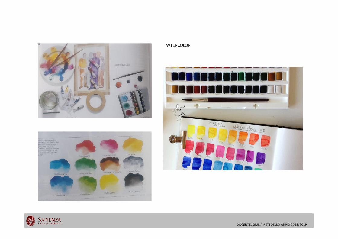
WTERCOLOR

DOCENTE: GIULIA PETTOELLO ANNO 2018/2019
TECHNIQUE OF SUBSEQUENTIAL COATS (velatura = thin layers overlapped)WATERCOLOR main features:
1.THE TRANSPARENCY(WHITECOLOR NOT USED BUT WATER)
2. TECHNIQUE OF SUBSEQUENTIAL LAYERS
3. «CONSTRUCTING» the color obtained from the mix of two or more colors.Just rarely the color is used pure directly prom the box