the technical edge - amazon simple storage service · the technical edge page 1 thomsett the...
TRANSCRIPT

The Technical Edge Page 1
Thomsett
The Technical Edge
MOVING AVERAGES
Part 1. What are moving averages?
The moving average (MA) is a tool used in technical analysis to better understand trends in
price. Because short-term price movement may be very chaotic, computing averages helps
smooth out the trend and better displays the direction and momentum underway.
MA is used in many of the widely used indicators, notably momentum oscillators and
volume signals. Averaging the recent past is a key component in analyzing and understanding
the current trend, and in anticipating what might happen next.
Computing the moving average (MA)
MA is a basic statistical function. It consists of adding up the values in a field, and then dividing
the total by the number of values.
A field is a collection of values. For example, 20 sessions of closing prices represents a
field of 20 values.
A value is a single entry within the field.
The formula for the simple moving average is:
( V1 + V2 + … Vn ) ÷ n = MA
V = value
n = number of values in the field
To apply this formula, a field of seven values is averaged. In this case, the ‘n’ value is 7:
1 13.40
2 13.21
3 11.64
4 12.90
5 12.15
6 12.98
7 13.16
The first step in finding the moving average is to add these together:
( 13.40 + 13.21 + 11.64 + 12.90 + 12.15 + 12.98 + 13.16 = 89.44

The Technical Edge Page 2
Thomsett
Next, because there is a field of seven values, the total is divided by 7:
89.44 ÷ 7 = 12.777
The simple MA in this case is 12.777, representing the average of the seven values in the field.
Applications of the MA concept
In chart reading, the opening and closing prices are revealed, and may also be
accompanied by a series of one or more MAs. For example, the chart for Briggs & Stratton
(BGG) includes a popular combination of MA lines, a 200-day MA (shown as the red line) and a
50-day MA (shown as the blue line).

The Technical Edge Page 3
Thomsett
This chart highlights one of the key concepts in MA analysis, the crossover. When the shorter-
term MA (in this case, the 50 MA) crosses below the longer-term (200 MA), it produces a
bearish signal. When the 50 MA crosses above the 200 MA, it is bullish.
On the BGG chart, the price behaves as expected, declining along with the bearish
crossover, and increasing with the bullish crossover. The MA pattern is not conclusive; it is one
of many confirming signals that develop on a chart. However, MAS signals are lagging
indicators, normally following price and volume signals. This makes sense considering that
every MA is a reflection of price behavior only the indicated time period.
A second concept in MA analysis is that of convergence, the movement of two averages
toward one another immediately before a crossover. The value of tracking convergence is that it
anticipates coming crossover and can anticipate a trend movement or directional change.
For example, the chart of Occidental Petroleum (OXY) identified two instances of
convergence, easily recognized as the space between the two MA lines narrows. On this chart,
there are two instances of convergence. As expected, the MA convergence anticipated the
change in price direction. As the 50 MA moved below the 200 MA, it confirmed the bearish
movement. In the second case, as the 50 MA converged, it anticipated a bullish moved; and as
the crossover appeared, a bullish trend began.

The Technical Edge Page 4
Thomsett
Yet another aspect of MA analysis is divergence, which describes the two MA lines moving
away from one another. Positive divergence occurs when the MA is moving upward, but price is
trending downward. Negative divergence is the opposite, with MA moving down as price
advances.
An example of divergence between MA and price was seen on the chart of Rogers
Communications (RCI). As the 50 MA rose, price declined. The contrary indications complicate
interpretation, so in cases of divergence, additional reversal and confirmation is clearly required.
* * *
The theory behind the use of MA in price analysis, is that the averages reveal a lot about the
trend, and help to identify the strength or weakness of that trend as it evolves.

The Technical Edge Page 5
Thomsett
Part 2. Types of Mas: simple and exponential
The MA is a statistical measurement used in many technical indicators. It is intended to smooth
out otherwise chaotic short-term price movements. This MA reflects the trend direction by
incorporating the values for several periods.
MA can be computed as either simple or exponential.
Simple moving average
The simple moving average assigns equal weight to all of the values in a field. Charting includes
MA calculation, enabling you to visualize the trend without needing to calculate its change. MA
normally is shown as an overlay to price. In this way, you can see when MA is above or below
price, or when it crosses over.
The longer the MA, the less volatile it is likely to be. However, longer-term MA also
tends to distort the true current trend because older data are outdated. This is why many
indicators take two corrective steps:
First, they employ two MA lines, a longer-term and a shorter-term.
Second, they weight the MA so that the more recent values are given more
influence.
Exponential moving average
One method for weighting that relies on a set formula is exponential moving average (EMA).
This is widely used in technical analysis, notably for momentum oscillators.
The calculation involves first finding an exponent, and then applying it to the newest
entry in a field of values. This enables calculation even over a long period of time, but without
requiring recalculation. EMA is automatically calculated in online charts including technical
indicators.
The computation of the exponent is 2 ÷ n, where n is the number of values in a field. This
exponent is used to calculate the EMA. The steps:
1. Calculate the exponent based on the number of values in the field.
2. Calculate a simple MA for the first MA value.
3. Subtract the next entry to the field from the MA.
4. Multiply the difference by the exponent.
5. Add the result to the previous MA.
6. Repeat for each new entry to the field.
This process is calculated automatically on online charts and for momentum oscillators relying
on EMA. Because the calculation involves several steps, it would take considerable time to track
MA over a long period being charted. However, EMA is calculated instantly when used on
online charting services.

The Technical Edge Page 6
Thomsett
The t-line
The trigger line, or trend line, abbreviated as the “t line” is a leading indicator that closely tracks
price and anticipates short-term price movement and correction.
It consists of an 8-day exponential moving average (8-EMA). Because the period of the
average is short, a “normal” pattern emerges when the t-line tracks price closely. The significant
signal occurs when price begins trading above the t-line over a series of days. This strong run in
price is a bullish signal. The opposite occurs when price drops below the t-line, the price does
not move above the t-line over a period of days. This is a bearish signal.
As price moves farther away from the t-line, either above or below, the chances increase
that the distance will close. The nature of averages makes this a certainty, although the time
required varies with the momentum of a directional price trend.
A single session’s move above or below the t-line is not significant. The consistency of
prices remaining above or below confirms the likelihood of a bullish (above) or bearish (below)
short-term trend. As a strong and highly visible signal, the t-line strengthens indicators that serve
as confirmation, including candlesticks, Western signals, volume and momentum.

The Technical Edge Page 7
Thomsett
The chart of Rockwell Automation (ROK) demonstrates the application of the t-line. Note the
highlighted areas. First is a range of prices trading below the t-line, providing bearish
confirmation of the downward trend. That trend’s conclusion is easily identified once the t-line
moves into the range of price. After this, the direction reverses and moves up.
In the second case, price trades above the t-line for several consecutive sessions, and
price does not close below the t-line at any time. This clear bullish trend is identified as ending
once the t-line merges with the price level and price then closes below the t-line.
The t-line is an excellent source of confirmation of a trend and identification of the
timing for it to end.
Part 3. Trends and trend reversals based on MA analysis
Trends never continue indefinitely. The purpose in MA-based analysis is to identify when a
current trend begins to flatten out, slow turn, or reverse.
MA is one of many indicators used by chartists in an attempt to characterize price
movement and to develop a rationale for timing of entry and exit.
The nature of trends
Trends are not predictable. However, some common traits exist in trends, largely based on MA
study and analysis. These include:
1. As trends approach their end, they tend to flatten out and plateau.
2. Exceptionally strong and sudden trends also tend to have equally strong and sudden
reversals.
3. Trends are inhibited by resistance and support.
None of these observations are true all of the time. They are common traits seen often, and may
be used to anticipate likely price movement. Trends, like all indicators, are most reliable when
independently confirmed.
Momentum and peaking
Trends begin with a degree of increasing momentum. The stronger the momentum, the faster the
trend develops. This momentum is easily spotted.
Also easily spotted is a peeking effect. A trend will not continue to grow at the same pace
indefinitely. Eventually the rate of growth in the trend slows down, and then levels out. After
this, a period of sideways movement may occur; or the trend may suddenly turn and move in the
opposite direction.

The Technical Edge Page 8
Thomsett
Finding reversals with MA changes
The likely signs of slowing momentum and coming change will take many forms. These include
the development of triangles, volume spikes, candlestick reversal signals, and changes in
directional indication in momentum oscillators.
Reversal takes many forms. Keep these guidelines in mind when trying to find the point
of likely reversal:
1. Confirmation is essential before acting on reversal indicators.
2. The likelihood of reversal is strongest when signal appear in close proximity to
resistance and support.
3. Sideways price movement presents opportunities for many types of trades, but
eventually either buyers or sellers will take control and create a new trend or a renewal of a
previous one. Recognizing when consolidation is likely to end is accomplished with the use of
many signals, notably MA analysis.
Part 4. MA applied to price changes
Moving averages assist chartists in recognizing the meaning of trends, reversals, and momentum.
By tracking the MA line next to price movement, trends and subtle changes in trends become
evident.
The significance of MA crossover (moving from above to below price or vice versa) is
that the MA either supports the evolving trend or contradicts it.
MA changes that signal price reversal
The single MA line works as a tool for anticipating long-term price trend, its momentum, and
coming directional change.
Because the MA is a lagging indicator, it may be found either above the current price
level or below it. That in itself is not significant; however, when the MA line crosses price or
lags far behind (diverges away from the price trend) that implies a reduction in the trend’s
momentum.
When MA crosses the price (from above to below or vice versa) that acts as a significant
signal. However, this should be confirmed before entry or exit decisions are made. The MA
includes a range of information that has to be judged in the context of current price and direction.

The Technical Edge Page 9
Thomsett
Gaps and their role in price movement
There are many types of gaps observed in technical analysis; many are not important. The
common gap occurs frequently, representing a space between one session’s closing price and
another’s opening price.
A second is the breakaway gap, which is found at a point where price begins to trend
above or below the established trading range. When found in conjunction with a move above
resistance or below support, it deserves further attention.
A gapping move such as this may mark the beginning of a new trend. It may also reverse
very quickly and fill, meaning the price trend returns to the established trading range. Gaps are
key technical signals when tracking price trends and momentum.
Two additional kinds of gaps hold special significance when confirmed by MA. The
runaway gap is seen when a trend – especially a newly set trend – is exceptionally strong. It
consists of several sessions of gapping prices, often consecutively.
For example, the chart of SPDR Gold Shares (GLD) revealed a strong uptrend
characterized by a long series of runaway gaps. This trend concluded with a very large gap
representing exhaustion.
The Technical Edge Page 10
Thomsett
Confirmation was found in two forms:
1. The volume spike appearing at the same time as the exhaustion gap signaled a
very strong likelihood of bearish reversal.
2. The movement of the RSI index at the same time, into overbought territory,
confirmed the high probability that price would stop rising and reverse to the downside.
MA interaction with resistance and support levels
Analysts expect MA lines to reveal and anticipate the momentum of a price trend. At the same
time, MA also interacts with resistance and support and reveals whether these trading range
borders are strong or weak.
Even in a dynamic trading range, when MA moves close to the treading range, it
indicates greater strength in that range; and as MA moves farther away, it signals likely
movement in the trend.

The Technical Edge Page 11
Thomsett
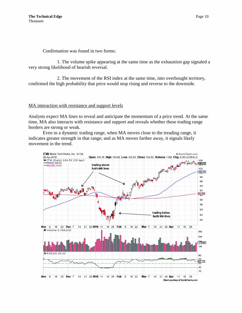
The chart of Illinois Tool Works (ITW) makes this point. It consists of an initial period of
consolidation, a brief downtrend, and then a new uptrend. Trading above or below the MA lines
reveals the strength of likely changes to follow. Two general observations:
1. When price trades above both MA lines, the likelihood of a bearish adjustment
is increased.
2. When price trades below both MA lines, the likelihood of a bullish adjustment
is increased.
* * *
The combination of MA with other indicators – such as candlestick reversal signals, analysis of
gapping price patterns, and conformity to the trading range, all make MA a useful technical
confirmation indicator.
Part 5. Bollinger Bands
This indicator mixes three moving averages. The middle band is a simple moving average, and
the upper and lower bands are each simple moving averages removed by two standard deviations
from the middle band. This creates a likely trading range that serves as dynamic levels of
resistance and support.
Because stock price behavior involves a constantly moving field, the commonly used bell
curve with normal distribution cannot be applied to stock prices. The Bollinger bands solves this
problem by creating a “probability matrix” indicating a range in which stock prices are expected
to trade. This sets up a continually moving trading range with resistance (upper band) and
support (lower band).
Beyond the advantageous tracking of the trading range, Bollinger Bands provides
numerous reversal signals. For example, the “Bollinger squeeze” is a narrowing of daily breadth
into exceptionally narrow range, located close to the edges of the upper band or lower band.
Narrow ranges are expected to be followed by wider bands, and the squeeze is likely to forecast a
breakout above the upper or below the lower band.
The chart of Gannett (GCI) includes Bollinger Bands overlaid with price. The upper and
lower bands generally track resistance and support, but the specific squeeze signal is highlighted
at the point that two things occur: first, price moves closer to the upper band and trades between
upper and middle band levels. Second, the price breadth narrows.

The Technical Edge Page 12
Thomsett
The squeeze anticipates a strong move in the indicated direction. In this case, the squeeze
occurred near the upper band, and this forecast a strong breakout and move above that level. The
stock had been trading in a consolidation range as indicated, and the Bollinger squeeze predicted
a breakout to the upside.
As Bollinger Band overall width increases or decreases, it visually demonstrates volatility. When
the change is extreme, it aids in identifying the volatility levels of stock price behavior. Within
this ever-changing trading range, specific reversal signals may emerge. These include the M top,
which is similar in significance to the double top or head and shoulders, providing a strong
bearish reversal signal. The key segment of the M top is a requirement that the final leg of the M
should break below support, signaling a successful breakout.
The Technical Edge Page 13
Thomsett
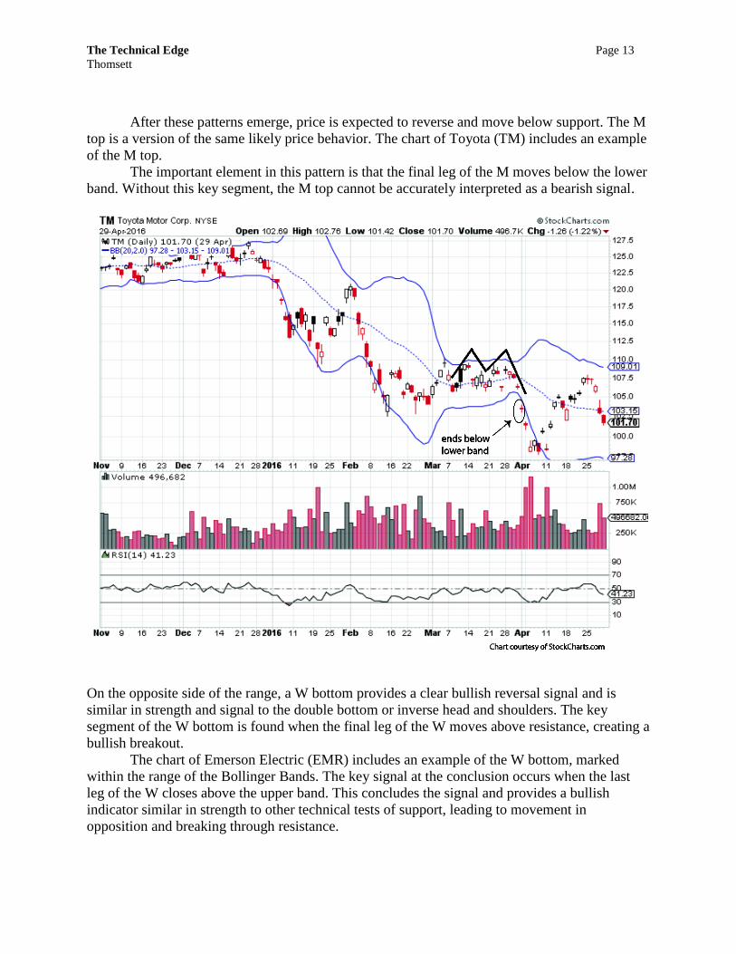
After these patterns emerge, price is expected to reverse and move below support. The M
top is a version of the same likely price behavior. The chart of Toyota (TM) includes an example
of the M top.
The important element in this pattern is that the final leg of the M moves below the lower
band. Without this key segment, the M top cannot be accurately interpreted as a bearish signal.
On the opposite side of the range, a W bottom provides a clear bullish reversal signal and is
similar in strength and signal to the double bottom or inverse head and shoulders. The key
segment of the W bottom is found when the final leg of the W moves above resistance, creating a
bullish breakout.
The chart of Emerson Electric (EMR) includes an example of the W bottom, marked
within the range of the Bollinger Bands. The key signal at the conclusion occurs when the last
leg of the W closes above the upper band. This concludes the signal and provides a bullish
indicator similar in strength to other technical tests of support, leading to movement in
opposition and breaking through resistance.

The Technical Edge Page 14
Thomsett
Most noteworthy on the EMR chart is the strong bullish movement that follows the W
bottom. This does not mean that the W bottom by itself is always a strong reversal indicator, but
it is one of several signals that, when confirmed, point to such a reversal. The rapid upward gaps
confirm a bullish change, and as trading levels move from the lower side of Bollinger to the
upper side, even more bullish forecasting is only strengthened.
The reversal signals such as the M and W, Bollinger squeeze, and related price patterns found in
Bollinger Bands should be viewed as reversals of the trend and not just of the price. Thus,
Bollinger Bands provides a valuable set of indicators during periods of consolidation. Among
these is the island cluster, a grouping a trading sessions characterized by gaps both before and
after.
Island clusters (also called island reversals) contain specific attributes: Gaps both before
and after, with price reversing and moving back to previous range levels. When an island cluster
appears, it is exceptionally strong if it also trades above the upper band or below the lower band.
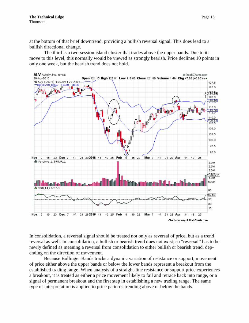
The chart of Autoliv (ALV) contains three examples of island clusters, and are
highlighted. The first occurs within the range of the bands and is bearish; but it is not especially
significant since trading does not evolve below the lower band. The second island cluster appears
The Technical Edge Page 15
Thomsett
at the bottom of that brief downtrend, providing a bullish reversal signal. This does lead to a
bullish directional change.
The third is a two-session island cluster that trades above the upper bands. Due to its
move to this level, this normally would be viewed as strongly bearish. Price declines 10 points in
only one week, but the bearish trend does not hold.
In consolidation, a reversal signal should be treated not only as reversal of price, but as a trend
reversal as well. In consolidation, a bullish or bearish trend does not exist, so “reversal” has to be
newly defined as meaning a reversal from consolidation to either bullish or bearish trend, dep-
ending on the direction of movement.
Because Bollinger Bands tracks a dynamic variation of resistance or support, movement
of price either above the upper bands or below the lower bands represent a breakout from the
established trading range. When analysis of a straight-line resistance or support price experiences
a breakout, it is treated as either a price movement likely to fail and retrace back into range, or a
signal of permanent breakout and the first step in establishing a new trading range. The same
type of interpretation is applied to price patterns trending above or below the bands.

The Technical Edge Page 16
Thomsett
Raytheon (RTN) experienced two periods of such price behavior. First was a series of
consecutive sessions trading and closing above the upper bands, confirming the bullish trend. As
price retreated back below the upper band, the bull trend also ended. Second was a similar
pattern of consecutive sessions trading below the lower band. This confirmed the downtrend and
also identified the point where the downtrend ended. As price moved back above the lower band,
the price trend reversed and moved upward.
Both patterns – consecutive trades above the upper band or below the lower band – can
be used to determine when a short-term trend is coming to an end.
Bollinger for tracking the range
Bollinger Bands may be viewed as a form of dynamic trading range. It is not always possible to
find close tracking of price for both resistance and support, but tracking one or the other is
witnessed frequently. For example, the chart of AT&T (T) very closely combined the upper band
and the price level. So in this case, the bands track dynamic resistance. At the same time,
however, the lower band diverges away from the fairly narrow trading range, visually

The Technical Edge Page 17
Thomsett
demonstrating varying degrees of price volatility. The farther away the lower band from the price
level, the greater the volatility. It tends to reflect the momentum in uptrends; the greater
momentum outpaces the lower bands, explaining the changes in Bollinger band width.
The same observation applies on the support side. A tendency for Bollinger close tracking of
support tends to be experienced during times of downtrends. The upper bands do not keep pace
with the falling price range, so as the price decline accelerates, the Bollinger band width grows
as well.
This was the case for Rack Space Hosting (RAX). Through the period of downtrend in
price, the lower band remained very close to the price level. At the same time, the upper band
broadened, reflecting the strength of the downtrend and growing volatility at the same time.

The Technical Edge Page 18
Thomsett
The many ways that moving averages are used to confirm price trends and to signal reversals
make this a key indicator. The use of two MA lines and tracking of crossovers, convergence and
divergence is a popular device for clarifying the nature of trends and reversals. The t-line
provides exceptional confirmation based on whether price trades above or below. And the
moving averages comprising Bollinger Bands provide an array of valuable insights into the
current trends and likely reversals and breakouts, notably during consolidation.