the tutor cityscape in one-point...
TRANSCRIPT

The Tutor
DOWNLOADEXTRA TEMPLATES
3dtotalpublishing.com/resources
Cityscape in one-point perspectiveLearn how to draw a city scene using one-point perspective
Cities seem big and daunting at first, but everything can be broken down into straightforward lines and blocks. This workshop will show
you how to draw a cityscape using simple perspective guidelines in a one-point perspective, which is ideal for a beginner, but it can go a long
way when constructing a detailed background or a busy urban scene. A solid sense of perspective really brings the scenery to life.
The objects closest to the foreground are drawn with bolder, thicker lines. This also helps to create a sense of depth and distance, drawing the eye into the picture.
The furthest buildings are fainter and less detailed due to aerial perspective (light scattering in the atmosphere). This helps create depth, and is why distant objects look misty in real life.
Try adding different features to each building to break up the
monotony of a long street.
Roofs, windows, signage and
broken elements add character to
the scene.
People often say “I can’t even draw a straight line!” But
really, nobody can. You’d need to be a robot. Don’t be
afraid to use a ruler for your drawings.
Marisa Lewis Illustrator
www.artsthread.com/p/marisalewis

Even a towering skyscraper is easy to draw if you just think of it as a big block. Here, we’ll begin with
some simple guidelines to establish the correct perspective. You can make blocks of all sizes and
proportions using the same rules – and eventually a whole street of them.
Always begin with the horizon line. The vanishing point is
marked here with a dot – this is the one point where all the scenery converges towards
the horizon.
The horizon line can be set low or high in the picture. Do you want more ground or more sky in your scene? The horizon here
is roughly at eye-level.
The diagonal lines mark where the angled sides of the buildings
will be. The steeper the guidelines, the steeper your perspective.

cityscapes
The hardest part of one-point perspective is the vanishing point, because everything converges very fast.
I prefer to just block it in.
You can use a ruler to draw your lines and boxes, or try to get them down freehand if you’re feeling brave. There’s nothing wrong with using a ruler at this stage.

cityscapes
When you decide how to break or divide the big shapes, think about
functionality. Where would the main function or empty space be?
I always think about the functionality of objects, and how they work in different time periods or genres, such as a gate mechanism. In a sci-fi world it would work in a mechanical way and in a
medieval design it would be made from wood and ropes.
Try adding more overlapping shapes to improve your designs.
To add visual interest, I use the rule of thirds, which is when you imagine your image divided into nine equal
parts – you can do this by imagining two equally spaced horizontal lines
and two equally spaced vertical lines running through your image.

cityscapes
As the sci-fi reference is the side alley of a mall, they might keep some crates outside, under the slope.
Remember: everything you draw is a 3D object that has thickness, like
doors, windows, railings and so on. Don’t just draw
flat textures on the wall.
Even when I draw small cables, I keep in mind where and how they would bend, so I
can emphasize the shape by drawing some lines across it. It’s the detail that will add realism
to your work.
When I add detail I always keep in mind how it would be used by
people, or how it was built.
You can dress up your buildings any way you like. Here are some different themes and variations to inspire you, such as Art Deco, medieval fantasy and sci-fi.
You can show depth by using lines with different thicknesses, or by drawing double/
triple lines. To show that the object is closer or overlapping other objects, use thicker lines.
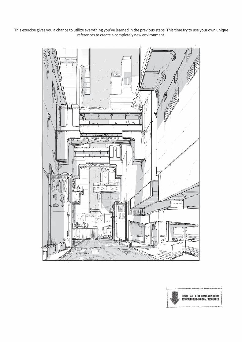
This exercise gives you a chance to utilize everything you’ve learned in the previous steps. This time try to use your own unique references to create a completely new environment.
download extra templates from3dtotalpublishing.com/resources

You can find perspective lines here that you have to draw in the very beginning of your work. You can also see cube outlines that we are going to use to draw buildings, but let’s start with the horizon line. It’s the main line on the picture, as you place the vanishing point along this.
You may plan more vanishing points, but you should always put them on the horizon line.
Gridlines should be drawn very gently – you can use an H pencil for this. They should not distract
the viewer or collide with the shapes.
While drawing a city, don’t over-complicate
your work with complex 3D structures.
Try to build your composition based on
the simplest shapes and cubes.
Hyper-precision is not the most important thing. Sometimes
it is the composition dynamic that plays the key role. Don’t
hesitate to play with gridlines and try to bend them.
To make your work with a multipoint perspective easier, you can draw supporting curves first. Use
curves to sketch gridlines and cube lines.
Please note that when drawing
a cube, it is four parallel lines
intersecting at one vanishing point,
while the other four parallel lines have
different intersection points. Remember
the vanishing points are placed on the
horizon line.
Depending on the position of the horizon
line, we can get a bird’s-eye perspective
or a worm’s-eye perspective.
Gridlines and horizon lines are helpful, not only to sketch the cubes,
but they also define the viewer’s position. If you lie on your side the horizon line seems to be vertical.
Please remember that gridlines are there to
help you. Do not draw a complex network of gridlines as you will lose the overview.

Draw your own set of cubes using the gridlines provided and the reference above as a guide.
At this stage we need to define the final composition. Think about proportions, gaps
between buildings and the space for the background. Cubes, even when drawn gently,
should be more visible than perspective lines. To control proportions, you can also sketch a figure
next to the buildings.
You should now have more confidence in drawing perspective and how to play with it. In the next exercise, we will define the
main characteristic points and shapes of the composition –elements that give the city its identity…

Who knows how long this banner
has been hanging around! Make it look tatty and stained by fraying and shading
the edges.
Roof tiles sit on top of each other, overlapping slightly, so the line they make won’t be totally
smooth. Add some zig-zag to your edges so
the tiles don’t look flat.
You can brighten up your walls with
some torches, but remember to
leave a bright area around them where the flames light up the surroundings.
An unfriendly fortress town needs a wall of sharp stakes. Make them rough and
jagged, and add some knots and bumps so they look like real tree trunks.
Some ramshackle huts can make the place look inhabited and give the bigger buildings a sense of scale. They’re not well-built, so a bit of wonkiness doesn’t hurt.
Bricks and mortar make a building look solid, but there’s more to a lived-in place than just walls, which can look monotonous without the extra detailing. Now you can add some roofing, beams and banners to decorate your buildings.

Practice some wall textures, tiles and shading on these templates. You can even add some emblems of your own on the banners.
A bit of wonkiness adds character to your buildings, so keep your
guidelines faint: it makes it easier to go over them with linework and
shading later. Try miniaturizing your details to make it work to this scale.
Now you’ve drawn all the parts you need, in the next exercise you can have a go at
completing a whole scene, adding in your own textures and details…