title art as collaboration: 50 years of edition hansjörg mayer
TRANSCRIPT

Title Art as collaboration: 50 years of Edition Hansjörg Mayer
Type Article
URL http://ualresearchonline.arts.ac.uk/6139/
Date 2013
Citation Mayer, Hansjörg and Brown, Eleanor Vonne and Grandal Montero,
Gustavo (2013) Art as collaboration: 50 years of Edition Hansjörg Mayer.
Artist’s Book Yearbook 2014 - 2015. pp. 64-75. ISSN 978-1-906501-07-5
Creators Mayer, Hansjörg and Brown, Eleanor Vonne and Grandal Montero,
Gustavo
Usage Guidelines
Please refer to usage guidelines at http://ualresearchonline.arts.ac.uk/policies.html or
alternatively contact [email protected].
License: Creative Commons Attribution Non-commercial No Derivatives
Unless otherwise stated, copyright owned by the author

64
Poster for Dieter Roth’s exhibition at Galerie der Edition Hansjörg Mayer (1967). Image courtesy of Edition Hansjörg Mayer
Typocolumns in the retrospective exhibition at the Haags Gemeentemuseum in 1968. Image courtesy of Edition Hansjörg Mayer
abyb14.indd 64 04/10/2013 11:34

65
Art as collaboration:
50 years of Edition Hansjörg Mayer
An interview with Eleanor Vonne Brown and
Gustavo Grandal Montero
he introduction to the monograph ‘Publications
by Edition Hansjörg Mayer and work by Hansjörg
Mayer’, published on the occasion of a retrospective
of his work at the Haags Gemeentemuseum in 1968,
described him as “a typographer, printer, publisher
and lecturer”. He is also, or has been, a graphic
designer, photographer, ilm-maker, composer…
but would probably be best described as an artist,
one that primarily works in collaborative publishing
projects with other artists and writers.
Raised in Stuttgart in a family of printers, in 1963
he founded Edition Hansjörg Mayer, arguably the
most important publisher of artists’ books of the
last 50 years, with a back catalogue that includes the
‘Complete works’ of Dieter Roth alongside seminal
titles by Richard Hamilton, Emmett Williams, John
Latham, Mark Boyle, Robert Filliou, Herman de
Vries, Tom Phillips, and many others.
Associated at an early stage with Max Bense’s
Stuttgart Group, he developed during the 60s his
own “typoems” and other forms of experimental
visual poetry, oten employing complex conceptual
methods (e.g. “typoactions”). His published output
includes prints, portfolios, books and the broadsheet
series ‘Futura’, featuring his own work, that of many
major international practitioners of Concrete poetry,
and his typographic interpretations of texts by
diferent authors.
Mayer, who celebrated his 70th birthday this year,
is receiving overdue recognition from art and
graphic design historians for his contribution to
the development of modern artists’ books, and his
work is being rediscovered as a referent for both
graphic designers and contemporary artists. With a
current exhibition at Museum Ostwall, Dortmund
(‘Künstler, Verleger, Galerist: Hansjörg Mayer zum
70’) and several retrospectives planned for next year
(Nationalgalerie Berlin, Staatsgalerie Stuttgart, Tate)
the number of his admirers is set to increase.
When we visited his London studio in April 2013 we
found him surrounded by prints and photographs,
working on material for a series of three new
publications that will focus on his own practice
and early work with experimental typography and
ilm. ‘Typo’, ‘Foto’ and ‘Film’, compiled and designed
by Mayer and with text by Stefan Rippling, will
be published by Walther König later in the year.
Meanwhile, those looking for more information can
visit his website: http://hansjorgmayer.com, which
includes a webslide documenting his publications,
and English and German interviews with this
generous artist. A generous man.
Max Bense and John Cage
GGM You studied philosophy with Max Bense, this
perhaps could be a good starting point.
HM Very much a starting point. I used to play
football with Max Bense’s son, Georg Bense, when
I was 13, in Stuttgart. he place where we played
was right next door to their home, so sometimes,
as kids, we would go to this beautiful house, where
I saw for the irst time stuf other than the boring,
slightly kitsch things normal in a German bourgeois
home like my own. I was always looking at these
wonderful things, Concrete and other Modern art,
and Bense was very kind and patient. He answered
my questions, and in time some kind of friendship
developed. He introduced me to contemporary art,
and many other things. When I started to attend
the Technische Hochschule, I oten went to listen
to his lectures. Bense was an extremely important
igure in Stuttgart at the time, a Professor of
Philosophy with a particular interest in aesthetics,
and saw himself as a kind of theoretical centre for
all the arts and design: artists, poets, composers,
industrial designers, etc. He was an amazing magnet,
introducing all these diferent people to each other.
So that was certainly the starting point.
GGM Could you give us some names of people
that he put you in contact with, or work that he
introduced you to, from the point of view of graphics
or in general? Max Bill?
HM Yes, I did meet Max Bill through him. Max
Bill and Max Bense had started the New Bauhaus
in Ulm, and sometimes I went to Ulm with him.
I didn’t like Bill, I found him arrogant, charming
but very ixed in his views, I was never terribly
impressed. I also met Maldonado, who had taken
over as head; I thought he was more interesting.
I never really liked Ulm, however fantastic the
original Bauhaus was, I thought that what the
English called the New Bauhaus didn’t get very far.
One of the most important things in terms of
inluences was visiting the new music festivals in
Darmstadt and Donaueschingen, two of the most
important contemporary music festivals ater the
war. Bense sometimes went there, and he took me
with him a few times. hese were very liberating
experiences. For instance, to meet Cage and to
listen to Cage… he had a huge inluence on me.
abyb14.indd 65 04/10/2013 11:34

66
I was also fascinated by a lot of other by-products
of prooing, inking, cleaning rollers, etc. I can show
you a few because I have been photographing them.
Pictures made out of random inking, cleaning, etc.
processes. I love all this throwaway stuf. But without
Cage, without this amazing idea that sound and
music are the same, I wouldn’t have realised that,
I would have been too ashamed or afraid, it was
totally against everything I had been told. It gave me
the courage to see things in a diferent light, to open
up. I wanted to get away from crat and Kitsch, and
use randomness, I started with that. Without Bense,
I don’t know where I would have ended up. Probably
in a boring printing shop somewhere.
In addition to going to Bense’s lectures, I also went
to lectures at the music academy, in composition,
because I was very interested in music. When I
started making experimental ilms in the early 60s
with Georg Bense I mostly made the soundtracks.
FAT (Filmarbeitsteam)
GGM What can you tell us about these early 60s
ilms?
HM Max’s son Georg was very keen on ilm
making (he ended up being a ilm-maker with the
Saarbrücken State Television), so we started an
experimental ilm unit called FAT (Filmarbeitsteam)
under Bense’s umbrella, the Studium Generale of
the Technische Hochschule Stuttgart. We made
about 10 experimental 16mm ilms inspired by texts
and things like that, from 1960/61 perhaps. Some
of them were shown in experimental ilm festivals
(Oberhausen, etc.), some were even run in cinemas
in Stuttgart. But then we all went our own ways…
We showed them a year ago in Berlin, at Barbara
Wien, the ones that we had already digitised and
were OK.
EVB I saw one of them at the Barbara Wien show
(‘JETZT: edition hansjörg mayer, london’, 2012), a
ilm of a tram.
HM hat one is called ‘Jetzt’. It was still in good
condition. We also showed another, ‘Terry Jo’, in a
room at the back. he others need a lot of work, and
parts of the soundtracks need to be re-recorded.
GGM You were responsible for the music, did you
have any responsibility for the image?
HM We all were. All three of us, Georg Bense,
Rainer Wössner and I worked on everything, but I
was responsible for the soundtrack, let’s call it that.
Stockhausen, Boulez, Nono, all the important new
composers were there and performed there, but the
most liberating thing for me was actually to listen
to Cage, and to realise that there is no diference
between noise and music.
Staib und Mayer
In 1953 we moved in Stuttgart to a new house,
which my father built, and I started Gymnasium
(secondary school). My grandfather’s printing works
had been hit by a bomb and destroyed completely,
so my grandparents and parents got together with
another printer and started a new company, Staib
und Mayer, which was exactly in between where I
went to school and our home. So, from around the
age of 10, oten ater school I didn’t go home but
to the printing shop, because it was brand new and
wonderful, and I loved the smell of ink and the noise
of the printing machinery and everything that was
going on there... and I started using the printing
processes.
EVB What equipment did they have?
HM I actually have photos of the printing works
which I believe were taken in the sixties. hey had
hand hot metal typesetting, Linotype, proof presses
and Heidelberg printing machines of various kinds;
and then bookbinding, etc.
Since I was the son of the boss, I could muck around
and ask people, sometimes I was probably a pain,
but they were patient. hey thought that I was the
next generation that would take over later on, which
I of course didn’t... I got used to whatever hot metal
typesetting and letterpress printing methods existed,
and was fascinated by all sorts of things: very early
on I collected pre-run sheets, normally thrown away.
I oten collected them and cut them out, but they
had to be colourful, and have weird things on top of
each other, etc. My grandfather, who was a master
printer, found out that I collected them in a drawer
and he called me over and asked me: “What do you
think is this? Why are you collecting this kind of
rubbish we throw away? You should be collecting
beautiful examples of well-printed things! hrow
them out.”
EVB For him it was an embarrassment, wasn’t it?
HM Exactly! In those days, all good printing shops
collected sheets to show potential clients the quality
of their work. To him, this was an insult. I was
furious with him for weeks, but then I collected
some more, in a diferent drawer, until I lost interest.
Believe it or not, I have found one. I am so glad, the
only piece that is let from the 1950s…
abyb14.indd 66 04/10/2013 11:34

67
GGM What sort of soundtracks did you make? Re-
used sounds?
HM Yes, but not in Pierre Schaefer’s tightly knit,
musique concrète style. hat to me was a bit too
restricted... in a much freer way. Again, Cage played
a big part, I suppose, a liberating one. Sometimes
I recorded sounds somewhere, distorted them or
mixed them, but not in a very formal way, not like
Schaefer or Nono or Stockhausen. It was very...
incidental, I could call it. I was quite astonished,
listening to it again ater more than 40 years…
I found in an old ammunition box reel to reel tapes,
which I thought I had lost. I had to buy on ebay a
machine to play them so I could listen to them and
digitise them.
GGM I read somewhere that you also studied
painting, around 1962, is that correct?
HM Painting? I have never painted in my life!
GGM Don’t ever take any information from the
Internet…
HM My whole idea was no painting, no hand made
crat, nothing like that… I wanted to get away from
it. Absolutely not!
GGM Do you have any formal training or studies in
graphic design or typography?
HM I am a master typesetter and studied at the
Printing Engineering Academy, including graphic
design.
Dieter Roth
HM In 1963 I went to the USA. I was lying via
Reykjavik, the cheapest at the time (obviously,
I had no money) and Max Bense said: “Iceland?”
We were in the study, in his house. He went to the
bookshelves and pulled out two books: “here is
someone called Dieter Roth who lives in Iceland and
has sent me these (‘Bok 2b’ and ‘Bok 3c’), I am very
interested to know who this man is, ind out who he
is”. I asked him: “How do I ind him?” “It says here
on the book Box 412, Reykjavic, you will ind him”.
When I got to Reykjavic I asked people, nobody
knew who he was, until inally someone told me
where he lived. I went there, knocked on the door
and nothing. Next day, went back, knocked on the
door, nothing. hen, fortunately, a woman who was
working on a garden next door, saw me. She didn’t
speak English or German but kindly wrote down an
address, so I took a taxi and went there. He was for
the summer months in a house outside Reykiavik
that belonged to his brother in law. I knocked on the
door and he opened. hat was the end of that,
or rather the beginning…
EVB Why do you think Dieter Roth had sent Bense
those books?
HM He had published himself several books in the
late 50s but nothing happened. So he got Bense’s
name from someone and sent him the books, in the
hope that something would happen.
GGM Roth had published a magazine in Switzerland
in the 50s with Eugen Gomringer and Marcel Wyss,
‘Spirale’.
HM Yes, he did that before he went to Iceland. hey
never got on terribly well because Dieter was already
out of the Concrete art stuf that the other two were
into. He went from Switzerland irst to Denmark to
work in textile design, and there he met his Icelandic
wife, and then went with her to Iceland.
We got on extremely well, because our ideas were
very similar. here weren’t many people who were
as open as he was… for instance, he showed me this
book made of pre-run sheets, and I laughed and
told him that I was collecting them in our printing
shop when I was 11 years old. hat was it, we saw
eye to eye… Before I let for America I said to him:
“I would like to publish your books, I think that you
have made the most wonderful books that I have
ever seen...” He was quite pleased, because nobody
else wanted to do it. Later we oten talked about
the few books published by others, for example
Something Else Press, or Dumont, they never
did what he really wanted. I made the books with
him exactly as he wanted them, no censorship, no
interference, nothing. And, of course, if an artist’s
book is not exactly the way the artist wants it, what
is the point? hat’s what we always did.
EVB When you ofered to publish his books, had you
already published other artists’ books?
HM Not really… I had done some typographical
interpretations, and some so-called Concrete poetry.
I had some intentions to publish books.
GGM But it is not just that you facilitated or
realised his works, in some books you make a more
fundamental contribution, for instance, ofering a
typographical interpretation of his texts, as in ‘he
blue tide’ (Volume 14).
HM I had published a series of small books
like Emmett Williams ‘Sweethearts’, so I said to
him: “Wouldn’t it be fun to print ‘he blue tide’
abyb14.indd 67 04/10/2013 11:34

68
Cover of ‘Publications by Edition Hansjörg Mayer and work by Hansjörg Mayer’ (1968). Image courtesy of Edition Hansjörg Mayer
Cover of ‘Alphabetenquadratbuch 1’ (1965). Image courtesy of Edition Hansjörg Mayer
abyb14.indd 68 04/10/2013 11:34

69
letterpress? I could set it all, whatever I see, in
diferent type sizes.” He thought it was a wonderful
idea. So I sat on a linotype machine and set whatever
I saw on his manuscript just using my ‘futura’
typeface.
GGM his is an example of a collaborative project, it
is as much your work as it is Dieter Roth’s.
HM I was never interested in that. What I wanted
was to publish books that are exactly what the artist
wants, that’s all. Who does it is not interesting.
EVB hat is very generous.
GGM Extremely generous.…
HM It’s the only way that makes sense, if you think
about it. You are either a publisher who is really
trying to do what the artist wants, or you are one of
these commercial boys who have all sorts of other
ideas…
Obviously I made suggestions, and had my take at
the technical level, some things I knew better, but I
was never pushing myself forward. If I showed him
something, he would say: “Oh, this is interesting.”
Dieter was always curious about everything, so he
would say, that is a new idea, no one has ever done
that…
EVB Did you print at your father’s press?
HM Yes, we printed most books there, but not all.
We didn’t want that everything would look the same,
and if you print everything in the same press it may
do, so we also printed in Iceland, we had two books
made by Cantz, etc.
EVB Did you work with a distributor? Were you
interested in getting the books out?
HM I was very interested in getting them out,
but it was hopelessly diicult, I can tell you that…
My luck was that when I irst went to the USA I
met George Wittenborn, a German refugee, by
then a major art books distributor and publisher
in the USA. Someone had told me about him, and
I walked into his shop in New York, a little bit shy.
By chance he was standing at the door; he looked
at me and asked in German: “Are you German?”
He said: “Come in! What have you got under your
arm? Show me”. I had some of the concrete poetry
folders and some of the early typography things. He
bought everything… He asked me if I had more and
I had it sent to him from Stuttgart. hat was a huge
help… hanks to the Wittenborn connection I had a
wonderful distributor in the USA. He introduced me
to Bernard Karpel, the librarian at MoMA who then
bought everything for many years. As my oicial
distributor he sold lots of stuf, without him it would
have been very diicult…
Exhibitions and catalogues
GGM What about exhibitions? When you had your
gallery in Stuttgart (1966-69), for instance, how did
you see it in relation to publishing? Was it just a way
of highlighting the work of people you liked? Why
did you decide to open a gallery?
HM I called it Gallery of Editions Hansjörg Mayer
(galerie der edition hansjörg mayer) so, yes, the aim
was to show works by the artists that I published,
because nobody showed these people… I did the
irst Dieter Roth exhibition in Germany, can you
believe it? he irst Robert Filliou, irst George
Brecht… it was very much related to my books, yes.
GGM You made a sort of installation of
‘Typocolumns’ for the Brighton Festival.
Was this a unique project or have you made any
other 3D work?
HM he three big typo columns I made specially
for the Brighton Festival in 1967. I also made some
smaller ones, which were shown in 1968 in the
Hague. I made no other 3D work.
GGM Since the 1968 retrospective (Haags
Gemeentemuseum, he Hague) there hasn’t been
any major exhibition of your work, will this change
soon?
HM he Tate is interested in doing an exhibition
(Trustees expressed this following a recent
acquisition of a large collection of work, including
portfolios, monoprints, etc.), and the Nationalgalerie
in Berlin is planning to do a show, next year. hey
have a collection of Concrete poetry acquired from
Jasia Reichardt years ago, and they have added
further material: it’s a nearly complete collection
now. And the Staatsgalerie Stuttgart decided that,
as they have the Sohm Archive and a lot of my
material, they would do a show too.
he three books I am planning now should also
be helpful. I don’t want them to be exhibition
catalogues as such, just material which is there,
available.
Already in 1968 I didn’t like the idea of an exhibition
catalogue. ‘Publications by Edition Hansjörg Mayer
and work by Hansjörg Mayer’ was published as
part of an exhibition, it’s complementary material,
abyb14.indd 69 04/10/2013 11:34

70
Print part of the ‘Last alphabet’ (1968). Image courtesy of Edition Hansjörg Mayer
‘Typoaktionen’ (1967). Image courtesy of Edition Hansjörg Mayer
abyb14.indd 70 04/10/2013 11:34

71
not documenting the show but giving additional
information. People tell me that this was one of the
irst times that this happened.
EVB What made you approach it that way?
HM When they came and told me that they
wanted to do a retrospective of my work at the
Haags Gemeentemuseum, the published work
alongside my own, at the age of 25, they asked me
if I wanted to do a book, and I knew I didn’t want
to do a catalogue, I wanted to do something that
complemented the show, and they were very happy
with that.
his retrospective inished a chapter in my life and
I thought from then on I would just publish artists’
books. hat is also what I said to Dieter, who was
a little bit jealous… which he was oten anyhow,
because nobody knew him then. He was a little
angry that I, 13 years younger, had a big exhibition
in a museum, something he had never had…
(He never came to look at the show, by the way…)
But I said to him that from then on I would just
publish his books and a few other artists’ books,
like Richard Hamilton’s.
Alphabets
I made the ‘First alphabet’ in 1961/2. In 1968, before
the exhibition even, I wanted to do a ‘Last alphabet’.
But because of other work (I was teaching at Bath
Academy, at Watford School of Art, I was working
with Petersburg Press, which I had started with Paul
Cornwall-Jones… I was doing a thousand things),
I just didn’t have time to actually do it… When the
show was over, in January 1969, I think, I started to
print the ‘Last alphabet’, and it was a very elaborate,
huge project, involving some 2,700 prints. I was
in Stuttgart and Dieter came over: he was very
enthusiastic and encouraging, but I could see that
he actually was furious about it, he thought that I
would continue doing my own work instead, as I had
promised, to publish his books… I told him: “don’t
worry about it, I am not going to inish it”. I only did
the irst prints, I let it and that was that… And now,
I have been working on it again, because now I have
time… so I am actually doing it, but not to the full
extent I had planned.
EVB Is it the same that you sent me for the
XALPHABET series?
HM he ‘x’ that I sent you is one out of 26 random
ones. It’s quite a simple idea, you take each futura
letter and print each, one by one, 26 times, by just
randomly moving them ater each printing. he
letters are not ixed on the bed of the proof press.
You do that with the whole alphabet, each one
is printed 26 times – but in order to get a deeper
impression into the paper (I always like to print
with a lot of pressure), I put another sheet of paper
underneath, so you get a blind embossed version of
the print. My idea was to print 26 diferent colours
on a set of tissue sheets, make die cut forms, and die
cut each of them. his was about reduction (as the
previous was about addition)… I still have got some
here. What I did is to use only part of each letter.
his is the blind embossed second sheet which I then
illed in, at the time, with whatever part I wanted to
keep. Because this is about the reduction, this isn’t ‘h’,
I only wanted to keep this… So, random techniques,
randomness was always an important thing.
I am doing inkjet prints, now. Originally it would
have been all letterpress printed with die-cut
coloured sheets stuck on by hand, each one. But now,
of course, things have changed, so I am now using
computers and inkjet printing.
EVB Do you like that? People are not actually keen
on inkjet printing, but I think in the future inkjet
prints would be what people love about today…
HM Of course. It achives print quality that has never
been seen before. Richard Hamilton’s last work,
the last ive years, are all inkjet prints, and they
are beautiful. I published a little book of his about
printing technology, and he explains how it is as
much work as any other technique, but people don’t
understand it…
GGM What was your interest in type speciically, in
the early 60s?
HM I come from a printing family, my grandfather
had a printing shop, my father and so on…
It comes from growing up with it… I got printing
ink in my veins.
Concrete
GGM Why Concrete poetry as opposed to
mainstream graphic design?
HM Bense! Again this early meeting… Bense
was already interested in Concrete poetry, he had
contacts with the Noigandres (Haroldo de Campos,
Augusto), etc. hrough him I met a lot of diferent
people from all over the world…
GGM Gomringer?
HM Sure, although I wasn’t very keen on
Gomringer… I like his old stuf, his so called
‘Constellations’, a lot of really beautiful work…
abyb14.indd 71 04/10/2013 11:34

72
He is so dry, so Swiss… but nice, friendly, I am not
knocking him…
GGM You met Cliford Ellis at the opening of
‘Between Poetry and Painting’…
HM Indeed, yes. When Jasia Reichardt made this
show in 65 at the ICA, I had just come back to
Stuttgart from Brazil, and she wanted lots of work,
my own things as well as what I had published.
I had been pretty much everywhere in Europe,
but not to England, so I thought it was a good
opportunity, and I said that I would come over
by car and bring the stuf with me.
I just loved England from the irst day, it was heaven,
absolutely wonderful, and I have never looked
back… everybody was terribly nice… I remember
I arrived a bit late because, coming by ferry,
I stopped at Canterbury, to look at the fabulous
cathedral and because I was hungry. here was a tea
room just next to the cathedral, with lovely old ladies
having tea. I looked at the menu, and they had two
things: beans on toast and spaghetti on toast. I just
killed myself laughing, it was the funniest thing I’d
heard in my life!
When I arrived in London the ICA was already
closed. Jasia had gone home, I didn’t have any
telephone numbers… the only address I had was
that of John Willett, Deputy Editor of the TLS,
in Hampstead, so I went there, I had a little map,
knocked at the door, and fortunately John Willett
opened. I said: “I am Hansjörg Mayer, I am terribly
sorry…” He had already done an article in the TLS
about my work... anyhow, a nice, wonderful guy:
“Come in, have dinner with us! Where are you
staying? Stay with us!”… Next day I went to see
Jasia, who lived nearby… I had such a good time.
So I decided to stay for the opening, which I hadn’t
planned. And then, of course, at the ICA in those
days, everybody was there! Richard Hamilton,
Hockney, Kitaj, Paolozzi, everybody in the art
world was there. It was a tiny group, not like now…
And also Cliford and Rosemary Ellis. He came over,
smoking his cigar, and asked: “Would you like to
teach at the Bath Academy of Art?” It was the last
thing I wanted, I had too many other things to do…
But he insisted: “Why don’t you come and visit us?
I’ll send the chaufeur over.” Bath Academy at the
time was in Lord Methuen’s beautiful country house
(Corsham Court), 30 peacocks running around, and
I was put in the red room, and all that… and the
students were lovely, and all was fantastic…
so, of course, I conceded: “all right, but you have to
buy a better proof press, futura typefaces in such and
such sizes, and I can’t come normal times, I can only
do blocks, because I do many things, I can come
two weeks at the time, but then I can work from
10 in the morning to 10 at night…” hey agreed to
everything! Astonishing! So I started teaching on the
1st of January 1966. Wonderful place, nice people,
incredible… We did so much work there…
Talking about Emmett Williams, Ann (Williams)
was my student, at Bath Academy. She inished in 68
and then was my assistant, she helped me with the
68 catalogue, Robert Filliou, etc.
GGM It was another hotbed for Concrete poetry at
the time, wasn’t it?
HM Well, I got John Furnival to come and teach
there, Tom Phillips stayed for a little while, and of
course Dom Sylvester Houedard was nearby, and so
on… We did this Concrete poetry portfolio that you
also have, and I did another one with work by the
students which Tate has now…
Typoems
GGM You published the folded poem
‘Openingnisolc no.8’ with Openings Press in 67.
Did you work with Edward Wright on it?
HM I don’t remember working on it with Edward,
but we met a number of times, and I liked him very
much, and his work, needless to say.
GGM here are two later books of your own work:
‘Typoaktionen 2’ (Pieter Brattinga, 1976) and ‘Bis
zum unfallen: just ice’ (Hansjörg Mayer, 1987).
HM hey relate to 60s projects. ‘Typoaktionen 2’
is based on the original one, I didn’t have to do
anything: Pieter Brattinga just blew up the pages
of the 1967 typo action book, but only the ones
which are not overprinted, so there are 26 sheets.
He said he wanted to see them bigger… he original
‘Typoaktionen’ was published by Typos Verlag, using
a photocomposition machine, with the super letters
of the irst alphabet, exposing each one randomly
and blindly in a 13-minute action, and moving the
ilm ater each exposure. he result could only be
seen ater the ilm was developed. ‘Bis zum umfallen’
was an idea (some proofs still exist) from 1967, but I
only printed the edition in 1987, ater I had inished
publishing Dieter Roth’s books and had therefore
more time.
GGM In your work, how do you see the visual
aspects as opposed to the literary aspects?
Did you write other things? Was your interest
primarily graphical?
abyb14.indd 72 04/10/2013 11:34

73
HM When I let the USA in 65, I went travelling
in Mexico, staying with Mathias Goeritz for a long
time, then went to Ecuador, Peru, Chile, etc., and
ended up in Brasil, where I stayed with Haroldo de
Campos for quite a long time, and he introduced me
to the other Noigandres members. He coined the
term “typoems” for the work I did. He wrote a little
letter which was reproduced in the 68 catalogue:
“A type is a type, a poem is a poem, but when a type
is a poem, and a poem is a type, this type of this
poem is a typoem (…)” What I was interested in was
to reduce all the diferent elements to just type.
It may not have words or semantic components, only
visual, and sometimes also acoustic ones.
Futura
I created many portfolios and the whole of the
‘Futura’ series (1965-1968), where I worked mostly
with typography. hey oten sent me text, asking:
“How should we do this?” I would come up with an
idea, send them the proofs: “Is that what you would
like?”, and make any changes until they would say
“yes”. Only then was it printed.
GGM How did you select the artists to work with?
HM hat is a question which is so oten asked,
and it’s very simple: a lot of it is random. Random
elements are there all the time… You meet
somebody, more or less by chance, you actually like
them or you don’t like them. here is no system,
there is no pre-conceived idea of who and what,
it was all just meeting somebody and just doing
something with them.
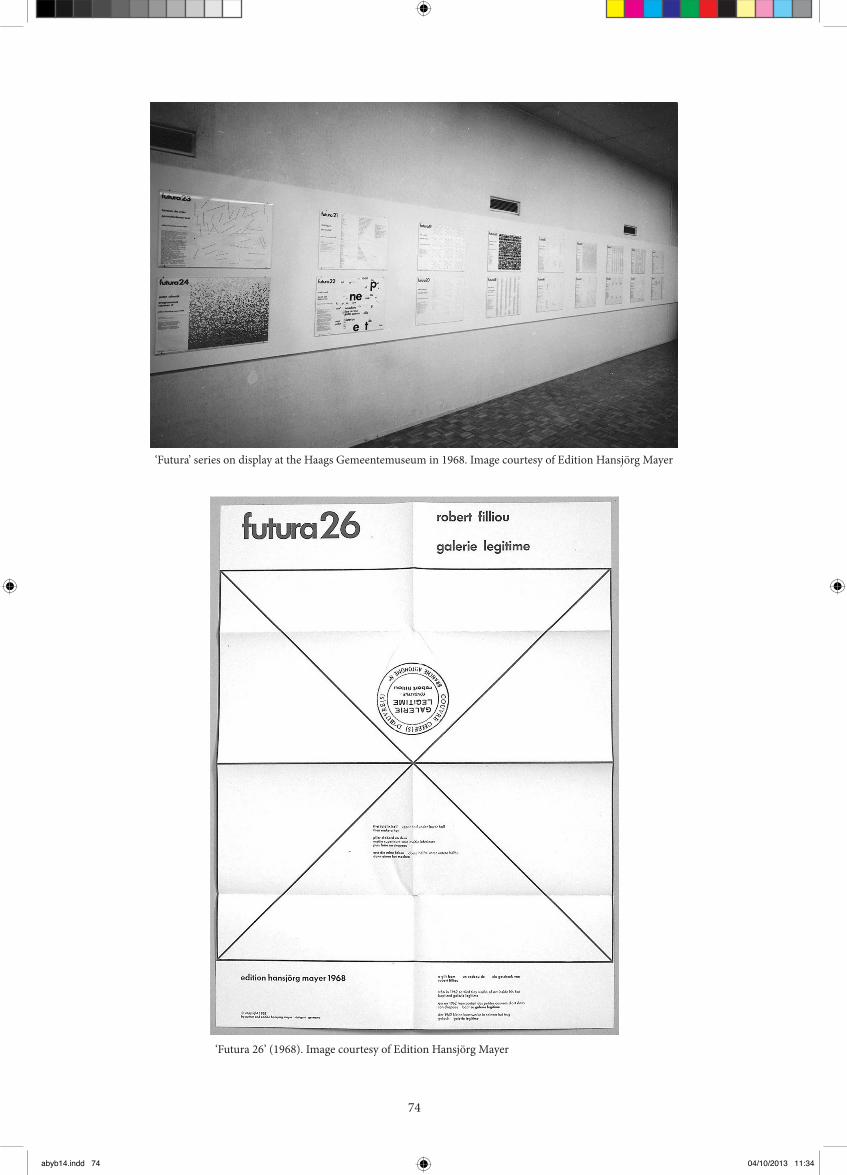
GGM here is a ‘Futura’ that is handwritten…
HM Andre homkins (no. 25).
GGM …breaking the rules, which I rather like,
you have a structure and then you break it, or play
beyond its limits; and there is another, I am not sure
how to describe it, made of little squares…
HM hat’s Peter Schmidt (no. 24). he last numbers
already point to other directions, through ‘Futura’
no. 25, the handwritten one by Andre homkins,
and no. 26, Robert Filliou, which you can fold into
a hat.
GGM I am not familiar with that one, we don’t have
it in the collection…
HM I am going to give you one straight away!
No way, if you don’t have that…
1968 and beyond
In 68 everything changes: my interests change,
I concentrate much more on publishing works by
others, away from strict letterpress printing, with
ofset printing coming in. When Andre, an old
friend, came with his text, I told him “you have
written this down so well, it’s a shame for me to set
it, ofset is coming, let’s just have it like that.” his is
already pointing in another direction. hen comes
brilliant Robert Filliou, with ‘Gallerie Legitime’, and
what do we do? You can fold it up into a hat, like a
painter’s hat… he end of an era, and from then on
I worked with a lot of other artists.
One of the things that Bense did was to be a catalyst
for collaboration already in the 50s. He was always
saying: “came on, get on with it, mix, talk to each
other…” he musician composes here, the artist
works there, the literary world… all separated.
And he really pulled people in, he said: I am your
theoretical, philosophical centre here, come around
me. He was a great catalyst.
GGM Collaboration seems a good idea, but
successful collaboration is a rare thing, many
collaborations are oten boring or pointless or…
HM supericial… yes. Look at Dieter Roth and
Richard Hamilton, that is great collaboration,
incredible. Someone as dry as good old Richard,
in a way, and this crazy Dieter Roth, fantastic stuf
came out of it. hat is what I call real collaboration…
But I agree with you.
Future publications
EVB How are you going to do your new
publications?
HM hey will be done in InDesign and printed
ofset. I will do the design, I have more or less done
it all, but I will let someone who is 50 years younger
and can do this in his sleep do the InDesign work.
In the irst volume (‘Typo’), there will be four
diferent sections: the irst is about images made by
using various printing processes, the second will
be the alphabets (the irst alphabet, typo actions
which used the super letters of the irst alphabet as
well as other projects which used them, and the last
alphabet, which I am now going to follow through
and inish according to plans from the sixties), the
third will be typoems, where I show many aspects
of that work, and the fourth is typographical
interpretations of poems by others: the three
portfolios, of which you have one, and the 26
Futuras (there are other things but I don’t want
to overdo it).
abyb14.indd 73 04/10/2013 11:34
74
‘Futura’ series on display at the Haags Gemeentemuseum in 1968. Image courtesy of Edition Hansjörg Mayer
‘Futura 26’ (1968). Image courtesy of Edition Hansjörg Mayer
abyb14.indd 74 04/10/2013 11:34

75
EVB Do you still have an interest in contemporary
publishing and are you aware of new experimental
graphic design?
HM Well, I am not very knowledgeable, interested
yes, but…
EVB I brought you a present: it’s a book that we
launched at the shop, a collaboration between an
artist and a designer (‘Hide’ by Giorgio Sadotti and
Fraser Muggeridge). It has been printed by Print on
Demand. Are you familiar with that?
HM I am very interested in print on demand, I think
it’s a wonderful technique. We are thinking about
doing some of Dieter Roth’s diaries like that, with
Walther König.
I have always been interested in having cheaply
produced books, the opposite of the livre d’artiste,
which really didn’t interest me very much. I worked
on some of them with Petersburg Press, to make
money to inance the other stuf. My interest was
always in artists’ books produced simply, normal
books, not for £100 but for £10 or less…
We sometimes made De Luxe editions, but only to
help to inance it, because it was dire, oten… you
sold a hundred copies, maybe, for £5… It was tough!
GGM How many copies did you sell in a year,
typically – a new Dieter Roth book, for instance?
HM he irst three or four titles sold relatively a lot,
because people like König would order 100, and then
reorder 100… So there was a real movement, but
then it slowed down a bit…
EVB Did you have subscriptions or anything like
that?
HM No, but people knew about the new books.
I always used to go to the Frankfurt Book Fair
(for 50 years, no more now…) he old Book Fair
was something else, now it is boring and nothing
happens, but in the old days it was a fair where you
sold books… he booksellers, the collectors, the
museums… they came and actually bought!
Now nobody comes to buy, it’s all done with reps,
etc. Well, I suppose we had some subscriptions with
the Futuras, for a few people, but for Dieter Roth’s
‘Complete Works’, they knew when new ones were
coming out and just ordered them.
EVB So you have the ‘Last Alphabet’ to inish, have
you got any other project beyond that?
HM No. hat is an old project from 68, which I
couldn’t do (Dieter Roth being so enthusiastic about
it… It would have taken a lot of time!) No, this is it.
EVB So no more publishing?
HM Well, I don’t know, of course, having said that…
At the moment I think not, but tomorrow I may
think of something else…
Gustavo Grandal Montero is a librarian and special
collections curator at Chelsea College of Art &
Design and Camberwell College of Arts. Trained as
an art historian, he writes and presents regularly on
art and librarianship topics and has curated or co-
curated a number of exhibitions and events. He was
the recipient of the Art Libraries Society (ARLIS)
UK & Ireland Travel & Study Fund Award 2010 for
his research on the documentation of biennials and
is a member of the AHRC-funded Transforming
Artists’ Books research network. He is Deputy Editor
of the ‘Art Libraries Journal’.
Recent publications: Foden-Lenahan, E., Grandal
Montero, G., Hirata Tanaka, A.P. (2013) Defending
the aesthetic: the conservation of an artist’s book.
Art Libraries Journal, vol. 38 no. 1, pp. 32-37.
Grandal Montero, G. (2012) Kinkon biobib: life and
work of Dom Sylvester Houédard. In: Simpson, N.
(ed.) Notes from the Cosmic Typewriter. London:
Occasional Papers. Grandal Montero, G. (2012)
Artists’ books in HE teaching and learning.
he Blue Notebook, vol. 7 no. 1, Oct., pp. 36-43.
Grandal Montero, G. (2012) Biennalization? What
biennalization?: the documentation of biennials and
other recurrent exhibitions. Art Libraries Journal,
vol. 37 no. 1, pp. 13-23.
Chelsea College of Art & Design Library
University of the Arts London, 16 John Islip Street,
London SW1P 4JU, UK
Eleanor Vonne Brown set up and runs X Marks
the Bökship, a bookshop and project space for
independent publishers in London, UK.
www.bokship.org
abyb14.indd 75 04/10/2013 11:34