· memorandum to: melissa mark-viverito, speaker, new york city council from: mindy tarlow,...
TRANSCRIPT
MeMoranduM
TO: Melissa Mark-Viverito, Speaker, New York City Council FROM: Mindy Tarlow, Director, Mayor’s Office of Operations DATE: April 22, 2015 SUBJECT: The CEO Poverty Report, 2005 - 2013
I am pleased to submit the annual poverty report on behalf of Mayor de Blasio in accordance with Section 16, Chapter 1 of the New York City Charter.
The report covers the years 2005-2013. The latest data available are from calendar year 2013, representing a two-year lag from present conditions.
The City used methodology that is now mandated by the Charter. The City’s methodology provides an alternative to the official U.S. poverty measure that more fully reflects New York City conditions. The analysis was carried out by the New York City Center for Economic Opportunity (CEO), a part of the Mayor’s Office.
The report finds that CEO poverty rates in New York City rose from 19.0 percent in 2008 to 21.5 percent in 2013. The rate remains statistically unchanged since 2011. By comparison, the official poverty rate rose from 16.8 percent in 2008 to 18.8 percent in 2010, and continued to climb, reaching 19.9 percent in 2013, statistically the same as the 2012 official poverty rate. Although the CEO poverty rate exceeds the official rate, this report finds that a smaller proportion of the City’s population was living in extreme poverty - below 50 percent of the poverty threshold - in 2013. The CEO method estimates this figure at 5.7 percent in 2013 compared to 7.9 percent according to the official method. Conversely, however, our measure finds a larger share of the population was living near poverty – below 150 percent of the respective poverty thresholds - compared to the official measure. The CEO measure puts this figure at 41.1 percent in 2008 and 45.1 percent in 2013 compared to the respective 26.6 percent and 30.6 percent of the official method.
The increase in poverty continues to be notable among workers and working families. The poverty rate for working age adults (persons 18 through 64 years of age) who were employed full-time, year-round, rose by 2.2 percentage points from 2008 to 2013, reaching 8.5 percent in 2013.
This year, concurrent with the publication of this report, the City is releasing One New York: The Plan for a Strong and Just City, or OneNYC, an update of the City’s long-term planning document. For the first time, our long-term plan contains an explicit focus on equity, and a vision for a city with an inclusive, equitable economy that offers well-paying jobs and opportunity for all to live with dignity and security. In both this report and OneNYC we have set a goal of moving 800,000 New Yorkers out of poverty or near poverty in the next ten years. As we describe, one of the most powerful ways to reach this goal is to raise the minimum wage. In his 2015 State of the City address, Mayor de Blasio called for raising the City’s minimum wage to more than $13 an hour next year, and indexing it to inflation to reach $15 an hour in 2019. The City’s own living wage law, signed last year by Mayor de Blasio building on the law previously passed by the City Council, already sets an example at $13.30 per hour without benefits, or $11.90 with benefits, and adjusted to match the Consumer Price Index. Raising the floor on wages is critical for low-income New Yorkers and central to achieving our long-term poverty reduction goal.

Increasing the minimum wage will lower the poverty rate immediately upon implementation. But over the next ten years we need to make the minimum wage only one important step in improving the economic conditions of New Yorkers. The broad set of anti-poverty initiatives described in this report and in OneNYC will also have a significant impact. Workforce development programs that will better train and place New Yorkers in available jobs, educational programs that prepare students for college and career success, affordable and supportive housing programs, social services and broad-based economic growth strategies will lift tens of thousands of New Yorkers out of poverty and near poverty. The Administration is taking a comprehensive approach, from programs that create the fundamental opportunities we aspire to for all residents - high quality early education, access to the internet, municipal identification that opens doors to critical civic services - to those that make living in New York City more affordable.
In all of this work, the City will be promoting evidence-based, data-driven approaches to reducing poverty and income inequality. We are committed to designing initiatives based on solid research, conducting rigorous evaluations – and only continuing those with proven records of success.
We look forward to working in partnership with the City Council on reducing poverty and increasing opportunity for all New Yorkers.

The CEO Poverty Measure, 2005 - 2013
An Annual Report from the Office of the Mayor
April 2015


Table of ConTenTs
PREFACE AND ACKNOWLEDGMENTS ............................................................................................. i
EXECUTIVE SUMMARY ................................................................................................................... iii
1. INTRODUCTION ......................................................................................................................... 1 1.1 The Need for an Alternative to the Official Poverty Measure .............................................. 1 1.2 The National Academy of Sciences’ Alternative ................................................................. 2 1.3 The Supplemental Poverty Measure ................................................................................... 2 1.4 CEO’s Adoption of the NAS/SPM Method .......................................................................... 3 1.5 Comparing Poverty Rates ................................................................................................... 5 1.6 The New York City Labor Market ........................................................................................ 6 1.7 Key Findings in This Report ................................................................................................ 9
2. POVERTY IN NEW YORK CITY, 2005 - 2013 .............................................................................. 11 2.1 New York City Poverty Rates, 2005 - 2013 ....................................................................... 11 2.2 The Depth of Poverty and Extent of Near Poverty ............................................................. 16 2.3 The Effect of Non-Cash Resources on the CEO Poverty Rate............................................. 18
3. CEO POVERTY RATES IN DEMOGRAPHIC DETAIL, 2005 - 2013 .............................................. 23 3.1 Poverty Rates by Demographic Characteristic of the Individual ........................................ 23 3.2 Poverty Rates by Family Characteristic ............................................................................. 26 3.3 Poverty Rates by Borough ................................................................................................ 29 3.4 Poverty Rates by Neighborhood ....................................................................................... 29 3.5 A Closer Look at Some Patterns in the Data ..................................................................... 32
4. ALTERNATIVE POVERTY MEASURES IN THE U.S. AND NEW YORK CITY ................................. 37 4.1 Poverty Rates by Age Group ............................................................................................ 37 4.2 Extreme Poverty and Near Poverty ................................................................................... 38 4.3 Changes in the SPM and CEO Poverty Rates, 2009 - 2013 ............................................... 39
5. POLICY AFFECTS POVERTY, ADDITIONAL DATA AND FUTURE DIRECTIONS ......................... 41 5.1 Lifting 800,000 New Yorkers Out of Poverty in the Next 10 Years ..................................... 41 5.2 The City’s Approach to Poverty ......................................................................................... 42 5.3 Looking Forward .............................................................................................................. 43 5.4 Ongoing Programs ........................................................................................................... 47 5.5 In Conclusion .................................................................................................................. 51
APPENDIX A: THE POVERTY UNIVERSE AND UNIT OF ANALYSIS ............................................... 55 APPENDIX B: DERIVING A POVERTY THRESHOLD FOR NEW YORK CITY .................................. 58 APPENDIX C: ADJUSTMENT FOR HOUSING STATUS .................................................................. 63 APPENDIX D: THE CEO TAX MODEL ............................................................................................. 73 APPENDIX E: ESTIMATING THE VALUE OF NUTRITIONAL ASSISTANCE ...................................... 81 APPENDIX F: ESTIMATING THE VALUE OF HEAP BENEFITS ......................................................... 91 APPENDIX G: WORK-RELATED EXPENSES .................................................................................... 93 APPENDIX H: MEDICAL OUT-OF-POCKET EXPENDITURES .......................................................... 99 APPENDIX I: THE EFFECT OF A MINIMUM WAGE INCREASE ON THE POVERTY RATE ............. 104 APPENDIX J: ACCURACY OF THE DATA AND CHANGES TO THE CEO MODEL ........................ 107


Preface and Acknowledgments i
NYC.GOV/CEO Poverty Data and Research
PrefaCe and aCknowledgMenTs
This is the second issue of the New York City Poverty Report since the New York City Charter was revised in December 2013, requiring the Mayor to issue an annual report on poverty in the City. It is also the second report on poverty issued by Mayor Bill de Blasio. The Charter mandates that the report contain data describing the city’s strategy and resources aimed at alleviating poverty. This year we continue that narrative and link our poverty strategy to programs described in One New York: The Plan for a Strong and Just City (OneNYC), an update to the City’s long-term plan, released concurrent with this report.
The poverty measure has its origins in 2006, when a Commission on Economic Opportunity was convened to craft innovative approaches to reducing poverty in the City. The Commissioners soon learned what social scientists have known for decades: the nation’s fifty-year-old measure of poverty no longer provides useful information. In the 1960s, the poverty measure was a focal point for the nation’s growing concern about poverty. Over the decades, society evolved and policies have shifted, but the official poverty measure remains frozen in time. As a result, it has steadily lost credibility and usefulness as a social indicator. The Commissioners concluded that, along with new programs, the City needed to develop a new measure of poverty. The development of an improved measure of poverty became a goal of the New York City Center for Economic Opportunity (CEO), tasked with implementing the Commission’s recommendations.
There has been no shortage of proposals for improving the way America counts its poor. The most influential of these was developed, at the request of Congress, by the National Academy of Sciences (NAS). Although the NAS’s proposal was issued in 1995, neither the Federal nor any other branch of government had adopted this approach until 2008 when we released our first working paper on poverty in New York City. This study – our seventh – continues our practice of issuing annual updates of our measure.
The CEO poverty measure has become an important resource for how we think about poverty in New York City. We have gained a better estimate of the rate of poverty - what portion of the city is poor and near poor; the extent to which some anti-poverty programs lower the poverty rate; and a demographic and economic profile of New Yorkers in poverty. This data-backed understanding of the nature of poverty is now the first
step in a progressive framework for addressing poverty as initiated by the de Blasio administration. We identify and implement solutions based on the growing body of evaluation data and then continue to monitor and measure the effectiveness of these solutions. Successful outcomes will be judged as those that address income inequality and inequality in access to critical services.
The need for an alternative poverty measure is seen in the increasing interest in a new measure. In recent years, New York City has been joined by other state and local poverty measurement initiatives. To date, NAS-style, state-level poverty measures have been developed for New York, Connecticut, Georgia, Illinois, Massachusetts, Minnesota, Wisconsin, California, and the city (and metro area) of Philadelphia. In addition, longitudinal estimates for the U.S. have been developed by the Population Research Center at Columbia University. All these projects have been enormously helpful to our work. We have benefited from the wisdom of many: Linda Giannarelli, Laura Wheaton, and Sheila Zedlewski at the Urban Institute; Julia Isaacs and Timothy Smeeding at the University of Wisconsin’s Institute for Research on Poverty.
In 2011, the U.S. Bureau of the Census began releasing annual reports on poverty in the United States using a new Supplemental Poverty Measure, which is also based on the NAS recommendations. To enhance the commensurability of our work with the new Federal measure, CEO revised some elements of our approach. Our colleagues at the Census Bureau, David Johnson, Kathleen Short, and Trudi Renwick, as well as Thesia Garner at the Bureau of Labor Statistics – friends of the CEO project since its inception – have been particularly helpful in this work.
From the earliest stages of our effort, we have benefited from opportunities to present our work to other scholars and policy practitioners. The Brookings Institute’s Center on Children and Families hosted a number of meetings, some at CEO’s request, where many of the nation’s leading poverty experts not only shared their work, but offered us advice for improving our measure. We need to recognize the generosity of Ron Haskins, the Center’s Co-Director, as well as the wisdom of those who have attended these events. CEO has also presented our work at a number of conferences, including annual meetings of the Association for Public Policy and Management, the National Association for Welfare Research and Statistics, the American Statistical Association, the International Association for Research in Income and Wealth, and the Administration for Children and Families’ Welfare

NYC.GOV/CEO Poverty Data and Research
ii The CEO Poverty Measure, 2005 - 2013
Research and Evaluation Conference. Thanks to a grant from the RIDGE Center for National Food and Nutrition Assistance Research at the University of Wisconsin’s Institute for Research on Poverty, we were able to present our work on valuing Food Stamp benefits to experts in this field. In the course of all this we have amassed a considerable debt. In addition to those mentioned above, we wish to acknowledge Jessica Banthin, Richard Bavier, David Betson, Rebecca Blank, Gary Burtless, Constance Citro, Sharon O’Donnell, Rachel Garfield, Irv Garfinkel, Mark Greenberg, Amy O’Hara, Nathan Hutto, John Iceland, Dottie Rosenbaum, Isabelle Sawhill, Karl Scholz, Arloc Sherman, Sharon Stern, Jane Waldfogel, Christopher Wimer and James Ziliak.
Closer to home, Dr. Joseph Salvo, Director of the Population Division at New York City Department of City Planning has made several important contributions. Many other colleagues in City government have shared their expertise about public policy, the City’s administration of benefit programs, and agency-level data: Adam Hartke at MTA; Jay Fiegerman, Metro North Railroad; Patricia Yang, Director of Health Policy, NYC Mayor’s Office; Kent Cherny, NYC Office of Management and Budget; Tracey Thorne, Kevin Fellner, Audrey Diop, and Joanne Bailey at the City’s Human Resources Administration helped us understand several benefits programs, and also to Hildy Dworkin, librarian at the Human Resources Administration, for her continuing support. Thanks are due to Dave Hall and the staff at the HRA print shop; Erin Shigaki at Purple Gate Design; and Eileen Salzig for their help in producing this document.
Staff at other government agencies that also assisted us include: Grace Forte-Fitzgibbon, Long Island Railroad; Robert Hickey, Office of Management and Budget; Jessica Semega, Housing and Household Economic Statistics Division, U.S. Bureau of the Census; Mahdi Sundukchi, Demographic Statistical Methods Division, U.S. Bureau of the Census; and Lynda Laughlin, Social, Economic and Housing Statistics Division, U.S. Bureau of the Census.
Over the years we have also amassed a considerable debt to past and present CEO colleagues, including Mark Levitan, Daniel Scheer and Todd Seidel original members of the Poverty Research Unit; Carson Hicks, Deputy Executive Director of CEO, Emily Apple, Diego Benitez, Sarah Bennett, David Berman, Brigit Beyea, Jean-Marie Callan, Kate Dempsey, Emily Firgens, Patrick Hart, Blair Hewes, Sinead Keegan, Minden Koopmans, Parker Krasney, Ada Rehnberg-Campos, and Shammara Wright
were especially generous in sharing their time, space, and able assistance this year.
Adam Cohen, Tina Chiu and Stephanie Puzo of the Mayor’s Office of Operations helped bring this document to completion. Matthew Klein, Executive Director of CEO and Senior Advisor in the Office of Operations, was indispensable in his guidance.
The Center for Economic Opportunity since 2014 has operated as a unit within the Mayor’s Office of Operations. Mindy Tarlow, Director of Operations, provides both visionary leadership and engaged support on the details of our work, and we are grateful for her expertise and commitment to our research.
This report was authored by John Krampner, Danny Silitonga, Jihyun Shin, and Vicky Virgin, along with myself.
Christine D’Onofrio, Ph.D. Director, CEO Poverty Research Unit On behalf of the New York City Center for Economic Opportunity and the Mayor’s Office of Operations.
CEO POVERTY RESEARCH UNIT 253 Broadway, 14th floor New York, NY 10038 Christine D’Onofrio: [email protected] John Krampner: [email protected] Danny Silitonga: [email protected] Jihyun Shin: [email protected] Vicky Virgin: [email protected]
desi
gn: w
ww.
pur
pleg
ated
esig
n.co
m

Executive Summary iii
NYC.GOV/CEO Poverty Data and Research
exeCuTive suMMary
In December 2013, the New York City Charter was revised, requiring the Mayor to issue an annual report on poverty in the City. The Charter specifically requires that the report be based on the poverty measure developed by the New York City Center for Economic Opportunity (CEO). The purpose is to provide policymakers and the public with a more informative alternative to the 50-year-old official U.S. poverty measure and present current anti-poverty initiatives. This is the second report released under the new mandate. It includes data from 2005 to 2013, the most recent years for which data are available. The report finds that there has been no significant change in the poverty rate since 2011, when the City first began to recover from the Great Recession. Lowering the poverty rate is central to new initiatives across the policy spectrum.
In 2013, 21.5 percent of the New York City population was living below the CEO poverty line. This rate is statistically unchanged from the two prior years. The poverty rates for 2011, 2012 and 2013 are 21.5, 21.4 and 21.5 percent, respectively. In 2013, 45.1 percent of the New York City population was living below 150 percent of the CEO poverty line, meaning they were in poverty or near poverty.
Changes in the CEO poverty rate have closely matched trends in employment and earned income in the City. The poverty rate fell from 2005 to 2008, to 19.0 percent, when the local economy was expanding. The
Great Recession began in 2008. By 2010 the poverty rate rose to 21.0 percent and reached a cyclical peak of 21.5 percent in 2011. The post-recession growth in employment and earnings stopped any further increases in the poverty rate, but the recovery has yet to gather sufficient strength to move the poverty rate towards its pre-recession level.
Figure 1 illustrates the trend in the CEO poverty rate. It is paralleled by the movement in the official poverty rate. This on-the-surface similarity, however, masks many important differences between the two poverty measures. The first part of this Executive Summary reviews those differences.
We then turn to the economic and public policy context that has shaped recent trends in the poverty rate. The next section identifies the report’s key findings. In the final section we describe the current policy framework and initiatives for addressing poverty as defined in this report.
The Official Poverty MeasureThe official U.S. poverty measure was developed in the early 1960s. Its threshold was based on the cost of the U.S. Department of Agriculture’s Economy Food Plan, a diet designed for “temporary or emergency use when funds are low.” Because the survey data available at the time indicated that families typically spent a third of their income on food, the cost of the plan was simply multiplied by three to account for other needs. Since the threshold’s 1963 base year, it has been updated annually
figure 1Official and CEO Poverty Rates, 2005 - 2013
Source: American Community Survey Public Use Micro Sample as augmented by CEO. Note: Official poverty rates are based on the CEO poverty universe and unit of analysis.
Perc
ent o
f the
Pop
ulat
ion
2005 2006 2007 2008 2009 2010 2011 2012 2013
Official CEO
12
14
16
18
20
22
24
18.317.9
16.8 16.8 17.3
18.819.3 19.9
21.021.5 21.5
20.0
21.4
19.819.0
19.819.820.4

NYC.GOV/CEO Poverty Data and Research
iv The CEO Poverty Measure, 2005 - 2013
by the change in the Consumer Price Index.1
A half century later, this poverty line has little justification. The threshold does not represent contemporary spending patterns; food now accounts for less than one-seventh of family expenditures, and housing is the largest item in the typical family’s budget. The official threshold also ignores differences in the cost of living across the nation, an issue of obvious importance to measuring poverty in New York City. A final shortcoming of the threshold is that it is frozen in time. Since it only rises with the cost of living, it assumes that a standard of living that defined poverty in the early 1960s remains appropriate, despite advances in the nation’s standard of living since that time.
The official measure’s definition of the resources that are compared against the threshold is pre-tax cash income. This includes wages, salaries, and earnings from self-employment; income from interest, dividends, and rents; and some of what families receive from public programs if they take the form of cash. Thus, payments from Unemployment Insurance, Social Security, Supplemental Security Income, and public assistance are included in the official resource measure.
Given the data available and the policies in place at the time, this was not an unreasonable definition. But over the decades an increasing share of what government programs do to support low-income families takes the form of tax credits (such as the Earned Income Tax Credit) and in-kind benefits (such as Food Stamps). If policymakers or the public want to know how these programs affect poverty, the official measure cannot provide an answer.
1. Fisher, Gordon M. “The Development and History of the Poverty Thresholds.” Social Security Bulletin, Vol. 55, No. 4, Winter 1992.
Measures of Poverty
Official: The current official poverty measure was de-veloped in the early 1960s. It consists of a set of thresh-olds that were based on the cost of a minimum diet at that time. A family’s pre-tax cash income is compared against the threshold to determine whether its mem-bers are poor.
NAS: At the request of Congress, the National Academy of Sciences issued a set of recommendations for an improved poverty measure in 1995. The NAS threshold represents the need for clothing, shelter, and utilities, as well as food. The NAS income measure accounts for taxation and the value of in-kind benefits.
SPM: In March 2010 the Obama Administration an-nounced that the Census Bureau, in cooperation with the Bureau of Labor Statistics, would create a Supple-mental Poverty Measure based on the NAS recommen-dations, subsequent research, and a set of guidelines proposed by an Interagency Working Group. The first report on poverty using this measure was issued by the Census Bureau in November 2011.
CEO: The Center for Economic Opportunity released its first report on poverty in New York City in August 2008. CEO’s poverty measure is largely based on the NAS recommendations, with modifications based on the guidelines from the Interagency Working Group.
The National Academy of Sciences’ AlternativeDissatisfaction with the official measure prompted Congress to request a study by the National Academy of Sciences (NAS). The NAS’s recommendations for an improved measure were issued in 1995.2 The NAS took a considerably different approach to both the threshold and resource side of the poverty measure. Its poverty threshold reflects the need for clothing, shelter, and utilities, as well as food. It is established by selecting a sub-group of families as reference families,3 calculating their spending on these items and then choosing a point in the resulting expenditure distribution.4 A small multiplier is applied to account for miscellaneous
2. Citro, Constance F. and Robert T. Michael (eds). Measuring Poverty: A New Approach. Washington, DC: National Academy Press. 1995.3. The NAS reference families are those composed of two adults and two children. The threshold for this family is then scaled for families of different sizes and compositions. See Appendix B.4. The NAS suggested that this point lie between the 30th and 35th percentile. Citro and Michael, p.106.

Executive Summary v
NYC.GOV/CEO Poverty Data and Research
expenses such as personal care, household supplies, and non-work-related transportation. The threshold is updated each year by the change in the level of this spending. This connects the threshold to the growth in living standards. In further contrast to the official measure, the NAS proposed that the poverty line be adjusted to reflect geographic differences in housing costs.
On the resource side, the NAS measure is designed to account for the flow of income and in-kind benefits that a family can use to meet the needs represented in the threshold. This creates a much more inclusive measure of income than pre-tax cash. The tax system and the cash-equivalent value of in-kind benefits for food and housing create important additions to family resources. But families also have non-discretionary expenses that reduce the income available to meet their other needs. These include the cost of childcare, commuting to work, and medical care that must be paid for out of pocket. This non-discretionary spending is accounted for as deductions from income.
The NAS report sparked further research and garnered widespread support among poverty experts.5 However, neither the Federal nor any state or local government had adopted the NAS approach until CEO’s initial report on poverty in New York City in August 2008.6
More recently the U.S. Bureau of the Census has issued annual reports on poverty using a Supplemental Poverty Measure (SPM). Like CEO’s measure, the Census Bureau’s SPM – first issued in November 2011 – is also shaped by the NAS recommendations, along with a set of guidelines provided by an Interagency Technical Working Group in March 2010.7 Subsequent to the original NAS report, the guidelines incorporated work by researchers at the Census Bureau, the Bureau of Labor Statistics, and others. Many of these recommendations are reflected in our measure.
5. Much of the research inspired by the NAS report is available at: www.census.gov/hhes povmeas/methodology/nas/index.html6. New York City Center for Economic Opportunity. The CEO Poverty Measure: A Working Paper by the New York City Center for Economic Opportunity. August 2008. Available at: www.nyc.gov/html/ceo/ downloads/pdf/final_poverty_report.pdf7. Observations from the Interagency Technical Working Group on Developing a Supplemental Poverty Measure. March 2010. Available at: www.census.gov/hhes/www/poverty/SPM_TWGObservations.pdf
Poverty Thresholds
Official: The official threshold was developed in the early 1960s and was based on the cost of a minimum diet at that time. It is updated each year by the change in consumer prices. It is uniform across the United States.
CEO: The CEO poverty threshold is a New York City-specific threshold derived from the U.S.-wide thresh-old developed for the Federal Supplemental Poverty Measure. The threshold is based on what families spend on basic necessities: food, clothing, shelter, and utilities. It is adjusted to reflect the variation in housing costs across the United States.
Measuring Income
Official Income: The official poverty measure’s defini-tion of family resources is pre-tax cash. This includes income from sources such as wages and salaries, as well as government transfer payments, provided that they take the form of cash. Thus, Social Security benefits are included in this measure, but the value of in-kind ben-efits, like Food Stamps or tax credits such as the Earned Income Tax Credit, are not counted.
CEO Income: Based on the NAS recommendations, CEO income includes all the elements of pre-tax cash plus the effect of income and payroll taxes, as well as the value of in-kind nutritional and housing assistance. Non-discretionary spending for commuting to work, childcare, and out-of-pocket medical care are deduc-tions from income.
CEO’s Adoption of the NAS/SPM MethodCEO bases our New York City-specific poverty threshold on the U.S.-wide threshold developed for the SPM. We adjust the national-level threshold to account for the relatively high cost of housing in New York City by applying the ratio of the New York City to the U.S.-wide Fair Market Rent for a two-bedroom apartment to the housing portion of the threshold.8 In 2013, our poverty line for the two-adult, two-child family comes to $31,156. We refer to this New York City-specific threshold as the CEO poverty threshold. The 2013 official U.S. poverty threshold for the corresponding family was $23,624.
8. Details of the calculation are given in Appendix B.

NYC.GOV/CEO Poverty Data and Research
vi The CEO Poverty Measure, 2005 - 2013
Obviously, if this were the only change CEO had made to the poverty measure, it would lead to a poverty rate higher than the official rate. But, as described above, CEO also uses a far different measure of income to compare against the poverty threshold. Although our measure includes subtractions as well as additions to resources, CEO income is higher than pre-tax cash income at the lower rungs of the income ladder. At the 20th percentile, for example, CEO income was $30,254 in 2013. The corresponding official income figure for pre-tax cash was only $23,364. Thus, if a more complete account of resources had been the only change we had made to the poverty measure, the CEO poverty rate would fall below the official measure. Figure 2 illustrates official and CEO thresholds, incomes, and poverty rates for 2013. The effect of the higher CEO threshold (31.9 percent above the official) outweighs the effect of CEO’s more complete definition of resources (which is 29.5 percent higher, at the 20th percentile, than the official resource measure), resulting in a higher poverty rate. In 2013, the CEO poverty rate stood at 21.5 percent while the official rate was 19.9 percent, a 1.6 percentage point difference.9
To measure the resources available to a family to meet the needs represented by the threshold, our poverty measure employs the Public Use Micro Sample (PUMS) from the Census Bureau’s American Community Survey (ACS) as its principal data set. The advantages of this
9. Differences are taken from unrounded numbers.
survey for local poverty measurement are numerous. The ACS is designed to provide measures of socioeconomic conditions on an annual basis in states and larger localities. It offers a robust sample for New York City (roughly 26,000 households) and contains essential information about household composition, family relationships, and cash income from a variety of sources.
But, as noted earlier, the NAS-recommended poverty measure greatly expands the scope of resources that must be measured in order to determine whether a family is poor. Unfortunately, the ACS provides only some of the information needed to estimate these additional resources. CEO has developed a variety of models that estimate the effect of taxation, nutritional and housing assistance, work-related expenses, and medical out-of-pocket expenditures on total family resources and poverty status. We reference the resulting data set in this report as the “American Community Survey Public Use Micro Sample as augmented by CEO” and we refer to our estimate of family resources as “CEO income.”
This ReportThis report incorporates data through 2013. The focus of this year’s report is on poverty in New York City during the continuing recovery from the Great Recession. From 2008 to 2010, labor market indicators for City residents showed that a declining proportion of the working age population was employed. As Figure 3 illustrates, the share of New Yorkers 18 through 64 years of age who were holding a job at the time they were surveyed peaked in 2008 at 70.8 percent. That proportion declined to 66.4 percent in 2010. By 2013 it had edged back up to 68.4 percent. The trend is positive, but has not reached the pre-recession peak.
Because poverty status is determined by annual income, employment over the course of a year is a particularly useful labor market indicator for understanding trends in the poverty rate. Figure 4 shows that the share of the working age population with steady work, defined as 50 or more weeks in the prior 12 months, declined from 59.8 percent in 2008 to 56.3 percent in 2010, while the proportion of the population that had no work at all grew from 23.5 percent in 2008 to 27.3 percent in 2010. This indicator improved somewhat by 2013. The share of the working age population with year-round work was 57.5 percent, statistically unchanged from 2012. The share of the population with no work fell to 26.0 percent by 2013. The largest change from 2012 to 2013 occurred in
$23,624
OfficialThresholds Incomes Poverty Rates
$23,364
$31,156
CEO Official CEO Official CEO
$30,254
19.9% 21.5%
figure 2 Thresholds, Incomes and Poverty Rates, 2013
Source: U.S. Bureau of the Census and American Community Survey Public Use Micro Sample as augmented by CEO.Notes: Incomes are measured at the 20th percentile and stated in family size and composition-adjusted dollars. Official poverty rates are based on the CEO poverty universe and unit of analysis.

Executive Summary vii
NYC.GOV/CEO Poverty Data and Research
the share of the population with less than full time work, from 15.9 to 16.4 percent.
The decline and then slow increase in weeks worked is reflected in measures of annual earnings. Table 1 reports cost of living (COL) adjusted per family earnings. We focus on those families whose earnings put them near the CEO poverty threshold (between the 25th and 40th percentile of the earnings distribution).10 Table 1 shows that the decline in earnings continued into 2011, even as employment stabilized. The declines range from 20.2 percent to 18.8 percent from 2008 to 2011. The 2013 data indicate an improvement from the prior year, with gains for the 25th percentile greater than gains for groups just above them in the income distribution. But the
10. These earnings data are stated in 2013 dollars using the CEO threshold as a price index.
combined gains from 2011 to 2013 fall short of the earnings lost in the recession.
The job market, we have seen, plays an important role in year-to-year changes in the CEO poverty rate. But its effect takes place within the broader scope of our measure of family resources and the context of public policies intended to bolster family incomes. In addition to earnings, low-income families’ ability to meet their needs is determined by public benefit programs. Over the last several decades there has been an important shift in the composition of these programs, especially for the non-elderly population. As noted above, a smaller proportion of means-tested assistance takes the form of cash payments such as public assistance, while a larger proportion is composed of tax credits and in-kind benefits. The trend has been reinforced by the Bush and
Perc
ent o
f 18-
thro
ugh
64-Y
ear-
Olds
2005 2006 2007 2008 2009 2010
67.068.7 69.3
70.868.2
2012 2013
68.0 68.466.4
2011
67.0
50
55
60
65
70
75
figure 3Employment/Population Ratios, 2005 - 2013
Source: American Community Survey Public Use Micro Sample as augmented by CEO.
0
20
40
60
80
100
Perc
ent o
f 18-
thro
ugh
64-Y
ear-
Olds 23.5
2008
59.8
16.7
2009 2010
24.6 27.3
16.5
56.3
2011
27.0
16.6
56.3
2012 2013
26.4
15.9
57.8
26.0
16.4
57.5
17.1
58.3
At Least 50 Less Than 50 No Weeks
figure 4Weeks Worked in Prior 12 Months, 2008 - 2013
Source: American Community Survey Public Use Micro Sample as augmented by CEO.
NYC.GOV/CEO Poverty Data and Research
viii The CEO Poverty Measure, 2005 - 2013
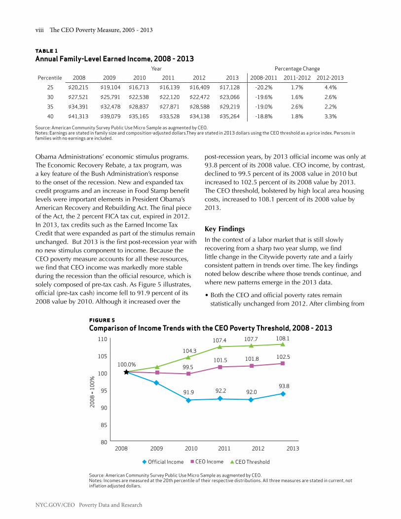
Obama Administrations’ economic stimulus programs. The Economic Recovery Rebate, a tax program, was a key feature of the Bush Administration’s response to the onset of the recession. New and expanded tax credit programs and an increase in Food Stamp benefit levels were important elements in President Obama’s American Recovery and Rebuilding Act. The final piece of the Act, the 2 percent FICA tax cut, expired in 2012. In 2013, tax credits such as the Earned Income Tax Credit that were expanded as part of the stimulus remain unchanged. But 2013 is the first post-recession year with no new stimulus component to income. Because the CEO poverty measure accounts for all these resources, we find that CEO income was markedly more stable during the recession than the official resource, which is solely composed of pre-tax cash. As Figure 5 illustrates, official (pre-tax cash) income fell to 91.9 percent of its 2008 value by 2010. Although it increased over the
post-recession years, by 2013 official income was only at 93.8 percent of its 2008 value. CEO income, by contrast, declined to 99.5 percent of its 2008 value in 2010 but increased to 102.5 percent of its 2008 value by 2013. The CEO threshold, bolstered by high local area housing costs, increased to 108.1 percent of its 2008 value by 2013.
Key FindingsIn the context of a labor market that is still slowly recovering from a sharp two year slump, we find little change in the Citywide poverty rate and a fairly consistent pattern in trends over time. The key findings noted below describe where those trends continue, and where new patterns emerge in the 2013 data.
• Both the CEO and official poverty rates remain statistically unchanged from 2012. After climbing from
table 1Annual Family-Level Earned Income, 2008 - 2013
Year Percentage ChangePercentile 2008 2009 2010 2011 2012 2013 2008-2011 2011-2012 2012-2013
25 $20,215 $19,104 $16,713 $16,139 $16,409 $17,128 -20.2% 1.7% 4.4%
30 $27,521 $25,791 $22,538 $22,120 $22,472 $23,066 -19.6% 1.6% 2.6%
35 $34,391 $32,478 $28,837 $27,871 $28,588 $29,219 -19.0% 2.6% 2.2%
40 $41,313 $39,079 $35,165 $33,528 $34,138 $35,264 -18.8% 1.8% 3.3% Source: American Community Survey Public Use Micro Sample as augmented by CEO. Notes: Earnings are stated in family size and composition-adjusted dollars.They are stated in 2013 dollars using the CEO threshold as a price index. Persons in families with no earnings are included.
104.3
99.5
2008
= 10
0%
2008 2009 2010 2011 2012 2013
Official Income CEO Income CEO Threshold
107.4
101.5
107.7
101.8
108.1
102.5
80
85
90
95
100
105
110
100.0%
91.9 92.2 92.093.8
figure 5Comparison of Income Trends with the CEO Poverty Threshold, 2008 - 2013
Source: American Community Survey Public Use Micro Sample as augmented by CEO. Notes: Incomes are measured at the 20th percentile of their respective distributions. All three measures are stated in current, not inflation adjusted dollars.

Executive Summary ix
NYC.GOV/CEO Poverty Data and Research
0
1
2
3
4
5
6
7
8
9
6.9
7.78.1
Official CEO
5.15.5
7.9
5.75.4
Perc
ent o
f the
Pop
ulat
ion
2008 2010 2012 2013
19.0 percent in 2008 to 21.5 percent in 2011, the CEO poverty rate remained at 21.5 percent in 2013, statistically unchanged from its 2012 level. The official poverty rate rose from 16.8 percent in 2008 to 19.3 percent in 2011 and continued to climb, reaching 19.9 percent in 2013, statistically unchanged from 2012. (See Figure 1.)
• Although the CEO poverty rate exceeds the official rate in each year for which we have data, the CEO methodology finds that a smaller proportion of the City’s population is living in extreme poverty – below 50 percent of the poverty threshold – than the official method (5.7 percent compared to 7.9 percent in 2013). The CEO extreme poverty rate rose from 5.1 percent in 2008 to 5.7 percent in 2013. The official extreme poverty rate increased from 6.9 percent in 2008 to 7.9 percent in 2013. (See Figure 6.)
figure 6 Share of the Population in Extreme Poverty
Source: American Community Survey Public Use Micro Sample as augmented by CEO.
• The CEO measure categorizes a much larger share of the population as living in “near poverty” – above, but uncomfortably close to the poverty threshold – than the official measure. This is reflected in comparisons of the share of the population that is living below 150 percent of the respective poverty thresholds. In 2013, 45.1 percent of New York City residents were living below 150 percent of the CEO poverty threshold, up from 41.1 percent in 2008. The corresponding shares
for the official measure were 30.6 percent in 2013 and 26.6 percent in 2008. (See Figure 7.)
figure 7 Share of the Population below 150 Percent of the Poverty Threshold
Source: American Community Survey Public Use Micro Sample as augmented by CEO.
• The trend in CEO poverty rates by demographic characteristics such as age, race/ethnicity, nativity/citizenship, and family type generally follows the rise in the Citywide poverty rate from 2008 to 2010 and its statistical stability from 2010 to 2013, with a few exceptions. Looking over the 2008 to 2013 time period, there are statistically significant increases in the poverty rate across nearly every demographic group. Increases in poverty were particularly pronounced for Asians (by 3.6 percentage points to 25.9 percent). Poverty for Asian New Yorkers hit a high of 29.0 percent in 2012, but abated somewhat by 2013. The poverty rate for non-citizens continued to increase (by 6.3 percentage points to 30.7 percent). (See Figures 8 and 9.) There is considerable overlap between these two demographic groups; nearly one-third (30.5 percent) of the City’s Asian population falls into the non-citizen category.
26.629.3 30.7
41.1
45.2 45.3
Perc
ent o
f the
Pop
ulat
ion
2008 2010 2012 2013
Official CEO0
5
10
15
20
25
30
35
40
45
50
30.6
45.1

NYC.GOV/CEO Poverty Data and Research
x The CEO Poverty Measure, 2005 - 2013
figure 8CEO Poverty Rates by Race/Ethnicity
Source: American Community Survey Public Use Micro Sample as augmented by CEO.
figure 9CEO Poverty Rates by Nativity/Citizenship
Source: American Community Survey Public Use Micro Sample as augmented by CEO.
13.215.3
13.8
Non-Hispanic White
Non-Hispanic Black
Non-Hispanic Asian
Hispanic, Any Race
Perc
ent o
f the
Pop
ulat
ion
2008 2010 2012 2013
0
5
10
15
20
25
30
20.8 22.4 22.3 22.4
26.0
29.0
23.5 24.425.8
15.0
22.4
25.9 25.8
0
5
10
15
20
25
30
17.7
Citizen by Birth
20.0 19.3 19.6
Naturalized Citizen Not a Citizen
18.4 18.220.2 19.4
24.4
30.2 30.727.2
Perc
ent o
f the
Pop
ulat
ion
2008 2010 2012 2013

Executive Summary xi
NYC.GOV/CEO Poverty Data and Research
• From 2008 to 2013, poverty rates increased in three of the City’s boroughs. More recent data show different trajectories in the recovery. In some boroughs, 2013 marks a decline from post-recession peaks, in others the poverty rate remains relatively unchanged or is increasing. Brooklyn, with a 22.9 percent poverty rate, saw a decline from its 2010 peak of 24.5 percent; Manhattan, in 2013, reached a post-recession peak of 15.8 percent; the Bronx saw relatively small movements in its poverty rate, from 26.5 percent in 2008 to 27.1 percent in 2013; Queens rose 4.7 percentage points from 16.4 percent in 2008 to 21.1 percent in 2013 (although this represents a full percentage point decline from the peak rate of 22.1 percent in 2012, it was not a statistically significant change); Staten Island, with an increase of 6.7 percentage points from 2008 to 2013 (11.5 percent to 18.2 percent) shows an upward trend in the poverty rate, even when year-to-year comparisons are numerically large but statistically insignificant. (See Figure 10.)
• The relatively large jump in the Queens poverty rate is consistent with its demographic composition. One-half of the City’s Asian population (49.7 percent) lives in Queens and the borough is home to just over one-third (33.8 percent) of New York’s non-citizens. This does represent a small decline from 2012 when Queens was home to 50.2 percent of the City’s Asian population and 32.8 percent of its non-citizens.
• In Staten Island, we find the upward trend in poverty is due to a confluence of factors. The borough, when compared to the rest of the City, has a population that is older on average with lower earnings among full-time workers and more post-recession job loss. The data from 2013 also cover the time period of the aftermath of Hurricane Sandy in late 2012. In the ACS data we cannot directly identify job loss or dislocation due to the hurricane, but consider it a potential contributing factor to the poverty rate. Finally, the Staten Island data consist of a smaller sample than other boroughs. This contributes to large margins of error in the data such that even the difference in the poverty rate from 15.5 percent to 18.2 percent from 2012 to 2013 is not statistically significant.
• The 2008 to 2013 increase in poverty remains particularly pronounced for workers and working families. The poverty rate for working age adults (persons 18 through 64 years of age) who were employed full time, year round rose by 2.2 percentage points from 2008, reaching 8.5 percent in 2013. (See Figure 11.) Over the same time period, poverty rates increased for persons living in families with the equivalent of two full-time, year-round workers, 2.3 percentage points (to 6.1 percent); and one full-time, year-round worker, 2.7 percentage points (to 18.6 percent), respectively. (See Figure 12.) The only statistically significant difference from 2012 was for families with one full-time, year-round worker.
figure 10CEO Poverty Rates by Borough
Source: American Community Survey Public Use Micro Sample as augmented by CEO.
26.5 25.3 26.0 27.1
22.3 22.924.5 23.4
13.515.2 14.9 15.8 16.4
19.9 18.222.1 21.1
11.513.7
15.5
Bronx Brooklyn Manhattan Queens Staten Island
Perc
ent o
f the
Pop
ulat
ion
0
5
10
15
20
25
30
2008 2010 2012 2013

NYC.GOV/CEO Poverty Data and Research
xii The CEO Poverty Measure, 2005 - 2013
• The pattern in poverty rates for the United States based on the new Federal Supplemental Poverty Measure resembles the CEO pattern for New York City. In both the nation and the City, the two NAS-based poverty measures find a higher incidence of poverty than do the official measures. In the U.S., the SPM rate in 2013 was 15.5 percent as opposed to the official rate of 14.6 percent. In New York City, the respective poverty rates
were 21.5 percent (CEO) and 19.9 percent (official) in that year. Because they count the value of non-cash assistance, however, both the SPM and CEO measures of poverty among children are lower than child poverty rates based on the official method: 16.4 percent compared to 20.4 percent for the nation and 24.8 percent rather than 29.1 percent for the City. (See Figures 13 and 14.)
figure 11CEO Poverty Rates by Individual Work Experience
Source: American Community Survey Public Use Micro Sample as augmented by CEO.
6.2 7.1 8.1
22.6 23.6 24.4
36.638.1 39.0
Perc
ent o
f the
Pop
ulat
ion
Full-Time,Year-Round
Some Work No Work0
5
10
15
20
25
30
35
40
4539.1
25.2
8.5
2008 2010 2012 2013

Executive Summary xiii
NYC.GOV/CEO Poverty Data and Research
figure 13 Official and SPM Poverty Rates for the U.S., by Age, 2013
Source: U.S. Bureau of the Census.
figure 12CEO Poverty Rates by Family’s Work Experience
Source: American Community Survey Public Use Micro Sample as augmented by CEO.
3.8 5.0 5.4
12.413.7 14.9 16.0 16.3 17.2
44.4 45.243.4
51.3 51.751.9
Perc
ent o
f the
Pop
ulat
ion
2 Full TimeWorkers
1 Full Time, 1 Part Time
Worker
1 Full TimeWorker
Less than 1 Full Time Worker
No Work0
10
20
30
40
50
60
51.1
44.8
18.613.0
6.1
2008 2010 2012 2013
Total Under 18 18 through 64 65 and Older
Perc
ent o
f the
Pop
ulat
ion
14.615.5
20.4
16.4
13.615.4
9.5
14.6
0
5
10
15
20
25
Official SPM

NYC.GOV/CEO Poverty Data and Research
xiv The CEO Poverty Measure, 2005 - 2013
Perc
ent o
f the
Pop
ulat
ion
19.921.5
29.1
24.8
17.1
20.418.6
21.6
Total Under 18 18 through 64 65 and Older
Official CEO
0
5
10
15
20
25
30
35
figure 14 Official and CEO Poverty Rates for New York City, by Age, 2013
Source: American Community Survey Public Use Micro Sample as augmented by CEO.
Executive Summary xv
NYC.GOV/CEO Poverty Data and Research
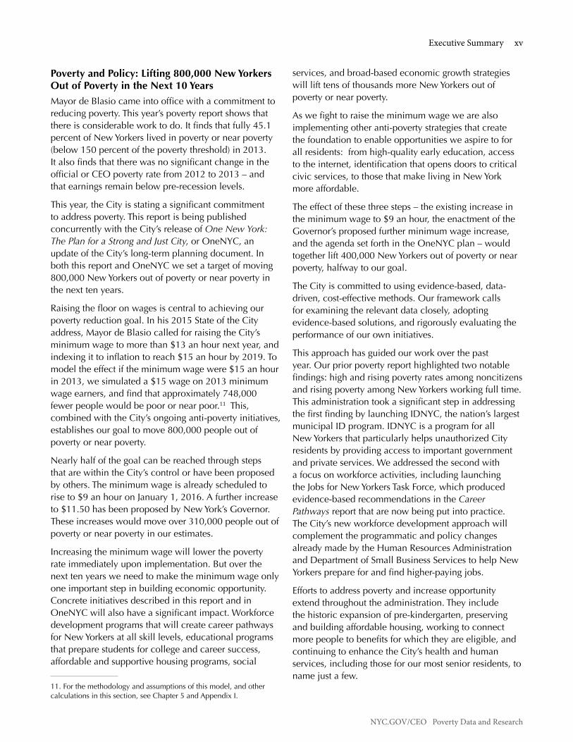
Poverty and Policy: Lifting 800,000 New Yorkers Out of Poverty in the Next 10 YearsMayor de Blasio came into office with a commitment to reducing poverty. This year’s poverty report shows that there is considerable work to do. It finds that fully 45.1 percent of New Yorkers lived in poverty or near poverty (below 150 percent of the poverty threshold) in 2013. It also finds that there was no significant change in the official or CEO poverty rate from 2012 to 2013 – and that earnings remain below pre-recession levels.
This year, the City is stating a significant commitment to address poverty. This report is being published concurrently with the City’s release of One New York: The Plan for a Strong and Just City, or OneNYC, an update of the City’s long-term planning document. In both this report and OneNYC we set a target of moving 800,000 New Yorkers out of poverty or near poverty in the next ten years.
Raising the floor on wages is central to achieving our poverty reduction goal. In his 2015 State of the City address, Mayor de Blasio called for raising the City’s minimum wage to more than $13 an hour next year, and indexing it to inflation to reach $15 an hour by 2019. To model the effect if the minimum wage were $15 an hour in 2013, we simulated a $15 wage on 2013 minimum wage earners, and find that approximately 748,000 fewer people would be poor or near poor.11 This, combined with the City’s ongoing anti-poverty initiatives, establishes our goal to move 800,000 people out of poverty or near poverty.
Nearly half of the goal can be reached through steps that are within the City’s control or have been proposed by others. The minimum wage is already scheduled to rise to $9 an hour on January 1, 2016. A further increase to $11.50 has been proposed by New York’s Governor. These increases would move over 310,000 people out of poverty or near poverty in our estimates.
Increasing the minimum wage will lower the poverty rate immediately upon implementation. But over the next ten years we need to make the minimum wage only one important step in building economic opportunity. Concrete initiatives described in this report and in OneNYC will also have a significant impact. Workforce development programs that will create career pathways for New Yorkers at all skill levels, educational programs that prepare students for college and career success, affordable and supportive housing programs, social
11. For the methodology and assumptions of this model, and other calculations in this section, see Chapter 5 and Appendix I.
services, and broad-based economic growth strategies will lift tens of thousands more New Yorkers out of poverty or near poverty.
As we fight to raise the minimum wage we are also implementing other anti-poverty strategies that create the foundation to enable opportunities we aspire to for all residents: from high-quality early education, access to the internet, identification that opens doors to critical civic services, to those that make living in New York more affordable.
The effect of these three steps – the existing increase in the minimum wage to $9 an hour, the enactment of the Governor’s proposed further minimum wage increase, and the agenda set forth in the OneNYC plan – would together lift 400,000 New Yorkers out of poverty or near poverty, halfway to our goal.
The City is committed to using evidence-based, data-driven, cost-effective methods. Our framework calls for examining the relevant data closely, adopting evidence-based solutions, and rigorously evaluating the performance of our own initiatives.
This approach has guided our work over the past year. Our prior poverty report highlighted two notable findings: high and rising poverty rates among noncitizens and rising poverty among New Yorkers working full time. This administration took a significant step in addressing the first finding by launching IDNYC, the nation’s largest municipal ID program. IDNYC is a program for all New Yorkers that particularly helps unauthorized City residents by providing access to important government and private services. We addressed the second with a focus on workforce activities, including launching the Jobs for New Yorkers Task Force, which produced evidence-based recommendations in the Career Pathways report that are now being put into practice. The City’s new workforce development approach will complement the programmatic and policy changes already made by the Human Resources Administration and Department of Small Business Services to help New Yorkers prepare for and find higher-paying jobs.
Efforts to address poverty and increase opportunity extend throughout the administration. They include the historic expansion of pre-kindergarten, preserving and building affordable housing, working to connect more people to benefits for which they are eligible, and continuing to enhance the City’s health and human services, including those for our most senior residents, to name just a few.
NYC.GOV/CEO Poverty Data and Research
xvi The CEO Poverty Measure, 2005 - 2013
We will build on this work in the coming year. The City is working to make affordable or free high-speed internet – a critical service in this digital age – available to low-income New Yorkers, with a variety of cutting-edge programs, including LinkNYC, which will replace the City’s payphones with up to 10,000 kiosks with free, high-speed internet service.
The City is putting a particular emphasis on initiatives that help low-income New Yorkers to graduate from college. As one example, we have increased funding to the City University of New York’s Accelerated Study in Associate Programs (CUNY ASAP), which has a proven track record of significantly increasing student graduation rates.
We expect “Pre-K for All” to make full-day, high quality pre-K available to every four-year-old in the City. There is robust evidence that children in pre-K have better employment and life outcomes, and the availability of pre-K helps parents to reenter the workforce to support their families.
Looking forward, the commitment to addressing poverty and inequality will continue to be central to the City’s work. The goals and initiatives set out in OneNYC’s long-term plan include broad-based economic development, public health efforts, inclusive workforce strategies, targeted hiring connected with our investments, and an ongoing pledge to strengthen our neighborhoods and help all New Yorkers access services that provide gateways to opportunity. With the release of OneNYC, the City has entered a new era in fighting poverty and inequality. We have committed to making equity issues a key part of all of our planning – and to lifting 800,000 New Yorkers out of poverty or near poverty. Our goal is an inclusive, equitable City, with opportunity, dignity, and security for all.

Chapter 1: Introduction 1
NYC.GOV/CEO Poverty Data and Research
ChaPTer 1: inTroduCTion
This is the sixth release of CEO’s alternative poverty measure for New York City. We now have data covering the time span of 2005-2013, dating back to the inception of the American Community Survey, our primary data source. Over the economic expansion and subsequent Great Recession we have provided a unique perspective on poverty as incomes rose and then fell. During the recession we measured the impact of income support programs. Since the recession’s official end in 2010 and the ensuing modest recovery, we have measured poverty amid growing employment but stagnant wages.
This chapter establishes the context for our findings. It begins with an overview of the reasons why CEO developed a new measure of poverty and a description of our alternative measure. Because trends in poverty are so closely associated with economic conditions, the second part of the Introduction moves the discussion from methodology to trends in the local labor market. The Introduction’s final section summarizes the report’s principal findings.
1.1 The Need for an Alternative to the Official Poverty MeasureIt has been over a half century since the development of the current official measure of poverty. In the early 1960s the measure represented an important advance, serving as a focal point for the public’s growing concern about poverty in America. But over the decades, discussions about poverty have increasingly included criticism of how poorly it was being measured. Society has evolved and public policy has shifted, yet the Census Bureau has been measuring poverty as if nothing had changed. This still widely used indicator is now sorely out of date.
The official poverty measure is income-based. All such measures must answer two key questions. First, how much is enough? The answer to this question gives us the income threshold (the poverty line) that separates the poor from the non-poor. The second question is, how much of what? Which resources available to families should be counted as income to meet their needs and compared against the poverty thresholds?
The official measure’s threshold, developed in the early 1960s, was based on the cost of the U.S. Department of Agriculture’s Economy Food Plan, a diet designed for “temporary or emergency use when funds are low.” Because the survey data available at the time indicated that families typically spent a third of their income on food, the cost of the plan was simply multiplied by three to account for other needs. Since the threshold’s 1963 base year, it has been updated annually by the change in the Consumer Price Index.12
A half century later, this poverty line has little justifi–cation. The threshold does not represent contemporary spending patterns. Food now accounts for less than one-seventh of family expenditures. Housing is the largest item in the typical family’s budget. The official threshold also ignores differences in the cost of living across the nation, an issue of obvious importance when measuring poverty in New York City. A final shortcoming of the threshold is that it is frozen in time. Since it only rises with the cost of living, it assumes that a standard of living that defined poverty in the early 1960s remains appropriate, despite advances in living standards since that time.
The official measure’s definition of the resources that are compared against the threshold is pre-tax cash. This includes wages, salaries, and earnings from self-employment; income from interest, dividends, and rents; and some of what families receive from public programs, if they take the form of cash. Thus, payments from Unemployment Insurance, Social Security, Supplemental Security Income (SSI), and public assistance are included in the official resource measure.
Given the data available and the policies in place at the time, this was not an unreasonable definition. But in recent years an increasing share of what government does to support low-income families takes the form of tax credits (such as the Earned Income Tax Credit) and in-kind benefits (such as Food Stamps). If policymakers or the public want to know how these programs affect poverty, the official measure cannot provide an answer.
12. Fisher, Gordon M. “The Development and History of the Poverty Thresholds.” Social Security Bulletin, Vol. 55, No. 4. Winter 1992.

NYC.GOV/CEO Poverty Data and Research
2 The CEO Poverty Measure, 2005 - 2013
1.2 The National Academy of Sciences’ AlternativeDissatisfaction with the official measure prompted Congress to request a study by the National Academy of Sciences (NAS). The NAS’s recommendations, issued in 1995, sparked further research and garnered widespread support among poverty experts.13 However, neither the Federal nor any state or local government had adopted the NAS approach until CEO’s initial report on poverty in New York City in August 2008.14
The NAS-based methodology is also income based, but takes a considerably different approach to both the threshold and resource sides of the poverty measure. The poverty threshold reflects the need for clothing, shelter, and utilities, as well as food. It is established by selecting a sub-group of families as reference families,15 calculating their spending on these items, and then choosing a point in the resulting expenditure distribution.16 A small multiplier is applied to account for miscellaneous expenses such as personal care, household supplies, and non-work-related transportation. The threshold is updated each year by the change in the level of this spending. This connects the threshold to the growth in living standards. In further contrast to the official measure, the NAS-style poverty line is also adjusted to reflect geographic differences in housing costs.
On the resource side, the NAS-based measure is designed to account for the flow of income and in-kind benefits that a family can use to meet the needs represented in the threshold. This creates a much more inclusive measure of income than pre-tax cash. The tax system and the cash-equivalent value of in-kind benefits for food and housing are important additions to family resources. But families also have non-discretionary expenses that reduce the income available to meet their other needs. These include the cost of commuting to work, childcare, and medical care that must be paid for out of pocket. This spending is accounted for as deductions from income.
13. Citro, Constance F. and Robert T. Michael (eds). Measuring Poverty: A New Approach. Washington, DC: National Academy Press. 1995. Much of the research inspired by the NAS report is available at: www. census.gov/hhes/povmeas/methodology/nas/index.html14. New York City Center for Economic Opportunity. The CEO Poverty Measure: A Working Paper by the New York City Center for Economic Opportunity. August 2008. Available at: www.nyc.gov/html/ceo/ downloads/pdf/final_poverty_report.pdf15. The reference family proposed by the NAS is composed of two adults and two children. The threshold for this family is then scaled for families of different sizes and compositions. See Appendix B.16. The NAS suggested that this point lie between the 30th and 35th percentile of the distribution. Citro and Michael, p.106.
Measures of Poverty
Official: The current official poverty measure was de-veloped in the early 1960s. It consists of a set of thresh-olds that were based on the cost of a minimum diet at that time. A family’s pre-tax cash income is compared against the threshold to determine whether its mem-bers are poor.
NAS: At the request of Congress, the National Academy of Sciences issued a set of recommendations for an improved poverty measure in 1995. The NAS threshold represents the need for clothing, shelter, and utilities, as well as food. The NAS income measure accounts for taxation and the value of in-kind benefits.
SPM: In March 2010 the Obama Administration an-nounced that the Census Bureau, in cooperation with the Bureau of Labor Statistics, would create a Supple-mental Poverty Measure based on the NAS recommen-dations, subsequent research, and a set of guidelines proposed by an Interagency Working Group. The first report on poverty using this measure was issued by the Census Bureau in November 2011.
CEO: The Center for Economic Opportunity released its first report on poverty in New York City in August 2008. CEO’s poverty measure is largely based on the NAS recommendations, with modifications based on the guidelines from the Interagency Working Group.
1.3 The Supplemental Poverty MeasureSince November 2011, the U.S. Bureau of the Census has been issuing a Supplemental Poverty Measure (SPM).17 The new Federal measure is shaped by the NAS recommendations and an additional set of guidelines provided by an Interagency Technical Working Group (ITWG) in March 2010.18 The guidelines made several revisions to the 1995 NAS recommendations. The most important of these are:
17. U.S. Bureau of the Census. The Research Supplemental Poverty Measure: 2010. November 2011. Available at: www.census. gov/hhes/povmeas/methodology/supplemental/research/ Short_ ResearchSPM2010.pdf18. Observations from the Interagency Technical Working Group on Developing a Supplemental Poverty Measure. March 2010. Available at: www.census.gov/hhes/www/poverty/SPM_TWGObservations.pdf

Chapter 1: Introduction 3
NYC.GOV/CEO Poverty Data and Research
1. An expansion of the type of family unit whose expenditures determine the poverty threshold from two-adult families with two children to all families with two children.
2. Use of a five-year, rather than three-year, moving average of expenditure data to update the poverty threshold over time.
3. Creation of separate thresholds based on housing status: whether the family owns its home with a mortgage; owns, but is free and clear of a mortgage; or rents.
1.4 CEO’s Adoption of the NAS/SPM MethodCEO has followed the first two of these three revisions to the NAS recommendations in our poverty measure. However, we do not utilize the SPM’s development of thresholds that vary by housing status. We account for all differences in housing status – including residence in rent-regulated apartments and participation in means-tested housing assistance programs – on the income side of the poverty measure.19 By applying the ratio of New York City to U.S.-wide Fair Market Rent for a two-bedroom apartment to the housing portion of the SPM poverty line, we adjust the national-level threshold (before its adjustment for housing status) to account for the relatively high cost of housing in New York City. In 2013, our poverty line for the two-adult, two-child family comes to $31,156, some 25.0 percent above the U.S.-wide SPM threshold of $24,931. We refer to this New York City-specific threshold as the CEO poverty threshold. (See Appendix B.)
19. The rationale for this decision is provided in Appendix B of an earlier report. See: The CEO Poverty Measure, 2005 – 2010: A Working Paper by the NYC Center for Economic Opportunity. Available at: www.nyc.gov/html/ceo/downloads/pdf/CEO_Poverty_Measure_ April_16.pdf
Poverty Thresholds
Official: The official threshold was developed in the early 1960s and was based on the cost of a minimum diet at that time. It is updated each year by the change in consumer prices. It is uniform across the United States.
CEO: The CEO poverty threshold is a New York City-specific threshold derived from the U.S.-wide thresh-old developed for the Federal Supplemental Poverty Measure. The threshold is based on what families spend on basic necessities: food, clothing, shelter, and utilities. It is adjusted to reflect the variation in housing costs across the United States.
To measure the resources available to a family to meet the needs represented by the threshold, we employ the Public Use Micro Sample from the Census Bureau’s American Community Survey (ACS) as our principal data set. The advantages of this survey for local poverty measurement are numerous. The ACS is designed to provide measures of socioeconomic conditions on an annual basis in states and larger localities. It offers a robust sample for New York City (roughly 26,000 households) and contains essential information about household composition, family relationships, and cash income from a variety of sources.
But, as noted earlier, the NAS-recommended poverty measure greatly expands the scope of resources that must be measured in order to determine whether a family is poor. Unfortunately, the ACS provides only some of the information needed to estimate the additional resources required by the NAS measure. Therefore, CEO has developed a variety of models that estimate the effect of taxation, nutritional and housing assistance, work-related expenses, and medical out-of-pocket expenditures on total family resources and poverty status. We reference the resulting data set as the “American Community Survey Public Use Micro Sample as augmented by CEO” and we refer to our estimate of family resources as “CEO income.”

NYC.GOV/CEO Poverty Data and Research
4 The CEO Poverty Measure, 2005 - 2013
Measuring Income
Official Income: The official poverty measure’s defini-tion of family resources is pre-tax cash. This includes income from sources such as wages and salaries, as well as government transfer payments, provided that they take the form of cash. Thus, Social Security benefits are included in this measure, but the value of in-kind ben-efits, like Food Stamps or tax credits such as the Earned Income Tax Credit, are not counted.
CEO Income: Based on the NAS recommendations, CEO income includes all the elements of pre-tax cash plus the effect of income and payroll taxes, as well as the value of in-kind nutritional and housing assistance. Non-discretionary spending for commuting to work, childcare, and out-of-pocket medical care are deduc-tions from income.
Below is a brief description of how the non-pre-tax-cash income items are estimated. More details on these procedures can be found in the report’s technical appendices.
Housing Adjustment: The high cost of housing makes New York City an expensive place to live. The CEO poverty threshold, we noted above, is adjusted to reflect that reality. But some New Yorkers do not need to spend as much to secure adequate housing as the higher threshold implies. Many of the City’s low-income families live in public housing or receive a housing subsidy, such as a Section 8 housing voucher. A large proportion of New York’s renters live in rent-regulated apartments. Some homeowners have paid off their mortgages and own their homes free and clear. We make an upward adjustment to these families’ incomes to reflect these advantages. The adjustment equals the difference between what they would be paying for their housing if it were market rate and what they are actually paying out of pocket. The adjustment is capped so that it cannot exceed the housing portion of the CEO threshold.
The ACS does not provide data on housing program participation. To determine which households in the ACS could be participants in rental subsidy or regulation programs, we match households in the Census Bureau’s New York City Housing and Vacancy Survey with household-level records in the ACS. (See Appendix C.)
Taxation: CEO has developed a tax model that creates tax filing units within the ACS households; computes their adjusted gross income, taxable income, and tax liability; and then estimates net income taxes after non-refundable and refundable credits are applied. The model takes account of Federal, State, and City income tax programs, including all the credits that are designed to aid low-income filers. The model also includes the effect of the Federal payroll tax for Social Security and Medicare (FICA). (See Appendix D.)
Nutritional Assistance: We estimate the effect of Food Stamps,20 the National School Lunch program, the School Breakfast Program, and the Supplementary Nutrition Program for Women, Infants, and Children (WIC). To estimate Food Stamp benefits, we make use of New York City Human Resources Administration Food Stamp records, imputing Food Stamp cases to the “Food Stamp Units” we construct in the ACS data. We count each dollar of Food Stamp benefits as a dollar added to family income.
The likelihood of participation in the school meals programs is calculated by a probability model. Participation is assigned to eligible families to replicate administrative data on meals served provided to us by the City’s Department of Education. We follow the Census Bureau’s method for valuing the income from the programs by using the per-meal cost of the subsidy. We identify participants in the WIC program in a similar manner, matching enrollment in the program to participation rate estimates from the New York State Department of Health. Benefits are calculated using the average benefit level per participant calculated by the U.S. Department of Agriculture. (See Appendix E.)
Home Energy Assistance Program: The Home Energy Assistance Program (HEAP) provides assistance to low-income households that offsets their utility costs. In New York City, households that receive cash assistance, Food Stamps, or are composed of a single person receiving SSI benefits are automatically enrolled in the program. Other low-income households can apply for HEAP, but administrative data from the City’s Human Resources Administration indicate that nearly all HEAP households come into the program through their participation in these other benefit programs. We identify HEAP-receiving households by their participation in public assistance, Food Stamps, or SSI, and then add
20. The Food Stamp program has been renamed the Supplemental Nutritional Assistance Program (SNAP). Since the program is more widely recognized by its former name, we continue to use it.

Chapter 1: Introduction 5
NYC.GOV/CEO Poverty Data and Research
the appropriate benefit to their income. Beginning in 2011, we also make use of HEAP receipt reported in the Housing and Vacancy Survey. (See Appendix F.)
Work-Related Expenses: Workers must travel to and from their jobs, and we treat the cost of that travel as a non-discretionary expense. We estimate the number of trips a worker will make per week based on their usual weekly hours. We then calculate the cost per trip using information in the ACS about their mode of transportation and administrative data (such as subway fares). Weekly commuting costs are computed by multiplying the cost per trip by the number of trips per week. Annual commuting costs equal weekly costs times the number of weeks worked over the past 12 months.
Families in which the parents are working must often pay for the care of their young children. Like the cost
of commuting, the CEO poverty measure treats these childcare expenses as a non-discretionary reduction in income. Because the American Community Survey provides no information on childcare spending, we have created an imputation model that matches the weekly childcare expenditures reported in the Census Bureau’s Survey of Income and Program Participation (SIPP) to working families with children in the ACS data set. Childcare costs are only counted if they are incurred in a week in which the parents (or the single parent) are at work. They are capped by the earned income of the lowest earning parent. (See Appendix G.)
Medical Out-of-Pocket Expenditures (MOOP): The cost of medical care is also treated as a non-discretionary expense that limits the ability of families to attain the standard of living represented by the poverty threshold. MOOP includes health insurance premiums, co-pays, and deductibles, as well as the cost of medical services that are not covered by insurance. In a manner similar to that for childcare, we use an imputation model to match MOOP expenditures by families in the Agency for Healthcare Research and Quality’s Medical Expenditure Panel Survey to families in the ACS sample. (See Appendix H.)
Figure 1.1 summarizes the discussion thus far, contrasting how the official and CEO poverty measures establish a threshold and account for family resources.
1.5 Comparing Poverty Rates
As noted above, the CEO poverty threshold for a two-adult, two-child family in 2013 was $31,156. The official poverty line for the equivalent family was $23,624 in that year. Obviously, if this were the only change CEO had made to the poverty measure, it would lead to a poverty rate above the official measure. But, as described above, CEO also uses a far different measure of income to compare against the poverty threshold. Although our measure includes subtractions as well as additions to resources, CEO income is higher than pre-tax cash income at the lower rungs of the income ladder. At the
figure 1.1Comparison of Poverty Measures
Official CEO
Threshold
Established in early 1960s at three times the cost of “Economy Food Plan.”
Equal to the 33rd percentile of family expenditures on food, clothing, shelter, and utilities, plus 20 percent more for miscellaneous needs.
Updated by change in Consumer Price Index.
Updated by the change in expenditures for the items in the threshold.
No geographic adjustment. Inter-area adjustment based on differences in housing costs.
Resources
Total family pre-tax cash income. Includes earned income and transfer payments, if they take the form of cash.
Total family after-tax income.
Include value of near-cash, in-kind benefits such as Food Stamps.Housing status adjustment.Subtract work-related expenses such as childcare and transportation costs.Subtract medical out-of-pocket expenditures.

NYC.GOV/CEO Poverty Data and Research
6 The CEO Poverty Measure, 2005 - 2013
20th percentile, for example, CEO income was $30,254 in 2013.21 The corresponding figure for pre-tax cash was only $23,364. Thus, if a more complete account of resources had been the only change we made to the poverty measure, the CEO poverty rate would fall below the official measure. Figure 1.2 illustrates official and CEO thresholds, incomes, and poverty rates for 2013. The effect of the higher CEO threshold (31.9 percent above the official) outweighs the effect of CEO’s more complete definition of resources (which is 29.5 percent higher at the 20th percentile than the official resource measure), resulting in a higher poverty rate. In 2013, the CEO poverty rate stood at 21.5 percent while the official rate was 19.9 percent, a 1.6 percentage point difference.
Official Poverty Rates
The official poverty rates reported in this study differ from those provided by the Census Bureau. To make them more comparable to the CEO poverty rates, they are calculated using CEO’s poverty universe and unit of analysis. CEO excludes all members of the group quar-ters population and includes all members of the house-hold population in its universe of persons for whom a poverty status is determined. The CEO poverty unit of analysis expands the notion of the family unit to include more members of the household than just those related by blood, marriage, or adoption. Unmarried partners, for example, are treated as members of the family unit. Both these changes lower the poverty rate. In 2013, for example, the Census Bureau’s official poverty rate for New York City is 20.9 percent. The 2013 official poverty rate for the City that we report is 19.9 percent. See Ap-pendix A for further explanation.
21. Throughout this paper we report income in family size and composition-adjusted dollars. This makes the income measures directly comparable to the two-child reference family poverty threshold.
figure 1.2Official and CEO Thresholds, Incomes, and Poverty Rates, 2013
1.6 The New York City Labor MarketPoverty rates are influenced by the economic environment. A focus of this report is on the change in the CEO poverty rate since 2008. The national economy began to contract sharply in early 2008, marking December 2007 as the prior high water mark in the U.S.-wide business cycle.22 Thus, U.S.-level studies tracking the effects of the Great Recession and subsequent period of sluggish employment growth have used 2007 as their point of comparison, but the recession came later to New York City. Here, employment did not begin to decline until the fall of 2008, making that year the last before the post-recession upturn for which annual indicators find increases in employment, earnings, and income. Therefore we use 2008 as our comparison point in time. From 2008 to 2010, labor market indicators for City residents show that a smaller proportion of the working age population was holding a job. Subsequent to 2010 a slow recovery is seen in the employment/population ratio. For this reason, many of the charts and tables presented in this report include 2008, the peak of the expansion, and 2010, the low point of the recession, as comparative data points against which we can measure our current situation. We also use 2012 as a point of comparison to 2013 where relevant to measure progress of the economic recovery.
22. The National Bureau for Economic Research dates the start of the recession at December 2007.
$23,624
OfficialThresholds Incomes Poverty Rates
$23,364
$31,156
CEO Official CEO Official CEO
$30,254
19.9% 21.5%
Source: U.S. Bureau of the Census and American Community Survey Public Use Micro Sample as augmented by CEO.Notes: Incomes are measured at the 20th percentile and stated in family size and composition-adjusted dollars. Official poverty rates are based on the CEO poverty universe and unit of analysis.

Chapter 1: Introduction 7
NYC.GOV/CEO Poverty Data and Research
Perc
ent o
f 18-
thro
ugh
64-Y
ear-
Olds
2005 2006 2007 2008 2009 2010
67.068.7 69.3
70.868.2
2012 2013
68.0 68.466.4
2011
67.0
50
55
60
65
70
75
figure 1.3Employment/Population Ratios, 2005 - 2013
Source: American Community Survey Public Use Micro Sample as augmented by CEO.
0
20
40
60
80
100
Perc
ent o
f 18-
thro
ugh
64-Y
ear-
Olds 23.5
2008
59.8
16.7
2009 2010
24.6 27.3
16.5
56.3
2011
27.0
16.6
56.3
2012 2013
26.4
15.9
57.8
26.0
16.4
57.5
17.1
58.3
At Least 50 Less Than 50 No Weeks
figure 1.4Weeks Worked in Prior 12 Months, 2008 - 2013
Source: American Community Survey Public Use Micro Sample as augmented by CEO.
As Figure 1.3 illustrates, the employment/population ratio – the share of New Yorkers 18 through 64 years of age who were holding a job at the time they were surveyed – peaked in 2008 at 70.8 percent. That proportion declined to 66.4 percent by 2010. The downward trend began a reversal in 2011. Data for 2013 continues this slow upward trend, rising to 68.4 percent.
Because poverty status is determined by annual income, employment over the course of a year is a particularly salient labor market indicator. Figure 1.4 shows that the share of the working age population with steady work, defined as 50 or more weeks in the prior 12 months,
declined from 59.8 percent in 2008 to 56.3 percent in 2010, while the proportion of the population that had no work at all grew from 23.5 percent in 2008 to 27.3 percent in 2010. By 2013 the proportion of the working age population employed at least 50 weeks increased to 57.5 percent. At the same time, the population with no work shrank and the population with less than full time work grew by 0.5 percentage points from the prior year in 2013.
The trend in weeks worked is reflected in measures of earnings. Table 1.1 reports cost of living (COL) adjusted earnings per family for those families that are in the

NYC.GOV/CEO Poverty Data and Research
8 The CEO Poverty Measure, 2005 - 2013
lower half of the earnings distribution.23 The declines in earnings continued through 2011, past the point where employment began to increase, with the largest losses occurring in the lowest end of the earnings distribution. Persons at the 20th percentile saw a 23.2 percentage point decline in their earnings between 2008 and 2011.
Beginning in 2011 earnings growth turned positive for some, as seen in Table 1.1. But the cumulative growth from 2011 to 2013 remains far below the magnitude of earnings loss incurred in the recession.
The labor market data from the 2013 ACS describe an economy that is yet to fully recover from recession. Both the rise in the employment/population ratio and the upward trend in annual weeks worked indicate that employment levels are recovering (albeit modestly) from their deep 2008 to 2010 plunge. The earnings data, however, are less encouraging. Despite the modest uptick from 2011 to 2013, they suggest that while more New Yorkers have found employment, income growth during the post-recession period has been limited.
23. These earnings data are stated in 2013 dollars using the CEO threshold as a price index.
Calendar Years and ACS Survey Years
The American Community Survey (ACS) is conducted as a rolling sample gathered over the course of a calendar year. Approximately one-twelfth of the total sample is collected in each month. Respondents are asked to provide information on work experience and income dur-ing the 12 months prior to the time they are included in the sample. Households that are surveyed in January of 2013, for example, would report their income for the 12 months of 2012; households that are surveyed in February 2013 would report their income for February 2012 through January 2013, and so on. Consequently, estimates for poverty rates derived from the 2013 ACS do not, strictly speaking, represent a 2013 poverty rate. Rather, it is a poverty rate derived from a survey that was fielded in 2013. Readers should bear in mind this difference as they interpret the findings in this report.
table 1.1Annual Family-Level Earned Income, 2008 - 2013
Year Percentage ChangePercentile 2008 2009 2010 2011 2012 2013 2008-2011 2011-2012 2012-2013
20 $13,308 $11,834 $10,028 $10,226 $10,140 $10,870 -23.2% -0.8% 7.2%
25 $20,215 $19,104 $16,713 $16,139 $16,409 $17,128 -20.2% 1.7% 4.4%
30 $27,521 $25,791 $22,538 $22,120 $22,472 $23,066 -19.6% 1.6% 2.6%
35 $34,391 $32,478 $28,837 $27,871 $28,588 $29,219 -19.0% 2.6% 2.2%
40 $41,313 $39,079 $35,165 $33,528 $34,138 $35,264 -18.8% 1.8% 3.3%
45 $48,254 $45,918 $41,781 $40,597 $40,624 $42,342 -15.9% 0.1% 4.2%
50 $55,354 $53,251 $48,208 $47,321 $47,659 $49,427 -14.5% 0.7% 3.7% Source: American Community Survey Public Use Micro Sample as augmented by CEO. Notes: Earnings are stated in family size and composition-adjusted dollars. They are stated in 2013 dollars using the CEO threshold as a price index. Persons in families with no earnings are included.

Chapter 1: Introduction 9
NYC.GOV/CEO Poverty Data and Research
1.7 Key Findings in This ReportIn the context of a labor market that is still slowly recovering from a sharp two year slump, we find little change in the Citywide poverty rate and a fairly consistent pattern in trends over time. The key findings noted below describe where those trends continue, and where new patterns emerge in the 2013 data.
• Both the CEO and official poverty rates remain statistically unchanged from 2012. After climbing from 19.0 percent in 2008 to 21.5 percent in 2011, the CEO poverty rate remained at 21.5 percent in 2013, statistically unchanged from its 2012 level. The official poverty rate rose from 16.8 percent in 2008 to 19.3 percent in 2011 and continued to climb, reaching 19.9 percent in 2013, statistically unchanged from 2012.
• Although the CEO poverty rate exceeds the official rate in each year for which we have data, the CEO methodology finds that a smaller proportion of the City’s population is living in extreme poverty – below 50 percent of the poverty threshold – than the official method (5.7 percent compared to 7.9 percent in 2013). The CEO extreme poverty rate rose from 5.1 percent in 2008 to 5.7 percent in 2013. The official extreme poverty rate increased from 6.9 percent in 2008 to 7.9 percent in 2013.
• The CEO measure categorizes a much larger share of the population as living in “near poverty” – above, but uncomfortably close to the poverty threshold – than the official measure. This is reflected in comparisons of the share of the population that is living below 150 percent of the respective poverty thresholds. In 2013, 45.1 percent of New York City residents were living below 150 percent of the CEO poverty threshold, up from 41.1 percent in 2008. The corresponding shares for the official measure were 30.6 percent in 2013 and 26.6 percent in 2008.
• The trend in CEO poverty rates by demographic characteristics such as age, race/ethnicity, nativity/citizenship, and family type generally follows the rise in the Citywide poverty rate from 2008 to 2010 and its statistical stability from 2010 to 2013, with a few exceptions. Looking over the 2008 to 2013 time period, there are statistically significant increases in the poverty rate across nearly every demographic group. Increases in poverty were particularly pronounced for Asians (by 3.6 percentage points to 25.9 percent). Poverty for Asian New Yorkers hit a high of 29.0 percent in 2012, but abated somewhat by 2013. The poverty rate for non-citizens continued to increase
(by 6.3 percentage points to 30.7 percent). There is considerable overlap between these two demographic groups; nearly one-third (30.5 percent) of the City’s Asian population falls into the non-citizen category.
• From 2008 to 2013, poverty rates increased in three of the City’s boroughs. More recent data show different trajectories in the recovery. In some boroughs, 2013 marks a decline from post-recession peaks, in others the poverty rate remains relatively unchanged or is increasing. Brooklyn, with a 22.9 percent poverty rate, saw a decline from its 2010 peak of 24.5 percent; Manhattan, in 2013, reached a post-recession peak of 15.8 percent; the Bronx saw relatively small movements in its poverty rate, from 26.5 percent in 2008 to 27.1 percent in 2013; Queens rose 4.7 percentage points from 16.4 percent in 2008 to 21.1 percent in 2013 (although this represents a full percentage point decline from the peak rate of 22.1 percent in 2012, it was not a statistically significant change); Staten Island, with an increase of 6.7 percentage points from 2008 to 2013 (11.5 percent to 18.2 percent) shows an upward trend in the poverty rate, even when year-to-year comparisons are numerically large but statistically insignificant.
• The relatively large jump in the Queens poverty rate is consistent with its demographic composition. One-half of the City’s Asian population (49.7 percent) lives in Queens and the borough is home to just over one-third (33.8 percent) of New York’s non-citizens. This does represent a small decline from 2012 when Queens was home to 50.2 percent of the City’s Asian population and 32.8 percent of its non-citizens.
• In Staten Island, we find the upward trend in poverty is due to a confluence of factors. The borough, when compared to the rest of the City, has a population that is older on average with lower earnings among full-time workers and more post-recession job loss. The data from 2013 also cover the time period of the aftermath of Hurricane Sandy in late 2012. In the ACS data we cannot directly identify job loss or dislocation due to the hurricane, but consider it a potential contributing factor to the poverty rate. Finally, the Staten Island data consist of a smaller sample than other boroughs. This contributes to large margins of error in the data such that even the difference in the poverty rate from 15.5 percent to 18.2 percent from 2012 to 2013 is not statistically significant.
• The 2008 to 2013 increase in poverty remains particularly pronounced for workers and working families. The poverty rate for working age adults
NYC.GOV/CEO Poverty Data and Research
10 The CEO Poverty Measure, 2005 - 2013
(persons 18 through 64 years of age) who were employed full time, year round rose by 2.2 percentage points from 2008, reaching 8.5 percent in 2013. Over the same time period, poverty rates increased for persons living in families with the equivalent of two full-time, year-round workers, 2.3 percentage points (to 6.1 percent); and one full-time, year-round worker, 2.7 percentage points (to 18.6 percent), respectively. The only statistically significant difference from 2012 was for families with one full-time, year-round worker.
• The pattern in poverty rates for the United States based on the new Federal Supplemental Poverty Measure resembles the CEO pattern for New York City. In both the nation and the City, the two NAS-based poverty measures find a higher incidence of poverty than do the official measures. In the U.S., the SPM rate in 2013 was 15.5 percent as opposed to the official rate of 14.6 percent. In New York City, the respective poverty rates were 21.5 percent (CEO) and 19.9 percent (official) in that year. Because they count the value of non-cash assistance, however, both the SPM and CEO measures of poverty among children are lower than child poverty rates based on the official method: 16.4 percent compared to 20.4 percent for the nation and 24.8 percent rather than 29.1 percent for the City.

Chapter 2: Poverty in New York City, 2005 - 2013 11
NYC.GOV/CEO Poverty Data and Research
ChaPTer 2: PoverTy in new york CiTy, 2005 - 2013The Introduction noted that the CEO poverty rate exceeds the official rate in 2013. Indeed, it does so in each of the years for which we have comparable data. The focus of this chapter, however, is not on the different levels of poverty derived from the two approaches, but on how and why they change over time. The official and CEO poverty rates have taken parallel paths during the eight-year time span covered by this report. From 2005 to 2008, when the City economy was expanding, the two measures register declines of nearly equal magnitude. From 2008 to 2013, the increase is greater in the official rate.
This chapter begins with an overview of how and why the official and CEO poverty rates changed from 2005 to 2013. The similarity in their trend masks important differences between the measures. This is most evident in how their gauges of income evolve after 2008. From 2008 to 2010, the recession-related decline in the official measure of income – pre-tax cash – is dramatic. Over the same time period, however, CEO income was remarkably stable.
A second section in the chapter explores the depth of poverty, the degree to which the poor are living close to or far below the poverty threshold, as well as the extent of near poverty (the degree to which the population resides above the poverty line but is uncomfortably close to it). Because CEO’s poverty measure provides a more inclusive definition of income, it finds a smaller
proportion of the population in extreme poverty than does the official measure. On the other hand, because eligibility for means-tested benefits ends and the value of tax credits phase out as incomes rise, the CEO measure finds a larger share of the population living in near poverty compared to the official measure.
The chapter’s third section explores the role that non-cash resources and non-discretionary expenses play in the CEO poverty measure. We find that since 2008, tax programs and Food Stamps have become increasingly important resources for low-income families. This is not simply a “passive” outcome reflecting greater need in a bad economy. It is also a result of policy initiatives, most notably President Obama’s American Recovery and Reinvestment Act.
2.1 New York City Poverty Rates, 2005 - 2013Changes in the official and CEO poverty rates from 2005 to 2013 move in tandem with the labor market conditions described in the Introduction. Poverty declines during the expansion, rises after 2008 and plateaus during the post-recession years. Figure 2.1 illustrates the official and CEO poverty rates for New York City over the nine-year time span. Table 2.1 provides these rates, indicates differences between them, and reports changes over time.
figure 2.1Official and CEO Poverty Rates, 2005 - 2013
Source: American Community Survey Public Use Micro Sample as augmented by CEO. Note: Official poverty rates are based on the CEO poverty universe and unit of analysis.
Perc
ent o
f the
Pop
ulat
ion
2005 2006 2007 2008 2009 2010 2011 2012 2013
Official CEO
12
14
16
18
20
22
24
18.317.9
16.8 16.8 17.3
18.819.3 19.9
21.021.5 21.5
20.0
21.4
19.819.0
19.819.820.4

NYC.GOV/CEO Poverty Data and Research
12 The CEO Poverty Measure, 2005 - 2013
As noted above, the CEO poverty rate exceeds the official rate in each year, a difference that ranges from 1.5 to 3.0 percentage points. However, changes in the two rates over time are remarkably similar. While the City economy was growing from 2005 to 2008, the official poverty rate declined by 1.5 percentage points while the CEO poverty rate fell by 1.4 percentage points. From 2008 to 2010, as employment and earnings contracted, the official poverty rate rose by 2.1 percentage points to 18.8 percent and the CEO poverty rate climbed by 1.9 percentage points, reaching 21.0 percent in 2010. The most recent data reflect a stabilized labor market; neither poverty rate experienced a statistically significant change from 2011 to 2013. However, the official measure of poverty did increase by 1.1 percentage points over the two-year period from 2010 to 2013 while the CEO measure increased by just less than half that amount, 0.5 percentage points.
table 2.1Official and CEO Poverty Rates, 2005 - 2013(Numbers are Percent of the Population)
Year Official CEOPercentage Point
Difference*2005 18.3 20.4 2.1
2006 17.9 19.8 1.9
2007 16.8 19.8 3.0
2008 16.8 19.0 2.3
2009 17.3 19.8 2.4
2010 18.8 21.0 2.1
2011 19.3 21.5 2.2
2012 20.0 21.4 1.5
2013 19.9 21.5 1.6
Percentage Point Change* Official CEO
2005-2008 -1.5 -1.4
2008-2013 3.1 2.5
2008-2010 2.1 1.9
2010-2013 1.1 0.5
2012-2013 -0.1 0.1 *Differences and changes are measured in percentage points and are taken from unrounded numbers; those in bold type are statistically significant. Source: American Community Survey Public Use Micro Sample as augmented by CEO. Note: Official poverty rates are based on the CEO poverty universe and unit of analysis.
Table 2.2 explores the changes in poverty rates from the vantage point of changes on the income and threshold side of their respective poverty measures.24 As the table’s Panel A reports, the official measure of income – pre-tax cash – rose in each year from 2005 to 2008 on a nominal basis, growing by 17.7 percent across the period. From 2008 to 2010, pre-tax cash plunged by 8.1 percent. This measure of income was essentially unchanged from 2010 to 2012, but grew a bit in 2013 so that the increase from the 2010 end of the recession to 2013 was 2.1 percent.
Changes in income tell a story about the direction of poverty rates when they are compared against changes in the poverty threshold. In the 2005 to 2008 period, the growth in pre-tax income exceeded the increase in the official threshold, 17.7 percent versus 10.2 percent. As a consequence, the official poverty rate declined by 1.5 percentage points. In the two-year period from 2008 to 2010, by contrast, the steep fall in nominal income (of 8.1 percent) was coupled with a modest rise in the official threshold (of 1.3 percent), leading to a rise in the official rate of 2.1 percentage points. The 6.8 percent climb in the official threshold from 2010 to 2013 outpaced the growth in income, which generated a rise in the official poverty rate of 1.1 percentage points over that time span. (The apparent increase in the official poverty rate from 2011 to 2013 is not large enough to be statistically significant.)
Panel B in the table provides the same information for nominal CEO income, poverty thresholds, and poverty rates. The pattern of rising incomes and poverty thresholds it describes, from 2005 to 2008, follows the general trend of the official measure. The 21.6 percent rise in nominal CEO income from 2005 to 2008 outpaced the 17.5 percent increase in the CEO threshold, leading to a fall in the poverty rate of 1.3 percentage points.
From 2008 to 2010 the CEO poverty rate rose by 1.9 percentage points, roughly equal to the climb in the official rate. But the similarity in the two poverty rate increases masks important differences on the income side of the poverty measure during the economic contraction. CEO income is remarkably more stable than official income; measured in current dollars it changed only slightly from 2008 to 2010. From 2010 to 2013, CEO income rose by 3.0 percent.
24. To make the income figures in the table comparable to the two-adult, two-child family poverty thresholds, they are adjusted for family size and composition. Pre-tax cash and CEO incomes are both reported at the 20th percentile of their respective distributions and both are stated in current, not inflation adjusted, dollars.

Chapter 2: Poverty in New York City, 2005 - 2013 13
NYC.GOV/CEO Poverty Data and Research
If CEO income was so much more stable than the official income measure, why did the two poverty rates have similar increases from 2008 to 2010? The answer is the more rapid increase in the CEO poverty threshold during the economic contraction. As Table 2.2 indicates, the official threshold slipped by 0.4 percent from 2008 to 2009 and edged up by 1.6 percent from 2009 to 2010.25 Reflecting the post-bubble fall-off in housing expenditures, the rate of growth in the CEO threshold from 2008 to 2010 is considerably slower than its pace from 2005 to 2008. Yet the CEO threshold grew more rapidly than the official threshold, rising by 1.5 percent from 2008 to 2009 and by 2.7 percent from 2009 to 2010. From 2010 to 2013, however, growth in the official threshold (6.8 percent) outpaced the change in the CEO threshold (3.7 percent).26
25. The decline in the official poverty threshold from 2008 to 2009 is due to a rare fall in the Consumer Price Index.26. The connection between trends in housing costs and expenditures and the CEO threshold is discussed in Appendix B.

NYC.GOV/CEO Poverty Data and Research
14 The CEO Poverty Measure, 2005 - 2013
table 2.2 Income, Thresholds, and Poverty Rates, Official and CEO, 2005 - 2013
A. Official Income, Thresholds, and Poverty Rates
Income (Pre-tax Cash) Threshold Poverty Rate
Year LevelPercentage
Change* LevelPercentage
Change* Level
Percentage Point
Change*2005 $21,154 $19,806 18.3%
2006 $22,339 5.6% $20,444 3.2% 17.9% -0.3
2007 $24,083 7.8% $21,027 2.9% 16.8% -1.2
2008 $24,896 3.4% $21,834 3.8% 16.8% 0.0
2009 $24,087 -3.2% $21,756 -0.4% 17.3% 0.6
2010 $22,873 -5.0% $22,113 1.6% 18.8% 1.5
2011 $22,944 0.3% $22,811 3.2% 19.3% 0.5
2012 $22,900 -0.2% $23,283 2.1% 20.0% 0.7
2013 $23,364 2.0% $23,624 1.5% 19.9% -0.1
Percentage Change
Percentage Change
Percentage Point Change
2005-2008 17.7% 10.2% -1.5
2008-2013 -6.2% 8.2% 3.1
2008-2010 -8.1% 1.3% 2.1
2010-2013 2.1% 6.8% 1.1
B. CEO Income, Thresholds, and Poverty Rates
Income Threshold Poverty Rate
Year LevelPercentage
Change* LevelPercentage
Change* Level
Percentage Point
Change*2005 $24,271 $24,532 20.3%
2006 $25,725 6.0% $25,615 4.4% 19.8% -0.5
2007 $27,102 5.4% $26,979 5.3% 19.8% 0.0
2008 $29,512 8.9% $28,822 6.8% 19.0% -0.8
2009 $29,458 -0.2% $29,265 1.5% 19.7% 0.6
2010 $29,370 -0.3% $30,055 2.7% 20.9% 1.2
2011 $29,946 2.0% $30,945 3.0% 21.4% 0.5
2012 $30,041 0.3% $31,039 0.3% 21.4% 0.1
2013 $30,254 0.7% $31,156 0.4% 21.5% 0.0
Percentage Change
Percentage Change
Percentage Point Change
2005-2008 21.6% 17.5% -1.3
2008-2013 2.5% 8.1% 2.5
2008-2010 -0.5% 4.3% 1.9
2010-2013 3.0% 3.7% 0.6 *Change from prior year.Source: American Community Survey Public Use Micro Sample as augmented by CEO.Notes: Official poverty rates are based on the CEO poverty universe and unit of analysis. Incomes are measured at the 20th percentile and are stated in family size and composition-adjusted dollars. They are not adjusted for inflation. Differences in poverty rates are measured in percentage points and are taken from unrounded numbers; those in bold type are statistically significant.

Chapter 2: Poverty in New York City, 2005 - 2013 15
NYC.GOV/CEO Poverty Data and Research
Figure 2.2 illustrates some of these patterns. The figure measures nominal official income (pre-tax cash), nominal CEO income, and the CEO threshold relative to their respective levels in 2008.27 Each income measure is scaled to equal 100 percent in that year. Pre-tax cash (the official poverty measure’s definition of income) includes earnings, along with income from investments and – most importantly in this context – transfer payments if they take the form of cash. Despite the inclusion of income from public assistance, Supplemental Security Income (SSI), Social Security, and Unemployment Insurance, pre-tax cash in 2010 was 91.9 percent of its 2008 level, suggesting that the cash safety net provided a very modest cushion for low-income families as the economy was contracting. This measure of income was essentially unchanged from 2010 to 2012 and eventually rose 1.9 percentage points from 2012 to 2013, but still only reached 93.8 percent of its 2008 level.
27. As in the prior tables, each income measure is stated in family size and composition-adjusted dollars. Official and CEO incomes are taken at the 20th percentile of their respective distributions. All three measures are stated in current, not inflation adjusted, dollars.
The stability of CEO income during the economic downturn is striking, reflecting the extent to which non-cash resources (such as tax credits and in-kind benefits) filled the income gap created by the recession-related decline in earnings. After two years of economic decline, it stood at 99.5 percent of its 2008 level. This measure of income then rose to 102.5 percent of its 2008 level in 2013.
Figure 2.2 also illustrates how the trends in two income measures compare to the growth in the CEO threshold. By 2010 the CEO poverty threshold stood at 104.3 percent of its 2008 value, illustrating a growing gap between the threshold and all the income measures, including CEO income. But that growth is modest relative to the chasm that would have occurred had CEO income fallen as rapidly as official income. (The chapter’s third section discusses the expanding importance of non-cash resources in the CEO measure during this time period.)
104.3
99.5
2008
= 10
0%
2008 2009 2010 2011 2012 2013
Official Income CEO Income CEO Threshold
107.4
101.5
107.7
101.8
108.1
102.5
80
85
90
95
100
105
110
100.0%
91.9 92.2 92.093.8
figure 2.2Comparison of Income Trends with the CEO Poverty Threshold, 2008 - 2013
Source: American Community Survey Public Use Micro Sample as augmented by CEO. Notes: Incomes are measured at the 20th percentile of their respective distributions. All three measures are stated in current, not inflation adjusted, dollars.

NYC.GOV/CEO Poverty Data and Research
16 The CEO Poverty Measure, 2005 - 2013
2.2 The Depth of Poverty and Extent of Near PovertyThe poverty rate is a one-number summary measure. It simply tells us what fraction of the population lives below the poverty threshold. Because it is based on a binary classification – people are either poor or not poor – the rate makes no distinction between the poor who live far below the poverty line and those who live just under it. By the same token, the poverty rate does not indicate whether a relatively large share of the non-poor lives just above the line or far beyond it. These can be important distinctions. The distance between people just below and those just above the poverty line may only be a few dollars, while the distance between the poorest of the poor and those just below the poverty threshold can be $20,000 or more.
Table 2.3 compares the distribution of the population by percentages of the poverty threshold under the official and CEO poverty measures for 2013. For both measures we classify the population as living below 50 percent, 50 through 74 percent, 75 through 99 percent, 100 through 124 percent, and 125 through 149 percent of the poverty line. We refer to these categories as degrees of poverty. Because the two measures’ thresholds differ, the table provides the corresponding values of the reference family’s poverty threshold that define each interval. The next two columns in the table provide the percent of the population within each interval of the respective threshold and the cumulative percent of the population below the upper bound of the interval.
The table indicates that although a larger share of the population lives below 100 percent of the CEO poverty threshold than the official poverty line, a smaller share of the population under the CEO measure is living in extreme poverty, below 50 percent of the poverty threshold: 5.7 percent against 7.9 percent for the official measure. This difference is particularly striking given the higher CEO threshold. At the 50 percent level it was $15,578, while 50 percent of the official threshold was only $11,812. The lower proportion of the population in extreme poverty under the CEO measure is the result of CEO’s more inclusive definition of income, which captures the effects of tax credits and in-kind benefits that are missing from the official measure. (This is illustrated later in this section in Figure 2.3.)
The relatively smaller proportion of the population that is living below 50 percent of the poverty threshold implies, of course, that using the CEO measure, a larger share of the City population lies between 50 through 99 percent of the poverty threshold than with the official
measure. The table shows that under the CEO measure, 5.8 percent and 10.0 percent of the population were in the 50 through 74 percent and 75 through 99 percent intervals, respectively. The corresponding shares under the official measure were 5.5 percent and 6.5 percent.
In addition to classifying a larger share of the poor close to 100 percent of the poverty line, the CEO measure also places a larger proportion of the non-poor near poverty. The “near poor” – people who are in the 100 through 124 percent and 125 through 149 percent of the poverty threshold groups – are 12.3 percent and 11.3 percent, respectively, of the City’s population using the CEO measure. Under the official measure, these two categories also respectively contain only 5.2 percent and 5.5 percent of the population. A greater share of the population is near poor using the CEO measure than the official measure for two reasons. First, as noted above, the CEO threshold creates wider income bands; all else equal they would contain more families. Second, families that lie above, but close to, the CEO threshold may be in the phase-out ranges of some tax credits. In addition, they are hitting income cutoff points that disqualify them for in-kind means-tested assistance such as Food Stamps. Their CEO income is no longer being bolstered by these resources and may be less than their pre-tax cash income. The effect of the more inclusive CEO measure of income, therefore, is no longer offsetting the effect of the higher CEO poverty threshold. This brings a large share of the population into the near-poverty group.

Chapter 2: Poverty in New York City, 2005 - 2013 17
NYC.GOV/CEO Poverty Data and Research
table 2.3Distribution of the Population by Degrees of Poverty, Official and CEO, 2013
A. Official Poverty Measure
Percent of Poverty Threshold
Reference Family Threshold Range Percent
Cumulative Percent
Less than 50 Less than $11,812 7.9% 7.9%
50-74 $11,812 - $17,717 5.5% 13.4%
75-99 $17,718 - $23,623 6.5% 19.9%
100-124 $23,624 - $29,529 5.2% 25.1%
125-149 $29,530 - $35,435 5.5% 30.6%
B. CEO Poverty Measure
Percent of Poverty Threshold
Reference Family Threshold Range Percent
Cumulative Percent
Less than 50 Less than $15,578 5.7% 5.7%
50-74 $15,578 - $23,366 5.8% 11.5%
75-99 $23,367 - $31,155 10.0% 21.5%
100-124 $31,156 - $38,944 12.3% 33.8%
125-149 $38,945 - $46,732 11.3% 45.1%
Source: American Community Survey Public Use Micro Sample as augmented by CEO.Note: Official poverty rates are based on the CEO poverty universe and unit of analysis.
This change in income composition above the threshold is illustrated in Figure 2.3. Each pair of the figure’s bars compares the median pre-tax cash and median CEO income for families that lie within five intervals of the CEO threshold. CEO income is nearly twice the official income ($8,444 versus $4,534) for families below 50 percent of the CEO threshold. The difference between the two income measures narrows on the rungs further up the income ladder. For families residing at 100 percent through 124 percent of the CEO threshold, CEO income is only eight percent higher than pre-tax cash income, $35,041 compared to $32,443. On the next rung (families living at 125 percent through 149 percent of the CEO threshold) official income exceeds CEO income by 3.8 percent, $44,484 versus $42,801.
Given the similarities in trends in the CEO and official poverty rates noted in the prior section, does this finer-grained perspective reveal differences in the poverty measures’ change over time? Table 2.4 focuses on the 2008 to 2013 period and simplifies Table 2.3’s groupings. We track the share of population that is below 50 percent, 50 through 99 percent, and 100 through 149 percent of the poverty threshold. The final columns in the table give the percentage point change in the shares from
$4,534
$8,444
$20,128
$0
$10,000
$20,000
$30,000
$40,000
$50,000
Less than 50% 50%-74% 75%-99% 100%-124% 125%-149%
$16,126
$27,755
$22,901
$35,041 $32,443
$42,801$44,484
Official CEO
figure 2.3Median Income at Intervals of the CEO Threshold, 2013
Source: American Community Survey Public Use Micro Sample as augmented by CEO.
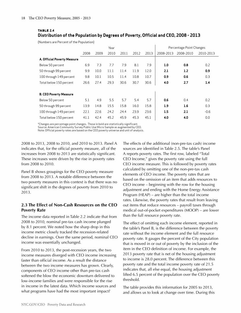
NYC.GOV/CEO Poverty Data and Research
18 The CEO Poverty Measure, 2005 - 2013
table 2.4 Distribution of the Population by Degrees of Poverty, Official and CEO, 2008 - 2013(Numbers are Percent of the Population)
Year Percentage Point Changes
2008 2009 2010 2011 2012 2013 2008-2013 2008-2010 2010-2013
A. Official Poverty Measure
Below 50 percent 6.9 7.3 7.7 7.9 8.1 7.9 1.0 0.8 0.2
50 through 99 percent 9.9 10.0 11.1 11.4 11.9 12.0 2.1 1.2 0.9
100 through 149 percent 9.8 10.1 10.5 11.4 10.8 10.7 0.9 0.6 0.3
Total below 150 percent 26.6 27.4 29.3 30.6 30.7 30.6 4.0 2.7 1.4
B. CEO Poverty Measure
Below 50 percent 5.1 4.9 5.5 5.7 5.4 5.7 0.6 0.4 0.2
50 through 99 percent 13.9 14.8 15.5 15.8 16.0 15.8 1.9 1.6 0.3
100 through 149 percent 22.1 22.6 24.2 24.4 23.9 23.6 1.5 2.1 -0.6
Total below 150 percent 41.1 42.4 45.2 45.9 45.3 45.1 4.0 4.0 0.0
*Changes are percentage point changes. Those in bold are statistically significant.Source: American Community Survey Public Use Micro Sample as augmented by CEO. Note: Official poverty rates are based on the CEO poverty universe and unit of analysis.
2008 to 2013, 2008 to 2010, and 2010 to 2013. Panel A indicates that, for the official poverty measure, all of the increases from 2008 to 2013 are statistically significant. These increases were driven by the rise in poverty rates from 2008 to 2010.
Panel B shows groupings for the CEO poverty measure from 2008 to 2013. A notable difference between the two poverty measures in this context is that there was no significant shift in the degrees of poverty from 2010 to 2013.
2.3 The Effect of Non-Cash Resources on the CEO Poverty RateThe income data reported in Table 2.2 indicate that from 2008 to 2010, nominal pre-tax cash income plunged by 8.1 percent. We noted how the sharp drop in this income metric closely tracked the recession-related decline in earnings. Over the same period, nominal CEO income was essentially unchanged.
From 2010 to 2013, the post-recession years, the two income measures diverged with CEO income increasing faster than official income. As a result the distance between the two income measures has grown. Clearly, components of CEO income other than pre-tax cash softened the blow the economic downturn delivered to low-income families and were responsible for the rise in income in the latest data. Which income sources and what programs have had the most important impact?
The effects of the additional (non-pre-tax cash) income sources are identified in Table 2.5. The table’s Panel A reports poverty rates. The first row, labeled “Total CEO Income,” gives the poverty rate using the full CEO income measure. This is followed by poverty rates calculated by omitting one of the non-pre-tax cash elements of CEO income. The poverty rates that are based on the omission of an item that adds resources to CEO income – beginning with the row for the housing adjustment and ending with the Home Energy Assistance Program (HEAP) – are higher than the total income rates. Likewise, the poverty rates that result from leaving out items that reduce resources – payroll taxes through medical out-of-pocket expenditures (MOOP) – are lower than the full resource poverty rate.
The effect of omitting each income element, reported in the table’s Panel B, is the difference between the poverty rate without the income element and the full resource poverty rate. It gauges the percent of the City population that is moved in or out of poverty by the inclusion of the item in the CEO definition of income. For example, the 2013 poverty rate that is net of the housing adjustment to income is 28.0 percent. The difference between this poverty rate and the total income poverty rate of 21.5 indicates that, all else equal, the housing adjustment lifted 6.5 percent of the population over the CEO poverty threshold.
The table provides this information for 2005 to 2013, and allows us to look at change over time. During this

Chapter 2: Poverty in New York City, 2005 - 2013 19
NYC.GOV/CEO Poverty Data and Research
period the rankings of the marginal effects are quite stable. The housing adjustment has the largest poverty-reducing effect in each year, followed by income taxes and Food Stamps (the income tax system reduces poverty because so many low-income tax filers benefit from tax credits that not only eliminate their tax liability, but generate refunds that create a net addition to their after-tax income). The other poverty-reducing income elements – school meals, the Supplemental Nutritional Program for Women, Infants, and Children (WIC), and HEAP – have relatively minor effects on the Citywide poverty rate, either because they are narrowly targeted (WIC) or because their benefit levels are so small (HEAP).
On the other side of the ledger, MOOP consistently has the largest poverty-increasing effect of the non-discretionary expenses which reduce family incomes.28 This is followed by payroll taxes (FICA) and commuting costs, which have notable, and nearly equal, effects. Although childcare costs can be a considerable drain on a family’s resources, they are incurred by too small a share of the total population to have much effect on the Citywide poverty rate.
The stability of the rankings, however, does not mean that there were no important changes in these marginal effects. Several of them directly reflect policy initiatives that were part of Presidents Bush and Obama’s economic stimulus programs. Both included initiatives that directly bolstered consumer demand by providing families with more resources. Tax programs were one of the tools used. President Bush’s 2008 Economic Recovery Rebate, for example, provided as much as $1,200 per married couple income tax filer. President Obama’s American Recovery and Reinvestment Act created new and expanded several existing tax credit programs that are targeted to low-income working families.29
These initiatives are reflected in the growth of the poverty reducing effect of tax programs illustrated in the table. Income tax programs brought 2.9 percent of the population out of poverty in 2007, but this effect leapt to 4.4 percentage points in 2008 and stayed statistically unchanged from this level through 2010. The subsequent drop-off in the income tax effect in 2011 to 2013 reflects the expiration of several of the income tax credit programs, particularly the Making Work Pay Credit. However, the fall in the income tax effect was
28. The marginal effect for medical out-of-pocket expenditures drops after 2007. This may be a result of a change in the ACS questionnaire as well as the implementation of prescription drug coverage for Medicare enrollees. See Appendix H for more discussion.29. Details on the size and timing of the tax initiatives are found in Appendix D.
offset by a 2.0 percentage point reduction in the payroll tax rate that took effect in 2011. The poverty increasing effect of payroll taxes fell from 2.0 percentage points in 2010 to 1.8 and 1.7 percentage points in 2011 and 2012 respectively. The effect of payroll taxes increased sharply to 2.3 percentage points in 2013 with the elimination of the payroll tax cut. Had the tax cut remained in place in 2013, the poverty rate would have been 20.8 percent. (See Appendix D.)
Another initiative to alleviate hardship and bolster consumer spending was through the Food Stamp program. The increasing importance of Food Stamps as a poverty reducing resource is evident in the post-2007 data, rising from 1.8 percentage points in that year to 3.6 percentage points in 2013, and hitting a high point in 2012 of 3.9 percent. The growth of the program’s effect reflects a sharp rise in enrollment in the program along with a 13.6 percent increase in benefit levels that was part of President Obama’s American Recovery and Reinvestment Act.30
30. Table 2.5 also indicates a jump in the effect of the housing adjustment from 2010 to 2011-2013. Unlike the changes we have noted for tax programs and Food Stamps, this does not appear to be driven by any change in policy. Rather, as we note in Appendix C, it is a reflection of several factors including differences between the 2008 and 2011 New York City Housing and Vacancy Surveys and trends in the market cost of housing.

NYC.GOV/CEO Poverty Data and Research
20 The CEO Poverty Measure, 2005 - 2013
table 2.5 Marginal Effects of Non-Cash Resources on CEO Poverty Rates, 2005 - 2013 (Numbers are Percent of the Population)
2005 2006 2007 2008 2009 2010 2011 2012 2013A. Poverty Rates
Total CEO Income 20.4 19.8 19.8 19.0 19.8 21.0 21.5 21.4 21.5
Net of:
Housing Adjustment 25.5 25.3 25.4 24.6 25.5 26.5 27.8 27.7 28.0
Income Taxes 23.5 22.6 22.7 23.4 24.1 25.3 25.1 25.1 25.0
Food Stamps 22.3 21.8 21.5 21.1 22.4 24.4 25.0 25.3 25.0
School Meals 21.0 20.3 20.3 19.5 20.2 21.4 21.9 21.9 22.1
WIC 20.5 19.9 19.9 19.1 19.8 21.1 21.5 21.5 21.6
HEAP 20.4 19.8 19.8 19.0 19.8 21.0 21.5 21.4 21.5
FICA (Payroll Taxes) 18.5 17.7 17.7 17.0 17.7 19.0 19.7 19.7 19.2
Commuting 19.0 18.5 18.1 17.6 18.1 19.5 19.7 19.8 19.5
Childcare 20.1 19.5 19.6 18.7 19.5 20.6 21.2 21.2 21.2
MOOP 16.8 16.4 16.0 15.8 16.5 18.1 18.2 18.4 18.5
2005 2006 2007 2008 2009 2010 2011 2012 2013
B. Marginal Effects
Housing Adjustment -5.1 -5.5 -5.7 -5.6 -5.7 -5.6 -6.3 -6.3 -6.5
Income Taxes -3.1 -2.8 -2.9 -4.4 -4.3 -4.4 -3.6 -3.7 -3.6
Food Stamps -2.0 -2.0 -1.8 -2.1 -2.6 -3.5 -3.6 -3.9 -3.6
School Meals -0.6 -0.5 -0.5 -0.5 -0.5 -0.4 -0.5 -0.5 -0.6
WIC -0.1 -0.1 -0.1 -0.1 -0.1 -0.1 -0.1 -0.1 -0.1
HEAP 0.0 0.0 0.0 0.0 0.0 0.0 0.0 0.0 0.0
FICA (Payroll Taxes) 1.9 2.2 2.1 2.0 2.1 2.0 1.8 1.7 2.3
Commuting 1.4 1.3 1.7 1.4 1.7 1.5 1.7 1.6 1.9
Childcare 0.3 0.3 0.2 0.3 0.3 0.4 0.3 0.2 0.3
MOOP 3.5 3.4 3.8 3.2 3.2 2.9 3.2 3.0 3.0
Source: American Community Survey Public Use Micro Sample as augmented by CEO.

Chapter 2: Poverty in New York City, 2005 - 2013 21
NYC.GOV/CEO Poverty Data and Research
Figure 2.4 illustrates the marginal effect of the non-cash resources in 2013. To put their magnitude in context, the figure includes the effect of cash transfer programs. Given their relative importance, we group these programs into Social Security and all other cash transfers. Social Security (which includes pensions, survivor benefits, and disability insurance) lifts 5.3 percent of the City’s population out of poverty. Only the housing adjustment has a larger impact. The combined effect of all the other cash transfer programs (such as public assistance, Supplemental Security Income, Unemployment Insurance, Workers Compensation, etc.) is 3.7 percentage points, not that different from the impact of Food Stamps and income taxes.
figure 2.4Marginal Effects of Selected Sources of Income on the CEO Poverty Rate, 2013
Source: American Community Survey Public Use Micro Sample as augmented by CEO.
Perc
enta
ge P
oint
s
-6.5
-5.3
-3.7 -3.6 -3.6
-0.6-0.1 0.0
0.3
1.92.3
3.0
Housing Adjustment
Income Taxes
Food Stamps
School Meals
WIC
Social Securit
y
Other Cash Transfers
HEAP
Payroll Taxes
Commuting
Childcare
Medical Expenses
Cash TransfersNon-Cash Transfers
-7
-6
-5
-4
-3
-2
-1
0
1
2
3
4

NYC.GOV/CEO Poverty Data and Research
22 The CEO Poverty Measure, 2005 - 2013

Chapter 3: CEO Poverty Rates in Demographic Detail, 2005 - 2013 23
NYC.GOV/CEO Poverty Data and Research
ChaPTer 3: Ceo PoverTy raTes in deMograPhiC deTail, 2005 - 2013As noted in Chapter 1, CEO employs the American Community Survey (ACS) as our principal data set because it provides a large annual sample of New York City residents, allowing us to track poverty rates for key population groups. This chapter reports poverty rates by individual demographic characteristic, family composition, work experience, and borough over the 2005 to 2013 period. We also provide poverty rates for 55 City neighborhoods by averaging data for 2009 through 2013.
Where statistically significant, the text identifies differences between groups, such as the disparity between poverty rates by race and Hispanic ethnicity. The chapter’s tables are organized so that readers can readily track changes over time. The first set of columns in the tables provides poverty rates. These are followed by calculations of change (measured in percentage points). Statistically significant changes are identified by bold type in the tables. The final column of each row provides context by giving the subgroup’s share of the Citywide population.
By and large, the pattern of change for subgroups of the City’s population parallels the broad trends described in Chapter 2. Poverty rates fall from 2005 to 2008 then rise from 2008 to 2013. Further echoing the Citywide pattern, the post-2008 increases in poverty are largely driven by the growth in poverty that occurred from 2008 to 2010. The lack of significant change in most of our data points for 2013 continues the trend that began in 2011 and reinforces the weakness of recovery from the Great Recession.
Because so few of the recent changes are statistically significant, the text focuses on changes from 2008 to 2013. Table 3.1 provides poverty rates by demographic characteristic. Table 3.2 reports poverty rates by family composition and work experience. Poverty rates by borough are given in Table 3.3. Figure 3.1 maps poverty rates across the City’s neighborhoods and poverty rates by neighborhood are listed in Table 3.4. A final section in the chapter provides some insight into a few of the new or notable patterns we identified in this report.
3.1 Poverty Rates by Demographic Characteristic of the IndividualWhen they are statistically significant, changes in poverty rates from 2005 to 2008 and 2008 to 2013 almost always follow the cyclical pattern evident in the Citywide poverty rate. All of the widespread statistically significant changes in poverty rates between 2008 and 2013 have been increases. These were mostly due to the growth in poverty rates from 2008 to 2010. (See Table 3.1.) We highlight the exceptions and significant changes from 2012 to 2013 in the discussion below.
Poverty Rates by Gender: Females are more likely to live in poverty than males. In 2013, for example, the poverty rate for male New Yorkers was 20.7 percent; it stood at 22.2 percent for their female counterparts. From 2008 to 2013, both genders’ poverty rates rose, by 2.8 percentage points for males and 2.2 percentage points for females.
Poverty Rates by Age: Children are poorer than adults. In 2013, the poverty rate for children under 18 was 24.8 percent, significantly higher than the 20.4 percent rate for working-age adults (18 through 64 years of age) and the 21.6 percent rate for elderly persons (65 and older). From 2008 to 2013, the poverty rate for children and working age adults increased by 1.9 percentage points and 3.4 percentage points, respectively. The rise in poverty among working age adults and the statistical stability of the poverty rate for the elderly has affected their relative standing. In 2008, the poverty rate for New Yorkers 65 and older was 22.8 percent, 5.8 percentage points above the 16.9 percent poverty rate for the 18 through 64-year-old group. By 2013, this gap had narrowed to 1.2 percentage points.
Poverty Rates for Children by Presence of Parent: Children in single-parent families are nearly twice as likely to be living in poverty as children living in two-parent families, 35.8 percent versus 18.5 percent in 2013. Since 2008, the poverty rate for children in two-parent families increased by 3.0 percentage points. The poverty rate for children in single-parent families was statistically unchanged over the same time period.
Poverty Rates by Race/Ethnicity: Over the 2008-2013 time period, poverty rates for all racial or ethnic groupings increased significantly except for Non-Hispanic Blacks. In 2013, the poverty rate for Non-Hispanic Whites was 15.0 percent, the lowest rate of any major race/ethnic group in the City. Yet this represents a statistically significant increase of 1.2 percentage points since the prior year. Non-Hispanic Blacks have
NYC.GOV/CEO Poverty Data and Research
24 The CEO Poverty Measure, 2005 - 2013
New York’s next lowest poverty rate, 22.4 percent in 2013. The poverty rate for Non-Hispanic Asians, at 25.9 percent, is statistically the same as the Hispanic rate of 25.8 percent, a condition that was also true in 2008. But there is a different pattern between the two groups. The Hispanic poverty rate has remained stable since 2011. The Non-Hispanic Asian rate is more volatile. In 2012, the poverty rate for Non-Hispanic Asians rose to 29.0 percent, the highest for any race/ethnic grouping in the years under study here. In 2013 that rate fell 3.1 percentage points to 25.9 percent. When we look at the Non-Hispanic Asian poverty rate over the recovery, the net change in the poverty rate is zero over those years. This volatility is related to the poverty rate for non-citizens and for the borough of Queens, as described below.
Race/Ethnicity categories are constructed as follows: First, individuals are categorized by Hispanic ethnicity into Non-Hispanic and Hispanic ethnic groups; Non-His-panic individuals are then categorized by race. We use three racial categories: White, Black, and Asian. Each includes persons who identify themselves as members of only one racial group. This sorting of the population omits 2.9 percent of the City population that is Non- Hispanic and multi-racial or Non-Hispanic and a member of some other race, such as Native American. We omit this residual category from Table 3.1.
Poverty Rates by Nativity/Citizenship: The 2013 poverty rate for non-citizens was 30.7 percent, which is significantly higher than poverty rates for both citizens by birth (19.6 percent) and naturalized citizens (19.4 percent). Non-citizens saw the largest jump in poverty between 2008 and 2013, increasing from 24.4 to 30.7, a 6.3 percentage point increase. However, between 2012 and 2013, their poverty rate remained stable. Poverty for native born and naturalized citizens has tracked together since 2005 with rates ranging from 17.7 to 20.2 percent. Most year-to-year changes were not statistically significant. There were a few notably significant changes: the poverty rate for the native born increased by 2.0 percentage points between 2008 and 2013, while naturalized citizens experienced a growth in their poverty rate between 2010 and 2013 (a 1.2 percentage point increase).
Poverty Rates for Persons 18 through 64 by Educational Attainment: For working age adults, the probability of being in poverty is inversely proportional to the individual’s educational attainment. Those with less than a high school education are almost four times more likely to be in poverty than those with a bachelor’s or more advanced degree (34.7 percent against 8.9 percent). The 2013 poverty rates for those with no more than a high school degree and those with some college (but less than a bachelor’s degree) fell between these two extremes, at 24.6 percent and 17.8 percent, respectively. From 2008 to 2013, poverty rates rose for adults with less than a high school degree (by 5.1 percentage points), only a high school degree (by 5.3 percentage points), those with some college (by 4.2 percentage points), and those with at least a bachelor’s degree (by 1.4 percentage points).
Work Experience of Family categories are constructed by summing the number of hours worked in the prior 12 months by persons 18 and older for each family. Families with over 3,500 hours of work are labeled as having the equivalent of “Two Full-Time, Year-Round Workers.” Families with 2,341 through 3,499 hours are labeled “One Full-Time, Year-Round and One Part-Time Worker.” Families with at least 1,750 through 2,340 hours are identified as “One Full-Time, Year-Round Worker.” Families with at least one hour of work, but less than 1,750 hours, are called “Less than One Full-Time, Year-Round Worker.” And finally, there are families that have “No Work.”
Poverty Rates for Persons 18 through 64 by Work Experience: Poverty rates vary markedly by individuals’ work experience over the prior 12 months. In 2013, the poverty rate for non-elderly adults that worked full-time, year-round was 8.5 percent; for those with no work it stood at 39.1 percent. Working age adults with some, but less than full-time, year-round work had a poverty rate of 25.2 percent. All three work experience groups saw statistically significant increases from 2008 to 2013. The poverty rate for working age adults with full-time, year-round work as well as those with some work rose by 2.2 and 2.6 percentage points, respectively; the poverty rate for those with no work climbed by 2.5 percentage points. The increasing poverty among workers raises questions about wage growth, an issue we will return to later in the chapter.

Chapter 3: CEO Poverty Rates in Demographic Detail, 2005 - 2013 25
NYC.GOV/CEO Poverty Data and Research
1. C
ateg
ory e
xclu
des p
eopl
e en
rolle
d in
scho
ol.
2. A
chan
ge in
the
2008
ACS
que
stio
nnai
re re
gard
ing
work
expe
rienc
e af
fect
s the
com
para
bilit
y of e
stim
ates
for 2
008
and
afte
r with
thos
e fo
r prio
r yea
rs.
See
text
for d
efini
tion
of w
ork
expe
rienc
e ca
tego
ries.
Sour
ce: A
mer
ican
Com
mun
ity S
urve
y Pub
lic U
se M
icro
Sam
ple
as a
ugm
ente
d by
CEO
.No
tes:
Diff
eren
ces a
re ta
ken
from
unr
ound
ed n
umbe
rs; t
hose
in b
old
type
are
stat
istic
ally
sign
ifica
nt. S
hare
s may
not
sum
to 1
00 p
erce
nt d
ue to
roun
ding
err
or.
tabl
e 3.1
CEO
Pov
erty
Rat
es fo
r Per
sons
by
Dem
ogra
phic
Cha
ract
eris
tic,
200
5 - 2
013
(Num
bers
are
Per
cent
of t
he P
opul
atio
n)
Year
Perc
enta
ge P
oint
Diff
eren
ces
Grou
p Sh
are
of
2013
Pop
.20
0520
0620
0720
0820
0920
1020
1120
1220
1320
05-0
820
08-1
320
08-1
020
10-1
320
12-1
3To
tal N
ew Y
ork
City
20.4
19.8
19.8
19.0
19.8
21.0
21.5
21.4
21.5
-1.4
2.5
1.9
0.5
0.1
100.
0G
ende
r
Mal
es19
.118
.418
.317
.918
.819
.820
.220
.520
.7-1
.22.
81.
90.
90.
247
.7Fe
mal
es21
.521
.121
.220
.020
.622
.022
.622
.322
.2-1
.52.
22.
00.
2-0
.152
.3A
ge G
roup
Unde
r 18
25.1
25.1
25.1
22.9
23.9
25.7
25.2
25.7
24.8
-2.3
1.9
2.8
-0.9
-0.9
21.5
18 th
roug
h 64
17.9
17.3
17.3
16.9
17.8
19.3
20.2
20.0
20.4
-0.9
3.4
2.4
1.1
0.3
66.1
65 a
nd O
lder
24.2
22.9
22.7
22.8
22.3
21.4
21.8
21.2
21.6
-1.5
-1.1
-1.3
0.2
0.4
12.5
Child
ren
(und
er 1
8), b
y Pr
esen
ce o
f Par
ent
One
Pare
nt37
.137
.837
.735
.138
.537
.236
.038
.435
.8-2
.00.
72.
1-1
.4-2
.636
.6Tw
o Pa
rent
s17
.417
.117
.515
.416
.019
.318
.818
.818
.5-1
.93.
03.
8-0
.8-0
.463
.4R
ace/
Ethn
icit
y
Non-
Hisp
anic
Whi
te14
.814
.014
.313
.213
.615
.315
.213
.815
.0-1
.61.
82.
0-0
.31.
232
.5No
n-Hi
span
ic B
lack
21.1
21.5
20.3
20.8
21.2
22.4
21.7
22.3
22.4
-0.3
1.6
1.6
0.0
0.1
22.1
Non-
Hisp
anic
Asi
an23
.724
.225
.522
.424
.826
.026
.629
.025
.9-1
.33.
63.
60.
0-3
.113
.4Hi
span
ic, A
ny R
ace
25.3
23.8
24.2
23.5
24.4
24.4
26.0
25.8
25.8
-1.7
2.3
0.9
1.4
0.0
29.1
Nat
ivit
y/Ci
tize
nshi
p
Citiz
en b
y Birt
h19
.118
.418
.617
.718
.320
.020
.019
.319
.6-1
.42.
02.
3-0
.30.
462
.6Na
tura
lized
Citi
zen
18.9
18.0
18.2
18.4
18.3
18.2
19.0
20.2
19.4
-0.5
1.0
-0.2
1.2
-0.8
20.3
Not a
Citi
zen
26.6
26.5
25.7
24.4
26.7
27.2
29.1
30.2
30.7
-2.1
6.3
2.8
3.5
0.5
17.1
Wor
king
Age
Adu
lts
(18
thru
64)
, by
Educ
atio
nal A
ttai
nmen
t1
Less
than
Hig
h Sc
hool
31.7
29.9
29.9
29.6
30.7
30.9
31.8
34.2
34.7
-2.0
5.1
1.3
3.8
0.5
18.0
High
Sch
ool D
egre
e20
.220
.820
.919
.321
.223
.025
.124
.924
.6-0
.95.
33.
61.
6-0
.325
.2So
me
Colle
ge14
.213
.314
.513
.615
.015
.817
.316
.717
.8-0
.64.
22.
22.
01.
120
.5Ba
chel
or's
Degr
ee o
r Hi
gher
7.3
6.9
6.9
7.5
7.6
9.2
9.3
8.5
8.9
0.2
1.4
1.7
-0.3
0.4
36.2
Wor
king
Age
Adu
lts
(18
thru
64)
, by
Wor
k Ex
peri
ence
in P
ast 1
2 M
onth
s1,2
Full-
Tim
e, Y
ear-
Roun
d6.
46.
56.
76.
26.
77.
17.
68.
18.
5-0
.22.
20.
91.
40.
454
.3So
me W
ork
19.7
19.8
20.4
22.6
22.2
23.6
24.8
24.4
25.2
2.8
2.6
1.1
1.6
0.8
22.4
No W
ork
37.7
36.5
36.4
36.6
36.8
38.1
38.9
39.0
39.1
-1.1
2.5
1.5
1.0
0.1
23.3

NYC.GOV/CEO Poverty Data and Research
26 The CEO Poverty Measure, 2005 - 2013
3.2 Poverty Rates by Family CharacteristicTable 3.2 provides poverty rates for persons based on the characteristics of the family unit in which they live. As more fully described in Appendix A, “Family,” from the perspective of the CEO poverty measure, is a broader concept than that used in the official poverty measure (persons who live together and are related by blood, marriage, or adoption). The CEO “Family” is the “Poverty Unit,” persons living together who share costs and resources. This includes related persons, but extends to unmarried partners, their children, and other persons we believe to be economically dependent on other members of the household even if they are not kin. (See Appendix A.)
Panel A in Table 3.2 begins by categorizing people as living in families headed by a married/unmarried partner or in a single-head family.31 A third category is unrelated individuals. Each family-type category includes everyone that is a member of the family. If a married couple has two children and two in-laws living with them, for example, then all six family members would be characterized as living in a married/unmarried partner family. Single heads are “householders” who do not have a spouse or unmarried partner but are living in families, for instance, a single mother with her children.32 Within each of these family types we distinguish between those that do or do not include children under 18. Because single mothers have been a particular focus of public policy, we also provide the poverty rates for members of single-mother families (households headed by a single female with children under 18), as well as members of all families with children under 18 regardless of the number of parents in the family.
Not everyone is in a family or poverty unit with other persons. Unrelated individuals are people that do not have family members in their household. This would include persons that live alone (the typical case) and some persons living with others, such as roommates or boarders, who we treat as economically independent from the people they live with. Unrelated individuals are one-person poverty units.
Panel B in Table 3.2 presents poverty rates for persons in families by different groupings of work experience. The categories range from families with no workers to
31. 2013 is the first year that the ACS provides data on same-sex partners. For this reason we have changed the family composition descriptors used in prior reports from “Husband Wife/Unmarried Partner” to “Married/Unmarried Partner.”32. The householder is typically the person in whose name the dwelling is owned or rented.
families with two full-time, year-round workers. Both panels are organized in a similar fashion to Table 3.1. They report poverty rates, the change in the poverty rate, and the group share of the population.
The changes in the poverty rates from 2005 to 2008 and 2008 to 2013 in Table 3.2 are also consistent with the Citywide pattern. From 2005 to 2008 all the statistically significant changes are declines, with the exception of persons living in families with the equivalent of less than one full-time, year-round worker. From 2008 to 2013 all the statistically meaningful changes in the poverty rate are increases.
Married/Unmarried Partner: In 2013, the poverty rate for persons living in married/unmarried partner families without children under 18 was the lowest of any family type described in Panel A at 14.0 percent. The 2013 poverty rate for married/unmarried partner families with children was higher, at 17.3 percent. Both married/unmarried partner family types experienced an increase in poverty between 2008 and 2013, with the former group rising by 2.1 percentage points and the latter by 3.0 percentage points.
Single Head: Even though the poverty rate for single householders with no children is lower than for those with children, this group experienced a significant increase of 4.5 percentage points from 2008 to 2013 (16.5 percent compared to 21.0 percent).
All Families with Children: The 2013 poverty rate for persons living in a family with children (a group that includes nearly half the City’s population) was 22.3 percent. This represents a 2.1 percentage point increase from 2008, but the rate remains statistically unchanged from 2012.
Unrelated Individuals: Individuals in one-person “family” units are another high poverty group. In 2013, well over one quarter of this group was poor (28.3 percent). Unrelated individuals experienced a 2.6 percentage point rise in poverty from 2008 to 2013.
Work Experience of Family: Panel B in Table 3.2 groups individuals by the work experience of the family in which they reside. (Work Experience of Family categories are defined in the accompanying text box.) Poverty rates rise sharply as work activity decreases, ranging from 6.1 percent for families with the equivalent of two full-time, year-round workers to 51.1 percent for persons in families with no work at all in 2013.

Chapter 3: CEO Poverty Rates in Demographic Detail, 2005 - 2013 27
NYC.GOV/CEO Poverty Data and Research
However, even a considerable level of work does not always spare people from poverty. Echoing the rise in poverty among workers reported in Table 3.1, poverty rates rose significantly from 2008 to 2013 for persons living in families with the equivalent of two full-time, year-round workers (2.3 percentage points). For families with the equivalent of one-full-time, year-round worker, the poverty rate increased a significant 2.7 percentage points in the same time period. This trend is troubling, considering that nearly 59 percent of the City’s population lives in one of these two family types.

NYC.GOV/CEO Poverty Data and Research
28 The CEO Poverty Measure, 2005 - 2013ta
ble 3.2
CEO
Pov
erty
Rat
es fo
r Per
sons
Liv
ing
in V
ario
us F
amily
Typ
es, 2
005
- 201
3(N
umbe
rs a
re P
erce
nt o
f the
Pop
ulat
ion)
Year
Perc
enta
ge P
oint
Diff
eren
ces
Grou
p
Shar
e of
20
13 P
op.
2005
2006
2007
2008
2009
2010
2011
2012
2013
2005
-08
2008
-13
2008
-10
2010
-13
2012
-13
Tota
l New
Yor
k Ci
ty20
.419
.819
.819
.019
.821
.021
.521
.421
.5-1
.42.
51.
90.
50.
110
0.0
A. F
amily
Com
posi
tion
Mar
ried/
Unm
arrie
d Pa
rtne
r1
No
Chi
ldre
n un
der 1
811
.811
.612
.111
.912
.612
.513
.013
.714
.00.
12.
10.
71.
50.
321
.6
With
Chi
ldre
n un
der 1
816
.515
.716
.414
.314
.917
.918
.217
.717
.3-2
.23.
03.
7-0
.7-0
.432
.2
Sing
le H
ead
of H
ouse
hold
No
Child
ren
unde
r 18
16.8
16.4
15.4
16.5
16.9
18.5
19.0
19.3
21.0
-0.3
4.5
2.1
2.4
1.7
11.2
With
Chi
ldre
n un
der 1
833
.833
.133
.131
.133
.733
.132
.334
.532
.1-2
.71.
02.
1-1
.1-2
.416
.6
Sing
le M
othe
r Fam
ily36
.135
.035
.232
.834
.634
.934
.036
.133
.4-3
.30.
62.
0-1
.5-2
.714
.0
All F
amili
es w
ith C
hild
ren
unde
r 18
22.5
21.9
22.3
20.2
21.1
23.0
23.1
23.2
22.3
-2.3
2.1
2.8
-0.7
-0.9
48.8
Unre
late
d In
divi
dual
s26
.225
.324
.125
.826
.327
.428
.627
.128
.3-0
.52.
61.
60.
91.
218
.5
B. W
ork
Expe
rien
ce o
f th
e Fa
mily
2
Two
Full-
Tim
e, Y
ear-
Roun
d W
orke
rs4.
04.
45.
23.
84.
45.
05.
15.
46.
1-0
.22.
31.
21.
10.
732
.9
One
Full-
Tim
e, Y
ear-
Roun
d, O
ne P
art-
Tim
e W
orke
r
13.0
14.4
13.5
12.4
12.5
13.7
14.1
14.9
13.0
-0.6
0.7
1.3
-0.7
-1.9
14.8
One
Full-
Tim
e, Y
ear-
Roun
d W
orke
r14
.814
.016
.116
.016
.416
.317
.417
.218
.61.
12.
70.
32.
41.
425
.9
Less
than
One
Ful
l-Tim
e,
Year
-Rou
nd W
orke
r40
.542
.140
.344
.441
.445
.244
.443
.444
.83.
90.
40.
9-0
.41.
411
.9
No W
ork
53.1
52.0
50.0
51.3
52.1
51.7
51.6
51.9
51.1
-1.9
-0.1
0.4
-0.5
-0.7
14.5
1. In
the
CEO
mea
sure
, unm
arrie
d pa
rtne
rs a
re tr
eate
d as
spou
ses.
See
text
for e
xpla
natio
n.2.
See
text
for e
xpla
natio
n of
wor
k ex
perie
nce
cate
gorie
s.So
urce
: Am
eric
an C
omm
unity
Sur
vey P
ublic
Use
Mic
ro S
ampl
e as
aug
men
ted
by C
EO.
Note
s: Di
ffer
ence
s are
take
n fr
om u
nrou
nded
num
bers
; tho
se in
bol
d ty
pe a
re st
atis
tical
ly si
gnifi
cant
. Sha
res m
ay n
ot su
m to
100
per
cent
due
to ro
undi
ng e
rror
. A ch
ange
in th
e 20
08 A
CS q
uest
ionn
aire
rega
rdin
g wo
rk
expe
rienc
e af
fect
s the
com
para
bilit
y of e
stim
ates
for 2
008
and
late
r with
thos
e fo
r prio
r yea
rs.

Chapter 3: CEO Poverty Rates in Demographic Detail, 2005 - 2013 29
NYC.GOV/CEO Poverty Data and Research
3.3 Poverty Rates by BoroughIn 2013, the poverty rate in the Bronx was the highest in the City at 27.1 percent. Brooklyn, at 22.9 percent, had the City’s second highest poverty rate, followed by Queens (21.1 percent), Staten Island (18.2 percent), and Manhattan (15.8 percent).
From 2008 to 2013, poverty rates rose in Manhattan (by 2.3 percentage points), Queens (by 4.7 percentage points), and Staten Island (by 6.7 percentage points). The poverty rate in the Bronx remained stubbornly high but stable over the entire 2005 to 2013 period. There were no statistically significant changes in borough poverty rates from 2012 to 2013.
In 2013 we note a drop in the Queens poverty rate from 2012, but it was not statistically significant. The stabilization of the poverty rate in this borough correlates with the 2013 drop in Asian poverty (3.1 percentage points from 2012 to 2013). Approximately one half of all Asians in the City live in Queens.
Notable shifts have occurred in other boroughs as the economy recovered. From 2010 to 2013, there was a 1.6 percentage point drop in the poverty rate in Brooklyn. There has been a slow but steady increase in poverty on Staten Island, totaling 6.7 percentage points, from 11.5 in 2008 to 18.2 percent in 2013. We explore the Staten Island poverty rate further in Section 3.5 below.
3.4 Poverty Rates by NeighborhoodFigure 3.1 illustrates and Table 3.4 lists CEO poverty rates for a total of 55 neighborhoods in New York City. The neighborhoods are the smallest geographical areas identified in the American Community Survey public use micro sample files. Each area contains approximately 100,000 people and their boundaries roughly coincide with New York City’s Community Districts. However, the sample for each area is small, making it impossible to generate meaningful one-year estimates of poverty across the City’s neighborhoods. Therefore, we have combined estimates from the 2009 through 2013 ACS data and report the average poverty rate for neighborhoods over the five-year period in the figure and table. The five-year Citywide average poverty rate is 21.0 percent.
The disparities across New York’s neighborhoods are striking, ranging from a poverty rate of 7.3 percent on Manhattan’s Upper East Side to a 34.1 percent poverty rate in the Bronx neighborhood of University Heights/Fordham. Areas of the City with the lowest poverty rates (no more than 15 percent) are shaded in green in the map (Figure 3.1). These include Manhattan south of Harlem (except for the Lower East Side); Mid-Island and South Shore Staten Island; and eastern Queens. Poverty rates are also relatively low in “Brownstone Brooklyn” (Brooklyn Heights/Fort Greene and Park Slope/Carroll Gardens), as well as Flatlands/Canarsie. Neighborhoods with the highest poverty rates (more than 25 percent) are identified in shades of orange. They are clustered together in the South Bronx and across a wide swath of Brooklyn, from Sunset Park and Borough Park to East New York. Queens is home to a third high-poverty cluster composed of Jackson Heights and Elmhurst/Corona.
table 3.3 CEO Poverty Rates by Borough, 2005 - 2013(Numbers are Percent of the Population)
Year Percentage Point Change Borough Share of
2013 Pop.2005 2006 2007 2008 2009 2010 2011 2012 2013 2005-2008
2008-2013
2008-2010
2010-2013
2012-2013
Total New York City
20.4 19.8 19.8 19.0 19.8 21.0 21.5 21.4 21.5 -1.4 2.5 1.9 0.5 0.1 100.0
Bronx 27.4 25.8 25.2 26.5 25.8 25.3 26.5 26.0 27.1 -0.9 0.7 -1.1 1.8 1.1 16.7
Brooklyn 24.0 23.5 24.0 22.3 23.4 24.5 23.9 23.4 22.9 -1.7 0.6 2.2 -1.6 -0.5 31.0
Manhattan 15.8 15.0 14.3 13.5 13.5 15.2 14.9 14.9 15.8 -2.3 2.3 1.7 0.7 0.9 19.0
Queens 17.2 17.0 17.2 16.4 17.6 19.9 21.6 22.1 21.1 -0.8 4.7 3.5 1.2 -1.0 27.6
Staten Island 12.2 12.5 12.5 11.5 14.4 13.7 14.5 15.5 18.2 -0.7 6.7 2.3 4.5 2.7 5.7
Source: American Community Survey Public Use Micro Sample as augmented by CEO.Note: Differences are taken from unrounded numbers; those in bold type are statistically significant.
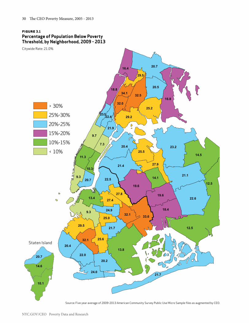
NYC.GOV/CEO Poverty Data and Research
30 The CEO Poverty Measure, 2005 - 2013
figure 3.1 Percentage of Population Below Poverty Threshold, by Neighborhood, 2009 - 2013Citywide Rate: 21.0%
9.3
9.7
9.3
7.3
13.8
12.5
14.5
13.4
11.3
14.1
10.3
12.519.6
18.4
16.8
19.6
16.4
18.8
23.2
22.6
21.7
21.1
20.7
21.4
20.4
20.2
22.5
20.4
20.5
24.0
22.0
21.7
24.9
20.7
21.9
22.423.5
25.2
29.2
29.5
27.9
25.5
25.6
27.8
27.4
25.0
29.5
33.6
32.5
32.1
32.1
34.1
32.0
10.1
14.6
20.7
Staten Island
> 30%
25%-30%
20%-25%
15%-20%
10%-15%
< 10%
Source: Five year average of 2009-2013 American Community Survey Public Use Micro Sample files as augmented by CEO.

Chapter 3: CEO Poverty Rates in Demographic Detail, 2005 - 2013 31
NYC.GOV/CEO Poverty Data and Research
Community District Neighborhood
5 Year Avg.
Community District Neighborhood
5 Year Avg.
Bronx Manhattan
1 & 2 Mott Haven / Hunts Point 29.2 1 & 2 Greenwich Village / Financial District 9.33 & 6 Morrisania / East Tremont 32.5 3 Lower East Side / Chinatown 20.74 Highbridge / S. Concourse 32.0 4 & 5 Chelsea / Clinton / Midtown 11.35 University Heights / Fordham 34.1 6 Stuyvesant Town / Turtle Bay 10.37 Kingsbridge Heights / Mosholu 29.5 7 Upper West Side 9.78 Riverdale / Kingsbridge 16.4 8 Upper East Side 7.39 Soundview / Parkchester 25.2 9 Morningside Heights / Hamilton Heights 23.510 Throgs Neck / Co-op City 16.8 10 Central Harlem 22.411 Pelham Parkway 20.5 11 East Harlem 21.912 Williamsbridge / Baychester 20.7 12 Washington Heights / Inwood 18.8Brooklyn Queens
1 Williamsburg / Greenpoint 22.5 1 Astoria 20.42 Brooklyn Heights / Fort Greene 13.4 2 Sunnyside / Woodside 21.43 Bedford Stuyvesant 27.4 3 Jackson Heights 25.54 Bushwick 27.8 4 Elmhurst / Corona 27.95 East New York / Starrett City 33.6 5 Middle Village / Ridgewood 19.66 Park Slope / Carroll Gardens 9.3 6 Forest Hills / Rego Park 14.17 Sunset Park 29.5 7 Flushing / Whitestone 23.28 North Crown Heights / Prospect Heights 24.9 8 Hillcrest / Fresh Meadows 21.19 South Crown Heights 25.0 9 Kew Gardens / Woodhaven 19.610 Bay Ridge 20.4 10 Howard Beach / S. Ozone Park 18.411 Bensonhurst 22.0 11 Bayside / Little Neck 14.512 Borough Park 32.1 12 Jamaica 22.613 Coney Island 24.0 13 Bellerose / Rosedale 12.514 Flatbush 25.6 14 Rockaways 21.715 Sheepshead Bay / Gravesend 20.2 Staten Island
16 Brownsville / Ocean Hill 32.1 1 North Shore 20.717 East Flatbush 21.7 2 Mid-Island 14.618 Flatlands / Canarsie 13.8 3 South Shore 10.1
table 3.4CEO Poverty Rates by Community District/Neighborhood, 2009 - 2013(Numbers are Percent of the Population)
Source: American Community Survey Public Use Micro Sample as augmented by CEO.Note: Poverty rate is the average over the 2009-2013 period.

NYC.GOV/CEO Poverty Data and Research
32 The CEO Poverty Measure, 2005 - 2013
3.5 A Closer Look at Some Patterns in the DataRising Poverty among Workers and Working Families: As this report’s introductory chapter outlined, the CEO poverty rate rose as the share of the working age population with steady employment declined from 2008 to 2010. But Table 3.1 and Table 3.2 also indicate that employment was not a guarantee against increasing poverty. The poverty rate for working age adults who were full-time, year-round workers rose 0.9 percentage points from 2008 to 2010 and continued to rise from 2010 to 2013 by an additional 1.4 percentage points (see Table 3.1). The poverty rates for persons living in family units with the equivalent of two full-time, year-round workers and one full-time, year-round worker all rose significantly from 2008 to 2013 (see Table 3.2). This pattern suggests that declining wage rates were a key player in the rise in poverty among these groups.
Table 3.5 provides measures of annual earnings for full-time, year-round workers, defined as adults 18 through 64 years of age who worked at least fifty 35-hour weeks
over the course of a year. Because our interest is in the relationship between earnings and poverty, the table reports earnings for workers in the bottom half of the distribution. In order to make the change in earnings over time more directly relevant to the growth in poverty, nominal earnings have been adjusted for the growth in the CEO poverty threshold.33 The table points to a considerable decline in wages, from 2008 to 2013, at the 10th, 20th, and 30th deciles of the distribution, that is, for workers who would be most vulnerable to poverty. Wage rates fell broadly during the period of declining employment from 2008 to 2010, and continued to fall throughout 2011. The decline in earnings is finally arrested in 2012 for parts of the distribution, and we begin to see positive change in 2013 at the 10th, 40th and 50th deciles and very small declines at the 20th and 30th deciles. The frustrations of working full time yet remaining in poverty are addressed in Chapter 5, in the discussion of the minimum wage policy.
33. We use the CEO poverty threshold as a cost of living index to restate pre-2013 earnings in 2013 dollars.
table 3.5Annual Earnings for Full-Time, Year-Round Workers, 2008-2013
Year Percentage ChangePercentile 2008 2009 2010 2011 2012 2013 2008-2013 2008-2011 2011-2012 2012-2013
10 $18,164 $18,089 $17,757 $17,752 $17,238 $17,632 -2.9% -2.3% -2.9% 2.3%20 $25,760 $25,538 $25,069 $24,346 $24,336 $24,181 -6.1% -5.5% 0.0% -0.6%30 $33,026 $31,922 $31,336 $30,433 $30,420 $30,226 -8.5% -7.9% 0.0% -0.6%40 $38,530 $39,370 $37,603 $39,562 $38,533 $39,294 2.0% 2.7% -2.6% 2.0%50 $45,245 $47,883 $45,124 $46,663 $45,631 $46,347 2.4% 3.1% -2.2% 1.6%
Source: American Community Survey Public Use Micro Sample as augmented by CEO. Notes: Earnings are stated in 2013 dollars. See text.

Chapter 3: CEO Poverty Rates in Demographic Detail, 2005 - 2013 33
NYC.GOV/CEO Poverty Data and Research
Poverty Trends in Staten Island: Staten Island has seen a slow but steady increase in poverty from 2008 to 2013. At 18.2 percent, the poverty rate in 2013 remains lower than all other boroughs except Manhattan. But the 6.7 percentage point growth rate in poverty in Staten Island is the highest among the boroughs. Although year-over-year changes are not significant, the overall trend is that of a steady increase. In 2008, 11.5 percent of the borough was in poverty compared to 19.0 percent for the City, a difference of 7.5 percentage points. By 2013 this difference had narrowed to 3.3 percentage points (21.5 for the City and 18.2 for Staten Island); the poverty rate on Staten Island was approaching the Citywide rate (See Table 3.3.). We approach even the trend data with caution in our interpretation because of the statistical weakness of the data.
We looked at the data for this borough with an eye for the traditional poverty factors. Specifically, we examined the influences of demographic factors such as age, race, and ethnicity; and of economic factors including earnings, labor force participation rates, and industry of employment. We also considered the aftereffects of Hurricane Sandy in late 2012 and the overarching issues around sampling and non-sampling error in the data.
Population: Staten Island was one of the fastest growing counties in New York State between 2000 and 2010.34 However, since 2010 this growth has slowed. The population on Staten Island declined 2.9 percent between 2008 and 2013, the time period used most often in our analysis, while the population of all other boroughs increased.35 Moreover, the age distribution of the Staten Island population has shifted with time. The number of people of working age – the population aged 18 to 64 – declined by 5.2 percent compared to growth of 2.5 percent for the City. Staten Island was the only borough to show a drop in population for this age group from 2008 to 2013.
Simultaneously, there was a large increase in the elderly share of the population on Staten Island. Between 2008 and 2013, the number of persons 65 years and older on Staten Island increased by 15.5 percent compared to a 3.7 percent increase for the City as a whole (see Figure 3.2). Population projections for the 2010-2020 decade expect Staten Island to see the largest increase in the population over 65 years of age relative to all other boroughs, 30.8 percent. The next largest increase
34. See: http://factfinder.census.gov/faces/tableservices/jsf/pages/productview.xhtml?pid=DEC_10_SF1_P1&prodType=table35. Data not shown; compiled using 2008 and 2013 American Community Survey as augmented by CEO.
5.76.4
4.6
1.5 1.02.0 2.5
3.7
9.2
-1.7
-5.2-6.0
-4.0
-2.0
0.0
2.0
4.0
6.0
8.0
10.0
12.0
14.0
16.0
Bronx Brooklyn Manhattan Queens Staten Island NYC
18 to 64 65 and over
15.5
figure 3.2Percent Change in Number of Working Age and Elderly Adults by Borough, 2008-2013
Source: American Community Survey Public Use Micro Sample as augmented by CEO.

NYC.GOV/CEO Poverty Data and Research
34 The CEO Poverty Measure, 2005 - 2013
is projected for Brooklyn with a 19.3 percent increase in seniors.36
Poverty rates for the elderly have declined across the City since 2005 (see Table 3.1), but on Staten Island there has been no significant change in the elderly poverty rate. We are cautious in our interpretation of this trend for Staten Island. The population over 65 years of age and in poverty on Staten Island is subject to the sampling problems we discuss in the Survey Data section below.
Staten Island also has demographic differences in the ethnic and racial composition of its population. Historically, the Staten Island population has been majority Non-Hispanic White, which stands in contrast to the rest of the City. In 2013, about one-third of the City’s population was comprised of White Non-Hispanics. In Staten Island, this statistic was 62.8 percent, down from 67.0 percent in 2008 – a decline of 4.2 percentage points. Hispanics on Staten Island increased from 15.4 percent of the population in 2008 to 17.9 percent in 2013 (2.5 percentage points). Both the
36. New York City Department of City Planning, New York City Population Projections by Age/Sex and Borough, 2010-2040. New York, December 2013. http://www.nyc.gov/html/dcp/pdf/census/projections_report_2010_2040.pdf
Asian and Non-Hispanic Black share of the Staten Island population has remained essentially unchanged.37
We attempted to examine changes in the distribution of poverty by race, but the sample proved to be too small for the creation of reliable estimates for all groups. The year-to-year changes for race and ethnic groups were especially problematic.
Labor Market: When we turned to the labor market, the story for Staten Island workers was slightly worse than for all workers Citywide. For most of the City, the decline in earnings leveled off between 2012 and 2013. But earnings continued to decline for full-time, year-round workers on Staten Island. In Chapter 1, we noted the large drop in earnings from 2008 to 2013 and detected the beginnings of a reversal in that trend from 2012 to 2013 in the lower half of the earnings distribution. For Staten Island workers there was no reversal. Earnings continued to fall (see Table 3.6).
37. Data not shown; compiled using 2008 and 2013 American Community Survey as augmented by CEO.
table 3.6Earnings for Full-Time, Year-Round Workers for Staten Island and NYC, 2008, 2012 and 2013
Total, NYCPercentile 2008 2012 2013 2008-2013 2012-2013
10 $18,164 $17,238 $17,632 -2.9 2.220 $25,760 $24,336 $24,181 -6.1 -0.630 $33,026 $30,420 $30,226 -8.5 -0.640 $38,530 $38,533 $39,294 2.0 1.950 $45,245 $45,631 $46,347 2.4 1.5
Staten IslandPercentile 2008 2012 2013 2008-2013 2012-2013
10 24,989 21,497 21,238 -15.0 -1.220 33,026 30,420 30,340 -8.1 -0.330 39,631 38,533 35,397 -10.7 -8.940 48,218 45,631 45,207 -6.2 -0.950 55,043 54,757 53,601 -2.6 -2.2
Source: American Community Survey Public Use Micro Sample as augmented by CEO.

Chapter 3: CEO Poverty Rates in Demographic Detail, 2005 - 2013 35
NYC.GOV/CEO Poverty Data and Research
Table 3.7 shows changes in labor force status for the working age population on Staten Island and Citywide from 2008 to 2013. The patterns are similar. Employment fell, unemployment rose, and the share of the population not in the labor force increased for both the City as a whole and Staten Island. We detected no statistically significant difference between the trends in Staten Island and the City. This decline in employment and labor force participation is playing out against the backdrop of a shrinking population of wage earners in Staten Island.
We also looked at the industry distribution of jobs held by Staten Islanders to see whether this influenced the decline in earnings. Industries were ranked by the numbers of Staten Islanders employed in each. The distribution of wage earners across industry remains relatively stable. The top five industries for employment in both 2008 and 2013 were Government; Education, Health and Human Services; Finance; Professional; and Retail. Among these industries, the share of Staten Islanders employed in government and finance declined with time but only the drop in financial employment was statistically significant (see Table 3.8). We also note that some of the realignment of that distribution may be due to retirement patterns among elderly Staten Islanders.
table 3.7Percent of Population 18 to 64, by Labor Force Status, Staten Island and New York City, 2008 and 2013
Total, NYC Staten Island
2008 2013Percentage
Point Change 2008 2013Percentage
Point ChangeEmployed in labor force 70.8 68.4 -2.4 69.8 66.3 -3.5
Unemployed 5.4 7.2 1.8 3.8 5.8 2.0Not in labor force 23.8 24.5 0.7 26.4 27.9 1.5
Source: American Community Survey Public Use Micro Sample as augmented by CEO.

NYC.GOV/CEO Poverty Data and Research
36 The CEO Poverty Measure, 2005 - 2013
Storm Damage: Hurricane Sandy hit New York City in late October 2012. Staten Island, with its large exposed shoreline, suffered major damage. The destruction of homes and businesses created disruption, displacement, and job loss. It is not possible to specifically identify the effects of the storm in ACS data or the resulting effect on the poverty rate.38 Year-over-year changes are not reliable due to large standard errors in the data (see below), especially if we attempt to look at geographic areas below the borough level (e.g., Community Districts).
Survey Data: The relatively small sample size in Staten Island made many of the metrics derived from the ACS difficult to apply in our model because of the volatility of estimates from year-to-year and across various population subgroups. For example, while the overall sample size for the ACS in Staten Island was 4,039 persons in 2013, the sample for the Non-Hispanic Black population was just 271 persons. This generates large margins of error that make trends and differences difficult or impossible to interpret. Similar problems exist for other detailed subgroups.
Still, it is likely that overall poverty has increased on Staten Island. Contributing factors are a growing population 65 years and over, with no statistical evidence of the declining poverty rates we observe for seniors Citywide; the shrinking size of the borough’s working age population and labor force; and fewer workers in traditional industries that, for the most part, pay middle income wages. We will continue to monitor trends in Staten Island in future reports.
38. We note that Queens suffered similar damage, but the areas affected were a smaller part, geographically, of that borough, and storm influences are even harder to detect in the data.
table 3.8Change in Share of Employed Workers by Selected Industries, Staten Island, 2008 and 2013
2008 2013 Percentage Point
DifferenceNumber Percent Number PercentTotal, Workers 217,497 100.0 195,923 100.0 Government 50,273 23.1 39,973 20.4 -2.7 Education/Health and Human Services 33,874 15.6 35,304 18.0 2.4
Financial 24,068 11.1 16,798 8.6 -2.5
Professional 19,184 8.8 17,524 8.9 0.1 Retailers 17,588 8.1 16,963 8.7 0.6 All other industries 72,510 33.3 69,361 35.4 2.1
Source: American Community Survey Public Use Micro Sample as augmented by CEO.

Chapter 4: Alternative Poverty Measures in the U.S. and New York City 37
NYC.GOV/CEO Poverty Data and Research
ChaPTer 4: alTernaTive PoverTy Measures in The u.s. and new york CiTy
As the Introduction noted, the U.S. Bureau of the Census has been issuing a Supplemental Poverty Measure (SPM) since November 2011. Like the CEO measure the SPM is based on recommendations made by the National Academy of Sciences. The creation of the new Federal measure allows us to compare poverty in New York City to the nation using a similar methodology. This chapter compares some of the principal findings from the Census Bureau’s SPM reports with our findings for New York City. The Bureau provides comparisons between the SPM and the official poverty rates for the U.S., much as we have done with the CEO and official measure in Chapters 1 and 2. We find that the pattern of differences between the official and National Academy of Sciences (NAS)-style poverty rates in the nation and the City are quite similar. Changes in the SPM and CEO poverty rates from 2009 to 2013 are also alike.
4.1 Poverty Rates by Age GroupGiven the focus that policymaking has had on children, differences in poverty rates by age group are a particularly important set of comparisons. Table 4.1 provides 2013 poverty rates by age using the official and NAS-style measures. Panel A reports these for the U.S.39 The table’s Panel B provides the New York City data. Differences between the official and SPM measures for the nation and differences between the official and CEO measures for the City follow the same pattern. The poverty rates for the total population using the alternative measures exceed the poverty rates using the official measure. For the U.S., the difference is 0.9 percentage points while the City’s difference is 1.6 percentage points.
Another important difference between the official and alternative poverty measures – common to the City and the nation – is that, despite the higher poverty rate overall, the alternative measures yield poverty rates for children that are below the official poverty rates. The U.S. SPM poverty rate for children is 16.4 percent, 4.0 percentage points below the official rate of 20.4 percent. The New York City CEO poverty rate for children is 24.8 percent, 4.3 percentage points below the official rate of 29.1 percent. The lower poverty rates for children using
39. The U.S.-level poverty rates cited in this chapter are taken from Short, Kathleen. The Supplemental Poverty Measure: 2013. U.S. Bureau of the Census. October 2014. Available at: http://www.census.gov/content/dam/Census/library/publications/2014/demo/p60-251.pdf
the NAS-style poverty measures are a result of their more inclusive account of resources. The alternative measures capture the effect of tax credits and in-kind benefits, many of which are targeted toward families with children.40
table 4.1Comparison of Poverty Rates by Age Group Using Different Measures, 2013(Numbers are Percent of the Population)
A. United States
Official SPM
Percentage Point
DifferenceTotal 14.6 15.5 0.9
Under 18 20.4 16.4 -4.0
18 through 64 13.6 15.4 1.8
65 and Older 9.5 14.6 5.1
B. New York City
Official CEO
Percentage Point
DifferenceTotal 19.9 21.5 1.6
Under 18 29.1 24.8 -4.3
18 through 64 17.1 20.4 3.3
65 and Older 18.6 21.6 3.0 Sources: U.S. Bureau of the Census and American Community Survey Public Use Micro Sample as augmented by CEO. Note: Differences are measured in percentage points and are taken from unrounded numbers; those in bold type are statistically significant.
Poverty, however, is markedly more prevalent among the elderly using the NAS-style measures than it is under the official measure. This is primarily a result of the alternative measures’ deduction of medical out-of-pocket expenditures (MOOP) from their measure of income. Without this deduction the NAS-based measures would yield poverty rates that are lower than those from the official measures. For the U.S. SPM, the 2013 poverty rate for persons 65 and older would fall to 8.3 percent if MOOP was not included in the poverty measure; for the CEO measure, the 2013 elderly poverty rate net of MOOP is 17.3 percent. The U.S.-wide official poverty rate for the elderly in 2013 was 9.5 percent while the official poverty rate for the elderly in New York City was 18.6 percent.41
40. Although the SPM and CEO poverty rates for children are lower than the official rates, both the SPM and CEO child poverty rates exceed those of working age and elderly adults.41. See Short, Table 5A, and Appendix H in this report for details on MOOP estimates and the impact of MOOP on the elderly poverty rate.

NYC.GOV/CEO Poverty Data and Research
38 The CEO Poverty Measure, 2005 - 2013
4.2 Extreme Poverty and Near PovertyIn Chapter 2 we noted that the proportion of the population living in extreme poverty (below 50 percent of the poverty line) is smaller under the CEO poverty measure than it is with the official measure. Table 4.2 reports extreme poverty rates for the U.S. and New York City by age. A smaller fraction of the nation’s population is in extreme poverty using the alternative poverty measure. For the U.S. as a whole the difference is 1.3 percentage points. The corresponding difference in the City is 2.2 percentage points. The pattern of differences across the age groups is also alike. For the nation and the City, the largest difference between the official and alternative measures of extreme poverty is for children, 4.9 percentage points and 7.1 percentage points, respectively. Differences between the measures for working age adults are more modest: 0.6 percentage points for the U.S. and 1.0 percentage points for New York City.
This pattern of lower rates of extreme poverty when using alternative measures is reversed for the elderly. Historically, the alternative measures have found a higher incidence of extreme poverty for persons 65 and older than do the official measures. For the U.S., the SPM extreme poverty rate for persons 65 and over is 2.1 percentage points above that of the official rate. In 2013, the CEO extreme poverty rate for the elderly is statically the same as the official rate.42
42. In part, this is a function of overall lower estimates of extreme poverty than in official measures. See also Appendix H for CEO methodology in modeling of Medicare, and especially Medicare Part D, in the effect of medical expenditures on the elderly.
table 4.2 Comparison of Extreme Poverty Rates by Age Group, Using Different Measures, 2013(Numbers are Percent of the Population)
A. United States
Official SPM
Percentage Point
DifferenceTotal 6.5 5.2 -1.3
Under 18 9.3 4.4 -4.9
18 through 64 6.2 5.6 -0.6
65 and Older 2.7 4.8 2.1
B. New York City
Official CEO
Percentage Point
DifferenceTotal 7.9 5.7 -2.2
Under 18 12.5 5.4 -7.1
18 through 64 7.0 6.0 -1.0
65 and Older 4.8 4.7 -0.1 Sources: U.S. Bureau of the Census and American Community Survey Public Use Micro Sample as augmented by CEO. Note: Differences are measured in percentage points and are taken from unrounded numbers; those in bold type are statistically significant.
Table 4.3 reports the share of the U.S. and New York City population that is near poor in the official and NAS-based poverty measures. The near poor poverty rate is defined here as the proportion of the population whose income falls from 100 percent through 149 percent of the respective poverty thresholds. As Chapter 2 indicated the CEO measure places a much larger share of the population in near poverty than does the official measure. Likewise, the Census SPM categorizes a larger share of the nation in this group than the official measure. For the population as a whole, the SPM near poverty rate is 17.0 percent, 7.2 percentage points above the official rate. The differences between the SPM and official measures for children are particularly high at 9.4 percentage points above the official rate, while the near poverty rates for the elderly in the two measures are relatively closer.

Chapter 4: Alternative Poverty Measures in the U.S. and New York City 39
NYC.GOV/CEO Poverty Data and Research
table 4.3Comparison of Near Poverty Rates by Age Group, Using Different Measures, 2013(Numbers are Percent of the Population)
A. United States
Official SPM
Percentage Point
DifferenceTotal 9.8 17.0 7.2
Under 18 12.1 21.5 9.4
18 through 64 8.5 15.2 6.7
65 and Older 11.5 17.2 5.7
B. New York City
Official CEO
Percentage Point
DifferenceTotal 10.7 23.6 12.9
Under 18 13.4 30.2 16.8
18 through 64 9.5 21.6 12.1
65 and Older 12.5 22.9 10.4
Sources: U.S. Bureau of the Census and American Community Survey Public Use Micro Sample as augmented by CEO. Note: Changes are measured in percentage points and are taken from unrounded numbers; those in bold type are statistically significant.
In one respect the pattern of difference between the measures for New York City is similar to that for the total U.S.; differences between the near poverty rates are greatest for children and more modest for the elderly. But the more eye-catching comparison between the City and the nation is how much larger the between-measure differences are in New York. The CEO measure, for example, categorizes 23.6 percent of the City population as near poor while the corresponding proportion from the official measure is 10.7 percent. One reason for the larger between-measure difference in New York City than the nation is due to the geographic adjustment that accounts for the relatively high cost of housing in New York City. The resulting CEO poverty threshold is higher than the U.S.-wide SPM poverty threshold. In 2013, the U.S.-wide SPM threshold for a two-adult, two-child family was $24,931 (a decline of $28 from the prior year) while the comparable CEO threshold was $31,156 (an increase of $116 from the prior year).43 Thus, the near poor in the U.S.-wide SPM measure are defined as persons living in families with the equivalent income of $24,931 through $37,397 (1.5 times the threshold).44 The near poor for the CEO measure are persons living in families with the equivalent income of $31,156
43. This is the SPM threshold prior to its adjustment for differences in housing tenure. See Chapter 1.44. We use the term “equivalent income” to remind readers that the thresholds are adjusted for family size and composition.
to $46,734. Thus, one reason why the CEO measure categorizes a much larger share of the population as near poor than does the SPM is simply because the income band that defines the group is larger, $15,578 compared to $12,466.
4.3 Changes in the SPM and CEO Poverty Rates, 2009-2013The Census Bureau has developed SPM poverty rates for 2009 through 2013. Table 4.4 reproduces the Bureau’s estimates for these years along with comparable data for New York City. From 2009 to 2013, the SPM rose by 0.2 percentage points while the CEO poverty rate climbed by 1.7 percentage points. Poverty rates derived from these measures fell by 0.9 percentage points for children in the U.S. and remained statistically unchanged for children in New York City. The working age adult poverty rates increased in both measures (1.0 percentage points in the U.S. and 2.6 percentage points in New York City) over this time span. The SPM poverty rate for the elderly fell by the same amount as for children (0.9 percentage points) while the CEO poverty rate for the elderly fell by a statistically insignificant 0.7 percentage points from 2009 to 2013. The 2009 to 2013 changes in poverty rates are, to a large degree, influenced by increases that occurred between 2009 and 2011. For example, the U.S.-wide SPM poverty rate rose from 15.3 percent in 2009 to 16.1 percent in 2011, a change of 0.8 percentage points. Over that same time, the CEO poverty rate rose 1.7 percentage points. By 2013, the SPM nationwide rate fell 0.6 percentage points from the 2011 high. The CEO rate remained unchanged over that time period. Again, the difference between the two rates is explained by differences in the threshold. The SPM threshold is influenced by the slow recovery in the national housing market and the accompanying cost of shelter. The CEO rate is influenced by the quicker pace of recovery in the local real estate market and rising shelter prices.

NYC.GOV/CEO Poverty Data and Research
40 The CEO Poverty Measure, 2005 - 2013
table 4.4 Change in Poverty Rates, U.S. SPM and NYC CEO, 2009 - 2013(Numbers are Percent of the Population)
Percentage Point ChangeA. United States, SPM 2009 2010 2011 2012 2013 2009-2013 2009-2011 2011-2013Total 15.3 16.0 16.1 16.0 15.5 0.2 0.8 -0.6
Under 18 17.3 18.0 18.0 18.0 16.4 -0.9 0.7 -1.6
18 through 64 14.4 15.2 15.5 15.5 15.4 1.0 1.1 -0.165 and Older 15.5 15.8 15.1 14.8 14.6 -0.9 -0.4 -0.5
Percentage Point ChangeB. New York City, CEO 2009 2010 2011 2012 2013 2009-2013 2009-2011 2011-2013Total 19.8 21.0 21.5 21.4 21.5 1.7 1.7 0.0Under 18 23.9 25.7 25.2 25.7 24.8 0.9 1.2 -0.418 through 64 17.8 19.3 20.2 20.0 20.4 2.6 2.3 0.265 and Older 22.3 21.4 21.8 21.2 21.6 -0.7 -0.5 -0.2
Sources: U.S. Bureau of the Census published data for 2009 through 2013, and American Community Survey Public Use Micro Sample as augmented by CEO. Note: Changes are measured in percentage points, those for New York City CEO rates are taken from unrounded numbers; those in bold type are statistically significant.

Chapter 5: Policy Affects Poverty, Additional Data and Future Directions 41
NYC.GOV/CEO Poverty Data and Research
ChaPTer 5: PoliCy affeCTs PoverTy, addiTional daTa and fuTure direCTions
Introduction Mayor Bill de Blasio came into office with a commitment to reduce poverty and inequality. In his first State of the City address, he set a goal of building a “city that lifts the floor for those struggling day to day, that offers every New Yorker a fair shot.”
The Mayor was speaking to the same issues identified in this year’s poverty report. The report finds that in 2013 fully 45.1 percent of New Yorkers lived in poverty or near poverty (below 150 percent of the poverty threshold). This report also finds that the poverty rate stagnated – there was no significant change in the official or CEO poverty rate from 2012 to 2013. Even as employment rose, wages increased slowly and remained below pre-recession level. (See Chapter 1.)
We can and must do better. That effort is underway. With the concurrent publication of this report and One New York: The Plan for a Strong and Just City (OneNYC), an update to the City’s long-term planning blueprint, the Administration has set a goal of moving 800,000 New Yorkers out of poverty or near poverty in the next ten years. This can be achieved through a broad set of anti-poverty initiatives including raising the minimum wage – a particularly effective tool for reducing poverty and income inequality.
But raising the floor on wages is not our sole objective. The set of initiatives we describe in this chapter approach poverty from several angles. The minimum wage does not help those who cannot enter the work place, so we have programs to bring people into the labor force. Those who are currently earning the minimum wage will see an immediate impact when the wage increases. Gains can also be made through initiatives that create ladders out of low-wage earning jobs by building skills, or helping participants obtain certification or college degrees. Finally, the multi-sector development approach in OneNYC will diversify the economy, creating a better buffer against economic disruptions.
Moving people out of poverty is not enough. We also must consider the risk factors faced by those living above the poverty line, but dangerously close to it. We reference those living below 150 percent of the poverty threshold often in this report. We recognize how small life events can turn into economic disaster. Eliminating risk factors includes job retraining and new economic
opportunities mentioned above. It also means helping families build assets, avoid costly medical events, and live in safe, healthy communities with easily accessible services.
The remainder of this chapter explains the path to our ten year poverty reduction goal, including the effects of increasing the minimum wage; describes our general framework in approaching poverty; looks forward, outlining notable initiatives; and, provides statistics about ongoing anti-poverty programs.
5.1 Lifting 800,000 New Yorkers Out of Poverty in the Next 10 YearsIn his 2015 State of the City address, Mayor de Blasio called for raising the City’s minimum wage to more than $13 an hour next year, and indexing it to inflation to reach $15 an hour by 2019. We simulated a $15 wage for 2013 minimum wage earners, and find that approximately 748,000 fewer people would be poor or near poor.45 This represents nearly ten percent of the total population, and 25 percent of minimum wage earners and their families. This, combined with the City’s ongoing anti-poverty initiatives, establishes our goal to move 800,000 people out of poverty or near poverty.46
The model assumes spillover effects – that anyone earning $1 below the original minimum wage or $1 above the new minimum wage received an increase to keep them at or near parity with the minimum wage. In addition, it takes into consideration the effect of rising wages on eligibility for tax credits and benefits such as SNAP. Finally, no job loss effects were incorporated into the model.47
Half of our goal to lift 800,000 New Yorkers out of poverty or near poverty can be reached through steps that are within the City’s control or have been proposed by others. The minimum wage is scheduled to rise to $9 an hour on January 1, 2016. Our analysis assumes anyone who earned the $7.25 minimum wage in 2013 would receive $9 an hour. That modeling increases wages for about 451,000 workers, reducing the poverty rate of the group by four percentage points. When increased wages are added to family incomes, the combined number of wage earners and family members who move out of poverty or near poverty is approximately 73,000.
45. For these calculations, as throughout the report, we used the 2013 ACS file augmented with additional CEO imputations.46. See Appendix A for CEO definition of population and the poverty universe.47. The methodology is described in detail in Appendix I.

NYC.GOV/CEO Poverty Data and Research
42 The CEO Poverty Measure, 2005 - 2013
If the minimum wage is raised to $11.50 – which the Governor called for in January – it would lift an additional 238,000 New Yorkers out of poverty or near poverty. For the group receiving the minimum wage increase and their families, 14.5 percent of them would move out of poverty or near poverty.
Taken together, scheduled and proposed increases to the City’s minimum wage will lift 310,000 people over the poverty or near poverty line, about 40 percent of our 800,000 goal.
Increasing the minimum wage will lower the poverty rate immediately upon implementation. But over the next ten years we need to make the minimum wage only one important step in building economic opportunity. The broad set of anti-poverty initiatives described in this report and in OneNYC will have a significant impact. Workforce development programs that create career pathways for New Yorkers at all skill levels, educational programs that prepare students for college and career success, supportive housing programs, social services and broad-based economic growth strategies will lift tens of thousands more New Yorkers out of poverty and near poverty. At the same time, the Administration’s comprehensive approach to improving the economic conditions of New Yorkers is creating the foundation to enable opportunities for all residents: from high quality early education, access to the internet, identification that opens doors to critical civic services, to housing policies that make living in New York more affordable. We estimate that these interventions will move at least 100,000 people out of poverty or near poverty in the coming decade.
In the near term, these three steps – the increase to a $9 minimum wage, which will happen at the end of this year; the Governor’s proposed increase to $11.50 for the City’s minimum wage; and the City’s anti-poverty and growth agenda – would lift a total of 400,000 New Yorkers out of poverty or near poverty, halfway to our goal of 800,000.
The City will continue to present the case for an even higher minimum wage indexed to inflation. While municipalities in New York State do not have control over setting their own minimum wages, we will use all the levers at our disposal to get the starting wage we need. For example, the Living Wage expanded under the de Blasio Administration stands at $13.30 per hour without benefits, or $11.90 with benefits, and is adjusted each year to match changes in the Consumer Price Index. The expanded living wage law is an important use of the City’s economic development tools and now
covers thousands more local workers associated with City-funded projects. We will tirelessly work toward implementing programs and systems that will benefit all New Yorkers, including the low-income and vulnerable populations that are the subject of this report.
In the pages that follow, numerous other anti-poverty initiatives are described that can have a profound effect on the lives of New Yorkers over the next ten years. We are confident that the initiatives we describe below combined with better wages reduce poverty and lessen the risk that many others will become poor. Our goal to move 800,000 out of poverty or near poverty is an achievable target.
5.2 The City’s Approach to Poverty
The Framework: Evidence-Based, Data-Driven, Cost-EffectiveThe de Blasio Administration is committed to combatting poverty and inequality using evidence-based, data-driven, cost-effective methods. The framework has three components: examining economic, social, and demographic data to understand the nature of a problem; developing evidence-based initiatives by drawing on research and prior evaluation results; and tracking the performance of programs and funding streams.
This evidence- and data-driven approach allows the City to direct resources to the most significant problems affecting low-income New Yorkers, and to ensure that those initiatives are as effective as possible. Continuous monitoring supplies the data needed to make the informed decisions about which programs should be continued, expanded, or ended.
Applying the FrameworkIn last year’s poverty report – this Administration’s first – the data and analysis identified high and growing poverty among noncitizens and in Queens. The same trends are reflected in the 2013 data covered by this year’s report.
On January 12, 2015, the City launched a new municipal ID program, motivated in significant part by these facts. IDNYC ensures that every New Yorker, regardless of immigration status, has the opportunity to obtain government-issued ID. The IDNYC card is designed to open a wide variety of doors. It provides eligibility for City services. It allows entry to City buildings, including schools. It is recognized by City agencies like the New York Police Department. And it

Chapter 5: Policy Affects Poverty, Additional Data and Future Directions 43
NYC.GOV/CEO Poverty Data and Research
provides cardholders with the opportunity to open bank accounts at select financial institutions – something many New Yorkers have had difficulty doing.
IDNYC addressed a significant unmet need: about half of City residents age 16 and over do not have a New York State driver’s license. Research suggests that low-income people are more likely than average not to have government-issued ID.48 The IDNYC card is bringing New Yorkers who have faced exclusion into the mainstream of civic life.
In the first three months of the program, the City has already issued more than 100,000 IDNYC cards, making New York City’s the largest municipal identification program in the country. Of the first 100,000 cards mailed out, residents of Queens received 34,000 – a share significantly larger than Queens’s share of the population. As of mid-April, 2.25 percent of Queens residents had applied for IDNYC cards, the highest rate of any borough.
A second major problem identified by both last year’s poverty report and this one is the rising poverty among working-age New Yorkers (persons 18-64 years old) employed full-time, year-round. The poverty rate of this group increased 2.2 percentage points between 2008 and 2013 to 8.5 percent.
To address the problem of rising poverty among full-time workers, the City introduced a series of initiatives to reshape workforce development. The Career Pathways report from the Jobs for New Yorkers Task Force sets out the City’s vision for a new sector-oriented workforce approach and a commitment to training and skills development. The principles that guide this system-wide effort already are reflected in new agency practices. The Human Resources Administration has made significant changes to its employment plan, focused on moving more New Yorkers out of poverty by tailoring plans to the needs and strengths of individual clients and aligning them with employer demand. The Department of Small Business Services has reshaped its priorities to support job hires in higher skilled, higher wage roles, and has launched new programs in communities that have traditionally lacked employment-related services.
48. The Brennan Center for Justice, “Citizens Without Proof: A Survey of Americans; Possession of Documentary Proof of Citizenship and Photo Identification.” New York, 2006. http://www.brennancenter.org/sites/default/files/legacy/d/download_file_39242.pdf
5.3 Looking Forward The City will continue to expand anti-poverty initiatives that address the problems identified last year and this year. Through OneNYC, the City is also making a significant, lasting commitment that poverty reduction is central to its long-term goals. This section describes key themes contained in OneNYC as well as examples of efforts taking place across the administration that are intended to help New Yorkers move out of poverty or near poverty in the short and long term.
One New York: The Plan for a Strong and Just City (OneNYC): For the first time, the City’s planning document has a major focus on fighting poverty and advancing greater equity and opportunity. Now called OneNYC, the document is the latest iteration of what launched in 2007 as PlaNYC, and originally focused on growth and sustainability, including a commitment by the City to reduce greenhouse gas emissions. In 2011, the plan strengthened the City’s commitment to environmental stability and livable neighborhoods, and in 2013, the plan evolved further to address issues of resiliency following Hurricane Sandy. This year, OneNYC adds equity as a cornerstone principle of the plan, recognizing that the growing opportunity gap represents a threat to the City’s future vitality.
OneNYC calls for fairness and equal access to assets, services, resources and opportunities so that all New Yorkers can reach their full potential. It advances this vision by expanding economic opportunity and providing extra support to low-income New Yorkers.
First, the plan’s economic initiatives include the expansion of both traditional and emerging industries to promote the growth of high-paying jobs. It will activate more of the City’s industrial properties to support job creation. Of particular importance to low-income New Yorkers, it calls for offering additional help in starting and growing small businesses. Small businesses employ more than half of New York City’s private sector workforce, and small business ownership often provides the first chance for economic self-determination and a path to the middle class for low-income New Yorkers.
OneNYC also expands economic opportunity by putting a priority on workforce development. It contains a robust set of programs designed to create an inclusive workforce, and to ensure that all New Yorkers have the skills necessary to participate in a 21st century economy. Programs highlighted within OneNYC include sector-focused job training and placement efforts, such
NYC.GOV/CEO Poverty Data and Research
44 The CEO Poverty Measure, 2005 - 2013
as targeted hiring, which allow the City to leverage its purchasing power to increase employment opportunities.
The second way OneNYC fights poverty and inequality is by providing extra support to low-income New Yorkers. Among this group’s most serious needs is access to affordable housing. OneNYC contains a set of initiatives that support the de Blasio administration’s affordable housing plan, which commits to building or preserving 200,000 units of affordable housing in the next ten years. It also describes specific supportive housing efforts targeting particularly vulnerable populations.
OneNYC emphasizes providing health care services to all New Yorkers. To accomplish this, the plan calls for establishing health clinics in high-need communities and expanding access points for mental health and substance abuse care, including integrating them more directly into primary care.
Other significant initiatives in OneNYC aimed at strengthening communities will particularly benefit New Yorkers living at or near poverty. These include transportation improvements to link more neighborhoods to job centers, programs to promote neonatal health, initiatives to improve safety while also reducing a reliance on incarceration, and new models of neighborhood-based service delivery that meet residents where they live.
Pre-K for All: This year, the City will be building on its historic creation of “Pre-K for All.” We are making the program available to every four-year-old in the City whose family wants to enroll their child. There is robust evidence that children who receive pre-K education have improved academic success, employment opportunities, and life outcomes.
Pre-K for All is critically important for children living at or near poverty, who might not otherwise have an opportunity to receive a pre-K education. The City’s poorest children are benefiting disproportionately from Pre-K for All, as confirmed by independent analysis by the Citizens’ Committee for Children (CCC). The CCC noted that the majority of pre-K enrollments (53.5 percent) are in zip codes that have child poverty rates above the citywide average of 29.4 percent49.
49. Citizens Commission for Children, “City’s Pre-Kindergarten For All Initiative Reaches Children Across the 5 Boroughs with Children in the Poorest Districts Benefiting Greatly” March 12, 2015, New York. http://www.cccnewyork.org/blog/citys-pre-kindergarten-for-all-initiative-reaches-children-across-the-5-boroughs-with-children-in-the-poorest-districts-benefiting-greatly/
Pre-K for All works to reduce poverty in another important way: it helps low-income parents increase their earnings. They can go back to work more easily – or increase the hours they work – knowing that their children will be in safe, educationally enriching pre-K classes during the day.
Post-Secondary Success: The City has put a particular emphasis on initiatives that help low-income New Yorkers graduate from college. This year, we significantly increased funding for the City University of New York’s Accelerated Study in Associate Programs (CUNY ASAP), an example of an evidence-based intervention. It has been shown to more than double community college graduation rates for participating students and is being expanded accordingly.
There is a notable wage difference between workers with a college degree and those without. CEO estimates that if an average New York high school graduate aged 20 to 30 years old becomes a college graduate, and receives the commensurate increase in earnings for their age group, they are likely to move out of poverty. Chapter 3 shows the CEO poverty rate for college graduates in NYC is 8.9 percent, but 24.6 percent for high school graduates. Raising college graduation rates of more low-income New Yorkers will be an increasingly important part of the City’s approach to expanding opportunity.
Career Pathways: The City’s new Career Pathways strategy aims to create a more inclusive workforce, including those facing challenges to entering and advancing in the labor market in neighborhoods across New York City. To realize this vision, the City will support training programs that give people who historically struggle to enter the labor market the skills needed for entry-level work, which will have a positive effect on wage earners living at or near the poverty level. Career Pathways programs will increase the number of individuals receiving industry-focused training each year from approximately 8,900 to 30,000.

Chapter 5: Policy Affects Poverty, Additional Data and Future Directions 45
NYC.GOV/CEO Poverty Data and Research
Career Pathways features programming for low-skill, low-literacy New Yorkers to help increase participation in the labor market. Known as bridge programs, these initiatives serve individuals who are not yet ready for college, training, or career-track jobs. Bridge programs will help New Yorkers obtain the academic credentials, experience, and technical skills required to secure entry-level work and advance into skilled training.
Programs Serving Older New Yorkers: The City operates an array of anti-poverty initiatives that are focused on older New Yorkers. These include Naturally Occurring Retirement Communities (NORC) Programs, which bring health and social services to housing developments. Innovative Senior Centers, a new model of senior center with flexible hours, new technology and volunteer opportunities, and the first programming specifically for LGBTQ and visually impaired seniors; the Senior Citizen Rent Increase Exemption, which provided rent exemptions to more than 52,000 senior citizens as of December 2014; the Health Insurance Information Counseling and Assistance Program, which provides individualized counseling to seniors on health insurance options; and a senior anti-fall initiative in OneNYC. These last two are particularly relevant given the effect of medical expenditures on poverty rates for seniors.
Broadband: In today’s digital world, high-speed internet is critical for residents to access opportunities in areas such as education, employment, government services, and civic engagement. The internet is becoming a basic necessity for full participation in the City’s civic and economic life, and expanding internet access and investing in broadband infrastructure are key components of New York City’s strategy to reduce poverty. However, as shown below, nearly 22 percent of City households did not have internet access in 2013, including 36 percent of households living in poverty. The City has a goal of making high-quality, low-cost broadband internet available to every New Yorker.
The City has formed a Broadband Task Force to help guide the development and implementation of a citywide broadband strategy. It has also launched, or will soon launch, a series of initiatives designed to expand low-income New Yorkers’ access to high-speed internet. These include LinkNYC, a pioneering program expected to roll out by the end of 2015, which will replace the City’s payphones with up to 10,000 kiosks that will offer free, high-speed internet service and free nationwide phone calls. The City is also implementing the Library HotSpot Program, through which the City’s
three library systems have lent out 2,600 mobile Wi-Fi hotspots. Harlem Free Wi-Fi, another initiative, is already connecting an average of nearly 17,000 distinct clients per month and growing.
In 2013 questions about internet access were included for the first time in the American Community survey (ACS). Table 5.1 provides an opportunity to look at how computer and internet access differs for households in poverty when compared to the non-poor New Yorkers.

NYC.GOV/CEO Poverty Data and Research
46 The CEO Poverty Measure, 2005 - 2013
table 5.1Household Computer and Internet Access by Degrees of Poverty, 2013
In Poverty In Near Poverty Total NYC Below 100% Threshold 100-149% Threshold
Number Percent Number Percent Number Percent Access to the Internet
Total, Households 3,084,862 100.0 645,528 100.0 647,963 100.0 Yes, with subscription to an
Internet service 2,296,941 74.5 388,225 60.1 411,363 63.5
Yes, without a subscription to an Internet service
113,458 3.7 27,219 4.2 28,558 4.4
No Internet access at this house, apartment, or mobile home
674,463 21.9 230,084 35.6 208,042 32.1
Type of Service*
Households with Access to the Internet
2,410,399 100.0 415,444 100.0 439,921 100.0
Cable Internet service 1,588,763 65.9 278,950 67.1 297,312 67.6 Mobile broadband plan 886,847 36.8 116,879 28.1 132,037 30.0 Fiber-optic Internet service 423,317 17.6 57,783 13.9 57,079 13.0 DSL 403,670 16.7 69,285 16.7 76,395 17.4 Dial-up service 79,902 3.3 15,723 3.8 12,845 2.9 Satellite Internet service 71,634 3.0 14,849 3.6 14,422 3.3 Other Internet service 43,633 1.8 8,257 2.0 8,183 1.9
Own or Use a Computer*
Total, Households 3,084,862 100.0 645,528 100.0 647,963 100.0 Laptop, desktop, or
notebook computer 2,383,582 77.3 409,484 63.4 438,146 67.6
Hand-held computer 1,998,870 64.8 322,342 49.9 344,216 53.1 Laptop, desktop, notebook,
or hand-held computer 2,548,159 82.6 455,671 70.6 479,488 74.0
Other computer equipment 225,635 7.3 29,957 4.6 39,516 6.1 None 531,002 17.2 188,482 29.2 166,375 25.7
*Numbers will not add to the total because a household can have more than one response.Source: American Community Survey Public Use Micro Sample as augmented by CEO.

Chapter 5: Policy Affects Poverty, Additional Data and Future Directions 47
NYC.GOV/CEO Poverty Data and Research
Other Initiatives: There are many more initiatives across City government aimed at improving conditions and expanding opportunity for New Yorkers living in poverty or near poverty. For example, in 2014, the City enacted a major paid sick leave law, extending the right to paid sick leave to half a million more New Yorkers. The new law, enforced by the Department of Consumer Affairs, ensures that many more low-income New Yorkers will not have to choose between taking care of their health and earning a paycheck.
The Department of Consumer Affairs also conducted the City’s largest Earned Income Tax Credit campaign, with more than 2,000 volunteers calling more than 100,000 New Yorkers in multiple languages. It also expanded the number of free tax preparation sites to help ensure that low-income workers are getting all of the tax credits to which they are entitled.
The Department of Parks and Recreation has launched a Community Parks Initiative increasing investment in densely populated, growing neighborhoods with higher than average rates of poverty. The Department of Youth and Community Development oversaw a dramatic expansion of after-school programs for middle school students. And additional agencies are collaborating to address the needs of individuals with behavioral and mental health issues who are in the criminal justice system – a group that is disproportionately low-income and challenged in seeking employment.
These are just some of the initiatives that, combined with the ongoing agency programs in the next section, reflect the Administration’s across-the-board commitment to address the issues raised in the earlier chapters of this report.
5.4 Ongoing ProgramsThe NYC Center for Economic Opportunity (CEO) and Young Men’s Initiative (YMI): The Center for Economic Opportunity, which produced this report, supports the City’s efforts to apply research and evidence to address poverty and advance equity. As part of this citywide function, CEO also serves as an innovation arm of the Mayor’s Office, working in conjunction with City agencies and other partners to develop, manage, and evaluate program and policy initiatives to support low-income New Yorkers.
The Young Men’s Initiative (YMI) is the nation’s most comprehensive municipal strategy for addressing the disparities faced by young men of color. YMI, which was launched in 2011, helped inspire the White House’s “My Brother’s Keeper” initiative, an interagency effort to increase opportunities for a group that has encountered significant obstacles in education, employment, and other areas. The White House has challenged all cities to align with the “My Brother’s Keeper” initiative, and New York City has proudly answered this call and is helping to lead the way.
CEO and YMI work closely together and both develop targeted responses to fill gaps in the City’s anti-poverty strategy. A selection of initiatives supported by CEO and YMI is listed in Table 5.2.
table 5.1Household Computer and Internet Access by Degrees of Poverty, 2013
In Poverty In Near Poverty Total NYC Below 100% Threshold 100-149% Threshold
Number Percent Number Percent Number Percent Access to the Internet
Total, Households 3,084,862 100.0 645,528 100.0 647,963 100.0 Yes, with subscription to an
Internet service 2,296,941 74.5 388,225 60.1 411,363 63.5
Yes, without a subscription to an Internet service
113,458 3.7 27,219 4.2 28,558 4.4
No Internet access at this house, apartment, or mobile home
674,463 21.9 230,084 35.6 208,042 32.1
Type of Service*
Households with Access to the Internet
2,410,399 100.0 415,444 100.0 439,921 100.0
Cable Internet service 1,588,763 65.9 278,950 67.1 297,312 67.6 Mobile broadband plan 886,847 36.8 116,879 28.1 132,037 30.0 Fiber-optic Internet service 423,317 17.6 57,783 13.9 57,079 13.0 DSL 403,670 16.7 69,285 16.7 76,395 17.4 Dial-up service 79,902 3.3 15,723 3.8 12,845 2.9 Satellite Internet service 71,634 3.0 14,849 3.6 14,422 3.3 Other Internet service 43,633 1.8 8,257 2.0 8,183 1.9
Own or Use a Computer*
Total, Households 3,084,862 100.0 645,528 100.0 647,963 100.0 Laptop, desktop, or
notebook computer 2,383,582 77.3 409,484 63.4 438,146 67.6
Hand-held computer 1,998,870 64.8 322,342 49.9 344,216 53.1 Laptop, desktop, notebook,
or hand-held computer 2,548,159 82.6 455,671 70.6 479,488 74.0
Other computer equipment 225,635 7.3 29,957 4.6 39,516 6.1 None 531,002 17.2 188,482 29.2 166,375 25.7
*Numbers will not add to the total because a household can have more than one response.Source: American Community Survey Public Use Micro Sample as augmented by CEO.

NYC.GOV/CEO Poverty Data and Research
48 The CEO Poverty Measure, 2005 - 2013
table 5.2 Selected Performance Indicators from the Center for Economic Opportunity and Young Men’s Initiative
EDUCATIONCUNY Accelerated Study in Associate Programs (ASAP) (City University of New York) CEO Launched 9/2007
FY14Actual
FY14Comparison
Group
Enrollees Cohort 7 (Entered Fall 2013) 1,764 - Cohort 5 (Fall 2011) Graduation Rate after 2.5 Years 49.1% 8.9%Cohort 4 (Fall 2010) Graduation Rate after 3 Years 44.5% 20.4%
IMPACT (Improving My Progress At College Today) Peer Mentoring (City University of New York) YMI Launched 1/2012
FY14 FY13
New Enrollees 1,029 616HSE Exam Takers 292 218HSE Exam Passers 200 146Enrolled in College 44 46Young Adult Literacy Program / Community Education Pathways to Success (Department of Youth and Community Development/Brooklyn Public Library/New York Public Library/Queens Public Library/Department of Probation) CEO Launched 11/2007, YMI Expansion Began 8/2011New Enrollees 859 851Gained 1 or More Literacy Grade Level 38%
(329/859)57%
(485)
Gained 1 or More Numeracy Grade Level 25%(219/859)
46% (395)
EMPLOYMENT Jobs-Plus (New York City Housing Authority/Human Resources Administration/Department of Consumer Affairs - Office of Financial Empowerment) CEO Launched 10/2009, YMI Expansion began 3/2013
FY14 FY13
New Enrollees 4,533 1,650 Placed in Jobs 1,268 227 3-Month Job Retention 726 78 Sector-Focused Career Centers (Small Business Services) CEO Launched 6/2008New Enrollees 13,523 13,883 Placed in Jobs Paying $10/hour or More, or Promoted 2,373 3,020 Young Adult Internship Program (Department of Youth and Community Development) CEO Launched 11/2007, YMI Expansion began 8/2011Participants 1,805 1,831 Completed Internships 1,527 1,536 Placed in Job or Education 891 966

Chapter 5: Policy Affects Poverty, Additional Data and Future Directions 49
NYC.GOV/CEO Poverty Data and Research
ASSET DEVELOPMENTEarned Income Tax Credit Mailing (Department of Finance) CEO Launched 1/2007
Tax Year 2010 Tax Year 2009
Targeted Households Receiving EITC 5,484 6,239
Average Claimed by Households $1,101 $976
Financial Empowerment Centers (Department of Consumer Affairs - Office of Financial Empowerment) CEO Launched 6/2008 FY14 FY13
New Enrollees 6,929 6,117 Financial Counseling Sessions 11,962 10,662 Cumulative Debt Reduced $19.5M $12.4M
HEALTH School-Based Health Centers (Department of Health and Mental Hygiene) CEO Launched 6/2008
FY14 FY13
Program Participants 17,919 7,508 Program Participants Utilizing the Clinics 11,207 5,504 Number of Total Clinic Visits 55,987 26,324 Shop Healthy NYC (Department of Health and Mental Hygiene) Launched 1/2012 Number of Stores Promoting Healthy Foods 133 170 Number of Community Members Who Attended a Training Event 503 503
JUSTICE Arches: Transformative Mentoring (Department of Probation) YMI Launched 7/2012
FY14 FY13
Program Participants 892 583Number of New Participants Receiving One-on-One Mentoring 345 316Number Completed Program 42%
(226)23% (63)
Employment Works (Small Business Services/Department of Probation) CEO Launched 8/2008Program Participants 2,805 3,255Placed in Jobs 863 7366-Month Job Retention 29%
(230/799)34%
(219/632)Justice Community (Department of Probation) YMI Launched 1/2012Program Participants 367 395Placed in Job or Education 36%
(87/245)26%
(61/228)Justice Scholars (Department of Probation) YMI Launched 1/2012Program Participants 410 368Percent Who Gained 1 or More Literacy Grade Level 22%
(55/246)20%
(33/161)Percent Who Gained 1 or More Numeracy Grade Level 20%
(49/246)10%
(17/168)Number Who Earned a HSE or High School Diploma 48 35
Source: Center for Economic Opportunity, www.nyc.gov/CEO

NYC.GOV/CEO Poverty Data and Research
50 The CEO Poverty Measure, 2005 - 2013
Selected Agency Performance Indicators: Lifting New Yorkers out of poverty and near poverty is a major undertaking that involves many parts of City government. Table 5.3 shows the breadth of this effort, presenting data on the performance of an array of City agencies, drawn from the Preliminary Mayor’s Management Report (PMMR) of February 2015. The PMMR includes data on the performance of City agencies during the fiscal year, from July to June.
These charts reflect activity from fiscal years 2012, 2013 and 2014, which are the closest available comparisons to the 2013 poverty data that is contained in this report. For more detailed information on the agencies, initiatives, and indicators and their performance over time, see the full MMR report at www.nyc.gov/mmr
5.5 In Conclusion This administration is committed to addressing poverty and inequality as a central focus of the City’s work. Equity will continue to inform all of our planning, policymaking, and governing, and guide our efforts to lift 800,000 New Yorkers out of poverty and near poverty over the next ten years. Reducing poverty is not an isolated effort – it is integral to all of the City’s goals for the future. Our vision is an inclusive, equitable City, with opportunity, dignity, and security for all.

Chapter 5: Policy Affects Poverty, Additional Data and Future Directions 51
NYC.GOV/CEO Poverty Data and Research
table 5.3Selected Agency Performance Indicators
Agency/Program Area Indicator Name FY12 FY13 FY14
ADMINISTRATION FOR CHILDREN’S SERVICES (ACS)
Early Child Care and Education Average EarlyLearn contract enrollment 45,310 30,096 30,422Average EarlyLearn center-based enrollment N/A 25,548 24,068Average EarlyLearn family child care enrollment N/A 4,549 6,354Average EarlyLearn Utilization (%) N/A 71.4% 82.1%Average EarlyLearn Utilization - center-based (%) N/A 76.2% 84.6%Average EarlyLearn Utilization - family child care (%) N/A 52.9% 73.9%Average mandated children voucher enrollment N/A 56,649 54,852Average other eligible children voucher enrollment N/A 15,107 12,689Average center-based child care voucher enrollment N/A 27,552 26,401Average family child care voucher enrollment N/A 21,503 21,507Average legally exempt (home-based) voucher enrollment N/A 22,700 19,633
CITY UNIVERSITY OF NEW YORK (CUNY)
Academic Success One-year (fall to fall) retention rate of full-time, first-time freshmen enrolled in CUNY Associate's degree programs
67.1% 66.6% 67.1%
One-year (fall to fall) retention rate of full-time, first-time freshmen enrolled in CUNY baccalaureate degree programs
86.3% 86.5% 86.6%
Six-year system-wide graduation rate (%) - CUNY Associate's degree students
29.4% 30.1% 31.7%
Six-year system-wide graduation rate (%) - CUNY baccalaureate students
49.8% 51.0% 52.6%
CUNY Associate's degree recipients who transfer to a CUNY baccalaureate program within one year (%)
51.3% 52.3% 51.5%
DEPARTMENT FOR THE AGING (DFTA)
Administer In-home Services Hours of home care services provided 823,831 890,232 990,778Total annual recipients of home care services 2,861 2,835 3,250Total meals served (000) 11,276 11,521 11,557
Administer Senior Centers Senior center utilization rate (%) 93.0% 86.0% 85.0%Administer the Caregiver Program Persons who received supportive services through DFTA’s
In-house and Contracted ProvidersN/A N/A 9,296
DEPARTMENT OF HOMELESS SERVICES (DHS)
Adult Services Adults receiving preventive services who did not enter the shelter system (%)
91.4% 96.7% 96.0%
Single adults entering the DHS shelter services system 17,872 16,448 17,547Average number of single adults in shelters per day 8,622 9,536 10,116Average length of stay for single adults in shelter (days) 275 293 305Single adults who exited to permanent housing and returned to the DHS shelter services system within one year (%)
3.9% 4.5% 4.4%
Adult Services (Street Homelessness Reduction)
Unsheltered individuals who are estimated to be living on the streets, in parks, under highways, on subways, and in the public transportation stations in New York City (HOPE)
3,262 3,180 3,357
Family Services (Adult Families) Adult families receiving preventive services who did not enter the shelter system (%)
97.0% 95.5% 97.3%
Adult families entering the DHS shelter services system 1,109 1,156 1,283Average number of adult families in shelters per day 1,450 1,723 1,866Average length of stay for adult families in shelters (days) 416 469 515Adult families who exited to permanent housing and returned to the DHS shelter services system within one year (%)
5.6% 15.0% 12.5%

NYC.GOV/CEO Poverty Data and Research
52 The CEO Poverty Measure, 2005 - 2013
Agency/Program Area Indicator Name FY12 FY13 FY14
Family Services (Families with Children)
Families with children receiving preventive services who did not enter the shelter system (%)
93.9% 93.0% 94.0%
Families with children entering the DHS shelter services system
10,878 12,306 11,848
Average number of families with children in shelters per day
8,445 9,840 10,649
Families with children who exited to permanent housing and returned to the DHS shelter services system within one year (%)
4.4% 9.5% 12.5%
DEPARTMENT OF EDUCATION (DOE)
General Education Teaching and Learning
Students in grades 3 to 8 meeting or exceeding standards - English Language Arts (%)
46.9% 26.4% 28.4%
Students in grades 3 to 8 meeting or exceeding standards - Math (%)
60.0% 29.6% 34.2%
Graduation and Dropout Prevention Students in cohort graduating from high school in 4 years (%) (NYSED)
64.7% 66.0% 68.4%
Students in cohort graduating from high school in 6 years (%) (NYSED)
72.7% N/A N/A
Students with disabilities in cohort graduating from high school in 4 years (%) (NYSED)
30.5% 37.5% 40.5%
Students with disabilities in cohort graduating from high school in 6 years (%) (NYSED)
39.5% N/A N/A
Students in cohort dropping out of high school in 4 years (%) (NYSED)
11.4% 10.6% 9.7%
Students with disabilities in cohort dropping out of high school in 4 years (%) (NYSED)
19.9% 17.6% 15.8%
DEPARTMENT OF YOUTH AND COMMUNITY DEVELOPMENT (DYCD)
Community Development Programs Community anti-poverty program participants achieving target outcomes designated for clients in each program area (%)
59.0% 60.0% 61.0%
Literacy Programs Participants in DYCD-funded English literacy programs meeting federal standards of improvement in their ability to read, write, and speak English (%)
56.0% 59.0% 54.0%
Comprehensive After SchoolSystem of NYC (COMPASS NYC)
COMPASS NYC programs meeting minimum attendance rate goal - elementary (school year) (%)
87.0% 84.0% 83.0%
COMPASS NYC programs meeting target enrollment (school year) (%)
98.0% 96.0% 95.0%
COMPASS NYC programs meeting target enrollment (summer) (%)
97.0% 93.0% 95.0%
Runaway and Homeless Youth (RHY) Services
Utilization rate for crisis beds (%) 98.0% 98.0% 98.0%Utilization rate for Transitional Independent Living (TIL) beds (%)
86.0% 91.0% 94.0%
Youth reunited with family or placed in a suitable environment from crisis shelters (%)
80.0% 86.0% 83.0%
Youth reunited with family or placed in a suitable environment from Transitional Independent Living (TIL) centers (%)
93.0% 91.0% 93.0%
Youth Employment Programs (OSY and ISY)
Youth who are out of school, attend a DYCD-funded training or employment program, and are placed in post-secondary education, employment, or advanced training in the first quarter after exiting the program
68.0% 70.0% 68.0%
Youth who attend a training program while in school and are placed in post-secondary education, employment or advanced training during the first quarter after exiting the program (%)
78.0% 77.0% 78.0%

Chapter 5: Policy Affects Poverty, Additional Data and Future Directions 53
NYC.GOV/CEO Poverty Data and Research
HEALTH AND HOSPITALS CORPORATION (HHC)
Health Insurance Access Uninsured patients served 478,731 475,627 469,239HOUSING PRESERVATION AND DEVELOPMENT (HPD)
Tenant Resources Section 8 utilization rate 97.1% 98.2% 98.2%HUMAN RESOURCES ADMINISTRATION (HRA)
Cash Assistance Administration Cash assistance caseload (point in time) (000) 190.3 193.1 182.4Cash assistance unduplicated caseload (12-month) (000) N/A 607.0 589.1Cash assistance application timeliness rate (%) 94.5% 92.6% 93.6%Individuals and families at imminent risk diverted from becoming homeless (%)
92.0% 93.9% 88.9%
Child Support Enforcement Current obligations collected (%) 69.8% 70.9% 84.4%Child support cases with orders of support (%) 70.1% 70.1% 71.5%
Employment Programs Cash assistance family cases participating in work or work-related activities per Federal guidelines (official Federal fiscal year-to-date average) (%)
34.2% 34.1% 33.9%
Clients whom HRA helped obtain employment (000)* N/A N/A 48.1Current and former cash assistance cases that retained employment income 180 days after HRA helped the client obtain employment (City fiscal year-to-date average) (%)*
N/A N/A 74.5%
Safety Net Assistance (SNA) cases engaged in training or education in accordance with New York City guidelines (%)
N/A 16.2% 19.0%
Family cases engaged in training or education in accordance with New York City guidelines (%)
N/A 23.7% 24.3%
Public Health Insurance Application timeliness rate for Medicaid administered by HRA (%)
99.4% 98.3% 91.7%
Fair hearings upheld (%)* N/A N/A 7.0%Supplemental Nutrition Assistance Program
SNAP application timeliness rate (%) 95.7% 94.6% 87.2%
NEW YORK CITY HOUSING AUTHORITY (NYCHA)
Public Housing Access Occupancy rate (%) 99.2% 98.8% 99.4%Resident/Social Services Resident job placements 1,593 1,567 874
Emergency Transfer Program disposition time (days) 44.18 54.25 45.91Average daily attendance in community centers ages 6-12 2,447 1,980 1,144Average daily attendance in community centers ages 13-19 1,618 1,437 646
Section 8 Program Section 8 Occupied Units (certificates and vouchers) 93,789 91,892 88,529Utilization rate for Section 8 vouchers (%) 95.3% 93.9% 91.2%
SMALL BUSINESS SERVICES (SBS)
NYC Business Solutions Recruit-to-hire ratio for job placements made through accounts managed by NYC Business Solutions Hiring
3:1 3:1 3:1
Workforce1 Career Centers Workforce1 system-wide job placements 30,900 28,166 36,097
Agency/Program Area Indicator Name FY12 FY13 FY14
*FY14 calculation method changed; data from previous years not comparable.Source: Mayor’s Management Report FY 2014. For more information, including budget data, see www.nyc.gov/mmr

NYC.GOV/CEO Poverty Data and Research
54 The CEO Poverty Measure, 2005 - 2013

Appendix A 55
NYC.GOV/CEO Poverty Data and Research
Appendix A: The poverTy Universe And UniT of AnAlysis
The Introduction to this report noted that a measure of poverty must establish a threshold, a line that demarcates the poor from the rest of society. It must also define what resources a family can draw on to meet its needs. Once these parameters are in place, a method for measuring poverty needs to assess which groups in the population it can be meaningfully applied to. The “poverty universe” is the population whose poverty status can be determined.
Another important task is to create a “poverty unit of analysis.” People live together for a variety of reasons. The ones that are relevant to poverty measurement are that they pool economic resources and satisfy material needs as a unit. As described below, CEO expands the definition of the unit of analysis beyond the family-based unit that is employed by the official measure.
Who Is Counted When Measuring Poverty?Not everyone can be counted when measuring poverty. For example, the poverty universe used by the Census Bureau in its official poverty measure excludes most people living in “group quarters” such as college dormitories, nursing homes, military bases, and prisons.1 It is easy to see why. Much of this population is in no position to earn income. At the same time, group quarters residents typically receive housing, meals, and other services that are provided by the institutions they reside in. The former condition could be used to judge that every individual in an institutionalized setting is poor. The latter condition could be used to judge that these persons’ basic material needs are being met and that they are not poor. Either choice reveals that a concept of poverty as material deprivation is an awkward fit for this group.
An additional challenge to determining the poverty status of group quarters residents is the lack of information the American Community Survey (ACS) provides about them, particularly their relationship with others. A college student living in a dormitory, for example, may have little or no personal income, but might be comfortably supported by parents. That information is unavailable in the survey. All of these reasons make it very difficult to determine the poverty status of group
1. For a definition of group quarters, see: http://www.census.gov/acs/www/Downloads/data_documentation/SubjectDefinitions/2013_ACSSubjectDefinitions.pdf
quarters residents. CEO, therefore, excludes the entire group quarters population from our measure.
Another group that is excluded from the official poverty measure is unrelated persons living in households who are under 15 years of age. They are not assigned a poverty status because, as unrelated individuals, whether they would be poor or not poor would depend on their personal income. The ACS, however, does not collect data on the incomes of persons under 15 years of age. CEO, by contrast, includes this group in our poverty universe. As explained below, unrelated individuals under 15 are placed in a poverty unit with other members of the household they reside in and their poverty status is determined by the income of the unit as a whole.
In sum, the CEO poverty universe excludes the entire group quarters population, but includes the entire household population in the ACS sample for New York City. As Table A.1 illustrates, the universe for this study includes 8.227 million out of the 8.407 million City residents in 2013. All of the excluded, close to 181,000 people or 2.1 percent of the population, are living in group quarters.
table a.1The CEO Poverty Universe, 2013
Number PercentHousehold Population 8,226,741 97.9%Group Quarters Population 180,622 2.1%Total Population 8,407,363 100.0%
Source: American Community Survey Public Use Micro Sample as augmented by CEO.
The Poverty Unit of Analysis: Who Is Sharing Income and Expenses?From the perspective of the current official methodology, individuals are considered poor if the total income of the family they live in fails to reach the appropriate poverty threshold for their family’s size and type. The rationale for this is straightforward: family members who reside in the same household share resources and living expenses. Spouses typically pool their income and make joint decisions about major expenditures. Parents provide financial support to their children. Treating family members as lone individuals whose poverty status is determined by their own income would place nearly every non-working spouse and child in poverty.

NYC.GOV/CEO Poverty Data and Research
56 The CEO Poverty Measure, 2005 - 2013
Families in the official poverty measure are composed of people who are related to the household head by blood, marriage, or adoption.2 CEO modifies this definition of the family unit in three ways:
1. People who are unmarried partners of the household head are considered part of that head’s family rather than separate unrelated individuals.3 Following a recommendation by the National Academy of Sciences (NAS) Panel, such people are treated as the householder’s spouse.4 If the household also includes children of the partner who have not already been identified as children of the reference person, they are included as children in the householder-unmarried partner family.
2. CEO creates additional family units, referred to as “unrelated subfamilies.” These are family units within households that do not include someone who is related to the householder. An example of such a unit would be two persons who are married to each other and are boarders in someone else’s home. Because of data limitations, unrelated subfamilies can only be observed when they are composed of married couple families, with or without their own children, or single persons with children.
3. We place other unrelated individuals who we identify as being claimed as dependents for tax filing purposes into the poverty unit of those claiming them. Individuals claimed as dependents are being supported by others in the household. Given that relationship, we judge that they should be members of the poverty unit of the person(s) whom they are dependent upon. This step assigns non-relative indigent adults and nearly all the unrelated children in private households to a poverty unit. In the few instances where the tax program cannot connect an unrelated child to a tax unit (see Appendix D describing the CEO tax model), the child joins the poverty unit of the household’s reference person.5
2. The ACS does not identify unrelated subfamilies. See below for a definition of this group. Beginning in 2013, the ACS allows same-sex married couples to identify themselves as such. We make no gender distinction in our analysis of married couples or unmarried couples. 3. The ACS Subject Definitions defines an unmarried partner as “a person age 15 years and over, who is not related to the householder, who shares living quarters, and who has a close personal relationship with the householder.”4. Citro and Michael, p. 306.5. For a detailed description of how these units are created and evaluation of the accuracy of CEO’s methods, see Virgin, Vicky. “Creating the CEO Poverty Unit: An Evaluation Using the CPS ASEC.” June 2011. Available at: www.irp.wisc.edu/research/povmeas/Poverty_ unit_analysis_CEO_2011.pdf
Together, these three modifications bring over 440,000 individuals who would have been treated as single-person poverty units or excluded from the poverty universe in the official measure into multi-person poverty units in the CEO measure.
Thus, the poverty unit of analysis for this study is composed of:
1. Expanded families: all persons residing in the same household who are related to the household’s reference person by blood, marriage, adoption, or are the reference person’s unmarried partner (and any children and dependents of that partner not already identified as related to the reference person), or others who are claimed by the household head as dependents for tax filing purposes. As Table A.2 reports, this group accounts for 82.7 percent of the total poverty universe. Persons living in families that include an unmarried partner, a subgroup within the expanded family category, comprise 5.3 percent of the poverty universe.
2. Unrelated subfamilies. This subgroup accounts for only 0.4 percent of the poverty universe.
3. The remainder of the poverty universe is composed of “unrelated individuals.” These are people who are either living alone (12.3 percent of the poverty universe) or are living in a household with others with whom they have no familial or obvious economic relationship (5.0 percent of the poverty universe). Both groups of unrelated individuals are treated as “single-person families” and their poverty status is determined using their individual CEO incomes.
table a.2The Unit of Analysis for Poverty Measurement, 2013
Number of Persons
Share of Poverty Universe
People in CEO Expanded Families 6,803,772 82.7% People in Unmarried Partner
Families 438,103 5.3%
People in Unrelated Subfamilies
34,984 0.4%
Unrelated Individuals Living with Others
407,520 5.0%
Unrelated Individuals Living Alone
1,015,449 12.3%
Total Poverty Universe 8,226,741 100% Source: American Community Survey Public Use Micro Sample as augmented by CEO.

NYC.GOV/CEO Poverty Data and Research
Appendix A 57
A poverty threshold is assigned to each unit based on its size and composition (see Appendix B). The sum of the resources of all the people in the unit is computed and compared to the appropriate threshold to determine whether the members of the unit are poor.

NYC.GOV/CEO Poverty Data and Research
58 The CEO Poverty Measure, 2005 - 2013
Appendix B: deriving A poverTy Threshold for new york CiTy
One of the primary goals of the CEO poverty measure is to establish a realistic standard of need for New York City. In our first three reports, we created a poverty threshold that was based on the 1995 recommendations of the National Academy of Sciences (NAS). The Interagency Technical Working Group’s (ITWG) March 2010 guidelines called for a similar, but not identical, approach to drawing the poverty line.6 These recommendations are reflected in the Supplemental Poverty Measure (SPM) the Census Bureau first released in November 2011.7
CEO revised the method we use to construct a New York City-specific threshold in light of the ITWG’s guidelines. Bringing our threshold into closer alignment with the SPM makes our poverty rates more commensurable with those issued by the Census Bureau. However, we have not followed the SPM in all respects. This appendix briefly describes the SPM threshold and the ways in which CEO has followed or diverged from the SPM method. It then provides the steps we take to create our New York City-specific threshold. Because year-to-year changes in the threshold are important to understanding changes in poverty rates over time, it also compares growth in CEO’s New York City threshold with the U.S.-wide SPM and the official thresholds.
From NAS to SPMThe NAS recommended that the first step in creating the poverty threshold was to compute a nationwide threshold based on the distribution of expenditures on food, clothing, shelter, and utilities by a reference unit composed of two-adult, two-child families.8 Expenditures are measured using a three-year moving average of data available in the Bureau of Labor Statistics’ Consumer Expenditure Survey (CE). An additional factor is included in the base threshold to account for miscellaneous
6. Observations from the Interagency Technical Working Group on Developing a Supplemental Poverty Measure. March 2010. Available at: www.census.gov/hhes/www/poverty/SPM_TWGObservations.pdf7. Short, Kathleen. The Research Supplemental Poverty Measure: 2010. U.S. Bureau of the Census. November 2011. Available at: www.census.gov/hhes/povmeas/methodology/supplemental/research/Short_ResearchSPM2010.pdf8. Two-adult, two-child units are referred to as the reference family because, as we discuss below, the thresholds for other families are calculated in reference to families of this type. This family was chosen by the NAS because it is the most common structure among families that include children less than 18 years of age.
expenses, such as non-work-related travel, household supplies, and personal care products.
The NAS did not recommend a specific poverty line; instead, it suggested that the threshold fall between the 30th and 35th percentile of the distribution of what families spend on the items in the threshold. The NAS also offered an upper and lower bound for the factor that accounts for miscellaneous necessities, a multiplier ranging from 1.15 to 1.25 times the food, clothing, shelter, and utilities expenditure estimate.9
The SPM threshold is also based on CE measures of expenditures on the same group of necessities. However, the SPM differs from the prior NAS method in four respects:
1. The SPM expands the reference family to include all Consumer Units in the CE with exactly two children, not just those with two adults.
2. The SPM is based on the 33rd percentile of the expenditure distribution, not a fixed percentage of the median of the distribution.
3. The SPM uses a five-year moving average of expenditure data. The NAS had proposed a three-year moving average.
4. The SPM creates separate thresholds to reflect differences in housing status for owners with a mortgage, owners free and clear of a mortgage, and renters. The NAS-based research had used a common threshold for these groups.10
Accounting for Housing StatusCEO has adopted the first three of the changes listed above. However, we have not followed the fourth, the ITWG guidelines that call for the creation of separate thresholds by housing status. Instead, CEO accounts for all differences in housing status on the income side of the poverty measure, applying a housing status adjustment to all households that reside in “non-market rate” housing. This includes homeowners without a mortgage, renters living in rent-regulated units, and renters who do not pay cash rent, along with renters participating in means-tested housing assistance programs.
9. Citro and Michael, p. 106.10. The NAS report was aware of the limitations of this approach and suggested that one remedy would be to develop a separate threshold for homeowners with low or no housing costs. Citro and Michael, p. 245.

NYC.GOV/CEO Poverty Data and Research
Appendix B 59
The different approaches reflect the availability of data that describe the unique features of the New York City housing market. The SPM method has been created for use with the Census Bureau’s Current Population Survey (CPS). The CPS indicates whether respondents own or rent their housing. A newly added question identifies homeowners who make or do not make mortgage payments. The CPS, however, does not provide information about housing expenditures, and the Survey provides little other information (such as the size or condition of the housing unit) that would make estimating these feasible. The SPM’s recourse is to create separate thresholds, by housing status, derived from the housing expenditure data available in the CE.
CEO, by contrast, uses the American Community Survey (ACS) as its principal data set. The ACS identifies homeowners who make mortgage payments, homeowners free and clear of a mortgage, renters who pay rent, and renters who do not pay cash for their shelter. In addition, the ACS provides data on what nearly all households pay out-of-pocket for their shelter and utilities.11 The unique-to-New York City Housing and Vacancy Survey (HVS) provides CEO with the ability to identify households that are participating in the wide variety and far-reaching array of housing affordability programs available to renters in the City. This creates the opportunity to account for the advantages of home ownership free of a mortgage and participation in housing affordability programs on a household-by-household basis without having to construct separate thresholds that try to capture them “on average.” Given the wealth of data available to us, CEO concluded that we should take advantage of it. Our income-side method for accounting for housing status is detailed in Appendix C.
Geographic AdjustmentThe NAS argued that because living costs are not uniform across the United States, the poverty thresholds should be geographically adjusted. Since research indicates that the largest source of the disparity in inter-area living costs is a result of differences in housing costs, the Panel recommended that only the part of the threshold that is made up of shelter and utilities expenditures should be adjusted. It further suggested that the ratio of area-specific to U.S.-wide Fair Market Rents developed by the
11. The exception is renters participating in tenant-based subsidy programs. CEO imputes their expenditures by a statistical match with the New York City Housing and Vacancy Survey.
U.S. Department of Housing and Urban Development (HUD) could be used as the adjustment factor.12
Following the ITWG Guidelines, the SPM uses the ratio of median rents for two-bedroom units for its adjustment factor, but computes these from the ACS. CEO continues to use HUD’s Fair Market Rents (FMR) for two-bedroom units. The FMR ratio for New York City differs from the ACS ratio (1.50735 vs. 1.35278 in 2013) because they measure different things.13 Fair Market Rents are representative of recently rented units of standard quality. The rent data from the ACS covers all rental units except the very small number that lack complete plumbing and kitchen facilities. Because rent regulation is so widespread in New York City, rents at the median of the ACS distribution are not an accurate reflection of the market rate rental housing market. This creates two inconsistencies. First, the SPM method compares a New York City median rent that is influenced by housing affordability programs against a U.S.-wide median that (because of the very narrow scope of these programs nationally) is not. The impact of rent regulation on the ACS-based rents for New York City creates a second inconsistency in that CEO is already accounting for the effect of housing affordability programs on the income side of the poverty measure. CEO, therefore, continues to use the FMRs to create the adjustment factor.
Table B.1 provides the steps taken in creating the CEO threshold for 2013. The 2013 U.S.-wide SPM threshold (before the housing adjustment) is $24,931.14 Housing (shelter and utilities) makes up nearly half (49.2 percent) of this threshold. The housing portion is multiplied by the ratio of U.S. to New York City Fair Market Rents (1.50735) and comes to $18,493. This is added together with the (unadjusted) non-housing portion of the threshold, yielding a New York City-specific threshold of $31,156. This CEO threshold is 25 percent higher than the U.S.-wide SPM threshold. The geographic adjustment implies that a New York City resident needs $1.25 to obtain a standard of living equivalent to what $1.00 would obtain, on average, across the United States.
12. Citro and Michael, pp. 182-201. The NAS Panel regarded this approach as provisional, pending further research.13. Both ratios are computed using a five-year moving average from their respective data sources.14. For 2013, the Bureau of Labor Statistics did not report a pre-housing status adjustment SPM threshold. CEO calculated it from the data provided at http://www.bls.gov/pir/spmhome.htm#threshold

NYC.GOV/CEO Poverty Data and Research
60 The CEO Poverty Measure, 2005 - 2013
table b.1Creation of CEO Threshold, 2013
U.S.-wide SPM Threshold $24,931 Housing Portion of Threshold 49.2%Geographic Adjustment Factor 1.50734976Adjusted Housing Portion of Threshold $18,493 CEO Threshold $31,156
Sources: U.S. Bureau of Labor Statistics and U.S. Department of Housing and Urban Development.Note: See text for explanation of concepts.
Adjustment for Poverty Unit Size Once a threshold for the reference family has been set, thresholds need to be calculated for families (or poverty units) of other sizes and compositions (i.e., number of children and number of adults). This study uses the three-parameter scale developed by David Betson after the release of the NAS report.15 The scale has been used in the Census Bureau’s NAS-based poverty reports and in the new SPM.
Table B.2 provides a selection of family size adjustments using Betson’s scale. These are known as equivalence scales because they are used to compute the amounts of income needed by families of different types to be equivalently well-off. The scales give the adjustments that are needed to convert the threshold for the reference family of two adults and two children to thresholds for other family sizes. For example, to calculate the threshold for a family of two adults and one child, the table indicates that the reference family threshold of $31,156 would have to be multiplied by 0.88, which would yield a threshold of $27,417.
table b.2 Factors Used by CEO to Adjust Reference Family Thresholds for Units of Other Sizes and Types
Number of Children Under 18
Number of Adults None One Two ThreeOne 0.463 0.699 0.830 0.953
Two 0.653 0.880 1.000 1.114
Three 1.000 1.114 1.223 1.328
Four 1.223 1.328 1.430 1.529 Source: Computed by CEO based on Betson, David. Is Everything Relative? The Role of Equivalence Scales in Poverty Measurement. University of Notre Dame. 1996.
15. Betson, David. Is Everything Relative? The Role of Equivalence Scales in Poverty Measurement. University of Notre Dame. March 1996. Available at: http://aspe.hhs.gov/poverty/papers/escale.pdf
Table B.3 lists the resulting CEO poverty thresholds for a variety of families and compares them to the official thresholds for families of corresponding sizes and compositions. The CEO thresholds are always higher, but not by the same factor. This reflects the differences between the Betson scale and the scale implicit in the official thresholds. An important difference between the scaling methods (not reported in the table) is that the official method creates a different, and lower, poverty threshold for individuals and some families with a householder who is age 65 or older. The official threshold for a single adult is $12,119 if he or she is under 65, but $11,173 if that person is older. The CEO threshold makes no distinction by age. While the CEO threshold for a single, non-elderly person is 1.190 times the official threshold, it is 1.291 times the official threshold for a single, elderly person.
table b.3Comparison of Poverty Thresholds, 2013
Poverty Unit Composition CEO Official
Ratio CEO/
OfficialOne Adult*, No Child $14,424 $12,119 1.190Two Adults*, No Child $20,344 $15,600 1.304
One Adult*, One Child $21,777 $16,057 1.356
One Adult, Two Children $25,858 $18,769 1.378
One Adult, Three Children $29,690 $23,707 1.252
Two Adults, One Child $27,417 $18,751 1.462
Two Adults, Two Children $31,156 $23,624 1.319
Two Adults, Three Children $34,706 $27,801 1.248 *Adult is non-elderly in official threshold. Sources: U.S. Bureau of the Census and CEO calculations from Tables B .1and B.2.
Changes in the Poverty Thresholds Over TimeMeasuring poverty is an exercise in comparing incomes to thresholds. Thus, part of understanding changes in poverty rates over time is tracking how the thresholds are changing from one year to the next. Table B.4 provides the official, U.S.-wide SPM, and CEO reference family thresholds for 2005 through 2013. It also reports the percentage change in the thresholds from the prior year as well as the ratio of the SPM to official, CEO to official, and CEO to SPM thresholds.

NYC.GOV/CEO Poverty Data and Research
Appendix B 61
table b.4Poverty Thresholds, 2005 - 2013
Reference Family Thresholds
Year Official US-Wide SPM CEO2005 $19,806 $20,492 $24,532 2006 $20,444 $21,320 $25,615 2007 $21,027 $22,317 $26,979 2008 $21,834 $23,608 $28,822 2009 $21,756 $23,854 $29,265 2010 $22,113 $24,343 $30,055 2011 $22,811 $24,999 $30,945 2012 $23,283 $24,959 $31,0392013 $23,624 $24,931 $31,156
Percentage Change from Prior Year
Year Official US-Wide SPM CEO2006 3.2% 4.0% 4.4%2007 2.9% 4.7% 5.3%2008 3.8% 5.8% 6.8%2009 -0.4% 1.0% 1.5%2010 1.6% 2.0% 2.7%2011 3.2% 2.7% 3.0%2012 2.1% -0.2% 0.3%2013 1.5% -0.1% 0.4%
Ratio of Thresholds
Year SPM/Official CEO/Official CEO/SPM2005 103.5% 123.9% 119.7%2006 104.3% 125.3% 120.1%2007 106.1% 128.3% 120.9%2008 108.1% 132.0% 122.1%2009 109.6% 134.5% 122.7%2010 110.1% 135.9% 123.5%2011 109.6% 135.7% 123.8%2012 107.2% 133.3% 124.4%2013 105.5% 131.9% 125.0%
Sources: U.S. Bureau of Labor Statistics and U.S. Department of Housing and Urban Development.
From 2005 to 2010, the SPM and CEO thresholds grew at a faster rate than the official threshold. From 2010 to 2011, the percentage increases in the three thresholds are quite similar. But from 2011 to 2012, the official threshold rose by 2.1 percent while the SPM threshold edged down by 0.2 percent and the CEO threshold grew by 0.3 percent. A similar pattern was repeated in the next year. From 2012 to 2013, the official threshold
increased by 1.5 percent while the SPM inched down by 0.1 percent and the CEO threshold grew by 0.4 percent. What accounts for this unusual pattern?
Year-to-year changes in the official threshold are determined by the year-to-year growth in the U.S.-wide Consumer Price Index for All Urban Consumers. Annual changes in the SPM and CEO thresholds, however, reflect changes in five-year moving averages in consumer expenditures. The threshold is a combination of housing and non-housing expenditure, which may not move along the same trajectory in any given year. The two NAS-style thresholds for 2012 are determined by households’ spending during the 2008 to 2012 period, that is, in the wake of the bursting of the housing bubble and the Great Recession-related fall in income. Both these factors would be expected to reduce housing expenditures, the largest component of the U.S.-wide SPM threshold. From 2011 to 2012, the housing share of the U.S.-wide SPM declined by $170, from $12,325 to $12,155 (table not shown).
For 2013, the SPM and CEO thresholds are based on households’ spending during the 2009 to 2013 period, which includes the start of the slow-yet-steady economic recovery. We expect to see an increase in housing expenditures in the U.S.-wide SPM threshold. From 2012 to 2013, the housing share of the U.S.-wide SPM increased by $113, from $12,155 to $12,268, partially offsetting prior year declines.
In 2013, the total U.S.-wide SPM fell ($28 or 0.1 percent) for the second consecutive year. This decline was brought by a drop (of $141) in the non-housing component of the threshold, which completely offset the increase in the housing portion of the threshold. (See Table B.5). This marks the second year of declines in the U.S.-wide SPM, which fell from $24,999 in 2011 to $24,959 in 2012, a decline of $40.
The total CEO threshold, on the other hand, did not drop in 2012 or 2013, but showed an uptick for both years. This was caused by an increase in the geographic adjustment factor. The effects of the 2012 fall in the U.S.-level housing portion of the threshold were severely damped in New York City. The decline in the housing portion of the CEO threshold was only $35 in 2012 compared to a $170 decline in the housing share of the U.S-wide SPM threshold.
For 2013, the housing adjustment remained essentially unchanged at 1.51. But it was amplified by the increase in the U.S.-level housing portion of the threshold, causing the year-over-year changes in the housing

NYC.GOV/CEO Poverty Data and Research
62 The CEO Poverty Measure, 2005 - 2013
portion of the CEO threshold to exceed $250 in 2013. All in all, when the housing proportion of the CEO threshold was added to the non-housing portion the result was $116, or a 0.4 percent increase in the total CEO threshold in 2013. The absolute decline in the non-housing share of the threshold for both CEO and SPM further magnifies the effect of the different housing adjustments when comparing the measures.
table b.5Change in SPM and CEO Poverty Thresholds, 2012 - 2013
U.S.-wide SPM PortionHousing Non-Housing Total
2012 $12,155 $12,804 $24,959
2013 $12,268 $12,663 $24,931
Change $113 -$141 -$28
New York City CEO Portion
Housing Non-Housing Total
2012 $18,235 $12,804 $31,039
2013 $18,493 $12,663 $31,156
Change $258 -$141 $116 Sources: U.S. Bureau of Labor Statistics and U.S. Department of Housing and Urban Development.Note: Totals are computed from unrounded numbers.

NYC.GOV/CEO Poverty Data and Research
Appendix C 63
Appendix C: AdjUsTmenT for hoUsing sTATUs
Housing plays a central role in National Academy of Sciences (NAS)-type poverty measures. As noted in Appendix B, housing needs are represented in the creation of the threshold and account for nearly one-half of the U.S.-wide Supplemental Poverty Measure (SPM) poverty line. Differences in housing expenditures are also the basis for adjusting the SPM poverty thresholds to account for inter-area differences in living costs.
An ongoing concern among poverty researchers is how to account for differences in housing status. This has often been thought of as two distinct issues. One is the requirement to account for the lower spending needs that homeowners who are free and clear of a mortgage have relative to homeowners who are carrying a mortgage.16 A second issue is how to value means-tested housing assistance, such as residence in public housing or participation in tenant-based subsidy programs.17
The Interagency Technical Working Group (ITWG) Observations addressed these concerns. The new SPM accounts for the first housing status issue by creating distinct thresholds for owners with a mortgage, owners without a mortgage, and renters. In addition, recent research by Census Bureau staff has established an approach to valuing means-tested housing assistance that has been incorporated into the SPM.18
Appendix B explained why CEO believes that a household-by-household adjustment on the income side of the poverty measure is the most appropriate way for us to measure the advantages of ownership free and clear of a mortgage, residence in rent-regulated housing units, or participation in a means-tested housing assistance program. This appendix begins with the conceptual issue of how best to define “advantage” in a way that can be measured in dollars that are added to a family’s income. After describing our approach, the appendix details the steps we take to create the estimates needed
16. See, for example: Garner, Thesia I. and David Betson. Housing and Poverty Thresholds: Different Potions for Different Notions. March 2010. Available at: www.bls.gov/pir/spm/spm_pap_housing10.pdf17. A variety of approaches to valuing housing subsidies are discussed in Renwick, Trudi. Improving the Measurement of Family Resources in a Modernized Poverty Measurement. U.S. Bureau of the Census. January 2010. Available at: www.census.gov/hhes/povmeas/publications/overview/RenwickSGE2010.pdf18. Johnson, Paul D., Trudi Renwick, and Kathleen Short. Estimating the Value of Federal Housing Assistance for the Supplemental Poverty Measure. SEHSD Working Paper #2010-13. July 2011. Available at: www.census.gov/hhes/povmeas/methodology/supplemental/research/SPM_HousingAssistance.pdf
to implement it. We conclude with a note about the housing adjustment for homeowners without a mortgage.
Measuring Advantage Not all New Yorkers require the same level of expenditure to obtain shelter of comparable size and quality. Renters in public housing or rent-regulated units, renters who receive a tenant-based subsidy, and homeowners free and clear of a mortgage have lower housing costs than residents of “market rate” housing. To account for this advantage, the CEO poverty measure makes an adjustment to the income of the non-market rate households.19
The housing adjustment for non-market rate renters is calculated as the lesser of:
Either,
(1) Adjustment = The estimated market rate gross rent of their housing unit minus their actual out-of-pocket housing expenditures
Or,
(2) Adjustment = The housing portion of the threshold minus their actual out-of-pocket housing expenditures
The estimated market rate gross rent of a rent-regulated or subsidized unit is what the household would be paying for the unit if its costs equaled that of a market rate unit of similar size and quality. The housing adjustment for homeowners who are free and clear of a mortgage is always calculated using the second alternative. (The reason why we take a somewhat different approach for this group is taken up below.)
This approach rests on several judgments. The first is that the quality of non-market housing units is not inferior to market rate units of similar size and quality. If non-market housing residents were simply paying less for their housing because they were living in poorer quality homes, then there would be little or no advantage to their housing status. As we demonstrate below, our modeling of market rate rents indicates that many non-market rate renters, particularly those that are participants in means-tested housing programs, are able to secure housing whose market value is well in excess of what they actually spend to meet their housing needs.
A second judgment is that residence in non-market rate housing can make resources which would have
19. If more than one poverty unit resides in a household, the housing adjustment is prorated across the units according to their relative size.

NYC.GOV/CEO Poverty Data and Research
64 The CEO Poverty Measure, 2005 - 2013
been devoted to housing available to meet other non-housing needs. However, the advantage of residence in non-market rate housing is not fully fungible. By its construction, the adjustment cannot exceed the value of the housing portion of the threshold. Even if a household is enjoying shelter that would cost many times the value of the housing portion of the threshold, the entire difference between what it is paying for its housing and the housing’s market value does not represent a resource it can use for other purposes. Thus a family will be counted as poor if its income, after meeting its housing needs, is not sufficient to meet its non-housing needs.
In our final judgment call, we do not allow for negative adjustments. If out-of-pocket expenditures exceed the housing portion of the threshold, the difference is not deducted from the poverty unit’s income. This rule rests on the judgment that housing of adequate quality is available at a level of expenditure equal to the housing portion of the threshold. Or, more simply put, that the housing portion of the threshold is not too low. Expenditures in excess of the housing portion of the threshold, therefore, are discretionary and do not belong in a measure of poverty.
In order to implement this approach we need to: 1) Distinguish market from non-market rate housing units; 2) Measure out-of-pocket housing costs; and 3) Estimate market rents for non-market rate units. We begin with a description of how we make use of the New York City Housing and Vacancy Survey (HVS) to create the necessary data.20
Identifying Housing Status and Out-of-Pocket RentsParticipants in means-tested housing assistance programs, tenants in rent stabilized/controlled apartments, tenants who pay no rent, and homeowners free and clear of a mortgage receive a housing adjustment to their income. The American Community Survey (ACS) provides some of the information needed to identify these groups. The survey indicates which households own their home and whether or not they are carrying a mortgage. It also identifies those renter households who do not pay any cash rent.
There are, however, two crucial pieces of information that the ACS does not contain, both of which pertain to renters. First, the ACS does not indicate whether the household resides in public housing, a rent-regulated
20. A complete description of the HVS can be found at: www.census.gov/hhes/www/housing/nychvs/nychvs.html
unit, or is receiving a tenant-based subsidy. The second piece of missing information is that the ACS does not identify a tenant-based subsidy recipient’s out-of-pocket expenditures for shelter and utilities. There are two rent variables in the ACS – contract rent and gross rent. Contract rent is the rent received each month by the landlord. Gross rent is contract rent plus utility payments. These two variables do not represent renter out-of pocket expenditures for shelter and utilities, if the household is participating in a rental subsidy program.21
To address these deficiencies we turn to the HVS, which collects detailed information on geographic, demographic, and housing-related characteristics of housing units and their occupants. By matching renter households in the ACS to renter households in the HVS, we are able to impute the missing housing program status and the out-of-pocket expenditures data to the ACS. Our matching routine is based on a set of household and head-of-household characteristics that identify corresponding households between the ACS and HVS. Listed below are characteristics used for matching renter households in the matching algorithm:
1. Neighborhoods: Community District (CD) or Public Use Microdata Area (PUMA).
2. Race/Ethnicity of the householder (Non-Hispanic White, Non-Hispanic Black, Hispanic, Non-Hispanic Asian, and Other Race).
3. Whether the householder was 65 or older.
4. Equivalized household income as a ranking based on the distribution. (Income is banded into septiles, sextiles, quintiles, and quartiles calculated for each respective data set.)
5. Contract rent as a ranking based on the distribution. (Contract rent is also banded similarly to equivalized household income.)
6. Number of bedrooms in the household (studio, 1 through 4+).
7. Household composition (husband and wife with and without children, male- and female-headed single households with and without children, households of unrelated people, and single person households).
8. Whether or not the household had wage income.
21. Although ACS respondents are instructed to provide the rent received by the landlord, it is unclear whether subsidy recipients include the portion of the rent they do not pay in their answers. See: Parker, Julie. Rent: A Story of Misreporting? NAWRS 2010. Available at: http://www.nawrs.org/LA2010/Papers/t1c3.pdf

NYC.GOV/CEO Poverty Data and Research
Appendix C 65
Our initial match is an attempt to match on all eight household characteristics. If we do not find a matching household in the HVS, we incrementally remove or relax characteristics and attempt to match again. Our goal is to preserve the geographical, racial, and family composition distribution of the housing statuses found in the HVS. Because the distribution of participation in means-tested housing assistance (in particular the location of public housing) varies by neighborhood, we attempted to match as many households as possible within the same neighborhood. We then move to adjacent neighborhoods and, finally, to neighborhoods within the same borough.
Once the ACS and HVS renter households are matched, a housing status variable to categorize the
ACS households is created. This categorical scheme is derived from variables that are unique to the HVS22 and variables that are common to the ACS and HVS: renter with no rent, homeowner free and clear of a mortgage, and homeowner with a mortgage. The housing status categories are summarized in Table C.1. It is important to note that when a household lived in public housing or Mitchell-Lama rental housing and received tenant-based subsidies, it is characterized as a tenant-based subsidy household. We use housing expenditures reported in the ACS for all housing statuses, except subsidy recipients, whose out-of-pocket rent is derived from variables in the HVS. A more detailed description of our ACS-HVS match can be found in the housing appendix of our 2011 report.23
22. The variables used were Control Status, which indicates what type of housing development the unit is in, and a set of variables that identify whether or not that household participated in at least one of the several tenant-based subsidy programs that are available to low-income renters.23. Available at: www.nyc.gov/html/ceo/downloads/pdf/poverty_measure_2011.pdf
table c.1Definition of CEO Housing Status
Renter
Public Housing Living in a building that is NYCHA-operated public housing.
Mitchell-Lama Living in Mitchell-Lama rental housing.
Tenant-Based Subsidy Receiving Federal Section 8, Public Assistance Shelter Allowance, Senior Citizen Rent Increase Exemption, "Jiggets" rent supplement program, Employee Incentive Housing Program, Work Advantage Housing program for the homeless, or some other Federal, State, or City subsidy program.
Stabilized/Controlled Living in an apartment under rent control or rent stabilization status.
Other Regulated Living in an apartment under Article 4 or 5, HUD or Loft Board regulated building, or building owned by the city in "In Rem" status.
Market Rate Living in a rental apartment that is neither public housing nor stabilized/controlled, and whose occupants do not receive a subsidy.
No Cash Rent Does not pay cash rent to occupy apartment.
Owner
Owned Free and Clear Living in a housing unit that is owned with no mortgage.
Paying Mortgage Living in a housing unit that is owned and has a mortgage.
No Mortgage Status Reported There is no mortgage status reported in the HVS. Sources: New York City Housing and Vacancy Survey and American Community Survey Public Use Micro Sample as augmented by CEO. Note: Tenant-based subsidy takes precedence over all other housing statuses. For example, if someone lives in public housing and also receives a subsidy, they are categorized as receiving a subsidy.

NYC.GOV/CEO Poverty Data and Research
66 The CEO Poverty Measure, 2005 - 2013
Table C.2 provides the results of the match between the 2011 HVS (most recent available) and 2013 ACS. The percentage distribution of households between the donor HVS and the recipient ACS by housing status categories is extremely close. In no case does the difference between the distributions exceed 1.3 percentage points.
Estimating Market RentsMarket value is a hypothetical level of expenditure that must be estimated. In the economics literature, the value of housing services is often thought of as a bundle of different physical and location-specific characteristics of a given unit.24 We can, therefore, estimate the market rent of non-market rate housing by fitting a hedonic regression model accounting for these factors to a sample consisting of market rate units, and then apply the resulting coefficients to the same set of characteristics of non-market rate units.
Before describing the model, a clarification should be made. The dependent variable in the regression is the gross rent currently paid for the unit. Thus, in this context, market value is not necessarily equal to what a unit would rent for if it were placed on today’s market. Since our concern is differences in current spending needs between residents of market and non-market housing units, the former sense of market value is what
24. An application of this approach in New York City can be found in Roistacher, Elizabeth A. “Rent Regulation in New York City: Simulating Decontrol Options.” Journal of Housing Economics 2, pp.107-138. 1992.
we need to measure.
To estimate market rate rents, we rely on the 2005, 2008, and 2011 New York City Housing and Vacancy Surveys, which contain detailed information on the location and physical condition of rental units. For these years, we
estimate a regression model on the subset of observations that are in market rate rental units. We employ variables that measure housing quality at three levels: the unit/tenant, the building, and the neighborhood. The unit/tenant-specific indicators are the number of rooms and the length of the tenant’s tenure, which captures the negotiating power accrued by long-term tenants. At the building level, we use measures of building conditions, building size, building age, and whether the owner lives in the building. To capture neighborhood effects, we include a subjective “neighborhood quality” measure as reported by the tenant, as well as median PUMA income and dummy variables for the super-PUMA in which the building is located.25 We use super-PUMA dummies rather than PUMA dummies due to the limited number of market-rate units in some of the PUMAs. By including median PUMA income in the model, however, we are able to capture some of the variation in neighborhood effects at the PUMA level.
25. Super-PUMAs are Census-defined geographic units that represent approximately 400,000 residents. In their level of geographic detail, New York City’s 15 super-PUMAs stand between the City’s five boroughs and its 55 PUMAs.
table c.2Comparison of Housing Status Between 2011 HVS and 2013 ACS
2011 HVS 2013 ACS Percentage Point
DifferenceHousing Status Frequency Percent Frequency PercentRenter
Public Housing 161,519 5.2% 169,820 5.5% -0.3Mitchell-Lama Rental 30,925 1.0% 32,704 1.1% -0.1Tenant-Based Subsidy 267,374 8.7% 231,815 7.5% 1.1Stabilized/Controlled 840,077 27.2% 815,387 26.4% 0.8Other Regulated 35,069 1.1% 75,972 2.5% -1.3Market Rate 723,664 23.4% 718,816 23.3% 0.1No Cash Rent 46,188 1.5% 53,821 1.7% -0.2Owner
Owned Free and Clear 351,095 11.4% 382,249 12.4% -1.0Paying Mortgage 632,970 20.5% 604,307 19.6% 0.9Total 3,088,881 100.0% 3,084,891 100.0%
Sources: New York City Housing and Vacancy Survey and American Community Survey Public Use Micro Sample as augmented by CEO.

NYC.GOV/CEO Poverty Data and Research
Appendix C 67
The relationship between gross rent and many of its predictor variables is complex and non-linear. In order to achieve the best possible fit to the data, we employ nonparametric techniques via a Generalized Additive Regression Model (GAM). A GAM is a regression model that allows different functional forms for each independent variable. Some of the variables used in the regression are included as dummy variables, while others are fit nonparametrically, using smoothing spline functions.26 The regression variables are defined in Table C.3.27
26. Smoothing splines are a particular type of nonparametric smoothing technique. For an overview of smoothing spline functions and GAM, see Keele, Luke John. Semiparametric Regression for the Social Sciences. West Sussex, England: John Wiley and Sons, Ltd. 2008. 27. Nonparametric variables do not have reported coefficients, but rather have smoothed bivariate plots. These plots are available from the authors upon request.
The results of the regression for 2011 are shown in Table C.4. The models for 2005 and 2008 (not shown) have a similar fit. The widest divergence in the coefficients across the years is in variables that are not statistically significant. In particular, the relationship between gross rent and median PUMA income in all three years’ models is quite close and highly significant.
table c.3Regression Variables
Variable DescriptionTenant Tenure Years in ApartmentRooms Number of Rooms
4+ Stories, No Elevator Dummy (1 = Four or More Stories and No Elevator)
Median PUMA Income Median Income within PUMA, in Thousands of Dollars
Tenant Rating Indicators Rated Fair Omitted
Rated Excellent Buildings in Neighborhood Rated by Tenant
Rated Poor Buildings in Neighborhood Rated by Tenant
Year Built Indicators
Built before 1947 OmittedBuilt 2000+Built 1990-1999Built 1980-1989Built 1970-1979Built 1960-1969Built 1947-1959Built 1930-1946Built 1920-1929Built 1901-1919Built 1900 and earlier
VariableNumber of Units
Description
Super-PUMA Indicators
Northern Bronx OmittedSouthern BronxNorthern BrooklynWestern BrooklynCentral BrooklynEastern BrooklynSouthern BrooklynEastern ManhattanNorthern ManhattanWestern ManhattanStaten IslandNorthern QueensEastern QueensSouth Eastern QueensSouthern Queens

NYC.GOV/CEO Poverty Data and Research
68 The CEO Poverty Measure, 2005 - 2013
table c.4Regression Models of Market Rate Rents, 2011
Dummy Variables Estimate t-Statistic
Intercept 1441.14 25.81
4+ Stories, No Elevator -241.95 -3.81
Rated Excellent 127.94 4.08
Rated Poor 143.18 1.63
Southern Bronx 77.98 0.55
Northern Brooklyn 162.91 2.25
Western Brooklyn 410.57 5.73
Central Brooklyn 84.42 1.10
Eastern Brooklyn -31.48 -0.45
Southern Brooklyn 73.80 1.03
Northern Manhattan 745.58 7.92
Eastern Manhattan 1299.22 13.92
Western Manhattan 1501.90 15.40
Staten Island -331.98 -3.77
Northern Queens 145.70 2.15Eastern Queens -68.88 -0.89
South Eastern Queens -262.35 -3.25
Southern Queens -130.51 -1.73
Nonparametric Variables EDF F-Statistic
Log of Median PUMA Income
6.78 7.15
Tenant Tenure 2.06 59.23
Year Built 8.32 8.40
Number of Rooms 6.69 126.55
Number of Units 11.56 11.88
N 3,715
R2 0.574 Source: 2011 New York City Housing and Vacancy Survey. Notes: Dependent variable is monthly gross rent. Data weighted with the New York City Housing and Vacancy Survey household weight.
We then use the regression models to compute estimated market rate rent values for the non-market rental units. Table C.5 shows the reported gross rent, estimated market rent, and their difference for various categories of renters in the 2011 HVS. The data are presented as rent per number of bedrooms since the average number of bedrooms tends to vary across rental groups. The small difference between the reported and estimated rents for market rate units highlights the quality of the model’s fit. By contrast, there are large per-bedroom differences between the reported out-of-pocket rent and the estimated market rate rents for all the non-market rate groups. This is especially the case for public housing
units, with a mean per-room difference of $461 in 2011. The considerably higher market rate estimates are consistent with our assumption that non-market renters are, indeed, advantaged relative to market rate renters.
table c.5Mean Reported Gross Out-of-Pocket Rent and Estimated Market Rate Rent, Per Bedroom, 2011
Housing StatusGross Out-of-Pocket Rent
Estimated Market Rent Difference
Market Rate $756 $765 -$8Public Housing $177 $638 -$461Mitchell-Lama Housing $472 $837 -$365Tenant-Based Subsidy $490 $587 -$97Stabilized/Controlled $600 $752 -$152Other Regulated $442 $920 -$478No Cash Rent $0 $583 -$583
Source: 2011 New York City Housing and Vacancy Survey.
Table C.6 reports the mean difference between households’ out-of-pocket housing expenditures and two values: 1) the housing portion of the threshold, and 2) the estimated market rent. These two differences correspond to the two income adjustment equations described previously. The differences that are based on the estimated market rate rents are uniformly higher (on average) than those using the housing portion of the threshold for all groups.28 When we apply the rule of taking the smaller of the two differences to compute the housing adjustment to income, Equation (1) is used in the majority of cases, ranging from 64.1 percent of the time for renters in stabilized/controlled units to 91.0 percent of the time for renters in Mitchell-Lama housing. This indicates that, for the most part, renters of non-market units are not “paying” for their cheaper rents by living in housing that is of such low quality that it would rent for less than the housing portion of the threshold.29
28. The mean adjustment using the housing portion of the threshold for rent-stabilized and controlled units is negative, indicating that a majority of these households’ housing expenditures exceed that standard. This is not surprising as rent control and stabilization are not means-tested programs.29. The table shows that the average adjustment using the housing portion of the threshold for Mitchell-Lama housing is negative while its median is positive. A negative number means out-of-pocket expenses exceeded the housing portion of the threshold in 2013. A positive number indicates the converse. Why is there a negative sign for the mean, and not the median? We find in the data a few outliers with large out-of-pocket expenses. This skews the distribution of Mitchell-Lama housing adjustments. In a total of 253 unweighted samples representing Mitchell-Lama housing, 12 unweighted samples have a large negative housing adjustment, exceeding two or more standard deviations from the mean.

NYC.GOV/CEO Poverty Data and Research
Appendix C 69
Impact of the Housing Adjustment on the Poverty RateThe housing adjustment continues to have the largest impact on the CEO poverty rate of all the non-cash resource components. In 2013, it reduced the Citywide poverty rate by 6.5 percentage points. As Table C.7 indicates, the reductions for recipients of means-tested assistance are particularly large. For example, valuing housing assistance reduces the poverty rates for individuals in public housing and those receiving tenant-based subsidies by 29.3 and 25.6 percentage points, respectively.
table c.7Effect of Housing Adjustment on the Poverty Rate, 2013
Poverty Rate Based
on Total CEO Income
Poverty Rate
without Housing
Adjustment
Percentage Point
DifferenceTotal Population 21.5% 28.0% -6.5Renter
Public Housing 31.0% 60.3% -29.3Mitchell-Lama Rental 20.8% 29.3% -8.5Tenant-Based Subsidy 36.3% 61.9% -25.6Stabilized/Controlled 24.5% 29.3% -4.8Other Regulated 31.7% 55.2% -23.5Market Rate 25.5% 25.5% 0.0No Cash Rent 16.9% 41.0% -24.1Owner
Owned Free and Clear 9.7% 17.1% -7.4Paying Mortgage 12.2% 12.2% 0.0
Sources: New York City Housing and Vacancy Survey and American Community Survey Public Use Micro Sample as augmented by CEO.
As we noted in Chapter 1, the effect of our housing status adjustment on the Citywide poverty rate grew markedly over time, from 5.5 percentage points in 2010 to 6.4 percentage points in 2011, 6.3 percentage points in 2012, and 6.5 percentage points in 2013. What would have accounted for such a large increase in the impact of the housing adjustment? One possible explanation for the rise is that there was an unusual jump in the housing portion of the CEO threshold between the four years. Since the threshold caps the value of the housing adjustment, an unusually large rise in this part of the poverty threshold might explain a rise in the value of the housing adjustment and its effect on the poverty rate. However, no such jump occurred. From 2010 to 2011 the housing portion of the threshold for the reference family increased by 2.7 percent. This is smaller than the 3.4 percent increase from 2009 to 2010, and in fact, the housing portion of the threshold actually decreased by 0.2 percent from 2011 to 2012. In 2013, with the economic recovery, the housing portion of the threshold increased, but only slightly – by 1.4 percent.
A second explanation might be found in our use of the 2011 Housing and Vacancy Survey (HVS) for our 2011, 2012, and 2013 estimates. The HVS is conducted every three years by the Census Bureau. We use the 2008 HVS for imputing housing status for the 2008, 2009, and 2010 ACS. The 2011 HVS is matched with the 2011 ACS. This creates the risk that a new survey would cause an abrupt shift in the distribution of housing statuses beginning in 2011 and generate a marked change in the influence of the housing status adjustment on the poverty rate. To investigate this possibility, we matched the 2008 HVS to the 2011 ACS and computed the before and after housing status adjustment poverty rates. We found that there was only a 0.1 percentage point difference (6.1
table c.6Housing Portion of the Threshold vs. Estimated Market Rate Rent, 2013
(1)Adjustment using Housing Portion of the Threshold
(2)Adjustment using
Estimated Market Rate Share using Housing Portion of the ThresholdHousing Status Mean Median Mean Median
Public Housing $6,966 $5,931 $15,232 $14,125 83.0%Mitchell-Lama Housing -$674 $582 $11,226 $9,484 91.0%Tenant-Based Subsidy $7,970 $6,720 $11,338 $10,466 65.1%Rent-Stabilized/Controlled -$1,974 -$1,297 $4,564 $3,220 64.1%Other Regulated $3,715 $4,971 $11,800 $12,097 81.5%No Cash Rent $12,067 $10,555 $18,082 $16,057 71.8%
Source: American Community Survey Public Use Micro Sample as augmented by CEO.Note: Data weighted by the ACS household weight.

NYC.GOV/CEO Poverty Data and Research
70 The CEO Poverty Measure, 2005 - 2013
percentage points compared to 6.2 percentage points) in the effect of the adjustment on the New York City poverty rate.
This suggests that the jump in the housing status adjustment effect is the result of something intrinsic to our method for valuing housing status, that there is a growing gap between the market-equivalent value of the non-market rate rental units and what these renters are paying out of pocket for their housing. We see evidence of this in Table C.8. Across nearly all of the renter groups that receive a housing status adjustment, the out-of-pocket gross rent continues to be higher than the estimated market rent, although this difference is smaller in 2013 than we have seen in previous years. We hope that the 2014 HVS will provide deeper insight into this matter.
A Note on Accounting for the Advantage of Home Ownership Free and Clear of a MortgageAs noted above, CEO does not take the same approach to valuing the advantage of owning a home free and clear of a mortgage as we do for non-market rate renters. We only use the difference between the housing portion of the threshold and out-of-pocket housing expenditures to make the housing adjustment for this group. In effect, we are assuming that the market value of the units that are owned free and clear would at least be equal to the housing portion of the threshold.
We attempted to test this assumption by applying our hedonic regression model to the housing units that are owned free and clear. The results we obtained were not credible. Table C.9 provides the distribution of estimated market rate rents for market rate units and units that are owned free and clear.
table c.8Mean Actual Gross Out-of-Pocket Rent and Estimated Market Rate Rent
2012 2013 Percentage Change from 2012
Housing Status
Actual Out-of-Pocket
Gross Rent
Estimated Market
Rent Difference
Actual Out-of-Pocket
Gross Rent
Estimated Market
Rent Difference
Actual Out-of-Pocket
Gross Rent
Estimated Market
Rent DifferencePublic Housing $541 $1,738 $1,197 $568 $1,760 $1,192 5.0% 1.3% -0.4%Mitchell-Lama Housing
$956 $1,869 $913 $1,135 $2,015 $880 18.7% 7.8% -3.7%
Tenant-Based Subsidy
$476 $1,424 $948 $466 $1,400 $935 -2.3% -1.7% -1.4%
Stabilized/Controlled
$1,297 $1,628 $332 $1,311 $1,630 $319 1.1% 0.1% -3.8%
Other Regulated $717 $1,741 $1,025 $735 $1,651 $915 2.6% -5.2% -10.7%No Cash Rent $119 $1,762 $1,643 $118 $1,636 $1,519 -1.1% -7.1% -7.6% Sources: 2012 and 2013 American Community Survey as augmented by CEO.
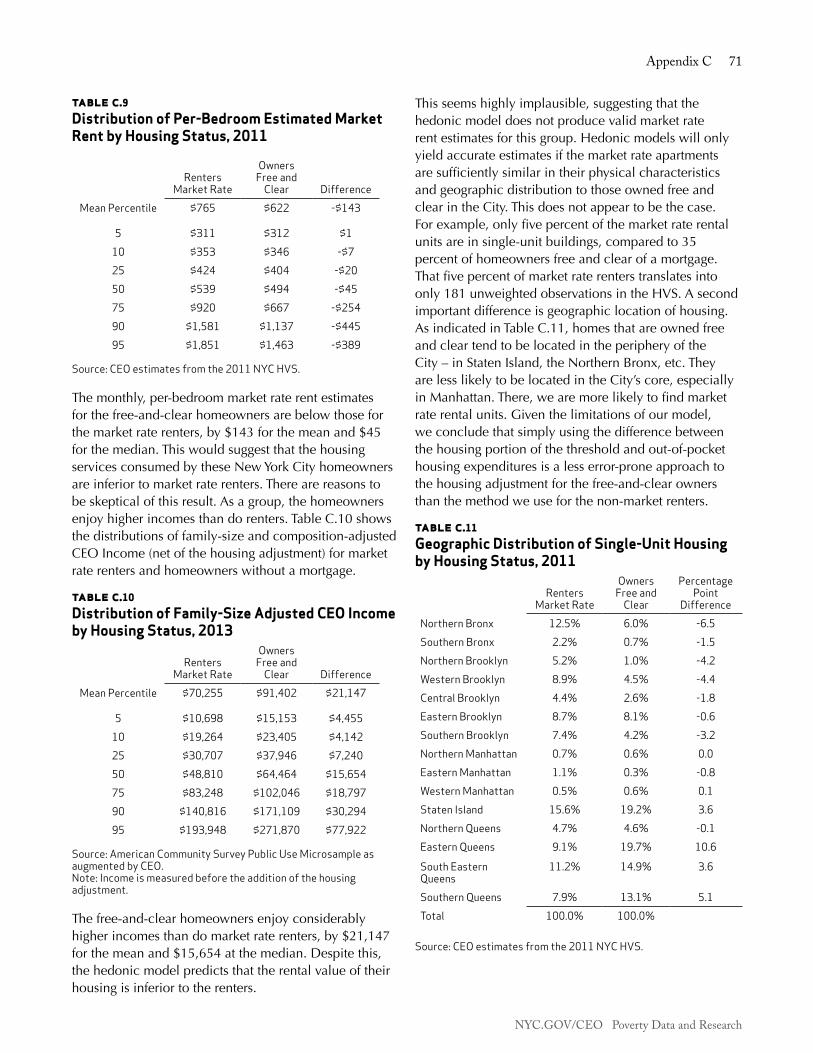
NYC.GOV/CEO Poverty Data and Research
Appendix C 71
table c.9Distribution of Per-Bedroom Estimated Market Rent by Housing Status, 2011
Renters Market Rate
Owners Free and
Clear DifferenceMean Percentile $765 $622 -$143
5 $311 $312 $110 $353 $346 -$725 $424 $404 -$2050 $539 $494 -$4575 $920 $667 -$25490 $1,581 $1,137 -$44595 $1,851 $1,463 -$389
Source: CEO estimates from the 2011 NYC HVS.
The monthly, per-bedroom market rate rent estimates for the free-and-clear homeowners are below those for the market rate renters, by $143 for the mean and $45 for the median. This would suggest that the housing services consumed by these New York City homeowners are inferior to market rate renters. There are reasons to be skeptical of this result. As a group, the homeowners enjoy higher incomes than do renters. Table C.10 shows the distributions of family-size and composition-adjusted CEO Income (net of the housing adjustment) for market rate renters and homeowners without a mortgage.
table c.10Distribution of Family-Size Adjusted CEO Income by Housing Status, 2013
Renters Market Rate
Owners Free and
Clear DifferenceMean Percentile $70,255 $91,402 $21,147
5 $10,698 $15,153 $4,45510 $19,264 $23,405 $4,14225 $30,707 $37,946 $7,24050 $48,810 $64,464 $15,65475 $83,248 $102,046 $18,79790 $140,816 $171,109 $30,29495 $193,948 $271,870 $77,922
Source: American Community Survey Public Use Microsample as augmented by CEO.Note: Income is measured before the addition of the housing adjustment.
The free-and-clear homeowners enjoy considerably higher incomes than do market rate renters, by $21,147 for the mean and $15,654 at the median. Despite this, the hedonic model predicts that the rental value of their housing is inferior to the renters.
This seems highly implausible, suggesting that the hedonic model does not produce valid market rate rent estimates for this group. Hedonic models will only yield accurate estimates if the market rate apartments are sufficiently similar in their physical characteristics and geographic distribution to those owned free and clear in the City. This does not appear to be the case. For example, only five percent of the market rate rental units are in single-unit buildings, compared to 35 percent of homeowners free and clear of a mortgage. That five percent of market rate renters translates into only 181 unweighted observations in the HVS. A second important difference is geographic location of housing. As indicated in Table C.11, homes that are owned free and clear tend to be located in the periphery of the City – in Staten Island, the Northern Bronx, etc. They are less likely to be located in the City’s core, especially in Manhattan. There, we are more likely to find market rate rental units. Given the limitations of our model, we conclude that simply using the difference between the housing portion of the threshold and out-of-pocket housing expenditures is a less error-prone approach to the housing adjustment for the free-and-clear owners than the method we use for the non-market renters.
table c.11Geographic Distribution of Single-Unit Housing by Housing Status, 2011
Renters Market Rate
Owners Free and
Clear
Percentage Point
DifferenceNorthern Bronx 12.5% 6.0% -6.5Southern Bronx 2.2% 0.7% -1.5Northern Brooklyn 5.2% 1.0% -4.2Western Brooklyn 8.9% 4.5% -4.4Central Brooklyn 4.4% 2.6% -1.8Eastern Brooklyn 8.7% 8.1% -0.6Southern Brooklyn 7.4% 4.2% -3.2Northern Manhattan 0.7% 0.6% 0.0Eastern Manhattan 1.1% 0.3% -0.8Western Manhattan 0.5% 0.6% 0.1Staten Island 15.6% 19.2% 3.6Northern Queens 4.7% 4.6% -0.1Eastern Queens 9.1% 19.7% 10.6
South Eastern Queens
11.2% 14.9% 3.6
Southern Queens 7.9% 13.1% 5.1Total 100.0% 100.0%
Source: CEO estimates from the 2011 NYC HVS.

NYC.GOV/CEO Poverty Data and Research
72 The CEO Poverty Measure, 2005 - 2013

NYC.GOV/CEO Poverty Data and Research
Appendix D 73
Appendix d: The Ceo TAx model
Low-income families, especially those with children, often find that their refundable tax credits are greater than the taxes they owe. The result is that many low-income families have a negative tax rate – they receive more from the income tax system than they pay into it. The expansion of tax credits to low-income families, as well as to those more well-off, has been a key component of Federal economic stimulus programs since 2008. Some of the credits initiated during the Great Recession have been extended into 2013 and still affect the poverty measure. Tax programs remain an increasingly important component of the resources available to families to meet their needs. At the same time, all working families are also subject to payroll taxes under the Federal Insurance Contribution Act (FICA). FICA payments offset some of the gains derived from income tax credits. But even when payroll taxes are accounted for, the total tax effect on income leads to a reduction in the CEO poverty rate.
The Tax ModelThe American Community Survey (ACS), our primary source of data, does not include information about taxes. CEO, therefore, has created a tax model. The model’s first task is to create tax filing units within ACS households. It then applies the tax code to estimate the taxes owed and tax credits received for New York City tax filers.
Creating Tax Filing UnitsACS households consist of all persons residing in the same housing unit. Within the household, each member is identified only through their relationship to the person answering the ACS questionnaire. This person is designated as the reference person and is usually, but not always, the primary owner or renter of the household. The remaining residents of the household may form a complex network of relationships. Occupants may include a family embodying several generations; families unrelated to the respondent; and one or more unrelated individuals, including roomers and boarders. Because residents are only identified in relation to the reference person, we cannot always see how they may be related to each other. For tax purposes, this presents a challenge. We need to use the information available in the ACS to estimate how many tax returns are filed from each household, and identify who on each return is the filer (along with their spouse and dependents). CEO addresses this problem by first dividing ACS households into
Minimal Household Units (MHUs) that create a richer set of information about how persons in the household are related to each other. For example, two boarders individually listed as married will be linked together using age and other demographic characteristics. The children of unmarried partners (unless they are coded as children of the respondent) are identified in a similar manner and are then coded as the child of a specific parent.30 The tax model then identifies MHU members who are tax filers, along with their spouse or dependent(s). Additional decisions are made about allocating children and indigent household members to filers as dependents.31 Based on these decisions, each tax filer is then given a status of Married Filing Joint, Head of Household, Single, or Married Filing Separate.32
The Tax CalculatorA simulated Federal, New York State, and New York City tax return is prepared for each tax filing unit based on income and other data provided in the ACS.33 We identify adjusted gross income (AGI) for the tax unit, which is the sum of all earned income, interest income, and other income sources. Social Security income is included to the extent it is taxable. Personal exemptions and standard deductions are then subtracted from AGI to find taxable income. The Federal tax liability on that income is calculated and then – going through the steps of a Federal 1040 tax return – we compute each of the tax credits for which filers are eligible. Once the 1040 is completed, an IT-201 New York State tax return is modeled, which relies on income and credit calculation from the Federal return. The IT-201 generates New York State and City tax liabilities and credits. In a final step, FICA payroll taxes are applied to all wage and salary income, and self-employment taxes are deducted from self-employment earnings.
30. The MHU methodology is derived from Jeffery Passel. “Editing Family Data in Census 2000 Public-Use Microdata Samples: Creating Minimal Household Units (MHUs).” August 23, 2002. The application of Passel’s method to the CEO model is explained in Virgin, Vicky. Creating the CEO Poverty Unit: An Evaluation Using the CPS ASEC. June 2011. Available at: www.irp.wisc.edu/research/povmeas/Poverty_ unit_analysis_CEO_2011.pdf. 31. The methodology used to create tax filing units is discussed at length in NYC Center for Economic Opportunity. The CEO Poverty Measure, 2005-2008. New York, NY: Center for Economic Opportunity. 2010. http://www.nyc.gov/html/ceo/downloads/pdf/ceo_poverty_measure_v5.pdf32. The ACS does not provide enough information to identify widows, the other filing status used by the IRS.33. Due to a lack of data in the ACS, tax estimates for middle to higher income households are less accurate than estimates for lower income households. We do not estimate itemized deductions, capital gains, and other tax items more common to higher income returns. For this reason, we confine our analysis to filers with AGI under $50,000.

NYC.GOV/CEO Poverty Data and Research
74 The CEO Poverty Measure, 2005 - 2013
Tax PolicyEstimates for the years 2008 to 2012 contain deductions, credits, or expansion of existing credits that were a key feature of the Bush and Obama Administrations’ economic stimulus programs. We describe these policy initiatives in detail below. Table D.1 lists these tax programs and notes the years they were in effect.
• Recovery Rebate Tax Credit for Individuals: A one-time tax rebate included in the Economic Stimulus Act of 2008. The credit was based on information provided in the 2007 tax return, to be paid out in 2008. The maximum payment was $600 for single filers, $1,200 for married filers, and an additional $300 per qualifying child.34
• Additional Standard Deduction for Real Estate: Passed as part of the Housing Assistance Act of 2008 and extended for 2009 by the Emergency Economic Stabilization Act of 2009. Filers who took the standard deduction (all filers in the CEO tax model) and were homeowners could claim an additional standard deduction of up to $500 ($1,000 for married filers) against their local property taxes.
• Additional Child Tax Credit: The Additional Child Tax Credit is a refundable supplement to the Child Tax Credit. Prior to passage of the Emergency Economic Stabilization Act of 2008, the credit required a minimum earned income of over $12,050 in 2008 and $12,550 in 2009. The Act lowered the income threshold to $8,500 for 2008 and reduced it again to $3,000 in 2009. The result is that more filers with lower incomes receive a refundable credit.
• Making Work Pay Tax Credit (MWP): A credit of up to $400 ($800 for married filers). The CEO model added it as a refundable tax credit in 2009 and 2010. In 2009, the Economic Recovery Payment was deducted from the MWP for eligible recipients (see below).
• Economic Recovery Payment: A payment of $250 distributed in 2009 to recipients of Social Security or Supplemental Security Income (SSI) payments and
34. The Economic Stimulus Act became law in early 2008, just as returns were being filed for 2007 taxes. It was paid as a tax refund, using 2007 income as an estimate for 2008 income. Filers who had already sent in a tax return could claim the rebate retroactively, carrying it into calendar year 2009. Filers whose 2008 income generated a different credit than that based on their 2007 returns had to reconcile the difference in their 2008 return, filed in early 2009. We assume that all filers received the credit in calendar year 2008, at an amount based on the model’s 2008 estimates. We include no rebate credit in 2009. We assume this overestimates the amount of credit actually awarded in 2008 and underestimates it for 2009.
Veterans or Railroad Retirement benefits. The ACS allows us to identify only Social Security and SSI recipients. Although not technically a tax credit, we included this payment as a tax offset.
• Expansion of the Earned Income Tax Credit (EITC): Two changes occurred in 2009. First, the increased maximum credit for married filers accelerated the already ongoing elimination of the marriage penalty in the EITC. Second, a third tier of credits was added to allow filers with more than two children to claim a larger credit. The maximum possible credit for a married couple with three children was $4,824 in 2008. In 2013, the maximum credit for this family rose to $6,044.
• College Tuition Credits: The tuition credit in the CEO model combines the Lifetime Learning Credit and, prior to 2009, the Hope Credit for college students in the tax unit. In 2009 the Hope Credit was replaced by the American Opportunity Credit. The newer credit is up to 40 percent refundable.
• Payroll Tax Cut: The Making Work Pay Tax Credit expired and was replaced by a two percentage point cut in the payroll (FICA) tax in 2011 and 2012. For most filers in the CEO model, this represented a cut in the tax rate for the Social Security portion of FICA from 6.2 to 4.2 percent of earned income.35
The American Tax Reform Act of 2012 extended some of the changes described above to 2017. The expanded Additional Child Tax Credit, third child tier in the EITC, and the American Opportunity Credit were all extended. The elimination of the marriage penalty from EITC rates was made permanent.
Other changes occurred at the State and City level.
• School Tax Relief Credit: A credit against the income tax for New York City residents and funded by New York State. The credit was reduced significantly in 2009.
• New York State and City Earned Income Credit: No legislative change was made to these credits, but they are calculated at 30.0 percent and 5.0 percent of the Federal EITC, respectively. Thus, changes at the Federal level beginning in 2009 resulted in an expansion of the State and City EITC.
35. The replacement of the MWP Credit with the Payroll Tax Cut was less effective for filers close to, or just below, the poverty line. See: The CEO Poverty Measure, 2005-2011. New York, NY: Center for Economic Opportunity, 2013, pp. 61-62, for an explanation.

NYC.GOV/CEO Poverty Data and Research
Appendix D 75
Taxes in DetailThis section compares tax liabilities and tax credits from 2007 to 2012. Table D.2 and Table D.3 divide tax filers into two groups: Panel A consists of those filers with AGI from $1 to $25,000 and Panel B consists of filers with AGI from $25,001 to $50,000. This divides filers into those who are most likely to be poor, with incomes close to or below the poverty threshold, and those filers with incomes close to or somewhat above the poverty line. The division roughly illustrates the impact of tax programs as income rises.
Major Tax ComponentsTable D.2 shows the major components of the tax model. Taxable Income is Adjusted Gross Income after standard deductions and exemptions. Pre-Credit Liability is the total Federal, State, and City income tax due on Taxable Income before any credits are applied. Federal, State, and City credits are the sum of tax credits received from each level of government. The Net Income Tax Effect is the total effect of the income tax system on resources. A positive value for Net Income Tax Effect indicates that tax credit refunds are greater than the taxes owed. In other words, the tax system generates a net gain to the taxpayer. A negative number indicates a net loss to the taxpayer, since taxes paid are greater than taxes refunded. Table D.2 shows the recession related decline in AGI in both panels. This in turn generates a lower
Taxable Income and a lower Pre-Credit Liability.36 The table also shows a rise in tax credits for both groups starting in 2008 when fiscal stimulus programs began.
Panel A of Table D.2 shows that filers with AGI up to $25,000 have a positive value for their Net Income Tax Effect for each of the years shown, representing a net gain to CEO’s measure of family income after taxes. Prior to the expansion of tax credits in 2008, most filers in our lower income bracket had a relatively slight gain from total taxes. The Net Income Tax effect in this panel peaks in 2010.
Filers with AGI over $25,000 and up to $50,000, shown in Panel B, have an annual net loss to their household resources in all years after income taxes. This loss was greatest, over $4 billion, in 2007. The losses shrink over time as tax credits expand and taxable income falls.
In addition to income taxes, FICA (payroll taxes for Social Security and Medicare) is another piece of the total tax picture. The combined rate for both is 7.65 percent of wages, with the exception of 2011 and 2012 when the combined rate was 5.65 percent.
36. The Real Estate Standard Deduction, applicable in 2008 and 2009, is the only tax policy in our model that impacts Taxable Income and Pre-Credit Liability.
table d.1Timing of Stimulus Tax Credits, 2008 - 2013
Years in Effect
Tax/Credit 2008 2009 2010 2011 2012 2013Recovery Rebate Credit XAdditional Standard Deduction for Real Estate
X X
Additional Child Tax Credit Expansion (Refundable Part of Child Tax Credit)
X X X X X X
Making Work Pay Credit X XEconomic Recovery Payment XEITC Marriage Penalty Elimination X X X X XEITC Third Child Tier X X X X XAmerican Opportunity Credit (Refundable Tuition Credit)
X X X X X
Payroll Tax Cut X X
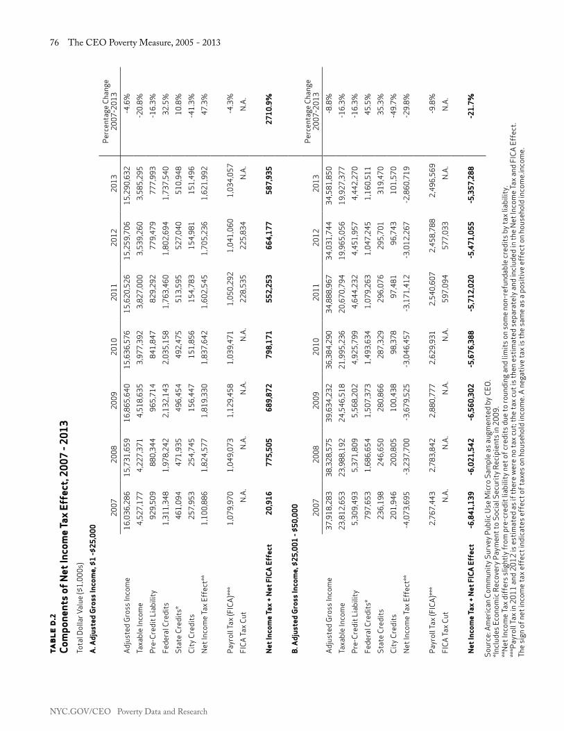
NYC.GOV/CEO Poverty Data and Research
76 The CEO Poverty Measure, 2005 - 2013ta
ble
d.2
Com
pone
nts
of N
et In
com
e Ta
x Ef
fect
, 200
7 - 2
013
Tota
l Dol
lar V
alue
($1,
000s
)A
. Adj
uste
d G
ross
Inco
me,
$1
-$25
,000
2007
2008
2009
2010
2011
2012
2013
Perc
enta
ge C
hang
e 20
07-2
013
Adju
sted
Gro
ss In
com
e16
,036
,286
15,7
31,6
5916
,865
,640
15,6
36,5
7615
,620
,526
15,2
59,7
06 1
5,29
0,63
2 -4
.6%
Taxa
ble
Inco
me
4,52
7,17
74,
227,
371
4,51
8,63
53,
977,
392
3,82
7,00
03,
539,
260
3,5
85,2
95
-20.
8%Pr
e-Cr
edit
Liab
ility
929,
509
880,
344
965,
714
841,
847
829,
292
779,
479
777
,993
-1
6.3%
Fede
ral C
redi
ts1,
311,
348
1,97
8,24
22,
132,
143
2,03
5,15
81,
763,
460
1,80
2,69
4 1
,737
,540
32
.5%
Stat
e Cr
edits
*46
1,09
447
1,93
549
6,45
449
2,47
551
3,59
552
7,04
0 5
10,9
48
10.8
%Ci
ty C
redi
ts25
7,95
325
4,74
515
6,44
715
1,85
615
4,78
315
4,98
1 1
51,4
96
-41.
3%Ne
t Inc
ome T
ax E
ffec
t**
1,10
0,88
61,
824,
577
1,81
9,33
01,
837,
642
1,60
2,54
51,
705,
236
1,6
21,9
92
47.3
%
Payr
oll T
ax (F
ICA)
***
1,07
9,97
01,
049,
073
1,12
9,45
81,
039,
471
1,05
0,29
21,
041,
060
1,0
34,0
57
-4.3
%FI
CA Ta
x Cut
N.A.
N.A.
N.A.
N.A.
228,
535
225,
834
N.A.
N.A.
Net
Inco
me
Tax
+ N
et F
ICA
Eff
ect
20,9
1677
5,50
568
9,87
279
8,17
155
2,25
366
4,17
758
7,93
527
10.9
%
B. A
djus
ted
Gro
ss In
com
e, $
25,0
01 -
$50,
000
2007
2008
2009
2010
2011
2012
2013
Perc
enta
ge C
hang
e 20
07-2
013
Adju
sted
Gro
ss In
com
e37
,918
,283
38,3
28,5
7539
,634
,232
36,3
84,2
9034
,888
,967
34,0
31,7
44 3
4,58
1,85
0 -8
.8%
Taxa
ble
Inco
me
23,8
12,6
5323
,988
,192
24,5
46,5
1821
,995
,236
20,6
70,7
9419
,965
,056
19,
927,
377
-16.
3%Pr
e-Cr
edit
Liab
ility
5,30
9,49
35,
371,
809
5,56
8,20
24,
925,
799
4,64
4,23
24,
451,
957
4,4
42,2
70
-16.
3%Fe
dera
l Cre
dits
*79
7,65
31,
686,
654
1,50
7,37
31,
493,
634
1,07
9,26
31,
047,
245
1,1
60,5
11
45.5
%St
ate
Cred
its23
6,19
824
6,65
028
0,86
628
7,32
929
6,07
629
5,70
1 3
19,4
70
35.3
%Ci
ty C
redi
ts20
1,94
620
0,80
510
0,43
898
,378
97,4
8196
,743
101
,570
-4
9.7%
Net I
ncom
e Tax
Eff
ect*
*-4
,073
,695
-3,2
37,7
00-3
,679
,525
-3,0
46,4
57-3
,171
,412
-3,0
12,2
67-2
,860
,719
-29.
8%
Payr
oll T
ax (F
ICA)
***
2,76
7,44
32,
783,
842
2,88
0,77
72,
629,
931
2,54
0,60
72,
458,
788
2,4
96,5
69
-9.8
%FI
CA Ta
x Cut
N.A.
N.A.
N.A.
N.A.
597,
094
577,
033
N.A.
N.A.
Net
Inco
me
Tax
+ N
et F
ICA
Eff
ect
-6,8
41,1
39-6
,021
,542
-6,5
60,3
02-5
,676
,388
-5,7
12,0
20-5
,471
,055
-5,3
57,2
88-2
1.7%
Sour
ce: A
mer
ican
Com
mun
ity S
urve
y Pub
lic U
se M
icro
Sam
ple
as a
ugm
ente
d by
CEO
.*In
clud
es E
cono
mic
Rec
over
y Pay
men
t to
Soci
al S
ecur
ity R
ecip
ient
s in
2009
.**
Net I
ncom
e Tax
diff
ers s
light
ly fr
om p
re-c
redi
t lia
bilit
y net
of c
redi
ts d
ue to
roun
ding
and
lim
its o
n so
me
non-
refu
ndab
le cr
edits
by t
ax li
abili
ty.
***P
ayro
ll Tax
in 2
011
and
2012
is e
stim
ated
as i
f the
re w
ere
no ta
x cut
; the
tax c
ut is
then
est
imat
ed se
para
tely
and
incl
uded
in th
e Ne
t Inc
ome T
ax a
nd F
ICA
Effe
ct.
The
sign
of n
et in
com
e ta
x eff
ect i
ndic
ates
eff
ect o
f tax
es o
n ho
useh
old
inco
me.
A n
egat
ive
tax i
s the
sam
e as
a p
ositi
ve e
ffec
t on
hous
ehol
d in
com
e.in
com
e.
NYC.GOV/CEO Poverty Data and Research
Appendix D 77
The final line of each panel, Net Income Tax + Net FICA Effect, shows the combined effect of income and payroll taxes, including tax credits. Again, a positive number represents a net gain to the taxpayer and a negative number a net loss to the taxpayer. The greatest net gain for lower income tax payers occurred in 2010. Taxpayers in the higher income panel sustained the greatest loss of income in 2007.
Changes in each of the individual tax credits from 2008 to 2013 are detailed in Table D.3. Total Tax Relief is the sum of all credits. Table D.3 also illustrates the timing of each of the Federal stimulus tax credits. The Recovery Rebate Credit, Economic Recovery Payment, Making Work Pay Credit, and Real Estate Standard Deduction all expired by 2011. In 2013, what remained of the stimulus was the expanded and partly refundable Education Credit, Earned Income Tax Credit, and Additional Child Tax Credit. At the City level, the School Tax Credit (STAR) was cut nearly in half in 2009. Only New York State tax credits continued to rise. There were no changes in State tax policy, but the State (and City) EITC grew as a function of the rise in the Federal EITC. For lower income taxpayers in Panel A, the greatest assistance from tax credits occurred in 2009 at nearly $3 billion in total credits from Federal, State, and City sources. For the higher income group in Panel B, tax relief peaked in 2008 at over $2 billion. The most notable increases in tax credits were the changes in the Federal EITC described above and the tuition credit, which was no longer capped by tax liability and instead was made partially refundable.37
37. This is solely an increase in the tuition tax credit and does not include the itemized tuition deduction. The CEO tax model does not include itemized deductions.

NYC.GOV/CEO Poverty Data and Research
78 The CEO Poverty Measure, 2005 - 2013
table d.3Selected Tax Credits, 2007 - 2013Total Dollar Value (in $1,000s)
A. Adjusted Gross Income $1 - $25,000 Percentage Change
B. Adjusted Gross Income $25,001 - $50,000 Percentage Change
Federal 2007 2008 2009 2010 2011 2012 2013 2007-2013 2007 2008 2009 2010 2011 2012 2013 2007-2013Child and Dependent Care Credit
2,032 2,207 2,234 1,117 1,526 1,016 1,170 -42.4% 17,447 14,325 16,860 14,674 14,269 11,299 11,671 -33.1%
Child Tax Credit (+ACTC)*
157,069 216,287 332,634 319,401 337,043 335,133 312,395 98.9% 231,769 394,067 407,998 390,837 397,929 356,677 381,355 64.5%
Elderly and Dependent Credit
1,150 816 918 1,025 1,096 913 1,036 -9.9% N.A. N.A. N.A. N.A. N.A. N.A. N.A. N.A.
Education Credit** 33,668 33,978 114,478 114,939 115,743 117,464 110,980 229.6% 142,882 149,010 217,417 217,204 214,620 213,853 216,654 51.6%Earned Income Credit Federal
1,117,430 1,146,788 1,256,403 1,244,591 1,309,303 1,349,404 1,313,790 17.6% 238,788 275,084 374,439 415,528 452,445 465,416 550,831 130.7%
Real Estate Standard Deduction
N.A. 92,361 94,848 N.A. N.A. N.A. N.A. N.A. N.A. 89,740 96,180 N.A. N.A. N.A. N.A. N.A.
Recovery Rebate Credit N.A. 619,716 N.A. N.A. N.A. N.A. N.A. N.A. N.A. 854,166 N.A. N.A. N.A. N.A. N.A. N.A.Economic Recovery Payment
N.A. N.A. 98,267 N.A. N.A. N.A. N.A. N.A. N.A. N.A. 21,292 N.A. N.A. N.A. N.A. N.A.
Making Work Pay Credit N.A. N.A. 363,561 356,024 N.A. N.A. N.A. N.A. N.A. N.A. 469,366 455,391 597,094 577,033 N.A. N.A.Payroll Tax Cut N.A. N.A. N.A. N.A. 251,411 248,833 N.A. N.A. N.A. N.A. N.A. N.A. N.A. N.A. N.A. N.A.
New York StateHousehold Credit 39,678 39,102 42,080 39,234 39,348 38,776 37,239 -6.1% 7,298 7,197 6,400 6,943 6,997 6,827 6,803 -6.8%Child and Dependent Care Credit
2,235 2,428 2,457 1,228 1,679 1,117 1,287 -42.4% 17,989 14,828 17,316 15,116 14,703 11,709 12,080 -32.8%
Child Tax Credit 40,763 33,799 24,349 20,715 21,143 20,560 15,189 -62.7% 88,386 89,475 88,306 77,414 78,209 72,978 72,978 -17.4%Tuition Credit 70,829 84,267 87,184 94,795 101,881 104,176 105,334 48.7% 55,434 57,173 60,357 67,642 64,949 68,796 66,807 20.5%Real Property Tax Credit 8,384 6,901 7,427 6,102 6,191 6,221 5,438 -35.1% 140 12 137 42 11 32 38 -73.1%Earned Income Credit NYS
318,081 326,909 357,824 356,132 374,759 386,096 377,092 18.6% 66,952 77,965 108,350 120,172 131,208 135,359 160,765 140.1%
New York CityHousehold Credit 10,444 10,312 10,218 9,934 10,144 10,117 8,803 -15.7% N.A. N.A. N.A. N.A. N.A. N.A. N.A. N.A.School Tax Credit (STAR) 234,559 231,392 103,792 101,782 104,232 101,444 101,707 -56.6% 189,032 186,488 81,447 77,137 74,567 72,889 73,534 -61.1%Child and Dependent Care Credit**
1,130 890 811 355 607 418 557 -50.7% 975 563 270 465 292 584 494 -49.3%
Earned Income Credit NYC
55,871 57,339 62,820 62,230 65,465 67,470 65,690 17.6% 11,939 13,754 18,722 20,776 22,622 23,271 27,542 130.7%
Total Tax Relief 2,093,323 2,905,494 2,962,305 2,729,604 2,741,572 2,789,159 2,457,706 17.4% 1,069,030 2,223,849 1,984,857 1,879,342 2,069,914 2,016,722 1,581,551 47.9%
Source: American Community Survey Public Use Micro Sample as augmented by CEO.*Includes refundable additional child tax credit.**Combines American Opportunity Credit and Hope Credit in 2008; American Opportunity Credit and Lifetime Learning Credit in 2009 and 2010.Notes: N.A. - Not applicable in that tax year. The sum of nonrefundable credits may be limited by total tax liability at the level of individual filers.

NYC.GOV/CEO Poverty Data and Research
Appendix D 79
table d.3Selected Tax Credits, 2007 - 2013Total Dollar Value (in $1,000s)
A. Adjusted Gross Income $1 - $25,000 Percentage Change
B. Adjusted Gross Income $25,001 - $50,000 Percentage Change
Federal 2007 2008 2009 2010 2011 2012 2013 2007-2013 2007 2008 2009 2010 2011 2012 2013 2007-2013Child and Dependent Care Credit
2,032 2,207 2,234 1,117 1,526 1,016 1,170 -42.4% 17,447 14,325 16,860 14,674 14,269 11,299 11,671 -33.1%
Child Tax Credit (+ACTC)*
157,069 216,287 332,634 319,401 337,043 335,133 312,395 98.9% 231,769 394,067 407,998 390,837 397,929 356,677 381,355 64.5%
Elderly and Dependent Credit
1,150 816 918 1,025 1,096 913 1,036 -9.9% N.A. N.A. N.A. N.A. N.A. N.A. N.A. N.A.
Education Credit** 33,668 33,978 114,478 114,939 115,743 117,464 110,980 229.6% 142,882 149,010 217,417 217,204 214,620 213,853 216,654 51.6%Earned Income Credit Federal
1,117,430 1,146,788 1,256,403 1,244,591 1,309,303 1,349,404 1,313,790 17.6% 238,788 275,084 374,439 415,528 452,445 465,416 550,831 130.7%
Real Estate Standard Deduction
N.A. 92,361 94,848 N.A. N.A. N.A. N.A. N.A. N.A. 89,740 96,180 N.A. N.A. N.A. N.A. N.A.
Recovery Rebate Credit N.A. 619,716 N.A. N.A. N.A. N.A. N.A. N.A. N.A. 854,166 N.A. N.A. N.A. N.A. N.A. N.A.Economic Recovery Payment
N.A. N.A. 98,267 N.A. N.A. N.A. N.A. N.A. N.A. N.A. 21,292 N.A. N.A. N.A. N.A. N.A.
Making Work Pay Credit N.A. N.A. 363,561 356,024 N.A. N.A. N.A. N.A. N.A. N.A. 469,366 455,391 597,094 577,033 N.A. N.A.Payroll Tax Cut N.A. N.A. N.A. N.A. 251,411 248,833 N.A. N.A. N.A. N.A. N.A. N.A. N.A. N.A. N.A. N.A.
New York StateHousehold Credit 39,678 39,102 42,080 39,234 39,348 38,776 37,239 -6.1% 7,298 7,197 6,400 6,943 6,997 6,827 6,803 -6.8%Child and Dependent Care Credit
2,235 2,428 2,457 1,228 1,679 1,117 1,287 -42.4% 17,989 14,828 17,316 15,116 14,703 11,709 12,080 -32.8%
Child Tax Credit 40,763 33,799 24,349 20,715 21,143 20,560 15,189 -62.7% 88,386 89,475 88,306 77,414 78,209 72,978 72,978 -17.4%Tuition Credit 70,829 84,267 87,184 94,795 101,881 104,176 105,334 48.7% 55,434 57,173 60,357 67,642 64,949 68,796 66,807 20.5%Real Property Tax Credit 8,384 6,901 7,427 6,102 6,191 6,221 5,438 -35.1% 140 12 137 42 11 32 38 -73.1%Earned Income Credit NYS
318,081 326,909 357,824 356,132 374,759 386,096 377,092 18.6% 66,952 77,965 108,350 120,172 131,208 135,359 160,765 140.1%
New York CityHousehold Credit 10,444 10,312 10,218 9,934 10,144 10,117 8,803 -15.7% N.A. N.A. N.A. N.A. N.A. N.A. N.A. N.A.School Tax Credit (STAR) 234,559 231,392 103,792 101,782 104,232 101,444 101,707 -56.6% 189,032 186,488 81,447 77,137 74,567 72,889 73,534 -61.1%Child and Dependent Care Credit**
1,130 890 811 355 607 418 557 -50.7% 975 563 270 465 292 584 494 -49.3%
Earned Income Credit NYC
55,871 57,339 62,820 62,230 65,465 67,470 65,690 17.6% 11,939 13,754 18,722 20,776 22,622 23,271 27,542 130.7%
Total Tax Relief 2,093,323 2,905,494 2,962,305 2,729,604 2,741,572 2,789,159 2,457,706 17.4% 1,069,030 2,223,849 1,984,857 1,879,342 2,069,914 2,016,722 1,581,551 47.9%
Source: American Community Survey Public Use Micro Sample as augmented by CEO.*Includes refundable additional child tax credit.**Combines American Opportunity Credit and Hope Credit in 2008; American Opportunity Credit and Lifetime Learning Credit in 2009 and 2010.Notes: N.A. - Not applicable in that tax year. The sum of nonrefundable credits may be limited by total tax liability at the level of individual filers.

NYC.GOV/CEO Poverty Data and Research
80 The CEO Poverty Measure, 2005 - 2013
Taxes and the Poverty RateThe poverty rate would be higher in the absence of net taxation. For low income New Yorkers, payroll and income taxes are offset by tax credits large enough so that the tax system creates an addition to their total resources. Table D.4 illustrates the impact of taxation on the poverty rate. The table compares poverty rates calculated net of the tax effect against poverty rates calculated with total CEO income including a tax effect. The benefit of stimulus programs is apparent. The effect of income tax credits was consistent during the years of peak stimulus credits, 2008-2010, generating a 4.4 or 4.3 percentage point effect on the poverty rate in each year. This fell to a 3.6 percentage point effect by 2013. Compare this to the years 2005-2007, before the enactment of tax stimulus programs. In those years, the marginal impact of income taxes in offsetting poverty averaged 3.0 percentage points. Some of the income tax benefit is offset by mandatory payroll taxes. The marginal effect of FICA increases the poverty rate on average by 2.0 percentage points from 2005 to 2013, yet taxes still have an overall positive effect on household resources. The FICA tax cut in 2011 and 2012 provided some relief from the payroll tax, as shown in Tables D.2 and D.3. Thus the effect of FICA on the poverty rate declined from 2.0 percentage points in 2010 to 1.7 percentage points in 2012, but rose in 2013 to 2.3 percentage points. Measuring the combined effect of payroll and income taxes we find a 1.3 percentage point decline in the CEO poverty rate in 2013. In the absence of payroll and income taxes, the CEO poverty rate of 21.5 percent in 2013 would have been 22.8 percent.
We also looked at what would have happened if the FICA tax cut was not eliminated in 2013. In that case, the poverty rate would have been reduced from 21.5 to 20.8 percent, with the marginal impact of the payroll tax reduced from 2.3 to 1.7 percentage points.
table d.4Impact of Net Taxes on Poverty Rates, 2005 - 2013 (Numbers are Percent of the Population)
2005 2006 2007 2008 2009 2010 2011 2012 2013
A. Poverty Rates
Total CEO Income 20.4 19.8 19.8 19.0 19.8 21.0 21.5 21.4 21.5
Net of:
Income Taxes 23.5 22.6 22.7 23.4 24.1 25.3 25.1 25.1 25.0
FICA (Payroll Taxes) 18.5 17.7 17.7 17.0 17.7 19.0 19.7 19.7 19.2
Income Taxes and FICA 21.7 20.8 20.4 21.3 22.0 23.1 23.5 23.6 22.8
B. Marginal Effects
Income Taxes -3.1 -2.8 -2.9 -4.4 -4.3 -4.4 -3.6 -3.7 -3.6
FICA (Payroll Taxes) 1.9 2.2 2.1 2.0 2.1 2.0 1.8 1.7 2.3
Income Taxes and FICA -1.3 -1.0 -0.6 -2.3 -2.2 -2.1 -2.0 -2.2 -1.3
Source: American Community Survey Public Use Micro Sample as augmented by CEO.

NYC.GOV/CEO Poverty Data and Research
Appendix E 81
Appendix e: esTimATing The vAlUe of nUTriTionAl AssisTAnCe
Food StampsData in the American Community Survey (ACS) about Food Stamp participation are very limited. First, as of 2008, the ACS only indicates whether a member of a household received Food Stamps at any time in the prior 12 months, providing no information on the value or duration of the benefit.38 This must be estimated. CEO’s decision to make use of New York City administrative data as its source for imputing the value of Food Stamps received leads to a second problem: Food Stamp participation in the ACS is reported at the household level, which differs from a typical Food Stamp case. A household is comprised of persons who share residence in a housing unit. A Food Stamp case, in contrast, includes household members who purchase and prepare food in common. The distinction shows up clearly in the data. In 2013, for example, the average New York City Food Stamp case had 1.84 members, while the average ACS household reporting Food Stamp receipt had 2.97 members. A third problem is underreporting of program participation.
CEO’s method for imputing the yearly value of Food Stamps thus entails three steps: 1) creating Food Stamp units within ACS household units; 2) estimating the value of yearly Food Stamp receipt; and 3) adjusting the number of Food Stamp cases created in the ACS data to correct for underreporting.
To create commensurable units, CEO developed a program to divide ACS households into the maximum number of “Food Stamp units” that the program rules allow. The Supplemental Nutrition Assistance Program (SNAP) uses the following rules to determine who in a household must be in the same Food Stamp case:
1. Spouses.
2. Parents and children under 22, including spouses of these children, and grandchildren.
38. The decision to drop the question about value of Food Stamps received was influenced by the Census Bureau’s testing of the ACS questionnaire, which revealed that respondents were more likely to indicate receipt of the benefit if the follow-up question about the value of the benefit did not appear in the survey instrument. See: www.census.gov/acs/www/Downloads/methodology/content_test/H6_Food_ Stamps.pdf
3. A child under 18 living with, and under the parental control of, an adult that provides 50 percent or more of the minor child’s support.
4. Anyone else in the household that purchases and prepares food together.
The first three of these rules are based on familial relationships within the household. Some of these are readily described by variables in the ACS. Others are not and must be created. To construct these relationships, we used the minimal household unit (MHU) program, which was originally written by Jeff Passel, Senior Demographer at the Pew Hispanic Center. The MHU program is designed to parse an ACS household into its smallest family units.39 The program loops through the data, linking individuals within the household by kinship and marriage. This work creates Food Stamp units that conform to the first three rules listed above.
Because CEO does not attempt to infer who else in the household is purchasing and preparing food together, the program creates the maximum number of Food Stamp units within each household allowable under SNAP rules. The size and composition of the Food Stamp cases produced with this method accurately reproduce the number of cases reported in the administrative data. In 2013, for example, the proportion of single-person Food Stamp cases created in the ACS (60.4 percent) is quite close to the proportion of single-person cases in the administrative data (56.9 percent). Using the Food Stamp unit rather than the ACS household also increases the estimated number of Food Stamp cases in the 2013 ACS from 661,565 (57 percent of the administrative total) to 1,125,352 (97 percent of the administrative total). (See Table E.1.)
39. Passel, Jeffrey. “Editing Family Data in Census 2000 Public-Use Microdata Samples: Creating Minimal Household Units (MHUs).” August 2002.

NYC.GOV/CEO Poverty Data and Research
82 The CEO Poverty Measure, 2005 - 2013
Once commensurable units are created, we begin the Food Stamp value estimation process by compiling administrative data on Food Stamp cases in New York City from the Human Resources Administration’s internal database. The data include all cases in New York City that were active for any period between July and June of the appropriate year. This period is chosen because it represents the mid-point in the ACS rolling sample, helping to ensure that the timeframe for the administrative data is comparable to the ACS data. To preserve comparability with our poverty universe, individuals in group quarters are removed from both the administrative data and the ACS sample.
The administrative data set contains demographic information about the Food Stamp case heads and families, as well as relevant budget information such as household income. For each case, we sum the total amount of Food Stamp payments over the previous year. Using these data, we developed a regression model using the demographic characteristics present in both the administrative and ACS data sets in order to predict the yearly value of Food Stamp payments to families in New York City.
We focus on variables that are strongly predictive of Food Stamp benefits and for which high quality data exists in both the ACS and administrative data sets. Case size is, unsurprisingly, the strongest predictor of benefit level. Further, the number of children, and the dummy variables for elderly case head and elderly or disabled member in the case are also predictive of the
benefit level. This is likely due to the fact that it is easier for these groups to remain on Food Stamps longer since they are not subject to work requirements. Age of the case head is included as a proxy for factors such as work status.40 The coefficient on the age of the case head is positive, even when controlling for elderly status. This may be because the probability of employment among low-income New Yorkers declines after age 50, which would lead to an increasing benefit with age in the administrative data that are independent of elderly status.
The ACS and administrative data are constructed differently and are utilized for very different purposes, a fact that complicates the development of a regression model. This is a particular issue with regard to measuring income, an important determinant of benefit levels. While the ACS reports yearly cash income from all sources, the administrative data only contain the monthly income reported on the Food Stamp application. This creates two challenges. First, families often apply for Food Stamps after an income shock, such as a job loss, yielding a potentially biased estimate of the family’s income over the past year. Second, Food Stamp applicants are allowed to make deductions from their gross income to qualify for the program, further complicating comparisons of the two variables.
40. While the New York City administrative database does contain information on work status of Food Stamp recipients, these data are generally low quality and contain large numbers of missing observations. As a result, we decided to use the age proxy in the regression model.
table e.1 Percentage Distribution of Food Stamp Cases by Size, 2013
ACS Households CEO Food Stamp Units Administrative Cases
Size Frequency Percent Frequency Percent Frequency Percent1 188,092 28.4 680,183 60.4 660,081 56.9
2 133,293 20.1 196,530 17.5 239,963 20.7
3 110,764 16.7 109,018 9.7 137,608 11.9
4 98,210 14.8 72,871 6.5 71,562 6.2
5 66,669 10.1 41,725 3.7 29,482 2.5
6 36,318 5.5 14,792 1.3 11,428 1.0
7 12,550 1.9 4,683 0.4 4,833 0.4
8 6,339 1.0 2,323 0.2 2,569 0.2
9 4,124 0.6 1,710 0.2 1,458 0.1
10 or More 5,206 0.8 1,517 0.1 1,581 0.1
Total 661,565 100.0 1,125,352 100.0 1,160,565 100.0 Sources: American Community Survey Public Use Micro Sample as augmented by CEO and New York City Human Resources Administration.

NYC.GOV/CEO Poverty Data and Research
Appendix E 83
In order to address this comparability issue, we construct a net income measure in the ACS that represents an estimate of what a Food Stamp unit would report on a Food Stamp application. We aggregate personal income to the Food Stamp unit and divide it by 12 to get a monthly estimate. We then apply the various income deductions allowed on the Food Stamp application, including a standard deduction and deductions for childcare expenses and medical expenses for elderly applicants.
This constructed net income measure has a similar distribution to that of the income reported in the administrative data, with positive values beginning at the 75th percentile. Given the highly skewed nature of this distribution, where most observations have a value of zero, we feel that a linear model would produce incoherent results. Instead, we convert the income data into a categorical variable with three categories: 1) income between zero and the 74th percentile; 2) income between the 75th and 89th percentile; and 3) income at or above the 90th percentile. We tested numerous
regression specifications, evaluating them on the basis of fit. The final model is generally consistent over the years 2005-2013, as shown in Table E.2.
As noted above, the ACS contains data on whether a household received Food Stamps for some period over the previous year, but does not contain data on how many months the household participated in the program. This is, potentially, a source of unexplained variation, as a household receiving Food Stamps for six months will have a lower yearly value than a household receiving them for the full year, holding other factors constant. However, using a model that cannot include a months-of-receipt variable is justified for two reasons. First, the variables included in regression correlate with the months-of-receipt variable in the administrative sample. As a result, a good deal of the variation in the months-of-receipt variable is captured by the coefficients in the included variables. Second, since this model is used for prediction rather than inference, we are less concerned with potential omitted variable bias in the individual coefficients.
table e.2 Regression Model of Yearly Food Stamp Value, 2005 - 2013
Variable 2005 2006 2007 2008 2009 2010 2011 2012 2013Intercept -352.64
[-6.93]-473.88
[-9.15]-538.12[-10.94]
-498.71[-10.16]
-514.70[-11.41]
-483.60[-8.80]
-779.10[-16.00]
-949.30[-20.47]
-937.80[-12.30]
Income between 75-89th Percentile
-179.44[-10.12]
-117.88[-6.35]
-166.38[-8.93]
-162.43[-8.19]
-478.60[-27.41]
-120.73[-6.05]
-176.30[-11.53]
-474.20[-27.34]
-187.60[-8.19]
Income at or above 90th Percentile
-950.89[-46.10]
-899.14[-43.01]
-784.82[-39.51]
-842.82[-39.76]
-1342.00[-61.51]
-874.46[-35.36]
-1222.00[-55.82]
-1369.00[-64.48]
-1305.00[-38.35]
Household Size
860.69[103.83]
874.84[102.70]
834.70[100.75]
846.46[53.45]
1010.00[67.35]
1051.50[64.28]
1239.00[85.37]
1297.00[89.44]
1301.00[58.69]
Number of Children
108.16[14.86]
120.69[16.00]
162.44[21.69]
144.07[11.23]
170.00[14.21]
137.54[10.49]
130.80[11.43]
120.80[10.63]
112.80[6.39]
Elderly Household Head
70.34[2.51]
101.11[3.47]
98.76[3.55]
120.36[3.93]
118.90[3.75]
140.63[4.10]
43.44[1.45]
69.52[2.38]
-81.48[-1.87]
Elderly or Disabled Person in Unit
101.34[6.04]
91.31[5.27]
189.05[11.14]
194.13[10.91]
372.00[21.67]
312.45[16.23]
509.70[29.40]
451.40[27.12]
525.50[19.27]
Age of Household Head
15.61[7.61]
22.47[10.53]
23.36[11.59]
24.60[11.51]
27.46[13.30]
35.23[14.82]
35.18[16.88]
40.88[20.22]
36.37[11.52]
Age of Household Head Squared
-0.10[-4.57]
-0.16[-7.16]
-0.16[-7.57]
-0.17[-7.59]
-0.22[-9.49]
-0.27[-10.63]
-0.25[-11.55]
-0.31[-14.12]
-0.23[-7.19]
R2 0.588 0.583 0.562 0.553 0.594 0.530 0.593 0.60 0.60 Source: New York City Human Resources Administration.Notes: The dependent variable is the annual value of Food Stamps. “Income” is net of deductions allowable by Food Stamp program rules. t-statistics in brackets.

NYC.GOV/CEO Poverty Data and Research
84 The CEO Poverty Measure, 2005 - 2013
We then match the administrative data into the ACS through a predictive mean match (PMM).41 First, we use the regression coefficients to estimate Food Stamp values for observations in the ACS and in the administrative data. These ACS and administrative values are then matched using a nearest neighbor algorithm, whereby an ACS case would be matched with the administrative case that has the closest estimated value, with the added constraint of both host and donor cases being in the same Community District.42 This additional match criterion is designed to capture neighborhood effects that were not explicit in the model. The ACS case was then given the actual Food Stamp value from the administrative case. Once an administrative case donates its value to an ACS case, it is removed from the donor pool.
The advantage of using PMM rather than simply using the estimated values is that PMM does a better job at preserving the actual distribution of Food Stamp values. Regression estimates accurately capture the mean and aggregate values of the distribution, but yield considerably less variation than seen in the administrative data. This is unsurprising, given the fact that regressions are designed to model means rather than full distributions.
Given the gap between the number of Food Stamp cases in the administrative data and the number of cases in the ACS households reporting Food Stamp receipt,
41. See O’Donnell, Sharon and Rodney Beard, “Imputing Medical Out-of-Pocket (MOOP) Expenditures using SIPP and MEPS,” 2009, for an application of this method in a similar context.42. The ACS’s public use micro sample areas are constructed to match New York City’s Community Districts.
CEO decided to assign participation in the Food Stamp program to some of the apparently eligible units that did not report receipt. There are several possible reasons for not reporting receipt. Unfortunately, none of these factors are directly measureable in the ACS, which limits our ability to model underreporting of participation.
What is known is that Food Stamp participation is highly correlated with participation in other income support programs such as Public Assistance (PA) and Supplemental Security Income (SSI). Analysis of administrative data shows that nearly all participants in means-tested cash benefit programs also receive Food Stamps. We assign Food Stamp values to individuals who were eligible for Food Stamps and reported PA or SSI receipt, but did not report Food Stamp receipt.43 Adding these cases increased the number of Food Stamp units from 1,034,700 to 1,125,414 in 2013. (See Table E.3.)
Trends in the receipt of CEO Food Stamp estimates from 2005 to 2013 are reported in Figure E.1. They come close to replicating the observed trends in the administrative data, but do not do so exactly. Specifically, while the administrative data show a consistent upward trend over these years, the CEO estimates show a decrease in cases and aggregate value from 2006 to 2007, which interrupts the overall pattern of increases. This is likely the result of sampling variability in the ACS. Additionally, the CEO estimates show a larger spike in the number of cases between 2007 and 2008 than seen in the administrative data. This may be a result of the change in the question regarding Food Stamps in the 2008 ACS survey, described above.
43. “Eligible” is defined using the SNAP program rules, requiring that the recipient be a citizen or legal resident for five years or more with a gross income less than 130 percent of the official poverty line.
table e.3 Comparison of Self-Reported and Estimated Food Stamp Values, 2013
Cases Individuals Aggregate Value
Number Ratio Number Ratio Number Ratio
ACS Households, Self-Reported Participation
661,565 0.57 1,964,511 0.92 N.A. N.A.
CEO Food Stamp Units, Self-Reported Participation, Estimated Value
1,034,700 0.89 1,964,511 0.92 $2,785,217,989 0.92
CEO Food Stamp Units, Estimated Value, Case Adjusted
1,125,414 0.97 2,072,714 0.97 $2,947,314,720 0.97
Administrative 1,160,565 1.00 2,139,568 1.00 $3,037,723,246 1.00 Sources: American Community Survey Public Use Micro Sample as augmented by CEO and New York City Human Resources Administration. Note: “Ratio” compares the estimated value to administrative data.N.A. - Not applicable due to the fact that the unadjusted ACS does not contain data on the value of the Food Stamp benefit.

NYC.GOV/CEO Poverty Data and Research
Appendix E 85
Finally, growth in both the ACS and CEO estimates between 2009 and 2010 is higher than reflected in the administrative data, but the trends in all three series converge in 2011-2013.
Subsidized School MealsThe National School Lunch Program (NSLP) and the School Breakfast Program (SBP) offer free and reduced-price meals to low-income students. Free meals are provided to children with family income below 130 percent of the Federal Poverty Guidelines (FPG), and reduced-price lunches are provided to children with family income between 130 and 185 percent of the FPG. All school breakfasts in New York City are served free of charge.
The ACS does not contain information on whether children receive free or reduced-price school meals; therefore, we model participation in these programs in our augmented ACS data set. Although participation in the subsidized school meals programs is widespread, it is not universal among eligible families.44 Table E.4
44. Research (much of it sponsored by the U.S. Department of Agriculture) suggests that only about 75 percent of eligible students participate in the NSLP and as children get older they are less likely to participate.
indicates, for example, that out of over 699,305 eligible school children, only about 492,144 free or reduced price meals were served, on average, per school day.
table e.4Comparison of Eligibility to Participation in the National School Lunch Program, 2013
Grade Level
Eligible for Free or Reduced-Price
School Lunch Receiving Free or
Reduced-Price LunchElementary 326,360 313,515
Middle 162,463 95,758
High 210,482 82,871
Total 699,305 492,144 Sources: American Community Survey as augmented by CEO and New York City Department of Education.Note: “Receiving” is measured as the average number of meals served per day in the 2012-2013 school year.
Given this difference, we must estimate which families would be participating in the programs. We do so via a statistical model that assigns a probability that an eligible family would participate in either the NSLP or SBP program, given a set of characteristics that can be
figure e.1Food Stamp Recipients, 2005 - 2013
1,000
1,400
2,200
1,800
2,0722,139
1,964
1,415
1,321
1,109
Reci
pien
ts ( i
n 10
00s )
ACS CEO ADMINISTRATIVE
2005 2006 2007 2008 2009 2010 2011 2012 2013
Sources: Tabulated from American Community Survey Public Use Micro Sample as augmented by CEO and New York City Human Resources Administration.Note: “ACS” refers to unadjusted values.

NYC.GOV/CEO Poverty Data and Research
86 The CEO Poverty Measure, 2005 - 2013
measured by variables that are available in the ACS. The model is estimated using New York City families that are included in the Census Bureau’s Annual Social and Economic Supplement (ASEC) of the Current Population Survey (CPS). The CPS is a survey at the national level with a very limited sample for local areas. To muster a sufficiently large number of observations, we pool six years of data. For this report’s analysis we use the 2009 through 2014 ASEC, which provides information on participation from 2008 through 2013. The model’s householder characteristics and household variables, as well as their coefficient values and their statistical significance, are provided in Table E.5.
In the ACS, we flag as eligible for free or reduced-price meals poverty units with school-age children45 that have incomes below 185 percent of the poverty guideline, or are receiving Food Stamps, or have a member that was receiving Public Assistance. We then apply the model’s coefficients to calculate each eligible poverty unit’s probability of participation. These values fall between 0 and 1, with 1 being the highest probability of participation. Once the probability is calculated, we use New York City Department of Education (DOE) administrative data as our target number for assigning participation.
45. Children were defined as school age if they were 5 or older and less than 18.
table e.5Logit Regression Model of School Meals Participation, Coefficient Definitions and Values, 2009 - 2014
Estimate
Household Head Characteristics B S.E. Exp(B)
Race/Ethnicity Non-Hispanic White -.080 .006 .923
Non-Hispanic Black .249 .005 1.283
Hispanic .518 .005 1.679
Other Race/Ethnicity (Omitted Variable)
Education High School Graduate through College Graduate -.034 .004 .967
Master’s Degree or Higher -.499 .009 .607
Less Than High School (Omitted Variable)
Citizenship Foreign Born, Citizen by Naturalization .248 .004 1.281
Foreign Born, Not a Citizen .389 .004 1.476
Citizen by Birth (Omitted Variable)
Work Experience Works Less Than Full-Time, Year Round -.160 .004 .852
Does Not Work -.219 .004 .804
Works Full-Time, Year Round (Omitted Variable)
Household Characteristics
Female Householder .037 .004 1.038
Age of Householder -.013 .000 .987
Age of Youngest School-aged Child -.070 .000 .932
Single Householder .506 .004 1.659
Number of Persons in Household -.086 .001 .917
Household Receives Food Stamps 1.347 .003 3.845
Household Income/Poverty Guideline Ratio -.368 .002 .692
Constant 1.600 .011 4.955 Source: Current Population Survey Annual Social and Economic Supplement, New York City Sample, 2009-2014.Notes: All coefficients significant at the p< 0.01. Analysis used the household weight. Dependent Variable, HFLUNCH, recoded to a binary. “N =1340.”
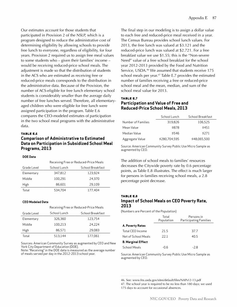
NYC.GOV/CEO Poverty Data and Research
Appendix E 87
Our estimates account for those students that participated in Provision 2 of the NSLP, which is a program designed to reduce the administrative cost of determining eligibility by allowing schools to provide free lunch to everyone, regardless of eligibility, for four years. Provision 2 required us to assign free meal values to some students who – given their families’ income – would be receiving reduced-price school meals. The adjustment is made so that the distribution of students in the ACS who are estimated as receiving free or reduced-price meals corresponds to the distribution in the administrative data. Because of the Provision, the number of ACS-eligible for free lunch elementary school students is considerably smaller than the average daily number of free lunches served. Therefore, all elementary-aged children who were eligible for free lunch were assigned participation in the program. Table E.6 compares the CEO-modeled estimates of participation in the two school meal programs with the administrative data.
table e.6 Comparison of Administrative to Estimated Data on Participation in Subsidized School Meal Programs, 2013
DOE Data
Receiving Free or Reduced-Price MealsGrade Level School Lunch School BreakfastElementary 347,812 123,924
Middle 100,291 24,370
High 86,601 29,109
Total 534,704 177,404
CEO Modeled Data
Receiving Free or Reduced-Price Meals
Grade Level School Lunch School BreakfastElementary 326,360 123,754
Middle 100,213 24,224
High 86,571 29,083
Total 513,144 177,061 Sources: American Community Survey as augmented by CEO and New York City Department of Education (DOE).Note: “Receiving” in the DOE data is measured as the average number of meals served per day in the 2012-2013 school year.
The final step in our modeling is to assign a dollar value to each free and reduced-price meal received in a year. The Census Bureau provides school lunch values. For 2013, the free lunch was valued at $3.121 and the reduced-price lunch was valued at $2.721. For a free breakfast value we use $1.55; this is the “Non-severe Need” value of a free school breakfast for the school year 2012-2013 provided by the Food and Nutrition Service, USDA.46 We assumed that students receive 175 school meals per year.47 Table E.7 provides the estimated number of families receiving a free or reduced-price school meal and the mean, median, and sum of the school meal value for 2013.
table e.7Participation and Value of Free and Reduced-Price School Meals, 2013
School Lunch School BreakfastNumber of Families 319,826 106,525Mean Value $878 $451
Median Value $546 $271
Aggregate Value $280,704,595 $48,065,500 Source: American Community Survey Public Use Micro Sample as augmented by CEO.
The addition of school meals to families’ resources decreases the Citywide poverty rate by 0.6 percentage points, as Table E.8 illustrates. The effect is much larger for persons in families receiving school meals, a 2.8 percentage point decrease.
table e.8 Impact of School Meals on CEO Poverty Rate, 2013 (Numbers are Percent of the Population)
Total Population
Persons in Participating Families
A. Poverty Rates
Total CEO Income 21.5 37.7Net of School Meals 22.1 40.5B. Marginal Effect
School Meals -0.6 -2.8 Source: American Community Survey Public Use Micro Sample as augmented by CEO.
46. See: www.fns.usda.gov/sites/default/files/NAPs12-13.pdf47. The school year is required to be no less than 180 days; we used 175 days to account for occasional absences.
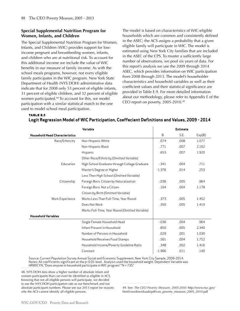
NYC.GOV/CEO Poverty Data and Research
88 The CEO Poverty Measure, 2005 - 2013
Special Supplemental Nutrition Program for Women, Infants, and ChildrenThe Special Supplemental Nutrition Program for Women, Infants, and Children (WIC) provides support for low-income pregnant and breastfeeding women, infants, and children who are at nutritional risk. To account for this additional income we include the value of WIC benefits in our measure of family income. As with the school meals programs, however, not every eligible family participates in the WIC program. New York State Department of Health (NYS DOH) administrative data indicate that for 2008 only 53 percent of eligible infants, 31 percent of eligible children, and 32 percent of eligible women participated.48 To account for this, we model participation with a similar statistical match to the one used to model school meal participation.
48. NYS DOH data show a higher number of absolute infant and women participants than can even be identified as eligible in ACS. Knowing that not all eligible persons will participate, we decided to use the NYS DOH participation rate as our benchmark and not absolute participant numbers. Please see our 2013 report for reasons why the ACS cannot identify all eligible persons.
The model is based on characteristics of WIC-eligible households which are common and consistently defined in the ASEC; the ACS assigns a probability that a given eligible family will participate in WIC. The model is estimated using New York City families that are included in the ASEC of the CPS. To muster a sufficiently large number of observations, we pool six years of data. For this report’s analysis we use the 2009 through 2014 ASEC, which provides information on WIC participation from 2008 through 2013. The model’s householder characteristics and household variables as well as their coefficient values and their statistical significance are provided in Table E.9. For more detailed information about our methodology, please refer to Appendix E of the CEO report on poverty, 2005-2010.49
49. See: The CEO Poverty Measure, 2005-2010: http://www.nyc.gov/html/ceo/downloads/pdf/ceo_poverty_measure_2005_2010.pdf
table e.9Logit Regression Model of WIC Participation, Coeffecient Definitions and Values, 2009 - 2014
Household Head Characteristics
Variable Estimate
B S.E. Exp(B)
Race/Ethnicity Non-Hispanic White .074 .008 1.077
Non-Hispanic Black .771 .007 2.162
Hispanic .653 .007 1.920
Other Race/Ethnicity (Omitted Variable)
Education High School Graduate through College Graduate -.341 .004 .711
Master’s Degree or Higher -1.376 .014 .253
Less Than High School (Omitted Variable)
Citizenship Foreign Born, Citizen by Naturalization -.036 .005 .964
Foreign Born, Not a Citizen .164 .004 1.178
Citizen by Birth (Omitted Variable)
Work Experience Works Less Than Full-Time, Year Round .373 .005 1.452
Does Not Work .350 .005 1.419
Works Full-Time, Year Round (Omitted Variable)
Household Variables
Single Female Household Head -.036 .004 .964
Infant Present in Household .850 .005 2.340
Number of Persons in Household .029 .001 1.030
Household Receives Food Stamps .561 .004 1.752
Household Income/Poverty Guideline Ratio .348 .002 1.416
Constant -1.966 .011 .140 Source: Current Population Survey Annual Social and Economic Supplement, New York City Sample, 2009-2014. Notes: All coefficients significant at the p< 0.01 level. Analysis used the household weight. Dependent Variable was HRWICYN, “Does anyone in household participate in WIC program.” “N = 735.”
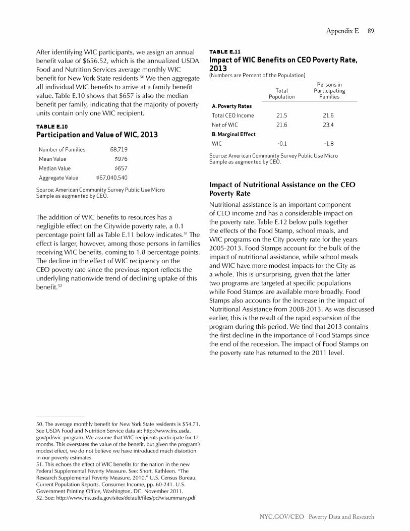
NYC.GOV/CEO Poverty Data and Research
Appendix E 89
After identifying WIC participants, we assign an annual benefit value of $656.52, which is the annualized USDA Food and Nutrition Services average monthly WIC benefit for New York State residents.50 We then aggregate all individual WIC benefits to arrive at a family benefit value. Table E.10 shows that $657 is also the median benefit per family, indicating that the majority of poverty units contain only one WIC recipient.
table e.10 Participation and Value of WIC, 2013
Number of Families 68,719Mean Value $976Median Value $657Aggregate Value $67,040,540
Source: American Community Survey Public Use Micro Sample as augmented by CEO.
The addition of WIC benefits to resources has a negligible effect on the Citywide poverty rate, a 0.1 percentage point fall as Table E.11 below indicates.51 The effect is larger, however, among those persons in families receiving WIC benefits, coming to 1.8 percentage points. The decline in the effect of WIC recipiency on the CEO poverty rate since the previous report reflects the underlyling nationwide trend of declining uptake of this benefit.52
50. The average monthly benefit for New York State residents is $54.71. See USDA Food and Nutrition Service data at: http://www.fns.usda.gov/pd/wic-program. We assume that WIC recipients participate for 12 months. This overstates the value of the benefit, but given the program’s modest effect, we do not believe we have introduced much distortion in our poverty estimates.51. This echoes the effect of WIC benefits for the nation in the new Federal Supplemental Poverty Measure. See: Short, Kathleen. “The Research Supplemental Poverty Measure, 2010.” U.S. Census Bureau, Current Population Reports, Consumer Income, pp. 60-241. U.S. Government Printing Office, Washington, DC. November 2011.52. See: http://www.fns.usda.gov/sites/default/files/pd/wisummary.pdf
table e.11 Impact of WIC Benefits on CEO Poverty Rate, 2013(Numbers are Percent of the Population)
Total Population
Persons in Participating
FamiliesA. Poverty Rates
Total CEO Income 21.5 21.6Net of WIC 21.6 23.4B. Marginal Effect
WIC -0.1 -1.8 Source: American Community Survey Public Use Micro Sample as augmented by CEO.
Impact of Nutritional Assistance on the CEO Poverty RateNutritional assistance is an important component of CEO income and has a considerable impact on the poverty rate. Table E.12 below pulls together the effects of the Food Stamp, school meals, and WIC programs on the City poverty rate for the years 2005-2013. Food Stamps account for the bulk of the impact of nutritional assistance, while school meals and WIC have more modest impacts for the City as a whole. This is unsurprising, given that the latter two programs are targeted at specific populations while Food Stamps are available more broadly. Food Stamps also accounts for the increase in the impact of Nutritional Assistance from 2008-2013. As was discussed earlier, this is the result of the rapid expansion of the program during this period. We find that 2013 contains the first decline in the importance of Food Stamps since the end of the recession. The impact of Food Stamps on the poverty rate has returned to the 2011 level.

NYC.GOV/CEO Poverty Data and Research
90 The CEO Poverty Measure, 2005 - 2013
table e.12Impact of Nutritional Assistance on the Poverty Rate, 2005 - 2013(Numbers are Percent of the Population)
2005 2006 2007 2008 2009 2010 2011 2012 2013A. Poverty Rates
Total CEO Income 20.4 19.8 19.8 19.0 19.8 21.0 21.5 21.4 21.5Net of: Food Stamps 22.3 21.8 21.5 21.1 22.4 24.4 25.0 25.3 25.0 School Meals 21.0 20.3 20.3 19.5 20.2 21.4 21.9 21.9 22.1 WIC 20.5 19.9 19.9 19.1 19.8 21.1 21.5 21.5 21.6 Total Nutritional
Assistance22.9 22.4 22.1 21.7 22.8 25.0 25.8 26.1 25.8
B. Marginal Effects
Food Stamps -2.0 -2.0 -1.8 -2.1 -2.6 -3.5 -3.6 -3.9 -3.6 School Meals -0.6 -0.5 -0.5 -0.5 -0.5 -0.4 -0.5 -0.5 -0.6 WIC -0.1 -0.1 -0.1 -0.1 -0.1 -0.1 -0.1 -0.1 -0.1 Total Nutritional
Assistance -2.5 -2.6 -2.3 -2.7 -3.1 -4.1 -4.3 -4.7 -4.3
Source: American Community Survey Public Use Micro Sample as augmented by CEO.
NYC.GOV/CEO Poverty Data and Research
Appendix F 91
Appendix f: esTimATing The vAlUe of heAp BenefiTs
The Home Energy Assistance Program (HEAP) is a federally funded subsidy that offsets the energy costs of low-income households. Unless a household faces a heating emergency, HEAP takes the form of a one-time annual payment. If the household’s heating expenses are included in its rent or mortgage payments, it receives its HEAP benefit directly.53 If the household pays a utility company for its heating fuel, the HEAP payment is sent to the provider, who then reduces the household’s heating bill.
HEAP benefits are available to households whose income falls below the HEAP Benefit Income Guidelines.54 In New York City, households are automatically enrolled in the program if they receive cash assistance, Food Stamps, or are composed of a single person receiving Supplemental Security Income (SSI) benefits. Other low-income households can apply for HEAP, but administrative data from the City’s Human Resources Administration (HRA) indicate that the vast majority of HEAP households are those whom it automatically enrolls. In 2010, for example, 689,745 households out of the 702,665 households that received HEAP benefits – 98.2 percent – were automatic enrollees.55
HEAP benefits are very modest. As of 2008, if the eligible household resides in public housing or receives a Section 8 subsidy it only receives an annual one dollar HEAP payment, receipt of which entitles the household to claim a higher Food Stamp benefit. Otherwise, the household is eligible to receive an annual $20 or $25 payment depending on whether its income is above or below 130 percent of the Federal Poverty Guidelines, or if the household contains a “vulnerable” individual: someone under age 6, over age 59, or under age 65 and receiving SSI benefits.56
There was no reliable survey data that collected information on HEAP benefits in New York City until the 2011 New York City Housing and Vacancy Survey, to which CEO was able to add a question about HEAP recipiency. This question unfortunately had a very low response rate, which is not surprising since HEAP
53. Households with a Common Benefit Identification Card receive a HEAP benefit as an electronic benefit transfer.54. These guidelines are based on household size and are available at: www.otda.ny.gov/programs/heap/program.asp#income55. These figures do not include the small number of HEAP participants who pay their home heating bills directly.56. OTDA (Office of Temporary and Disability Assistance), www.otda.ny.gov/programs/heap/program.asp#regular
benefits are one-time payments and are usually put on a recipient’s Electronic Benefit Transfer card, and so are easy to overlook.
CEO, therefore, continues to take advantage of the large degree to which beneficiaries are automatically enrolled and the simplicity of the program’s benefit structure to estimate the value of HEAP payments for households in the American Community Survey (ACS). A poverty unit in which any member is receiving Food Stamps or public assistance, or is a single-person household with SSI benefits, is assumed to be receiving a HEAP benefit. One new criterion has been added to our measure: if, as part of the housing imputation process, an ACS household has been matched to an HVS household that reported receiving HEAP payments, it is also assumed to be receiving a HEAP benefit.57 Because administrative data show that very few households received a $20 HEAP payment, only $1 and $25 dollar values are distributed to eligible poverty units.
Once it has been estimated, the value of the HEAP benefit is added to a poverty unit’s income. Since there can be more than one poverty unit in an ACS-defined household, the benefit is only given to one poverty unit in a multi-poverty unit household. This follows program rules that limit payments to one per household. Table F.1 compares CEO’s estimates to HRA administrative data for the number of New York City households that received HEAP benefits, the total value of the benefits, and the mean benefit per household in 2013. CEO’s estimates come to 93.1 percent of the administrative data for the number of HEAP households, 82.7 percent of the administrative data for total benefits, and 88.9 percent of the administrative data for mean benefit per household.
The very low level of HEAP benefits explains the too-small-to-register effect of HEAP on the CEO poverty rate noted in Chapter Two.
57. See Appendix C.

NYC.GOV/CEO Poverty Data and Research
92 The CEO Poverty Measure, 2005 - 2013
table f.1Comparison of CEO Estimates to Administrative Data for HEAP Program, 2013
A. Recipient Households
CEO Estimate 764,202HRA Administrative Data 821,010CEO as a Percentage of HRA 93.1%B. Total Benefits
CEO Estimate $13,032,138HRA Administrative Data $15,754,593CEO as a Percentage of HRA 82.7%C. Mean Benefit per Household
CEO Estimate $17HRA Administrative Data $19CEO as a Percentage of HRA 88.9% Sources: American Community Survey Public Use Micro Sample as augmented by CEO and New York City Human Resources Administration.
NYC.GOV/CEO Poverty Data and Research
Appendix G 93
Appendix g: work-relATed expenses
Many families with children must pay for childcare in order to work. The expense of getting to and from work is an unavoidable cost for nearly every jobholder. These costs are non-discretionary and limit the ability of families to meet the needs that are represented in the poverty threshold. The National Academy of Sciences (NAS) recommended that work-related expenses be deducted from family resources.58 The American Community Survey (ACS) does not include data on childcare costs or commuting costs, nor does it contain all the data needed to calculate these expenses. This appendix describes our childcare cost imputation and the methodology used to calculate commuting costs.
Childcare CostsCEO deducts the cost of childcare expenditures from income in the construction of our poverty measure. Because we are only interested in out-of-pocket childcare costs that are non-discretionary – that is, necessary for work – we only count the expenses incurred when all of the parents are working. If one or both parents are not working, their childcare spending is uncounted. Since childcare spending is not reported in the ACS, CEO relies on an imputation model to estimate childcare spending. This childcare cost imputation model employs a predicted mean match (PMM) of observations in the Census Bureau’s Survey of Income and Program Participation (SIPP) to observations in the ACS.
Creation of the SIPP Data SetIn order to generate a sufficiently large sample, we pool data from the 2004 and 2008 SIPP childcare module data sets. These surveys cover the periods January 2005 through April 2005 and December 2009 through March 2010, respectively. In previous reports, we used pooled data from the 2001 and 2004 SIPP. The 2008 SIPP data was released in late 2011; we dropped the 2001 SIPP data in favor of these newer data. This way, the SIPP data used for imputation more closely reflect the 2005-2013 period covered by this report.
Setting up the pooled SIPP data involves several steps. First, we remove foster children from this sample, given that their childcare costs are subsidized by government programs and we are only measuring out-of-pocket costs for working parents. Next, we take several steps to
58. Citro and Michael, pp. 70-71.
ensure that the unit of analysis within the SIPP is consistent with the “poverty units” CEO creates in the ACS.
The SIPP is a longitudinal data set in which participants are sampled over a two-year period. Individual observations in the SIPP are linked by sampling unit, household address, and family. The sampling unit is the original household as of the first round of interviews. A “household” is defined, as in the ACS, as all members living within the household unit, including family members and all unrelated individuals, such as unmarried partners, roommates, or foster children. Over the two-year SIPP sampling period, some members of a sampling unit leave and form their own households at a different address. Thus, in order to form a unique identifier for each household, we concatenate the sampling unit ID (SSUID) and the household address ID (SHHADID). Further, since ID markers can be reassigned to new sampling units between survey panels, we also include panel year as part of the constructed household ID. This yields an unweighted count of 74,047 unique households.
Within a household, a “family” in the SIPP is comprised of a group of two or more persons related by birth, marriage, or adoption who reside together. Unlike the ACS, the SIPP identifies and links members of subfamilies, even if they are unrelated to the reference person. (CEO creates unrelated sub-families in the ACS.)59 Unique families within a sampling unit are identified with the RFID variable. The constructed family ID variable concatenates RFID with the constructed household ID. This yields 80,731 unique families.
The SIPP places unmarried partners of the reference person into a different family within the household, which does not include their own children, if there are any. This is inconsistent with CEO’s unit of analysis, which treats unrelated partners as equivalent to spouses and includes them and their children in the reference person’s poverty unit. Thus, in order to make “families” in the SIPP commensurate with CEO poverty units, we place unmarried partners of the reference person and their children into the reference person’s family.
Individual relationships to the reference person are designated in the SIPP with a household relationship variable (ERRP). All unmarried partners of the reference person (ERRP = 10) are placed in the same family as the reference person. Additionally, all children of the
59. For a more detailed explanation of CEO’s “poverty unit of analysis,” see Appendix A in this report.

NYC.GOV/CEO Poverty Data and Research
94 The CEO Poverty Measure, 2005 - 2013
unmarried partner (including non-biological children) are placed in the reference person’s family.
Finally, we have to address the issue of minors classified as “other non-relatives of the reference person” (ERRP = 13). For this group, we use the following rule: if there is no other parent or guardian in the household, the individual is placed in the reference person’s family; otherwise, they are placed in their parent/guardian’s family.
Placing unmarried partners and unrelated minors in the reference person’s family reduces the number of unique families to 77,220. Out of this number, 20.9 percent of the families (16,160) have all parents working at least part of the year,60 at least one child 12 years of age or younger,61 and live in an urban area. This number represents the sample of SIPP families that is used for the regression model and the match.
Matching SIPP and ACS CasesSince SIPP data are measured for the reference month, the two income variables (total person income and earned income) are annualized and adjusted using the Betson equivalency scales,62 and inflated using the ratio of the Consumer Price Index (CPI) all-items index for the ACS data set year and the periods covered by the SIPP panels.63 These data are aggregated from the person to the family level.
60. The CEO childcare model caps childcare costs by the weeks worked of the spouse that works less. If one spouse does not work, this family will have no childcare costs. In order to reflect this in the imputation procedure, we narrowed the SIPP sample to mirror the rules we apply to ACS observations.61. The age range is consistent with the tax code, which provides childcare tax credits for children 12 and under.62. See Appendix B for a description.63. We took the average of the CPI Index from January 2005 through April 2005 and December 2009 through March 2010 for panel years 2004 and 2008, respectively.
The SIPP divides childcare payments into 11 categories, organized by provider. These include: grandparents; other relatives; family daycare; daycare; preschool; Head Start; other non-relative; after-school sports; clubs; other after-school activities; and private lessons. These payments are further subdivided in the SIPP by child, yielding a total of 80 childcare payment variables. Childcare payments are measured as the sum of all such childcare payment variables in the SIPP topical module. These values are inflated using the CPI childcare cost index.
This SIPP data set is then used to develop a regression model to predict childcare costs for families. Following work by John Iceland and David Ribar,64 we estimate separate regressions for the two-parent and single-parent sub-samples in the SIPP.
The relationship between childcare spending and many of its predictor variables is complex and non-linear. In order to achieve the best possible fit to the data, we employ nonparametric techniques via a Generalized Additive Regression Model (GAM). A GAM is a regression model that allows different functional forms for each independent variable. Some of the variables used in the regression are included as dummy variables, while others are fit nonparametrically, using smoothing spline functions.65 The regression output is summarized in Table G.1.66
64. Iceland, John and David C. Ribar. “Measuring the Impact of Child Care Expenses on Poverty.” Paper presented at the 2001 Population Association of America (PAA) meetings in Washington, D.C., March 29, 2001.65. Smoothing splines are a particular type of nonparametric smoothing technique. For an overview of smoothing spline functions and GAM, see Keele, Luke John. Semiparametric Regression for the Social Sciences. West Sussex, England: John Wiley and Sons, Ltd. 2008. 66. Nonparametric variables do not have reported coefficients, but rather have smoothed bivariate plots. These plots are available from the authors upon request.

NYC.GOV/CEO Poverty Data and Research
Appendix G 95
These regression models are used to compute predicted means for childcare expenditures in both the SIPP and ACS files. ACS observations are then matched with SIPP observations based on their predicted means, and the actual weekly childcare cost value from the SIPP observation is donated to the ACS observation. We constrain the match so that SIPP observations can only match ACS observations with the same number of parents. Table G.2 compares the distributions of the SIPP childcare values and the matched values for the subset of families with at least one working parent and at least one child 12 years of age or younger in the 2013 ACS. The matched values closely reproduce the distribution of childcare costs in the SIPP and percentage of observations with zero childcare costs.
Single-Parent Sample
Dummy Variables Coefficient t-StatisticIntercept 32.57 6.74Food Stamps -17.13 -5.41High School 2.76 0.52Some College 7.58 1.50College 24.13 4.03Graduate Degree 16.32 2.18
Nonparametric Variables EDF F-StatisticEarned 7.82 16.64Child 0-5 1.86 108.26Child 13-17 1.51 3.13Adults 2.41 18.42Female Income Proportion 1.90 10.32N 3,841R2 0.158
table g.1Regression Model of Weekly Childcare Costs, 2013
Married-Parent Sample
Dummy Variables Coefficient t-StatisticIntercept 53.95 9.46Food Stamps -20.50 -4.03High School -6.31 -1.02Some College 1.50 0.26College 5.47 0.91Graduate Degree 25.28 4.04
Nonparametric Variables EDF F-StatisticEarned 8.68 67.64Child 0-5 2.00 624.05Child 13-17 1.85 6.80Adults 3.93 12.21Female Income Proportion 7.32 37.31N 12,319R2 0.241
Source: 2004 and 2008 Survey of Income and Program Participation (SIPP).Notes: Dependent variable is weekly childcare expenditures in 2013 dollars. Sample comprised of SIPP families with at least one child under 13 and all parents working. Regressions were run using the SIPP person weight of the family head. This weight functions similarly to a family weight for each adjusted family unit within the household. “EDF” is the “equivalent degrees of freedom.”

NYC.GOV/CEO Poverty Data and Research
96 The CEO Poverty Measure, 2005 - 2013
table g.2Comparison of Weekly Childcare Payments, ACS and SIPP, 2013
Working Parents
ACS SIPPMean $54 $54
Percent Zero 64.8% 62.7%
Percentile
5 $0 $0
10 $0 $0
25 $0 $0
50 $0 $0
75 $63 $68
90 $190 $186
95 $274 $273
Working Parents with Non-Zero Expenditures
ACS SIPPMean $153 $139Percentile5 $11 $1110 $20 $2225 $54 $5450 $112 $10875 $203 $19690 $328 $32395 $413 $413
Sources: American Community Survey Public Use Micro Sample as augmented by CEO, and 2004 and 2008 Survey of Income and Program Participation (SIPP) inflated to 2013 prices using the CPI childcare index. Notes: Sample comprised of ACS and SIPP families with at least one child under 13 and all parents working. Values are reported at the level of the designated parent. Values are unweighted.
The weekly childcare values are then adjusted to reflect annual costs. In order to calculate childcare expenditures that are non-discretionary, we multiply the weekly value by the lowest reported number of weeks worked among the parents and cap the childcare costs for the family by the wages of the lower-earning parent. Table G.3 below shows the distributions for the annualized values using the PMM procedure.
table g.3Annual Non-Discretionary Childcare Expenditures, 2013
All Working Parents
Working Parents with Non-Zero
Mean $2,541 $7,623Percent Zero 66.7% N.A.Percentile5 $0 $339
10 $0 $712
25 $0 $2,031
50 $0 $5,417
75 $2,031 $10,157
90 $8,938 $17,876
95 $13,683 $21,346 Source: American Community Survey Public Use Micro Sample as augmented by CEO. Notes: Samples are comprised of ACS families with at least one child under 13 and all parents working. Values are reported at the level of the designated parent. Data weighted by ACS household weight. N.A. - Not applicable because these families all have positive childcare costs.
Commuting CostsTo estimate commuting costs we employ the ACS variables that provide information about means of transportation, travel time, usual weekly hours, vehicle occupancy, work location, and weeks worked in the past 12 months. We rely on administrative data to calculate the cost per trip of various modes of transportation. Listed below are the means of transportation and the cost per trip:
• Drove: $0.565 per vehicle mile – the average of the two IRS standard mileage rates67 released in 2011, plus bridge and tunnel tolls.
• Drove with Others: Divide all driving costs by number of carpoolers.
• Motorcycle: IRS standard mileage rate with motorcycle rates for tolls.
• Bus, Subway, or Ferry: $2.29 per trip.68
67. See: http://www.irs.gov/publications/p463/ch04.html#en_US_2013_publink100033935 68. Metropolitan Transportation Authority (MTA) increased fares on March 3, 2013. We use $2.29 as the cost of a subway or bus trip which is the average cost per ride of pay-per-ride, 7-day and 30-day Metrocards, weighted by their usage. We assume that ferry riders take the free-of-charge Staten Island Ferry and then use an additional form of public transit.

NYC.GOV/CEO Poverty Data and Research
Appendix G 97
• Railroad: $80 per week for out-of-city work locations and $55 per week for in-city work locations.69
• Taxi: We estimate each commute at $8.70
• Walk, Bike, or Work from Home: No cost per trip.
Other Methods71: We assume a bus or subway fare of $2.29 per trip.
Once we have established a cost per trip for each means of transportation (other than railroad which is already a weekly cost), we use the formula below to calculate the weekly commuting cost:
Weekly Commuting Cost = (Cost/Trip x Min((WKHP/8 x 2),14))
69. A Long Island Railroad (LIRR) Zone 1 to Zone 1 weekly pass costs $56.75; a Zone 1 to Zone 4 pass costs $77.50. A weekly pass from Grand Central Station (GCT) to Harlem on Metro-North costs $53.50. A weekly pass from GCT to White Plains costs $79.75. 70. We use a slightly lower cost than the $9.61 per trip cost in The New York City Taxicab Fact Book to account for outer-borough trips, which are more likely to be with a non-medallion taxi. See: http://www.schallerconsult.com/taxi/taxifb.pdf 71. The ACS only asks for means of transportation to work if the respondent worked last week. Therefore, for respondents that have worked in the past 12 months but not last week we assume a subway or bus fare.
We assume an eight-hour work day and use the ACS variable “WKHP – Usual hours worked per week in the past 12 months” to calculate the number of days worked per week.72 To account for a trip to and from work, we then multiply the number of work days by two and cap the number of possible weekly trips at 14. The cost per trip is then multiplied by the number of commuting trips per week to establish a weekly commuting cost. This is then multiplied by the “WKW – Weeks worked in the last 12 months”73 to establish the annual commuting cost.
Table G.4 shows that almost half (49.2 percent) of all New York City commuters used either the subway or bus. This results in a median annual commuting cost of $1,145. The highest commuting costs were incurred by those taking a taxi, driving alone, or using the railroad.
72. We round to the nearest whole number for the number of work days.73. In 2008, the WKW variable was changed from the actual number of weeks to a range format. For our 2008 through 2011 calculations, we used the midpoint of each range in our calculations. We cap the number of weeks worked at 50 to account for sickness or vacation.
table g.4Transportation Mode and Costs, 2013
Weekly Cost Annual CostMode of Transport Number of Commuters Percent Median Mean Median MeanDrove Alone 813,774 19.2% $46 $60 $2,317 $2,859Drove with Others 184,339 4.4% $21 $27 $965 $1,296
Bus 429,132 10.1% $23 $21 $1,145 $986
Subway 1,650,333 39.0% $23 $23 $1,145 $1,077
Railroad 63,009 1.5% $55 $63 $2,775 $2,921
Ferry 11,057 0.3% $23 $23 $1,145 $1,112
Taxi 39,991 0.9% $96 $88 $4,800 $4,251
Motorcycle 3,807 0.1% $31 $38 $1,544 $1,731
Bike 45,860 1.1% $0 $0 $0 $0
Walked 379,103 9.0% $0 $0 $0 $0
Worked at Home 155,447 3.7% $0 $0 $0 $0
Other Method 21,440 0.5% $23 $22 $1,145 $1,058
No Mode Reported 433,264 10.2% $23 $19 $458 $556
All Modes 4,230,556 100.0% $23 $27 $1,145 $1,277
Percent Using Subway or Bus 49.2%
Cost per Subway or Bus Trip $2.29 Sources: American Community Survey Public Use Micro Sample as augmented by CEO, using data from the following: “Regional Travel-Household Interview Survey.” New York Metropolitan Transportation Council-New Jersey Transportation Planning Authority. February 2000; IRS Publication 463 (2012), Travel, Entertainment, Gift, and Car Expenses established the standard mileage rates for deductible costs of operating an automobile for business purposes; The New York City Taxicab Fact Book. Schaller Consulting. March 2006. Note: Those that commuted via “Other Method” or reported no mode but did have work within the last 12 months were assigned the average cost per subway or bus trip.

NYC.GOV/CEO Poverty Data and Research
98 The CEO Poverty Measure, 2005 - 2013
The top panel of Table G.5 illustrates the impact of work-related expenses on the poverty status of the total population. It shows the combined impact, as well as the individual impact of both commuting costs and childcare expenditures. As expected, poverty rates are lower when we do not subtract work-related expenses from income. The effect of commuting costs is fairly consistent between 1.3 percent in 2006 and 2.0 percent in 2013. The impact of childcare expenses is stable, averaging 0.3 percentage points from 2005 through 2013.
The second panel of Table G.5 shows the impact of work-related expenses for persons living in working families with children. This is the population that would be most affected by work-related expenses. Interestingly, while the impact of commuting costs for this group is notably larger than for the population as whole, this is not true for childcare costs, which continue to have a relatively small effect on the poverty rate.
table g.5Impact of Work-Related Expenses on Poverty Rates, 2005 - 2013(Numbers are Percent of the Population)
2005 2006 2007 2008 2009 2010 2011 2012 2013A. Total Population
Total CEO Income 20.4 19.8 19.8 19.0 19.8 21.0 21.5 21.4 21.5Net of:
Commuting Cost 19.0 18.5 18.1 17.6 18.1 19.5 19.7 19.8 19.5
Childcare Expenses 20.1 19.5 19.6 18.7 19.5 20.6 21.2 21.2 21.2
Total Work-Related Expenses 18.8 18.2 17.9 17.4 17.8 19.2 19.5 19.6 19.3
Marginal Effects
Commuting Costs 1.4 1.3 1.7 1.4 1.7 1.5 1.8 1.6 2.0
Childcare Expenses 0.3 0.3 0.2 0.3 0.3 0.4 0.3 0.3 0.3
Total Work-Related Expenses 1.6 1.6 1.9 1.6 2.0 1.8 2.0 1.8 2.2
B. Persons Living in Working Families with Children
Total CEO Income 12.5 12.5 13.3 11.8 12.3 13.2 14.3 13.7 14.0
Net of:
Commuting Cost 10.2 10.7 10.8 10.1 9.9 11.2 11.7 11.6 11.2
Childcare Expenses 12.0 11.9 12.9 11.2 11.6 12.4 13.7 13.2 13.5
Total Work-Related Expenses 9.8 10.1 10.5 9.6 9.4 10.7 11.3 11.2 10.6
Marginal Effects
Commuting Costs 2.2 1.8 2.5 1.7 2.4 2.0 2.6 2.1 2.8
Childcare Expenses 0.5 0.6 0.5 0.6 0.7 0.8 0.6 0.5 0.5
Total Work-Related Expenses 2.7 2.4 2.8 2.2 2.9 2.5 3.0 2.5 3.4 Source: American Community Survey Public Use Micro Sample as augmented by CEO.

NYC.GOV/CEO Poverty Data and Research
Appendix H 99
Appendix h: mediCAl oUT-of-poCkeT expendiTUres
Following the National Academy of Sciences’ (NAS) recommendation, CEO’s measure of income is net of what families spend for their medical care. Medical out-of-pocket expenditures (MOOP) include health insurance premiums, co-pays, deductibles, and the cost of health services that are not covered by insurance. Since the American Community Survey (ACS) does not report this information, it must be imputed from an outside data source. We use the Medical Expenditures Panel Survey (MEPS) to impute MOOP into the ACS. MEPS files have a slightly longer processing time than the ACS, so for the 2013 CEO Poverty Measure we use the 2012 MEPS data adjusted by the medical care component of the Consumer Price Index for All Urban Consumers (CPI-U).74
The MEPS contains two files that we use for our MOOP calculations. The Full Year (FY) file contains all the information pertaining to medical expenses except for health insurance premiums. Premiums for persons that are privately insured are contained in the Person Round Plan Public Use (PRPL) file. To calculate MOOP for those on private insurance, we add the PRPL file’s premium values to the FY file’s medical expenses. For those on public insurance, we create premium values based on program rules and add them to the FY file’s medical expenses.
Private Insurance PremiumsThere are five different categories of private insurance in the FY file. They specify whether a policyholder has employer/union group insurance, private insurance with the source unknown, a non-group private policy, an “other group” insurance policy, or a self-employed (firm size of one) policy. All FY private insurance policyholders should have a corresponding private insurance premium in the PRPL file. However, there are a number of private insurance holder records in the FY file without corresponding records in the PRPL file. This occurs because health insurance premium values are only collected at the beginning of the year. Therefore, if a person began private insurance coverage in the middle of the year, a premium value would not be recorded in the PRPL file.
74. For further information about the MEPS, please visit the Agency for Healthcare Research and Quality website at: http://meps.ahrq.gov/mepsweb/
For records with missing premiums, we impute values via a hot-deck methodology. To insure that we are assigning an appropriate premium, we identify the policyholders as belonging to either an individual or a multi-person plan based on the number of persons in the FY health insurance unit (HIDUDX). The health insurance unit variable is a MEPS-constructed variable which links adults, their spouses, and any unmarried children age 18 and under who would most likely be covered under one health insurance plan.75 We then randomly assign non-missing premium values to records with missing premiums within their specified categories.
Public Insurance PremiumsWe use program rules to assign appropriate premiums for those on public insurance. We assume all persons identified in the MEPS as Medicare recipients have Medicare Part B. All Medicare recipients with incomes above 135 percent of the Federal Poverty Guidelines (FPG) are required to pay a monthly premium for Medicare Part B. If the Medicare participant is not married, we use only personal income when calculating their percentage of FPG. For married participants we aggregate the income of both partners.
All persons enrolled in Medicare Part B also have the option of enrolling in Medicare Part C, Medicare Advantage. Medicare Advantage is a type of Medicare administered by a private health insurance company, which usually offers greater benefits and services for an additional premium. For those identified in the MEPS as enrolled in Medicare Part C, we assign an additional annual premium of $420 for 2012.76
Persons also have the option to enroll in Medicare Part D, prescription drug coverage, which also requires a supplemental monthly premium.77 Many Medicare Advantage plans roll prescription drug coverage into their services and, therefore, for persons identified as enrolled in both Medicare Part C and Part D, we assign only the additional Medicare Part C premium.
75. For the employer/union group, we also include whether or not the policyholder was in a union.76. “Medicare Advantage 2012 Data Spotlight.” The Henry J. Kaiser Family Foundation. See: http://kaiserfamilyfoundation.files.wordpress.com/2013/01/8323.pdf77. For 2012 we assign an annual premium of $452, which is the weighted average by enrollment of Part D premiums for New York State. “Analysis of Medicare Prescription Drug Plans in 2012 and Key Trends since 2006.” The Henry J. Kaiser Family Foundation. September 2012. See: http://kaiserfamilyfoundation.files.wordpress.com/2013/01/8357.pdf.

NYC.GOV/CEO Poverty Data and Research
100 The CEO Poverty Measure, 2005 - 2013
To assign Child Health Plus premiums, we look at all children identified as public insurance recipients. We aggregate incomes for everyone in the same health insurance unit and compare that against the FPG. Families are required to pay a monthly per-child premium based on their income’s percentage of the FPG. For all categories of participants there is also a family cap. For example, families with incomes between 160 percent and 222 percent of the FPG are required to pay a premium of $9 per child per month. The premium is capped at the payment for three children ($27 per family per month).78
New York State’s Family Health Plus program does not have a premium but does require co-payments based on different types of procedures. These co-payments are captured in the MEPS Full Year file.79 Medicaid participants have no premiums or co-pays.
Once the premium data is calculated, we aggregate all premiums within the identified family variable and add that to other medical expenses80 to arrive at total medical out-of-pocket expenditures for the health insurance unit.
Developing a Predictive Mean Matching (PMM) Model for MOOP ImputationWe developed a regression model to predict determinants of MOOP values in the MEPS. All variables are measured for the head of the poverty unit.81 Income, age of the household head, poverty unit size, and number of children are measured as continuous variables, while the race, education, insurance status, and working status categories are included as binary variables.
In 2008, the ACS began measuring insurance status, which is an important covariate in a model of MOOP. Thus, the imputation model for 2008 and onward contains insurance status while the previous years cannot. This may create some discontinuity over time in our estimates. We address it by using Food Stamp receipt as a proxy for Medicaid status for the years prior to 2008. In addition, a good deal of the variation in insurance status is picked up by the full-time work and income variables (which proxy for private insurance) and the
78. We used the health insurance unit as opposed to the family unit when capping the premium.79. The TOTSLF variable identifies total out-of-pocket expenditures by patient or patient’s family (other than premiums).80. We aggregate each individual TOTSLF variable within the family to arrive at a total medical expenses value for the family.81. See Appendix A for a description of the CEO poverty unit of analysis.
age of the poverty unit head variable (which proxies for Medicare enrollment). We tested the 2008 data using the model without insurance status and found similar outcomes to the model with insurance status, yielding a mean MOOP value of $2,867 compared with $2,895 for the model including insurance status.82 This proxy method is imperfect, however, and may impact the quality of the statistical match.
The relationship between MOOP and many of its predictor variables is complex and non-linear. In order to achieve the best possible fit to the data, we employ non-parametric techniques via a Generalized Additive Regression Model (GAM). A GAM is a regression model that allows different functional forms for each independent variable. Binary variables used in the regression are included as dummy variables, while continuous ones are fit nonparametrically using smoothing spline functions.83 The regression output is summarized in Table H.1 below.84
82. Additional information on the comparison of imputation models with and without insurance status is available upon request.83. Smoothing splines are a particular type of nonparametric smoothing technique. For an overview of smoothing spline functions and GAM, see: Keele, Luke John. Semiparametric Regression for the Social Sciences. West Sussex, England: John Wiley and Sons, Ltd. 2008.84. Nonparametric variables do not have reported coefficients, but rather have smoothed bivariate plots. These plots are available from the authors upon request.

NYC.GOV/CEO Poverty Data and Research
Appendix H 101
table h.1 Regression Model of Medical Out-of-Pocket Spending, 2013
Dummy Variables Estimate t-StatisticIntercept 7.55 165.68Public Insurance -2.25 -37.10No Insurance -2.37 -49.24Work Full-Time -0.17 -4.61
Black -0.51 -10.80
Hispanic -0.68 -14.35
Asian -0.43 -5.83
Other Race/Ethnicity -0.21 -2.00
Bachelor's Degree or Greater 0.22 4.58
Less than High School 0.08 2.20
Elderly Head -0.75 -5.47
Elderly Present 0.33 3.59
Public Insurance × Elderly 1.79 20.42
No Insurance × Elderly 0.94 1.47
Nonparametric Variables EDF F-Statistic
Income 8.48 68.46
Family Size 6.94 63.69
Age 5.98 105.01
Children 3.22 6.31
N 15,801
R2 0.894 Source: 2012 Medical Expenditure Panel Survey inflated to 2013 prices using the CPI Medical Index.Notes: Dependent variable is the natural log of family-level MOOP. Income measured as household income divided by 10,000. “EDF” is the “equivalent degrees of freedom.”
ACS and MEPS cases are matched based on their predicted means, using the regression model. When cases are matched, the actual MOOP value from the MEPS case is donated. Since there are slightly less than half as many donor cases in the MEPS as cases in the ACS, we allow MEPS observations to donate their value to multiple ACS observations. We also apply a rule that a single MEPS case cannot donate more than ten times. This ensures that all ACS cases can be matched and helps preserve the full distribution of MOOP values from the MEPS. After some experimentation, we imposed a further restriction on the match: MEPS and ACS observations can only be paired if they match on health insurance status and the elderly status of their respective reference person. We did this because initial testing of the imputation model without these conditions yielded
poor matches for certain sub-groups. Adding these matching criteria overcomes this problem.
The following table, H.2, shows the distribution of MOOP values in the MEPS and the PMM values for 2013. The matched MOOP values in the ACS are lower than those in the MEPS, particularly at the mean. This does not necessarily mean that the imputation procedure yields a poor match. The MEPS is a nationally representative survey while our estimates are for New York City. Since New York City differs in demographic composition from the rest of the U.S., the overall mean MOOP value may be higher or lower than that for the overall population.
table h.2Comparison of MOOP Distributions, MEPS and ACS, 2013
MEPS ACSMean $3,382 $2,845Aggregate (in $1,000s ) N.A. $9,551,975 Percentile
5 $0 $0
10 $15 $8
25 $405 $228
50 $1,998 $1,521
75 $4,770 $3,936
90 $8,296 $7,027
95 $11,079 $9,928
Proportion of families with Zero MOOP Values
8.0% 8.5%
Sources: American Community Survey Public Use Micro Sample as augmented by CEO, and 2012 Medical Expenditure Panel Survey (MEPS) inflated to 2013 prices using the CPI Medical Index.Note: N.A. - Not applicable due to the fact that the MEPS provides data at the U.S. level as opposed to the New York City level.

NYC.GOV/CEO Poverty Data and Research
102 The CEO Poverty Measure, 2005 - 2013
A better measure of the match quality is the conditional distributions. By looking at the matched values conditional on the matching variables, we can see whether or not the medical spending patterns are reproduced in the ACS, adjusting for the compositional differences in the data sets. Table H.3 reports the mean and median MOOP expenditures in the MEPS and ACS by insurance and elderly status.
table h.3Comparison of MEPS and ACS MOOP Values by Age and Insurance Status, 2013
MEPS
Non-Elderly ElderlyPrivate Public Uninsured Private Public and
UninsuredMean $4,267 $869 $1,122 $4,642 $3,144Median $2,953 $128 $189 $3,596 $2,161
ACS
Non-Elderly Elderly
Private Public Uninsured Private Public and Uninsured
Mean $3,830 $796 $961 $4,383 $2,272
Median $2,567 $139 $183 $3,185 $1,360 Sources: American Community Survey Public Use Micro Sample as augmented by CEO, and 2012 Medical Expenditure Panel Survey (MEPS) inflated to 2013 prices using the CPI Medical Index.
The mean and median values by subgroups are closer to the MEPS data than the Citywide mean. However, this table only conditions on two variables: elderly status and insurance status. Much of the difference between medical spending in New York and the U.S. is driven by New York’s vastly different demographic profile. Re-computing Table H.3 for the non-Hispanic White population in the MEPS and the ACS, for example, yields even closer spending estimates.85
Impact of MOOP on the CEO Poverty RateTable H.4 reports the impact of MOOP on the poverty rate. MOOP has a substantial impact on the poverty rate, increasing poverty throughout the City by between 2.9 and 3.8 percentage points. The impact of MOOP on the poverty rate is larger in 2005-2007 than in 2008-2012. This is likely the result of the better statistical match that is generated when insurance status is included as a matching variable.
85. This data is available from the authors upon request.
table h.4Impact of MOOP on Poverty Rates, 2005 - 2013(Numbers are Percent of the Population)
2005 2006 2007 2008 2009 2010 2011 2012 2013A. All Persons
Total CEO Income 20.4 19.8 19.8 19.0 19.8 21.0 21.5 21.4 21.5Net of MOOP 16.8 16.4 16.0 15.8 16.5 18.1 18.2 18.4 18.5
Marginal Effect of MOOP 3.5 3.4 3.8 3.2 3.2 2.9 3.2 3.2 3.0
B. Elderly Individuals
Total CEO Income 24.2 22.9 22.7 22.8 22.3 21.4 21.8 21.2 21.6
Net of MOOP 17.3 16.6 16.2 17.1 17.1 16.4 16.9 16.6 17.3
Marginal Effect of MOOP 6.9 6.3 6.5 5.7 5.2 5.0 4.9 4.6 4.4 Source: American Community Survey Public Use Micro Sample as augmented by CEO.

NYC.GOV/CEO Poverty Data and Research
Appendix H 103
Table H.4 also reports the impact of MOOP on poverty among the elderly, the group most affected by medical spending. The MOOP adjustment raises elderly poverty by a much larger amount, ranging from 4.4 percentage points to 6.9 percentage points. The impact of MOOP on the elderly leads to a considerable change in the way we understand their poverty. The elderly have a higher overall poverty rate than the City as a whole for every year from 2005 through 2011 and have the same rate for 2012 and 2013. However, the elderly have a net-of-MOOP poverty rate that is close to the Citywide poverty rate net-of-MOOP from 2005-2009, and a lower net-of-MOOP poverty rate than the Citywide average in 2010 and after. The pattern after 2009 differs from prior years because poverty rose for younger and more labor-market dependent New Yorkers and because the effect of MOOP declined for the population as a whole. Indeed, it declines markedly over the 2005-2013 period. This may be a reflection of implementation of Medicare Part D, the prescription drug coverage program that could be protecting more of the elderly from catastrophic medical costs.
Affordable Care Act of 2010 In 2010, President Obama signed the Affordable Care Act (ACA), putting in place comprehensive health insurance reforms. All Americans have access to affordable health insurance options as of 2014. Next year’s MEPS and ACS data will allow the effects of this landmark legislation to be analyzed for the first time.86 Keen attention will be paid to the consequences this legislation will have on medical out-of-pocket expenditures. The ACA has the potential to dramatically change the landscape of health care for those in poverty.
86. Even then, the rolling survey method of the ACS and panel survey method of the MEPS means we will not have a full picture of the ACA until after 2014.

NYC.GOV/CEO Poverty Data and Research
104 The CEO Poverty Measure, 2005 - 2013
Appendix i: The effeCT of A minimUm wAge inCreAse on The poverTy rATe
Chapter 5 discusses our goal of lifting 800,000 people out of poverty or near poverty over the next decade. An important lever in this effort is an increase in the minimum wage. The CEO poverty measure has consistently shown that wages are inadequate relative to the poverty threshold, to the point where the poverty rate continues to rise even among families with two full-time workers.
In 2013, the most recent year for ACS data, the minimum wage was $7.25 per hour in New York State (New York City was subject to state law in setting the minimum wage). On December 21, 2013, the minimum wage increased to $8, and one year later it rose to $8.75. It is scheduled to increase to $9 per hour on December 31, 2015.87 Employing the 2013 American Community Survey (ACS), CEO simulated the effects of several wage increases on the poverty rate: $9, $11.50, $13, and $15 per hour.
87. New York State Department of Labor. History of the Hourly Minimum Wage. New York, 2015. See: https://www.labor.ny.gov/stats/minimum_wage.asp
Methods and AssumptionsWe began the simulation by identifying the workers who earned the current minimum wage (of $7.25) in 2013. The ACS, our primary data set, provides an annual wage income but not an hourly one. Consequently, an hourly variable was constructed utilizing the annual wage income, the number of weeks worked, and number of hours worked in a given week. With this new variable, an hourly wage rate for all workers between the age of 16 and 64 was derived, excluding the self-employed. Continuing with this simulation, we raised the wage of the target population of those who earned the current minimum wage of $7.25.
We then incorporated a spillover effect into the model. We assumed workers making anywhere between one dollar under the current minimum wage and one dollar over the new minimum wage would receive the new minimum wage or a commensurate increase in their wage. Table I.1 shows the earnings of workers who would receive the benefit of the new minimum wage, including the spillover effect, for all four scenarios. We include the new upper and lower bounds around each wage option. Wage growth increases from one dollar below to the current minimum, and slows until the wage reaches the upper bound.
table I.1Minimum Wage, Spillover Range, and Wage Parameters, 2013
Minimum Wage Spillover Threshold New Low Wage New High Wage
$ 9 Per Hour Scenario
current 7.25 1.00 6.25 6.25 9.00 proposed 9.00 1.00 10.00 9.64 10.00
$ 11.50 Per Hour Scenario
current 7.25 1.00 6.25 6.25 11.50 proposed 11.50 1.00 12.50 12.31 12.50
$ 13 Per Hour Scenario
current 7.25 1.00 6.25 6.25 13.00 proposed 13.00 1.00 14.00 13.85 14.00
$ 15 Per Hour Scenario
current 7.25 1.00 6.25 6.25 15.00 proposed 15.00 1.00 16.00 15.89 16.00
Source: American Community Survey Public Use Micro Sample 2013 as augmented by CEO

NYC.GOV/CEO Poverty Data and Research
Appendix I 105
Several other assumptions were made:
• We made the assumption that income-dependent benefits such as SNAP and WIC would decline as wages rose, and tax credits would change with income.
• No job loss effects were incorporated into the model.88
• We also made the assumption that there would be no short-run behavioral changes with respect to housing choice or medical-out-of-pocket expenses, and decided to hold those components of the model constant. An increase in expenditures on either component could erase some of the gains in moving out of poverty. In a long-run simulation, new minimum wage recipients would have more options and more discretionary income for housing and medical care. For housing, we expect, especially in the case of younger workers, that there would be more household formation. In other cases, some of the higher wage recipients may make a discretionary choice to increase their housing expenditures at some future date. In the case of medical care, the change is less predictable. The Affordable Care Act changes available choices starting in 2014. We do not yet know how much this would differ from the out-of-pocket medical expenditures that we have estimated using the 2013 data.
88. For research supporting the zero job loss assumption, see: Institute for Research on Labor and Employment, Minimum Wage Effects Across State Borders: Estimates Using Contiguous Counties. California, 2010. http://escholarship.org/uc/item/86w5m90m; Center for Economic and Policy Research, 2014 Job Creation Faster in States that Raised the Minimum Wage. Washington, D.C., June 30, 2014. http://www.cepr.net/index.php/blogs/cepr-blog/2014-job-creation-in-states-that-raised-the-minimum-wage.
We incorporated our assumptions and the increased wage estimates into family incomes in our model and re-estimated the poverty rate given this additional resource. The results have a notable effect at all levels of the wage increase. Table I.2 shows the impact of the new minimum wage on the poverty rates, at 100 percent and 150 percent of the threshold (poverty and near poverty). Panel A shows the number of workers affected and the decline of the in-group poverty and near poverty rates. Panel B shows the number of poverty units affected by the wage change – those with at least one minimum wage earner in the family. Panel C shows the total number of individuals in these families and how their in-group poverty rate changes as family incomes rise. Panel D shows the decline in the Citywide poverty rate as the minimum wage increases.

NYC.GOV/CEO Poverty Data and Research
106 The CEO Poverty Measure, 2005 - 2013
table I.2Minimum Wage Simulation: Effect on Poverty and Near Poverty Rates, 2013Poverty Rate: poverty units below 100% of poverty threshold Near Poverty: poverty units below 150% of poverty threshold (Changes in poverty rates are percentage point changes.)
New Wage Per Hour
$9.00 $11.50 $13.00 $15.00
A. Workers with Wage Change
Population 450,807 802,235 977,728 1,214,723 Poverty Rate Change -4.3 -9.2 -10.4 -11.5 Near Poverty Rate Change -7.1 -17.6 -23.0 -29.6
B. Poverty Units with at Least One Worker with Wage Change
Population 365,042 616,962 742,526 905,036
C. Individuals in Poverty Unit with at Least One Worker with Wage Change
Population 1,334,824 2,138,636 2,532,077 3,023,633 Poverty Rate Change -3.1 -7.4 -8.8 -10.2 Near Poverty Rate Change -5.4 -14.5 -19.6 -24.7
D. Citywide Poverty Rates
Poverty Rate Change -0.6 -2.0 -2.8 -3.8 Near Poverty Rate Change -0.3 -1.8 -3.2 -5.5
Source: American Community Survey Public Use Micro Sample 2013 as augmented by CEO.

NYC.GOV/CEO Poverty Data and Research
Appendix J 107
Appendix j: ACCUrACy of The dATA And ChAnges To The Ceo model
The principal data set for CEO’s poverty estimates is the American Community Survey (ACS) Public Use Micro Sample (PUMS). The ACS is designed to sample three percent of the households in the U.S. each year. The PUMS is a subset of the full ACS sample. It provides information collected from roughly 25,000 households in New York City annually.
Because the ACS is a survey, it is subject to two types of error: nonsampling error and sampling error.
Nonsampling Error: Nonsampling error is the error within survey data that is not specifically associated with the statistical sampling procedures of the sample data. Nonsampling error may occur because of erroneous responses by survey respondents, for example. Another source of nonsampling error may come from mistakes in the processing of the data by the Census Bureau, such as when data are edited or recoded.
Nonsampling error may affect the data in two ways: either randomly, which increases the variability of the data, or systematically, which introduces bias into the results. To minimize bias in the survey, the Census Bureau conducts extensive research of sampling techniques, questionnaire design, and data collection and processing procedures. For instance, after identifying a systematic underreporting of Food Stamp receipt and benefit dollar values in the ACS, the Census Bureau researched methods to increase the reported participation rate. The Census Bureau concluded through this research that changing the wording of the Food Stamp question to include “Food Stamp benefit card,” as well as not asking about the Food Stamp benefit value, would significantly increase the number of households responding whether they have received Food Stamps.89
Sampling Error: Sampling error occurs in the ACS, as in other sample survey data, because inferences about the entire population, such as the poverty rate for New York City, are derived from samples, the poverty rate for ACS sample. Another sample drawn from the same population would provide a different estimate of the poverty rate. The sampling error is estimated by the standard error, which can be thought of as a measure
89. John Hisnanick, T. Loveless, and J. Chesnut. U.S. Bureau of the Census. 2006 American Community Survey Content Test Report H.6 - Evaluation Report Covering Receipt of Food Stamps. January 3, 2007. See: www.census.gov/acs/www/AdvMeth/content_test/H6_Food_Stamps.pdf
of the deviation of an estimate drawn from one sample from the average estimate of all possible samples.
For this report, CEO employed the replicate weight method recommended by the Census Bureau to compute direct standard errors for our estimated poverty rates. The standard errors provide a measure of sampling error and some types of nonsampling error.90 Using the standard errors, we tested the statistical significance of differences and changes in the report’s poverty rates at the 10 percent level of significance. In the report’s tables, we highlight, in bold, statistically significant differences between poverty rates.
An additional source of error in the data results from CEO’s need to impute information on items such as the value of Food Stamp benefits, housing status, childcare expenditures, and medical out-of-pocket expenditures from other survey data into the ACS sample. We do not, however, account for the imputation error in this report.
Changes To The Poverty Model In This ReportReaders may notice that many of the statistics shown for the 2005-2012 period are slightly different from what we had reported in the previous editions of this report. We made small adjustments to our methodology and corrected some minor errors. These changes were incorporated into the model this year. In several instances, we adjusted which years of the administrative data were matched with the ACS data in the imputation models. The goal was to match on files with the most similar time period possible. The cumulative effect of these upgrades created small changes in our results.
These changes were applied to our 2013 estimate and also to the prior years, when appropriate. While each revision was small, the combined result generated changes in some of the poverty statistics. Because of the notable, combined impact, we detail the changes below:
MOOP: There is a recurring revision in the prior year of data using the current MEPS data. In order to estimate medical out-of-pocket expenses, we use data from the Medical Expenditures Panel Survey (MEPS). These data are released every year, typically in February, four to five months after the release of the ACS. As a result, our report, which utilizes the ACS as our primary data set, has a one-year lag with respect to the MEPS data set. In order to keep dollars constant between the survey time periods, we use the Consumer Price Index for Medical
90. U.S. Bureau of the Census. PUMS Accuracy of the Data (2013). Available at: http://www.census.gov/acs/www/Downloads/data_ documentation/pums/Accuracy/2013AccuracyPUMS.pdf

NYC.GOV/CEO Poverty Data and Research
108 The CEO Poverty Measure, 2005 - 2013
Expenditures to adjust the variables derived from the MEPS data set.
At the same time, we take the opportunity to revise the prior year’s data with what is now the matching MEPS data for that year. For example, the 2012 MEPS data is used with the 2013 ACS, which is also used to update the 2012 estimates. As a result, the 2012 poverty rate published in the 2013 report could be slightly different from the same rate published in the 2012 report.
School Meals and WIC: School meals and WIC estimates use several combined years of data (see Appendix E). For this report, we made adjustments in the combined Current Population Survey Annual Social and Economic (CPS ASEC) data set years, causing a change in the regression coefficients. The WIC and School Meals coefficients are now derived from the following CPS ASEC data sets: 2007-2012 for the poverty rates from 2005 to 2011; 2008-2013 for the poverty rates in 2012; and 2009-2014 for the poverty rates in 2013.
We also changed the model for matching administrative data for WIC and School Meals to the ACS, using the number of people in the CEO poverty unit, rather than the ACS household size, to define household characteristics. With the new model, there are approximately 100 fewer weighted poverty units receiving WIC than under the previous model.
Childcare: Revised CPI series were used for inflation adjustments to the values taken from SIPP data.
Income Tax: We reviewed the Federal, New York State, and City tax models and made several changes. Adjustments were made in calculating excluded self-employment tax; the New York State Real Property Tax Credit; and computation of taxable retirement income on the New York State return.

NYC.GOV/CEO Poverty Data and Research
Appendix J 109

NYC.GOV/CEO Poverty Data and Research
110 The CEO Poverty Measure, 2005 - 2013