two-way frequency tables (day-1) - lancaster high school · 2015-03-31 · two-way frequency tables...
TRANSCRIPT

1
Two-Way Frequency Tables (Day-1)
Bivariate Statistics: _____________________________________________________________________
Bivariate categorical data results from collecting data on two categorical variables. In this
lesson, you will see examples involving categorical data collected from two survey
questions.
Example 1: More than 1,000 students responded to a survey that included a question
about a student’s most favorite superhero power. 450 of the completed surveys were
randomly selected. A breakdown of the data by gender was compiled from the 450
surveys:
100 students indicated their favorite power was “to fly.” 49 of those were females.
131 students selected the power to “freeze time” as their favorite power. 71 of those
were males.
75 students selected “invisibility” as their favorite power. 48 of those were females.
26 students indicated “super strength” as their favorite power. 25 of those were
males.
And finally, 118 students indicated “telepathy” as their favorite power. 70 of those
were females.
Follow-up questions:
1. How many more females than males indicated their favorite power is “telepathy?”
2. How many more males than females indicated their favorite power was “to fly?”
3. Write survey questions that you think might have been used to collect this data.

2
Two-way frequency table:
Joint frequency:
Marginal Frequency:
Complete the two-way frequency table below based off of the information given from the
superhero survey:
To Fly Freeze
Time
Invisibility Super
Strength
Telepathy Total
Females
Males
Total
Questions:
1. Put a circle around two boxes that you would consider “joint frequencies.” Why?
2. Put a triangle around two boxes that you would consider “marginal frequencies.” Why?

3
Example 2: Another random sample of 100 surveys was selected. Jill had a copy of the
frequency table that summarized these 100 surveys. Unfortunately, she spilled part of
her lunch on the copy. The following summaries were still readable:
To Fly Freeze
Time
Invisibility Super
Strength
Telepathy Total
Females 12 15 (c) 5 (e) 55
Males 12 16 10 (j) 3 45
Total 24 31 25 9 (q) 100
Try on your own:
1. Help Jill recreate the table by determining the frequencies for cells (c), (e), (j), and (q).
2. Of the cells (c), (e), (j), and (q), which cells represent joint frequencies?
3. Of the cells (c), (e), (j), and (q), which cells represent marginal frequencies?
Example 3: A survey asked the question “How tall are you to the nearest inch?” A second
question on this survey asked, “What sports do you play?”
1. Indicate what type of data, numerical or categorical, would be collected from the first
question and why?
2. What type of data would be collected from the second question and why?

4
Relative Frequencies (Day-2)
Example 1: Extending the Frequency Table to a Relative Frequency Table
Determining the number of students in each cell presents the first step in organizing
bivariate categorical data. Another way of analyzing the data in the table is to calculate
the relative frequency for each cell. Relative frequencies relate each frequency count to
the total number of observations. For each cell in this table, the relative frequency of a
cell is found by ______________________________________________________________________.
What is the point? Relative frequencies tell you
Consider the two-way frequency table from yesterday’s notes:
Relative frequencies can be expressed as decimals, as fractions, or as ________________.
Fill in the rest of the relative frequency table below:
Follow-up questions:
1. What is the joint relative frequency for females who selected “invisibility” as their favorite
superpower?
2. What is the marginal relative frequency for “freeze time?” Interpret the meaning of this
value?

5
Example 2: Consider the following data about a high school’s after school activities.
Calculate the relative frequencies for each of the cells to the nearest percent. Place the
relative frequencies in the cells of the following table.
1. Based on your relative frequency table, what is the relative frequency of students
who indicated they played basketball?
2. Based on your table, what is the relative frequency of males who play basketball?
3. If a student were randomly selected from the students at the school, do you think
the student selected would be a male or a female? Why??
4. If a student were selected at random from school, do you think this student would
be involved in an after-school program? Explain your answer.
5. Why might females think they are more involved in after-school activities than
males? Explain your answer. Is this a logical conclusion?
6
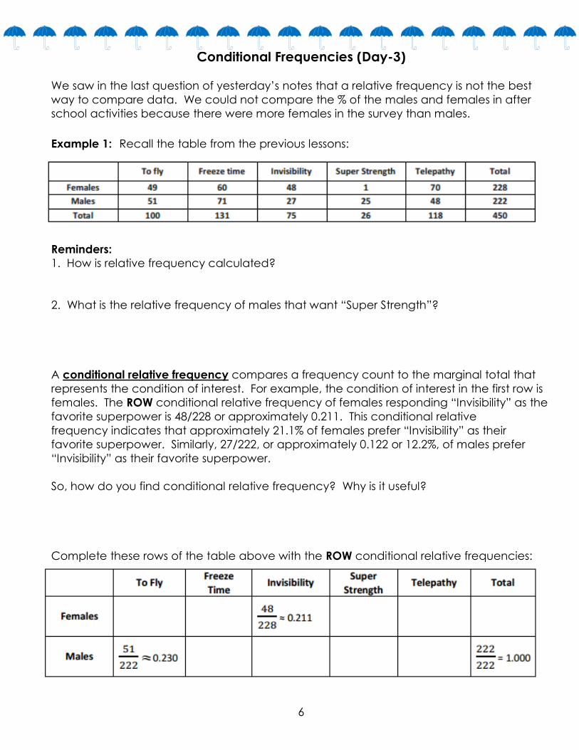
Conditional Frequencies (Day-3)
We saw in the last question of yesterday’s notes that a relative frequency is not the best
way to compare data. We could not compare the % of the males and females in after
school activities because there were more females in the survey than males.
Example 1: Recall the table from the previous lessons:
Reminders:
1. How is relative frequency calculated?
2. What is the relative frequency of males that want “Super Strength”?
A conditional relative frequency compares a frequency count to the marginal total that
represents the condition of interest. For example, the condition of interest in the first row is
females. The ROW conditional relative frequency of females responding “Invisibility” as the
favorite superpower is 48/228 or approximately 0.211. This conditional relative
frequency indicates that approximately 21.1% of females prefer “Invisibility” as their
favorite superpower. Similarly, 27/222, or approximately 0.122 or 12.2%, of males prefer
“Invisibility” as their favorite superpower.
So, how do you find conditional relative frequency? Why is it useful?
Complete these rows of the table above with the ROW conditional relative frequencies:
7
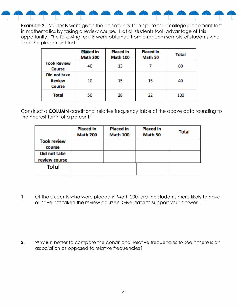
Example 2: Students were given the opportunity to prepare for a college placement test
in mathematics by taking a review course. Not all students took advantage of this
opportunity. The following results were obtained from a random sample of students who
took the placement test:
Construct a COLUMN conditional relative frequency table of the above data rounding to
the nearest tenth of a percent:
1. Of the students who were placed in Math 200, are the students more likely to have
or have not taken the review course? Give data to support your answer.
2. Why is it better to compare the conditional relative frequencies to see if there is an
association as opposed to relative frequencies?
Total

8
Relationships Between Two Numerical Variables: Scatter Plots (Day-4)
A scatter plot is an informative way to display numerical data with two variables. In your
previous work with scatter plots, you’ve seen that the two variables are denoted by _____
and ______, and the scatter plot of the data is a plot of the ____________ data pairs.
Example 1: Looking for Patterns in a Scatter Plot
The National Climate Data Center collects data on weather conditions at various
locations. They classify each day as clear, partly cloudy, or cloudy. Using data taken over
a number of years, they provide data on the following variables:
x = elevation above sea level (in feet)
y = mean number of clear days per year
Here is a scatter plot of the data on elevation
and mean number of clear days.
1. Do you see a pattern in the scatter plot, or does it look like the data points are
scattered? If there is some sort of pattern, what is it?
2. Do you think a straight line would be a good way to describe the relationship between
the mean number of clear days and elevation? Why do you think this?

9
Example 2: Thinking about Linear Relationships
Below are three scatter plots that represent data plots made up of eight observations. The
x and y axis labels have been left off on purpose to make you think of the relationships.
Scatter Plot #1 Scatter Plot #2
Scatter Plot #3
1. If one of these scatter plots represents the relationship between height and weight for
eight adults, which scatter plot do you think it is and why?
2. If one of these scatter plots represents the relationship between height and SAT math
score for eight high school seniors, which scatter plot do you think it is and why?
3. If one of these scatter plots represents the relationship between the weight of a car and
fuel efficiency for eight cars, which scatter plot do you think it is and why?
4. Which of these three scatter plots does not appear to represent a linear relationship?
Explain the reasoning behind your choice.

10
Recall: Name the three types of functions below.
Example 3: Not every relationship is linear.
When a straight line provides a reasonable summary of the relationship between two
numerical variables, we say that the two variables are linearly related or that there is a
linear relationship between the two variables. Take a look at the scatter plots below and
answer the questions that follow.
1. Is there a relationship between number of cell phone calls and age, or does it look like
the data points are scattered?
2. If there is a relationship between number of cell phone calls and age, does the
relationship appear to be linear?

11
3. Is there a relationship between moisture content and frying time, or do the data points
look scattered?
4. If there is a relationship between moisture content and frying time, does the relationship
look linear? Have we seen this shape before?
5. Scatter plot 3 shows data for the prices of bike helmets and the quality ratings of the
helmets (based on a scale that estimates helmet quality). Is there a relationship
between quality rating and price, or are the data points scattered?
6. Can we call the relationship linear? Exponential? Quadratic?

12
Scatter Plots Continued (Day-5)
Not all relationships between two numerical variables are linear. There are many situations
where the pattern in the scatter plot would best be described by a curve. Two types of
functions often used in modeling nonlinear relationships are quadratic and exponential
functions.
Sometimes the pattern in a scatter plot will look like the graph of a quadratic function (with
points falling roughly in the shape of a U that opens up or down), as in the graph below:
Quadratic
In other situations, the pattern in the scatter plot might look like the graphs of exponential
functions that either are upward sloping (Graph 1) or downward sloping (Graph 2):
Exponential Growth Exponential Decay

13
Example 1: Select the correct scatter plot.
1. Which scatter plot above shows data that has…
a. a linear relationship? c. an exponential relationship?
b. a quadratic relationship? d. no relationship?

14
Example 2: Let’s revisit the data on elevation (in feet above sea level) and mean number
of clear days per year. The scatter plot of this data is shown below. The plot also
shows a straight line that can be used to model the relationship between elevation
and mean number of clear days. The equation of this line is y = 83.6 + 0.008x.
1. Should you see more clear days per year in Los Angeles, which is near sea level, or in
Denver, which is known as the mile-high city? Justify your choice by describing the
relationship between elevation and mean number of clear days.
2. One of the cities in the data set was Albany, New York, which has an elevation of
275 feet. If you did not know the mean number of clear days for Albany, what
would you predict this number to be based on the points on the graph?
3. What would you predict for the mean number of clear days in Albany using the
equation of the line?
4. Another city in the data set was Albuquerque, New Mexico. Albuquerque has an
elevation of 5,311 feet. If you did not know the mean number of clear days for
Albuquerque, what would you predict this number to be based on the points on the
graph? Using the equation of the line?

15
Example 3: A Quadratic Model
Farmers sometimes use fertilizers to increase crop yield, but often wonder just how much
fertilizer they should use. The data shown in the scatter plot below are from a study of the
effect of fertilizer on the yield of corn.
1. Why do you think the crop yield eventually decreased as the amount of fertilizer
increased?
2. The equation that models crop yield after being fertilized is y = 4.7 + 0.05x – 0.0001x2,
where x represents the amount of fertilizer and y represents corn yield. Use this
quadratic equation to complete the following table. Then add these points to the
graph above and sketch a curve through the added points.
3. Based on this quadratic model you just sketched, how much fertilizer per 10,000
square meters would you recommend that a farmer use on his cornfields in order to
maximize crop yield?

16
Modeling Relationships with a Line: Residuals (Day 6)
Example 1: Kendra likes to watch crime scene investigation shows on television. She
watched a show where investigators used a shoe print to help identify a suspect in a
case. She questioned how possible it is to predict someone’s height is from his shoe
print. To investigate, she collected data on shoe length (in inches) and height (in
inches) from 10 adult men. Her data appear in the table and scatter plot below.
1. Above is also the same scatter plot of the data with two linear models; y = 130 – 5x
and y = 25.3 + 3.66x. Which of these two models does a better job of describing
how shoe length (x) and height (y) are related? Explain your choice.
2. One of the men in the sample has a shoe length of 11.8 inches and a height of 71
inches. Circle the point in the scatter plot in that represents this man. What do these
equations predict the height of a man with 11.8 inch shoe length to be?
3. Do we now think that y = 130 – 5x is the better model for the data?

17
Example 2: Residuals
One way to think about how useful a line is for describing a relationship between two
variables is to use the line to predict the y-values for the points in the scatter plot. These
predicted values could then be compared to the actual y-values. For example, the first
data point in the table represents a man with a shoe length of 12.6 inches and height of
74 inches. If you use the line y = 25.3 + 3.66x to predict this man’s height, you would get:
y = 25.3 + 3.66x
= 25.3 + 3.66(12.6)
= 71.42 inches
Because his actual height was 74 inches, you can calculate the prediction error by
subtracting the predicted value from the actual value. This prediction error is called a
residual. For the first data point, the residual is calculated as follows:
Residual = actual y value – predicted y value
= 74 – 71.42
= 2.58 inches
1. For the line y = 25.3 + 3.66x, calculate the missing values and complete the table.
2. Why is the residual in the first row positive, and the residual in the second row
negative?
3. What is the sum of the residuals? Why did you get a number close to zero for this
sum? Does this mean that all of the residuals were close to 0?

18
Exercise 3: Least-Squares Line (Line of Best Fit)
When you use a line to describe the relationship between two numerical variables, the
best line is the line that makes the residuals (vertical distances to the line) as small as
possible overall.
1. What will the graph look like if all the residuals are very small?
2. The most common choice for the best line is the line that makes the sum of the
squared residuals as small as possible. Add a column on the right of the table below
and calculate the square of each residual and place the answer in the column.
3. Why do we use the sum of the squared residuals instead of just the sum of the
residuals (without squaring)?
4. What is the sum of the squared residuals from the data above?

19
Modeling Relationships with Lines/Curves: Regression Equations (Day-7)
Regression Line: The line that has a smaller sum of squared residuals for this data set than
any other line is called the least-squares line. This line can also be called the best-fit line,
the line of best fit, or the regression line.
For the shoe-length and height data for the sample of 10 men, the line y = 25.3 + 3.66x is
the least-squares line. No other line would have a smaller sum of squared residuals for this
data set than this line. There are ways to calculate this equation that are very tough.
Fortunately, the calculator can be used to find the equation of the least-squares line.
Example 1:
1. Enter the shoe-length and height data and then use your
calculator to find the equation of the least-squares line. Did
you get y = 25.3 + 3.66x?
2. Assuming that the 10 men in the sample are representative
of adult men in general, what height would you predict for a
man whose shoe length is 12.5 inches?
3. What shoe length would you predict for a man that is 63
inches tall?
4. What are the slope and y-intercept of the regression line? What does the slope mean in
terms of the situation? Why does the y-intercept not make sense in our situation?
Steps to finding a regression line using the GRAPHING CALCULATOR:
1. Hit STAT and then EDIT
2. Enter in your x-values into L1 and your y-values into L2
3. Hit STAT again, then over to CALC
4. Choose #4: LinReg(ax + b) put L1, L2 after this command, then hit ENTER
20
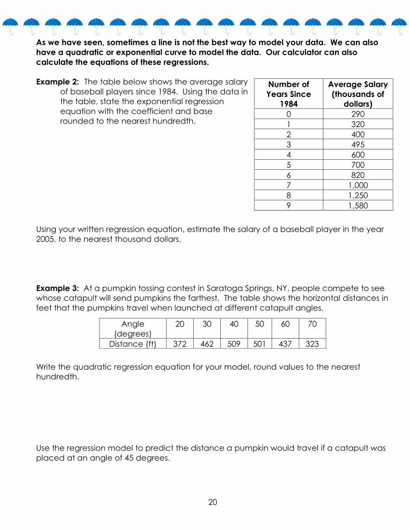
As we have seen, sometimes a line is not the best way to model your data. We can also
have a quadratic or exponential curve to model the data. Our calculator can also
calculate the equations of these regressions.
Example 2: The table below shows the average salary
of baseball players since 1984. Using the data in
the table, state the exponential regression
equation with the coefficient and base
rounded to the nearest hundredth.
Using your written regression equation, estimate the salary of a baseball player in the year
2005, to the nearest thousand dollars.
Example 3: At a pumpkin tossing contest in Saratoga Springs, NY, people compete to see
whose catapult will send pumpkins the farthest. The table shows the horizontal distances in
feet that the pumpkins travel when launched at different catapult angles.
Write the quadratic regression equation for your model, round values to the nearest
hundredth.
Use the regression model to predict the distance a pumpkin would travel if a catapult was
placed at an angle of 45 degrees.
Number of
Years Since
1984
Average Salary
(thousands of
dollars)
0 290
1 320
2 400
3 495
4 600
5 700
6 820
7 1,000
8 1,250
9 1,580
Angle
(degrees)
20 30 40 50 60 70
Distance (ft) 372 462 509 501 437 323

21
Modeling Relationships with a Line: Residuals continued (Day 8)
Exercise 1: The curb weight of a car is the weight of the car without luggage or
passengers. The table below shows the curb weights (in hundreds of pounds) and fuel
efficiencies (in miles per gallon) of five compact cars.
1. Calculate the least-squares line (regression
equation) for the following data given “x” is the curb
weight (in hundreds of lbs.) and “y” is the fuel
efficiency. Round all coefficients to the nearest
hundredth.
2. To the right is the scatter plot of the data
with the least-squares line shown. Draw in 5
lines to represent the residuals for the 5 data
plots.
3. Roughly guess the residuals for each of
the five points.
4. Now use the least-squares line (regression equation) to determine the exact residuals.
5. Suppose that a car has a curb weight (in hundreds of pounds) of 31.
a. What does the least-squares line predict for the fuel efficiency of this car?
b. Would you be surprised if the actual fuel efficiency of this car was 29 miles per
gallon? Explain your answer.

22
Example 2: Making a residual plot.
It is often useful to make a graph of the residuals, called a residual plot. You will make the
residual plot for the compact car data set. Plot the original x-variable (curb weight in this
case) on the horizontal axis and the residuals on the vertical axis. For this example, you
need to draw a horizontal axis that goes from 25 to 32 and a vertical axis with a scale that
includes the values of the residuals that you calculated.
1. Describe in words what the plotted point (25.33, 3.1) means.
2. Complete the rest of the residual plot.
3. How does the pattern of the points in the residual plot relate to pattern in the original
scatter plot? Looking at the original scatter plot, could you have known what the
pattern in the residual plot would be?

23
Analyzing Residuals Plots (Day-9)
What do residual plots tell us?
But why is a residual plot important?
If a pattern arises in the residual plot, the original data does not have a linear
pattern!
If the points seem to be randomly scattered in a residual plot, the original
data has a linear relationship!
Exercise 3: Linear Relationship or Not??
1. On each of the three scatter plots, sketch the least-squares line. Does the residual
plot for each make sense based on your sketch?
2. Which residual plots look like they have a pattern to them? What does this mean?
3. Which residual plot(s) look like they have no pattern? What does this mean?

24
Exercise 4: Why not just look at the scatter plot of the original data set? Why was the
residual plot necessary?
The temperature (in degrees Fahrenheit) was measured at various altitudes (in thousands
of feet) above Los Angeles.
The scatter plot (below) seems to show a linear (straight line) relationship between these
two quantities. However, look at the residual plot:
There is a clear curve in the residual plot. So what appeared to be a linear relationship in
the original scatter plot was, in fact, a nonlinear (curved) relationship.
1. If the data does not have a linear model (relationship), what type of relationship
might it have?
2. Why/how did this residual plot result from the original scatter plot?
25
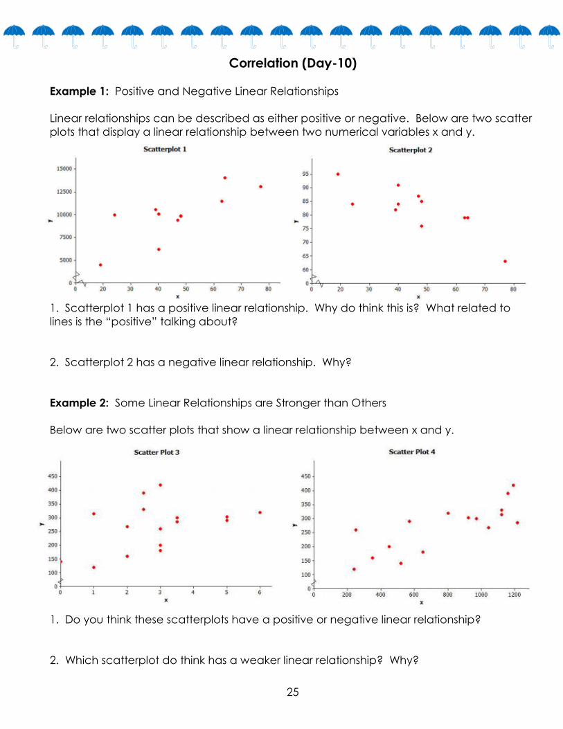
Correlation (Day-10)
Example 1: Positive and Negative Linear Relationships
Linear relationships can be described as either positive or negative. Below are two scatter
plots that display a linear relationship between two numerical variables x and y.
1. Scatterplot 1 has a positive linear relationship. Why do think this is? What related to
lines is the “positive” talking about?
2. Scatterplot 2 has a negative linear relationship. Why?
Example 2: Some Linear Relationships are Stronger than Others
Below are two scatter plots that show a linear relationship between x and y.
1. Do you think these scatterplots have a positive or negative linear relationship?
2. Which scatterplot do think has a weaker linear relationship? Why?

26
The correlation coefficient is a number between −1 and +1 (including −1 and +1) that
measures the strength and direction of a linear relationship. The correlation coefficient is
denoted by the letter 𝒓.
Here are the properties of the correlation coefficient:
The sign of 𝒓 (positive or negative) corresponds to the direction of the linear
relationship.
A value of 𝒓 = +1 indicates a perfect positive linear relationship, with all points in the
scatter plot falling exactly on a straight line.
A value of 𝒓 = −1 indicates a perfect negative linear relationship, with all points in the
scatter plot falling exactly on a straight line.
The closer the value of 𝒓 is to +1 or −1, the stronger the linear relationship.
Example 3: Here is data from a previous lesson. This data represents the shoe length and
heights of 10 men.
1. Find the regression equation (least-squares line).
Round your coefficients to the nearest hundredth.
2. Find the correlation coefficient. How would you
interpret this correlation of this data?
Steps to finding the Correlation Coefficient, r, using the GRAPHING CALCULATOR:
1. Hit 2nd, 0 for the Catalog. Select Diagnostics ON. Press Enter twice.
2. Rest of steps are the same for finding the REGRESSION EQUATION.
3. When you get your data, scroll down to bottom and find your r-value. This is the
Correlation Coefficient.

27
Example 4: Consumer Reports published a study of fast-food items. The table and scatter
plot below display the fat content (in grams) and number of calories per serving for 16 fast-
food items.
1. Based on the scatter plot, do you think that the value of the correlation coefficient
between fat content and calories per serving will be positive or negative? Predict
the correlation coefficient and explain why you made this choice.
2. Find the linear regression equation using the calculator.
3. Find the correlation coefficient in the calculator. Interpret the correlation.
4. Why is it important to know if a relationship is strong or weak?
Causation: The idea that one event causes the other event to happen.
Correlation does not necessarily mean causation.
Which situation describes a situation that is NOT a causal relationship?
(1) The more powerful the microwave the faster the food cooks.
(2) The more miles driven the more gasoline needed.
(3) The rooster crows and the sun rises.
(4) The faster the pace of the runner the quicker the runner finishes.