typography presentation fnl
TRANSCRIPT
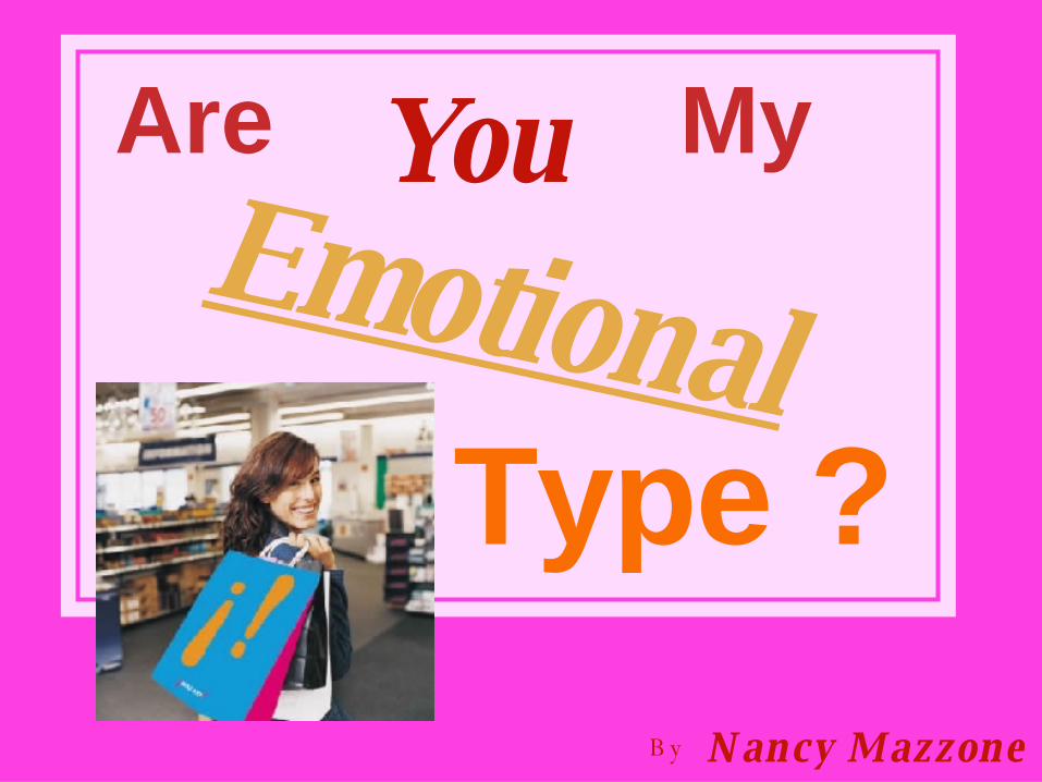
Are
You MyEmotional
Type ?
B y N ancy Mazzone

As children we relate to the world first through images.
Then we are given a set of letters and we learn that when we combine them we can define what we see visually.
As Graphic Designers we push the envelope one step further.
By using specific fonts we can illustrate the emotion behind the words.

What we choose to include or
exclude draws attention to our
Message. The strong, bold, even
lettering in this type is in conflict
with the background.It leaves us
disoriented as if we were
Love struck!
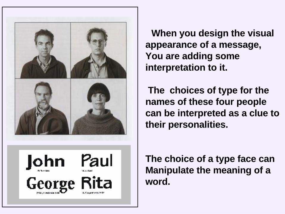
When you design the visualappearance of a message,You are adding some interpretation to it.
The choices of type for the names of these four people can be interpreted as a clue to their personalities.
The choice of a type face canManipulate the meaning of a word.
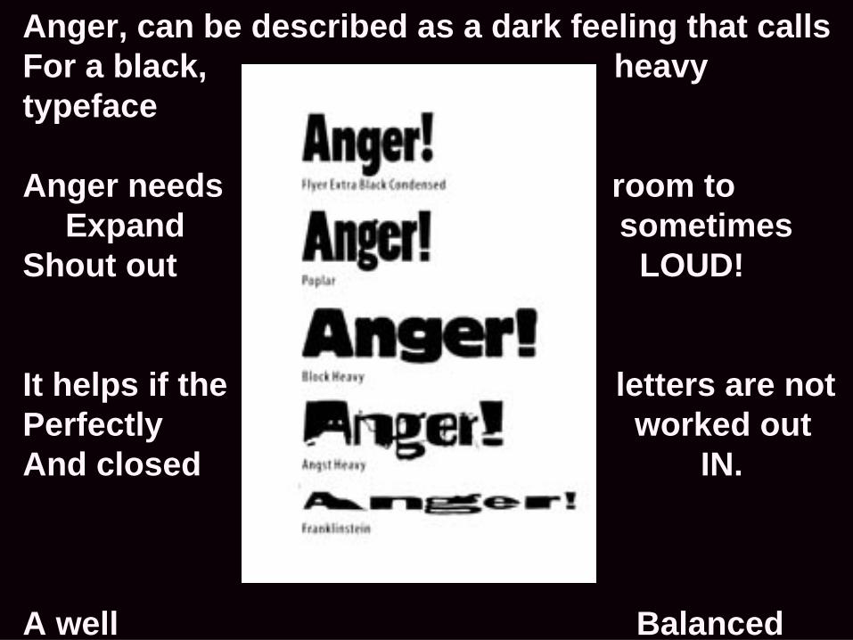
Anger, can be described as a dark feeling that callsFor a black, heavy typeface
Anger needs room toExpand sometimes
Shout out LOUD!
It helps if the letters are notPerfectly worked outAnd closed IN.
A well BalancedUniverse or HELVTICA would not do

Interesting layouts
ATTENTION to the message.
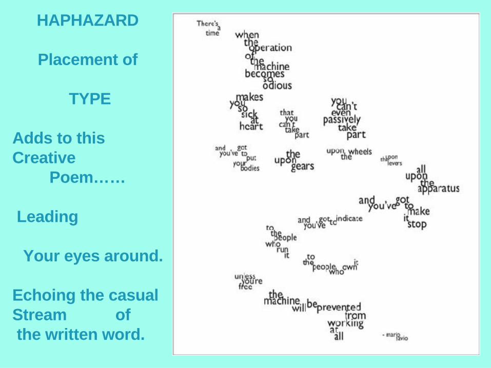
HAPHAZARD
Placement of
TYPE
Adds to this Creative
Poem……
Leading
Your eyes around.
Echoing the casual Stream of the written word.

Clever type treatment reinforces the
Between image
and
words.
EMOTIONALCONNECTION
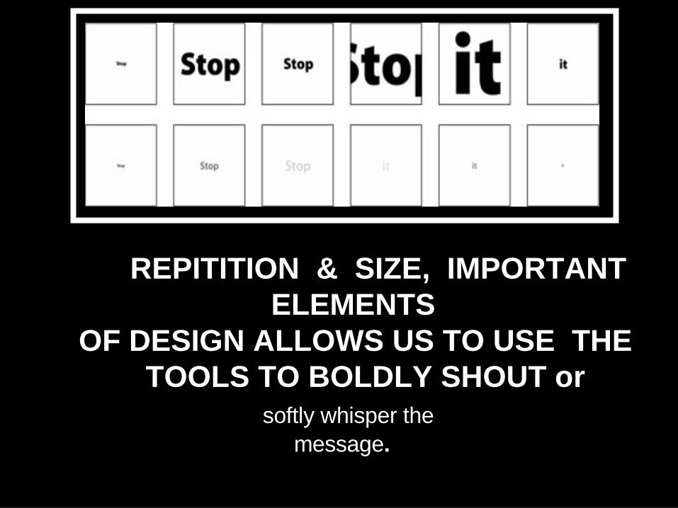
REPITITION & SIZE, IMPORTANT ELEMENTS OF DESIGN ALLOWS US TO USE THE TOOLS TO BOLDLY SHOUT or softly whisper the message.

Different type faces areclassified by theirindividual characteristicsallowing us the choice of being specific incontrolling the emotionsof the viewer.
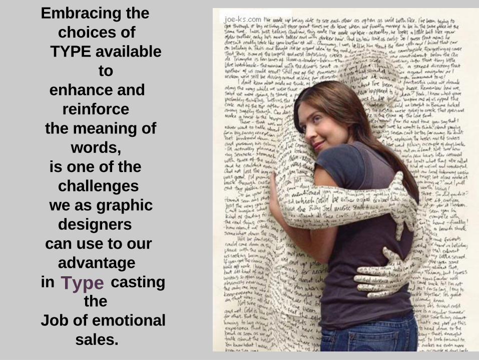
Embracing the choices of
TYPE available to
enhance and reinforce the meaning of words, is one of the challenges we as graphic designers can use to our advantagein casting theJob of emotional sales.
Type

To research this topic further see links below:
www.designingwithtype.com/essays/essayRand.html
http://experiencedynamics.blogs.com/site_search_usability/2004/08/
http://www.creativepro.com/story/feature/17988.html