usability in practice: the tao of screen design jason beres [email protected] @jasonberes
TRANSCRIPT


About Me• Manage the product feature sets at
Infragistics in the .NET, Reporting, UX, Testing, Icon products
• INETA Speakers Bureau, MVP for 8 years• Founder of Florida.NET & New Jersey .NET
User Groups• Author/co-Author of 8 books, latest is
Silverlight 4 Professional, Wrox Press

Agenda• Yin and Yang of Development• Case Study – Office Ribbon• Path to Effective Screens• Patterns + Style Guides Tool
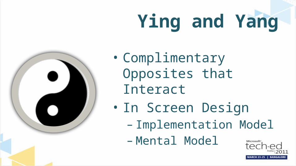
Ying and Yang
• Complimentary Opposites that Interact
• In Screen Design– Implementation Model–Mental Model
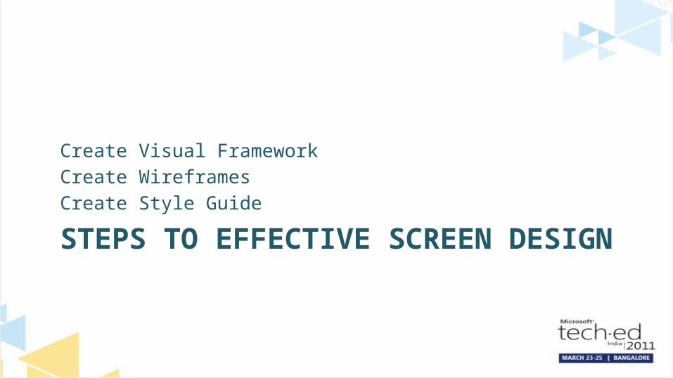
STEPS TO EFFECTIVE SCREEN DESIGN
Create Visual FrameworkCreate WireframesCreate Style Guide

• High Level to Detailed Design• 2 Key Aspects– Navigational Scheme– Persistent Elements
Create a Visual Framework

Create Wireframes• Create a Consistent, Seamless
Design– Elements from screen to screen should
be consistent– Screen should be divided by function
• Overall Design is Easy for the User to Organize Perceptually

Create Style Guides• Document the Framework in a Style
Guide• Formalize the Language and Terms• Should be Specific Enough for Others
to Understand the Goals– Fonts, Font Size, Colors, Color Hue,
Gradients, Object Offsets

NOT SO FAST …And then we’re done?

GETTING CONCRETEScreen Design Process = Art + Science

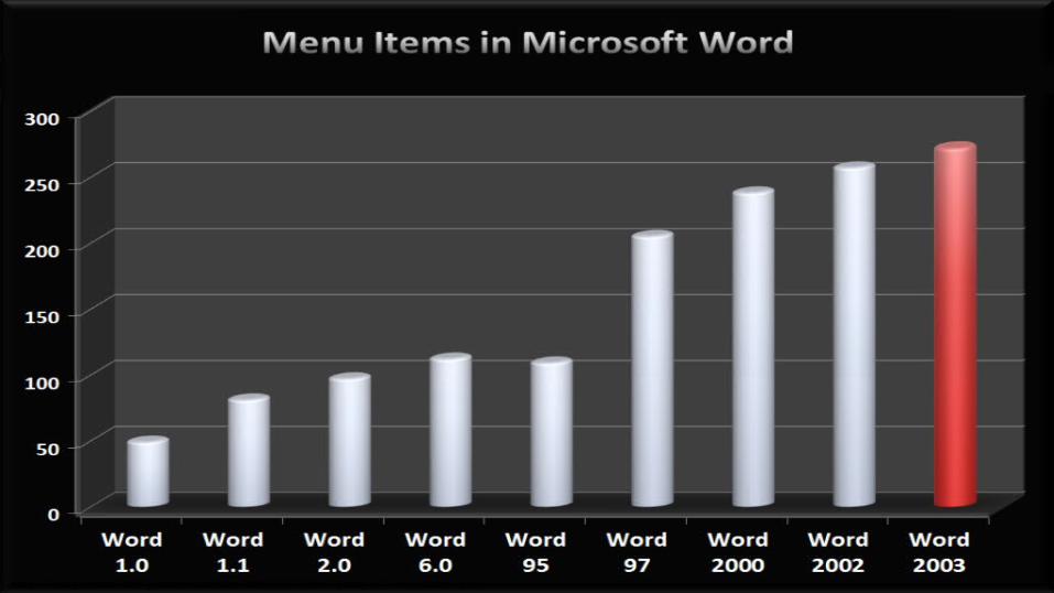
What Do These Have In Common?
• Find out the current number of words• Turn on speech command and control• Create a SharePoint Document Workspace• Print Envelopes• Open the Visual Basic Editor• Turn on hyphenation• Merge the contents of multiple documents• Start a web conference• Tweak AutoCorrect settings
http://blogs.msdn.com/jensenh/archive/2008/03/12/the-story-of-the-ribbon.aspx

They’re all on theWord 2003 Tools menu!

Case Study - Microsoft• Re-Designing the Office UI• Assumptions that customers are using 5%
of the office features• For the COMPLETE story, check out Jensen
Harris’ blog (along with videos, podcast, etc)– http://blogs.msdn.com/jensenh/archive/
2008/03/12/the-story-of-the-ribbon.aspx


http://blogs.msdn.com/jensenh/archive/2008/03/12/the-story-of-the-ribbon.aspx

http://blogs.msdn.com/jensenh/archive/2008/03/12/the-story-of-the-ribbon.aspx

SO WE ENDED UP WITH …

http://blogs.msdn.com/jensenh/archive/2008/03/12/the-story-of-the-ribbon.aspx

HOW DO WE FIX THAT?

Art: User Research• Understanding the Human-Computer Impedance
Mismatch– Interviews– Surveys– Workshops– Observations
• Overall – how do people feel when using the software? What workflows and tasks do they expect?
• What are the existing patterns (if they exist) that you can use?

Prototypes!

Science: The Role of Data• Over 3 billion data sessions collected from
Office users• ~2 million sessions per day• In a 90 day period, 352 million command bar
clicks in Word were tracked• 6000 individual data points were tracked• It couldn’t have been done this without data!
http://blogs.msdn.com/jensenh/archive/2008/03/12/the-story-of-the-ribbon.aspx

Science: Using Data• Which commands do people
use most?• How are commands commonly
sequenced together?• Which commands are accessed
via toolbar, mouse, keyboard?• Where do people fail to find
functionality they’re asking for(in newsgroups, support calls,etc.)?


Case Study Summary• Like it or not, Microsoft did an
enormous about of research on the Ribbon UI
• Change is not easy – but you need to look at the long term view of your products
• Case Study #2 – Aqua - http://healthcare.codeplex.com

UX – THE PATH TO THE WAY
Feeling of First Love or Boring Day Job?
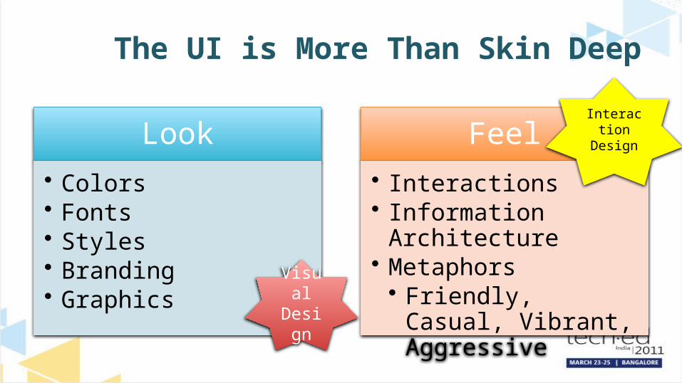
The UI is More Than Skin Deep
Look• Colors• Fonts• Styles• Branding• Graphics
Feel• Interactions• Information Architecture• Metaphors• Friendly, Casual,
Vibrant, AggressiveVisual Design
InteractionDesign

Which Would You Buy?

Cognitive Model
• User has a ‘Major Goal’– Log in– Search
• Do Not Depend on User’s Memory
• Effective Use of Gestalt Principles

SAP Design Guild• Focus on 4 Areas of the Cognitive
Model– Sequence – takes care of flow control– Nesting – takes care of dependencies– Spacing – takes care of readability– Grouping – takes care of togetherness

Effect of Cognitive Process• Recent study on following effective screen
display rules
University of Alberta, Effects of Violating Screen Design Principles of Balance, Unity & Focus on Recall Learning, Study Time & Completion Rates
74%Had a higher completion rate
21%Completed in less time
Visuals got in the way of the cognitive process

HOW CAN YOU GET IT RIGHT?

Elicit the WHAT, WHO,
WHY, WHERE, and WHEN
DESIGN
VALIDATEUNDERSTAND
Build
Build
Build
Build
Build Build
Development
Build
Use an Iterative, Agile Interaction Design Process

11 KEYS TO BETTER SCREENS

#0 – Refer to Known Patterns
• http://www.quince.infragistics.com
• http://www.welie.com
• http://developer.yahoo.com/ypatterns/

#1 - Layout
• Find Successful Patterns– Outlook style for business apps?– Emphasize an Orderly, Clutter Free Design– Create Groups or Grids – Visual Units

#2 - Screen Consistency• Screens Must Maintain Familiarity– Look to Master Page concepts– Use Same Terminology on Screens– Organize Tasks Consistently– Present Results Consistently– Use Controls / User Controls

#3 - Content Flow• Maintain Locale Consistency

#4 – Good Dialog
• Create a Good Conversational Dialog • Be Informative and Forgiving

#5 – Logical Navigation
Give Waypoints so users know where to go or go back to
Where am I?
Where have I come from?
What’s next?

#6 – Proper Use of Controls
• Menu – look to Office Ribbon for Menu obfuscation issues
• Treeview – Do not go more than 3 levels deep, too difficult to search
• Tabstrips – Nesting can obfuscate important items
• Tables/Grids – Easy to Read and Scroll, but can become cumbersome – look to Charts to make display more meaningful

#8 – Be Direct
“Straightforward is better than clever.”
http://blogs.msdn.com/jensenh/archive/2008/03/12/the-story-of-the-ribbon.aspx

#9 – Stick to the Mental Model
• A Button Should Click• A Checkbox Should Check• A Scrollbar Should Scroll

#10 – Visual Design Should Support Information Architecture

Review• #0 – Refer to Known Patterns• #1 - Layout• #2 - Screen Consistency• #3 - Content Flow• #4 – Good Dialog• #5 – Logical Navigation• #6 – Proper Use of Controls• #8 – Be Direct• #9 – Stick to the Mental Model • #10 – Visual Design Should Support Information Architecture

WRAP UP

Summary
• Follow a process to get to the right answer - UX process to determine visual framework, wireframes, style guides
• Look to successful case studies on UX (Office Ribbon, Aqua)
• Interaction Design should guide the Visual Design– It’s not about the Art, it’s about the Usability (plus some beauty)
• Look to Patterns for answers• Refer to the 11 Tips on Screen Design while searching
for patterns (http://quince.infragistics.com)

Resources
• Tao of Screen Design - http://msdn.microsoft.com/en-us/magazine/ee413547.aspx
• http://www.quince.infragistics.com• http://community.infragistics.com/ux• http://blogs.msdn.com/jensenh/default.aspx• http://www.sapdesignguild.org/index1.asp• http://lukew.com/ff/• http://healthcare.codeplex.com• http://www.demystifyingusability.com/2004/12/
eyetracking_stu.html?cid=25652258#comment-6a00d8345a66bf69e200d83500d1da69e2
