visual analysis #2
TRANSCRIPT

Running Head: VISUAL ANALYSIS OF THE BETTER HOMES & GARDENS BROCHURE
1
Visual Analysis of the Gary Greene Better Homes and Gardens Tri-fold Brochure
Jelilat Adesiyan
University of Houston-Downtown
November 05, 2014

VISUAL ANALYSIS OF THE BETTER HOMES & GARDENS BROCHURE 2
Introduction
In this paper, I will be analyzing the Gary Greene better homes and gardens real estate tri-fold brochure. The artifact is
created in a three page portrait format. The front and back of each page is utilized in order to serve its rhetorical concerns to its
fullest degree (i.e. it has six pages in total). The brochure uses a variety of colors and images (sign, representational, and
informational), data displays, and free standing text in an attempt to fulfill its rhetorical concerns (See Figure 1 & 2).
Figure 1: Inside Panel of the brochure
Figure 2: Outside Panel of the brochure
VISUAL ANALYSIS OF THE BETTER HOMES & GARDENS BROCHURE 3
Rhetorical Background
The brochure’s purpose is to persuade a potential seller to contract their home to Gary
Greene’s real estate company for sale. The title of the brochure is “Strategies to Get Your Home
Sold”. It is intended to be used as a fully informational reference booklet that can be carried
around. This brochure is for advertising and informational purposes only.
Method
I will assess the brochure in order to prove the overall ineffectiveness of the visual
design. In analyzing the brochure, I will discuss five of the design principles it utilizes, images,
color and the four levels of design it employs. The four levels of design are the intra, inter, extra
and supra levels. Each level has three coding modes. The presence of design elements
contributes to the weight of the coding modes present in each level of design. The five design
principles I will be utilizing are gestalt principles of similarity, closure, and the support design
principles of movement, rhythm, and repetition.
Thesis
It is my opinion that when the brochure pages are assessed in respect to the images, color,
design principles and levels of design present in it, the brochure’s overall visual design will be
found ineffective. One of the reasons I find the visual design ineffective is the lack of a
consistent theme. The front page, using images and color creates a theme suggestive of a sedate
earthy tone. The front page of a document usually sets the tone for the whole document,
especially in the cases of small documents like a brochure. The rest of the brochure pages deviate
from the sedate earthy tone created by the introductory page. There are mismatched font
treatments present in the same section. The brochure also uses several font types and treatment.

VISUAL ANALYSIS OF THE BETTER HOMES & GARDENS BROCHURE 4
As I’ll later fully develop, on an intra, inter, extra, and supra level, the document also needs to be
further improved. The presence of these inconsistences lead me to conclude that the brochure has
an overall ineffective visual design.
The importance of Design Principles
Evans & Thomas (2013) define design principles as “a structure for combining the
common elements of design by serving as the relationship between the parts or design elements
involved” (p. 4). Design elements are the functioning parts of a document’s visual design.
Design principles unite the various design elements on a given page and assigns them a purpose.
Design elements are already working on a document anyway, but design principles ascribe them
a stated purpose.
Naming design principles bestows upon it its place as an important part of visual design.
People who do not know the name of a design principle still use it; but by naming the effect of
the design elements on a page, that is calling it a design principle, they acknowledge that the
design elements are working together as a cohesive unit rather than as a lone wolf. Kimball
(2013) refers to design principles as lore. He defines lore as “anecdotal, implicit, and often using
design principles and claim to rely only on instinct and artistic sensibilities (p.4). Some study
participants stated that did not use design principles and yet as the study progressed, Kimball
(2013) was able to collect information regarding the terms that designers often used to refer to
their design process. These terms were terms associated with visual design. This indeed proves
that whether designers know it or not, they exercise the functions of various design principles
when using various design elements. Now that it has been established that design principles are

VISUAL ANALYSIS OF THE BETTER HOMES & GARDENS BROCHURE 5
being used in every given document whether unknowingly or knowingly, it stands to reason that
they must be an important part of document design.
Design principles are very important because they affect the internal and external
relationships of a document design. Designers make decisions every time they include a design
element on a page. They question whether their design decisions are the right decisions for the
rhetorical situation at hand. In the case of the Gary Greene tri-fold brochure, the rhetorical
situation demands that the design take into account the audience, context and purpose of the
brochure. That is, who the tri-fold brochure is intended for, how it is going to be used and what it
is going to be used for. Without the use of design principles, a designer would not know how to
organize the design elements to best suit the rhetorical situation.
Defining Design Terminology
There are several design principles in use in the creation of the brochure. However, I
chose to focus on the gestalt principles of similarity, closure, and the support design principles of
movement, rhythm, repetition. I believe that the similarity, closure, movement, rhythm, and
repetition utilized in the visual design of the brochure can be further improved. In order to define
the gestalt design principles I will be assessing within the document, I chose to reference Fitz &
Moore’s (1993) definition. They are as followed;
o Similarity: “[…] suggests that units that resemble each other in shape, size, color and/or
direction will be seen together as a homogenous grouping” (n.p).
o Closure: “refers to the “closed areas of a document that are self-sustaining and stable
organizations” (n.p).

VISUAL ANALYSIS OF THE BETTER HOMES & GARDENS BROCHURE 6
In order to define the support design principles, I will be referencing the definitions put
forth by Evans & Thomas (2013). They are as follows;
o Movement: The “creation of implied direction and rhythmic path with the placement
elements as manifested through the eye of the viewer” (p. 14).
o Rhythm: “an alternating repetition of shape and space, or a planned movement of
elements in a composition” (p.14).
o Repetition: “a pattern of related or juxtaposed elements” (p.15).
Several elements are also utilized in the visual design of the brochure. Design elements
such as shape, line, size, space, type, value, and color contribute to the composition of the Gestalt
and support principles. These principles then contribute to the ineffectiveness of the visual
design of the tri-fold brochure as a whole.
As stated earlier, the levels of designs for examining visual language are the intra, inter,
extra and supra levels. Kostelnick & Roberts (2011) refer to the first two levels, the intra and
inter levels, as levels that have to do with text design (p. 81). In order to define these levels, I
will associate them with their use in the brochure. They are as follows;
o Intra: In the brochure, the intra consists of the punctuation marks, the type styles and
sizes, as well as the treatment of the characters present. Were they bolded, italicize, or
bolded and italicized? (p. 81).
o Inter: The inter level in the brochure, deals with the numbering system, the headings, and
the spacing distribution of words (p. 81).
o Extra: The extra level has to do with non-textual elements which in the Gary Greene tri-
fold brochure consists of the horizontal bar chart, the front page image, the home listing

VISUAL ANALYSIS OF THE BETTER HOMES & GARDENS BROCHURE 7
distribution chart, the multi media exposure magazine images, the CARTUS logo, the
guarantee contract image, the flower chart, the social media icons, as well as the image of
the map on the back page. (p. 81).
o Supra: The supra level “refers to the large-scale design” of the tri-fold brochure such as
the orientation of the tri-fold brochure, placement of data displays and pictures, the page
size and thickness (p. 81).
Each design level has three coding modes, textual, spatial and graphic. Kostelnick & Roberts
(2011) define coding modes as the “raw materials of design, […] –the words and numbers,
the graphic elements (lines, texture, shading etc.), and the spatial positioning of the elements
on a page “(p. 81).
There brochure also uses the three types of images. There are three categories of images,
representational imagery, informational imagery and signs. Evans & Thomas (2013) define
them as follows;
o Representational images: Images that “replicate the real world in a descriptive
manner using objects that are defined and are namable referents to the real world (p.
309).
o Informational imagery: Images that “guide and inform people in situations where
words do not do an adequate job” (p. 110).
o Signs or icons: “images or words that have been stripped down to their simplest form
in order to emphasize its most salient points” (Evans & Thomas, 2013, p. 103).
In the following pages, I will be analyzing the document using these terminologies.
VISUAL ANALYSIS OF THE BETTER HOMES & GARDENS BROCHURE 8
Analysis
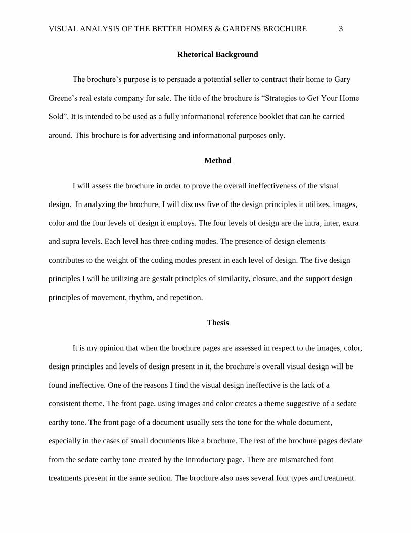
The images used in the brochure come across as ineffective due to the deviation of theme
from the established pattern. The brochure utilizes the three types of images in an attempt to
create an effective visual design. Images are a persuasive tool and in a brochure like this can set
the tone of the document. It can also dictate the manner in which the document information will
be received by the audience. Images function on the extra plane on the levels of design. In
regards to the representational images, the brochure uses three to make referents to the real world
(See Figure 3 below).
Figure 3: the three representational images

VISUAL ANALYSIS OF THE BETTER HOMES & GARDENS BROCHURE 9
The front page employs a representational image that should supposedly set the tone of
the entire document (See Figure 4 below). The front page is an important part of a document
because it can set the tone of the entire document, and using a representational image like the one
below can further that impression.
The front page pictured above is an inviting representational image whose message might be
familiar to the audience. The image uses the ‘realness’ in an attempt to convince the audience
that what they’re seeing could be a possibility for them if they give their business to the Gary
Greene Company. As Evans & Thomas (2013) write, “the realism in a representational image is
what helps to convince the audience members that what they are seeing is or could be within the
Figure 4: Front page of brochure with inviting representational image

VISUAL ANALYSIS OF THE BETTER HOMES & GARDENS BROCHURE 10
realm of their experience” (p. 90). Representational images because of their realism can be used
to elicit emotional responses in the audience. The image above is supposed to evoke in the
audience a feeling of companionship and trust, not only between the couple, but between the
couple & the Gary Greene real estate company. This front page seems to stand alone in its
message when viewed with the document as a whole. The colors of the fonts that accompany the
image also work in tandem to send this message to the audience.
Color, like images, functions on the extra plane of design levels. Color is important in
design because it increases the emotional response of the audience. It can make them happy, sad,
angry, nostalgic, and can present the mood that should accompany a rhetorical situation when
used in conjunction with other elements and principles. As Evans & Thomas (2013) write, color
“heightens a viewer’s perception and intensifies emotional and psychological reactions” (p .123).
Certain colors can create certain moods, and when a designer understands the power of a certain
color, the use of that color can intensify the purpose of a rhetorical situation. “Color creates
mood, enhances content, composition and communication” (Evans & Thomas, 2013, p. 162).
Color can give a composition a stronger voice.
Judging from the colors brown, green and yellow from figure 4, the theme is supposed to
be earthy and natural. Green is supposed to represent growth, yellow sunlight and brown the
earth. With the conjunction of the Greene present in the name of the company, a lush
environment that represents growth is expected (Evans & Thomas, 2013, p. 149-150). What isn’t
signified nor expected based on the use of the establishing colors from the front page is a tropical
theme. The next page of the brochure uses colors that don’t match the initially established mild
and earthy tones. The colors used in the subsequent pages are tropical colors (See Figure 5
below).

VISUAL ANALYSIS OF THE BETTER HOMES & GARDENS BROCHURE 11
Figure 5: The blue, green and orange color variations
This is quite different from the mild and earthy tone of the front page. Tropical colors are
colors that invite the audience to think of calm and bright beaches. The variations of blue, orange
and green used in the above image seem to perpetuate that idea. The repetition of the colors used
in the front page is expected, what is not is the introduction of the new colors; turquoise blue,
orange and lime green. The introduction of these new colors violates the support principle of
repetition. The orange color is only used twice later but the lime green is used for numbering
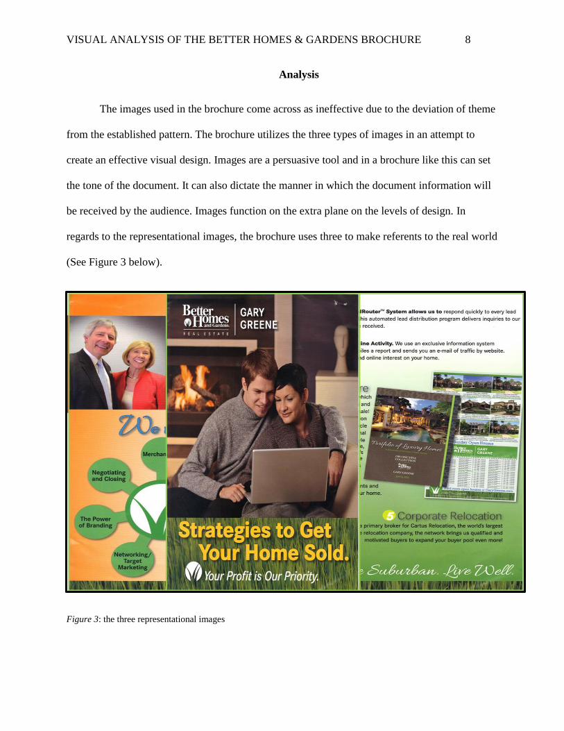
purposes as well as once more to color a character with a huge font (See Figure 6 below). The
yellow highlight (color) is also introduced later in the brochure (See Figure 6 also).
VISUAL ANALYSIS OF THE BETTER HOMES & GARDENS BROCHURE 12
Figure 6: Repetition of the lime green color & the introduction of the yellow highlight (color)
The introduction of the yellow highlight color, a color different from the yellow of the
front page contributes to the violation of the repetition principle. This contributes in part to the
overall ineffectiveness of the visual design of the brochure.
The numerous amount of types used in the brochure also renders it visually ineffective.
On the intra level of the brochure, the type style is on the textual sublevel, the size of the
documents and the space taken up by the characters are on the spatial sublevel while the
treatment of the fonts operate on the graphic level. There are a minimum of three fonts used in
the brochure (See Figure 7 & 8 below). The characters are either bolded, regular or italicized.
Due to the treatment of the characters, it is hard to tell precisely how many fonts are used in this
document. This uncertainty also contributes to the ineffectiveness of the brochure.

VISUAL ANALYSIS OF THE BETTER HOMES & GARDENS BROCHURE 13
Figure 7: The use of various front treatments on a page
In the figure above, at first glance, it appears as if a variety of fonts have been used. The colors
are all different. In this page alone, there are different shades of green, tinted orange and orange,
black, and turquoise blue. If one used the color pyramid to choose a color palette, only two
colors at a time would pop up. The color pyramid is a color system that can assist in the creation
of a color scheme (Evans & Thomas, 2013, p. 129). In the figure below, the highlighted
characters have also been treated in a different manner from the previously established character

VISUAL ANALYSIS OF THE BETTER HOMES & GARDENS BROCHURE 14
treatment style.
Figure 8: Further use of various front treatments in the brochure
The first image of the three images has a different sized font and is colored lime-green. The
second image has a different font and is colored yellow while the third image has a different
color, font, and is also italicized. This gives the document a cluttered look and violates the gestalt
principle of similarity. The middle image which actually functions as the front page seems to be
widely different in theme due to the color and size of image used. The numerous amount of types
and treatment in the brochure altogether reduces its visually ineffectiveness.
Another image category used in the brochure is that of the informational category. The
brochure uses charts and maps to display data. There are two charts and one map present (See
Figure 9 below).

VISUAL ANALYSIS OF THE BETTER HOMES & GARDENS BROCHURE 15
Figure 9: Informational images present
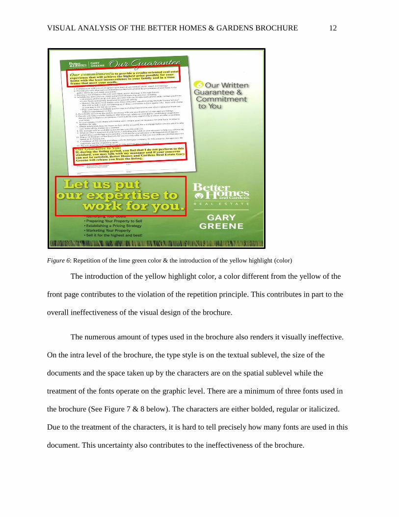
The diagrammatic illustration used in the second page of the brochure detracts from the
visual ineffectiveness. The first informational imagery is a horizontal cloister bar that instead of
having a y or x axis just has percentages. When an expectant customer opens the brochure for the
first time, the first thing seen is the diagrammatic rendering of the bars that illustrate the
percentages of the information sources buyers use to find a home. When read on its own, it is
self-sustaining. When the audience moves on to the first numbered item, due to the placement
and title of the first numbered item, a relationship is immediately visualized. Whereas, based on
the placement and intellectual task that the brochure attempts to disseminate, the relationship is
not the one the reader would imagine. One can’t help but view the first numbered item in respect
to its intellectual task because of its highly visual look and that’s why its intellectual value must
VISUAL ANALYSIS OF THE BETTER HOMES & GARDENS BROCHURE 16
be acknowledged as part of the visual analysis process. If the section with the diagrammatic
illustration is moved to beneath the first numbered item and above the second chart, and is
enclosed with a border, (maybe not even a border since the color also delineates it from the
numbered item) the rhetorical situation will be further served and proper movement will be
established (See Figure 8 & 9).
Figure 9: Disconnected relationship between number item and “How we promote your home” section
Evans & Thomas (2013) refer to movement as the “creation of implied direction and
rhythmic path with the placement elements as manifested through the eye of the viewer” (p. 14).
In figure 8, the implied direction is from the top to the side then to the bottom of the page. This
direction is implied based on the brightness of the color of the diagrammatical illustration,
because the color is the first element to draw the viewer’s eye. It is then followed by the
numbering which is further highlighted with the use of the bright lime green color. Although,

VISUAL ANALYSIS OF THE BETTER HOMES & GARDENS BROCHURE 17
based on the intellectual task at hand, the number ‘1’ should have come first. The number ‘1’
itself implies hierarchy and dominance. When items are numbered, people expect to see number
1 on top rather than above the middle of the page unless there is preceding information needed.
In this case, I believe that the number ‘1’ could have stood first rather than to have been
preceded by bar especially with the title being ‘How we promote your home’, Not ‘how homes
are usually promoted’ or some other variation saying the same thing.
On the Inter level of design is the numbering system of the booklet. Graphically, the
numbers all have the same font and color treatment. This numbering system creates expectations.
On a textual, spatial and graphical coding level, these expectations create a rhythm for the
document (See figure 10 below).
Figure 10: The consistent numbering style and font treatment
VISUAL ANALYSIS OF THE BETTER HOMES & GARDENS BROCHURE 18
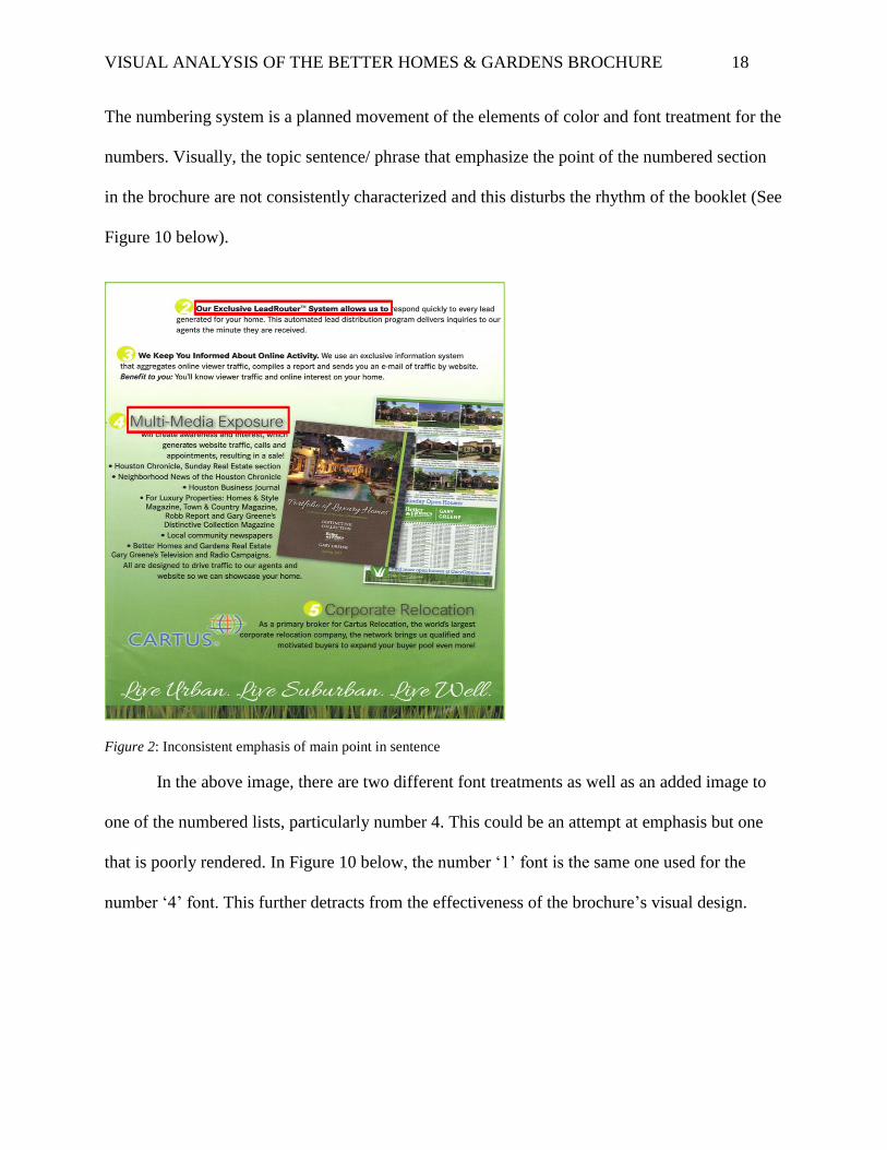
The numbering system is a planned movement of the elements of color and font treatment for the
numbers. Visually, the topic sentence/ phrase that emphasize the point of the numbered section
in the brochure are not consistently characterized and this disturbs the rhythm of the booklet (See
Figure 10 below).
Figure 2: Inconsistent emphasis of main point in sentence
In the above image, there are two different font treatments as well as an added image to
one of the numbered lists, particularly number 4. This could be an attempt at emphasis but one
that is poorly rendered. In Figure 10 below, the number ‘1’ font is the same one used for the
number ‘4’ font. This further detracts from the effectiveness of the brochure’s visual design.
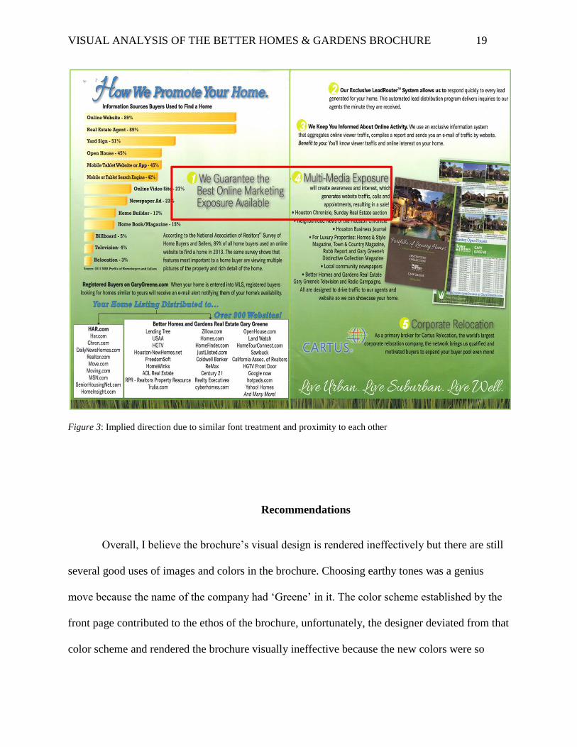
VISUAL ANALYSIS OF THE BETTER HOMES & GARDENS BROCHURE 19
Figure 3: Implied direction due to similar font treatment and proximity to each other
Recommendations
Overall, I believe the brochure’s visual design is rendered ineffectively but there are still
several good uses of images and colors in the brochure. Choosing earthy tones was a genius
move because the name of the company had ‘Greene’ in it. The color scheme established by the
front page contributed to the ethos of the brochure, unfortunately, the designer deviated from that
color scheme and rendered the brochure visually ineffective because the new colors were so

VISUAL ANALYSIS OF THE BETTER HOMES & GARDENS BROCHURE 20
different from what was expected due to earthy nature of the front page. Images already give
emphasis in this case especially because it is the first and only image on the page. In order to
keep consistency, one of either font treatments should have been chosen. Choosing one font
treatment would have improved consistency and created repetition as well as improved the
implied direction of the viewer. Based on the position and treatment of the number ‘4’ item and
its close proximity to the number ‘1’ item, the viewer’s eye is likely to follow that implied
direction from number ‘1’ straight to ‘4’rather than the ones implied by the order of the numbers
from 1 to 4. This further contributes to overall ineffectiveness of the visual design of the
brochure. As implied earlier, the diagrammatic illustration that depicted the percentages of the
information sources buyers use to find a home is misleading. It is only misleading, especially at
first glance, because it has some of the characteristics of a horizontal cloister bar. The lowest
percentage possible, 0%, is represented by the lightest of tints with the color becoming more
saturated in conjunction with the increase in percentage. Its persuasive power would be better
utilized with better closure and movement. Overall, a consistent type font and treatment and
better use of color could improve the effectiveness artifact’s visual design.
Conclusion
In conclusion, the brochure made of good use of signs and icons, the third image
category. In this booklet, social media company logos are used to signify to the audience that the
real estate company has an online presence (See Figure 12 below).

VISUAL ANALYSIS OF THE BETTER HOMES & GARDENS BROCHURE 21
Figure 12: Social media icons that signify social media presence
These icons are understood globally as social media icons. Using them in conjunction
with the written links not only informed potential customers of the sites in which the real estate
company has an online presence, it also functioned as an immediate signifier to the audience.
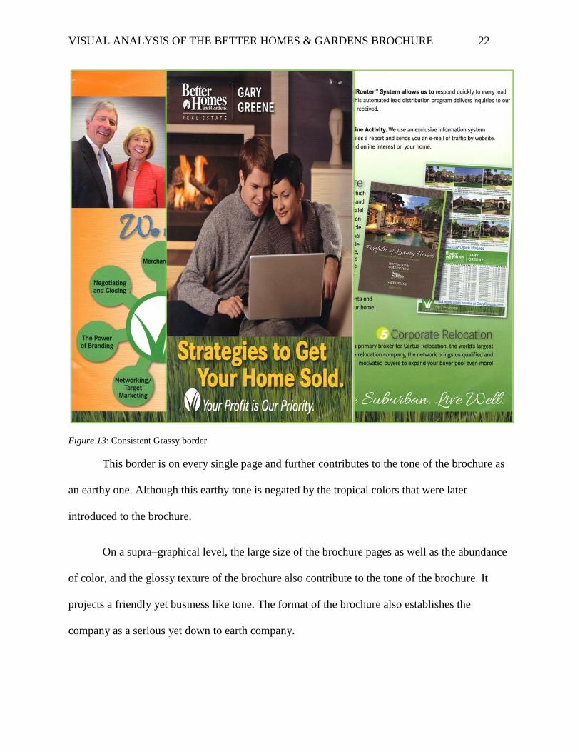
On a supra level, the brochure functioned effectively, all the pages have the same border,
one of a grassy nature (See figure 13 below).
VISUAL ANALYSIS OF THE BETTER HOMES & GARDENS BROCHURE 22
Figure 13: Consistent Grassy border
This border is on every single page and further contributes to the tone of the brochure as
an earthy one. Although this earthy tone is negated by the tropical colors that were later
introduced to the brochure.
On a supra–graphical level, the large size of the brochure pages as well as the abundance
of color, and the glossy texture of the brochure also contribute to the tone of the brochure. It
projects a friendly yet business like tone. The format of the brochure also establishes the
company as a serious yet down to earth company.
VISUAL ANALYSIS OF THE BETTER HOMES & GARDENS BROCHURE 23
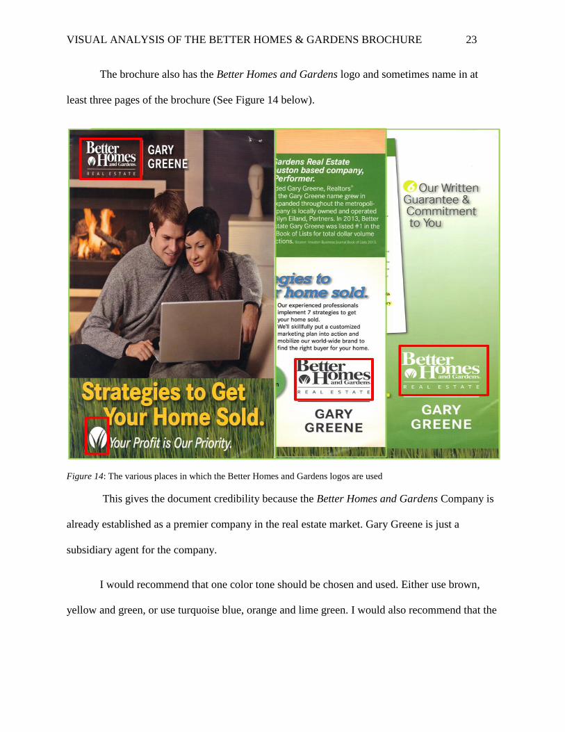
The brochure also has the Better Homes and Gardens logo and sometimes name in at
least three pages of the brochure (See Figure 14 below).
Figure 14: The various places in which the Better Homes and Gardens logos are used
This gives the document credibility because the Better Homes and Gardens Company is
already established as a premier company in the real estate market. Gary Greene is just a
subsidiary agent for the company.
I would recommend that one color tone should be chosen and used. Either use brown,
yellow and green, or use turquoise blue, orange and lime green. I would also recommend that the
VISUAL ANALYSIS OF THE BETTER HOMES & GARDENS BROCHURE 24
fonts shouldn’t be treated with quite so many modifications. Either stick with regular and bold or
regular or italics.
Overall, I stand with my initial assessment that the menu’s visual design is ineffective.
There are too many fonts and too many font styles. The color scheme uses too many colors that
have different meanings when used together at the same time. Similar font sizes use different
colors, the introduction of new colors violates the support principle of repetition, and the order of
some information could be improved. I believe that the similarity, closure, movement, rhythm,
and repetition utilized in the visual design of the brochure can be improved.
All in all, the use of images and colors in the brochure contribute heavily to the
ineffectiveness of the brochure’s visual design.

VISUAL ANALYSIS OF THE BETTER HOMES & GARDENS BROCHURE 25
References
Evans, P., & Thomas, M. (2013). Exploring the elements of design (Third ed.). New York:
Cengage Learning.
Gary Greene Better Homes and Gardens Real Estate [Tri-fold brochure]. (n.d.) N.P: n.p
Kimball, M. A. (2013). Visual Design Principles: An Empirical Study of Design Lore. Journal of
Technical Writing and Communication, 43(1), 3-41. Retrieved September 21, 2014,
from http://dx.doi.org/10.2190/TW.43.1.b
Kostelnick, C., & Roberts, D. D. (2011). Designing visual language: strategies for professional
communicators (2nd ed., pp. 3-45). Boston: Longman.
Moore, P., & Fitz, C. (1993). Using Gestalt theory to teach document design and graphics.
Technical Communication Quarterly, 2(4), 389- 410. Retrieved October 23, 2014, from
https://bb.uhd.edu/bbcswebdav/pid-947715-dt-content-rid-6898404_1/xid-6898404_1