w from home the new norm? an bservational s based … · business analytics & statistics...
TRANSCRIPT

IS WORKING FROM HOME THE NEW NORM? ANOBSERVATIONAL STUDY BASED ON A LARGE GEO-TAGGED
COVID-19 TWITTER DATASET
Yunhe FengElectrical Engineering & Computer Science
University of TennesseeKnoxville, TN [email protected]
Wenjun ZhouBusiness Analytics & Statistics
University of TennesseeKnoxville, TN [email protected]
June 16, 2020
ABSTRACT
As the COVID-19 pandemic swept over the world, people discussed facts, expressed opinions, andshared sentiments on social media. Since the reaction to COVID-19 in different locations may be tiedto local cases, government regulations, healthcare resources and socioeconomic factors, we curated alarge geo-tagged Twitter dataset and performed exploratory analysis by location. Specifically, wecollected 650,563 unique geo-tagged tweets across the United States (50 states and Washington,D.C.) covering the date range from January 25 to May 10, 2020. Tweet locations enabled us toconduct region-specific studies such as tweeting volumes and sentiment, sometimes in response tolocal regulations and reported COVID-19 cases. During this period, many people started workingfrom home. The gap between workdays and weekends in hourly tweet volumes inspired us to proposealgorithms to estimate work engagement during the COVID-19 crisis. This paper also summarizesthemes and topics of tweets in our dataset using both social media exclusive tools (i.e., #hashtags,@mentions) and the latent Dirichlet allocation model. We welcome requests for data sharing andconversations for more insights.Dataset link: http://covid19research.site/geo-tagged_twitter_datasets/
Keywords work from home · stay-at-home order · lockdown · reopen · spatiotemporal analysis · Twitter · COVID-19
1 Introduction
The COVID-19 pandemic has had a widespread impact on people’s daily lives all over the globe. According to localpandemic conditions, countries worldwide adopted various containment policies to protect their residents and slowdown the spread of COVID-19. Although countries like Sweden and South Korea did not lock down cities during thepandemic, most of the other countries, including China, Italy, Spain, and India, imposed long and stringent lockdowns torestrict gathering and social contact. Inside the same country, different strategies and timelines were also set by regionsand cities to “flatten the curve” and fight against the COVID-19 crisis. People expressed various opinions, attitudes, andemotions on the same COVID-19 regulations due to local hospital resources, economic statuses, demographics, andmany other geographic factors. Therefore, it is reasonable and necessary to consider the location information wheninvestigating the public reactions to COVID-19.
However, it is challenging to conduct such large-scale studies using traditional surveys and questionnaires. First,regulations and policies proposed and enforced in different regions are time-sensitive and changeable, making it hardto determine when surveys to be conducted and which survey questions to be included. For example, California andTennessee implemented stay-at-home orders on different dates. The initialized plannings and executive orders couldalso be tuned promptly, such as extending lockdowns due to the fast-growing COVID-19 confirmed cases. Traditionalsurveys are not flexible enough for such changes. Second, it is time-consuming and expensive to recruit a large number
arX
iv:2
006.
0858
1v1
[cs
.SI]
15
Jun
2020

A PREPRINT - JUNE 16, 2020
of participants to take surveys, because demographics (especially geographical locations) must be considered. If acomparative spatial study is conducted, it takes more time to recruit participants from multiple regions.
In this paper, we built a large geo-tagged Twitter dataset enabling fine-grained investigations of the public reactions tothe COVID-19 pandemic. More than 170 million English COVID-19 related tweets were harvested from Jan. 25 toMay 10, 2020, among which 650,563 geo-tagged tweets posted within the United States were selected. We took theU.S. as an example to explore the public reactions in different regions because states in the U.S. determined when, how,and what policies and regulations were imposed independently. We first presented an overview of both daily and hourlytweet distributions. Then, state-level and county-level geographic patterns of COVID-19 tweets were illustrated. Wealso proposed algorithms to evaluate work engagement by comparing tweeting behaviors on workdays and weekends.In addition, we extracted the involved popular topics using both social media exclusive tools (i.e., #hashtags and@mentions) and general topic models. Finally, we analyzed public emotions using polarized words and facial emojis.
We summarized the contributions and findings of this paper as follows:
• A large geo-tagged COVID-19 Twitter dataset, containing more than 650,000 tweets collected from Jan. 25 toMay 10 2020 in the United States, was built and published at http://covid19research.site/geo-tagged_twitter_datasets/. We listed tweet IDs for all 50 states and Washington D.C. respectively.
• We profiled geospatial distributions of COVID-19 tweets at multiple location levels, and reported the differencebetween states after normalizing tweet volumes based on COVID-19 case and death numbers. For example, we foundresidents in Oregon, Montana, Texas, and California reacted more intensely to the confirmed cases and deaths thanother states.
• We defined work engagement measurements based on the difference between workdays and weekends by hourlytweeting volumes.
• When studying work engagement patterns after lockdown and reopen, we reporeted a few interesting findings. Forexample, the New York state showed lower work engagement than other states in the first week under stay-at-homeorders. The average hourly work engagement in the afternoon (i.e., from 13:00 to 16:59) in the first week of reopeningwas much higher than the first week of staying at home.
• We also conducted a comprehensive social sentiment analysis via facial emojis to measure the general pub-lic’s emotions on stay-at-home orders, reopening, the first/hundredth/thousandth confirmed cases, and thefirst/hundredth/thousandth deaths. We observed that negative moods dominated the public sentiment over these keyCOVID-19 events, which showed a similar pattern across states.
2 Temporal Patterns
In this section, we first provide an overview of tweet daily distributions, demonstrating when COVID-19 tweets becameviral. Next, the hourly distributions during different periods were illustrated. We then proposed methods to measurework engagement by comparing the hourly tweeting frequencies on workdays and weekends. We also studied theinfluence of COVID-19 regulations, such as stay-at-home orders and reopening, on work engagement.
2.1 Daily Patterns
Figure 1 shows the daily distribution of geo-tagged tweets within the top 10 states with the highest tweet volumes.1We can see that daily tweet volumes generated by different states show similar trends. In fact, we tested statisticalrelationships regarding the daily volumes over time for all pairs of two arbitrary states, and found strong linearcorrelations existed among 93.2% state pairs with a Pearson’s r > 0.8 and p < 0.001.
Based on key dates, we split the entire observation period into the following three phases.
• Phase 1 (from Jan. 25 to Feb. 24, 31 days): people mentioned little about COVID-19 except for a small peak at theend of January.
• Phase 2 (from Feb. 25 to Mar. 14, 19 days): the number of COVID-19 related tweets began to increase quickly. OnFeb. 25 U.S. health officials warned the COVID-19 community spread in America was coming [1]. On March 13,the U.S. declared the national emergency due to COVID-19 [2].
1As mentioned in Appendix A.1, we lost around one-third detailed tweets between Mar. 18 and Apr. 4 due to the corrupted data.But we recorded the daily tweet counts during this period (see the dashed lines in Figure 13). Our crawlers shut down for 8 hours and9 hours On Mar. 27 and Apr. 23 respectively, which caused the data gaps in the two days.
2

A PREPRINT - JUNE 16, 2020
1-25
1-26
1-27
1-28
1-29
1-30
1-31 2-
12-
22-
32-
42-
52-
62-
72-
82-
92-
102-
112-
122-
132-
142-
152-
162-
172-
182-
192-
202-
212-
222-
232-
242-
252-
262-
272-
282-
29 3-1
3-2
3-3
3-4
3-5
3-6
3-7
3-8
3-9
3-10
3-11
3-12
3-13
3-14
3-15
3-16
3-17
3-18
3-19
3-20
3-21
3-22
3-23
3-24
3-25
3-26
3-27
3-28
3-29
3-30
3-31 4-
14-
24-
34-
44-
54-
64-
74-
84-
94-
104-
114-
124-
134-
144-
154-
164-
174-
184-
194-
204-
214-
224-
234-
244-
254-
264-
274-
284-
294-
30 5-1
5-2
5-3
5-4
5-5
5-6
5-7
5-8
5-9
5-10
0
500
1000
1500
2000
2500#
of tw
eets
CATXNYFLPA
ILGAOHNJVA
Figure 1: The daily number of tweets from the top 10 states generating most tweets.
• Phase 3 (from Mar. 15 to May 10, 57 days): people began to adjust to the new normal caused by COVID-19, such asworking from home and city lockdowns.
2.2 Hourly Patterns
For each tweet, we converted the UTC time zone to its local time zone2 according to the state where it was posted. Theaggregated hourly tweeting distributions in different phases are shown in Figure 2. The tweeting behaviors on workdaysand weekends were studied separately because we wanted to figure out how the working status impacted on tweetingpatterns. We colored the tweeting frequency gaps during business hours (8:00-16:59) as green if people tweeted morefrequently on weekends than workdays. Otherwise, the hourly gap is colored as red.
0 1 2 3 4 5 6 7 8 9 10 11 12 13 14 15 16 17 18 19 20 21 22 23
Local hour
1
2
3
4
5
6
7
8
PDF(
%)
weekendworkday
(a) All
0 1 2 3 4 5 6 7 8 9 10 11 12 13 14 15 16 17 18 19 20 21 22 23
Local hour
1
2
3
4
5
6
7
8
PDF(
%)
weekendworkday
(b) Phase 1
0 1 2 3 4 5 6 7 8 9 10 11 12 13 14 15 16 17 18 19 20 21 22 23
Local hour
1
2
3
4
5
6
7
8
PDF(
%)
weekendworkday
(c) Phase 20 1 2 3 4 5 6 7 8 9 10 11 12 13 14 15 16 17 18 19 20 21 22 23
Local hour
1
2
3
4
5
6
7
8
PDF(
%)
weekendworkday
(d) Phase 3
Figure 2: Hourly distribution in three phases. The tweeting frequency gap during business hours are colored as green ifthe hourly frequency on weekends are higher than workdays. Otherwise, the gap is colored as red.
In Phase 1, there existed a tweeting gap from 8:00 to 16:59 between workdays and weekends. The tweeting peakoccurred at 12:00-12:59 on weekends but at 17:00-17:59 on workdays. We think it may be explained by the fact thatpeople engage at work during regular working hours and have little time to post tweets on workdays. But they becomefree to express concerns on COVID-19 on Twitter after work.
The hourly distribution patterns changed in Phase 2 when confirmed COVID-19 cases increased quickly in the UnitedStates. People posted COVID-19 tweets more frequently during business hours than at the same time slots on weekends,indicating COVID-19 had drawn great attention of workers when they were working.
It is interesting to note that a green tweeting gap from 8:00 to 16:59 reappeared in Phase 3 when most people had workedfrom home. These findings motivated us to take advantage of the tweeting frequencies on workdays and weekends toestimate work engagement in the COVID-19 crisis (see Section 4).
3 Geographic Patterns
Twitter users can tag tweets with general locations (e.g. city, neighborhood) or exact GPS locations. In this section, weutilized the two types of tweet locations to explore geographic patterns of COVID-19 tweets at state and county levels.
2For states spanning multiple time zones, we took the time zone covering most areas inside the state. For example, we usedEastern Standard Time (EST) when processing tweets from Michigan because EST is adopted by most of the state. Except forArizona and Hawaii, we switched to Daylight Saving Time (DST) for all states after Mar. 8, 2020
3

A PREPRINT - JUNE 16, 2020
3.1 State-level Distribution
We extracted the state information from both general and exact tweet locations and calculated tweet volume percentagesfor each state, as shown in Figure 3(a). The most populated states, i.e., California, Texas, New York, and Florida,contributed the most tweets. In contrast, less populated states such as Wyoming, Montana, North Dakota, and SouthDakota created the least tweets. We measured the relationship between tweet volumes and populations for all states,and found a strong linear correlation existed (Pearson’s r = 0.977 and p < 0.001).
Then we normalized tweet volumes using state residential populations. Figure 3(b) illustrates Washington D.C. postedthe highest volume of tweets by every 1000 residents, followed by Nevada, New York, California, and Maryland.The rest states demonstrate similar patterns. We think the top ranking of Washington D.C. might be caused by itsfunctionality serving as a political center, where COVID-19 news and policies were spawned.
Unlike state populations, we did not find strong correlations between tweet counts and cumulative confirmed COVID-19cases (Pearson’s r = 0.544 and p < 0.001) or deaths (Pearson’s r = 0.450 and p < 0.001). We further normalizedtweet volumes based on COVID-19 cumulative number of cases and deaths in each state. Figure 3(c) and Figure 3(d)shows the average number of tweets generated by each COVID-19 case and each death respectively. Note that Hawaiiand Alaska (not plotted in Figure 3(c) and Figure 3(d)) ranked as the first and second in both scenarios. Residents instates like Oregon, Montana, Texas, and California reacted sensitively to both confirmed cases and deaths, as thesestates dominated in Figure 3(c) and Figure 3(d).
(a) Tweeting percentage in each state (b) # of geo-tagged tweets per 1000 residents in each state
(c) # of geo-tagged tweets per COVID-19 case in each state (d) # of geo-tagged tweets per COVID-19 death in each state
Figure 3: State-level geospatial distribution across the United States
3.2 County-level Distribution
We utilized GPS locations to profile the geographic distribution of COVID-19 tweets at the county level because generaltweet locations might not contain county information. In our collected geo-tagged tweets, 3.95% of them containedGPS locations. We resorted to Nominatim [3], a search engine for OpenStreetMap data, to identify the counties whereeach tweet GPS coordinate lay. Figure 4(a) and Figure 4(b) visualize the raw GPS coordinate and corresponding countydistributions. Large cities in each state demonstrated a higher tweeting density than small ones. In fact, we found astrong correlations between GPS-tagged tweet counts and county populations (Pearson’s r = 0.871 and p < 0.001).
4

A PREPRINT - JUNE 16, 2020
But such correlations did not hold true for cumulative confirmed COVID-19 cases (Pearson’s r = 0.590 and p < 0.001)or deaths (Pearson’s r = 0.497 and p < 0.001).
(a) Exact (lat, lon) coordinates (b) Geospatial distribution by county
Figure 4: Distribution of tweets tagged with exact GPS coordinates at the county level
4 Work Engagement Analysis
In this section, we first propose methods to measure hourly and daily work engagement. Then, we investigate howstay-at-home orders and reopening influenced hourly and daily work engagement respectively. Note that we use theterm of “lockdown” referring stay-at-home orders in this section. The lockdown dates and reopening dates for eachstate are retrieved from Wikipedia [4] and New York Times [5] respectively.
4.1 The Work Engagement Index
We assumed that (1) people would tweet less frequently during working hours if they engaged more on their workingtasks; (2) if people spent no time on work tasks during business hours on workdays, their tweeting behaviors kept thesame as that on weekends, especially when people were confined at home. We think the two assumptions are intuitiveand reasonable as both Phase 1 and Phase 3 showed the meaningful working-hour tweeting gaps in Figure 2(b) andFigure 2(d).
We took the tweeting gap size as an indicator of work engagement. More specifically, let hji denote the tweet volume
at the i-th hour on the j-th day in a week. For example, h28 meant the number of tweets posted from 8:00 to 8:59 on
Tuesdays (we took Monday as the first day in one week). Accordingly, the total number of tweets on the j-th day ina week was represented by Tj =
∑24i=1 h
ji . The total tweet volumes on workdays and weekends can be expressed as
Tworkday =∑5
j=1 Tj and Tweekend =∑7
j=6 Tj .
Note that we estimated both hourly and daily work engagement by considering at least seven days, because the datasparsity would lead to unreliable results if fewer days were involved. The work engagement at i-th hour H(i) could bedefined as the ratio of the normalized tweeting frequency at i-th hour on weekends over that on workdays and minusone, as expressed in Equation 1.
H(i) =
∑7j=6 h
ji
Tweekend/
∑5j=1 h
ji
Tworkday− 1, (1)
where i ∈ {8, 10, 11, 12, 13, 14, 15, 16}. A larger positive H(i) indicates higher work engagement. When H(i) equals0, it means there exists no difference on work engagement at i-th hour between workdays and weekends. A positivevalue of H(i) implies people are more engaged at work on workdays than weekends. Although it is rare, a negativeH(i) means people fail to focus more on their work on workdays than weekends.
5

A PREPRINT - JUNE 16, 2020
We also defined the daily (from Monday to Friday only) work engagement by aggregating tweeting frequencies inregular working hours (from 8:00 to 16:59). The daily work engagement on j-th day was expressed as:
D(j) =
∑7j=6
∑16i=8 h
ji
Tweekend/
∑16i=8 h
ji
Tj− 1 (2)
where j ∈ {1, 2, 3, 4, 5} and Tj was the total tweet count on the j-th day. Similar to hourly engagement, a largerpositive D(j) means higher work engagement.
4.1.1 Stay-at-home Order Impacts on Work Engagement
We chose the ten states that generated the most massive tweet volumes from 8:00 to 16:59 on each day of the first weekafter stay-at-home orders were enforced, to study the hourly and daily work engagement. Table 1 illustrates the hourlywork engagement of the ten states. Except for California and New York, all other eight states had positive average workengagement scores (see the second last column in Table 1), implying people worked more extensively on workdaysthan weekends. Georgia and Maryland demonstrated relatively higher average work engagements (> 0.15). Acrossall the ten states, people focused more on work tasks at 10:00 and 13:00 than other hour slots, and reached the lowestengagement score at 11:00 (see the second last row in Table 1).
Table 1: Hourly work engagement scores (first stay-at-home week of each state)
State Date #Tweets 8:00 9:00 10:00 11:00 12:00 13:00 14:00 15:00 16:00 Avg. Std.CA Mar 19 8,091 -0.016 -0.063 0.206 0.081 -0.018 0.136 -0.178 -0.184 0.009 -0.003 0.131TX Apr 2 6,758 -0.109 0.083 0.195 0.104 0.272 0.256 -0.04 0.047 0.099 0.101 0.127FL Apr 3 5,582 -0.123 0.057 0.367 -0.092 0.209 0.115 0.279 0.097 0.374 0.143 0.181NY Mar 22 4,213 -0.366 0.025 0.065 0.164 0.174 0.157 -0.241 -0.056 -0.281 -0.040 0.208GA Apr 3 2,334 -0.226 -0.108 0.328 -0.347 0.053 0.388 0.831 0.473 0.000 0.155 0.378PA Apr 1 2,327 -0.078 0.368 0.144 0.201 -0.098 0.650 -0.214 0.092 0.094 0.129 0.262IL Mar 21 1,639 0.337 -0.096 0.321 -0.296 0.252 -0.038 0.242 -0.089 0.033 0.074 0.223MD Mar 30 1,598 0.151 0.266 1.275 -0.030 -0.336 -0.036 -0.073 0.455 0.767 0.271 0.497VA Mar 30 1,595 0.460 0.065 0.792 -0.200 0.024 0.135 -0.240 0.182 -0.089 0.125 0.328AZ Mar 31 1,508 0.381 -0.097 -0.160 -0.020 -0.038 0.624 -0.185 0.674 0.054 0.137 0.334
Avg. 0.041 0.050 0.353 -0.043 0.049 0.239 0.018 0.169 0.106Std. 0.278 0.160 0.406 0.190 0.187 0.244 0.343 0.278 0.284
Table 2 shows the daily work engagement in the first week after stay-at-home orders were announced. The average dailypatterns for each state is very similar to the hourly ones. For example, both the daily and hourly average engagementsin California and New York were negative. Based on average daily work engagement of the ten states, we found peopleput themselves more in their work on Thursday and Friday than Monday, Tuesday, and Wednesday (see the second lastrow in Table 2).
Table 2: Daily work engagement scores (first stay-at-home week of each state)
State Date #Tweets Mon. Tue. Wed. Thu. Fri. Avg. Std.CA Mar 19 8,091 -0.005 -0.042 -0.032 0.026 -0.001 -0.011 0.027TX Apr 2 6,758 0.097 0.045 0.001 0.383 0.083 0.122 0.151FL Apr 3 5,582 0.004 0.093 0.093 0.352 0.260 0.160 0.142NY Mar 22 4,213 0.036 -0.103 -0.07 0.076 -0.115 -0.035 0.086GA Apr 3 2,334 0.103 0.027 0.009 0.388 0.138 0.133 0.152PA Apr 1 2,327 0.115 0.013 0.009 0.336 0.201 0.135 0.138IL Mar 21 1,639 0.020 0.021 0.112 0.088 -0.009 0.046 0.051MD Mar 30 1,598 -0.047 0.311 0.117 0.410 0.668 0.292 0.274VA Mar 30 1,595 -0.097 0.190 0.127 0.112 0.124 0.091 0.110AZ Mar 31 1,508 0.291 0.051 0.140 0.008 0.103 0.119 0.109
Avg. 0.052 0.061 0.051 0.218 0.145Std. 0.108 0.117 0.075 0.168 0.213
Besides the first stay-at-home week, we reported the average hourly and daily work engagement for states in a moreextended period ranging from five weeks ahead of and three weeks after stay-at-home orders were issued. As shown
6

A PREPRINT - JUNE 16, 2020
in Figure 5, hourly and daily work engagement patterns of the same state are very similar along the nine weeks.States performed very differently one month before local lockdowns (see x-axis=-4 and x-axis=-5 in Figure 5(a) andFigure 5(b)). Surprisingly, most states achieved higher work engagement in the first two weeks of lockdowns (seex-axis=Lockdown and x-axis=1 in Figure 5(a) and Figure 5(b)) than before lockdowns.
-5 Week -4 -3 -2 -1 Lockdown 1 2 30.2
0.0
0.2
0.4
0.6
Hour
ly e
ngag
emen
t
CA HourlyTX HourlyFL HourlyNY HourlyPA Hourly
GA HourlyVA HourlyNC HourlyMD HourlyAZ Hourly
(a) Average hourly work engagement per week-5 Week -4 -3 -2 -1 Lockdown 1 2 3
0.2
0.0
0.2
0.4
0.6
Daily
eng
agem
ent
CA DailyTX DailyFL DailyNY DailyPA Daily
GA DailyVA DailyNC DailyMD DailyAZ Daily
(b) Average daily work engagement per week
Figure 5: Average hourly and daily work engagement in the first five weeks before and three weeks after localstay-at-home orders were released
4.1.2 Reopening Impacts on Work Engagement
Some states had started to reopen partially since the end of April. We selected the states that were partially reopenedbefore May 33 to investigate their hourly and daily work engagement in the first week of reopening. As Table 3and Table 4 show, averaged hourly and daily work engagement of the nine states except Alaska are positive. Peopledemonstrated much higher work engagement in the afternoon than in the morning (see the last second row in Table 3).Figure 6 demonstrates the afternoon work engagement of reopening is much larger than its counterpart in the first weekof lockdowns. Also, the average work engagement of reopening on Tuesday and Friday improves a lot when comparingwith lockdowns.
Table 3: Hourly work engagement in the first week after reopen
State Date #Tweets 8:00 9:00 10:00 11:00 12:00 13:00 14:00 15:00 16:00 Avg. Std.TX May 1 5,927 -0.308 0.215 -0.187 0.010 0.170 0.125 0.913 0.367 -0.098 0.134 0.360GA May 1 2,049 -0.294 0.068 0.231 0.015 -0.011 1.105 0.140 0.567 0.753 0.286 0.438TN May 1 1,280 0.236 -0.119 -0.116 0.242 -0.129 0.105 1.895 0.535 -0.061 0.288 0.643CO Apr 27 990 -0.316 0.434 0.092 0.703 -0.206 0.300 -0.230 -0.133 0.021 0.074 0.344AL May 1 603 1.453 -0.328 -0.398 0.472 -0.097 2.753 3.047 0.104 -0.146 0.762 1.336MS Apr 28 317 0.204 -0.518 -0.037 -0.484 -0.259 1.108 2.372 1.409 3.014 0.757 1.293ID May 1 184 0.523 0.692 -0.805 0.587 0.523 3.231 -1.000 -0.154 -0.683 0.324 1.275AK Apr 25 142 0.898 0.898 -1.000 -1.000 -0.051 -1.000 -0.526 -0.431 -0.209 -0.269 0.748MT Apr 27 106 1.786 -0.443 -0.071 0.114 1.786 -1.000 -1.000 -0.071 0.671 0.197 1.043
Avg. 0.465 0.100 -0.255 0.073 0.192 0.747 0.623 0.244 0.362Std. 0.776 0.503 0.409 0.538 0.642 1.481 1.508 0.552 1.088
5 Content Analysis
In this section, we summarized and revealed the themes people discussed on Twitter. Social network exclusive tools(i.e., #hashtags and @mentions) and general text-based topic models were used to infer underlying tweet topics duringthe COVID-19 pandemic.
3We made sure each reopened state had at least seven-day tweets after its reopening in our dataset (Jan.25 - May 10).
7

A PREPRINT - JUNE 16, 2020
Table 4: Daily work engagement in the first week of reopening
State Date #Tweets Mon. Tue. Wed. Thu. Fri. Avg. Std.TX May 1 5,927 0.053 0.196 -0.053 0.013 0.521 0.146 0.229GA May 1 2,049 0.099 0.362 0.168 0.158 0.504 0.258 0.169TN May 1 1,280 0.016 0.324 0.020 -0.019 0.958 0.260 0.414CO Apr 27 990 -0.213 0.334 -0.077 0.049 0.502 0.119 0.294AL May 1 603 0.321 0.367 0.230 0.062 0.660 0.328 0.219MS Apr 28 317 0.310 0.787 0.239 0.226 0.245 0.361 0.240ID May 1 184 1.110 0.327 -0.282 -0.231 0.108 0.206 0.564AK Apr 25 142 -0.486 -0.020 -0.449 -0.327 -0.327 -0.322 0.183MT Apr 27 106 -0.265 0.429 0.224 -0.095 0.457 0.150 0.320
Avg. 0.105 0.345 0.002 -0.018 0.403Std. 0.461 0.212 0.245 0.176 0.363
8:00 9:00 10:00 11:00 12:00 13:00 14:00 15:00 16:001.0
0.5
0.0
0.5
1.0
1.5
2.0
Hour
ly e
ngag
emen
t LockdownReopening
(a) Average hourly work engagement in 1st weekMon. Tue. Wed. Thu. Fri.
0.4
0.2
0.0
0.2
0.4
0.6
0.8
Daily
eng
agem
ent Lockdown
Reopening
(b) Average daily work engagement in 1st week
Figure 6: Average hourly and daily work engagement in the first week of lockdowns and reopening
5.1 Top Hashtags
Hashtags are widely used on social networks to categorize topics and increase engagement. According to Twitter,hashtagged words that become very popular are often trending topics. We found #hashtags were extensively used ingeo-tagged COVID-19 tweets — each tweet contained 0.68 #hashtags on average. Our dataset covered more than 86,000unique #hashtags, and 95.2% of them appeared less than 10 times. #COVID-19 and its variations (e.g., “Covid_19”,and “Coronavid19”) were the most popular ones, accounting for over 25% of all #hashtags. To make the visualizationof #hashtags more readable, we did not plot #COVID-19 and its variations in Figure 7. In other words, Figure 7 displaystop #hashtags starting from the second most popular one. All #hashtags were grouped into five categories, namelyCOVID-19, Healthcare, Place, Politics, and Others.
5.2 Top Mentions
People use @mentions to get someone’s attention on social networks. We found most of the frequent mentions wereabout politicians and news media, as illustrated in Figure 8. The mention of @realDonaldTrump accounted for 4.5% ofall mentions and was the most popular one. To make Figure 8 more readable, the mention of @realDonaldTrump wasnot plotted. Other national (e.g., @VP, and @JeoBiden) and regional (e.g., @NYGovCuomo, and @GavinNewsom)politicians were mentioned many times. As news channels played a crucial role in broadcasting the updated COVID-19news and policies to the public, it is not surprising to observe news media such as @CNN, @FoxNews, @nytimes, and@YouTube are prevalent in Figure 8. In addition, the World Health Organization @WHO, the beer brand @corona, andElon Musk @elonmusk were among the top 40 mentions.
5.3 Topic Modeling
To further explore what people tweeted, we adopted latent Dirichlet allocation (LDA) [6] to infer coherent topics fromplain-text tweets. We created a tweet corpus by treating each unique tweet as one document. Commonly used textpreprocessing techniques, such as tokenization, lemmatization, and removing stop words, were then applied on eachdocument to improve modeling performance. Next, we performed the term frequency-inverse document frequency
8

A PREPRINT - JUNE 16, 2020
#Sta
yhom
e#Q
uara
ntin
e#S
ocia
ldist
ancin
g#P
ande
mic
#Cor
onav
irusp
ande
mic
#Sta
yath
ome
#Tru
mp
#Qua
rant
inel
ife#C
oron
aviru
sout
brea
k#C
oron
aviru
supd
ate
#NYC
#Sta
ysaf
e#C
oron
aviru
susa
#Loc
kdow
n#F
latte
nthe
curv
e#W
uhan
#USA
#Cov
idio
t#M
AGA
#Cor
onap
ocal
ypse
#Mas
k#C
hina
#Bre
akin
g#T
rum
pviru
s#W
ashy
ourh
and
#Lov
e#N
ewyo
rk#V
irus
#Flo
rida
#Sta
yhom
esav
eliv
e#C
oron
aout
brea
k#B
illion
shie
lds
#Billi
onsh
ield
scha
lleng
e#T
rum
plie
sam
erica
nsdi
e#F
acem
ask
#Int
hist
oget
her
#Cal
iforn
ia#L
osan
gele
s#H
ealth
care
hero
e0.000
0.002
0.004
0.006
0.008
0.010Fr
eque
ncy
of h
asht
ags
COVID-19HealthcarePlacePoliticsOthers
Figure 7: Top 40 most popular #hashtags. #COVID-19 and its variations (accounting for more than 25%) are not plotted.
@po
tus
@cn
n@
vp@
nygo
vcuo
mo
@cd
cgov
@sp
eake
rpel
osi
@go
p@
white
hous
e@
joeb
iden
@wh
o@
foxn
ews
@ny
times
@yo
utub
e@
msn
bc@
sena
tem
ajld
r@
gavi
nnew
som
@se
anha
nnity
@go
vron
desa
ntis
@se
nsch
umer
@m
addo
w@
abc
@in
grah
aman
gle
@cb
snew
s@
nycm
ayor
@nb
cnew
s@
wash
ingt
onpo
st@
dona
ldjtr
umpj
r@
coro
na@
chris
cuom
o@
gopl
eade
r@
pres
ssec
@be
rnie
sand
ers
@ba
rack
obam
a@
aoc
@tu
cker
carls
on@
sena
tego
p@
govw
hitm
er@
chris
lhay
es@
linds
eygr
aham
sc@
elon
mus
k0.000
0.001
0.002
0.003
0.004
0.005
0.006
0.007
Freq
uenc
y of
men
tions Politician
MediaOthers
Figure 8: The 40 most frequently mentioned Twitter accounts. The most popular mention @realDonaldTrump(accounting for more than 4.5%) are not displayed.
(TF-IDF) on the whole tweet corpus to assign higher weights to most import words. Finally, the LDA model wasapplied on the TF-IDF corpus to extract latent topics.
We determined the optimal number of topics in LDA using Cv metric, which was reported as the best coherencemeasure by combining normalized pointwise mutual information (NPMI) and the cosine similarity [7]. For each topicnumber, we trained 500-pass LDA models for ten times. We found the average Cv scores demonstrated an increasingtrend as the topic number became larger. But the increasing speed became relatively slow if more than ten topics wereconsidered. Therefore, we chose ten as the most suitable topic number in our study.
The ten topics and words in each topic are illustrated in Table 5. We can see that Topic 1 is mostly related to statistics ofCOVID-19, such as deaths, cases, tests, and rates. In the topic of treatment, healthcare related words, e.g., “mask”,“patient”, “hospital”, “nurse”, “medical”, and “PPE”, are clustered together. Topic 3 is about politics, as top keywordsinclude “Trump”, “president”, “vote”, and “democratic”. The emotion topic mainly consists of informal languageexpressing emotions. Topic 5 is related to impact on work, businesses, and schools. We believe Americans who arebilingual in Spanish and English contributed to the topic of Spanish. Topic 7 is calling for unity in the community.In the topic of places, many states (e.g., Florida and California) and cities (e.g., New York and San Francisco) arementioned. The last two topics are about praying and home activities when people followed stay-at-home orders. Thesetopics are very informative and well summarize the overall conversations on social media.
9

A PREPRINT - JUNE 16, 2020
Table 5: Top 40 keywords for the 10 topics extracted using the LDA topic model
Topic 1 Topic 2 Topic 3 Topic 4 Topic 5 Topic 6 Topic 7 Topic 8 Topic 9 Topic 10Rank Facts Healthcare Politics Emotion Business Spanish Community Location Praying Activities
1 death mask trump viru money que help case famili quarantin2 test wear presid shit pay lo amp counti stay day3 flu patient peopl peopl bill por thank new love time4 viru hospit viru fuck busi del commun test god amp5 peopl nurs american got fund la work state thank today6 case worker lie go need para need confirm home new7 number medic amp realli unemploy con health york friend game8 china doctor nt think work una student posit one play9 die disinfect vote know tax angel support order pray watch
10 rate healthcar say hand help como great san pleas music11 infect inject democrat gon stimulu pero time citi safe home12 vaccin ppe china thing relief est pleas updat amp season13 spread face respons get compani vega pandem close time one14 say protect america one peopl hay inform death bless sport15 report front countri nt amp su school via life love16 know line know want job son share home prayer go17 mani treat call home worker no learn florida day movi18 diseas drug news time due persona join governor hope make19 symptom care need stay via esto import beach good see20 million thank think make million solo crisi report happi look21 one use want take market sin donat california peopl thank22 amp hero right back pandem casa impact reopen know due23 countri work pandem work small ser provid break work social24 new ventil one day stock le read health lost distanc25 day help blame say insur mundo resourc open today got26 year need medium as govern puerto team francisco help viru27 popul fight state lol food hoy take stay die good28 nt glove polit need make rico public announc year night29 think treatment die wash dollar do make today everyon pandem30 kill frontlin republican still employe eso social texa take show31 state amp hoax come paid sea respons first keep year32 world via tri see check dio continu day see video33 data respond make even price han busi resid heart walk34 cdc trump cnn feel trump california updat gov mom back35 immun bleach time stop state gracia onlin total viru week36 caus lysol stop sick give ma care offici best store37 time suppli elect damn rent nada proud say posit cancel38 even test go everyon feder pod today school need fan39 lab clinic white someon american muy educ mayor feel fun40 studi cure take said cut tan local area go work
6 Sentiment Analysis
In this section, we conducted a comprehensive sentiment analysis from three aspects. First, the overall public emotionswere investigated using polarized words and facial emojis. Then, we studied how sentiment changed over time at thenational and state levels during the COVID-19 pandemic. Finally, event-specific emotions were reported.
6.1 Emotionally Polarized Tweets
Emotionally polarized words or sentences express either positive or negative emotions. We leveraged TextBlob [8] toestimate the sentimental polarity of words and tweets. For each word, TextBlob offers a subjectivity score within therange [0.0, 1.0] where 0.0 is most objective and 1.0 is most subjective, and a polarity score within the range [-1.0, 1.0]where -0.1 is the most negative and 1.0 is the most positive. We used the subjectivity threshold to filter out objectivetweets, and used the polarity threshold to determine the sentiment. For example, a subjectivity threshold of 0.5 would
10

A PREPRINT - JUNE 16, 2020
only select the tweets with a subjectivity score greater than 0.5 as the candidates for polarity checking. A polaritythreshold of 0.7 treated tweets with a polarity score greater than 0.7 as positive and those with a polarity less than -0.7as negative.
Figure 9 illustrates the ratio of the number of positive tweets over negative ones with different combinations ofsubjectivity and polarity thresholds. Positive and negative emotions evenly matched with each other when the ratioequaled one. We can see that emotion patterns changes along with threshold settings. Specifically, positive emotionsdominated on Twitter with small polarity and subjectivity thresholds. However, negative emotions became to overshadowthe positive ones under large polarity and subjectivity thresholds. Figure 10 shows three examples of polarized wordclouds where the ratio was greater than 1 (subjectivity=0.2, polarity=0.7), equal to 1 (subjectivity=0.8, polarity=0.2),and less than 1 (subjectivity=0.8, polarity=0.7).
0.0
0.05 0.1
0.15 0.2
0.25 0.3
0.35 0.4
0.45 0.5
0.55 0.6
0.65 0.7
0.75 0.8
0.85 0.9
0.95
Subjectivity threshold
0.00.10.20.30.40.50.60.70.80.9
Pola
rity
thre
shol
d
0.8
1.0
1.2
1.4
1.6
1.8
2.0
Figure 9: The ratio of # of positive tweets over # of negative tweets with different polarity and subjectivity thresholds.Positive emotions dominate when the ratio is greater than one. Otherwise, negative emotions are more popular.
(a) Ratio > 1 (b) Ratio ≈ 1 (c) Ratio < 1
Figure 10: Polarized word clouds of different positive/negative ratios. (a) was generated with thresholds (subjectiv-ity=0.2, polarity=0.7), (b) with (subjectivity=0.8, polarity=0.2), and (c) with (subjectivity=0.8, polarity=0.7).
6.2 Facial Emoji Patterns
Besides polarized-text based sentiment analysis, we took advantage of facial emojis to further study the public emotions.Facial emojis are suitable to measure tweet sentiments because they are ubiquitous on social media, conveying diversepositive, neutral, and negative feelings. We grouped the sub-categories of facial emojis suggested by the UnicodeConsortium into positive, neutral, and negative categories. Specifically, all face-smiling, face-affection, face-tongue,face-hat emojis, and were regarded as positive; all face-neutral-skeptical, face-glasses emojis, andwere grouped as neutral; and all face-sleepy, face-unwell, face-concerned, face-negative emojis were treated as negative.A full list of our emoji emotion categories are available at http://covid19research.site/emoji-category/.
We detected 4,739 (35.2%) positive emojis, 2,438 (18.1%) neutral emojis, and 6,271 (46.6%) negative emojis in ourdataset. Negative emojis accounted for almost half of all emoji usages. Table 6 illustrates top emojis by sentimentcategories with their usage frequencies. The most frequent emojis in the three categories were very representative. Asexpected, still was the most popular emojis in all categories, which kept consistent with many other recent researchfindings[9, 10]. The thinking face emoji was the most widely used neutral facial emoji, indicting people were puzzledon COVID-19. Surprisingly, the face with medical mask emoji ranked higher than any other negative emojis. Theskull emoji appeared more frequently than any other positive and neutral emojis except . We think thesneezing face and the hot face emoji are very likely to be relative to suspected symptoms of COVID-19.
11

A PREPRINT - JUNE 16, 2020
Table 6: Top emojis by sentiment categories (numbers represent frequency)
Positive1608 522 199 189 176 173 171 162 153 150 139 138 132
95 91 77 77 67 59 56 52 50 49 44 28 27
Neutral865 591 197 146 143 104 104 87 81 43 36 27 14
Negative1167 629 446 401 394 368 251 245 227 207 184 159 145
117 104 102 95 75 70 70 68 68 63 59 54 47
6.3 Sentiment Over Time
We used facial emojis to track the different types of public sentiment during the COVID-19 pandemic. Figure 11(a)shows the daily overall emotions aggregated by all states. In Phase 1 (from Jan. 25 to Feb. 24), the publish emotionschanged in large ranges due to the data sparsity. In Phase 2 (from Feb. 25 to Mar. 14), positive and negative emotionsovershadowed each other dynamically but demonstrated stable trends. In Phase 3 (from Mar. 15 to May 10), negativesentiment dominated both positive and neutral emotions, expressing the public’s concerns on COVID-19.
We also investigated the daily positive, neutral, and negative sentiment of different states as presented in Figure 11(b),Figure 11(c), and Figure 11(d) respectively. The top five states with the highest tweet volumes, i.e., CA, TX, NY, FL,and PA, were taken as examples. Similar to Phase 1 patterns in Figure 11(a), the expression of emotion by people indifferent states varied greatly. In Phase 2 and Phase 3, the five states demonstrated similar positive, neutral, and negativepatterns at most dates, as their sentiment percentages were cluttered together and even overlapped. However, thereexisted state-specific emotion outliers in Phase 2 and Phase 3. For example, the positive sentiment went up to 70% inPA when the Allegheny County Health Department (ACHD) announced there were no confirmed cases of COVID-19in Pennsylvania on Mar. 5. People in New York state expressed more than 75% neutral sentiments on Feb. 27 whenthe New York City Health Department announced that it was investigating a possible COVID-19 case in the city. OnMar. 17 and Mar. 18, residents in PA demonstrated almost 100% negative sentiments when the statewide COVID-19confirmed cases climbed to 100.
6.4 Event-specific Sentiment
We studied the event-specific sentiment by aggregating tweets posted from different states when the same criticalCOVID-19 events occurred. We focused on the following eight events:
• The first, the 100th, and the 1000th confirmed COVID-19 cases,
• The first, the 100th, and the 1000th confirmed COVID-19 deaths,
• Lockdown
• Reopen
For the first seven events, we aggregated the tweets in CA, TX, FL, NY, GA, PA, IL, MD, VA, and AZ, which werealso studied in Subsection 4.1.2. For the last event, we investigated the nine states of TX, GA, TN, CO, AL, MS, ID,AK, and MT, which kept consistent with Subsection 4.1.2. To our surprise, the average percentages of each sentimenttype in the eight events demonstrated similar patterns, as shown in Figure 12. We carried out the one-way multivariateanalysis of variance (MANOVA) and found the p-value was nearly 1.0, indicating there was no significant differenceamong these eight event-specific sentiments. When the first case, 100th cases, and first death were confirmed, sentimentstandard deviations were much larger than the rest events, suggesting people in different states expressed varying and
12

A PREPRINT - JUNE 16, 2020
1-25
1-26
1-27
1-28
1-29
1-30
1-31 2-
12-
22-
32-
42-
52-
62-
72-
82-
92-
102-
112-
122-
132-
142-
152-
162-
172-
182-
192-
202-
212-
222-
232-
242-
252-
262-
272-
282-
29 3-1
3-2
3-3
3-4
3-5
3-6
3-7
3-8
3-9
3-10
3-11
3-12
3-13
3-14
3-15
3-16
3-17
3-18
3-19
3-20
3-21
3-22
3-23
3-24
3-25
3-26
3-27
3-28
3-29
3-30
3-31 4-
14-
24-
34-
44-
54-
64-
74-
84-
94-
104-
114-
124-
134-
144-
154-
164-
174-
184-
194-
204-
214-
224-
234-
244-
254-
264-
274-
284-
294-
30 5-1
5-2
5-3
5-4
5-5
5-6
5-7
5-8
5-9
5-10
0.0
0.2
0.4
0.6
0.8
1.0Pe
rcen
tage
Overall positiveOverall neutralOverall negative
(a) Daily overall sentiment aggregated by all states
1-25
1-26
1-27
1-28
1-29
1-30
1-31 2-
12-
22-
32-
42-
52-
62-
72-
82-
92-
102-
112-
122-
132-
142-
152-
162-
172-
182-
192-
202-
212-
222-
232-
242-
252-
262-
272-
282-
29 3-1
3-2
3-3
3-4
3-5
3-6
3-7
3-8
3-9
3-10
3-11
3-12
3-13
3-14
3-15
3-16
3-17
3-18
3-19
3-20
3-21
3-22
3-23
3-24
3-25
3-26
3-27
3-28
3-29
3-30
3-31 4-
14-
24-
34-
44-
54-
64-
74-
84-
94-
104-
114-
124-
134-
144-
154-
164-
174-
184-
194-
204-
214-
224-
234-
244-
254-
264-
274-
284-
294-
30 5-1
5-2
5-3
5-4
5-5
5-6
5-7
5-8
5-9
5-10
0.0
0.2
0.4
0.6
0.8
1.0
Posit
ive
perc
enta
ge
CATXNYFLPA
←ACHD announced no confirmed cases in PA
←Bars and nightclubs closed in FL←More people are leaving hospitals than arriving in NY
(b) Daily positive sentiment by state
1-25
1-26
1-27
1-28
1-29
1-30
1-31 2-
12-
22-
32-
42-
52-
62-
72-
82-
92-
102-
112-
122-
132-
142-
152-
162-
172-
182-
192-
202-
212-
222-
232-
242-
252-
262-
272-
282-
29 3-1
3-2
3-3
3-4
3-5
3-6
3-7
3-8
3-9
3-10
3-11
3-12
3-13
3-14
3-15
3-16
3-17
3-18
3-19
3-20
3-21
3-22
3-23
3-24
3-25
3-26
3-27
3-28
3-29
3-30
3-31 4-
14-
24-
34-
44-
54-
64-
74-
84-
94-
104-
114-
124-
134-
144-
154-
164-
174-
184-
194-
204-
214-
224-
234-
244-
254-
264-
274-
284-
294-
30 5-1
5-2
5-3
5-4
5-5
5-6
5-7
5-8
5-9
5-10
0.0
0.2
0.4
0.6
0.8
1.0
Neut
ral p
erce
ntag
e
CATXNYFLPA
← Investigating a possible case in NYC
Statewide school closures in TX→ Expand openings of businesses and activities in TX
→Protesters rally against quarantines in PA→
(c) Daily neutral sentiment by state
1-25
1-26
1-27
1-28
1-29
1-30
1-31 2-
12-
22-
32-
42-
52-
62-
72-
82-
92-
102-
112-
122-
132-
142-
152-
162-
172-
182-
192-
202-
212-
222-
232-
242-
252-
262-
272-
282-
29 3-1
3-2
3-3
3-4
3-5
3-6
3-7
3-8
3-9
3-10
3-11
3-12
3-13
3-14
3-15
3-16
3-17
3-18
3-19
3-20
3-21
3-22
3-23
3-24
3-25
3-26
3-27
3-28
3-29
3-30
3-31 4-
14-
24-
34-
44-
54-
64-
74-
84-
94-
104-
114-
124-
134-
144-
154-
164-
174-
184-
194-
204-
214-
224-
234-
244-
254-
264-
274-
284-
294-
30 5-1
5-2
5-3
5-4
5-5
5-6
5-7
5-8
5-9
5-10
0.0
0.2
0.4
0.6
0.8
1.0
Nega
tive
perc
enta
ge
CATXNYFLPA
Cases climb to 100 in PA→ →PAUSE order was extended in NYSDeath toll neared 1000 in CA→
(d) Daily negative sentiment by state
Figure 11: Emotion distribution by day
diverse sentiments at the beginning of COVID-19 outbreak. The negative emotion reached the highest level amongall events when 1000th deaths were reported. The positive emotion achieved the highest level among all events whenstates began to reopen.
7 Discussions and Conclusion
This paper presents a large public geo-tagged COVID-19 Twitter dataset containing 650,563 unique geo-tagged COVID-19 tweets posted in the United States from Jan. 25 to May 10. A small number of tweets were missing during thedata collection period due to corrupted files and intermittent internet connectivity issues. We compensated for the datagaps using the COVID-19 dataset collected by Chen et al. [11]. As different COVID-19 keywords were used in [11]and our study to filter tweet streaming, it did not compensate for the missing data perfectly. However, given the small
13

A PREPRINT - JUNE 16, 2020
First case First death 100 cases 100 deaths 1000 cases 1000 deaths Lockdown Reopening0.00.10.20.30.40.50.60.70.8
Perc
enta
gePositiveNeutralNegative
Figure 12: Even-specific sentiments. The means of positive, neutral, and negative emotions are very close but withdifferent standard deviations.
proportion of missing data, we do not expect the conclusions to change. For more details about our dataset, please referto Appendix A.
Based on the geo-tagged dataset, we investigated fine-grained public reactions during the COVID-19 pandemic. First,we studied the daily tweeting patterns in different states and found most state pairs had a strong linear correlation. Thelocal time zones inferred from tweet locations make it possible to compare the hourly tweeting behaviors on workdaysand weekends. Their different hourly patterns during 8:00 to 17:00 inspired us to propose approaches to measurework engagement. Second, we utilized tweet locations to explore geographic distributions of COVID-19 tweets atstate and county levels. Third, we summarized and revealed the themes people discussed on Twitter using both socialnetwork exclusive tools (i.e., #hashtags and @mentions) and general text-based topic models. Finally, we reportedcomprehensive sentiment analytics, including the overall public emotions, how public feelings changed over time, andthe expressed emotions when specific events occurred. Hopefully, this geo-tagged Twitter dataset can facilitate morefine-grained COVID-19 studies in the future.
Appendix A Dataset
In this section, we first described how we collected Twitter data and compensated for data gaps. Then we removedTwitter bots to enhance data analytics. At last, we extracted the U.S. geo-tagged COVID-19 tweets from general tweets.
A.1 Data Collection
We utilized Twitter’s Streaming APIs to crawl real-time tweets containing a set of “coronavirus”, “wuhan”, “corona”,“nCoV” keywords related to the novel coronavirus outbreak since January 25, 2020.4 After the World Health Organization(WHO) announced the official name of COVID-19 on February 11, 2020, we added “COVID19”, “COVIDー19”,“coronapocalypse”, “Coronavid19”, “Covid_19”, “COVID-19”, and “covid” into our keyword set. We collectedmore than 170 million tweets generated by 2.7 million unique users from January 25 to May 10, 2020. Eachtweet was formatted in a JSON file with named attributes and associated values. We lost 38.5% tweets uniformlydistributed among May 18 and Apr. 4 due to corrupted files, and missed 88 hours of data because of intermittentinternet connectivity issues in the entire data collection period. More details about data gaps are available at http://covid19research.site/geo-tagged_twitter_datasets/known_data_gaps.csv. To compensate for thesedata gaps, we sought for the COVID-19 dataset maintained by Chen et al. [11] and downloaded 16,459,659 tweets.
1-25
1-26
1-27
1-28
1-29
1-30
1-31 2-
12-
22-
32-
42-
52-
62-
72-
82-
92-
102-
112-
122-
132-
142-
152-
162-
172-
182-
192-
202-
212-
222-
232-
242-
252-
262-
272-
282-
29 3-1
3-2
3-3
3-4
3-5
3-6
3-7
3-8
3-9
3-10
3-11
3-12
3-13
3-14
3-15
3-16
3-17
3-18
3-19
3-20
3-21
3-22
3-23
3-24
3-25
3-26
3-27
3-28
3-29
3-30
3-31 4-
14-
24-
34-
44-
54-
64-
74-
84-
94-
104-
114-
124-
134-
144-
154-
164-
174-
184-
194-
204-
214-
224-
234-
244-
254-
264-
274-
284-
294-
30 5-1
5-2
5-3
5-4
5-5
5-6
5-7
5-8
5-9
5-10
0
500
1000
1500
2000
2500
# of
twee
ts
CATXNYFLPAILGAOHNJVA
CA no corrputedTX no corrputedNY no corrputedFL no corrputedPA no corrputedIL no corrputedGA no corrputedOH no corrputedNJ no corrputedVA no corrputed
Figure 13: The daily number of tweets from the top 10 states generating most tweets.
4This is two days after Wuhan lockdown.
14
A PREPRINT - JUNE 16, 2020
A.2 Data Cleaning
One of the challenges when dealing with messy text like tweets is to remove noisy data generated by Twitter bots.Inspired by the bot detection approach proposed in [12], we conceived the two types of Twitter users as bots: (1) thosewho posted more than 5000 COVID-19 tweets (more than 46 tweets on average per day) during our data collectionperiod; (2) those who posted over 1000 COVID-19 tweets in total and the top three frequent posting intervals covered atleast their 90% tweets. For the two types of bots, we removed 317,101 tweets created by 32 bots and 120,932 tweets by36 bots respectively.
A.3 Geo-tagged Data in the U.S.
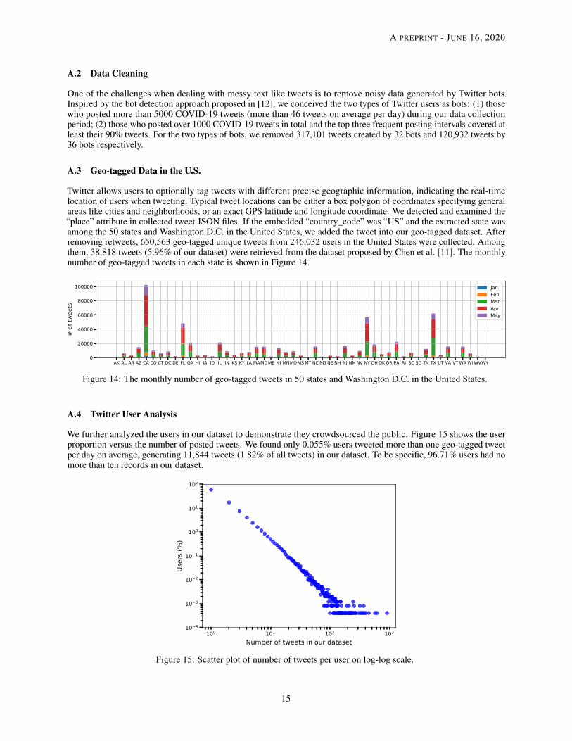
Twitter allows users to optionally tag tweets with different precise geographic information, indicating the real-timelocation of users when tweeting. Typical tweet locations can be either a box polygon of coordinates specifying generalareas like cities and neighborhoods, or an exact GPS latitude and longitude coordinate. We detected and examined the“place” attribute in collected tweet JSON files. If the embedded “country_code” was “US” and the extracted state wasamong the 50 states and Washington D.C. in the United States, we added the tweet into our geo-tagged dataset. Afterremoving retweets, 650,563 geo-tagged unique tweets from 246,032 users in the United States were collected. Amongthem, 38,818 tweets (5.96% of our dataset) were retrieved from the dataset proposed by Chen et al. [11]. The monthlynumber of geo-tagged tweets in each state is shown in Figure 14.
AK AL AR AZ CA CO CT DC DE FL GA HI IA ID IL IN KS KY LA MAMD ME MI MNMOMS MT NC ND NE NH NJ NM NV NY OH OK OR PA RI SC SD TN TX UT VA VT WA WI WVWY0
20000
40000
60000
80000
100000
# of
twee
ts
Jan.Feb.Mar.Apr.May
Figure 14: The monthly number of geo-tagged tweets in 50 states and Washington D.C. in the United States.
A.4 Twitter User Analysis
We further analyzed the users in our dataset to demonstrate they crowdsourced the public. Figure 15 shows the userproportion versus the number of posted tweets. We found only 0.055% users tweeted more than one geo-tagged tweetper day on average, generating 11,844 tweets (1.82% of all tweets) in our dataset. To be specific, 96.71% users had nomore than ten records in our dataset.
100 101 102 103
Number of tweets in our dataset
10 4
10 3
10 2
10 1
100
101
102
User
s (%
)
Figure 15: Scatter plot of number of tweets per user on log-log scale.
15

A PREPRINT - JUNE 16, 2020
References
[1] E.J. MUNDELL and Robin Foster. Coronavirus Outbreak in America Is Coming: CDC, 2020.[2] The White House. Proclamation on Declaring a National Emergency Concerning the Novel Coronavirus Disease
(COVID-19) Outbreak, 2020.[3] OpenStreetMap. Nominatim: a search engine for OpenStreetMap data, 2018.[4] Wikipedia. U.S. state and local government response to the COVID-19 pandemic, 2020.[5] Sarah Mervosh, Jasmine C. Lee, Lazaro Gamio, and Nadja Popovich. Coronavirus Outbreak in America Is
Coming: CDC, 2020.[6] David M Blei, Andrew Y Ng, and Michael I Jordan. Latent dirichlet allocation. Journal of machine Learning
research, 3(Jan):993–1022, 2003.[7] Michael Röder, Andreas Both, and Alexander Hinneburg. Exploring the space of topic coherence measures. In
Proceedings of the eighth ACM international conference on Web search and data mining, pages 399–408. ACM,2015.
[8] Steven Loria, P Keen, M Honnibal, R Yankovsky, D Karesh, E Dempsey, et al. Textblob: simplified text processing.Secondary TextBlob: Simplified Text Processing, 2014.
[9] Dictionary.com. What does the face with tears of joy emoji mean, 2017.[10] Yunhe Feng, Zheng Lu, Zhonghua Zheng, Peng Sun, Wenjun Zhou, Ran Huang, and Qing Cao. Chasing total solar
eclipses on twitter: Big social data analytics for once-in-a-lifetime events. In 2019 IEEE Global CommunicationsConference (GLOBECOM), pages 1–6. IEEE, 2019.
[11] Emily Chen, Kristina Lerman, and Emilio Ferrara. Covid-19: The first public coronavirus twitter dataset. arXivpreprint arXiv:2003.07372, 2020.
[12] Nikola Ljubešic and Darja Fišer. A global analysis of emoji usage. In Proceedings of the 10th Web as CorpusWorkshop, pages 82–89, 2016.
16