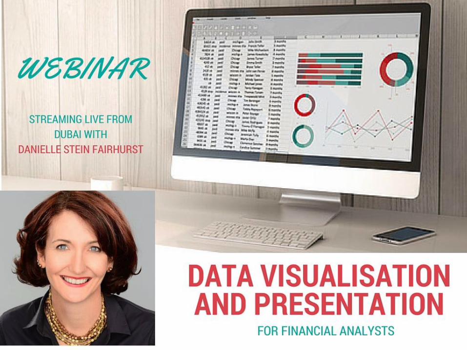
webinar: data visualisation and presentation for financial analysts
TRANSCRIPT

Data Visualisation and
Presentation for Financial Analysts
Danielle Stein Fairhurst

For supplementary material & updates, visit:
www.plumsolutions.com.au/book
You will find:
DOWLOADABLE RESOURCES
• Online resources & Weblinks (Chapter 1)
• Excel Versions (Chapter 5)
• Shortcuts (Windows Version) (Chap 5)
• Shortcuts (Mac Version) (Chap 5)
• How to Create a Break-Even Chart (Chapter 9)
• QA Log template (Chap 10, Appendix 10.1)MODELS
• Model Assessment Checklist (Chap 3)
• Salary Sacrifice Calculator (Chap 7)
• Scenario Comparison (including both Exercise and
Completed Versions) (Chap 11)

Data Visualisation and Presentation
for Financial AnalystsAgenda
1. Use visuals, not spreadsheets
2. Tell a story; our brains are better wired
for stories than abstract ideas
3. Make it personal. Don’t just spout
numbers. Put numbers into
perspective and make it relevant.
4. Use Excel for analysis, not
presentation

1. Use Visuals
Source: http://neomam.com/interactive/13reasons1 Google Ngram Viewer2 Google Trends3 Zacks, J., Levy, E., Tversky, B., Schinao, D. (2002). Graphs in Print,
Diagrammatic Representation and Reasoning London: Springer-Verlag.

Information OverloadWe receive five time as much information as we did in 1986
Alleyne, R. (11 Feb 2011). Welcome to the information age – 174 newspapers a day. The Telegraph

Infographics and other visuals are
successful at countering information
overload because…
• We like pictures
• We don’t like to read
• We want it now
and…

Is the Increase of Visual
Information “Dumbing us Down”?

Use visualisations
to grab your
audience’s
attention and get
your point across
Show your Message

Challenges when Presenting Financials
• Financial data is
complex. 85% of all
managers do not
understand the reports
they receive1
• Financial concepts are
not intuitive
• Audience comes from
different backgrounds
1. Source: Dr Irwin Jarett, Tomorrow’s Software

2. Tell a Story
• People respond to pictures and stories
• If they wanted data, just send a report.
• In a verbal presentation you can give them
emotion as well as data (no, it’s not a dirty
word)
• Slides should reinforce your message, not
repeat it
• Give them detailed financials as a handout
after the presentation.

Fatal and Non-Fatal
Workplace Accidents

Fatal and Non-Fatal Workplace
Accidents

Get your Message Straight
Men are more likely to die
in workplace accidents,
therefore we should hire
only women.
Is this a good interpretation of
the data?
0
500
1,000
1,500
2,000
2,500
3,000
3,500
Male Female
Fatal Workplace Accidents 2012

Workplace Safety is a
Deadly Responsibility
• Eight workers died over the past month:
• A worker, 46, crushed by a vehicle in a factory
• A 45-year-old killed after a cherry picker collapsed
• A ROAD worker killed by a reversing sweeper truck
• A 26-year-old crushed by a 150kg piece of machinery dropped
by a crane
• A 52-year-old dies after falling into a sewage tank
• A 73-year-old gored by a bull
• A 25-year-old man dies after a gas explosion in his van
• A worker crushed by a falling tree in the Otway Ranges
Source: Herald Sun

Case Studies
Gain the audience’s interest using stories, then back up
your message using the data

3. Make it Personal
• Your data is not the main event, you
are.
• Don’t rely the slides or the technology
• YOU are the presentation, not the
slides
• Data has no inherent meaning on its
own without context

Giving Data Meaning• Decision makers need insight, not information
• Give those numbers meaning by
comparing them to a benchmark
• Go further by adding some trends
• Exercise: if your target is to sell 120 units,
and 125 are produced, there’s no problem,
right?
Give them insight, not
numbers!

Show the Context
0
20
40
60
80
100
120
140
160
Jan Feb Mar Apr May Jun Jul Aug Sep Oct Nov Dec Jan Feb Mar Apr May Jun Jul Aug Sep Oct Nov Dec
Hstoricals vs TargetActual Target

For Example


4. Use Excel for analysis, not
presentation

Give them Insights, not Numbers
• Just because you love numbers,
doesn’t mean they do
• Don’t overwhelm
them with numbers
• Overwhelmed or
confused executives
won’t make decisions

Don’t embed a spreadsheet

Business Case for Pet Insurance Product - Scenario Analysis
Best Case Base Case Worst Case5 Year NPV: $2,705,912 $542,375 -$1,501,931
5 Year IRR: 40% 18% -5%
Payback: 3 Years and 8 months 4 Years and 4 months 5 Years and 3 months
-
50,000
100,000
150,000
200,000
250,000
-$10,000,000
-$5,000,000
$0
$5,000,000
$10,000,000
$15,000,000
$20,000,000
$25,000,000
$30,000,000
2017 2018 2019 2020 2021 2022 2023 2024 2025 2026
B USIN ESS CA SE F OR PET IN SUR A N CE PR ODUCT - WOR ST CA SE
Acquired Customers Cumulative Cashflow
Do summarise key points

Tips for Model Results Presentations• If running a live model, test the scenarios
you intend to run
• Only pick out the key points they need to
know
• Don’t just embed a spreadsheet onto a slide
• Numbers are only an underlying
measurement of your story
• Give your numbers meaning by comparing
them to a benchmark and add a trend
See “Using Excel for Business Analysis”, Chap12, p267

Presentation Structure
• How should you structure your
presentation?
₋ Take them through the model building
process?
₋ Walk them through the P&L?
₋ Think about what they need to know
• Be clear about the outcome of the
presentation. What do you want them to
do?
See “Using Excel for Business Analysis”, Chap12, p267

Remember…
confused
decision-makers
don’t make
decisions!

Have the Goal in
Sight• When presented with an
information dump,
executives will ask for
more analysis, hoping
you’ll come up with
something useful.
• Eg. “the purpose of this
session is….” or
“by the end of this meeting we will agree on….”
• Give them a roadmap or a clear structure for the
presentation

Excel Tools for Data Analysis

Excel Tools for Data Visualisation
• Charting
• Conditional Formatting;
₋Color Scales
₋Data Bars
₋Icon Sets
• Highlight Duplicates
• Sparklines

New Charts in Excel 2016

Which Chart Type?
Department Sales
Hammerhead $8,500
Mako $5,200
Goblin $7,600
Thresher $9,600


Using Visualisation to make
Sense of Messy Data

Using Visualisation to make
Sense of Messy Data