week three presentation
DESCRIPTION
Chapter 5 Notes John m lannon & don klepp Technical CommunicationTRANSCRIPT

STRUCTURE AND
LAYOUT
COMM. 1009: WEEK 3 INFORMATION DESIGN
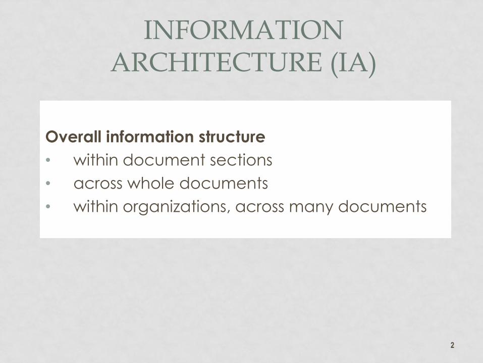
INFORMATION ARCHITECTURE (IA)
Overall information structure
• within document sections
• across whole documents
• within organizations, across many documents
2

DIRECT STRUCTURE
A summary followed by details, at the document,
section and paragraph levels
• results in clarity of structure for composition and
reading
• offers early bailout options for busy readers
unconcerned with detail
• supports searches for specific detail
• also known as pyramid or journalistic structure
3

CHUNKING CONTENT
Chunking makes information accessible to readers
Information should be chunked based on:
• Logical topical relationships
• Information needs of audience/proponent
4

GRAPHIC HIGHLIGHTING
Chunk information using whitespace
• Information chunks are signaled by using white
space and headings
• White space makes text visually more
appealing.
And headings
• Headings label chunked information
• Heading levels identify importance of chunks.
5

DESIGN CONVENTIONS
Use design conventions to arrange information
chunks
• Select an appropriate column grid
• Place visuals near related text
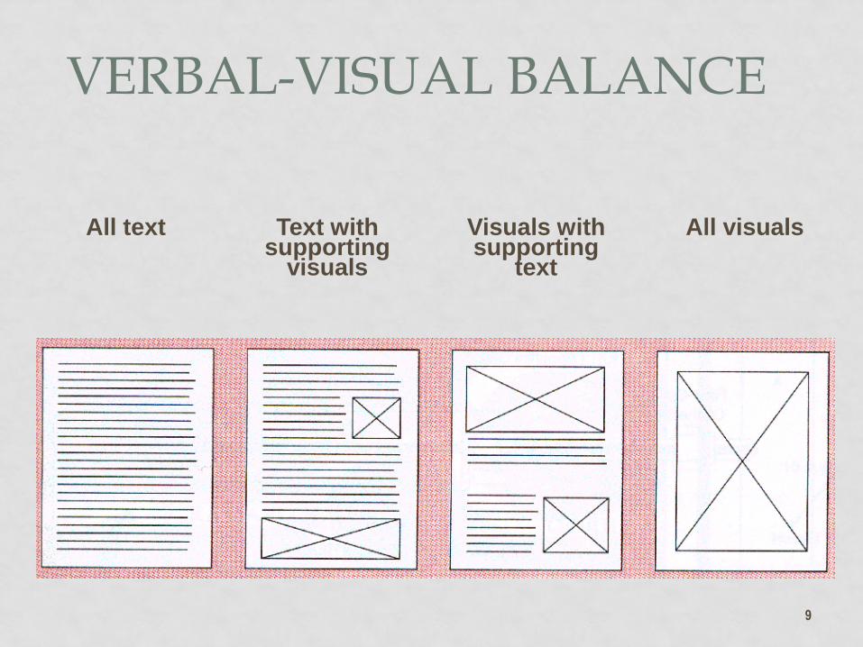
• Use appropriate visual-verbal balance.
6
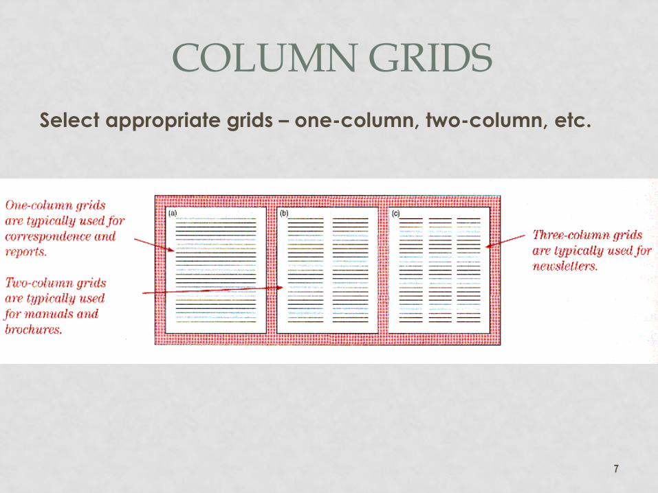
Select appropriate grids – one-column, two-column, etc.
7
COLUMN GRIDS
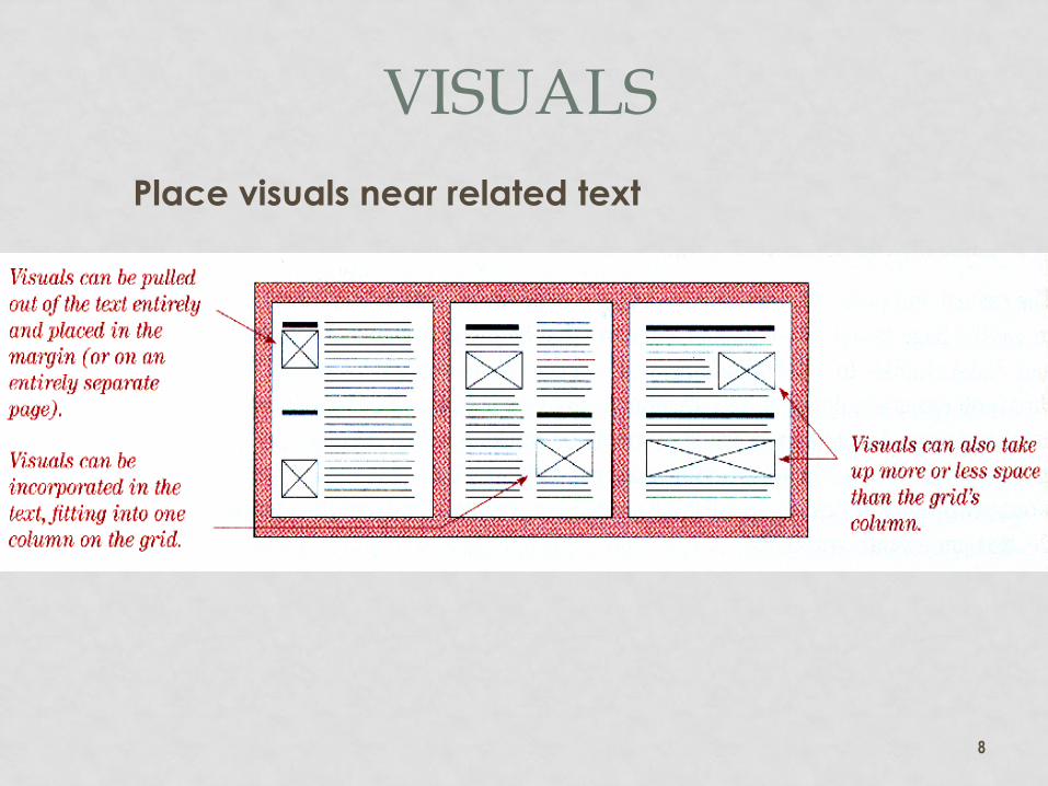
Place visuals near related text
8
VISUALS
9
All text Text with supporting
visuals
Visuals with supporting
text
All visuals
VERBAL-VISUAL BALANCE

TYPOGRAPHY
Emphasize information using:
• Typefaces (fonts)
• Typeface variations
• Typographic devices.
10

GOOD TYPEFACES
• Enhance message without being
distracting
• Are selected for the distribution medium
• Are the products of centuries of
typography
• Are now known as fonts, though that is
actually an element of measure in
typography, as in, this is a 24-point font.
11
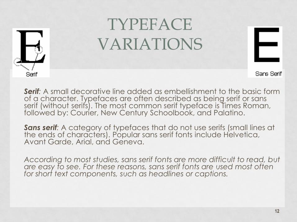
Serif: A small decorative line added as embellishment to the basic form
of a character. Typefaces are often described as being serif or sans serif (without serifs). The most common serif typeface is Times Roman, followed by: Courier, New Century Schoolbook, and Palatino.
Sans serif: A category of typefaces that do not use serifs (small lines at the ends of characters). Popular sans serif fonts include Helvetica, Avant Garde, Arial, and Geneva.
According to most studies, sans serif fonts are more difficult to read, but are easy to see. For these reasons, sans serif fonts are used most often for short text components, such as headlines or captions.
12
TYPEFACE VARIATIONS
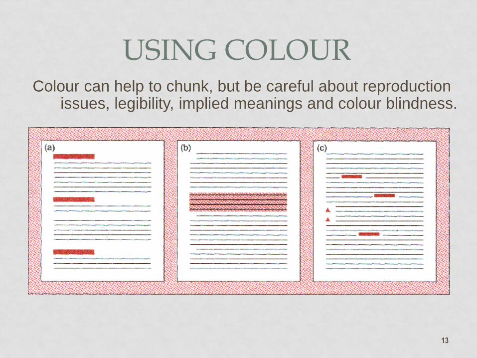
Colour can help to chunk, but be careful about reproduction issues, legibility, implied meanings and colour blindness.
13
USING COLOUR
TOMBSTONES, WIDOWS AND ORPHANS
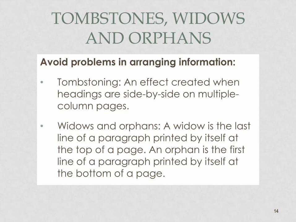
Avoid problems in arranging information:
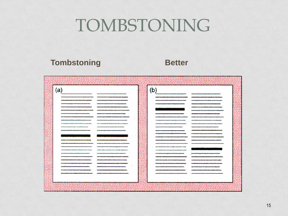
• Tombstoning: An effect created when
headings are side-by-side on multiple-
column pages.
• Widows and orphans: A widow is the last
line of a paragraph printed by itself at
the top of a page. An orphan is the first
line of a paragraph printed by itself at
the bottom of a page.
14
15
Tombstoning Better
TOMBSTONING

16
WIDOWS AND ORPHANS

C.R.A.P. DESIGN
• Contrast: if something is different, make it very different to show the distinction
• Repetition: repeat design approaches to similar elements
• Alignment: align like items to show associations and improve reader access
• Proximity: use spacing (including Space before and after) to show relationships
Adapted from: John Tollett, The Non-Designers Design Book, 3rd Ed., 2008
17