zooming, focus + context, and distortion presenters: stephanie hornung and leah zagreus
TRANSCRIPT
Zooming, Focus + Context, and Distortion
Presenters: Stephanie Hornung and
Leah Zagreus
Zooming, Focus + Context, and Distortion
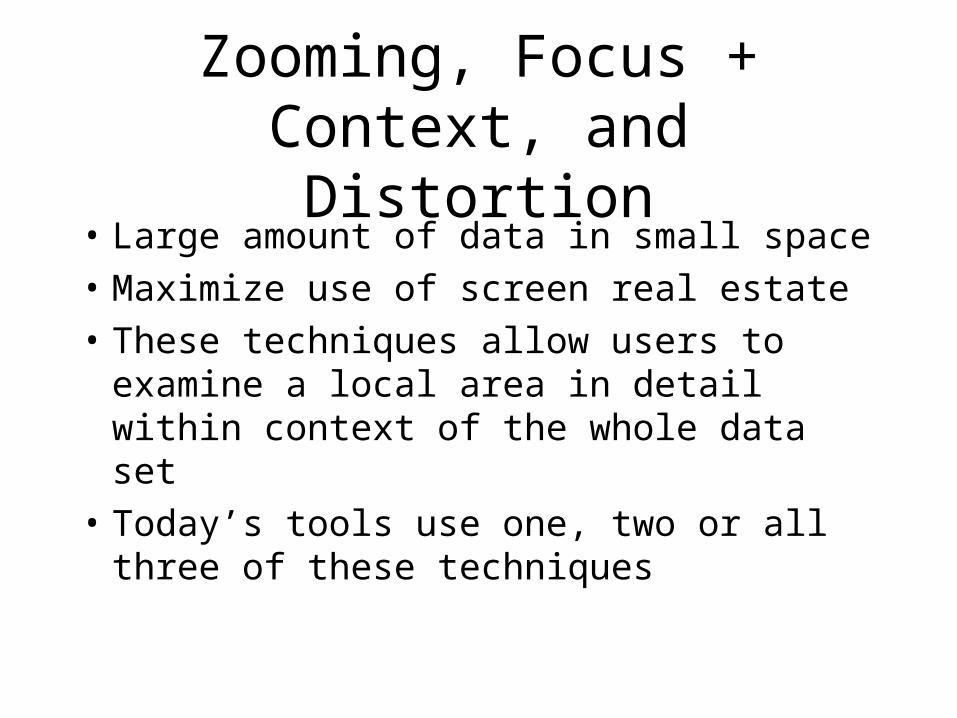
• Large amount of data in small space• Maximize use of screen real estate• These techniques allow users to
examine a local area in detail within context of the whole data set
• Today’s tools use one, two or all three of these techniques
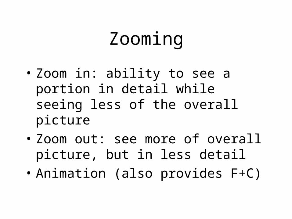
Zooming
• Zoom in: ability to see a portion in detail while seeing less of the overall picture
• Zoom out: see more of overall picture, but in less detail
• Animation (also provides F+C)
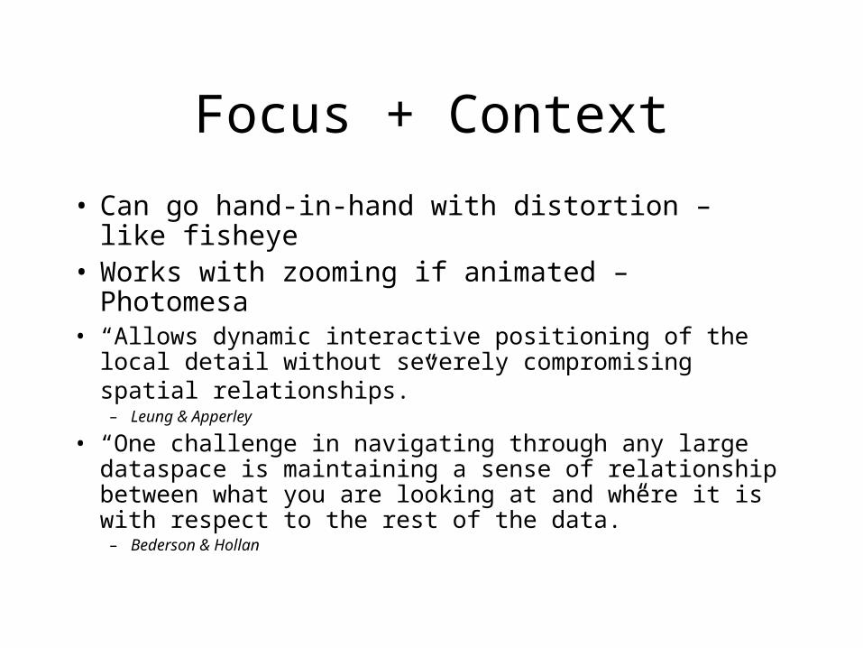
Focus + Context
• Can go hand-in-hand with distortion – like fisheye
• Works with zooming if animated – Photomesa • “Allows dynamic interactive positioning of the local
detail without severely compromising spatial relationships.” – Leung & Apperley
• “One challenge in navigating through any large dataspace is maintaining a sense of relationship between what you are looking at and where it is with respect to the rest of the data.”– Bederson & Hollan
Distortion
• With Focus + Context– Data not in focus is suppressed and
distorted– Data of interest is larger and clearer
(may still be distorted – polyfocal view)
Readings
• “A Review and Taxonomy of Distortion-Oriented Presentation Techniques,” Leung & Apperley, 1994
• “Information Visualization Using 3D Interactive Animation,” Robertson, Card, & Mackinlay, 1993
• “Pad++: A Zooming Graphical Interface for Exploring Alternate Interface Physics,” Bederson & Hollan, 1994
• “Data Mountain: Using Spatial Memory for Document Management,” Robertson, et al, 1998
• “Fisheye Menus,” Bederson, 2000• “Quantum Treemaps & Bubblemaps for a
Zoomable Image Browser,” Bederson, 2001
Leung & Apperley: Distortion
Unified theory of distortion techniques
• “…stretchable rubber sheet mounted on a rigid frame”
• Stretching = Magnification• Stretching one part must equal
shrinkage in other areas
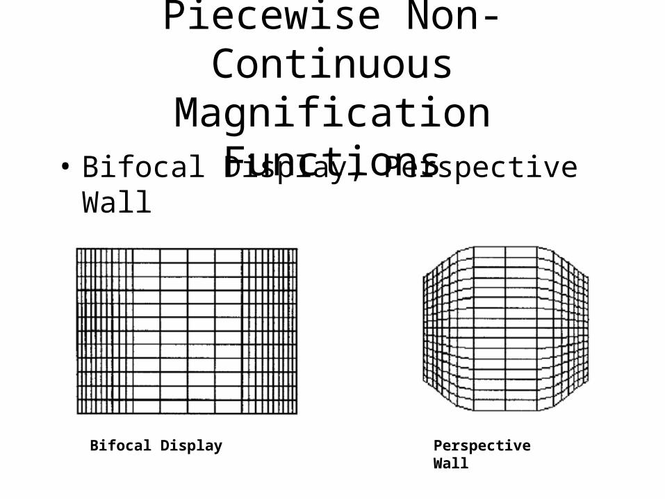
Piecewise Non-Continuous Magnification Functions
• Bifocal Display, Perspective Wall
Bifocal Display Perspective Wall

Bifocal Display
• Combination of detail view and two distorted side views
• Can be applied in 2D– Since the corners are
distorted by the same amount in x and y, it’s just scaled, not distorted
Perspective Wall
• Similar to Bifocal, except demagnifies at increasing rate, while Bifocal is constant
• Visualizes linear information such as timeline
• Adds 3D but wastes real estate on screen (which is contrary to prime objectives of distortion techniques)

Continuous Magnification Functions
• Fisheye View, Polyfocal Display– Can distort boundaries because
applied radially rather than x y
1D Fisheye 2D Polyfocal
Fisheye View
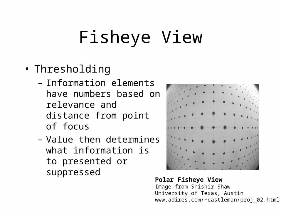
• Thresholding– Information elements
have numbers based on relevance and distance from point of focus
– Value then determines what information is to presented or suppressed
Polar Fisheye ViewImage from Shishir ShawUniversity of Texas, Austinwww.adires.com/~castleman/proj_02.html

Polyfocal Display
• Highest peak is focus of display
• Distorts shape of boundaries
• Troughs surrounding peaks are highly distorted and can effectively be shrunk to nothing
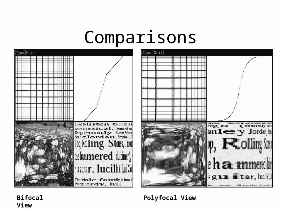
Comparisons
Bifocal View
Polyfocal View
Conclusions
• Techniques presented aim to solve problems of presenting large amounts of data in a confined space.
Robertson, Card & Mackinlay
• Tech advances: processing, networking
• Demand for info management apps
• Beyond the desktop metaphor– 1980s: text-editing– 1990s: information access
Information Visualization
• “Information Visualization attempt to display structural relationships and context that would be more difficult to detect by individual retrieval requests.”
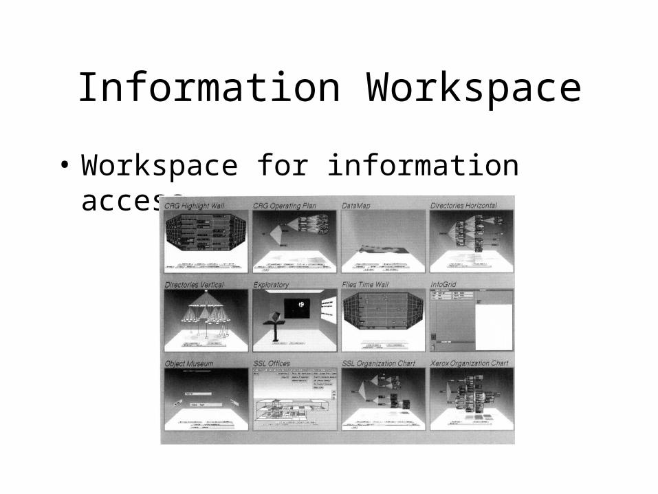
Information Workspace
• Workspace for information access
Information Workspace, cont’d
• Low-cost, immediate access to stored objects
• Exploits power of new computers• Intends to answer demand for
information management applications
• Information’s “cost structure”
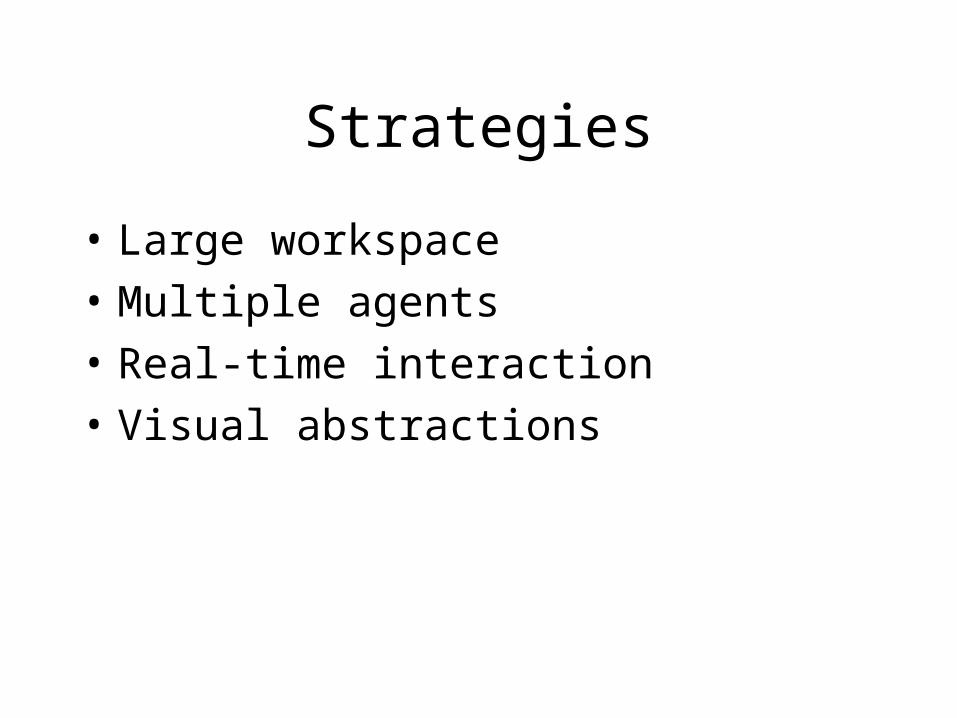
Strategies
• Large workspace• Multiple agents• Real-time interaction• Visual abstractions

Large workspace
• Add virtual screen space– Rooms– Extend the “WIMP” desktop metaphor
• Increase density– Animation– 3D perspective
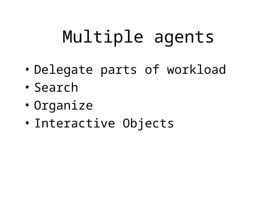
Multiple agents
• Delegate parts of workload• Search• Organize• Interactive Objects
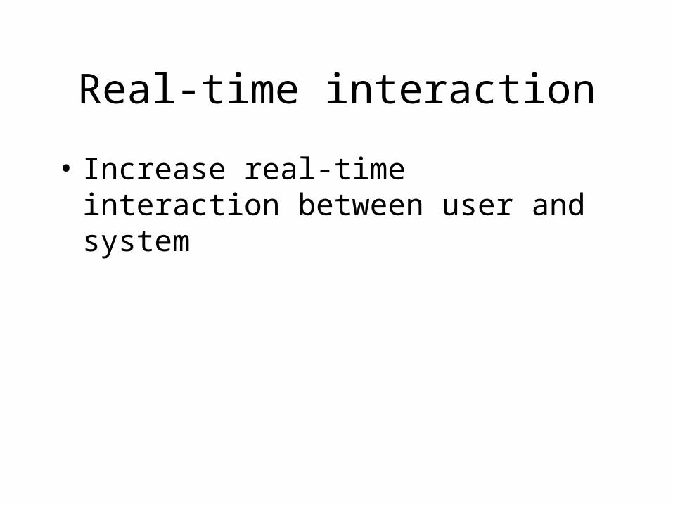
Real-time interaction
• Increase real-time interaction between user and system

Visual abstractions
• Shift cognitive load to application• Abstract information structures
speed user’s ability to assimilate and retrieve information

Interactive objects
• Room surfaces• Controls• Visualization

3D Navigation
• Walking Metaphor• Point of Interest Logarithmic Flight• Object of Interest Logarithmic
Manipulation• Doors• Overview
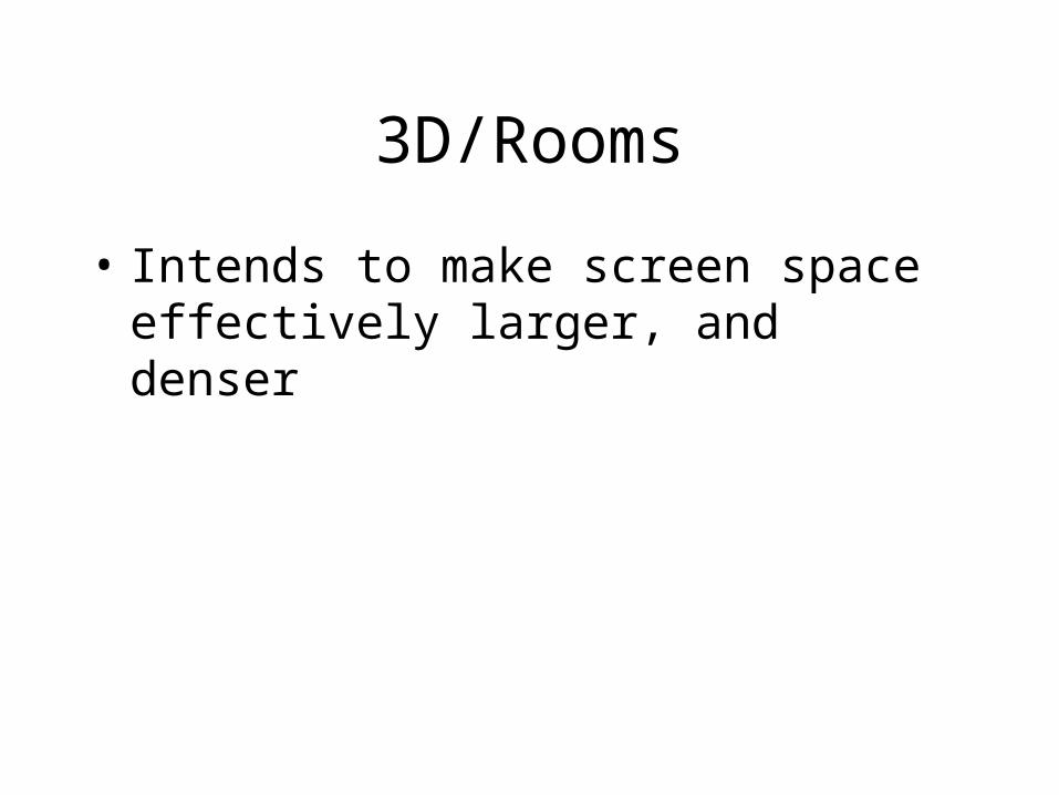
3D/Rooms
• Intends to make screen space effectively larger, and denser
Visualizers
• “attempt to present abstractions of large amounts of data tuned to the pattern detection properties of the human perceptual system”
• Interactive animation• 3D perspective
Visualizers, cont’d
• Hierarchical: Cone Tree• Linear: Perspective Wall• Spatial: Floor Plan• Continuous: Data Sculpture• Unstructured: Information Grid
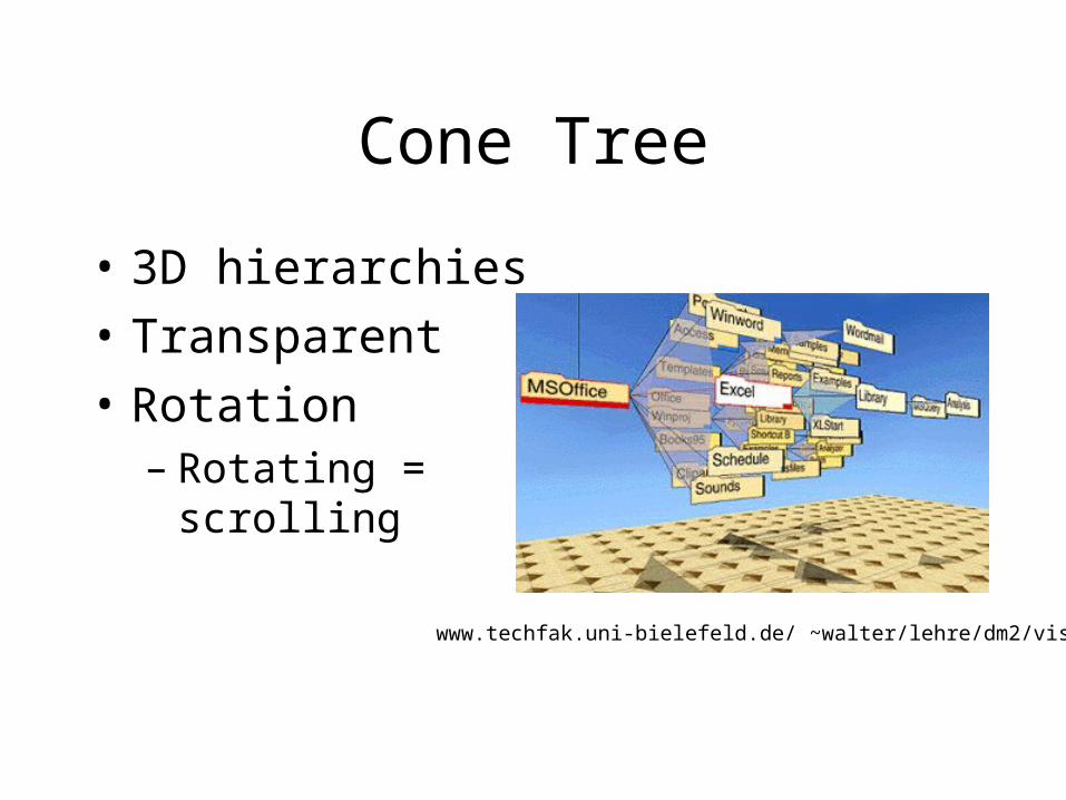
Cone Tree
• 3D hierarchies• Transparent• Rotation
– Rotating = scrolling
www.techfak.uni-bielefeld.de/ ~walter/lehre/dm2/vis/

Cone Tree, cont’d
• Difficult to see all contents of a directory
• “Gratuitous dimensionality” – Kevin Mullet, Icarian.com
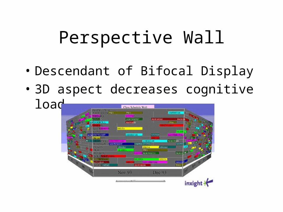
Perspective Wall
• Descendant of Bifocal Display• 3D aspect decreases cognitive
load
Perspective Wall, cont’d
• Typical example use is file navigation– However few files can be displayed at
once– Shown by date, type
• Provides Focus + Context, but wastes screen real estate
Conclusions
• Interactive animation to shift cognitive load
• 3D to maximize effective use of screen space
• Implemented new innovations• Works toward further innovation• Need more examples of real-world
use• Need usability studies
Bederson & Hollan: Pad++
• Beyond the desktop metaphor• Informational physics
– Representational cues a natural product of interaction (e.g., dog-eared books)
– History-enriched digital objects• Believes desktop metaphor
underutilizes mechanisms of new media
• Too much information
Pad++
• Not an application• Component employed by other
applications• Supports text, files, hypertext,
graphics and images• Semantic zooming: different
representations of objects at different zoom levels

Interface
• Graphical interface based on zooming• Attempts to tap into our natural spatial
ways of thinking• Intuitive interface for finding
information in large dataspace on small display
• Interface design as a “development of a physics of appearance and behavior for collections of informational objects.”

Physics
Pad++ Physics
• View information at different scales• Relationship between elements in
application• Furnas’ DOI approach• Focus + Context• Zoom• Smooth animation on zoom
maintains context
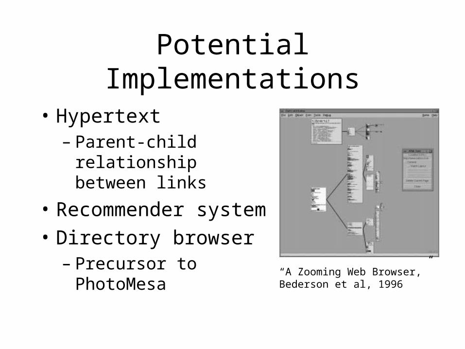
Potential Implementations
• Hypertext– Parent-child
relationship between links
• Recommender system
• Directory browser– Precursor to
PhotoMesa
“A Zooming Web Browser,” Bederson et al, 1996
Physics v. Metaphor
• Initial use of metaphor restricts potential functionality
• Dead metaphors?– Files, menus, windows, desktop– But these metaphors work!
• Combine physics with desktop metaphor for hypertext application, others
Conclusions
• Learnability consequences• Need more applications utilizing
Pad++• Usability studies
Robertson et al: Data Mountain
• “novel user interface for document management designed specifically to take advantage of human spatial memory.”
• Attempts to apply mental mapping of physical space to virtual space– i.e. finding a piece of paper using
spatial memory
Key Attributes
• Place documents arbitrarily • 2D interaction in 3D space• Active page avoidance• Audio cues• Page titles• Landmarks

Document Placement
• Arbitrary placement allows users to create their own organizational schemes
• Act of placement aids spatial memory
3D Space
• 2D interaction allows use of familiar mouse
• Cues include: perspective view, occlusion, landmarks and shadows
• Can display more information without increasing cognitive load– Pre-attentive processing of
perspective views
Page Avoidance Behavior
• Initially, did nothing– System was lifeless, weakened
metaphor• Simulated tall grass
– Two pages can end-up in same place, occlusion
• Minimum distance between pages– Gives consistent feedback– Prevents pages from being obscured
Audio Cues
• Audio cues are meant to reinforce visual cues– Are they a bit much?– Perhaps they would be more useful if
more subtle
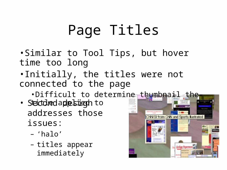
Page Titles
• Second design addresses those issues:– ‘halo’– titles appear
immediately
•Similar to Tool Tips, but hover time too long•Initially, the titles were not connected to the page
•Difficult to determine thumbnail the title applied to
Landmarks
• Surface has colored areas to facilitate conceptual organization
• Landmarks can assist in spatial navigation– Add visual cues to improve recall
User Study
• Our first user study… yeah!• Compares Data Mountain with
Internet Explorer 4• Users organized 100 pre-selected
pages and then retrieved them with either title, summary, thumbnail or all three as cues

IE4 v. Data Mountain
• IE4 excelled with title cues, but other cues were deleterious to retrieval
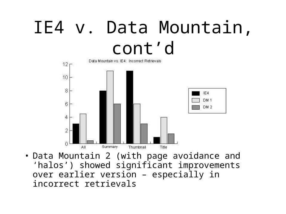
IE4 v. Data Mountain, cont’d
• Data Mountain 2 (with page avoidance and ‘halos’) showed significant improvements over earlier version – especially in incorrect retrievals
User Study Flaws
• Impact of time between storage and retrieval?
• Retrieval tests should be based on information need, not simple cues – like Kobsa paper from last week

Conclusions
• Need better user study• Should incorporate features
requested by users (i.e. group labels, ability to move landmarks)
• User study helps designers learn from others’ mistakes
Bederson: Fisheye Menus
• Dynamically change the size of a menu item to provide a focus area around the mouse pointer, while allowing all menu items to remain on screen
Menu Design
• Standard menu design appropriate for selecting operations– Well grouped– In consistent locations
Menu Design, cont’d
• Menus now include data items (i.e. bookmarks/favorites)– Tend to be longer– Users are less likely to know text of
each item• Supporting browsing is important
• Length is crucial in usability

Other Menu Approaches
• Scrolling Arrows• Hierarchical• Scrollbars
Scrolling Arrows
• User required to move mouse to arrows to scroll
• Access time is proportional to length
Hierarchical
• Requires user to know what group desired element is in
• Works well if user knows structure• Okay for stable menus• Uncommon for data-driven menus
(what about Favorites/Bookmarks?)

Scrollbars
• Better search time than arrows – fixed
• But rarely used for pull-down menus in applications
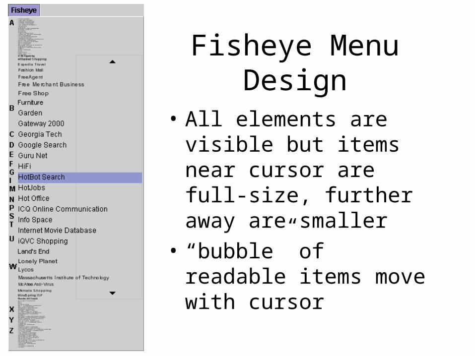
Fisheye Menu Design
• All elements are visible but items near cursor are full-size, further away are smaller
• “bubble” of readable items move with cursor
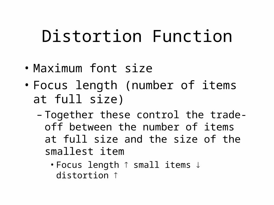
Distortion Function
• Maximum font size• Focus length (number of items at
full size)– Together these control the trade-off
between the number of items at full size and the size of the smallest item• Focus length small items distortion
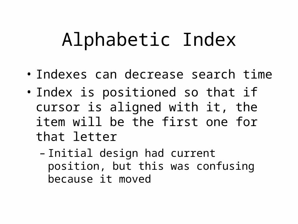
Alphabetic Index
• Indexes can decrease search time• Index is positioned so that if cursor
is aligned with it, the item will be the first one for that letter– Initial design had current position, but
this was confusing because it moved
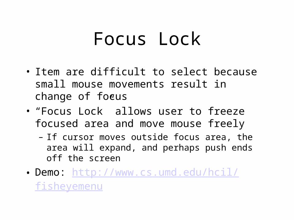
Focus Lock
• Item are difficult to select because small mouse movements result in change of focus
• “Focus Lock” allows user to freeze focused area and move mouse freely– If cursor moves outside focus area, the area
will expand, and perhaps push ends off the screen
• Demo: http://www.cs.umd.edu/hcil/fisheyemenu
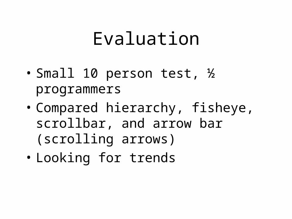
Evaluation
• Small 10 person test, ½ programmers
• Compared hierarchy, fisheye, scrollbar, and arrow bar (scrolling arrows)
• Looking for trends
Evaluation Findings
• Hierarchy was best for goal-directed task
• Fisheye preferred for browsing– Not significantly though– Non-programmers rated it much lower
than programmers• Only one person discovered Focus
Lock• Index was thought to be interactive
Conclusions
• Author sees needs for improvements– Focus lock should be more intuitive
• Could be useful for long menus, such as fonts, favorites, etc. if implemented well– Similar viz is part of Mac OS X!
Bederson: PhotoMesa
• Zoomable Image Browser• Quantum Treemaps
– Variation on existing treemaps– Difference: objects of elemental size– Build on Ordered Treemap algorithm,
but guarantee aspect ratio• Bubblemaps also quantum, but
non-rectangular; use space more efficiently
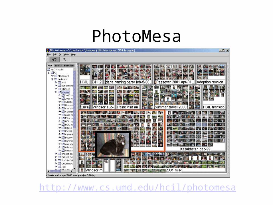
PhotoMesa
http://www.cs.umd.edu/hcil/photomesa

Motivation
• Image browsing– Regardless of IR system, must browse
results– Often browse along with other people
• Current systems– Grid with vertical scrollbar– Custom albums time-consuming
• Concentrate on images
Goal
• Automatically lay out images• Use immediately – little setup time• Large set of images in context
Organization of Images
• Default groupings are by directory, time, or filename– No hierarchy
• Makes managing photos difficult: can delete, but reorganization a problem
• Can add metadata
PhotoMesa Interface
• Zooming = primary presentation mechanism
• Zoom in, zoom out on levels of thumbnails• Quickly drill down to individual picture (at
full resolution)• Outline shows area of next zoom level• History of views• Thumbnail zooms up when hover w/cursor• Export images• Cluster by filename
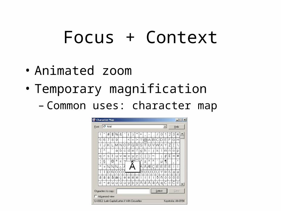
Focus + Context
• Animated zoom• Temporary magnification
– Common uses: character map

Quantum v. Ordered Treemaps
• Quantum Treemaps better in terms of aspect ratio
• But, QT wastes space• Most importantly, QT always
produce layouts where elements are the same size

Bubblemaps
• Like Quantum Treemaps, elements guaranteed to be same size
• Arbitrary shapes• No wasted space• May be harder to
visually parse than QT
Use of PhotoMesa
• No controlled studies– Bederson uses with daughter – Members of Bederson’s lab
Future Work
• Further usability studies• Additional image types
– Currently JPEG, GIF only
• Performance
Overall Conclusions
• The techniques all facilitate user comprehension the relationship between selected information and other items
• Screen real estate use– Zoom and focus + context combined
maximize screen space– Depending on the application, adding
distortion can be helpful